Archive

Archive for June, 2022

Useful Tools for Visualizing Databases on a Budget

June 13th, 2022 No comments

A diagram is a graphical representation of information that depicts the structure, relationship, or operation of anything. Diagrams enable your audience to visually grasp hidden information and engage with them in ways that words alone cannot. Depending on the type of project, there are numerous ways to use diagrams. For example, if you want to depict the relationship between distinct pieces, we usually use an Entity Relationship Diagram (ERD). There are many great tools that can help you sketch out your database designs beautifully.

In this article, I will be sharing some of my favorite tools that I use to curate my data structures and bring my ideas to life.

Google Docs Drawing

The drawing function in Google Docs allows you to add illustrations to your pages. You can add custom shapes, charts, graphs, infographics, and text boxes to your document with the built-in drawing tool.

Sketching with Google Docs

Although it is simple to add a graphic to your Google Docs, the procedure is not totally visible. Here’s how:

1 . Open a new document on Google Docs.

Screenshot of a new document in Google Docs.

2 . Click on the insert button and select Drawing . Then, from the drop-down option, choose New to open the drawing screen.

Screenshot of adding a new Drawing in Google Docs.

3 . You can use the toolbox on this screen to add text boxes, select lines, and shapes, and modify the colors of your drawing.

Screenshot of selecting an Arrow in Google Docs.

4 . You may also use the cursor to adjust the size of your drawings and the color of your designs by using the toolbox at the top of your screen.

Screenshot of customizing a drawing in Google Docs.

5 . When finished, click the Save and close button. You can click on the “File” toolbar displayed on the top of your screen to download your document.

Features

Cost Free.
CLI? GUI? Online? Online.
Requires an Account? Yes, a Google account is required.
Collaborative Editing? Yes, with Google Drive sharing.
Import SQL Not Applicable.
Export SQL Not Applicable.
Export Formats .doc, .pdf, .rtf, .odt, .txt, .html, .epub
Generate Shareable URL Yes.

Google Docs offers amazing convenience. However, diagramming databases is not something it was intended for. You may find yourself frustrated with redrawing arrows and relationships if you are making frequent edits to your model.

Graphviz

Graphviz is a free graph visualization software that allows us to express information diagrammatically.

Screenshot of database entity relationships using Graphviz.

Graphviz implements the DOT language. The DOT language is an abstract grammar that makes use of terminals, non terminals, parentheses, square brackets, and vertical bars. More information about the DOT language can be found in its documentation.

Features

Cost Free.
CLI? GUI? Online? CLI.
Visual Studio Code, Eclipse, and Notepad++.
Graphical Interfaces.
Requires an Account? No.
Collaborative Editing? Not Applicable.
Import SQL Yes, using SQL Graphviz.
Export SQL Yes, using SQL Graphviz.
Export Formats .gif, .png, .jpeg, .json, .pdf and more
Generate Shareable URL Not Applicable.

Graphviz has an impressive and supportive community. However, a high level of SQL support is only available when you install additional third-party software. This overhead may make it less approachable to users that are not comfortable setting up their computer to support these tools.

ERDPlus

ERDPlus is a database modeling tool that allows you to create Entity Relationship Diagrams, Relational Schemas, Star Schemas, and SQL DDL statements.

Screenshot of database entity relationships using ERDPlus.

It includes a brief guide on how to create your ER diagrams, which is especially useful for beginners. You can also easily convert your created ER diagrams to relation schemas.

Features

Cost Free.
CLI? GUI? Online? Online.
Requires an Account? Not required, but recommended for saving.
Collaborative Editing? Not Applicable.
Import SQL No.
Export SQL Yes, with the support of SQL DDL statements.
Export Formats .png
Generate Shareable URL Not Applicable.

ERDPlus is suited for SQL. It does lack additional export formats and ability to share with teams, but these features are not necessary with import and export.

Diagrams.net

Diagrams.net (previously Draw.io) is a free online diagramming tool that can be used to create flowcharts, UML diagrams, database models, and other types of diagrams.

Screenshot of database entity relationships using Diagrams.net.

Features

Cost Free.
CLI? GUI? Online? Desktop and Online.
Requires an Account? Not required, but recommended for saving.
Collaborative Editing? Sharing requires Google Drive or OneDrive.
Import SQL Yes.
Export SQL No.
Export Formats .png, .jpeg, .svg, .pdf, .html and more.
Generate Shareable URL Yes, export as URL an option.

Diagrams.net is designed to support many different workflows. Its ability to easily integrate with third-party integrations such as Trello, Quip, Notion, and others distinguishes it from the other options. The ability to share and collaborate may make it work well for collaborative teams.

Conclusion

This article is based on using free database tools that could help visualize your ideas and their capabilities with limitations to great details on how to use these tools.

In my research, I also came across other excellent tools with free trials available for creating database diagrams like Lucidchart, EDrawMax, and, DrawSQL. However, these free trials have limitations which may make them less suited for developers working on multiple projects.

I strongly recommend that you read the documentation for each of these tools to determine what works best for you and, most importantly, to avoid any difficulties in using these tools.

Thank you for taking the time to read this far, and I hope you found what you were looking for. Have a wonderful day!


Useful Tools for Visualizing Databases on a Budget originally published on CSS-Tricks. You should get the newsletter.
Categories: Designing, Others Tags:

Exciting New Tools for Designers, June 2022

June 13th, 2022 No comments

Automation is the theme of this month’s collection of exciting new tools for designers and developers. There are tools to make your images better, tools to create illustrations, and tools to make your workflow more efficient. Plus, a whole host of tools that are just plain fun.

Here’s what is new for designers this month…

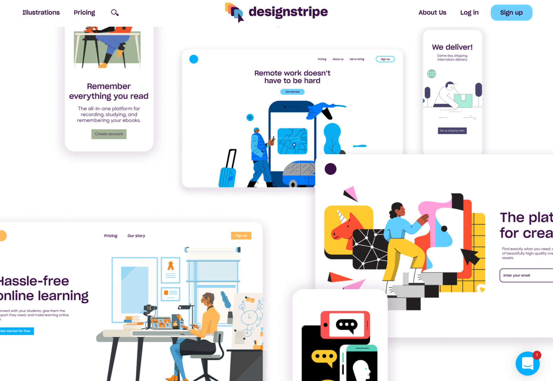
designstripe

designstripe lets you create beautiful illustrations with no design skills. Drag and drop different elements into place, then customize them for your brand.

DesignMaestro

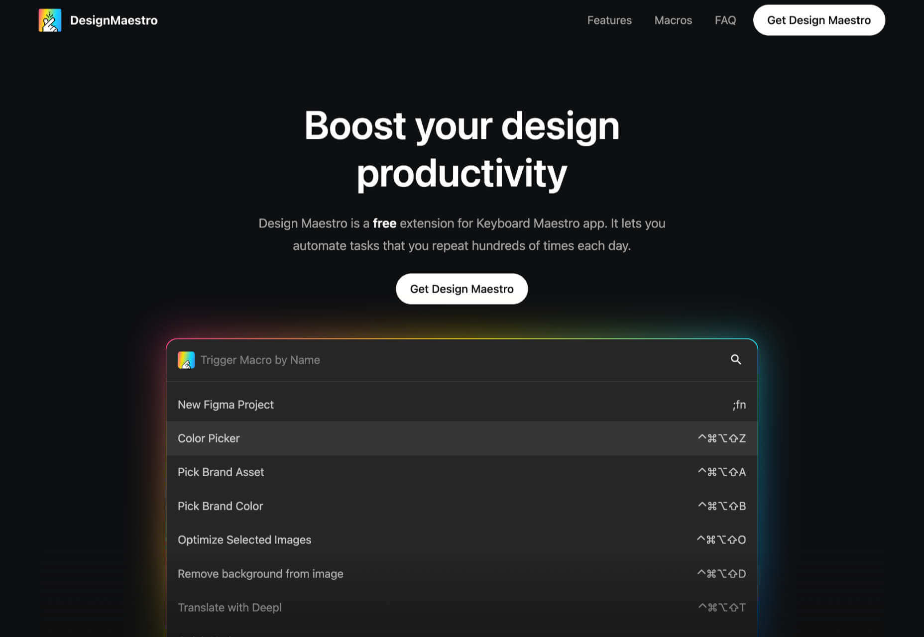
DesignMaestro is a free keyboard extension app that lets you automate the tasks you repeat daily. Set up a macro with a keyboard shortcut, and tap the shortcut to perform the action.

Ghost 5.0

Ghost is one of the best personal blogging platforms around, and version 5 enhances it with custom code, support for video, and performance upgrades.

Yep

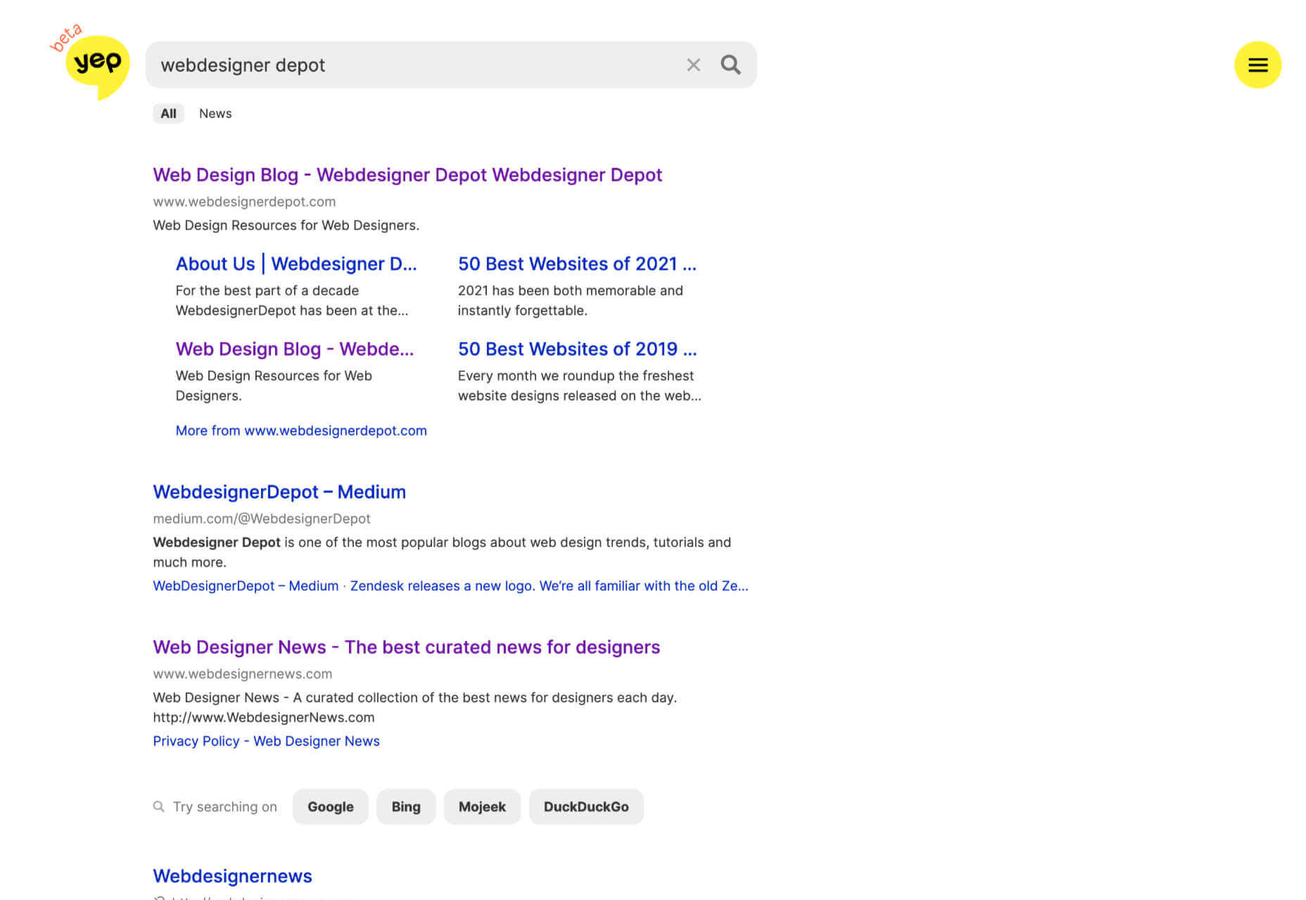
Yep is a new search engine from the makers of Ahrefs. Built from the ground up, Yep will give 90% of its ad revenue to content creators.

The CTO Field Guide

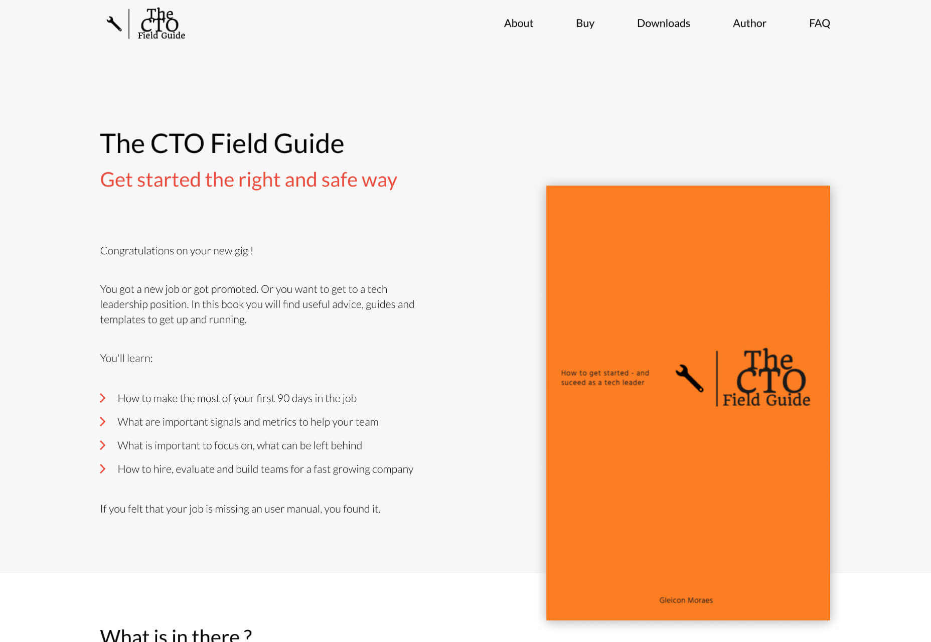
The CTO Field Guide is a free ebook for anyone newly promoted to a technology officer role or looking for a tech leadership role. It’s a simple guide to making the most of your first 90 days on the job.

ASCII Art Paint

ASCII Art Paint is a free, open-source web app for creating images made up of text characters and hieroglyphs. It’s a great way to add pictures to text-only formats.

Effekt

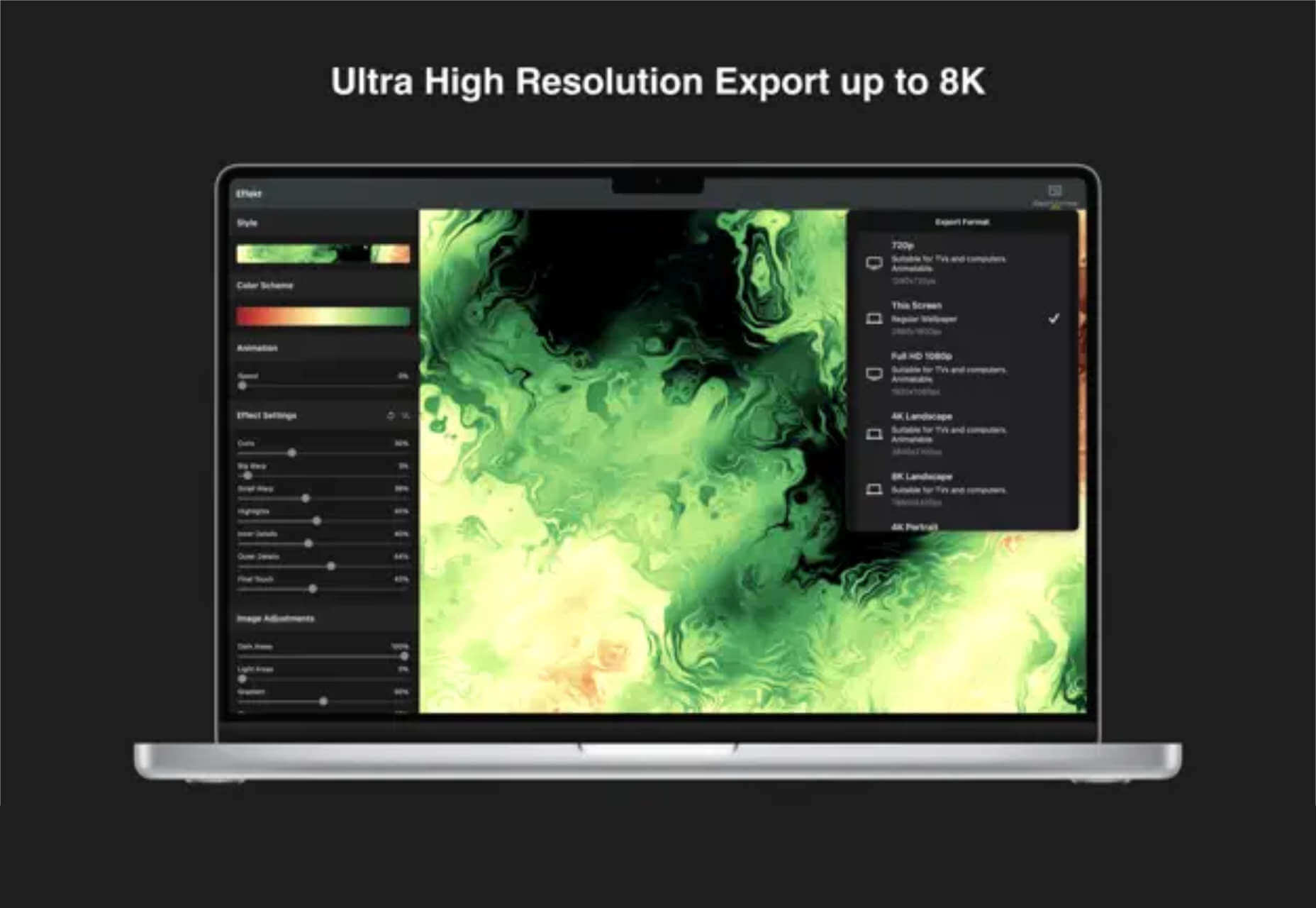
Make your own fun, wallpaper art at up to 8k resolution using Effekt, a mix between an image editor and a visual toy.

Animatiss

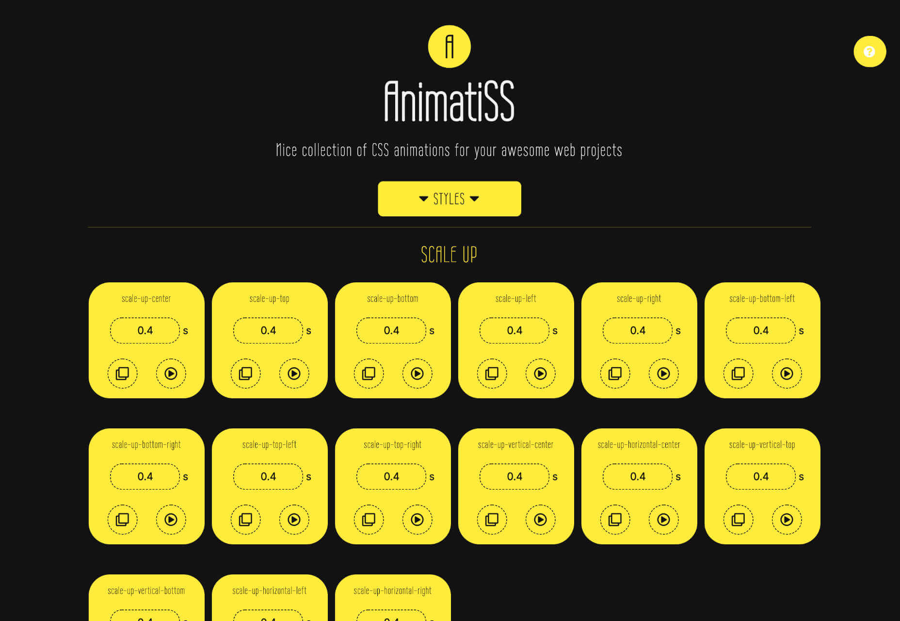
Animatiss is a fantastic collection of CSS animations that you can use for free. Tailor the speed of the animation, preview it, then copy and paste the code into your project.

Skiff

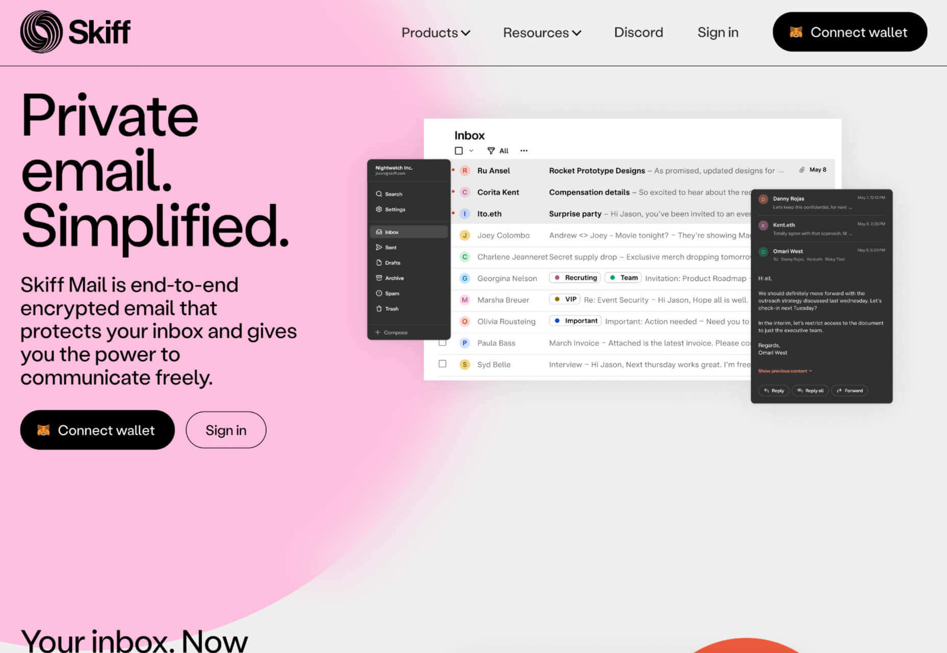
Skiff Mail is an email app that features end-to-end encryption. This means your email stays private and secure, so you’re free to discuss sensitive matters.

Super Designer Tools

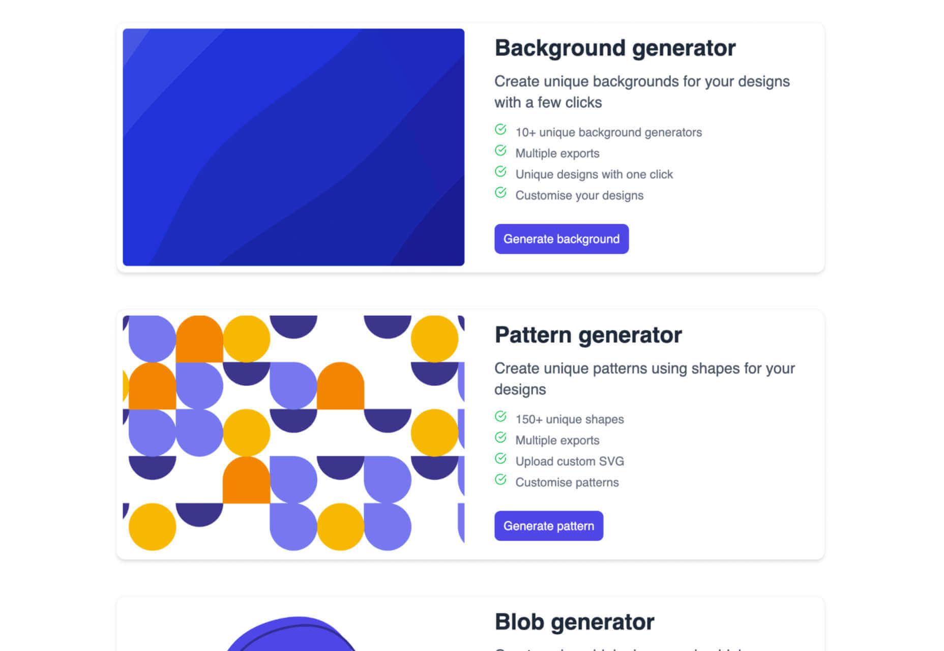
Super Designer is a collection of design tools for performing simple tasks. There’s a background generator, a pattern generator, a blob generator, and more—all free to use.

Web UI

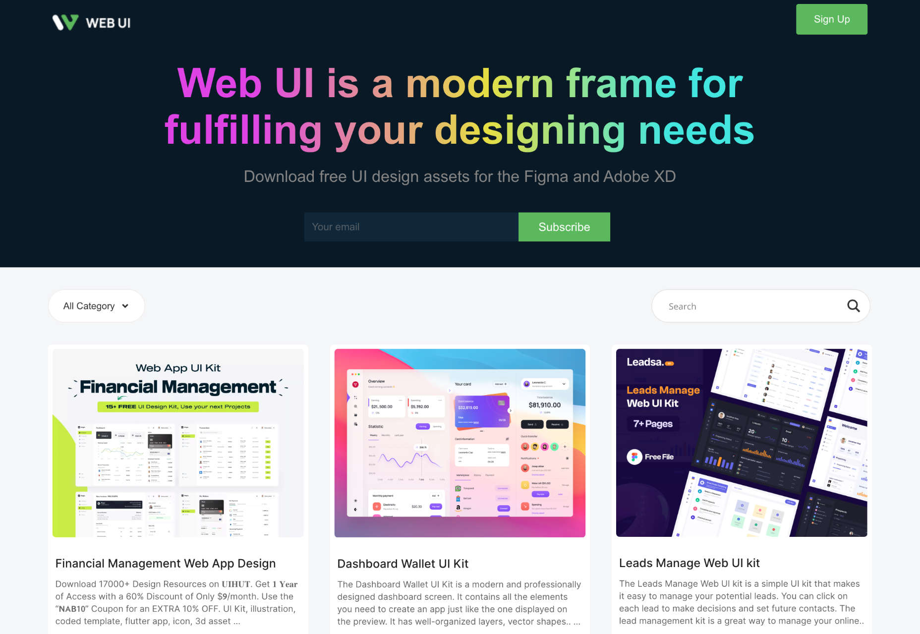
Web UI is a collection of UI kits and templates for Figma and Adobe XD. Most designs are free to download and use for projects, and some require payment.

Free Online Background Remover

Use this free online background remover to quickly and easily delete the background of photos, leaving you free to paste the foreground over flat colors, gradients, or even different backgrounds.

Untitled UI Icons

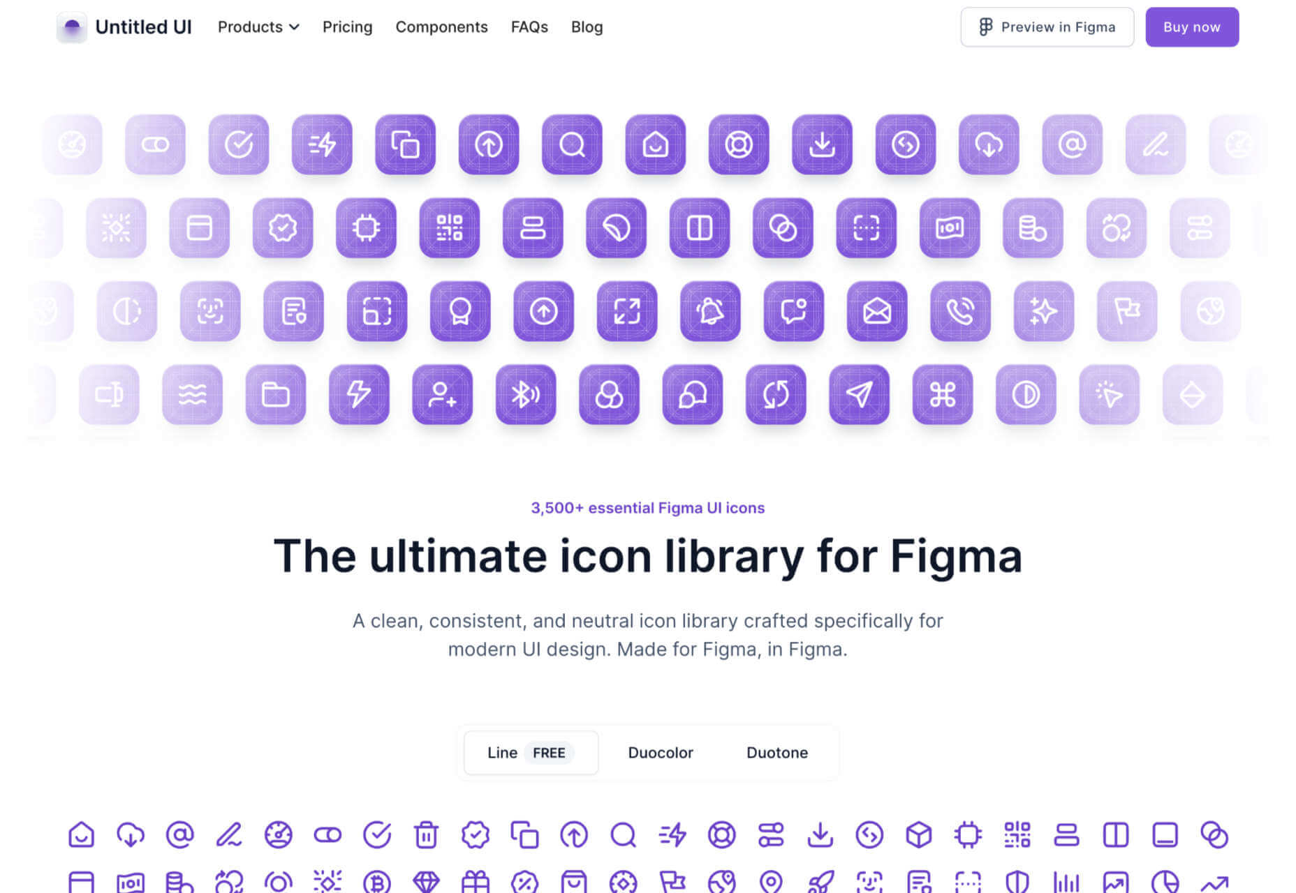
Untitled UI Icons is a set of clean, consistent, and neutral icons made for Figma in Figma. There are 3,500 icons in total. The line style is free to download.

OS

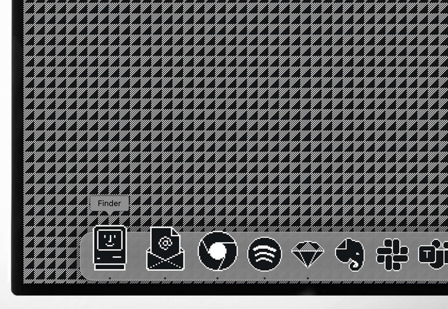
Turn your Mac or iPhone into an old-school Macintosh with this retro wallpaper and icon set, and transport yourself back to 1984. OS is a premium download.

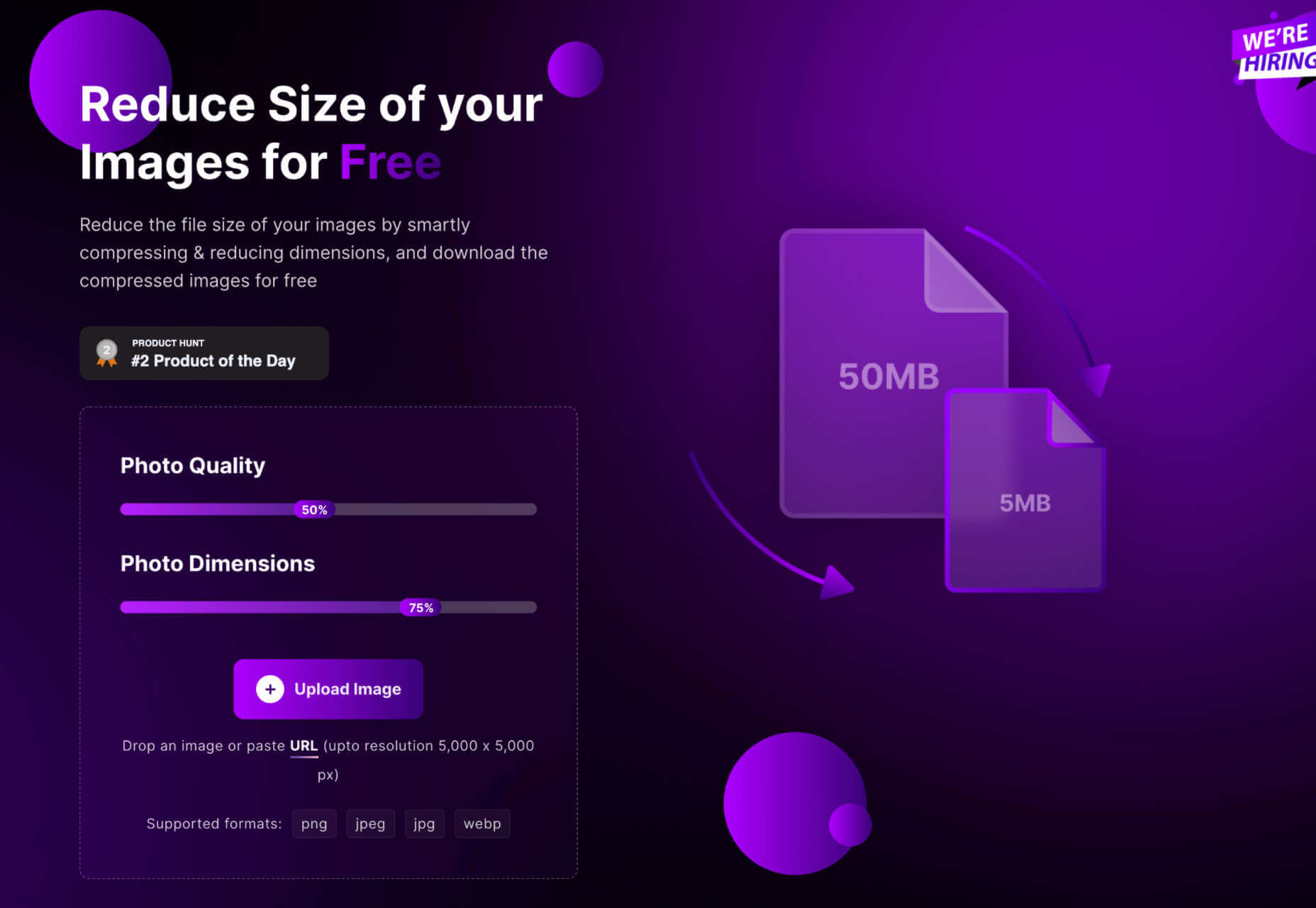
Shrink.media

Shrink.media is a free app for web, iOS, and Android that lets you reduce the size of your image file size and dimensions to reduce its footprint.

3D Avatars

This big library of 3D avatars is perfect for any project that needs staff images. There are different ethnicities, clothing, facial expressions, and accessories, so you never run out of options.

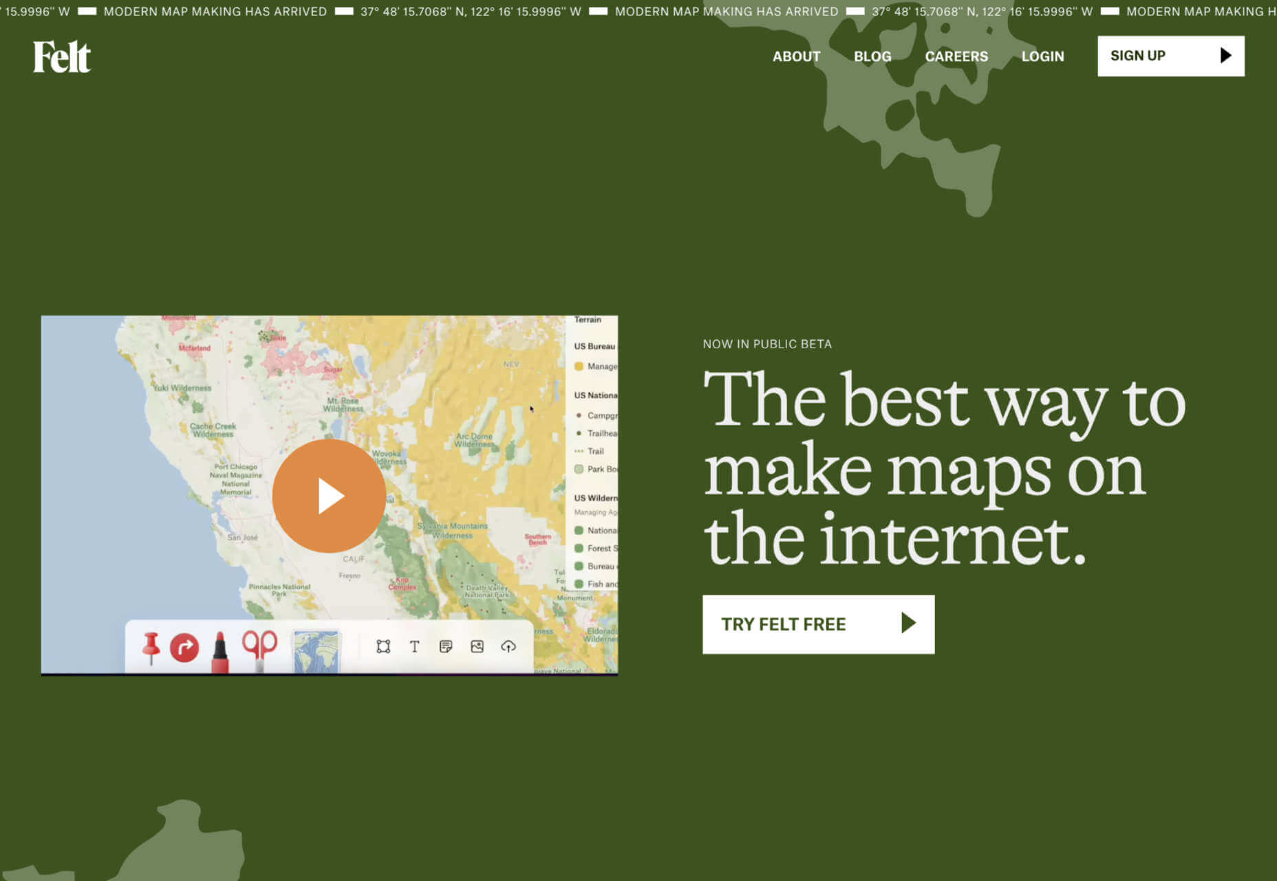
Felt

Felt is a modern map maker for the web that gives you more control, more design options, and easier sharing than Google maps.

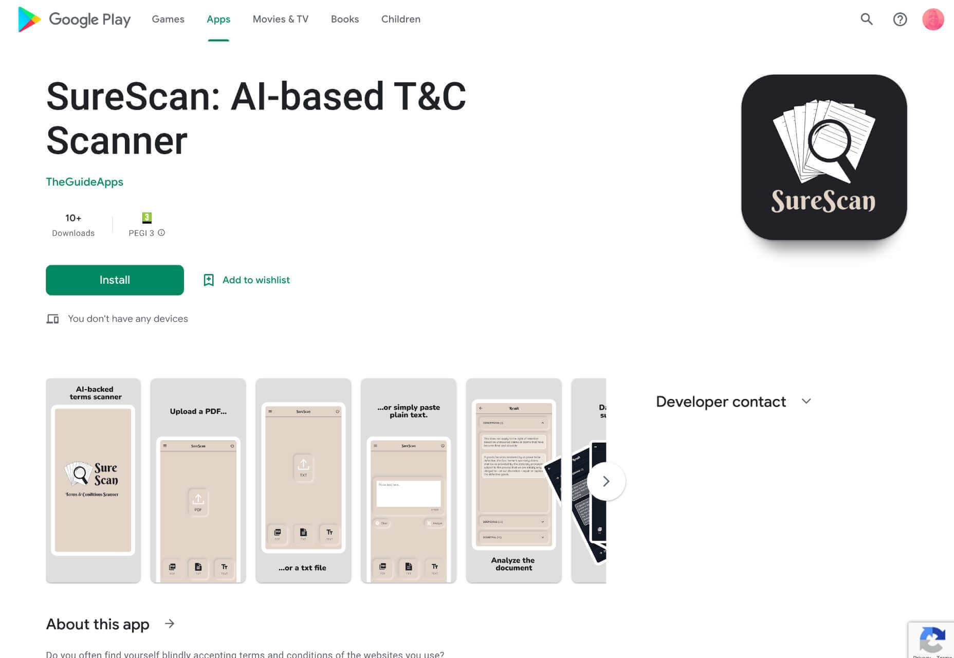
SureScan

SureScan is a helpful app that hunts through terms and conditions for dubious conditions on your behalf, so you can spend your time doing something less boring.

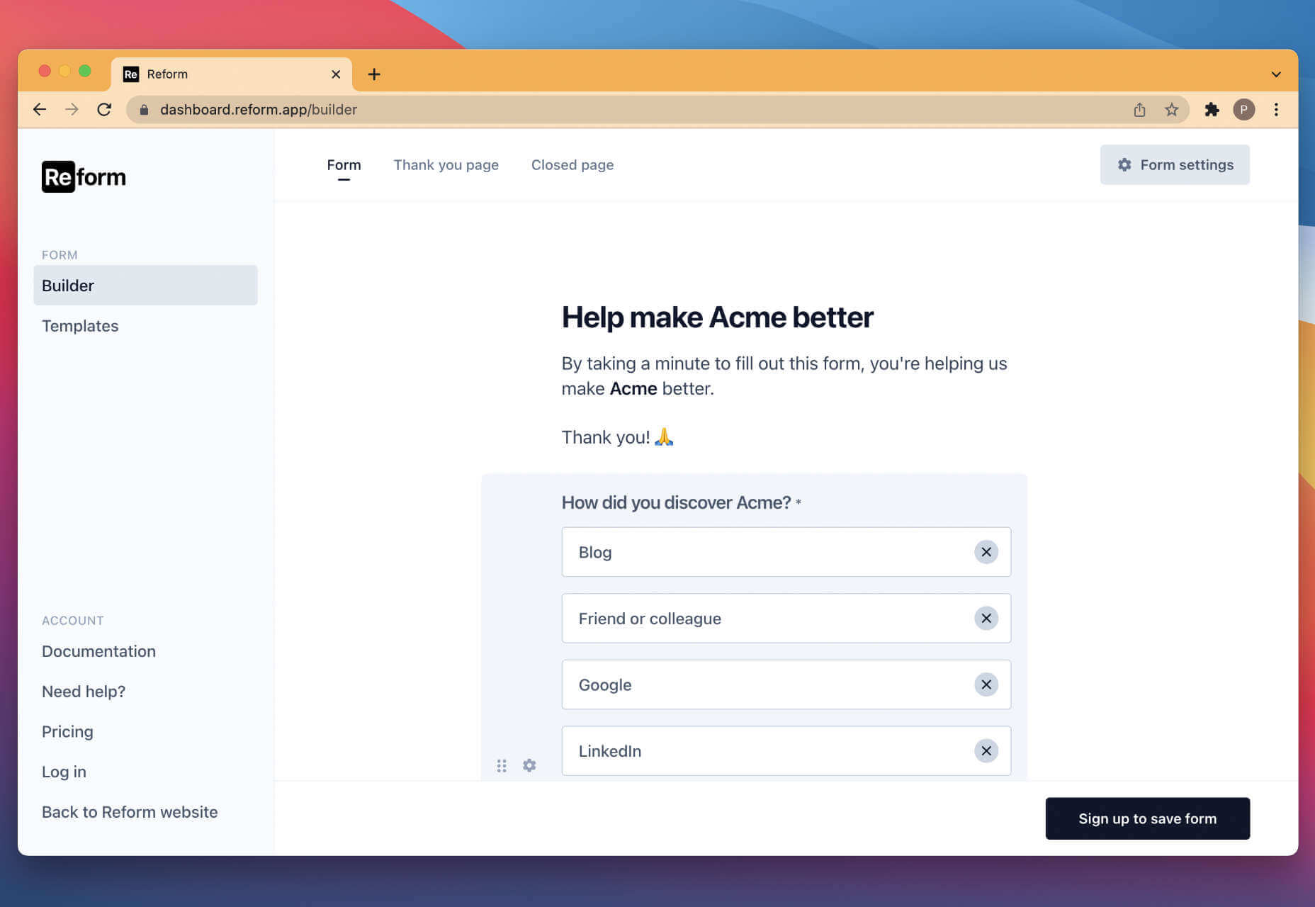
Reform

Reform is a no-code form builder that you can use to create clean, branded forms for your business without any design or code skills.

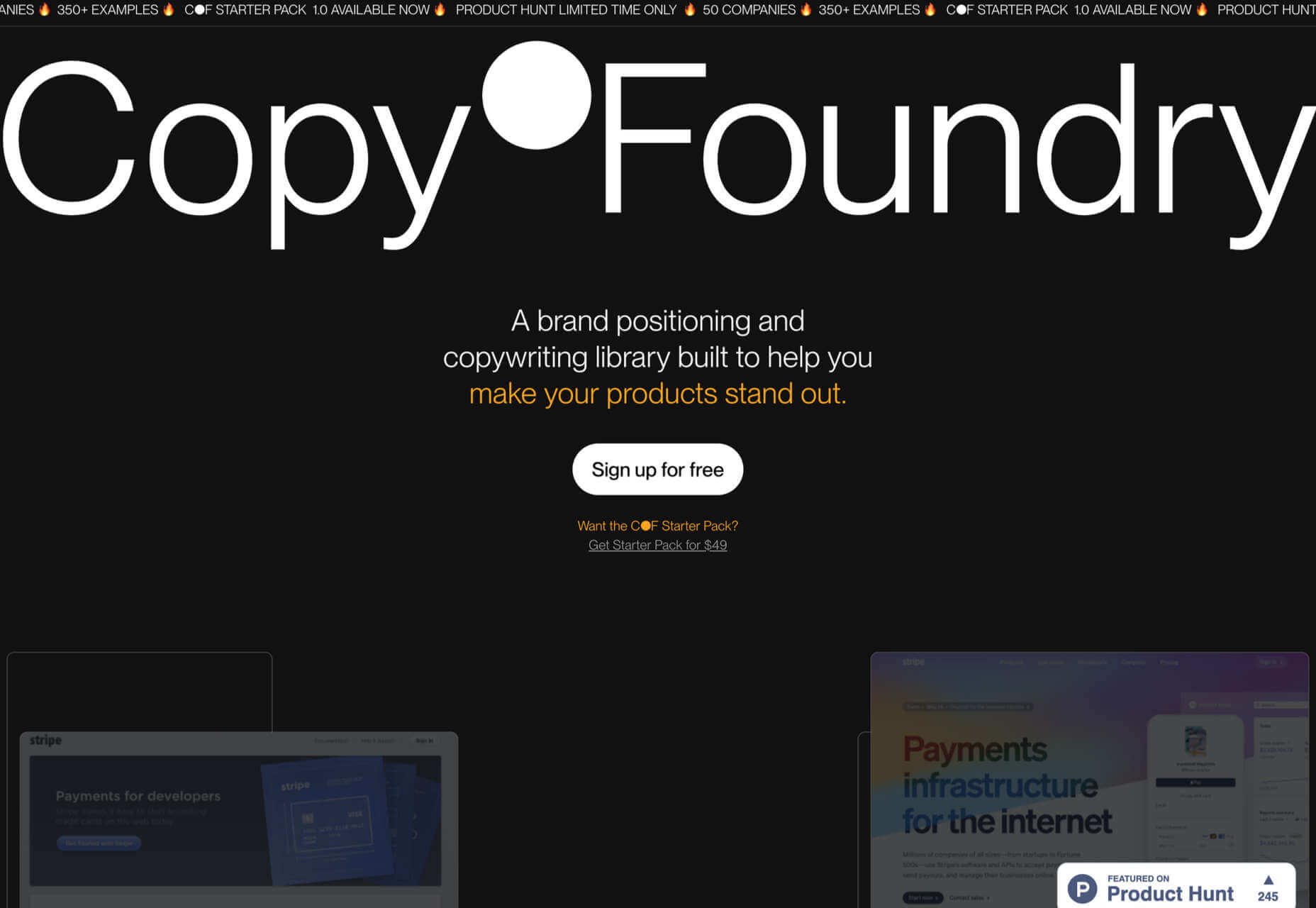
Copy Foundry

Discover how the best brands evolve their messaging over time with Copy Foundry, a brand positioning, and copywriting library to help your products stand out.

Source

The post Exciting New Tools for Designers, June 2022 first appeared on Webdesigner Depot.

Categories: Designing, Others Tags:

8 Easy Ideas to Grow Your YouTube Channel Quickly

June 13th, 2022 No comments

With popular sites like Snapchat, Facebook, Instagram, Twitter, and YouTube remains the market leader. If you know a few tactics, YouTube, the world’s “second largest search engine” can help you get your content found quickly and increase engagement. 

Here are 8 efficient techniques to grow your YouTube channel:

1. Create Videos Around a Single Keyword or Topic

The easiest strategy to attract the attention you desire, increase your following and grow your YouTube channel is to design your video around a particular topic or keyword. Many individuals who aren’t familiar with SEO’s best practices overlook this, but it’s critical if you want your videos to reach as many people as possible.

It’s essential to zero in on your primary keyword before you begin developing the video content because:

  • It will help you put together the most relevant materials related to the most trending topics in the videos.
  • If you incorporate your keyword as naturally as possible throughout the content, YouTube can pick it up when transcripts or closed captions are added.

Additionally, don’t forget to optimize your title and descriptions once you’ve chosen your keyword. This will grow your YouTube channel exponentially.

2. Reformat Existing Quality Content

The most straightforward strategy to grow your YouTube channel is to create excellent content. Some of your best videos that are available at present have been created and developed from existing materials. 

Such videos, especially those created to resolve existing problems, can be highly useful, engaging, valuable, and actionable. That’s because people often turn to YouTube to look for solutions and how-to lessons for difficulties they’re having, so video that solves problems is a natural fit and would create maximum engagement.

3. Audience Engagement

It’s vital to remember that YouTube is a social media platform that requires substantial social interaction. YouTube recognizes and rewards channels with high engagement levels. This includes total time spent on the channel, watch time, likes and dislikes, and, most significantly, comments, which will automatically grow your YouTube channel. Make sure to respond to all the comments, encourage viewers to like the video, and subscribe to your channel.

Video transcription can also boost your audience engagement. Adding accurate transcripts to your videos enables people to comprehend your video better and allows people with impaired hearing to access your videos as well.

4. Your Branding

Analyze your channel well to understand whether it is visually appealing or not. Your channel needs to have a professional look and feel if you want visitors to take your YouTube channel seriously, increase viewership, and want more viewers to subscribe to your channel. Users will be able to recognize your video content more quickly if you appropriately brand your channel.

If you own a website or a blog, you might have already created a template giving it a unique look and feel to set yourself apart from other businesses and competitors. Therefore, it only makes sense to extend that branding to your YouTube channel as well. 

Along with visual branding, don’t forget to include custom URLs in your channel header, trending hashtags related to your content, as well as a compelling bio about yourself and your videos.

5. Promote Your Youtube Channel and Videos on Other Popular Social Media Channels

One of the most appealing aspects of social media is the ability to cross-promote content across many platforms, which can help you grow your YouTube channel exponentially. The easiest and most practical tactic to increase your viewership and audience is to promote your YouTube videos and channel on your other popular social media platforms. 

What is your target audience watching and consuming? They could be watching anything from Facebook, Instagram, TikTok, or any other popular social media networks? There are a variety of social media channels available to choose from. 

If you wish to broadcast videos straight to a channel (such as Facebook), you can always do a teaser for the full-length video on YouTube to ensure maximum engagement across all channels. Also, don’t forget about your blog. You can optimize its potential by using it to submit and promote your videos.

6. Show Up

It can be quite advantageous to put your face on screen irrespective of whether you’re running YouTube by yourself or as part of a small corporation. When you put a face to a brand, people are more likely to connect with you as a person, thus helping you grow your YouTube channel.

Bloggers, fitness, life and business gurus, and solopreneurs, all benefit from this. You don’t have to show your face in every video you make, but you should reach out to your audience in every few videos or so. If you’re this type of YouTuber, you should also use a photo of yourself on your channel instead of a cliché logo.

7. Increase Your Uploading Frequency

This suggestion may appear scary at first, but increasing your posting frequency to at least one video per week can help you develop your audience, as well as grow your YouTube channel. The significance of being consistent with your content quality and frequency cannot be overstated.

Keep your followers informed about when new videos will be released by consistently posting each day or week (depending on your frequency). After then, stick to your plan and post at the scheduled time without fail. This will also enhance your credibility.

8. Post Great Thumbnails

Thumbnails may appear insignificant, yet they have a significant influence. YouTube uses thumbnails to promote other videos in its sidebar, so you want your content to stand out. The same rule of thumb might as well apply to YouTube searches. Even if the material isn’t as important, videos with a snappy title and appealing thumbnail often rank better since they have a greater click-through rate (CTR).

Conclusion

Despite popular myths, the most successful videos on YouTube with high appeal and viewership are often less than 5 minutes long. Keeping your video content crisp and concise can substantially help in the long-term growth and success of your YouTube channel. 

Remember that it’s through good quality content presented well that you can generate more and more engaged followers and, as a result, brand advocates! Try to use the best possible sound and lighting equipment, video editing software, etc., and rope in a skilled team to create high-quality content. If you add transcripts, collaborate with a professional transcription services company for the best results. Stay true to yourself and the core values of your brand while communicating with your audience.

The post 8 Easy Ideas to Grow Your YouTube Channel Quickly appeared first on noupe.

Categories: Others Tags:

Popular Design News of the Week: June 6, 2022 – June 12, 2022

June 12th, 2022 No comments

Every day design fans submit incredible industry stories to our sister-site, Webdesigner News. Our colleagues sift through it, selecting the very best stories from the design, UX, tech, and development worlds and posting them live on the site.

The best way to keep up with the most important stories for web professionals is to subscribe to Webdesigner News or check out the site regularly. However, in case you missed a day this week, here’s a handy compilation of the top curated stories from the last seven days. Enjoy!

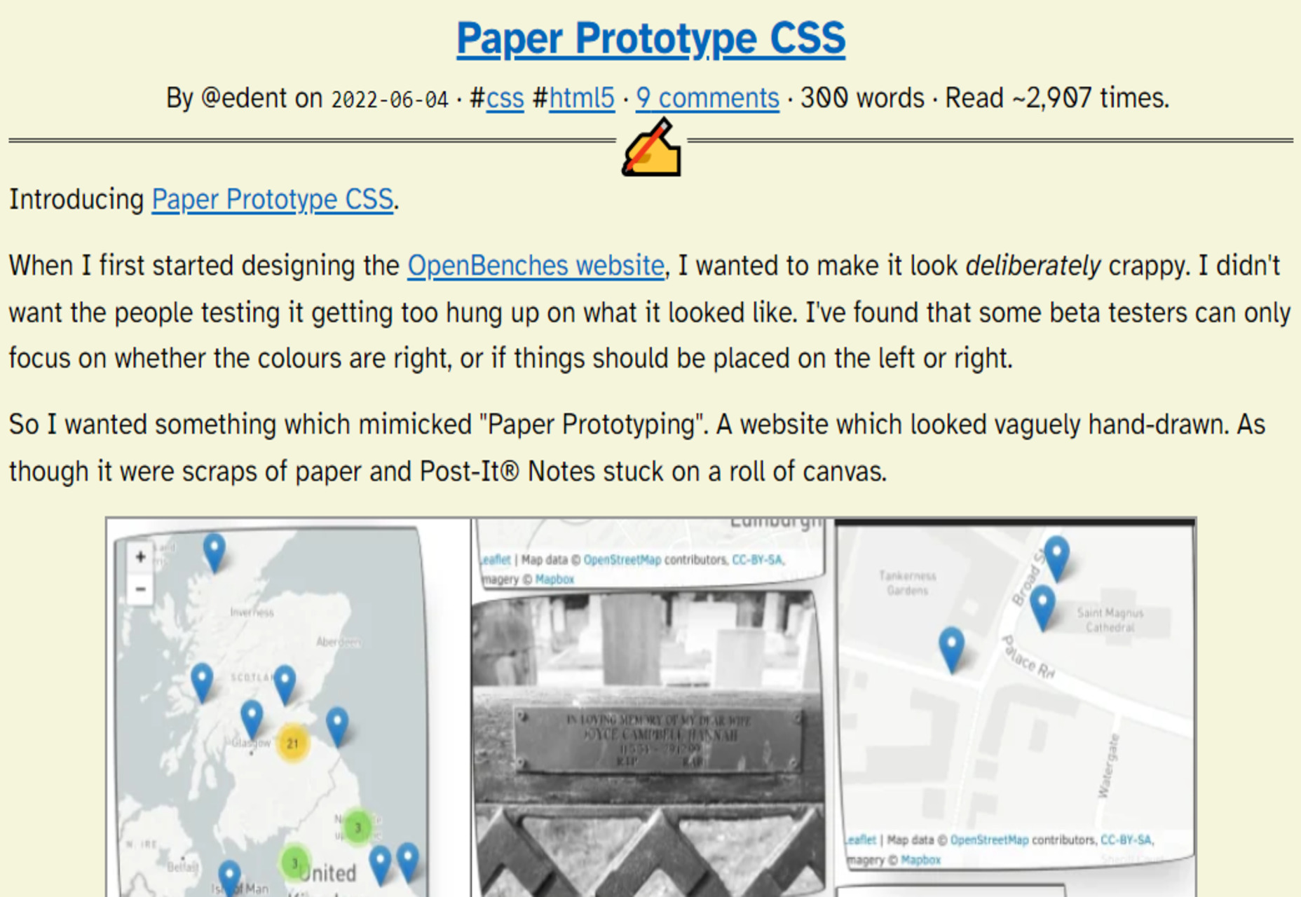
Paper Prototype CSS

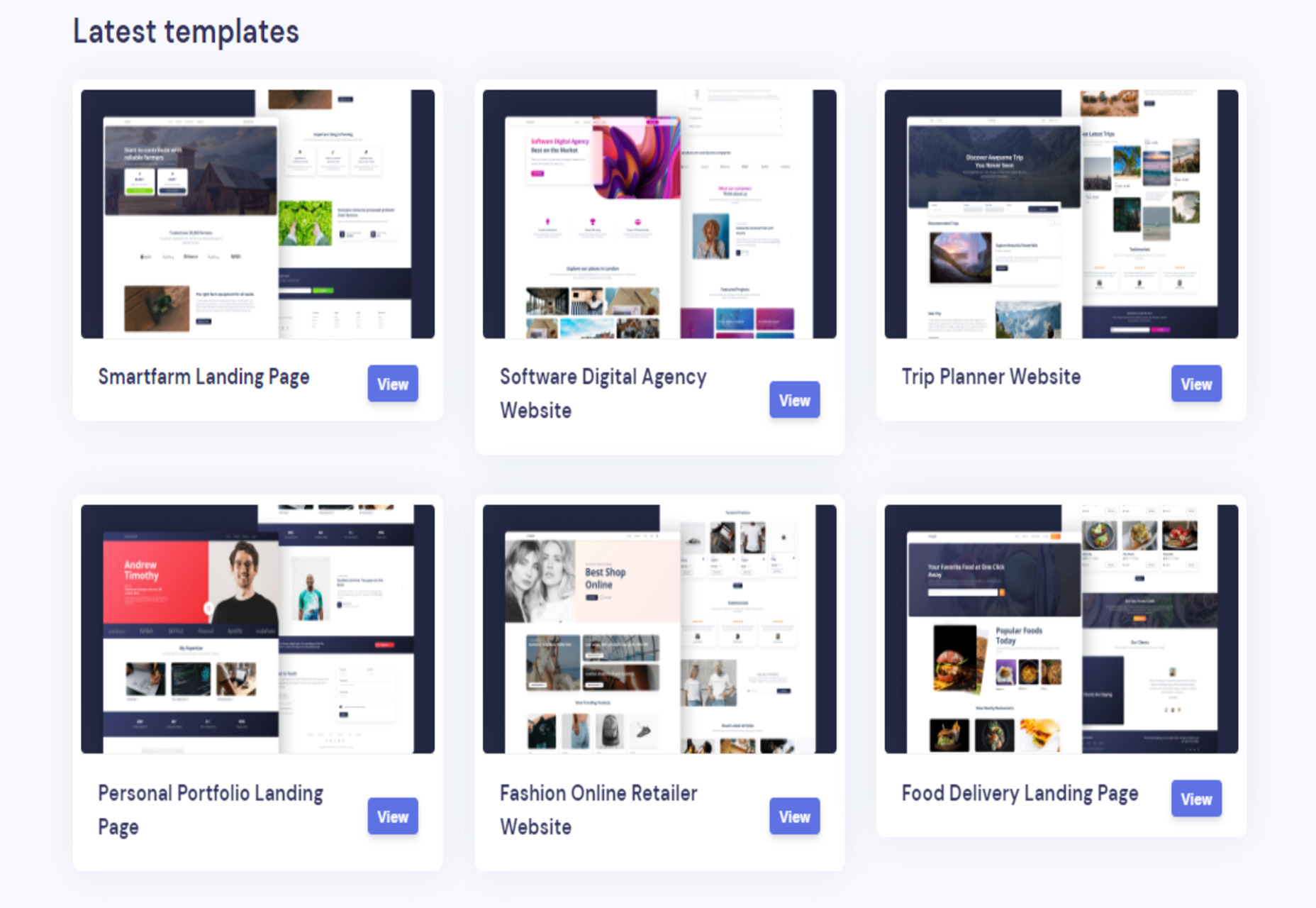
Loopple Landings – 40+ Ready to Use Templates for any Industry

Tips for Handing Off your Website Mockup to a Developer

The Surprising Psychology of Fonts

5 Tips for Writing Cleaner Code

Please Give Me Some Space

Orion – New WebKit Browser for Mac

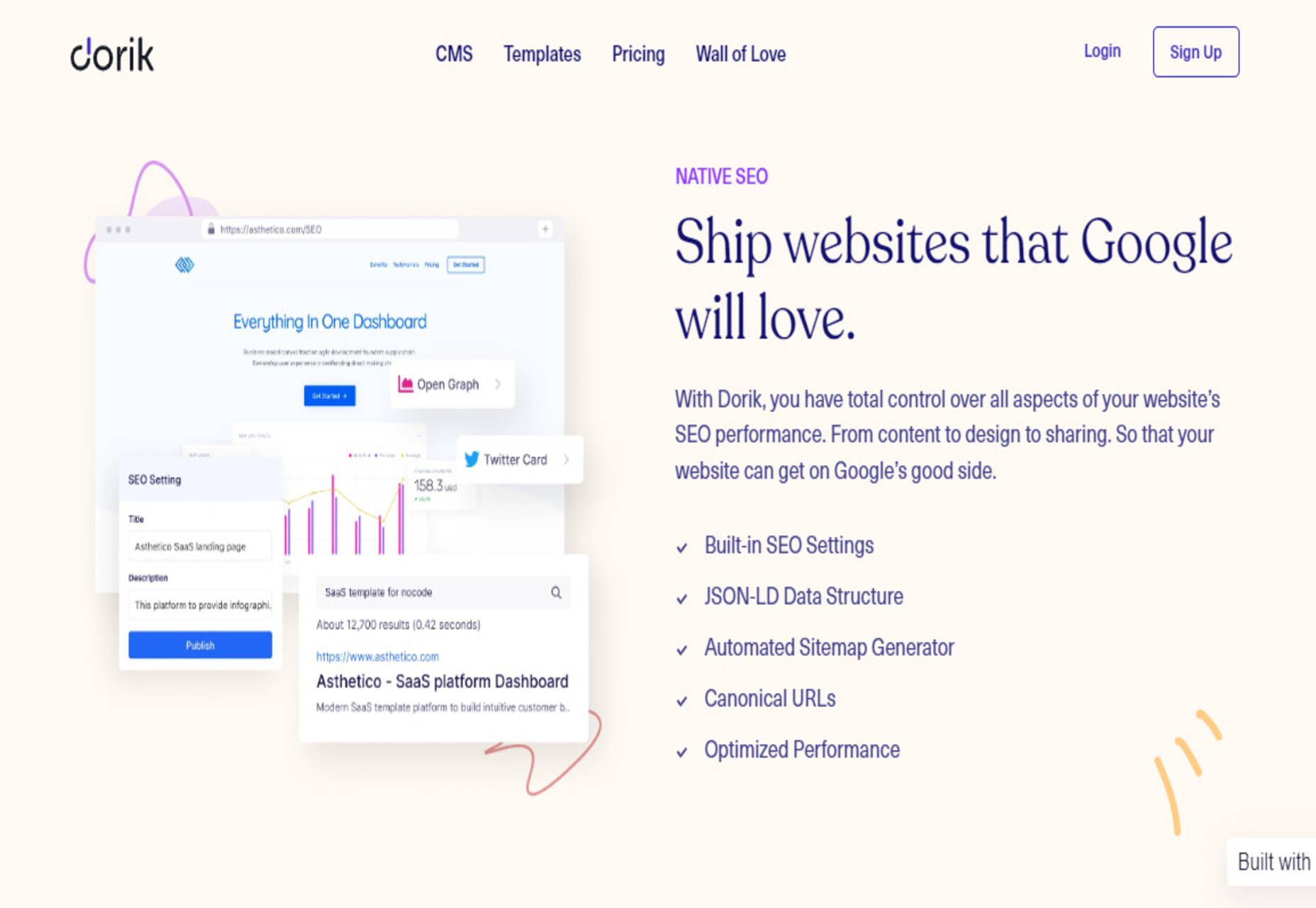
Dorik CMS – Simple, Affordable, and Flexible White-label CMS

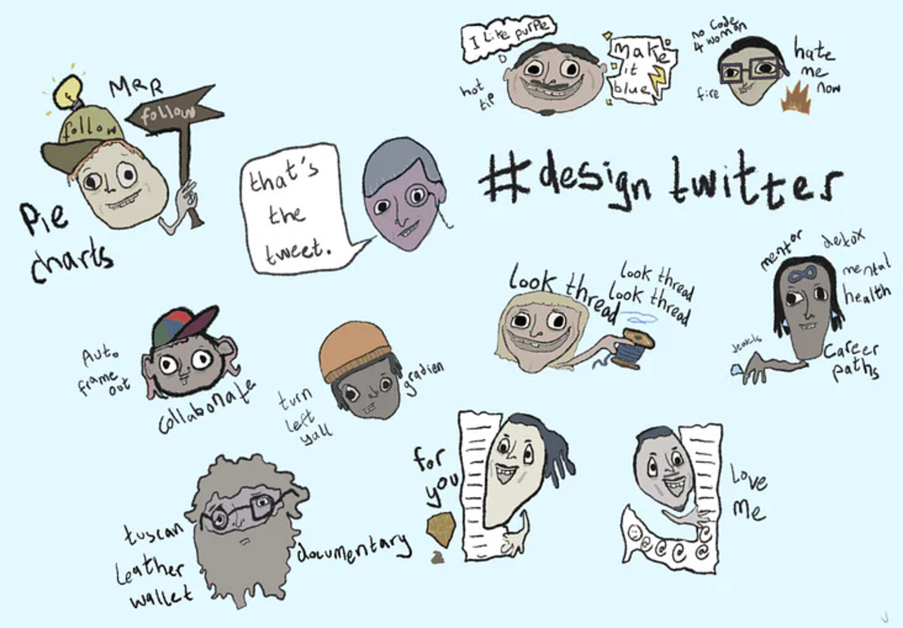
Design Personas for Twitter

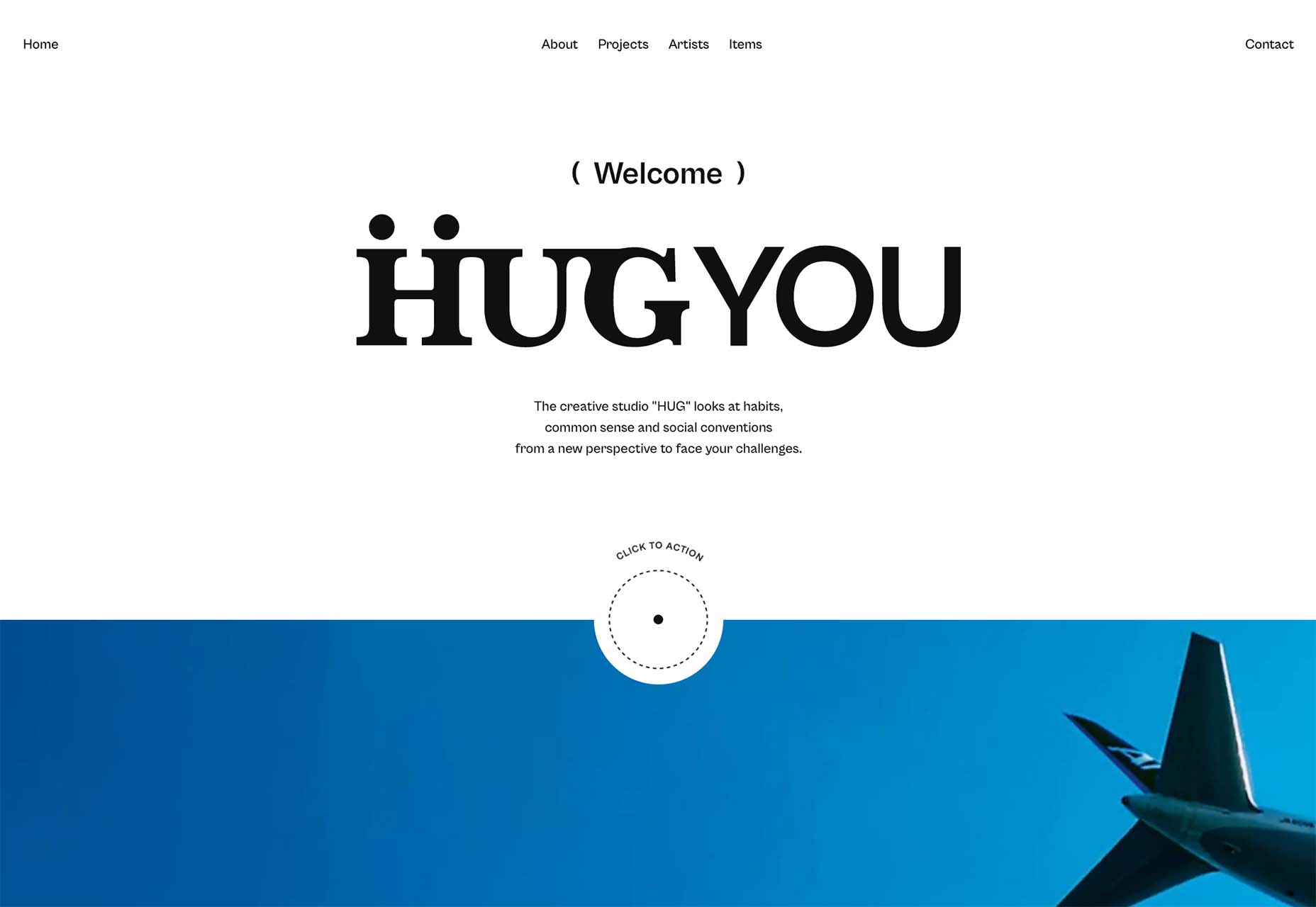
3 Essential Design Trends, June 2022

Source

The post Popular Design News of the Week: June 6, 2022 – June 12, 2022 first appeared on Webdesigner Depot.

Categories: Designing, Others Tags:

10 Dos and Don’Ts of Web Design in 2022

June 10th, 2022 No comments

Navigating the world of web design can be difficult. There is so much conflicting and outdated advice.

How many times have you been advised to obey the 3-Click Rule? It states that users must reach the content they want in three clicks. But, according to the Nielsen Norman Group, no research supports the 3-Click Rule. It’s just a guess, the web’s equivalent of an urban myth.

There are dos and don’ts of effective web design in 2022. In this post, we’ll present the most important so that you can design websites with confidence.

Do: Make Use of Design Patterns

Design Patterns sound like a complex technique. All it means is copying standard, well-known approaches. Jakob’s Law says that most people spend most of their time on other sites, so they will understand your site better if it is like those other sites.

You can’t make your site like every other, so your job is to pick and choose which design patterns will be most helpful to your target demographic.

Some of the most recognized design patterns include placing the logo in the top left of the viewport, underlining links, and placing essentials like shipping information in the footer.

Do: Make It Inclusive

Inclusive design holds the opinion that the web is for everybody. It hasn’t always been that way. Just a few years ago, it was common to see sites excluding some demographics to reduce development costs.

Excluding anyone from your website is wrong. In many jurisdictions, it’s so wrong it’s illegal. But, perhaps more importantly, excluding 5% of users deducts 5% from your profits.

It’s never been easier to be inclusive. The first step is to make your website responsive so that it caters to every device. Then, follow accessibility guidelines to ensure that you welcome everyone. Finally, be ready to listen to your users, and adapt to their needs.

Do: Keep It Simple

As a website designer, you’ve undoubtedly looked in envy at some of the more original sites out there. It’s important to remember that many of the most experimental sites are usually targeting other designers. Something that works well on a portfolio site won’t translate well to a local convenience store.

99 times out of 100, the simple choice is the right choice. Most people aren’t interested in an original design. They’re interested in accomplishing a task. The less effort expended to complete the task, the better the experience.

Complexity most often creeps into navigation. Start with a logical structure, and use simple, hierarchical navigation.

Do: Stay Focussed

Every website has goals. It might be promotion, profit, utility, or a combination. Each part of that website, every single page, should have one goal.

Hick’s Law says that the time it takes to make a decision increases when there are more choices. And the Goal-Gradient Effect says that a customer is more likely to complete a process the closer they are to the completion. Combine the two, and it means that giving users one CTA (call to action) on a page increases the chances of them taking it.

It’s OK to still have navigation, links, and secondary goals provided each page has a single clear purpose.

Do: Keep Your UI Consistent

Consistency is often referred to as the hallmark of quality. It means that you’ve paid attention to details. But consistency isn’t just about giving a good impression. Consistency is also essential for good UX (user experience).

Users learn to navigate your website as they go. They learn your website’s ‘rules’ or the logic as they interact with it. If your UI (user interface) is consistent, they’ll learn the rules faster and feel more confident.

Areas that often fail the consistency test are the corner radius of boxes, the style of links, and the tone of writing.

Don’t: Ignore Aesthetics

Design isn’t all about usability studies and reliance on design patterns. Design should also be beautiful.

Beauty is often seen as shallow and unimportant. However, the Aesthetic-Usability Effect states that a beautiful website is more likely to be seen as usable by customers.

A pretty design is a high-converting design.

To ensure your design is pretty, pay attention to your typography hierarchy, color scheme, and the symmetry of your layout.

Don’t: Make Users Wait

The worst thing you can do is make users wait. The more technology advances, the faster connections get the higher user expectations.

Your site needs to load in under a second and be interactive in under two seconds. Otherwise, you’ll lose customers who bounce back to their search engine and try one of your competitors instead.

Delays don’t only apply to the speed of your site. You need to ensure that the information or product a customer wants is easy to access. Don’t bury it multiple levels deep in your site. If users are delayed by complicated navigation or unpredictable structure, they will exit your site as surely as if it took 10 seconds to load.

Users have zero amounts of patience.

Don’t: Block the Screen

Browsing through the web, the number of designers that block users from seeing the content on a website is astounding.

The most common culprits are newsletter subscription offers. How can a customer know whether they want to sign up for your newsletter when they haven’t yet seen your products?! Let the user browse your site, and then offer them a newsletter subscription.

Another common culprit is cookie notices. Most sites require a modest cookie notice to stay on the right side of the Law. And yet they display a huge, site-blocking modal as if the cookie notice were the most critical content on the site.

Don’t: Leave Content Until Last

Content is frequently left until last. That’s because it’s hard. Just because we learned to read and write as kids doesn’t mean we can write persuasive, engaging sales copy.

Content is vitally important for SEO (search engine optimization), but more importantly, it’s essential for CX (customer experience).

Most websites make three big mistakes with their content.

Mistake one is unbalanced copy. That means writing 25 words about your flagship product and 5,000 words about the company’s history.

Mistake two is writing for the company, not for the customer. That means organizing content around the company structure rather than customer tasks.

Mistake three is too much content at once. Walls of text are a turn-off. Instead, write short, scannable snippets that will keep customers engaged.

“Don’t try to be original…

…Just try to be good.”

That quote is from the titan of twentieth-century design, Paul Rand.

It boils down to this: originality is about you, and quality is about the website. Great designers care more about their output than their reputation.


Featured image via Pexels.

Source

The post 10 Dos and Don’Ts of Web Design in 2022 first appeared on Webdesigner Depot.

Categories: Designing, Others Tags:

Single Element Loaders: The Spinner

June 10th, 2022 No comments
Showing a space between two gradient lines for a single element loader.

Making CSS-only loaders is one of my favorite tasks. It’s always satisfying to look at those infinite animations. And, of course, there are lots of techniques and approaches to make them — no need to look further than CodePen to see just how many. In this article, though, we will see how to make a single element loader writing as little code as possible.

I have made a collection of more than 500 single div loaders and in this four-part series, I am going to share the tricks I used to create many of them. We will cover a huge number of examples, showing how small adjustments can lead to fun variations, and how little code we need to write to make it all happen!

Single-Element Loaders series:

  1. Single Element Loaders: The Spinner — you are here
  2. Single Element Loaders: The Dots — coming June 17
  3. Single Element Loaders: The Bars — coming June 24
  4. Single Element Loaders: Going 3D — coming July 1

For this first article, we are going to create a one of the more common loader patterns: spinning bars:

CodePen Embed Fallback

Here’s the approach

A trivial implementation for this loader is to create one element for each bar wrapped inside a parent element (for nine total elements), then play with opacity and transform to get the spinning effect.

My implementation, though, requires only one element:

<div class="loader"></div>

…and 10 CSS declarations:

.loader {
  width: 150px; /* control the size */
  aspect-ratio: 1;
  display: grid;
  mask: conic-gradient(from 22deg, #0003, #000);
  animation: load 1s steps(8) infinite;
}
.loader,
.loader:before {
  --_g: linear-gradient(#17177c 0 0) 50%; /* update the color here */
  background: 
    var(--_g)/34% 8%  space no-repeat,
    var(--_g)/8%  34% no-repeat space;
}
.loader:before {
  content: "";
  transform: rotate(45deg);
}
@keyframes load {
  to { transform: rotate(1turn); }
}

Let’s break that down

At first glance, the code may look strange but you will see that it’s more simple than what you might think. The first step is to define the dimension of the element. In our case, it’s a 150px square. We can put aspect-ratio to use so the element stays square no matter what.

.loader {
  width: 150px; /* control the size */
  aspect-ratio: 1; /* make height equal to width */
}

When building CSS loaders, I always try to have one value for controlling the overall size. In this case, it’s the width and all the calculations we cover will refer to that value. This allows me to change a single value to control the loader. It’s always important to be able to easily adjust the size of our loaders without the need to adjust a lot of additional values.

Next, we will use gradients to create the bars. This is the trickiest part! Let’s use one gradient to create two bars like the below:

background: linear-gradient(#17177c 0 0) 50%/34% 8% space no-repeat;

Our gradient is defined with one color and two color stops. The result is a solid color with no fading or transitions. The size is equal to 34% wide and 8% tall. It’s also placed in the center (50%). The trick is the use of the keyword value space — this duplicates the gradient, giving us two total bars.

From the specification:

The image is repeated as often as will fit within the background positioning area without being clipped and then the images are spaced out to fill the area. The first and last images touch the edges of the area.

I am using a width equal to 34% which means we cannot have more than two bars (3*34% is greater than 100%) but with two bars we will have empty spaces (100% - 2 * 34% = 32%). That space is placed in the center between the two bars. In other words, we use a width for the gradient that is between 33% and 50% to make sure we have at least two bars with a little bit of space between them. The value space is what correctly places them for us.

We do the same and make a second similar gradient to get two more bars at the top and bottom, which give us a background property value of:

background: 
 linear-gradient(#17177c 0 0) 50%/34% 8%  space no-repeat,
 linear-gradient(#17177c 0 0) 50%/8%  34% no-repeat space;

We can optimize that using a CSS variable to avoid repetition:

--_g: linear-gradient(#17177c 0 0) 50%; /* update the color here */
background: 
 var(--_g)/34% 8%  space no-repeat,
 var(--_g)/8%  34% no-repeat space;

So, now we have four bars and, thanks to CSS variables, we can write the color value once which makes it easy to update later (like we did with the size of the loader).

To create the remaining bars, let’s tap into the .loader element and its ::before pseudo-element to get four more bars for a grand total of eight in all.

.loader {
  width: 150px; /* control the size */
  aspect-ratio: 1;
  display: grid;
}
.loader,
.loader::before {
  --_g: linear-gradient(#17177c 0 0) 50%; /* update the color here */
  background: 
    var(--_g)/34% 8%  space no-repeat,
    var(--_g)/8%  34% no-repeat space;
}
.loader::before {
  content: "";
  transform: rotate(45deg);
}

Note the use of display: grid. This allows us to rely on the grid’s default stretch alignment to make the pseudo-element cover the whole area of its parent; thus there’s no need to specify a dimension on it — another trick that reduces the code and avoid us to deal with a lot of values!

Now let’s rotate the pseudo-element by 45deg to position the remaining bars. Hover the following demo to see the trick:

CodePen Embed Fallback

Setting opacity

What we’re trying to do is create the impression that there is one bar that leaves a trail of fading bars behind it as it travels a circular path. What we need now is to play with the transparency of our bars to make that trail, which we are going to do with CSS mask combined with a conic-gradient as follows:

mask: conic-gradient(from 22deg,#0003,#000);

To better see the trick, let’s apply this to a full-colored box:

CodePen Embed Fallback

The transparency of the red color is gradually increasing clockwise. We apply this to our loader and we have the bars with different opacity:

Radial gradient plus, spinner bars equals spinner bars with gradients.

In reality, each bar appears to fade because it’s masked by a gradient and falls between two semi-transparent colors. It’s hardly noticeable when this runs, so it’s sort of like being able to say that all the bars have the same color with a different level of opacity.

The rotation

Let’s apply a rotation animation to get our loader. Note, that we need a stepped animation and not a continuous one that’s why I am using steps(8). 8 is nothing but the number of the bars, so that value can be changed depending on how many bars are in use.

.loader {
  animation: load 3s steps(8) infinite;
}

/* Same as before: */
@keyframes load {
  to { transform: rotate(1turn) }
}
CodePen Embed Fallback

That’s it! We have our loader with only one element and a few lines of CSS. We can easily control its size and color by adjusting one value.

CodePen Embed Fallback

Since we only used the ::before pseudo-element, we can add four more bars by using ::after to end with 12 bars in total and almost the same code:

CodePen Embed Fallback

We update the rotation of our pseudo-elements to consider 30deg and 60deg instead of 45deg while using an twelve-step animation, rather than eight. I also decreased the height to 5% instead of 8% to make the bars a little thinner.

Notice, too, that we have grid-area: 1/1 on the pseudo-elements. This allows us to place them in the same area as one another, stacked on top of each other.

Guess what? We can reach for the same loader using another implementation:

CodePen Embed Fallback

Can you figure out the logic behind the code? Here is a hint: the opacity is no longer handled with a CSS mask but inside the gradient and is also using the opacity property.

Why not dots instead?

We can totally do that:

CodePen Embed Fallback

If you check the code, you will see that we’re now working with a radial gradient instead of a linear one. Otherwise, the concept is exactly the same where the mask creates the impression of opacity, but we made the shapes as circles instead of lines.

Below is a figure to illustrate the new gradient configuration:

Showing placement of dots in the single-element loader.

If you’re using Safari, note that the demo may be buggy. That’s because Safari currently lacks support for the at syntax in radial gradients. But we can reconfigure the gradient a bit to overcome that:

.loader,
.loader:before,
.loader:after {
  background:
    radial-gradient(
      circle closest-side,
      currentColor 90%,
      #0000 98%
    ) 
    50% -150%/20% 80% repeat-y,
    radial-gradient(
      circle closest-side,
      currentColor 90%,
      #0000 98%
    ) 
    -150% 50%/80% 20% repeat-x;
}
CodePen Embed Fallback

More loader examples

Here is another idea for a spinner loader similar to the previous one.

CodePen Embed Fallback

For this one, I am only relying on background and mask to create the shape (no pseudo-elements needed). I am also defining the configuration with CSS variables to be able to create a lot of variations from the same code — another example of just the powers of CSS variables. I wrote another article about this technique if you want to more details.

Note that some browsers still rely on a -webkit- prefix for mask-composite with its own set of values, and will not display the spinner in the demo.

I have another one for you:

CodePen Embed Fallback

For this one, I am using a background-color to control the color, and use mask and mask-composite to create the final shape:

Different steps for applying a master to a element in the shape of a circle.

Before we end, here are some more spinning loaders I made a while back. I am relying on different techniques but still using gradients, masks, pseudo-element, etc. It could be a good exercise to figure out the logic of each one and learn new tricks at the same time. This said, if you have any question about them, the comment section is down below.

CodePen Embed Fallback

Wrapping up

See, there’s so much we can do in CSS with nothing but a single div, a couple of gradients, pseudo-elements, variables. It seems like we created a whole bunch of different spinning loaders, but they’re all basically the same thing with slight modifications.

This is only the the beginning. In this series, we will be looking at more ideas and advanced concepts for creating CSS loaders.

Single-Element Loaders series:

  1. Single Element Loaders: The Spinner — you are here
  2. Single Element Loaders: The Dots — coming June 17
  3. Single Element Loaders: The Bars — coming June 24
  4. Single Element Loaders: Going 3D — coming July 1

Single Element Loaders: The Spinner originally published on CSS-Tricks. You should get the newsletter.
Categories: Designing, Others Tags:

You’re Losing Money By Not Using Digital Marketing

June 10th, 2022 No comments

Having an excellent internet presence is essential in today’s advancing technological era. These days it is common knowledge that everyone has an online presence.And indeed, it is likewise with the digital marketing industry; even with all its extreme competitiveness, merely having just a website development for sure isn’t enough. 

In today’s time, it is a positive and good practice to seek professional assistance from a digital marketing firm to up your game as a brand/organization with all the trending and upgrading digital marketing practices that are penetrating the markets.

Is it difficult for your customers to locate you on the internet? Do you find it challenging to persuade your audience of your online reputation? Or, are you tired of calling people to sell your products with all these problems?

If you’re also amongst those many people who face these problems, you’ve come to the correct place, and maybe you’ll find the answers to your worries here. Set aside your existing knowledge and begin from the beginning.

Following this advice, has the suggestion of beginning from the very initial established any improvement to your mood? Well, let’s get started by getting to know each other and addressing your issues.

Another vital element to consider is where most of our audience finds or connects with us these days. Congratulations if you’ve made it to the point where I’m aiming to get to. Yes, you correctly guessed it! Online. 

Conducting an online search for people and businesses is the most practiced method these days. Now returning to the initial question, how do your clients get in touch with you or find you online? That’s right! By looking up the name and contact information for your company!

You can do this using Google My Business (GMB), where your targeted/ search audience will be able to see your entire contact card based on which they will contact you. Now, let’s speak a bit more about The Fundamentals of Marketing. 

Every marketing process begins even before you have a product to sell or during the phase where you are planning to sell your product or good. Be sure that, most certainly, marketing is not a one-time activity; it is a continual process that initially begins with just a few products and continues to evolve with time.

What Exactly Is Digital Marketing, and How Does It Work?

Digital marketing is the adequate use of digital channels to reach clients, using mediums that include the internet, search engines, social media, mobile devices, etc. The popularity of digital marketing has excelled to such hypes since it has allowed data to be allocated and evaluated much more efficiently, allowing digital marketers to keep a better track of their progress and control. This is only one of the many ways businesses have benefited from digital marketing. 

Additional Benefits Also Include:

  • Increasing Brand Awareness.
  • Reaching Your Target Audience on a Budget.
  • Progress Is Easy To Monitor.

Boost Brand Awareness

Digital marketing is a fantastic way to raise brand awareness. Your brand is what sets you apart from the competition’s products and services. Since you both provide similar services, it all boils down to what you “stand for.” Customers are more likely to draw back to you and your brand as returning customers only if they like and trust you for reasons other than the product/ service you’re selling.

Digital Marketing Results Are Easier to Track

Following up on advertising and digital marketing efforts becomes practically effortless thanks to different digital tools that precisely monitor digital initiatives in real-time. Also, whether using Social Media, or Google Ads, every online campaign leaves a digital trail that can be tracked and analyzed. These tools use digital marketing statistics to help you evaluate the effectiveness of your strategy and assess if you’re on track to accomplish your goals. 

Using Google Analytics can help accurately track where your consumers come from and what are the aspects that engage or aren’t of their interest. Data analysis also helps adjust and refocus your digital efforts based on the information you gain from your campaigns in real-time.

Reach Your Target Audience on a Budge

This is a low-cost marketing solution even in this advanced digital age. Digital Marketing is a much easier method to practice that allows you to keep track of your progress and figure out what works and what doesn’t work for you. 

It also offers the advantage of assessing your plan and making any improvements guaranteeing the money that you have invested is wisely spent. Additionally, it will also give you the benefit of accessing your target audience, those who are most likely to become your client or make a purchase from your brand.

Include These Search Engine Optimization (SEO) Strategies in Your Digital Marketing Plan To Attain Great Results!

According to an inside joke amongst digital marketers, Google’s second page doesn’t exist. As a reference, consider the thought if you ever have visited the second page of Google? Like 95% of others, your answer is most likely to be; NO, which is why having a well-optimized website is so critical. 

SEO is precisely all about: using specific keywords and links to help Google and other search engines to rank your site higher on their results (search engine result pages). As a result, higher rankings indicate that your website/ brand carries more visitors and potential customers. Many experts have also gone ahead to state that by the year 2021, the average number of online shoppers in the USA alone is expected to grow somewhere approximately around 230.5 million or more.

Social Media Marketing (SMM)

Social media, for certain, should be a priority part of your marketing strategy since a significant proportion of every target audience is found and resides on them. On the other hand, social media as a medium can also be used to highlight various other aspects of your business. 

Instead of blatant marketing, it can be used to take on a friendlier and personal approach. It is a huge advantage to develop a solid social media presence for any business. The best way to do so is by posting helpful content that directly connects and is relatable to your customers.

Last Thoughts

Marketing is an investment in the image and concept of your business; likewise, a gym membership is an investment in your health, and a savings account is an investment in your financial future. When you’re ready to invest in your company’s future, a great digital marketing plan can ensure that your brand/ business attains a decent return on your investment.

The post You’re Losing Money By Not Using Digital Marketing appeared first on noupe.

Categories: Others Tags:

How to Get More App Reviews (Without Annoying Your Users)

June 10th, 2022 No comments

Increasing positive reviews is a byproduct of a great solution, so having a great app that solves a clear problem for your users should be enough, right? Well, not really.

Users are more likely to leave bad reviews than positive ones. In other words, if you’re not actively asking for feedback, you could be missing out on hearing from your satisfied users.

And before you start adding random popups and prompts, in a lot of cases they can do more harm than good by annoying your users and potentially scaring them away from your app.

Instead, you’ll want to focus on these seven non-intrusive strategies that are guaranteed to increase the number and quality of reviews your app gets:

1. Run a Review-Writing Contest for Your App

An old but still effective strategy to get more reviews for your app is to run a review contest. This will incentivize and gamify the process for your users – or even score new ones in the process.

To run a successful contest, you’ll need a clear and organized process that makes it easier for your users to participate and easier for you to manage it. Some of the components you’ll need to think about are:

  • What’s the prize?
  • How will you pick the winner?
  • Where will you promote the contest?
  • What’s the messaging of the contest’s social media posts?

For example, you could create a social media post with all the information about the contest and ask users to comment on the post with their app username after leaving a review on the App Store or Google Play.

You can also use forums or Reddit threads related to your industry or app if there’s already a community around it.

2. Request a Review After Your User Achieves a Milestone or Success

Like sending sales messages, timing is one of the most critical aspects of the review campaign process. In our experience, many apps tend to ask for a review as soon as the user signs in. However, that could easily be one of the worst moments to ask.

Why? Because of intention. When users log into your app, they have a clear purpose, and a popup window is getting in their way. Take advantage of successes and milestones instead.

For an eCommerce app, this can look something like a product being delivered on time or ahead of time, or a user spending a certain amount of money. These scenarios are clear indications that users are getting great results and are happy with your app, in turn setting you up for a better review.

Think about your user’s intention and what a successful session on your app looks like. Is it time spent on the app or a certain number of actions? If you can figure out the best moment to ask for feedback, you’ll increase the number and quality of your reviews.

3. Leverage Your Customer Support Team Everywhere

User experience doesn’t stop at the app’s performance and design. Your customer support team also plays a vital role in your app’s success.

There will be problems no matter how well built your app is, and you’ll need a great team to solve those issues – especially when they come from third parties like delivery companies or API providers. But what does it have to do with app reviews? It’s a great way to turn bad experiences into good experiences, thus making it a great time to ask for reviews!

After issues are taken care of, and a positive outcome is achieved, users experience significant stress relief. You can take this as a little victory and, more often than not, a great moment to ask for positive feedback.

If this works for you, try replicating the process through all your contact channels like social media and forums.

Of course, not all scenarios are a good fit. Be sure to train your team to recognize opportunities for feedback, and when it’s better to let the user go on their way until the next milestone or success. In the meantime, you can then focus on building trust.

4. Optimize Your App Listing to Rank for Keywords Your Users Use

Another way to gain reviews is by getting your app discovered by a larger audience organically. Having more users will give you more opportunities to increase your reviews.

Although many factors contribute to your visibility on the App Store and Google Play, optimizing your app listing can help you bridge the gap, especially if your app is new.

Just like search engine optimization (SEO), the goal of app store optimization (ASO) is to help your app rank higher in search results when a potential user enters a query in the search bar. A Forrester study showed that 63% of all app downloads start with a search in the App Store or Google Play, so diversifying the keywords you rank for (as long as they are relevant to your app) will increase your user base.

App Radar created this comprehensive ASO guide if you consider implementing this strategy. Another great place to start is reading how your users describe your app or how they’re using it. This can give you some ideas of which keywords to include, for example, in the title or description.

5. Ask for Reviews and Feedback in Your Release Notes

Release notes were designed to tell your users about new features or bug fixes implemented in the latest version of your app. However, they can also be a great place to ask for feedback.

As a communication channel, release notes can help you connect with your users if you use the correct language. After all, these notes are meant to help users notice and use new features, making it natural to just ask for their feedback.

Yes, not all your users will read them, but you should still think about your app release notes as an extension of your brand. For those reading your notes, it can make a huge difference.

6. Gamify the Review Process

Gamification increases user engagement by bringing game elements to ordinary tasks. In fact, we already used gamification when discussing running a review contest.

To take gamification a bit further, you can use tools like Yotpo to add gaming elements, like progress bars and hints, to the review writing process and entice users not just to leave reviews, but to write better ones.

Yotpol’s smart prompts use AI to find the most common and relevant keywords used by other users and suggest them to new reviewers writing their app reviews. Every time they use one of these keywords, the progress bar fills in until it shows as a complete achievement.

Apps allow us to use gamification in many different ways, so be creative and open-minded, and you’ll grow your review count in no time.

7. Deal with Negative Reviews to Turn Them Around

As a business owner, you want to gain many reviews to reach a larger audience and to have the social proof that’ll make new users download your app.

However, focusing solely on their acquisition can blind you to the other side of the coin: bad reviews.

You don’t just want to get more of any kind of reviews, you want to increase the number of positive (five-star if possible) reviews. The best place to start is by addressing the bad reviews.

Reviews are nothing but direct feedback. Apple and Google have realized this, providing businesses with the ability to respond to reviews. Make a list of negative reviews, address their concerns, and reach out to users after implementing the changes.

Although it won’t work every single time, turning one-star reviews into five-star reviews can help you win back users and change their minds. It also tells new users that you’re actively improving the app and listening to what they have to say.

Ready to Get Started?

These seven strategies have proven to be effective time after time, but there’s a catch: you’ll need to be consistent and proactive. Consider your feedback campaign as part of your marketing strategy, because it is!

Organic, high-quality reviews are your app’s best sales tools. They will help you improve your app’s visibility in the App Store and Google Play’s search results and improve the download rates.

By thinking out of the box and providing the best user experience in both your app and feedback campaigns, you’ll enjoy steady and sustainable growth without annoying popups or unwanted forms.

The post How to Get More App Reviews (Without Annoying Your Users) appeared first on noupe.

Categories: Others Tags:

Am I on the IndieWeb yet?

June 9th, 2022 No comments
Diagram of IndieWeb integration on a WordPress site.

Can’t smash the Like button hard enough for what Miriam Suzanne has to say on the challenging technical hurdles of implementing Webmentions:

The first round required several online services along with HTML & JS changes to my static site, just to verify my indieweb identity. Then more changes to the site and more online services to help fetch any mentions (so far, nothing to see, but that’s probably expected). It seems the only way to test the setup is to launch all those changes publicly, and then ask for other devs to send you mentions.

[…]

I’m an experienced web developer, and I can figure it out. But the steps aren’t simple, and most of my friends are not web developers. So, to me, this all feels like the prototype of an idea – a proof of concept.

A proof of concept for sure. And one that has been around for quite some time. The IndieWeb idea of owning your own data and using your website as a social hub is right up my alley — and likely yours, too, as someone working on the front end.

Yet, I’ve tinkered on and off with it — specifically Webmentions — over the past like three years with little to show for it. The problem isn’t so much the documentation of getting started because it’s all there. It’s more a combination of things…

  • The wiki is confusing. Wikis are super cool in general, but the non-linear nature of it makes it tough to know where to start and where to end.
  • The plugin ecosystem is complex. My personal site is on WordPress and there’s a plugin designed to make it easy to integrate IndieWeb features on it. Except that it’s really one plugin that steers you to install several others, each one introducing a technology that I honestly struggle to understand.
  • There’s a bunch of terms to learn. I mean, “IndieWeb” and “Webmention” are already difficult to grok. Toss in things like “Micropub,” “Microformats,” “IndieAuth,” and “Semantic Linkbacks,” and suddenly it feels like a bunch of puzzle pieces from different puzzles trying to fit together.
  • Some middleware seems necessary? For example, I had to give a service called Bridgy access to my Twitter to get that activity going. It apparently has something to do with Twitter’s shortened t.co URLs and making them play well with microformats.

But, like Miriam, I struggled my way through it and got something working in the end. This is the sort of visual I wish I had when I was first getting started, and maybe it’ll help you too.

Feels like a lot to get Webmentions going, but maybe that’s only because I have such a light grasp of the tech and how it all fits together. All the pieces are there, though, and even with the initial struggle, I love the IndieWeb concept, er prototype.

To Shared LinkPermalink on CSS-Tricks


Am I on the IndieWeb yet? originally published on CSS-Tricks. You should get the newsletter.
Categories: Designing, Others Tags: