20 Best New Websites, July 2022
Welcome to our guide to the best new websites this month. If subtle, minimal sites are your thing, either look away now or prepare to have your preconceptions challenged because this month, we are going maximalist.
Lots of elements fill up the screen, lots of color, lots of big fonts, lots of illustration, and plenty of in-your-face personality. This is a tricky style to get right: if elements are not chosen and placed well, the result is simply annoying clutter. If done well, the result can be impactful and memorable.
[And Happy Independence Day to all of our American readers!]
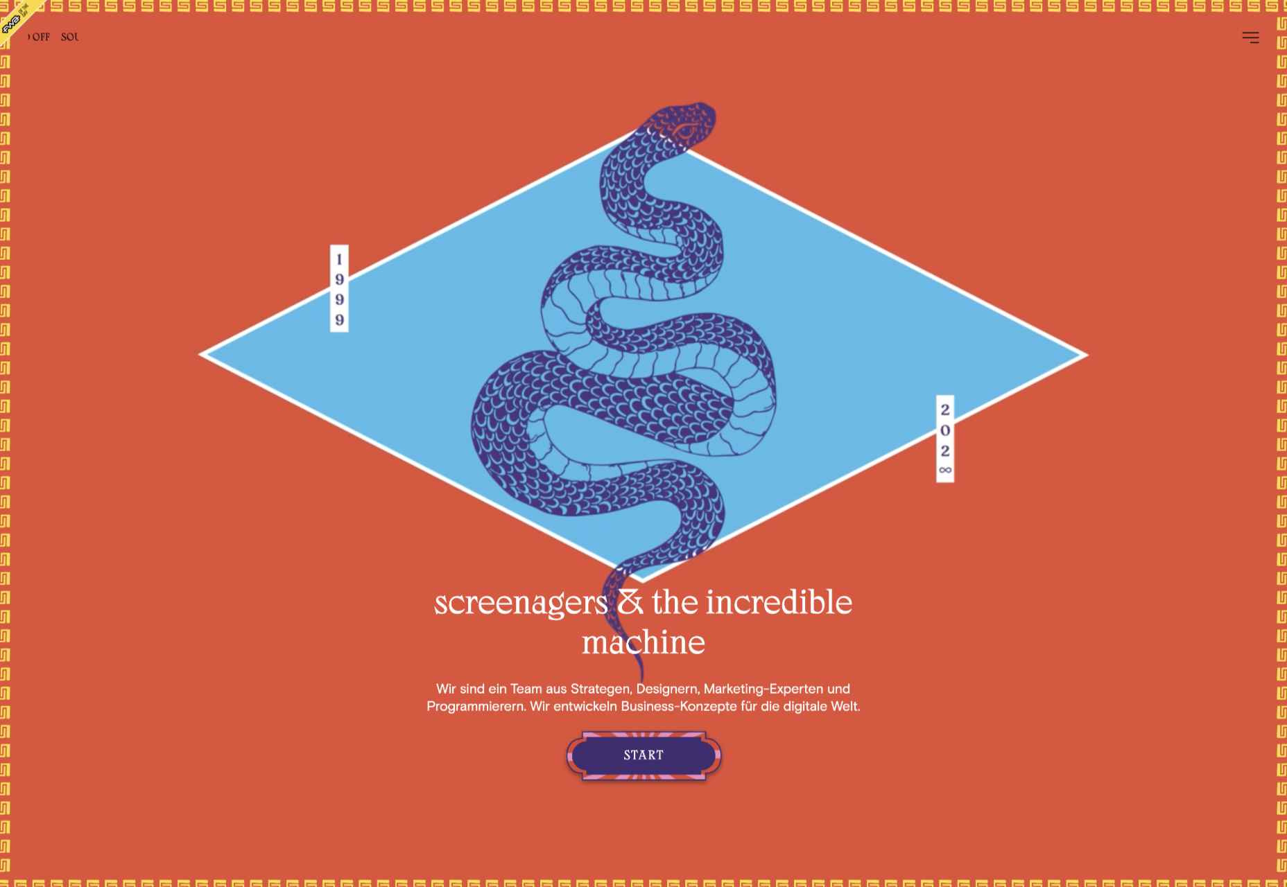
screenagers & the incredible machine
screenagers & the incredible machine’s site puts illustration front and center, creating a look that evokes various mystic ideas. It sounds strange, but it works.
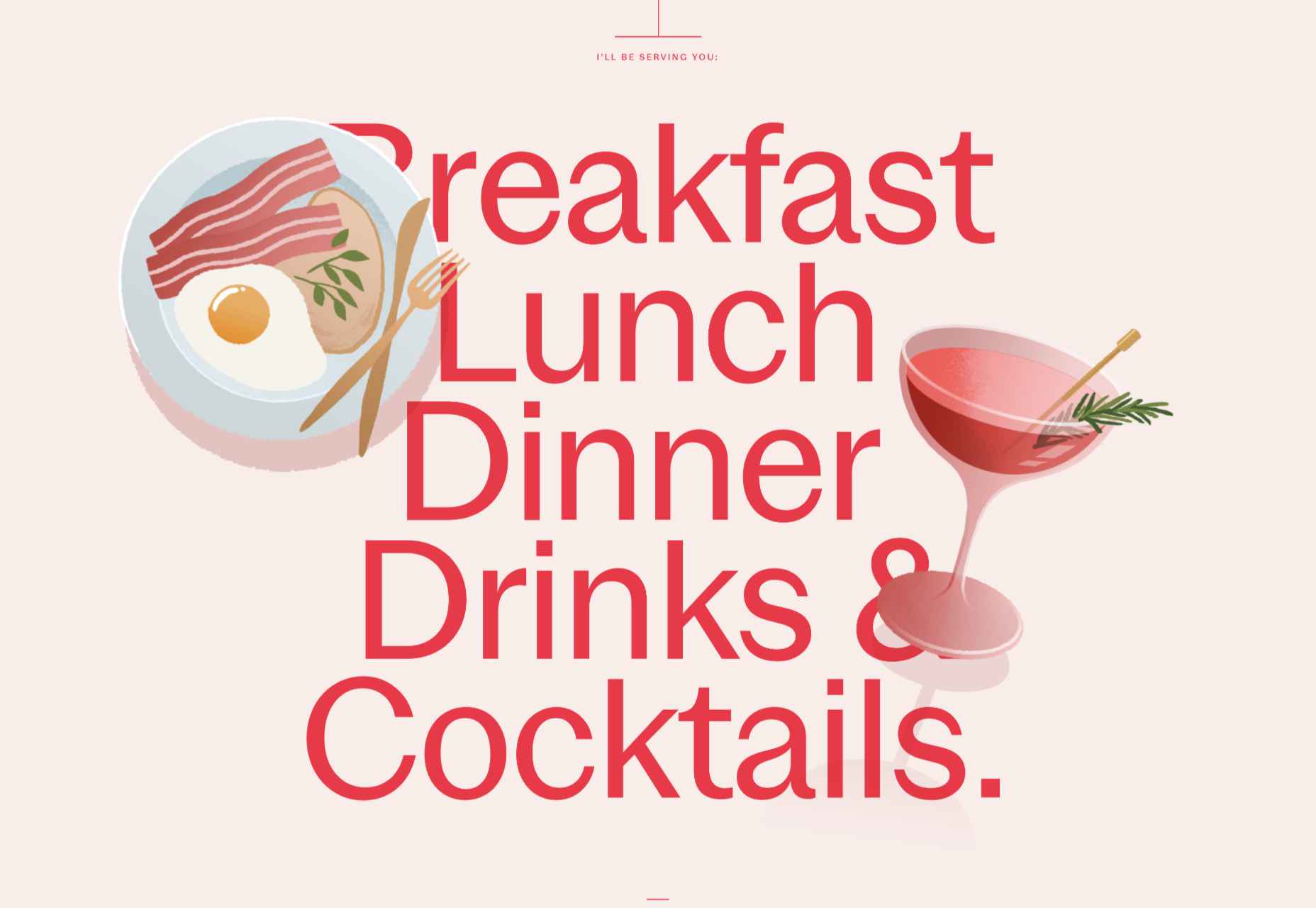
Anna Jóna
This prelaunch teaser site for Anna Jóna café and cinema has an elegant yet modern feel.
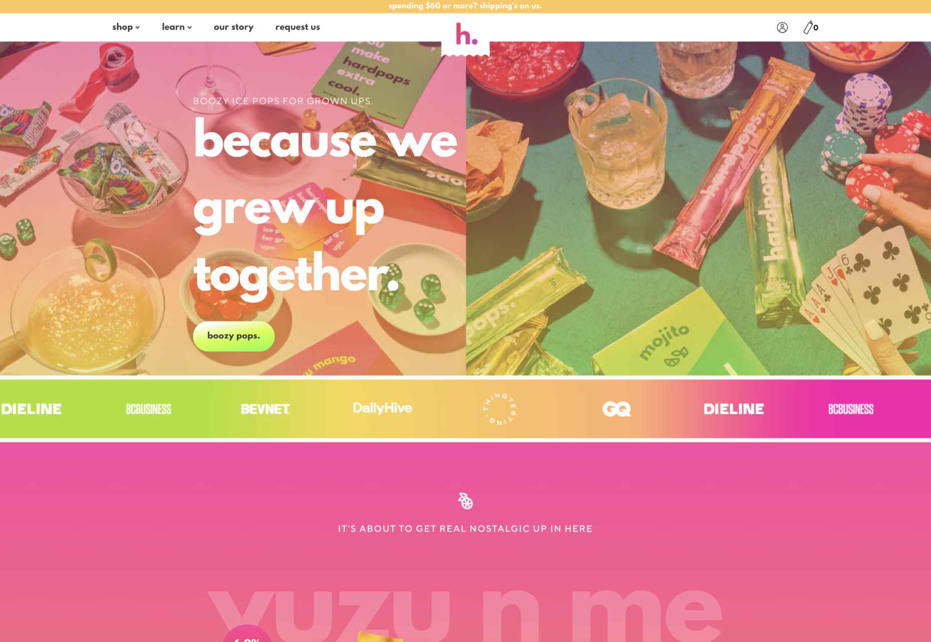
Hardpops
This site for Hardpops (alcoholic) ice pops takes its cue from the product flavors, and the bright, fruity colors give it a real zing.
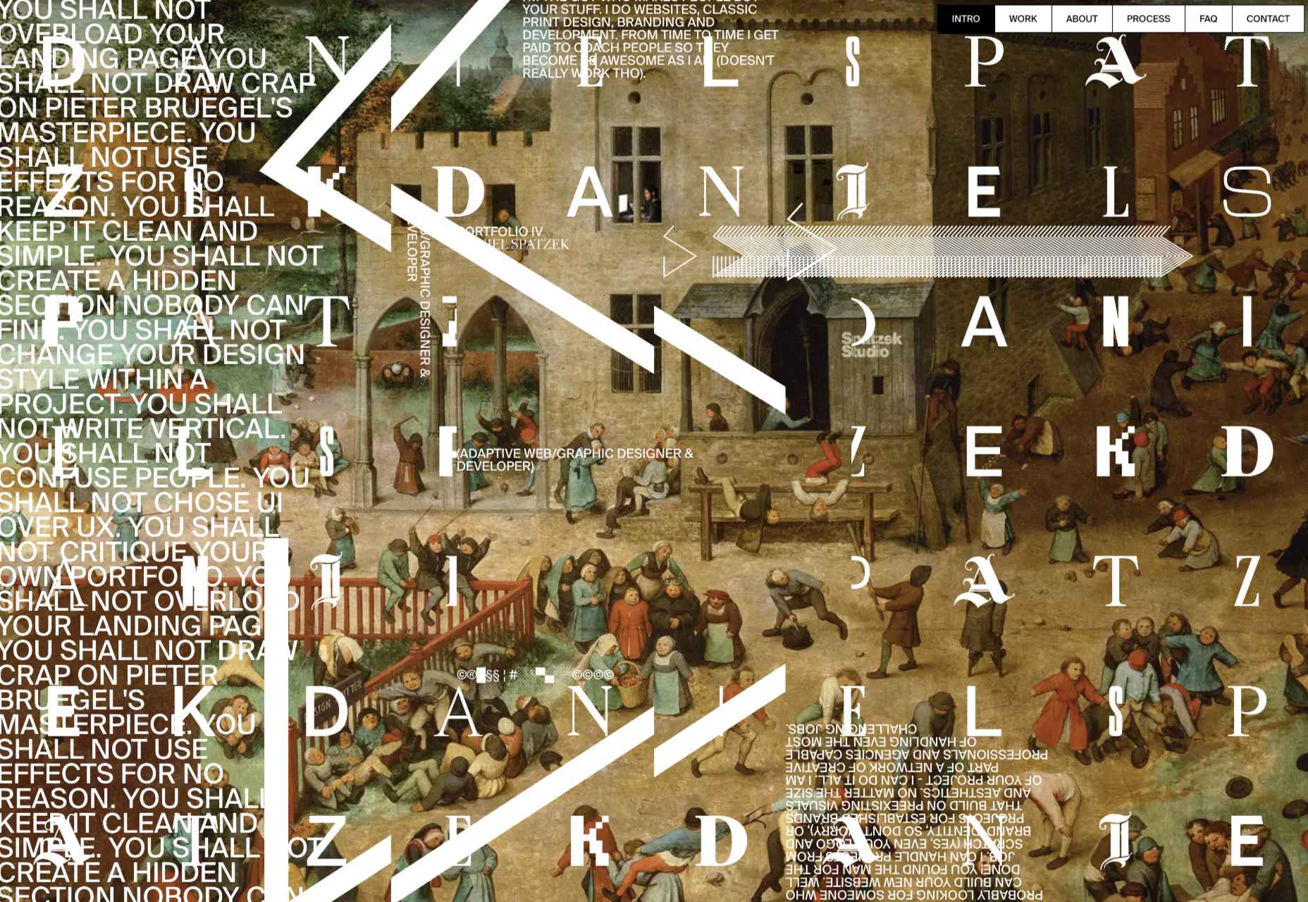
Daniel Spatzek
Daniel Spatzek’s portfolio site takes the rules-are-made-to-be-broken approach. The result has attitude and a nice touch of humor.
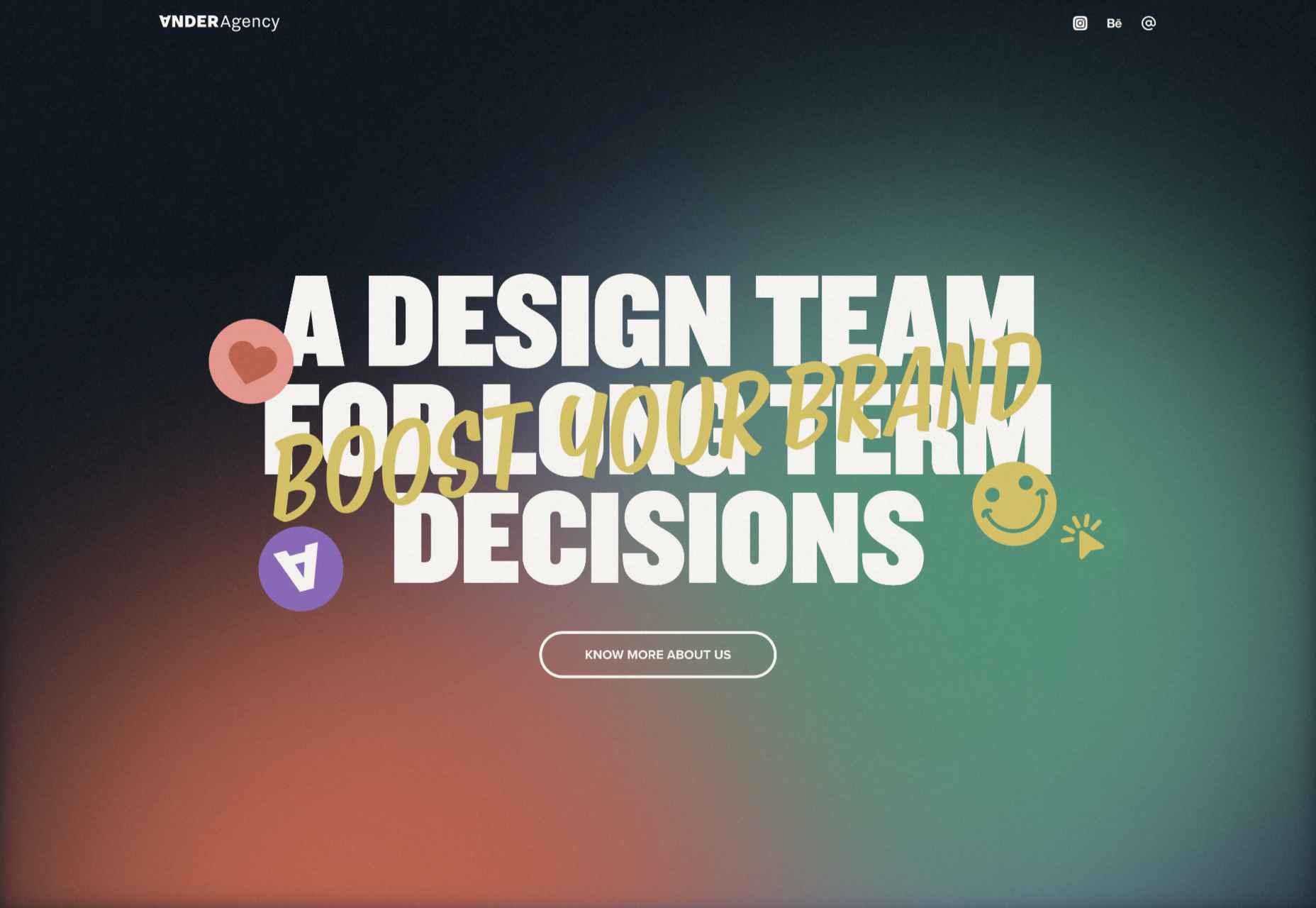
Ander Agency
Plenty of color, large type, and illustration make a bold statement for Ander Agency’s single-page site.
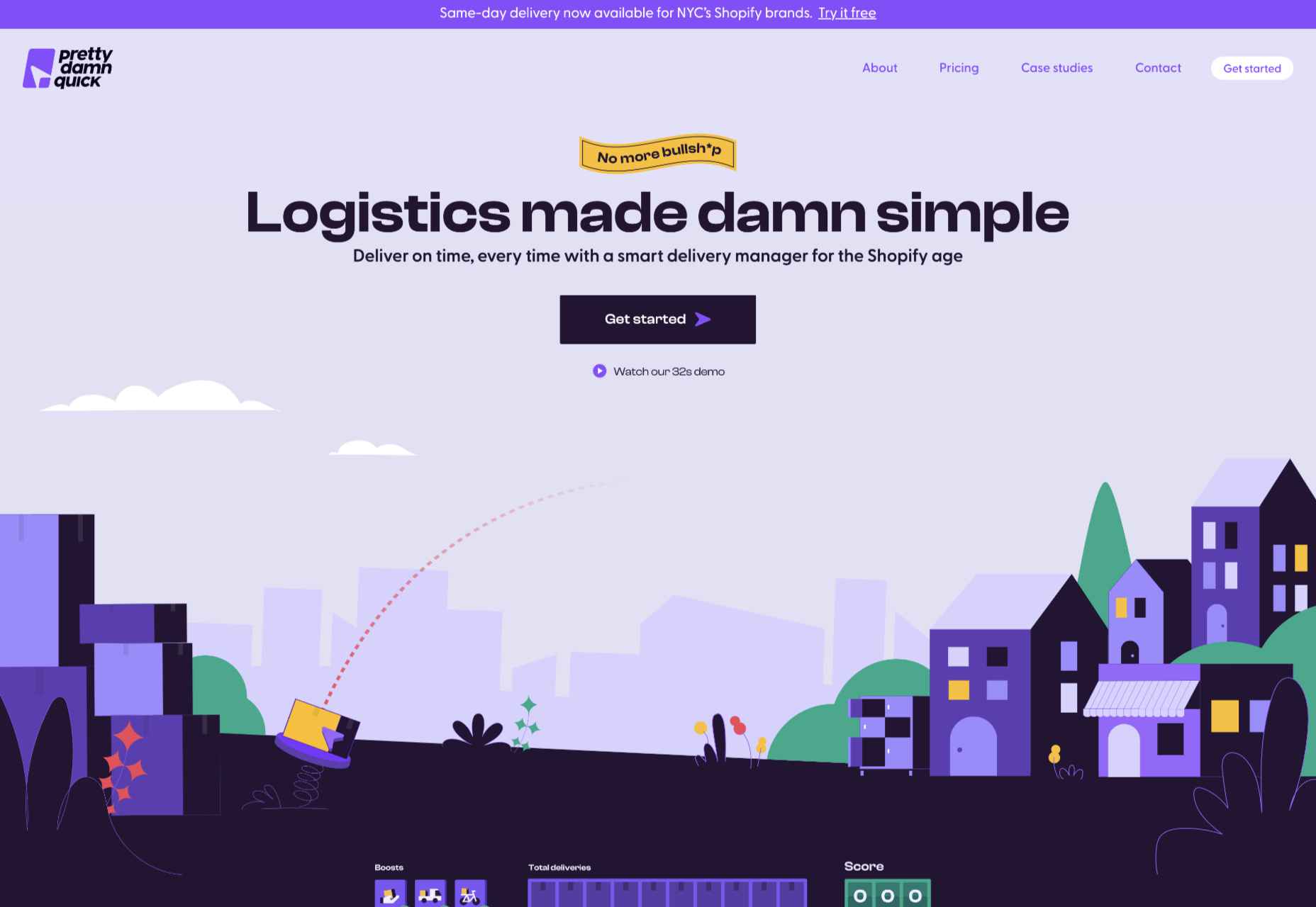
Pretty Damn Quick
Colorful illustration on this site for Pretty Damn Quick’s Shopify app creates an impression of friendliness about the company and ease of use of the product itself.
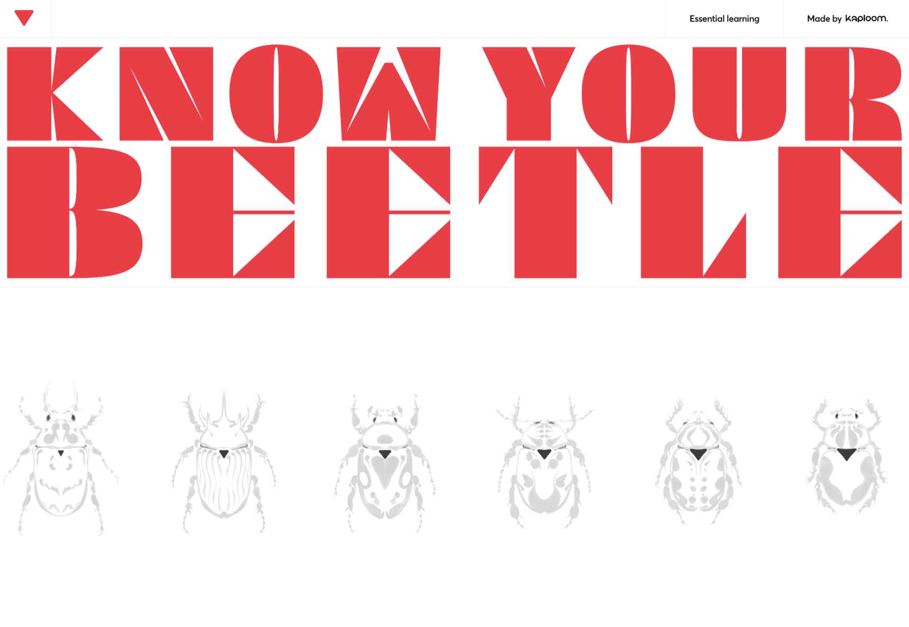
Know Your Beetle
Know Your Beetle is a showcase page for Kaploom creative studio. Color and type combinations make a big impact.
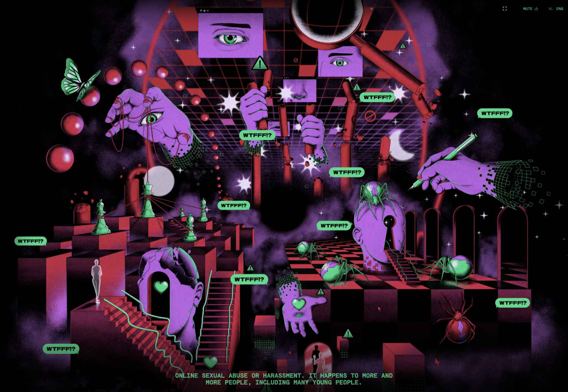
WTFFF
While many of the sites featured here have a sense of fun about them, WTFFF tackles a somber subject: online sexual abuse and harassment. Artwork and audio create an immersive experience in which five young people share their experiences with the aim of helping others.
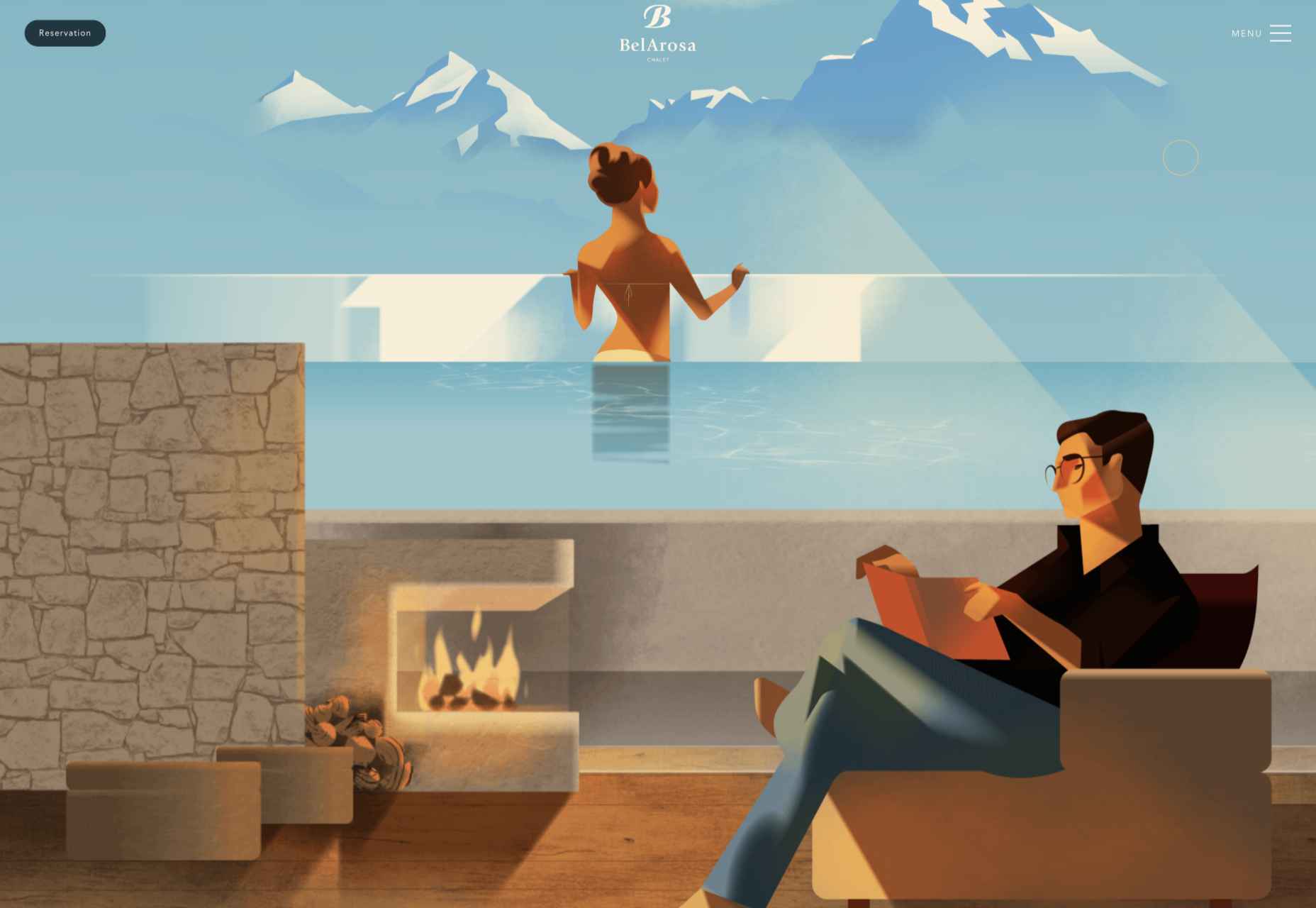
BelArosa Chalet
Full-screen illustrations with a hint of vintage style create an ideal impression of what future guests can expect from the currently under construction BelArosa Chalet.
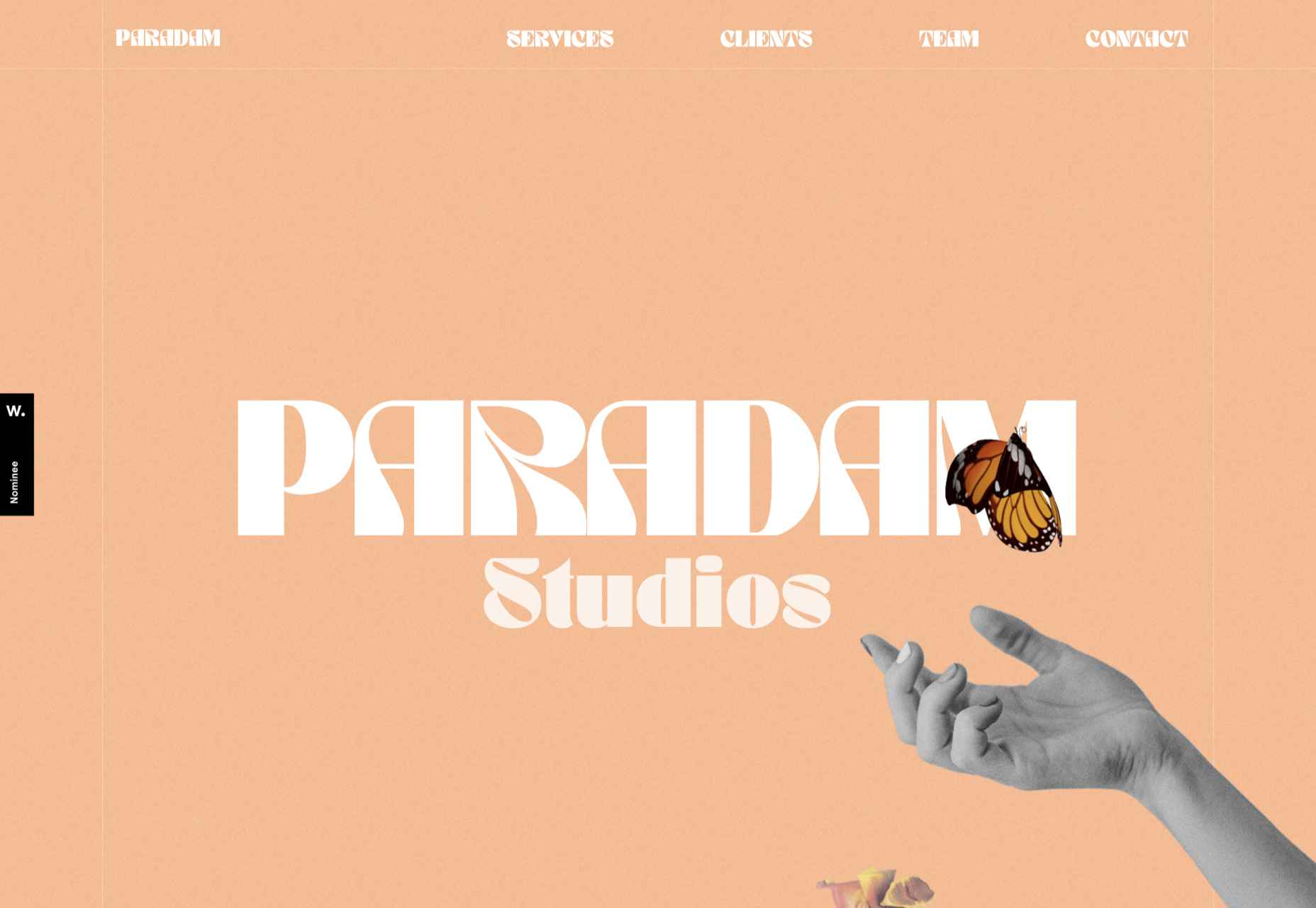
Paradam
The color scheme on the Paradam site is on the pastel end of the scale, but there is still lots going on to entrance the eye.
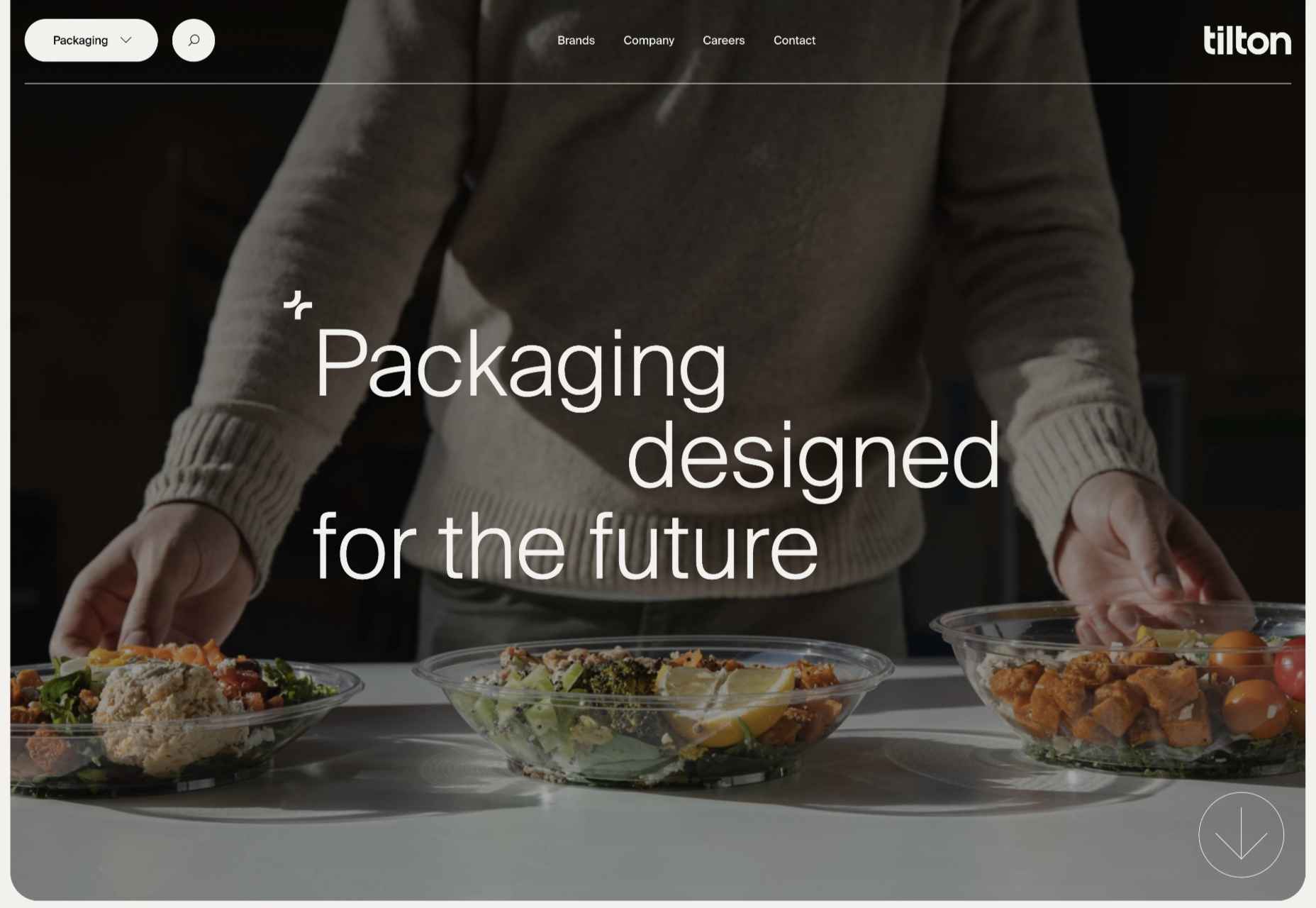
Tilton Group
The scrolling color panels on the Tilton Group site are a thing to behold.
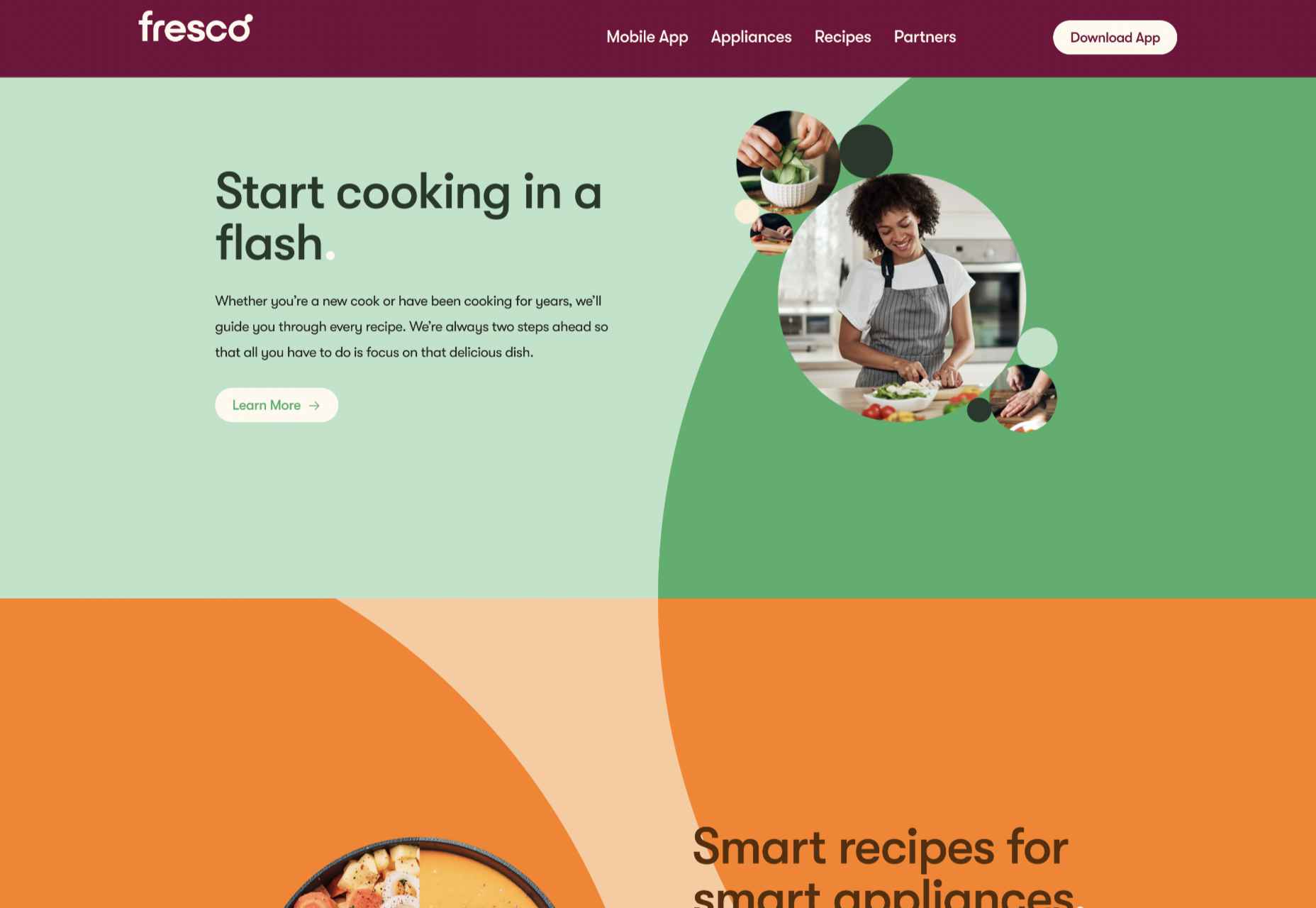
Fresco
Fresco uses a standard layout design, but the colors and quarter-circles instantly lift it.
Museum of Pink Art
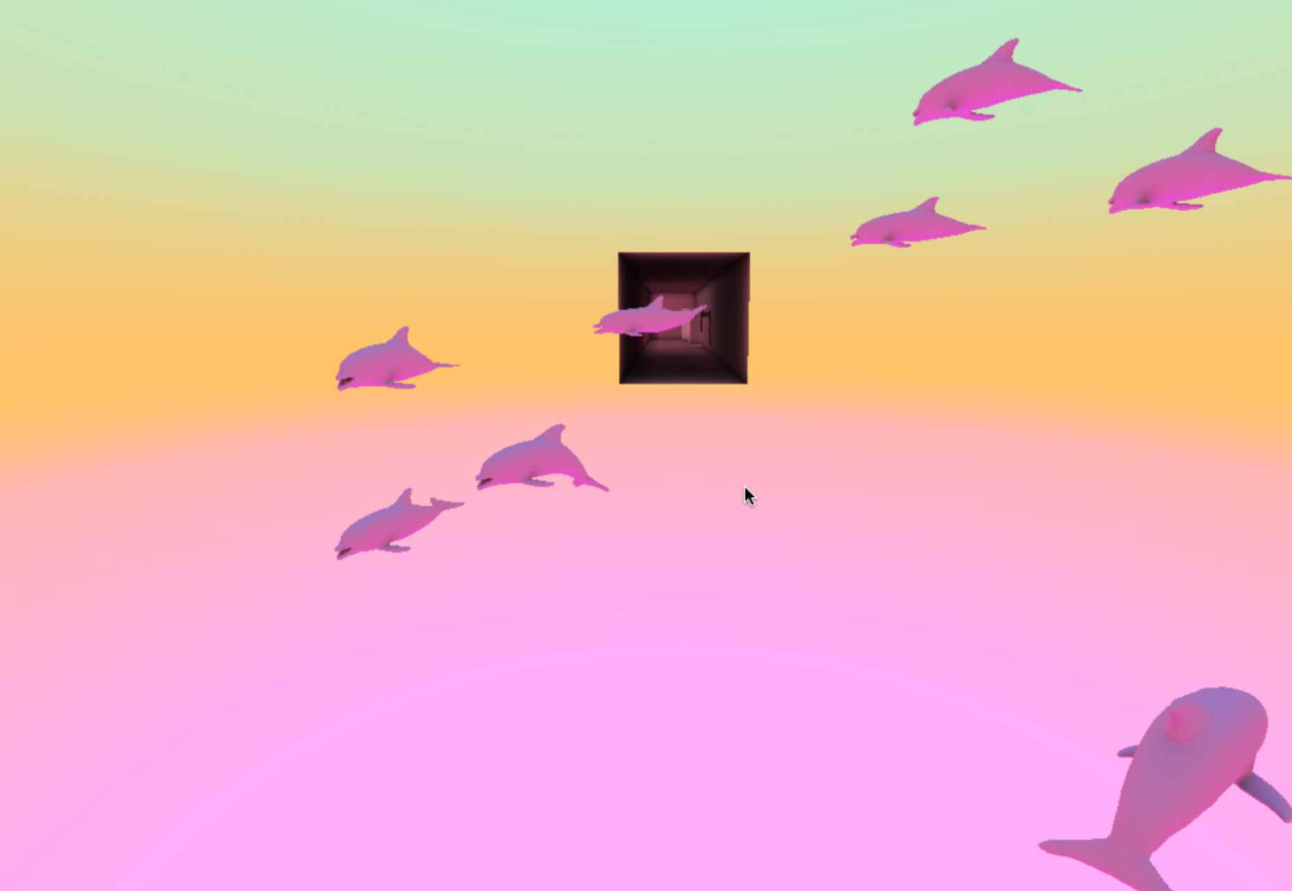
Museum of Pink Art is an immersive experience celebrating the color pink. Undoubtedly worth a virtual wander around.
Icons by Menu
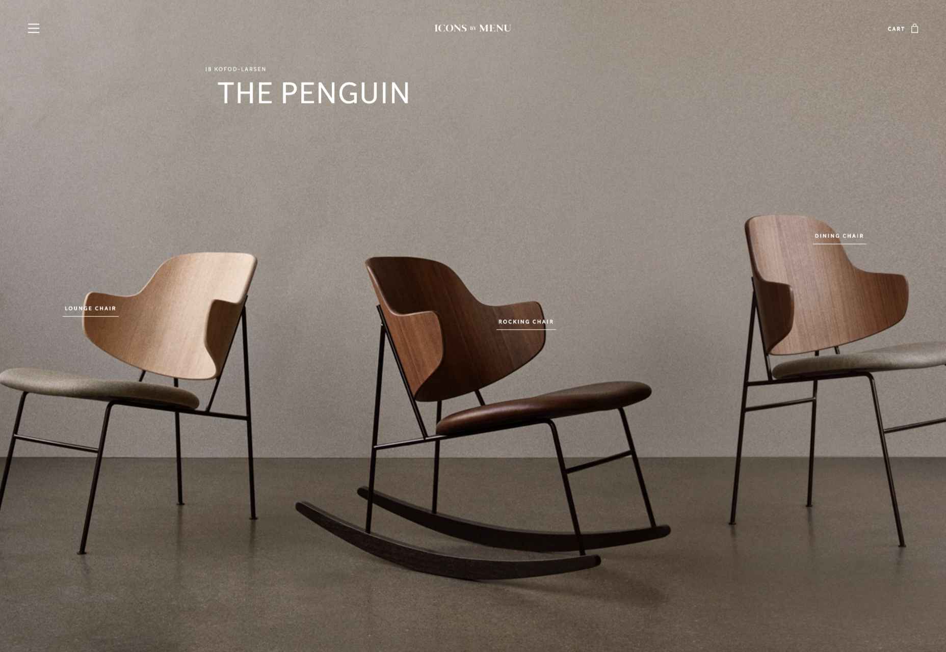
OK, this somewhat more minimalist site slipped through the net, but Icons by Menu is so pleasing to look at and use that we had to include it.
GlareDB
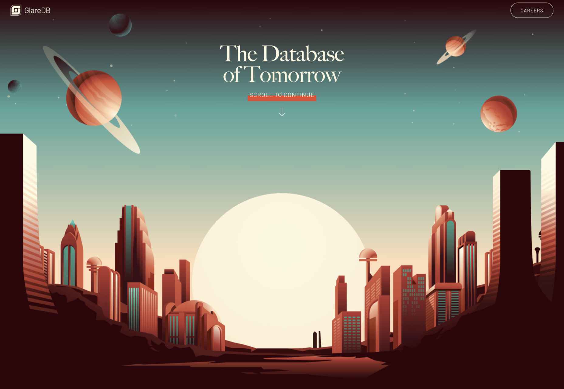
With an illustration that could be ideally at home on an Arthur C. Clarke book jacket and that rich, deep red background, this site for Glare DB is a world away from what might be expected.
Alex Beige
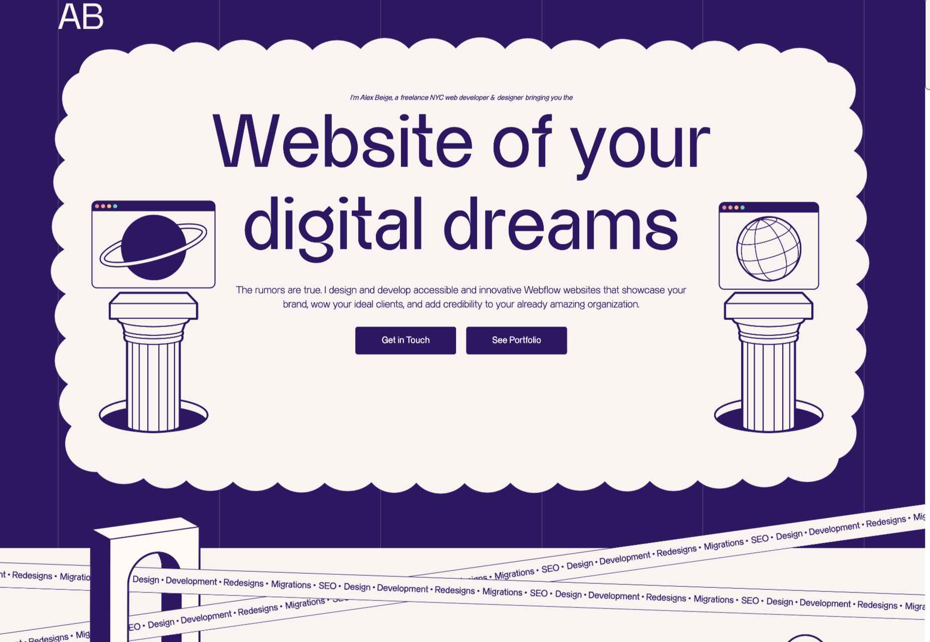
While the overall style and accent illustrations are pleasing on Alex Beige’s site, the Our Team section is guaranteed to raise a smile and stick in the user’s mind.
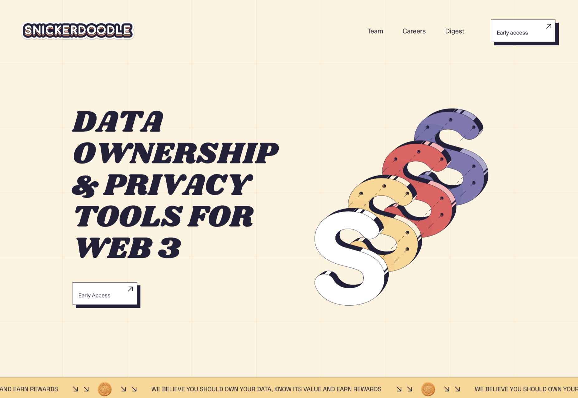
Snickerdoodle
Careful spacing means busy elements (like on scroll animated illustrations) don’t become overwhelming on the Snickerdoodle site.
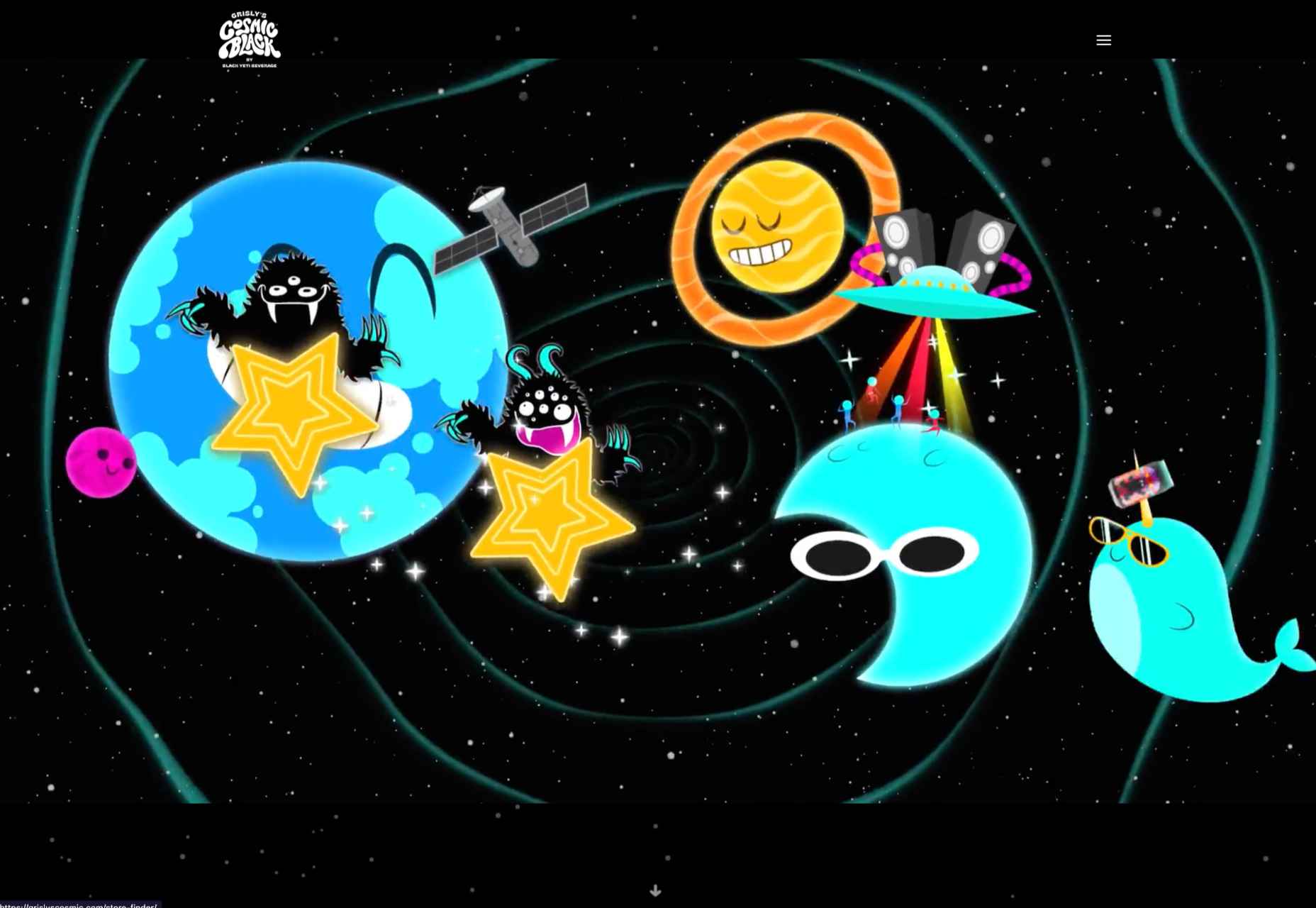
Grisly’s Cosmic Black
The site for Grisly’s Cosmic Black is fun, bright, and joyful. Plus, it’s nice to see an alcohol site going a bit further than the usual ‘drink responsibly’ and actually providing helpful links.
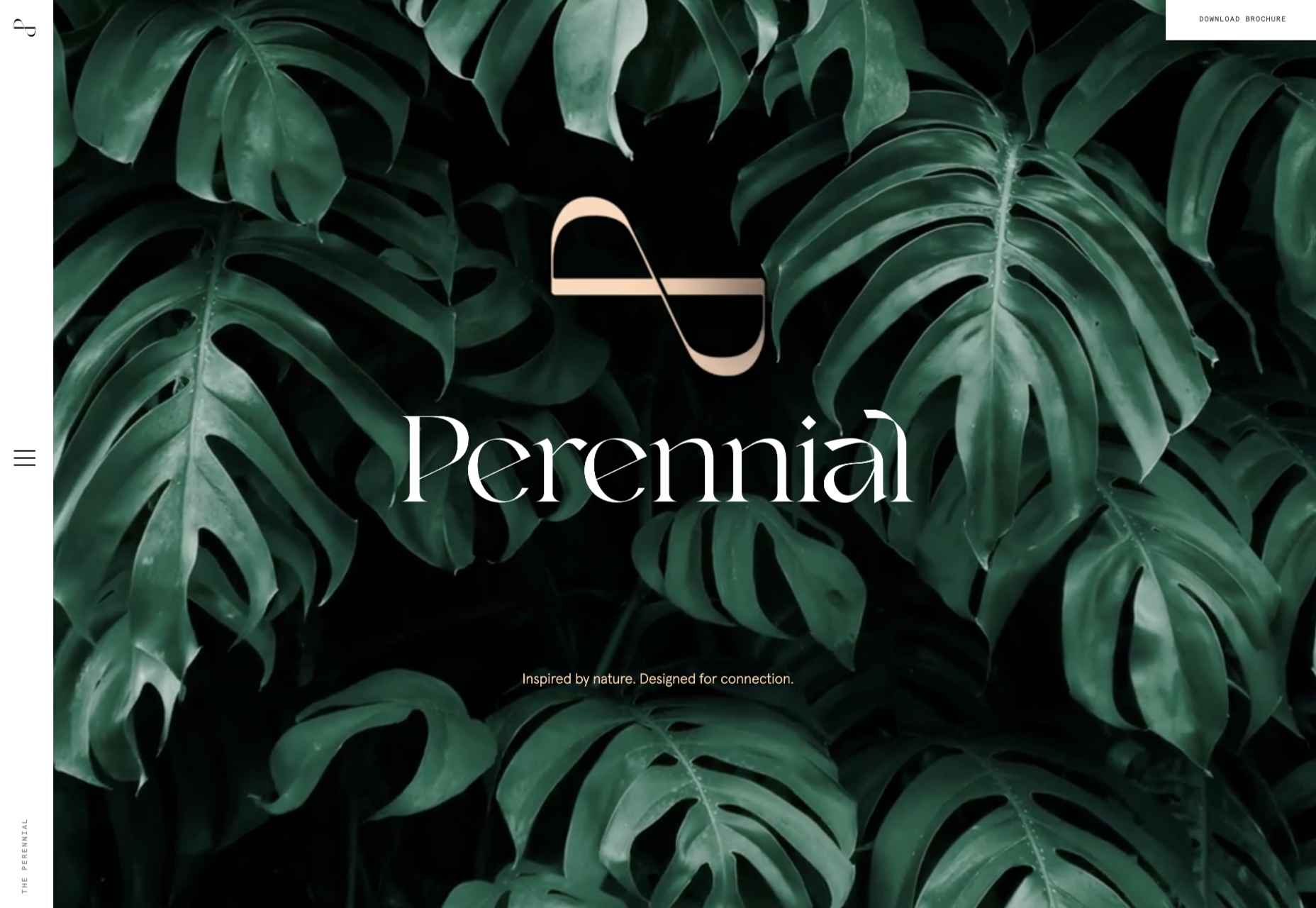
The Perennial
Not just floorplans and (lots of) images, but virtual walkthroughs too. The Perennial doesn’t feel like a standard office building.
The post 20 Best New Websites, July 2022 first appeared on Webdesigner Depot.
