Archive

Archive for July, 2022

Powerful Image Optimization Tools

July 20th, 2022 No comments

In recent years, the web development community has rightfully spread the message widely that images are often the largest resource on any given web page. While many developers spend time optimizing other areas of a web page’s performance, reducing the size of images can have a bigger impact on performance than all other areas combined.

You might already know that Smashing Magazine has published the book Image Optimization by Addy Osmani, which covers this topic in full detail. But consider this post a compliment to the book, as this will focus purely on different tools available for reducing the size of images.

WebUtils Bulk Image Compress

WebUtils Bulk Image Compress allows you to compress images and convert them to WebP, JPG, PNG, AVIF, and JXL. There doesn’t seem to be an indication of limitations on file size or the number of files, but it is a slow process if you try to do a bulk conversion. You can also adjust quality and size, and everything is done client-side.

Compressor.io

Compressor.io lets you optimize JPEG, PNG, SVG, GIF, and WebP using lossy or lossless compression up to 10MB per file. If you want to customize the compression or use larger files, you’ll have to get the Premium plan. The compression, in this case, seems to be on the server side, so you’ll get much faster results.

Imagecompresser.com

Imagecompresser.com lets you upload up to 10 files simultaneously and supports PNG, JPEG, WebP, JPG, and GIF formats. There doesn’t seem to be any limit on the file size per image, so this would likely work well for large files of 10 or fewer.

AnyWebP

AnyWebP is specifically for converting images in WebP format, and you can output to JPEG, PNG, or ICO. You can customize by file size or quality. You also have the option to convert just about any file format (TIFF, PSD, BMP, etc.) to WebP. This tool also offers offline native apps for Mac and Windows that let you bulk convert. In any case, none of the files get uploaded to the server.

Compressimage.io

Compressimage.io allows fully offline image optimization with no limits on file size or the number of files. The only limitation this seems to have is that you can only compress JPEG and PNG. The custom options allow you to adjust the compression level, image size, and if you want to convert to WebP. You can also add a custom suffix to the file name.

JPEG.rocks

JPEG.rocks, as the name suggests, is a privacy-friendly JPEG image optimizer, fully client-side and open-source. There doesn’t seem to be a limit to the file size or number of files, and you can customize the output file quality.

Compressor.js

Compressor.js is quite different from the other tools in this list. It includes about a dozen different settings that let you customize the image quality, size, mime type, and more. The only big limitation is that you have to do one file at a time. So this wouldn’t be a good option for bulk resizing but is effective for specific optimizations you want to perform on a particular image.

Squoosh

Squoosh is designed by the Chrome Labs team. The web app is limited to a single image, but it includes several options for reducing size, color palette, choosing a compression method, compression quality level, along with a slew of other advanced settings. The engine that powers this tool is also available as an API or CLI for bulk processing.

SVGOMG

SVGOMG is specifically for reducing the size of SVG graphics. It’s a GUI for SVGO, a Node.js-based tool. SVG optimizers are useful because many programs that produce SVG include redundant and useless info in the SVG code that produces the image.

Optimizilla

Optimizilla uses lossy compression to reduce the size of JPEG, GIF, and PNG images. You can upload up to 20 images, and you have the option to customize the compression level and quality for each of the images before downloading.

Shrink Me

Shrink Me lets you bulk optimize JPEG, PNG, WebP, or SVG images with no discernible quality loss. There is no limit on the number of files or file sizes, but larger files will mean a slower compression process.

JPEG Stripper

JPEG Stripper optimizes JPEG files by stripping out unnecessary data. Allows only a single image uploaded at a time, so this would only be useful for a few images in JPEG format.

Shrink Media

Shrink Media lets you optimize PNG, JPEG, and WebP images up to 5000×5000 resolution, and it’s also available as a mobile app for iOS or Android. Use the interactive sliders to change the quality level and the photo dimensions. You can also paste a URL to an image, but this tool only allows you to optimize one image at a time.

OptimizeImages

OptimizeImages lets you reduce the size of SVG, PNG, JPEG, WebP, GIF, and AVIF while also giving you the option to convert to WebP or AVIF. Optimize up to 30 images and choose a compression quality option (recommended, medium, or ultra).

ImagesTool.com

ImagesTool.com includes a number of different image manipulation tools. You can adjust the size, convert, compress images, and more. Supports JPEG, WebP, SVG, GIF, and APNG. All done client-side, and you can choose between lossless and custom compression. No limit to the number of files you can optimize, and you can also upload by folder or paste in your images.

AVPress

AVPress is a little different as it is specifically for optimizing video files and GIF animations. It allows a single video or GIF to be processed at once and includes several customizations and output settings you can apply to your chosen file.

AVIF Converter

AVIF Converter lets you convert just about any image format to AVIF, a next-generation file format that purports to have better compression than WebP, JPEG, PNG, and GIF. This app doesn’t seem to have any limitations on the number of files or file sizes, but note that the AVIF format is not yet supported in all modern browsers.

TinyPNG

TinyPNG is an older tool that optimizes WebP, PNG, or JPEG files. You can upload up to 20 at a time and up to 5MB in size each.

Build Tools and CLI Tools for Image Optimization

The tools I’ve listed up to this point are good options for manual batch processing or optimizing a few images at a time. But in the context of a large project, you’ll want to consider using different tools that are designed to be incorporated as part of an ongoing workflow or build process. Here are some options you can consider:

  • SVGO is the popular SVG optimization tool that’s the core behind the previously mentioned SVGOMG;
  • libSquoosh is the Squoosh API, allowing you to build JavaScript programs that optimize images on the fly;
  • Squoosh CLI is a command-line tool for using the engine that runs Squoosh;
  • pngquant is a command-line utility specifically for optimizing PNG images;
  • esbuild-squoosh;
  • imagemin is an older unmaintained JavaScript project that lets you optimize images programmatically.

Depending on what build tool or task runner you’re using, the aforementioned imagemin is likely available as a plugin for your tool of choice. Here are some imagemin plugins for different build tools:

Finally, if you’re building native apps that require image processing and optimizing on the fly, here are some C programming language options:

  • MozJPEG is a program for optimizing JPEG images, intended for use as a library in graphics programs, image processing tools, and similar apps;
  • jpegoptim is a utility to optimize JPEG files;
  • libvips is a library for processing images.

Other Tools

You might want to check out other tools and resources for image optimization. These don’t necessarily fall under the above categories, but they might fit one of your specific use cases.

  • QOI
    The Quite OK Image Format is an image format that losslessly compresses images to a similar size to PNG while offering 20x-50x faster encoding and 3x-4x faster decoding.
  • JXL
    Not a tool but a community website centered around the JPEG XL image format.
  • UPNG.js
    This is the PNG engine behind the popular Photopea app, an advanced PNG/APNG decoder and encoder that offers lossy and lossless optimization.
  • Optimus
    A native desktop app that allows you to compress, optimize, and convert images with support for JPEG, PNG, and WebP formats.
  • ImageOptim
    A Mac app and Sketch plugin for reducing image file sizes.
  • pngcrush
    A legacy image compression tool that can be used via the command line.
  • Trimage
    A native cross-platform app and command-line interface to optimize JPEG and PNG images.
  • PNGGauntlet
    An older configurable native app for Windows, Mac, and Linux that optimizes PNG and converts various formats to PNG.
  • Pngyu
    Another native app that uses pngquant for PNG optimization.

Conclusion

If you know of another tool for optimizing different image formats for web, native, or mobile apps, feel free to let us know in the comments. In the meantime, I hope this list of tools will suffice to provide whatever you need to fill your image optimization requirements.

Categories: Others Tags:

Graphic Design: Your Ultimate List of Tools and Resources

July 20th, 2022 No comments

We can’t do what we want to do without the aid of tools. Chefs employ fire to conjure up gastronomic wonders in the kitchen. Playing an instrument is an essential part of the music. A bridge that allows people to travel between two points in suspended space must be built using the correct tools and materials.

Visual art designers, such as graphic artists, require more than natural aptitude and skill to produce their work. Graphic designers use simple and advanced graphic design tips and tools to capture the constantly altering patterns and colors they see in their heads. 73 percent of firms are willing to invest in graphic design to stand out.

Even if there is a great demand for graphic designers, it is essential to note that there is a lot of competition to beat, which results in about 40% of new designers quitting the business after just two years. The instruments of graphic design tips have changed drastically over the centuries, beginning with Renaissance brushes and progressing to electronic styluses. Audiences and buyers of visual art agree. You must master a wide range of abilities and become adept in graphic design tools to succeed in today’s digital world as a successful graphic designer.

Many options exist, but these 22 critical tools for graphic designers who want to unleash the next generation of visual experiences are an excellent place to start.

Books

Thinking with Type

We have a copy of one of the first graphic design books we recommended reading, Thinking with Type, and occasionally refer to it. The book’s design enhances its usefulness by providing beautifully drawn examples of how to apply the topics addressed in the book.

Ellen Lupton provides specific and detailed instructions on how to align, space, order, and shape letters, words, and paragraphs. The book covers all aspects of typography, from typefaces and type families to kerning and tracking to the use of grids.

Graphic Design Thinking: Beyond Brainstorming

Second on this list is Ellen Lupton’s Graphic Design Thinking: Beyond Brainstorming. In Graphic Design Thinking, Lupton, the design curator of the Cooper-Hewitt National Design Museum in New York, draws on her expertise and those of industry leaders.

To come up with creative and practical solutions, graphic design thinking uses a range of strategies to encourage new ideas. Various visual examples and case studies follow a short narrative text to clarify each process.

How to

We see pieces for Saks Fifth Avenue, The New York Times, and Yale School of Architecture in this retrospective of Michael Bierut’s graphic design work. Bierut’s design philosophy is explained in the context of 35 of his creations in the book How to.

Each step of the process, from historical images, to early sketches, to working models, to the finished product, is explained by the artist in his voice through various media. It is revealed in the book that the author has a personal and professional life as well as obstacles he and other designers face in making fresh ideas available to a broader audience.

Work for Money, Design for Love

We highly recommend Work for Money, Design for Love to anyone starting in the design industry, especially as a freelancer. In his book Work for Money, author David Airey covers the business side of design. 

Internationally renowned logo designer David Airey, the author of Logo Design Love, offers a refreshingly plain guide to the challenges many designers confront when they first strike out on their own. In this new book, he finally addresses their serious challenges using tales, case studies, and sound advice garnered from his experience and that of well-known designers.

Graphic Design Rules: 365 Essential Dos and Don’ts

You can use Graphic Design Rules to improve your designs, whether you’re a student or an experienced artist. Clear-cut instruction on everything from typography to developing page layouts is provided in this article.

This colorful compilation of design dos and don’ts is full of practical guidance and walks readers through 365 guidelines like understanding when to utilize a modular grid—and when to chuck the grid out the window. These talented authors, who draw on years of experience to help you produce beautiful designs, will be appreciated by all designers.

Websites

Dribbble

Dribble, the company that poses the greatest threat to Behance’s market share, is yet another excellent portfolio website that creative professionals use to exhibit their work, network, and look for employment prospects. Since the user interface of this platform is intended only to provide “snippets” of projects, you will frequently find links on Dribble leading to the whole project presented on Behance. Dribbble, on the other hand, is an excellent platform for sharing work in which attention to detail is particularly crucial, such as logos or individualized illustrations.

Behance

Behance is currently the most popular platform for online portfolios, enabling design professionals to share their work in various fields, including typography and interior design. However, Behance is more than just a venue to display your best work to the world. It is an ideal venue for networking, drawing inspiration from the work of others, and even discovering employment prospects through the job search area of their website. It has a fantastic user interface that enables you to search for projects by name and industry or subject.

99Designs

Not only is 99 Designs a one-of-a-kind platform for freelancers, but it is also one of the oldest online design communities. They are well-known for hosting design contests, in which independent designers compete against one another to be awarded the design job of a client who has posted a pitch. In addition, 99 Designs features an excellent blog and provides a beautiful environment in which to investigate the work of others.

Inkbot Design

As a freelance designer, if you’re seeking a website that gives unique websites for learning about design and an incredible opportunity to improve your skills, Inkbot Design is the perfect option for you. They have a blog where they post design-related information. There is a wealth of information for independent designers in the articles provided. Inkbot is well-known for offering ‘Specialized logo composition’ at a low cost. Inkbot helps you get your business off to a good start by providing graphic design skills and services. Place your order for a characterized logo as soon as you have checked all your assets.

You’ll be able to come up with some great denomination names with Inkbot. The success of your business relies heavily on the strength of your company’s brand. Assert your brand’s personality in a memorable way on the internet. Inkbot Configuration is a complete trademark trading company for small and medium-sized enterprises that provides electronic advertising and promotional solutions. Elegant, effective websites that are simple to manage can be learned quickly. Focusing on your business while staying abreast of technological advancements allows you to do both.

Influencers

Maztrone

Parisian graphic designer Anthony Thiebaux, better known as Maztrone on Instagram, is a self-taught artist. Motion design, art, and typography are some of his specialties. For two reasons, he is one of Instagram’s top graphic designers.

He creates a scrolling feed of revelation and contemplation on his social media accounts. Two, the graphics are incredibly fluid, fascinating, and unexpectedly smooth. Maztrone is a terrific place to start for design teams looking for a means to give life to their creatives.

Rylsee

Designer Cyril Vouilloz, better known as Rylsee, is based in Berlin and has worked on projects for Nike, HP, Ikea, and many more. For a variety of reasons, the Instagram account of the graphic design influencer is a treasure trove of inspiration.

But the one that stands out the most is his use of avant-garde typography. At a minimum, his lettering adds a dimension that might serve as a muse for creative teams. So Rylsee’s account is an excellent place to start if you’re looking for an experimental and unique perspective for creatives.

Neil Secretario

Typographer Neil Secretario joins the ranks of graphic designers worth following on Instagram. In contrast to the majority of lettering artists, his work is eloquent, refined, and full of purity that piques your interest.

The Atlanta-based left-handed designer has worked for various companies, including Condé Nast, GQ Germany, Intercom, and Lionsgate. He regularly posts lessons learned on his Instagram profile. As you scroll through the stream, you’ll discover various knowledge about the creative process, from concept to completion.

Foreal

Foreal, a German design studio, is the place to go if you’re looking for a minimalistic design inspiration account. Clients like Google have come to rely on their eye-pleasing visuals and images. The Foreal Instagram account is an absolute must-follow if you like playful and whimsical designs.

Jon Contino

A self-employed illustrator, Jon Contino is the creative director of Contino Studio. Instagram is a virtual portfolio for a well-known graphic designer.

What makes it stand out is the constant experimenting with a wide range of mainstream and unusual styles. If you’re looking for a new perspective on branding, you should follow him.

Equipment

Large High Definition Monitor

It may seem like an unnecessary luxury if you don’t have a huge, high-end display. As a result, a high-quality monitor is critical to the quality of your job. Most folks have no idea what to look for regarding exhibitions. Getting lost in the language may be tricky, we know. The resolution is still essential, with or without a 4K monitor.

The most common resolutions for graphic artists are UHD (3840×2160 pixels) and QHD (4096×2160 pixels). Regarding size, most designers recommend that you go between 27 and 32 inches. There are many options for workstation accessories, but the monitor should not be slashed.

External Hard Drive

An external hard drive is a must-have for anyone who works with a lot of data or relies heavily on external files. Hard drives have many advantages, including portability, ease of use, and storage capacity. For projects involving animation, film, or other huge files, it’s critical to have a large storage capacity, even if you don’t utilize them to back up your existing files. Even though they aren’t specifically tools for graphic designers, external hard drives are a must for any professional designer.

Tablet and Stylus

Graphic designers often ignore tablets and pens. We overlook Wacom’s limitations since it’s been the leader in graphics tablets and design tools for so long. Some designers can’t spend all day on their laptops. This is true for mobile designers.

Freelancers, digital nomads, and people who work “in the field” love the iPad Pro and Apple Pen. With the variety of iPad apps, they don’t have to sacrifice quality for mobility. Graphic design is a creative ocean. You may construct a career and portfolio that were unimaginable a decade ago with the correct tools. Investing in the appropriate equipment helps your career and creativity.

Software Tools

Adobe Photoshop

Photoshop is a popular graphics application. It’s been used for design and picture editing since 1988. The broad spectrum of creative professions uses it for picture resizing, retouching, illustrations, digital art, and photo manipulation. Photoshop’s user-friendly interface, editing capabilities, and online tutorials make it ideal for beginners and pros alike. Photoshop tutorials, courses, and learning tools can help you master its complete control and creative capabilities.

Removal.AI

Removal. is powered by a cutting-edge Artificial Intelligence system. AI is one of the most user-friendly free online photo editors for amateur and professional photographers. This picture editor is not only simple to use, but it also has a plethora of photo editing options. Image background removal is its primary function.

However, with the easy photo editor, you can do far more than removing the backdrop. All you need is a simple photo editor to change the photo’s background to white or any other color. With its ease of use, it can handle a small number of photographs, up to tens of thousands.

Procreate

For the first time, both Photoshop and Affinity Photo are available for iPads. Procreate, on the other hand, is perhaps the most outstanding graphic design skills program if all you need is a few drawing tools and nothing else. It’s no surprise that Procreate has a stellar reputation in the art world. It has a plethora of attractive brushes and valuable features like QuickShape, which automatically creates precise shapes, and StreamLine, which smooths out your jerky strokes. Filters can also be painted directly onto the canvas. This is a must-have iPad app at a lower price than Affinity Photo. Even if you don’t have an iPhone, you should check out Procreate Pocket(which opens in a new tab).

Adobe Illustrator

Adobe Illustrator is the industry standard for vector drawing, design, and editing. As a standard in the business, it allows users to generate everything from digital art to typefaces to logos. Using Illustrator, designers have complete creative control and access to a wealth of shortcuts to expedite their work processes.

Pink Pony Creative co-founder Kristy Campbell said, “I’m a big fan of Illustrator since it’s so versatile, but I’d have to say that for branding, Illustrator is my go-to.” Using my Wacom drawing tablet, I’ve completely re-written the rules for myself.” Because of the ease with which I’ve been able to do so much more, I’ve produced far better work.”

Figma

It’s no secret that Figma, a cutting-edge design tool, is taking over the industry. Everything from wireframing websites, designing mobile app interfaces, prototype designs, and crafting social media posts can be done with it. No strings attached. Designing projects can be made more accessible using Figma’s vector, prototype, and code-creation tools.

Conclusion

As you begin your career as a graphic designer, we hope you find our list of resources and tools helpful. Whether you’re trying to find inspiration or preparing your workspace, you must ensure you have everything you need to succeed.

The post Graphic Design: Your Ultimate List of Tools and Resources appeared first on noupe.

Categories: Others Tags:

Effective Ways to Optimize your Remote Worker’s Experience

July 20th, 2022 No comments

We all would agree on the fact that the contemporary corporate world is undergoing some paradigm changes. The business world we see today is a lot different from how it seemed a few years back. What lies at the heart of the contemporary business world is an unimaginable saga of magnificent digitalization. Remote work cultures are swiftly replacing traditional office setups paving the way for a new normal. 

Today, organizations are either going completely remote or hiring additional human capital as per remote working arrangements. This explains why a lot of organizations today are interested in effective strategies for remote employee engagement and enhancing the experiences of virtual workforces. Needless to say, even if organizations are going increasingly remote, they still acknowledge the vitality of investing in employee experience in engagement.

However, the fact of the matter is that cultivating positive employee experiences in a virtual work environment is easier said than done. As an employer or HR manager, it will take a lot more from you to create a high-performing remote work culture by investing in employee experience. When it comes to your remote workers, you need some outside-the-box strategies to engage your remote workers through experiences they can cherish for a lifetime. 

In this blog, we look at some innovative ways in which you can enhance your remote workers’ experience in an incredible way. Even if your organization still operates in a traditional brick-and-mortar environment, in the future, you will surely need these tactics. How long do you think you can resist the need for having at least some sort of remote working arrangement? Sooner or later, your business too will feel the need to align with remote cultures. Having said that, in any case, this blog will add incredibly to the knowledge of employers and HR managers. 

Enhance Virtual Onboarding Experiences

Why not create amazing employee experiences from the word go? In fact, you may want to believe it or not but employees are most likely to remember their onboarding experiences for a lifetime. Having said that, it is a great idea to offer fascinating virtual onboarding experiences to your new recruits. 

The question is, what does it take to offer brilliant virtual onboarding experiences to your employees? Well, there are quite a few ways in which you can do that. To begin with, you can send a personalized welcome mail to the new remote employees with best wishes. Besides, if you want to go a step further, you can send a personalized welcome kit to your remote employees through courier services. 

Besides, another great way to create mesmerizing onboarding experiences is to give your remote employees a virtual tour of the office. Also, you can offer them an opportunity to virtually interact with their team members on the first day itself. In this way, you can foster a strong sense of belongingness among your new employees from the very beginning.

Did you know that as per TechJury, with impressive onboarding experiences, companies can retain up to 69 percent of their employees for 3 years? That is quite fascinating to know, isn’t it? Besides, as per Bamboo HR, great onboarding experiences can lead to 18 times higher commitment among employees. These insights clearly state that laying emphasis on great onboarding experiences is totally worth it.

Host Mental Health Webinars

In the modern corporate world, employee stress is for real irrespective of whether your employees are working on-site or remotely. As per a Deloitte Survey, 77 percent of employees in the modern workplace are experiencing burnout situations. Besides, if we talk about remote workers, in particular, as per Flexjobs, more than 75 percent of remote workers experience high stress and find themselves on the brink of burnout quite often. 

It is high time that leaders and organizations realize the simple fact that employee engagement and alarming rates of burnout cannot co-exist. Having said that, if we talk about the ways to enhance the experience of remote workers, there has to be a worthwhile discussion on mental wellness. 

Therefore, hosting virtual mental health webinars for your remote employees can be a great initiative for supporting their mental wellness. When you care for their wellness, they will feel valued and this will go down in their books as the highlight of their positive experience in the organization. Further, in lieu of such a positive experience, they will reciprocate greater allegiance and diligence to the organization.

All in all, you cannot get the best out of your employees unless they feel great physically or mentally. You always want them to have sharp cognitive skills and agile problem-solving skills, right? But do you think they can deliver on this expectation if they are always on the edge of burnout? Hence, the more you invest in their experience in terms of wellness the better will be the results.
 

Optimize Digital Learning Experiences

Workplace learning and development opportunities are silent to all employees irrespective of whether they are working on-site or in a virtual work environment. Speaking of millennials, as per Gallup, almost 90 percent of millennials assert that they look forward to effective learning opportunities in their jobs. Even if we put statistics aside for a while, everyone who has sincere career ambitions will hold learning and development in the highest regard, isn’t it?

Having said that, when employees talk about their experience in an organization, they will mostly view it in terms of their professional development. If you invest effectively in your employees’ learning and development, they will respond with greater engagement. Otherwise, you may soon have to face the peculiar problems of high employee attrition.

Therefore, you should look to add consistent value to your employees’ personal development by enriching their learning experiences. In the virtual work environment, learning technologies like LMS, gamified learning, professional learning apps, and so on will help you in achieving great results. 

If we look around, there is a stellar range of technology disrupting the conduct of learning in the workplace. You need to determine the best fit remote learning methodologies for your organization to deliver great experiences to your employees. The greater the value you offer in terms of learning the more cherishable the experiences.
 

Invest in the Right Technology

If you ask your employees, doing recurring and monotonous tasks each day does take a toll on their motivation. Besides, if they have to put in additional effort for tasks that can be completed conveniently via the right tools, they will feel discouraged at some point. Given that, you can always improve your employees’ experience by investing in the right workplace technologies.

In fact, the right choice of digital tools and technologies can make a significant difference in terms of internal communication, collaboration, and tracking of project progress. If you can simplify the lives of your employees with automation technologies and tools that can assist them effectively, they will surely be thankful. In this way, you can create a great virtual work environment and reap the benefits of positive company culture in a worthwhile way.

However, with such an extensive range of project management and other tools available, it will be prudent to carry out meticulous research before you make the investments. Make sure you invest your money in scalable technologies that can add to business success in an incremental way.
 

Offer Additional Time Off

Another great way in which you can optimize your employees’ experience is by offering additional time off to them. In fact, this could be a great non-monetary reward idea for your organization. As we discussed above, even remote workers are prone to high stress which can soon translate into burnout experiences.

So, to assist your employees in preventing burnout and adding to their optimism, you can offer additional paid leaves to your best performers as a token of appreciation. To explain, let’s say as of now you offer two paid leaves to your employees per month. You can introduce a reward scheme wherein your top performer of the month can avail two additional paid leaves in that month.

Besides adding to your employees’ experience, you can also promote greater allegiance among them by showing greater sensitivity towards their struggle with stress. Such an initiative as part of employee rewards will come across as an empathetic initiative by the organization hence, further adding to employees’ experience.

Speaking of the significance of empathy in the workplace, as per Businessolver, 76 percent of employees opine that workplace empathy adds to their motivation and job satisfaction. Hence, with the small initiative of offering additional paid time to your employees, you can win the hearts of your employees in an inexpensive way.

Introduce Virtual Coffee Breaks

What we need to acknowledge is that remote workers carry a constant feeling of social isolation. To explain, when employees work on-site, they can have some lighthearted conversations with their colleagues. Besides, they can also express their feelings in front of their co-workers and also seek emotional or social support from them.

However, when it comes to a virtual workplace, they do not have this privilege. Further, the feeling of social isolation among them can soon turn into disengagement or even compel them to quit. As a business leader, you surely do not want that to happen, right? So, is there anything you can do to help your employees overcome the feeling of social isolation?

Well, there are some interesting ways in which you can offer great experiences to your employees such that they don’t have to battle the feeling of social isolation. Introducing a culture of virtual coffee breaks can be an amazing way to take some pressure off your employees and let them have some candid conversions with their co-workers.  

To explain, employees can coordinate their coffee breaks and connect via a zoom call to have some heartwarming conversations outside of work. During these small breaks, your employees can share their emotions with each other and foster strong interpersonal connections in the virtual environment. Having said that, they will be able to overcome the feeling of isolation in a worthwhile way and enjoy themselves while working.

For all these great benefits, these virtual coffee breaks make great sense, isn’t it? In fact, you can also participate in these fun discussions to vent out your own stress. Needless to say, as a leader, even you are vulnerable to high stress or social isolation while working remotely. These coffee breaks can be a great opportunity for you as well to deal with all the negativity around you.

Appreciate in Creative Ways 

Who says remote workers do not care about appreciation and recognition. For all employees in the world, appreciation is a crucial determinant of their satisfaction and experience. It is interesting to note that as per HubSpot, 70 percent of employees are of the view that they will work with greater zeal and dedication when they receive due appreciation from leaders. 

Having said that, while enhancing the experience of your remote employees, it is imperative to find creative ways for extending recognition to them. The question is, how can recognition work in a virtual workplace environment? Well, listed below are some fabulous ideas for appreciating your remote employees. 

  • Social media shoutouts to celebrate employee achievements
  • Offering recognition to employees via internal newsletters 
  • Ordering surprise meals for employees as a token of appreciation
  • Offering personalized rewards like OTT subscriptions, gym memberships, etc 
  • Offering additional time off to your best-performing employees 

Besides, in a digital work environment, you can also introduce a digital employee benefits program to continuously add to your remote employees’ experience. By offering due recognition and in exciting ways, you can keep the morale of your remote employees high at all times. Subsequently, they will keep winning new milestones for their organization. For high workplace motivation in a remote environment, you need to explore employee appreciation ideas with great zest. 

To encapsulate, organizations are going remote and virtual workplaces are in vogue. Sooner or later, your organization will have to embrace this transition as well if it has not so far. In the ultimate sense, organizations are only as competent as their employees and to keep getting the best out of them, you need to invest in their experiences on a consistent basis. Speaking of employee experience in a virtual workplace, the above strategies will surely give you a competitive edge.

The post Effective Ways to Optimize your Remote Worker’s Experience appeared first on noupe.

Categories: Others Tags:

Why Should You Believe In Super Apps? Extended Up to Future Growth Insights

July 20th, 2022 No comments

Many brands provide all the primary app-based services in a single solution. At the same time, it makes it straightforward for users to book hotels, ride-hailing services, food ordering, and more. Gojek is one of the most suitable examples of a super app that has achieved great success in lots of regions and catered to the needs of millions of customers. 

Super app is more than just a mobility solution; it is developed into modular micro-apps that users can use to get all their work done right under one umbrella. Today most businesses are turning online, but smartphone users don’t have enough space and time to download multiple apps to get their day-to-day tasks completed. They are searching for a single app that helps them get multiple service booking options right under one roof, and the super app is the best option for the same. 

On-demand Services Market Growth and Future Insight

Grab and Gojek’s Q1 market share report shows that the super app Gojek covers almost 25% of the share in ride-hailing in Indonesia while it covers 17% of the market in Singapore. The multi-service providers have gained huge popularity among users as more and more customers these days are preferring for convenient options to get all their needs satisfied. 

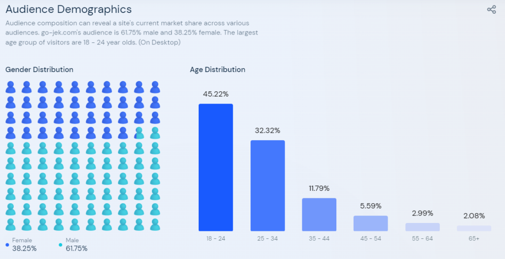
More than 60% of males and 38% of females use Gojek globally, and the largest age group of visitors is between 18 to 24-year-olds, according to Similar Web analysis. They are more likely to use desktop apps to book taxis, order food, make payments, and perform various activities right from one place. 

Source: similiarweb.com

Gojek secured around 1.3 billion in the first close of pre-IPO fundraising and had planned further investment in its ecosystem to strengthen its market position in the area and better serve customers. The multi-service platform is planning to provide its service to around 300 million tech-savvy population. 

Why is an All-in-One Solution Profitable for Your Business?

The economy is suffering a significant slowdown amid extended trade disputes and policy uncertainties. However, the pandemic spread has also affected various business operations, including taxi-hailing, logistics & transportation, and more. 

Experts of McKinsey believe that more than sixty trillion in annual revenue can be redistributed across the economy, which is almost one-third of the year’s total. Experts also predict that the economy is growing steadily as more enterprises are shifting to a mobile-first approach to satisfy the growing market demands. Since the concept of the super app was introduced, it has transformed the way customers and businesses get connected with each other. 

It has made their work faster and easier, as business owners can list all their services and track all activities from one place, while it also makes it easier for customers to eliminate the need to download multiple apps to get all their tasks completed efficiently. 

Due to changing customers’ preferences and the growing market, it is advisable for you to invest in a Gojek like multi-service app that consists of all essential features and modules, helping you build a strong presence in today’s competitive market. It provides you with lots of perks like: 

  • Helps to secure big chunk;
  • Collect and secure user data;
  • Makes tasks effortless and faster for you as well as your customers;
  • Attract new customers and helps retain existing one;
  • Have a deep insight into business activities and revenue generation;
  • Great insight can help to make better decisions.  

There are a lot more you can get with super app development; hence it wouldn’t be unfair to say that an all-in-one solution is profitable for brands to invest in. So why not take the support of a multi-service app development company to get Gojek-like super apps deployed within your budget and start a successful venture online. Launching an on-demand multi-service business is undoubtedly a profit-making decision that helps you unbox the path to success. 

Pandemic Boosted Super App Usage in Emerging Markets: Explore How?

Gojek engineers describe the multi-service platform as a bundle of apps that makes people’s life much easier and faster by connecting them with on-demand service providers. With quick access to the internet, most delivery brands were able to leapfrog the methods of the Western approach and invested in on-demand apps that help them provide multiple services with one platform and help users to eliminate the need to download hundreds of apps. 

The ride-hailing revenue market share of Gojek in 2022 reached around 42% in just Indonesia. The company has partnered with millions of brands to satisfy the growing needs of their targeted audience for food, grocery, taxi, and other services as well. However, the platform has made it easier for customers to find solutions to all their problems right under one umbrella. 

Super Apps Success: Top Reasons That Explains Everything

State of mobile 2021 report by Data.ai, in today’s competitive market, offering only one service with an app isn’t enough; you need to focus on providing more than one service to make your mobile app stand out from others and leverage a competitive edge. It also shows that there is almost 8% of growth in mobile app downloads year-on-year, jumping more than two hundred million since 2021. 

There are many more reasons and benefits for becoming a super app. To identify super apps’ success, we have listed the top reasons that explain why shifting to the approach is a better option for you. 

Mobile Experience

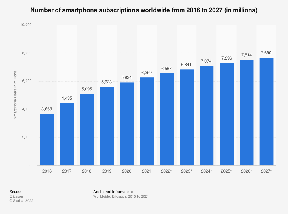
Smartphone users worldwide surpassed more than six million in recent years. Most individuals are likely to use their smartphone to use your branded solution rather than using it on their desktops. However, in most cases, their smart device doesn’t have enough storage, which leads them to uninstall a few of the apps immediately after their usage. 

Source: statista.com

For example, if they download the Dominos app, they prefer to uninstall it once they get done with their work (ordering pizza and getting it delivered). But it’s not the case with a super app as they can get multi-service needs satisfied from a one-stop solution. 

Homogeneous Markets

Most nations have an ordinary civilization; this greatly influences the uniformity of the market. This encouraged various enterprises to start simpler ventures and provide their brand service to customers on their demand. 

Hence when super apps like Gojek, Grab, and others were introduced, they created a huge buzz and grabbed success more instantly than our imagination. Therefore starting an online business with a similar idea and providing multiple services with one app can help you enjoy the perk of success.  

Unbanked Population

More than two million global population comes under the unbanked population, while the rest love it when they are offered options like online payment or other multi-service payment gateways. However, most super apps provide them with multiple payment options, including COD, credit/debit card payment, and more, making them more popular among tech-savvy customers. 

Administration Support

The administration is seeing practices that help them connect with citizens digitally; hence they are supporting the concept of the super app. For example, there are millions of public services that you can enjoy on super apps. Thus if you are thinking of launching your own super app, there is a great chance that you will get government support, making it easier for you to provide various public services like Wechat with ease. 

The Future of Super Apps is Bright: Isn’t it?

Undoubtedly super apps have a bright future ahead as people don’t have time to download multiple apps to get their day-to-day tasks completed; instead, they are looking for one which provides the solutions to all their problems. However, most business giants are looking forward to joining the race of super apps, so why should you be left behind. Get tech support and start offering a diverse range of services to your customers to stay ahead of their minds all the time.

The post Why Should You Believe In Super Apps? Extended Up to Future Growth Insights appeared first on noupe.

Categories: Others Tags:

Sales Tips that Will Succeed in 2022

July 19th, 2022 No comments

A good salesperson knows the importance of finding new customers and bettering your sales process. In order to help you out with that, we’ve created a short list of sales tips that will help you sell more effectively. 

These tips will work no matter the industry you’re in and they won’t take up too much of your time. We’ll also cover different stages of the sales cycle to give you a detailed overview of your sales process. 

Automate your sales process

The best way to save time while improving your productivity and efficiency is by automating your sales process. Automation will help you with repetitive tasks, leaving you more time to focus on the creative parts of your job. 

Parts of your sales process you can automate are: 

  • Generating leads
  • Qualifying leads
  • Proposal process
  • Scheduling sales calls and meetings
  • The follow-up process 
  • Upselling and so much more

The very start of your sales process refers to finding new leads and directing them through your pipeline. 

If you want to secure new clients, you’ll need to be able to quickly respond to requests for proposals. This means you need a reliable tool that can help you create high-quality documents in minutes. 

We recommend Better Proposals, a tool that comes with prewritten proposal templates you can customize to your needs in no time. You won’t have to worry about structuring your proposal from scratch, nor will you need to spend time figuring out how much text you need to write or where to include your pictures. 

All Better Proposal’s documents also come with the digital signature option, as well as payment integration, meaning your clients can sign the document and pay the first fee through the proposal itself. This way, no one has to print out documents, scan them or send them through snail mail. 

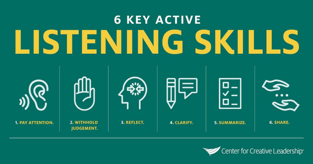
Work on active listening

In order to truly connect to your client base and get to understand their needs, goals and wants, you need to listen to them. There is no way around it. Sticking to the same sales script on every sales call or meeting will leave you with a low conversion rate.

What customers want nowadays is personalization. They want you to customize your approach to them and make the whole experience enjoyable. The sales proposal will help you get ahead in the clients’ minds. The customer is more likely to buy from a company that offers this kind of deal, so it’s worth looking into.

The best way to work on your communication skills is by practicing. Create workshops for your team and help them better their sales approach. 

Source: Center for Creative Leadership

It’s important that when your clients are speaking, you’re not thinking about what else you need to cover in your pitch, but truly try to understand where they’re coming from and think of ways to help them. 

The better you understand their issues and how your solution can help them, the more you can customize your approach. 

Focus on benefits instead of features

What your potential clients are most interested in is how your product or service will help their business. That’s why you need to focus your sale pitch on the benefits. 

Make sure you ask enough questions that you can specifically outline the benefits your solution can bring to your clients. The specifications of your products can be secondary, but first you need to hook them with specific benefits. 

For example, if you’re offering web site development, you should say that a new site will help the client sell more and build a loyal customer base. 

Once you’ve piqued their interest, you can talk a bit about your features and how you compare to your competitors. Since the first impression is so important, make sure to start by focusing on benefits. 

Make sure to follow up

If you’re not following up on your sales calls, you might be losing a lot of revenue. With research showing that only 2% of sales occur during the first meeting, you need to develop a bulletproof follow-up strategy. 

Whether you choose emails, calls or other ways of communication, make sure to test out your content. Create email sequences and divide your clients into 2-3 groups in order to test out which type of content works for them. 

Make sure to use a good CRM that will help you follow the customer journey of your clients. That way, you’ll know exactly where in your funnel are they and how to structure your approach. 

Source: flobile.com

You should also be following up on existing clients in order to upsell and cross-sell them. These are people that are already familiar with your products and services and therefore, don’t need a lot of persuading. 

Listen to customer feedback

Your customers are the best QA testers you can find. They will tell you if something doesn’t work, isn’t intuitive and more. 

Since they are the ones using your products and services, it’s important that you listen to their opinions and feedback. The better you understand what they like and don’t like about your solution, the easier it will be to develop new products and better your services. 

Make sure to provide your clients with a fast response that addresses all of their questions. If you choose to ignore your clients, it will lead them to frustration and in the end – your competition. 

Even if you don’t have a solution ready, make sure you explain to your clients that you understand their worries and are working on improving your solution. It will show them that you’re listening and care about them. 

Conclusion

Your sales process should constantly be worked on and improved. The best way to do that is to put your client base at the focus of all your strategies. They are the ones that should be directing your next moves, instead of your team. 

If you create new solutions and think that your audience will like whatever you put out, you’ll quickly realize that you need to change your approach. Make sure to always keep your audience at the centre of your decision-making process. 

Our guide will help you figure out what needs changing and how to create a better sales process that helps you sell more while fostering a loyal client base.

The post Sales Tips that Will Succeed in 2022 appeared first on noupe.

Categories: Others Tags:

How to Create Engaging Videos with the Top Trends in the Animation Industry?

July 19th, 2022 No comments

Video animation is the manipulation of characters and figures drawn by hand in a digitized system. The manipulation of these characters allows animators to create a compelling storyline that engages viewers and communicates a pre-determined message to the viewer(s).

Why is video animation better than making real-life videos?

Video animation is useful because of a few reasons. The first is that it is cost-effective when compared to the production of a real-life video. The second reason is that it is much easier to make as compared to a video advertisement. But perhaps the most important reason is that video animation provides a certain versatility to its creator, enabling them to make content that would otherwise be impossible or at least troublesome to create. 

But aside from being easy, cheap, and versatile in creation, animated videos allow for the possibility of clearly and precisely conveying an idea that could be useful in marketing, education, training, social awareness, and several other areas depending on the creativity of the animator. So without further ado, here are the top trends in the animation industry.

Keep it simple

Whether you’re making a video for a complex product or just a simple message, the first thing an animator must keep in mind is to simplify the content as much as possible and use a clear and concise design language that does not pull the viewers’ attention away from the main message. By providing motion to a collection of dots and lines, institutions like IBM can create animated videos that far surpass the creativity of some of the largest marketing agencies in the world. Similarly, a great animator can learn from their execution on a video titled “IBM Design Language” and incorporate their simplicity into their animations.  In a short phrase, the optimum balance between design is “simple yet breathtaking”. If you can find how to incorporate that into your work, chances are your video will do great. 

Combine animated and real-life elements

This may sound counterintuitive. But it also makes some sense. Compared to the design of the universe, human hands can only go so far in the pursuit of replicating it. Sometimes, your work should embed certain elements of real-life into the animated video to make it seem more realistic. And at the same time, using this method can help the animator by minimizing the number of details they have to draw by hand. Not only that, but this method can provide a canvas for the animator that allows them to bring their imagination to life. And with that, the viewer’s imagination as well. 

Don’t be afraid to mix things up

The majority of animators and design experts believe in using colors and styles that complement each other as conventionally as possible. However, the animator that is willing to take risks will often tell you that experimenting with various styles and color palettes is a great way to innovate an industry that seems to be at the peak of its creative time. By creating bold statements through never-before-seen combinations of styles and colors, animators can make viewers pay more attention and therefore get their message across in a more effective manner. 

Use Illustrations

While making an animated video, it’s important not to forget the “animated” part. This is exactly why we recommend putting one or two illustrations in your animated video. Possibly at a time when you’re trying to explain a stark statistic that dampens the mood, illustrations can come in to make that information that much easier to understand and take in. The skilled animator will always find the right opportunity to place an illustrative infographic or even a few decorative illustrations into their video to maintain a certain effect. 

Use Color Gradients

In trend number 3, we mentioned how great animators are willing to experiment. And one very useful way to do that is by understanding color gradients. This gradient is a sort of charting of how dark or light color can become. And by using this gradient, many animators can imbue the colors of the company they are creating the video for, into the video itself. This allows the video to feel more connected to the message on a subconscious level. 

Create Layers

An animator can design many things, but trying to design every single aspect at the same time can become daunting. Once you get a certain amount of experience under your belt, designing a set for video animation services can become easier as you understand the various elements and how they fit into the picture. For example, if you’re designing an underwater animation, the first thing you would design is the sea bed. Following that, you would at moving plants in layers. Some would be small while others would appear closer and hence larger. And finally, the animator will then add the fish and other characters on top of the predesigned set. By following this method, almost anyone can animate an entire world onto the storyboard. 

Bend Reality

As an animator, you are close to being the highest power in the animated world you create. And in moments of greatness, animators have found it helpful to create renderings that could be construed as unrealistic. This is because in the world of animations nothing is beyond reach. Other than a larger imagination. Of course, this doesn’t mean that you simply have to break reality. Rather, just bend it slightly to place your message into the original picture. 

Conclusion

Creating a new animation that engages your audience can be hard. Especially in a digital world where new kinds and styles of content are being spewed out by the second. But it isn’t that hard to make a mark either, all it takes is a little ingenuity and the occasional unorthodox approach. Whether these trends can help you or not depends entirely on how you choose to use them to make your voice just a bit louder. Even if you’re not an animator and are just someone who regularly employs Video Animation Services, these trends can help give you greater insight into how you can control your narrative in your animations.

The post How to Create Engaging Videos with the Top Trends in the Animation Industry? appeared first on noupe.

Categories: Others Tags:

Developer’s Guide to Building AI Chatbot

July 18th, 2022 No comments

Chatbots are ruling the marketing automation game. 

Studies show that more than 71% of businesses are planning to adopt chatbots in their businesses. 

And although they are increasingly gaining popularity because of their capabilities of streamlining core business processes, it is still their easy buildup that takes the cake. 

However, to truly leverage the chatbot technology, knowing the basics isn’t enough. 

Especially for developers. 

Because there isn’t just a single way of building chatbots. You either build them by a rule-based approach or an AI approach. 

In the former approach, the developer writes the rules for the system. Whereas with an AI approach, a massive amount of streaming data is used and the chatbot learns with each interaction. 

For an AI chatbot, there are several steps involved in between that the developers need to pay heed to. 

You also need to understand the technicalities of NLP (Natural Language Processing) engines, implementing design, adding integrations, and testing the chatbot to ensure accuracy. 

Let’s take a look at this process in detail. 

Steps to Building an AI Chatbot

Conversational Design

Before proceeding with the design, outline the goals and motives of the chatbot. Ask yourself: 

  • Why are you required to deploy a chatbot? 
  • What is the end goal of the chatbot?
  • What NLP engine are you going to require?
  • What will the flow look like? 

Answers to these questions will help you outline the conversational flow of your chatbot. They will help you understand how the chatbot will represent your brand, what tone you should adopt, what fonts you should use, and what personality to give to the chatbot. 

What makes conversational design challenging with AI chatbots is that you’re not simply making a decision tree on a bot-builder. In the case of NLP engines, you’ll have to start by defining the intents, entities, and responses. It will require you to brainstorm and get creative. 

Some of the top NLP engines in the market are:

  • Dialogflow
  • Luis
  • IBM Watson Assistant 
  • Amazon Lex
  • Wit.ai

The components of an NLP engine include: 

Intents

‘Intent’ in an AI chatbot is the core problem of the user. For example, for a movie theater, some of the most common questions that a visitor might have are related to timing, location, and pricing. These form the different intents for a movie theater chatbot. 

Entities

Entities comprise the objects of the conversation. It’s what breaks the intent to extract specific pieces of information from users. For example, the entities in our example would be the name of the movies and the intent would be the timing. 

Responses

This is the response to the different intents and the output that is aimed to satisfy the user intent. For example, what will be the answer to the question “What is the movie timing for X?”, or “What is the ticket price for the movie Y?”. 

Based on your customer queries, you’ll have to identify multiple intents and add responses to each one of them. This is also where you would want to add flavor to your bot conversations. Although the replies will be automated for every user, you can ensure that the copy isn’t bland. 

You can address every user by their name and also take the help of a content writer to draft a compelling chatbot script that engages the user. 

You can also make use of the marketing data to understand the ideal visitor and decide if your bot should be formal or informal, quirky or professional, etc. These factors will ultimately give your bot a personality that resonates with the overall brand image. 

Chatbot Development 

If the NLP engines are the brain behind the chatbot, the chatbot platforms are the body. This is the process where you’ll actually be integrating the NLP inputs on a no-code bot-builder. 

You can also build a chatbot framework using programming languages. But building it on a platform will save you the hassle of coding and hasten the process. 

To build an AI chatbot on a chatbot platform, you’ll need to ensure that the chatbot pricing plan provides integration with NLP engines like Dialogflow or IBM Watson. Some of the top examples of no-code bot-builders are:

  • WotNot
  • Landbot
  • Ada
  • Ubisend 

With a visual drag-and-drop interface, You can start by developing a rule-based flow for simple questions. You can then add an NLP integration by calling an API to the respective NLP engine.

Chatbot Testing

One of the most distinguished qualities of an AI chatbot is that it will constantly learn. The engine is such that it may or may not get the responses right in the first go. It will self-learn with each interaction. This makes testing a very essential part of AI chatbot development where you can keep training the bot to improve its accuracy and fix errors. 

To improve the chatbot programming skills to better understand the customer intent, you’ll need more training data to input values that chatbots need to process. Check all the manner in which users are asking the questions that the chatbot isn’t processing. You can use this data to ensure that your chatbot provides answers in every scenario. 

You can also test the chatbot via RPA, security testing, and UFT testing or leverage tools like: 

  • Botium
  • Zypnos
  • TestMyBot

After testing the bot, remember to implement the changes in the bot. You may come across various new training phases that ultimately have the same intent. You’ll have to include them in the bot to enhance the efficiency of AI conversations. 

Conclusion

AI chatbots are all about nailing the intricacies of human conversations and replicating them in a bot. The development of an AI chatbot becomes much easier if you have a holistic outlook of how people interact and how you can teach your AI to do so. 

Once you get that right, you have a range of options using which you can build an AI chatbot. Just take into account your business objectives and possess the basic technical know-how of constructing a chatbot and you’re good to go.

The post Developer’s Guide to Building AI Chatbot appeared first on noupe.

Categories: Others Tags:

A Guide to Optimizing your YouTube Business Channel

July 18th, 2022 No comments

Running a YouTube business channel is a really challenging but rewarding undertaking.

That is because your channel could become a massive success over night. However, there are a lot of factors that impact how well your content is ranked on YouTube. Perhaps you have seen well-established channels which have great content, but that is only one part of the story. Apart from improving the quality of your videos, there are several things that you need to understand in order to truly master running an optimal YouTube business. This optimization process usually revolves around figuring out how the YouTube search engine works under the hood. If done right, you will be able to maximize your YouTube revenue but also promote your business to a bigger audience, with the possibility of attracting many new investors and forging new powerful partnerships. Here is a guide on how to optimize your YouTube business channel. 

Use subtitles and CC

YouTube subtitles are a great opportunity for you to add keywords to boost the ranking of your videos. This is essentially a video script in the form of a text which can be uploaded as a Subrip Subtitle File (SRT). This has some additional benefits which indirectly boost your YouTube ranking, such as improving the viewing experience for people with audio impairment. This way you can actually say your keywords, which is going to come across way more smoothly. In a way, this also creates a sense of cohesion because your video will reflect your title and video description, which is a big plus in Google’s book. 

Your thumbnails make a huge difference

One of the latest additions to YouTube is the animated thumbnails, which just used to be a static image. This has become a massive factor that many big YouTubers leverage in order to gain a massive ranking on this rapidly-growing platform. This is important because your thumbnail means much more than just a fancy image that represents minimal information about your video. It is an actual preview of your video, which means that if your thumbnail fails to capture the attention of a potential viewer your video won’t even receive a view. To some extent, on the initial search engine results page (SERP) the video itself doesn’t really mean much, but it is actually the thumbnail that makes all the difference. Your viewers don’t even have to watch the full video, but it is worth noting that every click on your video counts towards driving the click-through rate. In human psychology, first impressions matter, because people are after all superficial when browsing the internet. Luckily, there are ways you can stand out from your competition. The first thing to consider is that you should use an interesting color scheme since bright inviting colors can be truly captivating. In addition, you should use the dynamic banner and design patterns. Most of all, your thumbnails should not over-promise either since people have developed a good sense of what a clickbait video is. 

Select relevant keywords

Metadata on a YouTube page works the same as on any other site. This means that the engine will heavily rely on using keywords. This sounds complicated, but it is actually a game-changer. One of the first things to consider is adding a suitable keyword to your company name. This will make it easier for people to find your business online, as they will be hitting the relevant terms in their searches most of the time. In order to find the most relevant terms for YouTube keyword search, you should check out the amazing online tool that allows you to understand which terms are most popular for your niche. With this information, you will be able to add powerful new keywords to almost any part of your YouTube content. The description section below your videos should also include these keywords. In addition to that, you can also implement these magic keywords into your titles. This ensures that people will find your videos among the top few results.  As more and more people discover your channel using these terms you are basically teaching the YouTube and Google algorithm to retrieve your channel on the search engine results page (SERP). 

Publish longer videos

One often overlooked part about creating YouTube content is the length of the video itself. People treat this hidden feature as if they do not have any choice over it. When their ideas run out, that’s it, they end the video in a really short period of time. It has been found that the ideal length is around the 10-minute mark because it achieves a drastically higher watch time. Ten minutes is the sweet spot because people feel it is not too long so they can easily afford 10 minutes of their time, and it feels like just the right amount to actually find out something new. This is especially true in the business world, where it is of essential importance to convey your message across as concisely as possible. A great type of video for this length of time comes in the format of how-to videos. You can easily create a few main points that are going to really capture the viewers’ attention as they catch on to the pattern that you create.

Use end screens 

In 2017 video annotations have been discontinued and this created a massive change in the way people watch YouTube. This is because with the rise of mobile viewing people have realized that it is nearly impossible to watch a video with annotations popping on the screen. This means that your strategy has to change. Luckily, YouTube cards and screens have been found to drive much higher click rates and they are much easier to implement. This has another benefit as people won’t have to click off your videos because of annoying popups. In addition, you can now point to your other videos using the amazing functionality of End Screens which can also link to other website domains. This is a great option for businesses because they can link to their online shops so that viewers that watched all the way through the end have an amazing opportunity to actually get their hands on their product or service. This is, in a sense, an instant way to get qualified leads.

Managing a business over YouTube is an extremely smart move because there are loads of things you can do to maximize your business success; use closed captions, make captivating thumbnails, select relevant keywords, publish videos that are around 10 minutes long, and use end screens.

The post A Guide to Optimizing your YouTube Business Channel appeared first on noupe.

Categories: Others Tags:

Design Thinking in Data-Driven Marketing

July 18th, 2022 No comments

In design thinking, there is one principle more vital to success than any others. That is creative problem solving centered around improving the human experience. Fortunately, data provides a means to access and improve upon this principle for businesses that apply it. 

As companies strive to incorporate more data-driven decisions into their operations, the role of design thinking should not be neglected. Data as a means of understanding user experience enables businesses to streamline their marketing strategies. Where design thinking and data analysis intersect, the results are actionable insights. Data-driven marketing is about using these insights to form a more relevant and impactful platform for your business. 

But what exactly does design thinking entail? How can you use these concepts in data-driven marketing? And how can your business grow as a result?

Here, you can explore these questions and more as you learn how design thinking powers data-driven marketing. From principles to potential, these insights can elevate your marketing for greater success. 

What is Design Thinking?

Let’s start by defining what design thinking is and how it can relate to data-driven analysis procedures. This ideology informs your ability to solve problems in terms of your audience, helping you to frame solutions around real and impactful strategies. In marketing, it can be the most effective tool in your toolkit. 

In short, design thinking is a multi-stage set of tools and principles that puts a target audience at its forefront. It assesses who you’re designing for and centers actionable solutions around real needs and problems. Attributed to former Boeing engineer David Kelley, this philosophy/toolkit is your key to better marketing strategies. 

Design thinking makes this possible through its unique principles. These include

  • Empathy. Because real people are at the center of all business, design thinking places the user’s or customer’s needs at the center of the work.
  • Collaboration. You need the input and opinions of customers and partners to build an effective and empathetic design.
  • Innovation. Solutions and scalability require thinking outside the box.
  • Experimentation. Trying out new ideas alongside your target users is key to generating greater success.
  • Actionability. The design thinking process focuses on hands-on strategies for improvement and innovation, actions you can take to explore business improvements. 

Central to all these principles is empathy. Design thinking is all about putting yourself in the place of your users and customers to better provide solutions. Through it, you make it easier to experiment and innovate in ways that can make a real difference. In marketing, this often revolves around content and messaging that is especially relevant to your audience.

Big data, or information sets too vast to be analyzed by a human being, can be an effective means of supplementing user-focused design thinking for even more powerful results. That’s because data itself can be a source of ideas and actionable strategies. 

Where Design Thinking and Data Analysis Meet

The data you gather (big or small) represents information. As a result, you can plug that information into the stages of design thinking to help you identify areas of improvement. From here, an empathetic approach to problem-solving elevates your ability to derive actionable insights. 

The intersections between design thinking and data analysis are many. These are the situations you’ll need to focus on as you look to improve your marketing and grow your business. From making your marketing data more palatable to enhancing overall visibility, the combination of data analysis and design thinking makes it easier to avoid analysis paralysis and come away with real-world improvement strategies. 

Businesses in all kinds of industries have made use of these intersection points to great success. For example, Airbnb transformed itself into a household name by applying design thinking, experimenting, and analyzing the data. The vacation rental platform found itself stuck at a flat revenue of $200 a month, but by exploring non-scalable solutions to the problems it found itself in, it was able to turn things around. 

This was a risk that gave the company the resources it needed to derive more scalable features and design a user-focused platform that grew with time. Similarly, PillPak went from a start-up to a $1 billion Amazon acquisition with design-thinking innovations applied to data from the pharmaceutical industry. 

With growth potential like this, applying design thinking to customer-centric marketing is one of the best things you can do for long-term business success. But how can you use design thinking in data analysis to produce the kinds of results Airbnb or PillPak did?

How you can use Design Thinking in Data Analysis

To understand the applications of design thinking in marketing, it helps to understand data analysis. This is a multi-step process that requires first specifying data collection requirements and then cleaning and organizing that data for assessment. Ultimately, you’ll have to effectively communicate your data-driven insights to your marketing team and even your customers if you hope to maximize the potential of data-driven design thinking. 

You can even pair the data analysis process with the stages of design thinking to inform a customer-centric experience from the start. Through the intersection points of these ideologies, it’s easier to identify real customer pain points and problems.

These are a few of the ways you can go about applying design thinking in data analysis for better, data-driven marketing:

Framing your analysis questions

To start, design thinking should frame the questions you ask of your marketing campaign. These should be questions you can answer with data, complete with built-in indicators of success. You want your approach to data to be targeted and focused on real solutions.

That’s why even the data requirements you specify for your marketing campaigns should be tied to design thinking. You want to evaluate which data informs customer outreach, success, loyalty, and more to ensure you maintain relevant messaging.

Then, the areas of improvement identified by the data you collect frame the ways you proceed with innovation. Examples of effective analysis questions that result might include

  • How can customer engagement be improved by at least 5%?
  • What ad strategies can we employ to boost conversion rates by 2%
  • What UX improvements can be made to reduce landing page bounce rates by 3%?

These and many more analysis questions like them combine the power of data with the empathy of design thinking. Above all, improvements in customer engagement come from adding value to the experience. Assisted by data, you can see the monetary implications of these improvements as well. 

Creating a data-driven workflow

Similarly, design thinking and data analysis can be combined to produce a more efficient workflow. This is because more convenient and collaborative ways to work give employees more time to focus on the customer and evaluate issues. 

This is why Agile development has taken off in the Software as a Service (SaaS) industry. Agile development (like design thinking) is all about collaboration and empathy, allowing developers to focus on the end-user experience throughout the process. A reported 41% of marketers already employ this flexible and customer-centric framework, with another 42% of marketers looking to implement it. 

Design thinking in data-driven marketing can offer similar flexibility in an empathetic context. By collaborating with employees, customers, and clients, you can generate higher-quality data directly from your most important sources. 

From here, your marketing approach can cater to actionable and highly relevant strategies. 

Targeting marketing success

Data analysis is also an essential method of segmenting your marketing audience to focus more specifically on niche marketing or certain demographic pain points. Any marketing strategy worth its salt includes customer personas. Each of these entails its unique data points.

From here, design thinking can be applied to each targeted group to help form narratives around needs and challenges. The metrics you evaluate through the data analysis process reveal your audience and the ways your marketing is or isn’t meeting their needs. 

For example, higher rates of abandoned carts for a certain demographic could indicate that your marketing to this group is misleading in some fashion. The data allows you to go back, reassess, and reevaluate. 

The focus, no matter what the application, is to take the collaborative and customer-focused aspects of design thinking and apply them wherever the data indicates a need. Whether this data comes from page analytics, customer surveys, or a healthy combination, its potential can mean more effective marketing strategies. 

The Potential of Design Thinking in Data-Drive Marketing

Design thinking is vital to every element of business success. That’s because it combines a customer-focused approach to business with innovation, collaboration, and data analysis to create the most relevant solutions to any given problem.

McKinsey research even found that high design scores correlated with higher revenue growth. The top quartile of these businesses experienced an average revenue that was 10% higher than their competitors. 

The key is empathy. Data helps us understand and collaborate. By applying these concepts to a marketing strategy, you stand to elevate your business as a whole. Indirect results may also include a better brand perception overall, a feature you can’t put a price on. 

Explore the potential of design thinking in your data-driven marketing campaigns and reap the rewards of a customer-centric business model.

The post Design Thinking in Data-Driven Marketing appeared first on noupe.

Categories: Others Tags:

A New Pattern For The Jamstack: Segmented Rendering

July 18th, 2022 No comments

If you think that static rendering is limited to generic, public content that is the same for every user of your website, you should definitely read this article.

Segmented Rendering is a new pattern for the Jamstack that lets you personalize content statically, without any sort of client-side rendering or per-request Server-Side Rendering. There are many use cases: personalization, internationalization, theming, multi-tenancy, A/B tests…

Let’s focus on a scenario very useful for blog owners: handling paid content.

Congratulations For Your New Job

Wow, you just got promoted! You are now “Head of Performance” at Repairing Magazine, the most serious competitor to Smashing Magazine. Repairing Magazine has a very peculiar business model. The witty jokes in each article are only visible to paid users.

Why did the programmer cross the road?

I bet you’d pay to know the answer.

Your job for today is to implement this feature with the best possible performances. Let’s see how you can do that. Hint: we are going to introduce a new pattern named “Segmented Rendering.”

The Many Ways To Render A Web Page With Modern JavaScript Frameworks

Next.js popularity stems from its mastery of the “Triforce of Rendering:” the ability to combine client-side rendering, per-request server-rendering and static rendering in a single framework.

CSR, SSR, SSG… Let’s Clarify What They Are

Repairing Magazine user interface relies on a modern JavaScript library, React. Like other similar UI libraries, React provides two ways of rendering content: client-side and server-side.

Client-Side Rendering (CSR) happens in the user’s browser. In the past, we would have used jQuery to do CSR.

Server-side rendering happens on your own server, either at request-time (SSR) or at build-time (static or SSG). SSR and SSG also exist outside of the JavaScript ecosystem. Think PHP or Jekyll, for instance.

Let’s see how those patterns apply to our use case.

CSR: The Ugly Loader Problem

Client-Side Rendering (CSR) would use JavaScript in the browser to add witty jokes after the page is loaded. We can use “fetch” to get the jokes content, and then insert them in the DOM.

// server.js
const wittyJoke =
  "Why did the programmer cross the road?
   There was something he wanted to C.";
app.get("/api/witty-joke", (req) => {
  if (isPaidUser(req)) {
    return { wittyJoke };
  } else {
    return { wittyJoke: null };
  }
});

// client.js
const ClientArticle = () => {
  const { wittyJoke, loadingJoke } = customFetch("/api/witty-jokes");
  // THIS I DON’T LIKE...
  if (loadingJoke) return <p>Ugly loader</p>;
  return (
    <p>
      {wittyJoke
        ? wittyJoke
        : "You have to pay to see jokes.
         Humor is a serious business."}
    </p>
  );
};

CSR involves redundant client-side computations and a lot of ugly loaders.

It works, but is it the best approach? Your server will have to serve witty jokes for each reader. If anything makes the JavaScript code fail, the paid user won’t have their dose of fun and might get angry. If users have a slow network or a slow computer, they will see an ugly loader while their joke is being downloaded. Remember that most visitors browse via a mobile device!

This problem only gets worse as the number of API calls increases. Remember that a browser can only run a handful of requests in parallel (usually 6 per server/proxy). Server-side rendering is not subject to this limitation and will be faster when it comes to fetching data from your own internal services.

SSR Per Request: Bitten By The First Byte

Per-request Server-Side Rendering (SSR) generates the content on demand, on the server. If the user is paid, the server returns the full article directly as HTML. Otherwise, it returns the bland article without any fun in it.

// page.js: server-code
async function getServerSideProps(req) {
  if (isPaidUser(req)) {
    const { wittyJoke } = getWittyJoke();
    return { wittyJoke };
  } else {
    return { wittyJoke: null };
  }
}
// page.js: client-code
const SSRArticle = ({ wittyJoke }) => {
  // No more loader! But...
  // we need to wait for "getServerSideProps" to run on every request
  return (
    <p>
      {wittyJoke
        ? wittyJoke
        : "You have to pay to see jokes. Humor is a serious business."}
    </p>
  );
};

SSR removes client-side computations, but not the loading time.

We don’t rely on client-side JavaScript anymore. However, it’s not energy-efficient to render the article for each and every request. The Time To First Byte (TTFB) is also increased because we have to wait for the server to finish its work before we start seeing some content.

We’ve replaced the ugly client-side loader with an even uglier blank screen! And now we even pay for it!

The “stale-while-revalidate” cache control strategy can reduce the TTFB issue by serving a cached version of the page until it’s updated. But it won’t work out-of-the-box for personalized content, as it can cache only one version of the page per URL without taking cookies into account and cannot handle the security checks needed for serving paid content.

Static Rendering: The Key To The Rich Guest/Poor Customer Problem

At this point, you are hitting what I call the “rich guest/poor customer” problem: your premium users get the worst performance instead of getting the best.

By design, client-side rendering and per-request server-side rendering involve the most computations compared to static rendering, which happens only once at build time.

99% of the websites I know will pick either CSR or SSR and suffer from the rich guest/poor customer problem.

Deep-Dive Into Segmented Rendering

Segmented Rendering is just a smarter way to do static rendering. Once you understand that it’s all about caching renders and then getting the right cached render for each request, everything will click into place.

Static Rendering Gives The Best Performances But Is Less Flexible

Static Site Generation (SSG) generates the content at build-time. That’s the most performant approach because we render the article once for all. It is then served as pure HTML.

This explains why pre-rendering at build-time is one of the cornerstones of the Jamstack philosophy. As a newly promoted “Head of Performance,” that’s definitely what you want!

As of 2022, all Jamstack frameworks have roughly the same approach of static rendering:

  • you compute a list of all possible URLs;
  • you render a page for each URL.
const myWittyArticles = [
  "/how-to-repair-a-smashed-magazine",
  "/segmented-rendering-makes-french-web-dev-famous",
  "/jamstack-is-so-2022-discover-haystack",
];

Result of the first step of static rendering: computing a bunch of URLs that you will prerender. For a blog, it’s usually a list of all your articles. In step 2 you simply render each article, one per URL.

This means that one URL strictly equals one version of the page. You cannot have a paid and a free version of the article on the same URL even for different users. The URL /how-to-repair-a-smashed-magazine will deliver the same HTML content to everyone, without any personalization option. It’s not possible to take request cookies into account.

Segmented Rendering can go a step further and render different variations for the same URL. Let’s learn how.

Decoupling URL And Page Variation

The most naive solution to allow personalized content is to add a new route parameter to the URL, for instance, “with-jokes” versus “bland.”

const premiumUrl = "/with-jokes/how-to-repair-a-smashed-magazine";
const freeUrl = "/bland/how-to-repair-a-smashed-magazine";

An implementation with Next.js will look roughly like this:

async function getStaticPaths() {
  return [
    // for paid users
    "/with-jokes/how-to-repair-a-smashed-magazine",
    // for free users
    "/bland/how-to-repair-a-smashed-magazine",
  ];
}
async function getStaticProps(routeParam) {
  if (routeParam === "with-jokes") {
    const { wittyJoke } = getWittyJoke();
    return { wittyJoke };
  } else if (routeParam === "bland") {
    return { wittyJoke: null };
  }
}

The first function computes 2 URLs for the same article, a fun one and a bland one. The second function gets the joke, but only for the paid version.

Great, you have 2 versions of your articles. We can start seeing the “Segments” in “Segmented Rendering” — paid users versus free users, with one rendered version for each segment.

But now, you have a new problem: how to redirect users to the right page? Easy: redirect users to the right page, literally! With a server and all!

It may sound weird at first that you need a web server to achieve efficient static rendering. But trust me on this: the only way to achieve the best performances for a static website is by doing some server optimization.

A Note On “Static” Hosts

If you come from the Jamstack ecosystem, you may be in love with static hosting. What’s a better feeling than pushing a few files and getting your website up and running on GitHub Pages? Or hosting a full-fledged application directly on a Content Delivery Network (CDN)?

Yet “static hosting” doesn’t mean that there is no server. It means that you cannot control the server. There is still a server in charge of pointing each URL to the right static file.

Static hosting should be seen as a limited but cheap and performant option to host a personal website or a company landing page. If you want to go beyond that, you will need to take control over the server, at least to handle things such as redirection based on the request cookies or headers.

No need to call a backend expert though. We don’t need any kind of fancy computation. A very basic redirection server that can check if the user is paid will do.

Great news: modern hosts such as Vercel or Netlify implements Edge Handlers, which are exactly what we need here. Next.js implements those Edge Handlers as “middlewares,” so you can code them in JavaScript.

The “Edge” means that the computations happen as close as possible to the end-user, as opposed to having a few big centralized servers. You can see them as the outer walls of your core infrastructure. They are great for personalization, which is often related to the actual geographical location of the user.

Easy redirection with Next.js middlewares

Next.js middlewares are dead fast and dead simple to code. Contrary to cloud proxies such as AWS Gateway or open source tools such as Nginx, middlewares are written in JavaScript, using Web standards, namely the fetch API.

In the “Segmented Rendering” architecture, middlewares are simply in charge of pointing each user request to the right version of the page:

import { NextResponse } from "next/server";
import type { NextRequest } from "next/server";

async function middleware(req: NextRequest) {
  // isPaidFromReq can read the cookies, get the authentication token,
  // and verify if the user is indeed a paid member or not
  const isPaid = await isPaidFromReq(req);
  const routeParam = isPaid ? "with-jokes" : "bland";
  return NextResponse.redirect(
    /${routeParam}/how-to-repair-a-smashed-magazine
  );
}

A middleware that implements Segmented Rendering for paid and free users.

Well, that’s it. Your first day as a “Head of Performance” is over. You have everything you need to achieve the best possible performances for your weird business model!

Of course, you can apply this pattern to many other use cases: internationalized content, A/B tests, light/dark mode, personalization… Each variation of your page makes up a new “Segment:” French users, people who prefer the dark theme, or paid users.

Cherry On The Top: URL Rewrites

But hey, you are the “Head of Performance,” not the “Average of Performance”! You want your web app to be perfect, not just good! Your website is certainly very fast on all metrics, but now your article URLs look like this:

/bucket-A/fr/light/with-jokes/3-tips-to-make-an-url-shorter

That’s not really good-looking… Segmented Rendering is great, but the end-user doesn’t have to be aware of its own “segments.” The punishment for good work is more work, so let’s add a final touch: instead of using URL redirects, use URL rewrites. They are exactly the same thing, except that you won’t see parameters in the URL.

// A rewrite won’t change the URL seen
// by the end user => they won’t see the "routeParam"
return NextResponse.rewrite(/${routeParam}/how-to-repair-a-smashed-magazine);

The URL /how-to-make-an-url-shorter, without any route parameter, will now display the right version of the page depending on the user’s cookies. The route parameter still “exists” in your app, but the end-user cannot see it, and the URL stays clean. Perfect.

Summary

To implement Segmented Rendering:

  1. Define your “segments” for a page.
    Example: paid users versus free users, users from company A versus users from company B or C, etc.
  2. Render as many static variations of a page you need, with one URL per segment.
    Example: /with-jokes/my-article, /bland/my-article. Each variation matches a segment, for instance, paid or free users.
  3. Setup a very small redirection server, that checks the HTTP request content and redirects the user to the right variation, depending on their segment.
    Example: paid users are redirected to /with-jokes/my-article. We can tell if a user is paid or not by checking their request cookies.

What’s Next? Even More Performance!

Now you can have as many variations of the same page as you want. You solved your issue with paid users elegantly. Better, you implemented a new pattern, Segmented Rendering, that brings personalization to the jamstack without sacrificing performances.

Final question: what happens if you have a lot of possible combinations? Like 5 parameters with 10 values each? You cannot render an infinite number of pages at build-time — that would take too long. And maybe you don’t actually have any paid users in France that picked the light theme and belong to bucket B for A/B testing. Some variations are not even worth rendering.

Hopefully, modern frontend frameworks got you covered. You can use an intermediate pattern such as Incremental Static Regeneration from Next or Deferred Static Generation from Gatsby, to render variations only on demand.

Website personalization is a hot topic, sadly adversarial to performance and energy consumption. Segmented Rendering resolves this conflict elegantly and lets you statically render any content, be it public or personalized for each user segment.

More Resources on This Topic

Further Reading on Smashing Magazine

Categories: Others Tags: