Archive

Archive for July, 2022

Resolving Conflicts Between Designers And Engineers

July 15th, 2022 No comments

In software development, UX designers and software engineers can get locked in verbal combat, which feels like a chess game of debate and wordplay. I’ve been there too many times and have the battle scars to prove it. If there has been anything I’ve learned from conflicts in the software development process, it’s that it’s not exclusively a cultural phenomenon, and obviously, it’s not productive.

The people involved in the conflicts generally react to a negative state of the world that no one wishes to be in. Sometimes it says more about a particular culture than us as individuals. Regardless of the reason, it’s not a good state for the organization or company to be in and will rob you of productivity, team cohesion, and focus on delivering customer value. Every company and department has its own challenges. In this article, we will go over some areas where you might find the challenges manifesting, what some of the contributing factors are, and strategies to work through the challenges.

I used to see the conflict between design and engineering in the software development process as annoying and an impediment to software design. When I began to see patterns in people and organizations involved in the conflicts mentioned above, I started to lean into the conflicts and see them more as an opportunity. I want to highlight some common contributing factors to design and engineering conflicts and lay out some strategies to work through them.

While engineers hold the keys to feasibility and how the technology works, designers hold the keys to the customer/market need and principles toward a delightful user experience.

If the two sides (design and engineering) don’t come together in perfect harmony, it could result in a functional feature that customers don’t enjoy or a good experience that’s not efficient and/or expensive to build. It’s not an either-or but an “and.” The design and the tech have to come together in harmony to balance the feasibility with aspects of a delightful experience.

I have found that, often, it’s easier for an engineer to see the aspects of a good user experience than for a designer to understand the technical aspects of how something functions, let alone how feasible it is. Regardless, the two sides work best when both lower their guards and reach across the aisle. Only then are your teams truly committed to delivering a great customer experience.

Assessing The Chasms

There can be several contributors to the aforementioned dissension. From an organizational structure standpoint, contributors to the chasm could be boiled down to the following categories: culture, teams, roles, and individuals.

A review of the literature in saylor.org’s course lays these categories out in a bit more detail, and they note that “sometimes the structure of the organization itself can directly lead to conflict” whether that be based on the organizational structure or the authority provided within the structure.

I’ve seen these categories manifested in several ways. You may be able to relate to some of them. Let’s discuss them below.

Culture

People do what they get rewarded for. If your organization incentivizes teams based on productivity, they will get good at cranking out widgets. Even if those widgets fall short of the customer expectations, the teams will become good at delivering what you asked for. Their focus becomes output over outcomes. This can cause teams to cut corners and produce “good-enough” solutions that miss the mark once released to customers. This is largely driven by the culture within the organization and can permeate the management hierarchy.

Teams

Similar to what I mentioned regarding culture, a team, while aligned with the larger culture, typically has a team sub-culture. Sometimes a team culture can be seemingly at odds with the corporate culture. For example, a corporate culture that is collaborative and open can have teams that are hyper-focused on metrics and productivity that misconstrue the intent of the culture to meet productivity metrics. This is generally done to reduce uncertainty. I’ve worked with teams that became so hyper-focused on themselves that sizing a single user story practically took up an entire meeting.

Roles

Staying in our lanes as designers and engineers. Personally, I couldn’t be more opposed to people staying in their lanes. I recognize that designers and engineers fulfill specific business needs, but we should be a unified body when it comes down to delivering outcomes. Engineers should have opinions on design, and designers should have opinions on the applied technical solution. The cross-pollination of views should support one another, which almost always leads to a better outcome.

Individuals

I can be a contributor or a hindrance. I can become so focused on myself and my desires that I close myself off to others’ views. Rather than focusing on the outcome and the team, my views are forced on others, including the customer. I have seen this causes engineers to be entirely focused on output, “Just tell me what you want from me,” rather than collaborating on the outcome.

United We Stand Or Divided We Fall

Let me provide a few examples from my experience. I worked at one company where I tried several experiments to work more effectively with engineering. At a certain point, a prevailing schism was entrenched and a rather strong engineering-focused culture of “let us build it, get out of the way, and we’ll let you know what we need.” This tension had created an “us vs. them” mentality.

For this same company, I was brainstorming with a team for an upcoming project. As we started to get into sketching, I was met with blank stares followed by a litany of technical constraints. It was awkward, to say the least. Reflecting on it, I don’t think it went well because there wasn’t Product Owner buy-in, nor the proper context was set. I realized from that experience that when we are entrenched in a particular culture/team mindset focused on output for an extended period of time, it can be poisonous and entrench not only our behavior but also our mindset.

Last but not least, while working at a different company, I noticed a middle management cultural problem. The senior leadership spoke about collaboration, great design, and high quality. The agile teams executing on work agreed with this philosophy and were trying to work towards the leadership vision. However, middle management was making decisions that conflicted with senior leadership. The engineering manager would tell engineers to build things that completely excluded design. When designers tried to engage in the process, the engineers were just following orders. There were engineering building and shipping things with little to no Product Management or UX Design input, which showed in the product.

For an organization to be successful, they need to be united. We need to balance our thought processes and cross-pollinate our skills for our organizations to thrive.

It is wise to give the organization and teams the benefit of the doubt. Too often, we’re all just caught in the middle of what appears to be dysfunction. That dysfunction can be an opportunity for change if we learn to navigate the distraction that leads to conflicts.

Distractions

Several studies have dug into this problem space of conflicts with teams, specifically UX designers and software engineers. A 2002 study by Dejana Tomasevic and Tea Pavicevic found that “tasks conflicts are the most common type of conflict. A 2019 study by Marissa Wilson also found that “100% of conflicts reported were task conflicts”.

After being in the trenches for a while, I’m not surprised by these studies, so I’d like to add some color to the study findings directly from the trenches. From my experience, most of the barriers to engineering and design collaboration are simply distractions. Although cultural issues can be barriers to collaboration, if people really want to bring about a positive change, they will find a way.

Let’s review some distractions that you’ll likely need to overcome:

  • Timing
    Designers generally build up ideas (induction) while engineers break them down (deduction) to chunk out building the solution. While there is time to build up ideas and time to break down work, getting the timing right for either of these is important to avoid conflicts. Too often, we’re trying to build up ideas, and our partners are trying to break down the work.
  • Miscommunications
    Designers and engineers have different skill sets and backgrounds. As a result, both groups come from different perspectives, speak different languages, and use different terms. This can lead to tremendous frustration, as Ari Joury points out in his article on designer and developer clashes.
  • Mis-alignments
    If you don’t have the same frame of reference, you will have disagreements. It might be impossible to share every detail at every moment with everyone on the team, but there must be a shared understanding of the problem and the value the team is targeting. Misalignments can cause teams to pull in different directions.
  • Role factions
    Sometimes teams get too focused on who’s responsible/owns what part of the solution. In a truly collaborative environment, the team owns the solution they’re working toward. Designers should get comfortable leaning into the engineering space, even if it’s to learn more about it. Same for engineers, lean into the design space and learn.
  • Metrics
    Metrics help teams to be more focused on the outcome. They also help us be more incremental in our approach. You definitely want a healthy balance here because metrics on value delivery vs. metrics on team productivity can sometimes feel at odds. This can lead teams to focus on getting all the details right, which robs time away from delivering an outcome. Winston Churchill once said, “perfection is the enemy of progress.”

Though the list above is not exhaustive, there have been common themes in the various companies and teams I’ve worked with. The teams you work with within your company may be experiencing one or multiple of these distractions. Hopefully, not all of them! Regardless, designers and engineers will have conflicts if they work together. It’s our job as business partners to lean into them and work through them for teams to be successful.

Striving For Unity

I think it’s crucial to understand that trust has to be the cornerstone of any team unity. In an article by Built In in 2021, they provide a variety of examples for uniting teams. In it, Jillian Priese, Engineering Manager at Granular tells us that for her teams, “When trust is present, it makes all the difference in the world.” And that without trust, it’s “easy for engineers and designers to question one another’s motivations and abilities.” Whatever the barrier, we must employ strategies to close the gaps and bring unity to the team.

Here are some tips that I’ve found to be effective:

  • Discover together.
    While the design team is in the discovery phase of a project, make a point to include the engineers. In the research stage, they can be observers while hearing from actual users of their code. Don’t forget to include them in the ideation process as well. Give them room to fall in love with the problem space. As you discover, iterate, and refine, pull in engineers to get their input, particularly in areas where you want special interactions to take place. They can help you balance the approach to provide more value and be more feasible.
  • Be curious.
    Try not to assume too much and be prepared to learn. Designers have a lot to learn from engineers, and engineers can learn a lot from designers. Cross-pollination of skills strengthens teams. You don’t have to be a designer or engineer, but you should spend some time learning a little about your partner’s role and their work. Exercise empathy and keep each other honest.
  • Speak their language.
    As Ari Joury notes in his article, designers and engineers speak different languages. Designers and engineers sometimes assume they’re speaking the same language and using the same terms only to find that when the wires get crossed, they are talking about different things. Sometimes you will learn to slow down for clarity and shared understanding. Engineers need to be willing to patiently translate foreign technology to designers. Designers need to be ready to patiently sketch and use visuals to translate concepts to engineers sometimes.
  • Be together.
    I literally mean that you sit with each other when you can. As a designer, I have learned a lot from sitting with or in near proximity to engineers about their work, each of them individually, about myself, and the need to modify my work behavior to be a better partner. If you happen to be remote, make a team commitment to be available whenever needed, and be sure you follow through on that commitment to help build trust.

It’s really powerful and rewarding when engineers are more aligned with UX designers because they can elevate good designs to be great designs when they’re fully engaged. I like to believe that engineers breathe life into UX designs through the power of technology.

Practical Examples

As noted above, no company is the same, and different tactics should be used depending on your team’s challenges. Here are some practical examples of how I have put the tips above into practice.

Growing By Learning

At one organization, I came in as the lone designer being dropped into an existing team. It was awkward because the culture had generally been tech-centric. I was the outsider and struggled to make headway. Over time, I realized that the team was open to more design collaboration but was a bit new to working with a designer. The team was in another country, so I petitioned to spend a few days working with them.

Part of my plan was to focus on our epic, which has a lot of frontend work; the other part of applying some design exercises. Since the team was new to design thinking, we did a lateral thinking exercise and UI pattern workshop. After that, things began to gel with us. The team became more user aware and empathetic, and the team started to come to me with UI defects and great ideas for solutions. I enjoyed working with that team.

Make Yourself Available

At another smaller organization, the UX team was positioned with the Product Management (PM) department. The PM and Engineering departments were located on separate floors in the same building. It didn’t take long to realize that the barriers to collaboration while manifesting in several ways, were rooted in physical separation.

To start working to resolve this, I set up shop in the engineering space a few times per week. A sort of “UX Help Deck,” if you will. At first, I think they thought it was weird, but eventually, people began to open up. It facilitated many opportunities to better understand the team’s needs, educate them on the users’ needs, learn about their tech stack, and find in-roads with Product Owners and Engineering Managers. Fortunately, much of the engineering team appreciated it. So, we built great relationships and made a lot of progress in a short amount of time.

Playing To Their Tune

At a much larger organization, I worked against a heavily entrenched engineering-centric culture. I made quite a few mistakes in that environment, such as not seeking more clarity on the authority of roles for the project, not pursuing more clarity in the project direction and priorities, and pushing back more against unreasonable hot-headed stakeholders.

I gained a lot of patience working with architects that had little experience working with UX designers. We were speaking different languages at different levels about different needs. They had a ton of domain knowledge from years of experience. So, they would pull these obscure edge cases out of thin air in conversations as a sort of trump card to any reasonable design recommendation. It was frustrating and humbling. To them, UX was all about “looking pretty” (the visceral aspects of the user interface). Sigh.

From my end, they saw UX as the lipstick they could just apply to the pigs they wanted to build. The in-road there was playing to their mindset. The architects fundamentally wanted to build a system that was robust, scalable, and easy to maintain quickly. The system being user-centered was the least important in their mind, and even that was generally boiled down to “looking nice,” which is not user-centered.

However, I believed we could build user-centered solutions and teach them along the way, but I had to think more modular and scalable. We needed to establish a frontend framework quickly and lay down some foundational guidelines we could build upon. We used that as building blocks that engineering could buy into. That helped them see UX as an ally to their goals rather than an adversary. We created a design system that helped us focus on user needs yet efficiently design at scale. While we got buy-in pretty quickly with engineers, we eventually began to see traction with the architects as the slow, grueling process slugged on.

Conclusion

Finding the impediments that are preventing the unification of the clan is important. It’s essential for your organization, your customers, and your sanity. It does entail effort but is well worth it. Experiment with your teams to find what works for them. The same strategy might not work for every team. When you meet resistance, don’t pull away, but lean into it and be patient.

As a reminder of the things we covered:

  • Assess the level at which you’re finding the biggest chasms;
  • Identify the distractions you’re seeing in your teams and what might be contributing to them;
  • Take action and experiment with different tactics to establish unity.

Challenge the status quo when appropriate. You may ruffle some feathers at first, but sometimes disruption is needed to get to a better state.

You may not make friends at first, but you will get respect. You may find that thirty percent of the people are on board with you. Another thirty percent are interested but not yet sold. The remaining percent of nay-sayers who want to continue with the status quo will eventually come along as the rest of the clan unites around them. Fight the good fight, my friends, and unite the clans!

Further Reading on Smashing Magazine

Categories: Others Tags:

Using Nothing But Docker For Projects

July 14th, 2022 No comments

Imagine the following situation: you start working on a new project, maybe also with a different programming language you’re not used to. So, the project is there, and you should be able to run it.

You hope there’s any documentation telling you what to do — which is not that common — and if/when there’s any, it usually doesn’t work. You need to know what to install, where to install it, how to set it up, etc. It’s not an uncommon scenario, and you can actually expect that at some point. But what if there was a way to ensure this won’t happen again?

Throughout this post, we’ll see different approaches we could use to make this easier using only Docker.

Level One: Using Alias With Docker

Example With Java + Maven

Let’s consider a Java project, for example. Usually, to run a Java application, you run java -jar application.jar.

To generate the jar file and manage project dependencies, you can use a lot of different tools, with the most known being Maven and Gradle. Let’s consider Maven for this example. Let’s see some Maven commands:

  • mvn dependency:copy-dependencies
    Downloads the dependencies if they’re not downloaded yet.
  • mvn package
    Builds the application and generates the jar. It also downloads the dependencies if they’re not downloaded yet. If you want to skip running the tests in the building process, you can also pass the -Dmaven.test.skip=true parameter.

Assuming we need Maven 3 and Java 11, that’s how you could use Docker:

alias java='docker run -v "$PWD":/home -w /home openjdk:11-jre-slim java'
alias mvn='docker run -it --rm --name maven -v "$(pwd)":/usr/src/mymaven -w /usr/src/mymaven maven:3-jdk-11-slim mvn'

This way, you can run any Maven and Java commands without having to install Java or Maven. You can test the commands by running java -version or mvn -version. Usually, the official Docker image of these tools gives you instructions on how to run it, and you can just create an alias for that.

Pros:

  • If you don’t need to use it anymore, you can remove the related Docker image.
  • It’s easy to change the version.

Cons:

  • In this example, you still need to find out what Java version is used and what tool is used (in this case, Maven) and its version.
  • If you’re dealing with a programming language you don’t know, it will take even more time to understand what to do.
  • You still need to know which commands to run.

It’s a fair approach, especially if you know what you’re doing. But that doesn’t come with the project itself. So, let’s try to improve it a bit.

Level Two: Using Docker For Running The Application

That’s where Dockerfile starts to shine. We know how to run commands using only Docker, but how to run the application?

A common Dockerfile for that situation could be:

FROM openjdk:11-jre-slim

ARG JAR_FILE=target/*.jar

ADD ${JAR_FILE} app.jar

ENTRYPOINT ["java", "-jar", "/app.jar"]

And you can build it the way you normally build a docker image, using docker build -t my-application ., for example.

You can see that it depends on an existing JAR file to build it. As you saw on the previous topic, we know how to generate it, but we would be in trouble if it were another programming language or tool.

It seems like a really minor improvement, but that helps a lot already, as you can see in its pros/cons:

Pros

  • The Dockerfile should come within the project. So, it tells you already how to run the application regardless of programming language knowledge.
  • It also tells you which version and image are being used.
  • It inherits the pros from the Level One topic if you also apply Level One knowledge.

Cons

  • You still need to find out how to build the application.
  • It also means you still need to know which commands to run.

It’s a good approach. You can merge Level One and Level Two to achieve a better result. The project should have Dockerfile, and life gets a bit easier already. But let’s see how life can be even easier.

Level Three: Using Docker For Building And Running The Application

What if you didn’t know anything about Java and Maven, and you were still able to build the application with just one command you already know?

That’s where Multi-Stage builds shine.

With multi-stage builds, you use multiple FROM statements in your Dockerfile. Each FROM instruction can use a different base, and each of them begins a new stage of the build. You can selectively copy artifacts from one stage to another, leaving behind everything you don’t want in the final image.

How can that help us? Well, let’s consider the previous Dockerfile. We needed a JAR file to build the Docker image. With Multi-Stage Build, Dockerfile itself can be responsible for generating it. In a simple approach, that Dockerfile would look like this:

# ============= DEPENDENCY + BUILD ===========================
# Download the dependencies on container and build application
# ============================================================

FROM maven:3-jdk-11-slim AS builder

COPY ./pom.xml /app/pom.xml
COPY . /app

WORKDIR /app

RUN mvn package $MAVEN_CLI_OPTS -Dmaven.test.skip=true

# ============= DOCKER IMAGE ================
# Prepare container image with application artifacts
# ===========================================

FROM openjdk:11-jre-slim

COPY --from=builder /app/target/*.jar app.jar

ENTRYPOINT ["java", "-jar", "/app.jar"]

Let’s see what’s happening here.

From the first FROM to the first RUN statement, it’s doing things related to Maven — copying the files that need to be copied and running the command that downloads the dependencies and builds the application. It’s doing that by using the maven:3-jdk-11-slim image, and it’s setting the name builder.

After that, you see the second FROM statement using the openjdk:11-jre-slim image. You also see a COPY statement which copies from a place called builder. But what’s that place? What’s that builder?

That’s the name we set for the Maven image at the first FROM statement. It’s copying the jar file from that container. So, you can literally play with different FROM entries to build whatever you want, and the command to build the Docker image is still the same: docker build -t my-application ..

Pros:

  • Regardless of the programming language, if the project has this approach, you can run the application without installing anything other than Docker.
  • It inherits the pros from Level One and Level Two.

Worth saying that you can also use this Dockerfile with Docker Compose, which can be really powerful, especially if your application needs to expose ports, sharing volumes, or it depends on other images.

Appendix: Using Docker For Every Major Command

Now that you know how to play with different FROM statements, another possible Dockerfile could be:

# ============= DEPENDENCY RESOLVER =============
# Download the dependencies on container
# ===============================================

FROM maven:3-jdk-11-slim AS dependency_resolver

# Download all library dependencies
COPY ./pom.xml /app/pom.xml

WORKDIR /app

RUN mvn dependency:copy-dependencies $MAVEN_CLI_OPTS

# ============= TESTING =================
# Run tests on container
# =======================================

FROM dependency_resolver AS tester

WORKDIR /app

CMD mvn clean test $MAVEN_CLI_OPTS

# ============= BUILDER =================
# Build the artifact on container
# =======================================

FROM dependency_resolver as builder

# Build application
COPY . /app

RUN mvn package $MAVEN_CLI_OPTS -Dmaven.test.skip=true

# ============= DOCKER IMAGE ================
# Prepare container image with application artifacts
# ===========================================

FROM openjdk:11-jre-slim

COPY --from=builder /app/target/*.jar app.jar

ENTRYPOINT ["java", "-jar", "/app.jar"]

So, now we have four different steps: dependency_resolver, tester, builder, and the application itself.

If we want either build the application or test it, we need the project dependencies. Thus, there’s a dependency_resolver step there. In the second and the third FROM statements, you can see that they depend on dependency_resolver.

Important: If you try to build the docker image with docker build -t my-application ., only the first, the third, and the last step (dependency_resolver, builder, and the application itself, respectively) would run.

But why?

When you try to build the image, it will try to see what the end state of the image is, which would be the application itself. As we know and can see, the last step depends on builder (COPY statement). If we check the builder step, we will see that it depends on dependency_resolver (FROM statement). So, it will run in this order:

dependency_resolver -> builder -> application

Then what’s the tester step doing there? Is there a way to reach it?

You can specify a target by using --target: docker build --target tester -t my-application ..

This is also compatible with Docker Compose.

Conclusion

We saw how to use only Docker to build and run applications and commands, removing the need for previous knowledge in some tool or programming language. Also, worth saying that even though we used Docker for these examples, this would also work with other container runtimes like Podman.

I hope you find this post helpful and spread the word about Docker.

Categories: Others Tags:

React Hooks: The Deep Cuts

July 13th, 2022 No comments

Hooks are reusable functions. They allow you to use state and other features (e.g. lifecycle methods and so on) without writing a class. Hook functions let us “hook into” the React state lifecycle using functional components, allowing us to manipulate the state of our functional components without needing to convert them to class components.

React introduced hooks back in version 16.8 and has been adding more ever since. Some are more used and popular than others, like useEffect, useState, and useContext hooks. I have no doubt that you’ve reached for those if you work with React.

But what I’m interested in are the lesser-known React hooks. While all React hooks are interesting in their own way, there are five of them that I really want to show you because they may not pop up in your everyday work — or maybe they do and knowing them gives you some extra superpowers.

useReducer

The useReducer hook is a state management tool like other hooks. Specifically, it is an alternative to the useState hook.

If you use the useReducer hook to change two or more states (or actions), you won’t have to manipulate those states individually. The hook keeps track of all the states and collectively manages them. In other words: it manages and re-renders state changes. Unlike the useState hook, useReducer is easier when it comes to handling many states in complex projects.

Use cases

useReducer can help reduce the complexity of working with multiple states. Use it when you find yourself needing to track multiple states collectively, as it allows you to treat state management and the rendering logic of a component as separate concerns.

Syntax

useReducer accepts three arguments, one of which is optional:

  • a reducer function
  • initialState
  • an init function (optional)
const [state, dispatch] = useReducer(reducer, initialState)
const [state, dispatch] = useReducer(reducer, initialState initFunction) // in the case where you initialize with the optional 3rd argument

Example

The following example is an interface that contains a text input, counter, and button. Interacting with each element updates the state. Notice how useReducer allows us to define multiple cases at once rather than setting them up individually.

import { useReducer } from 'react';
const reducer = (state, action) => {
  switch (action.type) {
    case 'INCREMENT':
      return { ...state, count: state.count + 1 };
    case 'DECREMENT':
      return { ...state, count: state.count - 1 };
    case 'USER_INPUT':
      return { ...state, userInput: action.payload };
    case 'TOGGLE_COLOR':
      return { ...state, color: !state.color };
    default:
      throw new Error();
  }
}

function App() {
  const [state, dispatch] = useReducer(reducer, { count: 0, userInput: '', color: false })

  return (
    <main className="App, App-header" style={{ color: state.color ? '#000' : '#FF07FF'}}>
      <input style={{margin: '2rem'}}
        type="text"
        value={state.userInput}
        onChange={(e) => dispatch({ type: 'USER_INPUT', payload: e.target.value })}
      />
      <br /><br />
      <p style={{margin: '2rem'}} >{state.count}</p>
      <section style={{margin: '2rem'}}>
        <button  onClick={(() => dispatch({ type: 'DECREMENT' }))}>-</button>
        <button onClick={(() => dispatch({ type: 'INCREMENT' }))}>+</button>
        <button onClick={(() => dispatch({ type: 'TOGGLE_COLOR' }))}>Color</button>
      </section>
      <br /><br />
      <p style={{margin: '2rem'}}>{state.userInput}</p>
    </main>
  );
}
export default App;

From the code above, noticed how we are able to easily managed several states in the reducer (switch-case), this shows the benefit of the useReducer. This is the power it gives when working in complex applications with multiple states.

useRef

The useRef hook is used to create refs on elements in order to access the DOM. But more than that, it returns an object with a .current property that can be used throughout a component’s entire lifecycle, allowing data to persist without causing a re-render. So, the useRef value stays the same between renders; updating the reference does not trigger a re-render.

Use cases

Reach for the useRef hook when you want to:

  • Manipulate the DOM with stored mutable information.
  • Access information from child components (nested elements).
  • Set focus on an element.

It’s most useful when storing mutatable data in your app without causing a re-render.

Syntax

useRef only accepts one argument, which is the initial value.

const newRefComponent = useRef(initialValue);

Example

Here I used the useRef and useState hook to show the amount of times an application renders an updated state when typing in a text input.

import './App.css'

function App() {
  const [anyInput, setAnyInput] = useState(" ");
  const showRender = useRef(0);
  const randomInput = useRef();
  const toggleChange = (e) => {
    setAnyInput (e.target.value);
    showRender.current++;
  
  }
  const focusRandomInput = () => {
    randomInput.current.focus();
  }

  return (
    <div className="App">
      <input className="TextBox" 
        ref ={randomInput} type="text" value={anyInput} onChange={toggleChange}
      />
      <h3>Amount Of Renders: {showRender.current}</h3>
      <button onClick={focusRandomInput}>Click To Focus On Input </button>
    </div>
  );
}

export default App;

Notice how typing each character in the text field updates the app’s state, but never triggers a complete re-render.

useImperativeHandle

You know how a child component has access to call functions passed down to them from the parent component? Parents pass those down via props, but that transfer is “unidirectional” in the sense that the parent is unable to call a function that’s in the child.

Well, useImperativeHandle makes it possible for a parent to access a child component’s functions.

How does that work?

  • A function is defined in the child component.
  • A ref is added in the parent.
  • We use forwardRef, allowing the ref that was defined to be passed to the child.
  • useImperativeHandle exposes the child’s functions via the ref.

Use cases

useImperativeHandle works well when you want a parent component to be affected by changes in the child. So, things like a changed focus, incrementing and decrementing, and blurred elements may be situations where you find yourself reaching for this hook so the parent can be updated accordingly.

Syntax

useImperativeHandle (ref, createHandle, [dependencies])

Example

In this example, we have two buttons, one that’s in a parent component and one that’s in a child. Clicking on the parent button retrieves data from the child, allowing us to manipulate the parent component. It’s set up so that clicking the child button does not pass anything from the parent component to the child to help illustrate how we are passing things in the opposite direction.

// Parent component
import React, { useRef } from "react";
import ChildComponent from "./childComponent";
import './App.css';

function ImperativeHandle() {
  const controlRef = useRef(null);
  return (
    onClick={
      () => {
        controlRef.current.controlPrint();
      }
    }
    >
    Parent Box
  );
}
export default ImperativeHandle;
// Child component
import React, { forwardRef, useImperativeHandle, useState } from "react";

const ChildComponent = forwardRef((props, ref) => {
  const [print, setPrint] = useState(false);
  useImperativeHandle(ref, () => ({
    controlPrint() 
    { setPrint(!print); },
  })
  );

  return (
    <>
    Child Box
    { print && I am from the child component }
  );
});

export default ChildComponent;

Output

useMemo

useMemo is one of the least-used but most interesting React hooks. It can improve performance and decrease latency, particularly on large computations in your app. How so? Every time a component’s state updates and components re-render, the useMemo hook prevents React from having to recalculate values.

You see, functions respond to state changes. The useMemo hook takes a function and returns the return value of that function. It caches that value to prevent spending additional effort re-rendering it, then returns it when one of the dependencies has changed.

This process is called memoization and it’s what helps to boost performance by remembering the value from a previous request so it can be used again without repeating all that math.

Use cases

The best use cases are going to be any time you’re working with heavy calculations where you want to store the value and use it on subsequent state changes. It can be a nice performance win, but using it too much can have the exact opposite effect by hogging your app’s memory.

Syntax

useMemo( () => 
  { // Code goes here },
  []
)

Example

When clicking the button, this mini-program indicates when a number is even or odd, then squares the value. I added lots of zeros to the loop to increase its computation power. It returns the value in spilt seconds and still works well due to the useMemo hook.

// UseMemo.js
import React, { useState, useMemo } from 'react'

function Memo() {
  const [memoOne, setMemoOne] = useState(0);
  const incrementMemoOne = () => { setMemoOne(memoOne + 1) }
  const isEven = useMemo(() => { 
    let i = 0 while (i < 2000000000) i++ return memoOne % 2 === 0
  },
  [memoOne]);
  
  const square = useMemo(()=> { 
    console.log("squared the number"); for(var i=0; i < 200000000; i++);
    return memoOne * memoOne;
  },
  [memoOne]);

  return (
    Memo One - 
    { memoOne }
    { isEven ? 'Even' : 'Odd' } { square } 
  );
}
export default Memo

Output

useMemo is a little like the useCallback hook, but the difference is that useMemo can store a memorized value from a function, where useCallback stores the memorized function itself.

useCallback

The useCallback hook is another interesting one and the last section was sort of a spoiler alert for what it does.

As we just saw, useCallback works like the useMemo hook in that they both use memoization to cache something for later use. While useMemo stores a function’s calculation as a cached value, useCallback stores and returns a function.

Use cases

Like useMemo, useCallback is a nice performance optimization in that it stores and returns a memoized callback and any of its dependencies without a re-render.

Syntax

const getMemoizedCallback = useCallback (
  () => { doSomething () }, []
);

Example


{ useCallback, useState } from "react";
import CallbackChild from "./UseCallback-Child";
import "./App.css"

export default function App() {
  const [toggle, setToggle] = useState(false);
  const [data, setData] = useState("I am a data that would not change at every render, thanks to the useCallback");
  const returnFunction = useCallback(
    (name) => 
    { return data + name; }, [data]
  );
  return (
    onClick={() => {
      setToggle(!toggle);
    }}
    >
    {" "}

    // Click To Toggle
    { toggle && h1. Toggling me no longer affects any function } 
  ); 
}
// The Child component
import React, { useEffect } from "react";

function CallbackChild(
  { returnFunction }
) {
  useEffect(() => 
    { console.log("FUNCTION WAS CALLED"); },
    [returnFunction]);
  return { returnFunction(" Hook!") };
}
export default CallbackChild;

Output

Final thoughts

There we go! We just looked at five super handy React hooks that I think often go overlooked. As with many roundups like this, we’re merely scratching the surface of these hooks. They each have their own nuances and considerations to take into account when you use them. But hopefully you have a nice high-level idea of what they are and when they might be a better fit than another hook you might reach for more often.

The best way to fully understand them is by practice. So I encourage you to practice using these hooks in your application for better understanding. For that, you can get way more in depth by checking out the following resources:


React Hooks: The Deep Cuts originally published on CSS-Tricks. You should get the newsletter.

Categories: Designing, Others Tags:

In Praise of Shadows

July 12th, 2022 No comments

Our dear friend Robin has a new essay called In Praise of Shadows. Now, before you hop over there looking for nuggets on CSS box shadows, text shadows, and shadow filters… this is not that. It’s an essay on photography and what Robin has learned about handing shadows with a camera.

So, why share this? Because it’s cool as heck that he made an article directed page dedicated to one essay. And you’ll learn a lot about CSS if you crack open DevTools on it:

  • Centering techniques. Notice how CSS Grid is used on the simply to center the pamphlet. Then Robin reaches for it again on each .frame of the essay to do the same thing with the content.
  • “Faux” background images. Robin could have made a lot of work for himself by creating a CSS class for each .frame to get the background images. Instead, he uses object-fit: cover on inlined HTML s to maintain the aspect ratio while filling the .frame container. (He’s actually written about this before.) That sure saves a lot of CSS’ing, but it also allows him to use alt text if needed. I sorta wonder if a
    /
    structure could’ve worked here instead but I doubt it would provide much additional benefit for what’s going on.
  • Stacking contexts. Another perk of those faux background images? They use absolute positioning which creates a stacking context, allowing Robin to set a z-index: 0 on the images. That way, the text stacks directly on top with z-index: 1. Again, CSS Grid is handling all the centering so things are nicely aligned.
  • Scroll snapping. I always love it when I see CSS scroll snapping in the wild. Robin made a nice choice to use it here, as it really lends to the whole page-turning experience while scrolling through frames. Horizontal scrolling can be maddening, but also extremely elegant when executed well as it is here in how it enhances the narrow-column design. If you want a nice explanation of how it all works, Robin has also written about horizontal scroll snapping.

If nothing else, Robin is an excellent writer and it’s worth reading anything he publishes, CSS and beyond.

To Shared LinkPermalink on CSS-Tricks


In Praise of Shadows originally published on CSS-Tricks. You should get the newsletter.

Categories: Designing, Others Tags:

Smashing Podcast Episode 49 With Paul Boag: How Do You Ship A Billion-Dollar Idea?

July 12th, 2022 No comments

In this episode, we ask what qualities are required to introduce change in large organizations, how to convince management to do the right thing, and how to ship a billion-dollar idea. Vitaly talks to expert Paul Boag to find out.

Show Notes

Weekly Update

Transcript

Vitaly Friedman: He’s a user experience consultant conversion rate optimization specialist, and all-around expert in digital transformation from Dorset in southwest England. He helps savvy marketers, product owners, and UX advocates make the case that a usable, accessible, and people-first experience and are not reading this and seeing this. He’s the best part of business success. In fact, he’s worked in digital for 25 years, and according to his Twitter profile, he’s a very grumpy old man off the web. Apparently, he also is an author of six books on topics such as conversion rate optimization and digital and transformation. And he provides coaching, training, and consultancy for digital strategy. So we know he’s an expert in digital transformation, conversion rate optimization, and UX, and all that stuff. But did you know that he spends every Saturday evening drinking tea and chatting with his Cheshire cat called Frankie.

Paul: Lies.

Vitaly: Mass smashing friends, please welcome Paul Boag, and hello, Paul, how are you feeling today?

Paul: Not bad. All things considered. That’s the official British answer to how are you. There’s a really funny comedian called Bill Bailey who talks about that. He says about how Americans, when they’re asked how they are, they’re awesome; everything’s awesome. It’s an awesome day. And I’m having an awesome time, while the British say, well, not bad. That’s as good as it ever gets; it means all things considered.

Vitaly: Means that it’s okay. Yeah. Okay.

Paul: Yeah. Yeah, no, that’s, that’s a good thing. Not bad is good.

Vitaly: Right. Right. Well, it’s wonderful to have you back here. I mean, we go way back, and it’s wonderful to see you in person as well. Although I have to admit, in a very different setting, with a very great background in the back and no fancy lamps, no fancy lighting, no even fancy microphones, what’s going on with your life, Paul. I was told that you’re now not at home. And this is kind of going to stay this way for a while.

Paul: Yeah. So it’s your fault because I saw your jet-setting lifestyle for so many years where you were traveling around continually. And I thought I wanted that, but being me, being old and not quite as adventurous as you going from Airbnb to Airbnb, we bought an RV out in the states. And so we are now traveling around. We’re basically trailer trash now. We’re traveling around the states, sleeping in car parks, and just visiting the various places around the states. It’s good; actually, it’s very enjoyable, but yes, it means I don’t have my fancy podcast set up, and I just look like a disembodied head amongst the brown background.

Vitaly: No, that’s not that bad actually. So I should give you credit for that. You blend in well. Talking about blending in, I would say it’s interesting because always now, when I think of you, I always think about all the things that you’ve been doing all these years. And it feels like you had so many different hats. At one point, you would be doing mostly UX, and you would be doing digital strategy, and then you were coding websites back in the day as well, right?

Paul: Yeah. Well, we all did back in the day.

Vitaly: Yeah, sure. And also, we worked in agencies, and being a big part of an agency and not having your own big career as a digital UX consultant. So I’m wondering, there might be some people here listening, thinking about, who are just starting out their career, and UX is a good thing to kind of dive into. Is there anything Paul that you are now looking back think, okay, I wish that when I was starting out, when was it like 20, 25 years ago, I wish I had known X or Y, what would be those things?

Paul: Yeah. I mean, it was 27 years ago now, which is terrifying. Yeah, it’s a question that I often get asked. I think the main thing that I would say to myself, and of course, it was a very different world back then, and the web was very different. So people often ask me, oh, what advice can you give someone starting in their UX career today? Well, none because I started mine so long ago that it was totally different. But in terms of what I would tell myself, which is what you asked, I think I tell myself to focus on the soft skills. Don’t get caught up on the latest tool or the latest design technique, or whatever. Those things come and go, but interacting with people, being persuasive, presenting your ideas well, and not being a complete idiot to work with.

Paul: Those are the kinds of skills that really last, so. And we’re really bad at teaching those. Take Smashing Magazine, and this isn’t a criticism of Smashing Magazine, because everybody has got this problem. You’ll find hundreds of posts about design techniques, development techniques, all of those kinds of things, but you don’t find as many posts about how to survive a meeting with your boss or how to pitch the design-in, or how to review somebody else’s code without coming across as an asshole. That those are the kinds of skills that I think are in short supply.

Vitaly: Well, maybe we should change that. I mean, I heard that you have a bit of time while you’re traveling some places. Would you like to write a few articles maybe that would be just on that topic?

Paul: Well, to be honest, yeah. I mean, to be honest, a lot of the articles I have written for you have been around that kind of thing.

Vitaly: True. That’s right.

Paul: Because I do tend to write that kind of stuff because I think it’s important. I mean, the favorite article I ever wrote for you was one about mental health, wasn’t it? “You’re not a machine” and “you’re not alone”, which it’s still one of my favorite articles I’ve ever written because I think it was a very important article to write, but it had nothing to do with design or development.

Vitaly: Well, I remember another article that you wrote a while back that got quite a bit of… How to put it? It was argued. Many people were arguing if this is a good way of kind of explaining things or not because I remember vividly you publishing that article about SEO, right? Yeah. Do you want to share that story?

Paul: Not really. No. Because I don’t want to drag it all up again. No. So, I wrote an article saying that, yeah, SEO, I can’t even remember really what it said.

Vitaly: I remember.

Paul: But basically, I was rude about SEO, wasn’t I? but that was a long time ago, to be honest. And SEO has come a long way since then. It was back in the day where SEO was a lot of smoke and mirrors, and oh, we’re going to spam links and all of that kind of stuff/ now, of course, because Google’s algorithm has matured, most of SEO is basically good content, which is great. That’s the way SEO should be. And actually, that was what I implied in the article back then, that you should just focus on creating great content. That was part of what I said as I remember. Spend your money on content, not on SEO consultants.

Vitaly: Yeah, yeah. Yeah. Pretty much sort of plenty of SEO consultants that came your way decided to argue with you in the comments. I remember that vividly. Not only in the comments, I’m sure.

Paul: But it was really good, you see. See, I think sometimes it’s really difficult because we’ve lost the ability to disagree without it escalating. I mean, that did escalate to some degree. There were a lot of people that strongly disagreed with me, but I had some amazing conversations at the back of that. And I actually posted a follow-up post on my own site, which basically said, “You’ve educated me.” The view that I shared of SEO on Smashing Magazine was even then a little bit out of date, and that SEO was already transitioning away from what I described as being towards more being content-focused. And so, it was a really educational process to me, and I think it was a very worthwhile conversation. But these days, it’s like that would’ve exploded up into quite a violent and obnoxious discussion. And it did to some degree even then, but not as bad as I think it would’ve done today.

Vitaly: That’s about right. That’s about right. Well, you mentioned that you’ve been in this industry for 27 years now. That’s a lot of time, of course. That makes me wonder, though. So, you’ve been doing this, maybe some kind of similar work, for such a long time. So have we actually managed to sort out these general misunderstandings about the role of UX and what UX means and how to use UX, and how to transform organizations? Because it seems like we still keep running in circles, having the same conversations. So did we fail at kind of doing the good UX education work out there? Or where do you see the state of things now working with companies and organizations small and large?

Paul: Yeah. Yeah. I mean, things have certainly progressed; they’re much better than they were. So I think most organizations now recognize the value of UX, which is a huge step forward. They didn’t always. I think the many larger organizations, UX is taken more seriously. And it does have that “seat at the table” to some degree. I think, however, there is still a lot of confusion about what UX is and what it isn’t. I think it’s still used interchangeably with UI. So UX, UI designer. While in my mind, those are very different roles. So yeah, I mean, we’re making progress, but like anything, these things take time, don’t they? Cultural change is always difficult. And when you’re talking about an entirely new discipline and integrating that into existing organizations, that doesn’t happen overnight, and we’re still only a quarter of a century old, which is barely out of our teens.

Vitaly: That’s right. That’s about right. Well, now that you’re talking about those large organizations/companies because you’re spending quite a bit of time working with companies on digital transformation. And I even heard that you wrote some books about this.

Paul: I did, which are published by Smashing Magazine of the Excellent Publishing House.

Vitaly: Oh, that’s very kind of you, but this was not supposed to be a promo at all, actually. But I’m actually quite wondering because I’m working on my own in some kind of large rooted organization, and they are bringing along this notion of let’s establish a UX culture. This sounds very foreign. Something doesn’t feel almost alienating to some people like, oh, you want to do this now? We’ve always been working differently. So why should we do that now? Why should we change that now? So what would be then your starting point if you want to start moving an organization again, of any size, really towards something that would be a little bit more user-centric? They have their own, of course, business goals. They have their own KPI. They have their own old way of thinking. And in my experience, changing the way people work is hard. It sometimes takes not even years, like multiple years; it’s really, really difficult. So, how would you start moving the needle?

Paul: Yeah. The bigger the organization, the longer it takes to turn. I mean, there are different ways of doing it, top-down or bottom-up. If you do it top-down, then you are basically targeting senior management initially. And sometimes, someone in senior management gets it, and then you can start chipping away from that angle. But most of the time, it has to come from the grassroots. And really, I think of it as a political movement. Let’s take changing policy towards the environment, right? If you just go in and you write your MP, you’re not going to get anywhere by yourself. Okay? The way that you get large-scale change like that is your band together with other people that feel the same. You make a lot of noise, and you get the attention of those people in power.

Paul: And fundamentally, it’s the same when you’re trying to change an organization, you have to find allies. You have to find other people in the organization that has got the same desire to be more user-centric. Now they might not know the term UX, but they might. Marketers, for example. UX people are very rude to marketers, but ultimately they want to achieve the same thing because they want customers to be happy; because if customers are happy, they repeat buy. They recommend you to other people, et cetera. So you could go to those people, and you start creating an informal group of people that share your views on UX. And then you start to mobilize just like a political movement would do. Write yourself a manifesto, right? What do you stand for? What do you want? What change do you actually want to see? Very specifically.

Paul: Then do you start propaganda, basically. You start doing lunchtime sessions and sharing UX best practices. You send emails around. You get in guest speakers. You make a noise. I’ve run internal conferences within organizations. I’ve started newsletters and internal blogs; you run a marketing campaign, promoting user experience best practices. And that’s how you do it. And you begin to build momentum over time and only go to senior management when you have got sufficient momentum that they can’t ignore you. But you’re right. That takes time. Takes time to build that kind of culture.

Vitaly: Yeah. So the interesting part for me is really that very often it feels like you really have to be so well prepared for that meeting with senior management.

Paul: Yeah.

Vitaly: Sometimes it feels like you have like 20 minutes shot. This is the window that you get. And if you can convince them, that’s the only chance you get because nobody’s going to be talking to you ever again.

Paul: Then you’re doing it wrong, right? I’ve walked into meetings like that. I’ve been in meetings like that, but I already know the result by the time I stepped through the door, right? A meeting like that has got to basically be a rubber stamp by that stage. You have got to have spoken individually to each of the people in that meeting before the meeting, you have to need to have won them over beforehand. And a lot of that is about, let’s say… It’s a couple of mistakes people make; first of all, they go into meetings like that, and they go, well, no one think of the user. And nobody cares about the user other than you. So that’s mistake number one. And then-

Vitaly: That’s a little bit disappointing.

Paul: Yeah. But it’s true. Because we’re all inherently selfish, and we’re no different, right? If somebody from the compliance team said to you, will you not think about our legal obligations, right? Are you telling me you would really give a shit? No, of course, you wouldn’t. Right? Because you’re selfish. You care about users because you’re a user experience designer. So we all are selfish. We all think about our own individual areas. So, that’s one thing, don’t talk about users. You’re wasting your time. The second thing with those kinds of winning over senior management is that you got to not ask for too much, right? So, for example, I don’t know, let’s say you’re Disney, right? And you’re a little group of Disney, and you’ve got this amazing idea of you to want to create magic bands with RDF chips in them that could do all these incredible things.

Paul: But you know it’s going to cost a billion dollars to renovate all of the hotels, all of the theme parks, all the rest of it. You don’t go into senior management and say, can I have a billion dollars? Because they’re going to say no, no matter what it is that you say. What you do is you go in and say, can I build a prototype, a proof of concept, right? For a much smaller fee using a backlog, right? And this is exactly what Disney did. So, reduce your ask, go for little steps. Slimy tactics to move towards your idea. And then in terms of the, not talking about the user, instead what you do is you go to each of those stakeholders and to the finance person, you say, well, if we implemented this magic band, yes, there’s going to be a big upfront cost.

Paul: But our ongoing operational costs are going to go down as a result because the finance person likes that, right? And then you talk to the marketing person, and you say, oh, can you imagine how excited kids are going to be to get their band? And how people are going to photograph it, and they’re going to share their band if we could personalize the band, so they’re different. They’re going to love that.

Paul: And then you talk to the operational director, and you say, oh, well, people won’t have to have money, so the number of transactions that need to be processed will go down. And so we could be more efficient in the way we work. So I’m taking the same idea, and instead of talking about the user experience, I’m tailoring it to each of those different people that I’m speaking to. So when I walk in the room, they’re already all convinced, right? Otherwise, you are wasting your time because you walk into the room, you give a pitch, and you can’t tailor it to the individual person. You’ve not got enough time to convince them. So you’ve got to do it before you get there.

Vitaly: Okay. Well, I think we should be speaking a bit more in the nearest future as well, but maybe actually looking into some more of the kind of navigation search kind of problems that often show up on websites. People don’t find what they want to find. People can’t accomplish stuff that they want to accomplish. And let’s imagine just taking an example, you have a huge site, which has dozens and dozens of subsites, different departments, owning different sites. It’s all very messy. Some of them are a kind of legacy. Some are just really poorly designed, and all those things, plenty of content duplication, ambiguous labels, just all the best things kind of put together, right? What would be the kind of your process to actually just deal with it in a complex organization that has just literally hundreds, maybe even thousands of people involved that is willing to actually get better in terms of UX?

Paul: Well, it depends how willing they are.

Vitaly: Well, they hired you. They hire the best person in town. So they pretty much are.

Paul: No, no, no, no. Do you honestly think that’s the case? Lots of people think they’re willing until they realize what is actually involved. In a situation like that, Okay. I was going to make a flipping comment. I won’t make a flipping comment. What would I really do? Okay. In a situation like that, I think the first thing I would want to do is audit everything, so. And I don’t mean an in-depth audit because there’ll be too much to do a proper content audit. But I literally would want a list of all of the sites. And I would want an owner for every single one of those, who owns it, right? And who is maintaining it. I’d also probably want very top-level analytics on it. How much traffic is each of those sites is getting and a sense of when the site is last updated, right?

Paul: And the reason that I want all of that is because normally, in the vast majority of situations, there will be a load of stuff that could be just cold, right? That nobody really owns, that hasn’t been updated for the longest time, that has got hardly any traffic going to it. So the aim would be to viciously cold back everything that was there. And the logic is very simple, right? The logic basically boils down to… For a long time, there’s been a perception that it’s like a brochure. You publish it, and you’re done, which we now know is not an option. That you get rocked, redundant and trivial content. And so any web service, any website, needs to be maintained over time, which means it needs an active owner and active budget, regular reviews, et cetera.

Paul: So when you’ve got hundreds and hundreds of websites, potentially thousands of websites, you’ve got one of two options, haven’t you? One is that you hire enough staff to actively manage every single one of those websites, right? Which you end up with hundreds and hundreds of people, basically, which is totally unfeasible. So you pitch that first. And of course, everybody says no, because that’s completely unrealistic. There’s no way that you can justify that. So that leaves option B, which is to reduce your footprint, your digital footprint down to a manageable level, right? And so that means culling anything that can’t be actively managed and maintained across the organization.

Vitaly: But Paul, that means deleting and archiving stuff. That’s scary. Who wants that in a large organization? Who knows, maybe we’ll delete something important, maybe we will not be able to find something important. Who even knows all the dependencies on all those things?

Paul: Yeah. Yeah. Yes. So you’re not going to delete anything. Because A, why? The web is cheap. Having content online is cheap, but what we need to do is we need to archive it. And by that, we need to remove it from navigation. We need to remove it from search .it can still be Googled, and any internal links that go to it will still work. But then, at the top of the page, we need to add a banner or notification that basically says this page is no longer being maintained. It was last updated on this date, right? So, that can deal with anybody’s fears that content is going to just disappear and it’s going to break stuff. Then there’ll be other content that you have to have online for compliance purposes that nobody ever looks at, but it has to be there. Fine.

Paul: Then with that kind of content, what you’re going to do is you’re going to remove it from navigation. You may potentially remove it from the internal search, but you still have a direct link that you can share as you need to. So there are lots of ways. Everybody thinks that every page that we have online has to be treated equally and has to be treated in the same way. There has to be part of the navigation. It has to be part of the search. In reality, probably most stuff doesn’t. A lot of stuff is just legacy or standalone content, or that could just be directly linked, that could be handed out as a URL, et cetera. And then, of course, that simplifies your navigation down. It simplifies your search down. It means that people can indeed find the needle in the haystack, so. Because you’ve just suddenly made that who stack a lot smaller. So, yeah, I mean, it’s really about stripping back to something that’s actually manageable and maintainable by the organization.

Vitaly: I can always hear people screaming in the back of the room, screaming and asking about things that were related to what you mentioned earlier, all those practical tips about how to convince management about anything. I think, at some point, you were even thinking about writing an article, how to convince… Or maybe it was my title that [inaudible 00:25:44].

Paul: You suggested I wrote a book on it.

Vitaly: Yeah.

Paul: And I said, “I’ll write an article for now.” And I’ve actually written the article for you, but I just don’t think you’ve published it yet. So it’s your problem, mate.

Vitaly: Oh, okay. Well, I’ll have to look into that, but maybe kind of bringing this up again, it’s always the same story. I think it’s always very useful to get insight from experienced people like yourself about how would you even deal with situations where you get difficult clients, where you get scope changes that are coming in late, where you have situations when you just have a really poor specification, you have communication problems, all those things, right? This is pretty much in every single project that’s going to be appearing in one way or the other. So what would be your good strategy to deal with on the one hand with managers, right? And on the other hand with clients?

Paul: I mean, I do a whole day workshop on this. I’ve literally just done a workshop on that for front-end masters. So yeah, it’s a huge subject that I think… What would be my top tip out of that?

Vitaly: You surely have some topics.

Paul: Yeah. Yeah. The trouble is a lot of it is kind of interlinked things. So, for example, it’s about how you set up a project in the first place and manage expectations out of the gate in terms of whose role is what. And let’s take, for example, scope creep, right? With scope creep, there’s nothing wrong with scope creep, right? As you go through a project, right? You learn things, don’t you? You do user testing, hopefully. You do user research, hopefully. You just have ideas when you’ve seen the prototype that hasn’t occurred to you. So what happens out of those things? You have ideas, you learn new things, you learn improvements, and you want to improve them. So actually, scope creep is good, right? The only problem with scope creep is we insist on having projects with fixed budgets, with fixed timelines, and fixed deliverables, right?

Paul: If we get rid of that idea, then suddenly scope creep is fine, but that’s complicated to do, that opens up another can of worms, right? So one of the things that you might want to do is don’t do these big website projects, right? So occasionally, I get asked to redesign a website. I don’t tend to do a lot of that work these days. But often, if I’m asked to do that, I’m asked to kind of oversee the process. And the first thing I say is, I am not going to do a project that is an end-to-end project, right? From initial user research through to delivery and post-launch optimization. I’m not doing that as a single project. That is a big mistake. Instead, I’m going to run a series of smaller projects. I’m going to do a discovery phase, right?

Paul: Which is going to clearly identify user needs, the competition, the constraints, everything like that. And then that is going to inform me, giving you a quote and a timeline for a prototyping phase where I create a visualization of it. And I test that and that visualization and that prototype, that’s going to allow me then to quote for the build phase, right? And I could give you a price hourly because each phase informs the next. So how you structure projects makes a big difference. And then, of course, that means that between each of those stages, between discovery and prototype, between prototype and build, you could change the scope all you want because it’s another project. So things like that make a big difference as well. So, yeah.

Vitaly: Yeah, but what if you’re working, let’s say, you have this big procurement processes and all those big companies and tenders and all those things where you kind of need to know upfront. I’m guessing looking at your face right now that you are going to say, just don’t do them. But I’m wondering if this is the answer that we should be getting to?

Paul: Yeah. Yeah. I mean, I don’t do them. It’s the honest answer because I’m lazy. And any time there’s a procurement team involved, which requires a fixed price and fixed scope, immediately that’s a warning flag for me that it’s going to be a nightmare project. So I’m just too lazy to deal with it. But I understand that I’m in quite a privileged position. What I did do when I ran Head Scape with projects like that, and my preferred approach there is to, yeah, I’ll give them a ballpark for the whole thing, right? I will quote them for the whole thing. But in my tender, I will say that this is an estimate only. And I will introduce the idea of breaking the project down and doing it in different ways. Just because you receive a brief asking for a certain set of deliverables in a certain thing doesn’t mean you have to give them that, right? It’s okay to say, hang on a minute. I don’t think you’re doing this in the smartest way, right? And that there is an alternative, better way of doing it.

Paul: Now, one of two things will happen in a situation like that. Either they’ll dismiss you out of hand, right? In which case, you really don’t want to work on that project, right? Because it will be a nightmare from beginning to end, the expectations will be unrealistic. It will be challenging. There will be problems with scope creep and all those different areas that we’ve just talked about. They will happen. There will be no way around them, right? So that would be a huge warning sign.

Paul: Or they go, oh, these people are suggesting something different. Oh, that’s interesting. And they’ll actually like the fact that you’ve challenged their brief, and suddenly all of your competition that has just blindly followed the procurement rules and done what they were told to do suddenly look less proactive. They look less like they care about the project and that they want the best for the project. So actually, it’s a really good way of differentiating yourself to actually turn around and say, well, here’s something that kind of gives you a sense of the overall budget, but this is how you really should work it. And that ultimately it’ll work out cheaper that way. Because obviously, the overall budget, I have to add a load of guesses in there and a load of contingency in case my guesses are bad.

Vitaly: Yeah. Yeah. So I also see some agencies or companies using value-based pricing, where they actually go in and think about the impact that they can make in an organization and then kind of price based on that. What’s your take on this?

Paul: It’s BS. There you go. Here we go. This could be SEO, the SEO article all over again.

Vitaly: I’m very much excited about what’s coming up next year listeners, please pay attention now. Bookmark this spot in the recording.

Paul: Oh, people are going to hate me for this. Jonathan’s start is a great… I think it’s Jonathan’s Start. My brain is just shut down. He’s a really great guy who pushes value-based pricing a lot. I’m cynical about it. Some people seem to manage to get it to work, and good on them. And well done them, but it feels like a fantasy to me, value-based pricing. I understand, theoretically makes a lot of sense. If I’m going to earn a company a million, then it’s perfectly reasonable for me to take 10% of that $100,000, even though it’s five grand worth of my time, right? That’s perfectly reasonable. Don’t disagree with the principle. It’s the reality of it that is difficult for two reasons. One is that in a vast number of projects, depending on the type of projects you do, that can be extremely hard to prove, to get real numbers, right?

Paul: So unless it’s an eCommerce site or something like that, then actually it’s pretty hard to get a solid estimate on how much potential you could make. Secondly, you are giving no guarantees that you will get that level of return. And you can’t make those guarantees because there are so many variables involved. When you are quoting at the beginning of the project, you don’t know what constraints may exist that would limit what you can do. You don’t know what the client might say they want or don’t want. They might come up with stuff that’s a bad idea. There are so many things you do not know that there is nowhere on earth you can be confident you can generate that degree of return, right? And so how then, can you say, I want this percentage of that number. So I think, in principle, it’s great, and it sounds wonderful in practice, but it rarely works.

Vitaly: So Paul then can you hear the voices from the back again saying, but Paul, but Paul, but we are UX practitioners. If you look at the number of job applications all around on UX, it’s tons of openings. So because he was speaking about millions, how do you then become a millionaire by being a UX designer? It doesn’t work. Well, the reason I’m bringing up this question is because a good friend of mine told me once many, many, many years ago, he’s kind of more my mentor. And he told me, “Well, you never become a millionaire by just working 24/7 or kind of having a full-time job alone. You really need to think about passive income. You really have to think about how do you invest money? And you cannot just make a lot of money by working nonstop. That’s just not going to work.” So how then do we become a millionaire, as you expect?

Paul: Why are you asking me? I’m not a millionaire?

Vitaly: Why not? Well, you do have a wonderful, fancy chocolate background in there.

Paul: exactly. Well, this looks really high quality, doesn’t it? You can tell that I’m in a quality vehicle at the moment. First of all, I would challenge why do you want to become a millionaire? And this is really interesting. Take my dad, for example, right? My dad is a worldwide photographer. They have barely any money ever, right? They earn below the national average of the UK. Okay? Yet they travel around the world, right? They go on multiple cruises every year. They go all of these amazing places on somebody else’s dime, right? Because he’s a wildlife photographer. And he lectures on cruise liners and stuff like that. So money is only a way of enabling you to do what it is that you want to do. So the question then becomes what you want to do. And because I do a lot of mentorship of agency owners, right? And agency owners, a lot of them start going on about passive income and stuff like that. And don’t get me wrong. I have passive income. I get passive income for the courses that I run. I would say the royalties from the books, but how little that actually is, but I do get-

Vitaly: Let’s not put it out there.

Paul: Well, you don’t get rich writing books. Everybody knows that. That’s not why you write them. I mean, unless you write Harry Potter or whatever, so. So, but I do have passive income, but not an enormous amount, but I live the life. I want to live. I go where I want to go; I do what I want to do. So the question then is not, how do I become a millionaire, but how do I get the lifestyle that I want, right? And that’s a very different question. And there are different ways of doing it. And passive income might be a part of it.

Paul: In other words, an exit strategy where you sell on your business, whatever that is. And then you can retire early. I take the approach of I’ve designed a business where I have to work four hours a day, right? So, and that is achievable as a UX designer or a UX, or you can get your rate to a point where you can get away with working four hours a day, take over a good income, and spend the rest of your time enjoying yourself. So, I don’t think the answer is just to become a millionaire. I think the answer is to get the lifestyle you want. That’s my opinion anyway. Unless, of course, your lifestyle is I want a yacht. In which case, you do need to be a millionaire.

Vitaly: Well, yeah, but just because you’re working four hours a day, we cannot afford you anymore. Because you’re getting really, really expensive, no, I’m just kidding at this point.

Paul: Yeah. No, no, I am very expensive, right? I’ll be upfront with you. I will charge anywhere between 195 and 165 pounds an hour, right? That is my rate, depending on the number of hours that you buy. And I can maintain a charge-out rate at that level because I’ve built a reputation that means that demand for my services outstrips my ability to supply that. So basically, I could charge and weed out people that can’t afford me unless I really fancy the project. That’s enough. This is how you should price projects, right? And this comes from Mike Coos. Do you know Mike Coos? Yeah. He’s an amazing, amazing designer amazing from Australia. And he told me this once, he said… when he comes to pricing, this is how he prices. He says to himself, “How much would they have to pay me to make me want to do this enthusiastically, right.” And I think that’s a great way of pricing. Okay? Because then you work on the stuff that you really, really want to work on, right? That you really enjoy. And because you charge that at a lower rate and then the stuff that you don’t want to do, you charge at a higher rate, which subsidizes the stuff at a lower rate, so.

Vitaly: Yeah, that makes sense. But what would you suggest then to people who maybe don’t have that much experience and they kind of have to compete on the market, and the market is quite saturated? I mean, if you’re a UX expert, that’s great. That works, but still, you go to there are plenty of platforms which provide services for like $30, $50, $80.

Paul: Yeah. Don’t play the game.

Vitaly: Yeah. So what would be the strategy for kind of pricing there?

Paul: So, I work with a lot of agencies that are kind working on these platforms like Fiver and Upwork and stuff like that. And those platforms are universally, without exception, price orientated, right? So you are always going to be stuck at the bottom of the market, and you’re always going to be competing on price at that point. And also, you’re competing against free stuff. You’re competing against creating a page that you can use a template from on Square Space; it’s a losing battle. So you’ve got to move out of the bottom of the market. So how do you move out of the bottom of the market? Where you start to build your own audience, rather than relying on the audience that’s provided by these marketplaces. And I’ve got a course on this called Finding Clients where essentially you need to decide, okay, I want to target a specific sector, because most freelancer agencies, their marketing approaches are terrible because they’ve got no training in it.

Paul: They don’t know how to do it. Nobody’s ever taught them how to do this kind of stuff. And so they throw out the old blog post, and they redesign their website for the 20th time. And they put out a few social updates, and they call that marketing well, that’s not going to win you any new clients. You need a strategy for targeting a particular sector, getting into that sector, and building relationships with that sector. So you become the go-to person for that sector. And once you are the go-to person, once you are the person that everybody goes to higher education, you must go to Paul for that; once you get to that point because you are specializing, then you could push your rates up. And also, you are targeting a sector that isn’t just going, oh, I need a cheap web designer. Now I know I’ve skipped over a lot of detail about doing all of that, but you know, we haven’t got that long, but.

Vitaly: We’ll have another session on just that I’m sure, sometimes soon in the future, I think.

Paul: Sure.

Vitaly: So maybe just one final question to wrap this kind of slowly wrap this up. I think just two weeks ago, I received an email from somebody who just, again, working maybe I think three or four years spent in the industry, and what they were asking is how do I negotiate my salary? So I’m working, let’s say, in a product team, or I’m working in an agency, and it feels like you are hired for the position, and you’re kind of stuck. So, the inflation is now through the roof, and it doesn’t seem like everybody’s going to get any increase in the foreseeable future also because the company isn’t doing that well. So at which point and how, what would be kind of strategic advice from your end to say, this is how you do it in order to increase your salary, at least, get a stronger position in the company, maybe instead of salary have more ownership or anything like that over time. What’s the right way of doing it?

Paul: I don’t really know. Sorry. That’s a really bad answer to your last question.

Vitaly: No, that’s an honest answer.

Paul: But the truth is the reason I don’t know is the last time I worked for a company was in 2001. So yeah. So it’s not an area I work in. Of course, I was an employer for a long length of time. And I could tell you what an employer’s big fears are, which is that you leave and so our desire is to maintain our staff because getting the new staff is really, really expensive. So I think if you are getting dissatisfied with your salary, probably an honest conversation with your boss and say, look, I want to be completely upfront with you, all right? I’m getting to the point where my cost at home because of inflation and all the rest of it is getting high. I’m going to need to start looking for another job, I’m afraid, right?

Paul: And instead of me taking lots of half-day sick and that kind of stuff, which is so obvious, I thought I’m going to be upfront with you and tell you instead. And if I get offered another job, I will come and talk to you first; if you want to match the salary, then we can certainly have that conversation because I don’t want to leave here. But this is the situation that I’m in. And it might be that is enough for them to want to nip that problem in the bud. And they’ll give you an increase there; if not, follow through on that, look for other jobs, find other positions. And if you do get an offer, go back to them. So sometimes, that’s the only way of doing it. It’s just honesty about your situation. Because most employers, in my experience at least, they’re not out to screw you over. They’ve got their own targets and things that they’re worrying about their own, budget-free constraints and that kind of stuff. And so honesty is always the best policy. Isn’t it really?

Vitaly: Yeah. That sounds about right. Well, maybe the final one, then. So Paul, is there the universal wish you would be writing a book about all those things combined and again, the management and the growth, and I don’t know what else. Do you have time doing it, don’t you?

Paul: No, I don’t have time on my hand. I will write another book. I will inevitably write another book eventually. It’s obviously quite a big-time commitment to write a book. I don’t think it could be about…

Vitaly: Is it? I think for you, it’s easy peasy. You just go ahead and say, okay, I can commit to the next three months. And then I get a chapter once a week. That’s much what it was like last time around.

Paul: Yeah. I mean, I can write a first draft in about a month of solid effort. Yeah. But I don’t earn any money in that month, so. And you got to keep that in mind as well.

Vitaly: I mean, we do pay some pennies,

Paul: But it doesn’t cover my charge out rate. Let’s put it like that, which we’ve already established is unrealistically high, so. But of course, it’s completely worth it for me to write a book because it kind of generates new business and stuff like that. But it does mean I’m in an interesting position. Let’s be honest about these things, right? I write books about subjects that I want to work on more right. So when I wanted to do digital transformation, I wrote Digital Adaptation. When I wanted to do more organizational user experience cultural change, I wrote User Experience Revolution. When I wanted to do conversion rate optimization, I wrote Click. That is simply how it works. And every time, without fail, it shifts people’s perception of what I’m an expert at.

Paul: And I win work in that, right? So it’s a really good marketing strategy, but there’s the problem. Literally, if I write a book on soft skills or I write a book on winning clients or whatever, what work does that bring me? See, that’s the interesting one, isn’t it? And that’s where you have to think ahead with these things. And what I was saying earlier about your marketing approach needs to be strategic. Yeah, perhaps it would get me more work with agency mentorship, freelance mentorship, and stuff like that. But that’s not a big earner compared to working for a multinational company.

Vitaly: Well, I know I have another title. No, no, no, no, no. I have another title. I would love you to write a book about something like, I don’t know, establishing processes or working in large enterprise organizations.

Paul: Yeah. See, now that one, that’s got a lot more potential, a lot more legs for it in terms of running my own business.

Vitaly: I think so too. So when should we sign the contract then?

Paul: No time soon, I’m afraid. I’m overjoyed in my life at the moment, so.

Vitaly: Okay. Well, that sounds about good. That’s good enough for me, but I’m not going to let it go, Paul. I’m just saying, so I’m going to send you a few messages back and forth.

Paul: Yeah. I’m feeling really bad about this interview. I feel like all I’ve come across is this really callous person that won’t do anything unless I’m paid; there’s other money to do it.

Vitaly: No, I don’t think it comes across this way at all. I think when I look at the articles and every now and again, when I Google anything really, I will be stumbling upon one of the articles that you have written over all this, what, 200 years?

Paul: 200. Yeah. Coming up to 200, right?

Vitaly: Yeah. That’s pretty impressive. So this in mind, I mean, I have no doubt that you do a lot of things also just because you honestly believe in that. If you, dear listener, would like to hear more from Paul, you can also find him on Twitter, where he’s at Paul Boag, and on his website, which is, surprise, surprise, Boagworld.com. His books, all the books that he’s so kindly mentioned in the last five minutes also available, of course, from Smashing Magazine. So you can also find them and read them. And if you want Paul to write more books, send him messages. Actually, he’ll appreciate that. Right from that end. Thanks so much for joining us today. Paul, do you have any parting words of wisdom with the wonderful people listening to us now?

Paul: I’ve always got the same one, which is a success is going from failure to failure with no loss of enthusiasm, which is a Winston Churchill quote. And when it talks about whether you’re talking about getting a pay rise, whether you’re talking about changing the culture in your organization, or whether you’re talking about getting a project over the line, success is going from failure to failure without any loss of enthusiasm. So just keep chipping away, and you’ll get there.
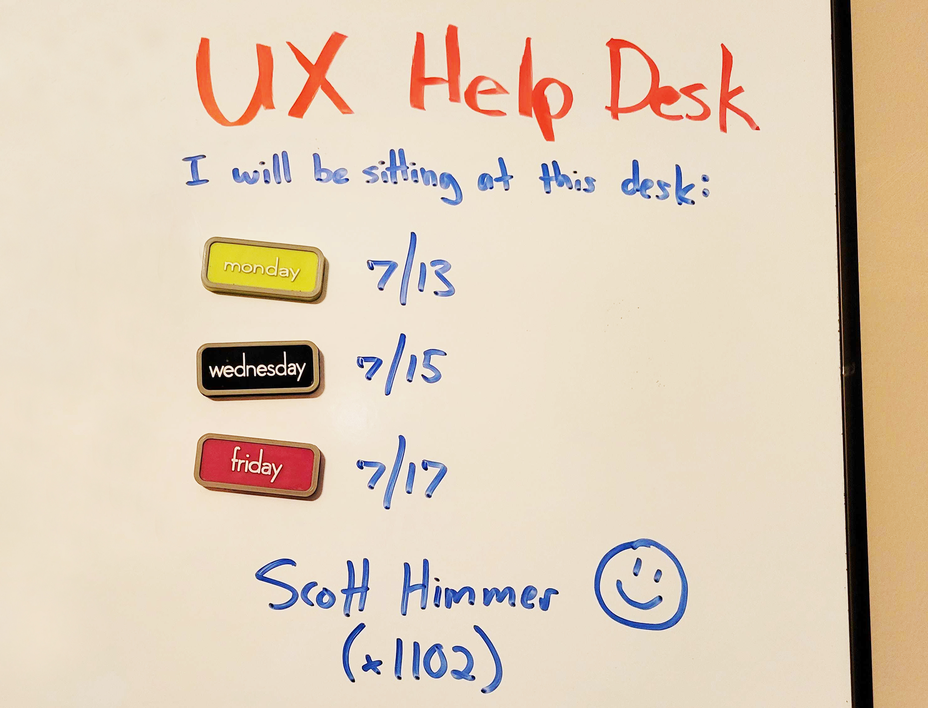
Categories: Others Tags:

Kendo UI For Angular Data Grid And Angular Material: Have Your Cake And Eat It Too

July 12th, 2022 No comments

This article is a sponsored by Progress Kendo UI

Designing and building data tables that handle large amounts of data requires a lot of consideration, planning, expertise, and time. The data tables have to be easy to read and navigate, allow users to search, filter, and group existing data as well as be able to load new data seamlessly. Some use cases may require that the data be editable within the table. While there exist tables like the Angular Material Table that can handle some basic tasks, the majority lack these crucial features. With the Kendo UI for Angular Data Grid, you can simplify the process of adding data tables with a material design feel to your application.

But what is Kendo UI? Kendo UI for Angular is a feature-rich component library that ships with more than 100 native Angular components. It covers everything from UX, performance, design, accessibility, globalization, and data handling. It offers three themes: standard, material, and bootstrap, and provides a theme builder if you wish to create a custom one.

Some of the components it ships with include data grids, charts, diagrams, schedulers, editors, date inputs, progress indicators, bar and QR code generators, upload inputs, gauges, and conversational UI, just to name a few. It’s built with quality and consistency in mind and strictly adheres to industry standards, making it ideal for enterprise applications. Its wide array of components can be applied to innumerable use cases. As such, you’ll find that you only need to rely on one library in your application. Since all the UI and UX design and implementation are already done, you don’t need to be an expert to use it. It saves you time during app development as its components only require minimal configuration to use.

The Data Grid is a comprehensive native table component that the Kendo UI for Angular library offers. Its UI is highly customizable, accessible, and automatically performs data filtering, sorting, and grouping. Besides that, it has first-rate features like in-table editing and CRUD operations, live reload, virtualization, and PDF and Excel exports. Rows and columns can be configured to be frozen, sticky, or selectable. Complex and hierarchical data can be adequately visualized using its detail template feature, multi-column headers, or even tree views. These are just a few of the things you can do with the Data Grid.

The Data Grid can be applied to a multitude of use cases. It can be used for simpler data tables, for KPI dashboards, in CRMs or POS systems. It can also be used for financial reporting or in inventory systems. The Data Grid makes visualizing, reading, and working with detailed complex data easier. It streamlines in-table data modification. Most importantly, it makes fetching and interacting with large amounts of data a whole lot simpler.

Angular Material is one of the most popular component libraries used in a majority of Angular applications. Its popularity is due to its clean material design, high-quality features, versatility, and ease of use with Angular. While it does offer a table, it lacks some crucial data handling features. In this article, we shall examine some of the features of the Kendo UI for Angular Data Grid in comparison to those offered by the Angular Material Table.

Kendo UI For Angular Data Grid vs. Angular Material Table

1. Pagination

The Data Grid handles pagination automatically only with minimal configuration. Its kendoGridBinding data binding directive specifically handles paging in the grid. The only thing you need to do to enable it is to set its pageable option to true and set the size of the page with the pageSize option. The Data Grid will then automatically have a paginator added to it. If you’d like to customize your paginator further, the Data Grid allows you to use Pager Templates that you can use with pre-built pager building blocks or with other Kendo UI for Angular components. For example, the PagerInfoComponent allows you to add information about the current page to the paginator.

In Angular Material, you have to explicitly add the mat-paginator component after a table. You then have to implement the pagination logic by listening for the paginator’s page event. Alternatively, you could specify the paginator as a paginator for the table’s MatTableDataSource. Adding a paginator to an Angular Material Table would involve a lot more work.

Pagination in Angular Material is a lot more involved because you not only have to add it to the table explicitly, but you also have to implement pagination logic. Comparatively, pagination in the Kendo UI for Angular Data Grid can be achieved in just a few simple steps.

2. Sorting, Filtering, And Grouping

Similar to pagination, the kendoGridBinding data binding directive handles sorting automatically. All you have to do is set its sortable option to true to enable it. Sorting functionality is then applied to each of the columns on the data grid. To achieve sorting in an Angular Material Table, you’d have to add the matSort directive to the table component. Then for each column, you wish to sort, you’d have to add the mat-sort-header directive to each column header cell. Lastly, you’d have to implement sorting logic or provide the MatSort directive to the table’s MatTableDataSource if it has one.

The kendoGridBinding directive also performs filtering automatically when added to a Data Grid with the filterable option set to true. The directive adds filter input fields to each column and allows you to filter text, dates, numbers, and boolean values. You can also set ranges and make comparisons on the data. The filters are customizable and can be extended. If you wish, you can customize the filter to be presented as menus or pop-ups. The directive can handle local and server-side filtering. In Angular Material, you would have to manually add an input field to your table to capture filter terms. You would then have to use the filterPredicate function of MatTableDataSource to enable filtering.

In addition to sorting and filtering, the kendoGridBinding directive enables the grouping of data within the data grid. It allows you to group either local or server-side data using single or multiple fields. The grouping is achieved by dragging and dropping column headers to a group panel. The grouped data is presented in data rows that are expendable, collapsible, dismissible, and sortable. You can also apply group aggregates to them and customize them using built-in group templates. To enable grouping, all you have to do is set the groupable option of the directive to true. The Angular Material table offers no grouping functionality. You would have to implement this complicated functionality from scratch.

3. Editing

To enable editing on the Data Grid, you’d use the kendoGridReactiveEditing and kendoGridTemplateEditing directives. These directives enable you to perform CRUD operations within the grid. Editing can be performed on a per-row or per-cell basis. Each of the directives requires that you provide a callback function that returns a form group as its value. kendoGridReactiveEditing works with reactive forms while kendoGridTemplateEditing works with template-driven forms. The data grid will then automatically handle CRUD operations.

Edits are usually in-line or in-cell but can be configured to be performed within pop-ups. Additionally, you can set up deletion confirmation pop-ups and configure custom input controls and validation on the edited data. Editing controls are not limited to text boxes, as you can also use date pickers, numeric text boxes, and checkboxes while editing within the grid.

The Angular Material Table makes no provisions for in-table editing. So, you would have to implement editing for the table data, which can get complicated.

4. Column Configuration

The Data Grid allows you to configure columns in different ways. For one, you can hide columns by enabling a hide option on it. You can also lock columns when a user scrolls through the Data Grid to keep the column visible all the time. You’d do this using the locked option on the column. Moreover, the Data Grid supports sticky columns that are similar to locked columns but can be placed on either side of the viewport. You’d enable sticky columns with the sticky option.

With the Data Grid, cells can span multiple columns with spanned columns. Spanned columns are added using the kendo-grid-span-column element. Additionally, you may choose to customize how column headers, footers, and cells look using column templates made available through various directives. You also have the option to group multiple columns under one column header with multi-column headers. Moreover, the Data Grid facilitates column resizing and reordering.

On the other hand, the Angular Material Table only supports one column configuration feature — sticky columns. This is achieved using the sticky or stickyEnd directives.

5. Row Configuration

When it comes to rows, the Data Grid supports row and cell selection. It facilitates single-row and multiple-row, checkboxes-only, and select-all selection. Additionally, you can select single or multiple cells. Rows can also be configured to be sticky using the rowSticky callback option. If you are working with detailed or complex data, you can take advantage of the Detail Row Template feature to properly visualize the data by embedding custom components. This feature is especially helpful for hierarchically ordered data.

The Angular Material Table does not have formal support for a row or cell selection, and embedding custom components within the table can be difficult. Although sticky rows can be achieved on the table through CSS styling.

6. Virtualization

Through the Data Grid’s column virtualization and virtual scrolling feature, you can choose only to render columns and rows that are in the viewport respectively. For column virtualization, you only have to set the virtualColumns property to true on the grid to enable it. For virtual rows, set the scrollable option to virtual. Unfortunately, the Angular Material Table has no support for virtualization.

7. Globalization

The Data Grid offers support for the loading of multiple locale data sets through the Kendo UI for Angular Internationalization package. This package also ships with an Intl Service that exposes formatting and parsing methods for dates and numbers. The package provides Intl Pipes for transforming locale values. Moreover, the grid offers Right-to-Left language support. With this package, you can easily load different locales at runtime within the grid.

When it comes to internationalization in Angular Material, only mat-pagination offers support. The Angular Material Table offers no explicit support for it.

8. PDF And Excel Exports

Exporting grid data to Excel or PDF is possible using the data grid. To enable it, you’d just have to add a kendo-grid-pdf or kendo-grid-excel component to the grid and bind their respective export methods to download buttons. With the PDF export component, you can configure page size, change column sizes, use templates, combine multiple grids in one PDF file, set up external export with triggers, and use custom fonts, among other handy features. Using the Excel export component, you can choose specific data or columns to export, customize columns and workbooks, set up external export with triggers, and export asynchronous data. The Angular Material Table has no support for either Excel or PDF exports.

9. Accessibility

The data grid meets two accessibility standards: WAI-ARIA and Section 508. It strictly follows best practices and requirements laid out in WAI-ARIA and Section 508 to ensure that it is keyboard navigable and works well with screen readers. While all Angular Material Tables automatically are assigned the role= “table” attribute, it’s not stated whether they meet any accessibility guidelines or standards.

How Kendo UI for Angular Data Grid Makes Developing Data-Heavy Tables Simpler

The numerous features that the Data Grid ships with make it flexible enough to fit a wide range of use cases, from simpler data tables to more complex data grid applications. The components it’s bundled with can be combined with it to meet more niche user needs. The Data Grid is available in multiple themes, including a material one, so it would fit well in an app that already uses Angular Material.

While the Data Grid can be immediately used with minimal modification, it still offers a wide range of configuration options if you choose to use them. The Kendo UI for Angular library has a well-documented API, and its site has an assortment of guides, tutorials, and support documents. Demos and sample applications are also available. The Kendo UI community offers support in their forums, Github repositories, and on Stack Overflow. So its learning curve is gentle.

By using the Data Grid, you free up crucial engineering time as it requires minimal modification and can pretty much be used out of the box. This leaves engineers more time to focus on solving more important problems crucial to reaching main business goals. In the long run, using the Data Grid is more cost-effective as engineering time and expertise that would go into building a data grid UI from scratch are saved. The Kendo UI for Angular ships with 100+ components that you could use in your application in addition to the Data Grid.

Conclusion

The Kendo UI for Angular Data Grid is a comprehensive table component that can seamlessly visualize large amounts of data. It automatically handles pagination, sorting, filtering, and grouping. Moreover, its rows and columns are highly customizable and can be virtualized and globalized. It meets multiple accessibility standards and offers both PDF and Excel data exports. If you’re migrating from using the Angular Material Table, the Data Grid offers a compatible material theme. To learn more about the Data Grid, check out its documentation on the Kendo UI for Angular site.

Categories: Others Tags:

10 Great Places to Find Music for Videos

July 6th, 2022 No comments

Creating videos for social media or to embed on your site can be a fun and creative way to promote your brand or business. More importantly, time spent on a page is a significant SEO ranking factor, so providing a video to watch is of enormous benefit.

However, coming up with the music for your videos can be challenging. You want something catchy that fits your video’s tone but don’t want to violate copyright laws.

Music licensing can be tricky, but if you’re smart about it and know what license your needs fall into, things will go swimmingly. Many different types of licenses cover differing budgets or use cases.

Public Domain: Public domain music is music that is not protected by copyright and can be used by anyone for any purpose. This includes traditional folk songs, classical music, and works released explicitly into the public domain.

Creative Commons: Creative Commons is a license that allows you to use someone else’s work for free, as long as you give credit to the creator. There are several Creative Commons licenses, so read the terms before using any music in your videos.

Royalty-Free: Royalty-free music is music you can use without paying royalties. This means you can use the music in your videos without getting permission from the artist or paying for a license. You can usually find royalty-free music on stock audio websites.

10 Places to Find Music for Videos

Below you’ll find the ten most common places to find music for your videos, including Youtube, Instagram, and TikTok videos.

1. YouTube Audio Library

The first place to look for music is YouTube’s Audio Library. This is an excellent resource for finding free, high-quality music for your videos. You can search by genre, instrument, mood, or duration and preview the tracks before downloading them.

You can use music from the YouTube Audio Library in your Instagram and Youtube videos. Just make sure you follow the copyright guidelines specified on the YouTube website.

2. AudioJungle

AudioJungle from EnvatoMarket is an excellent resource for finding high-quality music for your videos. You can search by genre or mood and listen to previews of the songs before you download them.

AudioJungle offers a variety of paid plans that give you access to more features and higher-quality audio files. Prices start at $12 per month for the basic plan and go up to $48 per month for the premium plan.

3. Free Music Archive

The Free Music Archive is another resource to search for free music. It’s a little more eclectic than the YouTube Audio Library, so you’ll find a broader range of genres and styles here. 

However, all of the music on the site is licensed under Creative Commons, so you’re free to use it in your videos. In addition, you can search by genre or artist and even listen to previews of the songs before you download them.

4. Incompetech

The next website to find royalty-free music for videos is Incompetech. You can search by genre, mood, or instrument, but also read about music licenses. Besides, the site has a handy “music for video” section that features tracks that are specifically designed for use in videos.

Incompetech is free for users, but the company still earns money on display ads and Patreon donations.

5. Bensound

Bensound is a website where you can find high-quality music for your social media videos. It has a library of music that you can choose from, and you can also create custom playlists. The site is easy to use, and you can search for music by genre, mood, or artist. 

All of the music on the site is licensed under Creative Commons, so you’re free to use it in your videos. Prices start from approximately $12/mo subscription, or you can pay $34 per track.

6. ccMixter

ccMixter was created as a Creative Commons Project. It is a collaboration platform for musicians who want to promote their work. The site also has a handy “music for video” section that features tracks that are specifically designed for use in videos.

ccMixter offers a variety of paid plans that give you access to more features and higher-quality audio files. Prices start at $12 per month for the basic plan and go up to $48 per month for the premium plan.

7. Epidemic Sound

Epidemic Sound is a music company with a rich history dating back to 2009. They provide high-quality music for social media videos, and their library is constantly expanding. Epidemic Sound was founded by three friends working in the music industry. They were frustrated with the quality of stock music available, so they decided to create their own. 

Epidemic Sound has since become a go-to source for high-quality music. In recent years, the company has been working hard to expand its library and make it easier for people to find the perfect song for their videos. As a result, they now have over 30,000 tracks available.

Epidemic Sound’s monthly subscription service starts at $15/month. This gives you access to all of the site’s music, and you can download as many tracks as you want.

8. Musopen

Musopen is a perfect website for finding classical music for your videos. The site has various tracks to choose from; you can filter them by composer, orchestra, period, mood, length, and more. In addition, all of the music on the site is licensed under Creative Commons, so you’re free to use it in your videos.

Musopen offers a subscription plan that gives you access to high-quality music for your social media videos. You can choose from three different pricing plans, and each plan comes with a different number of downloads per month.

9. Jamendo Music

Jamendo is a website where you can find royalty-free music for your social media videos. The music on the website ranges from rock to electronica, and there is something for everyone. 

You can either browse the music by genre or use the search function to find the perfect song for your video.

10. StoryBlocks

StoryBlocks is a website created by two brothers, Aaron and Evan Sharp. It has a royalty-free music library with various music genres to choose from. You can find everything from pop to classical on this website. 

There is also a section of the website devoted to social media-friendly tracks. This means you can find music perfect for your videos without worrying about copyright issues.


Featured image via Unsplash.

Source

The post 10 Great Places to Find Music for Videos first appeared on Webdesigner Depot.

Categories: Designing, Others Tags:

Eye-Catching Typography To Get More Leads

July 6th, 2022 No comments

Typography has been an ongoing trend in graphic design for the past five years. There are typography and font tools, and even courses on how to use them, all over the internet. The chances are that if you’ve seen a colorful, eyecatching infographic, you’ve also seen a good example of typography. This design approach has become indispensable in both web copy and web design, as it draws attention, sets the tone, and even underscores the overall theme and design of a website.

Typography’s Effects on the Mind

Image source: https://www.pexels.com/photo/framed-picture-with-inspirational-text-hanging-on-wall-6430730/

You’ll hardly find a contemporary website these days that doesn’t utilize some form of typography, whether it’s within the site design, banner, or the company logo. But typography is more than just artistic and creative methods of placing text in a graphic. It’s an art form that aids the onlooker in absorbing information better.

Fonts are the core of typography, and the right one can even affect a user’s mindset or impression of a company. There are many ways that fonts can affect the psychology of a user.

Expresses Brand Personality

You need to determine what identity and personality your company is trying to project on its site visitors and choose the right fonts. Using the right type or class of font becomes a reflection of the brand itself. And this personality is what customers will innately detect from the moment they see the typography on your webpage upon arrival.

Grabs Attention

Depending on the type of font used, it is also a method to gain the user’s attention. For example, a heavy, slab-type font is ideal for headings and headers as it’s bold, strong, and immediately draws the eye. For example, a site for podcast tools can highlight brand names with different font usage.

Another way is to use a serif font as a header and then a sans-serif font to create a hierarchy between the texts. It distinguishes which area is vital for readers to note in the body text.

Triggers a Visual, Emotional Response

Great typography can make your customers react. Your website’s text may be easier to read because of the typography elements compared to what your competitors do. It makes customers want to stay on your website and read more. They will become leads, which is a step closer to eventually converting them.

Typography also sets the mood for your readers’ emotions. This applies to all industries, whether using fonts in a formal website for lawyers, an elegant site for corporate gifts, or a playful dog walker’s site.

Weaponizing Typography

MINOLTA DIGITAL CAMERA – Image source: https://www.freeimages.com/photo/typograpgy-1242973

Today, many of the best graphic design software helps designers weaponize typography as a means of growth hacking, assisting websites in gaining more leads and conversions. Like other marketing methods, typography changes with different trends every year, going with what appeals to customers. It may only continue to evolve in the future.

In its most basic sense, typography is defined as the art of appealing to a user’s aesthetics through the appearance and style of the text. Typography applies to any form of text and any usage the text may have. It can apply to a single word, a phrase, a sentence, or even an entire paragraph.

The crucial elements of typography to know are:

  • Kerning — It specifically refers to the space between every letter and every word, which makes it legible and clarifies that they are separate words.
  • Hierarchy — An easy example of this is considering the differences between subheadings and body text. Headings typically have a different font, weight, and style than the body text, indicating that they are important pieces of information that categorize the rest of the body text below it.
  • Alignment — This unifies all the designs on the page, whether it be the images, videos, and other forms of media, with the text.
  • Contrast — Similar to hierarchy, contrast creates elements for the reader to focus on. A header might have a bright pastel color to draw attention, while the body text remains plain.
  • Line Length and Tracking ??— Tracking specifically refers to how much space there is between letters in the line. This is how long each line of the text becomes. With more spaces between letters and words or more flourishes in the fonts, the line becomes longer.

These elements affect the customer’s or reader’s personality and their perception of your brand. The text is what helps them assign and associate values with your business. This means typography must be used wisely as a weapon for conversion. Below are some tips you can apply: 

1. Choose a Font that Visually Reflects your Message and Identity

Remember that 93% of consumers rely heavily on the aesthetic and overall appearance of a product, site, or service before they judge it. Therefore, your choice of typography lends an image to your brand from the moment customers see it.

Consider your brand’s personality, values, and target audience. You don’t want to choose a curly, cursive, or informal font for a serious website such as one for medical services. You want elegant, straightforward types like serif and sans serif fonts.

2. Make Wise Usage of Font Contrast

As mentioned in the section above, font contrast refers to how a different font, weight, or color can create a highlight to the overall design. Use this to your advantage by contrasting through white space, color, and dark body text to draw your reader’s eye to crucial areas of the page.

If you have a lot of information on the page, make it more legible and easier to read with a light or white background and dark or black text. Colored types can be used to get attention on headlines.

3. Choose your Main Fonts and Get to Know Them

Every site’s overall design should have no more than two to three fonts. There are major fonts, and they can express different identities.

Fonts, for example, are typically categorized as

  • Serif (with the decorative lines or serifs at the tips of each letter),
  • Sans serif (with clean, modern endpoints),
  • Scripts (which mimic human handwriting and are full of curling flourishes),
  • Slab (with strong, heavy type), and
  • Modern (which are expressive, with chic, stylish cuts).

These different fonts give the brand different characteristics, whether it’s familiar and friendly, sophisticated and elegant, or blunt and straight to the point. Choose the type with the correct representation for your brand.

4. Consider your Font Stress

Font stress refers to the visual change of direction that affects every stroke of the type. Similar to the usage of contrast, font stress will depend on the hierarchy of your website. Some brand names and logos you see sometimes change font styles within the same name.

Quirky details like these can add to the personality of your products and your site. Clever usage of multiple old-type fonts can give a label or a brand a rustic or antique feel. Closely-fitted words in various weights add creativity and interesting depth.

5. Mobile Typography Matters

Remember that many users now visit your brand’s site through mobile devices. Just as a developer has to consider the site’s appearance between PC and mobile platforms, the typography should also accurately reflect the brand on both platforms.

Mobile is often smaller and more compact, so there isn’t much room for flourishes, so choose the logos and labels wisely without compromising character. Moreover, legibility is more important on smaller screens.

6. Use Safe Typefaces

What are websafe fonts? These are fonts that you can conceivably expect to appear on every user’s computer or mobile correctly. Some custom fonts won’t appear on a customer’s webpage because they haven’t been installed there. But websafe fonts can display correctly with everything.

Be familiar with the different varieties of websafe fonts and utilize them when possible. This ensures that your website appears as intended on any platform.

Eight Examples of Modern, Eye-Catching Fonts

Modern typography has come a long way, adapting to the ever-changing needs and moods of the online audience you’re trying to attract. Here are some crucial examples to study.

Moon

This rounded, sans serif font is wide with circular themes and comes with three different weights. As the name suggests, it’s a modern font that evokes futuristic and fun images. It’s an excellent, legible font for reading and is simple in its appearance that it can be used as a font to underscore more highlighted text.

Grand Hotel

It’s a highly versatile script font that is both elegant and fun. It’s ideal for headers and titles for the menu as it evokes comfort and softness while displaying elegance. Best of all, it’s a websafe font as it can be installed through Google Fonts, making it easily available for display on various platforms.

Playfair Display

This is another websafe font readily available on Google Fonts and multiple online design tool platforms. It has feminine appeal and pairs well as a header for sans serif fonts. It’s elegant with good height and available in multiple weights, creating an image of a fashion magazine and aesthetically pleasing.

Lato

Lato is also websafe and available on Google Fonts. It’s ideal for body text because of its crisp, slim lines and rounded ends. The overall appeal is high professionalism and great readability while remaining modern and friendly. It’s a popular font of choice for corporate or informative websites.

Arvo

It is a free font named after the Finnish term for “number” or value. It’s reflected in its heavy serif ends that are almost geometric and symmetrical, especially with its capital letters. It’s become popular for areas of emphasis like titles and headings. It’s attention-grabbing and versatile for various approaches but is best used for home or food-related goods. It’s ideal for promo graphics, banner work, and flyers.

Ultra

Ultra is an extra-bold, heavy, serif font that has been designed for headlines. It has a semi-retro approach and is great for creating a large headline that is ideally only one to a few words long. Music festivals, major events, and other celebrations benefit from this font as it evokes excitement and activity.

Odachi

This free font is a “brush” type font that mimics handwriting from a paintbrush. It’s semi-calligraphic in appearance but is in print type rather than script. It’s very visual, easy to use, and is Japanese-calligraphy-inspired. It’s another great title font or can be used for bold texts, lines, and graphics. It can easily be used as a decorative font for shirts, mugs, and other merchandise.

Bite Chocolate

This sweet script-type font shows the familiar swirls people associate with bonbons or chocolate and food swirls. It’s a script with flourishes but still comfortably readable, making it warm and enticing. Though it has gotten the best usage from food production sites and headlines, it’s also useable as a header for per7sonal websites or aesthetic services.

Final Words 

Make your text more than just a means to convey information. Turn it into an active, visual part of your design, evoking emotions and positive feelings about your company and brand. Let it become an intrinsic part of your brand identity, and improve customer conversion by the aesthetic appearance alone. You can gain more leads and draw more interest through typography, all before your customer even reads what’s on the page.

Is your typography poised to help you grow? Sound off in the comments below.

The post Eye-Catching Typography To Get More Leads appeared first on noupe.

Categories: Others Tags:

How Enterprises Establish Digital Trust with SSL Certificates

July 6th, 2022 No comments

In a fast-paced hybrid-multi-cloud world where remote work and online communications are the norm, increasingly sophisticated cyberattacks continue to disrupt enterprises on a daily basis.

Crucially, to mitigate the risks, enterprises must protect the sensitive data being shared online. This requires SSL certificates, the gold standard to authenticate the identity of a website and ensure secure, encrypted communications over the internet. 

But what exactly does this look like and how do SSL certificates benefit an enterprise? 

SSL stands for Secure Sockets Layer, and these certificates are also referred to as TLS (Transport Layer Security) certificates. Issued by Certificate Authorities (CAs), SSL certificates create safe connections between a server and a browser. They’re powered by public key infrastructure (PKI) cryptography, which has kept sensitive data private and secure for organizations for more than 50 years. 

PKI relies on two sets of keys, one private and one public, to encrypt and decrypt information exchanged online without giving access to unauthorized users. Think of a PKI-based certificate like a digital passport — SSL/TLS is the ‘S’ in ‘HTTPS’ that shows a visitor of a website it is safe and secure. 

Who needs SSL certificates? In the past, the answer to this question was quite different. An enterprise could get away with simply having a certificate on its login or payment pages. Today, with the massive amounts of users and the machines they leverage (software, devices, bots, etc.) – aka human and machine identities – communicating online, the reality is every website needs a certificate. Browsers are moving to the idea that security is the default. It doesn’t matter if the website is an e-commerce site asking for credit card information, or a personal blog with little to no data collection.  The benefits are real for everyone:

  • Increase Website Transaction Rates: Research shows that visitors who see trust indicators in a company’s address bar are more likely to transact and associate positive attributes like superior customer service and trustworthiness to the business.
  • Eliminate Web Browser Security Warnings: Firefox and Google Chrome require all web pages to be encrypted by SSL certificates. Any page that does not have a certificate will receive a “Not secure” warning to visitors. 
  • Boost SEO Ranking: SSL certificates are a simple and cost-effective way to boost a site’s SEO. Popular search engines improve the search rankings of SSL pages algorithmically.
  • Maintain Compliance: Businesses can be penalized if they do not meet the regulatory and industry standards to protect personally identifiable information (PII), personal health information (PHI), credit card numbers, and other sensitive data.
  • Enable Modern Browser Features: Browsers are increasingly tying newer features to the requirement for ‘secure contexts’ where sites and pages need to use certificates in order for those features to function correctly.  

Categories of SSL Certificates

There are several different SSL certificate types for any enterprise need, the main differentiator being the level of authentication by the CA. 

  • Domain Validation (DV) SSL Certificates: This is the fastest, easiest, and most cost-effective solution to industry-standard encryption. DV certificates require proof of ownership for the secured domain and can be issued within minutes. These certificates display trust indicators in browsers like the padlock icon and the ‘https://’ string before the domain name. Since these are the easiest certificates to obtain, the legitimacy of the organization is not vetted by the CA, therefore they are not recommended for business websites. Rather, they are ideal for internal sites and test domains and servers. 
  • Organization Validation (OV) SSL Certificates: OV certificates are the next step up from DV certificates because an organization must prove it is the owner of the domain it wants to secure and confirm it’s a legally registered business. OV certificates can only be issued to registered organizations, not individuals. This makes them ideal for public-facing websites. OV certificates can be issued in one to three days. 
  • Extended Validation (EV) SSL Certificates: These certificates are the industry standard, providing the highest level of digital trust for business websites. They provide all the trust indicators of DV and OV certificates, in addition to a green address bar in select browsers that displays the authenticated company name in green next to the web address. Website owners must go through a stricter vetting process which is conducted by a human specialist. EV SSL certificates are recommended for all business sites, especially ones that ask for personal information from users because website visitors who see the green address bar are more likely to make online transactions. These certificates can be issued in one to five days. 

There are also a variety of SSL certificate variations to choose from, based on a website’s number of pages, domains, and subdomains. These include: 

  • A standard single SSL certificate: As the name suggests, these are issued for just one domain name. 
  • A multi-domain SSL certificate: These can secure up to 250 domains, including subdomains, and are available in DV, OV, and EV validation options. 
  • A wildcard SSL certificate: Wildcard certificates can secure the main domain and an unlimited number of subdomains under the main domain. These are available in DV and OV options. 

How Long Are SSL Certificates Valid? 

The industry surrounding certificates is tightly regulated by groups such as the CA/B Browser Forum, and certificates must be renewed every 398 days (or sooner). SSL certificate subscriptions are available for up to a five-year period. It’s important to note the actual certificate in the subscription is still only valid for a maximum of 398 days. 

A Macro-Level View 

Now let’s put SSL certificates into the grand scheme of today’s modern enterprises. They are just one of several digital certificate types enterprises rely on to establish digital trust. 

As enterprises fully embrace remote and hybrid work environments and security perimeters are massively expanding far beyond corporate firewalls, securing and authenticating all human and machine identities requesting access to networks is mission-critical to conducting business securely. 

As such, digital certificates can also be used to manage multiple aspects of a user’s (human or machine) digital identity –anything from age, address, and email address, to digital signature, geo-location and more. Without going into all the technical details about the many other certificate types used today, think of it this way: certificates secure the digitization of many new businesses processes like:

  • Securing cloud environments 
  • Using digital signatures to ensure trust in documents, emails, and code 
  • Securing DevOps containers 
  • Hyper-automation initiatives like Robotic Process Automation

The list goes on. With this explosion of identities requiring certificates, it’s critically important for businesses to effectively manage the certificates within their environments, regardless of which CA they originated from. This requires automated Certificate Lifecycle Management (CLM). Enterprises can’t rely on outdated or manual approaches like spreadsheets, because just one certificate outage can lead to devastating damage and loss of revenue and reputation (like the recent outage caused by Spotify’s failure to renew an SSL certificate). 

Establishing digital trust today requires an identity-first security approach. From enabling secure online communications via SSL certificates to remotely signing documents, digitally signing emails, securing bots and DevOps containers – and in the very near future, navigating the new world of Web3 and the metaverse — digital certificates are front and center. 

Nick France, CTO of SSL, Sectigo
Photo by regularguy.eth on Unsplash

The post How Enterprises Establish Digital Trust with SSL Certificates appeared first on noupe.

Categories: Others Tags:

Best Practices To Manage A Scholarship Program Easily

July 6th, 2022 No comments

The effort involved in managing a scholarship is extensive, ranging from creating criteria for selection and recruiting applicants to analyzing entries and reporting results.

Administrators of scholarships always keep the needs of the students in mind. The objective is to encourage hard working students as much as possible with those scholarship grants. The entire scholarship administration procedure must be reviewed and streamlined to enhance the experience of the students who are the scholarships’ primary beneficiaries. Let’s look at some best practices modern scholarship managers use to answer your ‘How to manage a scholarship program.’

How To Manage A Scholarship Program?

Here are the best practices you can use along with a top-rated scholarship management software like SmarterSelect to efficiently manage a scholarship program, target the right applicants, award the rewards, and so much more. 

Smart Select is a self-funded, profitable organization that assists individuals with the creation, management, analysis, application, and evaluation of online applications. This tool helps make the scholarship management program and application process easier to handle, manage, and evaluate. 

This, along with the following best practices, can help your scholarship program reach its intended applicants and attract worthy students. 

  1. Obtain funding and establish a budget

Without a pool of money to draw from, there is no scholarship.

Securing funding and creating a budget is a crucial first step in managing a scholarship fund. (We’ve written tips on establishing a scholarship fund.) You must decide up front whether you will manage the scholarship yourself or through a scholarship administration agency.

Directly managing the scholarship will naturally need a huge amount of resources from inside your organization, but you’ll have complete control over how well it’s managed. A significant benefit is that.

You can estimate how many students will receive the scholarship and make plans for the management of the scholarship monies by laying out a precise budget.

  1. Make a standout online Scholarship application form

The most important practice to follow is to make your institute’s own standout online scholarship application form. Does your department or school have any distinctive values? 

To provide students the chance to explain why they are a good fit, make sure to include examples of these in the online application. Ask questions regarding how the core mission of your institution or certain subjects relate to the lifestyles of the applicants.

Long, cumbersome applications can be difficult for applicants to complete and much harder to sort through when it comes time to review the responses. Consider requiring interested candidates to upload files for essays and lengthy text questions. You can print out feedback and read them away from the computer more easily as a result.

  1. Establish your qualifying requirements and the procedure for applying for scholarships — Make it clear to whom you are serving.

Exceptional kids who are just one life-changing chance away from achievement are the foundation of your candidate pool. Give your team a chance to compare notes after you’ve given yourself some time to reflect on the types of people you want to draw to your program. 

Once your ideal candidate has been identified, think about how your application will aid in finding them and how you can make their experience rewarding.

The precise standards by which qualified candidates are found and ultimately suggested as scholarship recipients are known as the selection criteria. It is advised that you rank the eligibility criteria once you’ve determined what they are so that the scholarship recipient’s profile can be readily understood.

When defining eligibility requirements for candidates for scholarships, many aspects must be taken into account, including financial need, achievement, geographic dispersion, and demographic traits.

  1. Decide the Award’s duration

You must choose whether the scholarship is a one-time prize or a revolving one. You might want to provide a maximum number of years a student can reapply for and be granted a renewal if the scholarship is renewable. 

You should think about whether or not it is crucial that a fresh scholarship be given out every year as you address this matter. Scholarship rules that allow for renewal typically call for the recipient to submit an application each year rather than allowing the scholarship to be automatically renewed.

  1. Set a deadline and solicit many candidates for your scholarship

Setting clear application deadlines is crucial because nobody likes being late. Make sure deadlines are clearly marked and think about utilizing other tools to remind participants as time runs out, regardless of whether your program is based on a rolling, annual, or other intervals of time. When deadlines are approaching, helpful online alerts like a clock ticking down in the application portal or email or text alerts can make a significant impact.

Next, come up with a plan for promoting your scholarship. Right today, everyone is online, especially students. Therefore, spread your message on the websites and apps where students are active.

  1. Create a timeline and method for program management to assist your team

You should have a project management strategy that is efficient and defined review schedules in place before applications begin to pour in. You can take help from project management tools in this regard to abide by the deadlines and maintain efficient workflow. 

Reviewers may access information, examine applications, and assess candidates all in one location with the help of an online scholarship administration system. 

Through a series of review steps, this enables reviewers to collaborate (and work remotely), saving your important business time.

  1. Fairly evaluate applications

Make sure you put policies in place during the review process that permit fair application review. Knowing that implicit prejudice exists will help you to combat this widespread issue.

By randomly assigning reviewers and enabling blind reviews, your scholarship management software can aid in ensuring a fair review procedure. To include a range of people in the selection debate, you can also establish a review panel. The most qualified candidates have the chance to move to the top of the list thanks to these fair assessment procedures.

  1. Select The Most Deserving Candidate

Recall the scholarship’s goals and criteria for awarding it. As you look for the students most deserving of the scholarship, let those two principles serve as your compass. Additionally, by doing this, you can guarantee that each application is evaluated using the same criteria, which is crucial for equity.

Provide a personal touch when announcing the winners. A little bit makes a big difference, whether it’s a genuine phone conversation from a supervisor or a direct email encouraging applicants to continue working hard.

Spending time at this stage of selecting winners will result in better applicants down the road unless you are handling piles of submissions.

  1. Do Not Forget To Evaluate Your Results

Software for managing scholarships offers non-profit organizations a rare chance to gather, examine, and contrast data. The power of the data, though, is in how you use it; gathering the data is just one aspect.

Personalized dashboards help to track progress and produce real-time reports for reporting both during and after the cycle. This information can serve as the catalyst for your scholarship program’s improvement when combined with post-cycle in-depth analyses and conversations on what worked and what didn’t.

Watch out for applications that are never submitted, and look for patterns in where applicants stopped applying so you may streamline the application process or explain any ambiguous questions for the following cycle. Look over your demographic information; is there a region you aren’t reaching as effectively as you would like?

  1. Cooperate with other scholarship providers and pick their brains

Our list of practices to answer ‘How to manage a scholarship program?’ is incomplete without this step. 

Nobody is more familiar with the problems that scholarship providers face than another scholarship sponsor. Reach out to other organizations that operate locally or support causes that are similar to yours; you might be surprised at how eager they are to share their knowledge and lessons learned.

Scholarships are now essential for empowering the following generation of innovators and civic leaders, and your organization deserves the tools and resources necessary to serve as that first step.

Bottom Line

It is not necessary to start a non-profit organization to give scholarships for higher education. A scholarship or scholarship program for higher education can be started by anyone. This kind of scholarship program can be started by foundations, companies, community organizations, and even individuals or groups of individuals.

You might wish to think about setting up a scholarship program to be executed by your local community foundation, a particular college or university, or a scholarship administration agency as an alternative to developing a nonprofit organization to provide scholarships for higher education.

We hope this article answers your question ‘How to manage a scholarship program?’ Whatever you do, just remember the 10 practices we mentioned above and invest in a good scholarship management program to help you achieve your desired results. 

The post Best Practices To Manage A Scholarship Program Easily appeared first on noupe.

Categories: Others Tags: