Archive

Archive for August, 2022

Why (and How) I Write Code With Pencil and Paper

August 17th, 2022 No comments
White lined paper with cursive handwritten notes on using :nth-child.

If the thought of handwriting code seems silly, it might surprise you to know that it’s inevitable. If you’re unsure, think about the last job interview you did, and remember how there was no computer around in the interview room — just your interviewers, a blank sheet of paper, and a blue ball-point pen.

For the students among you, it’s even a bigger deal as your grades hang in by the lines of code you had strategically squeezed into the available space in your answer sheet.

And not just that, experienced programmers can point you to the bundle of A4 sheets they had removed from the office copy machine to scribble down a particularly complex algorithm they had been working on.

So whether you’re an exam student, potential job interviewee, or someone wanting to resolve their programming dead ends, I hope this article helps you out when you put your pen to the paper to code.

Although I will focus on the analog aspect of writing code, you can apply these steps to coding in any form or language. So consider this to be also like a generic coding guideline that works specifically for me but can also be very useful to you in your work.

Why write it down?

Before we start, it’s essential to understand that no one expects you to jot down production-ready code in a notebook. It’s not like you can drop that into a code editor and compile it without an error. If producing perfect code was the goal, you would be seated in front of a computer in the interview rooms and exam halls.

The purpose of handwriting code is to work through logic in advance. There’s s desire to “get in the browser” as soon as possible in design, but there is conventional wisdom in sketching designs by hand. A low-fidelity medium encourages quick experimentation and inexpensive mistakes.

The toil of trying to figure out how to affect surrounding items with one click (from my last article)

The same can be true of code, mainly when working out syntax and semantics. That said, getting the correct syntax and semantics is always a plus point, though not the sole focus of the whole handwriting exercise.

Let’s see where we can start when it comes to handwriting code.

Know your question

During my final year in college, I couldn’t do an internship or even attend campus interviews because of health reasons. As a result, my very first job interview was quite literal with high stakes.

When I look back now, the interview was pretty easy. But having never attended one before, I was anxious beyond reason. The first thing the interviewers asked about programming was if I could output an inverted triangle made of asterisks. As I said, it was easy — nothing a for loop can’t handle, right? But like I said, my anxiety was through the roof as well.

I took a deep breath, pressed my palm against the blank sheet of paper they had laid out for me, slid it as slow as possible towards me on the table (buying time, of course), clicked the pen, and then I did something right.

I first drew an inverted triangle made of asterisks. That’s how I found my feet on the ground to start answering their question.

I’ve seen otherwise brilliant developers get something wrong simply because they never fully grasp what it is they are solving.

The questions we work with are not like the questions physicists or mathematicians solve. They get a set of parameters and find the missing ones; our questions are also our results. We are already told what our results are — we have to figure out how to reach them. That’s why it’s imperative to know the question well because you’ll see the result.

Writing down or drawing out what you want to output is one of the best ways to start your coding. I understand that in our fast-paced industry, the expectation is that we have to jump right into the programming by running a “hello world” demo. And that’s great to familiarize yourself with an unfamiliar syntax and shake off your anxiousness about trying something new.

But when someone asks you a question and gives you a result to work up to, wouldn’t it just be better to put that down first? That question/result is not only your starting point but also your point of reference. At any step in your coding, you can look at it to ensure you’re working towards it and that you’re on the right track.

So whether in your answer sheets or in that blank A4 paper you’re about to write in, start by taking a second and writing down what it is you’re trying to output. You can put it in the margins or a corner if you don’t want it to be a part of your answer. Just make sure it’s somewhere where you can keep referencing it.

Outline your code

This step is like a double-edged sword. It can get you a roadmap to your program or waste your time. My job is to make sure it’s the former.

So, first and foremost, I like to say: outlining code is unnecessary if the scope of your problem or question is small. Again, this practice is neither prescriptive nor universal to all projects or situations. Imagine I’m your interviewer, and I ask you to write how to center an element in a web page using CSS in as many ways as possible. You won’t exactly be needing an outline for this. The code snippets are relatively small for each method.

But now, let’s say I assign you to write a web application that captures user signatures via a touchscreen interface and then saves the signature on the server. Not so straightforward, right? You’ve more than one thing to figure out. Perhaps, a little outline can help.

  1. UI for capturing signature — HTML Canvas? WebGL?
  2. Disable pointer events on the rest of the web page when the user is signing
  3. Convert and save the captured image to a PNG file — JS
  4. Then convert it to blob (maybe) and save it to the visitor’s log data table.

I’ve written a rough sequence of actions I think I might have to code. It could’ve been shorter or longer, depending on what I wanted from it.

I highly recommend outlining code for client projects. Write the outline along with your user requirements or on the back of wireframes you’ve printed out.

Your quick snapshot of bullet points gives you a map, a to-do list, and a checklist to verify against when you reach the end of the project — pretty much your whole project’s summary in a low-fidelity list. It can also become a template to start your next similar project.

But like I said before, this step is like a double-edged sword. You’ll have to keep this short for examinees and interviewees when there are time constraints.

If you don’t know where to start, write down just three essential functions you’ll have to code in your application, and if you have got the time, make it five.

But that’s about it. Spend as little time as possible on this, and don’t sweat over the details. The outline is not going to score you extra points. It’s there only to help you make sure you have everything covered. It captures your initial gut reaction and keeps you honest throughout the project’s life.

Longhand vs. shorthand

White lined paper with cursive handwritten notes in black ink.
A quick reference to disable text selection

Time to start coding. So, what do you write? “Bdrs” or “border-radius“; “div -> p” or “

“; “pl()” or “println()“; “q()” or “querySelector()“?

If someone else is grading your code, then there’s no choice. Leave out abbreviations, pseudo-codes, Emmet shortcuts, and any other form of shorthand writing. Otherwise, there’s no reason to assume that anyone reading this knows what your abbreviations mean.

It’s really up to you.

If you’ve gotten out of touch with writing by hand — and many of us have — it’s better not to go overboard with the longhand notations, as they get tedious. At the same time, there’s no such thing as being too frugal with your writing. Not if you want to be able to look back on it one day and understand what you’d written down.

I have an open file in my note-taking app and a lined notepad on my desk where I write down code snippets I want to save for later reference. They are unorganized, just a long stream of snippets. That’s why when I browse through older notes, I wouldn’t know what I meant to write if I had not written them down clearly.

I forget syntaxes all the time. For instance, I’ve been using the arrow notation for JavaScript functions since it was introduced (because it’s shorter), and I’m pretty sure if someone suddenly asks me to define a function using the function keyword, I might even misplace the parentheses or the function name, inciting a syntax error.

It’s not unusual for us to forget syntaxes we haven’t used in a while. That’s why it’s better to write your notes clearly when you know you need them for future reference.

The non-sequential flow of code

Unlike the last step, which doesn’t apply to those of you interviewees and test-takers, this one is catered especially to you.

Most programming languages are interpreted, compiled, and executed so that sometimes pre-written code in the source is executed later when called. We do it in JavaScript, for example, with function calling — functions can be defined initially, then executed later. Examinees and interviewees can use this to start working on the critical point of your answer first.

As I’ve said from the very beginning, the purpose of handwriting code is to work through or test the logic of whatever it is you program. It’s best when you focus on resolving that first.

Let’s take a classic textbook example — a program to find the nth Fibonacci number. If I were to write a simple outline for it, it would be something like this:

  1. Get the input.
  2. Calculate the Fibonacci number.
  3. Summarise the output.
  4. Print the output.

All the steps in that outline are essential; however, 1, 3, and 4 are more obligatory. They are necessary but not important enough to focus on right away.

It’s better to start writing down the code to calculate the Fibonacci number rather than to fetch the input. Wrap it in a function, then go ahead and write the code sequentially and write down a line to call that function where appropriate.

Spend your time writing code that focuses on the heart of the problem.

Real professionals can skip ahead. Let’s say I have a client project, and I have to work with some triangle geometry — got two sides, opposite angle, and gotta find the third side’s length. And I’ve decided to scribble on paper to get started rather than opening my IDE.

First, I would draw the triangle, of course (that’s something I’m very experienced with, as you can tell). I would write down some sample lengths and angles. Then I’d write the formula (compliments of online searching, for sure), and then I’d jump right to the code for the function.

There’s no point in me writing down the obligatory steps even though I’ll need them in production-ready code. But it would be different if I had to write that on an answer sheet in an exam. I can’t skip the other steps; however, I can still start with the code for the formula.

Pseudo-code

Chris has already written a handy article on pseudo-code that I highly recommend you give a solid read.

For all those professionals who feel like the whole handwriting code thing doesn’t seem like your cup of tea but still might be curious if it can help you, then pseudo-code might be the balance you’re looking for.

It’s similar to outlining the code, as I mentioned in one of the previous steps. However, it’s briefer and feels more like shorthand coding. It’s sometimes also referred to as “skeleton code.”

Here’s some quick pseudo-code for a CSS grid layout:

Grid
5 60px rows
6 100px columns

There isn’t much to write! So, even though putting a pencil to paper is excellent for this sort of thing, it’s just as effective, fast, and inexpensive to jot some pseudo code into whatever program you’re using.

Space and comments

I believe code is 90% keywords and 10% tabs. Withoutspacesthereadabilityofwordsdecreases. Indentations are necessary for handwritten code as well. However, please don’t use it for every level because the width of the paper will limit you. Use spaces judiciously, but use them.

Yellow unlined paper with code handwritten in cursive in black ink.
Prized OG snippet, written with extra TLC

If you’re writing code for your use, I also believe that if you’ve followed everything I’ve mentioned so far and have already written down your output and an outline on the page, you may not even need to include comments. Comments tell you quickly what its following set of code does. If you have already written and read an outline for the code, then comments are redundant notes.

However, if your judgment says to put down one, then do it. Add it to the right side of the code (since you won’t be able to insert it between already written lines the way you could in, say, VS Code). Use forward slashes, brackets, or arrows to denote that they are comments.

For examinees who are unconfident with a certain syntax, write down comments. This way, at least, you’re letting the person grading your paper know your intention with that incorrectly formatted code. And use only the correct delimiters to denote comments — for example, that would be the forward slashes for JavaScript.

Analog vs. digital

As I mentioned earlier, everything I’m providing here can is generic coding advice. If you don’t want to try this with physical paper, any note-taking application also works.

But if you’re going to try the digital route, my recommendation is to try using something other than a straight note-taking app. Work with more visual digital tools — flow diagrams, mind maps, wireframes, etc. They can help you visualize your result, the outlines, and the code itself.

I am not much of a digital citizen (except for working on the web and recently converting to reading e-books), so I stick to physical notebooks.

My favorite tools for handwriting code

Any pencil and paper will do! But there are lots of options out there, and these are a few choice tools I use:

There is no “write” way to code

I hope, if nothing else, my little way of handwriting code with pencil and paper makes you evaluate the way you already plan and write code. I like knowing how other developers approach their work, and this is my way of giving you a peek into the way I do things.

Again, nothing here is scientific or an exact art. But if you want to give handwritten code planning a try, here’s everything we’ve covered in a nice ordered list:

  1. Start by writing down (with sample data, if needed) the output of your code.
  2. Write an outline for the code. Please keep it to three steps for small projects or ones that are less complex.
  3. Use longhand notations. Developers writing for themselves can use shorthand notations as long as the writing is legible and makes sense to you when you refer to it later.
  4. When under a time constraint, consider writing the code that tackles the heart of the problem first. Later, write down a call to that code at the right place in your sequential code.
  5. If you feel confident, try writing pseudo code addressing the main idea.
  6. Use proper indentations and spaces — and be mindful of the paper’s width.

That’s it! When you’re ready to try writing code by hand, I hope this article makes it easy for you to start. And if you’re sitting down for an exam or an interview, I hope this helps you focus on getting the questions right.


Why (and How) I Write Code With Pencil and Paper originally published on CSS-Tricks, which is part of the DigitalOcean family. You should get the newsletter.

Categories: Designing, Others Tags:

10 Best Digital Business Card Solutions in 2022

August 17th, 2022 No comments

The digital era doesn’t necessarily mean the end for print. But going digital could mean the difference between providing a better customer experience and clinging to outdated and less efficient practices.

So with almost everything going digital, one thing, in particular, seems to be doing it at a much faster pace: business cards. According to research done by Market Research Future, the digital business card market may reach USD 242.3 million at an 11.2% CAGR by 2027. 

Digital business cards are in high demand. And in this article, you’re going to learn precisely why. We’ll also look at 10 of the best digital business card solutions you can use to help you make that digital jump.

What is a digital business card?

A digital business card is similar to a paper-based business card – less the paper. Think of them as digital versions of your traditional card. Once you store them in the cloud, any recipient can easily access them on a smartphone, tablet, or personal computer. 

As you know, print always has limitations regarding the information it can store. Perhaps the most significant advantage of digital business cards is that they allow you to provide as much detail as you want – quickly and conveniently. 

5 reasons why a digital business card is worth it

1. Provide convenience with easy sharing

Almost everyone owns a smartphone, which means almost everyone has quick access to any digital business card. When you go virtual, you don’t have to give away dozens and dozens of paper-based cards. Instead, recipients can save all details on their smartphones with a tap.

2. Offer a contactless solution

Clients, prospects, or partners – you’ll need to meet them in person to hand them your physical business card. You can cut out this process and opt for a contactless alternative. Share your digital business card anytime and anywhere via text, email, instant messaging, or other channels.

3. Stay up-to-date with your information

Ensuring accuracy with your business card information is always a great practice. Imagine if you’ve already bulk-printed your physical cards. If you’re using paper-based cards, even one slight detail change means starting from scratch with print. 

Steer clear of this issue by switching to electronic business cards that you can update whenever necessary. You get to ensure you provide everyone with the latest information.

4. Track your virtual business card performance

You’d never know who or how many people are engaging with your physical cards unless they take deliberate action, like giving your company a call. 

With digital business cards, you can monitor data points, like the number of views, locations, and clicks. And if you’re using a decent digital business card solution, you’ll have the means to set off retargeting for bounced viewers. 

5. Digital business cards are in high demand

As businesses go remote, they must actively seek new ways to share essential information regardless of where their clients or prospects are. Needless to say, digital business cards allow for that kind of sharing. And it’s one of the reasons why they’re currently in high demand.

Now that you know why digital business cards are worth the transition, the next step would be to look for a suitable digital business card maker. 

Before diving into our list of the best digital business card solutions, let’s go over 8 essential factors you’ll need to consider when choosing one.

8 things to consider when deciding on the best digital business card solution

With the advancement of technology, the number of offerings has increased immensely. Making a decision with too many options is not easy. You can create a digital business card with any platform that is available out there but to get the best value for your efforts, you need a solution that fulfills all your personal or business needs in-depth. So, here are ways that you can determine whether a particular digital business card solution is right for you or not. 

Let’s get right into it.

1. Usability 

Is the solution intuitive and easy to use? Does it boast a clean-looking interface? Does it force you to go through a steep and tiresome learning curve? These are some of the questions to ask when gauging usability. 

Usability doesn’t just account for the “looks” of a platform. It has more to do with its structure and flow. In addition, it directly impacts your experience as a user, so it’s always a good idea to first get a feel of a platform’s usability before putting out your wallet and seeing if your chosen platform offers a free trial.

2. Page design

A good digital business card platform might do well in terms of usability. But does it let you create stunning designs for your e-business cards? Can you get as comprehensive as you like when adding details? 

It makes little sense for a cloud-based vCard to limit you in design options and the details you can add. Digital business cards are supposed to be storehouses of personal and business information, so choose a platform that allows you to add more than just the basics. 

3. Tracking and analytics

Page design is there to help you appear authoritative and professional, in turn attracting the right audience. But can the solution monitor the engagement once you’ve drawn your target leads, clients, and customers?

The best digital solutions offer comprehensive tracking, letting you capture data on essential metrics like views, shares, and audience location. Some will even allow a Google Analytics integration for more actionable insights.

4. Security

Many businesses, regardless of size, value security the most when choosing a cloud-based service. Anything that happens online is prone to security threats. And since your electronic business card has your name and other relevant details, it’s best to ensure that you and your clients are protected by high-level security. 

If you can, choose one that’s SOC-2 Type 2 compliant. But so far, only one platform provides security at this level. Still, it would be best to go after the non-negotiables, like GDPR compliance, data encryption, and SSO authentication.

5. Value for money

No two digital business card solutions offer the exact same pricing. So is your platform of choice value for money? 

For instance, some digital business card makers attract users with their low-cost plans. But that doesn’t necessarily mean they’re the best choice. Low subscription costs often come with significant drawbacks, like limited functionalities and inadequate security. So create your e-business card from a good digital business card solution in order to worry less in the future. 

6. Ease of sharing

Business cards are meant to be shared. Does your chosen platform allow you to spread your digital business card using multiple avenues? 

Every solution will allow you to grab an e-card link you can share across different channels – social media, email, text, etc. But some will even go as far as to let you generate QR Codes that you can embed in your physical business cards or NFCs for short-range sharing. Hence, choose the one that matches your expectations. 

7. Bulk creation

If you’re running a large organization with hundreds of client-facing members, you will benefit from a solution that lets you bulk-create unique virtual business cards. A bulk-creation feature allows for significant savings on time and effort.

8. Integrations

Are API access and integrations that automate essential functions part of what you’re paying for? This factor is vital since purchasing third-party tools to get automation isn’t always practical money-wise.

App integrations can be anything from Google Analytics (for engagement insights) to Zapier (for workflow automation) or Slack (for notifications) that helps in automating the process. 

Remember that not every platform will offer the same set of API access. So, if you need to use a particular integration, see if it’s available in the platform’s library.

10 best digital business card solutions for 2022

Now that we are aware of the factors to look out for while choosing a suitable business card platform, let’s review the top 10 digital business card solutions: 

1. Beaconstac

Beaconstac takes the top spot on this list as the best digital business card solution that lets you create business cards with QR codes. The platform offers everything you need to effortlessly create electronic business cards and tweak them to your liking. 

When it comes to security, you get the best a digital business card solution can offer with Beaconstac. You also get robust analytics, bulk-creation, and multi-app integrations accessed via an easy-to-use interface.

Notable features:

  • Intuitive and easy-to-use interface.
  • Zero learning curve – create your first digital business card in minutes.
  • Exceptional page design capabilities. 
  • Google Analytics integration.
  • Top-notch security with SOC-2 Type 2 compliance. 
  • Bulk digital business card creation.
  • API access to over 4,000 app integrations, like Zapier, Workato, and Integromat. 

Drawbacks:

  • Beaconstac only offers QR Code-based digital business cards.

Pricing:

  • The price starts at 5 USD/month for the Starter plan. API integrations and dynamic QR Code API features unlock at Pro for 49 USD/month. 

2. HiHello 

HiHello is another widely used digital business card maker. Like Beaconstac, it’s recognized for its user-friendly interface and easy-to-use virtual business card creation dashboard. 

It also delivers excellent design capabilities and sharing functionalities. For example, you can create attractive and professional-looking cards and share them via email, URL link, text message, or QR Code.

Notable features

  • Clean web and mobile app design. 
  • Numerous attractive and professional templates. 
  • Multiple channel sharing. 
  • Phone number masking for increased privacy.

Drawbacks

  • You only get basic insights if you don’t integrate with Google Analytics. 
  • Data tracking only unlocks at higher plans. Some solutions provide analytics right off the bat. 
  • Access to bulk creation is available only at the highest-tiered plan.

Pricing

  • The platform starts you off with a Free plan (up to 4 unique business cards). The Basic plan (unlimited card creation) comes at 3 USD/month. 

3. Blinq

Easy contact sharing – that’s what Blinq is all about. And it remains to be one of the most highly-rated mobile business card solutions out there. The platform offers comprehensive sharing functionality – one that trumps most entries on this list. It also lets you add all the details you need to complete your contact information without the need to compromise on any critical data.

Notable features 

  • Multi-channel sharing.
  • NFC-based business card creation. 
  • Includes all essential API integrations
  • Comprehensive customizations.

Drawbacks

  • Robust customizations and custom branding are paid features. 
  • Security measures aren’t clear-cut.

Pricing

  • The first tier is free, providing you with basic creation tools. Both Premium (for individuals) and Business (for teams) plans cost 2.99 USD/month. 

4. Know.ee

Know.ee offers a sleek interface, and it doesn’t take long to figure out that this platform was built with enterprise needs in mind. But that doesn’t mean it comes behind in terms of features targeted at the individual professional.

Notable features 

  • Seamlessly combines platform intuitiveness with extensive design capabilities.
  • Full-scale customization and branding tools. 
  • Practical data analytics complete with timeframe filters. 
  • An Enterprise plan well-suited for teams of all sizes.

Drawbacks

  • Access to decent security only unlocks at higher-priced plans.
  • Auto credential generation and bulk creation only come with the costly Enterprise plan. 

Pricing

  • The Individual plan is free but only provides basic features. Paid plans are priced based on the number of digital business cards created, starting at 2 USD/month. 

5. Haystack 

“Make a great first impression” – is what greets you upon visiting the Haystack website. Sign-up for a free trial, and you’ll soon realize this solution has a laser focus on helping you market your business. 

Haystack wants you to be known, which becomes apparent with the analytics, design capabilities, and integrations.

Notable features 

  • Unique branding elements 
  • Valuable engagement insights, including the number of referrals. 
  • Integrate with hundreds of apps, including Zapier and HubSpot.
  • Showcase essential links to drive traffic to key online destinations.

Drawbacks

  • Pricing is somewhat on the higher side.
  • You’ll also have to pay an additional 3 USD/month for each extra user.

Pricing 

  • You can grab the For Individuals plan free for the basic tools. Data tracking and integrations start at 7.95 USD/month for the Business plan. 

6. QR Code Generator Pro

You might recognize QR Code Generator as a QR Code platform, but it also offers a QR Code-based digital business card solution. It enables you to create a virtual version of your physical card, which you can link with QR Codes. 

Notable features

  • Intuitive and easy-to-use dashboard. 
  • Create QR Codes for your physical business cards. 
  • Track engagement for insightful data.
  • Integration with Google Analytics.

Drawbacks

  • Minimal security features. 
  • The vCard service is entirely QR-based – no NFCs.

Pricing

  • The Starter plan is 6.99 USD/month. Bulk creation and API requests unlock at the Advanced plan for 15.99 USD/month. All plans are billed annually. 

7. SwitchIt 

SwitchIt lets you craft beautiful and professionally-designed business cards you can use to connect, keep track of, and convert clients. The dashboard feels simple, yet it has all the essential tools you need to create and share your virtual business cards quickly.

Notable features

  • Comprehensive page design and branding elements.
  • Efficiently distribute your business card on various channels.
  • SMART Contact Manager for a comprehensive contact library.
  • App-initiated phone calls and text messaging.
  • Business card scanner.

Drawbacks

  • Analytics and major integrations only become accessible at the highest tiered plan.

Pricing

  • You can use a “free forever” plan for basic elements. Premium plan comes at 6.99 USD/month. 

8. Kado Network

Kado’s platform was built primarily as a networking and relationship management platform. So it comes as no surprise that you can use it to create practical and comprehensive digital business cards. 

The dashboard provides more than just the basics. You can even record and share notes, events, and critical information for better team collaboration and productivity.

Notable features 

  • Robust team collaboration tools.
  • Customization allows multimedia elements like images and video content.
  • Easily import contacts from Excel files.
  • Integrate directly with Outlook and Gmail for real-time contact updates.
  • GDPR and AWS compliant. 

Drawbacks

  • Some admins find Kado’s process of adding users via email unintuitive. 
  • Gmail, Outlook, and Google Calendar integrations are only available at the highest-tiered plan. 

Pricing

  • You can get the Free plan for limited features. Advanced features start at 4.95 USD/month.

9. Dibiz 

Dibiz provides a dashboard packed with the tools you need to create practical digital business cards. From the dashboard, you can customize appearance and content to suit your needs and monitor digital business card performance through Dibiz Statistics.

Notable features 

  • Add diverse media, like custom URLs, image galleries, and videos. 
  • Share business cards on multiple channels.
  • Create tailored contact forms when you opt with Dibiz+.
  • In-depth data tracking and analytics.

Drawbacks

  • Access to fundamental insights unlocks at a premium. 
  • Dashboard intuitiveness falls short.
  • Lacks essential API integrations. 
  • Ambiguous security measures. 

Pricing

  • You can avail of the free forever plan for basic functionalities. Dibiz+ is 60 USD/year for unlimited multimedia uploads and contact forms. 

10. QRd.by

The last entry on our list of the best business card solution is QRd.by. Like any decent virtual business card maker, it lets you easily create e-business cards that you can share via multiple channels. 

What differentiates it from most card generators is that it gives you a dedicated landing page where you create your updatable digital business card. 

Notable features

  • Create updatable mobile-friendly business cards. 
  • Add as many business card details as you need.
  • Use analytics right from the Free plan. 
  • Full CCPA & GDPR compliance.

Drawback

  • A landing page has to be created to generate a vCard, making the process complex. 

Pricing 

  • QRd.by provides a free plan but limits you to 1 landing page. The Starter plan (for 5 landing pages) costs 5 USD/month. 

Conclusion

Companies embracing digital cards are rapidly increasing in number. And the recent pandemic only fueled this adoption.

Even though physical business cards are still essential, especially during offline meetings and events, going digital can make a massive difference in reach and engagement. 

When choosing a service, you must consider your needs and that of your target audience. Great digital business card platforms don’t just provide the tools required to digitize contact information. They’re also there to help you easily share them with the people that matter. Hope this comprehensive list of the best digital business cards available out there helps you stand out in this digital era.

The post 10 Best Digital Business Card Solutions in 2022 appeared first on noupe.

Categories: Others Tags:

The Ultimate Guide to Influencer Marketing ROI & How to Make Successful Campaigns

August 17th, 2022 No comments

You’ve probably noticed platforms like YouTube and Instagram taking over the world recently, right? If you’re a marketer or a business owner, it’s only natural to want a piece of the action and hopefully increase your influencer marketing ROI. 

You want to connect with your target audiences in a new way. And you want to connect with them in their natural environment: social media. This is where influencer marketing comes in.

Influencer marketing can range from sending free products to content creators in the hopes that they’ll feature it to more formalized agreements in which influencers are paid by posts. Other agreements in which influencers profit from affiliate tracking programs are also becoming more popular.

Unlike celebrity endorsements, in which a celebrity is employed to represent a brand in campaigns, influencers generally operate solo and create their own content on social media, YouTube, blogs, and other platforms based on a brand’s advertising specifications.

If you’re wondering how to find affiliates to sell your product or you need influencers, these platforms are a great place to start.

However, keep in mind that influencer marketing is becoming increasingly popular by the second. And tracking your return on investment (ROI) is a must if you want to run a successful campaign.

This guide will discuss ROI, how it appears in influencer marketing, and how to calculate the ROI of influencer marketing, as well as other variables.

What is ROI?

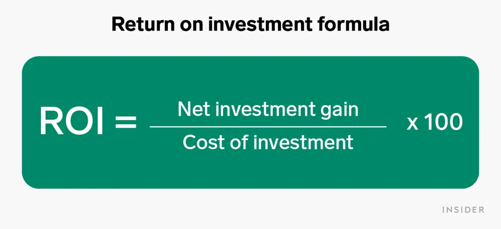
Return on investment (ROI) is a performance metric used to assess the efficiency or profitability of an investment or to compare the efficiency of several investments. ROI attempts to directly measure the amount of return on a specific investment in relation to the cost of the investment.

Image source

ROI in influencer marketing

A marketing strategy is like a fan. And each marketing channel (such as SEO, influencer marketing, PPC, etc.) is a blade. The fan’s blades all work together to keep it spinning. You can measure the ROI of the entire fan (the strategy as a whole). Or you can choose to calculate the ROI of each individual blade (each channel).

In this case, before you can measure your influencer marketing ROI, you must first determine how much to invest. 

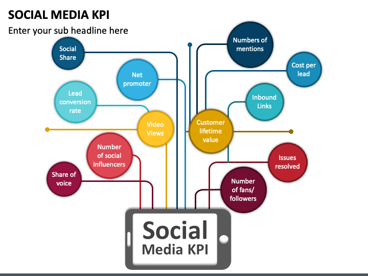
Here are the most commonly tracked performance indicators for determining whether an influencer’s bid is fair.

1. Audience reach

Reach refers to how many people view your influencer’s content. The incredible reach provided by various social networking platforms is the primary reason why brands are turning to influencer marketing.

As a result, campaign reach becomes an important metric for determining campaign success. However, keep in mind that quantifying the benefits of reach is difficult. 

And, even if an influencer has a million followers, remember that only 15-30% of those people will see any given post. Then there’s the possibility that the followers are fake or inactive accounts.

Consider an author who has just published a book called “What is orchestration?” and wants to reach out to influencers to promote it. In this case, impressions, which reflect how many times users saw the influencer’s post or downloads, would be a better indicator than followers for calculating the influencer’s actual reach.

2. Engagement on social media posts

In comparison to reach, engagement is frequently regarded as a better indicator of campaign performance. 

However, keep in mind that actual KPIs that you can measure will vary depending on the social media platform. But they’ll typically include the following: 

  • Number of shares
  • Likes
  • Comments
  • Brand mentions 
  • Engagement rate 

If you’re not sure which social media platform to use, here’s a guide to help you decide and tips on how to use them.

Image source

You should also track mentions of your brand on social media using a social media listening tool and a campaign management tool to manage campaigns. As part of your agreement with the influencer, you should request that they report on their analytics so you can measure how well the campaign is performing.

3. Leads and sales conversions from referral traffic

Referral traffic statistics show you which influencer content is directing traffic to your website or a specific landing page. It provides meaningful, actionable insights into which campaigns are resonating with their target audiences and which social media platforms are being used.

Google Analytics is excellent for determining where your website’s traffic is coming from. You can also use it to track a variety of metrics, such as: 

  • Who’s visiting your site and their demographics 
  • What content they prefer 
  • How much time they spend on your pages

How do you calculate ROI influencer marketing ROI?

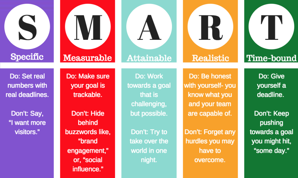
1. Set realistic goals

Is your goal to increase sales, raise brand awareness, expand your audience, or form partnerships?

“The biggest mistake brands make is not knowing what they want to achieve and then getting an unexpected result.”

For example, if forming partnerships is a top priority, you should be familiar with everything there is to know about partnership relationships, such as the proper partner relationship management definition or what the best brand influencer proposal template to use. Knowing the basics will save you a lot of time and stress when pitching and managing potential partners.

“Start with a clear goal, understand it thoroughly, and know how you’ll measure it.”

Image source

2. Identify the key performance indicators (KPIs) that are most relevant to your goal.

It cannot be overemphasized how important it is to have the proper tools in place to accurately measure KPIs.

Your goal will determine which KPIs you’ll need to track to ensure your campaign was a success. For example, to increase customer retention, tracking customer retention rate and churn rate will outperform tracking revenue.

The interesting thing about using the right KPI is that it allows you to understand your business’s performance and health so that you can make critical adjustments to achieve your strategic goals.

For example, if your customer retention rate is decreasing due to inaccessibility and poor customer communication, hiring the best small business phone service near you can help solve the problem.

3. Evaluate your expenses

This is where the “I” in ROI comes into play. Ask yourself how much you intend to pay the influencer. Determine your maximum budget. Identify which options provide the best possible return. It could be one or two advertisements in a more expensive medium or several advertisements in less expensive outlets.

You can calculate how much it will cost to reach each potential customer. For example:

  •    An influencer fee costs £5000
  •    You expect to reach 50,000 people
  •    50% are your potential customers
  •    It will cost 20 pence to get your message to each potential customer

What other variables should you take into account when tracking ROI on an influencer marketing campaign? 

1. The period of the year

Influencer costs rise during the holiday season and other special occasions, such as Children’s Day, due to the volume of campaign opportunities available and demand.

This also means that during these periods, social feeds become saturated with branded content, potentially skewing your ROI lower.

To stand out (at this time of year), you’ll need to devise creative guidelines that will attract attention, such as customer appreciation or interactive video content such as viral infographics and use of animation.

Image source

2. Cost of your product/service

The types of campaigns you opt for and how you measure them can vary dramatically depending on whether you sell impulse purchases or investment pieces.

Recently, short-term content creation (think Instagram stories and TikTok) has become more common. But certain products, like blog posts, still lend themselves to longer-form and long-term content.

For example, an enterprise contract management software is unlikely to be sold through an Instagram story swipe-up. You could, however, sell one via an Instagram swipe-up that links to a blog post in which someone reviews the product.

3. Consider the content’s longevity

Finally, just because a campaign has officially “ended” does not mean that the content has lost its impact or impressions. Content lives on long after a campaign ends. And depending on the terms of your agreement with the creator, the collateral produced can be repurposed for targeted ads, email marketing, or other campaigns.

Also, remember that, as influencer marketing grows, the concept of a person’s identity, image, or personality as a property right is becoming more deep-rooted. As a result, it’s more important than ever to ensure the safety of those engaged in these activities.

Without a basic understanding of online image copyright, such individuals may be vulnerable to exploitation, while consumers may fall victim to deceptive marketing schemes.

What’s considered a good ROI in influencer marketing?

Ultimately, there’s no universal standard or key industry number for calculating the ROI of an influencer marketing campaign.

Let’s imagine an ad agency wants small business owners to sign up for a webinar on how to build affiliate network best practices.

According to the 2020 report from Influencer Marketing Hub, they can earn up to $18 in earned media value for every dollar spent on influencer marketing, with the average being closer to $5.78 per dollar spent.

Taking the next step with influencer marketing

Working with an influencer, marketing firm, or app partner can help you save money and time on influencer marketing campaigns. Technologies and agencies that already have relationships with influencers will assist you in securing lower rates. They identify content creators who are the best fit for your objectives. They also build data-driven campaigns based on reliable metrics.

Image source

However, don’t rely entirely on influencer marketing because it’s not a guaranteed success. Successful influencer marketing requires dedication, time, and research. A well-thought-out influencer program and effective customer communication should be integrated into a broader marketing strategy.

The post The Ultimate Guide to Influencer Marketing ROI & How to Make Successful Campaigns appeared first on noupe.

Categories: Others Tags:

CX and UX: Where They Differ And Where They Meet

August 16th, 2022 No comments

CX (customer experience) and UX (user experience) are two important business strategies aimed at optimizing customer communication and engagement. The principles of UX have been around for centuries, but the term was first coined in the 1990s by Don Norman.

CX is a much newer concept that’s been gaining popularity as companies look to improve customer satisfaction. Many designers now argue that UX is a subset of CX, but there are some important differences between them.

In this article, we’ll look at where CX and UX differ and where they meet to improve the customer experience. But first, let’s define what CX and UX design are.

What is UX design?

User experience design focuses on the interactions people have with a service or product. This is usually a digital product such as an app, website, or software like PD DataFrame Python. But UX can also apply to non-digital products.

The aim of UX is to create better-designed products to improve the user experience. And it works: over two-thirds of businesses say UX improves customer satisfaction. Plus, 62% say it improves brand perception. So UX design is crucial for businesses to attract and convert customers.

UX design considers everything that shapes the user experience, from how the actual product feels to how easy the buying process is. An amazing product is one that’s efficient and easy to use, and that’s what UX is all about. 

If you need some help with designing your website, for example, search online for “tips on how to design website”.

UX covers four major disciplines:

  1. Experience Strategy (ExS)
  2. User Research (UR)
  3. Information Architecture (IA)
  4. Interaction Design (IxD)

Experience Strategy 

Experience strategy aims to combine business and design strategies to create a holistic experience that gives value to both users and businesses at the places they interact. So ExS considers both digital and bricks-and-mortar experiences.

ExS roles include product designer and product manager. Their aim is to align the company vision with customer needs and technical capabilities. They help companies manage their teams and keep them focused on the user experience.

Image sourced from careerfoundry.com

User Research

User research helps companies understand their users’ needs, motivations, and behavior. For instance, UR could help you understand why users are looking at alternatives for Grasshopper. This makes user research a vital part of UX design. In fact, integrating UR into product development boosts customer satisfaction by 30% and brand perception by 31%.

User researchers collect qualitative and quantitative data to create user personas. This involves collecting feedback from customers with surveys, interviews, and usability testing. They then use these personas to inform product development.

Information Architecture

Information architecture focuses on the structure of digital products. This includes how content is organized and the type of language used. The goal is to help users quickly find information with minimal effort. As such, you can use IA for wireframing to plan the layout of a product.

IA roles include data analyst, content strategist, and information architect.

Interaction Design

Interaction design focuses on the way users interact with a system. IxD considers all the interactive elements of a product, such as buttons, animations, and transitions. Interaction design roles include product designer, interaction designer, and experience designer. Their aim is to integrate ExS, UR, and IA into an interface that’s intuitive and effortless to use. 

The role of UX designers

The role of UX designers is to make products and services accessible, user-friendly, and enjoyable. They usually work as part of a product team and bridge the gap between the user and the company.

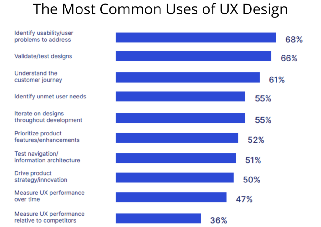
The most common uses of UX design companies are discovering usability issues (68% of companies) and validating designs (66% of companies). But UX designers perform a variety of tasks, including:

  • User research
  • User testing
  • Wireframing and prototyping
  • Presenting designs to stakeholders
  • Creating user personas
  • Designing the information architecture of a product
Image sourced from info.userzoom.com

Depending on the company, UX designers may focus on UX for non-digital products. They may also be service designers that focus on the experience of using services like public transport. But whatever their area of focus, it’s their job to ask questions like:

  • Is this product/service easy and intuitive to use?
  • Is this product/service accessible to a range of users?
  • Will this product/service make users happy?
  • Is this product/service what users want?

What is CX design?

Customer experience design includes all the interactions a customer has with each of a business’s touchpoints. CX considers a company’s advertising strategy, reputation, pricing, customer service, delivery, sales process, and the usability of a specific product or service. In this sense, UX is part of the broader experience of CX design.  

Let’s use a VoIP call center solution as an example. The customer experience isn’t only what it’s like to use the software, but also:

  • What it’s like to buy the software
  • How easy it is to access support
  • How effective is the company’s marketing campaign
  • What it’s like to upgrade or replace the software
  • What it’s like to receive notifications or offers from the company

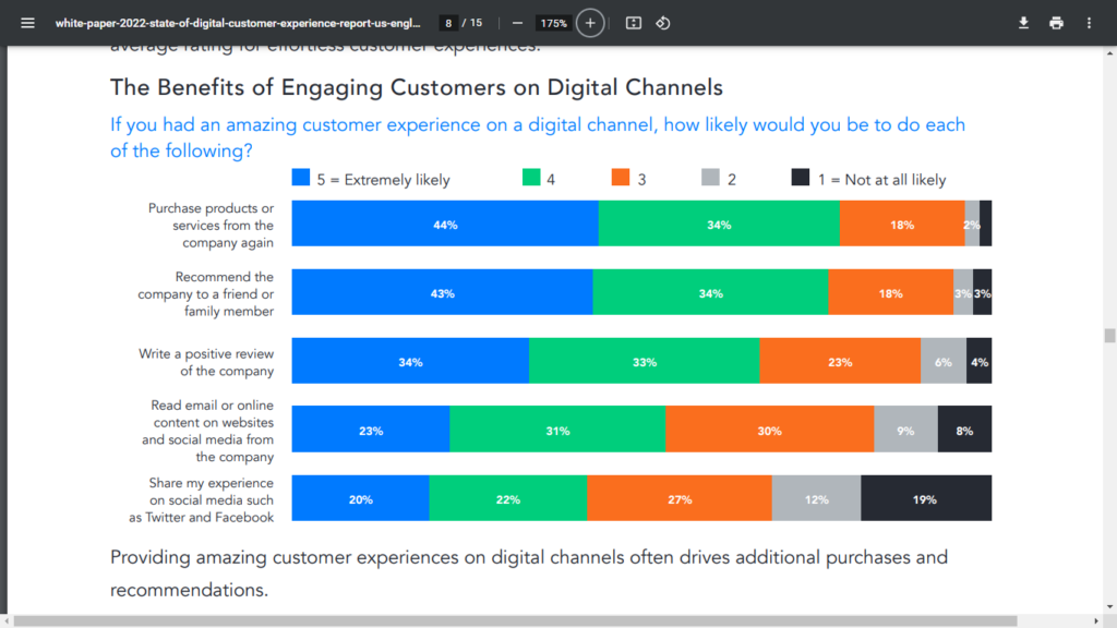
CX design also considers a customer’s emotional satisfaction. That is how they feel about a business. So, CX design is crucial to a company’s success. For instance, three-quarters of customers say it’s important to have a good experience on digital channels. The same goes for offline channels.

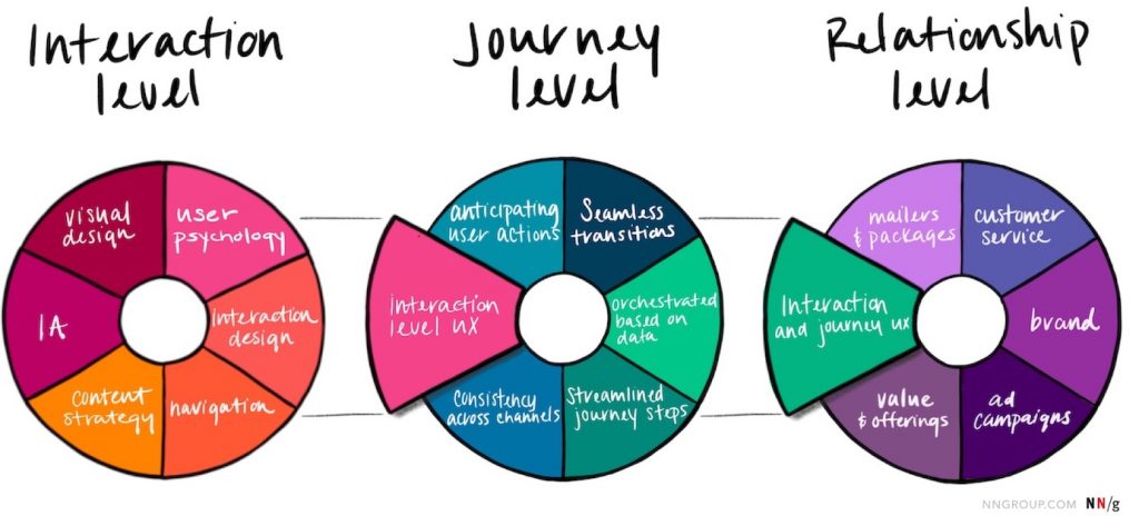
CX design considers three levels of customer experience:

  1. Single-interaction
  2. Customer journey
  3. Lifetime relationship

Single-interaction

The single-interaction experience is the customer experience during a single interaction or task. This is usually a short-term interaction with a product or service, such as ordering something from a website or signing up for a mailing list. Experiences at this level are only a small part of the total customer experience.

Design at the single-interaction level is what most people associate with UX design. In other words, this is the level most UX designers work at.

Image sourced from uxinsight.org

Customer Journey

The journey level of customer experience focuses on the series of interactions that take place to accomplish a goal. An example is buying journeys. It usually involves several channels, so a CX customer journey map may look something like this:

  1. You want to return a sweater, so you log in to your account and request a return.
  2. You print out the return label and take your parcel to the post office.
  3. A few days later, the company emails you to confirm the return and refund your money.

Many companies are now adopting an omnichannel approach to improve CX at the journey level. In fact, over one-quarter of companies say improving the omnichannel experience is a top CX priority.

Lifetime Relationship

The lifetime relationship level takes into account the single-interaction and customer journey levels to consider every interaction a customer has with a company. Each customer exchange with a company affects their perception of the company. So, CX design at this level is about nurturing the customer relationship.

For example, a software company that sells call center enterprise solutions would optimize their product to make it attractive to buyers and easy to use, upgrade, or uninstall. But they’d also look at improving their customer service and advertising campaigns.

The role of CX designers

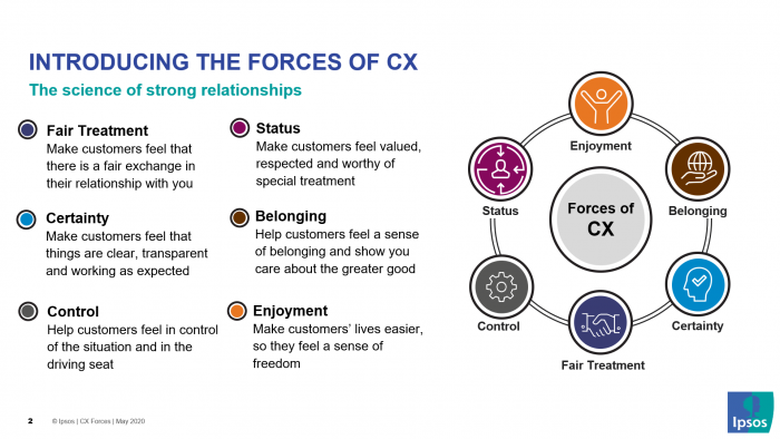
To create a bulletproof CX strategy, CX designers analyze how customers feel about a brand. They also look at ways to improve the quality of interactions with them. This means problem-solving skills are a must.

CX designers may have backgrounds in advertising, marketing, psychology, management, sales, and customer service. They perform a variety of tasks, such as:

  • User research and testing
  • Collecting and presenting data
  • Creating customer personas and empathy maps
  • Mapping the customer journey
  • Creating storyboards and workflows
  • Defining business goals
  • Tracking performance

In other words, CX designers focus on the who, what, where, when, why, and how of the customer experience.

Image sourced from ipsos.com

How do CX and UX differ?

UX is an important part of CX, but there are some key differences to be aware of. These differences include:

  • Focus
  • Responsibilities
  • Metrics
  • Audience
  • Testing

Focus

UX designers focus on how a user interacts with a single product or service?whether that’s an enterprise security solution or a hotel room. Their aim is to help users interact easily and successfully with a product. They want products to be accessible and give users a sense of satisfaction.

CX designers focus on the customer’s entire experience with the company. Their goal is to ensure customers have a good experience whenever they interact with a company. This includes both online and offline channels. They also want to boost brand revenue by nurturing customer loyalty.

Responsibilities

The responsibilities of UX designers revolve around the product or service. They spend most of their time on product design, usability testing, and improving the product based on user feedback. Both CX and UX design involves user research. But UX research tends to be smaller in scale and focuses on individual personas or groups.

The responsibilities of CX designers are more to do with boosting brand perception and customer loyalty. Their goal is to optimize marketing, communication channels, customer service, and all other business touchpoints. So, CX research tends to involve large-scale studies and surveys.

Metrics

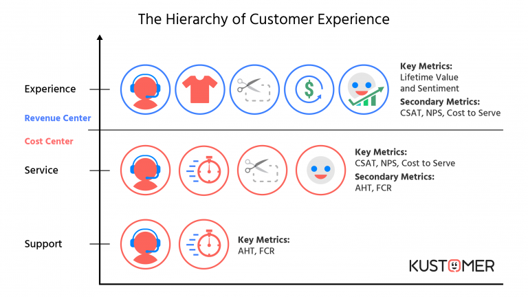
Because CX and UX focus on different aspects of the customer experience, they use different metrics to measure their success rate. For instance, over 50% of UX designers use product and site analytics like cart abandonment rate and engagement rate. Also, 48% use outcome metrics like app store ratings, conversion rate, and support tickets. But CX designers use metrics like:

  • Churn rate
  • Customer lifetime value (CLV)
  • Customer satisfaction (CSAT)
  • Net promoter score (NPS)
  • Average handle time (AHT)

For example, 63% of designers measure customer satisfaction, and 31% measure NPS. They may also look at how many customers the company gained or lost in a certain time frame.

Image sourced from kustomer.com

Audience 

The target audience for UX designers is the product’s end-user, whereas CX designers target customers. What’s the difference? Customers aren’t always the product’s intended user.

For instance, say a company’s CEO is buying software to reduce their employees’ data privacy risks. A UX designer would focus on the employees (the users), while a CX designer would focus on the CEO (the customer).

By focusing on the customer, CX designers look to enhance the business-customer relationship to make it mutually beneficial. The customer gets good service, while the business gets more income and a better reputation.

In contrast, since UX designers focus on the user, any business benefits are more of a by-product.

Testing

UX design mainly involves usability testing. Usability testing ensures the product or service is intuitive and easy to use in the way the designer intends. It involves observing real people using a product. For instance, watching people use a work schedule app to see if they get confused or frustrated. UX designers can then use these insights to make improvements.

CX testing looks beyond usability to create a holistic view of the customer experience. This usually involves studying key metrics and mapping the customer journey with diary studies, interviews, and surveys. Once CX designers understand the current customer journey, they can look at ways to optimize it.

Where do CX and UX meet?

Although CX and UX are different, they’re also similar. They both focus on improving the customer experience, and without one, the other won’t succeed. If a user isn’t happy with a product, they may not use that company again. And if a customer isn’t happy with a company’s buying process, they won’t buy the product in the first place.

Companies should use CX and UX together to optimize the whole customer experience. After all, 64% of customers stopped doing business with a company because of a bad customer experience. In contrast, a great customer experience increases customer satisfaction. This in turn improves brand reputation and revenue.

It’s important businesses pay attention to customer feedback, including how customers use, buy, upgrade, and troubleshoot a product. As we’ve said, a great product isn’t enough unless a customer also has a great lifetime experience. For this reason, many companies are now looking to hire designers with skills in both CX and UX.

Image sourced from verint.com

Takeaway 

It should now be clear that although there are differences, UX is an integral part of CX. For businesses to succeed in an increasingly competitive market, they should use CX and UX together as part of their business optimization strategies.

Designers that consider both CX and UX will not only create better products. They’ll also enhance the customer experience at all stages of the customer journey.

The post CX and UX: Where They Differ And Where They Meet appeared first on noupe.

Categories: Others Tags:

Top Tips for Keeping Your Website Data Breach Free

August 16th, 2022 No comments

Data breaches can cost businesses thousands and, in some cases, may even result in legal action. In this article, we’ll share tips for keeping your website data breach free. 

A data breach can be catastrophic for a business or an individual and can lead to a loss of reputation, a loss of revenue, and even legal action depending on the extent of the issues. 

In this article, we’ll explain what a data breach is, including when a company gets a GDPR data breach notification, and how to keep your website data breach free. 

What is a Data Breach?

In 2016, the European Union adopted the GDPR (General Data Protection Regulation which was introduced to better regulate the collation, handling, storage, and sharing of personal data. 

A data breach occurs when the integrity of the data held is compromised and, therefore, falls into the wrong hands or is at risk of doing so. Breaches can occur accidentally or through deliberate cyber-attacks and can mean that private information, including financial and medical details, may be distributed without consent. 

In the case of a data breach due to cybercrime, the data holding company may be ‘held to ransom by attackers who will threaten to release the data unless a financial payment is made. 

Since the introduction of GDPR, data controllers are required, by law, to report any data breach to the supervisory authority within 72 hours or face severe penalties – this is known as a GDPR notification. 

Protecting Your Website from Data Breaches

Source: pexels

Anybody who collates and stores data has a responsibility to keep it safe and, in this section, we’ll run through ways in which you can do just that: 

Use of High-Quality Firewalls

First and foremost, you need to make sure that you have a high-quality and comprehensive firewall in place to protect the data that you’re holding. This should be standard for any company and is the first defense against cybercrime. 

Multiple Authentications 

Many businesses make the mistake of still only requiring employees to use a simple password in order to access systems. This is inadequate when all employees are using company equipment and working from the same office – but is so much more dangerous when employees are working remotely some of the time. 

To protect data, it’s vital that you introduce two-step authentication – i.e. a password and a code sent by text or, a password plus a fingerprint, in order to prevent data breaches. 

Secure Sockets Layer

SSL (Secure Sockets Layer) adds another layer of protection to your website. This essentially encrypts data and information when it’s in transit, preventing unauthorized people from accessing and reading it. 

Regular Security Audits

Get into the habit of having regular security audits performed on your system to make sure that all is well. By doing this regularly, you have a much better chance of catching any problems early. 

Install Malware on Devices

Source: pexels

In 2022, we all use more devices than ever before and that includes employees. Plugging different devices into computers and laptops can significantly increase the risk of data breaches. 

Therefore, it’s a good idea to install malware that will scan each device before allowing use. 

Education and GDPR Training

Web security should be the responsibility of each and every employee and, as such, investing in proper education and training is vital in giving employees ownership of data protection and keeping your systems safe. 

Updating Software and Plugins

Many people are guilty of installing software and plugins and then forgetting about them. In reality, these need to be updated regularly in order to be effective and secure. Hackers and bots are able to make light work of breaching outdated software, so this is a really good habit to get into. 

Use Separate Devices for Work and Personal Matters

We spend a huge amount of time online both at work and in our spare time, and problems can occur when employees are using the same device for both. 

While there may not be any significant issues with employees downloading movies and other content on their own devices in their own time, these can introduce viruses and other nasties into work devices which can quickly compromise the data held. 

Banning Social Media on Work Devices 

It’s incredibly common for employees to log onto their Facebook or Instagram page during their lunch break or downtime but, as with downloads, this can be bad news for work systems. 

While it may seem a bit ‘big brother’ to ban access to social media on work computers, it’s a good idea to put security settings in place to limit the risk of data breaches. 

 Backup your backup

Information and data should be backed up on a very regular basis as we all know, however, this isn’t always enough. Adding an extra backup layer is a great way of making sure that, should a breach occur, your IT personnel will be able to identify where and when the issue happened and get to work on minimizing the damage. 

Don’t cut corners when it comes to cyber security… 

When thinking about your website security, think of your website address as an actual physical address and the web host as the property’s plot. Then think about the lengths that you would go to, to protect that property and everything inside it. 
This is exactly what you need to be doing to keep your website and the data stored within it secure. By following the tips in this article, it is possible to keep yours and your customers’ data locked up tight and avoid reputational loss and possible legal action.

The post Top Tips for Keeping Your Website Data Breach Free appeared first on noupe.

Categories: Others Tags:

Online Reputation Management: How Online Reviews Influence a Consumer’s Decision

August 16th, 2022 No comments

In the past few years, online reviews have played an important role in how consumers decide where to shop, what to buy, and who to trust. These reviews and ratings serve as the third-party confirmation that will influence the purchasing decision of many consumers who do not want to take any risks when it comes to the quality of goods and services they are getting. 

This has left an impact on companies around the world as they fight to protect their online reputation and that of their business. If a company is not careful, its brand can easily be tarnished by a few false claims made against it on review sites. To keep companies from being damaged by negative feedback on the Internet, online reputation management strategies must be implemented. 

In this article, we will talk about online reputation management and how it works to protect a company’s name online through social media and review sites like Yelp and TripAdvisor. 

The Power of Online Reviews

These days, it seems like everyone is reading online reviews before making a purchase. And it makes sense! After all, why would you buy something yet unseen when you can easily find out what other people think about it? 

Yes, the sad truth is that online reviews can either make or break a company. They not only give potential customers an idea of how well products work, but they also influence the buying decisions of others. 

In fact, one study found that 98% of shoppers read product reviews before purchasing anything on the internet! Needless to say, this is more than enough reason for companies to worry about their online reputation. 

And now, more than ever, there are a number of ways for businesses to help manage their reputation and monitor their reviews in order to keep them positive. One way companies do this is by hiring customer service professionals who are dedicated to responding quickly and appropriately whenever they receive complaints or inquiries from consumers via social media channels like Facebook and Twitter. 

But what’s with this trust issue that online consumers need to know what others have to say about a certain product first before trying it?

The Internet’s Trust Issue

A recent study shows that only 42% of people trust the internet, and that number has been on the decline since 2012. Why is this? 

Well, there are a few reasons. The first is that we’re constantly bombarded with information, and it’s hard to know what to believe. The second is that we’re seeing more and more instances of fake news and hoaxes. And the third is that we’re becoming more aware of data breaches, cybercrime, and other serious incidents that can affect a company in ways we can’t imagine, such as issues with Mac terminal permission denied resulting in becoming less efficient and unproductive. 

We see big companies like Target getting hacked, bank accounts getting compromised, or personal info being sold on the dark web. These things might not affect us directly right now, but they show us how vulnerable we can be when sharing so much online. 

It’s not surprising why, as consumers search for products and services online before making a purchase decision, many turn to reviews for guidance as well as ratings from other shoppers. 

According to statistics, about seventy-seven percent of people say that customer reviews influence their decision when shopping online; eighty-five percent say they read customer reviews in order to make an informed purchase decision; and ninety-eight percent have found customer reviews helpful at some point in their purchase journey.

The Impact of Online Reviews on Businesses

Businesses need to be proactive in monitoring what is being said about them online. This is because online reviews can have a significant impact on a consumer’s decision-making process. 

Say you are looking for a new restaurant or you are considering buying an item from an online retailer, what you read in the reviews might influence your final decision. Right?

The point is not to scare businesses but rather to illustrate that they should stay up-to-date with their online reputation and monitor what people are saying about them before the damage becomes irreparable.

As a business owner, what should you do when you get an unfavorable review?

If you get a negative review, the first thing you should do is take a deep breath. It can be tempting to respond immediately, but it’s important to keep a level head. Once you’ve calmed down, reach out to the customer privately and try to resolve the issue. If that doesn’t work, consider responding publicly. But be sure to keep it professional! Finally, keep monitoring your online reputation and proactively managing it. We will share more ways to handle these reviews below, though.

Harnessing the Power of Online Reviews

As a business owner, it’s important to understand how online reviews can impact your bottom line. If your business has negative reviews, that could be costing you sales. 

One study found that for every one-star increase in review rating, revenue increased by 5%. So, what should you do if your business has negative reviews? 

There are two possible solutions: 

  1. Reach out to unhappy customers and ask them for a new review.
  2. Improve the quality of service you provide and wait for the happy customers to post their own reviews. 

All this comes to proper online reputation management. So, how do you effectively and professionally manage your online reputation?

Some Helpful Online Reputation Management Strategies You Can Use to Protect Your Brand

Simply put, online reputation management (ORM) is the process of controlling what shows up when someone Googles your business. This means that to be successful in business, you need more than just good products and services – you also need a solid reputation as well. 

When your reputation is damaged by slanderous comments or unfair allegations, however, it can become difficult to continue to do business. If you want to find effective online reputation management strategies that will help protect your brand, here are some online reputation management strategies that can give you the peace of mind you deserve.

1. Build Trust

When it comes to online reputation management, one of the most important things you can do is build trust with your audience. But how do you do that? 

Here are some strategies you can use to build and maintain trust: 

  • Get Personal: Share stories from personal life or thoughts on current events. Show people who you really are and share things they will find interesting.
  • Answer Questions: Be honest when answering questions about your brand and create an environment where others feel comfortable asking questions.
  • Use Humor: A little humor goes a long way in building trust! Share amusing photos or videos of yourself at work. We all have our bad days, but showing a lighter side helps break down barriers.
  • Respond Quickly: When people have questions or complaints, respond quickly so they know you’re listening and take their comments seriously.
  • Be Kind: One thing we should all strive for is kindness in everything we do.

2. Monitor for Negative Reviews

One of the most important online reputation management strategies is monitoring for negative reviews. You can do this by setting up Google Alerts for your brand name and key terms related to your business. This will help you stay on top of any negative press so you can address it quickly. 

It’s also a good idea to set up alerts with websites like Yelp, TripAdvisor, Amazon, and more. Additionally, you should keep an eye out for bad press through social media channels such as Facebook and Twitter. 

Sometimes, people also post negative reviews or bad experiences they had with your company in public forums such as these. So, even if there isn’t a review that mentions your company specifically, if it’s in public view then it could have an impact on your brand overall.

3. Don’t Fret Over What You Cannot Control

No matter how great your product or service is, there will always be people who are unhappy with it. And in the age of the internet, those people can make their voices heard loud and clear. But don’t fret – there are things you can do to protect your brand’s reputation online. 

Start by taking a deep breath and accepting that there’s nothing you can do about what’s out there on the web. Now, find out where they’re talking about you. Figure out what they’re saying (or better yet, what they’re not saying). Look for gaps in feedback that may indicate a need for some additional explanation or elaboration on an issue related to your company’s products or services. 

If one customer had a negative experience with one of your employees, but others were satisfied, for example, maybe this person just needs some better customer service training instead of being fired from his job. If a customer claims he was told something different from what was written on the website, maybe he misread something because he didn’t scroll down far enough before giving up.

4. Have a Crisis Management Plan

It’s important to have a crisis management plan in place before you need it. That way, you can be prepared for anything that comes your way. Here’s how to create an effective crisis management plan: 

  • Closely monitor and control who has access to your online accounts.
  • Set reputation management alerts so you can proactively respond to negative feedback.
  • Listen to your customer’s complaints and respond accordingly.
  • Establish a digitized communication plan.
  • Draft generic communication statements so online reputation managers can quickly respond when needed.
  • Spread positive news to further the chances of people reading good stories about your company.

5. Respond Quickly and Professionally

Most importantly, you need to respond professionally and as fast as you can. You really have to be aware of what’s being said about your business online. Again, you can do this by setting up Google Alerts for your brand name and key executives. This will notify you anytime your brand is mentioned online so you can take action quickly if necessary.

When you receive negative feedback, sure, an apology is appropriate. And this is important even if you know you have done nothing wrong. It’s just that, sometimes, those negative feedback is triggered by mistakes or uncontrollable events.

And, of course, you can’t control how people talk about your brand. But you can always control how to respond. A little sympathy and understanding go a long way to ease the emotions somehow. If the reviewer complained about poor service, you could always apologize that they had an awful experience. Your message can be as simple as, “We’re sorry that you have to go through that.”

6. Be Active on Social Media

Also, make sure your website and social media profiles are up-to-date and professional. This will help create a positive first impression for anyone who comes across your brand online.

Monitoring competitor activity online is another way you can protect your reputation by making sure nothing damaging goes viral before it impacts your business negatively.

7. Create and Publish Positive Content

It also helps to be proactive in creating positive content about your brand. This could include blog posts, social media posts, or even press releases. By getting out in front of negative content, you can help shape the conversation about your brand. If it’s too late and someone has already posted something damaging about your company, reach out with an apology. Apologizing is always better than ignoring the situation. 

In Summary

The rise of online reviews has made the business world a much more competitive place, and consumers are constantly reading online reviews to help them decide which products and services to purchase, which hotels and restaurants to stay at, and which doctors to visit. 

Online reputation management has become an important aspect of marketing for any company or individual that relies on consumer traffic to make their living, and knowing how online reviews affect consumer decisions can help you leverage your review scores in your favor.

The post Online Reputation Management: How Online Reviews Influence a Consumer’s Decision appeared first on noupe.

Categories: Others Tags:

How to Improve Your Google TrustRank and Rank Higher on SERP

August 15th, 2022 No comments

Google’s job is to help people find content on the web.

Not just any content, however. It must be relevant and a good match to the search query.

Have you ever tried searching for important information and the sites that come up are just full of badly written blogs or articles? Or, you click a link only to be annoyed by the pop-ups and ads that make it impossible to easily locate the actual info that you are looking for. 

Sure, you need to use keywords so Google can match you with the appropriate user search. However, Google is also looking for something of quality using important SEO fundamentals. 

This is where TrustRank comes into play.

Understanding TrustRank

When you start to make blogs, Google needs to trust you before it can promote your blog.

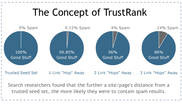
So, it uses TrustRank, a system that grades sites in terms of their authority, trustworthiness, and overall quality. It is Google’s and other search engines’ way to combat web spam. The higher your website’s TrustRank, the better it’s likely to perform in search results. 

How does it work?

TrustRank is calculated using the distance between the page on your website and a “seed site”. This is a trusted and known internet source chosen by Google and honored with a perfect 10 Trust Score. The closer your website is to the seed site, the higher your trust score.

Moz illustrated the process like this:

Image Source: Moz

So, can you measure your TrustRank?

Almost, thanks to Moz.

They developed a metric system called MozTrust. It is the closest thing you can try to measure your TrustRank directly. It may not be perfect, but it is a helpful starting point.

Why TrustRank Matters?

TrustRank is not an official term from Google. In fact, it was built by Hector Garcia-Molina and Zoltan Gyongyi, Standford University researchers, in collaboration with Yahoo!.

But it is a real thing. It gives credibility and weight to how trust plays a vital role in both virtual and real-world relationships. A healthy relationship is built on trust, after all. 

If consumers trust a business, both parties enjoy mutual benefits. 

With regards to web content, trust helps evaluate if the “trust signals” a website has is legitimate.

For these reasons, you should ensure your website has a high trust rank. 

How to Improve Your Google TrustRank

How can you optimize TrustRank and stay on Google’s good side?

1. Optimizing On-Page Trust

You will need to make sure that your web pages themselves are trustworthy and speak of quality. This is the first place that Google will look at and determine if you’re worth promoting.

So…

How do you improve your on-page optimization in line with TrustRank?

Linking To Authority Sites

What better way to show you’re trustworthy than buddy-ing up with an already trustworthy site?

When you link out to other authority sites, you’re essentially showing Google that you are referencing authority sources and building up trust in its eyes. Also, when you reference authority sources, people can learn more from these trusted sources and can verify your claims.

Linking out is a fundamental on-page SEO tactic. But doing so with an authority site garners attention from TrustRank.

In addition, a study found a significant correlation between linking out to authority sites and a higher Google ranking.

So, what would Google consider to be an authority and trusted source? The answer is any domain that ends in .edu or .gov. These websites synonymous with authority and linking to them shows that you are seriously reliable.

Or you can also link out to journal studies, like this one:

Image Source: Verywellfit

As you can see, the page includes all its references. This ensures that they are not making claims without backing them up with facts. These links lead to recognized and high-quality journals hosted at .org and .gov domains that create credibility and greatly improve their TrustRank score.

Mind Your Bounce Rate

Google’s RankBrain algorithm now places user interaction as a ranking factor. If people are not spending more than a couple of seconds on your website, then this does not communicate anything positive to Google. Such behavior will negatively affect your TrustRank score.

Think about it, if your website offers trustworthy information, then why is everyone in a rush to leave?

Make sure to keep an eye on your bounce rate and the time on page rate in your Google Analytics. Then, do whatever it takes to keep people sticking to your website like superglue. Here are some tips:

  •  Ensure ease of navigation
  • Optimize page load time, making sure that your site loads up quickly.
  • Ensure readability
  • Include sources and references. People are more likely to stay on sites with well-researched, accurate, and quality content.
  • Make sure that your site is device responsive
  • Include visuals and visually appealing graphical objects

While traditionally thin content was found on many websites, this is no longer the case. With Google’s Panda algorithm, sites that have little to no content are penalized. So, if you want to rank on Google and improve your TrustRank score, make sure that the content on your site is high quality, well researched, and informative.

Image Source: Unscrambled Words

This can be implemented on any site in any industry. For example, Unscrambled Words, a site that unscrambles words for people, not only provides a great service, but also has in-depth information on its homepage that helps people understand how it works.

With information about what a word unscrambler is, the benefits of using such as a word solver, information on how to use it, the rules for playing scrabble, and much more, this provides everything that a user needs to know about the site, without having to search for it elsewhere.

Copyright, Terms, Privacy Policy

These are the lengthy, boring pages that you should take seriously.

The fact that Google actually pays attention to these so-called boring pages should be enough to convince you to update that copyright notice to 2020.

There’s a fair amount of consensus that including these policies, terms, and copyright information all means further credibility to your website.

Plus, if you’re using Google Analytics, then a Privacy page is a must on your website, according to Google Analytics Terms of Service, Section 7:

Image Source: Google Marketing Platform

Content on these pages actually protects you from any legal liability, so don’t even think of ditching these lengthy terms and notice. Since the beginning Google has been notorious for having lengthy contracts and terms and conditions.

2.  Fix Your Domain

Fact: Google is a domain registrar.

It is not because it wants to sell domain hosting (at least for now), but it wants to look at your WHOIS information to determine who are the registered assignees or users of your website’s registered details such as the domain name.   

When approved by the Internet Corporation for Assigned Names and Numbers (ICANN) like Google, you can check WHOIS information all day long. This is so, big G can once again ensure that you are indeed trustworthy.

So, here’s how you can gain more trust from your domain info:

Go Public

There’s no real company with private WHOIS. When a company has nothing to hide, why would it keep its WHOIS a secret?

Here’s Microsoft WHOIS, for instance:

 Image Source: Who.is

Register Domain for 2+ Years

Google wants to know if you are in this for the long-term. Although the debate of domain registration in SEO hasn’t reached a conclusion yet, it is something that cannot possibly hurt your site and might even help you.

Include WHOIS info on your Contact page

In order to really show Google that you’re all about openness and transparency, you can place your WHOIS address and phone on your privacy notice page or contact page. Doing so is another signal telling Google that you actually have an “office” somewhere.

These may seem a minor detail, but which site would you trust more: 

  • A site with private WHOIS, no contact page and is expiring in 3 months, or
  • A website with a real phone number and address that matches the site’s official contact info, plus a 5 year or so domain registration.

I don’t know about you, but I’ll surely pick the latter. Choosing a domain name that’s perfect for your business leads to trust signals that improve your Google ranking.

3.  Be a Brand. Act Like a Brand.

Google has been into brands recently.

It makes sense that Google prefers a brand name for your URL instead of “howtobeacontentcreatorandearnmoney.com”, right?

So, how can a small business look like a big-time brand?

Improve your brand signals. No matter which online business you started with, you should ensure that your brand is perceived as important:

  • Produce content that showcases your brand’s expertise. It doesn’t matter if it is written, video, screencast, or audio. Your product type will determine the channel type.
  • Get press coverage to build authority
  • Become a guest contributor to influential media outlets
  • Build your brand’s social media following 

Keep in mind that Google is a website ranking machine, and it can identify ranking by reading signals. So, to identify brands, you need to give them online brand signals.

One more thing to note, Google takes brands very seriously. Eric Schmidt, Google’s CEO, even said, “Brands are the solution, not the problem. Brands are how you sort out the cesspool”.

So, let’s help you step out of the cesspool, clean you up, and make you look like a big-time brand.

Branded Site/Domain Name

Don’t focus on the phrase match or exact match domains. The EMD update, short for Exact Match Domain, has made it very clear that exact match domains will not do you any good.

Rocking a branded domain screams “unique brand” and that you’re not just some SEO-freak trying to rank for a keyword.

Active Social Media

All big-time brands are active on social media platforms including Pinterest, Facebook, Twitter, LinkedIn, and the like. And even if you’re just a small-time entrepreneur growing your business, you still should get your social accounts up and rolling as it helps with brand awareness.

Don’t Skimp On The About Us Page

You might think that this is one of those pages that users don’t bother looking at, but it matters anyway, at least to Google.

And real brands have lengthy About Us pages that talk about the company, mission and vision statement, and even the people that keep it running. So, make an epic and thorough About Us page that tells your brand story.

With tools like WordPress or Clickfunnels you are able to build a great looking About Us page fast.

Brand Name as Anchor Text

Naturally, people link to brands with brand name anchor text. So, if your website is SEOPowerLine.com, then you better get some links with the “SEO Power Line” anchor text.

Branded Searches

People search for brands.

Awesome videos? YouTube.

Quality furniture? Ikea.

Beauty and cosmetics? Maybelline or Loreal.

SEO practices? Neil Patel.

Best Webinar Platform? Zoom.

4.  Get Quality Links

So, previously we talked about how linking out to trustworthy sites can improve your TrustRank score. But what about receiving a link from one?

This is the best way to catapult you up the ranking ladder.

Like everything in the Google world, trust revolves around the links. And you will need to work really hard to get quality links from credible sites. This way you can level up your trustworthiness and get more juice for your website.

Basically, getting a link from the highly trusted “seed sites” (Google’s handpicked sites with 10/10 TrustRank score) is the best. But, if you receive a link on a website, that has a link on a website, that has a link from these seed sites, then you still get a lot of SEO juice from that.

Another good example is to link on an industry site or a news site. Google said that news sites are highly reliable, particularly the sites from Google News.

Bottom line? Do what you can to get links from highly trusted sites.

How?

  • Do guest posts on sites with a higher Domain Rating in your niche.
  • Hire a freelance SEO specialist.
  • Use LinkedIn to do some influencer marketing.
  • Use press releases to get a Google News placement.
  • Ask your university for a story in the student paper.

Final Thoughts

You should now have a better understanding of Google TrustRank and why it is so important. These are just some of the best ways to improve your TrustRank score. There is so much more to it, but a lot of it comes down to common sense.

Every time you want to update your website or publish an article, ask yourself this: “Does it make my site more trustworthy and credible or not?”

And perhaps the best question to ask is: “Does this prove any value to my audience?”

Because at the end of the day, Google only wants its user to have a quality search experience so that they will keep using it.

So, that means that it needs to provide sites offering quality experiences by relying on various ranking factors such as TrustRank.

So, start improving your Google TrustRank today using the methods mentioned above, and you will soon see the fruit of your labor.

Now that you have read all about TrustRank, let’s hear it from you.

Have you tried to optimize your website for TrustRank?

How did it go?

Let’s hear it from the comment section below!

The post How to Improve Your Google TrustRank and Rank Higher on SERP appeared first on noupe.

Categories: Others Tags:

Everything Developers Must Know About Figma

August 15th, 2022 No comments

We must understand the possibilities and limitations of each other’s tools to work hand in hand, so let me show you the design side of things and all the little Figma treasures you might not yet understand fully.

  1. We work with components and variants in Figma.
  2. We work with styles in Figma, but they are not very smart.
  3. We can set up and test responsive design!
  4. We have no breakpoints in Figma.
  5. We can also work with actual data (sort of).
  6. You might want to point out soft grid vs. hard grid to us.
  7. Why we sometimes mess up line-height.
  8. All we have in Figma is PX.
  9. We can set up pretty sweet prototypes in Figma.
  10. We will invite you to ‘View Only’ rights, giving you access to everything you need as a developer.

1. We Work With Components And Variants In Figma

Components In Figma

In Figma, we can set up re-usable UI components and create instances. Components can also be nested. Hence we can follow a nice atomic design path.

Tip: With true/false or yes/no, you can create a toggle of the entire component. This is a great way to create a light/dark mode.I saw this setup in Joey Banks’s excellent iOS 16 UI Kit for Figma. Best file setup I have ever seen in general!

We Have Props!

Component properties were released in March 2022. So I assume a lot of developers do not know about the possibility of using them in design yet. So far, we have text props, for instance, swap and toggle props. And of course, we can combine them all together.

Opportunities Between Design And Code

Align UI And Code Components In Naming And Structure

Due to the use of components, variants, and props, we can align our UI components with code components. However, to do so, we need information about the structure, naming, behavior, etc., from development. So sit down with us, have a coffee, and show us the code base you have or dream of building. Many videos and tutorials show how different teams handle this alignment process. I leave you to the rabbit hole.

Quick Link UI And Code Components In Figma

If you want to link components to a code base without much effort and documentation, you can simply add a link and a description to the Figma component documentation (a bit hidden). The link will create a button in the inspect tab linking directly to, e.g., the Github section of the same component in code. The Figma component search also picks up the description, which is handy for larger systems.

Note: Aligning components is fantastic, but it also takes a lot of effort and, most of all, maintenance, so use it where it makes sense, e.g., a design system. If you just design a one-pager website, you still use components with a clean and scalable design and clear building blocks to be coded, but they do not necessarily need to align with the code. It’s like you would not build an assembly line to streamline the process of making a cake if you would only want to bake a birthday cake for your friend. Yet you still use the same basic ingredients.

2. We Work With Styles In Figma, But They Are Not Very Smart

Styles In Figma

In Figma, we can create styles for color, text, grids, and things like shadows or blurs and re-apply them across our design. However, that’s pretty much it.

Opportunities Between Design And Code

Figma Token Plugin to create or connect with existing tokens

As you can see, Figma styles are a bit isolated and do not interact with one another. So you cannot set a base font size to scale and adapt the scaling rate. You can only set a fixed size. Also, we have no styles for spacing systems (yet). However, with the Figma Tokens plugin, you can create tokens in Figma and work with them. And even more impressive, you can connect and can align with code tokens. Check out the (really well-made) documentation and this fantastic video by the creator Jan Six. So amazing!!!

3. We Can Set Up And Test Responsive Design!

This is a big one! Let’s look at it step by step. The tools we have for responsive design are the following:

Our tools in Figma for responsive design:

We can use the above tools individually, not at all, or combine them. It depends a lot on what we want to build. There is no right or wrong.

Very important to know from a developer’s point of view is that we have no automated breakpoints in Figma (I will talk about how to deal with that in a bit).

Auto Layout

Auto layout is really powerful but takes some practice to work with (and will drive you nuts to start with, but stick with it!!!). It is (loosely) based on flexbox, as you will notice when you glimpse at the Inspect tab.

Combine Grids And Constraints

The cool thing is that as soon as a grid is applied to a frame, the constraints will assume the columns as the parent frame. So we can set up really nice and straightforward responsive behavior by combining grids and constraints.

Combine Grid, Constraints, And Auto Layout Elements

So even though we cannot combine auto layout and constraints within a frame, we can place auto layout elements/instances inside a parent frame and then use constraints around them. In this way, the content reshuffles nicely, keeping all set parameters.

We Can Make Our Own Breakpoints By Hand!

However, we can create our own breakpoints by hand! So with the technical information given, we can set up the visual representation in Figma. I am just using a random example of breakpoints here.

We can then place our auto layout components within those ranges and see where adjustments are necessary. In my example, I switch from a full fluid screen on mobile to an overlay with a fixed size at breakpoint S.

Note: Sometimes, you might use the same grid for several breakpoints, then just note, e.g., Grid: S+M (from 576 to 992). This way, you could always split it in two again in case the margin or anything changes in the future.

Responsive Typography Is Non-Existent

Unfortunately, what kicks in automatically with media queries in CSS needs to be added by hand in Figma. We can set up a responsive Typescale and then need to make sure to change text style (if applicable) when breakpoints are changing. It’s a bit annoying and full of potential errors, I know.

If you want to work with fluid typography (VW units, clamps(), calc(), you name it), this is best tested in the browser as we cannot simulate fluid text behavior with Figma. We can, however, pick a specific min and max screen size to get a rough idea of the situation at a specific width.

Breakpoint Plugin

However, to end on an exciting topic: Once you go through the effort of setting up your components and pages responsively, you can chuck them into the breakpoints plugin and get a really lovely overall idea of the design.

5. We Can Also Work With Actual Data (Sort Of)

Figma cannot connect to a classic database, but we can use actual data with some preparation. You can use the Google Sheets Sync plugin and just add actual content there. By simply naming our layers with #columnname, run the plugin, add the link, and hit sync. And boom, there you go. There is also a Plugin for Airtable and Notion Sync working pretty much in the same way.

In general, we should test components with different content such as ideal state, little content, heavy content, empty, error, and loading states where applicable. I made a checklist for components you can use before release.

Working with actual data gives us a good idea of potential shortcomings. We can also see if the database needs some grooming or if the image pool needs a bit of love and attention to live up to the brand promise.

6. You Might Want To Point Out Soft Grid vs. Hard Grid To Us

When we click on Grids, Figma adds this px grid to the background. Order! Structure! As a designer, you jump at this, and as you were told to space with 8pt, you use the grid.

So we have this grid, which is why many designers jump to conclusions using a hard grid to set their spacing (it can be used for other alignment and handy in mobile setup, though). We have no spacing blocks or cubes to create a soft grid, we can set this by hand, though, and nudge in steps of 8, but that is about it.

Tip: In Figma, we can alter the nudge amount. Press Cmd + / and type “nudge” and change to 8. Make sure to keep alt pressing when nudging to see the distances. By pressing shift and up and down arrows, we then nudge in, e.g., 8pt steps.

Opportunities Between Design And Code

How Does Spacing Work For You In CSS?

Feel free to point out (preferably at the beginning of the project) that there is no such magic background grid in CSS and that the spacing system means measuring in spacing blocks from element to element (including the line height!). Or, in other words, explain the difference between the hard grid vs. the soft Grid that we use later in UI Design and CSS.

And yet again: Use the Figma Tokens Plugin.

Here we can just pull the real spacing system with spacing tokens and apply it to our components. We can also set up our own tokens just in Figma right in the plugin.

Note: We cannot set line height in Figma to something like 1.5 notation! By default, it uses px. But we can cheat a little and use %, so 1.5 in CSS would be 150% in Figma. You will still find the px value only in the inspect tab.

Opportunities Between Design And Code

Explain It!

So as a developer, you might find that the line height is randomly set to 1. This is a desperate design attempt to get rid of the “random” space we do not understand (yet). So it makes sense to remind (new) designers that UI Design is dynamic. Screen sizes change, and content length will vary (either because the content is added or translated into a new language). Thus, we can never assume a single line of the text remains a single line of text forever. Also, we do not want to create too many styles. So explain that working with the natural line height is just fine, and you will do the same in CSS.

8. All We Have In Figma Is PX

In Figma, we can only work with px, and we work at 1px=1pt. We do not have rem, em, or any other relative way to define things like font size. So if you see px everywhere in a UI Design, this does not mean we want it hard coded!!!

9. We Can Set Up Pretty Sweet Prototypes In Figma

We can create rather impressive prototypes directly from our design files in Figma. If you hit the play button in the file (top right), you can see them. We can link frames to new pages or overlays and also animate within component sets from variant to variant.

Opportunities Between Design And Code

As a developer, you will be able to navigate the file and pull out all information you need:

Pages

You can navigate the different frames on the canvas but note how there are different pages above the layers menu on the left. Every team uses pages differently, some for versions and sprints, some to structure the file into the design, components, and testing. In any case, ensure not to overlook the pages as they are the file’s structure.

Inspect Mode

When entering a file with view mode, you will see the inspect menu open per default. Click on an element, and you will be shown the distance to the nearest objects and the specs on the right-hand side menu.

You can switch between CSS, iOS, and Android.

When clicking on the main component, you will see the link to the code documentation (if applicable) and any comments in inspect mode.

This only shows up if it was added to the design tab’s component documentation. And you obviously only need this if you want to align UI and code components.

By the way, it works with any link. However, some such Github links create a nice custom button.

Styles Overview

Click on the canvas to get an overview of all styles in the file. Note that this only shows local styles; some might be pulled in from an external library. So the best is to check for style documentation (every design team should set this up for you) to make sure you have all information.

You should, however, still receive a general overview of all styles from your design team, including internal and external styles used now or in the future.

Jump To The Main Component

This is really important yet a bit hidden. Click on any instance on the canvas and then click on the diamond-shaped symbol sign, and you will jump to the main component and documentation. This is where you can get all information and measurements.

You should then be led to the Figma UI component library. This might be a local page or an external UI component document giving you all the necessary information and specs defined by the UI team. If you do not find such an overview, kindly ask your design team to set this up for you.

There is no magic automation for style and component overview in Figma. This needs to be set up and documented by the design team, and the format may vary.

Export Assets Of Any Size And Form

Assets can be exported to any asset in the format (JPG, PNG, SVG) and @size from the “view only” mode, so no bulk export by the design team is needed anymore.

Tip: For a specific height or width, instead of 3x, 2x, just enter the width followed by w (e.g., 300w), and it will export it, keeping the image proportions. It also works for height (h).

Comment

Leave comments and discuss within your team.

Prototype

Hit the play button (top right corner of your design file), and you will jump to the presentation mode seeing your prototype in action. Usually, the designer was nice enough to add some flows and structure the prototype, so you get a good idea of different flows.

Tip: Individual links can be created from every flow of the prototype menu. I like using this to set up an overview of the design and testing stages. You can also link to any other team planning file here.

Stay In Touch!

If you liked this article, make sure to subscribe and visit me on moonlearning.io, where I teach about UX/UI Design+Figma. This article is also the base of my talk and workshop during the Smashing Conference New York, the 10th to the 13th of October 2022. See you there!

Categories: Others Tags:

Meet Skeleton: Svelte + Tailwind For Reactive UIs

August 12th, 2022 No comments

If you’ve ever found yourself tasked with creating and implementing custom UI, then you know how difficult it can be to meet the demands of the modern web. Your interface must be responsive, reactive, and accessible, all while remaining visually appealing to a broad spectrum of users. Let’s face it; this can be a challenge for even the most seasoned frontend developer.

Over the last ten years, we’ve seen the introduction of UI frameworks that help ease this burden. Most rely on JavaScript and lean into components and reactive patterns to handle real-time user interaction. Frameworks such as Angular, React, and Vue have been established as the standard for what we currently know as modern frontend development.

Alongside the tools, we’ve seen the rise of framework-specific libraries like Angular Material, Mantine (for React), and Vuetify that to provide a “batteries included” approach to implementing UI, including deep integration of each framework’s unique set of features. With the emergence of new frameworks such as Svelte, we might expect to see similar libraries appear to fulfill this role. To gain insight into how these tools might work, let’s review what Svelte brings to frontend development.

Svelte And SvelteKit

In 2016, Rich Harris introduced Svelte, a fresh take on components for the web. To understand the benefits of Svelte, see his 2019 conference talk titled “Rethinking Reactivity,” where Rich explains the origins of Svelte and demonstrates its unique compiler-driven approach.

Skeleton was founded by the development team at Brain & Bones. The team, myself included, has been consistently impressed with Svelte and the tools it brings to the frontend developer’s arsenal. The team and I were looking to migrate several internal projects from Angular to SvelteKit when we realized there was an opportunity to combine Svelte’s intuitive component system with the utility-driven design systems of Tailwind, and thus Skeleton was born.

The team realized Skeleton has the potential to benefit many in the Svelte community, and as such, we’ve decided to make it open-source. We hope to see Skeleton grow into a powerful UI toolkit that can help many developers, whether your skills lie within the frontend space or not.

To see what we mean, let’s take a moment to create a basic SvelteKit app and integrate Skeleton.

Getting Started With Skeleton

Open your terminal and run each of the following commands. Be sure to set “my-skeleton-app” to whatever name you prefer. When prompted, we recommend using Typescript and creating a barebones (aka “skeleton”) project:

npm create svelte@latest my-skeleton-app
cd my-skeleton-app
npm install
npm run dev -- --open

This will generate the SvelteKit app, move your terminal into the project directory, install all required dependencies, then start a local dev server. Using the -- --open flag here will open the following address in your browser automatically:

http://localhost:5173/

In your terminal, use Ctrl + C to close and stop the server. Don’t worry; we’ll resume it in a moment.

Next, we need to install Tailwind. Svelte-add helps make this process trivial. Simply run the following commands, and it’ll handle the rest.

npx svelte-add@latest tailwindcss
npm install

This will install the latest Tailwind version into your project, create /src/app.css to house your global CSS, and generate the necessary tailwind.config.cjs. Then we install our new Tailwind dependency.

Finally, let’s install the Skeleton package via NPM:

npm i @brainandbones/skeleton --save-dev

We’re nearly ready to add our first component, and we just need to make a couple of quick updates to the project configuration.

Configure Tailwind

To ensure Skeleton plays well with Tailwind, open tailwind.config.cjs in the root of your project and add the following:

module.exports = {
    content: [
        // ...
        './node_modules/@brainandbones/skeleton/*/.{html,js,svelte,ts}'
    ],
    plugins: [
        require('@brainandbones/skeleton/tailwind.cjs')
    ]
}

The content section ensures the compiler is aware of all Tailwind classes within our Skeleton components, while plugins uses a Skeleton file to prepare for the theme we’ll set up in the next section.

Implement A Skeleton Theme

Skeleton includes a simple yet powerful theme system that leans into Tailwind’s best practices. The theme controls the visual appearance of all components and intelligently adapts for dark mode while also providing access to Tailwind utility classes that represent your theme’s unique color palette.

The Skeleton team has provided a curated set of themes, as well as a theme generator to help design custom themes using either Tailwind colors or hex colors to match your brand’s identity.

To keep things simple, we’ll begin with Skeleton’s default theme. Copy the following CSS into a new file in /src/theme.css.

:root {
    /* --- Skeleton Theme --- */
    /* primary (emerald) */
    --color-primary-50: 236 253 245;
    --color-primary-100: 209 250 229;
    --color-primary-200: 167 243 208;
    --color-primary-300: 110 231 183;
    --color-primary-400: 52 211 153;
    --color-primary-500: 16 185 129;
    --color-primary-600: 5 150 105;
    --color-primary-700: 4 120 87;
    --color-primary-800: 6 95 70;
    --color-primary-900: 6 78 59;
    /* accent (indigo) */
    --color-accent-50: 238 242 255;
    --color-accent-100: 224 231 255;
    --color-accent-200: 199 210 254;
    --color-accent-300: 165 180 252;
    --color-accent-400: 129 140 248;
    --color-accent-500: 99 102 241;
    --color-accent-600: 79 70 229;
    --color-accent-700: 67 56 202;
    --color-accent-800: 55 48 163;
    --color-accent-900: 49 46 129;
    /* warning (rose) */
    --color-warning-50: 255 241 242;
    --color-warning-100: 255 228 230;
    --color-warning-200: 254 205 211;
    --color-warning-300: 253 164 175;
    --color-warning-400: 251 113 133;
    --color-warning-500: 244 63 94;
    --color-warning-600: 225 29 72;
    --color-warning-700: 190 18 60;
    --color-warning-800: 159 18 57;
    --color-warning-900: 136 19 55;
    /* surface (gray) */
    --color-surface-50: 249 250 251;
    --color-surface-100: 243 244 246;
    --color-surface-200: 229 231 235;
    --color-surface-300: 209 213 219;
    --color-surface-400: 156 163 175;
    --color-surface-500: 107 114 128;
    --color-surface-600: 75 85 99;
    --color-surface-700: 55 65 81;
    --color-surface-800: 31 41 55;
    --color-surface-900: 17 24 39;
}

Note: Colors are converted from Hex to RGB to properly support Tailwind’s background opacity.

Next, let’s configure SvelteKit to use our new theme. To do this, open your root layout file at /src/routes/__layout.svelte. Declare your theme just before your global stylesheet app.css.

import '../theme.css'; // <--
import '../app.css';

To make things look a bit nicer, we’ll add some basic element styles that support either light or dark mode system settings. Add the following to your /src/app.css.

body { @apply bg-surface-100 dark:bg-surface-900 text-black dark:text-white p-4; }

For more instruction, consult the Style documentation which covers global styles in greater detail.

Add A Component

Finally, let’s implement our first Skeleton component. Open your app’s home page /src/routes/index.svelte and add the follow. Feel free to replace the file’s entire contents:

<script lang="ts">
    import { Button } from '@brainandbones/skeleton';
</script>

<Button variant="filled-primary">Skeleton</Button>

To preview this, we’ll need to restart our local dev server. Run npm run dev in your terminal and point your browser to http://localhost:5173/. You should see a Skeleton Button component appear on the page!

Customizing Components

As with any Svelte component, custom “props” (read: properties) can be provided to configure your component. For example, the Button component’s variant prop allows us to set any number of canned options that adapt to your theme. By switching the variant value to filled-accent we’ll see the button change from our theme’s primary color (emerald) to the accent color (indigo).

Each component provides a set of props for you to configure as you please. See the Button documentation to try an interactive sandbox where you can test different sizes, colors, etc.

You may notice that many of the prop values resembled Tailwind class names. In fact, this is exactly what these are! These props are provided verbatim to the component’s template. This means we can set a component’s background style to any theme color, any Tailwind color, or even set a one-off color using Tailwind’s arbitrary value syntax.

<!-- Using our theme color -->
<Button background="bg-accent-500">Accent</Button>

<!-- Using Tailwind colors -->
<Button background="bg-orange-500">Orange</Button>

<!-- Using Tailwind's arbitrary value syntax -->
<Button background="bg-[#BADA55]">Arbitrary</Button>

This gives you the control to maintain a cohesive set of styles or choose to “draw outside of the lines” with arbitrary values. You’re not limited to the default props, though. You can provide any valid CSS classes to a component using a standard class attribute:

<Button variant="filled-primary" class="py-10 px-20">Big!</Button>

Form Meets Function

One of the primary benefits of framework-specific libraries like Skeleton is the potential for deep integration of the framework’s unique set of features. To see how Skeleton integrates with Svelte, let’s try out Skeleton’s dialog system.

First, add the Dialog component within the global scope of your app. The easiest way to do this is to open /src/routes/__layout.svelte and add the following above the element:

<script lang="ts">
    // ...
    import { Dialog } from '@brainandbones/skeleton';
</script>

<!-- Add the Dialog component here -->
<Dialog />

<slot />

Note: The Dialog component will not be visible on the page by default.

Next, let’s update our home page to trigger our first Dialog. Open /src/routes/index.svelte and replace the entire contents with the following:

<script lang="ts">
    import { Button, dialogStore } from '@brainandbones/skeleton';
    import type { DialogAlert } from '@brainandbones/skeleton/Notifications/Stores';

    function triggerDialog(): void {
        const d: DialogAlert = {
            title: ‘Welcome to Skeleton.’,
            body: ‘This is a standard alert dialog.’,
        };
        dialogStore.trigger(d);
    }
</script>

<Button variant="filled-primary" on:click={() => { triggerDialog() }}>Trigger Dialog</Button>

This provides all the scaffolding needed to trigger a dialog. In your browser, click the button, and you should see your new dialog message appear!

Skeleton accomplishes this using Svelte’s writable stores, which are reactive objects that help manage the global state. When the button is clicked, the dialog store is triggered, and an instance of a dialog is provided to the store. The store then acts as a queue. Since stores are reactive, this means our Dialog component can listen for any updates to the store’s contents. When a new dialog is added to the queue, the Dialog component updates to show the contents on the screen.

Skeleton always shows the top-most dialog in the queue. When dismissed, it then displays the following dialog in the queue. If no dialogs remain, the Dialog component hides and returns to its default non-visible state.

Here’s a simple mock to help visualize the data structure of the dialog store queue:

dialogStore = [
    // dialog #1, <-- top items the queue, shown on screen
    // dialog #2, <-- the next dialog in line
    // dialog #3, <-- bottom of the queue, the last added
];

It’s Skeleton’s tight integration with Svelte features that makes this possible. That’s the power of framework-specific tooling — structure, design, and functionality all in one tightly coupled package!

Learn More About Skeleton

Skeleton is currently available in early access beta, but feel free to visit our documentation if you would like to learn more. The site provides detailed guides to help get started and covers the full suite of available components and utilities. You can report issues, request walkthroughs, or contribute code at Skeleton’s GitHub. You’re also welcome to join our Discord community to chat with contributors and showcase projects you’ve created with Skeleton.

Skeleton was founded by Brain & Bones. We feed gamers’ love for competition, providing a platform that harnesses the power of hyper-casual games to enhance engagement online and in-person.

Further Resources

Categories: Others Tags:

How Accessible Marketing Benefits Your Company

August 12th, 2022 No comments

Increased awareness of social issues means that accessible marketing is more important today than ever before. Without accessible marketing, your company will lose out on engagement and will seem out of touch compared to more accessible competitors. 

But creating accessible marketing can be confusing at first. Fortunately, there are plenty of tools and resources to ensure that your next marketing campaign is accessible to everybody, regardless of their particular way of experiencing the world and your marketing content. 

What is Accessible Marketing?

Accessible marketing ensures that everyone can interact with your content and learn about your product or service without undue strain or effort on their part. 

According to the National Center for Deaf-Blindness, accessibility ensures “all people can perceive, understand, navigate, and interact with electronic information and be active, contributing members of the digital world.” This means your digital content should be tailored to serve everyone, regardless of “visual, auditory, physical, speech, cognitive, and neurological disabilities.”

Being accessible sounds straightforward, but many businesses run into issues when creating accessible content. Few marketers have received formal training in accessibility, even though it is a key feature in good customer experience (CX) and e-commerce marketing. This is a major issue as e-commerce marketing should promote greater traffic, drive a higher conversion rate, and give all existing customers a great CX.

If your marketing content or website is inaccessible, folks will turn to competitors who offer a better experience and account for differences in sight, hearing, physical abilities, or cognitive and neurological disabilities.  

Fortunately, there are plenty of examples to follow when attempting to improve the accessibility of your own company marketing materials. These include things like: 

  • Ensuring content is formatted so screen readers can turn all text to speech without issues
  • Using descriptions for all anchor text to improve the effectiveness of braille readers
  • Ensuring there is enough contrast between text and background color
  • Including relevant alt-text for all images you use
  • Supporting keyboard navigation to help users who cannot use a mouse

These examples are just the tip of the iceberg when it comes to accessible marketing. However, taking a few simple steps can lead to far greater reach and engagement with your digital content. 

Benefits of Accessible Marketing

Accessibility has been an afterthought in marketing for years. Most designers and web engineers favor flashy design over usability and disregard the experience that folks with a disability have when interacting with their marketing materials. 

Fortunately, this paradigm is starting to change as marketing managers realize they are losing out on revenue and harming their brand image with inaccessible content. 

Reach and Engagement 

According to data collected by the World Health Organization, 15% of the world’s population live with a disability of some kind. While some disabilities do not require reasonable accommodations for online users, many do. By accounting for these users, you can expect to gain greater reach and engagement. 

Gaining reach and engagement is particularly important if you are targeting growth in a sector that caters to folks with a disability. 

For example, if you are running a campaign for a new range of low-intensity lighting for neurodivergent people, then you absolutely must account for differences in experience between folks who live with things like dyslexia, autism, or ADHD. Folks who are neurodivergent process information and interact with the world differently from neurotypical people. This means your marketing content needs to account for differences in experience to foster greater engagement with your audience. 

Feedback

Receiving feedback from folks who live with a disability is important for your business’s long-term success. However, gathering feedback from folks with a disability is typically challenging as physical and digital infrastructure prevents their voice from being heard. 

You can gather much-needed feedback from folks with disabilities by tailoring all of your marketing to accessibility. This might include specific redirects to accessible surveys for folks who live with visual impairments or improved navigation options on your “contact us” forms. 

Gaining feedback from folks who have disabilities ensures that your brand moves in the right direction while avoiding accidental exclusions on your website. 

Brand Image

Running accessible marketing campaigns is the right thing to do — it also boosts your brand image. 

Consumers today are savvier and more socially conscious than ever before. This means that many users can spot inaccessible content and won’t be shy about their criticism. You can preempt this by actively creating branded content that is outwardly accessible and cherishes a range of user experiences. 

Creating intentionally accessible marketing materials is something that major brands already do well. Brands like Apple have championed accessibility for years, and actively promote usability with features like VoiceOver and their Braille display. This lends major credibility to CEO Tim Cook’s statement “When we work on making our devices accessible by the blind I don’t consider the bloody ROI.”

You can make an equally strong statement with your own marketing materials and create a brand image that promotes inclusion and accessibility. 

Accessible Marketing Plans

The benefits of creating accessible marketing content far outweigh the potential challenges. However, creating accessible content takes more than goodwill and some elbow grease. You need to complete a full accessibility audit and change the way you operate to ensure that accessibility is a foundational element of your marketing plan. 

You can complete an accessibility audit by tweaking design thinking in data-driven marketing. Design thinking forces you to imagine your user from a range of perspectives. This requires you to educate yourself and use empathy to consider the changes you want to make. You can experiment by simulating users who may face particular challenges like low-vision or neurodivergence when using your site. 

Once you’ve identified and implemented areas for improvement, you should open up a space for accessibility-specific queries and complaints. Accessibility-related queries and complaints should be easily located on your site map and provide a range of user-friendly data collection methods. Collecting data in this way will help identify further areas for improvement and ensure that you stay up to date with new technology and best practices.   

Conclusion

Taking a progressive approach to accessible marketing is the right thing to do. It ensures that everyone has an equitable experience while surfing the web and engaging with branded content. Accessible marketing also gives you greater reach and engagement, as previously excluded audiences can now provide feedback and spread the word about your business online.

The post How Accessible Marketing Benefits Your Company appeared first on noupe.

Categories: Others Tags: