Archive

Archive for August, 2022

Core Web Vitals Tools To Boost Your Web Performance Scores

August 9th, 2022 No comments

The success of your website depends on the impression it leaves on its users. By optimizing your Core Web Vitals scores, you can gauge and improve user experience. Essentially, a web vital is a quality standard for UX and web performance set by Google. Each web vital represents a discrete aspect of a user’s experience. It can be measured based on real data from users visiting your sites (field metric) or in a lab environment (lab metric).

In fact, several user-centric metrics are used to quantify web vitals. They keep evoling, too: as there were conversations around slowly adding accessibility and responsiveness as web vitals as well. In fact, Core Web Vitals are just a part of this large set of vitals.

It’s worth mentioning that good Core Web Vitals scores don’t necessarily mean that your website scores in high 90s on Lighthouse. You might have a pretty suboptimal Lighthouse score while having green Core Web Vitals scores. Ultimately, for now it seems that it’s only the latter that contribute to SEO ranking — both on mobile and on desktop.

While most of the tools covered below only rely on field metrics, others use a mix of both field and lab metrics.
1

PageSpeed Compare

PageSpeed Compare is a page speed evaluation and benchmarking tool. It measures the web performance of a single page using Google PageSpeed Insights. It can also compare the performance of multiple pages of your site or those of your competitors’ websites. It evaluates lab metrics, field metrics, page resources, DOM size, CPU time, and potential savings for a website. PageSpeed Compare measures vitals like FCP, LCP, FID, CLS, and others using land and field data.

The report it generates lists the resources loaded by a page, the overall size for each resource type category, and the number of requests made for each type. Additionally, it examines the number of third-party requests and resources a page makes. It also lists cached resources and identifies unused Javascript. PageSpeed Compare checks the DOM of the page and breaks down its size, complexity, and children. It also identifies unused images and layout shifts in a graph.

When it comes to CPU time, the tool breaks down CPU time spent for various tasks, Javascript execution time, and CPU blocking. Lastly, it recommends optimizations you can make to improve your page. It graphs server, network, CSS, Javascript, critical content, and image optimizations to show the potential savings you could gain by incorporating fixes into your site. It gives resource-specific suggestions you could make to optimize the performance of your page. For example, it could recommend that you remove unused CSS and show you the savings this would give in a graph.

PageSpeed Compare provides web performance reports in a dashboard-alike overview with a set of graphs. You can compare up to 12 pages at once and presents the report in a simple and readable way since it uses PageSpeed Insights to generate reports. Network and CPU are throttled for lab data tests for more realistic conditions.

Bulk Core Web Vitals Check

Experte’s Bulk Core Web Vitals Check is a free tool that crawls up to 500 pages of the entire domain and provides an overview of the Core Web Vitals scores for them. Once the tool has crawled all the pages, it starts performing a Core Web Vitals check for each page and returns the results in a table. Running the test takes a while, as each web page test is done one at a time. So it’s a good idea to let it run for 15-30 mins to get your results.
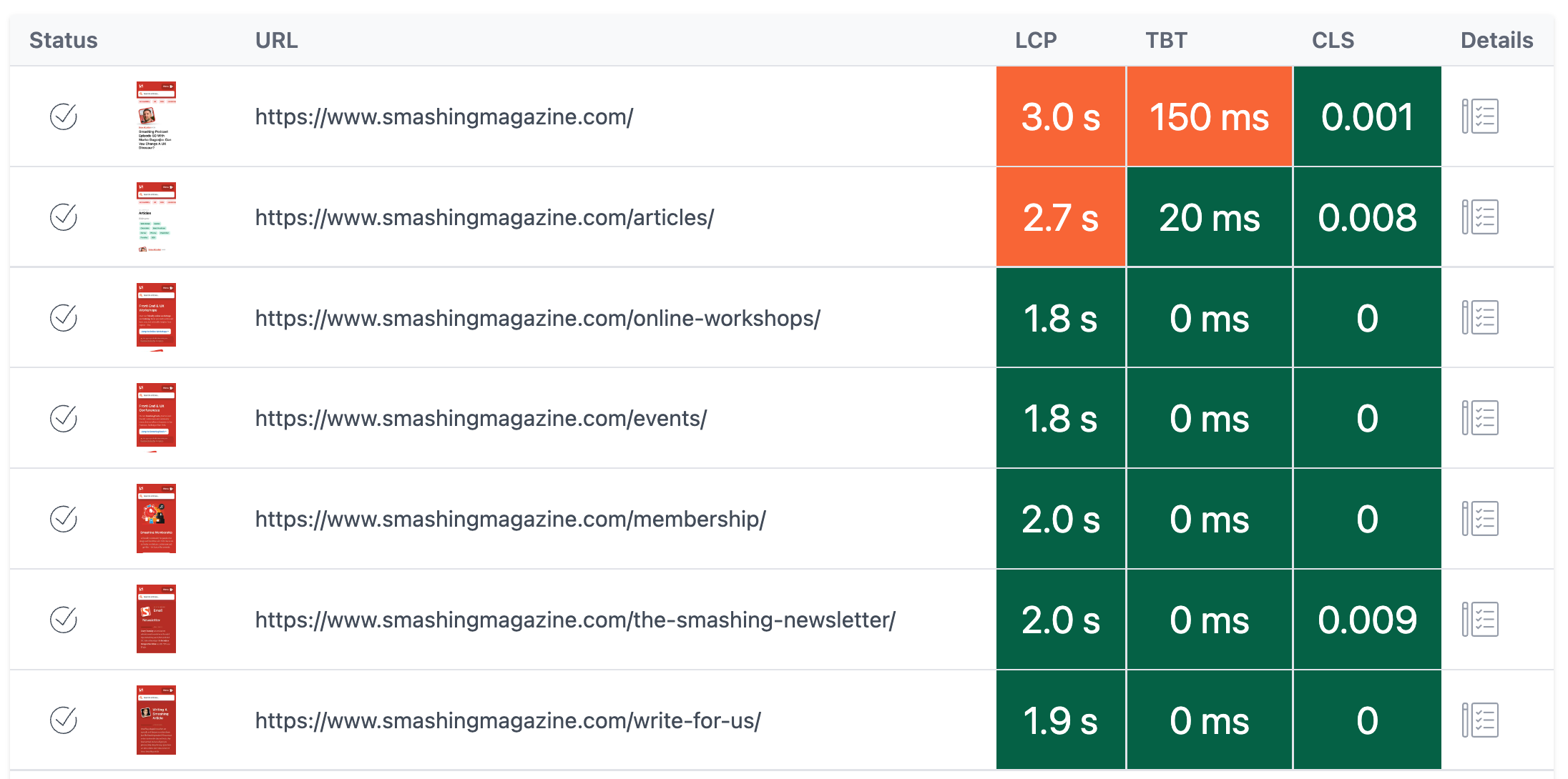
What’s the benefit then? As a result, you get a full overview of the pages that perform best, and pages that perform worst — and can compare the values over time. Under the hood, the tool uses Pagespeed Insights to measure Core Web Vitals.

You can export the results as a CSV file for Excel, Google Sheets or Apple Pages. The table format in which the results are returned makes it easy to compare web vitals across different pages. The tests can be run for both mobile and desktop.

Alternatively, you can also check David Gossage’s article on How to review Core Web Vitals scores in bulk, in which he shares the scripts and how to get an API key to run the script manually without any external tools or services.

Treo

If you’re looking for a slightly more advanced option for bulk Core Web Vitals check, this tool will cover your needs well. Treo Site Speed also performs site speed audits using data from the Chrome UX Report, Lighthouse and PageSpeed Insights.

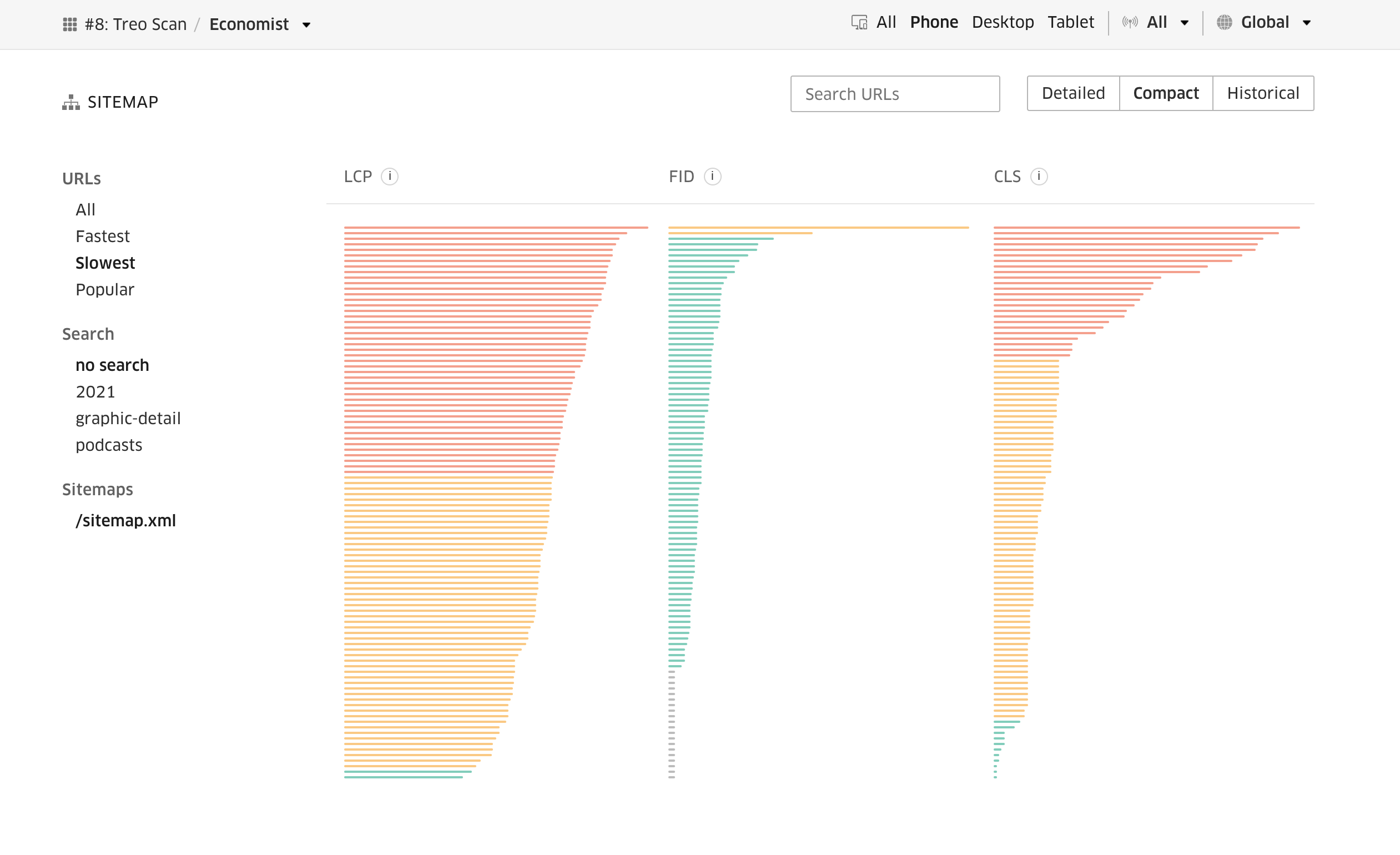
The audits can be performed across various devices and network conditions. Additionally though, with Treo, you can track the performance of all your pages across your sitemap, and even set up alerts for performance regressions. Additionally, you can receive monthly updates on your website’s performance.
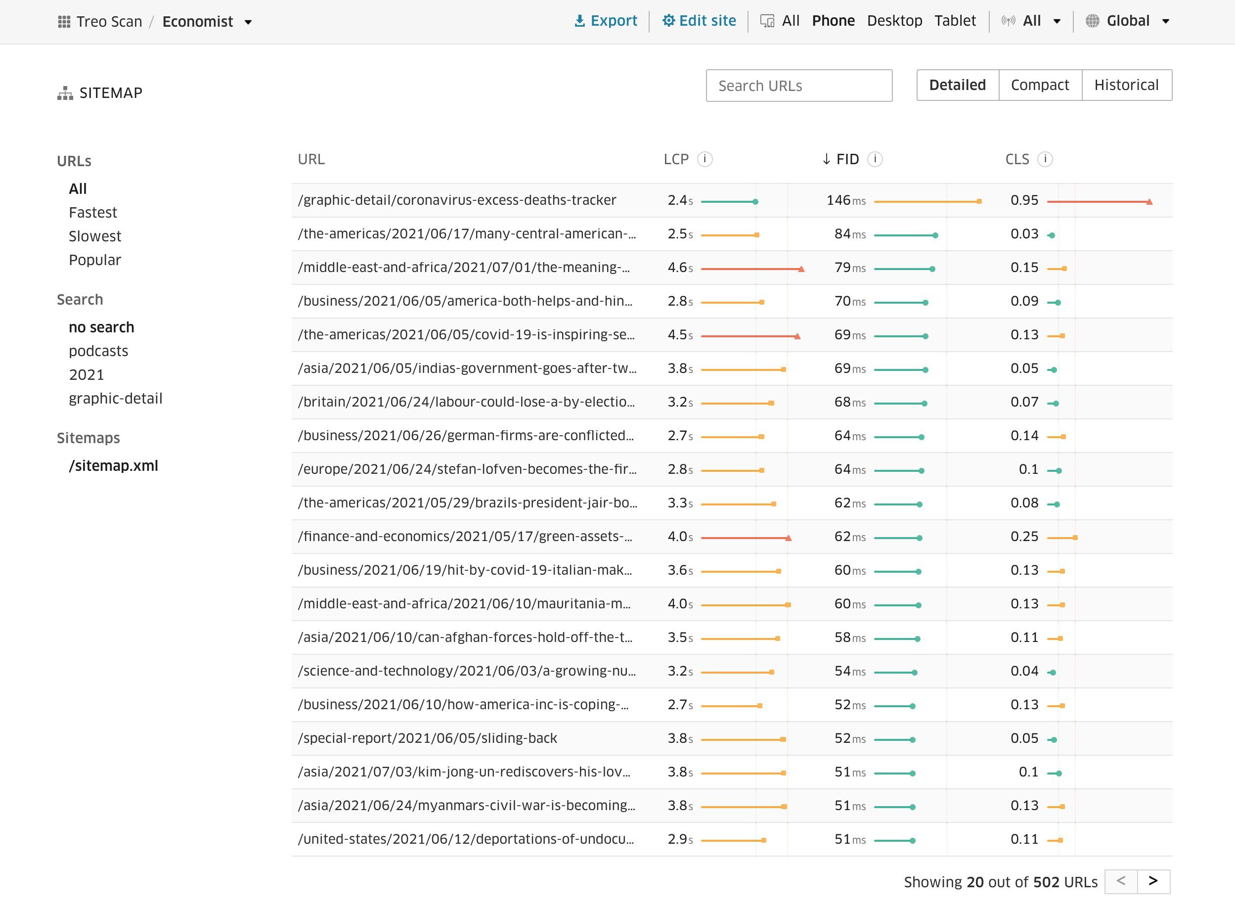
With Treo Site Speed, you can also benchmark a website against competitors. The reports Treo generates are comprehensive, broken down by devices and geography. They are granular and available at domain and page levels. You can export the reports or access their data using an API. They are also shareable.
WebPageTest Core Web Vitals Test

WebPageTest is, of course, a performance testing suite on its own. Yet one of the useful features it provides is a detailed breakdown of Core Web Vitals metrics and pointers to problematic areas and how to fix them.
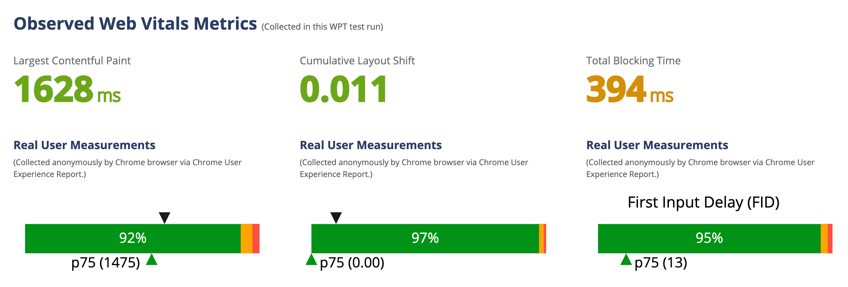
There are also plenty of Core Web Vitals-related details in the actual performance audit, along with suggestions for improvements which you can turn on without changing a line of code. For some, you will need a pro account though.

Cumulative Layout Shift Debuggers

Basically, the CLS Debugger helps you visualize CLS. It uses the Layout Instability API in Chromium to load pages and calculate their CLS. The CLS is calculated for both mobile and desktop devices and takes a few minutes to complete. The network and CPU are throttled during the test, and the pages are requested from the US.

The CLS debugger generates a GIF image with animations showing how the viewport elements shift. The generated GIF is important in practically visualizing layout shifts. The elements that contribute most to CLS are marked with squares to see their size and layout shift visually. They are also listed in a table together with their CLS scores.

CLS debugger in action: highlighting the shifts frame by frame.

Although the CLS is calculated as a lab metric initially, the CLS debugger receives CLS measurements from the Chrome UX Report as well. The CLS, then, is a rolling average of the past 28 days. The CLS debugger allows you to ignore cookie interstitials — plus, you can generate reports for specific countries, too.

Alternatively, you can also use the Layout Shift GIF Generator. The tool is available on its webpage or as a command line tool. With the CLI tool, you can specify additional options, such as the viewport width and height, cookies to supply to the page, the GIF output options, and the CLS calculation method.

Polypane Web Vitals

If you want to keep your Core Web Vitals scores nearby during development, Polypane Web Vitals is a fantastic feature worth looking into. Polypane is a standalone browser for web development, that includes tools for accessibility, responsive design and, most recently, performance and Core Web Vitals, too.

You can automatically gather Web Vitals scores for each page, and these are then shown at the bottom of your page. The tool also provides LCP visualization, and shows layout shifts as well.

Noteable Mentions

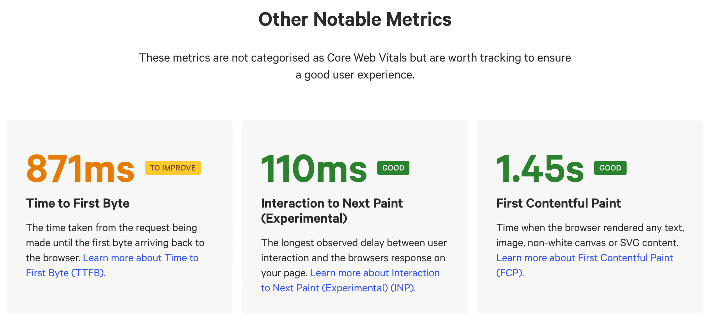
  • Calibre’s Core Web Vitals Checker allows you to check Core Web Vitals for your page with one click. It uses data from the Chrome UX Report and measures LCP, CLS, FID, TTFB, INP and FCP.
Categories: Others Tags:

An Introductory Guide On How To Do Web Scraping: Extracting Data From Your Website

August 9th, 2022 No comments

Web scraping is a great solution for those looking to access structured web data from websites containing large amounts of invaluable information.

Also known as web extraction, web scraping is a tool that helps you to gain information on products, contacts, and a lot more, even when a website doesn’t have an API (application programming interface), or grants limited access to its data.

 Web scraping offers a faster, more practical solution for extracting data from a website, instead of having to use the same format as the website in question, or even just copying and pasting information manually.

What is web scraping?

Web scraping is the process of gathering structured data into a spreadsheet or other file, but in an automated way. In the same way that a person can manually copy and paste information from a website into a document, web scraping performs the same function, just on a different scale. Web scraping also performs this task incredibly efficiently, extracting up to billions of data points through intelligent automation.

Image Source

It is often used by businesses and individuals looking to make use of the huge amounts of information available on the web, implementing web scraping into their data management scheme. This information can be mined to help a company to make smarter, better, informed decisions. 

Data scraping is particularly valuable, in fact, for companies looking to gather data on specific, niche topics. This data can then be utilized in your marketing strategy, where you might be considering the best niches for affiliate marketing.

Web scraping can be used for more than business intelligence however, as it can reveal insights into pricing and price comparison sites, Google Shopping related metrics where product data from an e-commerce site is sent to another online vendor, and can even help find sales leads and conduct market research. It has many benefits and many uses, though it is not necessarily always a simple task.

This is because websites can often be very diverse, coming in several different formats, shapes and sizes. As a result, you will find multiple different kinds of web scrapers, which all offer different functions and features. This is similar to the way in which there are multiple different kinds of mobile data collection apps to pick from.

Is web scraping a crime?

Web scraping is not illegal when it is used to mine public web data. However, it is important that you follow the prescribed rules, and avoid scraping information that is not available to the public. Scraping this data is illegal, and has become a rising crime with multiple recent cases of illegal web extraction occurring.

Though web scraping is a tool with many valuable features, it can be abused. A very common abuse of web scraping is through email harvesting. Scraping data from websites and social media can enable a person to harvest people’s email addresses, which can then be sold on to third parties and spammers for a sum. Harvesting data with commercial intent is illegal. 

Image Source

It is important that you remain aware of the darker side of web scraping and the importance of only harvesting data, or even emails acquired through an email finder, that is publicly available.

This also helps demonstrate why webpage defacement monitoring on your own company websites and personal blogs is so important.

How do web scrapers work?

Whether you want to learn to perform data scraping yourself, or are looking to learn more about it before you outsource the job to a data extraction specialist, it’s really important that you understand how it works, and the difference between web crawling and web scraping.

Web scraping works by first choosing the URLs you want to load before you begin scraping. You need to load the whole HTML code of that page in order to continue. If you outsource to a specialist or learn to do it yourself, you can go as far as loading the entire website, including all the Javascript and CSS. However, this isn’t necessary to perform web scraping, so don’t worry about it too much, especially if you are a beginner.

Then, the scraper extracts all the data on the page. However, you can choose what specific data you want to extract. This is performed when you only need specific information, and aren’t interested in the rest of the data on the page you are scraping. 

Then, all the data is outputted. This is done using the format that the web scraper has chosen, depending on what format will be most useful to the individual. Usually, data is output as an Excel spreadsheet or a CSV file, but more advanced web scrapers are also able to output data in other formats such as an API or JSON file. 

For more on learning to manage and organize your data: DataBricks Apache Hive articles.

What about web crawling?

Web scraping and web crawling go hand in hand. Web crawling comes before web scraping, and involves artificial intelligence that searches the internet to look for content, indexing it. 

This process finds the relevant websites and URLs that are then passed onto the web scraper, who uses them to mine information.

Web scrapers are specialized tools, designed to extract data from websites. There are four main types of scrapers, and they differ widely from one another.

Image Source

Types of web scrapers

Broadly speaking, web scrapers can be distinguished by placing them into four categories:

Category One: browser extension vs software

Generally speaking, web scrapers come in one of two forms, browser extensions and computer software. Browser extensions are simpler to run and are integrated directly into your browser. Like apps, they are programs that can be added to your browser (such as Firefox or Google Chrome). Some of the other best chrome extensions also include messaging extensions and ad blockers. 

However, these extensions are limited in that they ‘live’ inside of your browser. This means that advanced features are usually impossible to implement. On the other hand, scraping software can be installed onto your computer with a simple download. They enable more advanced features (not limited by what your browser can do), making up for the fact that they are a bit less convenient than browser extensions. 

Category two: self-built vs pre-built

Anyone can build their own web scraper. However, even in the implementation of tools that help you build a web scraper, there is a certain amount of coding knowledge needed. The more features you want to add to your scraper, the more knowledge you will need to have, as complexity increases accordingly.
On the other hand, you might want to opt for a pre-built web scraper that you can download and start using straight away. Some will offer advanced features (already built-in) such as Google Sheets Exports and more. This is a good option for those who have little familiarity with coding. If this seems enticing, consider learning more from databricks’ Introduction of hadoop to get you started.

Category three: User Interface

A user interface (UI) can vary depending on the web scraper. Some web scrapers have a full on UI, with a fully rendered website that users can click on and scrape. If you have little technical knowledge of coding and how scraping works, then this is a good place to begin.

The alternative – a user interface with a minimalistic UI and command line – might feel less intuitive and more confusing to a beginner, and might be worth avoiding if you are only just starting out.

Image Source

Category four: Local vs Cloud

This is all about where your web scraper is doing its job from. 

A local scraper runs using resources from your own computer and the internet. This can result in your computer becoming quite slow whilst it is scraping data, especially if it has a high usage of CPU or RAM. This can make your computer pretty much useless for other tasks whilst it is being used to scrape.

On the other hand, cloud-based web scrapers run using off-site servers provided by companies that develop scrapers. This gives you the ability to use your computer freely as its resources are not taken up by web scraping. You simply get notified when the data harvesting has completed.

How to do web scraping

Although the process, in itself, is fairly straightforward, it becomes complicated the minute your project grows to any significant size. As a result, it is often easier to outsource the job to a company of professional web scrapers. However, it is still interesting to understand the process of DIY web scraping, alongside learning about other forms of data collection.

Firstly, you need to identify the target website you are interested in scraping (a web crawler can help you do this). Let’s take websites for free stock videos as an example.

Then, collect all the URLs of the pages that hold the data you are looking to extract, namely on visual stock content.

Once you’ve done that, send a request to these URLs asking to be granted access to the HTML of the pages in question.

Then, once this is completed, use locators to find the data within the HTML.

Lastly, save said data in a CSV or JSON file, or in any other form of structured format that suits you. And just like that, you have a large amount of data on stock videos, all saved in one place.

If this seems like a tricky task, then an open-source web scraping data tool might be the right step forward for you. Or at the very least, a HDFS file system (what is HDFS in hadoop).

Conclusions 

Whether or not you plan to implement data scraping yourself or outsource to a specialist, it is important that you understand the process – it’s only going to grow in importance and popularity as more companies seek to make the most of the data that is available on the internet.
Without this valuable data, a company can never hope to make sense of a customer’s ecommerce journey, thus serving a vital purpose within a retailer’s repertoire of tools.

The post An Introductory Guide On How To Do Web Scraping: Extracting Data From Your Website appeared first on noupe.

Categories: Others Tags:

Committing CSS Crimes

August 9th, 2022 No comments

The time for CSS-Tricks is over. Now is the time for CSS Crimes!

In this current landscape of content service providers, users are often limited to expressing themselves in text, links, and images. Sanitization rules tend to strip out HTML, JavaScript, and various attributes.

Social media service Cohost allows users to have greater freedom with markup and inline styles than we may be typically used to. Some users have taken advantage of this freedom to commit CSS Crimes! It has resulted in creative recreations of familiar interfaces and interactive games by using properties in unconventional ways.

Blackle Mori created a contraption where pulling a handle slowly turns a series of gears, pulleys, and chains. Eventually an aperture opens to reveal the site’s mascot (“eggbug”) and the proclamation “Good Job!”. I have stared at this in Developer Tools and it is an amazing combination of grid, resize, transform, and calc(). I ended up adding a border to all

s to try and get a better understanding of how each individual element moved.

There have been situations in the past where I have been restricted from using the full toolkit of HTML, JavaScript, and CSS. There have been many instances of using decorative CSS shapes to get around images. I have used :hover as a workaround for mouseenter and mouseleave. I have used input:checked as a sibling selector for toggling.

While CSS Crimes are probably not something you would want to employ on a regular basis, we should embrace experiments within constraints that can foster creative solutions.

To Shared LinkPermalink on CSS-Tricks


Committing CSS Crimes originally published on CSS-Tricks, which is part of the DigitalOcean family. You should get the newsletter.

Categories: Designing, Others Tags:

7 Ways to Improve Efficiency of Your eCommerce Store

August 8th, 2022 No comments

Businesses try a lot of different things like offering free shipping, sale, loyalty discounts, and many more things to attract customers. But sometimes, they overlook that the website design can make a huge difference in attracting customers.

Website optimization helps in improving website performance. It includes page responsiveness, page speed, navigation, SEO friendliness, etc. Because if you lack in any of the above factors, you might lose a lot of user traffic.

For Shopify store owners, it becomes easy to optimize the website as it is a flexible platform. All they have to understand is how to do it. This article explains the ways you can use to improve the efficiency of your ecommerce stores.

1. Adding Good-quality Plugins

To build traffic and increase sales conversion, it is inevitable to optimize website performance regularly. And the best way to optimize the store is by adding plugins. Adding any plugin can slow down your store or complicate the user interface.

High-quality plugins would improve your website’s functionality and benefit your business tremendously. But try avoiding unnecessary plugins with features that would not make much difference to your store. You should also avoid plugins with complex assets, operations, and content strips.

2. Improve Website Speed

Customers are used to fast-loading websites. Customers don’t have patience; while your home page is loading, the customer would just switch to another website. If the pages do not load faster, it can affect the customer experience and conversion rates.

There is research that shows websites taking more than 5 seconds to load, fail to engage visitors, and they might not revisit the website in the future. In Google’s SERP performance, a page load time of 10 seconds is acceptable. But if your website takes more than 10 seconds to load, the visitors would be frustrated, and chances are they would leave the website. The point is that web visitors would not spend excessive time on such slower websites. 

3. Mobile Compatibility

Smartphones are the preferred choice over laptops of most of customers. Because it is more convenient to use. Ecommerce owners understood this inclination towards mobile phones and started optimizing their website by making it mobile responsive. 

If your website pages are not mobile responsive, if they take longer to load, or the UI gets scattered, then it is high time you optimize your website. Or else your customers would probably start looking for mobile responsive websites. If you have no idea whether your website is mobile-friendly or not, you can also check it on Google Search Console.

4. Image Optimization

Image Optimization can improve your website’s performance to a great extent. All websites use images in one or the other way as image helps in conveying the message more effectively. If you are using the images, selecting the file format is important so that you have high-quality images is important. For a web page to load faster, keeping the file image between 1 to 2 MB is ideal. But high-quality images of any format, PNG, JPEG, or GIF, do not fall in the 1 to 2 MB range.

There are tools available in the market that can help you reduce the size of an image without compromising on image quality. These tools help you reduce the size of images and enhance website performance. It will help improve the speed of the website.

5. SEO Optimization

For any website to rank and appear in search results, it should follow the search engine guidelines to bring more potential customers. And so SEO strategy becomes a crucial part of the success of any website. 

You can do some research on websites with more traffic and conversions. Analytical tools kike Google Analytics, Google Search Control, and many others help you give clear insights on bounce rates, behavior reports, and many more.

Optimizing a website with the right SEO keywords can help a website rank on the first pages. Focus on details like headlines, meta tags, URL slugs, etc. Find long and short-tail keywords and frame them in your website content. Additionally, you can also do off-page optimization by doing social media activities, guest blogging, influencer marketing, and many more things to improve your website performance.

6. Checkout Process

Complex checkouts can take away the joy of a seamless customer experience. A huge setback if a visitor enjoyed your website, selected the product, and changed their mind before payments due to complex checkout.

There can be many reasons your customers are abandoning the cart. You have to figure out those reasons and optimize your website accordingly. For instance, to simplify the checkout process, you can introduce single-page checkout to make it easier for buyers. Allow them to checkout as a guest user, rather than making the sign-up process compulsory.

Many plugins can help reduce cart abandonment rates. For example, you can use sticky carts or quick buy buttons on your website to remind users of the products in their cart. You can use sale timers to encourage quick checkout. To optimize the details, you can also edit the product details in bulk with the Shopify bulk editor.

7. Website Audit

If you do not keep an eye on your website’s performance, how would you optimize it? An underperforming website can make visitors feel you are incapable of offering a good user experience.

You can use tools like Lighthouse, Google Page Speed, etc., to audit your website performance. It shows detailed reports on what factors need improvement. They suggest steps for you to adopt to optimize those parts of your websites.

Conclusion

Now that you know how to improve the website, it is time to implement it. Shopify users can easily find high-quality plugins that help them optimize the site. To increase your website speed, you must use image optimizers that compress all the images and increase the website’s speed. All the product details must be optimized with uniformity by using the Shopify bulk editor plugin for bulk edits. You should all use the plugin wisely, so it does not slow down the website. Together, these would help you improve the website’s performance and increase traffic and conversion.

The post 7 Ways to Improve Efficiency of Your eCommerce Store appeared first on noupe.

Categories: Others Tags:

Zooming Images in a Grid Layout

August 8th, 2022 No comments

Creating a grid of images is easy, thanks to CSS Grid. But making the grid do fancy things after the images have been placed can be tricky to pull off.

Say you want to add some fancy hover effect to the images where they grow and zoom beyond the rows and columns where they sit? We can do that!

CodePen Embed Fallback

Cool, right? If you check the code, you won’t find any JavaScript, complex selectors, or even magic numbers. And this is only one example among many we will explore!

Building the grid

The HTML code to create the grid is as simple as a list of images within a container. We don’t need more than that.

<div class="gallery">
  <img>
  <img>
  <img>
  <!-- etc. -->
</div>

For the CSS, we first start by setting the grid using the following:

.gallery {
  --s: 150px; /* controls the size */
  --g: 10px;  /* controls the gap */

  display: grid;
  gap: var(--g);
  width: calc(3*var(--s) + 2*var(--g)); /* 3 times the size plus 2 times the gap */
  aspect-ratio: 1;
  grid-template-columns: repeat(3, auto);
}

In short, we have two variables, one that controls the size of the images and one that sets the size of the gap between images. aspect-ratio helps keep things in proportion.

You might be wondering why we are only defining three columns but no rows. No, I didn’t forget the rows — we just don’t need to explicitly set them. CSS Grid is capable of automatically placing items on implicit rows and columns, meaning we get as many rows as needed to any number of images we throw at it. We can explicitly define the rows instead but we need to add grid-auto-flow: column to make sure the browser will create the needed columns for us.

Here is an example to illustrate both cases. The difference is that one flows in a row direction an the other in a column direction.

CodePen Embed Fallback

Check out this other article I wrote for more about the implicit grids and the auto-placement algorithm.

Now that we have our grid, it’s time to style the images:

.gallery > img {
  width: 0;
  height: 0;
  min-height: 100%;
  min-width: 100%;
  object-fit: cover;
}

The hover effect we’re making relies on this CSS. It probably looks weird to you that we’re making images that have both no width or height but have a minimum width and height of 100%. But you will see that it’s a pretty neat trick for what we are trying to achieve.

What I’m doing here is telling the browser that the images need to have 0 width and height but also need to have a minimum height equal to 100%… but 100% of what? When using percentages, the value is relative to something else. In this case, our image is placed inside a grid cell and we need to know that size to know what’s 100% is relative to.

The browser will first ignore min-height: 100% to calculate the size of the grid cells, but it will use the height: 0 in its calculation. That means our images will not contribute to the size of the grid cells… because they technically have no physical size. This will result in three equal columns and rows that are based on the size of the grid (which we defined on the .gallery’s width and aspect-ratio). The height of each grid cell is nothing but the variable --s we defined (same for the width).

Now that we have the dimensions of our grid’s cells, the browser will use it with min-height: 100% (and min-width: 100%) which will force the images to completely fill the space of each grid cell. The whole thing may look a bit confusing but the main idea is to make sure that the grid defines the size of the images rather than the other way around. I don’t want the image to define the size of the grid and you will understand why after adding the hover effect.

Creating the hover effect

What we need to do is increase the scale of the images when they’re hovered. We can do that by adjusting an image’s width and height on :hover:

.gallery {
  --f: 1.5; /* controls the scale factor */
}

.gallery img:hover{
  width:  calc(var(--s) * var(--f));
  height: calc(var(--s) * var(--f));
}

I added a new custom variable, --f, to the mix as a scale factor to control the size on hover. Notice how I’m multiplying the size variable, --s, by it to calculate the new image size.

But you said that the image size needs to be 0. What is going on? I am lost…

What I said is still true but I am making an exception for the hovered image. I am telling the browser that only one image will have a size that’s not equal to zero — so it will contribute to the dimension of the grid — while all the others remain equal to 0.

The left side shows the grid in its natural state without any hovered images, which is what the right side is showing. All the grid cells on the left side are equal in size since all the images have no physical dimensions.

On the right side, the second image in the first row is hovered, which gives it dimensions that affect the grid cell’s size. The browser will make that specific grid cell bigger on hover, which contributes to the overall size. And since the size of the whole grid is set (because we set a fixed width on the .gallery), the other grid cells will logically respond by becoming smaller in order to keep the .gallery‘s overall size in tact.

That’s our zoom effect in action! By increasing the size of only one image we affect the whole grid configuration, and we said before that the grid defines the size of the images so that each image stretches inside its grid cell to fill all the space.

To this, we add a touch of transition and use object-fit to avoid image distortion and the illusion is perfect!

I know that the logic behind the trick is not easy to grasp. Don’t worry if you don’t fully understand it. The most important is to understand the structure of the code used and how to modify it to get more variations. That’s what we will do next!

Adding more images

We created a 3×3 grid to explain the main trick, but you have probably guessed that we there’d no need to stop there. We can make the number of columns and rows variables and add as many images as we want.

CodePen Embed Fallback
.gallery {
  --n: 3; /* number of rows*/
  --m: 4; /* number of columns */
  --s: 150px; /* control the size */
  --g: 10px;  /* control the gap */
  --f: 1.5;   /* control the scale factor */

  display: grid;
  gap: var(--g);
  width:  calc(var(--m)*var(--s) + (var(--m) - 1)*var(--g));
  height: calc(var(--n)*var(--s) + (var(--n) - 1)*var(--g));
  grid-template-columns: repeat(var(--m),auto);
}

We have two new variables for the number of rows and columns. Then we simply define the width and height of our grid using them. Same for grid-template-columns which uses the --m variable. And just like before, we don’t need to explicitly define the rows since the CSS Grid’s auto-placement feature will do the job for us no matter how many image elements we’re using.

Why not different values for the width and height? We can do that:

CodePen Embed Fallback
.gallery {
  --n: 3; /* number of rows*/
  --m: 4; /* number of columns */
  --h: 120px; /* control the height */
  --w: 150px; /* control the width */
  --g: 10px;  /* control the gap */
  --f: 1.5;   /* control the scale factor */

  display: grid;
  gap: var(--g);
  width:  calc(var(--m)*var(--w) + (var(--m) - 1)*var(--g));
  height: calc(var(--n)*var(--h) + (var(--n) - 1)*var(--g));
  grid-template-columns: repeat(var(--m),auto);
}

.gallery img:hover{
  width:  calc(var(--w)*var(--f));
  height: calc(var(--h)*var(--f));
}

We replace --s with two variables, one for the width, --w, and another one for the height, --h. Then we adjust everything else accordingly.

So, we started with a grid with a fixed size and number of elements, but then we made a new set of variables to get any configuration we want. All we have to do is to add as many images as we want and adjust the CSS variables accordingly. The combinations are limitless!

A full-screen gallery of images

What about a full-screen version? Yes, that’s also possible. All we need is to know what values we need to assign to our variables. If we want N rows of images and we want our grid to be full screen, we first need to solve for a height of 100vh:

var(--n) * var(--h) + (var(--n) - 1) * var(--g) = 100vh

Same logic for the width, but using vw instead of vh:

var(--m) * var(--w) + (var(--m) - 1) * var(--g) = 100vw

We do the math to get:

--w: (100vw - (var(--m) - 1) * var(--g)) / var(--m)
--h: (100vh - (var(--n) - 1) * var(--g)) / var(--n)

Done!

CodePen Embed Fallback

It’s the same exact HTML but with some updated variables that change the grid’s sizing and behavior.

Note that I have omitted the formula we previously set on the .gallery‘s width and height and replaced them with 100vw and 100vh, respectively. The formula will give us the same result but since we know what value we want, we can ditch all that added complexity.

We can also simplify the --h and --w by removing the gap from the equation in favor of this:

--h: calc(100vh / var(--n)); /* Viewport height divided by number of rows */
--w: calc(100vw / var(--m)); /* Viewport width divided by number of columns */

This will make the hovered image grow a bit more than the previous example, but it is no big deal since we can control the scale with the --f variable we’re using as a multiplier.

And since the variables are used in one place we can still simplify the code by removing them altogether:

CodePen Embed Fallback

It’s important to note this optimization applies only to the full-screen example and not to the examples we’ve covered. This example is a particular case where we can make the code lighter by removing some of the complex calculation work we needed in the other examples.

We actually have everything we need to create the popular pattern of expanding panels:

CodePen Embed Fallback

Let’s dig even deeper

Did you notice that our scale factor can be less than 1? We can define the size of the hovered image to be smaller than --h or --w but the image gets bigger on hover.

The initial grid cell size is equal to --w and --h, so why do a smaller values make the grid cell bigger? Shouldn’t the cell get smaller, or at least maintain its initial size? And what is the final size of the grid cell?

We need to dig deeper into how the CSS Grid algorithm calculates the size of the grid cells. And this is involves understanding CSS Grid’s default stretch alignment.

Here’s an example to understand the logic.

CodePen Embed Fallback

On the left side of the demo, I defined a two-column with auto width. We get the intuitive result: two equal columns (and two equal grid cells). But the grid I set up on the right side of the demo, where I am updating the alignment using place-content: start, appears to have nothing.

DevTools helps show us what’s really happening in both cases:

In the second grid, we have two columns, but their widths equal zero, so we get two grid cells that are collapsed at the top-left corner of the grid container. This is not a bug but the logical result of the grid’s alignment. When we size a column (or row) with auto, it means that its content dictates its size — but we have an empty div with no content to make room for.

But since stretch is the default alignment and we have enough space inside our grid, the browser will stretch both grid cells equally to cover all that area. That’s how the grid on the left winds up with two equal columns.

From the specification:

Note that certain values of justify-content and align-content can cause the tracks to be spaced apart (space-around, space-between, space-evenly) or to be resized (stretch).

Note the “to be resized” which is the key here. In the last example, I used place-content which is the shorthand for justify-content and align-content

And this is buried somewhere in the Grid Sizing algorithm specs:

This step expands tracks that have an auto max track sizing function by dividing any remaining positive, definite free space equally amongst them. If the free space is indefinite, but the grid container has a definite min-width/height, use that size to calculate the free space for this step instead.

“Equally” explains why we wind up with equal grid cells, but it applies to “the free space” which is very important.

Let’s take the previous example and add content to one of the divs:

CodePen Embed Fallback

We added a square 50px image. Here’s an illustration of how each grid in our example responds to that image:

In the first case, we can see that the first cell (in red) is bigger than the second one (in blue). In the second case, the size of the first cell changes to fit the physical size of the image while the second cell remains with no dimensions. The free space is divided equally, but the first cell has more content inside which makes it bigger.

This is the math to figure out our free space:

(grid width) - (gap) - (image width) = (free space)
200px - 5px - 50px = 145px 

Divided by two — the number of columns — we get a width of 72.5px for each column. But we add the size of the image, 50px, to the first column which leaves us with one column at 122.5px and the second one equal to 72.5px.

The same logic applies to our grid of images. All the images have a size equal to 0 (no content) while the hovered image contributes to size — even if it’s just 1px — making its grid cell bigger than the others. For this reason, the scale factor can be any value bigger than 0 even decimals between 0 and 1.

To get the final width of the grid cells, we do the same calculation to get the following:

(container width) - (sum of all gaps) - (hovered image width) = (free space)

The width of container is defined by:

var(--m)*var(--w) + (var(--m) - 1)*var(--g)

…and all the gaps are equal to:

(var(--m) - 1)*var(--g)

…and for the hovered image we have:

var(--w)*var(--f)

We can calculate all of that with our variables:

var(--m)*var(--w) - var(--w)*var(--f) = var(--w)*(var(--m) - var(--f))

The number of columns is defined by --m ,so we divide that free space equally to get:

var(--w)*(var(--m) - var(--f))/var(--m)

…which gives us the size of the non-hovered images. For hovered images, we have this:

var(--w)*(var(--m) - var(--f))/var(--m) + var(--w)*var(--f)
var(--w)*((var(--m) - var(--f))/var(--m) + var(--f))

If we want to control the final size of the hovered image, we consider the above formula to get the exact size we want. If, for example, we want the image to be twice as big:

(var(--m) - var(--f))/var(--m) + var(--f) = 2

So, the value of our scale multiplier, --f, needs to be equal to:

var(--m)/(var(--m) - 1)

For three columns we will have 3/2 = 1.5 and that’s the scale factor I used in the first demo of this article because I wanted to make the image twice as big on hover!

The same logic applies to the height calculation and in case we want to control both of them independently we will need to consider two scale factors to make sure we have a specific width and height on hover.

.gallery {
  /* same as before */
   --fw: 1.5; /* controls the scale factor for the width */
   --fh: 1.2; /* controls the scale factor for the height */

  /* same as before */
}

.gallery img:hover{
  width:  calc(var(--w)*var(--fw));
  height: calc(var(--h)*var(--fh));
}

Now, you know all the secrets to create any kind of image grid with a cool hover effect while also having control of the sizing you want using the math we just covered.

Wrapping up

In my last article, we created a complex-looking grid with a few lines of CSS that put CSS Grid’s implicit grid and auto-placement features to use. In this article, we relied on some CSS Grid sizing trickery to create a fancy grid of images that zoom on hover and cause the grid to adjust accordingly. All of this with a simplified code that is easy to adjust using CSS variables!

In the next article, we will play with shapes! We will combine CSS grid with mask and clip-path to get fancy grid of images.


Zooming Images in a Grid Layout originally published on CSS-Tricks, which is part of the DigitalOcean family. You should get the newsletter.

Categories: Designing, Others Tags:

How Our Organization Improved Web Accessibility (Case Study)

August 8th, 2022 No comments

The Understood front-end team has a special focus on removing barriers for people who learn and think differently. Our core users have ADHD, dyslexia, and other common challenges. But we are committed to creating products that meet the needs of all people. To do this, we combine accessibility and usability in ways that increase ease of use for everyone. This article outlines the why and how of our process. We also include basic steps on how to fix common accessibility issues.

Why Is Digital Accessibility Important?

Understood serves the one in five people who learn and think differently, which translates to approximately 70 million people in the U.S. alone. Learning and thinking differences can include the areas of memory, attention, and reading, as well as language and math, among others.

The Understood front-end team specializes in serving users who learn and think differently. But we are committed to creating products that meet the needs of all people.

Despite how common disabilities are, an article in AdWeek cited the fairly shocking fact that only 2% of all websites meet accessibility standards. Those guidelines are set out by the Web Content Accessibility Guidelines (WCAG), known and accepted worldwide as the minimum requirements to meet digital accessibility.

WCAGs are essential to our work, but they serve as a floor, not a ceiling. These standards should underlie each website and app but also be woven throughout the fabric of every developer’s process. Building and maintaining coding configurations that ensure error-free and equal access is the clarion call for all developers and designers.

Ethically, culturally, financially, and legally, expanding accessibility to include neurodivergent people and those with other disabilities is an intelligent and highly relevant business strategy.

Deep Focus On Accessibility

The engineering team at Understood.org is working to combine accessibility and usability in ways that improve ease of use for everyone.

We define accessibility as removing barriers for people to gain equal access to information, particularly neurodivergent people, and usability as making products like websites and apps easy to use for all people. That includes how simple the product is to use the first time and if the experience was gratifying, one that a user would likely repeat. A physical corollary would be knowing whether you need PUSH or PULL to open a door.

The reality is that digital accessibility is and will be an ongoing process.

Developers and designers who are fluent in accessibility are increasingly highly sought after. The Wall Street Journal noted job listings with ‘accessibility’ in the title grew a whopping 78% in 2021.

To be truly accessible, we need to implement solutions for people of all abilities, with both visible and invisible differences. Wheelchair ramps and closed captions are essential. But full access to the amazing power granted by access to goods, services, information, and communication options provided by the Internet also needs more learning and thinking support. This includes ways to help users focus and remember key points.

To do this, we have started putting people at the center of the process. Previously, the focus was on process, data evolution, key metrics, and results. That mindset leaves out a sizable portion of the population which diminishes access for users to all websites and apps across the board — from e-commerce and media outlets (including social and traditional) to government sites, search engines, and educational interests.

What Is The Role Of Front-End Developers

As developers, we play an important part in the consistency chain for coding best practices. We believe that due to timing and raising awareness, we are literally part of the process that is developing a foundational language for accessibility and usability that will be utilized by all future generations.

As such, we not only use our knowledge of programming languages to help develop the desired look and feel of our products, we ensure those products are accessible across multiple platforms.

And this is where the rubber meets the road: ensuring flawless operation when incorporating graphics, applications, audio, and video into the mix, ensuring those elements are cohesive and accessible for everyone by consistently testing for speed, usability, and accessibility.

Addressing Accessibility

We are on a continuous mission to ensure that sites are perceivable and error-free. Most industries come at the accessibility thing haphazardly. At Understood, we have found that the cleanest, most efficient way to approach it is to have Accessibility & Usability as prime factors in the initial development process.

It may seem like a basic statement, but as front-end developers, it is crucial that we have an in-depth understanding of how people actually use their devices when they are seeking information or online services.

At Understood, we reverse the traditional site creation process by listening closely to our users and accessibility consultants rather than designing first and asking questions second. It is not an exaggeration to say that our users’ insights guide our work.

The fundamentals of solid development and design practices apply doubly to accessibility and usability:

  • Basic to advanced accessibility training for all technical teams, including front-end, backend, and designers.
  • Attending accessibility conferences each year to keep up with the latest advancements and expand your knowledge base.
  • Conducting surveys and tests with ‘actual’ instead of theoretical users. In our case, that would be people who learn and think differently.

Working As A Team

Every industry has its own style and uses a unique flow for development. Because serving people with learning and thinking differences is top-of-mind for us, Understood begins with User Research which includes creating and applying surveys. The information and insights we glean from those surveys inform the designers, who then share content and possibilities with product managers. That information gets relayed to the front-end team to update/create, and then the front-end team creates the site/product for designers who provide feedback and apply their edits.

Why does our process start with user research to inform designers? Deque Systems, a provider of compliance accessibility tools and software, observed that 67% of accessibility issues originate in the design phase of development.

Evolving and maintaining open and honest communications with product managers and design teams translates to less compliance and operational issues down the road. As with any team that works together yet asynchronously, it is sometimes easier to spot potential concerns from the other side. In our experience:

  • Engineers detected accessibility flaws for which the designers found alternative solutions that also aligned with the design vision.
  • Designers had top-flight guidance on crafting color contrast, character counts, and effective font styles.

All engineer tickets include accessibility, so each ticket includes an Accessibility Audit. That way, we assign time to deal with whatever issues were revealed.

In our process, we use screen readers to test our pages manually. If there is a video, we refine the closed captions and check individual elements, including headings, buttons, navigation, lists, and color contrast.

Our front-end team always works with product managers to prioritize tickets, and we make it a point to align both teams to make things work. Importantly, engineering teams are realistic when they spec out the appropriate timeline for creation and review.

Product managers then QA all the features and test for accessibility issues. This means that we have two entire teams that review all features for accessibility and errors.

In evolving the workflow, we’ve learned how important it is to allocate time in sprints to work on accessibility.

Example

For our mobile app:

  • We examine everything page by page and log all errors into a central database.
  • We then convert that content to Jira tickets, complete with descriptions, screenshots, and story points.
  • If we work with a third party, and one of its tools is not accessible, we work with them to make it accessible.

The Developer’s POV

  • Will non-screen reader users have a comparable experience to that of screen reader users?
  • Can users focus on every interactivity in the right order?
  • Does the HTML markup make sense?
  • Are we conveying helpful semantic and stating information to screen readers? For example, we don’t want repeated information that isn’t necessary or bad image descriptions that don’t serve.
  • Make sure dynamic (error message for form, confirmation of login) changes are transmitted to screen reader users.
  • Are our features or components keyboard accessible?

The Designer’s POV

  • Is there sufficient color contrast?
  • Do we have a good font size, clean flow, and layout throughout?
  • Does the light/dark mode function well and look good?
  • Are all interactions reachable and executable?

Fixing Common Accessibility Errors

There’s a wide range of issues that can compromise accessibility, including those the website webaim.org calls “mistakes, misconceptions, over-indulgences, intricacies, and generally silly aspects of modern accessibility.” We find that webaim.org is an invaluable resource for understanding and then rectifying just about anything that can go haywire.

In the article for freecodecamp.org, Ilknur Eren, a front-end developer on our team, included a chart illustrating the most common types of WCAG 2 failures that WebAIM says comprise 96.8% of all accessibility errors:

WCAG Failure Type % of home pages in 2022 % of home pages in 2021 % of home pages in 2020 % of home pages in 2019
Low contrast text 83.9% 86.4% 86.3% 85.3%
Missing alternative text for images 55.4% 60.6% 66.0% 68.0%
Empty links 50.1% 51.3% 59.9% 58.1%
Missing form input labels 46.1% 54.4% 53.8% 52.8%
Empty buttons 27.2% 26.9% 28.7% 25.0%
Missing document language 22.3% 28.9% 28.0% 33.1%

This chart lists the biggies, but read on for those that are most common and for understanding quick fixes.

Missing Alternative Text For Images

Understanding the “why” of a coding style is as important as knowing a specific guideline. For images, the context from image to image will vary and should determine the code because algorithms can’t always interpret the meaning of an image.

One classic example of this is creating alternative text for an image in the alt attribute of an tag.

If you don’t understand why you’re doing it, you may create something that isn’t helpful to the end user but may actually create a brand new barrier.

Say we have an image, and we add the alt attribute:

<img src="example.png" alt="image"/>

While this might not get flagged by automated accessibility tests, a screen reader focusing on this image will say, “image, image.” It doesn’t inform the user and precludes their ability to solve their problem of understanding how to exit a program.

Low Contrast Text

According to recent reports from the WebAim Million, over the last three years, by far the most significant accessibility error is low contrast text. A surprising 80% of websites have this error, but it is relatively simple to fix. Google has a free tool called Lighthouse that makes it quick and easy to check the color contrast on any web page.

Missing Form Input Labels

According to WebAim, in 2021, half of the delinquent websites were missing their form input labels, which describe why the various fields in the form are for.

One of the most common missing labels is for search forms. If there is no label on a search form, screen readers won’t know what the form is.

Here’s how you fix that in HTML:

<label for="searchLabel" class="sr-only">Search</label>
<input type="text" name="search" id="searchLabel>
<input type="submit" value="Search">

And here’s CSS coding for the screen-reader portion of that HTML snippet:

.sr-only{
  position:absolute;
  left:-10000px;
  top:auto;
  width:1px;
  height:1px;
  overflow:hidden;
}

Empty Links

As above, almost half of the websites had empty links. This is a simple issue to identify and resolve.

For example, a Facebook logo that doesn’t add a label for a screen reader user will generate an empty link accessibility issue for a non-sighted user.

Adding a label to a link is simple and straightforward:

<a href="/facebook-page">
  <i aria-hidden="true"></i>
  <span class="sr-only">Facebook</span>
</a>
.sr-only{
  position:absolute;
  left:-10000px;
  top:auto;
  width:1px;
  height:1px;
  overflow:hidden;
}

Missing Document Language

It’s essential to list the language of the page. Screen readers use document language to decide how to pronounce words.

That said, somewhere between 28% and 33% of homepages have been missing a document language for the previous three years.

Add the language to the HTML tag:

<html lang="en">
...
</html>

Empty Buttons

It can be frustrating to click on a button and have nothing happen. The user is trying to submit a form or show/hide elements, and the lack of functionality is enough to make them exit the page.

Like empty links, buttons need text for screen readers to read when on focus.

If an image is used inside a button, we should add an alt attribute to create a functional image:

<button type="submit">
  <img src="/search.svg" alt="Search" />
</button>

Key Takeaways

In this day and age, accessibility should not be an afterthought. Everybody has the right to access the benefits and power of the Internet and apps that make daily life easier and more enjoyable.

When reviewing sites and apps for usability, make sure to test your products manually for accessibility. It makes a difference. Allocate specific time to focus on accessibility and maintain open communication channels with product managers and designers.

Continuing to explore technical training and new knowledge goes hand in hand with interviewing and surveying people who think differently so that what you produce and put out into the world is of the highest quality and easy for everyone to use.

Categories: Others Tags:

The Cost of Inefficient Meetings and How to Overcome Them?

August 8th, 2022 No comments

Have you ever met an employee or manager that looks forward to reoccurring meetings? That leaves back-to-back meetings to feel productive, clear-headed and equipped for the next steps. Most people have not, as meetings have been painted as this draining activity that is overwhelming, time-consuming, and used less. For the rare person who has encountered someone that loves attending meetings, it is generally because their organization has a positive meeting culture.

Meetings do not need to be a draining activity. When a company invests in their meeting productivity and culture, meetings can become an energizing and efficient activity that provides clarity and helps you develop professionally. For example, one-on-one meetings between a manager and their direct report should not be an anxiety-ridden conversation with unclear expectations and an unpredictable outcome. By simply setting a clear meeting agenda with both attendees talking points and action items, the direct report can be empowered to use the set time to discuss roadblocks and gain clarity on their progress.

Many organizations do not see the benefits of investing in their meeting culture. Some are even more aware that their companywide inefficiency or lack of motivation could be related to a meeting problem. Not considering how effective and productive your company meetings are is an expensive mistake. The meeting problem costs US companies $37 billion annually.

The first step in addressing an inefficient or lacking meeting culture is bringing awareness to the cost of your meetings. When employees and managers quantify the price of a forum, they become more mindful of the meeting inefficiencies. This blog post will discuss calculating the cost of your meetings and four tips to optimize your meetings and improve your meeting culture.

Why calculate the cost of your meetings?

Before explaining how to calculate the cost of your meeting, it is essential to understand why this is an important metric to qualify. As mentioned above, many organizations are not aware of their meeting problem. It can be challenging to pinpoint the issue as it can be disguised. For example, an unsuccessful marketing campaign where the target audience was not accurately defined could be because the team did not have an initial planning meeting and there was no alignment in the project.

Calculating the cost of your meetings is the first step in addressing an organization’s meeting problem. As this post will later discuss, changing a meeting culture will require leadership buy-in; when the cost of a meeting is quantified, it will be easier for the leadership team to understand the depth and urgency of the problem. Ultimately, calculating the cost of your meetings will allow:

Increase meeting productivity

We have all been in meetings that take a lot of time with no visible breakthrough. Once you know how much it costs for someone to attend a meeting, you become more aware of everyone’s cost of the meeting. With these numbers, it’s easy for you to judge whether each attendee’s presence is vital to the agenda. That way, your meetings become smaller in number and more productive.

Visualize the value of your team’s time

Time is the most crucial thing in a business, and visualizing/quantifying your team’s time dramatically improves productivity. With the cost, you will also know how much time is wasted during every meeting, giving you a chance to adjust accordingly.

Find alternate meeting strategies, such as asynchronous meetings

An asynchronous meeting discusses a topic that doesn’t happen in real-time. Participants share their views through recorded videos, voice messages and text before the deadline. This can include meeting through a shared agenda software, recorded videos, voice messages, etc. It is essentially an alternate method to facilitate communication between employees. Knowing your meeting cost makes it easier to consider moving to asynchronous meetings. The benefits of asynchronous meetings include more flexibility in distributed teams around meeting time, increased documentation habits and greater meeting productivity.

What factors into the cost of a meeting?

There are different ways to calculate the cost of a meeting. The fastest is to use a meeting cost calculator. This tool will consider the following factors in providing the total cost of your meeting:

Participants

This is the number of people who will attend the meeting. You need to have the exact number of attendees for you to know how much it costs for you to hold their meeting every year.

Average salary

What is the average salary of the participants? If the attendees are from different pay brackets (often the case), you need to calculate their average annual wage for the best results.

Duration

How long are the meetings? You must account for the duration of the meetings to know how much time and money you spend each year of the specific meetings.

Cadence

How often do you hold the meetings? Is it weekly, monthly, quarterly or annually? The frequency of the meetings is one of the things to consider when calculating the cost of the meetings.

Tips to Optimize Your Meetings

After calculating the cost of your meetings, you are probably wondering how you can optimize your meetings for more efficiency. Below are four tips to help increase your meeting productivity.

Use the right tech stack

It is important to leverage tools and workflows for your meetings to run smoothly. These tools include a video conferencing app, note-taking software and a calendar app to schedule the meeting. These three tools are the baseline, some teams will choose to add additional tools such as scheduling apps or meeting transcription tools.

Prepare an agenda  

An unprepared meeting, or a meeting without an agenda, is not worth attending as it will not be productive. Companies should strive to instill this messaging within their meeting culture. Different types of meetings include different agendas. For example, a project kick-off meeting will not discuss the same talking points as a leadership one-on-one meeting. Consulting different meeting agenda examples can help the meeting organizer identify which topics are relevant to cover in the meeting.

Get leadership buy-in

Organizational change is rarely effective without a push from leadership. A top-down approach to changing organizations will help form different habits and workflows among employees.

Gather feedback

As habits, routines and workflows change, it is crucial to continuously gather feedback from different teams to understand how they adapt and appreciate the change. This will help inform if the desired impact is happening and its benefits.

The post The Cost of Inefficient Meetings and How to Overcome Them? appeared first on noupe.

Categories: Others Tags:

How I Added Scroll Snapping To My Twitter Timeline

August 5th, 2022 No comments

CSS Scroll Snap allows websites to snap the web page or any other scroll container to a specific scroll position when the user performs a scrolling operation. This feature has been supported in all modern browsers for over two years, but many websites that could benefit from it are still not using it.

Scroll snapping is probably most associated with horizontal carousels (see Chris’s CSS-only approach) and particular web pages divided into full-screen slides. But why stop there? I believe that snapping can improve the scrolling experience on any web page that lays out items in a grid or feed.

For example, most shopping websites show products in a grid. Ideally, the user would like to jump between the grid rows with minimal effort. The user can press Space to scroll the page by roughly one screen (viewport height), but depending on the height of the grid rows, the scroll position will eventually get “out of sync” with the grid, and the user will have to re-adjust it manually.

If we add scroll snapping to this page, the user can consistently scroll to the next row with the Space key (pressing Shift + Space will scroll to the previous row). It’s pretty effortless.

I think that scroll snapping would be a welcome addition to this website. And it’s not even that complicated to implement. The CSS code that I used for this example is relatively simple:

html {
  scroll-snap-type: y proximity;
}

.product-item {
  scroll-snap-align: start;
  scroll-margin-top: 75px; /* height of web page’s sticky header */
}

You don’t have to wait if a website you visit regularly hasn’t yet added scroll snapping and you think it would improve your scrolling experience. You can add scroll snapping yourself — with user styles.

Adding user styles to websites

In the video above, you can see that I selected a user.css file in Safari’s advanced preferences. This file is a user style sheet. It contains CSS styles that I’ve written, stored in a local .css file, and added to Safari. These “user styles” are then applied to every web page I open in Safari.

Chrome and Firefox do not allow users to select a user style sheet. Firefox supported a similar feature called userContent.css in the past, but that feature was deprecated and disabled by default in 2019. I recommend the Stylus browser extension for these two browsers (and other Chromium-based browsers).

One significant advantage of Stylus is that it allows you to write user styles for specific websites and URLs. Safari’s user style sheet applies to all websites, but this can be worked around, e.g., by using the new :has() pseudo-class to create selectors that only match specific websites.

The Stylus extension has been reviewed by both Chrome and Firefox teams and received a badge that denotes high standards.

The CSS Cascading module defines a User Origin for styles the user adds. Safari’s user style sheet belongs to this origin, but the Stylus extension injects user styles to the Author Origin, where the website’s style sheets live. Specifically, Stylus inserts user styles directly to the page via a element at the end of which makes it the final style sheet on the page. Technically, this means styles added via Stylus are classified as author styles since they’re not in the User Origin, but I will continue to call them user styles because the user adds them.

However, it’s worth keeping this distinction in mind because it affects the cascade. When selector specificity is equal, a real user style is weaker than the page’s own style. This makes user styles an excellent fit for user defaults. Under the same conditions, a style added via Stylus is stronger than the page‘s style, so Stylus cannot as easily be used to define user defaults.

If we add !important to the mix, both real user styles and styles added via Stylus are stronger than the page’s styles. So when you want to impose your user styles on a website, it doesn’t matter if you use Safari’s “Style sheet” option or the Stylus extension. Your !important styles will win either way.

In the next section, I will use a set of !important user styles to enforce scroll snapping on the timeline page of Twitter’s website. My goal is to speed up the process of reading my Twitter timeline by avoiding awkward scroll positions where the topmost tweet is only partially on screen.

Scroll snap for Twitter’s timeline

After some experimentation, I’ve settled on the following CSS code. These styles work well in Firefox, but I’ve experienced some issues in Chrome and Safari. I will describe these issues in more detail later in the article, but for now, let’s focus on the behavior in Firefox.

html {
  scroll-snap-type: y mandatory !important;
}

/* tweets in the timeline are <article> elements */
article {
  scroll-snap-align: start !important;
}

/* un-stick the sticky header and make it “snappable” as well */
[aria-label="Home timeline"] > :first-child {
  position: static !important;
  scroll-snap-align: start !important;
}

/* hide the “new Tweets available” floating toast notification */
[aria-label="New Tweets are available."] {
  display: none !important;
}

It is necessary to add !important to each declaration because all the user styles must win over the web page’s own styles for our custom scroll snapping implementation to work correctly. I wish that instead of repeatedly writing !important, I could just put my user styles in an “important layer,” but such a CSS feature does not exist (yet).

Watch the video below to see my scroll snap user styles in action. Notice how each press on the Space key scrolls the next set of tweets into view, and the first tweet of each set is aligned to the top edge of the viewport. This allows me to read my timeline more quickly. When I need to go back to the previous set of tweets, I can press Shift + Space.

What I like about this type of scroll snapping is that it allows me to predict how far the page will scroll whenever I press Space. Each scroll distance equals the combined heights of the visible tweets that are entirely on the screen. In other words, the partially visible tweet at the bottom of the screen will move to the top of the screen, which is precisely what I want.

I know in advance that pressing Space will scroll Dave’s tweet to the top of the screen.

To try out my scroll snap user styles on your own Twitter timeline, follow these steps:

  1. Install the Stylus extension with Firefox Add-ons or the Chrome Web Store.
  2. Navigate to your Twitter timeline at https://twitter.com/home.
  3. Click the Stylus icon in the browser’s toolbar and click “this URL” in the pop-up.
  4. Stylus will open a code editor in a new browser tab. Copy-paste my scroll snap user styles into the editor and press the Save button in the sidebar on the left. The styles will be applied to your Twitter timeline immediately (no need to reload the page).
  5. You can update the styles at any time. Click the Stylus icon and the Pencil icon to open the editor again.

Inability to override snapping

My implementation of scroll snapping for Twitter’s timeline has one major flaw. If a tweet is taller than the viewport, it is impossible to scroll the page to reveal the bottom part of that tweet (e.g., if you want to like or retweet that tweet) because the browser forcefully snaps the page to show the top of the tweet (or the top of the following tweet).

The severity of this problem depends on the user’s display. Viewing Twitter’s timeline on a large desktop monitor at a small page zoom factor, you may not encounter any tweets taller than the viewport.

I have asked the CSS Working Group if it would be possible to add a mechanism allowing the user to override the browser’s mandatory scroll snapping. I should probably mention that this problem could, at least in theory, be resolved by switching from mandatory to proximity snapping. I’ve tested proximity snapping in Chrome and Firefox, and I found it inconsistent and confusing. The browser would often snap when I didn’t expect it to, and vice versa. Maybe Twitter’s code is interfering with the proximity algorithm, the browsers are still a bit buggy, or perhaps I’m just “scrolling it wrong,” if that’s even possible. I don’t know.

But the main reason why I went with mandatory snapping is that I wanted to avoid situations where the topmost tweet is only partially on screen after a scroll. The type of fast-scrolling between sets of tweets that I’ve shown in the video above is only possible with mandatory snapping.

If you, like me, prefer mandatory snapping, I can suggest the following two workarounds for the “tall tweet” problem:

  • You can open the tweet on its own page and return to the timeline afterward.
  • If you only want to click the Like or Retweet buttons, you can Shift-click the tweet to select it and then press L to like it, or T followed by Enter to retweet it.

Issues in Chrome and Safari

My scroll snap user styles produce noticeably different scroll snapping behaviors in Chrome, Safari, and Firefox. Those differences are in part since the exact implementation of the snapping mechanism is left up to the browser:

The CSS Scroll Snap Module intentionally does not specify nor mandate any precise animations or physics used to enforce snap positions; this is left up to the user agent.

The current version of Safari has a bug that prevents scroll snapping from working correctly on the Twitter timeline. I have reported this bug.

In Chrome, I have encountered the following problems:

  • The scrolling operations animate inconsistently. Sometimes the animation is slow, sometimes it’s instant, and sometimes it starts slow but is then cut short. I found this irritating.
  • The scrolling operations animate too slowly in general. I performed a test in Chrome and Firefox (20 Space presses), and it took me 70% more time to cover the same distance on my Twitter timeline in Chrome than in Firefox (18.5 seconds in Chrome vs. 11 seconds in Firefox).
  • When I scroll using my laptop’s trackpad, the page flickers a lot. When I attempt to scroll fast by holding down the Space key, the page scrolls very slowly and oscillates. I suspect that both issues are caused by the same algorithm. It seems that Chrome re-snaps at a very high rate in these cases. I have reported this bug.

These browser bugs and differences between browsers can be a problem for websites considering implementing scroll snapping. For example, a web developer might hold back because they don’t like how scroll snapping behaves in one particular browser. Browsers can mitigate this problem by becoming more interoperable. In fact, Scroll Snap is one of the areas of focus of the cross-browser Interop 2022 effort.

Another way the situation could be improved is by introducing new CSS properties that would make scroll snapping more configurable. This could include the duration of the snapping animation, the length of the proximity threshold for snapping, and a mechanism to override mandatory snapping.

To snap or not to snap?

I’ve been using my scroll snap user styles on Twitter’s timeline for a couple of weeks, and I don’t want to go back. The ability to quickly flip through my feed with only the Space key is just on another level.

However, I consider this an advanced feature that probably isn’t for everyone. There’s a reason why I’ve enabled it only on the timeline (/home path) and nowhere else on Twitter’s website. Snapping is a significant change in how the page scrolls, and it takes some time to get used to. It can work great for a specific use case, but it can also get in the way and frustrate the user.

Websites with feeds should therefore consider offering scroll snapping only as an optional feature, after careful consideration and plenty of testing in different browsers and with different input methods (mouse, keyboard, trackpad, touch screen, etc.).

Before you go…

Finally, I highly recommend installing and trying out the Stylus browser extension. Web developers (or anyone who knows CSS) have the power to style any website in their browser. You can apply minor improvements and fixes to your favorite websites. I mostly use it to hide page elements that I find annoying, such as sticky headers, video pop-ups, and vote counts.

But more importantly, Stylus allows you to quickly test new CSS features on any website and report browser bugs, if necessary. By doing this, you can help make the web platform a little better.


How I Added Scroll Snapping To My Twitter Timeline originally published on CSS-Tricks. You should get the newsletter.

Categories: Designing, Others Tags:

How do you Ensure your Business Runs Smoothly in Turbulent Times?

August 5th, 2022 No comments

Recession. 

It’s the word businesses dread because it means layoffs, a decline in sales and profit – and for many, bankruptcy.

However, the world has already weathered a great number of recessions, and businesses have been finding ways to thrive even in the direst conditions. 

That means you can do it too, and this article provides you with actionable ways in which you can ensure your business runs smoothly in turbulent times. 

1. Assess the impact of the crisis on different aspects of your business

The way your business operates, how it generates revenue, who your customers are, and what your products are like determine how you can attract and retain new investors and talent.

If you want an overview of how these things work, an activity map or a flowchart can tell you whether the way you’re currently operating makes it possible for you to meet your business objectives.

However, when the recession hits and when the resources of your consumers get scarce, your business will likely show certain shortcomings when attempting to meet those objectives. 

As it gets increasingly hard to get money out of people’s pockets, you’ll need to adapt and figure out how to address your customers’ problems in a cheap way for them but still profitable for your business. 

How? By figuring out how each aspect of your business is affected by turbulent times. 

To get this sort of insight, you need to talk to your stakeholders. 

Talk to your suppliers. Take a look at how your consumers are behaving – how their needs and the overall market are changing. 

Ask yourself: Where do my products and services fit in now? 

Anticipate the issues that may arise and analyze how the successful business models of your competitors have tackled similar issues in the past. 

Then, borrow from their experience and remain positive. Recessions tend to last up to 12 months, so you just need to keep your head above water for a couple of months. 

2. Consider your payroll

History has shown that recession proof businesses and employment loss are synonymous in people’s minds.

Unstable times often lead to layoffs, which is something that both businesses and their employees fear.

Juggling layoffs, protecting your business from legal liability, fighting the fear of your remaining top employees, and trying to keep them motivated is no easy feat, but someone has to do it.

If you come to a point where you have to lay people off, you want to make sure that the decisions you’re making will keep your business running smoothly until the tough times are behind you. 

The way you can do that? By hiring and keeping the right people.

You need to figure out which employees are confident that you can pull it through and can back it up by getting the job done. Identify those who can handle extra tasks, work in a team, bring hope into the corporate environment, and focus on the bottom line.

Sounds like a lot to ask of very few people? That’s because it is. 

And that means that, if you want to keep top players on your side, you need to keep them motivated.

The best way to find out what motivates your employees is to talk to them, not just when hiring them, but also every now and then once they join the company. It might also be a good idea to interview those who have been laid off to understand what they were dissatisfied with. 

In either case, you can’t go wrong with compensating your employees properly for their work.

While it may be tempting to underpay your staff when the recession hits, it’s always better to make cuts elsewhere and invest in what’s essential – and that’s your human resources. 

(Even if that means taking a pay cut yourself.)

3. Delegate tasks, create functional teams, and develop a sense of belonging in the workplace

Now that you’ve got the right people on your side, you need to get them working on the right tasks.

Task delegation is essential if you want to save resources and have your employees perform efficiently in teams. 

Source: Pixabay

And that’s the other thing – with turbulent times ahead, teams that work well are what will keep you afloat.  

What we mean by that is that having a functioning team, as opposed to one where people aren’t actively collaborating, is what can make or break a business during a recession.

Why? 

Because if you’ve made layoffs and you’re left with very few people where each of them is handling large chunks of workload – if just one of them leaves, you’re left in a tough position where you can’t quickly replace them and no one else can pick up where they’ve left off.

Having a functional team means providing training to all of them, all while ensuring that they’re sharing skills and knowledge among themselves. 

Just be wary of creating a sense that everyone is replaceable just because anyone in the office can do their job. 

Let your employees know how valuable they are, promote positive relationships between colleagues, and work on creating a sense of belonging in the workplace. 

That’s how you boost the share of ideas, the morale, and that’s how you meet your common objectives.  

4. Have liquid assets to cover your business in emergencies

Think about the predictable, short-term expenses that your business might have. When turbulent times arrive, you want to cover those first.

To ensure that you’ve got the means to handle these expenses, you’ll want to have enough cash on hand.

Get a loan early, before the rates skyrocket. 

Look into short-term financing options, such as invoice factoring, to speed up the payments. 

Secure a line of credit.

If you’ve got savings, tap into them. If you’ve got stock holdings, liquidate them. 

Borrowing money can help your business survive the tough times, but be mindful of the losses you could face if you default on payments. 

5. Cut costs where you can

Turbulent times are the perfect opportunity to take a look at your company’s income statement and identify the recurring expenses that are putting a dent in your budget.

The most important recurring expenses you should focus on are the smaller ones, as they tend to be overlooked when times are good, but can quickly add up.

For example, consider the equipment and office supply costs. 

Ask yourself questions like:

  • Does your office really need a revamp now? 
  • Can the branded products that you use be replaced with generic ones? 
  • Are any of your supplies recyclable?
  • Can you reduce the amount of paper that you use?

Monitor which of the supplies are used the most by your staff and which get wasted. Ask your employees for feedback and suggestions regarding cost control. 

Another area in which you can make cuts is in the supplies used to make your products. 

However, you want to be mindful of the impact these cuts may have on the quality of the finished product, as that is something you want to avoid. 

One thing you could do is to keep the same supplies, but use fewer of them per piece of product. Then, you can sell that product at reduced size or quantity, at the same price. That’s shrinkflation, for you! 

Source: Pixabay

6. Go remote 

While we’re on the topic of cutting recurring expenses, here’s a larger cut that you could make and completely transform your business.

Go remote.

China’s largest travel agency, Ctrip, has managed to reduce office costs by $1,250 annually per employee by introducing telework. 

Remote work, in certain industries, is even seen as a determining factor in employees choosing whether they want to work for a certain company. This shift is most notable in the IT sector.

Still, going fully digital requires quite a few changes in your business model. 

For starters, if you’re a retailer relying on customers who physically visit your stores, you’ll want to set up an e-commerce store with an online order system. 

Then, you’ll want to communicate this change, along with your brand’s values, to your consumer base. This means building a presence online, including on social media platforms. 

You’ll also want to consider the infrastructure of your remote work, to ensure that:

  • Your staff has the necessary equipment, tools, and training to work from home
  • Your key data is secure
  • Your team members can communicate effectively with one another
  • Your company culture remains positive

7. Reconsider your business offer 

Historically, consumers in a recession tend to spend most of their money on essentials while seeking out bargains and cheaper alternatives to branded products.

If you aren’t selling things that people can’t live without, expect to be hit harder by the recession. 

Sure, you could give discounts, but this will only get you so far if people don’t have money to spend on luxuries. 

So, what can you do?

Well, you can adapt. 

And by adapt, we mean to change your business offer. 

Look at that inventory of yours. Look at the supplies used to make your product.

What else can you use them for? How can you repurpose them to make something useful for your customers?

Remember: tough times don’t last forever. If you find a way to help your community survive the tough times, they’ll remember it and reward you with loyalty once the crisis ends. 

Conclusion

When things get hard, it’s important to remain positive. 

Remember that there isn’t just one, but many solutions that can keep your business running. However, if you lose your cool, you’ll blink and miss them.

The post How do you Ensure your Business Runs Smoothly in Turbulent Times? appeared first on noupe.

Categories: Others Tags:

Actually, the San Francisco Typeface Does Ship as a Variable Font

August 4th, 2022 No comments

Apple unveiled an expanded version of its San Francisco system font at WWDC 2022. Then, last month, Jim Nielsen zeroed in on the font’s variations, explaining how the font provides a spectrum of variations based on the width and weight. It’s a remarkable read if you haven’t checked it.

With all of these great new options, you might be tempted to use them in a web design. Chris was ogling over the expanded sets as well over on his personal blog and pondered:

But it’s not year clear how we might tap into the condensed, compressed, and expanded varieties in CSS, or if there is even a plan to allow that. I suppose we can peek around Apple.com eventually and see how they do it if they start using them there.

Doesn’t this make perfect sense to construct as a variable font and ship the whole kit and kaboodle that way?

Turns out, yes. It does make perfect sense. Chris follows up in a new post:

But just yesterday I randomly stumbled across the fact that the built-in San Francisco font (on the Apple devices that have it built-in) is already variable (!!). See, I was derping around with Roboto Flex, and had system-ui as the fallback font, and I was noticing that during the FOUT, the font-variation-settings I was using had an effect on the fallback font, which renders as San Francisco on my Mac. Which… unless I’m daft… means that San Francisco is a variable font.

So, as for using it? Chris has a demo, of course:

CodePen Embed Fallback

There are some gotchas to all this, the most significant being fallbacks for non-Apple devices. After all, that demo is simply calling system-ui for the font family — it’s not telling the browser to download a font file or anything and who knows if Apple is gonna ever ship a variable font file we can serve up as an actual custom web font.

The other interesting thing? Chris did some sleuthing and counted 35 layout featured included in that system font. Go read the rest of the post to see ’em all (and to get a good ol’ dose of Chris-isms — I know I miss them!).

To Shared LinkPermalink on CSS-Tricks


Actually, the San Francisco Typeface Does Ship as a Variable Font originally published on CSS-Tricks. You should get the newsletter.

Categories: Designing, Others Tags: