Poster Design Ideas – Fundamentals of Creating Eye-catching Posters
What is the most effective way to generate interest in a new film, book, product, or future event? Posters.
Posters are a global favorite because they work for everyone; no matter who you are, what you do, or what you’re marketing, a poster is a powerful and eye-catching way to provide information and excite your audience about upcoming events. They’re inventive, daring, funky and may elicit a wide range of feelings.
Some movie or music posters grab your attention, while other poster kinds may be informative and instructive. Finding the ideal balance between the title, content, photos, and design is crucial. Your poster will be ready once you achieve that.
The first and most crucial step in making a poster is understanding your target audience and product. Following that, you may experiment with color, alter forms, modify background textures, and apply stylish typography in order to complement the content. Here are some suggestions and poster ideas to help you find the best approach to convey your message.
The Principle Ideas of Poster Design
Understanding the elements of poster design is crucial for comprehending contemporary poster design concepts. The right poster will express your brand message and connect with your target audience, from storytelling aspects to title treatment design, technological requirements, and data-influenced decisions that you will make to convey the story and attract desired audiences. When you select these unique components, you will enhance your brand message, increase your audience’s recognition, and increase your product’s interest.
Here are some principles that help you strengthen your message.
Creating Color Harmony
Choosing the right colors is not always simple, especially if you have to stick to a logo or a certain theme. In this situation, you need to adhere to a color palette to create appropriate and attractive color combinations. In order to discover the ideal color combinations, you may also try working with the PowerPoint color palette.
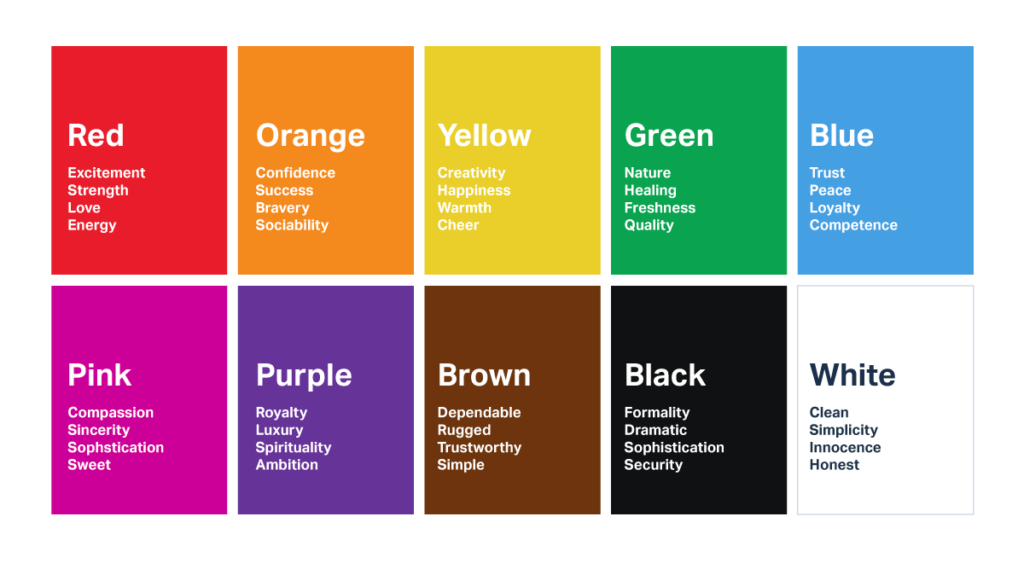
To keep things basic and appealing at first, try not to select more than two colors in addition to white and black. Use various shades of your current color choices if you need to add extra colors to your design. Also, remember that each color is symbolic and can represent a range of emotions. The colors that you pick will each convey a different feeling. Keeping color symbolism in mind is advised in poster design.
Below is a chart to help you.
Text and Font
Remember that your poster should be simple to read. You wouldn’t want your information lost due to incorrect font selections or sizes. Avoid using elaborate typefaces that might strain the eyes. Less is more! If your poster has a clear, straightforward, and readable font, your audience will be able to comprehend your content easily.
Instead of utilizing a distractive typeface, try using vibrant colors or intriguing imagery to show creativity and originality. It is important to utilize bright and intense colors as a crucial element in poster design since this will draw the focus and ensure it is a main component in the design.
Additionally, we advise you to ensure that the color of your text and the background contrast significantly. For instance, using the white font on a dark backdrop will ensure that everyone can see your message.
The Visual Hierarchy
An order of significance indicates that the most critical elements must be noticed first. Designers should adhere to this rule since it directs viewers to focus on the most crucial elements. You must ensure that the size of symbols and forms match their significance. The most important symbols should be highlighted on your poster.
The title, subtitle, and body content of the poster should be arranged according to size. Since the title is always the first thing readers will see, it should take up most of the page and be written in a standout font. The subtitle should support the title even if it should be smaller. The body copy must also be easier to read and smaller. Also, keep the information on the poster to a minimum. It is natural to want to include all pertinent information, but doing so risks cluttering your design and diverting the reader from the message.
What is the most important piece of information you want a viewer to remember? Your design should center on this statement.
The human eye is practically ‘conditioned’ to follow a Z-shaped pattern, which means it starts at the top left of a page, scrolls to the right, then returns to the left before continuing down the page. Keeping this in mind, it is typical to position the attention grabber in the top left of the page, followed by the necessary information about the product or event in the bottom right-hand block.
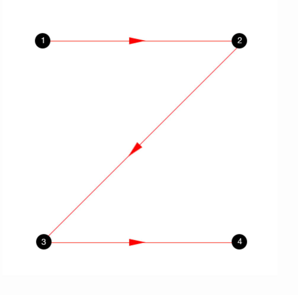
Take this into consideration while designing your poster.
Now that you’ve given your poster design some semblance of order and piqued your viewer’s interest, you can fully unleash your creative side!
Spacing and Alignment
A key design element is to align and space your text properly. Text that is spread out rather than jammed together is more readable, and readers will almost certainly retain the information better.
Additionally, it creates a scene that looks more integrated and unified, which is appealing to the eye.
Your components must all be in harmony with one another. The edges of one element must intersect the edges of another element if you extend their edges. This guideline is true for both text and pictures!
Creative Ideas for Poster Making
1. Use Color to Evoke a Feeling.
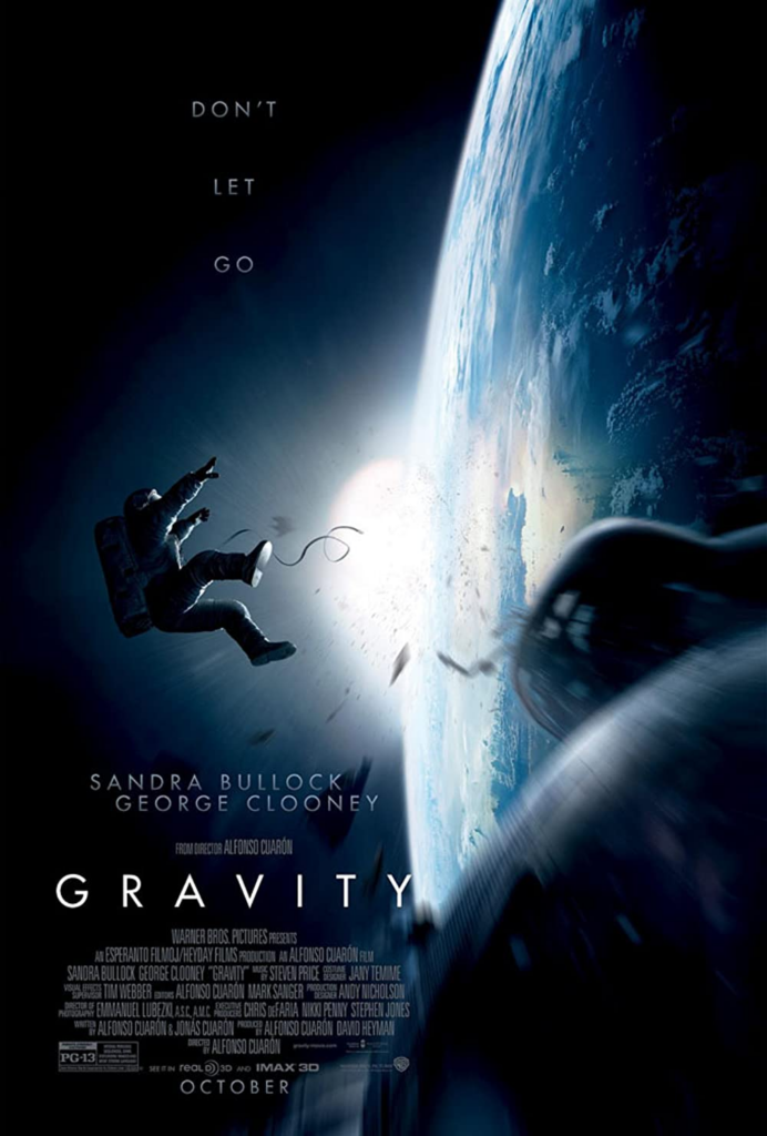
Use complementary colors to convey the mood and tone you want to see in your poster. Look into some correlations between emotions and color! An illustration of how to use hues like green and blue to evoke a sense of tranquility, peace, and nature is seen on the following poster

Take note of how the usage of the color blue in this poster elicits a sense of isolation, iciness, and dread.
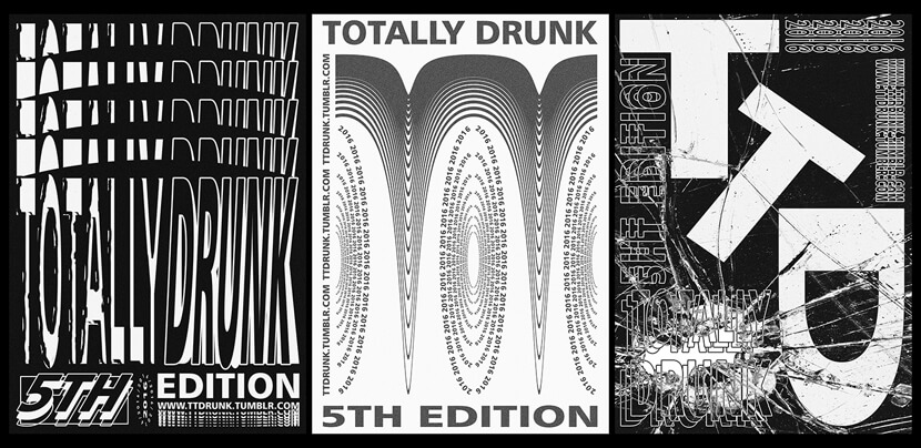
2. Use Typography
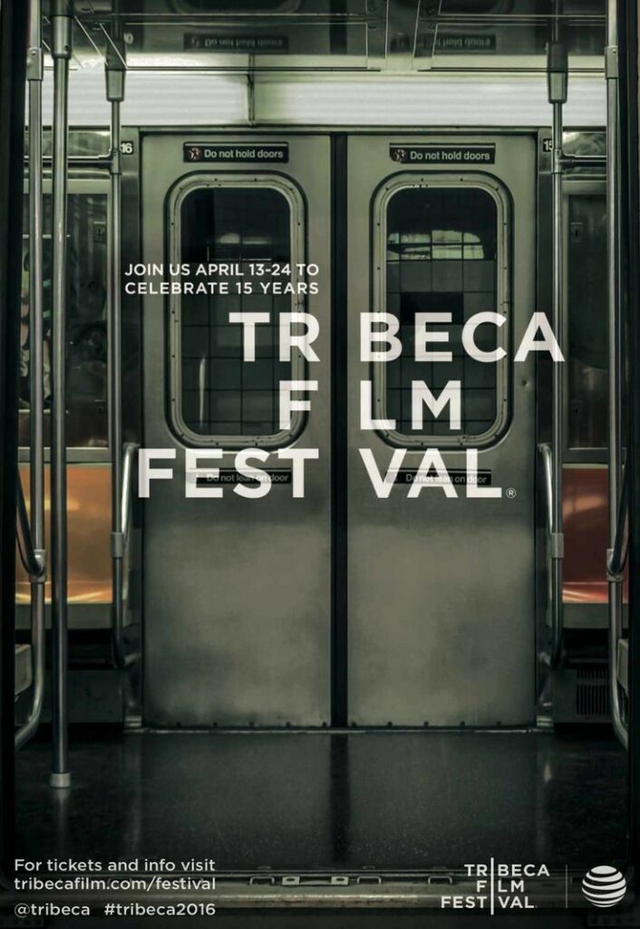
Experiment with different fonts to create a great impact on your viewers.

This poster used the imagery of food through typography to further emphasize the message.

3. Create Hierarchy
Making one element noticeably larger than the others is one of the quickest and easiest methods to establish hierarchy in your design.
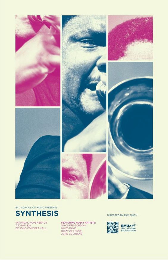
The main emphasis of this poster is a collage of jazz instruments and musicians.They compliment each other in terms of space and color, resulting in one large photo that serves as the design’s focal point. The audience quickly recognizes this as a promo for a jazz music performance. The poster also includes the event dates, venue, and artist information at the bottom.
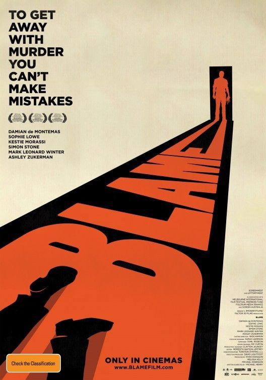
This poster design captures your attention not just via the use of scale, but also through the use of leading lines and perspective. The word “Blame” is surrounded with a black background and connected to a silhouette standing within a doorway as the main design element. The use of colors instantly gives us the impression that this is a murder mystery film narrative.
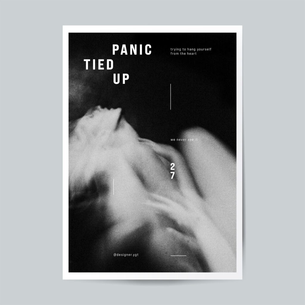
4. Use Minimalism
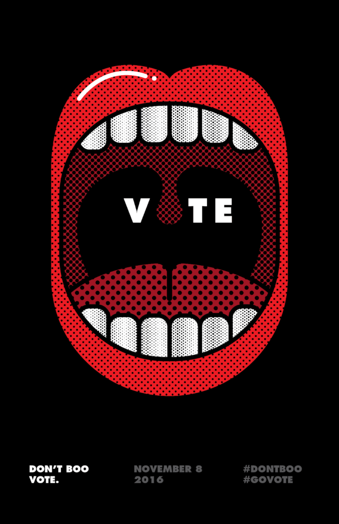
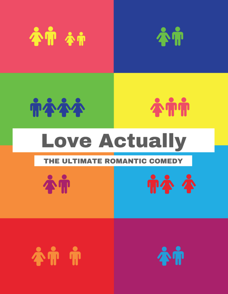
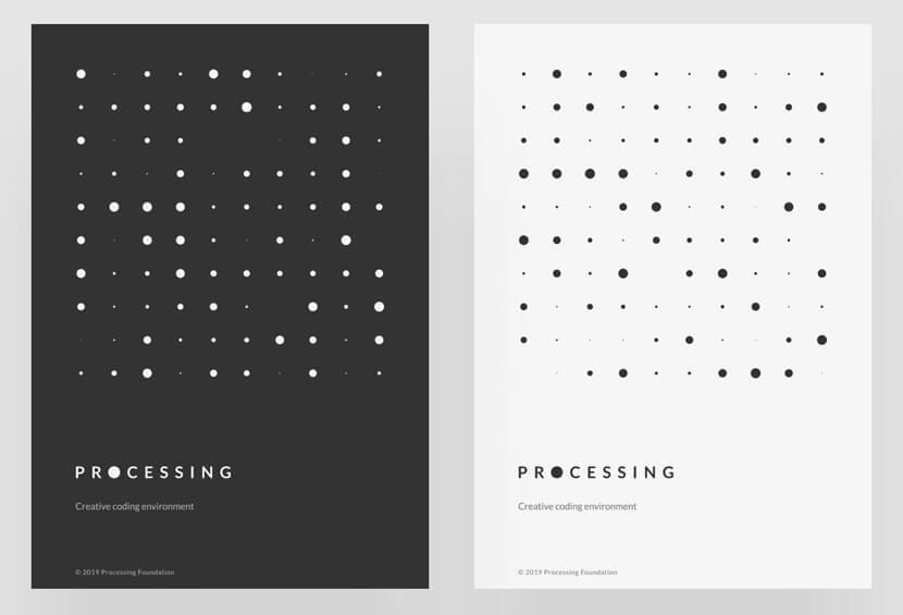
Sometimes, simple is better. Using basic design components to express whatever thing you want to say to your audience is possible with a minimalist approach to design.
5. Focus on Graphics
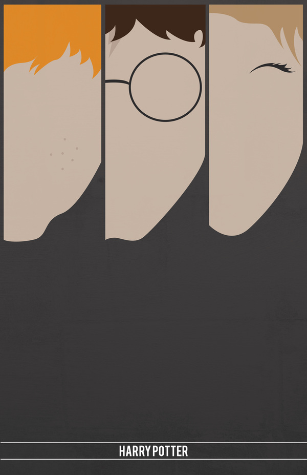
When it comes to making a compelling poster, reducing text to a minimal and focusing on the graphics is sometimes the best way. Instead of overloading your audience with words, graphic posters are a great choice for marketing a movie or event since you can leave it up to them to make sense of the imagery.
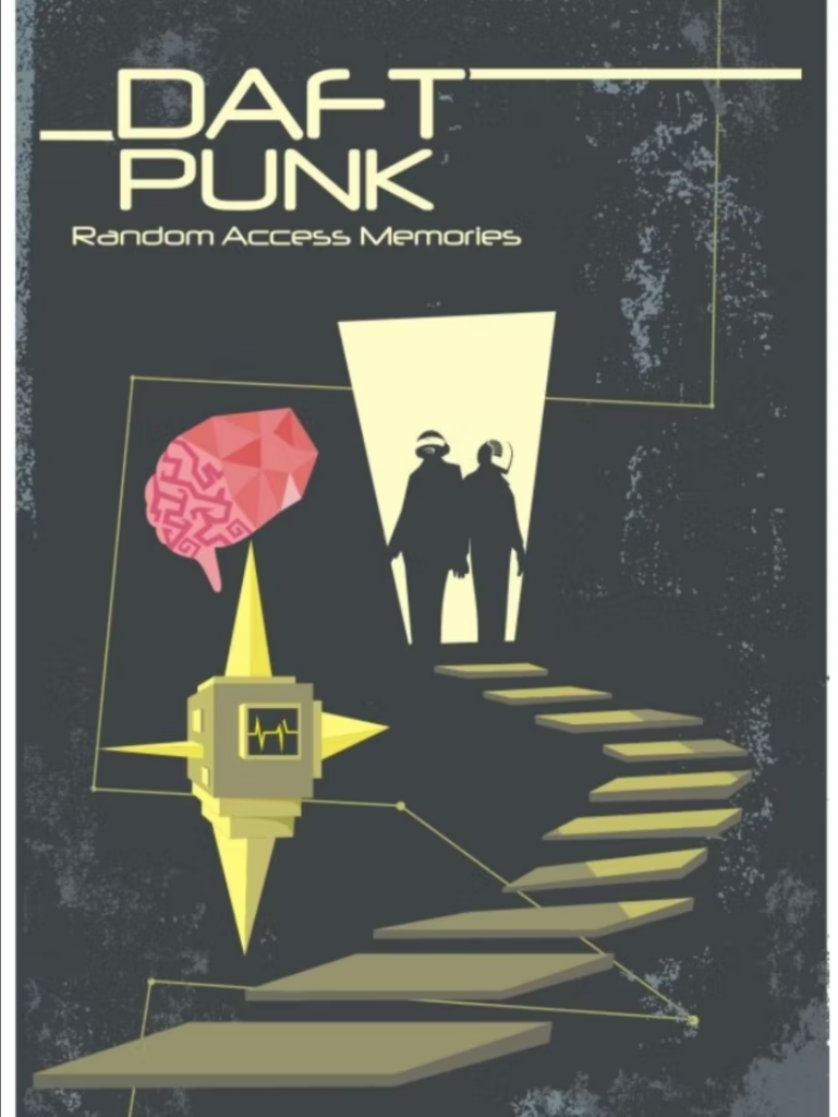
6. Use 3D effects and Play With Dimension
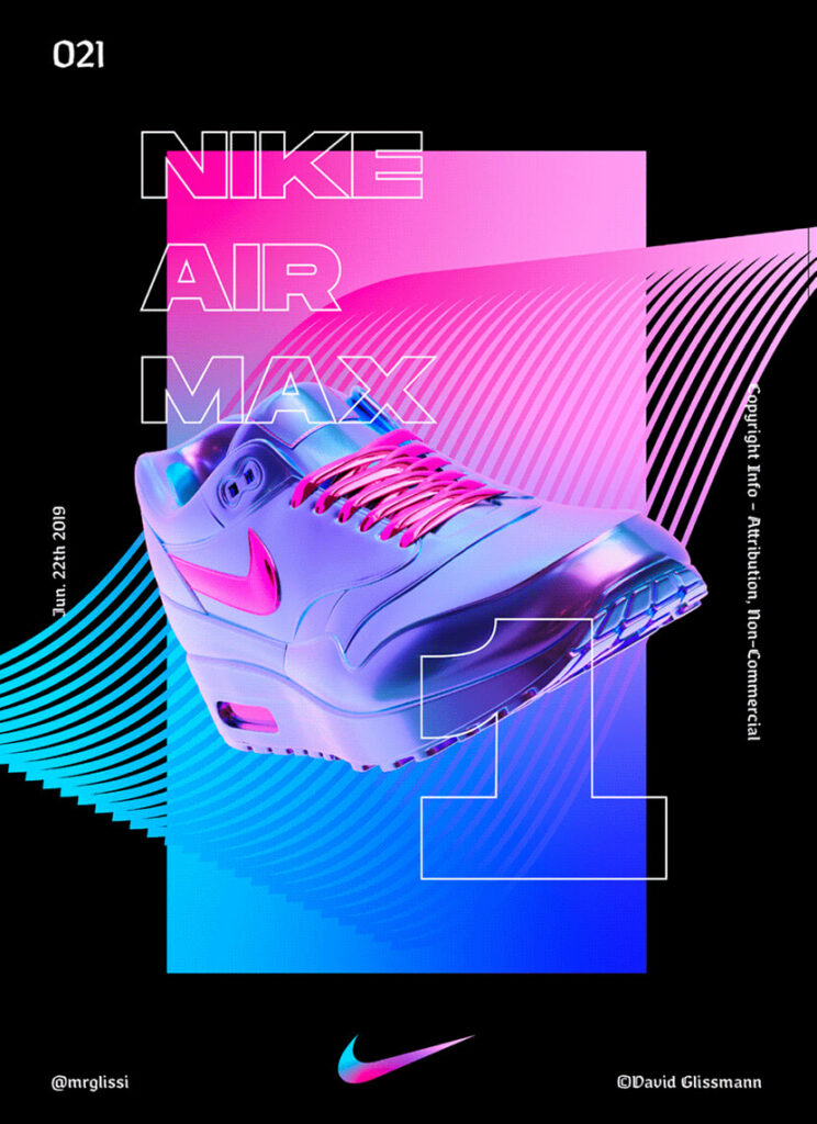
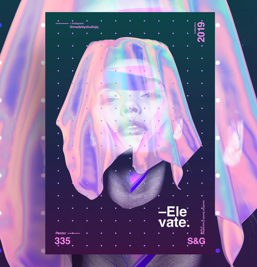
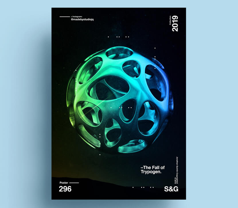
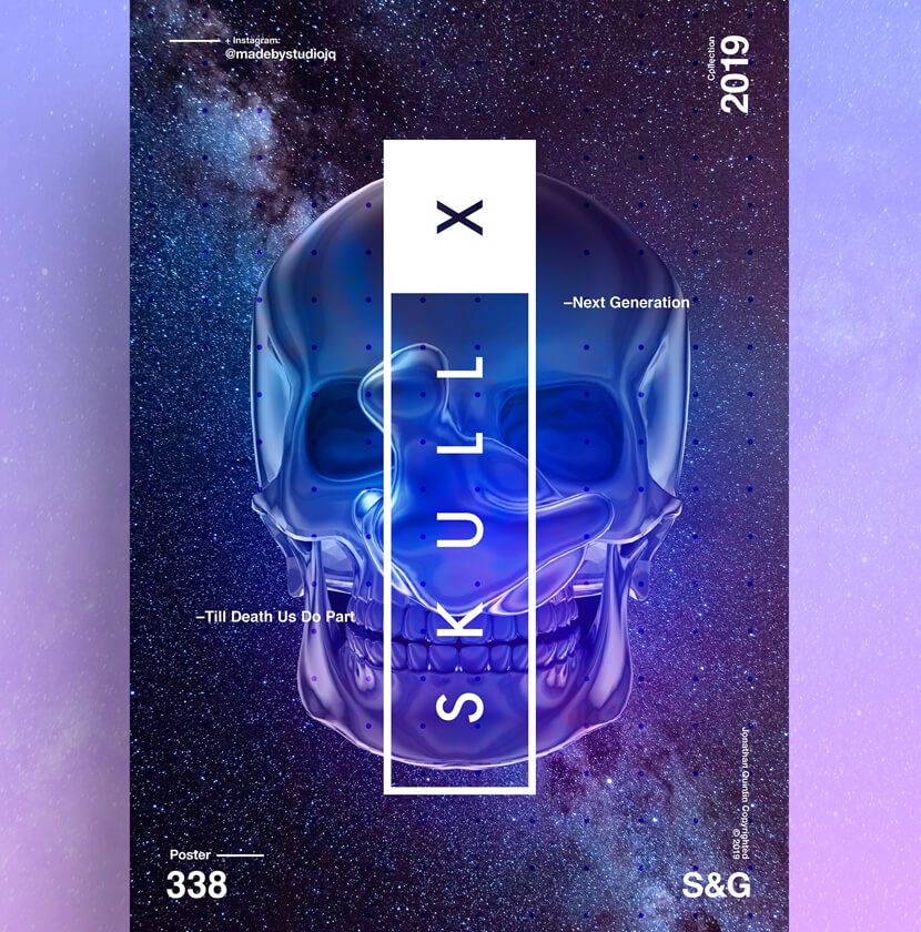
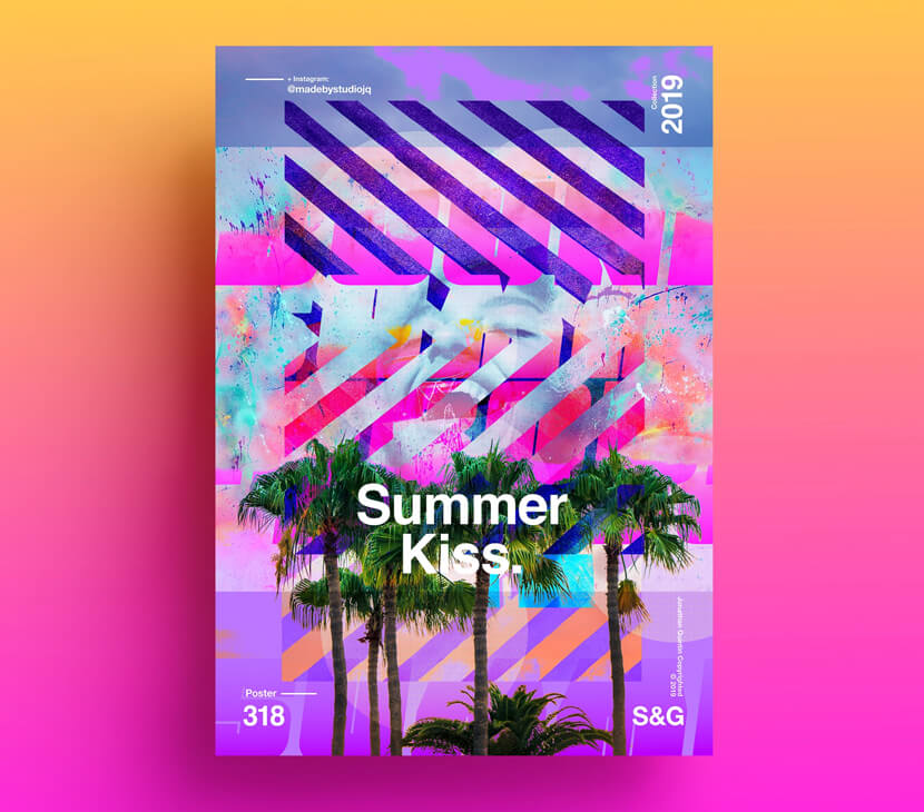
Posters that appear futuristic and extraterrestrial steal the show. These designs have futuristic-looking color combinations, neon hues, semi-transparent effects, liquid effects, iridescent effects, and 3D effects.
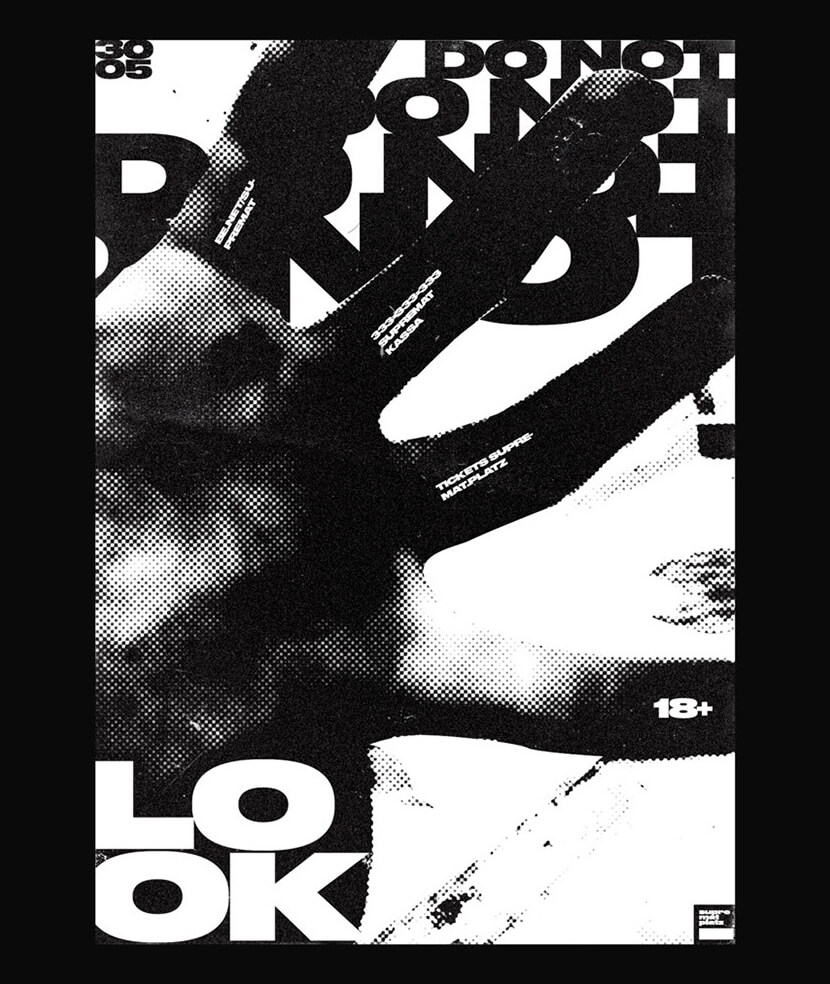
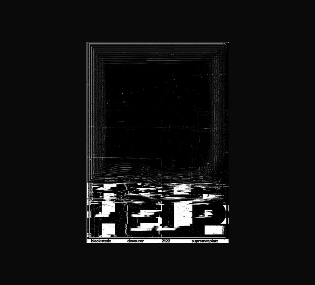
7. Use Only Black & White
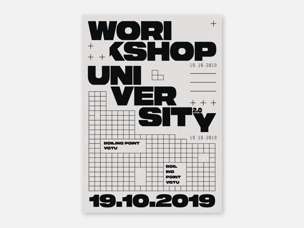
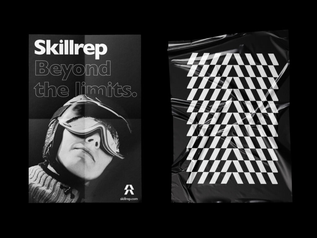
A poster may still make a big impression even with a limited color scheme since sometimes using too many colors might divert the audience’s attention from the content. Simple black and white posters are simple to read.
8. Experiment With Different Shapes
Using shapes is another approach to direct and lead a reader’s eye. They are used to contain text, to make an unusual composition, or to focus the viewer’s gaze in a specific direction. To bring attention to your message, you might utilize a background full of shapes and forms or build shapes with your text.
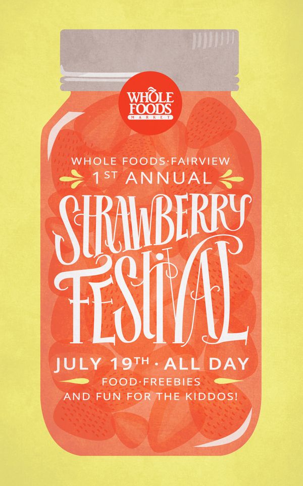
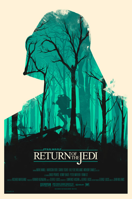
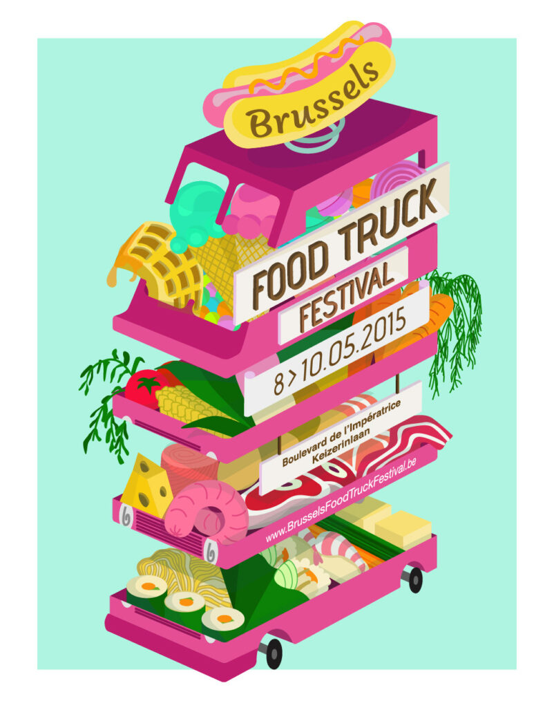
9. Use Creative Illustrations
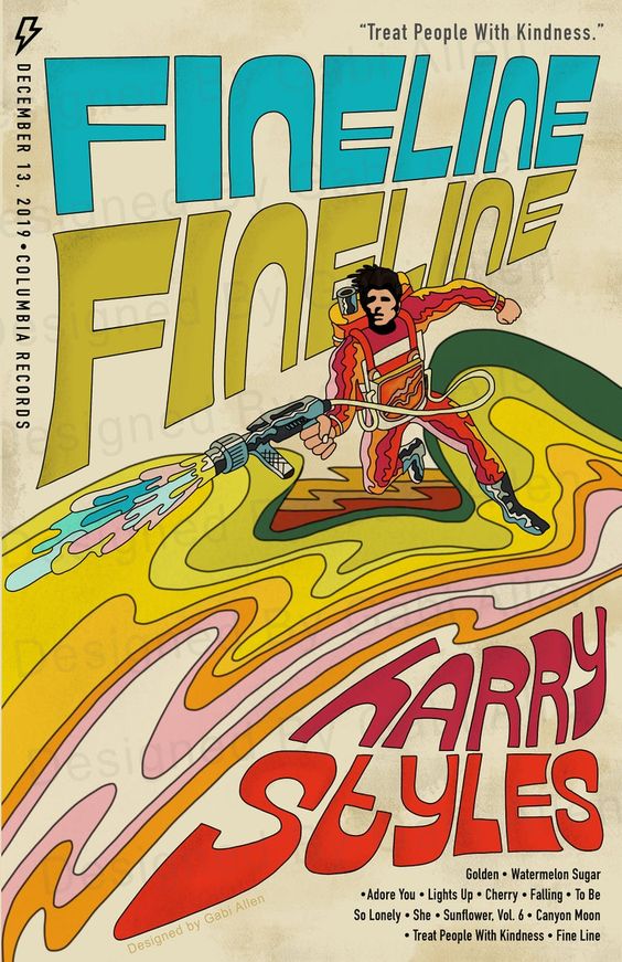
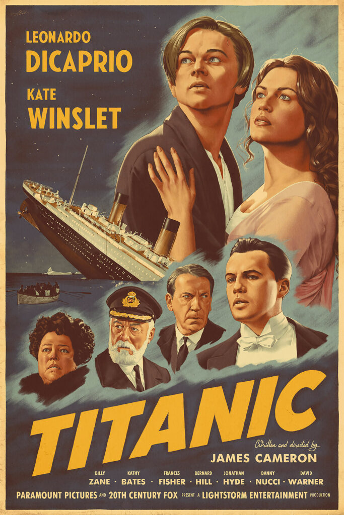
Instead of using photographs to produce a poster, use an illustration to create a poster that is uniquely intended for your purpose. Be creative!
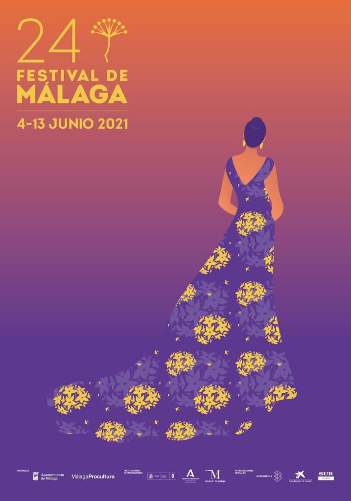
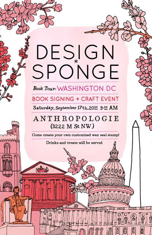
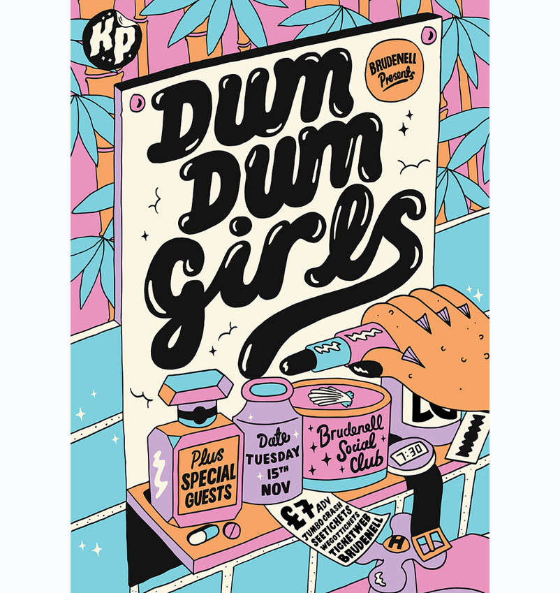
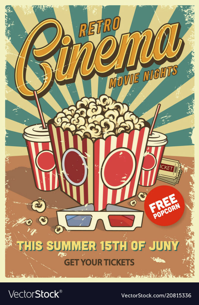
10. Go Vintage
Retro is undeniably trendy right now. Vintage clothing and film photography are closely intertwined, as is your new poster design concept.
Check out some of these poster design ideas to get inspired!
Now, It’s Your Turn !
That’s all. We hope you found this article as inspirational to read as it was to write. Now that you’ve seen many types of posters and some crucial principles to follow, it’s time to figure out which strategy is ideal for your company. Finding the right pictures, shapes, and fonts to convey your message can result in a wonderful design. You are now ready to design your poster!
The post Poster Design Ideas – Fundamentals of Creating Eye-catching Posters appeared first on noupe.


