Archive

Archive for September, 2022

Is your Website Accessible? It Should Be.

September 22nd, 2022 No comments

There’s a lot to think about when building a website, here we explore the importance of creating a site that’s accessible to all. 

No matter what type of website you run, whether it’s an e-commerce store or a one-page business showcase, you’re going to want to attract as many visitors as possible. 

The way to do this is to ensure your website is accessible. An accessible web design enables everyone to access your website and content, taking into account the needs of those with a disability.

According to the World Health Organisation, there are over 1 billion people in the world living with some sort of disability. That’s a lot of people you’re excluding from your website if it isn’t accessible. 

In this article, we’ll explore the importance of an accessible website, the design features that work together to ensure your website is accessible to all, and how you can test your website’s accessibility. 

What is an Accessible Website?

An accessible website is one that can be accessed and viewed by everyone, regardless of how they are surfing the web. 

Website accessibility refers to the need for websites to utilize various tools and technologies in order to ensure visiting, navigating, understanding, and contributing to content is the same experience for every user. 

The user journey of your website should be of the same standard no matter how a user is accessing your content. 

Accessibility is a crucial part of the user experience. Not only does it refer to ensuring your website is accessible for users with disabilities, but it also involves taking steps to make sure your website is compatible with different devices such as desktop computers, smartphones, and tablets.

Why Should Your Website Be Accessible?

When building your website, accessibility should be a key part of the process and not an afterthought. 

Firstly, an accessible website ensures as many people as possible can visit and enjoy your website. The last thing you want after you’ve designed and built a great website is to discover you’re blocking potentially hundreds of visitors. 

Plus, Search engines such as Google simply won’t rank a website that isn’t accessible and doesn’t offer a strong user experience. A great user experience and strong accessibility can both impact your search engine performance

What Makes a Website Accessible?

Luckily for website owners, there are official guidelines that you can refer to in order to ensure your website is accessible. 

The Web Content Accessibility Guidelines (WCAG) were created to set a universal standard that all websites worldwide should aim to meet in order to make their web content accessible. These accessibility considerations can be applied, not only to website design but to wider digital content like email marketing or social media. 

There are also four key principles of accessibility that form the foundations for any content created and published online. They are:

  • Perceivable – this refers to all aspects of the website being perceived by the human senses so that no aspect is hidden or inaccessible. For most users, this will be through sight but for those with a visual impairment, it may be sound or touch.
  • Operable – all interactive aspects of the website such as navigation and buttons should be able to be operated by all users.
  • Understandable – every user should be able to understand the content and its purpose.
  • Robust – web content should be able to function across a variety of technologies and devices.  

So how can you ensure you’re building a website that’s accessible? We’ve listed some of the key design features and principles you should consider below.

Use High Contrast Colours 

Some users may have difficulty viewing your content if you opt for low-contrast colors. Using high-contrast color combinations such as black and white or black and yellow ensures everyone can read your content. 

Enable Keyboard Navigation 

In order for a website to be considered accessible users should be able to navigate it without a mouse. Clicking on links and accessing new pages should all be able to be done via a keyboard if necessary. 

Add Captions to Videos 

If you feature any video content on your website, be sure to include captions or transcripts so that users who are hard of hearing or even those whose devices have no sound can enjoy your content. 

Include Alt Text on Images

Alt text is text that you can add in your image settings to describe the image to users who cannot see it. This way, all users are able to enjoy your website content.

Breakup Your Content with Headings

Using headings helps to break up your content to make it easier to digest for users. Clear headings also help screen readers to navigate through your webpage and interpret your content.

Ensure Your Website is Mobile Friendly

There are an array of different devices that people can use to access your website. Ensuring your website is optimized for mobile makes sure that your website will adapt no matter what the screen size.

How to Check if Your Website is Accessible 

It’s important to regularly check your website for various performance issues, including how accessible it is. 

There are various ways you can monitor the accessibility of your website in order to ensure it’s offering the best user experience possible for all visitors. 

Use an Online Accessibility Checker – online accessibility checkers such as WAVE are tools that can evaluate the accessibility of your web pages. To use accessibility software you simply enter the URL of the page you want to check and you’ll receive a report flagging any potential issues. 

Manually Check Your Website – a manual accessibility check will be more time-consuming than other alternatives. Use a checklist to ensure you’re conducting a thorough assessment of your website and view every page with accessibility as the priority. 

Hire an Accessibility Expert – if you’re dedicated to making accessibility a core principle of your online brand then hiring an accessibility expert is a good idea. An accessibility expert will audit your site and provide actionable feedback and recommendations. 

Website Accessibility at Every Step

An accessible website isn’t just to meet the needs of your end user either. Everyone from business partners and stakeholders to web developers and external consultants needs to be able to access your content. 

Accessibility should be the priority at every step of your website build. Whether your site is a simple landing page or a full software product, adhering to accessibility standards helps you ensure that all users can engage fully. So, if you’re working in-house or are outsourcing digital product development, providing clear guidelines to your developers and designers is essential.

The ease with which people can access your content will have a major impact on your brand positioning.

Think about it, if a user struggles to explore your website or engage with your content what does that say about your brand? You want to be positioned as a brand that cares, not as one that doesn’t think about others. 

Similarly, site audits should analyze accessibility whilst keeping up to date with the latest technologies and tools will ensure your website is staying ahead of the competition. 

Make Your Site Accessible To All

The fact is, you simply can’t afford to not prioritize building an accessible website. 

The good news though is that making a site accessible has never been easier and you have the potential to reach as many people as possible, even those who may have struggled to access websites in the past. 

In this article, we’ve explored everything you need to know about why an accessible website is so important and the steps you can implement to ensure your site is up to scratch. 

Incorporate website accessibility into every aspect of your web design and maintenance and you should have no problem welcoming an array of visitors to your site. 

The post Is your Website Accessible? It Should Be. appeared first on noupe.

Categories: Others Tags:

Deciding Your Web Design Priorities

September 22nd, 2022 No comments

A well-designed website is an incredibly important aspect of any business. Think of your website as your home base. It’s where most of your customers go to get information about your brand and what you offer. So if you don’t have a good website, it can deter customers and result in fewer conversions and sales. 

As the website is so critical, however, it can often become a point of frustration for many businesses. Getting your website just right can take time, and it can be overwhelming if you don’t know where to start or aren’t having any success. 

There are many aspects of web design, and knowing which areas to focus on throughout the process can be challenging, as there is no one right way to go about it. Is functionality more important? Aesthetics? User experience? Security?

These are all reasonable things to worry about when you are trying to design a new website. But the answer can vary depending on your brand and your company’s specific needs or goals. 

Below, we’ll explore the different elements of web design to help you understand what they are and which ones might be a priority over others, depending on your brand.  

The first step in deciding your web design priorities is to go through all the different elements and think about them in terms of your company’s specific needs and goals. The web design process can be different for every brand, so just because one company does it one way does not mean you should do the same. 

For some, the user experience might be the most important element of web design, for others, it might be cybersecurity. In the end, all of the below elements are important and should be included, but when you are just starting out, and perhaps don’t have the time or money to focus on them all, it’s helpful to identify each one to determine what is most important for your business’s specific needs. 

Brand Awareness

If you are a new business, brand awareness should be one of your top priorities. You need people to know about your brand in the first place before they will even go looking for your website. Once they do get to your website, your brand identity should be clear and easy to recognize. 

Focusing on establishing your brand identity through brand awareness will help you connect with people so they will remember you. In doing this, you will start to establish a new customer base, and those customers will become more loyal to your brand and recommend you to others. 

Think of brand identity as your first impression. If you leave a bad first impression, you aren’t going to attract any customers to your new business, but if you leave a good first impression, you will more quickly establish yourself as a brand to keep an eye on, which means you will grow your customer base and start making sales. 

So good branding is key when designing your website as a new business. This means having an appealing logo, a good brand story that tells customers who you are and what you value, and other memorable brand elements and aesthetics, such as appealing and recognizable color schemes and imagery. 

User Experience

If your company heavily relies on pleasing your customers, as most should, user experience should be one of your top priorities. Customer-focused businesses tend to have more success because they put the effort into prioritizing their customer’s wants and needs. The more you show your customers that you care about them and their experience, rather than seeing them as dollar signs, the more likely you are to have success growing your business. 

So, if you are a B2C business, user experience (UX) design is essential. B2B businesses should also have good UX design, but it is even more crucial when you are B2C and trying to appeal to large customer bases, as 50% of consumers believe that UX affects their opinion of a business. 

You can create a better user experience by following these steps: 

  1. Understand who your target customer is — You can do this by creating a customer persona — essentially a description summary of most of your customer’s demographics. This can include their age, identity, experiences, and even their location. 
  2. Identify the problem —  Listen to your customers. They may typically encounter a common problem among your site or other sites during their purchasing process. You can gain this data through surveys or other customer service queries.
  3. Solve the problem — Once you find out what common issues your target customers experience, brainstorm ideas on how your business or your site’s features can solve that problem. 

All of this indicates that UX design is often primarily about function. It’s about designing a website that is providing the best experience possible for your customers by solving their problems and giving them what they need.

So, if you are an e-commerce business, for example, how easy and satisfactory your website’s shopping and checkout process plays a significant role in the overall customer experience. In this case, your UX design should focus on making it easy for your customers to find the products they are looking for and checkout without running into any major issues. 

SEO

SEO, or search engine optimization, is technically important for all businesses. Optimizing your content will ensure you rank higher in Google search results, which means you will drive more traffic to your website and, thus, be more likely to increase conversions and sales.

If you are a unique business that is offering something that most others are not, then you can likely get away with putting SEO on the back burner. However, if you have a lot of competitors that offer similar products or services, SEO should be a priority. 

If a customer is looking for lawnmowers, for example, and they do a simple Google search for lawnmowers, there are likely a ton of websites that will pop up in the search results. So if you sell lawnmowers, you want to prioritize SEO to make sure your website ranks higher in search results; otherwise, competitors might constantly beat you to the punch. 

If you sell something more unique, however, like knitted hats for dogs, there are potentially not as many other businesses that sell the same thing. So if someone is searching for dog hats or knitted dog hats, your website might automatically show up higher in search results without SEO because there aren’t many other options out there. 

Cybersecurity

Ensuring the data on your website is secure is always a wise decision if you want to avoid cyber attacks — but some businesses should worry about this more than others. FinTech companies, for example, that deal with a lot of sensitive data should make cybersecurity a priority. 

B2B companies, as well, that deal with major clients that expect them to keep their information private and secure should also focus on quality website security. Essentially any company that keeps a lot of sensitive data on their website, or asks for client information through online forms, should be prioritizing the safety and security of their clients and their company. 

Wrapping Up

There are numerous other things that your business might want to consider when building a new website, but brand awareness and design, UX design, SEO, and cybersecurity are four of the primary elements of web design that tend to matter most. So it’s important to take a close look at these four things to determine which ones should be a priority. Once you get the most important elements out of the way, you can start to work on the rest of your web design as time and budget allows. 

The post Deciding Your Web Design Priorities appeared first on noupe.

Categories: Others Tags:

The Benefits of Building a SaaS Startup

September 22nd, 2022 No comments

The SaaS business model is growing at a tremendous speed in recent years. SaaS is a subscription-based service. It challenges the traditional model of on-premise software. If SaaS continues to grow at its present rate, then soon on-premise software might become a thing of the past. 

There are many reasons tech entrepreneurs are opting to build a SaaS startup like lower investment costs, flexibility, measurability of the performance, and scalability, among others. If you wish to begin a SaaS or Software as a Service business, then you need to know its advantages. 

Lower Investment Costs

The initial investment cost of starting a SaaS business model is much lower than that of other kinds of start-ups. Further, SaaS business also does not require much inventory except for a laptop and a stable internet connection. There is no need of lining your office with premium infrastructure. In fact, you do not need an office at all. You can start the business from your living room as well. 

The biggest advantage of SaaS is that you can build a team that works remotely. You need not invite them to the office on a daily basis. Here, you save on so many different types of costs, especially utilities. SaaS products do not require any kind of manufacturing or packaging as well. They need not be shipped but provided through the internet.

As compared to on-premise software, SaaS software can be offered at a greater speed to the clientele. There are many costs that are eliminated when you decide to build a SaaS startup. If you are equipped, you can develop the SaaS product on your own.

Recurring Stream of Revenue

In order to initiate any kind of business, entrepreneurs need to focus on costs and revenue for judging its profitability. The beauty of SaaS businesses is that they operate on the model of subscription. Businesses offer SaaS to clients in return for a monthly or annual fee. Entrepreneurs are ensured of a regular flow of income, thanks to this model.

When businesses are assured of steady income, they do not have to worry about regular expenses. A recurring stream of revenue also enables businesses to plan the future. Further, investors are also interested in the possibility of a regular income. The valuation of your business shoots up because of this. Start-ups can generate invoices and simplify the process of billing for clients. This even enhances the trust of the customers in the company. 

Recurring revenue always becomes the foundation of a stable business. The salaries and other expenses are taken care of. The team knows that the business is a stable one and there is a bright future working for the company. When the income is fixed, there is no stress over customer acquisition every day. The entire focus is on retaining the present ones. 

Scalability of the Model

The SaaS business model has a high potential for scalability. With SaaS, customers are able to extend the number of features they utilize and even cut down on them when not in use. SaaS models can be customized by the clients depending on their requirements. Start-ups offer flexibility in terms of usage. 

Traditional on-premise software did not offer such convenience. Small and medium enterprises were not able to afford traditional software. The SaaS business model is flexible and adaptable. End-users benefit from the cloud-based nature of this business. They can modify it frequently and deploy it at a quicker pace. 

When you initiate a SaaS start-up, your primary concern is finding the target market and customer acquisition. When you acquire a certain number of customers, you decide on expanding your product portfolio. It is easier to scale a SaaS business by changing the plan to attract bigger clients. You can attract big-ticket clients by giving them premium services. You can use tools like online quotation makers to make a grand impression.

SaaS start-ups can look for vertical growth or horizontal growth. You can either focus on bigger clients offering bigger businesses or offer solutions to a niche industry. If you find international markets more lucrative, you can even scale your business to the global market. As and when your product grows, you have the convenience of adding features and functions to existing products as well. 

Measurability of Performance

What differentiates SaaS from other businesses is that herein entrepreneurs can easily measure the performance and the impact. End-users of SaaS buy the product online. Your product is used online itself. Hence, the data of users and their usage is easily available to measure. 

The model of SaaS generates recurring income making it predictable. Other business models do not have this advantage. You can analyze the available data for the profitability of the business and take crucial decisions. Judging the stability of the business becomes easy with SaaS start-ups. 

It is necessary for SaaS businesses to track their customers. Gathering data regarding the features customers find useful and the reasons why they canceled the subscription can help companies understand the changes required to be made. They can take their in-product feedback and know the actual review of the customers. Understanding the pain points of customers and their friction points helps a company grow and expand. 

When start-ups keep a tap on customers, then customer acquisition, maintenance, and retention become easy and simple. This even helps in product expansion and growth. While companies gather data, they forget to analyze it. A proper analysis with the help of experts helps in more ways than one. 

In the end

It is the right time to initiate a SaaS start-up, irrespective of the country you belong to. Choosing to start a SaaS business model in the present age is a step in the right direction. While there is competition, it is not too high to cut down your profits. However, entrepreneurs first need to analyze the product offerings and services that are in demand in the industry. 

SaaS business model is one of the very low investment start-ups. Hence, there is not much to lose if things do not work out, somehow. A business like this that does not require a huge team and infrastructure helps an entrepreneur learn the ropes of the business. As there is no manufacturing, distribution does not take long. Customers can enjoy the product or service soon after it is launched. 

Start-ups all across the globe are increasingly adopting SaaS to scale their businesses. SaaS has made the lives of entrepreneurs easy and stress-free. As the demand for SaaS keeps on growing, this is the right time to plunge into the business to get a bigger share of this pie.

The post The Benefits of Building a SaaS Startup appeared first on noupe.

Categories: Others Tags:

Ways to Drive Sales Manager Productivity

September 21st, 2022 No comments

Introduction

Many sales representatives spend a lot of time selling, coordinating with marketing and finance teams and interacting with customers to receive feedback. It’s a taxing job and often leads to a downward spiral in sales teams’ productivity. Improving sales productivity is a challenge for many leaders. 

There may be a disconnect between time with customers and expectations. Improving productivity requires collaborating with sales representatives. There are various strategies you can use to boost it. This blog reveals six of these strategies. 

Sales productivity entails maximizing sales volumes while cutting down the associated resources. These resources include human capital and time. The rate of increasing company revenue is the best measure of productivity. For team leaders and management, and the sales team itself, the goal should be to improve efficiency.

Track your sales

Improving sales productivity requires an understanding of your current position. Dashboards are excellent for achieving this. They enable you to understand trends and gain insights into each employee’s activity-based metrics. 

The metrics will let you know how the sales representatives are spending most of their time. To measure activity-based metrics, you need to be consistent. Don’t allow your sales team to delay in entering their activities. This will make it difficult to define a benchmark to measure your outcome. 

The sales productivity levels are not just measured in monetary terms. Measuring the level can be done in different ways. One of the best methods to use to measure productivity is conversion rates. This refers to the number of contacts and attempts the sales representatives make. The idea is to find the percentage of customers who complete specific actions. 

The range of targets can vary depending on the sales type. Conversion rates will give you insights into the performance of each team member. The number of deals completed depends on the sales activities completed. For instance, if a sales representative closes five accounts out of 60 leads, this means they are inefficient. However, you need to know that sales are not universal. In some companies, even a single deal may be significant.

Another sales key performance indicator is the average hourly sales. Understanding your team’s efficiency is an important aspect of a business. To boost your team’s productivity, pay attention to the time employees spend completing activities. Exclude anything that is not related to deals. For instance, time spent attending company meetings is not necessary. 

Average hourly sales is an excellent metric to determine whether the sales team uses time effectively. If the number falls below average, the sales team is not efficient. You can also compare actual sales with forecasted sales. This metric measures whether an employee exceeds or fails to meet their target.

Establish a routine

Sales representatives who go for fieldwork normally have schedules. They are busier than the employees who spend more time in the office. Getting things done should be your ultimate aim. The method of achieving results may not always matter. For field sales persons, there are opportunities for creativity and flexibility.  

Achieving more results requires the sales team to create a daily schedule. After laying down what they need to do, they should prioritize the items. Encourage them to say no to anything that does not help them to meet their goals. 

Better sales outcomes require a good structure. The meetings must start and end at the scheduled time. Sometimes frequent business trips may interfere with meetings. This puts the employees in difficult positions in trying to reschedule the meetings. They should focus on prioritizing. This requires you to encourage the sales representatives to place long-term and significant clients on top of their list. 

Set daily goals

The key to improved results is setting goals. Goals help to motivate the sales team. They give them a sense of direction and encouragement to meet their targets. The goals should be SMART, that is:

  • Specific
  • Measurable
  • Attainable
  • Realistic
  • Time-bound

Use past data to make realistic and attainable goals. Analyzing the team’s past and present performance will also help you to succeed. Understand how your team is performing. You can divide the total annual leads by the total sales over the same period. 

The other step to setting smart goals is to determine the sales minimums. This requires determining where you want to be in the next few years. Failing to define business goals may make it hard to set sales goals. The idea is not to do the minimum but to help the business grow. The goals should be above the minimum. Encourage the individuals to follow up after a sales call. This will help the team to meet the sales goals. 

The trick here is to be realistic and ambitious. Don’t go too high in your estimate. Additionally, avoid shortchanging your organization and set targets that don’t challenge the sales team. In the end, this could demoralize them. A good sales goal will do the following:

  1. It accounts for past revenues and future projections.
  2. It is based on the entity’s expected product roadmap.
  3. The sales quota accounts for the market size.
  4. It includes growth in other departments within the organization.

Automate administrative tasks

Sales productivity entails maximizing sales volumes while cutting down the associated resources. These resources include human capital and time. The rate of increasing company revenue is the best measure of productivity. As a manager, your goal should be to improve efficiency. Automating administrative tasks could help to improve efficiency.

Administrative tasks take up a lot of sales representatives’ time. It is practical to automate tasks by investing in a digital engagement platform. This will reduce low-value work that lowers efficiency. It will also save a lot of time and employee effort.

Entering activities and contacts into CRM consumes over five hours a week. Think of how much time it is in a year. Selling and closing business deals should not be a time waster. Some key tasks that can be automated include:

  1. The day-to-day sales plan
  2. Data entry
  3. Emails and texts
  4. Logging visits
  5. Data management specific to sales targets

One of the ways through which automation can boost productivity is by optimizing sales processes. Some tasks are difficult to automate. In this case, sales software may be an alternative to take care of technical aspects. 

The sales software works fast and properly with a computer of the right speed. Learn more tips on how to free up memory and optimize your work device to enjoy the benefits of process automation. Always check your computer storage regularly to ensure that it functions smoothly. Remove viruses and uninstall unnecessary apps using special software.

Automation can enable sales representatives to make better decisions when interacting with customers. A good example is when they use lead scoring. Instead of analyzing and responding to many dozens of emails, special tools could simplify the task. This may help them automatically detect buying intent. 

Use sales tools

There is a need to embrace sales tools to achieve more results. The most effective tools will help to automate unproductive administrative tasks. It becomes easier to boost sales after automating repetitive tasks. 

CTM tools can help to increase the team’s effectiveness. CRM platforms significantly reduce the time employees take on redundant tasks. The idea is to let the employees create time for revenue-generating tasks.

A great way to use these tools to boost sales is through triggered events. These are particularly useful in dealing with follow-up emails. The trigger will let the sales representatives respond faster and do minimal work. Following a defined workflow can help you to boost your organization’s overall performance. 

Establish effective communication channels

Communication is one of the most important ingredients for success. Managing the field sales team is more difficult than managing the inside sales team. Many interactions have to take place over text messages or the phone. To boost sales, you need to consult each salesperson to know how they perform. 

Interact more with new hires. Understand that check-ins do not have to be always scheduled. Besides check-ins, you can conduct one-on-one meetings. The frequency of meetings may vary with the team. The face-to-face interactions could promote more in-depth engagements. 

Find opportunities to tailor your training to individual sales representatives

For a newly launched business, you need to create more time engaging with the sales team. This is because the team is yet to understand the communication channels in the business. One-one one interactions also help you to get timely feedback from the team. This will help to find room for improvement. If an individual is struggling in a particular area, others could be struggling too. Always ask the team what you can do to boost their productivity. 

Conclusion

Driving sales manager productivity is the best way to grow a business. As a sales manager, you should collaborate with your sales representatives. Understand the reasons for business existence and set goals based on that. Your role is to create an environment to help the team meet their targets. Evaluate your results regularly and design strategies for improvement. 

The post Ways to Drive Sales Manager Productivity appeared first on noupe.

Categories: Others Tags:

 10 Remote Work Tools To Manage Work & Collaborate Better In 2022

September 21st, 2022 No comments

Introduction

Do you think remote team members can manage work and collaborate using old-fashioned, painfully slow methods such as texting and email threads? 

You’re already on the wrong foot if you expect your remote teams to be at their productive best without providing them with the best remote work tools. 

You see, there’s a strong reason why the collaboration software market is expected to generate over $17B by 2025. With 30% of employees now working remotely at exclusive remote companies, we expect this number to grow in the coming years. 

While remote work has its benefits in flexibility and convenience, it also presents some formidable challenges, like poor collaboration, unorganized work, lack of transparency, etc. 

Let’s look at why using the best remote work tools is essential to ensure efficient performance from your widely distributed workforce. 

Remote Work Tools – Why Are They Important? 

Using the right tools helps you to tackle some common and formidable challenges associated with remote work. 

Let’s check out some crucial benefits. 

  • Using online work collaboration tools improves transparency as all team members are on the same page regarding task and project status, job roles and responsibilities, latest updates, etc.  
  • Remote collaboration tools facilitate seamless collaboration among widely distributed team members through advanced features like chat, online proofing, file sharing, etc. 
  • Remote workers can use online work management tools to organize and prioritize all their work in one place. They can attempt their tasks based on priority to ensure deadlines are met. 
  • Remote work tools are easily accessible across multiple devices (PC, laptops, mobile, tabs). Users can log into their accounts anytime and access the latest project updates while managing their work on the go. 
  • Top collaboration tools offer a range of work management and communication features on a single platform, which enables users to manage various aspects of work without switching various apps. 
  • Remote work can make some people feel isolated and left out. Remote work tools keep all team members connected so they can easily exchange casual and professional conversations and feel like an integral part of the group. 
  • Poor scheduling results in the wastage of up to 36 percent of employees’ work time. Remote collaboration software helps employees schedule their events, tasks, and milestones in one place to know all meetings and deadlines. Remote workers can schedule daily meetings, planning meetings, conferences, brainstorming sessions, and much more in just one click.

ProofHub (Project management & team collaboration)

Easy to use, simple to learn, and equipped with a suite of powerful features under one virtual roof, ProofHub is a SaaS-based project management and team collaboration tool that allows widely distributed employees to seamlessly collaborate on tasks and communicate with others from any location, on any device. 

What makes ProofHub a top-rated remote work collaboration tool is that teams of any size can easily use it to plan, organize, and execute projects while keeping every team member, client, and stakeholder in the loop. The tool is scalable and ideal for growing teams. 

From time tracking to task management, reporting to online proofing, file management to scheduling calendars, and more, ProofHub offers literally everything remote workers need to be more collaborative, efficient, and productive. 

Some advanced collaborative features of ProofHub are: 

  • Online proofing
  • Instant chat
  • File management
  • Real-time updates
  • Kanban boards
  • Gantt chart
  • Scheduling calendar
  • Reporting
  • Time tracking 

            Pricing: ProofHub offers flat-rate pricing with an unlimited number of users. The Ultimate Control plan, loaded with all CORE + Premium features is priced at $89 per month when billed annually. 

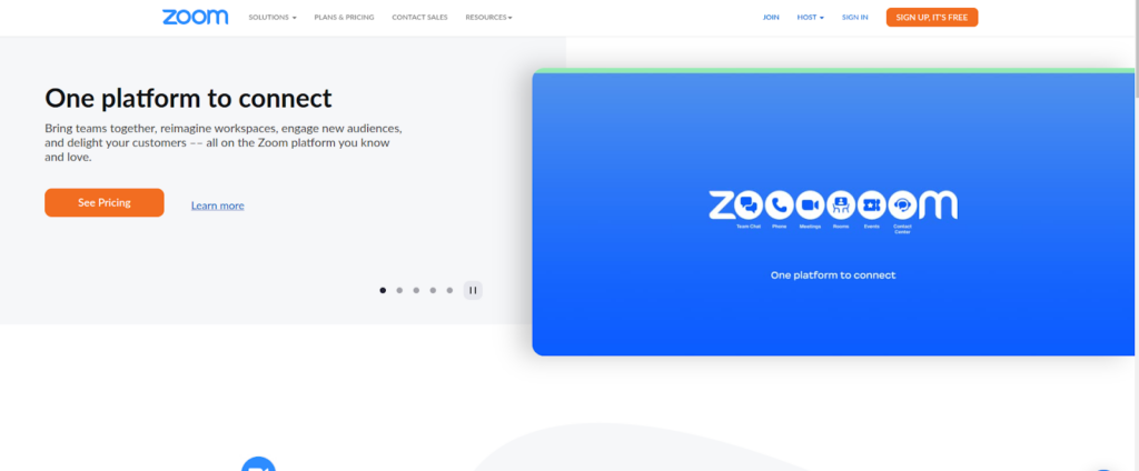
Zoom (audio and video conferencing)

Source

For millions of professionals (both in-office & remote workers) across the globe, Zoom has become an automatic choice for scheduling high-quality one-on-one or group video meetings, webinars, and conferences. This cloud-based remote work tool is incredibly easy to use and you can attend any video meeting by simply clicking on the link provided by the host. 

Zoom’s free plan allows up to 100 concurrent participants, with a 40-minute time restriction. Users can upgrade to a paid plan to get access to more features. For remote teams, Zoom serves as a one communication solution for chats and channels, phone, whiteboard, meetings, and more. Its whiteboard provides a collaboration space where individuals, hybrid teams, and remote teams can come together, brainstorm, and learn. 

Some advanced collaborative features of Zoom are: 

  • HD video and audio collaboration
  • Whiteboard
  • Chat
  • Rooms and Workspaces
  • Full-featured webinars
  • Phone system
  • Marketplace 

Pricing: The paid plan starts at $149.90 per user when billed annually. 

Discover the best practices for running great virtual business meetings

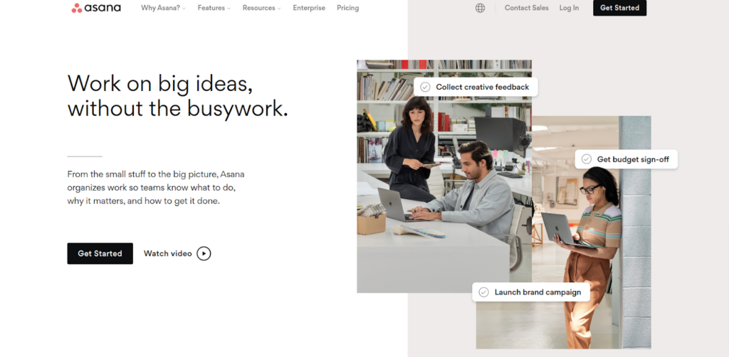
Asana (project management)

Source

Asana is a popular remote work software solution to keep your dispersed teams connected for improved collaboration on projects. Asana enables remote teams to move work forward without switching tools as the tool integrates with commonly used apps like Slack, Outlook, Google Drive, Zoom, Gmail and more. 

Asana offers a list of useful features that allow you to bring your remote team’s work to one shared workspace. You can choose the project view (Board, Timeline, and List view) and collaborate no matter where you are working from. You can automate routine work to make sure your team has clarity and context from the onset. Keep your team aligned by sharing goals, key resources, and more to set the stage for work.

Some advanced collaborative features of Asana are: 

  • Workflow builder
  • Automation
  • App integrations
  • Timeline 
  • Shared calendar
  • Work request forms
  • Workload
  • Messaging 

Pricing: The paid plan starts from $13.99 per user, per month when billed annually. 

Trello (work organization application)

Source

Trello is one of the most efficient collaboration tools available today for remote teams. It provides you with useful work-related information, like what’s being worked on, who’s working on what, and where something is in a process. Trello offers a list of impressive features to remote teams to quickly set up and customize workflows for just about anything. 

Trello cards are your portal to better organize your work. You can manage, track, and share every single part of your task with teammates. Its built-in automation, Butler, reduces the number of tedious tasks on your project board by harnessing the power of automation across your entire team. 

Some advanced collaborative features of Trello are: 

  • Easy-to-use templates
  • Butler
  • Cards
  • Boards
  • Integrations
  • Project views (Timeline, Dashboard, Table, Map, Workspace, Calendar)

           Pricing: The paid plan starts from $5 per user per month when billed annually

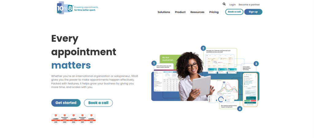
10to8 (appointment scheduling) 

Source

10 to 8 is more than just a simple appointment scheduling tool for business owners and managers overseeing remote teams. This remote work tool allows you to schedule and run virtual appointments smoothly and native Zoom Video Conferencing and Microsoft Teams integrations enable you to host video appointments of all kinds, be it internal team meetings, video conferencing with clients, or remote one-on-one or group appointments.

10 to 8 allows you to coordinate better with your remote teams regardless of wherever they are and increase productivity by scheduling team meetings efficiently. This remote work tool has a user-friendly interface which means your learning curve is very short, and automates your daily activities and provides a professional look to your business.

Some advanced collaborative features of 10 to 8 are: 

  • Accessibility suite
  • Reminders
  • Online booking
  • Staff coordination
  • Calendar sync
  • Reporting
  • Calendar 

Pricing: The paid plan starts from $9.6 per month for 2 staff logins. 

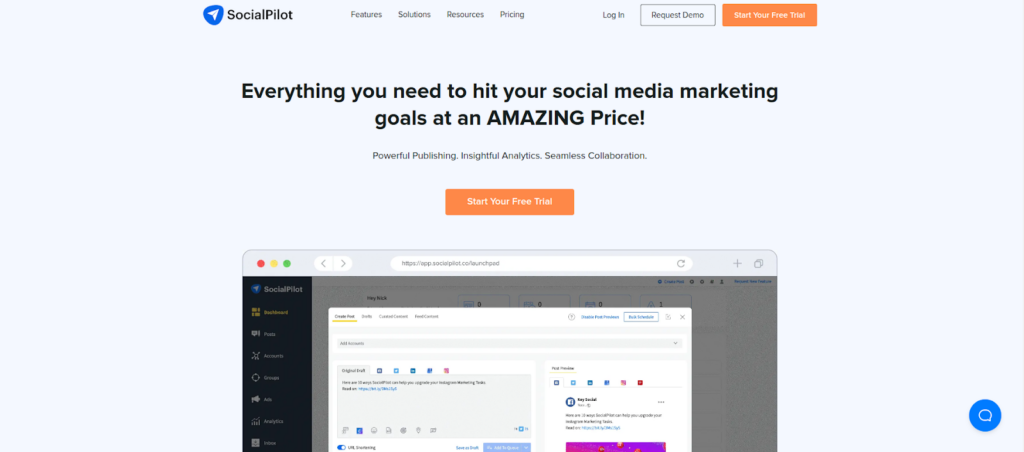
SocialPilot (social media marketing)

Source

SocialPilot is an easy-to-use social media marketing tool that remote teams can use to automate their social media management. You can schedule and publish your social media posts across multiple platforms to engage with your target audience when they are active. 

With SocialPilot, you can customize your posts with images, videos, gifs, tags, etc, for each social media platform. The tool gives you a clear picture of your account’s performance and users get insights into their audience with informative charts and graphs of critical metrics. 

Some advanced collaborative features of SocialPilot are: 

  • Client management
  • Team management
  • Bulk scheduling
  • Content creation
  • Social media scheduling
  • Social media calendar

       Pricing: The Paid plan starts from $25.50 per month per user when billed annually  

Narrato.io (content creation & workflow software)

Narrato is a simple and effective content creation, planning, and collaboration tool that is exclusively designed for both in-office and remote content teams at SMBs, content agencies, web design agencies as well as those of individual content creators. Narrato puts your entire content workflow in one place and helps users to replace clunky docs, sheets, emails, folders, and optimization tools. 

What makes Narrato a highly useful tool for content creators is that it offers an AI content assistant to help content creators create high-performance content faster. Narrato offers a host of features like content ideation tools, content optimization tools, SEO planning tools, workflow automation, AI writing tools, team collaboration tools, and more. 

Some advanced collaborative features of Narrato.io are: 

  • AI content assistant
  • Free image search and graphics tool
  • Content calendars and boards
  • Custom workflows
  • Team management
  • Content workflow and management
  • Content planning

            Pricing: The Paid plan starts from $8 per user, per month when billed annually

WebWork-Tracker (time tracking & employee monitoring software)

Source

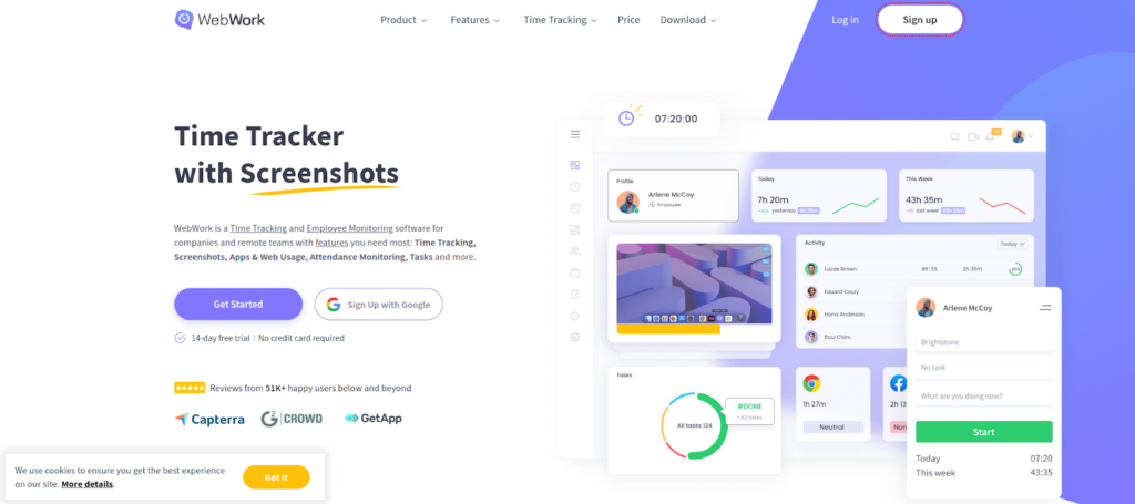
WebWork-Tracker is a popular time tracking and employee monitoring software that offers useful features for remote teams to help them stay productive consistently. Available as a cloud-based and on-premise solution, WebWork tracks time spent by users on different activities on their devices. 

Remote workers can record the time they spent on different tasks and analyze productivity. Managers and business owners can use WebWork to track employee productivity by analyzing mouse activity and keystrokes. Users can generate activity, project, and contract reports on a daily, weekly, or monthly basis. 

Some advanced collaborative features of WebWork are: 

  • Time tracking
  • Apps and website monitoring
  • Activity level
  • Task management
  • Screenshots
  • Activity description
  • Track offline activities 

            Pricing: The Paid plan starts at $2.99 per user, per month  

Recruiterflow (recruitment software)

Source

Recruiterflow is a popular applicant tracking and CRM software for ambitious recruitment agencies. The tool offers you a wide range of recruitment tools, so your remote team knows exactly how and when to automate tasks quickly. 

Whether you are working remotely or from an office space, Recruiterflow helps recruiting and staffing agencies to source candidates, engage them, and collaborate with your team. You can post jobs for free on job boards, invite applications, and process them. Recruiterflow integrates with G Suite and Office 365. 

Some advanced collaborative features of Recruiterflow are: 

  • Applicant tracking system
  • Client relationship management
  • Collaboration tools
  • Email sequences
  • Resume database
  • Candidate management
  • Applications management 

             Pricing: The Paid plan starts from $99 per user, per month

Empuls.io (employee engagement software)

Source

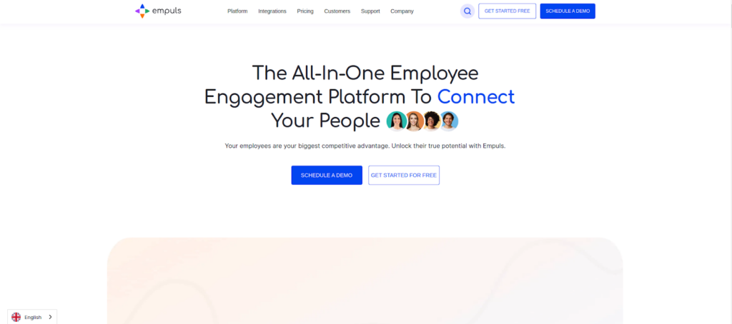
Empuls is an all-in-one employee engagement platform that actively helps businesses engage their workforce by building a culture of appreciation and continuous improvement. Empuls encourages employee empowerment and engagement via feeds, groups, and chats, which help employees stay connected through consistent and transparent communication. 

Empuls has everything covered with its rich features to get your employees engaged. From engagement scores to contests, water cooler conversations, one-on-one feedback, peer & social recognition, and a wide variety of rewards, it helps anyone get started without much training. Empuls can be easily integrated with various HRIS & HRMS software like Slack, MS Teams, G-Suite, BambooHR, Zoho People, SAP Successfactors, etc.

Some advanced collaborative features of Empuls are: 

  • Employee Recognition
  • Employee Rewards
  • Employee Surveys
  • Employee Social Intranet
  • People Analytics
  • Remote rewards

           Pricing: $2.5 per user per month. It comes with a 30-day DIY Free Trial. The friendly UX makes it easy for any organization to get started within 60 minutes.

Conclusion

Remote work tools help your distributed team members be on a common platform and collaborate effectively on work from anywhere. Whether it’s tracking time, organizing and prioritizing tasks, tracking projects, or managing files, you can manage various aspects of your from a single tool rather than switching various applications. 

The choice of your ideal remote work tool depends on what your requirements are. Do you want a feature-specific tool or software offering a comprehensive suite of features for more functionality? 

Assess your requirements and choose a remote work tool that fits your needs as well as your budget!

The post  10 Remote Work Tools To Manage Work & Collaborate Better In 2022 appeared first on noupe.

Categories: Others Tags:

5 Ways That UX Developers Influence SEO 

September 21st, 2022 No comments

User Experience is a crucial consideration for any web developer or designer; the only way to ensure that you’re delivering a successful website is to ensure that the end-user or customer will feel comfortable using it. 

A strong user experience increases your client’s chances of successful audience engagement and conversions.

What you might not realize, however, is that the strategies you use to enhance UX as a web developer or designer can also influence how the search engines respond to a website. 

Though many designers assume that SEO (Search Engine Optimization) is the work of a copywriter or content producer, there are design elements to consider too. 

After all, the definition of optimization is “the action of making the best version of a resource.”

So, how are UX and SEO connected?

Adding UX to a Successful SEO Strategy

SEO used to be easy. To stand out on the search results, you just needed to stuff a page full of as many keywords and phrases as possible. Now, it’s a little more complicated. 

Leaders in search engine development, like Google and Bing, know that they need to offer their customers excellent experiences to keep them. In this new experience-focused landscape, SEO and UX share common goals. 

Search engines don’t just want to provide customers with any answers to their questions. Instead, Google and its competitors are using everything from artificial intelligence to machine learning algorithms to ensure that search results are accurate, relevant, and engaging. 

In the same way, user experience is about providing users with easy access to the information and resources they want. 

Now that SEO is a multi-disciplined approach, UX is just one of the essential tools that makes it possible for developers to optimize their websites properly. 

Where UX Developers Influence SEO 

There are plenty of connections between UX and site indexability

We all know that since 2018, site speed has become a crucial ranking factor for companies in search of better search results. As a developer, it’s up to you to ensure that there aren’t too many elements weighing a website down that would prevent it from delivering fast results. 

Bounce rate is another critical factor in search engine ranking algorithms. When customers click on a website, Google wants to see that they get the answers they want. If your navigation is difficult to understand, or the correct information isn’t easy to see on a page, end-users will just hit the back button. 

Let’s take a closer look at how developers can influence SEO with their UX strategies. 

1. Site Navigation and Ease of Use

It’s no secret that today’s digital consumers crave easy-to-use sites.

A complex website with pages ranking for different terms might seem like an excellent idea for SEO. However, from a UX perspective, the easier it is to navigate your website, the more your end-users will benefit. 

According to a study from Ahrefs, well-optimized pages that rank for several keywords can be more beneficial than dozens of pages ranking for similar terms. At the same time, if the search engines have difficulty crawling all your pages due to a poor site navigation strategy, then some pages won’t get indexed. 

So, how do you improve navigation and SEO at once? Follow the proper structure for your site first, categories and subcategories on the retail page help customers find exactly what they need. A solid internal linking structure allows the crawlers to examine your website and index each essential page individually.

Keep navigation simple when designing a website for both UX and SEO potential. 

2. User-Friendly Page Layouts

There are countless cases where poor layout design and formatting disrupts SEO potential. For example, cluttering a page with too much information makes it tougher to read and index. At the same time, if your pages aren’t attractive and easy to navigate, customers are more likely to hit the back button. 

If customers come to a website and immediately leave it again, this tells the search engines that they’re not finding what they need on those pages. That means Google will bump you to a lower position on the SERPs. 

So, how do you make your layouts more UX and SEO-friendly?

  • Get your category pages right: Say you’re creating a blog page for your client. They want to list all of their blogs on one main page while linking to separate locations for each article. A design that puts a large chunk of content from each blog on the main page can be problematic for UX and SEO. It means your customers have to scroll further to find what they need. At the same time, the search engines never know which words to rank that main page for. On the other hand, listing blogs on smaller cards, as Fabrik does in this example, makes sorting through content easier. 
  • Leverage headers and tags: Your customers and the search engines habitually “scan” your pages. When trying to improve UX and SEO simultaneously, you must ensure that it’s easy to find crucial information quickly. Header 1 or H1 tags can help by showing your audience your website’s critical sections. Title tags also give search engines more information on the term you want to rank for. Organizing your content into a structure that draws the eye down the page also means your customers are more likely to stay on your website for longer. That shows the search engines that you have quality, relevant content. 
  • Make the most of images and videos: Visual media isn’t just an excellent way to engage your audience. With videos and pictures, you can convey more vital information in a quick and convenient format. This leads to greater satisfaction from your audience from a UX perspective. However, visual content is also great for SEO. You can optimize every image with alt text and meta descriptions. That means you have a higher chance of ranking both in the main search results and the image searches on Google. 

3. Using Search Data to Inform Site Architecture

Today, SEO is less about building hundreds of landing pages for individual queries. Now, it’s more important to take a simple, de-cluttered approach with your website. SEO can determine what kind of architecture you need to create for a successful website. 

For instance, say you wanted to rank for eCommerce SEO. There are tons of related words that connect to that primary search term. Rather than making dozens of different pages that try to rank for distinct phrases, you can cover a lot of other ideas at once with a larger, more detailed piece of content. 

If a topic is too big to cover everything on a single page, then you might decide to create something called “pillar” content out of your main terms. This involves using one main page where you discuss all of the topics you will cover. Then, you design several smaller sub-pages that link back to that central pillar. 

Once again, this helps the search engines to navigate your website and index your pages while assisting the customers in finding the correct information. At the same time, you combine more pages on a website and remove anything that might be detracting from your site’s authority or not offering enough value. 

4. Improving Website SERP Listings

It’s easy to forget as a developer that a customer’s first experience with a website won’t always happen on that site’s homepage. Usually, when your customers are looking for solutions to a problem, they’ll find your website on the search engine results instead. 

This means that you need to ensure that you make the right impression here:

There are a few ways that developers can ensure the search engine listings they create for their clients are up to scratch. For instance, a reasonable title tag for each page that includes appropriate keywords is excellent for SEO and UX. A title tag lets your customers know they’re in the right place and helps them find the information they need. 

Remember, around eight out of ten users on search engines say that they’ll click a title if it’s compelling. 

Another component you have control over as a developer or designer is the “rich snippet.” Rich snippets are the informative chunks of content that Google adds to a search listing to help it stand out. You can use rich snippet plugins on a website to tell Google what kind of extra information you want to include on a page. 

For instance, you might want a company’s ratings to show up on your search results, so customers can see how trustworthy they are:

5. Local Business Rankings

When you’re creating a website for a company, it’s easy to forget about local rankings. We see the digital world as a way of reaching countless people worldwide. Local orders are easier to overlook when you have a global scope to work with. 

However, as a developer, you can boost a company’s chances of attracting the right local audience and boosting its credibility. For instance, you can start by ensuring that the correct directory information appears on your client’s website and social media profiles.

Another option is to create dedicated location pages for each area the company serves. This will make it easier for clients to find the contact details they need for their specific location. 

At the same time, pages that have been carefully optimized to rank for specific locations will earn more attention, specifically from search engines. The more of the search engine landscape your client can cover, the more chances they have to attract new customers and leads. 

Combing SEO and UX

In a world where experience is crucial for every business, it’s no wonder that UX and SEO are blending more closely together. There are a lot of areas where SEO and UX work in harmony together if you know where to find them. Improving your client’s SEO ranking with UX doesn’t just mean ensuring that their pages load quickly anymore. 

Simple strategies, like making sure a call-to-action button is clickable on a mobile page, can simultaneously boost a website’s UX potential and SEO performance. At the same time, adding images and alt text to a website provides search engines with more information while adding context to your content. 

The key to success is understanding how SEO and UX work together. If you look at SEO and UX as part of the same comprehensive strategy to give end-users a better online experience, achieving the right design goals is much easier. 

Of course, just like any strategy, it’s also worth making sure that you take the time to track the results of your UX and SEO campaigns. Examine which systems help you, and examine customers from an SEO perspective with design and development strategies.


Features image by gstudioimagen on Freepik

Source

The post 5 Ways That UX Developers Influence SEO  first appeared on Webdesigner Depot.

Categories: Designing, Others Tags:

The Ultimate Guide to Raise Capital For a Startup

September 21st, 2022 No comments

Introduction

The finance of your business concept is one of the most significant aspects of starting your own company. Every founder’s work includes some kind of fundraising, whether one-time or recurring. While many entrepreneurs feel that they must save and spend their resources to make their goal a reality, or what is known as bootstrapping their companies, there are numerous methods to generate money for your firm, even if it may sometimes be a long and arduous process.

You must establish the framework by researching, utilizing your network, and estimating how much money you will need before embarking on your fundraising trip.

What is Startup Funding?

Some firms remain small, serving their customers and fulfilling their aspirations. Other businesses develop steadily. Firms with potential for rapid growth and new management might also be categorized as “startups.”

Depending on the extent of the investment and the projected value of your firm, investors assume equity ownership in which they partake in the risk-reward equation of your startup.

Investors aren’t only bringing their cash to the table; they’re also bringing their expertise.

Your ideal investor will be able to invest and help you expand your business by bringing experience in your industry, relationships with other investors and consumers, and even staff you’ll need to fill in the gaps.

What are the Basics of Raising Capital?

The gap between where your company is now and where you want it to be might be narrowed if you have a clear route. Listed below are a few strategies and methods to help you raise startup capital:

Prepare yourself for the capital raising process

The first and most important thing you must do when trying to get financing for your company is admit that you need it. Many parts of your business must be addressed at this level.

It’s not enough to just be informed; you’ll need to extensively study the industry, your startup’s rivals, the market status, your team’s performance, and any crucial players. It’s critical to have a firm grasp of your financial situation, including predictions, balance sheets, and cash flow statements, as well as the choice of whether to raise money through debt or stock.

Business planning

Before starting a new firm, every entrepreneur needs to research the industry, the market, and the competitors. Because it takes so much time, no shortcuts must be taken at this stage of company planning. Your future decisions will be based on the knowledge you gain from this course.

Product description

In the Product Description, your company’s offerings are laid forth. Your Marketing Plan will be based on the information in this area. Always give a full explanation of your product or service, and don’t rely on the fact that it will sell itself. If you want people to understand what your product does, you should write it in a way that is clear to them (features). A comparison of your product to similar ones on the market should also be included. If you have any problems with your product, this is the time to point them up so that you may improve on them in future releases.

Use your network and seek potential investors

A little compassion can go a long way, and I’m sure you’ve heard it before. You’ll build a good reputation if you do good deeds for others. Those who assist others grow are more inclined to help themselves in times of crisis. There is no need to constantly promote your firm as long as you focus on your networking abilities.

Fundraising Sources in Smaller Markets

For early-stage enterprises, the most often cited sources of finance include:

Self-funding

If you’re able to accomplish it, doing it alone is ideal. Diluting a company does not remove any of the company’s value. You retain full authority over the business. You don’t put off product development or market entry. One of the critical disadvantages of self-funding is the absence of additional investors.

Friends and family

Professional venture capitalists will tell you that they only invest in companies with complete faith in management teams. At an early stage, Murphy’s Law rules, and a firm’s success frequently rests on its founders’ capacity to respond quickly, adapt to new situations, and keep going despite obstacles.

Accelerators and incubators

An accelerator or incubator may be a viable option for you if your industry requires it. 

Mentorship, operations, marketing, and financial resources are all available through these programs, which may help startups succeed. While in these programs, startups typically collaborate with other startups in the same sector.

Crowdfunding

Crowdfunding platforms are thriving. A “gift” may be exchanged for money through the internet. Many individuals can raise small sums with no return or equity distribution requirement. A strong network of friends and relatives is typically required.

Angel investor funding

Eventually, as your company grows, you’ll need more money for product development, marketing, and expanding your workforce. The term “angel investor” refers to those who invest their money in promising startups in exchange for a stake in the company.

Strategic partners

Over the years, I’ve also raised significant capital for extremely early-stage startups from strategic investors. I’m getting that VC isn’t just about corporate venture funds anymore; it’s about firms doing business. It’s a fantastic thing to interact with strategic investors because they often:

  1. Make no fuss about where you are in the globe; it doesn’t matter.
  2. Consider figures such as $500,000 to be rounding mistakes.
  3. Beyond the money they invest, they may generate additional value for your organization.

How to Find Investors

An investor panel on a national platform is probably not something you can pitch your business to. Moreover, it’s a strategy that only a few entrepreneurs can use. 

Fortunately, you have the technology to help you find investors and how investors choose businesses to fund.

Getting investors for your business is possible by using the following six technologies.

  1. Anxiety
  2. Crunchbase Pro 
  3. The use of LinkedIn
  4. Use the Pitch Investors Live App to present your pitch to potential investors.
  5. MicroVentures
  6. WeFunder

How to Structure your Fundraising for a Startup?

The three most important things to keep in mind while raising money for a business are:

Estimate the fund requirements

Aggressive, realistic, and pessimistic are all viable fundraising approaches, each with a specific monetary goal. Sometimes it’s preferable to raise more money than you need to start your project (maybe 1.3x).

Plan the timing

Start looking at least six to twelve months in advance. It might take up to six months to raise funding from venture capitalists and angel investors. A contingency plan is essential when finances are delayed, even if it’s pessimistic.

Think of funds and leverage

If your company is growing, revenue might replace all or part of the money that was previously held in a growth fund. A loan (debt) rather than equity funding may be the best option if the business case indicates that bringing in additional capital would provide better returns than paying back the cost of that capital (such as interest costs). This will also keep the company’s leverage ratio in check.

Final Words

When taken as a whole, the elements listed above might shed light on the process of raising finance for a start-up. To effectively showcase your brand to investors, you will need to know the key variables and steps involved in generating finance for your company.

The post The Ultimate Guide to Raise Capital For a Startup appeared first on noupe.

Categories: Others Tags:

Smashing Podcast Episode 53 With Rémi Parmentier: Can HTML Email Use Modern CSS?

September 20th, 2022 No comments

In this episode of The Smashing Podcast, we’re talking about HTML email. Do we still have to design like we would for IE5? Vitaly talks to expert Rémi Parmentier to find out.

Show Notes

Weekly Update

Transcript

Vitaly Friedman: He’s an email and web developer based in the north of France, near Lille and goes by HTeuMeuLeu on the internet. He works in his own small web development agency, Tilt Studio, since 2008. And he also runs workshops, gives talks, and writes articles on his blog all around HTML emails. Now Rémi also likes collecting Game Boy consoles and listening to, Sufjan Stevens. My Smashing friends, please welcome Rémi Parmentier. Hello, Rémi. How are you doing today?

Rémi Parmentier: I’m smashing.

Vitaly: Oh, that’s so wonderful to hear, Rémi. I don’t know when we know we saw each other maybe, I don’t know, 27 years ago now?

Rémi: Ah, yeah, that feels like it. Yeah, I think we met in person for the first and last time in Smashing conference in Freiberg in 2019, I think.

Vitaly: I think so. This seems like it was a very, very long time ago.

Rémi: Yeah, it’s not even this decade, so.

Vitaly: Yeah, no. So Rémi, this is coming here maybe the questions from the audience, coming already. So if it was 27 years ago, was it the same back then, writing TL emails, like it is today? Or have things changed since then?

Rémi: You are already teasing me. No, I would say things have changed somehow. There are differences like mobile emails, we do responsive emails nowadays, that wasn’t the case 27 years ago. So, yeah, there are lots of differences like this.

Vitaly: Yeah. So it’s always interesting for me because there is an ongoing joke about HTML emails and people who have to do HTML emails and people who are forced to do emails. And you love to do HTML emails.

Rémi: Yeah.

Vitaly: You have to explain yourself, Rémi.

Rémi: Yeah, I don’t know how it came to be exactly, but I wouldn’t have had the repulsion that most web developers have these days when they get asked to code an HTML email.

Rémi: And I think one of the reason might be that I’m old and so when I started at my very first gig in a web agency, it was around 2006. And back then emails were coded pretty much the same way that webpages were coded. So we use tables for layouts for webpages and so did we for HTML email. So it wasn’t so different back then. And so it’s just that with time, we saw that web evolved to something different. To as a semantic web first with a growing introduction of CSS and growing use of CSS for layouts. And then we got responsive web. And nowadays we’ve got all sorts of web applications and stuff like this. And yeah, it’s true that emails didn’t catch on to all of these steps, at least not at the same ease, at the same timeframe than the web did.

Rémi: But I feel like somehow it’s catching up every now and then. And we do get to use nice and modern stuff, as well, in HTML emails. So yeah, I really like HTML emails. And I think one part of it is that’s whenever I stumble upon a really weird the bug or behavior or something that’s really maddening for the normal person, I like to just dig in and try to figure things out, try to understand why this happens this way, why things are this way? And so I think that’s really an interesting niche of HTML development nowadays.

Vitaly: But it’s probably keeps you… I don’t know, it keeps you on your toes and keeps you awake at night, thinking about all this incredible, wonderful bugs happening in, I don’t know, in Microsoft Outlook and, God for a forbid, Lotus Notes. Are you still testing Lotus Notes?

Rémi: No, no, no. I haven’t tested that for years now, so.

Vitaly: Okay. That makes me a bit happier at this point. But every time I think about HTML emails, I do remember your wonderful talk where you say that, well, we actually have to think about email development as being a slightly different way, a slightly different mindset that is required to actually get it right. And I remember you speaking about thinking in the Email Geek, which really takes a slightly different turn, I guess, or perspective on what it even means to be designing and developing emails. So if somebody’s very, let’s say unfamiliar, with this territory, if you had to explain how building, designing HTML emails is different from a regular website… I mean, it’s hard to say regular… From websites and applications. Regular always has a little of undertone in it. How are they actually different? And what are some of the important skills that are absolutely required to even make sense of building and designing for HTML email?

Rémi: Yeah, so I think the differences can fall down to two things. The first may be the email client’s landscape. So we’ve got tons of email clients existing and used by people all around the world, while in the browsers nowadays we pretty much sadly have only one browser, which is Chrome and Chromium used by Edge and WebKit used by Safari, which is very similar, as well. And unfortunately, there’s not much diversity in the browser world right now. And so that’s actually a good thing that I enjoy about the email space is that we have got a lot of diversity, tons of email clients. And of course, the bad part of this is that each client comes with its own bugs and quirks and weird behaviors and features that you might not expect and that can be surprising. But I think it’s really the same thing to have such an environment with so many difference email clients.

Rémi: And the second thing that’s really pretty different, I think, is people, it’s users. And on the web, even if you don’t really know beforehand who will visit your websites, you can know it afterwards. If you use any sorts of analytics or if you just look at your server statistics, you will know how many pages, were viewed, how many people came to your website and such. On the email world, it’s really hard to have such statistics because we cannot use JavaScript for this and we cannot use server stats because emails are never on our own server. They’re on the email service server, so we need to rely on invisible tracking pixels. But these are not really reliable because not everyone display images in emails and sometimes you have got image proxying like in Gmail or Apple Mail and so you end up with statistics that are very biased and I think kind of wrong because you miss a lot of the population.

Rémi: So you don’t really know who is opening your emails and how and when. And so you can’t really design and code an email with the expectations that, “Oh, okay. I know that my user base is 90% Apple Mail so I don’t need to care about Outlook.” You can’t really do this. So you need to have a more extended view and be really humble and realize that you won’t be able to code for everyone, but you need to do it as good as you can, get close to this. Because you really don’t know who’s going to open your emails.

Vitaly: But despite all of that, despite all this unpredictability, and I remember you mentioning in your session at… Also, one thing that actually quite happens quite a bit, and that’s something that we just don’t have on regular web pages or applications is that email clients also change the way HTML email works. They add links, they change links, they obfuscate things, they change markup for security and privacy reasons. And all those things are very often out of control. And not to mention all the different quirks that go in all the different email clients, as well.

Vitaly: But despite all of that, I’m very surprised, every now and again, to see an enormous, I would even say extraordinary level of creativity when it comes to what people turn HTML emails into. I don’t know, from shopping cart experiences within an email, to games and everything else.

Vitaly: What are some of the most impressive things that you saw built within HTML email?

Rémi: I think it has to be an email made quite a few years ago now. That was an email called Superman Request and it’s actually a mini game. I think it calls this a Night Beat adventure and it’s a choose-your-own-path game where you’re a small character that adventures in the land of tables and TDs and you need to find your path to the best emails. And it’s really such a clever use of all the CSS possibilities with checked input and radio buttons and things like this. That one really blew my mind at the time and it’s still stuck in my mind. Because not only is this really clever in the first place, but it also, I guess, took a huge amount of time and patience to do something like this. Yeah, that was really impressing.

Vitaly: Yeah, I think you mentioned this at some point as well. It looked absolutely incredible just to be able to do that in an email. It’s just something out of control. For me personally, it was, I think when Mark Robbins, I think, he was giving a presentation once. He’s working in one of the email companies.

Rémi: Yes, he’s working in Salesforce now.

Vitaly: Salesforce now. All right. And I remember him giving a talk about the HTML email and it all felt very natural. And then in the end of the session he showed that this was actually within HTML email where the entire presentation and slides and highlighting and everything. That was very, very impressive.

Vitaly: One thing though that really keeps impressing me, I guess, about these things is that there seem to be differences even within the same platform. So if I look at Outlook and outlook.com, if I look at Gmails across different devices and gmail.com, if look, I look at Yahoo web mail and Yahoo applications, it seems like even although they have the same vendor, basically, they operate differently.

Vitaly: So could you maybe shed a bit of light? Are they often very different or what should we as developers and keep in mind when we are, let’s say, dealing with Gmail? Because are there 50,000 versions of Gmail or is it just a few?

Rémi: So maybe they’re not that much. But yeah, there are a few differences and valuations across what we can call a family of email clients, so as you said, like Gmail or Outlook. And it’s not always clear why this is, but perhaps one of the most annoying at the moment is in Gmail. For example, you will get a different level of CSS support whether you are using the desktop web mail, which usually has the best CSS support across Gmail clients, versus if you’re using the mobile apps. And even if you’re using the mobile apps, you would get a different level of CSS supports, whether you are using Gmail address or whether you’re using third-party email address, like if you’re using your outlook.com email address inside the Gmail app on Android or iOS.

Rémi: In that case, you will get what is perhaps the worst CSS support possible. Because Gmail, I think for security purposes, strips a lot of styles and a lot of things. It doesn’t support style tags, it doesn’t support media queries. So you end up with a really bare and really raw HTML with just a few styles, just what you need to get your colors and a few things like this in there. But it’s a really minimalistic approach that you need to get your email to look good in that kind of circumstances. Yeah.

Vitaly: Yeah. So it’s always such a story and you probably can hear the very disappointed voices from the dark corners of the internet talking about, “What’s the deal with Outlook?”

Vitaly: We’ve been making fun of Outlook for, I don’t know how many years now, and I don’t know when it was a 2012 or ’11 or maybe even earlier than that where there was a big switch to use the Microsoft Word rendering engine, I heard. And it stayed like this, well, since then, if I’m not mistaken.

Rémi: Yeah, exactly.

Vitaly: So, Rémi, what are we going to do about this? Is there any, I don’t know, any help in sight, Are we just going to have to deal with Word rendering engine forever?

Rémi: So this is actually a very hot topic at the moment because something is happening at Microsoft. They might have heard all the complaints for the years and it looks like they are doing something. So as you mentioned in 2007, Microsoft decided to move Outlook on Windows from Internet Explorer rendering engine to Word rendering engine.

Rémi: And this has been really the bane of all email developers because Word is really terrible at rendering HTML and CSS. Not only does it just support very limited CSS features and HTML, but oftentimes it does it really wrong. So it doesn’t calculate weight from images correctly in CSS or it doesn’t… A lot of stuff happening that’s really intimidating for a web developer. So what’s changing at the moment is that just a few months ago, I think it was last month or just month before, Microsoft released is the first public beta version of Outlook on Windows, using Edge rendering engine.

Rémi: So they’re making a brand new Outlook on Windows and it’s basically just a web app, embedded as a desktop application. So now it’s going to mean to fix almost all the problems that Outlook had created in the first place. So it’s staying better for now, but I’m in good faith that Microsoft is really committed to push this to their end users and see how things go from there. And if they deploy this as the real update and replacement of the actual Outlook versions running on Word, it’s going to be a really big change because this means that we may no longer need to use tables for layouts. Because the only reason we use tables in HTML emails is because of the Outlook on Windows, because Word doesn’t really understand anything else than tables for layouts. So that’s really what we can out now is that Microsoft is going to push all this update and that all of the users are going to move to it. And yeah, that’s really what we need to do.

Vitaly: Well, I can hear a lot of enthusiasm and hope and I don’t know, I would say excitement about this. This seems like a very interesting move that we should probably be really watching out for, so that’s neat.

Vitaly: But given the scenario then, so with tables or without, what do you think then would be… Maybe actually looking back, look at your work specifically, how would you go around building HTML emails? So there are many solutions out there, obviously there are plenty of templates, very different kinds of templates, there’s also MGML and so on and so forth.

Vitaly: I’m wondering where do you stand in terms of what it takes, so what does it mean to be building HTML emails today? Is it still cool to be, I don’t know, coding HTML emails from scratch or do other particular templates that are normalizing things across email clients? What’s your take on this?

Rémi: So I’m definitely in from scratch camp right here. But I’m also there in for the web, as well. I like to do things from scratch.

Rémi: I think that a way to see this is that it’s not so different from the web. If you were to code a website, would you use something like Bootstrap or maybe start with a WordPress default theme and build your website from there on? Or would you rather build something from scratch? And so yeah, that’s really a way to see things. And both approaches can be good. It really depends on the time that you have, the knowledge that you have, and the will and patience that you have, as well.

Rémi: So yeah, I really, usually myself, I prefer to cut everything from scratch. But for any newcomers then if it’s good for them to start from an already made template that they found from their ESP, then go for it and maybe start learning from there and see how you can improve things from there and see what problems you encounter with the default templates and see how you can improve things and build something better from there. That’s a good approach as well.

Vitaly: Right. And in your case, where would you start? Are starting with… I mean obviously, I guess, I assume. I don’t know if I should be assuming that or not.

Vitaly: Will you be starting with HTML tables, or what is your take? Do you then build mobile first, desktop first, or how does it work for you?

Rémi: Yeah, so for a few in the years now, I think the start I approach in the email development industry and community has been more about doing things fluid, or hybrid, as we go them. So this means that we’re going to build the layouts that can adjust to any screen sizes with our media queries first. So by just using divs for example, a div is responsive by default. If you don’t set any fixed weight from it’ll adjust to your window’s size. And then from there, you can use media queries, whether targeting mobile or targeting desktop to improve things. So that’s really what we call progressive enhancements and graceful degradation. So that’s the whole mindset here, I think, is really important in the email world.

Rémi: So yeah, the approach regarding table and my approach at least, has been more to put the tables in conditional comments for Outlook because that’s really only Outlook that needs them. And then for other clients, use divs and use regular HTML semantics like H1, H2 tags, paragraphs, and such to create your elements and lay them out. And but I’ve been coding like this for, I don’t know, for how long, but for quite long now, and it’s still working well. So I think that’s a really valued approach, as well.

Vitaly: Oh, interesting. So that means that basically… Am correct to assume that you then would be having one markup specifically for Outlook, and then the rest will be getting the good old div or even potential section article. Is it even viable as well there?

Rémi: So regarding some of the semantics like article or editor and photo tags, it’s usually not appropriate because your email might get included in a more complex application like Gmail. And Gmail is web mail and its HTML itself. So when Gmail inserts your HTML newsletter in its interface, you end up with Gmail’s HTML code all around your own HTML code. So then the semantic might not make sense there. And on top of that, Gmail specifically doesn’t support these tags, so you need to find a proper fallback for years.

Rémi: But as far as Outlook is concerned, as the idea is not that much to create a separate, isolated code for the whole email, but more to add small chunks of code just for Outlook, that will say, “Okay, I’m going to open a table for Outlook right now.” And then I will have the rest of my concerns come on for both Outlook and other email clients. And then at the end of my email or of my blog, I will just add another block I’ve got just for Outlook that will say, “Okay, I’m closing the table that I opened.” And that’s it for tables and just for Outlook.

Vitaly: Okay. Is it actually still a good idea to inline styles in email?

Rémi: Yes. Yeah, it is because even though lot of clients do support style tags and even Outlook on Windows, actually, that’s something often surprising to people. It’s usually a good idea because some clients don’t support style tag. So earlier, I mentioned the Gmail apps on mobile when you don’t use the Gmail accounts. So this is what we Email Geeks often call GANGA, for Gmail apps with non-Gmail accounts.

Vitaly: This is quite an acronym word right there.

Rémi: Yeah, I love this acronym. And so in GANGA, you don’t get style tag support, so you need to inline your style there. So it’s really a good way to make sure that in these very restrictive conditions, at least your email looks properly styled for text and for font sizes and such and such things.

Rémi: But you can have some of your styles in separate style texts. And, in fact, that’s what we can do for responsive emails. When we use media queries, we cannot inline media queries, so we do have to use style tags. So we do a bit of both.

Rémi: And regarding inline styles, it’s also important because whenever you’re going to reply to an email or forward an email, which is something very unique to emails, some of this is really not something that happens on websites… Email clients, and that’s pretty much the case for all email clients, will really remove all the style tags of your code when you do this. And so if you don’t have in an inline style, suddenly your emails will look like something completely broken. So it’s always safer to have at least a bare minimum of times inline so that your emails looks good in this, when it happens.

Vitaly: Right. What about the font phase, by the way? So when we’re talking about embedding fonts, obviously, these font need to live somewhere. You’re not going to attach them to the email. And then sometimes I see that there are code errors appearing where you’re trying to fetch fonts from one place and then it doesn’t know where it’s going to be loaded from. So you cannot just, let’s say, whitelist a couple of domains and call it a day. So it needs to be just public to everyone.

Rémi: Yeah.

Vitaly: Right. What is a common way to deal with this?

Rémi: So, yeah. But that’s a very specific problem. And this happened to me a few times, especially when working with clients who have their own phones hosted on their own server, but they’re using CORS rules for security, so the font cannot be called from a specific web mail. I think in the end, it kind of falls apart because it then is working okay, because CORS restrictions like this do not apply to email applications.

Rémi: So for example, Apple Mail does support font face, and it doesn’t behave to CORS rules. So even if you have CORS restrictions, your fonts will still be available in Apple Mail. And for font face, Apple Mail is really just one of the few that supports it because there’s almost no web mail, so no Gmail, no outlook.com that supports font face like this no Yahoo, either. And there’s just I think a few international or local email clients that do support font face in that case.

Rémi: So yeah, whenever you are using font face, you need to realize that not a lot of people might see your fonts and because it might be stripped from the email clients, like Gmail or outlook.com. And you might have CORS errors like this. So it’s always a question of progressive enhancement and graceful degradation just… I like to use font face in emails when it’s part of the design and it’s a great enhancement, but you always need to realize that that’s not going work for 100% of your subscribers. So just you always have to think about what happens if it doesn’t work.

Vitaly: Right. What do you think in general about things like MGML. Do you use anything like that, sort of a templating language for writing coding, I would say, faster and still distant HTML emails? Or maybe using something else? What’s your take on it?

Rémi: So yeah, MGML is very popular and it’s always interesting to see. And the fun fact, I was actually hired as a consultant by Mailjet when we launched MGML in 2015 or ’16, I think. And so I worked with them to make sure that the HTML output by MDML is on par with our industry standards and just works well in all environments, including Outlook. And so it’s really fun to see that still up to this day it holds up pretty well, and even though I know there has been updates to MGML and such. But the basic way of doing things, which is mobile first, has been holding well across all these years.

Rémi: And so I don’t use MGML myself, but I do use a few of our tools. And this year, in particular, I’ve been really digging into Parcel, which is an online code editor dedicated to HTML emails. And so there are a lot of fun stuff in it, to really help you code emails maybe faster. There’s components, there are styles inlining, and you can send tests to your inbox from the editor. So that’s really great.

Rémi: And I’ve also been walking with Mazo, which is a node framework to build HMTL emails, as well. I kind see it like JQL or Ivanti, which is not so much that it impose a way to code to you, but you can bring your own code and it just helps you output things easier and faster and do all sorts of small routines that like styles inlining or things like this.

Rémi: So yeah, I think over the past few years, we are really starting to see tools appearing like this and really catching on across email developers. So you can… Yeah. Yeah, I think that’s a good sign of maturity among the-

Vitaly: Right, and while they’re talking about sending emails to yourself from Parcel, which I think is actually pretty cool, what would be then your strategy to test and debug emails? So do you literally send it to yourself via email and then you check on your phone, let’s say, if it looks okay, and then you go back to the editor, and then you fix, and then you resend it? Or is there any other way or approach to do that? What’s your take?

Rémi: Yeah, that’s usually my first approach, it’s just testing and sending to myself. And by sending to myself, I mean sending to the dozens and dozens of email addresses that I’ve created pretty much everywhere so that I can see how email code behaves in different email clients.

Vitaly: What a fun place it is for all those email addresses to be in. Probably tons of different tests and spam and everything else coming together in one, fun place.

Rémi: Yeah. That would be a weird thing if these email inboxes were ever to leak as part of, I don’t know, any data leak. People would be wondering, “What is this inbox doing exactly? There’s been 20 emails just this past hour about this thing. I’m not sure why.”

Rémi: But on top of that, we’ve got the chance to have email screenshot tools. So that’s kind of like browser stack for email. So where you just copy your HTML email code, just send your HTML email to, and then you will get screenshots on many, many different email clients. So you will get a quick preview of what your email looks like on Apple Mail, on iOS, on Gmail, on Outlook, on Windows, and all of this in just a few clicks. And it’s really a good way to make sure, as well, that your code works well in all these different environments.

Vitaly: And of course there is, CanIEmail.com, but which you wonderfully announced during the SmashingConf Freiburg. What was it like two years ago?

Rémi: Yeah, that was in Freiburg in 2019. So that’s already almost three years now.

Vitaly: Yeah. I mean, maybe you can also talk a bit about this and maybe any new features that are coming up and what it is. But for me personally, this is just a really ultimate great resource to just find out how well particular feature is supported. Think about it CanIUse.com, just for email?.

Rémi: That really was the idea. And I think that’s part of this sentiment that the email community is maturing and growing, is that we’ve got places like this where not only can we learn more publicly about what email clients do, what do they support and such things, but we can also contribute to it. And that was really, I think, the missing part. Because before that, we had a few websites that gave you the state of support for a few CSS properties in a few email clients, but it was most of the time just part of blog articles that were really outdated or on website that you couldn’t really interact with.

Rémi: So the idea with CanIEmail was really to make this available and open source and so that anyone can contribute to it. And if you see that an email client doesn’t support something, then you can report it on website and so everyone benefits from it, from them. So it’s really a great knowledge base that everyone can benefit from.

Vitaly: Yeah. Yeah, sure. Well, I do have to ask a question. I ask it every single time and I know what your answer is going to be like, but I do want to be… Oh, well these things have changed and I want you just to explain to our wonderful listeners here why we are where we are.

Vitaly: Now, obviously again, there is this large conversation about HTML email being such an outdated thing and HTML tables and everything and all of that. But we have this incredible, growing bloom of CSS features, grid, container queries, cascade layers. CSS is blooming like never. But when we are looking at this HTML email, we should be probably a bit of skeptical, I guess, of when we even would be able to use those things and do so reliably, and if it’s even an option at all.

Vitaly: So I’m wondering, and I think that many people are, should we be expecting at some point now in the future, at any point, really some sort of inter… Oh, this is a very difficult word… Interoperability sanitization around HTML emails and the features that are supported across Yahoo and Outlook. And with Edge moving, oh, well, not moving… It’s Outlook moving to Edge, no Edge moving into Outlook, That’s probably the better way of putting this.

Vitaly: Is it happening? Are we getting there or-

Rémi: So that’s a very interesting question because this is also a hot topic in the email world. Because I think it was just last month, there’s a new group that was formed in the past year that was announced and that’s called the Email Markup Consortium, so EMC for short. And basically, it’s a bunch of email developers and marketers and designers like me, who decided to gather together and try to really get things down to make email betters for everyone. So that means better for developers, with more standardizations and more uniformity across email clients. And also better for users because if email clients get support for all your roles, for example, or all your properties, then we can make some parts of emails more accessible for people who need it. And same thing goes for some things related to performance. If we get support to picture tags and responsive images, we could deliver more efficient and more performance email because we can have smaller image sizes and things like this.

Rémi: So this is really a work in progress. And I haven’t done much of it. So I think it’s mostly Marc Robbins and Alice Li, and I’m sorry I forgot his name, but a few people who are really active in the Email Geeks community. I think they are the main core members, but there are also a lot of members around who will contribute to the launch of this. And so now, it’s really about trying to catch the email clients’ developers attention and get them to improve things. And the good news is that there’s already been a few email clients that said they were interested in doing things better. So I know that there’s been a German email clients like this.

Rémi: So yeah, it’s really something new. So I’m really eager to see where this can go because there’s been attempts to improve things in the past, but that have never really caught on or that fell flat after a few months. So I know that this group has been around for a year secretly and trying to get things done, so it’s really great to see that now this is public and I’m really eager to see where this will lead. And hopefully it will lead to better standards and uniformity across email clients.

Vitaly: Oh, this does sound very exciting and it almost makes me feel like the future of HTML email is bright. However, I should probably curb my enthusiasm a little bit just because I don’t think we should be expecting, I don’t know, CSS sub grid and React or JavaScript getting into the world of HTML email anytime soon. Or am I wrong there?

Rémi: As for JavaScript, I think it’s nothing something you should expect and it’s really not something you should want because first, do you really want your emails to have flashy carousel and things like this? I’m not sure about that.

Vitaly: I mean, you can also do this with CSS and interactive, I don’t know.

Rémi: Yeah, yeah. But I’m not fully sure about this. But the main problem with JavaScript is really security because if you let any single line of JavaScript inside an email client, then some actors could really get your whole inbox and just download all your data and things like this with what you even knowing it. So there’s really a great danger with JavaScript. And so you should never expect full JavaScript support in email clients. But as for you mentioned a sub grid, and I think this is something that I haven’t heard of it exactly, but I think this is something we should expect in the next release of Apple Mail because if I’m not wrong, it’s coming in the next Safari.

Vitaly: Safari 16, yes.

Rémi: Yeah, iOS 16. And usually every time Apple adds some new features in WebKits and Safari, Apple Mail also benefits from it. So this is something that should come in Apple Mail this fall. So in some way if you really need to use CSS sub grids, you should be able to do it by the end of the year. But you just need to remind yourself that it will only work in Apple Mail from now. So, yeah.

Vitaly: But at the same time, I mean, you dismiss a wonderful, beautiful carousel just like that. However, I do remember vividly this time, maybe for a very brief period of time, while there was a huge excitement about this notion of interactive emails. And I think that still is, where you had AMP for Email?

Rémi: Yeah, AMP for email.

Vitaly: And you have all the beautiful carousels and everything else that you ever wanted, without having to write a single line of JavaScript because it would be just embedded into the platform and then you could reuse one of those components. Do you think that this is still a thing or where are we going with this?

Rémi: So yeah, interactive emails is still a thing and everyone talks about it every now and then. But there’s really two approaches to it. So the most traditional one is to use CSS and to ask CSS to use small interactions possible in CSS, like with the checked pseudo selector or hover pseudo selector. And from there you can do things where if you hover specific zone and some other content will appear, so you can do some image swap on hover or stuff like this. And we’ve checked, you can do much more detailed interactions where if you click on something, something else will appear on your email and you can do these sorts of things. So this is quite limitating because you are just limitating with these two sorts of interactions. But it does some decent support, like in Outlook.com, you can do things like this in Yahoo desktop one mail, as well. And Gmail does support hover interactions, as well. So that’s always interesting to do this for Gmail.

Rémi: But the hover approach, as you mentioned, was that Google announced a few years ago now AMP for email, and the idea was to bring the AMP JavaScript framework into the world of HTML emails, which is an interesting thought in the first place. But I think now it’s been quite a few years now that they did this, and I think now looking back that it was probably not the best approach to have because the way they did this is that they added a new mine type inside your email. So when you send an HTML email, you are not just really sending an HTML file to people, you’re sending an email code that’s actually a multi part code where there is a plain text version of the email, the HTML part, and all sorts of editor saying who you are sending your email to and things like this.

Rémi: And what Google did with AMP for email is that they brought a whole new AMP for email section in the email code like this. But this meant that if you wanted to send an AMP for email, then still if you want to send now an AMP for email email, for your ESP, or your email sending service, to support this specific mine types or else you cannot go code this and send it. So this was the whole email industry was really, really eager to look at who is going to support this and who will not. And a few years after, right now, it looks like most email providers and services didn’t really support this. So, for example, MailChimp doesn’t support this, so a lot of famous email services do not support AMP for email. So you cannot send for AMP for email easily.

Rémi: And I think another respect that makes AMP for email quite difficult is that even if you manage to send an AMP for email email, you need to get whitelisted from each clients that supports AMP for email. So if you want to send an AMP for email, you need to get whitelisted from Google so that people using Google desktop one mail will see it, and you need to get whitelisted from mail dot ?? that also supports it. And so it’s quite a difficult process, in my opinion. And it’s also quite opposite to the basic nature of email, which is a very open standard. Anyone can send email, any email clients can read email. So they try to act around the email format to get interactivity inside it, but I think that made things more difficult.

Rémi: So yeah, I still think that that can be exciting uses. I don’t know if you’ve ever used Google Docs and received an email where someone commented on your Google Docs and you can, inside Gmail, answer in the email, it’s an AMP for email email and you can answer right from your Gmail inbox to the comment that was left on your document. I think that’s an amazing use of AMP for email. But it’s hard to see how this could be made more popular. And, yeah, it’s hard to imagine this catching on and to find good uses like this for more traditional emails.

Vitaly: Well, maybe as we’re wrapping up here this point, I do have to ask one question that has been bothering me for a while. If there was a dream feature that you’d love HTML email to have, something that could be appearing in all the email clients everywhere tomorrow, if you just desired that to be in there, what would that feature be?

Rémi: So I think it wouldn’t necessarily be an HTML CSS feature, but I’d love to see something like reactions for emails, like you’ve got on Slack or on GitHub issues or just on messages on iOS and Android. And that would be a fun feature and I think that could spare a lot of emails because every time you need to just send an email to them saying “So, okay, I got this,” you could just send a reaction and that would be way faster. But again, this would require a lot of standardization and implementation. So I think we are not really very hit at all.

Vitaly: If you, dear listener, would like to hear more from Rémi, you can find him on Twitter where he is HTeuMeuLeu, or we’ll have to put that link in the notes. And on his website at HTeuMeuLeu.com, as well. But also at SmashingConf, he often runs HTML email workshops. We will be discussing when the next one is coming up.

Vitaly: Do you have any parting words with our wonderful audience, Rémi, for today? We’ve been learning today all about HTML email, but what have you been learning from this session or in general? What are the parting words you’d like to hand over for people who might be excited to join this dark side of the world and design and build a HTML email together with you?

Rémi: Well, I hope that I convinced a few of you that yeah, email development is a thing and it can be. If you’re frustrated with how a website works nowadays, join us. It’s really fun in here. And yeah, there’s a whole community, as well. So yeah, feel free to reach me and just join us. There are dozens of us.

Vitaly: Of course. And if you are, dear friends, interested in the community of HTML Email Geeks, as far as I understood. Rémi, please correct me if I’m wrong. There are Email Geeks, there is a Slack channel. And you can also talk to Rémi and I’m sure that he’ll be very happy to point you to the group where all the cool kids talking about HTML emails hang out.

Rémi: Absolutely.

Categories: Others Tags:

The Best WooCommerce Themes for Your Website

September 19th, 2022 No comments

Not just any old plan or approach will do when opening a new business, nor will it suffice when building and launching an online store – even if the underlying business is already a successful one.

It takes the right tools and design philosophy to build a successful online store – things not every WooCommerce WordPress theme is apt to have.

When you do come across a set of great WooCommerce WordPress themes that offers the optimal designs and settings to get the job done, you still may have to spend a little time narrowing the list down until you find one that suits your needs perfectly.

That’s the situation you are facing here. You have the 10 best WooCommerce themes on the market. At least one of them will have your name on it.

  1. BeTheme | The Biggest WordPress & WooCommerce Theme

With its more than 40 powerful core features, BeTheme has every tool, setting, and option you need to build any website type you want. BeTheme has addressed the special needs required to build an online store as well.

  • First, there’s BeBuilder Woo. This absolute gem of a WooCommerce-oriented tool features collections of single product layouts, WooCommerce theme options, and shopper-centric design elements.
  • BeBuilder is another powerful tool you’ll be happy to have at your fingertips. BeBuilder is the fastest and most flexible page builder for WordPress, and when combined with BeBlocks gives you a ton of design options and flexibility to work with.
  • Be’s Header Builder makes creating responsive headers a piece of cake rather than an unpleasant chore thanks to Header Builder 2.0. This drag and drop builder helps you create whatever you want in no time at all.
  • Be’s 650+ pre-built websites also deserve special notice. Their embedded UI functionality can save you tons of time.

Click on the banner. There is much, much more to see.

  1. WoodMart

When it gets down to having the right design philosophy in mind, WoodMart is hard to beat. A mere glimpse of their website says a lot about what you could accomplish when using this easy-to-set-up WooCommerce theme.

WoodMart gives you the following to work with:

  • Pre-built demo websites designed to help you get your online store building project off to a fast start,
  • Elementor and WPBakery page-building support – the most popular WordPress page builders on the market.
  • 400 pre-made templates you can use to create your pages or prototype them if you’re not quite sure of how you want them to appear.
  • A full Ajax shop and an Ajax Quick Shop. Smooth-running product search and checkout designs save customers time and correspondingly increases conversion rates.

Click on the banner to catch a glimpse of this all-in-one solution’s capabilities. You’ll want to dig deeper.

  1. Rey Theme

eCommerce rests on 4 pillars – filtering, searching, navigation, and presentation. Rey brilliantly addresses each of these in its design, innovation, and performance and easily passes them on into your online shop.

Rey does this with –

  • The Elementor page builder that Rey has spiced up with extra eCommerce oriented features and extensions
  • Ajax navigation options including smart search to help customers find what they want quickly, leading to higher conversion rates
  • Predesigned plug and play pages, a cart page with a progress bar and discounts – again to boost conversion rates
  • Headers designed specifically for eCommerce applications with a focus on mega menus, caller headers, and wish lists

Rey is SEO optimized to rank better on organic search so you can get more customers without spending more on advertising

Click on the banner to learn more.

  1. Uncode – Creative & WooCommerce Theme

Uncode is a pixel-perfect multiuse WordPress theme that creatives, businesses, and agencies have found to be a perfect fit for their eCommerce needs.

  • Enjoy the same performance that 100.000+ buyers have experienced.
  • Experience the joy of working with Uncode’s souped up Page Builder, professional WooCommerce shop design features, and its Wireframes plugin and 550+ section templates.

The best way to fully grasp Uncode’s capabilities is to view its gallery of user-created websites.

  1. TheGem – Creative Multi-Purpose WooCommerce Theme

This best-selling WooCommerce theme gives you the ultimate WooCommerce toolbox to build a modern online shop. TheGem’s unlimited customizations serve to improve CTR through its use of unique layouts and designs.

In TheGem’s WooCommerce toolbox you’ll find –

  • 400+ pre-built designs plus the Product Builder, Cart & Checkout Builder, Ajax filters, and more
  • TheGem Blocks with its 500+ pre-built WooCommerce-oriented page sections
  • Elementor and WPBakery page builder compatibility
  • one-click optimization for fast loading and optimal conversions.
  1. Total WordPress Theme

This aptly named multipurpose theme has the tools and flexibility you need and is designed with easy website building in mind.

Total’s key features include –

  • Total integration with WooCommerce
  • Professionally-crafted selections of ready-made section templates, site-builder elements, and quick-start demos
  • WooCommerce styling options for colors, fonts, cart icons, social sharing, product pages, and more.
  • An extended version of the WPBakery page builder.
  1. Jupiter X

The Jupiter X2 update introduces advanced segmentation and personalization to increase engagement and conversion in WooCommerce stores.

These advanced features include a full-site editing layout builder and automated discounts, personalized coupons and checkout notices that enable –

  • Showing personalized content to different audiences
  • Showing personalized product loops based on customer shopping behaviour
  • Creating personalized coupons, applying automated discounts, and showing smart checkout alerts
  • Introducing smart promotional campaigns based on customer journey state and loyalty.
  1. Avada Theme

What does Avada have that other WooCommerce WordPress themes may not?

  • Recognition as the #1 selling theme for the past 6+ years.
  • The ability to create a shopping experience that is both intuitive and gorgeous.
  • All the options you could want in a theme with custom settings for each and every page.
  • Fusion Builder and the Fusion Core toolbox of powerful tools and premium plugins,
  • 50+ design elements with hundreds of options.
  1. Hongo – Modern & Multipurpose WooCommerce WordPress Theme

The Hongo modern multipurpose WordPress theme is rich in features created with building WooCommerce stores in mind.

Features like –

  • 12 stunning, impressive, and unique store demos, 10 modern styles, and 8 elegant product page styles to get your creative juices flowing and beautifully showcase your products
  • quick view, compare products, wish list, catalog mode, advanced filters, color swatches, product tabs, product videos and more
  • 200 + creative elements and a library of ~250 templates.
  1. XStore – Best WordPress WooCommerce Theme for eCommerce

The XStore WooCommerce theme has already won the praise of 65,000+ delighted customers.

XStore –

  • is built for speed; quick site loading gives visitors more enjoyable experiences
  • works with Elementor and WPBakery, the best page builders on the market
  • features an outstanding collection of 120+ ready-to-customize shops together with 500+ pre-built blocks
  • a live Ajax theme option and $510 worth of “must have” plugins.

In other words, everything you need.

*******

It takes using a theme with the right tools and design philosophy to build a successful online store, plus working with a WooCommerce WordPress theme that has some great ideas to offer is a great deal quicker than trying to build a store from scratch.

When you do come across a set of WordPress themes with WooCommerce that offers the optimal designs and settings to get the job done, like those listed here, you’ll still need to spend a little time finding one that best suits your needs.

Hopefully, you already have a good idea as to which one that might be.

Read More at The Best WooCommerce Themes for Your Website

Categories: Designing, Others Tags:

Adobe Has Acquired You

September 19th, 2022 No comments

There were mixed reactions on Thursday morning when Adobe announced it had acquired Figma.

Excited press releases extolling the benefits of the “collaboration” followed the news. Dylan Field, founder and CEO of Figma, said: “There is a huge opportunity for us to accelerate the growth and innovation of the Figma platform with access to Adobe’s technology…”

The reaction from the design community has been a little less enthusiastic.

The problem for the design industry is that we’ve been here before. The acquisition of Macromedia followed a period in which Adobe tried to compete, failed to update its legacy code, lost the battle, and purchased the victor. You only need to look at the number of former Macromedia products in Adobe’s stable (zero) to see where Figma’s heading.

Figma has grown faster than any of its rivals in the last eight years. It is, of course, easier to grow when you start at zero. But there’s no denying Figma is a well-managed business and probably a good investment — if not worth the $20bn that Adobe reportedly paid.

Figma’s technology will give Adobe a leg-up in the collaborative design stakes, where it is clearly lacking. And Adobe’s resources will iron out some of the kinks in Figma, especially around typography, which is, if we’re honest, a bit hacky in places.

Adobe will provide a good home (we hope) for the Figma team, who will have the opportunity for career advancement in a much wider pool of development teams.

And, of course, Figma’s annual revenue will begin to trickle into Adobe’s vault — although it may be some time before it makes a dent in that $20bn hole.

But Adobe didn’t buy Figma for its business model, collaborative technology, team, or revenue stream. Adobe bought Figma’s users, all four million of them.

Adobe‘s approach to design software is upselling. It lures you in with free apps, and when you’re engaged, it integrates them with other parts of its ecosystem until suddenly, without meaning to, you’ve agreed to a Creative Cloud subscription.

Adobe was losing customers to a competitor. And more importantly, due to Figma’s free-use approach for individuals, it was losing young customers to a competitor. If it hadn’t bought Figma, Adobe would have needed to invest heavily in its own products while providing them to freelancers for free; that isn’t viable for a company with as many commitments as Adobe.

Yes, it is entirely accurate to say that competition drives innovation, and with fewer competing apps, there is less need for companies like Adobe to build high-quality, reliable products. However, it is also true to say that a lack of competition creates opportunities for new apps.

Somewhere out there, in a dorm room, or a basement, or on a kitchen table, someone is working on Adobe’s next big acquisition. It’s probably an AR design app; we need a few more of those.

For Figma, the next 12 months will be bright as Adobe works to retain the customers it’s bought. Within five years, you’ll probably need an Adobe Fonts subscription and a Photoshop plugin to use Figma. In ten years, it will be stored in a code archive next to Freehand.

Some designers will turn to Sketch; others will turn to Affinity; some will shrug and keep using Figma; others will shrug and keep using XD.

If an app is intrinsic to your design work, it’s probably time to switch apps. Your skills are transferable. I’ve switched apps many times; some I loved, some I just needed. I’ve never encountered an app that improved my work, although plenty have improved my mood while working.

Figma took a great approach and will continue to be great until it isn’t. Tools come and go, Adobe’s acquisitions team, it appears, is eternal.


Featured image uses photos by Afrika ufundi, Andrea Piacquadio, Andrea Piacquadio, Anna Tarazevich, cottonbro, fauxels, Ketut Subiyanto, Mikhail Nilov, Moose Photos, Pavel Danilyuk, Pavel Danilyuk, Polina Tankilevitch, Tima Miroshnichenko.

Source

The post Adobe Has Acquired You first appeared on Webdesigner Depot.

Categories: Designing, Others Tags: