Archive

Archive for September, 2022

Flutter For Front-End Web Developers

September 5th, 2022 No comments

I started as a front-end web developer and then became a Flutter developer. I think there were some concepts that helped me adopt Flutter easier. There were also some new concepts that were different.

In this article, I want to share my experience and inspire anyone feeling paralyzed with choosing one ecosystem over the other by showing how concepts transfer over and any new concepts are learnable.

Concepts That Transferred Over

This section shows places where front-end web development and Flutter resemble. It explains skills that you already have that are an advantage to you if you start Flutter.

1. Implementing User Interfaces (UIs)

To implement a given UI in front-end web, you compose HTML elements and style them with CSS. To implement UIs in Flutter, you compose widgets and style them with properties.

Like CSS, the Color class in Dart works with “rgba” and “hex”. Also like CSS, Flutter uses pixels for space and size units.

In Flutter, we have Dart classes and enums for almost all CSS properties and their values. For example:

Flutter also has Column and Row widgets. These are the Flutter equivalent for display: flex in CSS. To configure justify-content and align-items styles, you use MainAxisAlignment and CrossAxisAlignment properties. To adjust the flex-grow style, wrap the affected child(ren) widget(s) of the Column/Row, in an Expanded or Flexible.

For the advanced UIs, Flutter has the CustomPaint class – it is to Flutter what the Canvas API is to web development. CustomPaint gives you a painter to draw any UI as you wish. You will usually use CustomPaint when you want something that is really complex. Also, CustomPaint is the go-to way when a combination of widgets doesn’t work.

2. Developing For Multiple Screen Resolutions

Websites run on browsers and mobile apps run on devices. As such, while developing for either platform, you have to keep the platform in mind. Each platform implements the same features (camera, location, notifications, etc.) in different ways.

As a web developer, you think about your website’s responsiveness. You use media queries to handle what your website looks like in smaller and wider screens.

Coming over from mobile web development to Flutter, you have the MediaQuery helper class. The MediaQuery class gives you the current device orientation (landscape or portrait). It also gives you the current viewport size, the devicePixelRatio, among other device info. Together, these values give you insights about the mobile device’s configuration. You can use them to change what your mobile app looks like at various screen sizes.

3. Working with Debuggers, Editors, and Command Line Tools

Desktop browsers have developer tools. These tools include an inspector, a console, a network monitor, etc. These tools improve the web development process. Flutter too has its own DevTools. It has its widget inspector, debugger, network monitor, among other features.

IDE support is also similar. Visual Studio Code is one of the most popular IDE for web development. There are many web-related extensions for VS Code. Flutter too supports VS Code. So while transitioning, you don’t need to change IDE. There are Dart and Flutter extensions for VS Code. Flutter also works well with Android Studio. Both Android Studio and VS Code support Flutter DevTools. These IDE integrations make Flutter tooling complete.

Most front-end JavaScript frameworks come with their command-line interface (CLI). For example: Angular CLI, Create React App, Vue CLI, etc. Flutter also comes with an exclusive CLI. The Flutter CLI permits you to build, create, and develop Angular projects. It has commands for analyzing and testing Flutter projects.

Concepts That Were New

This section talks about Flutter-specific concepts that are easier or non-existent in web development. It explains ideas you should keep in mind as you enter Flutter.

How To Handle Scrolling

When developing for the web, default scrolling behavior is handled by web browsers. Yet, you are free to customize scrolling with CSS (using overflow).

This is not the case in Flutter. Widget groups don’t scroll by default. When you sense that widget groups might overflow, you have to proactively configure scrolling.

In Flutter, you configure scrolling by using peculiar widgets that permit scrolling. For example: ListView, SingleChildScrollView, CustomScrollView, etc. These scrollable widgets give you great control over scrolling. With CustomScrollView, you can configure expert and complex scroll mechanisms within the application.

On Flutter’s side, using ScrollViews is inevitable. Android and iOS have ScrollView and UIScrollView to handle scrolling. Flutter needs a way to unify the rendering and developer experience by using its ScrollViews, too.

It may help to stop thinking about the flow of document structure and instead consider the application as an open canvas for a device’s native painting mechanisms.

2. Setting Up Your Development Environment

To create the simplest website, you can create a file with a .html extension and open it in a browser. Flutter is not that simple. To use Flutter, you need to have installed the Flutter SDK and have configured Flutter for a test device. So if you want to code Flutter for Android, you need to set up the Android SDK. You will also need to configure at least one Android device (an Android Emulator or a physical device).

This is the same case for Apple devices (iOS and macOS). After installing Flutter on a Mac, you still need to set up Xcode before going further. You will also need at least an iOS simulator or an iPhone to test Flutter on iOS. Flutter for desktop is also a considerable setup. On Windows, you need to set up the Windows Development SDK with Visual Studio (not VS Code). On Linux, you will install more packages.

Without extra setup, Flutter works on browsers. As a result, you could overlook the extra setup for target devices. In most cases, you would use Flutter for mobile app development. Hence, you would want to setup at least Android or iOS. Flutter comes with the flutter doctor command. This command reports the status of your development setup. That way, you know what to work on, in the setup, if need be.

This doesn’t mean that development in Flutter is slow. Flutter comes with a powerful engine. The flutter run command permits hot-reloading to the test device while coding. But then you will need to press R to actually hot-reload. This is not an issue. Flutter’s VS Code extension permits auto-hot-reload on file changes.

3. Packaging and Deployment

Deploying websites is cheaper and easier compared to deploying mobile applications. When you deploy websites, you access them through domain names. These domain names are usually renewed annually. However, they are optional.

Today, many platforms offer free hosting.

For example: DigitalOcean gives you a free subdomain on .ondigitalocean.com.

You can use these domains if you are building a documentation website. You can also use them when you are not worried about branding.

In Flutter’s world with mobile applications, you usually in most cases deploy your app to two places.

You have to register a developer account on each of these platforms. Registering a developer account requires a fee or subscription and identity verification.

For App Store, you need to enroll for the Apple Developer program. You need to maintain an annual subscription of $99. For Google Play, you need to make a one-time $25 payment for the account.

These stores review every app reviewed before it goes live.

Also bear in mind that users don’t easily consume app updates. Users must explicitly update installed applications. This is in contrast to the web where everyone just gets to see the latest deployed version of a website.

Managing deployed applications is relatively more demanding than managing deployed websites. However, this shouldn’t scare you. After all, there are millions of apps deployed on either stores so you can add yours, too.

Additional Thoughts On Flutter

Flutter is a cross-platform tool to build desktop, mobile, or web applications. Flutter apps are pixel-perfect. Flutter paints the same UI on each app irrespective of the target platform. This is because each Flutter app contains the Flutter engine. This engine renders the Flutter UI code. Flutter provides a canvas for each device and allows you to paint as you want. The engine communicates with the target platform to handle events and interactions.

Flutter is efficient. It has high-performance levels. This is because it is built with Dart and it leverages Dart’s features.

With these many benefits, Flutter is a good choice for many applications. Cross-platform apps save money and time during production and maintenance. However, Flutter (and cross-platform solutions) might not be an optimum choice in some cases.

Don’t use Flutter if you want users to use platform developer tools with your application. Platform developer tools here mean device-specific tools like Android developer options. It also includes browser developer tools.

Don’t use Flutter for web if you expect browser extensions to interact with the website.

Also, don’t use Flutter for content-heavy websites.

Conclusion

This was a review of skills that carry over from front-end web development to working with Flutter. We also discussed app development concepts that you have to learn as a web developer.

Flutter is simpler for web developers because they both involve implementing UIs. If you start Flutter, you will find out that it gives you a good developer experience. Give Flutter a try! Use it to build mobile apps and of course, showcase what you build.

Cheers!


Flutter For Front-End Web Developers originally published on CSS-Tricks, which is part of the DigitalOcean family. You should get the newsletter.

Categories: Designing, Others Tags:

How Effective Are Language Learning Apps?

September 5th, 2022 No comments

The use of mobile Internet and the number of mobile device users are increasing day by day. Such changes are entirely determined. Now everyone strives for convenience and mobility in all spheres of life. With the advent of communicators and tablets, there is no need to use laptops when it is not always convenient (on a business trip, or at a meeting).

However, mobile devices would not bring so much benefit without special programs – mobile applications. The importance of mobile applications in education is growing, and the main reason for this is the opportunities they provide. Language learning applications are quite popular today. They increase motivation to study, allow quick file exchange, improve student learning outcomes, etc. In this article, learn more about the effectiveness of modern mobile applications and create a language learning app by following simple tips. Try to allocate enough time to study useful information.

Language Learning Apps: Definition and Types

A mobile application is a software designed for use on smartphones, tablets, and other mobile devices. Many mobile applications are installed on the device itself or can be downloaded from online mobile application stores such as the App Store, Google Play, Windows Phone Store, etc., for free or for a fee. Mobile applications perform various functions, including optimization of the working environment, access to useful content, training, etc.

Applications that are used to learn a certain language are called language learning apps. They can be conditionally divided into several categories. The first category consists of electronic dictionaries useful for studying and learning new words. This category includes both sites and applications dedicated to this topic, as well as some Telegram bots or channels. They greatly simplify the search for the necessary words, because now there is no need to look for special dictionaries and terms in libraries. Sometimes they also have reference elements in their content to remind the user of some rules of pronunciation or grammar. In such applications, there is often an opportunity to check your vocabulary by testing.

The second category includes applications with a set of exercises for learning the language. They allow learning new words, the rules of their pronunciation, writing, and use, but are recommended for those users who already have a minimum level of knowledge. Such programs have many variable exercises for studying and consolidating knowledge of a language.

An example is Duolingo. This is an app for learning foreign languages. The course interface is friendly with an animated course mascot – an owl. Access to the course is possible by creating a student profile. The student is encouraged to choose their own daily learning pace, which can vary from 10 to 30 minutes. The user is informed about the violation of the regime by e-mail. Exercises can be discussed with other users on the forum. There is always an opportunity to scroll the Duolingo leaderboards down. The student can report to the administrator if a problem with the content is found.

The app is designed like a game. So, in each test, the user has 3 “lives”. Losing them, the user cannot go to the next level and the test must be repeated. For the correct execution of exercises, the student receives points that can be exchanged for additional “lives” in tests, or allow access to phrase modules. Thus, Duolingo is the best choice for those who want to improve sentence construction skills and prefers learning through play.

Advantages of Using Mobile Applications in the Language Learning Process

Apps like Duolingo demonstrate high efficiency in the process of learning languages. Here is a list of benefits of their use:

  • Access to learning anytime, anywhere;
  • Students can communicate with each other and ask questions to which they do not know the correct answer;
  • The opportunity to study for people with disabilities who cannot attend classes due to their health;
  • Pocket or tablet PCs and e-books are lighter and take up less space than files, paper, and textbooks;
  • Recognition using a stylus or touch screen becomes more visual than when using a keyboard and mouse;
  • Educational materials are easily distributed among users thanks to modern wireless technologies (WAP, GPRS, EDGE, 3G, 4G, LTE, Bluetooth, Wi-Fi).

Requirements for Language Learning Apps

The effectiveness of language learning apps usually depends on whether they meet the requirements:

  • Compactness. Mobile learning components should be short in duration, given that they are available in an environment where potential communication interruptions are likely;
  • High level of macro ergonomics. This implies high image and sound quality with small screen size, download speed, etc.;
  • Ubiquity and availability. A mobile learning application should be accessible anywhere, regardless of location. This will allow the student to study at any convenient time;
  • Access on demand. A mobile device should provide the student with on-demand access, maximizing the potential to deliver valuable content at the moment of need.

How to Make a Learning App Step-by-Step?

If you want to make your own language app, be sure that it is possible. The main thing is to follow the steps below:

  1. Decide on the idea of the program, its concept;
  2. Define basic functionality;
  3. Determine the basic distribution model;
  4. Work on UI/UX design;
  5. Create a detailed technical task;
  6. Work on creating the conceived idea;
  7. Test the functionality of the program;
  8. Release;
  9. Promote the product.

Conclusion

Although mobile applications do not replace traditional learning methods, they create a new environment and opportunities for it. Mobile learning tools have become an important educational tool that helps in language learning. Mobile learning promotes independent processing of material, development of communicative and creative abilities, and preparation for life in the conditions of the modern information society.

In addition, it solves the problem of individualization of training. A mobile device and language learning applications ??help to repeatedly repeat the material at a pace convenient for the student and control the extent of its assimilation. Create your own language app and help others master the language without any difficulties!

The post How Effective Are Language Learning Apps? appeared first on noupe.

Categories: Others Tags:

15 Best New Fonts, September 2022

September 5th, 2022 No comments

Typefaces give expression to text, communicating personality in a way that no other design element can. And so, we put together this collection of the best new fonts we’ve seen on the web each month.

This month’s collection of fresh new fonts includes some typefaces that push boundaries in subtle but irresistible ways, a few retro fonts that evoke specific eras, and some exceptionally well-drawn examples of classic themes.

Gazzetta

Gazzetta is a condensed typeface with soft curves and sharp joins that gives it plenty of personality at display sizes while still being highly practical.

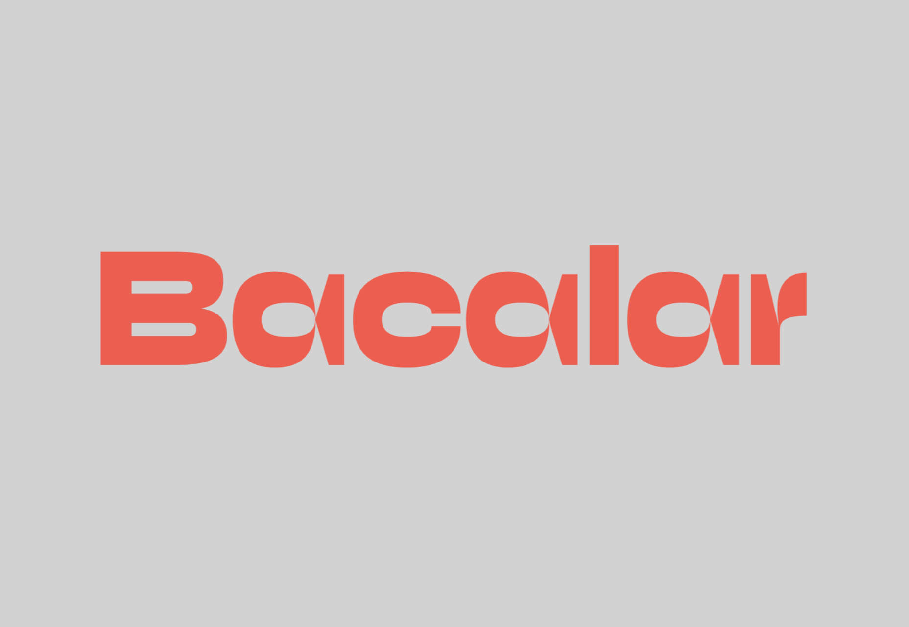
Bacalar

Bacalar is an intriguing variable font inspired by the Yucatan peninsula in Mexico. The bold, simple shapes are contrasted by extreme tapers that create dynamic shapes.

Monden

Monden is a high-contrast serif with an interesting slant applied to the lowercase h, m, and n. This “kick” adds a modern richness to blocks of text.

Flecha

Flecha is a sharp typeface with precise, simplified shapes that make it ideal for digital use. There is a range of styles and weights that provide flexibility.

Wonder Varelia

Countless calligraphic script fonts are available, but few are executed with the same elegance as Wonder Varelia. It works best as concise display text.

Okkult

Okkult is inspired by 70s horror films. It’s a great alternative choice for Halloween, Stranger Things-style retro designs, and hard-rock bands.

Southern Beach

Southern Beach is a classy script typeface that feels carefree and optimistic. It would work well as the logotype for a hotel, a travel company, or a restaurant.

Connection

Connection is a beautifully drawn typeface that makes unexpected decisions to create interest in what is otherwise a traditional design.

Lokeya

Lokeya is a playful sans-serif with a distinctly modern-French style. It includes several stylistic alternatives to enliven word shapes and is excellent for brand work.

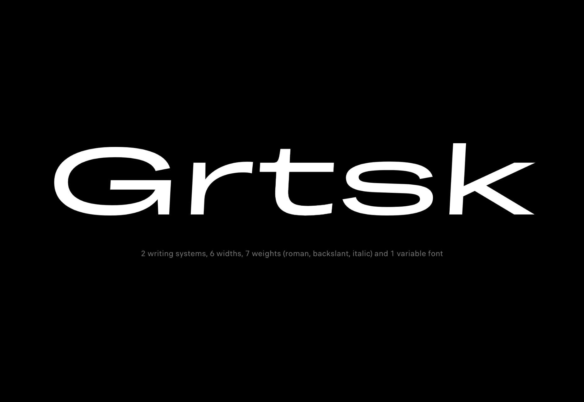
Grtsk

Grtsk is an exceptionally flexible set of fonts with two writing systems, six widths, and seven weights that are also available as one highly-practical variable font.

Beast Head

Beast Head is an expressive brush script packed with energy. It’s a great branding option for gyms, workout clothing, energy drinks, and music events.

Happy Monday

Happy Monday is a retro script font that evokes the late-60s and early-70s. It’s a laid-back option for T-shirts, branding, and editorial work.

TT Espina

TT Espina is a serif face with extreme contrasts and particularly large serifs. The bold weight swells unevenly on the counters, creating a unique aesthetic.

Spookyman

Horrifyingly, Halloween is just around the corner, and if you’re looking for a spooky font for seasonal promotions, look no further than Spookyman.

Quebra

Quebra is a useful sans-serif for projects that need a range of widths. At small sizes, it feels corporate and reserved; at larger sizes, more human details begin to emerge.

Source

The post 15 Best New Fonts, September 2022 first appeared on Webdesigner Depot.

Categories: Designing, Others Tags:

How to Increase Cross-Team Collaboration in Your Web Development Projects

September 5th, 2022 No comments

Web designers and developers have figured out that collaboration is critical to producing a great product. The designers have the visuals, and the developers have the skills to translate them into form and function. One team can’t complete a project without the other.

Bringing a successful product to fruition involves a lot of other people as well. There are team leaders, product developers, client services, and marketing, to name a few. It takes a village of diverse talent.

Remote and hybrid work arrangements, varying areas of expertise and job descriptions, and dramatically different roles make collaboration challenging. But if you fail the challenge, you’ll likely end up with a disjointed product that makes no sense. In other words, collaborate effectively or die.

Set yourself up for success by increasing collaboration within and across teams. Here’s how.

Reach Across the Aisle

There’s a lot of lip service paid in politics to “reaching across the aisle” to pass legislation. In reality, little of that is actually done, so little policy is actually made. It’s an unfortunate impasse that renders productivity impossible.

Companies can’t afford a lack of productivity just because of the people who need to achieve it happen to have different perspectives. In fact, it is precisely the differences in perspective, skill sets, talents, and experience that generate stellar products. The key is to find a way for unlike-minded team members to work together toward a shared goal.

How does that come about? It happens with effective cross-team collaboration. And that requires that members of every team speak and be heard by every other team from start to finish.

The communication and feedback loop required for collaboration benefits from tools that encourage it, like an intuitive project management solution. You’ll need one that accommodates remote and in-house employees, real-time meetings, and asynchronous work, dreamers, and doers.

Cross-team collaboration should empower everyone to participate, monitor progress, solve problems, and weigh in with their opinions. Everybody plays. Everybody wins.

Crush Cubicles and Squash Silos

Imagine an office where every individual is working in a cubicle on one piece of a project. The seclusion inhibits the exchange of ideas, brainstorming, and team problem-solving. Even with the most talented people inhabiting each of those cubicles, the end product would feel cobbled together.

In reality, those cubicles are more likely to be home offices and asynchronous work schedules. But the same analogy applies. There is a risk of performing work in a vacuum rather than across teams.

Project management software breaks down walls real and virtual, allowing teams to collaborate in real-time. But it’s just as important for teams to be using the same project management tool rather than multiple ones. Otherwise, there will be an accumulation of information, input, and data in silos.

Data silos are problematic if not downright dangerous. Over time, they can create competition rather than collaboration among teams clinging to their “secret” data. 

A single project collaboration tool will bring every team into the same space, no matter what each team’s role is. If you want teams to talk to one another and share information, walls and silos need to be eliminated. Using one project management tool will make silo demolition a breeze.

Learn New Languages

Teams tend to speak their own languages. The lingo, jargon, and acronyms used among developers are going to broadly differ from those used by the marketing team. Additionally, if the native national languages of various team members differ, you’ll need to find a way past that barrier.

To improve cross-team collaboration, every team needs to speak the language of every other team. Fluency isn’t a requirement, but a basic understanding is. And it’s up to teams and their members to be both students and teachers in creating a shared vocabulary.

The solution is to create a glossary everyone can reference quickly and discreetly if they feel left out of the conversation. Teams should know their APIs from their KPIs and their word count from their bandwidth. Definitions should be as plain-spoken as possible.

Non-native speakers struggle with idioms, like “beat around the bush” and “think outside the box.” Include such sayings in the glossary, and make sure the global employees include theirs as well. Rather than leaving anyone out of the conversation, everyone can learn a little something new.

For teams to collaborate, they must be able to communicate, pure and simple. No one should feel confused, overwhelmed, or clueless in the process. Project-speak should be universal.

Help Others Tech Themselves

Cross-team collaboration is also strengthened when capability differences are reduced, notably where technology is concerned. The ability of some teams to use tech comfortably and fearlessly will be far different than for other teams. Those who can easily catch on the need to stop long enough to assist and support those who can’t.

If you’re a web developer, joining that first Zoom meeting during lockdown was probably no big deal. But it might have been for employees accustomed to doing business with handshakes rather than keystrokes.

Tech-savvy teams need to resist the temptation to talk over or get exasperated with other teams when using technology. If you don’t, you’ll just get frustrated for the hold-up, and they’ll get frustrated because they feel incompetent.

The disparities are more challenging now that more teams are working remotely and with more technology than ever. Before, someone struggling with software could ask a coworker down the hall to help. Now there must be a different way to troubleshoot problems and teach those employees so they can be more independent.

Tech-ableism has no place in a collaborative workplace. Those who struggle need to feel comfortable asking for help. Those who can provide it need to do so with patience and without judgment.

Break It Down

Teams share the overarching goal for a project. However, each team’s role in achieving it will look quite different, involve vastly different timelines, and require unique resources. Those varying means to an end need to be broken down into manageable chunks.

Breaking down a project in this manner accomplishes two things. First, it makes the project seem less onerous than it might otherwise appear. Second, every team’s chunks are more approachable for them and more comprehensible to other teams.

Great cross-collaboration doesn’t require every team to know how to do every other team’s tasks. What it does require is for every team to have a working knowledge of what another team has to accomplish. Moreover, every team should understand the challenges other teams will need to address to get their part done.

For example, the marketing team needs to understand, in layperson’s terms, when a project entails more complex programming. If marketing knows that, the team can have realistic expectations for when the development team’s work will be done. That also means marketing can set realistic timelines for itself.

Solid collaboration demands good timing. To get it right within your own team and across them, every team needs to serve up bite-size pieces.

Increase Collaboration, Increase Success

Empowerment, understanding, total participation, and the free flow of ideas are hallmarks of collaboration. Encouraging those among members of the same team is challenging enough. Making collaboration happen across teams is even more so.

Leveling the project field despite the myriad differences between teams is the best way to remove all barriers to success. And no barriers mean every member of every team can pull in the same direction.

The post How to Increase Cross-Team Collaboration in Your Web Development Projects appeared first on noupe.

Categories: Others Tags:

Is Employee Ownership a Good Business Model for Web Development Businesses?

September 5th, 2022 No comments

Web development is big business in 2022, as more and more businesses move away from the high street and onto the internet. These days, web developers are more in demand than ever before, and, as lucrative as this industry is, we’re going to look at whether it’s right for the increasingly popular employee ownership model.

When we look at employee ownership trusts explained, we see that it’s a model whereby ‘ownership’ of a business is distributed among its workforce. This is usually done through an employee benefit trust, which allows employees to collect shares in the company. They can do this either by buying them, earning them, or being gifted them as part of a reward program.

These schemes are increasingly popular with businesses in the UK, following the example of companies like John Lewis who have been using the model for almost a century. In fact, there are around 1,557 web development companies in the UK serving businesses across the country. So, does it work for web development businesses? In this article, we explore this question…

Why Do Businesses Choose Employee Ownership?

There are a number of benefits to the employee ownership model – most specifically the fact that, when employees own a part of the company they work for, they tend to be more invested in the business. Therefore, they are usually more productive.

The model also benefits the company in other ways, such as raising capital in order to invest or expand the business more quickly than would otherwise be possible. 

For employees, this model is extremely attractive as it removes the idea that they are working for somebody else as they own a piece of the business, however small that piece may be.

Is Employee Ownership Right for Web Development Companies?

Source: Pexels

In most cases, employees of web development companies work to either a remote or hybrid work model. These businesses tend to lend themselves perfectly to employee ownership for a number of reasons, including: 

Accountability

With remote and hybrid models, it can at times be difficult to keep staff motivated and to make sure that they are putting in the necessary work. Employee ownership can help here by adding a layer of accountability whereby employees understand that the harder they work, the more money the company makes and, subsequently, the more their shares will be worth.

Staff turnover

The very nature of web development jobs means that staff turnover can often be high, as employees are poached or tempted away by other businesses. Employee ownership helps with staff retention by making employees feel more invested in the company and, therefore, they are likely to stay for longer. 

2021 was the year of The Great Resignation – followed by 2022 which has become known for the ‘Quiet Quit’, whereby employees remain in their positions but put in just enough work to prevent them from being fired. All of this means that it’s becoming more and more challenging for employers to retain great, hardworking talent.

As employees become ever more demanding, business owners need to offer more than just a salary and an annual bonus. Employee ownership is proven to be seen as an extremely valuable benefit by UK employees. 

Future-proofing

When employees become partners, they tend to be more willing to give input to the company. This increased engagement can help to tap into different perspectives, as the employees work together to make the company stronger and better for the future. 

Tax

Source: Pexels

The UK government offers a number of tax benefits to companies who choose to move to employee ownership, and these include: 

  • Save As You Earn
  • Share Incentive Plan
  • Enterprise Management Incentives

These tax savings can be incredibly useful for small companies and can help them to more quickly scale their businesses.

Employee Ownership is a Win-Win for Web Development Companies

In many more traditional, old-school businesses, owners and stakeholders are often reluctant to change to new working models, simply because it’s something that they are not accustomed to. Businesses such as web development agencies, on the other hand, have the advantage of being younger, more modern companies that are more willing to embrace new ideas and ways of working. 

Changing to a different work model is something that should never be taken lightly. It’s fair to say that employee ownership is far from a ‘one size fits all’ solution. There are some industries that are simply not suited to such a model for various reasons – but web development isn’t one of them.

By their very nature, website development companies tend to be modern and forward-thinking, and this type of environment lends itself perfectly to the employee ownership model. 

Web development agencies also tend to employ young people who do not find traditional working models attractive, as older people perhaps would. Because of this, employee ownership appeals to the entrepreneurial nature of today’s talent. It also offers significant benefits for business owners and CEOs, making this a win-win solution for all concerned.

The post Is Employee Ownership a Good Business Model for Web Development Businesses? appeared first on noupe.

Categories: Others Tags:

Best WordPress Coupon Code Plugins

September 2nd, 2022 No comments

Introduction

Coupon plugins help you promote sales and reduce bounce rates. We nit-picked 6 of the best WordPress Coupon plugins for your online store.

The WordPress plugin directory houses thousands of discount plugins. Searching for a plugin against so many choices is taxing. 

Things to Look for in a Coupon Plugin 

How do you narrow down your search for the right coupon code plugin? 

Here’s a rule of thumb: Check the boxes below before choosing any plugin on WordPress

  • Site Compatibility and Installation 
  • Near Future Requirements 
  • Support and Updates & Security 
  • User Reviews 

This list discusses sustainable coupon solutions. We’ve included both free and premium plugins that are entirely mobile responsive. 

Expert Recommended WordPress Coupon Plugins

Discount Rules for Woocommerce by Flycart

Set up a wide range of promotion campaigns using coupons. Here’s a powerful tool with a simple, straightforward interface. Discount Rules for WooCommerce is an effective, fool-proof discount strategy plugin. You can create discount campaigns based on cart value, product categories, attributes, customers, and user roles. 

Source

Discount Features 

  • Dynamic Pricing 
  • Bulk Discount
  • Percentage Discounts
  • Store-Wide Discount
  • BOGO Deals 
  • Combo
  • Shareable Coupons 
  • Cart Condition Discounts 
  • User-Specific Discounts 
  • Product-Specific Discounts 
  • Quantity Based Discounts
  • Conditional / Dependent Product Discount
  • Time Sensitive Discounts
  • Multiple Discount Rules Per Purchase
  • Product Exclusion from Discounts 
  • Discounts Based on Purchase History
  • Free Shipping 

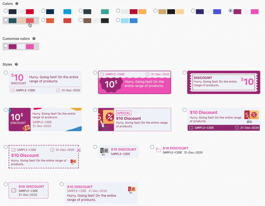
Discount Rules for Woocommerce offers readymade, smart and customizable coupon styles. It creates discount rules in three simple steps with a wizard-like interface—display discounts on the product page, cart, checkout, or email notifications. 

Far ahead of the standard coupon functionality, this is a well-investigated plugin. Discount Rules for WooCommerce has over 90,000+ active installations. It offers above and beyond support services, all while being beginner-friendly.

What Users Say:

Pricing

Retainful

Create coupons to win back sales. Retainful exclusively targets customers who bail out at the last minute of checkout. A brow-raising number of customers exit the purchase funnel too early, as 70% of carts are abandoned before checkout. And every time this happens, Retainful generates personalized coupons, which are delivered through automated emails, inviting customers to make the next move. 

Primarily a WordPress abandoned cart recovery plugin, Retainful is adept at managing dynamic coupons. 

Discount Features

  • Abandoned Cart Recovery Coupons 

Connects and converts customers who revoked commitment and abandoned their carts. 

  • Next Order Coupon

Sends coupons to encourage customers to place future orders

Offer Fixed Amount Discount, Percentage Discount, or Free Shipping Discount Via Next Order Coupons. 

Other Features

  • Email Automation
  • Thank You & Win-Back Emails
  • Referrals
  • Exit Intent Pop-Ups

Along with cart recovery, Retainful maintains an Order loop with ‘Next Order Coupon.’ You can influence customer decisions with Retainful. You can set an expiry period and a minimum purchase value for coupon eligibility. 

What Users Say:

Pricing

OptinMonster 

OptinMonster is a powerful conversion plugin, and it monetizes traffic pretty consistently. OptinMonster uses coupons and offers to do most of the heavy lifting, and it’s a plugin designed to reduce friction between the user and the discount. OptinMonster can create interactive layouts and gamified wheels to unlock offers. 

Features:

  • Pre-built templates and forms
  • Auto-apply coupon codes 
  • Automated Spin-to-Win Coupon Wheel 
  • Drag and drop builder 

Exit-intent popups 

Behavior automation technology makes OptinMonster one of the Best WordPress Coupon Code Plugins out there. It follows best practices for discount-based conversions and shows the right offers at the right time to the right people. 

What OptinMonster users say:

Image

Pricing

Smart Coupons 

Smart Coupons take an all-in-one approach to discount marketing. It is a complete coupon plugin. You can easily design and manage WooCommerce coupons with customer purchase history. It can create bulk discounts with click-to-apply/auto-apply coupon codes during checkout. For flash sales and seasonal sales, it displays coupon banners. 

Discount Features:

  • Fixed Amount & Percentage Coupons
  • BOGO
  • Giveaways
  • Gift Vouchers 
  • Free Shipping 
  • Subscription / Recurring Coupons
  • New User / First Order Coupons
  • Custom Coupon Message

Store Credits for Customer Retention

Smart coupons assign credit to your customer to encourage repeat purchases, and credits are used until exhaustion or expiry of validity. Customers can purchase credit and gift it to others with a personalized message, and this feature increases WOM buzz. Smart Coupons help retain customers. 

What Smart Coupon Users Say:

Pricing

Ninja Popups 

Popups are agreeably intrusive. As a coupon delivery system, they’re popular and effective. Ninja Popups – WordPress is a plugin that uses coupon popups for conversion. 

With 65+ premade templates to choose from, Drag & Drop visual editor and fully customizable templates. Creating and activating a popup from scratch takes significantly less time. 

Features:

  • Event-triggered popups 
  • Action-triggered popups 
  • Exit Intent Popups
  • Scroll Percentage Popup
  • Page-Level Targeting 

Ninja Popups integrates with WooCommerce and all major email marketing and social media platforms. You can find out which variations of coupon pop-ups, floating bars, and sliders perform the best through its A/B testing feature. 

What Users Say:

Pricing

Coupon Creator 

You can display single coupons or a loop of coupons with alignment options through Coupon Blocks. Being a highly competent coupon plugin, WordPress Coupon Creator offers leveled-up features like Coupon Blocks and action-based coupons and presents a clutter-free approach to managing coupons. 

Features

  • Block Editor support for coupon loop shortcode 
  • Easy Coupon Editor 
  • Dynamic Code Feature
  • Recurring Expiration
  • Visual Editor to match the style
  • Custom Affiliate links 

Even without all the frills, this plugin is popular amongst users. Rightly so, as it makes availing of coupons less of a task for the user. 

What Users Say:

Pricing

Conclusion

Coupons exert soft power over customers. Customers love a good offer! When discounts and coupons present a dialogue, customers begin to take the relationship a little bit more seriously. When you roll the clock forward, existing customers should not wait for coupons to make a purchase. 

A sophisticated coupon plugin reproduces the same results each time. It is essential to maintain a healthy customer relationship. If you want to boost your eCommerce store’s customer engagement rate, pick the right coupon code plugin that helps you with conversion. It has to help earn long-term customers who move through the shopping funnel more often.

The post Best WordPress Coupon Code Plugins appeared first on noupe.

Categories: Others Tags:

Top Benefits Of Hybrid Events

September 2nd, 2022 No comments

Audience engagement is a major objective of every event. Marketers want to organize something that would remain in their audience’s minds for years to come. 

However, not everyone can attend an event, so how can you boost your event audience numbers? The answer is hybrid events! 

Hybrid events ensure people sitting at home can also attend an event. That’s not it, hybrid events serve multiple other benefits that we will go through in this article. So, stay with us till the end of this blog! Let’s get started with the definition of Hybrid events.

Explanation: Hybrid Events

Hybrid events combine virtual and real-world activities, enabling viewers to watch and take part from anywhere. In other words, individuals who choose to engage in person can do so, while those who prefer to participate remotely can do so using hybrid event platforms like video conferencing and virtual event booths. This level of adaptability is possibly the single most significant benefit of using a hybrid strategy.

The fact that hybrid events are designed around interaction and give a consistent experience to every participant sets them apart from other types of events. The uploading of videos on demand after the event or giving your live audience priority over your remote audience is not the same as this. 

How Do Hybrid Events Work?

A hybrid event’s main objective is to deliver a consistent attendee experience regardless of how people choose to participate. Remote participants can take part in live events that are being held in person by watching them online. 

When these participants can interact with speakers and other attendees directly, that is an excellent example of a hybrid event. Even if they might not be at the same location as the in-person participants, it shouldn’t matter if you have the appropriate technology on your side. 

Hybrid events are successful because everyone who attends has access to the same event content and chances to interact with speakers and other participants. In-person and distant attendees, for instance, can expand their networks by corresponding over instant messaging or live video. 

Benefits Of Hybrid Events

Hybrid events are terrific when it comes to boosting an event on every front. Let’s have a look at how.

Increases Audience Reach

The problem with in-person and virtual events is that they are one-dimensional. In-person events invite only physical attendants while virtual events are designed for behind-the-screen audiences. This is where hybrid events stand out. 

The first and foremost benefit of a hybrid event is that you can attract an audience from across the globe since no one has to physically attend the event. Geographical boundaries are lifted which brings in more and more attendance. 

Venue capacity, budget restrictions, and tight schedules too are taken out of the equation by hybrid events. When the major issues are sorted, the audience reach increases automatically.

Greater Audience Engagement

Engaging the audience is always on the hosts’ minds. Audience engagement is a tricky proportion that could make or break your event’s success. 

However, with a hybrid event in place, one can be sure of high audience engagement. What makes hybrid events ideal for audience engagement? Well, there are multiple hybrid event ideas to choose from.

One can engage the event audience through emcees who through their conversational skills can lighten up the mood. Gamification is another option in which you can organize contests & giveaways to present gifts to the winners. 

Sketch artists, magicians, musicians, and singers can also be invited to give a party touch to the event and prevent it from becoming boring. 

Social walls for hybrid events stand out from all other engagement ideas. A social wall keeps the audience on their toes by displaying the social media posts by attendees about the event in real-time. Attendees keep posting on social media platforms such as Instagram, Facebook, and Twitter which gets displayed on the social wall. Now, this part motivates other attendees to post on social media which in turn increases audience engagement.

Increased Sponsorship Opportunities

The hybrid event benefits are catching the eye of event sponsors, who are therefore more likely to support them. For instance, a trade show will only likely draw sponsors if a sizable crowd is anticipated.

Hybrid events have a far wider audience, which is incredibly important for sponsors. Additionally, sponsors can engage remotely too by setting up online exhibits and making presentations via video conference. This is crucial for events that want to host sponsors and speakers from other countries during a time of significant travel restrictions.

Brilliant Analytics Track

Hybrid events have a higher return on investment (ROI) since they can be scaled up and down more easily. More sign-ups, more attendees, and more views for sponsors. Additionally, this directly affects how many leads are generated for exhibitors.

You gain access to information that can’t be gathered at an in-person event. You can keep track of participants, attendance rates, and perhaps the number of people who attended various sessions at events that are held in person.

The behavior and interests of your audience can be very well understood through hybrid events. Especially for participants participating electronically, hosts may easily follow their digital footprints, which helps them learn more about their attendees.

Flexibility For Speakers/VIPs

Speakers & VIPs can readily participate in the event from wherever they are located, just as audiences can from any location. They are not required to travel and physically be present. They can still take part in your event while saving time and money thanks to this.

Similar to attendees, exhibitors can set up a virtual booth in the virtual exhibit hall if they are unable to present in person. They won’t have to pass up the opportunity just because they can’t physically attend the event.

Strong Community-Building

In the end, events are basically social gatherings. People attend them not only to hear presentations or keynote speeches but also to network with people who have similar interests. 

Attendees will have lots to talk about after an engaging presentation from a knowledgeable and entertaining speaker, but you’ll need to give them the proper platforms to interact.

Both online and in-person participant groups can benefit from networking and professional matchmaking at hybrid events. 

It doesn’t matter how attendees are participating, the thing that matters is how this participation is boosting long-term community building. 

The best part is that these communities can endure and benefit your company long after the event has ended.

Conclusion

In this blog, we discussed hybrid events in detail taking from what it is about to ideas of hybrid events. We hope that you have got a grip on what a hybrid event is all about and how you can use them to your advantage. So, let’s get going!

The post Top Benefits Of Hybrid Events appeared first on noupe.

Categories: Others Tags:

Behind the CSScenes, September 2022

September 1st, 2022 No comments

Those of you who have been reading CSS-Tricks for a while may remember that we used to publish a little thing we called CSS-Tricks Chronicles. Our friend Chris Coyier would write up a reflection from the past couple of months or so, and it was a great way to get a pulse on what’s happening around CSS-Tricks, the site, and what the team is doing.

We like that and want to keep it going. It’s a new era, though! So what we’re going to do is welcome you back to what we’re now calling Behind the CSScenes. You’re going to meet some new and familiar faces in these updates, starting with Haley Mills, who is kicking off the very first issue.

How’s the transition going?

[Haley Mills:] Before we dive in, let me start by introducing myself! My name is Haley, and I’m the manager of Content Integration here at DigitalOcean. I’ve been at DigitalOcean for 5 years and previously worked on our editorial team, helping authors publish all sorts of topics through our Write For DOnations program. 

Many folks here at DigitalOcean (including myself) are avid readers of CSS-Tricks, and we still have to pinch ourselves for how lucky we are to be entrusted with this community. We recognize that CSS-Tricks is a critical free resource for devs across the world, and my goal is to keep it that way. 

  • Since the acquisition, we have published 95 pieces of new content and look forward to growing that number.
  • In the month of August, we performed maintenance on 6 existing pieces of content.

That said, change is to be expected when passing a torch.

I think we all know that no one can replace Chris’ voice — it’s a big reason why CSS-Tricks is, well, CSS-Tricks. His ability to have you laughing while learning something new is a skill that few can compete with. I know many of you miss his writing because you told us so in a survey (which we’ll get to in a bit), but it also opens up a huge opportunity for us all to take the torch and continue doing what CSS-Tricks does best:

Find creative solutions to problems and share them with the world. Chris brought people together this way on CSS-Tricks — and you can give back, too.

Your blossoming idea could turn out to be what the Flexbox Guide is for me and so many other people, so I humbly encourage you to reach out in our Guest Writing Form and talk to us about your topic ideas. We have two awesome editors, Geoff and Brad, to help you shape and bring your ideas to life to share with the CSS-Tricks community. In addition to paying you for your contribution, we will now also make a matching donation to a tech-focused charity of your choice.

Next up, we have Product Manager Karen Degi with some survey result highlights.

The results are in…

[Karen Degi:] In June, we shared a survey to collect feedback to help shape the future of CSS-Tricks. We received almost 900 responses, including some great written responses that helped us understand what CSS-Tricks means to the larger community. 

Many of you also volunteered to talk to us directly, which has us thinking about the best way to gather those thoughts. If you’re one of those folks, know that we haven’t forgotten about you and still want to hear from you. We just want to make sure we approach this in the most effective way!

The survey confirmed some things we already suspected and brought new things to our attention. The top few things that grabbed our attention are:

  • Engaging, high-quality content is at the heart of CSS-Tricks. We’re working to make sure that we continue investing in in-depth guides on front-end topics, as well as providing short articles about quick tricks and tutorials with embedded demos.
  • You love RSS! As we continue investing in CSS-Tricks and bringing new functionality, we’ll make sure we keep an eye on how our changes affect the RSS feed.
  • You come to CSS-Tricks to learn, to be entertained, and to do your jobs better. You do not come to CSS-Tricks because you’re excited about being sold…well, anything, really. Although we think DigitalOcean is pretty great, and we’ll probably continue to talk about ourselves where it makes sense, we understand that we need to do so in a way that is honest, trustworthy, and connected to your needs as a front-end enthusiast.

Next up is Logan Liffick, Senior Digital Experience Designer, with redesign updates.

A redesign is in the works!

[Logan Liffick:] If you’ve worked on the front end — or really anywhere on the web, you’re bound to know CSS-Tricks. It’s where I, and many others, started the journey. So, when I was asked to spearhead a redesign for the site, it was nothing short of an honor. Without a doubt, undertaking a brand update for something so familiar to so many is a challenge of incredible magnitude

If I were to do justice to this project, I’d need to pay tribute to the original. That mentality became the underlying theme of my work, and any effort to rejuvenate took inspiration from existing patterns and styles from the site.

  • Slideshow of Redesign Preview

Upon first glance, you’ll notice the fresh coat of paint. Past that, you’ll recognize the site reads more “editorial” than before. This was a purposeful decision to accentuate existing type stylings and, more importantly, to pay homage to the essence of CSS-Tricks as an informational resource. 

Preserving the element of “fun” was also top of mind. Sprinkled throughout the site are various snippets from the actual CSS “tricks” shared on this site — for example, there’s going to be a little Easter egg tucked inside a sticky footer using Preethi’s slide-out effect that’s my personal favorite, a fantastic suggestion from Geoff himself. Gradients are now a core color-way in the system, and border-radii have been rounded out. 

We wanted to give ourselves permission and space to explore an open-ended and malleable system far into the future, which lines up nicely with the overall mission and goal of CSS-Tricks: to explore what’s possible with CSS. This is just the beginning, there’s so much more to see, do, and learn with CSS-Tricks living in our (digital) ocean.

Next is Geoff with author highlights!

New authors!

[Geoff:] We’ve added a few new faces to our growing list of guest authors who have contributed to CSS-Tricks:

You may have also seen our editor Bradley Kouchi’s name pop up a couple of times, and you can expect to continue seeing him on a semi-regular basis.

That’s 16 new authors! You can be one, too, by filling out our guest writing form.

On a related note, I’m pleased as punch that we still get regular contributions from a large band of familiar faces from before the DigitalOcean acquisition. Just look at all the fine folks who’ve continued to share their great ideas with us:

Big shake-ups like the one we’re going through today can be scary. Seeing these familiar names in article bylines has helped me a ton as far as continuity and consistency go. CSS-Tricks still seems very CSS-Tricks-y to me, and that’s a big deal.

Until next time…

We hope you’ve enjoyed this little peek behind the CSScenes! We’ll do it again… and again and again. As you can tell, there’s a lot of activity happening around here, which means we’ll have lots to share in the next edition.

Oh, and if you’re one of the many who’ve told us just how much you miss the newsletter, it’s still here! We’re sending it just once a month while we get back in the swing of things, and you may very well need to re-subscribe to get it (we had to do a lot of scrubbing after the keys to the site were handed over).

Thanks for reading!


Behind the CSScenes, September 2022 originally published on CSS-Tricks, which is part of the DigitalOcean family. You should get the newsletter.
Categories: Designing, Others Tags:

Comparing JAWS, NVDA, and VoiceOver

September 1st, 2022 No comments

A screen reader is an important accessibility tool for people with no or limited vision. People who are blind or those with low vision can use a screen reader to navigate the computer. Screen readers will read contents on the screen and explain to the user what is on the page. Screen readers allow people to use the computer for daily tasks.

There are many screen reader software available for people through their operating system or through open source projects.

A 2021 research by WebAim found that from 1568 responders, more than 53.7 percent of people surveyed used JAWS on Windows, more than 30.7 percent of people used NVDA on Windows and little over 6.5 percent of people used VoiceOver on macOS.

JAWS and NVDA for Windows and VoiceOver for macOS are the most popular screen readers people use.

First, I should clarify that this article will be written from my point of view. To give background, I have been a front-end developer at a non-profit for people with learning differences for over three years. I, along with my colleagues, seek to make our projects more accessible every day. I am not visually impaired and do not use these tools on a regular basis. For work, I have a Mac machine and test accessibility using VoiceOver.

Here is my planned testing methodology:

  1. Navigate the page by heading, until “Accessibility APIs” section.
  2. In the “Accessibility APIs” section, read the content and the unordered list inside.
  3. TAB to hear focusable items in the unordered list.
  4. Jump to the Search field.
  5. TAB to hear a few items in the navigation section

To find similarities and differences between them, I decided to test a set of steps with each screen reader on a Wikipedia page about screen readers. I will browse the web with Chrome for my tests. Testing all screen readers on the same page and browser will reduce the amount of variables and keep the tests consistent.

JAWS

JAWS is an acronym for Job Access With Speech and is the most widely used screen reader in the world. It is only available on Windows. Depending on the plan and features, JAWS can be purchased anywhere from $90 yearly license all the way to $1605 for perpetual license.

JAWS has predefined keyboard commands to navigate the web. Full list of keyboard commands can be found on their website.

Demonstration

JAWS Demo

In the beginning of the demo, I am clicking on H key on my keyboard to go to the next heading. JAWS is moving down the page, reading me the headings along with their level.

Later in the video, I am clicking on number 2 and number 3 on my keyboard to have JAWS read Heading Levels 2s then later Heading Levels 3s. This is a great feature because we can move down the page and sections by heading level and get a better sense of the page layout.

When I reach the “Accessible APIs” section, I press the DOWN ARROW key until the third item in the unordered list.

Later in the demo, I am clicking on the TAB key for JAWS to read to me the next focusable item on the page, which is inside this list. I click TAB until I reach a focusable element in another section.

Then I press F key to focus on the search field, which JAWS reads to me.

Then I click on TAB and JAWS focuses on the navigation elements that are on the side of the page.

Pros & Cons

Pros:

  • JAWS is more customizable than other screen readers.
  • There are more options to navigate through the page.
  • JAWS is industry standard.
  • Widely used, which means there are lots of user to user support.

Cons:

  • JAWS is more complicated to use than NVDA or VoiceOver.
  • Some commands are not intuitive.
  • There are a lot more commands for the user to learn.
  • More learning curve for users.
  • JAWS is also not available on the Mac, which limits its users.
  • Costs anywhere between $90 – $1605 for the user.
  • JAWS has different key commands for desktop and laptop which may make it harder for users to transfer knowledge and may cause confusion.

NVDA

NVDA, or NonVisual Digital Access, is available on Windows only. Users need to download the software from NVDA’s website, NVAccess. This software is free to download but does not come already installed on Windows machines. NVDA is the second most popular screen reader in the world according to WebAim’s 2021 survey.

Like other screen readers, NVDA has defined keyboard commands to navigate the web. NVDA’s full keyboard commands can be found on their website.

Demonstration

NVDA Demo

In the demo I am clicking on H key on the keyboard to go to the next heading. First, NVDA reads me Heading Level 1, which is “Screen reader”. Then NVDA goes to read Heading Level 2s and 3s.

When I reach “References” I begin to click on TAB on my keyboard for NVDA to focus on next focusable items.

After focusing on a few items on the list, I click ENTER and go to the New York Times page.

Pros & Cons

Pros:

  • Overall, I found NVDA was able to provide me with information on the screen.
  • The out-of-the-box keyboard commands were easy to use and easy to learn.
  • NVDA is open source, which means the community can update and fix.
  • NVDA is free, which makes it an affordable option to Windows users.

Cons:

  • NVDA is not available on the Mac, which limits its users.

VoiceOver

VoiceOver is the screen reader used in Mac. VoiceOver is only available on Mac not available in Windows. VoiceOver is free and is already installed on the computer, which removes barriers because this is part of the computer setup and the user does not have to download or purchase any additional software.

VoiceOver has defined keyboard commands to navigate the web. VoiceOver’s full keyboard commands can be found on their website.

Demonstration

VoiceOver Demo

In the demo, I am on a Wikipedia page and I am clicking on the VoiceOver Command (which is Control+Option) along with Command+H to navigate through the headings. VoiceOver reads the headings in order, starting from Heading Level 1, “Screen Reader”, to Heading Level 2, “Contents”, to Heading Level 3, and so on.

When I reach the “Accessibility APIs” section, I click on VoiceOver Command plus the RIGHT ARROW, to tell VoiceOver that I want it to read this section. Later I am clicking on the VoiceOver Command plus the RIGHT ARROW on my keyboard, to navigate the section.

When I get on to the third item on the unordered list, I press TAB on my keyboard to focus on the next focusable element.

I press TAB a few times, then I press VoiceOver Command plus U, to open the Form Control Menu. In the menu, I press DOWN ARROW until I hear the “Search Wikipedia” option. When I hear it, I click ENTER and the screen reader focuses on the form field. In the form field, I press TAB to navigate to the navigation section.

Pros & Cons

Pros:

  • VoiceOver is easy to use and learn.
  • VoiceOver’s commands are intuitive.
  • Free tool that comes installed in every macOS device.

Cons:

  • VoiceOver is also not available on Windows, which limits its users.
  • VoiceOver is not an app and can only be updated when Apple releases macOS update.

Key Takeaways

A screen reader is an important accessibility tool for people with no or limited vision. Screen readers allow people to use the computer for daily tasks.

There are many screen reader softwares available. In this article I compared JAWS, NVDA, and VoiceOver.

Here is a comparison chart overview of the three screen readers:

JAWS NVDA VoiceOver
Operating System Windows Windows macOS
Price $90 – $1695 Free Free
# of users 30% 50% 6%
Ease of Use Hard Easy Easy

I found that for basic screen reader testing, most screen readers follow a similar keystroke pattern and knowledge from one screen reader can be used for others.

All screen readers have their pros and cons. Ultimately, it’s up to user preference and also the operating system they use to determine which screen reader software is best for them.

Previously: “Small Tweaks That Can Make a Huge Impact on Your Website’s Accessibility” (2018), and “Why, How, and When to Use Semantic HTML and ARIA” (2019), “15 Things to Improve Your Website Accessibility” (2020), “5 Accessibility Quick Wins You Can Implement Today” (2022).


Comparing JAWS, NVDA, and VoiceOver originally published on CSS-Tricks, which is part of the DigitalOcean family. You should get the newsletter.

Categories: Designing, Others Tags:

iShadeed’s Container Queries Lab

September 1st, 2022 No comments

Ahmad Shadeed got an early jump on container queries and has a growing collection of examples based on everyday patterns.

And, if you missed it, his latest post on container queries does a wonderful job covering how they work since landing in Chrome 105 this month (we’ll see them in Safari 16 soon). Some choice highlights and takeaways:

  • Containers are defined with the container-type property. Previous demos and proposals had been using contain instead.
  • Container queries are very much like the media queries we’ve been writing all along to target the viewport size. So, rather than something like @media (min-width: 600px) {}, we have @container (min-width: 600px) {}. That should make converting many of those media queries to container queries fairly straightfoward, minus the work of figuring out the new breakpoint values.
  • We can name containers to help distinguish them in our code (e.g. container-name: blockquote).

Great job, Ahmad! And thanks for sharing!

To Shared LinkPermalink on CSS-Tricks


iShadeed’s Container Queries Lab originally published on CSS-Tricks, which is part of the DigitalOcean family. You should get the newsletter.

Categories: Designing, Others Tags: