Archive

Archive for November, 2022

Smashing Podcast Episode 54 With Stéphanie Walter: What Is User Journey Mapping?

November 18th, 2022 No comments

In this episode we’re talking about User Journey Mapping. What is it, and how does it help us build better digital products? Vitaly talks to expert Stéphanie Walter to find out.

Show Notes

Weekly Update

Transcript

Vitaly Friedman: She’s a UX expert, researcher and product designer with expertise in design and strategy. She lives in Luxembourg, teaches at school and universities and facilitates workshops in small and large teams, not a day passes by without Stephanie sharing what she has learned on Twitter on LinkedIn, and in her wonderful weekly roundup called the Pixels of the Week. She recently wrote a book on user journey maps and currently works for MAL consulting and European Investment Bank all around enterprise UX challenges.
So we know she’s a fantastic designer and problem solver, but did you know that she once had a full 45 minutes long conference talk on pizza recipe examples. If your favorite pizza surprise, surprise is a vegetarian one, but with added bacon or ham. My smashing friends, please welcome Stephanie Walter. Hello Stephanie. How are you doing today?

Stéphanie Walter: Yay, I’m smashing. And it’s Friday. So yeah.

Vitaly: Yay. It’s Friday. Does Friday usually mean pizza day for you?

Stéphanie: Yeah, pizza or Indian food as well.

Vitaly: Okay, that sounds wonderful. Well, Stephanie, it’s always such a pleasure to see you. I know that you spoke at the Smashing Cup Barcelona, I think a while back. It feels like it was, yeah, I don’t know, 150 years ago. So I always learned so much from you. So maybe it’s a good idea to start by just asking you to share a little bit of your story. So how did you even end up getting into this? I know that much of your time is spent around Enterprise UX, but eventually you had to go through a lot of different things and I know you did a lot of different things throughout your career to get there. So maybe share a little bit about your background and your story.

Stéphanie: So I have a master degree in design and languages. It’s a little bit strange. It’s both. It’s a degree where you learn how to build website and how to translate them basically. And after that I decided to do an internship in Germany. So I was working for a company and I think I finished what I was supposed to do in three months instead of six. So they said, hey, do you want to do mobile apps? I was like, yeah, I’ve never done that, but sure. So I got interested and at the time there was not a lot of documentation on mobile and native design, but there was something on Apple guideline and it was called Human Computer Interaction, something like that. So it kind of drove me into HCI and UX design. So we had usability class at the university. We had kind of a few hours of how do you do usability tests, but that was basically it.
And then during my internship I discovered UX design. I thought like, oh, this is actually what I want to do. It’s quite interesting, understanding user needs and really building products and services that try to fit and match those needs. So I worked in Germany, then I went back to France to work for a web agency and I said, yeah, if I’m going to leave the agency, I’m going to leave France. So this is basically what I did. And I got hired at the University of Luxembourg as a researcher assistant in the Human Computer Interaction Department. So it was very interesting to work in an academic place. And after that I decided to go back to private sector, and I was lucky I worked with a company that had a lot of different contracts in a lot of different areas, and this is really when I started specializing in Enterprise UX because they were doing a lot of things that were either B2B or B2B to C, but it was always ugly complex dashboards and a lot.

Vitaly: This sounds exciting stuff, isn’t it?

Stéphanie: Yeah, I remember I had to help with the design of a form that was for Luxembourgish customs, and the form was so complicated in terms of levels that I printed it on a piece of paper and I just drew lines to understand the hierarchy and information architecture of that. And it’s a little bit complicated because it’s like you have to have a number and all the numbers stacks up. So if you have the tax number, every single digit means something. So it’s like apples that were harvest between October and November in specific countries in Europe that are designed to become cider, all of that, it’s a number.

Vitaly: Well that does sound like a very exciting exercise in design.

Stéphanie: Crazily complex. But I have eight levels, we have six levels in html, H1, 2, 3, 4, 5, 6. What do we do?

Vitaly: But then look at that, you have established itself as an expert in helping other people harvest apples, but instead of decided to jump more into design and UX work.

Stéphanie: So it was a lot of different really, really cool stuff around that. And I was like, yeah, you know what? I’m never going to be a fancy designer, like those designer who do amazing website for marketing campaigns or I don’t know, I know a lot of people who do really cool stuff around the museum and things like very immersive. I was like, yay. I like complex challenging, super heavy information architecture and solving problems for people who have to work with a tool on a daily basis. And I was like, okay, I think this is kind of the kind of challenge that I like and I want to keep on working on that.

Vitaly: That’s interesting. So it’s always kind of fascinating story to me because I think that we have a lot of articles about designing a perfect button and picking the right icons and making responsive tables and navigation, things like that. But when I dive deep into this really, really complicated world of enterprise applications or multi-level like six, seven levels of navigation and I don’t know, 20, 25 multi form pages with PDFs integrated and all of that, I’m wondering, I mean I know that this is your life, most part of it. I’m wondering at this point, do you think that the world in which we’re living in, the enterprise world, is undiscovered? Are there a lot of books, articles, resources on that? How do you feel in that world?

Stéphanie: Honestly, there’s not a lot of content that specifically talked to that. And I don’t know why. Maybe because NDAs and things like, that’s a lot of stuff that you can’t show in those areas. Also, let’s face it’s not fancy. No one wants to see an interface that is supposed to help you optimize track driving through the area or something super complicated. So it’s not self explanatory. So a lot of people, they don’t put those on the portfolios because today there’s still this idea that you need some wow stuff in the portfolio. So I think there’s a lot of people around here that actually work in enterprise UX with complex software like that, but there’s not a lot of content about it. But why is a mystery to me.

Vitaly: Well, you are changing that. I think in many ways it’s just the fact that what really surprises me really is that we see a lot of case studies about portfolio designs, about immersive campaigns, like you mentioned, things related to branding, I don’t know, big redesigns that happen in big companies and so on. But not necessarily about those things, which are, I don’t know, insurance companies and truck configurators and whatnot. So that’s kind of always challenging for me. But I also want to ask you maybe on another side of that, when you think about enterprise UX, I think that many of us listening this later or in years from now, maybe still will be thinking about long meetings, long deadlines, complex workflows, a lot of legacy. Is that enterprise UX or how would you describe it? How would you define it?

Stéphanie: It necessarily depends. You can arrive on a project where they have nothing and then there’s no legacy. You build from the ground, but you still have a lot of meeting because the business is complex. So you need time to understand the business. You also need help to, you can’t really go around those meetings because they are usually kind of useful to help you understand exactly what is going on. But then, yeah, it depends. Legacy is one problem. Another problem that I see and foresee in the future is depending on when we are those Gartner, Bloomberg and all of those big company, they either tell people that they need to internalize the team and then you need to do in-house developments. So you have a bunch of developer who will develop the enterprise, product often without designers.
And then a few years later, Gartner goes like, no, you know what, no. Package the new thing. So stop having an internal IT team, buy packages, and then everyone decides to buy package. And then there’s a new wave from, I don’t know, Gartner, Bloom, whatever, Harvard Business Review, those people that big company listen to. And they say, yeah, no, let’s go hybrid, let’s do something like a package. But then the package is the business web services, and then you can still do the UI, the front ends. So this cycling through, and it’s really, really funny because if you worked in such industry for a few years, you’ve seen the waves of Oh, let’s build everything internally. Oh, let’s build a package. But look, the business is so complicated. We bought a package and now we discover doesn’t fit our need. I think we need to rebuild something internally and then, but building things internally costs a lot of money. So let’s package. It’s kind of every few years it comes around.

Vitaly: I think it’s also related to the fact that there is just a lot of layers and with every layer comes a bit of politics involved and everybody has their own interests and KPIs and goals. And I’m wondering how do you even operate in this kind of environment? I mean, you must have very strong governance, very strong guidelines, and very strong buy-in from the top. The reason why I bring this up is because your work has been known for being you focus very much on accessibility, inclusive design, user-centric design. But then at the same time, if you have all the different layers of politics and all these different layers of business decisions, which in some situations might be more important even than the user research part, how do you even navigate that space? Do you find this or is it maybe the case that now in 2023 or ’22 still when we’re recording this, that UX is kind of a part of what we do, that it’s understood by stakeholders?

Stéphanie: I think it’s that bad. The way we do it is we navigate around the mess. Basically. We try to stay away. And I am lucky, I work with amazing people who actually shield the team from all the political stuff. So I have people working with us who try to deal with that so that we on the team can do our daily job. And also I think I’m lucky because my manager understands, I’m my manager. The person I’m referring to understands what is UX design and why it’s useful. So they will fight basically for me to have some time to talk to the users. But I’m super lucky in the place where I work, I think we are the only project that’s actually able to have a very user centered approach. And in a lot of area in enterprise UX not everyone is that lucky.
In a lot of places you have analysts will ask to the user what do they want, and then the users are expected to provide a solution and then the person will just write a technical ticket saying the user wants an export to Excel. Well, if you go there and you’re like, you talk to the user and yeah, but today you don’t have an export to Excel button, so what do you do? And the user shows you the table, they will copy paste the whole table, paste it in Excel, and then you’re like, okay, so it’s in Excel, what do you do now? And then the person goes into one of the column that is the status of something. So it’s either active or inactive, and she just removes all the inactive from the table and she’s like, so we have an analyst that is writing a story saying the user needs an export to Excel button, but the user doesn’t need an export to Excel button in this very specific situation. She needs to remove all the inactive stuff from the screen.
And yet the export to Excel is the solution she came up with because this is what she does today. But we could also maybe have filters in the browser directly on that table, modern tables and things. So the user need here is not to export to Excel, is to clean up some stuff on the screen and then you come here and you’re like, yeah, but actually no, we are not going to do the export. We will do the export to Excel for other reasons because it’s needed. But for this specific user need, it’s not an export to Excel that we will provide a solution is a filter on the table.
And unfortunately in a lot of places you have this kind of old school analysis where they will go to people, ask them what they want and then IT will implement it and hopefully find a place somewhere in the screen in a corner to put that button or that feature. So yeah, it’s really, really complicated. But I think at the same time, a lot of people like me are starting to have this kind of change and pushing things forward, but then you don’t make friends all the time, then the old school people are not super happy about you coming and saying, wait a minute, that’s a weird requirement. Can we talk about that and really try to understand what’s going on here?

Vitaly: Yeah.

Stéphanie: Yeah, definitely.

Vitaly: For me, it’s also just really this interesting part because I feel like in a way everything is a little bit of a fight. Sometimes it’s a bigger fight, sometimes it’s a smaller fight. But one thing is even those little things like discovery, I can imagine that it might take, I don’t know, literally months to just discover what are the user needs, how do we make it work? And then apply the good old UX process to it. Maybe you could describe your UX process in general for those kind of projects. Is it just regular way how we do UX or do you have to adjust, do something else? Maybe some methodologies work better than the others? What has your experience been so far?

Stéphanie: So for me, it’s actually faster I think because here I work with my users are the people who work for the bank I work for. We don’t work in the same department, but for recruiting user for tests and things like that, it’s actually easier. I can have a list of the people who use the tool. So in this specific case for me, discovery really, it actually goes a little bit faster because we lose less time in the recruitment. Also, when you go to the people and you say, we are going to talk about the tool that you use in order to improve it. Most of the time people are super happy to talk to you, even if they have a lot of things to do, they’re happy to be invested, that you take time to talk to them to get invested in the project. And it’s a tool they use on a daily basis.
So I think in my specific case, but here you have to understand the context is I work in the IT department internally, and we provide tools for the users. So I’m not working for a SaaS company that provides B2B employee tools that they resell. So here it’s very specific context and for me it’s actually easier in this case. But for the process, what we have is, so we are redesigning a tool. So we have some basic data, which is server logs that say, okay, how many people visited this page? But then that’s kind of the baseline to say if we migrate some pages, we should migrate first the one that were visited the most. And we have kind of two streams, we have the pages visited the most, and also we have things around user tasks.
So the user, they need to do some things in the whole process of loan at the bank. So to give you some context, the bank is lending money is just that it’s a European investment bank. So they’re lending money to other countries, to other banks. So it’s not a loan for your car, but it’s kind of has the same principle. You need to build a project, you need to explain what you are going to do with the money, how it’s going to be used and stuff like that. So there’s a lot of different steps and there’s a lot of tasks and activities around that. So a lot of the things we do is we start with the user tasks. So sometimes people ask me about personnel and I’m like, yeah, if I do personnel, if I have 300 of those, and for me, it doesn’t matter if the person is an assistant, a lawyer, an engineer, or we don’t discriminate based on personnel, we discriminate and we do the user research on specific tasks and then we’d check what type of user needs to do this task at which step of the process.
And in the discovery phase, we will involve the different users from different department who will have to perform this task. We do a lot of interviews. So usually we have kind of interview script where, so I prepare my research plan with the objective of the research, then I write my questions to kind of understand what people are doing. Often it’s kind of open interview where you will ask a few question and then you will connect topics that will go around. Sometimes we go way beyond the research that we’re currently doing, but you’re like, yeah, we’re going to write this down because eventually we will tackle the other topic that the person is currently talking about. So I’m just going to write it down and then take a note that whenever we tackle that specific topic, oh, that’s a user, I can also talk to you to about that.
So we do a lot of interviews. We do some kind of light shadowing where we ask people to show us to share their screen where we’re working on a specific feature or page. We would be like, okay, then show us where do you go? How does it works? We do a lot of, it’s not really observational. Yeah, it’s kind of observational studies, but with screen sharing. So we are not observing them work as in they do the daily basis, we’re behind them, but we ask them to show how do they perform a task or an activity so that we can get a better understanding of that. And I’m also working a lot with business analysts to understand the business processes because this is super complicated and I can’t know it all by heart to start with. So yeah, mostly discovery interviews. Then we will do some prototype, what needs a big feature and some usability testing on those prototypes.
What we do is if it’s not such a big feature, we would sometimes just do a design, implement it, and then ask feedback on the implemented version. If it’s something we are pretty confident about and we know we may not have too many user issues or too many question about that, then we will implement it and ask questions or do some light testing once it’s implemented.
Add then what we did is we onboarding new users and we gave them the user diary, which is an Excel sheet because I work for a bank. So the idea was they use the new interface for a month to see if anything is missing, if there’s some things they don’t understand. And for a month they have this diary where they can log every time there’s something that prevents them from doing their job, whether it’s a bag, a content missing, a feature or something, they put it in the diary log and then we check those diary. We usually come back to them with specific question about certain area. And then we keep on improving the product. So we are not just doing kind of discovery before launching a feature. We also do a lot of back and forth once something is launched and then, yeah [inaudible 00:21:05].

Vitaly: That sounds fantastic.

Stéphanie: Yeah, we support people. So we don’t do the training unless someone asks us to. But every department basically has some support people who are helping the user with different tools, including our tools. So what I usually do is I attend those smaller training sessions because it’s quite interesting also to see how people react the first time they see the interface, what are their questions, stuff like that. So we collaborate a lot. It takes a tremendous amount of time because then it’s one hour meetings where you just sit and listen and watch what the people are doing. So in terms of time, it takes a lot of time, but it also helps gather interesting data.

Vitaly: Do you also use of a speak aloud protocol when people are going through tasks or you just observe mostly how people deal with, I don’t know, with an interface kind of competing the tasks?

Stéphanie: No, we ask them to speak aloud, so we explain what speak aloud means. Because if you’re not UX, you might not mean.

Vitaly: Yes.

Stéphanie: So we try to make people feel comfortable. So some people are amazing at that. They will just tell you what everything that is going on in their brain where they click, what’s weird, and some people even after you told them, please feel free to explain to us what you see on the screen, what’s happening in your mind, why do you want to click somewhere? All of that. They will still just click and say nothing. So we trying to nudge them like, oh yeah, then when they stopped you just say something like, “Oh, you stopped. What is happening? Can you explain us why?” So we try to nudge them without kind of helping them, but yeah, it’s not academic research.

Vitaly: Yeah, yeah, I understand. But do you feel, Stephanie, at this point, after all these interviews, that you can actually read people’s minds when they start clicking around or tap on buttons and so on? Can you just predict what people are doing or do you feel like it’s always almost a miracle? Surprises are always in there.

Stéphanie: Depends on the people. Some stuff you can kind of predict, especially when we test some of the older things that were developed years ago, we kind of anticipate the issues, but no, sometimes on the new things, we have interesting results and you’re like, yeah, actually that makes sense. We should have thought about this. That’s a really good idea. We will do that. We had a column with the name of the person, and we have a place where you have the team member for a specific project. And in the team place, what I did, I put mail to on everyone’s name. So you click on it auto fills an email with the name of the project nicely, the introduction. And people are super happy about that because then they don’t need to copy paste the email of the person anymore. They do all of that.
And then I have another page where I have the name of the person, I didn’t even think about putting the link there, and the user was like, “Yeah, but we have the link on the teams here. We have also name. Why is it not there?” Ah, actually, yeah.

Vitaly: That makes sense.

Stéphanie: That makes a lot sense. So it’s easy to develop. So yeah, quick win. Definitely. Yeah.

Vitaly: Yeah. Excellent. Well, one thing that surprised me is that you wrote this entire book about customer journey maps and you published customer journey maps, but you did not mention customer journey map as a part of your workflow. Does it not quite fit, or is it just something that you do for other projects?

Stéphanie: Because customer journey map for me is that research method is a tool that you build based on the research. So basically some of the interviews, we worked on a project that was people have to validate tasks, and we actually build a customer journey map for that. But basically we did some interviews and the customer journey map was kind of an artifact kind of result of the user interview. So no, I use customer journey maps a lot, but it’s as if I’m say I and I didn’t learn to mention that I do word frames. To me it’s the kind of same thing.
It’s not building a customer journey map to build a customer journey map. You are basically doing some research and sometimes you present it as a customer journey map, sometimes as a report, sometimes as an empathy map. But yeah, definitely we have this amazing customer journey where one of the trigger is human notification. And it always makes me laugh so much, which is they have a lot of email and all of the stuff for notification, but kind of the biggest notifications at some point, an assistant picking up the phone and saying, “Hey look, you need to validate this before six tonight. Could you please do it?” So we have this whole journey with human notification in the middle, which is quite funny.

Vitaly: Well, that’s the enterprise world for you, I guess in some way or the other. I’m also wondering now I can only imagine that it takes quite a bit of time to even work in this space, but then you always find time to, I don’t know, read a lot apparently, because every time I jump into LinkedIn or on a blog, it’s just an incredible wealth of resources all around things from CSS to UX to freebies, goodies, whatever, everything. So how does that work? Where do you find all of the stuff? Do you just spend time, I don’t know, during your pizza experiences by reading articles all around design front and then UX.

Stéphanie: Okay, so the big secret is most of the articles, I don’t read them, I listen to them.

Vitaly: No, come on Stephanie. You can’t say that.

Stéphanie: No. I listen to them.

Vitaly: Oh, so you listen to them.

Stéphanie: Yeah, I listen to them.

Vitaly: Please share details.

Stéphanie: Which means in Firefox you have, I think it’s called Reading Mode, but you can ask Firefox to read the article to you. So usually a lot of the super long in-depth articles, I don’t have the patience to read them on a screen, so I will just put the headset on my ears and then I will listen to the article while cooking, cleaning the dishes, doing [inaudible 00:27:34] for the moving of my flats and stuff like that. So yeah, that’s the secret. It’s like I’m multitasking and often I’m listening to the articles while doing manual labor that doesn’t need my brain.

Vitaly: Right. But I assume that compiling the list of links and writing on LinkedIn is done manually.

Stéphanie: Yeah, yeah. I have actually where it is basically, I can schedule things on LinkedIn and Twitter at the same time, so it makes it a little bit easier. It just allows me to post, so I enter it once. Sometimes I need to check for the handles because the tool is able to get the Twitter handles, but not the LinkedIn handles. So if I post something on LinkedIn, I need to tag someone, I need to go back to the post and edit it, which is a little bit annoying. And also sometimes I will not read anything for a whole day and just read, I don’t know, 10 articles during the weekend. And I don’t want to annoy people with an article during the weekend, so will just schedule the post so that it’s not kind of overwhelming and posting everything at the same time. So yeah, organization and having an AI.

Vitaly: So I think that-

Stéphanie: A screen reader read the articles to me.

Vitaly: I think that enterprise world taught you how to be very well organized, but I’m sure that you’ve been organized even before that as well. I can almost hear some people in the back asking, “But I’m interested in getting into enterprise UX.” So maybe kind of jumping back on quickly to the topic, I’m wondering are there particular roles, skills that you think are absolutely important to be able to comfortably navigate that enterprise UX space? Or is it just the regular UX work, just more challenging?

Stéphanie: I think definitely information architecture and the ability to make sense of a lot of data and kind of organizational skills as on information in UI level, because you will get a lot of information thrown at you in enterprise. The business is so complicated that you need to make sense of all the mess. And there’s an amazing book that I think it’s called Making of Sense of the Mess, Abby Covert. She wrote a book on information architecture and she wrote a second book on diagrams, which I really like as well. And so yeah, I would say if you want to work in enterprise UX, it’s definitely being able to not be scared of the complexity because you will get a lot of complexity to deal with on a daily basis. And then, yeah, information architecture is one of the biggest skills at some point to make sure that you arrange the content in a way that makes sense to the user.
You cannot comprehend all the complexity of the business behind that. Yes, but it’s a bit tricky. Also, I think you need to understand that you might need to let go of all the UI principle that are taught in mainstream articles, like make the font bigger and put some more white space. And no. I have places who wants a small font, they want as much data as possible on the screen, they don’t want to scroll. So if you could condense everything on one single screen. So all these fancy article that say, yeah, big font size are trendy there, it’s like, yeah, sure on blogs and marketing websites, but in my world, nah.

Vitaly: Yeah. So I can only agree with you on that because I think in many ways what my job has been is really trying to keep as I’m really literally also show as much information as possible in given place. And then of course you have a table with filters, with sorting, with multi sorting, with all those things, and they all have to be visible and then you need to add some batch actions on top of that and export features and whatnot. And then it has to kind of in some way or the other, work on mobile as well.
So this is a very different world for sure. So I think it would definitely be a good idea to see, just to be able to explore or see more case studies and work done in that world as well. But I heard that enterprise UX actually is just one part of your story because you are also interested in other things like for example, illustrations and graphic design. And on your beautiful blog, you also of course have your beautiful illustrations, and every now and again one can see your illustrations, but do you even have time for it now that you are so, I don’t know, so deep dive into this messy world of tables, filters, forms, and all of that. Do you have time for your beautiful graphic design illustration work?

Stéphanie: Yeah, usually in the evenings or weekends when I have a topic that I’m interested in too. This is also why I could not be a professional illustrator because I don’t know, how do you illustrate something someone else asks you to do? So all the illustration I’m doing is just like, yeah, I have this really fun idea and I’m going to draw it, and that’s basically it. So I would not be able to have someone tell me, oh, could you do an illustration on that on that, so I admire illustrator who are able to do that work for other people and stuff. For me it’s kind of just a hobby and just having fun illustrating kind of funny things.
And also I blame Instagram, they have this Domestica advertisements. So Domestica is a website where you can learn a lot of art, craft and stuff. Really like this illustration, I think the pottery, how to build furniture out of wood. I’ve done some courses on that. So it’s really all the creativity stuff and sometimes they’re pushing me advertisement on my Instagram’s like, “Hey, do you want to do a new class on [inaudible 00:33:37] illustration? I was like, “Damn it.”

Vitaly: Right?

Stéphanie: Another class on [inaudible 00:33:44] illustration just for fun.

Vitaly: But it’s unlikely that you’re going to give up your wonderful world of enterprise UX for that. Will you?

Stéphanie: No, no. Yeah, I prefer, I think it’s kind of tough to be in enterprise UX because there’s a lot of politics and so it’s very, very demanding. But artist world, illustration world, then this sounds even worse with everyone thinking they can just do whatever they want. Copyright issue, content theft AI as you know who are fed by styles of a specific artist and you can create-

Vitaly: Well who knows Stephanie, maybe at some point we just waiting for a startup to be building an enterprise AI constructor bot something using mid journey and whatnot.

Stéphanie: I don’t see that. But that’s the same as a package. And everywhere where they bought a package, I saw it fail. Either it didn’t work or you end up with some users super frustrated. In one company they bought a package and they could not have it involved anymore because the company went bankrupt and they basically repurposed some of the labels. So it’s like, okay, this label is something, but it does something completely else. And everyone knows that if you want to do that, you need to click on this label that has nothing to do. But they can’t change the label.

Vitaly: Oh well I think it sad.

Stéphanie: Yeah, I’m like, yeah, I’m curious to see what AI and stuff can do for enterprise UX. But honestly I don’t know.

Vitaly: A little bit skeptical. I can tell from your voice and from the way you answer that question, well, but I’m wondering if your students challenge you because of course you also teach for University in Strasbourg and also online and you also provide mentorship. And not only do I wonder just how do you find time for it all, but I understand that one, I mean for me it’s kind of the same story. I always kind of make time for it. It’s not about finding time, it’s kind of making time for it.
But I do want to ask at this point, what is for you, the most rewarding part about this? I can tell that of course, you’re very passionate about disability and design interface design and the world of enterprise UX one can tell of course as well, I think it might be a little bit difficult to convey to students all the difficult part about enterprise UX and how to apply UX work in enterprise UX setting. Or are you teaching something that’s maybe a little bit more just general UXy? And again, just the experience. What would be the most rewarding part for you of taking time to do this?

Stéphanie: So I am teaching mobile usability and UX design applied to mobile and responsive design. So it’s not specifically enterprise UX, but the cool thing is I’m teaching a framework which helps people build products and services with reusable components. And I think that’s the interesting part because then the students are super happy that I’m providing a framework to help them deal with the complexity. And sometime they will be like, yeah, I’m not sure where the teacher is going with this framework. But then after they started working, they’re like, oh, I remembered your course. And then I used that framework and it totally helped me kind of make sense of the mess and stuff. So I have a very small part of my course that is dedicated to information architecture and how to build reusable components for responsive web design. So components that can adapt to different screen sizes or that you can reuse in a big area in a smaller area.
So I’m not going in all the media query and container query detail, that would be the technical part. But basically I’m preparing designers to be ready for that. And I had a lot of feedback that was like, “Oh, I went back to work on Monday and I reuse what you taught us.” And I think this is what drives me, the best feedback you can give someone who is teaching a workshop is on Monday morning, I was able to apply something I learned from you last week, which is amazing because then you really made a difference in that person’s work. So I think it’s the same for students. I’m like, I’m pretty sure that they are not super convinced that everything I’m teaching them today is going to be useful, but at some point later in their career, they will remember, oh yeah, we didn’t know how to decide if we needed to build a mobile or native app.
But then we remembered was Stephanie said about starting with the user need and checking what makes sense based on the user needs, so user need first, and then decide on the technology instead of deciding technology and try to feed the user need into that technology, which makes very little sense. So it’s often about, but it’s the same for some of my classes. While you are in the class, you’re like, yeah, okay, it’s interesting, but I’m not sure if I’m ever going to reuse that. And then a few years later, you’re working. I like, huh, yeah, actually that was very useful.

Vitaly: That is indeed I’m sure, a very rewarding experience. I think it’s always just getting some sort of a feedback from people who, I don’t know, read something that you posted or found something useful. And all this is in many ways kind of the fuel of motivation to keep going and explore and keep exploring and keep growing.
But also, actually one thing that I ask myself a lot based on that, every time it comes to a point where I realize, okay, well these are some bits of knowledge that I’ve gathered and I presented maybe, and then somebody learned from that, I always try to look back and see when did I learn that actually? Or how did I learn that? And how did it evolve over time maybe. So the question that I’m thinking of at this point is when you look back at your career, what do you wish you would’ve told yourself 10, 15 years ago? Or what do you wish you, I don’t know, how would you wish you would have structured your career? Or do you feel comfortable where you are? Do you feel like you would’ve done something a little bit differently, looking back?

Stéphanie: I would’ve loved to have more psychology. I have this whole thing on, we created some [inaudible 00:40:25] on cognitive biases of years ago with a trend and it’s kind of blown up. I have people in different institutions and in some company using it to help their colleagues understand cognitive biases. And definitely I think I would’ve liked to have a little bit more background in psychology, cognitive psychology, behavioral psychology, also as a UX designer. But at the same time, I think when I was a student, this kind of UX career path didn’t really exist per se. So in France you had something called ergonomic, which is an issue with ergonomics. That’s my problem. Ergonomics. Ergonomics is chair and posture and how do you make sure physical, but ergonomy in French is both, it’s either the chair, but it can also be the usability part.
So it’s a tricky word to translate. So there’s some master degree that in psychology that you prepare you to become an ergonomist in the English version of the world, which is you go to the people, you observe how they work and then you try to help them with postures or moving around things, but also adapting their workspace and adapting the processes and stuff like that. And it’s kind of linked to mastering, is it mastering? No, it’s a license. So it’s a bachelor in psychology in France, but this is not your design again, it’s something else. So I wish I had kind of more of a background in that. So now I’m trying to compensate with some online learning, some books and a lot of that. But yeah, definitely I would say if you want to become a UX designer and really if you are interested into that, having a little bit of background in how does the human brain work when it comes to memory, how do we learn, how do we perceive information, all of that can be very, very helpful.

Vitaly: I remember the last one that would be, that’s always something I ask because who knows who is going to listen to this podcast at some point, well, this year or in a few years. Is there a particular dream project that you ever wished or always wished you would be working on? I mean, you are working on some pretty complex environments and projects already, but if you had to pick your battle, what would be one of the really interesting products, companies, challenges, dream projects that you ever wished you could work on?

Stéphanie: I don’t know honestly, but I think something around maybe service design or more having stuff built in to not only the UI but also the whole service around it. So maybe connected houses or kind of helping in different area, maybe working on some tools in factory for instance. I would love to do that, go there, observe how do people work, and then optimize the tool to help them in their daily job. So kind of a mix between a little bit of interface, but also a lot of work around service design, process design, things like that. I think this would be cool. I’ve seen some that Airbus, a plane company was looking for an intern and was like, oh gosh, I would’ve loved to be a York’s intern for Airbus when I started. Because I think it’s working on the cockpits and the UI interface of a plane. That must be something quite challenging and quite fun.

Vitaly: You do a good challenge, one can tell. Wait and see, wait and see Stephanie, wait and see, who knows. Well, so we’ve been learning today what enterprise UX is, but maybe as a final word from you Stephanie, what have you been learning recently? You’ve been publishing, linking to all the articles and mentioning all the tools. What were some of the really interesting things that you learned recently?

Stéphanie: I think I shared it last week. Gary Reid had a super interesting take on [inaudible 00:44:44] 3.0 and the need or not need of interfaces. A lot of interesting thought on how Web3 is not accessible and not open at all, even if people are trying to tell you that it’s open and easy. So yeah, I really like that her take mixing what’s coming in the new work and kind of accessibility in the future and how we will include human being in different experiences.
That is something that I really like that talk that she gave because it’s really cool to try to imagine and foresee the future in a not bullshit way, because it’s the end of the year. We will get the trends for next year and it’ll be all bullshit. But her talk is actually, it sound did grounded on reality. So that was really, really cool.

Vitaly: Yeah, that’s interesting. I’m very excited actually about this plethora of articles around all the cool and important and less important digital trends in 2023. Always look at them and then think, huh, let’s see how well we or better we have become in predicting the future. It didn’t look very good over the last decade or so at all.
Well if you, dear listener, would like to hear more from Stephanie, you can find her on Twitter where she’s @WalterStephanie and on LinkedIn where she’s Stephanie Walter Pro and on her website StephanieWalter.design, Stephanie will also be running a workshop on designing better products for Smashing Workshops. So please drop in if you have time. I totally forgot to ask about that, Stephanie, but is it true that you are running that workshop?

Stéphanie: Yay. I hope so. It should be a lot of fun. It should be about dealing with complexity of product, giving people, again, a framework to help them. And I hope they will be happy and find something that will help them deal with complexity on the work on the Monday morning also-

Vitaly: Oh, you do like complexity?

Stéphanie: Yeah.

Vitaly: Excellent, excellent. So that sounds very, very good. So please do join us on November 28th and December 12th where we’re going to dive in into designing by the products with Stephanie. I’m very excited about that. Well, thanks for joining us today, Stephanie. Do you have any parting words or wisdom that you would like to send into the universe by people who actually manage to listen to the very last sentence of this podcast?

Stéphanie: No, I don’t know. I’m really bad at this.

Vitaly: We all are.

Stéphanie: Stay safe maybe. And yeah, I think stay safe is still something we need to make sure, even if the pandemic seems to be a little bit over. Yeah, stay safe.

Categories: Others Tags:

Creating a Settings UI for a Custom WordPress Block

November 17th, 2022 No comments

So far, we’ve covered how to work with data from an external API in a custom WordPress block. We walked through the process of fetching that data for use on the front end of a WordPress site, and how to render it directly in the WordPress Block Editor when placing the block in content. This time, we’re going to bridge those two articles by hooking into the block editor’s control panel to create a settings UI for the block we made.

Working With External APIs in WordPress Blocks

You know the control panel I’m referring to, right? It’s that panel on the right that contains post and block settings in the block editor.

See that red highlighted area? That’s the control panel. A Paragraph block is currently selected and the settings for it are displayed in the panel. We can change styles, color, typography… a number of things!

Well, that’s exactly what we’re doing this time around. We’re going to create the controls for the settings of the Football Rankings block we worked on in the last two articles. Last time, we made a button in our block that fetches the external data for the football rankings. We already knew the URL and endpoints we needed. But what if we want to fetch ranking for a different country? Or maybe a different league? How about data from a different season?

We need form controls to do that. We could make use of interactive React components — like React-Select — to browse through the various API options that are available to parse that data. But there’s no need for that since WordPress ships with a bunch of core components that we hook right into!

The documentation for these components — called InspectorControls — is getting better in the WordPress Block Editor Handbook. That’ll get even better over time, but meanwhile, we also have the WordPress Gutenberg Storybook and WordPress Gutenberg Components sites for additional help.

The API architecture

Before we hook into anything, it’s a good idea to map out what it is we need in the first place. I’ve mapped out the structure of the RapidAPI data we’re fetching so we know what’s available to us:

Flow chart connecting the API endpoints for the custom WordPress block data that is fetched.
Credit: API-Football

Seasons and countries are two top-level endpoints that map to a leagues endpoint. From there, we have the rest of the data we’re already using to populate the rankings table. So, what we want to do is create settings in the WordPress Block Editor that filter the data by Season, Country, and League, then pass that filtered data into the rankings table. That gives us the ability to drop the block in any WordPress page or post and display variations of the data in the block.

In order to get the standings, we need to first get the leagues. And in order to get the leagues, we first need to get the countries and/or the seasons. You can view the various endpoints in the RapidAPI dashboard.

Full screen for the Rapid API dashboard that visualizes the API data.

There are different combinations of data that we can use to populate the rankings, and you might have a preference for which data you want. For the sake of this article, we are going to create the following options in the block settings panel:

  • Choose Country
  • Choose League
  • Choose Season

Then we’ll have a button to submit those selections and fetch the relevant data and pass them into the rankings table.

Load and store a list of countries

We can’t select which country we want data for if we don’t have a list of countries to choose from. So, our first task is to grab a list of countries from RapidAPI.

The ideal thing is to fetch the list of countries when the block is actually used in the page or post content. There’s no need to fetch anything if the block isn’t in use. The approach is very similar to what we did in the first article, the difference being that we are using a different API endpoint and different attributes to store the list of returned countries. There are other WordPress ways to fetch data, like api-fetch, but that‘s outside the scope of what we’re doing here.

We can either include the country list manually after copying it from the API data, or we could use a separate API or library to populate the countries. But the API we’re using already has a list of countries, so I would just use one of its endpoints. Let’s make sure the initial country list loads when the block is inserted into the page or post content in the block editor:

// edit.js
const [countriesList, setCountriesList] = useState(null);

useEffect(() => {
  let countryOptions = {
    method: "GET",
    headers: {
      "X-RapidAPI-Key": "Your Rapid API key",
      "X-RapidAPI-Host": "api-football-v1.p.rapidapi.com",
    },
  };
  fetch("https://api-football-v1.p.rapidapi.com/v3/countries", countryOptions)
    .then( (response) => response.json() )
    .then( (response) => {
      let countriesArray = { ...response };
      console.log("Countries list", countriesArray.response);
      setCountriesList(countriesArray.response);
    })
  .catch((err) => console.error(err));
}, []);

We have a state variable to store the list of countries. Next, we are going to import a component from the @wordpress/block-editor package called InspectorControls which is where all of the components we need to create our settings controls are located.

import { InspectorControls } from "@wordpress/block-editor";

The package’s GitHub repo does a good job explaining InspectorControls. In our example, we can use it to control the API data settings like Country, League, and Season. Here’s a preview so that you get an idea of the UI we’re making:

The custom settings UI for the WordPress block showing the three settings options for the custom block and a blue button to fetch the data.

And once those selections are made in the block settings, we use them in the block’s Edit function:

<InspectorControls>
  { countriesList && (
    <LeagueSettings
      props={props}
      countriesList={ countriesList }
      setApiData={ setApiData }
    ></LeagueSettings>
  )}
</InspectorControls>

Here, I am making sure that we are using conditional rendering so that the function only loads the component after the list of countries is loaded. If you’re wondering about that LeagueSettings component, it is a custom component I created in a separate components subfolder in the block so we can have a cleaner and more organized Edit function instead of hundreds of lines of country data to deal with in a single file.

File structure for the block directory showing the current file.

We can import it into the edit.js file like this:

import { LeagueSettings } from "./components/LeagueSettings";

Next, we’re passing the required props to the LeagueSettings component from the parent Edit component so that we can access the state variables and attributes from the LeagueSettings child component. We can also do that with other methods like the Context API to avoid prop drilling, but what we have right now is perfectly suitable for what we’re doing.

The other parts of the Edit function can also be converted into components. For example, the league standings code can be put inside a separate component — like maybe LeagueTable.js — and then imported just like we imported LeagueSettings into the Edit function.

Inside the LeagueSettings.js file

LeagueSettings is just like another React component from which we can destructure the props from the parent component. I am going to use three state variables and an additional leagueID state because we are going to extract the ID from the league object:

const [country, setCountry] = useState(null);
const [league, setLeague] = useState(null);
const [season, setSeason] = useState(null);
const [leagueID, setLeagueID] = useState(null);

The first thing we’re going to do is import the PanelBody component from the @wordpress/block-editor package:

import { PanelBody } from "@wordpress/block-editor";

…and include it in our return function:

<PanelBody title="Data settings" initialOpen={false}></PanelBody>

There are other panel tags and attributes — it’s just my personal preference to use these ones. None of the others are required… but look at all the components we have available to make a settings panel! I like the simplicity of the PanelBody for our use case. It expands and collapses to reveal the dropdown settings for the block and that’s it.

Speaking of which, we have a choice to make for those selections. We could use the SelectControl component or a ComboBoxControl, which the docs describe as “an enhanced version of a SelectControl, with the addition of being able to search for options using a search input.” That’s nice for us because the list of countries could get pretty long and users will be able to either do a search query or select from a list.

Here’s an example of how a ComboboxControl could work for our country list:

<ComboboxControl
  label="Choose country"
  value={country}
  options={ filteredCountryOptions }
  onChange={ (value) => handleCountryChange(value) }
  onInputChange={ (inputValue) => {
    setFilteredCountryOptions(
      setupCountrySelect.filter((option) =>
        option.label
          .toLowerCase()
          .startsWith(inputValue.toLowerCase())
      )
    );
  }}
/>

The ComboboxControl is configurable in the sense that we can apply different sizing for the control’s label and values:

{
  value: 'small',
  label: 'Small',
},

But our API data is not in this syntax, so we can convert the countriesList array that comes from the parent component when the block is included:

let setupCountrySelect;

setupCountrySelect = countriesList.map((country) => {
  return {
    label: country.name,
    value: country.name,
  };
});

When a country is selected from the ComboboxControl, the country value changes and we filter the data accordingly:

function handleCountryChange(value) {
  // Set state of the country 
  setCountry(value); 

  // League code from RapidAPI
  const options = {
    method: "GET",
    headers: {
      "X-RapidAPI-Key": "Your RapidAPI key",
      "X-RapidAPI-Host": "api-football-v1.p.rapidapi.com",
    },
  };

  fetch(`https://api-football-v1.p.rapidapi.com/v3/leagues?country=${value}`, options)
    .then((response) => response.json())
    .then((response) => {
      return response.response;
    })
    .then((leagueOptions) => {
      // Set state of the league variable
      setLeague(leagueOptions);

      // Convert it as we did for Country options
      setupLeagueSelect = leagueOptions.map((league) => {
        return {
          label: league.league.name,
          value: league.league.name,
        };
      });
      setFilteredLeagueOptions(setupLeagueSelect);
    })
  .catch((err) => console.error(err));
}

Note that I am using another three state variables to handle changes when the country selection changes:

const [filteredCountryOptions, setFilteredCountryOptions] = useState(setupCountrySelect);
const [filteredLeagueOptions, setFilteredLeagueOptions] = useState(null);
const [filteredSeasonOptions, setFilteredSeasonOptions] = useState(null);

What about the other settings options?

I will show the code that I used for the other settings but all it does is take normal cases into account while defining errors for special cases. For example, there will be errors in some countries and leagues because:

  • there are no standings for some leagues, and
  • some leagues have standings but they are not in a single table.

This isn’t a JavaScript or React tutorial, so I will let you handle the special cases for the API that you plan to use:

function handleLeagueChange(value) {
  setLeague(value);
  if (league) {
    const selectedLeague = league.filter((el) => {
      if (el.league.name === value) {
        return el;
      }
    });

    if (selectedLeague) {
      setLeague(selectedLeague[0].league.name);
      setLeagueID(selectedLeague[0].league.id);
      setupSeasonSelect = selectedLeague[0].seasons.map((season) => {
        return {
          label: season.year,
          value: season.year,
        };
      });
      setFilteredSeasonOptions(setupSeasonSelect);
    }
  } else {
    return;
  }
}

function handleSeasonChange(value) {
  setSeason(value);
}

Submitting the settings selections

In the last article, we made a button in the block editor that fetches fresh data from the API. There’s no more need for it now that we have settings. Well, we do need it — just not where it currently is. Instead of having it directly in the block that’s rendered in the block editor, we’re going to move it to our PanelBody component to submit the settings selections.

So, back in LeagueSettings.js:

// When countriesList is loaded, show the country combo box
{ countriesList && (
  <ComboboxControl
    label="Choose country"
    value={country}
    options={filteredCountryOptions}
    onChange={(value) => handleCountryChange(value)}
    onInputChange={(inputValue) => {
      setFilteredCountryOptions(
        setupCountrySelect.filter((option) =>
          option.label
            .toLowerCase()
            .startsWith(inputValue.toLowerCase())
        )
      );
    }}
  />
)}

// When filteredLeagueOptions is set through handleCountryChange, show league combobox
{ filteredLeagueOptions && (
  <ComboboxControl
    label="Choose league"
    value={league}
    options={filteredLeagueOptions}
    onChange={(value) => handleLeagueChange(value)}
    onInputChange={(inputValue) => {
      setFilteredLeagueOptions(
        setupLeagueSelect.filter((option) =>
          option.label
            .toLowerCase()
            .startsWith(inputValue.toLowerCase())
        )
      );
    }}
  />
)}

// When filteredSeasonOptions is set through handleLeagueChange, show season combobox
{ filteredSeasonOptions && (
  <>
    <ComboboxControl
      label="Choose season"
      value={season}
      options={filteredSeasonOptions}
      onChange={(value) => handleSeasonChange(value)}
      onInputChange={
          (inputValue) => {
            setFilteredSeasonOptions(
              setupSeasonSelect.filter((option) =>
              option.label
              .toLowerCase()
              .startsWith(inputValue.toLowerCase()
            )
          );
        }
      }
    />

    // When season is set through handleSeasonChange, show the "Fetch data" button
    {
      season && (
        <button className="fetch-data" onClick={() => getData()}>Fetch data</button>
      )
    }
    </>
  </>
)}

Here’s the result!

We’re in a very good place with our block. We can render it in the block editor and the front end of the site. We can fetch data from an external API based on a selection of settings we created that filters the data. It’s pretty darn functional!

But there’s another thing we have to tackle. Right now, when we save the page or post that contains the block, the settings we selected for the block reset. In other words, those selections are not saved anywhere. There’s a little more work to make those selections persistent. That’s where we plan to go in the next article, so stay tuned.


Creating a Settings UI for a Custom WordPress Block originally published on CSS-Tricks, which is part of the DigitalOcean family. You should get the newsletter.

Categories: Designing, Others Tags:

DigitalOcean Welcomes Cloudways to the Family

November 16th, 2022 No comments

Hey folks! If you’ve been keeping up with the latest DigitalOcean news, you might be aware that we recently announced our acquisition of a company called Cloudways. In case you’re curious about what this means, we thought it might be helpful to share a short description of Cloudways and why we’re pumped to have them join the DO and CSS-Tricks family!

What is Cloudways?

Many of the technologies and tricks we love at CSS-Tricks make it easier for us and you to design cool websites and build applications. One of the reasons DigitalOcean was excited to team up with CSS-Tricks is that we love helping developers and small technology-powered businesses do what they love. At DigitalOcean and CSS-Tricks, we strive to do this through education and products that make your lives easier.

And this is why Cloudways was so interesting to our team. Cloudways offers managed hosting right on top of a cloud provider. So, in addition to the 24/7 support, back-ups, monitoring, SSL, optimized caching, and other benefits you get from a managed host, you also get to deploy from Cloudways on a variety of cloud providers (including DigitalOcean, among others, of course!) in a few easy clicks.

That means you gain a bunch of things, like speedy CDN delivery, serverless functions, and Kubernetes — basically everything you’d want from a cloud provider — baked right into a managed hosting plan that lets you deploy a new site in minutes.

What’s next?

We are happy to go more in-depth into Cloudways offerings and how they might be relevant to designers and front-end developers if that’s helpful. Let us know in the comments if you’d like to learn more!

If you’re ready to start exploring, you can test out Cloudways with a $50 credit on us!

To Shared LinkPermalink on CSS-Tricks


DigitalOcean Welcomes Cloudways to the Family originally published on CSS-Tricks, which is part of the DigitalOcean family. You should get the newsletter.

Categories: Designing, Others Tags:

15 Best New Fonts, November 2022

November 16th, 2022 No comments

Nothing breathes life into your designs like the typefaces you choose, so every month, we put together this roundup of the best new fonts we’ve found online.

This month, a distinctly medieval aesthetic permeates some of the designs. You’ll find plenty of rebellion in fonts that break the rules for fun. And as always, we’ve included some excellent practical options. Enjoy!

Arnika

Arnika is a relaxed typeface with much more character than typical sans-serifs. Its strokes flare to the point that it’s almost a serif, and the oversized x-height gives it an almost medieval sensibility. There are four weights crying out to be used in a branding project.

Nosi

Nosi is an irreverent typeface that does an excellent job of evoking the spirit of music fanzines, French cinema, and teenage dramas. It’s a great choice for editorial display work if used sparingly.

Parabole

Parabole Display is what happens when you join the wrong points on your outlines: outer curves become inner curves creating an engaging and very usable display font. Parabole Text is the simplified sans-serif. It’s an exciting pairing for editorial work.

Rizoma

There aren’t enough new serif fonts, perhaps because they are harder to draw than the more popular sans-serif. Rizoma is a welcome exception. Based on Roman inscription letters, it is confident, modern, and highly usable.

Guacheva

If you’re shopping for a festive typeface and want to avoid the usual brush scripts, look at Guacheva. The all-caps serif is elegant and feminine, with a clear sense of calligraphy.

Axios Pro

Axios Pro is a good solid workhorse of a sans-serif. Based on early 20th-century grotesques, it will feel familiar to anyone interested in western architectural type design. It’s available in 10 weights and two variable fonts, with extensive OpenType support.

GT Pressura

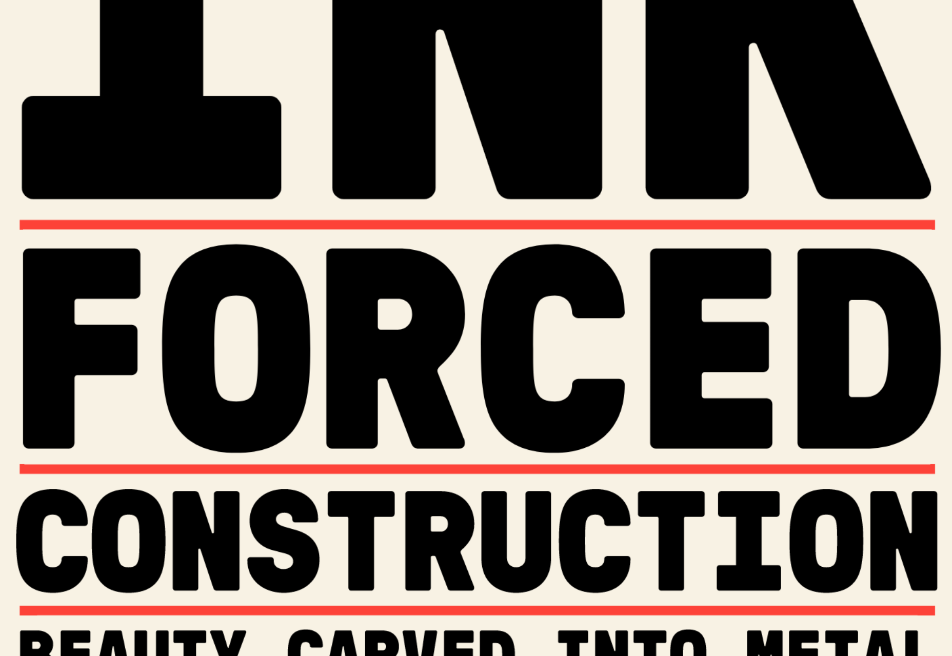
GT Pressura brings the warmth of print to the web by simulating the effect of ink spreading over paper. The subtle rounding of the sans typeface adds a unique visual interest to the mono, standard, and extended fonts.

Galdy

Script fonts are almost always based on a brush or a pen, traced into vectors. So it’s refreshing to see Galdy, a refined retro script. With a distinctly americana feel, it’s perfect for branding projects.

Nitido

Nitido is a humanist sans-serif typeface designed as a companion for Nitida. It is an expertly realized font family with seven weights and seven accompanying italics. As a result, it‘s ideally suited to corporate design work.

Kinckq

Kinckq is an intriguing experiment with variable font techniques. Inspired by a 19th-century woodcut font, Kinckq is a didone that bends through its middle, creating a 3D effect that’s made for large sizes.

Broger

Broger is another distorted typeface, this time twisting shapes and tying them together with elegant ligatures. It’s an excellent choice for branding in the health & beauty market.

Charte Mono

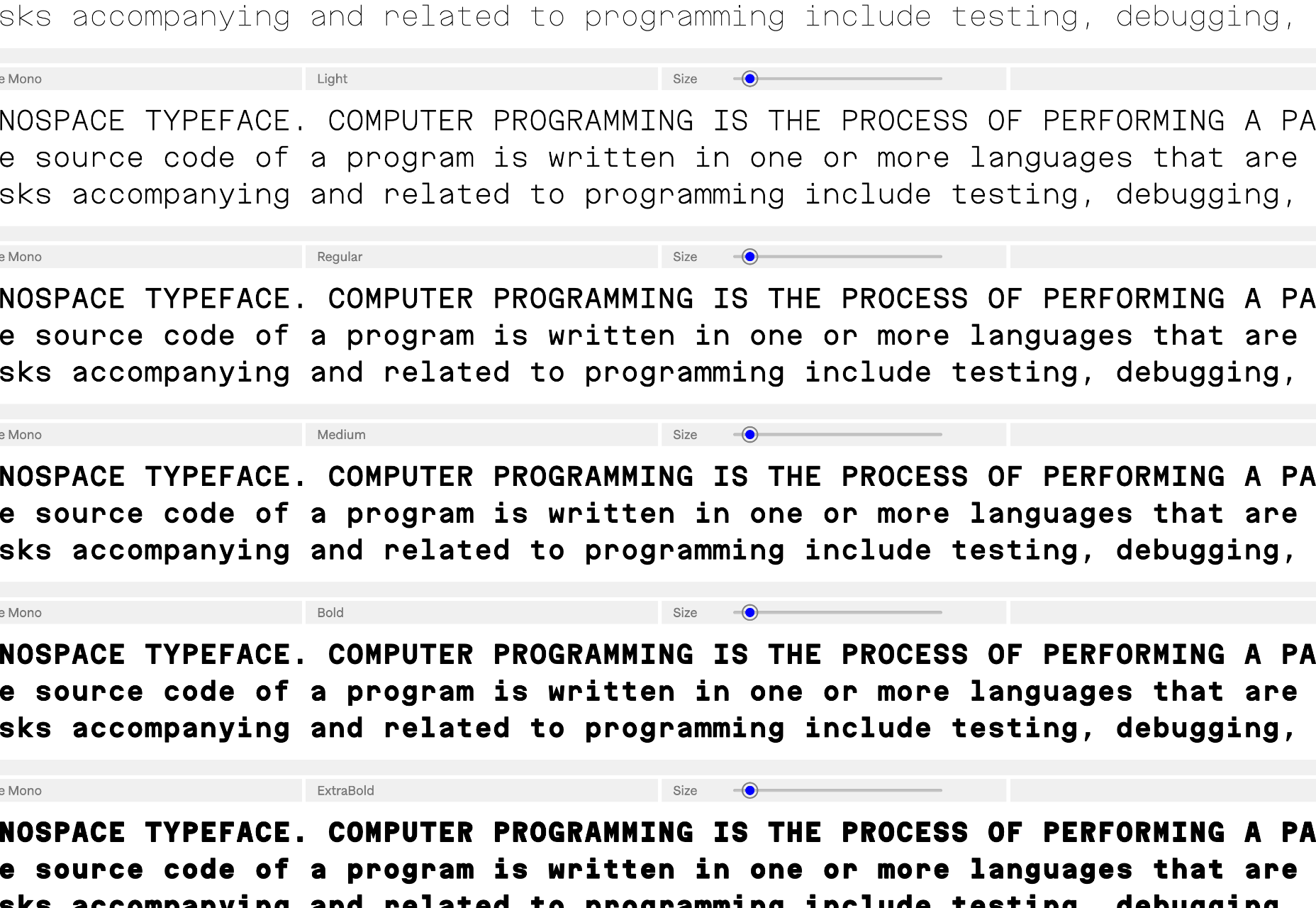
Charte Mono is another attempt to solve the unsolvable — the Latin alphabet is not monosized. However, when resolved as well as Charte Mono, monospaced fonts are excellent for user interface design, charts, and signage systems.

Lini

Lini is designed to be as compressed as possible while remaining highly legible. It supports Latin and Devanagari languages and works equally well in both forms. Lini is still in beta but is already award-winning.

Rotulo Variable

Rotulo is a variable font with huge contrast between its thick and thin strokes. Inspired by hand-lettering on signs, it’s a chunky option for branding or display type on websites.

Bouuuuuh

OK, so we’re a month late for Halloween, but Bouuuuuh is still worth a mention. Its cartoonish shapes are perfect for poster design, T-shirts, brand design, and, yes, next year’s Halloween marketing.

Source

The post 15 Best New Fonts, November 2022 first appeared on Webdesigner Depot.

Categories: Designing, Others Tags:

Finding Front-End Development Scholarships

November 16th, 2022 No comments

I’m often asked where to learn web development. The answer varies, of course, and we’ve published a few posts on the topic over the years, the most recent of which was Chris taking a stab at different learning paths in 2020.

The answer doesn’t have to be school. But sometimes it is, and if your goal is to earn a degree in front-end web development from a college or university, there are other questions you probably have. One of those is probably how the heck do I afford tuition? That’s the second most-asked question I get from the students I teach at my little city college. (Well, that and if they can get an extension on an assignment.)

Scholarships! That’s the golden ticket, right? Unlike a loan, a scholarship is money you don’t have to pay back. There are strings attached. You might need to write an essay with your application, demonstrate a certain level of academic success, or even complete the program before the any funds are dispersed.

Where to look for scholarships

Good gosh, there are practically hundreds of sites that turn up with a simple online search. The problem is that most of them are aggregate sites littered with ads and affiliate links, many of which busted years ago.

That makes finding a legit source of scholarships like finding a needle in the proverbial haystack. It’s a little easier if your goal is to sign up for some sort of coding bootcamp because those usually offer needs-based discounts up front. But that doesn’t help afford a college degree.

Besides an online search, your best bet for finding scholarships might be on major corporate websites, like Google and Microsoft, both of which offer annually recurring scholarships for a number of programs related to technology.

Finding front-end scholarships

As great as big companies can be for scholarships, you might find it tough to find a scholarship that’s explicitly for front-end development. That’s because many scholarships are only loosely tied to front-end development. Many of the scholarships I’ve found are more like:

  • Graphic communications
  • Media design
  • Digital media
  • Interactive design
  • Computer science
  • Information technology
  • Video game design

That’s a bummer because you’re essentially applying for a scholarship that’s open to other fields not directly related to front-end development.

And a certain scholarship offered this year might not be offered next year. It all depends on who is doling out the money and how much money they have to give. Often it’s going to be some private foundation, endowment, or small company that offers the most promising scholarships, and it could be a one-time deal. I found that many of the most enticing front-end scholarships ended years ago, but are still popping up all over those pesky aggregate sites that claim to have updated information for the current year.

Some scholarships worth looking at

I went down a few rabbit holes trying to find academic scholarships that specifically say “front-end development” or “web design” in their materials. Again, different scholarships have different strings attached to them and what I found today could be gone tomorrow.

That said, here’s a few (in no particular order) that passed my filters:

Scholarship Who it’s for How much it offers
BOWEN Web Design Scholarship Full or part-time students, with a declared major related to web design or development. $1,500
Chee Web Development Scholarship Students embarking on a web-related certificate or undergraduate degree. $1,000
The Web Development of Tomorrow Scholarship LGBTQ individuals $1,000
Lounge Lizard Web Design Students at an accredited school, or accepted to begin school at an accredited school within 6 months of application. $1,000
Digital Excellence Awards Scholarship Students under 25 in an accredited school looking for an education in web design, digital marketing, SEO, or computer science. $1,000
Net Solutions Annual Scholarship Students enrolled in a four-year college or university in the U.S., U.K., Canada, or Australia. $2,500

There could be more! These were just the ones I found. Link me up to others you know of in the comments and I’ll check ’em out to add to the list.

Front-end adjacent scholarships

If you’re willing to apply for scholarships that are less directly tied to front-end development, there are more to consider:

Online programs that offer scholarships

Not attending a college or university? Coding bootcamps are all the rage, or so I hear, and many of them are offered online with discounts and scholarship opportunities. I can’t personlly vouch for each and every bootcamp out there. If you’re interested in taking one — like maybe Fullstack Academy, Udacity, Coding Dojo, or any of the learning paths at Frontend Masters — then it’s worth a quick check for financial help.

We need better scholarships for budding developers

Seriously! For all the college and university students I know who are enrolled in a front-end development program, there is scant resourcing available to make their education more affordable — at least ones without stipulations for which school you’re attending or that are directly related to the front-end field.

Part of me is tempted to go on some sort of rant, but instead what I’ll say is this is a ripe area for private individuals and companies to step in and make a difference. Sure, there are lots of ways to “give back” and it doesn’t have to be a scholarship.

But I see a big hole here and I imagine it’s relatively easy for any mid-sized company to hand out $500-$1,000 once a year to promote education. It’s not only good for students and good for the web, but most likely good for the company, too.

Different types of front-end scholarships

Every scholarship I found is either directly tied to front-end development (or web design), or groups front-end development with other loosely-related disciplines. How cool would it be to see scholarships that are specifically for front-end and geared toward front-end disciplines?!

There are so many areas we could support…

  • Accessibility
  • Content management systems
  • Design systems
  • Front-end curriculum design
  • Inclusive design
  • Interoperability
  • Specifications and documentation
  • Technical writing
  • Web performance

…just to name a few.


Finding Front-End Development Scholarships originally published on CSS-Tricks, which is part of the DigitalOcean family. You should get the newsletter.

Categories: Designing, Others Tags:

Using Automated Test Results To Improve Accessibility

November 16th, 2022 No comments

A cursory google search will return a treasure trove of blog posts and articles espousing the value of adding accessibility checks to the testing automation pipeline. These articles are rife with tutorials and code snippets demonstrating just how simple it can be to grab one’s favorite open-source accessibility testing library, jam it into a cypress project, and presto changeo, shifting left, and accessibility has been achieved… right?

Unfortunately, no, because actioning results in a consistent, repeatable process is the actual goal of shift-left, not just injecting more testing. Unlike the aforementioned treasure trove of blog posts about how to add accessibility checks to testing automation, there is a noticeable dearth of content focused on how to leverage the results from those accessibility checks to drive change and improve accessibility.

With that in mind, the following article aims to fill that dearth by walking through a variety of ways to answer the question of “what’s next?” after the testing integration has been completed.

Status Quo

The confluence of maximum scalability and accessibility as requirements has brought most modern-day digital teams to the conclusion that the path to sustainable accessibility improvements requires a shift left with accessibility. Not surprisingly, the general agreement on the merits of shifting left has led to a tidal wave of content focused on how important it is to include accessibility checks in DevOps processes, like frontend testing automation, as a means to address accessibility earlier on in the product life cycle.

Unfortunately, there has yet to be a similar tidal wave of content addressing the important next steps of how to effectively use test results to fix problems and how to create processes and policies to reduce repeat issues and regression. This gap in enablement creates the problem that exists today:

The dramatic increase in the amount of accessibility testing performed in automation is not correlating to a proportional increase in the accessibility of the digital world.

Problem

The problem with the status quo is that without guidance on what to do with the results, increased testing does not correlate with increased accessibility (or a decrease in accessibility bugs).

Solutions

In order to properly tackle this problem, development teams need to be enabled and empowered to make the most of the output from automated accessibility testing. Only then can they effectively use the results to translate the increase in accessibility testing in their development lifecycle to a proportional decrease in accessibility issues that exist in the application.

How can we achieve this? With a combination of strategically positioned and mindfully structured quality gates within the CI/CD pipeline and leveraging freely available tools and technologies to efficiently remediate bugs when they are uncovered, your development team can be well on their way to effectively using automated accessibility results. Let’s dive into each of these ideas!

Quality Gates

Making a quality gate is an easy and effective way to automate an action on your project when committing your code. Most development teams now create gates to check if there are no linting errors, if all test cases have passed, or if the project has no errors. Automated accessibility results can fit right into this same model with ease!

Where Do The Gates Exist?

For the most part, the two primary locations for quality gates within the software development lifecycle (SDLC) are during pull requests (PRs) and build jobs (in CI).

With pull requests, one of the most commonly used tools is GitHub Actions, which allows development teams to automate a set of tasks that should be completed or checked when code is committed or deployed. In CI Jobs, the tools’ built-in functionality (Azure, Jenkins) is used to create a script that checks to see if test cases or scenario has passed. So, where does it make sense to have one for your team?

It all depends on what level development teams want to put a gate in place for accessibility testing results. If the team is doing more linting and component-level testing, the accessibility gate would make the most sense at a pull request level. If the automated test is at an integration level, meaning a full baked-out site ready for deployment, then the gate can be placed with a CI job.

Types Of Gates

There are two different ways that quality gates can operate: a soft check and a hard assertion.

A soft check is relatively simple in the definition. It looks at whether or not the accessibility tests were executed. That is it! If the accessibility checks were run, then the test passes. In contrast, assertions are more specific and stringent on what is allowed to pass. For example, if my accessibility test case runs, and it finds even ONE issue, the assertion fails, and the gate will say it has not passed.

So which one is most effective for your team? If you are looking to get more teams to buy into accessibility testing as a whole, a best practice is to not throw a hard assertion right away. Teams initially struggle with added tasks or requirements, and accessibility is no different. Starting with a soft gate allows teams to see what the requirement is going to be and what they are required to be doing.

Once a certain amount of time has passed, then that soft gate can switch to a hard assertion that will not allow a single automated issue out the door. However, if your team is mature enough and has been using accessibility automation for a while, a hard assertion may be used initially, as they already have experience with it.

Creating Effective Gates

Whether you are using a soft or hard gate, you have to create requirements that govern what the quality gate does with regard to accessibility automated results. Simply stating, “The accessibility test case failed,” is not the most effective way to make use of the automated results. Creation of gates that are data-driven, meaning they are based on a piece of data from the results, can help make a more effective gate that matches your development team or organization’s accessibility goals.

Here are three of the methods of applying assertions to govern accessibility quality:

  • Issue severity
    Pass or fail based on the existence or count of specific severity issues (Critical, Serious, and so on).
  • Most common issues
    Pass or fail based on the existence or count of specific issue types which are known to be most common (either global or organization specific).
  • Critical or Targeted UI /UX
    Do these bugs exist in high-traffic areas of the application, or do these bugs directly impede a user along a critical path through the UX?

Fixing Bugs

The creation and implementation of quality gates is an essential first step, but unfortunately, this is only half the battle. Ultimately a development organization needs to be able to fix the bugs found at the various quality gate inspection points. Otherwise, the applications’ quality will never improve, and nothing will clear the gates that were just put in place. What a terrifying thought that is.

In order to translate the adoption of the quality gates into improved accessibility, it is vital to be able to make effective use of the accessibility test results and leverage tools and technologies whenever possible to help drive remediation, which eliminates accessibility blockers and ultimately creates more inclusive experiences for users.

Accessibility Test Results

There is a common adage that “there is no such thing as bug-free software,” and given that accessibility conformance issues are bugs, this axiom applies to accessibility as well. As such, it is absolutely necessary to be able to clearly prioritize and triage accessibility test results in order to apply limited resources to seemingly unlimited bugs to fix them in as efficient and effective a way as possible.

It is helpful to have a few prioritization metrics to assist in the filtration and triage work when working with test results. Typically, context is an effective top-level filter, which is to say, attacking bugs and blockers that exist in high-traffic pages or screens or critical user flows is a useful way to drive maximal impact on the user experience and the application at large.

Another common filter, and one that is often secondary to the “context” filter mentioned above, is to prioritize bugs by their severity, which is to say, the impact on the user caused by the bug’s existence. Most free or open-source automated accessibility tools and libraries apply some form of issue severity or criticality label to their test results to help with this kind of prioritization.

Lastly, as a tertiary filter, some development teams are able to organize these bugs or tasks by thinking about the level of effort to implement a fix. This last filter isn’t something that will commonly be found in the test results themselves. Still, developers or product managers may be able to infer a level of effort estimation based on their own internal understanding of the application infrastructure and underlying source code.

Thankfully, accessibility test results, for the most part, share a level of consistency, regardless of which library is being used to generate the test results, in that they generally provide details about what specific checks failed, where the failures occurred in terms of page URL and sometimes even CSS or XPath as well as specific component HTML, and finally actionable recommendations on how to fix the components that failed the specific checks. That way, a developer always has a result that clearly states what’s wrong, where’s it wrong, and how to fix what’s wrong.

In the above ways, developers can clearly stack, rank, and prioritize tasks that result from automated accessibility test results. The test results themselves are typically designed to be clear and actionable so that each task can be remediated in a timely fashion. Again, the focus here is to be able to effectively deliver maximal impact with limited resources.

Helpful Tools

The above strategies are well and good in terms of having a clear direction for attacking known bugs within a project. Still, it can be daunting to figure out whether one’s remediation solution actually worked or further to figure out a path forward to prevent similar issues from recurring. This is where a number of free tools that exist in the community can come into play and support and empower development organizations to expedite remediation and enable validation of fixes, which ultimately improves downstream accessibility while maintaining development velocity.

One such family of free tools is the accessibility browser extension. These are free tools that can help teams locate, fix, and validate the remediation of accessibility bugs. It is likely that whatever accessibility library is being used in the CI/CD pipeline has an accompanying (and free) browser extension that can be used in local development environments. A couple of examples of browser extensions include:

The browser extensions allow a developer to quickly and easily scan a page in the browser, identify issues on the page, or as in the case described above, they can validate that an issue that was detected during the testing automation process, which they have since remediated, no longer exists (validation!). Browser extensions are also a fantastic tool that can be leveraged during active development to find and fix bugs before code gets committed. Often, they are used as a quality check during a pull request approval process, which can help prevent bugs from making their way downstream.

Another group of free tools that can help developers fix accessibility bugs is linters which can be integrated within the developers integrated development environment (IDE)and automatically identifies and sometimes automatically remediates accessibility bugs detected within the actual source code before it compiles and renders into HTML in a browser.

Linters are fantastic because they function similarly to a spell checker in a document editor tool like Microsoft Word. It’s largely fully automated and requires little to no effort for the developer. The downside is that linters typically have a limited number of reliable checks that can be executed for accessibility at the point of source code editing. Here are some of the top accessibility linters:

Equipping a development team with browser extensions and linters is a free and fast way to empower them to find and fix accessibility bugs immediately. The tools are simple to use, and no special accessibility training is required to execute the tests or consume and action the results. If the goal is to get farther faster with regard to actioning automated accessibility test results and improving accessibility, the adoption of these tools is a great first step.

The Next Level

Now that we have strategies for how to use results to improve accessibility at an operational level, what’s next? How can we ensure that all of our organization knows that accessibility is a practical piece of our development lifecycle? How can we build out our regression testing to include accessibility so that issues may not be reintroduced?

Codify it!

One way we can truly ensure that what we have created above will be done on a daily basis is to bring accessibility into your organization’s policy (also known as code policy or policy of code) — establishing such means that accessibility will be included throughout the SDLC as a foundational requirement and not an optional feature.

Although putting accessibility into the policy can take a while to achieve, the benefits of it are immeasurable. It creates a set of accessible coding practices that are clearly defined and established for how accessibility becomes part of the acceptance criteria or definition of “done” at the company level. We can use the automated accessibility results to drive this policy of code and ensure that the teams are doing full testing, using gates, and fixing the issues set by the policy!

Automate it!

Most automated accessibility testing libraries are standard out-of-the-box libraries that test generically for accessibility issues that exist on the page. The typical amount of issues caught is around 40%, which is a good amount. However, there is a way in which we can write automated accessibility tests to go above and beyond even more!

Accessibility regression scripts allow you to check accessibility functionality and markup to ensure that the contents of your page are behaving the way they should. Will this guarantee it works with a screen reader? Nope. But it will ensure that the accessible functionality of it is properly working.

For example, let’s say you have an expand/collapse section that shows extra details have you click the button. Automated accessibility libraries would be able to check to ensure the button has accessible text and maybe that it has a focus indicator. Writing a regression script, you could check to ensure the following:

  • It works with a keyboard (Enter and Space);
  • aria-expanded=” true/false” is properly set on the button;
  • The content in the expanded section is properly hidden from screen readers.

Doing this on key components can help ensure that the markup is properly set for assistive technology, and if there is an issue, it can be easier to debug if the issue is in code or potentially a bug in the assistive technology.

Conclusion

The “shift left” movement within the accessibility industry over the last few years has done a lot of good in terms of generating awareness and momentum. It has helped engage and activate companies and teams to actually take action to impact accessibility and inclusion within their digital properties, which in and of itself is a victory.

Even so, the actual impact on the overall accessibility of the digital world will continue to be somewhat limited until teams are not only empowered to execute tests in efficient ways but also that they are enabled to effectively use the test results to govern the overall quality, drive rapid remediation, and ultimately put process and structure in place to prevent regression.

In the end, the goal is really more than simply shifting left with accessibility, which often ends up taking what a bottleneck of testing in the QA stage of the SDLC is and simply dragging it left and upstream and placing it into the CI/CD pipeline. What really is desired, if sustainable digital accessibility transformation is the goal, is to decentralize the accessibility work and democratize it across the entire development team so that everyone participates (and hopefully into the design as well!) in the process.

The huge increase in automated accessibility testing adoption is a wonderful first step, but ultimately its impact is limited if we don’t know what to do with the results. If teams better understand how they can use these test results, then the increase in testing will, by default, increase accessibility in the end product. Simple gatekeeping, effective tool use and a mindful approach can have a major impact and lead to a more accessible digital world for all.

Related Reading on Smashing Magazine

Categories: Others Tags:

The Differences Between CRM and CMS Management Software

November 16th, 2022 No comments

CRMs and CMSs are both essential business tools. CRM software provides valuable insights into how your customers interact with your business. While CMS software helps you create and manage your website and other digital assets.

When choosing a CMS or CRM, it’s helpful to know the differences between them and how they can complement each other to grow your eCommerce business. In this post, we’ll explain the key differences and benefits of CRM vs. CMS software to help you decide which is right for you or if you need both.

What is CRM software?

CRM (Customer Relationship Management) software is a single source of truth that helps you track and manage your customer relationships throughout the sales cycle. Examples include Salesforce, Zendesk, Pipedrive, and SAP. Some VoIP service providers like 8×8 also offer integrated CRMs.

A CRM stores valuable customer information, such as their names, contact details, past interactions, and more. It pools information from your different business channels, organizes it, and provides detailed analytics and forecasts to help you give customers a seamless experience. 

Why do you need CRM software?

CRM software uses marketing automation to streamline your sales processes and improve productivity. Your employees can focus on nurturing leads, creating content, and other vital tasks to generate revenue for your business.

Also, by tracking interactions across channels, CRMs give sales representatives a clear picture of where each customer is in your sales pipeline. That way, your reps know when?and how?to follow up with each prospect. 

What is CMS software?

CMS (Content Management System) software helps you create and manage your website content and other digital assets. Examples include WordPress, Joomla, Shopify, Squarespace, and Wix.

A CMS provides back-end and front-end functionality to manage and publish your online content. So, it’s often the first type of software a business invests in.

Image sourced from Zippia

Why do you need CMS software?

CMS software comes with customizable themes and templates, meaning you can update content with a click. And, since the templates are responsive, your website will look great on any device.

With a CMS, you can schedule when and where to publish each piece of content. Plus, you can integrate your CMS with popular business tools like AWS and HubSpot, or use plugins for a ton of extra features. You can also link it with your UCaaS (UCaaS meaning, Unified Communications as a service).

A CMS also comes with built-in analytics to track the performance of your website, from traffic sources and bounce rates to how many people view your video customer support page.

CRM vs. CMS: How does the software differ?

The main difference between CRM and CMS software is that a CRM manages customer interactions, while a CMS manages your website and other content. But there’s a bit more to it than that?starting with how the software is priced.

Price

CRM platforms usually charge per user per month with monthly or annual billing. Some CRM products come with a limited free trial period, such as Salesforce. Others, like HubSpot, offer a free CRM, albeit with limited features.

The price of CMS platforms varies hugely depending on the level of functionality you need. CMS pricing ranges from free, open-source software to enterprise-grade software costing hundreds or even thousands of dollars per month. So, be sure you’re only paying for the features you need.

Business use

CRM software is primarily a sales tool, so it’s ideal for companies looking to improve the customer experience throughout the sales cycle. 

A CMS gives you the tools you need to market your business, from website building and blogging to email marketing and videos. So, it’s a must-have tool for any business looking to enact an effective eCommerce content strategy to attract and retain customers.

Image sourced from SelectHub

Features 

CRMs and CMSs also have very different features, although they both offer automation and analytics tools.

CRM 

A CRM comes with a range of features to track and manage your customer interactions. The most common capabilities are:

  • Contact management: Organize and store customer data from all your business channels.
  • Interaction tracking: Record customer interactions, such as purchase history and phone calls.
  • Lead management: Score, qualify, and follow up with leads. You can use lead management software to help you with this.
  • Email management: Integrate your email marketing software and run email campaigns from your CRM.
  • Document management: Store your important documents, such as marketing materials and pre-made templates.
  • Workflow automation: Automate routine tasks like drip campaigns, lead scoring, and call logging.
  • Reporting and analytics: Track campaign performance, forecast sales, and more to improve your business processes.

CMS

A CMS provides a variety of features to create, update, and manage your content, including:

  • Publishing tools: Publish content on your website, blog, social media pages, or other channels.
  • Templates and themes: Choose a pre-made template or theme or customize your own.
  • SEO tools: Create sitemaps, optimize metadata, and more to generate organic search traffic.
  • Content library: Store your content before publication, such as videos, images, and illustrations.
  • Web hosting: Store your site data in your CMS or integrate with a web hosting platform.
  • Site editor: Edit your site’s layout and content with coding or drag-and-drop editing.
  • Analytics: Track KPIs like website traffic, bounce rate, page views, and so on.

CRM vs CMS: Which is better for your business?

If you’re a small eCommerce business looking to grow or you mainly rely on inbound marketing, it makes sense to invest in CMS software first. Or, if you mainly rely on outbound sales, you’ll probably want to start with a CRM.

As your business scales, you’ll need to invest in?and integrate?both types of software. For instance, say you sell multiple line telephone systems. With your CMS, you can create marketing materials and other content to entice customers to buy them. 

Your CRM will then store the details of each sale. Plus, you can analyze the data to inform your future marketing campaigns and improve the buying experience.

Image created by writer

CRM and CMS: Better Together 

Rather than looking at it as CRM vs CMS, the two software can complement each other. CRM and CMS software are very different, but they both give you the tools you need to grow your brand. 

A CRM helps you streamline your sales process, organize customer data, and generate insights to improve the customer experience. A CMS, meanwhile, enables you to create, edit, and manage your website and other digital assets to generate sales.

By integrating a CRM with a CMS, you can optimize your sales funnel and earn your customers’ trust. And that’s great for your bottom line.

The post The Differences Between CRM and CMS Management Software appeared first on noupe.

Categories: Others Tags:

Behind the CSScenes, November 2022

November 15th, 2022 No comments

Is it Fall? Winter? I don’t know, but I woke up with snow in the front yard this morning and felt like it was time to write a little update about what’s been happening around CSS-Tricks this past month, as we’re known to do from time to time.

First up is the CSS-Tricks Newsletter! It’s starting to feel like we’re getting our rhythm down after months of hiatus. The last edition went out at the very end of October. That’s the third consecutive month we’ve been able to shoot it out which I’d call a big win for consistency. Nah, it’s not the weekly cadence we had before, but that’s something we’re aspiring to as our team continues to establish itself.

Speaking of which — we have a new team member! We brought Andrea Anderson on board. She’s a well-established technical editor and we’re lucky as heck she’s here. While she might work on a CSS-Tricks piece from time to time, her main focus is working on content that’s integrated into DigitalOcean’s Community site.

Oh, and while we’re on the topic of DigitalOcean’s Community, check out this Developer Markepear post deep-diving into DigitalOcean’s writing process. Seriously, it’s an incredibly deep dive that gets into the way tutorials are outlined and structured, the UX of navigating the tutorial archives, and even the delicate interplay between the content and advertising in each article.

I really like how DigitalOcean’s tutorials are described as “give-first” content that “has a smell of value all over it.” It speaks volumes about the team’s work ethic, which I can personally attest is top-notch. It’s really the reason DigitalOcean and CSS-Tricks make a great match.

Advertising is also pretty top-of-mind for us right now. When we ran a survey the other month, we knew that there’d be concerns about how CSS-Tricks ads would be affected after the DigitalOcean acquisition. Would we remove them? Make them all about DigitalOcean? Keep everything as-is? I mean, CSS-Tricks has traditionally relied on an advertising model to keep the lights on, but now that it’s backed by a company, how much do we really need to rely on ads at all?

Turns out many of you like the ads, according to the survey. They’re sort of like product recommendations baked into the site, and I think that’s a testament to Chris’s effort to make sure ads are (1) promoting good stuff and (2) are relevant to the front-end work we do. Case in point: we recently swapped out a bunch of DigitalOcean ads to promote Cloudways hosting after DigitalOcean acquired it. Those ads didn’t do so well, so we swapped the DigitalOcean ones back in, which were already doing quite well.

(The advertised deal is pretty darn good, by the way… $200 in free credits to spin up your project.)

The work to move CSS-Tricks from WordPress to the same CMS the DigitalOcean Community uses for its content is still in progress. A lot of the work is still mapping WordPress content fields to the new CMS. That’s no trivial task when we’re talking about a website with 7,000-odd articles over a 15-year span. That’s going well, as is the initial site architecture. Next up, we need to figure out how we’re handling WordPress blocks, replicating their features, and creating an inventory of all that we need to carry over. Phew!

New faces!

As always, we tend to have a few new faces on the site each month as we work with new guest authors. This month, we welcomed Krzysztof Gonciarz and Lorenzo Bonannella. Check out their articles and give ’em a high five for sharing their work. It takes a lot of work to write, not to mention some courage to put your ideas in front of other people. So, thanks a bunch Krzysztof and Lorenzo!

Meet Mojtaba Seyedi

I thought catching up with one of our long-time writers would be a nice way to cap off this month’s update. And few people have contributed as many articles to CSS-Tricks as Mojtaba Seyedi. You may not see his name pop up in the archives all that much, but it’s only because he spends so much time in the Almanac.

I asked Mojtaba a few questions about his work and he graciously responded with these answers…

Your very first article with us was a roundup of plugins for the Sublime Text editor way back in 2017. What made you think to publish it on CSS-Tricks?

I used to be very passionate about the Sublime Text editor and its plugins. I could always find a plugin to ease the pain whenever I was tired of doing repetitive tasks. I would show my co-workers how interesting whatever plugin I was using was and encourage them to use it.

One of my New Year’s resolutions back then — in 2017 — was to publish an article on CSS-Tricks. I always thought the idea had been highly technical. It never occurred to me I could simply create a list of Sublime Text plugins that I happened to find useful for development! Nowadays, I can see how the high bar I had set was preventing me from writing about something that I loved.

There was a brief moment when I considered giving up on that first article. I had psyched myself out thinking that there were tons of other posts already covering the exact same thing. But out of curiosity, I Googled some of the top Sublime Text plugin posts, and surprisingly, I didn’t see any of the plugins I was writing about. So, that’s how I submitted my first article on this website!

You’ve written a total of 35 articles for CSS-Tricks, 33 of which are in the Almanac. What do you enjoy about writing technical information like that?

Almanac entries are referenceable. We keep coming back to them to check the syntax of a property or a selector. For example, we might need to visit the background shorthand property to remember whether the background-position value goes before or after the slash (/). References never get old, which is why the Almanac is special to me.

Along the same lines, documentation is challenging. One of the challenges of writing for the CSS-Tricks Almanac is reading and understanding the W3C’s specifications. For example, when I wanted to write about the mask-border property, the CSS spec was practically my only source. I needed to figure out all the aspects of that module and how different values behave in different situations because there were scant examples in the wild. I enjoy that sort of challenge and feel great when I can turn my findings into something tangible that other developers can understand and use in their own work.

There’s also the joy of completeness. Documentation allows me to get deep into details that might not make it in a typical article. I get satisfaction when I’m able to grasp a property or selector and explain it in my own words. The CSS-Tricks Alamanc gives me that opportunity.

What can you say about the editing process for those who haven’t gone through it?

First, enjoy a clean and easy process. The CSS-Tricks editorial team will help you improve it and make it better than you can on your own.

Also, be sure to edit your draft first. Always edit the article yourself before submitting it. The more ready your writing is, the more time it gives the editor to help you improve your work. If the editor needs to spend a lot of time fixing basic grammar and spelling, that’s time that could have been spent pushing the idea further with feedback and other considerations.

And, of course, learn from your mistakes. Be open to learning while you’re in the editing process. The editorial team here is very experienced and helpful. I try to review what they have changed in my article and put them into practice in my next writings. I would love to thank Geoff, from whom I have learned a lot about technical writing.

Do you have any tips for someone thinking about submitting an article proposal?

Do not overthink the idea. Your article doesn’t have to be rocket science. Anything you know well enough to write about can be helpful to others.

Another piece of advice: do not underestimate yourself. When Chris Coyier invited the community to contribute to the CSS-Tricks Almanac, I told myself there were many more qualified people who could do that, even though I had experience writing CSS docs. And yes, many folks were (and maybe still are) more knowledgeable than me. But as it turned out, I could be a part of this because I was willing to try.

Another big deal is to not worry about repeating others. Your idea doesn’t have to be unique. You can write about something others have written about in a new and different way. Your point of view and perspective matter! Your approach to solving a problem and how you explain it might be different in a super helpful way.

And finally… what’s your favorite CSS trick?

My favorite trick used to be centering an element by setting display: table on it and letting auto margins do the rest. Nowadays, with CSS becoming much more awesome, I can do the same trick with min-content and without an additional wrapper.

I’m sure there is a blog post or article about this same topic somewhere on the web. But I would like to write about it here on CSS-Tricks. See? I want to share my own perspective with you and I want to explain it in my own way.

Have something you want to share on CSS-Tricks? Send us your pitch!


Behind the CSScenes, November 2022 originally published on CSS-Tricks, which is part of the DigitalOcean family. You should get the newsletter.

Categories: Designing, Others Tags:

What Digital Marketing has to Learn from more Traditional Efforts

November 15th, 2022 No comments

Digital marketing continues to be one of the primary forms of consumer outreach. Its methods, such as websites, certainly tend to be more accessible to a wider range of businesses than many analog methods. Even small enterprises have the ability to reach a genuinely global audience without decimating their budgets. Not to mention that brands can now create impactful video and textual content without seeking out relationships with television networks or publishers. 

But does this mean that traditional marketing should be discarded as irrelevant? Far from it. Both digital and analog practices have important roles to play in the current landscape. Even when traditional tools aren’t appropriate, the methods and ideas behind them can help make digital practices more effective.

Let’s dive a little deeper into this idea by exploring what digital marketing still has to learn from traditional approaches. How can you utilize this knowledge effectively in your campaigns?

Recognize the Differences

The first step is to gain a better understanding of what separates these approaches to advertising. When marketers assume false equivalencies between traditional and digital marketing methods this prevents either from being effective tools. For instance, thinking of search engine optimization (SEO) as just another form of billboard is both inaccurate and unhelpful. While both can be used to raise visibility, they each have different roles in achieving this. SEO is more akin to improving statistics in a way that demonstrates to search algorithms that your marketing materials present value to searchers. While a billboard is a static brand statement that is intended to immediately grab attention.

Learning about the key differences between these marketing methods isn’t just about selecting the right tools for your campaigns. It also helps you to embrace these variations in ways that benefit your strategies. It also empowers you to truly understand what aspects of traditional marketing you should aim to transfer into your digital approach wherever possible.

Make Meaningful Connections

The first and perhaps most important thing digital marketers can learn from traditional efforts is the focus on building meaningful connections. Too often, digital marketing is aimed at gaining engagement from as wide an audience spread as possible. Unfortunately, the methods and tools used to achieve this forgo the genuine human connection that is so often found in analog marketing.

If you think about it, traditional marketing can’t rely on the potential for consumers to revisit content later or bookmark pages. It has to gain the trust and enthusiasm of audiences in a short space of time. As a result, traditional marketers tend to lean into messaging and tools that enhance the recipient’s emotional connection to the brand. This can often be made more meaningful by traditional tools that are more physically integrated into the audience’s lives, like their daily newspapers or the billboards they drive past every day on their commute to work.

Digital marketing really needs to gain a better handle on forging those meaningful connections. Videos and podcasts can be informative while also utilizing audiovisual elements that induce positive emotional responses. When digital marketers partner with influencers, they should prioritize those with more than a surface role in their followers’ lives.

Focus Locally

Among the key differences between digital and traditional marketing is the potential reach. Purely online campaigns have the advantage of the potential to connect with a global audience. There are certainly opportunities for global campaigns with analog tools, but these tend to be more expensive and a little unwieldy. As such, traditional marketing practices usually have a far more localized focus.

This localization doesn’t necessarily mean traditional marketing is inferior. In many cases, it allows marketers to make more relevant and impactful pitches to consumers. When brands reach out to customers in limited geographical areas, the content and visuals can be tailored to the preferences of local demographics. Sponsorship of local teams and events can also mean the brand gains invaluable community recognition that wouldn’t usually be achieved through social media marketing.  

There is starting to be greater recognition of the importance of this approach, with localized SEO becoming more prevalent. Nevertheless, this still focuses on search engine rankings and discovery. Digital marketers need to learn from traditional marketers’ approaches to gaining footholds in communities. This could certainly involve performing outreach to online groups or subcultures or partnering with live-streamed events like esports tournaments.

Incorporate Analog Approaches

The differences between digital and traditional methods should be recognized and embraced. However, it’s always worth exploring whether there are elements of analog approaches that can be directly transplanted into digital tools. After all, there are certain traditional methods that continue to be effective despite rising digital dominance. Delivering the substance of traditional marketing in a digital manner can help brands gain the best of both worlds. 

It’s important to be mindful in your approach here, as not every tool is suitable for this kind of digital transference. One analog method that is worth exploring in digital realism is the sales mail-out. Analog direct mail is most effective when it provides recipients with personalized value. This often involves coupons based on consumers’ purchases or information in an area of niche interest. Therefore, your email marketing campaigns shouldn’t just introduce your company and provide a call to action. Offer value via sales emails by including a piece of informative or entertaining digital content or a unique discount code for their preferred products.

Conclusion

As a digital marketer, it is vital not to dismiss traditional efforts as irrelevant. While some of the tools are different, this doesn’t mean the methods and intentions can’t still be useful. The first step should always be to gain a better understanding of the differences between each to avoid making unhelpful false equivalencies. Digital marketers must find ways to enhance the emotional value of their content to make similar meaningful connections to traditional counterparts. By the same token, having a more local digital focus can bring brands closer to communities. Not all analog practices can make a good transition to the digital landscape. Nevertheless, marketers should take the time to explore the opportunities and ideas traditional approaches offer.

The post What Digital Marketing has to Learn from more Traditional Efforts appeared first on noupe.

Categories: Others Tags:

20 Best AI Writing Apps

November 14th, 2022 No comments

Artificial intelligence is the latest buzzword in the tech world. It’s everywhere and has been for a while, but AI-powered writing software is a relatively new concept.

AI Writing Software uses artificial intelligence to write articles, blog posts, and other content in your voice. The goal is to provide a tool that will save you time and energy so you can focus on different aspects of your business or life.
To help you get started, we’ve compiled a list of 20 AI writing software you can use to create content for your website, blog, or social media accounts.

1. Copy.ai 

Copy.ai uses Natural Language Processing (NLP) to produce high-quality content for your business, ebooks, blog posts, articles, product descriptions, social media content, and more. It can also be used to rewrite existing content so that you can use it on your website, blog, or social media pages.
Since it uses artificial intelligence to mimic human writing patterns and styles, the copy will be more natural and easier to read than the typical machine-generated text we’re used to seeing.

Copy.ai differs from traditional content creation tools because it doesn’t just offer suggestions on improving your current content; it generates new text based on what it thinks would be most relevant for the topic or audience.

Key Features: 

  • Pre-built Templates – Copy.ai has a ton of pre-built templates for different kinds of content. For example, you can see below that it has options for blogs, social media content, video, case studies, and more:

  • Different tones and variations – Get access to tones like friendly, persuasive, professional, luxury, witty, bold, and more to align the content with your writing style. It also creates multiple variations based on your input – you can pick the one you like or make more.

    To illustrate this, here’s a screenshot of the results we got while trying to write the introduction for this article using Copy AI. 

  • Writing and Brainstorming tools – You also get tons of writing tools, brainstorming tools, and personal tools. Writing tools include essay intro, cliffhanger generator, adjective accelerator, passive to active voice, verb booster, and the like. Brainstorming tools have a name generator, startup ideas, viral ideas, and more – while Personal tools include birthday cards, clubhouse bios, cover letters, love letters, and shower thoughts.

    You can save your content and then return to it later if you wish. Plus, the software’s user interface is easy to navigate, and the program is simple. 

Luciano Viterale, Co-founder of Ticker Nerd, also shares his experience with Copy.ai

“I’ve been experimenting with AI copywriting tools since GPT-3 was released. I have explored many of the popular tools. However, my favorite tool by far is Copy AI. They have an outstanding blogging outline feature; the UX is clean and easy to navigate, and the pricing is reasonable.

Copy AI also generated the name of my startup, “Ticker Nerd,” which is an investing newsletter that was recently acquired.”

That said, Viterale suggests that the blog outlines can be repetitive. He says, “one thing I don’t particularly like is that blog outlines include the same point repeatedly but articulated slightly differently, essentially adding no value.” 

Pros: 

  • Copy.ai produces content at least 80% as good as a human writer (and often better). The system continually learns, which means the more you use it, the better it gets. 
  • It has an extensive library of templates available for different requirements. 
  • It supports over 25 languages, including English, French, Spanish, Portuguese, German, Italian, Dutch, Russian, and more. 

Cons: 

  • Not suitable for long-form content. 
  • The content can get a bit repetitive after a while.  
  • The free plan lets you create only 2000 words per month. 

Pricing: 

It starts from $39 per month (if you pay yearly) for up to 40k words per month, unlimited copywriting tools, priority email support, Blog Wizard tool, support for 25+ languages, and five user seats. 

2. Jasper 

Jasper.ai is an AI copywriting tool that uses a combination of artificial intelligence (AI) and natural language processing (NLP) to create content based on user input. 

It helps you generate original content for your blogs, social media, websites, and more. Jasper also knows 10% of what’s on the internet and continues to learn more daily.

Just like Copy.ai, Jasper’s user interface is easy to use and navigate around. With its specific template for blog posts, articles, ebooks, and more, it’s also one of the few AI writing software suitable for long-form content. 

All you have to do is enter the title, your intended audience, tone of voice, and language options, along with the main point of your copy, and voila – Jasper can churn out a high-quality piece of content for you within seconds.

(Jasper Interface

Key Features: 

  • 50+ AI templates – Jasper.ai offers a variety of AI templates, including Blog Posts, Summary, Conclusion, Q&A, Ads, Videos, Social Media, Rewriter, Marketing Frameworks, Articles, and more. Each template has several use cases – for example, a blog has Blog Titles, Content Briefs, and Outlines.

Headline Generator

  • Boss Mode lets you write long-form content such as blog posts, stories, and books. It also allows you to organize your content into projects and find help with priority chat support, Grammarly integration, and plagiarism checks. You can also choose from 25 languages, including English, French, German, Italian, Spanish, Polish, and more.
  • SurferSEO Integration – If you have a Boss Mode plan, you can add SurferSEO to your Jasper account. This integration will enable you to find the best keywords, build a content strategy, create blog outlines, and more.

Content production using Surfer SEO Integration

Pros: 

  • No technical assistance is required.
  • Simple, easy-to-use interface.
  • Provides plagiarism-free content every time.
  • It helps you build a content strategy based on high-ranking topics and keywords.
  • Ready-to-use templates cover most of the use cases that a writer or marketer will need.
  • Excellent customer support is provided through live training sessions, live Q&A sessions, blogs, Facebook community, help docs, and emails.

Cons: 

  • Plagiarism-free content doesn’t always mean unique content.
  • Customer support options via chat or email are limited.

Pricing: 

It starts with $40/mo for 35K words, 50+ AI templates, 20+ languages, up to 5 seats, and chat support.

3. Rytr 

Rytr is a content generation tool that uses AI to generate high-quality, human-sounding content for emails, blogs, YouTube videos, and landing pages. 

It also supports multiple languages and tones and uses copywriting frameworks, including AIDA & PAS. And to ensure that your content is free of plagiarism, it comes with a built-in plagiarism checker.

Like Copy.ai. Rytr is also more suitable for short-form content and copywriting than long-form content. 

Key Features: 

  • 30+ languages – Rytr supports many languages, including English, Finnish, French, German, Greek, Italian, Japanese, Korean and Polish. It also uses a proprietary approach to support languages that are not supported by the limitations of GPT3.

Language Support

  • Use Cases: Rytr offers 40+ use cases, including Blog Section Writing, Blog Ideas & Outline, Brand Name, Business Idea Pitches, Call-to-action, Cover letters, Emails, and more.

    Each use case has a short description of what it’s about below it. Select the use case to write about, give a little context about what you want to write, and then select how many variants you want the AI to write for you (max is 3). 

You can also choose a creativity level by selecting one of 6 options, including Default, Non, Low, Medium, High, or Max.

Generating Blog Ideas & Outlines

  • Tone – You can add a personal touch to your content by choosing from over 18 tones, including Formal, Convincing, Inspirational, and more.

Writing in a formal tone.

Pros: 

  • Simple user interface.
  • Fast live chat support.
  • Using the magic command, you can produce content for poems, letters, and more.
  • Comes with an in-built tool for plagiarism checks.
  • Provides multiple resources for guidance.

Cons: 

  • Tone options are limited.
  • You will receive a small number of credits per month.

Pricing: 

It starts at $9/month for 100K characters per month. There is also a free plan with a 10K characters limit.

4. Writesonic 

Writesonic is a content-creation platform that uses generative artificial intelligence models to write SEO-optimized long-form blogs and articles. 

It has 65+ use cases or templates, including Article Writer 3.0, Landing Pages, Tweets, Quora Answers, Facebook Ads, and more.

You can easily create desired content by picking a suitable use case, typing a topic, and adding a paragraph of your own words. You can also set the language and quality level before generating it.

Generating Pros and Cons

Key Features: 

  • 24 Languages: You can produce content in 24 languages, including English, Dutch, French, German, Italian, Russian, Czech, Danish, Greek, Hungarian, and more. They’re also continually adding more language options.

Languages

  • Unconventional Use Cases: It’s got a more comprehensive range of templates, including Sentence Expander, Text Summary, Conclusion Writer, YouTube Outlines, LinkedIn Ad Descriptions, Analogy Maker, Question Generator, Song Lyrics, Definition, and more.
  • SEMrush and WordPress Integrations: Writesonic integrates with SEMrush, Zapier, and WordPress.org. SEMrush helps you optimize your content for search engines, and WordPress.org lets you publish your blog directly from Writesonic. Zapier integration enables you to automate your content from Writesonic.

SEMrush Integration

Pros: 

  • Easy to use.
  • The User Interface gives you step-by-step instructions and tips for how to use the tool more efficiently.
  • There are many unique use cases, including a hook generator, pros and cons generator, and landing page creator.
  • Free trial available.

Cons: 

  • Like other tools on this list, the copy may not always be accurate. 

Pricing: 

It starts at $10/month for 12K words, 70+ AI templates, a Landing page generator, a browser extension, Zapier integration, and more.

5. Grammarly Business 

Like most other tools on this list, Grammarly Business isn’t an AI-based content writer per se—it’s more like an AI-based writing assistant. Specifically, it checks your documents for grammar, spelling, plagiarism, and style mistakes.

Grammarly Business also provides feedback on your writing style so that you can improve as a writer over time. 

You can use Grammarly Business to:

  • Get suggestions to improve your writing style, including word choice and sentence structure.
  • Identify common grammatical mistakes and fix them in one click.
  • Improve your email response time by checking emails before they’re sent out.

It’s also ideal for larger teams of writers who need to access the same Grammarly accounts, enabling multiple users to edit documents simultaneously.

One of the best parts about this tool is that it integrates with every online writing space, including Google Docs. This allows you to write and edit simultaneously without waiting for one draft to be finished before making changes to the next.

Key Features: 

  • Custom Brand Tone: You can create multiple tone profiles to suit your needs and assign them to different Teams. You’ll also get real-time feedback on your tone and can adjust it while writing. Your tone can be anything from Joyful, Excited, Loving, and Surprised to Curious, Formal, and Cautionary.

Brand Tone Feedback

  • Grammar Checker: Grammarly gives you feedback on everything that can be improved in your writing – from typos to sentence structure. It also checks for grammar mistakes, spelling errors, and incorrect punctuation.
  • Style Guide: Grammarly Style Guide enables you to establish a uniform tone and style across all your teams. You can set a library of words, terms, and phrases that your teams should adhere to.

    You can also prevent them from using complex acronyms or jargon. Lastly, you can get feedback on how the performance has increased with the Style Guide.

Style Guide Analytics

Pros: 

  • Real-time feedback on errors and tone usage.
  • Grammarly gives instant, easy-to-understand feedback and lets you fix mistakes with just one click.
  • You can always add new words to the dictionary.

Cons: 

  • It flags passive voice as an error.
  • Grammarly is good at catching mistakes, but sometimes it corrects things unnecessarily.

Pricing: 

It starts at $15/month for one member, real-time feedback, style guide, snippets, brand tones, admin controls, and more.

6. Peppertype.ai 

Peppertype.ai is another AI-based content generation tool that claims to create content ten times faster, boost Google ranking, and optimize conversions.

It’s a simple but valuable tool for writers who need help getting started on their next article, email, or blog post.

Some of its use cases include a product review generator, Amazon product descriptions, personal bio, email subject lines, cold emails, paragraph writing, Google Ad copy, Meta descriptions, blog outlines, blog conclusion, and more.

Key Features: 

  • Projects: You can organize your content under Projects, which will group similar types of content so that you have an easier time finding and repurposing the content.

Projects

  • Output personalization: You can like or dislike the output so that the AI behind it can learn your preferences and improve its performance.

Personalizing output

Pros: 

  • If you invite your friends to use Peppertype.ai, join our community, write them a review, and schedule a training call, they’ll reward you with more word credits.
  • You can create teams, projects, and workspaces.
  • You can filter out unwanted results with annotations.

Cons: 

  • One seat is expensive, and the price increases with each added seat.

Pricing: 

It starts at $35/month for one user, 50K words, 40+ use cases, unlimited projects, customer support, and more.

7. Anyword 

Anyword is a copywriting AI that creates content tailored for your customers and target audiences. 

It has a unique feature – the predictive performance score to predict how well your copy will perform and engage with your audience. This helps you write optimized texts that boost your conversions.

It has 11 major use cases, including a social post generator, Instagram caption generator, sentence rewriter, AI writer tool, meta description generator, Ad copy, landing page, blog, and more. 

Generating Facebook Post

Although it can create blog post titles and outlines, it’s better suited for writing short-form content like ad copy, product descriptions, and headlines. When writing a blog post, it can generate the title, outline, and introduction before creating body paragraphs.

Key Features: 

  • Predictive Performance Score: This score is given to your copy based on its potential to perform well with your target audience. This can help you immediately improve your copy.

Predictive Performance Score

  • Website Triggered Messages: This feature helps you create and deploy multiple copy variations on your website and apply the best one automatically.

Pros: 

  • It offers a predictive performance score to optimize your copy beforehand.
  • It also offers a free social post generator. No sign-up is required.
  • It automatically creates and runs multiple copy variations to determine the best one.
  • A Freemium plan is available.

Cons: 

  • Limited use cases.
  • A bit expensive for the credits and the number of use cases it offers.

Pricing: 

It costs $24/month for 20K words and one seat.

8. Scalenut 

Scalenut uses Natural Language Processing (NLP) to produce content that ranks higher on search results. It also gives insights into statistics such as word count, grade level, H tags, readability, and the number of images you should use in your content piece. 

Aside from that, it offers a variety of use cases, including SEO Hub, AI Copywriter, Talent Network, Chrome Extension, Cruise Mode, and more. With these features, you can create content for blog ideas, product descriptions, website copies, blog intros, and more.

Key Features: 

  • Integrations: You can integrate Scalenut with SEMrush for keyword research, cluster boost, and Copyscape to check plagiarism.

App integrations

  • Cruise Mode: Cruise Mode helps you create blog content in 5 minutes. You just need to provide your blog post’s title, outline, and main points to get your intended content. You’ll also get a real-time quality score that helps you improve your search ranking.

Pros: 

  • It offers a quality score.
  • Affordable plans with a 7-day free trial.
  • 24*7 chat & email support.

Cons: 

  • Limited use cases and features.
  • Content quality is not consistent for all businesses.

Pricing: 

It starts at $12/month for 100K AI words, 5 SEO reports, 24*7 chat and email support, and more.

9. Frase.io 

Frase.io is an all-in-one AI writing tool that helps you, research competitors, develop content briefs, and produce and optimize content.

First, you’ll analyze your search competitors using Frase so you can see what your competition is writing about. Next, you can focus on Then, your overall outline or dig deeper by focusing on individual headlines, external links, statistics, etc. 

Next, use Frase’s AI writer to finish your draft. You can choose from dozens of use cases to generate content, including product descriptions, blog introductions, and more. You can even automatically expand on what you’re currently writing or rewrite what you’ve already written. 

Finally, you can optimize your draft using recommended keywords and readability scores. Again, Frase provides real-time feedback as you fill in the gaps. 

Key Features: 

  • AI Writing Tools: They include an AI content generator, introduction generator, outline generator, paraphrasing tool, paragraph rewriter, blog title generator, meta description generator, product description generator, slogan generator, summary generator, sentence rewriter, and more. 

Blog introduction generator

  • Content Analytics: It fetches data from Google Search Console to provide insights into organic growth, content decay, and keyword opportunities.

Frase Content Analytics

  • Integrations: It integrates with Google Docs, Google Search Console, and WordPress. It also offers a Chrome extension.

Frase Integrations

Pros: 

  • You can add multiple pages in a single doc.
  • It offers content analytics, allowing you to see which articles are getting the most traction and which ones are not.
  • It enables you to do competitors’ research.

Cons: 

  • Limited word credits in each plan.
  • Max 3 seats available.

Pricing: 

It starts at $14.99/month for one user, 20K AI characters, and four articles (write/optimize) per month. There’s also a 5-day free trial for $1. 

10. Surfer SEO 

Surfer SEO is an SEO tool and AI writing assistance that uses Natural Language Processing (NLP) and machine learning (ML) to help you manage and improve your content strategy.

Rather than creating the body of your copy, it helps you create outlines and optimize the content you write based on that outline. 

It helps you to evaluate your content and find places to improve it using its content score metric, competitor research, SERP analyzer, and keyword recommendations. It also offers a content planner that you can share with your team. 

Key Features: 

  • Outline Builder for Content Editor: The tool generates headlines and paragraphs based on your competitors’ postings. You can use that content as is or edit it by copy-pasting it into the editor. Content paragraphs are available in English, German, French, Polish, Swedish, and Dutch.

Outline Builder Content Builder

  • SEO Audit Tool: This tool performs step-by-step optimization on your website to improve your Google search results. When you pick an URL to audit, it provides suggestions such as missing backlinks, internal links, word count, and important keywords to use.

Terms to use

  • Content Planner: You can start with your content planner by keyword or domain. Based on your keywords, it comes up with clusters that you can use to create your content topics.

    However, there is a learning curve involved. You will need to understand topic clusters, search intent, and keyword difficulty, among other metrics.

Content Planner

Pros: 

  • Easy to use interface.
  • They offer a 7-day money-back guarantee – if you don’t find it helpful, you get your money back.
  • It identifies keyword stuffing and prevents you from doing so.

Cons: 

  • Each plan offers a limited number of pages that you can audit.

Pricing:

It starts at $49/month for one website tracking and ten articles/month.

11. Copysmith 

Copysmith markets itself as an AI content creation solution for teams. 

This AI writer is best suited for bulk and short-form content copy like product descriptions, blog templates, social media content, advertising content, and more.

Key Features: 

  • Use cases: It includes product descriptions, content enhancement, ads & social media, blog templates, and brainstorming. With Product descriptions, you can generate descriptions for eCommerce Products, Instagram, Amazon, eBay, Etsy, and Flipkart. Blog templates include blog titles, blog ideas, outlines, intro, Kickstarter, and more.

Product Description

  • Campaign Builder: It includes several AI templates to help you generate SEO-optimized product descriptions, Facebook posts, and Google ads in just a few seconds. 
  • Integrations: Copysmith integrates with Frase to use SEO data, Google Ads to publish campaigns, Microsoft Word to produce content, and WooCommerce for products.

Pros: 

  • It’s easy to use and generates SEO-optimized content.
  • It comes with an in-built plagiarism checker.
  • Provides good training material for new users.

Cons: 

  • Not suitable for long-form content. 

Pricing:  

It starts at $19/month for 75 credits, up to 40K words, and up to 20 plagiarism checks.

12. ClosersCopy  

ClosersCopy is an AI writing robot that provides various templates for producing marketing materials, including website content, sales copy, email marketing campaigns, and social media posts. This tool doesn’t require any special skills or training to create engaging text.

Key Features: 

  • Use cases: It includes Facebook & Google Ads, email subject lines, landing pages, sales copies, social media content, and more.
  • LongForm editor: You can create blog posts, articles, sales copies, and email marketing copies.
  • Drag-and-drop builders: The drag-and-drop content builder makes your tasks more manageable by allowing you to drag and drop elements on your copy. The only thing you need to do is provide some context at the time of configuring this builder.

Pros: 

  • Its user interface is easy to use and navigate.
  • You can easily create content with their drag-and-drop builder.
  • The video tutorials provide in-depth, step-by-step instructions for each process.
  • Tone analysis helps you understand the emotions in your writing.

Cons: 

  • No free plan or trial period is available.
  • More expensive than most other AI tools.

Pricing:  

It starts at $49.99/month for two seats, 300 AI runs, 50 SEO Audits, an SEO planner, Email support, and more.

13. LongShot AI

LongShot AI is another writing tool that can help you write SEO-friendly content. It comes with over 30 use cases and a plagiarism checker to ensure your content is original. 

While most of its use cases are for short-form content, you can use templates like the content expander, write more, or bullets to text generator to assist you with your long-form piece. 

Key Features: 

  • Use Cases: It includes content rephrasing, FAQ generator, headline generator, blog ideas generator, meta description generator, text extender, blog insights creator, headline intro generator, product description generator, FAB copywriting framework generator, content readability improver, sales email generator, video description generator, and more.

Headline Generator

  • Integrations: It integrates with WordPress to enable you to export AI-generated copies directly to WordPress. Its integration with SEMrush will help you write SEO-friendly content. Apart from these, LongShot AI will also provide integration with Hubspot and Grammarly soon.

LongShot X SEMrush

  • LongShot AI Community: The LongShot AI Community is a group of researchers and developers working on open artificial intelligence problems. Anyone can join and contribute to the research.

Pros: 

  • The free forever plan offers ten credits daily.
  • Community is a big help for new users.
  • It gives you multiple ways to know more about the product, including blog posts, help videos, customer support, and announcements.

Cons: 

  • Aside from the free plan, it’s costly, especially considering the limited number of use cases and credits.
  • Doesn’t have use cases for social media content.
  • Supports only eight languages.

Pricing: 

It starts at $49/month for 1000 monthly credits, one user, basic integrations, and more.

14. INK Editor

Inky is a suite of content marketing tools that include AI-powered tools: AI Writer, SEO Optimizer, Copy Assistant, and Content Planner. These features can be used individually or collectively, and the price will be adjusted accordingly.

The AI Writer offers unlimited credits and helps you write long-form and short-form content. In addition, you can re-edit the generated copy with a single click as often as you want. The tool also offers WordPress plugin integration and open-source export API.

In addition, you get access to use cases like product descriptions, social media copies, sales copies, blogs, essays, emails, microcopies, product ideas, and more.

AI Writing Tools

Key Features: 

  • SEO Optimizer: INK’s SEO Optimizer is a natural language optimization tool that can improve your SEO score and increase engagement by providing recommendations on keywords, titles, alt text, and the like. Enter a keyword or phrase, and the INK SEO Optimizer will do the rest.

SEO Optimization Score

  • Content Planner: The INK Content Planner helps you group keywords and analyze search intent. You can also import your keywords and download your clusters for further analysis.
  • Copy Assistant: A built-in grammar checker automatically checks your grammar and spelling. It also checks words, tone, and sentence fragments.

Pros: 

  • Easy to use.
  • You can use it as an all-in-one content marketing tool. 
  • Offers unlimited AI text writing even on a free plan.
  • Offers keyword clusters to optimize your SEO strategy.

Cons: 

  • The paid plan is relatively costly for one seat.

Pricing: 

It starts at $50/month for one seat, INK Copy Assistant PRO, INK AI Writer PRO, INK SEO Optimizer PRO, and INK Content Planner PRO with 1,000 Keywords.

15. Articoolo

Articoolo is an AI content generator developed by a group of mathematicians, computer scientists, content writers, and marketing specialists. Thanks to NLP and AI technology, the tool drafts articles in a way that mimics the human brain.

Key Features: 

  • Use Cases: It includes Text Writer, Article Rewriter, Article Summarizer, and Image Scraper. Based on your keyword, Articoolo will also fetch images from royalty-free websites.
  • WordPress Plugin: This will help you export your copies directly to WordPress so you can post faster.
  • Plagiarism Checker: All you have to do is enter your text into the program, and it will scan for instances of plagiarism.

Pros: 

  • It has pay-per-use plans.

Cons: 

  • There’s no official website.
  • Customer support is missing the mark.
  • Not much information about the tool online.

Pricing: 

It starts at $19/month for a ten-article fixed package.

16. NeuralText

NeuralText is a writing tool that offers users keyword reports and cluster credits. It also has an API for developers looking to integrate its services into other programs.

Some of its most prominent use cases include a paragraph generator, content outline, and product description – making it a short-form content-centric tool. 

The best part is that it not only creates content but also creates content briefs and optimizes the content based on keywords and SERP analysis.

Key Features: 

  • AI Writing Assistant: This tool will help you produce text in any format. It also provides text recommendations while you write.

AI Writing Assistant

  • Content Optimization: NeuralText can help make your content more search engine-friendly and improve its score in Google’s search results. It analyzes your word choice and sentence structure to ensure your content is easy to scan and relevant to your topic.

Content Score

  • Content research analysis: It makes content research and studies more accessible, allowing you to see real-time data across SERPs. It also has a Google Docs-style editor, making managing your data points and keeping track of your research effortless.

Content research analysis

Pros: 

  • Free plan available.
  • Offers keyword clusters.
  • You can group content into different projects.

Cons: 

  • The community is not active.
  • A bit on the expensive side. 

Pricing: 

It starts at $49/month for one user, unlimited AI text generation, 50 content analyses, and 50 keyword reports.

17. AI Writer

AI Writer helps you create unique, SEO-friendly content that you can publish directly to WordPress. In addition, it offers features like research & write, text rewording, verifiable citations, and source summarizer.

Key Features: 

  • AI-Writer Content Kit: AI Writer uses artificial intelligence to analyze keyword difficulty and ranking opportunities based on the field you enter. It chooses up to 250 keywords and generates one article per keyword, which can be directly published to WordPress.
  • (Sub)Topic Discoverer: It checks to see what other writers have written about and then uses that information to create new topics for you.
  • Verifiable Citations: When it produces content for you, it also provides a list of citations so that you can check the accuracy of the information.

Pros: 

  • It offers a free trial for seven days.
  • One of the few AI writing tools to offer verifiable citations so you can confirm the accuracy of the content.

Cons: 

  • Not enough resources in the knowledge base for new users.
  • Fewer use cases.
  • Does not offer a free version.

Pricing: 

It starts at $29/month for one user and up to 40 articles.

18. Wordtune

Wordtune makes your previously written content clearer, more compelling, and more authentic by bringing out the best.

Although this tool doesn’t write content from scratch, it makes your content look more professional. It also integrates with Microsoft Word, so you can edit your work while you write your content.

It provides tools to: 

  • Rewrite your content 
  • Make your content casual 
  • Make your content formal 
  • Shorten your sentences to make them crisp 
  • Expand your sentences to give more detail 

Key Features: 

  • Paragraph Rewriter: Wordtune can rewrite your paragraphs entirely at once, one sentence at a time, and one word at a time. See below for an example.

Paragraph Rewriter

  • Tone: You can alter how your content appears by making it more informal or formal. Here’s an example: 

Casual Tone

Pros: 

  • You can make the text longer or shorter.
  • It offers a casual and formal tone.
  • Simple and easy-to-use interface. 

Cons: 

  • It doesn’t offer any other benefits besides rewriting.

Pricing: 

It starts at $9.99/month for unlimited rewrites. 

19. ProWritingAid

Rather than a full-fledged artificial intelligence writer, ProWritingAid is a grammar checker and style editor that’s available online. It helps prevent spelling errors, suggests impactful words, and corrects grammar and punctuation.

It supports general English, British English, US English, Australian English, and Canadian English.

Key Features: 

  • Document type: You can choose from 35+ document types for your content. They include general academic abstract, academic essays, admission letters, book reviews, business books, and more.
  • Reports: ProWritingAid provides three types of reports: real-time reports, summary reports, and style reports.

    Real-time reports show errors and corrections as you write. Summary reports provide an overview of all reports. It contains a spelling score, grammar score, and style score. On the other hand, Style reports identify problems in writing style and readability.

Summary report

Pros: 

  • It offers 20+ reports to track your progress as you improve your writing.
  • There are no limits on the number of words you can use with premium plans.
  • Notifies of style changes and suggests corrections if needed.

Cons: 

  • Only available through the web browser. 

Pricing: 

It starts at $20 per month or $120 per year (if you pay yearly). 

20. Article Forge

Once you provide ArticleForge.com with a keyword, article length, and other custom information, the program creates a 1500+ word article in seconds.

Your content will be checked for plagiarism and uniqueness before being delivered.

Key Features: 

  • Media-rich content: It can automatically find and insert relevant images, videos, titles, and links in your articles. To make it more relevant, ArticleForge also uses LSI keywords.

Creating an article

  • SEO Automation: It integrates with WordPress to automate your scheduling and posting of articles.

WordPress Integration

  • Interlinking: It can automatically turn URLs into links within your article. You can choose how often to do this for every keyword or just the first occurrence.
  • Languages: It can generate content in English, French, German, Dutch, Portuguese, Spanish, and Italian.

Pros: 

  • Produces SEO-optimized content.
  • Can schedule posts on WordPress automatically.
  • Plagiarism-free content.
  • Automatic keyword linking.

Cons: 

  • The content can be repetitive.
  • You need to check the accuracy of the content before publishing.

Pricing: 

It starts at $13/month for 25K words and the rest of the features.

Frequently asked questions about AI writing software.

1. What is AI Writing Software?

AI writing software is an artificial intelligence program used to write text. It can generate content for websites, blogs, and other fields. The content created by AI writers is often indistinguishable from human-created content. Still, sometimes it has a slightly robotic feel or may include words or phrases that seem out of place in the context of the writing.

2. How does AI Writing Software work?

The software uses an algorithm to mimic the creative process of human writers. It first creates a base text that modifies by adding words and phrases specific to your content. This ensures that you get high-quality original content every time you use it.

3. Who can use AI Writing Software?

Anyone who needs to create texts for their business or website can benefit from using this software. It’s also an excellent option for freelance writers and content marketers facing writer’s block. As it’s easy and fast, even beginners can start using it immediately and see great results within minutes!

4. Can I use AI writers for everything I write?

No — AI writers are best suited for shorter pieces like headlines or product descriptions because they don’t have much time to learn about your company’s brand voice or personality. 

While there are tools to churn out long-form content, you still need the human touch for longer and more research-intensive pieces like blog posts or sales copy. AI algorithms still can’t pick up on nuances like a human can.

5. What are some of the benefits of using AI Writing Software?

There are many benefits to using AI writing software. The most obvious benefit is that you no longer need to spend time creating content yourself. The software will do it for you! 

Another benefit is that AI writing software allows you to create content in any niche or topic you desire. You can even target multiple niches at once! This makes it possible to scale your business quickly and easily by leveraging the power of automation while still keeping your hands on the work itself.

6. How much does it cost?

The pricing depends on the type of service you want to use. Some companies offer free trials or even freemium versions with limited credits so that you can test their services before making a purchase decision. Some companies offer lifetime discounts for repeat customers, so keep an eye out for those offers when making your choice!

7. What’s the difference between AI-powered and human-written content?

While humans are still required for high-quality content creation, AI makes scaling up your content marketing efforts easier. By automating much of the writing process – from keyword research to formatting – AI can help you create more content at a lower cost per article. In addition, this frees your team members to focus on other tasks that require their expertise (like outreach) or simply spend more time enjoying their lives!

8. What is the best AI Writer?

The best AI writer depends on what you want it to do and how much you want to spend. If you’re going to write books or articles, many different programs can help you with this task. Our top pick for long-form would be Jasper

On the other hand, if you only need help with short-form content such as blog posts or press releases, there may not be any need for an AI writer because these documents don’t require as much work or effort from the user. In that case, you might want to use tools like Copy.ai, Rytr, and more. 

9. Can I use AI Writing Software to replace my human writers?

No, AI writing software isn’t meant to replace human writers. It’s designed to work alongside them, helping them create more engaging and relevant content for their audiences. You’ll still need human writers who can add style and personality to your content.

Over to You! 

Do you find writing to be an exhausting activity? If yes, you would want to try one of the AI Writing Software tools we suggested above. These are some of the best AI writing tools specially developed to boost creativity, motivation, and productivity.

There’s room for experimentation with AI-generated content as long as you can recognize where specific tools are lacking and how to incorporate that into your work. Ultimately, the future of AI writing assistant software will mean ever-more versatile tools for writers, so don’t be shy about testing the waters.


Featured image by pch.vector on Freepik.

Source

The post 20 Best AI Writing Apps first appeared on Webdesigner Depot.

Categories: Designing, Others Tags: