Archive

Archive for November, 2022

Classy and Cool Custom CSS Scrollbars: A Showcase

November 14th, 2022 No comments
A webpage wireframe with a scrollbar highlighting the scrollbar thumb and scrollbar track.

In this article we will be diving into the world of scrollbars. I know, it doesn’t sound too glamorous, but trust me, a well-designed page goes hand-in-hand with a matching scrollbar. The old-fashioned chrome scrollbar just doesn’t fit in as much.

We will be looking into the nitty gritty details of a scrollbar and then look at some cool examples.

Components of a scrollbar

This is more of a refresher, really. There are a bunch of posts right here on CSS-Tricks that go into deep detail when it comes to custom scrollbar styling in CSS.

To style a scroll bar you need to be familiar with the anatomy of a scrollbar. Have a look at this illustration:

The two main components to keep in mind here are:

  1. The track is the background beneath the bar.
  2. The thumb is the part that the user clicks and drags around.

We can change the properties of the complete scrollbar using the vendor-prefixed::-webkit-scrollbar selector. We can give the scroll bar a fixed width, background color, rounded corners… lots of things! If we’re customizing the main scrollbar of a page, then we can use ::-webkit-scrollbar directly on the HTML element:

html::-webkit-scrollbar {
  /* Style away! */
}

If we’re customizing a scroll box that’s the result of overflow: scroll, then we can use ::-webkit-scrollbar on that element instead:

.element::-webkit-scrollbar {
  /* Style away! */
}

Here’s a quick example that styles the HTML element’s scrollbar so that it is wide with a red background:

CodePen Embed Fallback

What if we only want to change the scrollbar’s thumb or track? You guessed it — we have special prefixed pseudo-elements for those two: ::-webkit-scrollbar-thumb and ::-webkit-scrollbar-track, respectively. Here’s an idea of what’s possible when we put all of these things together:

CodePen Embed Fallback

Enough brushing up! I want to show you three degrees of custom scrollbar styling, then open up a big ol’ showcase of examples pulled from across the web for inspiration.

Simple and classy scrollbars

A custom scrollbar can still be minimal. I put together a group of examples that subtly change the appearance, whether with a slight color change to the thumb or track, or some light styling to the background.

CodePen Embed Fallback

As you can see, we don’t have to go nuts when it comes to scrollbar styling. Sometimes a subtle change is all it takes to enhance the overall user experience with a scrollbar that matches the overall theme.

Cool eye-catching scrollbars

But let’s admit it: it’s fun to go a little overboard and exercise some creativity. Here are some weird and unique scrollbars that might be “too much” in some cases, but they sure are eye-catching.

CodePen Embed Fallback

One more…

How about we take the scrollbar for a spin in a train for the thumb and tracks for the, well, the track!

CodePen Embed Fallback

Classy and Cool Custom CSS Scrollbars: A Showcase originally published on CSS-Tricks, which is part of the DigitalOcean family. You should get the newsletter.

Categories: Designing, Others Tags:

CSS Grid and Custom Shapes, Part 3

November 11th, 2022 No comments

After Part 1 and Part 2, I am back with a third article to explore more fancy shapes. Like the previous articles, we are going to combine CSS Grid with clipping and masking to create fancy layouts for image galleries.

CSS Grid and Custom Shapes series

Should I read the previous articles before?

It’s not mandatory but highly recommended to cover as many tricks as possible. You can also read them in any order, but following along in chronological is a good idea to see how we arrived here.

Enough talking, let’s jump straight to our first example.

The Die Cut Photo Gallery

CodePen Embed Fallback

Before digging into the CSS, let’s check the markup:

<div class="gallery">
  <img src="..." alt="...">
  <img src="..." alt="...">
  <img src="..." alt="...">
  <img src="..." alt="...">
</div>

Nothing but a few tags in a div wrapper, right? Remember, the main challenge for this series is to work with the smallest amount of HTML possible. All the examples we’ve seen throughout this series use the exact same HTML markup. No extra divs, wrappers, and whatnot. All that we need are images contained in a wrapper element.

Let’s check the CSS now:

.gallery {
  --g: 6px; /* the gap */

  display: grid;
  width: 450px; /* the size */
  aspect-ratio: 1; /* equal height */
  grid: auto-flow 1fr / repeat(3, 1fr);
  gap: var(--g);
}
.gallery img:nth-child(2) {
  grid-area: 1 / 2 / span 2 / span 2;
}
.gallery img:nth-child(3) {
  grid-area: 2 / 1 / span 2 / span 2;
}

Basically, this is a square grid with three equal columns. From there, all that’s happening is the second and third images are explicitly placed on the grid, allowing the first and last images to lay out automatically around them.

This automatic behavior is a powerful feature of CSS Grid called “auto-placement”. Same thing with the number of rows — none of them are explicitly defined. The browser “implicitly” creates them based on the placement of the items. I have a very detailed article that explores both concepts.

You might be wondering what’s going on with those grid and grid-area property values. They look strange and are tough to grok! That’s because I chose the CSS grid shorthand property, which is super useful but accepts an unseemly number of values from its constituent properties. You can see all of them in the Almanac.

But what you really need to know is this:

grid: auto-flow 1fr / repeat(3, 1fr);

…is equivalent to this:

grid-template-columns: repeat(3, 1fr);
grid-auto-rows: 1fr;
DevTools style rules for the grid property.
You can also use your favorite DevTools for further proof.

Same for the grid-area property. If we open DevTools and inspect our declaration: grid-area: 1/2/span 2/span 2; you will get the following:

grid-area: 1 / 2 / span 2 / span 2;

…that is the same as writing all this out:

grid-row-start: 1; /* 1st row */
grid-column-start: 2; /* 2nd column */
grid-row-end: span 2; /* take 2 rows */
grid-column-end: span 2; /* take 2 columns */

Same deal for the other grid-area declaration. When we put it all together, here’s what we get:

The different images labeled by number on the grid.

Yes, the second and third images are overlapped in the middle. That’s no mistake! I purposely spanned them on top of one another so that I can apply a clip-path to cut a portion from each one and get the final result:

Showing the effect with and without clip-path.

How do we do that? We can cut the bottom-left corner of the second image (img:nth-child(2)) with the CSS clip-path property:

clip-path: polygon(0 0, 100% 0, 100% 100%, calc(50% + var(--g) / 4) 100%, 0 calc(50% - var(--g) / 4))

And the top-right corner of the third one:

clip-path: polygon(0 0, calc(50% - var(--g) / 4) 0, 100% calc(50% + var(--g) / 4), 100% 100%, 0 100%);

I know, I know. That’s a lot of numbers and whatnot. I do have an article that details the technique.

That’s it, we have our first grid of images! I added a grayscale filter on the selector to get that neat little hover effect.

The Split Image Reveal

Let’s try something different. We can take what we learned about clipping the corner of an image and combine it with a nice effect to reveal the full image on hover.

CodePen Embed Fallback

The grid configuration for this one is less intense than the last one, as all we need are two overlapping images:

.gallery {
  display: grid;
}
.gallery > img {
  grid-area: 1 / 1;
  width: 350px; /* the size */
  aspect-ratio: 1; /* equal height */
}

Two images that are the same size are stacked on top of each other (thanks to grid-area: 1 / 1).

The hover effect relies on animating clip-path. We will dissect the code of the first image to see how it works, then plug the same thing into the second image with updated values. Notice, though that we have three different states:

  1. When no images are hovered, half of each image is revealed.
  2. When we hover over the first image, it is more fully revealed but retains a small corner clip.
  3. When we hover over the second image, the first one has only a small triangle visible.
Showing the three clipping states of the hover effect.

In each case, we have a triangular shape. That means we need a three-point polygon for the clip-path value.

What? The second state isn’t a triangle, but more of a square with a cut corner.

You are right, but if we look closely we can see a “hidden” triangle. Let’s add a box-shadow to the images.

CodePen Embed Fallback

A ha! Did you notice it?

Showing the transition between states with the overflow shape revealed to explain how it works.

What sort of magic is this? It’s a little known fact that clip-path accepts values outside the 0%-100% range, which allows us to create “overflowing” shapes. (Yes, I just coined this. You’re welcome.) This way, we only have to work with three points instead of the five it would take to make the same shape from the visible parts. Optimized CSS for the win!

This is the code after we plug in the polygon values into the clip-path property:

.gallery > img:first-child {
  clip-path: polygon(0 0, calc(100% + var(--_p)) 0 , 0 calc(100% + var(--_p)))
}
.gallery > img:last-child {
  clip-path: polygon(100% 100%, 100% calc(0% - var(--_p)), calc(0% - var(--_p)) 100%)
}

Notice the --_p variable. I’m using that to optimize the code a bit as we add the hover transition. Instead of updating the whole clip-path we only update this variable to get the movement. Here is a video to see how the points should move between each state:

We can take slap a transition on the selector, then update the --_p variable on the states to get the final effect:

.gallery {
  --g: 8px; /* the gap */
}
.gallery > img {
  /* etc. */
  --_p: calc(-1 * var(--g));
  transition: .4s .1s;
}
.gallery:hover > img:last-child,
.gallery:hover > img:first-child:hover{
  --_p: calc(50% - var(--g));
}
.gallery:hover > img:first-child,
.gallery:hover > img:first-child:hover + img {
  --_p: calc(-50% - var(--g));
}

If we don’t consider the gap (defined as --g in the code) between the images, then the three values of --_p are 0%, 50%, and -50%. Each one defines one of the states we explained previously.

The Pie Image Reveal

Let’s increase the difficulty level from that last one and try to do the same trick but with four images instead of two.

CodePen Embed Fallback

Cool, right? Each image is a quarter of a circle and, on hover, we have an animation that transforms an image into a full circle that covers the remaining images. The effect may look impossible because there is no way to rotate points and transform them to fill the circle. In reality, though, we are not rotating any points at all. It’s an illusion!

For this example, I will only focus on the clip-path animation since the configuration of the grid is the same as the previous example: four equally-sized images stacked on top of each other.

And a video worth a boring and long explanation:

The clip-path is formed by seven points, where three of them are in a fixed position and the others move as shown in the video. The effect looks less cool when it’s running slowly but we can see how the clip-path morphs between shapes.

The effect is a little better if we add border-radius and we make it faster:

And by making it even faster like in the original example, we get the perfect illusion of one quarter of a circle morphing into a full circle. Here’s the polygon value for our clip-path on the first image in the sequence:

.gallery > img:nth-child(1) {
  clip-path: polygon(50% 50%, calc(50% * var(--_i, 0)) calc(120% * var(--_i, 0)), 0 calc(100% * var(--_i, 0)),0 0, 100% 0, 100% calc(100% * var(--_i, 0)), calc(100% - 50% * var(--_i, 0)) calc(120% * var(--_i, 0)));
}
.gallery > img:hover {
 --_i: 1;
}

As usual, I am using a variable to optimize the code. The variable will switch between 0 and 1 to update the polygon.

The same goes for the others image but with a different clip-path configuration. I know that the values may look hard to decipher but you can always use online tools like Clippy to visualize the values.

The Mosaic of Images

You know mosaics, right? It’s an art style that creates decorative designs out of smaller individual pieces, like colored stones. But it can also be a composite image made up of other smaller images.

And, you guessed it: we can totally do that sort of thing in CSS!

CodePen Embed Fallback

First, let’s imagine what things are like if clip-path were taken out of the mix and all we had were five overlapping images:

I am cheating a little in this video because I am inspecting the code to identify the area of each image, but this is what you need to do in your head. For each image, try to complete the missing part to see the full rectangle and, with this, we can identify the position and size of each one.

We need to find how many columns and rows we need for the grid:

  1. We have two big images placed next to each other that each fill half the grid width and the full grid height. That means will probably need two columns (one for both images) and one row (for the full height of the grid).
  2. We have the image in the middle that overlaps the two other images. That means we actually need four columns instead of two, though we still only need the one row.
  3. The last two images each fill half the grid, just like the first two images. But they’re only half the height of the grid. We can use the existing columns we already have, but we’re going to need two rows instead of one to account for these images being half the grid height.
That leaves us with a tidy 4×2 grid.

I don’t want you to think that the way I sliced this up is the only way to do it. This is merely how I’ve made sense of it. I am sure there are other configurations possible to get the same layout!

Let’s take that information and define our grid, then place the images on it:

.gallery {
  display: grid;
  grid: repeat(2, 1fr) / repeat(4, 1fr); 
  aspect-ratio: 2;
}
.gallery img:nth-child(1) {
  grid-area: 1 / 1 / span 2 / span 2;
}
.gallery img:nth-child(2) {
  grid-area: 1 / 2 / span 2 / span 2;
}
.gallery img:nth-child(3) {
  grid-area: span 2 / span 2 / -1 / -1;
}
.gallery img:nth-child(4) {
  grid-area: 2 / 1 / span 1 / span 2;
}
.gallery img:nth-child(5) {
  grid-area: span 1 / span 2 / -1 / -1;
}

I think you get the idea of what’s happening here now that we’ve seen a few examples using the same approach. We define a grid and place images on it explicitly, using grid-area so the images overlap.

OK, but the aspect-ratio is different this time.

It is! If you get back to the reasoning we made, we have the first two images that are square next to each other having the same size. This means that the width of the grid needs to be equal to twice its height. Hence, aspect-ratio: 2.

Now it’s time for the clip-path values. We have four triangles and a rhombus.

Showing the three unique shapes and the clip-path values that create them.
We’re only showing the three unique shapes we’re making instead of the five total shapes.

Again, I’m using Clippy for all this math-y stuff. But, honestly, I can write many simple shapes by hand, having spent several years working closely with clip-path, and I know you can too with practice!

The Complex Mosaic of Images

Let’s increase the difficulty and try another mosaic, this time with less symmetry and more complex shapes.

CodePen Embed Fallback

Don’t worry, you will see that it’s the same concept as the one we just made! Again, let’s imagine each image is a rectangle, then go about defining the grid based on what we see.

We’ll start with two images:

They are both squares. The first image is equal to half the size of the second image. The first image takes up less than one half of the grid width, while the second image takes up more than half giving us a total of two columns with a different size (the first one is equal to half the second one). The first image is half the height, so let’s automatically assume we need two rows as well.

Let’s add another image to the layout

This one makes things a bit more complex! We need to draw some lines to identify how to update the grid configuration.

We will move from a 2×2 grid to four columns and three rows. Pretty asymmetric, right? Before we try to figure out that complete sizing, let’s see if the same layout holds up when we add the other images.

Looks like we still need more rows and columns for everything to fall into place. Based on the lines in that image, we’re going to have a total of five columns and four rows.

The logic is simple even though the layout is complex, right? We add the images one by one to find the right configuration that fits everything. Now we need to identify the size of each column and row.

If we say the smallest row/column is equal to one fraction of the grid (1fr) we will get:

grid-template-columns: 1fr 1fr 2fr 3fr 5fr;

…for the columns, and:

grid-template-rows: 3fr 1fr 2fr 2fr;

…for the rows. We can consolidate this using the grid shorthand property again:

grid: 3fr 1fr 2fr 2fr / 1fr 1fr 2fr 3fr 5fr;

You know the drill! Place the images on the grid and apply a clip-path on them:

.gallery img:nth-child(1) {
  grid-area: 1 / 1 /span 2 / span 3;
  clip-path: polygon(0 0, 100% 0, 0 100%);
}
.gallery img:nth-child(2) {
  grid-area: 1/2/span 3/span 3;
  clip-path: polygon(50% 0, 100% 50%, 50% 100%, 0 50%);
}
.gallery img:nth-child(3) {
  grid-area: 1 / span 2 / -1 / -1;
  clip-path: polygon(0 0, 100% 0, 100% 100%);
}
.gallery img:nth-child(4) {
  grid-area: span 3 / 1 / -1 / span 3;
  clip-path: polygon(25% 0, 100% 60%, 50% 100%, 0 100%, 0 20%);
}
.gallery img:nth-child(5) {
  grid-area: span 3/span 3/-1/-1;
  clip-path: polygon(50% 0, 100% 100%, 0 100%);
}

We can stop here and our code is fine, but we will do a little more to optimize the clip-path values. Since we don’t have any gaps between our images, we can use the fact that our images overlap to slim things down. Here is a video to illustrate the idea:

As you can see, the image in the middle (the one with the camera) doesn’t need a clip-path. because the other images overlap it, giving us the shape without any additional work! And notice that we can use the same overflowing three-point clip-path concept we used earlier on the image in the bottom-left to keep the code smaller there as well.

In the end, we have a complex-looking grid of images with only four clip-path declarations — all of them are three-point polygons!

CodePen Embed Fallback

Wrapping up

Wow, right? I don’t know about you, but I never get bored of seeing what CSS can do these days. It wasn’t long ago that all of this would have taken verbose hackery and definitely some JavaScript.

Throughout this series, we explored many, many different types of image grids, from the basic stuff to the complex mosaics we made today. And we got a lot of hands-on experience working with CSS clipping — something that you will definitely be able to use on other projects!

But before we end this, I have some homework for you…

Here are two mosaics that I want you to make using what we covered here. One is on the “easier” side, and the other is a bit tricky. It would be really awesome to see your work in the comments, so link them up! I’m curious to see if your approach is different from how I’d go about it!


CSS Grid and Custom Shapes, Part 3 originally published on CSS-Tricks, which is part of the DigitalOcean family. You should get the newsletter.

Categories: Designing, Others Tags:

How To Search For A Developer Job Abroad

November 11th, 2022 No comments

Many millions of people dream of flying the coop and spending time working abroad.

The opportunity to work abroad is a popular prospect, one undimmed by the years of restriction due to the pandemic and made only more accessible thanks to hybrid working and the rise of the digital native.

However, despite the still-growing desire to work abroad, many people — including professionals in the IT sphere — don’t know where to start. With that in mind, I wanted to write the ultimate guide for finding international employment opportunities.

The article primarily aims at seasoned developers, focusing on where to look for jobs, how to apply, and how to prepare a resume to get called for interviews. I will explore the dos and don’ts during international job interviews and hopefully provide the right sort of advice that should be able to help any IT professional, at any stage of their career, be able to seek out career options abroad.

So, let’s dive in!

Table of Contents:

How To Prepare Your Resume For Getting A Developer Job Abroad

Let’s start with the basics — your resume.

The critical thing to remember about creating a resume for an international employer is the relevance and flexibility of skills to match your target company’s needs and their specific market.

While there are some hard and fast rules to resume writing that apply no matter where you’re sending an application, your resume needs to be tailored to your new market. This is where a little research goes a long way.

I’ll give you an example: In Malaysia, it’s considered good practice to include your personal details like marital status or date of birth on your resume. However, in other markets, these sorts of details (especially around age, sex, or marital status) are unnecessary or, in some cases, considered inappropriate.

So choose the information you share wisely! Your resume has to reflect your desire to relocate to your chosen market/region, it has to be hyper-personalized in approach, and it needs to sound like you’re passionate about your work.

Resume Length, Format, And Size

  • Depending on your skill set and experience, the details in a developer resume will vary, but I stand by my rule of not making a resume more than 2 pages.
  • Your resume should be formatted in a simple, easy-to-read font (Lato, Merriweather, or Helvetica, for example).
  • You should also include succinct summaries in sections like About Me or Key Achievements. Keep it short, keep it direct, and don’t repeat information.

Achievements

  • Instead of giving generic lists of tasks/duties/responsibilities, I advise you to clearly communicate your achievements and accomplishments, with statistics to back them up. This will help you stand out from other applicants.

For example, if you helped develop an app, make sure you include a variety of proven KPI deliverables, such as engagement KPI metrics, UX KPI metrics, and revenue metrics, rather than just a final product showcase:

Developed a social sharing feature using Android Studio, which increased downloads by 150% in the first three months.

Language

  • Use strong action verbs, such as built, led, deployed, reduced, developed, automated, managed, re-architected, implemented, designed, overhauled, and so on to describe your experience/accomplishments. They will bring a confident tone to your resume.
  • Use industry-specific adjectives like scalable, fault-tolerant, multi-threaded, and robust (to name a few) to highlight your expertise.

Tailoring

  • Tailoring doesn’t mean changing every line of your resume. It means adapting the direction and desire of your resume for a specific employer and their market.
  • Tailoring your application can take many forms: you can write a personalized cover letter, adapt your introductory paragraph to reflect your desire to work at a specific company, add specific terminology used in the job listing you’re applying for, or angle your achievements to the market and needs of a particular employer. It shows you’ve done your research and are willing and able to adapt your skill set to the needs of an employer abroad.

For some great advice on writing an effective developer resume, head to Stack Overflow and FreeCodeCamp for a further deep-dive.

Where Do You Find An International Developer Job?

My advice is to build a strategy based around four key international job-seeking means:

  • Job boards and aggregators;
  • Networking and network news;
  • International recruitment agencies;
  • Boolean search logic on Google.

Jumping onto Google and leaving your international career in the hands of algorithmic fate is not the way to approach getting a developer job abroad.

Job Boards And Aggregators

Job boards and job aggregators (the differences between the two are sometimes vague but transformative to the scale of your international job search) are a popular and effective first port of call for job hunters.

I suggest using job boards for specificity (specific markets and employers in certain countries) and aggregators as overview searches (a generalist overview of where employers are hiring the most and in what sectors).

It’s also important to utilize international job boards that have filters for “relocation” and “visa sponsorship.” In other words, fish in the right pond. Here are some sites I recommend:

  • AngelList Talent is now one of the go-to websites for finding a tech job with a startup.

You need to sign up and complete the mandatory profile information in order to filter for positions that offer visa sponsorship. Once you’re all set up on the site, you can enter your search parameters at https://angel.co/jobs.

If you open the Filters tab, you’ll find a section called “Immigration.” Choose “Only show companies that can sponsor a visa” to narrow your search appropriately.

If you don’t turn on this filter, you’ll find all jobs that meet your other criteria, regardless of whether they offer visa sponsorship.

  • Relocate.me is a job board for IT professionals (mainly software engineers) that is designed with relocation in mind.

You can see job opportunities in Europe, Asia, and North America from verified employers who offer relocation benefits. The listings include specific details about the relocation packages, making it easy to compare your options.

  • Japan Dev is a job board for finding a variety of tech jobs in Japan.

This site features hand-curated jobs from companies that have immediate openings. You can search for positions that offer relocation benefits by clicking the “Jobs with Relocation” button on the home page. You’ll be taken to the Jobs page, where you can further refine your search.

Most of the listings are for software developers and programmers, but other positions for those who work directly with developers are listed as well.

  • TokyoDev is another site that helps foreign developers find positions in Japan.

You’ll be able to filter your search with labels such as “No Japanese Required,” “Apply From Abroad,” “Residents Only,” and so on.

  • Landing.Jobs is specifically for tech jobs in Europe, with a focus on Portugal.

When you’re looking for jobs through this site, be sure to find the “Visa & work permit” filter section and select the options you need.

  • SwissDevJobs is, as the name indicates, specifically for IT jobs in Switzerland.

The site is well-designed, with a modern and easy-to-navigate UI. In the advanced filters, you can narrow your search down to only show jobs that provide visa sponsorship with a simple checkbox.

  • Arbeitnow is based in Berlin and features positions in Germany. It makes it simple to filter for jobs that provide visa sponsorship and many other options.

Indeed, LinkedIn Jobs, SimplyHired, and Monster are major job aggregators that can be very effective when searching for developer jobs abroad if you use the appropriate keywords.

When searching on LinkedIn, for example, you should add “relocation,” “visa support,” or “visa sponsorship” into the keywords tab, and select the city/country/region that’s your choice for relocation. Of course, some searches can come back with opportunities not quite suited to your situation, but using relevant keywords does a good job of filtering them out.

The same method works for Indeed, Monster, and other similar aggregators. Include “relocation,” “visa sponsorship,” or “visa support” along with your job title (or other keywords) in your search.

Networking And Network News

Networking takes time but is a highly effective source of referral recommendations. Utilizing social networks (LinkedIn, GitHub, Twitter, and even Instagram) is a highly personal and effective way of making connections with hiring teams and business leaders worldwide.

But I also urge the eagle-eyed developer to look at the market and network leaders like Hacker News’ Ask HN: Who is hiring? and TechCrunch to see where the movers and shakers are in the tech world and where upticks in hiring are occurring. You can then use these media-led referrals to directly approach companies and hiring managers online, via social media channels, and through their own websites.

International Recruitment Agencies

For a complete end-to-end application handling service, specialist developer support is available for those looking for a little more hands-on guidance via international recruitment agencies.

My suggested best first ports of call are international talent acquisition agencies like Global Skills Hub, Zero to One Search, Toughbyte, Orange Quarter, and TechBrainJobs, amongst others.

Tech companies often outsource hiring international talent to recruitment agencies, so going through a recruitment agency can be very beneficial. In addition to helping you find the right position, a good recruiter can fill you in on all of the relevant information on a company, including company relocation policy, benefits, and more.

Boolean Search

The trick to finding unadvertised yet very alive jobs is by using a rarely-utilized search tool strategy called Boolean logic.

Boolean logic refers to an algebraic formula that creates a clear “true” or “false” value to a data type by using “operator” terms while searching for jobs. For job seekers, “data type” refers to a job vacancy query, and “operator” terms refer to the words used to search for the jobs!

So, applying Boolean logic to a job search very quickly gives you a highly relevant shortlist of live jobs from your chosen country, region, or industry and even from targeted companies’ applicant tracking systems like Lever, Workable, and Greenhouse!

It sounds complex (and the theory behind it is), but the search terms are super effective and simple to deploy. As Reed highlights in their piece on Boolean job searches, “You can use keyword searching almost everywhere, ranging from big search engines through to search functions within smaller sites.”

So, how does it work?

You add the relevant “operator” terms into your search platform or site that refer to specific jobs, skills, or criteria you’re looking for. It’s not as complex as it sounds!

These operator terms are the following:

  • AND: for job searches containing multiple keywords, for example, developer AND javascript AND python will guarantee search results with only those primary keywords as priority indexed terms.
  • OR: for job searches where one of several keywords are prioritized, but not all of them need to be. For example, web developer OR software developer will bring you back jobs with both web and software developer in the title or text, but no other jobs.
  • "" marks: used in searches for a particular phrase or term. For example, putting "mobile developer" into a job search will only bring back mobile rather than other developer roles.
  • *: for searches where you want to start with a certain term. For example, *Engineer will return all jobs that start with the term Engineer, such as Engineering Manager.
  • ( ): when you want to group certain job criteria together. For example, software developer (startup and python) will only bring back specific jobs that fit the startup and tech stack mold you’re looking for.

Example: (site:https://jobs.lever.co OR site: https://apply.workable.com) (engineer OR developer) AND android AND (relocation assistance OR relocation support OR relocation package OR visa sponsorship OR visa support)

Ex-Amazoner Kip Brookbank has a great article on LinkedIn about using Boolean searches to source a job. Make sure to check it out!

Put It All Together

The end result of using all four strategies above is a highly targeted, specific, niche, and personal job search that utilizes the best of digital job searching tools and the international recruitment consultant market.

But above all else, the above four points should drive home the feeling that you can get the perfect international tech job with a bit of patience and consideration using these very effective, free tools at your disposal.

By using each specific search platform’s own location tools, you can narrow down the right sort of opportunities for you. Recruiters offer advice, targeted recruitment support, and hands-on help finding a role. Through networking, you can get job referrals. Finally, using Boolean search removes a lot of the stress of sifting through hundreds of jobs.

Your Primary Considerations When Looking For A Developer Job Abroad

Now you’ve got your resume sorted, and you’re utilizing a raft of different strategies to source your new developer role abroad. So what are your primary considerations beyond clicking the “apply” button?

My advice is to start by building an application strategy (or multiple strategies) that will handle the complexity of relocation and which will keep you focused on building a foundation of credible, flexible professionalism in the eyes of your new employer.

These strategies include some of the points raised above and further details on referral systems, social media approaches, and watching out for red flags!

Application Strategies

My top 5 applications strategies are:

  1. Apply through specific job boards or aggregators.
    As mentioned above, utilize all digital options at your disposal.
  2. Apply with information from company websites.
    Go directly to your chosen company or use Boolean search terms to shortlist your chosen jobs better.
  3. Seek referrals.
    One of the most versatile and personal job search channels, referrals are found via your network and network news.
  4. Contact your target companies’ HR departments through LinkedIn or email.
    Utilizing social media is no bad thing, and LinkedIn is your primary weapon.
  5. Watch out for red flags.
    Get yourself savvy about what constitutes a poor job advert (Workable provides some eye-opening advice on bad job ads), and use Glassdoor and Blind to sift through companies with bad reviews. You might dodge a career bullet by doing so.

Interview Preparation

In my experience working with incredibly exacting tech talent, sometimes the basics of interview prep can get lost in the melting pot of assessment testing and high-value candidate handling.

There are some absolutely crucial dos and don’ts for getting a developer job abroad you must adhere to:

Do:

  • Learn about the company.
    Do your research, understand your employer’s journey, and get under the skin of their company’s purpose and mission.
  • Look up interview questions that the company may ask and consider your answers.
    Prepare for any and every question, from coding to critical thinking, from teamwork to timekeeping.
  • Prepare your own questions to ask to show your interest.
    Your research should guide the types of questions you want to ask your prospective new employer. This is your one chance to mine them for information!
  • Be on time.
    A basic interview must is not be late.
  • Reiterate your desire to relocate and your plans to do so.
    Although I do go into more detail on this below, international employers will want to know how you plan to factor in a relocation into your application. Better to be prepared than caught out.

Don’t:

  • Criticize or otherwise speak poorly about former or current employers.
    It’s not a good look, shows a lack of professionalism, and will reflect poorly on your exit strategies.
  • Imply that your main interest in the job is relocation.
    Although relocation is important, it shouldn’t be the main reason for moving as it makes the job sound like a means to an end.
  • Say “I don’t know” during the interview.
    Contrary to popular belief, you are allowed to make mistakes in an interview. But rather than so you don’t know, say you’d be happy to provide an answer for it in a follow-up interview or post-interview as you don’t have the right information to hand or something to that effect. In short, indicate you may not know now, but you can find out easily.
  • Ask about salary, bonuses, and benefits during the interview.
    Interviews are designed to determine whether you have the character, skills, drive, and determination for a role. The salary and bonus conversation will come later. It’s not a conversation for now unless an interviewer asks you directly. My advice is to be prepared and know your worth!
  • Forget details on your resume.
    You will be asked about certain points on your resume, and your interview will ask you to elaborate on key points. You must know your resume back to front. If you don’t, you run the risk of looking half-prepared and out of your depth.

How To Negotiate A Job Offer And Navigate Discussions About Your Salary

Contract, salary, and compensation negotiation is a vital moment in your international developer job search. This discussion is not just about money alone; this is your opportunity to talk about everything from relocation packages to IP rights, expat taxes, and more.

  • First things first, do your research.
    Understand the expectations for tech talent in the market (and for the size of the company) you wish to relocate to, and formulate an idea of what you’d want from your pay packet commensurate with the situation of your ideal employer.
  • Be careful about offering salary expectations.
    The best way to approach a discussion around salary is to ask for an offer first rather than put in your expectations based on your research. See if the offer meets your idea of fair pay and relocation package (if offered).
  • Relocation packages
    Does your new employer help with relocation, and if so, by how much and at which stage?
  • Negotiate perks and benefits
    From subsidized travel to commute costs, your employer needs to put a whole package in writing.

Other negotiation considerations should be:

  • Factor in expat taxes: do you pay more tax while working abroad?
  • Discuss intellectual property rights: do you retain any IP in the course of product creation, or are there other options available?
  • Ensure agreement is enforceable: international employment contracts can be a foggy minefield to navigate through, so do your research regarding everything from employer’s rights to e-signing capability.

Relocation, Preparation, And Moving To Your New Developer Job

Relocation is a complex, emotional, and risky endeavor, and never one a developer should take lightly. I advise relocating developer talent to run through a pre-travel hitlist to guarantee smooth sailing:

  • Learn everything you can about your destination.
    The first thing you should do is deep-dive into the place you’re moving to, from intercity travel to the nuances of the local language. It’ll help reduce the culture shock of the first few weeks and months in a new place.
  • Visit your new location before your move.
    I appreciate international travel isn’t cheap, but if it’s possible to visit pre-move, you’ll benefit from a bit of a headstart with getting around and making some local connections. It’s also beneficial when it comes to meeting potential landlords, work colleagues, and so on.
  • Determine the cost of living in your new location.
    Cost of living fact-finding will be done around the negotiation stage. Still, it’s worthwhile understanding how far your salary will stretch and any nuances around pay and tax bandings, cost of living, rent, food, travel, and the like. That’s where websites like Numbeo come in handy.
  • Understand what’s included in your relocation package.
    This is vital. How much of your travel, accommodation, or relocation will be subsidized, if at all, by a new employer? This is a cornerstone of your financial planning arrangements.
  • Consider your family’s requirements in your planning.
    Finally, although it should never be far from your mind and it no doubt won’t be, your family is an important factor in your relocation. I urge you to include them as much as possible in the process and remember the emotional toll of moving away from home to a new country, as much as the physical and financial.

Finding a developer job abroad is a labor of love — one that has to take stock of everything from financial planning to tweaking and perfecting your resume for an international audience.

It takes a lot of preparation, but the results of a well-planned international job search are incredibly rewarding.

Moving abroad for work is one of the most rewarding and life-changing things you can do, especially if you’re a talented worker with an in-demand skill set like software development.

The world is your oyster!

Categories: Others Tags:

What is B2B Performance Marketing?

November 11th, 2022 No comments

Performance marketing includes any paid online marketing campaigns that businesses pay for based on the action taken by ad viewers. It’s a highly targeted marketing strategy that ensures a performance-based return on investment. 

Both performance marketing and traditional marketing work for the same desired outcome, but the key difference is that you only pay if your campaign achieves a specified result. As a B2B company, it is important to use a results-driven marketing approach such as performance marketing. 

What are the benefits of B2B Performance Marketing?

  • Performance-based spend: With measurable user action, you know exactly what you are paying for and you only pay when the desired result is achieved.
  • Measurable performance: You can measure the effectiveness and success of your campaign during its entire duration of it. It allows you to adapt and amend it at any time depending on the performance.
  • Lower Risks: Compared to other approaches, performance marketing involves less financial risk. Your decisions are data-driven, allowing you to increase your chances of running successful campaigns.


What are the B2B Performance Marketing goals?

Establishing clear goals is the key to any successful marketing campaign. Before allocating a budget to performance marketing, it is important to identify the goals and understand the results you can expect from them. The basic goals of performance marketing campaigns are:

  • Generate brand awareness;
  • Drive more traffic to your website;
  • Generate quality leads and convert them.

What are the different types of Performance marketing channels for B2B?

  • Social Media Advertising: Businesses often use social media to create brand awareness, increase website traffic, and generate leads. B2B businesses commonly use social media platforms like LinkedIn, Twitter, and Facebook/Instagram to target the most diverse user base for specific objectives. 

These platforms ensure that the impressions and engagement come from the audience that is most likely to be interested in your business and convert. Along with metrics like engagement metric likes, comments, and shares you should also track CPM – Cost Per Mille or Cost Per Thousand impressions.

  • Native Advertising: Native advertising is sponsored content that blends into the platform in which it appears and doesn’t appear as paid advertising. It seamlessly imitates the content and function of the site it is placed in. Native ads are ads that appear in the same format as the content on the site or platform where they are shown.

It can be used to inform the top of the sales funnel customers since native ads are shown to users based on their interests and viewing history. Due to its nature of imitating the rest of the content on the site, native ads get more clicks than traditional advertising. 

  • Affiliate Marketing: With affiliate marketing, a business rewards or pays an affiliate for certain specific actions such as – traffic, leads, free trial users, or sales. Here’s how it works: 

    • An affiliate shares your product or service on their blog or a social media platform. 
    • Once any purchase or any other desired action happens via the platform, the affiliate earns a commission.

Here are a few KPIs to help you track the performance of your affiliate marketing campaigns – Click-Through Rate (CTR), Conversion Rate, Cost Per Action (CPA), Average Order Value (AOV)

  • Search Engine Marketing: Search engine marketing involves paid advertising on search engine result pages (SERPs) to improve your business’s online visibility. It helps you to reach users on search engines like Google, Bing, and Yahoo. 

Target specific keywords your target users might use and pay to appear as search results for those keywords. Search advertising platforms charge you only if a user clicks on your ad.

  • Search Engine Optimisation: Along with performance-based ads, marketers with the help of their SEO consultant rely on the search engine’s algorithm to gain organic clicks. While SEO isn’t considered a part of the performance marketing model, proper attribution allows you to differentiate organic traffic from other paid channels.

How to track and measure the success of B2B Performance Marketing?

Here are a few KPIs for you can track to measure the success of your performance marketing campaign:

  • Cost per click (CPC): Tracking CPC helps marketers understand how efficiently their ads are performing and which channels are performing better. 
  • Cost per thousand (CPM): One of the most common payment models is CPM where you calculate the cost per 1,000 impressions. Instead of paying for someone clicking on an ad, you pay every time the ad is shown to the target audience. It’s an important metric to track if the campaign goal is to increase brand awareness. While paying for views, it’s important to use advanced targeting so that the impressions are from relevant audiences.
  • Lifetime Value (LTV): You can analyze a customer’s lifetime value using predictive analytics and estimate how much revenue you will get from them based on their ongoing activity. Use that data to plan strategies and boost your ROI.
  • Conversions or Pay Per Lead (PPL): PPL is a pricing model where a business pays for a specified action such as submitting a form submit and converting a visit into a qualified lead.
  • Revenue: The ultimate aim of any marketing campaign is to earn revenue. Measure the performance of your campaigns based on the revenue you earn from them. Be sure to use an advanced attribution model to track revenue from various performance marketing channels. Otherwise, you cannot accurately measure the results of your marketing strategy.

How to set up a B2B Performance Marketing campaign?

Create your B2B performance marketing campaign in 5 simple steps:

  • Define clear and measurable goals: Set business goals, a plan, and a timeline for your campaign. Knowing the results you can expect helps you create a well-rounded marketing plan. 
  • Pick the right channels: Consider an omnichannel approach to increase the chances of reaching your target audience. Identify where your audience is spending their time, and the websites they frequent, and pick those channels to place your ads. Be sure to align your choice of channels with the kind of conversions you’re seeking. conversions.
  • Create relevant content: Create tailored content that resonates with your audience’s needs and expectations. Find out their pain points and conduct keyword research. Draft personalized ads that will appeal to your audience.
  • Monitor performance: Track your metrics and monitor results, to identify your campaign’s strengths and weaknesses. Compare ads that are not performing to those that are succeeding, and decide what can be changed to improve performance. 

Summary

With any digital advertising campaign, businesses are looking to get the most bang for their buck. Performance marketing ensures that you only pay when you receive some value – such as an impression or a click. It’s a better and optimal use of your marketing budget because you don’t pay for ad campaigns unless it generates engagement.

The post What is B2B Performance Marketing? appeared first on noupe.

Categories: Others Tags:

How Business Travelers Can Manage Work and Leisure Together

November 10th, 2022 No comments

Back in the day, business trips were strictly confined to work. Business travelers’ daily schedules were overflowing with long hours of meetings, conferences, and client interactions. Hence, they got increasingly burnt out, stressed, and frustrated.
However, companies are striving to improve employee travel experience these days. This has given rise to traveler-wellness-oriented trends like Bleisure. Bleisure (business+leisure) is a term used to describe business trips that combine work and leisure activities. 

Post-pandemic, business travelers are increasingly gravitating toward bleisure travel. According to a study by The American Hotel and Lodging Association, 89% of business travelers plan to add a leisure component to their business trips.

As glamorous as it may seem, managing work and leisure simultaneously can be daunting. First, you have to ensure your company is on board with the idea. If affirmative, you must plan the trip so that work and leisure don’t overlap. Moreover, you have to find ways to have fun without compromising productivity.  

To help you handle all this easily, here are a few tips on how you can manage work and leisure together: 

Check the Company’s Travel Policy

Bleisure travel is a relatively new concept in the corporate travel management world. Most companies have not figured out how to incorporate it into their travel policy. According to a GBTA poll, 88% of travel managers say their company’s travel policy does not include a bleisure component. 

There is a fair chance that, like most companies, your organization might not have any provision regarding the duration, scope, and reimbursement of bleisure in their travel policy.  

In such cases, your company will consider all the leisure-related expenses you incur during business trips as out-of-policy. Therefore, you will not receive any compensation for such claims. Moreover, you can warrant a reprimand from the HR/Travel manager if there are many out-of-policy expenses in your expense tracking software. 

Hence, you should check the company’s guidelines before planning any bleisure trip. You can skim through the policy document for bleisure-related terms and conditions. Additionally, you can double-check with your travel manager if you don’t find any relevant information in the policy document. This way, you can spend within the travel policy limits and avoid expense submission mistakes.

Ensure You are Protected

Traveling for business entails various risks. Whether visiting a domestic or international destination for work, you can find yourself facing troubles like sudden civil unrest or a mass health emergency. 

In such cases, the company’s duty of care is to ensure you escape danger unharmed. However, when you add leisure to the equation, complications can arise. Your company may not have a proper bleisure travel support system in place. 

Hence, before traveling, you should clearly understand what your company’s duty of care plan covers regarding business and leisure. You should also check whether the business travel insurance plan includes leisure activities. 

Prepare a Detailed Itinerary

Planning a bleisure trip can be quite a handful. You have to find ways to accommodate work and leisure activities. Moreover, you must do it in a way that neither work nor fun overlaps with the other.

For instance, if you are traveling to the Bahamas for a two-day business conference, you might want to enjoy the beaches. You may also want to participate in adventure activities like Kayaking and windsurfing. However, managing work and all these activities requires a precise schedule to help you divide your time. 

Therefore, instead of creating a rough list of activities, you should prepare a detailed bleisure itinerary. Your bleisure itinerary can include all the details of a corporate travel management itinerary along with leisure activities.

Preparing a detailed itinerary can be strenuous and highly time-consuming. However, once you have a plan of action, you can be confident about your trip.

Pack Carefully

Packing for a bleisure travel is very different from packing for a business trip. Business trips are shorter and are limited to getting the job done. Hence, you only need to pack formal business clothes and work essentials like your laptop and documents.      

However, bleisure trips usually last longer and include a variety of activities. Other than meetings and conferences, you might want to explore local tourist destinations. Or you may go thrill-seeking through adventure sports. Hence, you must pack more extensively while being mindful of luggage limitations. 

A pro tip for bleisure packing is to keep versatile clothes you can wear for both work and leisure activities. You can pack your clothes using packing cubes to save space.
Also, use multi-port USB chargers to avoid carrying multiple charging devices. Moreover, pack safety gear and a basic first-aid kit if you plan to indulge in adventure sports. 

If remembering all this seems daunting, create a packing checklist to ensure you carry every essential item.   

Prioritize Work 

Bleisure travel allows you to relax and work simultaneously. However, sometimes you may have to choose between leisure and business. For instance, a deadline on a significant client project might force you to work beyond official hours. Which means you have to skip a few late-night cocktail parties.

While missing out on such events can induce major Fear Of Missing Out (FOMO), you must prioritize work. Always remember that the trip’s primary purpose is to accomplish organizational goals. So, if you can’t naturally accommodate leisure activities without disrupting the work schedule, don’t do it.      

Get Proper Sleep

While traveling for work, your day is jam-packed with activities. You have to prepare presentations, attend conferences and meet multiple clients. Additionally, the schedule becomes even more hectic when you factor in leisure activities like sightseeing. Due to this, you may become sleep deprived. 

Sleep deprivation is a bigger problem than it seems on the surface. It can adversely affect your mind and body, resulting in nausea, irritability, forgetfulness, and many other issues. 

Hence, you should take all the necessary steps to get 7-9 hours of uninterrupted sleep to ensure physical and mental wellness. Only when you are healthy will you be able to function properly. 

 Here are some things you can do to get good sleep:

  • Follow a sleep schedule 
  • Reduce blue light exposure 3 hours before bedtime 
  • Eat a hearty dinner
  • Create a relaxing environment with soft music, dim lights, and essential oils.

Switch Hotels 

If you plan to combine work and leisure, staying at a single hotel is not the best idea. The reason is that the hotel you choose in the workplace may not offer access to significant local attractions. Moreover, if you are traveling to Europe, where various countries are just a short train ride away, you should not limit your reach by staying in one place. 

Therefore, once you are done with the business part of your bleisure trip, shift to a hotel best suited for fun. You can use the company-provided travel and expense tracking software to find policy-compliant hotels according to various locations in your itinerary.

Utilize Weekends 

While traveling for work, you are responsible for achieving the company’s goals. There is a fair chance that business projects may occupy most of your trip, leaving you with no time to enjoy leisure activities. In such cases, smart scheduling can help you out. 

If you get to plan your business travel, make sure you take advantage of the weekends. You can do that by scheduling the trip to begin on a Monday so you can arrive on the previous Saturday. Or you can ensure that it ends on Friday so you can have two extra days to enjoy before returning to the office. 

Bleisure Travel is the Norm. 

Incorporating leisure in your business trips can help you relax and avoid burnout. So you should take full advantage of the extra resting time and enjoy the adventure activities thoroughly. However, you must manage it so that fun activities do not interfere with work. The tips mentioned above can help you juggle work and leisure seamlessly. 

Above all, remember that a bleisure trip is your company’s incentive for you. So work hard and play hard.       

The post How Business Travelers Can Manage Work and Leisure Together appeared first on noupe.

Categories: Others Tags:

10+ Best SaaS Black Friday Deals

November 10th, 2022 No comments

It’s that time of the year again! If you were looking for a new tool to use to elevate your business, now is the time. Black Friday is just around the corner and we have gathered our favorite tools that have special discounts all throughout this week.

Make sure to close in on these deals before it’s too late! Whether it’s email marketing tools or WordPress plugins, you can find a suitable product for your business and workflow.

Jotform

Jotform is one of the most widely-used form builders out there. Create surveys, collect payments and automate workflows with this versatile tool.

Use their many templates to get started on your forms and integrate them with your favorite apps to help your business grow. All of its features are free but if you would like to upgrade your limits and storage, the paid plans are %50 off during Black Friday and Cyber Monday.

Offer

  • Jotform has a free starter plan that includes all features.
  • The paid plans are %50 off during Black Friday.

Sender

Sender is an easy-to-use email marketing tool that lets you set up and launch your email campaigns in minutes. Even if you’ve never done it before!

Pound-for-pound it blows its competition away with a rare combination of high-end premium features and cost-effective plans. It is ideal for small and medium-sized businesses and e-commerce companies and features integrated low-cost SMS messaging too. Receive 20% off all plans with code FRIDAY.

Offer

  • Valid until December 1
  • When buying an annual plan – 2 months free
  • When buying a PRO plan – free SMS credits (values from 35 dollars)

SocialBee

SocialBee is a social media management tool that allows users to create, schedule, and post content to every major social platform from one place.

Say goodbye to manual posting and time-consuming tasks—it’s time to centralize all your tasks within one platform and maintain a consistent posting schedule with utmost ease.

Pair SocialBee’s social media tool with their concierge services for social media creation, content writing, and engaged growth to take the hassle out of your work and improve your marketing strategy in no time.

Offer

  • Get your SocialBee (social media management tool) plan with a “cant-miss” discount: 70% off for 3 months. 
  • Promotion availability: 21-28 November
  • Discount code: SOCIALBEEBF22

Newoldstamp

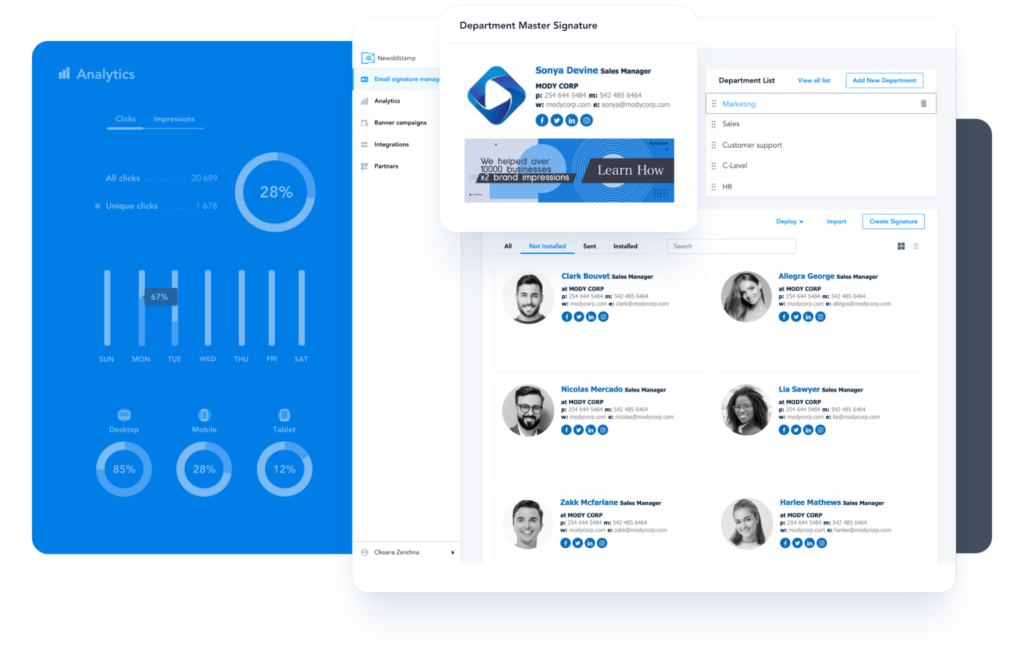
Newoldstamp is the leading email signature management platform that enables businesses to create, customize and deploy brand-consistent signatures across the entire company.

Newoldstamp turns emails into a powerful marketing tool. It allows you to drive traffic to your website, generate leads, upsell products, and announce online and offline events by adding clickable links, beautiful banners with CTAs, and interactive buttons to your email
signature.

This email signature software offers seamless integrations with Google Workspace, Exchange, and Microsoft 365. Use Newoldstamp to create an online email signature that will look awesome on most email clients and all devices.

Offer

  • Newoldstamp offers its customers 25% off on any plan (recurring discount for all next payments)
  • Use the Coupon Code: BF2022NOS
  • The offer will be valid: from 25 November 2022 – to 30 November 2022

MySignature

MySignature is an all-in-one email signature and email tracking platform. It allows you to easily create professional email signatures and make your business emails stand out from the crowd.  

With MySignature you can build brand recognition by turning yourself and your team into brand ambassadors. Embedding a unique email signature will help you advertise the products or services in a more efficient way. Increase brand awareness, create trust, and boost credibility by creating personalized email signatures with your logo/photo, banner, contact information, links to social profiles, and calls-to-action.

Offer

  • MySignature offers its customers 50% off for the first payment for all yearly plans
  • Use the coupon code: SigFriday2022
  • The Black Friday offer will be valid:  25-30 November 2022 

SmartrMail

SmartrMail is the highest-rated email app on the Shopify app store. Its easy email composer paired with its powerful automation builder makes it the best tool to increase your sales this Black Friday and Cyber Monday. Discover why so many Shopify merchants rave about our customer support experience and book a call with our team to discover the app here.

Key features

  • Advanced tools to automatically send the right products to the right subscribers at the right time
  • Pop-up builder and pop-up integrations to quickly grow your list.
  • 150+ Premade templates and 10+ Premade series of automated emails.
  • All best-practice automation and a customer support team to help you enable them within your first 20 minutes.
  • Most affordable advanced email app on the Shopify app store.

Offer

Install SmartrMail now to get 30% Off your first 6 months on all paid plans as well as the free migration of all of your subscribers, your email design, and all your existing email automation. Redeem this offer via this link. Noted: This BFCM offer applies to new users only.

Wappalyzer

Wappalyzer’s products provide sales and marketing teams with tech stack insights and tools for lead generation, market analysis, and competitor research.

We track thousands of web technologies across millions of websites. We know who uses your software and that of your competitors.

Offer

Use code “NoupeBF75” at checkout to take $75/month off any of our plans: 

  • Starter
  • Team
  • Business
  • Enterprise 

Discount valid for the first 12 months of your subscription. There are no contracts and you may cancel at any time.  See their pricing page for more details.

ZeroBounce

ZeroBounce is an email validation and deliverability platform. Validate your email list with 98% accuracy, test your emails to see if they land in the inbox, and get useful subscriber insights with this award-winning tool. ZeroBounce has validated 13+ billion emails and serves more than 200,000 companies around the world – including Amazon, Netflix, and Sephora. Verify 100 email addresses free, every month.

Offer

This Black Friday, ZeroBounce offers 40% free extra credits, on top of any number you buy. The credits never expire and you can use them to validate, score, or get subscriber activity data on your email list. Bonus applied automatically. Valid November 22 – November 30.

Hive

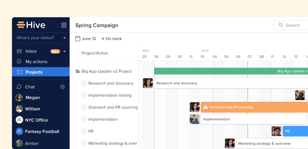
Hive is a leading project management tool that helps thousands of teams work faster in today’s hybrid work environment. Hive brings all of your workplace tools to one single dashboard, so you can manage projects, chat with coworkers, send emails, and even start Zoom calls without ever leaving the window. Hive is more than just your classic project management software – it’s the future of work productivity.

Offer

Hive is offering 22% off annual subscriptions of Hive Teams, the all-in-one plan including project management, task-tracking, note-taking, and many other collaborative features. Use the following promo code at checkout to redeem the offer: BLACKFRIDAY22

Debutify

Debutify is growing! Our vision is to become…

The All-in-One eCommerce Toolkit For Brand Owners. We’re on a mission to give you all the sales and marketing tools you need —at every stage of your eCommerce journey.

  • Empower eCommerce Entrepreneurs  
  • Focus on Revenue
  • Seamless Integration
  • Reliable Support

Offer

  • Use the promo code DEBUTIFY15 for 15% OFF first 4 Months  
  • Use the promo code DEBUTIFY30 for 30% OFF first 2 Months

SendPost

SendPost is an email delivery service. It provides developers, businesses, and ESPs with a solution to reliably deliver, measure, and optimize emails. They have API SDKs in 14+ programming languages. You can use their API to send and validate emails, measure stats and manage domains/IPs. You can get detailed deliverability stats to keep an eye on your deliverability and fix it before it dips down.

Offer

  • Grab the deal: Get credits to send a million emails for free
  • Signup to send 1 million emails (free!)
  • Offer Valid from 25 November – 28 November 2022
  • There is no coupon code needed just signup here

Mailtrap

Mailtrap Email Delivery Platform is an end-to-end sending and testing solution built for developers. Mailtrap Email API allows you to timely deliver emails from any application and monitor deliverability via insight while storing 60 days of email logs for better troubleshooting.

Offer

Take advantage of Maltrap’s Black Friday & Cyber Monday deal using the “BFCM22” promo code: 

  • 70% OFF Email API for all pricing plans
  • The discount lasts for 6 months
  • The Promo code is valid for 2 weeks

Conclusion

We hope this list saves you time by using these productivity-inducing tools and saves you money this holiday season by taking advantage of their offers! We believe all of these products deserve to be looked into as they can genuinely help with your workflow and boost your business.

The post 10+ Best SaaS Black Friday Deals appeared first on noupe.

Categories: Others Tags:

How To Deal with Online Course Piracy

November 10th, 2022 No comments

Do you offer any online courses? Are you concerned that someone might steal your content? Did you know that $50 million is lost annually to piracy by the developers of online courses?

Protecting your content online doesn’t involve any mysterious science. You always run the risk of having something you post online stolen. Most of the time, it would just be a matter of copying and pasting, recording the screen with a program, or downloading a PDF.

So, how would you safeguard your online content? Here are some suggestions for safeguarding your online course.

Challenges with Copyright for Online Courses

This is a significant issue that affects not only the online course market but also much bigger markets like the movie and music industries. Even the biggest video streaming services from the biggest corporations in the world are not immune to this issue, despite the billions they spend on research and development. Once you have logged in and have access to the content, it is still easy to download it from services like Netflix, Disney+, or Amazon Prime. If you are able to view the content, it must no longer be encrypted, at least not on your computer. The content has to be decrypted before it can be shown on a monitor. And that’s when the content is most at risk of being stolen.

More or less sophisticated technology, such as easily installable software, can be used to commit theft. It might be as easy as taking a screenshot of what is displayed. Because it is an unsolved issue, no company in the world can do anything about it. But it doesn’t mean you have no options.

Here are some easy methods to test out.

Use the safe course hosting platform from Heights

An online course management system called Learnyst Platform offers a secure setting for your videos and content. Learnyst automatically protects videos you upload inside of lessons so they can’t be embedded or played outside of your program. This means that only students who registered for your online course created accounts, and made payments will have access to it. Additionally, videos that you upload to the Learnsyt Platform can only be viewed; they cannot be downloaded.

In order to prevent students from sharing a link for downloading with others, Learnsyt Platform also protects your digital downloads by not displaying any public or private URL for the download file. Additionally, you can view the IP addresses that downloaded a product from a specific account. These are just a few of the measures we take to protect your intellectual property.

Each Learnyst participant in your course receives a special ID and password. They won’t need to remember numerous usernames and passwords because they can use this to access the course from both desktop and mobile devices. Your courses will have an additional layer of security because each URL connected to them will only be accessible for a brief period of time.

The most recent encryption method, L1 DRM, safeguards all of your content. Videos, PDFs, and other file types fall under this category. Learnyst completely restricts access and usage by unauthorized parties. Like any other secure website, Learnyst uses OTP to identify any suspicious behavior, like frequent logins. Any mobile device cannot be used to share your content in the form of screenshots or screencasts to a secondary screen. You only use HTTPS links, which are more secure and encrypted than HTTP links.

Increase the level of interaction in your course

Making your course interactive is a great way to safeguard your online course while also giving your legitimate students an excellent learning experience.

Providing more than just content—such as text, PDFs, video lessons, etc.—as well as more one-on-one interactions with your students is necessary to achieve this. Your students will have a distinctive learning experience if your course is highly interactive.

More valuable than any video or other content you upload is your course. Someone who watched a screen-recorded video of your content would not have access to a community, projects, one-on-one support, assignments, or gamification tools like points and badges (as an example).

The term “copyright” is used in law to refer to a person’s ownership of intellectual property. In other words, copyright gives you legal ownership of and protection for your creative work while enabling you to earn money only from it. You can use this to prevent piracy of your videos, images, texts, logos, or entire courses if you are an online course creator.

Unlike trademarks or other legal protections, copyrighting is much simpler and easier to set up, and it provides unmistakable evidence of ownership of the materials in your online course.

In the event of piracy or theft, this will be useful as it will spare you a lot of time and hassle demonstrating that you are the content’s legitimate owner.

Branding

There is no better way to safeguard your content than by including a watermark that includes your name, logo, or website address. While it is simple to claim your content in this way, it also implies that others must get your permission before using or sharing it, and adds a level of possession. Even if dishonest individuals choose to share your content illegally, it is still obvious that you are the author and you might even get traffic from those actions. Also, keep in mind that nobody can ever be you!

Talking Head Videos

Making talking head videos is another method for preventing piracy of your online course. If you’re not familiar, talking head videos are recordings in which you appear on the screen and address your audience directly. Because anyone who views the video will be able to clearly see that it belongs to you, doing this may deter people from stealing your content in the first place. This could also be a useful method for preventing online theft.

At the beginning or end of your course videos, you can even go so far as to mention your name, your company’s name, or any other pertinent information about yourself.

Watermarks

Using watermarks is one of the most popular and efficient ways to prevent piracy of your online course. Any digital content can have a watermark added as a security measure in the form of a mark or lettering. To prevent distorting the visual content, it is typically transparent. You can use this as a course creator on any of your course materials, such as pictures, videos, downloads, and so forth. More intriguingly, you can make a custom watermark with your name, your brand’s logo, learner information, your website URL, or a combination of these to add flair to this. This gives your content personality and a sense of ownership, which may discourage piracy or theft.

Even if your content is shared illegally, the watermark makes it obvious that it belongs to you, which may increase traffic to your website and be advantageous to you. The watermark will most importantly make it very simple to prove to a third-party platform or authority that the video is actually yours.

Conclusion

The online course market is expanding at the same time as digital piracy.

The vast majority of people will not attempt to steal or obtain your content for free, despite the possibility of one or two bad actors that creators should be aware of. Those who do are unlikely to have initially paid for your content.

There are many steps you can take to protect your intellectual property, and they don’t have to be complicated. A few of them include making talking head videos in which you display your face, incorporating your branding wherever possible, and making your course incomparable by adding interactive components like projects, assignments, a community, one-on-one time, gamification, and more.
Hosting your course on Learnyst Platform and benefiting from secure video hosting, IP inspection, and features that make your online course secure and impossible to replicate is one of the simplest ways to secure and protect your online course content from digital piracy.

The post How To Deal with Online Course Piracy appeared first on noupe.

Categories: Others Tags:

How to Sell on Pinterest Without a Website

November 9th, 2022 No comments

You don’t need an online shop to sell on Pinterest, but owning one can give you the upper hand.

The only problem is that managing an eCommerce store is expensive.

On the other hand, selling on Pinterest has a low entry barrier. So it’s an excellent place to start even if you can’t afford a website.

Plus, Pinterest has many engaged users who are happy to buy your product, craft or offer. This is the only social media network where the most significant users hold the most disposable income in America.
This guide shows you how to sell to these top spenders on Pinterest, whether you own a website or not.

What Pinterest Brings to the Table

Pinterest is not just a visual discovery engine. The social network brings more to the table.

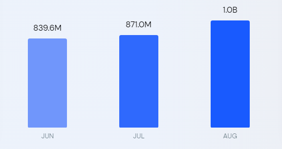
With 433 million monthly active users and over one billion web visits in August 2022, the platform offers businesses new opportunities to reach highly engaged audiences.

Data Source: SimilarWeb

Also, data shows that about 38% of pinners have a college education, whereas Snapchat is 20%, Twitter is 32%, and Reddit stands at 15%, offering you access to a sophisticated market.

The social network enables about two billion monthly searches.

The company’s data revealed that 97% of the searches are unbranded, providing a level playing ground for all competing brands. However, for context, 42% of Google search queries are with branded keywords, meaning many searchers already have a brand in mind before searching.

Also, 80% of pinners said they discovered new products or brands on Pinterest, and 85% buy things they’ve seen from brands. Additionally, pinners are 55% more likely to buy a product after seeing a visual on Pinterest compared to other platforms.

The platform is not all talk and no action.

For instance, nearly nine in ten weekly pinners make buying decisions on Pinterest, and 50% of users have bought after seeing a Promoted Pin.

Pinterest might not be as popular and imposing as Facebook, Twitter, YouTube, LinkedIn, and TikTok, but the user engagement shows the platform can hold its ground against some perennial favorites.

Its numbers are impressive, making Pinterest too good to pass up.

Selling On Pinterest Without a Website

You can sell on Pinterest without a website.

It’s an excellent option for affiliate marketers. A Pinterest business account will work best since it lets you monitor analytics and run ads. You might also need a Facebook page and a Medium account to further your marketing.

When you’re ready, here’s how to start selling on Pinterest without a website.

Organize Your Products into Boards

Pinterest Board is a collection of pins.

It lets you stay organized. You can create different boards to categorize your products. For example, having boards for televisions, sound systems, video players, and other products in your catalog will make sense if you deal in electronics. You can further classify the boards into sections, like LG, Samsung, and Sony.

Boards make it easy for shoppers to find your products.

To create one, log in to your profile and click the Saved tab.

Click the + icon to reveal a drop-down menu, then select Board from the options.

Enter the product category in the name field to create the Board.

Open the newly created Board, click the ellipsis icon (the three horizontal dots), then the Edit board option to type a befitting description for the Board.

Use the Organize option to create and organize the pins into sections.


Publish Your Products as Pins

Create visually engaging pins to display your products.

One exciting thing about Pinterest is that you can create unlimited pins for the same product using different visuals, titles, and descriptions. And the more pins you create, the greater your chances of increasing your visibility and CTR.

The mistake most brands make is creating a single pin for a product and leaving the rest to fate.

But it doesn’t work that way.

As a visual discovery engine, you’ll need to create a lot of pins to stand out and hold your ground on Pinterest. It also lets you cover most of the keywords pinners use to discover products on the platform, stretching your visibility further.

To create pins, head to your profile and select Create Pin from the Create drop-down to begin.

On the next page, select the Board you wish to have the Pin on from the drop-down, then enter the Pin’s title. Of course. Use the keywords people are likely to search for to target Pinterest searchers.

You can see in this Pin that Cicinia, an online retailer of bridal dresses and accessories, uses searchable keywords in the title. But the Pin doesn’t have a description. Don’t make the same mistake.

Write a compelling description to entice users to click your link.

You can search your keywords on Google to see what other brands have as their descriptions if you don’t know what to write. Then, add a discount code to the description if you have any. It supports up to 500 characters, so make the most of it.

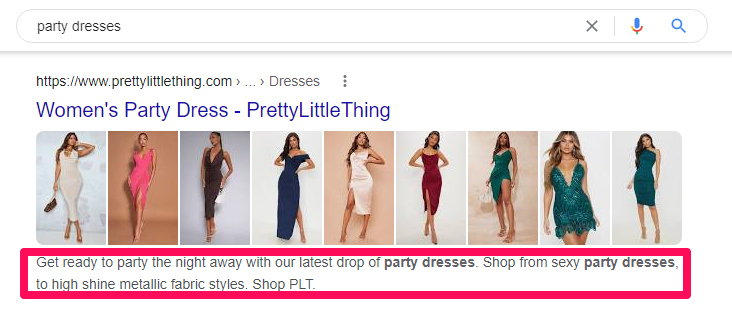
Finally, upload your visuals, add your alt text describing the visual you uploaded, then include the destination link, in this case, your affiliate link, and publish the Pin.

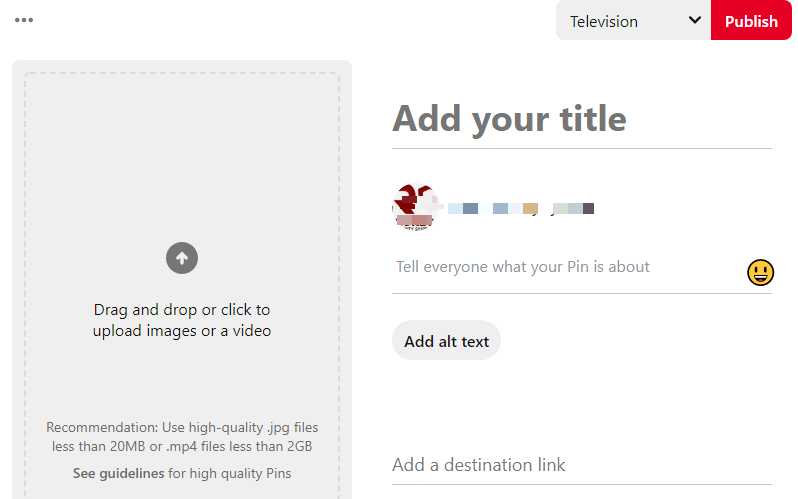
Repeat this step for the rest of your products.

Promote Pins on Pinterest

Pinterest comes with a built-in ad manager.

With this tool, you can promote your pins to the perfect audience. It lets you target people based on demographics like age, gender, and location. You may also run campaigns based on their interests or search terms.

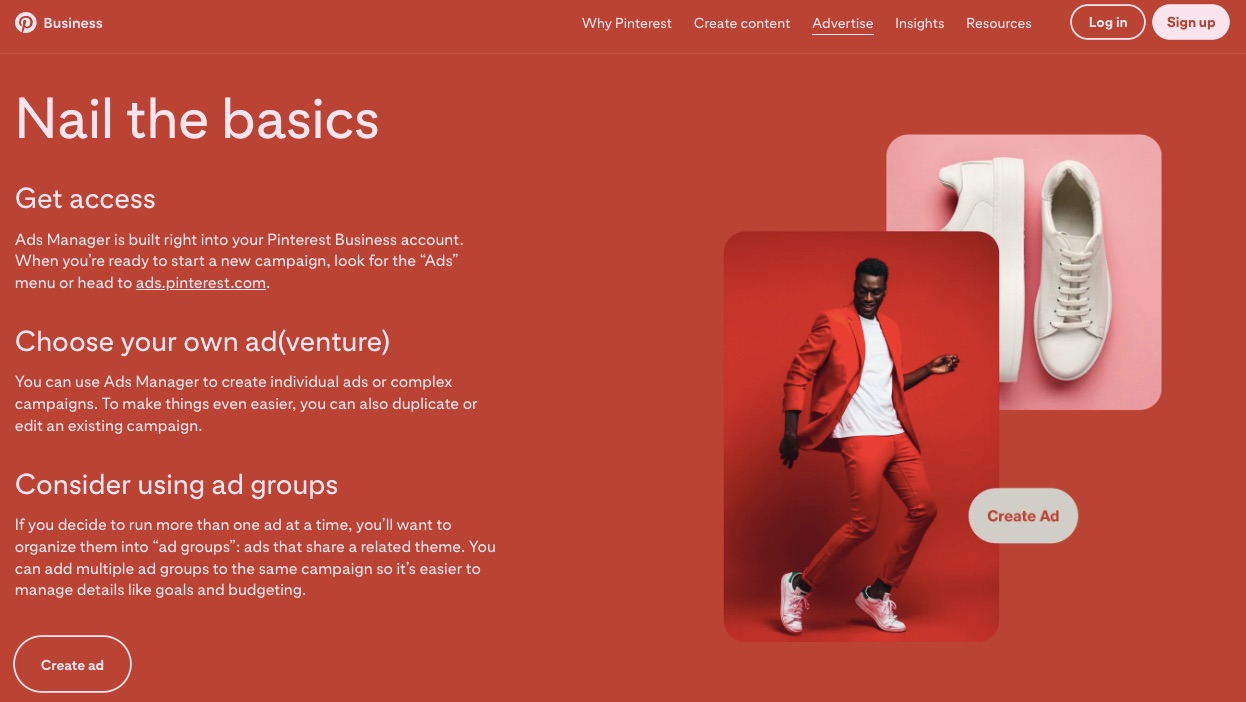
Additionally, Pinterest allows advertisers to upload their customer lists for custom targeting. However, it works best for sellers that own a website.

Running ads means you don’t have to compete with the over 240 billion pins for attention. Instead, promoted pins put you on the spot and in front of the right people.

Dimniko, an online advertising agency, helped a client sell over 22,500 products with Pinterest ad campaigns, generating up to 11-times ROAS.

The brand pivoted to Pinterest after experiencing slow sales from other channels. According to them, the client spent around $15,000 daily on Facebook ads, generating $3 million monthly in Shopify; that’s $6 for every $1 spent on ads.

But with Pinterest, they generated $1.29 million with $116,000—$11.12 per $1.

Dimniko advised Pinterest advertisers to kill assets that didn’t meet the KPI in the first seven days and scale the budget of the top performers by 20% every two to three days.

They admitted that half of their sales were due to their retargeting strategy and suggested that new advertisers should start with their existing buyers and ‘actalikes.’

Go Beyond Pinterest

Several opportunities exist for you outside Pinterest.

Depending solely on the channel to reach prospects is a considerable risk. The platform only controls about 450 million of the estimated 4.7 billion global social media users, so there are always more people to reach.

You can do this organically by publicly sharing your pins or boards using trending and relevant Twitter and TikTok hashtags. Also, brands like Bergdorf Goodman use Facebook to promote their pins.

Like them, you can post your pins’ links as updates on your Facebook page.

Promote the post to reach more people.

Blog on Medium

Nearly 43% of global internet-enabled persons use ad blockers, meaning there’s little future for intrusive marketing.

So, content marketing is a no-brainer.

It lets you reach prospects through organic search when they are most likely to purchase. Also, creating consistent, valuable, and engaging content helps you answer customers’ questions, build trust, and influence buying decisions.

Studies found that content marketing generates three times more leads than traditional marketing channels. Also, brands that create content have a six times higher conversion rate than non-adopters.

Thankfully, you don’t need a website for content marketing with Medium. It’s a free and intuitive online publishing platform that lets anyone create, share and discover content.

Sign up on the platform. Research keywords and create quality content with them. You can repurpose the article into a video with tools like Lumen5.com and share it on YouTube.

Selling On Pinterest With a Website

A website puts your Pinterest marketing on steroids.

At least you won’t have to upload your products manually. Instead, the platform can automatically pull your products from your online store to Pinterest and update your catalog regularly. It also lets you retarget non-converters and upsell existing buyers, improving conversion and customer lifetime value.

Follow these steps to connect your website to Pinterest and sell on the platform.

Set Up Your Online Store

Create an online store if you don’t have one yet.

Pinterest currently supports Shopify and WooCommerce stores and online shops that can integrate with the following:

  • Lengow
  • ChannelAdvisor
  • GoDataFeed
  • Feedonomics
  • Products

Next, add the website to your Pinterest business account to claim ownership. Verifying your site allows you to access analytics for the pins you publish from your website and pins other users created from your site and get a verified merchant tag.

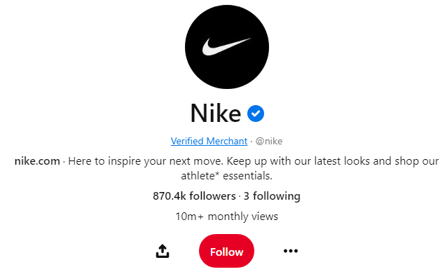
You can claim your website by adding a DNS TXT record to your domain host, uploading an HTML file to your website’s web server, or adding an HTML tag to your website code.

Add Your Product Catalog

Upload your catalogs to start selling on the platform.

Catalogs are a feed ingestion tool that lets you connect your eCommerce shop to your Pinterest store. The file lists all your available products and their corresponding attributes, creating a data source for the Pinterest store.

Pinterest ingests the data source every 24 hours to create your product Pins and process up to 20 million products per account. You’ll need to contact Pinterest support if you have more than that number of products.

You can add up to 20 data sources to promote your products across different markets, languages, and currencies. However, uploading your data sources to Pinterest is only available in selected countries. If you’re eligible, the steps here can get you started. 

Alternatively, you may use third-party integrations like Shopify’s Pinterest app and Pinterest for WooCommerce plugin to get your products on Pinterest. Tools like Lengow, ChannelAdvisor, GoDataFeed, Feedonomics, and Productsup can also streamline your Pinterest data ingestion.

Create Rich Pins

Rich Pin is a step up for Pinterest pins.

They have extra information like price, product availability, description, and product link, providing pinners with rich shopping experiences. Rich pins encourage higher click-through rates, enabling you to sell more. They also make better ads.

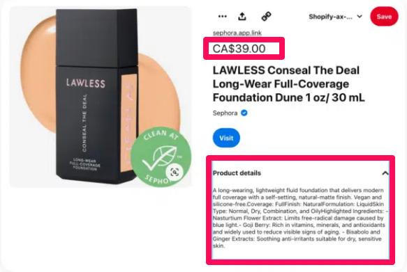
With rich Pins, you don’t need to update your product Pins manually whenever the need arises. Instead, they update automatically each time you change your product titles, description, price, or availability.

Another fantastic thing is that rich Pins require only a one-time, easy setup. Pinterest will convert all your product Pins to rich Pins if you enable the feature for your account, and new Pins will appear as rich Pins.

Shopify natively supports Pinterest product-rich Pins, so it doesn’t require manual setup. Open any product page, copy the link and append .oembed to the URL, then validate with the Pinterest Rich Pins Validator.

If your store runs on WooCommerce, install the Yoast SEO plugin and enable Open Graph in the plugin setting. Next, copy any of your product URLs and validate. It’s that easy.

However, you’ll have to roll up your sleeves for custom sites.

It requires you to manually add rich metadata to the header of all your product pages. Pinterest supports Schema.org properties. Use any product schema generator like Merkel Schema Markup Generator to generate the JSON-LD code for each product page.

 Next, use Google Tag Manager to add the code to the page’s HTML.

To begin, log in to your account and select Add a new tag under the “New Tag” section.

Choose a name for your tag, then select Custom HTML as the tag type.

Scroll down to Triggering to choose a trigger, then click the + icon.

Name your trigger and select Page View as the trigger type. Next, choose Some Page Views under the “This trigger fires on” section.

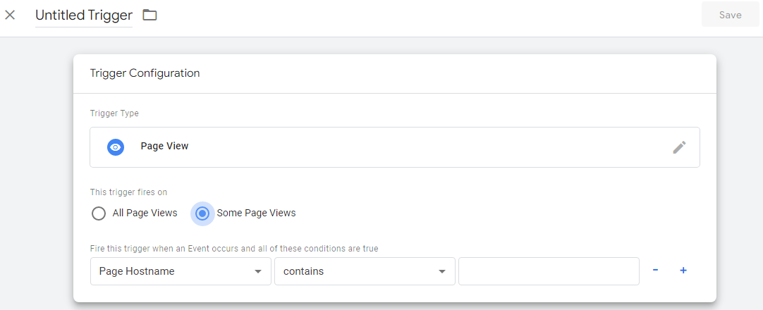
Specify your trigger condition, save and then publish your tag.

Repeat the steps for all your product pages, then validate any URLs to apply for rich Pins.

Stay Organized With Product Groups

Product groups help you manage your inventory.

It also lets you promote a product category instead of individual Pins. You can create a product group manually or leave that for Pinterest to handle if you use Shopify. The app can automatically sync your Shopify collections to create relevant Pinterest product groups.

The auto-created product groups include All Products, Top Sellers, Back In Stock, Best Deals, New Arrivals, and Most Popular.

You can add others manually if you need different product groups like brand, custom label, product type, category, or gender. First, ensure the fields exist in your data source and name the products based on your chosen filters.

Follow these steps to create a product group:

  • First, log in to your Pinterest business account from your desktop.
  • Click Ads on the top menu and select Catalogs.
  • Select View product groups, then Create product group.
  • Apply filters to select the products for the group
  • Go to the next page and enter a name for the product group.

Prompt With Shopping Ads

A website lets you take your Pinterest ad campaigns to a new level.

For instance, you can retarget non-converting shoppers to recover lost sales or upsell active buyers to improve their lifetime value. You may also create an act alike (equivalent to Facebook’s lookalike) audience to reach your ideal prospects, eliminating guesses from your targeting.

However, the first is to install the Pinterest tracking tag.

It’s a code snippet that lets Pinterest track your store visitors and their actions while on your site. The code helps you measure your campaign performance, optimize your conversion, build a targeting audience and become a verified merchant.

To install the tag, log in to your Pinterest ads account, click the Ads tab on the top menu, select conversion from the drop-down, and follow the rest of the instructions to complete the process.

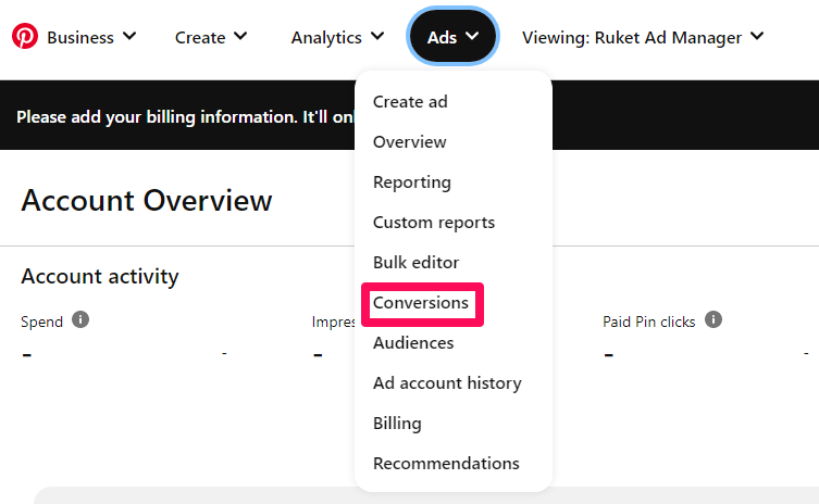
Create your audience and run shopping and personalized collections ads to promote your products. Also, launch dynamic retargeting campaigns to upsell buyers and retarget shoppers that abandoned their carts. Run these campaigns concurrently for the best results. This resource can guide you in setting up high-converting Pinterest ads.

Also, don’t forget to promote your store outside Pinterest for maximum reach.

Wrapping It Up

So you don’t need to own a website to sell on Pinterest.

With just an affiliate link, you can get started on the platform. That might even change soon. The social network is piloting a feature that lets shoppers checkout and pay for items on Pinterest so that they don’t have to leave the app to complete their purchases.

The in-app checkout will probably redefine social commerce in the coming years, and getting onboard Pinterest and setting up your stores now means you’ll always be ready for the mad rush.

Thankfully, the tips in this article can get you started.


Featured image by rawpixel.com on Freepik

Source

The post How to Sell on Pinterest Without a Website first appeared on Webdesigner Depot.

Categories: Designing, Others Tags:

Fintech uses Design but not in the way it should

November 9th, 2022 No comments
Singapore Fintech Festival
 
I was honoured to be invited last Friday (4th Nov 2022) to speak at the Singapore Fintech Festival’s Talent Pavilion organised by our partner WSG (Workforce Singapore). I shared why Fintech needs Design. But before I get into that, let me share a few of my observations of the festival and my thoughts about Fintech in general.
 
Walking through all 6 halls of tech goodness, you could feel the buzz. Indeed there was a lot of hype for this festival, the first since the country reopened after COVID. However looking past the glam and glitter, there are a lot of problems.  Many of which throwing more money at it, is not going to help solve.  I can’t help but be reminded of the saying: “Drinking the Kool-Aid” which is something everyone did just before the 2000 dot-com bust.  
 
I love technology. I’ve spent the last 25 years bringing all kinds of tech solutions to market.  So I could see right away that this Fintech hype is no different to the journey of many of its predecessors.  The latest Gartner Hype Cycle for 2022, published on 10th August 2022, is a nice starting point for our discussion.
 
Gartner Hype Cycle 2022
 
As you can see above, many of the themes at the Fintech Festival: Web3, Blockchain, Metaverse, Artificial Intelligence (AI), and Decentralise Finance (DeFi) are estimated by Gartner to be 5-10 years out.  As in 5-10 years before the tech is both productive and profitable through mass adoption.  It was clear roaming the booths and chatting with exhibitors, that while everything looks great and “well designed”, it is not clear that many have a strong business case that can lead to financial sustainability beyond the initial VC investment.
 
As someone who closely watches, trades and “invests” in NFTs, this “trough of disillusionment” is closer than you think.  During this phase in the Hype Cycle: “Interest wanes as experiments and implementations fail to deliver. Producers of the technology shake out or fail. Investment continues only if the surviving providers improve their products to the satisfaction of early adopters.”  There is a reason why people have stopped spending hundreds of thousands on pictures of bored apes or portraits with random clothing accessories.
 
Interestingly, there is also very little differentiation between each company.  They seem to be all doing the same thing.  It’s another payment portal/funds transfer/digital wallet, or crypto asset management/trading platform.  I observed that many exhibitors were also not willing to explain exactly what they did or what made them different from the other platform next door.  Sharing a similar experience with a colleague who also went to the event, she suggested that “perhaps they don’t even know themselves.” 
 
The value proposition of Fintech is still not clear. Until this is clear, it is not going to have a mass adoption that will deliver financial sustainability. Currently, it’s all focused on what the tech can do, not how it will benefit the man on the street.
 
One organisation bucking this tech-focused trend is the Monetary Authority of Singapore (MAS).  They are exploring the creation of a Retail Central Bank Digital Currency (CBDC) and prototyping potential scenarios of how it can be used.  Their Project Orchid initiative looks at an application for CBDC in a form of Purpose Bound Money (PDM) that builds on the concept of programmable payment and programmable money. Nicely explained by the gentleman in the booth, “if I want to make sure my son spends his pocket money on a healthy lunch rather than toys, this is the tool for me.”
Project Orchard Use Case
 
In wonderful Design Thinking fashion, rather than spend money and time building the ledger or tech stack, like many of the exhibitors in the festival, the MAS took a user-driven approach. They prototyped this idea by representing the PBM with digital vouchers (basically coupons) and then mass-testing these vouchers with the public, banks and retailers. Subsequent phases will explore optimal ledger technology and how it will integrate with existing financial market infrastructure (the key to mass adoption).
 
PBM Architecture
Source: MAS Project Orchard Report (Yes I know, it’s still all tech, but at least you know what the benefit of this tech is!)
It was also explained to me that MAS has assessed that there is no urgent need for a retail CBDC in Singapore at this point.  So this bottom-up approach to learning will allow the MAS to understand what it will take to get Singaporeans on board a CBDC system as well as advance the financial infrastructure in Singapore.
 
Anyways going back to the topic of my talk, Fintech needs Design.  We know in eCommerce, Fintech’s predecessor, that bad design causes an approximate loss of $18 billion in yearly revenue and $4 trillion worth of merchandise abandoned in digital carts next year alone.  So you need Design, not just in creating great digital products (ie great UX/UI), but as a strategic tool to:
  1. understand a user’s needs and “Jobs To Be Done” and how your technology can assist them to reach goals. (Just what is Fintech’s JTBD anyway?)
  2. bridge the gap in the user’s understanding of the tech. (Use stories and narratives that are familiar to the user.)
  3. be empathic and understand a user’s resistance to change.  (How can you create a great change management process to convince adoption?)
  4. and finally, link the experience across multiple touch-points from the brand, product, service, and space. (Last I checked, most people still live in the real world.)

Kudos to all the people involved in the festival, but I just wished I saw more examples of these 4 points as I roamed the halls.  That’s all from me, but please feel free to share your thoughts in the comments below.  Love to hear them!  


The post Fintech uses Design but not in the way it should appeared first on Design Sojourn. Please click above if you cannot see this post.

Categories: Designing, Others Tags:

Top Tips for Using Background Textures in Your Website Design

November 9th, 2022 No comments

Website backgrounds are similar to breathing. They are a part of our daily lives, yet we rarely pay attention to them unless something is wrong. And, like every breath you take, website background designs are essential to the success and longevity of your website; they improve the performance of every other aspect of your site.

While there are several methods to employ textures in web design, if you adopt a contemporary approach and follow a few easy guidelines, you’ll get a lot more mileage out of those backgrounds.

Backgrounds are the foundation of good design. This is why:

  • Backgrounds are the building blocks of a great composition.
  • Background textures and colors add depth and contrast to visuals, helping them to stand out and be seen.
  • Well-composed background photos can assist generate room for you to overlay text.
  • Backgrounds may add context to a design by offering supporting visual components.
  • Because beginning with an empty page might be intimidating. 

What Exactly are Background Textures in Web design?

Structures exist in the realm of web design as texture background pictures. These graphics appear to be a three-dimensional surface, with relief visible through the screen. They provide the eyeballs with a tactile sense. 

As a result, web textures provide dimension to design and draw attention. Furthermore, the resemblance of the texture of the background pictures to real-world items provides the virtual area with a sense of reality.  Along with this naturalism, there are linkages with what is outside the screen. 

Effective Tips For Using Background Textures For A Website

Here are seven pointers to help you use background textures for a website effectively all of which are in line with the latest and greatest design patterns and trends.

1. Keep it Simple and Understated

Many people may need to notice a fantastic background texture. It should be an almost invisible feature that adds depth or visual appeal while contributing to general readability and usefulness.

Background textures that are simple and subtle are ideal for this. Simple background textures can be practically any color and contain tiny or tight repeating patterns. 

The concept is that these background textures aren’t intended to be a focal point, but rather to assist in drawing attention to the rest of the design.

2. Obtain a Gradient

Gradients are fashionable and visually appealing. You may use a gradient as a background texture either alone or in conjunction with a photo. Almost any color combination is acceptable, so utilizing a gradient to create texture and depth is simple. 

The animated animations in the forefront virtually jump off the gradients, and the dark-colored call to action is clear. The gradient texture’s lighter and darker sections aid the user in moving around the design at a glance.

3. Take It Out If It Serves No Purpose

Before you use your strategy on a client’s website, fine-tune it. As with any website you develop, always make sure that your usage of texture is based on a solid plan. If you can’t defend what you’ve done as an improvement, get rid of it.

Overdoing texturing is pointless. The Web’s sole goal is to spread information. How will you do this if your material is unreadable? Furthermore, subtlety and nuance are more effective ways to demonstrate knowledge of a subject.

4. It Should Be Animated

While many of the recommendations have concentrated on static background components, no law states that a background cannot be dynamic.

To get the most out of this style of background texture, keep the movement minimal so it doesn’t distract from the primary picture or statement, including a subdued or delicate color palette.

This animation may incorporate moving, twisting, turning, or video components. Users’ attention may be captured by using motion. Make the most of a moving background texture by ensuring that it does not overpower the design’s foreground.

5. Make Use of an Image

A website background texture does not have to be a repeating pattern downloaded from the internet, instead takes help from a professional website designer. Images that relate to the brand or core theme are some of the most incredible background textures to offer another degree of visual intrigue and engagement.

Tip: 11 Questions to Ask a Web Designer Before You Hire Them

The idea is to fade the image into the background successfully. When you fade a picture, it fades out of the primary visual area and into the distance.

6. Incorporate a Trending Texture

A trending background texture may make your design feel ultra-modern and new. With geometric forms being so popular right now, 

The pattern produces a beautiful texture and depth with a combination of bright-colored geometry on a dark backdrop, which helps the user focus on the huge text and call to action because these components contrast with the background. 

In basic sans serif script, the text appears to float over the green forms. Texture layering also helps the overall impression. Color distinguishes two levels of backgrounds, with darker portions behind lighter areas.

Keep a watch on analytics and user behaviors after adjusting to ensure that your bigger background texture is effective. A significant drop in traffic or conversions indicates that your graphics and users are not connecting.

7. Select Logical Textures

Finally, and arguably as crucial as preserving readability, select textures that are logical for your design. If you’re creating a website for a furniture company, rusty textures aren’t going to work. 

Textures, regardless of whether they appear excellent, are supposed to establish identity rather than mislead visitors. Usability should always come first.

How to Get Your Dream Website Background?

Choosing the proper background texture for your website may transform it from ordinary to amazing. Remember that user experience is vital, so use colors and pictures that appeal to your visitors and make sure that you can read content over a website background image clearly and effortlessly.

To keep contemporary and trendy, use solid background colors, avoid cluttering photos at all costs, and consider introducing a trend like a gradient or geometric form. If you truly want to stand out, try your hand at animation, and always use a background that adapts well to tiny displays.

Most essential, keep in mind that there are no hard and fast rules in design. The finest ideas frequently defy the norms entirely. What is most important is your user’s experience. Use these suggestions as a starting point, and don’t be afraid to trust your artistic instincts.

Conclusion

An excellent background texture may add depth and visual appeal to the overall appearance of your website with the help of professional web designers. While the usage of texture in web design isn’t as prevalent as it once was, there are still some useful techniques for incorporating texture into your designs. 

Instead of employing a large, aggressive, grunge backdrop that would age your design, you may use texture gradually.

The post Top Tips for Using Background Textures in Your Website Design appeared first on noupe.

Categories: Others Tags: