Archive

Archive for December, 2022

Fluid Typography: How To Predict A Problem With Your User’s Zoom-In

December 30th, 2022 No comments

When I wrote my previous tutorial about the extended use of the CSS clamp function, I was surprised by the drawback of zooming of text in fluid typography.Thanks to Adrian Bece and Adrian Roselli, I now know that this problem is known as a WCAG Failure Under 1.4.4 Resize Text (AA).

But what does this exactly mean?

“When people zoom a page, it is typically because they want the text to be bigger. When we anchor the text to the viewport size, even with a (fractional) multiplier, we can take away their ability to do that. It can be as much a barrier as disabling zoom. If a user cannot get the text to 200% of the original size, you may also be looking at a WCAG 1.4.4 Resize text (AA) problem — check out Failure of Success Criterion 1.4.4 due to incorrect use of viewport units to resize text.”

— Adrian Roselli

The prominent example that demonstrates the problem is a simple demo from Adrian Roselli’s article, “Responsive Type and Zoom.” Make the viewport width to 800px and see how text gets smaller while zooming to 220%. If you continue zooming, the text will begin to increase again, but will never reach its 2× increase in size (browsers currently have a zoom limit of 500%).

The text becomes smaller as the zoom increases. (Large preview)

When I started to study this question intently, I found out that there is no solution at the time as well as detailed explanation. The great recommendation is:

“If you are going to use responsive typography techniques anyway, you must test it by zooming. Zoom across devices, across browsers, across viewport sizes (not everyone surfs full-screen), and across viewport orientations.”

— Adrian Roselli

So, if you want to be sure that the user will be able to zoom in the text to at least 200% of original size, you should make a huge amount of tests. In this article I propose the solution how to predict the mentioned WCAG Failure at the stage of development. And I am not sure that my findings will guarantee the 100% absence of the problem, but I am sure that it will be helpful to avoid developers from rough errors in the real use cases.

Not Responsive Typography

So, what is really going on when users try to zoom the web page? The answer to this question is very simple: All modern browsers assume that pixel is stretchable. Therefore, the screen size “effectively” decreases on zooming.

Note: This article was written a few months ago, and OMG, Firefox now zooms pages correctly. The screen size doesn’t “effectively” decrease as you zoom in, but it is constant. Thus, the problem described in the article is still relevant for Chrome, Opera, but not for Firefox. So, while reading, you may find different behavior of the examples depending on the browser.

When we try to zoom the page to 200% of its original size, the pixel becomes twice as large in height and width. So, look at the code below:

p {
  font-size: 16px;
}

Without zooming, we will see a text of this paragraph as text of some “visual-size”. Due to different physical size of pixels for different devices, this “visual-size” will change from one device to another. Really, if your 42-inch TV has a resolution of 1920×1080 pixels, then it contains 2073600 pixels, and your 6.1-inch iPhone 13, for example, has a resolution of 2532×1170 pixels and contains a whopping 2962440 pixels. Let introduce some coefficient k that is proportional coefficient between “visual-size” (what we see on screen) and “font-size” (what we set in CSS):

$$(1)quad visual_size=k * font_size$$

This coefficient depends on type of screen. But as we will see below, it does not effect on a final result.

Now let’s try zoom in and see what happens.

As we can see, the "visual-siz"e of the text monotonically increases while zooming, and we can describe this by introducing the "zoom-coefficient" (browser zoom) as the following:

$$(2)quad visual_size=k zoom_coefficient font_size$$

The "zoom-coefficient" is equal to 1 for the original size (without zoom in), 2 — for 200% of browser zoom, 3 — for 300%, and so on, and "zoom-coefficient" < 1 when we zoom out. Now we can introduce and calculate a "visible-zoom" coefficient, which is a measure of the real visible increasing (decreasing) of a size of the text, as ratio:

$$begin{eqnarray}
(3)quad visible_zoom&=&frac{textrm{size what we see while zooming},(zoom_coefficientne 1)}{textrm{size what we see without zooming},(zoom_coefficient=1)}=nonumber
&=&frac{(k zoom_coefficient font_size)}{(k * font_size)}=zoom_coefficient nonumber
end{eqnarray}$$

As we can see from equation (3), the "visible-zoom" is equal to browser "zoom-coefficient". That is, to double the text size ("visible-size" of text), we need to simple apply browser 200% zoom in. So, the mentioned WCAG Failure Under 1.4.4 Resize Text (AA) will never be observed in the case of not responsive typography (constant font size).

Fluid Typography

So, what happens in the case of responsive typography? In the mentioned simple demo one can find the following record in CSS stylesheet:

h1{
   font-size: clamp(1rem, -0.875rem + 8.333333vw, 3.5rem);
(*)
}

It is an example of fluid (responsive) typography. Fluid typography give us the possibility to change text smoothly with viewport width. The widespread implementation of such concept in CSS stylesheet is to use a clamp function. Using clamp you can smoothly change "font-size" between "min-value" and "max-value" in the given range of viewport width (from "start-width" to "end-width").

In such the case, when font-size value depends on viewport width, equations (2) and (3) can be easily modified. In these equations we should take into account two facts:

  1. "font-size" depends on (function of) "viewport-width", so "font-size" = "font-size"("viewport-width");
  2. The value of viewport width depends on "zoom-coefficient".

The second fact is not so obvious like the first one. But we should remember that under zooming the viewport width “effectively” decreases. So, we will have the following transformation when zooming:

$$(4)quad viewport_widthrightarrowfrac{viewport_width}{zoom_coefficient}$$

Using relation (4), equation (3) take the following form:

$$begin{eqnarray}
(5)quad visible_zoom&=&frac{k zoom_coefficient font_sizeleft(frac{viewport_width}{zoom_coefficient}right)}{k font_sizeleft(frac{viewport_width}{zoom_coefficient=1}right)}=nonumber
&=&frac{zoom_coefficient
font_sizeleft(frac{viewport_width}{zoom_coefficient}right)}{font_sizeleft(viewport_widthright)} nonumber
end{eqnarray}$$

Equation (5) and a simple criterion (“minimum 200% zoom requirement”):

$$(6)quad visible_zoomge 2$$

can be used to check whatever users can get text to 200% of its original size for the available range of browser zoom (up to 5 or 500% nowadays) for the any value of viewport width. On a practice, it is better to create some 3D plot in coordinates "visible-zoom""viewport-width""zoom-coefficient" or corresponding contour map. Such visualization is an easy way to estimate the extent of the problem if it exists.

Example: Let’s apply equation (5) to analyze the simple demo from Introduction. At first, we can reassemble the (*) record for better understanding of the parent behavior (what developer specified in). Here we will assume that browser’s default font size is 16px. The influence of browser default font size on our conclusion will be discussed latter. Keeping in the mind clamp("min-value", "responsive-value", "max-value") function record form, we have from (*)"min-value" = 1rem = 16px, "max-value" = 3.5rem = 56px. Taken into account that viewport width is equal to 100vw, we can write two equations to determine "start-width" and "end-width":

-0.875rem + 0.08333333 * "start-width" = 1rem;
-0.875rem + 0.08333333 * "end-width" = 3.5rem.

From these equations one can find that "start-width"= 22.5rem= 360px, and "end-width" = 52.5rem=840px, or represent the result graphically:

To obtain the calculated dependency of "visible-zoom" on "zoom-coefficient" at 800px of viewport width where anomalous behavior is observed, we can use equation (5) with fixed value of “viewport-width” = 800px and plot the corresponding curve (by Plotly JavaScript Open Source Graphing Library). Here you can see the result:

$$begin{eqnarray}
(7)&quad& font_size(viewport_width)=nonumber[5pt]
&=&left{begin{array}{cc}
function_1 (viewport_width),,viewport_width>breakPoint_1,nonumber[3pt]
function_2 (viewport_width),,breakPoint_1>viewport_width>breakPoint_2,nonumber
end{array}right.
end{eqnarray}$$

  • You can exclude it by using the algorithm proposed in my previous article and return to pt. 1;
  • For given "viewport-width" and "zoom-coefficient", we should transform the equation (7) to use as numerator in equation (5) like:

$$begin{eqnarray}
&quad& font_sizeleft(frac{viewport_width}{zoom_coefficient}right)=nonumber[5pt]
&=&left{begin{array}{cc}
function_1left(frac{viewport_width}{zoom_coefficient}right),,frac{viewport_width}{zoom_coefficient}>breakPoint_1,nonumber[3pt]
function_2left(frac{viewport_width}{zoom_coefficient}right),,breakPoint_1>frac{viewport_width}{zoom_coefficient}>breakPoint_2,nonumber
end{array}right.
end{eqnarray}$$

It is your choice how to use equation (5), but I recommend to reduce the task to pt. 1/2(i).

It should be noted that we did not consider operating system zoom here. When user applied it this will also affect on “effective” screen size. As a result, the "zoom-coefficient" should be represented as a product of browser and operating system zoom. Such influence on final prediction will be similar to the case of changing browser default font size.

Conclusion

Now we are able to predict the behavior of text size changing while zooming to avoid the WCAG Failure Under 1.4.4 Resize Text (AA). Equation (5) and “minimum 200% zoom requirement” (6) give us an easy way to anticipate a problem on the stage of development and analyze it. Due to a variety of possible dependencies for a text font size on viewport width that developer can implement, there is no general solution of a problem. But you can slightly change the input parameters and view the predictions. In most cases, such corrections will give the desired result. We should make a choice in favor of completely eliminating possible problems with text scaling.

Categories: Others Tags:

An Ultimate Guide On Sizing, Spacing, Grids And Layout In Web And UI/UX Design

December 29th, 2022 No comments

A spatial system is a set of design guidelines about spacing, sizing, and dimensions of user interface components. It is a mandatory part of any design system, as it helps to create visual rhythm, creates consistent products, and reduces the amount of decisions designers make every day. A spatial system usually consists of four basics: a base unit, a spatial scale, grids, and sometimes layouts. Why is it so important?

Let’s look at these two layouts in the image below. It’s an example of how proper organization of space can help designers create better layouts:

We can assume that this is most likely an authorization form on a website. The first layout has some inconsistencies with spacing and does not have a clear vertical rhythm. However, when we look at the second layout, everything seems more clear. It’s because all the elements are adjusted to the 8pt spatial system, so vertical rhythm becomes predictable and clear. When a design does not have an immediately recognizable spatial pattern, users may find it inconsistent and unreliable.

Now that we have an idea of what we are discussing, let’s start with grids since the organization of space usually begins with them.

What Is A Grid?

Grids provide a structure for the layout of elements, while a spatial system defines rules for using spacing and sizing. Early print designers used grids to organize text blocks and images into pleasing visual hierarchies for achieving better readability and scannability. The same basic principles can be applied to web and interface design.

The Nielsen Norman Group wrote a good article about using grids in interface design. According to the article, there are three common grid types used in websites and interfaces: column grid, modular grid, and hierarchical. I suggest considering another type that came from graphic design — a baseline grid.

In this article, we will not go deep into the topic of grids but consider them in the context of a spatial system.

A column grid is the most popular grid in web and interface design. It helps to organize content into evenly spaced vertical columns with gutters between them. A modular grid extends the column grid by adding rows to it. It helps us to organize content into a matrix structure, so it is very helpful for e-commerce, galleries or card layouts.

With a baseline grid, things get more complicated. Let’s take a closer look at it:

A baseline grid is a dense grid of equally spaced horizontal lines. As I mentioned before, It came to us from graphic design, where all texts flow vertically along the baseline, creating a similar rhythm. In order to align all the elements on this grid, it is necessary that all spacings and dimensions are multiples of the interval value between the lines. In order for us to do this, we need to create a clear spatial system. Let’s start with a base unit.

Base Unit

A spatial base unit is a number by which all composite grids, dimensions, margins and frames are divided. Choosing a base unit value is the first and the most important step since the entire spatial system will be based on this value.

Most systems use an 8pt spatial base unit with a 4pt half-step, for example, design systems like Google’s Material Design, Atlassian Design System, Adobe’s Spectrum Design System, etc. This is because 8 itself is a very convenient number.

Many screen sizes are divisible by 8 (320px, 768px, 1024px, etc.), which makes scaling for a wide variety of screen sizes easy and consistent. Also, we can easily divide it by 2 or 4 to get fractional values. Look at the image below: 4pt is a @0.5 of an 8pt base unit, and 2pt is a @0.25:

Fractional values are very convenient when we work with elements that need a more flexible system, for example, icons, typography, and a baseline grid. Therefore the interval between lines in baseline grids is also half the base unit. Atlassian Design System uses this approach. Look at the image below: they have a great baseline grid and typography system, which is aligned by line height and baseline at the same time, although usually, on the web, we place texts by a line height instead of a baseline, just like in graphic design.

Another nice feature of an 8pt base unit is a perfect balance between the visual distancing and the number of variants. If we take all the linear values in the range from 0pt to 120pt, with an 8pt base unit, we will get 15 different values; with a 10pt base unit, we will get only 12 values; and with a 5pt base unit, we will get all 24 values!

On the other hand, there are some teams that prefer to use a 5pt base unit. For example, Adidas and Upwork websites are built using a 5pt base unit. They don’t have open design guidelines, but If we inspect the code, we can see values that are multiples of 5.

However, keep in mind that choosing an odd value for a base unit can cause some problems. There are some devices that have @1.5 scale ratio to the original size. Odd values will become fractional, and splitted pixels will be blurred and create visual noise.

You can choose any value for a base unit: 4pt, 5pt, 6pt, 8pt, 10pt. Hence your choice should depend on the overall product and brand aesthetic you are going for. When you have chosen a base unit value, the next step is defining a spatial scale. Summing up, choosing a small value for a base unit will create too many variables in your spatial system. It will be hard to notice the difference between adjacent values; for example, a 2pt base unit will create 12pt, 14pt, and 16pt values. Contrariwise choosing a large value for a base unit will create too few variables in your spatial system. The difference between adjacent values will be too large; for example, a 16pt base unit will create 16pt, 32pt, and 48pt values.

Spatial Scale

The next step is defining a spatial scale. These are the very values or tokens that we use for margins, paddings, and dimensions of UI components. There are several approaches to the formation of a spatial scale. Let’s walk through them.

Some teams use a linear spatial scale where each step is a fixed base unit increment. For example, Wave Design System is based on a linear spatial scale with an 8px base unit (8px, 16px, 24px, 32px, etc.). In my opinion, however, It creates too many options to choose from, especially when it comes to large values. Let’s consider the image below. It’s hard to notice the difference between two adjacent values larger than 72px, isn’t it? When do we use 104px and 112px? What is the difference between them?

On the other hand, you can use scales based on Golden Ratio, Geometric Progression, or other mathematical rules. For example, Pega’s Bolt Design System uses Geometric Progression with a factor of 2x for their spatial scale.

Hence if at a linear scale, we may have a bunch of unnecessary values, then with the geometric progression, we may lack many useful ones. In this case, some teams just break their systems and use custom values, not from the scale. For example, Pega’s Bolt Design System uses custom values for margins and paddings for their card component. We can find this out by inspecting the CSS styles via the browser. Despite all these advantages, this approach has a drawback, which I think is essential — it is very easy to spoil the consistency of a product. Why make rules if you break them later?

I prefer to use a linear scale, remove all unnecessary values, especially larger than 72px, and add useful ones. The most popular design systems use this approach too, for example Adobe’s Spectrum Design System or IBM’s Carbon Design System. Remember that all variables should be reasonable and visually distinguishable.

Another thing to consider is naming spatial scale values. Roughly speaking, a spatial scale is a set of constants or tokens, and their names should be the same in both code and design. This will help designers and developers speak the same language and reduce the number of visual bugs. Because there is no universal solution for naming, you can name spatial scale values the way you and your team like the most. For example, IBM’s Carbon Design System uses numbers from ‘1’ to ‘13’, Adobe’s Spectrum Design System uses numbers from ‘50’ to ‘1000’, Bootstrap uses names from ‘xs’ to ‘xxl’, Salesforce’s Lightning Design System uses names from ‘xxx-small’ to ‘xx-large’.

How To Use A Spatial System

When we have chosen a base unit and defined a spatial scale, we may have a question: how to use it properly? Let’s figure that out.

As we know, spatial scale applies to margins, paddings, and dimensions. For width or height, we just set a value from a spatial scale. It is ok to set only height or only width if we cannot predict the content of the component, so it will hug the content and stretch dynamically. But with margins and paddings, things get more complicated. Look at the image below. As you can see, there are three types of spacing: inner spacing, vertical gaps, and horizontal gaps (or inline spacing).

Vertical and horizontal gaps are white spaces between UI elements, components, and sections. We will assume that in design, these gaps will be transparent rectangles with strict height or width definition, while in web development, they will be in the form of ‘margin’, ‘top’, ‘right’, ‘bottom’, and ‘left’ CSS properties. For their values, we should use spatial scale values, nothing special.

Inner spacing, or paddings, is white space inside the borders of UI components. In design, we can use it as auto layout properties or the same transparent rectangles. In web development, it will be in the form of ‘padding’ CSS property. Sometimes it’s not possible to use spatial scale values both for inner spacing and dimensions of UI components.

Let’s look at the following example:

In the above image, we have two buttons. The label’s line height is 20px (@2.5 of the 8px base unit). If we set a strict height of 32px for the first button, it will have 6px top and bottom paddings. The spatial scale includes the 32px value, but it does not include the 6px value. And if we set strict top and bottom paddings of 8px for the second button, it will have a 36px height. The spatial scale includes the 8px value, but it does not include the 36px value. Which one is the right choice?

If we can predict the content or its size, we could set strict size properties. For example, we know that the button can have only 1 line of text inside, so we can set a strict height value from the scale. Therefore, the first button is made correctly. Components, where we can set strict size properties, are the key to creating rhythm in the overall composition.

But if the content of the component is less predictable, we could set strict internal paddings. For example, we don’t know what the content of the table row component will be, so we can set strict internal padding from the spatial scale and let the height of the component depend on the content.

Conclusion

Summing up, we saw that space is one of the core elements of design. The spatial system is a mandatory part of any design system, and it helps to achieve consistency, create visual rhythm, limit decision-making, and help different teams stay on the same page.

There are no good or bad spatial systems — every system has its own pros and cons. Create your system based on the needs of your product and the overall brand aesthetics you are going for. Remember that a spatial system is a tool, i.e. it should help you to create better products, and not limit you.

Categories: Others Tags:

How to be More Productive when you are Working From Home

December 28th, 2022 No comments

The Covid-19 epidemic has had a lengthy range of implications in recent years, one of which is the work-from-home culture that has become a part of our current way of life. And there’s no telling when it’ll end and we’ll be able to return to our 9-5 jobs. While working from home allows us to spend less time traveling and more time with our families, remaining productive is the most difficult aspect.

According to a big global poll, more than half of respondents say that they spend considerably longer and significant hours on office work. This prompts the question, “How to Stay Productive While Working From Home and Achieve Your Goals”?

To assist you, I have compiled a list of six proven and established tactics that can assist you in increasing your productivity when working remotely, regardless of whether you are new to this culture or have been seeking solutions for a while.

Let’s dive into them. 

Have a Morning Routine

Maintaining a morning routine is just as important as keeping office hours. Take a moment and consider what one thing you do in the morning that makes you happy from the inside out. What are the activities that make your mind and spirit feel light? Make a plan for everything and stick to it. Many successful people credit their personal and monetary success to a rigid morning routine. Don’t be depressed. If you haven’t already, this is a fantastic opportunity to get started. 

The same is true for what you wear and how you carry yourself throughout the day. Many individuals I know are using this time to build out their beards or experiment with various hairstyles (some out of curiosity, some out of laziness), but I do not advocate working entirely in your jammies. Casual days are OK, but exceeding them may have an influence on the effectiveness of your job.

Energize your Intellect With a Cup of Coffee

People across the world love coffee, especially corporate ones. Not because it tastes good but because it acts as a mental energy enhancer. Work and coffee go hand in hand, whether it’s an early morning wake-up call or a mid-afternoon break. And the greatest thing is that, aside from its numerous benefits such as increased productivity and creativity, it is available in a variety of price points ranging from budget to premium.  

People from different countries prefer diverse coffee flavors and each has its unique method of brewing it. Whatever the case may be, it’s no surprise that coffee has evolved into a trademark moment for remaining focused on the work-from-home lifestyle. If you are a fan of coffee like me, you can use another soft drink that can help you refresh your mind and give you energy.

Establish a Personalized Workspace

Though it may be enticing to function from your bedroom or couch, attempt to establish something more formal. According to research, having a dedicated workstation might help you focus. Having a specific area in your house where you can work might lead to less distraction and more focus.

You may transform your dining room into an office, or you may already have a study room in your house. Preferably, your workstation should include a gate to keep out interruptions, as well as all the items and tools you might require accessible, such as a laptop, pad, headphones, water bottle, and so on. You’ll want to avoid getting up frequently to fetch anything you could want since this will simply reduce your productivity.

Try to Maintain Your Office Hours

Yes, working from home allows you the flexibility to accomplish your job whenever you choose, but it also combines the habit of procrastination if done for an extended length of time. This increases the pressure of unfinished work all the time, resulting in restless time and lower productivity. 

To avoid this issue, strive to keep your regular office hours and accomplish all of your jobs within that time range. This involves checking your email on a regular basis, coordinating on-call with employees, and submitting a job assignment. Professional work is crucial, but so is taking time to unwind, appreciate your loved ones, and simply relax. Make certain that you are setting fair parameters on both a personal and professional level.

Take Short Breaks

Seeking to spend lengthy periods of time in front of a computer is what not I am aiming for. The one we’re after is productivity. Working nonstop for lengthy periods of time depletes your energy and lowers your efficiency. Your mind and body require time to recharge, which can only be accomplished by taking brief pauses while working on your assignment.

Consider taking a break every hour and just walking around your house or refilling your water bottle and doing a brief house chore if possible to feel much more lively. You may add additional variety to your breaks by, for example, taking a 15-20 minute break to chat with your elders and absorb their ingrained beliefs. Or whatever makes you feel happy, just do it.

Eliminate the Digital Distractions

While at work, you are constrained by certain etiquette and cannot check your social media often, but this is not the case at home. Unfortunately, it’s all too easy to become lost in the rabbit hole. You don’t even notice it when a minute of browsing turns into an hour or more, and ding, you’re behind on your job.

Do whatever fits you best to keep yourself away from these distractions. For example, you may set a task deadline and only then access any social app, or you can set a timer, or you can enable zen mode or DND mode. As soon as you are done with your work, you can check your social apps’ notifications as much as you like.

Finally, Put These Suggestions to Use Right Now!

Do you really wish to get the most out of this article’s advice? Don’t accept everything at once. Choose one or two recommendations and try to implement them right now. And then start gradually increasing the aforementioned suggestions. I promise you that after a certain period of time, you will be in a better position with your work-life balance.

The post How to be More Productive when you are Working From Home appeared first on noupe.

Categories: Others Tags:

Things to take care of when you are Starting an eCommerce Store

December 28th, 2022 No comments

Online stores are the future of conventional retail. As innovative and exciting as it may sound, it is not simple to make your initial sales and keep those orders coming in. Why so?

The most prevalent explanation is that the ECOM business was not properly established. There are always certain crucial pieces lacking, making it challenging for website owners to attract and keep clients in the long run. However, you do not need to be concerned about this.

There are methods for putting the puzzle pieces together and growing your eCommerce store. Regardless of whether you are in the research stage or want to assess why sales are stalling, there are ten things you should cross off your list before you begin.

Let’s dive into them.

Research “What You Should Sell” Intensively

Product assessment is an essential component of every eCommerce store plan, regardless of size. There is no limit in a rapidly digitizing society where anyone with genuine drive may become a business person. Before you determine the final products to put on your eCommerce site, you must conduct extensive market research. So, you shouldn’t just start because someone else has had success in a specific area or you have goods that you want others to buy.

The hottest items are ones that have an existing large following and face little competition. To find out the in-demand or trendy products, you can start by analyzing your competitors or you can use tools like keyword planners. Once you’ve found the right items, the rest will seem a lot easier to you.

Examine Your Market Rivals

Before entering a market, it is ideally a good idea to have a thorough understanding of your competition. Assess what they are delivering to their customers (services, USP), their strengths, shortcomings, and any other techniques they employ to get out to their target demographic. Given this data, your brand can outrank the competitors if you can deliver superior services to your prospective customers. 

Furthermore, it is beneficial to understand how prominent organizations function and to mimic the best practices. Once you have done this study, construct a new marketing strategy if necessary.

A Powerful Branding Approach

How would you position your brand in the face of large eCommerce competitors such as Amazon or Flipkart? The solution is a thoughtful, powerful branding plan. Your brand represents a vital aspect of yourself.  As a result, it is the next crucial step that needs to be done right. 

The process of branding goes through a number of steps including naming your store, designing a logo, and deciding what you want to deliver to your consumers. So, think hard. What do you have to offer your consumers that no one else has? Once you’ve identified your USP, you’re ready to go on to the following stage.

Choose the Right Platform

Whenever it comes to opening an online business, choosing the correct platform is critical. Sellers have two options: sell their items on their own websites or register with any ECOM marketplace to offer their things online. With the former part, you will encounter a couple of options that demand different skills, including a range of expenditure costs, unique styling features, and a distinct user-friendly experience. Depending on your needs and budget, you may select from well-known platforms. You can check a detailed comparison between BigCommerce vs Shopify vs Squareup.

And if you are not ready to build your own store, you may always use an eCommerce platform like Amazon to locate new consumers.

Register Your Business

Once you’ve decided on a platform or marketplace, the following steps are to register your business:

Select a business name: Conduct professional research to establish an easy-to-remember name for your company.

Protect your domain name: If your business name is not available as a domain name, consider a URL that is easy to remember and relevant to your business. So, if your company is SkinCare Tips and SkinCareTips.com is not accessible, consider TipsbySkinCare.com.

Choose a Business Structure: To create a unique legal entity, you must register your firm under the appropriate business structure. This includes the following: Sole Proprietorship/ Partnership (with a company partner)/ LLC/ Corporation

To register your business, you will have to obtain:

  • Certificate of Digital Signature
  • Director Identification Number
  • MCA Portal Registration
  • Certificate of Incorporation

In addition, the legal documentation requires the submission of a GST, PAN card, and company email ID.

Prepare Your Inventory

One of the most difficult difficulties that both conventional offline and eCommerce businesses confront is assigning and monitoring stock levels in their stores on a regular basis. It is also possible that demand will not be satisfied or that the amount necessary will be overstated. Consider using inventory-management software tools to assist you in controlling your inventory supplies. Whatever strategy you use, make absolutely sure you have adequate stock on the day of the product launch, but not too much, or it will be difficult to handle and will go to waste.

Determine Shipping Options

Online shipping may make or kill a company. If your shopping expenditures are excessively expensive, a consumer who adds a product to their cart is likely to abandon it. This is particularly true when the cart value is too low. Keeping this in mind, it is best to maintain a fixed shipping fee or no shipping cost at all for all of your items in order to convert your almost-prospective purchasers into your sure-sure customers. Aside from shipping costs, ensure that your company follows models such as Amazon’s Prime Delivery by collaborating with local vendors to provide shoppers with consistent fastest delivery on time.

Use SEO to Rank Your Website

As an eCommerce store owner, it is imperative that your website ranks top in the search engine results. To do this, you must guarantee that your website is search engine optimized. Google, Bing, and other popular search engines generally follow a well-structured path to score webpages. As a vendor, you must compile a keyword list related to your goods or assistance which you believe buyers may use while looking for the items or services you offer. In addition to aiding your product rank better in search rankings, SEO may be used to structure your eCommerce store appearance, making navigating easier for users. Apart from these, you should properly optimize your website with proper schemas. If you are using WooCommerce to set up your online store, you can find many schema WordPress plugins which can help you to mark your products and pages with proper schema tags. Same applies to Shopify and other platforms. 

Harness the Power of Affiliate Program

As long as the product/ service you’re offering on your site generates a profit, pooling that earnings with affiliates in return for more purchases is never a terrible idea. Amazon, the world’s largest ECOM company, pays affiliates between 5 and 8% commission on purchases, so you may determine what proportion of your revenue you are willing to divide with associates and create a system like this on your online store. This way your site will gain greater exposure since affiliates help bring your items in front of numerous individuals who might not have seen them otherwise.

Strong Customer Support

How do you manage customer complaints or any significant consumer who has a question about your services or a problem with a recent purchase? Robust customer support would do that for you. Make it simple for your consumers to get in touch with you. If you have a business email or a contact page on your site, ensure to respond to such messages as soon as possible. If you provide a call feature, make your business open-hours and local time explicit on your website. 

Another thing you can do is integrate a live chat feature that would allow customers to seek assistance with any issue they have on your site without leaving. You don’t have to provide every type of assistance, but the important thing is to be persistent and timely.

Wrapping-Up

So that’s all I’ve got for now. There is no single formula for achieving instant success. Building a business from the ground up takes persistent work. It is critical to recognize that each firm is distinct and provides various services and that the industry environment is always evolving. However, if you begin with the aforementioned list, you’ll discover a plethora of possibilities to make the improvements that will continue your eCommerce business expanding and flourishing.

The post Things to take care of when you are Starting an eCommerce Store appeared first on noupe.

Categories: Others Tags:

Why Web Design Still Matters in 2023

December 28th, 2022 No comments

As we move into 2023, there are an increasing number of ways companies can engage with their customers. And as the number of apps, browser extensions, social media feeds, newsletters, vlogs, and podcasts grows, you can be forgiven for thinking that websites are a little less essential than they were in say, 2021.

However, the truth is that websites remain an irreplaceable part of the digital landscape and they will continue to be into 2023 and beyond.

Websites, as the keystone of a centralized, privately run digital experience couldn’t be more relevant. Unlike competing technologies, websites allow almost total control of their source code, and that provides an opportunity for skilled designers and developers to compete against the biggest names in their clients’ industries in a way that simply isn’t possible in tightly governed systems like social media.

Not only does quality web design help businesses increase their traffic, but it can increase the quality of that traffic; an attractive and user-friendly web page will encourage web users to stay on the page longer, and explore more of the content it links to.

Websites vs. Social Media

For many brands, the option they turn to for connecting with customers is social media. Particularly platforms like Facebook and Instagram. While billions of us are happy to while away our free time on social media, it’s not a great platform for informed decision-making or task fulfillment. For any form of productivity, websites are superior:

  • Flexibility: Websites can be customized to suit a company’s vision and values, whereas social media tends to magnify accounts that reflect its own values.
  • Ownership: When you publish on your website you own your content, when you post to social media the platform tends to own your content.
  • Investment: As we’ve seen recently with a certain bird-themed social network, you can spend years investing time in your social media channel only to have it canceled by an individual with his own agenda.
  • Findability: Websites are discoverable on search engines, and although algorithms govern these search engines, competition across different search engines keeps search algorithms honest. Social media networks each use a single algorithm making them free to skew browsing any way they choose.
  • Scaleability: Websites can take advantage of the latest technologies to improve user experience, on social media user experience is governed by the network’s decisions.

Websites vs. Apps

When it comes to owning a piece of the internet, a connected app feels like ownership. However, websites have a number of benefits over an app, from a superior user experience to lower development costs. And ultimately, apps are also controlled by 3rd parties.

  • Accessibility: Websites are universally accessible, while apps are usually limited to certain operating systems or platforms. If you want to distribute to devices, you’ll need to be approved by the store owner who can (and will) change the terms and conditions of store distribution without consulting you.
  • Flexibility: Websites provide a greater level of flexibility and scalability than apps.
  • Cost-effective: A simple website can be created and launched in a weekend, they are considerably more cost-effective to develop and maintain than apps.
  • Findability: Search engines have evolved around website technologies, and it is far easier to create a discoverable website than an app that ranks high in an app store.
  • Universality: Websites have lower entry costs for users, and there aren’t any downloads or purchases required.
  • 3rd-party features: Websites can integrate 3rd-party content like chatbots, payment gateways, and forms, that generally require licensing to include in an app.

Websites vs. Podcasts and Vlogs

There’s no question that podcasts and vlogs are engaging types of content. However, they are very limited when it comes to different kinds of experience. These tend to be passive, linear experiences. Even if your podcast opens itself up to listener interaction, your customers are still passive consumers.

  • Cost-effective: Websites can be set up very cheaply, podcasts and vlogs on the other hand require high-production values to compete.
  • Longevity: Well-written website content can remain relevant for years, the lifespan of a vlog or podcast is often just a few months.
  • Flexibility: Websites can embed podcasts and vlogs, as well as virtually any other content; podcasts and vlogs can only ever be podcasts and vlogs. Websites will continue to evolve long after podcasts are obsolete.
  • Simple: There is now a range of no-code options for creating a reliable website, meaning it can be done with little to no skills or experience. Podcasts and vlogs require a great deal of technical knowledge to produce.
  • Findability: As with other technologies, podcasts and vlogs can’t compete with websites when it comes to search engine optimization.
  • Faster: A well-designed website is much smaller than a podcast or vlog, making it cheaper and easier to access, especially on a cellular network.

Websites in 2023 and Beyond

In 2023 websites will still be a critical part of a successful business strategy and web designers will continue to be essential members of any team.

Websites continue to offer numerous benefits over other technologies including increased flexibility, cost-effectiveness, and superior search engine opportunities.

Unlike social media platforms that allow you to customize a few assets like avatars and colors, websites can be completely customized to fit the tone and style of a brand. Additionally, websites have a far lower barrier to entry than podcasts, vlogs, or apps. While apps may offer a richer set of features than a website, that is offset by the restrictions on platform and device capabilities that apps impose.

Websites will continue to evolve as the tech landscape changes. New ideas for consuming digital media will appear over time, offering unique new experiences — for example, mass adoption of AR (Augmented Reality) is just around the corner. However, the website is perfectly evolved for the types of simple customer interaction that businesses rely on, and will continue to matter in 2023 and beyond.


Featured image by fullvector on Freepik

Source

The post Why Web Design Still Matters in 2023 first appeared on Webdesigner Depot.

Categories: Designing, Others Tags:

Effective Social Media Marketing Tips for WooCommerce Store

December 28th, 2022 No comments

With 6+ million active users and over 36% of the total market share, WooCommerce is undoubtedly the most popular and powerful eCommerce platform.

The primary reason for it being so popular is its user-friendliness and flexibility. From beginners to experts, anyone can build a store using WooCommerce, and you can start with a small store and scale up to a large one anytime with little to no investments.

And the best part is the core WooCommerce platform/plugin is absolutely free.

However, your job is only half done after you build a WooCommerce store. You still need to bring your audience to your website and make sales.

For that, you need a well-thought-out marketing strategy that will help you promote your products through the appropriate channels and attract the attention of your ideal customers. There are multiple places where you can promote your products, such as search engines, marketplaces, prince comparison engines, and of course, social media platforms.

With 4.59 billion daily users, social media is now a mammoth marketing channel, especially for eCommerce store owners. Therefore, you must make sure you have an effective social media marketing strategy in place.

In this article, we will share some social media marketing tips for WooCommerce that can help you reach your target audience and boost your sales.

Why do you Need Social Media Marketing for WooCommerce stores?

Social media marketing can be a useful tool for a WooCommerce store because it can help increase brand awareness, drive traffic to the store’s website, and ultimately generate sales.

Here are a few specific ways that social media marketing can benefit a WooCommerce store:

  • Reach a larger audience: Social media platforms have a large user base, and advertising on these platforms can help to expose the store to a wider audience.
  • Engage with customers: Social media platforms allow businesses to interact and build relationships with customers. This can help to build brand loyalty and encourage repeat business.
  • Drive traffic to the store: Social media marketing can help to drive traffic to the WooCommerce website by promoting products and offering special deals or promotions.
  • Understand customer preferences: Social media platforms provide businesses with valuable insights into customer preferences and behavior. This can help businesses to tailor their marketing efforts and make informed decisions about product offerings and pricing.

Social Media Marketing Tips for WooCommerce

Now that we know the importance of social media marketing, let’s talk about the best social media marketing strategies for WooCommerce, and let us give you some WooCommerce social media marketing tips you can apply.

Choose the right social media platform

In spite of the abundance of social media sites, it may not be in your company’s best interest to actively participate in each one. Each serves a distinct purpose in the lives of its users and in the operations of various companies.

To begin your social media marketing campaign successfully, you must first determine which platforms will best help you achieve your business objectives. The right one for your eCommerce business depends on many factors, including:

  • Your target audience: Different social media platforms have different user bases, so it’s important to choose a platform that your target audience is likely to be using.
  • The nature of your products: Some products lend themselves better to certain platforms. For example, visual products like clothing and home decor may be more suited to platforms like Instagram and Pinterest.
  • Your budget and resources: Some platforms, such as Facebook and Instagram, offer paid advertising options that can be effective for reaching a larger audience. If you don’t have a budget for paid ads, you may want to focus on platforms that are free to use.
  • Your goals: Think about what you want to achieve with your social media marketing efforts. Different platforms may be better suited to different goals, such as driving traffic to your website or increasing brand awareness.

If you sell trendy fashion items, skincare, or jewelry, then Instagram or Snapchat is a good place to start. If you are selling technical products which require demo videos, then YouTube is your best choice.

To determine the best social media platform for your eCommerce business, it’s a good idea to experiment with a few different platforms and see which ones produce the best results. It’s also a good idea to have a presence on more than one platform to reach a wider audience.

Research and target WooCommerce audience

After deciding on the best social media platform, you may want to divide your audience into subgroups based on characteristics such as their age, gender, interests, location, preferred content format, and search terms.

In terms of user demographics, each social media site is unique. Lean heavily on your familiarity with your target market. Since not all social media platforms are the same, it’s important to take into account your target audience’s demographics and how they use social media marketing tools when setting up your WooCommerce store.

To target and research your WooCommerce audience for social media marketing, you can take the following steps:

  • Define your target audience: Consider your ideal customer’s demographics, interests, and behaviors. This will help you create content and promotions that are more likely to appeal to them.
  • Use social media analytics tools: Many social media platforms, such as Facebook and Instagram, have built-in analytics tools that can help you understand the demographics and interests of your followers. You can also use tools like Google Analytics to see who is visiting your website and making purchases.
  • Monitor your competition: Take a look at what your competitors are doing on social media and see if there are any tactics you can borrow or improve upon.
  • Conduct market research: Use online surveys, focus groups, and other market research techniques to gather more information about your target audience and their preferences.
  • Engage with your audience: Use social media to interact with your followers and ask for their feedback. This can help you better understand their needs and preferences and tailor your marketing efforts accordingly.

By taking these steps, you can better understand your audience and create more targeted and effective social media marketing campaigns.

Determine social media marketing goals for your WooCommerce store

Here are a few potential goals that you might want to consider for your store’s social media marketing efforts:

  • Increase brand awareness: Use social media to introduce your brand to a larger audience and build recognition for your products.
  • Drive traffic to your website: Use social media to direct people to your website and increase the number of visitors to your store.
  • Increase sales: Use social media to promote your products and encourage people to make a purchase.
  • Build customer loyalty: Use social media to engage with your customers and create a sense of community around your brand. This can help increase customer loyalty and repeat business.
  • Gather customer feedback: Use social media to ask for feedback from your customers and use that feedback to improve your products and services.
  • Stay top-of-mind: Use social media to stay in touch with your customers and keep your brand at the forefront of their minds.

When setting goals for your social media marketing efforts, it’s important to be specific and measurable. For example, instead of setting a goal to “increase sales,” you might set a goal to “increase online sales by 10% within the next three months.” This will help you track your progress and determine the effectiveness of your strategies.

Create quality content to generate leads

Whether we talk about marketing strategies for new WooCommerce stores or marketing strategies for WooCommerce growth in general, there’s no alternative to creating great quality content.

If all you do on social media is advertise your products, your followers will quickly lose interest in what you post and stop visiting your site altogether. Pinterest, Twitter, and Facebook all do a good job of keeping their users interested by showing them only content that they might find useful or entertaining.

You can reach a large number of potential customers through social media, so you shouldn’t waste the opportunity to build rapport with them by failing to provide them with anything of value. You should be using content marketing strategies here.

Make the content so amazing that it can’t help but be shared by your followers. The traffic to your site could increase by 100% if you just got people to share your content.

Your content must be compelling enough to stand on its own if you want it to go viral. In addition to making money, you should try to specialize in certain content types.

Find the most engaging ideas and transform them into something more appealing and superior to the starting point. As a result, people will begin to read the new article and hopefully buy something from your online shop where you originally published it.

Don’t bank on this new molded content selling out right away. However, a well-optimized article like this will produce more leads and sales in the long run.

Upload and display your WooCommerce product catalog

Source: WebAppick

Our next social media marketing tip for WooCommerce is about displaying your WooCommerce products on different social media platforms.

Almost all the major social media platforms, including Facebook, Instagram, Snapchat, TikTok, etc., allow you to create official brand/shop pages and display your WooCommerce products on those platforms. You need to create your brand page and upload your WooCommerce product catalog.

After that, the platforms will display your products, not only on your official page of that platform but also in their product search results. This will boost your traffic, conversion, and overall revenue.

However, different social media platforms have different catalog eligibility or attribute requirements. Studying and learning about all of them and creating individual files accordingly will be a hassle and also a bit technical for new users.

Moreover, it will be time-consuming for you if you try to create catalog files manually, putting all product data individually.

Using a product catalog plugin

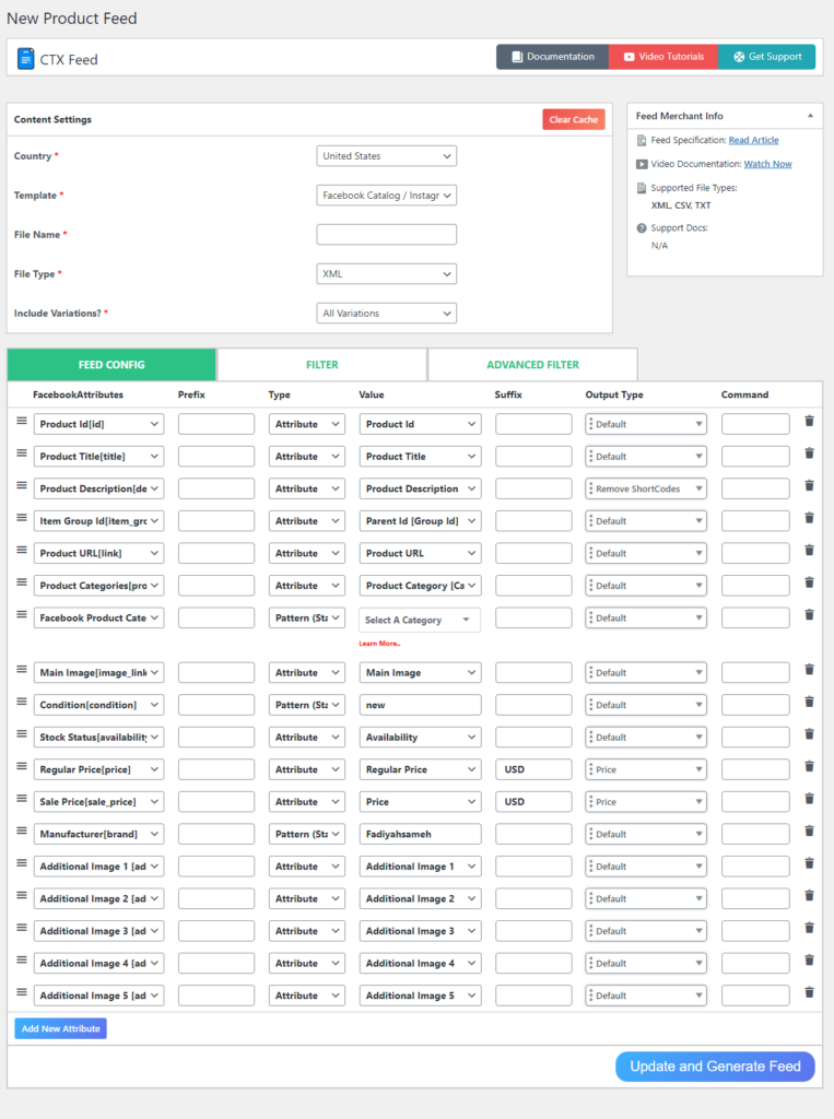
The best solution is to use a Woocommerce product feed or product catalog plugin such as the CTX Feed. CTX Feed allows you to create product feed or catalog for different channels with just a click of a button right from your WordPress WooCommerce back panel.

This plugin has premade templates for 100+ channels, including all the social media platform that supports uploading and displaying product catalog. CTX Feed already knows which platform requires what attributes in its product catalog.

Therefore, all you need to do is, install the plugin and select the social media channel you want to create the catalog for, and the plugin will do the rest. The plugin will automatically populate the required attributes for that channel, collect your WooCommerce product information, and organize them in the product catalog file.

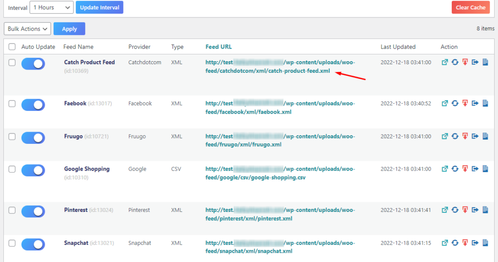
You can then upload your catalog through the feed URL, and the channel will fetch all your WooCommerce product data and display them on their platform. The greatest thing about using CTX Feed is you won’t need to manually change any updates your make to your WooCommerce product pages.

For any changes you make, CTX Feed will automatically update the changes in the feed file and update those changes across all your channels through the connected feed URLs.

Invest in Social media ads

This one is one of the obvious tips for WooCommerce store growth. You can’t expect to go viral or your products to be a hit right after launching them on social media.

To be honest, paid advertising is the most surefire way to boost your online profile. You can also run dynamic ads with variable products on platforms like Facebook, Snapchat, Instagram, etc.

When you run dynamic ads, for example, if you run Snapchat dynamic ads, the platforms take all the decisions from creating ads to placing the ads in the right places at the right time and to the right audience.

These platforms ask you to upload your product catalog to run those ads. In the previous section, we have already covered how you can use CTX Feed to create and upload your product catalogs.

It’s important to familiarize yourself with each platform’s ad policies before deciding which ones to use. Although it may be challenging initially, it is wise to allocate some funds for paid advertisements.

Make use of social reviews

The next of our social media marketing tips for WooCommerce is using social media reviews. Customer reviews are the best way to display social proof on your product pages.

Customer reviews give you an advantage when trying to gain trustworthiness for your product pages. On top of that, customers can get a much better idea of what they can expect from your product thanks to reviews written by other customers.

Use product reviews from satisfied customers posted on any of your social media pages as another marketing tool. You can publish user-generated content/reviews on WooCommerce sites by using an app/plugin that lets you connect all your social media accounts.

Facebook already has built-in review capabilities, so all you need to do to take advantage of them is enable them. This makes it simple for potential customers to read through your product reviews on multiple social media platforms before making a purchase decision.

Reviews are an integral part of any business and one of the effective marketing strategies to grow your online store. So constantly ask your customers to share their thoughts.

Instead of relying on social media platforms to solicit feedback from customers, you can send them a follow-up email or text message after they make a purchase. In this case, a call-to-action button should be included and made prominently obvious.

Encourage customers to share their thoughts on your products by inviting them to do so in your online store or on your social media pages. Positive reviews will allure your new customers to purchase products from your WooCommerce store.

Use hashtags

Another of the best WooCommerce social media marketing tips we want to share is effectively using hashtags.

In order to get ahead in social media advertising, hashtags can be a fantastic tool. Don’t settle for generic tags; instead, seek out brand-specific or community-based tags with more clout.

Your WooCommerce store can have its own branded hashtag, which you can then ask your customers to use. In this way, you can monitor the feedback your online community provides about your business.

Run contests and giveaways

Our final social media marketing tip for WooCommerce is running contests and giveaways on different social media platforms.

Here are some steps you can follow to run a contest or giveaway for your WooCommerce products on social media:

  1. Determine the purpose of your contest or giveaway. Is it to increase brand awareness, engage with your audience, or drive sales?
  2. Choose the social media platform(s) that you want to use for your contest or giveaway. This will depend on where your target audience is most active.
  3. Decide on the details of your contest or giveaway, including the prize(s) you will offer, the eligibility requirements, and the rules for entry. Make sure to clearly communicate these details to your audience.
  4. Create a visually appealing and engaging post on your social media platforms announcing the contest or giveaway. Be sure to include all relevant information, such as how to enter, the prize(s) being offered, and any eligibility requirements.
  5. Promote your contest or giveaway using hashtags, tag relevant accounts, and using paid advertising if necessary. This will help to reach a wider audience and increase engagement.
  6. Monitor and respond to comments and questions from your audience during the contest or giveaway period.
  7. When the contest or giveaway is over, announce the winner(s) and thank all participants for their participation.

Remember to follow all relevant laws and guidelines for running contests and giveaways on social media, and be sure to adhere to the terms of service for each platform you are using.

Conclusion

If you want your online store to attract more customers and boost sales, think about incorporating some of the above social media strategies.

The aforementioned social media tips will streamline the process of providing prospective customers with content, services, and products that are highly valued, timely, and genuinely engaging.

You should regularly post on multiple social media sites to reach a wider audience. We hope this article on social media marketing tips for WooCommerce was of help to you.

Let us know in the comments if you have any questions or suggestions on the topic.

FAQ

Which is the most effective marketing channel in social media?

Hootsuite’s Social Media Trends 2021 report finds that Facebook is widely regarded as the best social media platform for achieving business objectives.

However, a particular channel’s effectiveness will depend on various factors, including your target audience, the type of product or service you are promoting, and your marketing goals.

Does WooCommerce integrate with social media?

WooCommerce is a robust online store solution that can be connected to many different social media channels, including Facebook, Instagram, Snapchat, Twitter, LinkedIn, etc.

The post Effective Social Media Marketing Tips for WooCommerce Store appeared first on noupe.

Categories: Others Tags:

12 Marketing Tips for Businesses with a Niche Audience

December 28th, 2022 No comments

The riches are in the niches, as the saying goes, and there’s a lot of truth in that. For example, a conventional real estate agent may have a huge potential client base, but they also face a ton of competition. On the other hand, a flat fee MLS service may only appeal to a narrow demographic, but it can absolutely dominate that niche market, since there’s little competition.

Businesses catering to a niche audience have unique challenges and advantages that set them apart from businesses targeting a broader market. Niche audiences are more discerning, more fickle, and more sensitive to things like authenticity, small shifts in brand identity, and product quality. So how do you put together an effective market strategy to help you corner a niche market? Here are our 12 best tips.

Know Your Market

It may sound like stating the obvious, but you should learn as much about your market as possible. Analyze your niche market going back five to 10 years, paying particular attention to trends, which are the best natural mechanism for spreading product awareness. If you can get a grasp on trends and where they’re going, that will give you a leg up in terms of growth and scalability.

Know Yourself

Equally as important as knowing your market is knowing who you are, as a brand. Defining your brand is always important, but it’s exponentially more important in a niche market. You’ll want to have a unified brand vision and strategy that encompasses everything from your messaging to your visual aesthetic. After all, you can’t sell your product to the market until you define what that product is.

Follow Your Intuition

That being said, don’t let trends completely determine your marketing strategy. As we will touch on later, authenticity is of paramount importance in a niche market, so you’ll want to rely on your instincts here. Don’t betray your authentic creative vision just for a passing buzz!

Follow the Data

There’s so much valuable consumer data available today, and you’d be remiss if you didn’t take full advantage. If there’s a downside to the data revolution, it’s that there’s almost too much consumer data out there now — to the point that you may have to consult with an expert just to contextualize and decipher it all. 

Make sure you conduct copious market research, sales prospecting, and that you comb through all the relevant consumer data and trends to figure out how, exactly, you’re going to target your niche audience. 

Don’t Overlook the Competition

Your competitors are, yes, the competition — but that doesn’t mean they don’t have a lot to teach you. Analyzing how your competitors engage the market can tell you a lot about what does — and could — work in terms of marketing strategy. Don’t waste time reinventing the wheel when you can glean valuable intelligence from your rivals!

Don’t Launch With a Product That’s Still in Beta

You’ve probably heard the saying, “you only get one chance to make a first impression,” and that’s especially true when it comes to a niche market. In a comparatively smaller market, launching a buggy, unrefined product can permanently sour your image with your entire target audience. It can be tempting to rush to market when the clock is ticking and you’re running on small business loans, but this early refinement pays off down the line. Take the time to really drill down into what makes your product special, and make sure it’s polished and presented in as user-friendly a manner as possible — before you launch. 

Always Be Fine-Tuning

Continually evaluate your marketing strategy and business plan. If your latest attempts aren’t landing properly, tweak them immediately. Always monitor your metrics, and don’t be afraid to make necessary changes, even if they’re small. Entire multimillion-dollar companies have been built on offering slightly lower-than-average real estate commissions. 

Social Media and Influencers Are Key

One advantage of catering to a niche audience is that it’s small and easily definable. That means that the niche market’s influencers will have an outsized, well, influence in that market. A key early endorsement could make or break your business. A huge plank of your marketing strategy, then, is going to be determining who the major, authentic influencers are in that niche market, and partnering with them

Quality Beats Quantity in a Niche Market

Resist the temptation to scale up as quickly as possible. In a niche market, consumers are extremely sensitive to quality, and any quality sacrifices you make in order to ramp up growth will be felt by your target market. 

Focus on refining your product to relentlessly meet the needs and preferences of your target consumer, and when you do embark on a growth phase, never endanger your reputation with a dropoff in quality.

Know Your Market Intimately

A niche market is small, so it can be tough to figure out, at first, how exactly you want to differentiate yourself from the competition. The good news, however, is that your target market will tell you what they need. You just have to know how to listen. 

Spend quality time in the niche market and its communities (online and in real life), and listen to what they want. Sometimes, the biggest innovations are built on the most basic ideas: For example, multibillion-dollar online brokerage Redfin was built on the very simple insight that people want to pay less in closing costs — something that anyone could have learned if they’d just listened to home buyers.

Don’t Lose Your Authenticity

Businesses that appeal to a broad, general audience can afford to have a more bland presence, but a niche brand has to be memorable, well-defined and, above all, authentic. Your brand’s authenticity might be the biggest single factor in its eventual success or failure. Instead of envisioning your brand’s interaction with your niche audience as a two-way exchange, think of your brand as a part of the culture that your niche audience identifies with. When you think of it that way, the importance of authenticity becomes clear. 

Take Big Swings

Once you’ve done your market research, spent time in your niche communities, talked to your target market about what they want and need, and put together a rock-solid business plan and market strategy, it’s time to make big, bold moves. If you’ve put in the work, don’t be afraid to take big swings, and unleash your passion — you may turn a profit a lot faster than you projected.

The post 12 Marketing Tips for Businesses with a Niche Audience appeared first on noupe.

Categories: Others Tags:

Website Elements That Will Engage and Convert

December 28th, 2022 No comments

In this article, we suggest 10 simple and different elements that you should incorporate into your website. Each of these elements has been proven to be user magnets, with enough engagement power to convert first-time visitors to lifetime users—or the next best thing.

Detailed Contact Information

In a time when virtual structures are crashing up and down, trust is a coin that the average internet user is unwilling to use. Therefore, if you can get first-time users to trust that you are who you claim you are, you would have increased the odds of converting them by a large margin.

One of the easiest ways to achieve this user trust is to include detailed contact information on your website. This is not the ‘90s, so very few web users are interested in going down the rabbit hole in search of ordinary contact information. So, don’t go using rainbow colors on your website to cover the fact that you did not include a simple address or phone number that users can reach you with.

You have multiple contact information options to choose from. These include your email address, phone number, fax, links to your social media account or channel, business location, or even an interactive map. The more of these contact information options that you include on your website, the more legit your website appears to users.

So, place this information on a different page that users can access via your website’s navigation menu. If this is inconvenient, place your contact information at the bottom of the home (welcome) page.

Detailed Information on Your Merchandise

Your core products and/or services is another area that users want to have detailed information on. Many website owners go through a lot of stress including interactive elements but fail to list what they are selling. This is one of the biggest turnoffs for the kind of users that will commit to products and services for a long time.

This is the deal with providing detailed information on your core products and/or services: the internet is a multiverse with copies of everything everywhere. Therefore, web users looking to find anything want it to be specified without their having to ask a thousand questions or scroll through images of smiling people that don’t really say anything.

So, if you are looking to engage first-time visitors to your website and convert them to long-time users, show them what you are offering. Put up a virtual glass case on your Home page that effectively says, “Welcome. We are so-and-so. We sell such-and-such.”
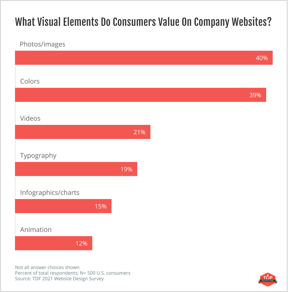
The most popular way to include information on core products and services is to have a Products/Services page. This way, users can easily find your products and services and ask you for clarification or just straight up click the Buy Now option.

Bonus point: Although you can include information on your core products and services on your About Us page, you should not. Users know that such pages are stuffed with exaggerations, so you risk them polishing genuine information about your products and services.

Pricing Page

Specific information on pricing is another area that many website owners have a hard time including on their websites. As a result, first-time users quickly lose interest after reading that products and services are ‘cheap,’ ‘affordable,’ and other vague terms you here dishonest sales people use all the time.

If you want to quickly engage a first-time user, you have to give them as much detailed information as you can without overwhelming them. This includes information about how you price your products and services.

Using terms like ‘cheap’ and ‘affordable’ to describe your products and services without including the real figures on your website is off-putting. Internet users cannot set websites on fire, or they would have done so for the thousands of websites that use this stupid trick in an attempt to get new users. But it rarely works, if at all.
So, to avoid coming off as a dishonest or stupid web owner, make sure to include your pricing plan on your website as clearly as possible. The best way you can include this inclusion for user convenience and satisfaction is to create a separate page for it. This way, the user only needs to scroll to the top of your Home page or click the Menu to get pointers to your pricing plan.

Customer Reviews and Testimonials

We noted earlier that user trust is a coin that you don’t find lying around. No, you earn it. The easiest and most convenient way to find out about the value of a product is to ask someone who has used it before. This is what customer reviews and client testimonials are for.

Imagine that your website offers a product that auto-detects and fixes SSL errors and similar browser issues.  You are not likely to be the only person with this kind of information. So, what can make you stand out and get users to check out your website first before looking elsewhere? User comments. Customer reviews and testimonials work the same way.

Users tend to trust websites where they can read customer reviews about your products and services. This is another reason users prefer brand application stores (like Google Play and Apple Store) to third-party options, even if the latter is cheaper. To include customer reviews is to tell first-time visitors to your website that you are confident in what you are selling.

Of course, it is important that the majority of those reviews are positive and a few are negative. It is even more important that the negative reviews have been dealt with, such as a response from your support team that the noted problems have been fixed.

Testimonials on websites are efficient tools for converting users. A typical user scrolls down a Products/Services web page to find testimonials or, at least, customer reviews. So, make sure to ask for testimonials from your clients on how your products and services helped them and in what way exactly. Then you can include this information on a page of its own or in your Products/Services page.

FAQs Page

How many times have you had questions about something you saw on a website and were excited to find that there is a FAQs (Frequently Asked Questions) page and your question has been answered? This is the narrative all users share. That excitement is the kind that can trigger user conversion, so you need to make it happen with your website.

One understandable reason many web owners and managers don’t include a FAQs page on their website is that it requires a bit of work. First, you might need to use advanced tools to find out what questions users are asking about your products/services. Second, you would need to find a way to answer these questions directly and concisely.

However, spending time and money to build a useful FAQ page is worth it. Apart from using it to answer general user questions, it could also be indexed on search engines as the most suitable response to user inquiries.

So, including a FAQs page on your website is an all-around win situation for you. It can get more users to visit your website and visitors to trust you and consequently subscribe to your products/services.

Live Chats

Providing a virtual bridge for first-time visitors to your website to reach you is another reliable way through which you can engage and convert them. You may be able to nudge these users towards trusting you by including detailed contact information. However, you can significantly bump up your chances of converting them by including a Live Chat option.

The Live Chat is what it says it is: a method through which users can immediately contact and get responses from website support teams. When a user sees that you included this feature on your website, they grow confident in their decision to patronize you. This is because they know that they can easily reach you to lodge complaints if they need to.

Thus, including a Live Chat feature on your website is one of the best ways to make your website interactive, engaging, and likely to convert first-time visitors looking to get the products and services that you are offering.

Blog

Blogs are easily the most common web pages that internet users love to visit. This is because the typical blog is a hub of relevant information. Therefore, a user looking to hire a content manager (your area of expertise, for example), might want more assurance than customer reviews and client testimonials can offer. This is where adding an informative blog to your website saves the day.

A good blog is a reliable source of information for everything, especially stuff related to what you are offering online. First, it tells first-time visitors to your website that you are an expert in your industry. Second, it tells them that you care enough to provide such important information for free. And these reasons are enough to convert users.

Incorporating a blog into your website also helps you get ranked on search engines for targeted keywords. This makes it easier for you to attract traffic to your website, thereby lending you more authority in your industry. This authority is another selling point for converting users, and it can help you convert as many users that come looking to read something interesting on your blog as possible.

Navigation Menu

Navigation menus are as important on websites as they are everywhere else. They make it easier for web users to follow the content on your web pages without having to deal with a virtual labyrinth. And which web user is opposed to easing or convenience?

So, if you are committed to designing your website in a way that engages and converts users, you have to make it easy to navigate.

Rather than throw everything onto one page, create different pages: for information on products and services, pricing plans, customer reviews and testimonials, and more. And lock up all these pages under a Menu option. So, first-time visitors will very easily navigate your website and find more reasons to subscribe to your offerings.

Mobile-Friendly Formatting

Another important consideration you have to make on your website to engage and convert first-time visitors is text formatting. Smart users are put off by websites that feature scrawny-looking texts and copies with multiple fonts haphazardly strewn about. And smart users tend to commit to online products and services longer than others, so these are the users you should target.

Therefore, make sure to clean up your website and use uniform text formatting. It does not have to be flashy, only clean and regular enough that it makes it easy for users to follow the content. Also, the fewer font styles you use on your website, the better for your user conversion aspirations.

Website Conversion Funnel (CTA)

The point of suggesting these website elements is to have your website engage and convert users easily. But the effectiveness of including these elements in your website will drop critically if you don’t tell your users to ‘Click here for more information’ or ‘Subscribe for our newsletters’ or ‘Subscribe to this service by clicking here.’

This is the point of a conversion funnel or CTA (call to action). It shows your users what you need them to do and completes the conversion process. So, make allowances for this feature on your website to make it easier for users to do whatever it is you need them to.

Conclusion

Going through the effort of building a website to advertise to and interact with your target audience is only beneficial if you manage to engage and convert users that visit your website. There is no big secret to how to achieve this user engagement and conversion apart from the tips in this article about what elements to incorporate into your website.

The post Website Elements That Will Engage and Convert appeared first on noupe.

Categories: Others Tags:

How To Attract More Consumers to Your Website

December 28th, 2022 No comments

For a website, especially an eCommerce website, driving traffic to your website and attracting potential customers is essential in terms of the success of your business.

If your website is failing to achieve the levels of traffic you need to increase conversions, then steps need to be taken to rectify the situation.

This article will provide an overview of how to attract more consumers to your website, focusing on aspects such as design, marketing, and the overall customer experience (CX). 

The Benefits Of Driving New Traffic to Your Website

The benefits of increased web traffic may seem obvious but it is always helpful to revisit them so you can determine realistic goals for your website. 

Speak to Your Target Audience 

The more people who visit your website, the more likely they are to be interested in your products or service. This means that they likely fall within your target audience and you have an opportunity to speak to them directly through your website’s copy and content. 

Your website allows you to create your business’s own narrative to tell users why they should choose you over your competitors. 

More Conversions 

An obvious benefit of having more consumers visit your website is that the chance of regular conversions greatly increases. Creating conversion funnels from relevant landing pages can help direct users where you want them to go, enabling a customer journey across your key pages.

Valuable Data

Through the use of Cookies, you can gather valuable data about your website’s users and target audience. Analytics relating to their location, the devices they use, age ranges, and more. 

As well as this, you can also leave prompts on your website to ask users to answer surveys and leave feedback so you can improve the customer experience.

Improved Search Engine Rankings

Achieving high rankings on search engines such as Google will increase your search visibility. One of the ranking factors is the number of people who are visiting and engaging with your web pages. 

Therefore, the more consumers you have interacting with your website, the more likely you are to rank for targeted keywords.

Showcase Your Brand

Source: Freepik

Attracting more consumers to your website will not always result in a sale or conversion, however, it does mean more people are learning about your business and brand. 

This results in brand recognition, so if a person is interested in a product in the future, your website may be the first one they think of. 

3 Ways To Attract More Consumers to Your Website

There are a number of ways that you can attract more consumers to your website but to try and make life easier, we have broken this down into three main areas. 

Your Website’s Design and User Experience

Design/ Aesthetics

Websites that have a poor and visually unappealing design often have a high bounce rate, meaning people leave a website almost as quickly as they have landed on it. This also includes having navigation that is confusing or doesn’t work the way it should.  

A simple design, with a color palette that is easy on the eye, and uses plenty of visuals is generally the way forward. Fortunately, even if you lack any coding skills, there are many website builders (e.g. WordPress) out there that can create an attractive functional website. 

You can also use a wide range of affordable online tools to create professional infographics, and videos, optimize images, and every aspect of your website taking it to the next level.

Don’t let poor design sabotage your website’s success. Refresh it with helpful UI design tips and practices to help make navigation smoother, and visuals more appealing – so visitors stick around longer!

High-Quality Visuals

Visual search is very important but customers also need to know exactly what they are spending their money on. Images, colors, and videos are the top visual elements consumers value on business websites. 

This is why all of the images and videos that are included on your website need to be of the highest quality. 

Optimized Product Pages (for eCommerce Websites)

If you own an eCommerce website, then you should ensure your product pages include the following:

  • Optimized product titles that include the brand name and key details
  • Accurate shipping information and fees
  • Customer reviews
  • Detailed product descriptions with useful information such as FAQs

Here’s an example of how a printer supplies company Toner Buzz offers customers helpful answers to all their questions via FAQs right on their homepage:

SEO and Marketing

Your SEO and marketing efforts are just as important as the design and functionality of your website, as, without them, users are unlikely to ever discover you exist. 

Branding and Social Media

Creating a strong brand identity that can live long in the memory is essential to establishing yourself in your chosen niche. You also need to be as active as possible across social media platforms, creating engaging content that encourages interaction and click-throughs to your website. 

Email Marketing

Email marketing can also be a very powerful tool, helping to reach out to lapsed customers or speak to potential customers who have previously shown an interest in your products and provide them with valuable information about your services and products. 

By capitalizing on the power of email marketing, you can create engaging content that speaks to the interests of your consumer base, resulting in increased website visits and ultimately more business.

SEO

Finally, SEO is fundamental to a successful website. This includes your website’s copy, ensuring it is engaging, accurate, and error-free, in addition to the technical aspects such as redirects, SSL encryption, the use of alt tags on images, and more. 

Improving the Customer Experience (CX)

Source: Pixabay

A business’s website cannot hope to be successful if the customer experience (CX) is poor. 

Providing a good customer experience depends on offering strong customer support throughout the user’s journey, regular promotions and discounts, and quick and affordable shipping. To deliver this, you need to effectively tie in your website with the other areas of your business. 

We hope this article has helped to provide some valuable insights and has given you a few ideas to make positive changes to your website to attract more customers.

The post How To Attract More Consumers to Your Website appeared first on noupe.

Categories: Others Tags:

Ultimate Guide on Working with Suppression Lists

December 27th, 2022 No comments

Email suppression lists are a powerful tool that every email marketer should use. Since suppression lists allow keeping your sending reputation and email deliverability rates high, they directly affect the success of your email marketing. 

Keep reading to learn all about suppression lists, from what types of lists there are to why they matter for your business growth.

What is an Email Suppression List?

An email suppression list is a list of email addresses that, for some reason, don’t want to or can’t receive promotional emails from your email address or domain. 

Source: Mailmodo 

Along with blacklists and whitelists, email suppression lists are a powerful approach to managing outbound mail of your business and keeping your sender’s reputation high. But these three types of mail management differ from one another:

  • blacklists are used to stop emails from being sent to a particular domain
  • suppression lists stop emails from being sent to a particular address
  • whitelists are used to allow emails to be sent to particular email addresses

For example, your recipient no longer wants to receive promotional emails from you, so they unsubscribe. This means their email address is automatically added to your suppression list. Someone’s email address can also be added to a suppression list if it is invalid or when recipients report your emails as spam.

At the same time, recipients in your email suppression lists can still receive other types of emails from you, like transactional emails with order confirmations and password resets.

But if you are blacklisted, any type of email from your domain won’t reach the recipient’s inbox. And vice versa, all of your emails will always come through to the recipient without falling into the spam box if your address is whitelisted.

How do Email Suppression Lists Work?

The suppression lists define the list of recipients for your email campaigns. Or, rather, they define who will not receive the emails during your campaign. A suppression list in action consists of 3 steps:

  1. The system searches for the recipient’s email address in your existing suppression list.
  2. The system searches for the domain of the recipient’s email address in the list.
  3. If there are no matches, the email is sent; otherwise, the email is not sent to the particular recipient.

Then, after the campaign is launched, the suppression list can be extended. If, for example, a recipient’s email address is invalid or the recipient unsubscribes from your newsletter, their email address is added to the suppression list. So during the next campaigns, they won’t be receiving any emails from you.

The process described above runs automatically. But you can also manually add email addresses to your email suppression lists, as well as remove recipients from the list.

Email Types in Suppression Lists

There are different types of emails that end up in email suppression lists. Here’s a quick rundown of these 4 email types. 

Unsubscribed

Unsubscribed emails in a suppression list are the most common — the list consists of email addresses that have unsubscribed from your emails. In this case, email addresses are added to the suppression list automatically.

Source: Yamm Support

While you can identify unsubscribed users and remove them from the email suppression lists to be able to send emails to them, this isn’t recommended. Ignoring the recipients’ decision to unsubscribe may lead them to lose trust in your brand, get annoyed with you for still sending them emails and mark them as spam. Of course, all these would be harmful to your sender’s reputation and relationships with your audience.

The best way to proceed with these addresses is to remove them from future emails. Or, you can send a special offer to those customers to encourage them to get back on your subscription list. 

Unwanted

The unwanted type of emails is emails that are considered spam or phishing based on their contents, such as when your is suspicious or contains a lot of errors. In this case, the system recognizes the email as unwanted and places it in the suppression list. But a user can also report the email manually, which would add the email address to the list.

If your email address has been automatically marked as unwanted, you can change this by improving your email newsletter templates and contents to meet the ISP’s standards.

An email can also become unwanted if it is sent without the recipient’s permission. These email addresses should not be used for future marketing efforts because they violate consumer trust. This could not only destroy your sending reputation but may also cause legal issues.

Invalid

Emails in a suppression list that are invalid are also known as hard bounce emails. Emails can bounce and end up in the email suppression lists as invalid for different reasons, like the following:

  • the email address no longer exists 
  • the email address is misspelled
  • the recipient’s inbox is full
  • the domain is no longer active
  • the recipient’s email server is unavailable at the moment

If your email bounced because of a server failure, the recipient’s email address can change to valid and be removed from the suppression list after some time when the server is responsive again.

Source: Digital Inspiration

A good practice to avoid keeping invalid addresses in your contact list is to validate your contacts before starting any email campaigns. There are many ways to do that, including via various software.

Blocked

Blocked email addresses come from bounced emails, which are emails that couldn’t be delivered to the recipient’s service and returned back to you. Blocked emails include both soft and hard bounces, usually signaling for unavailable or non-existing email addresses. In other words, the issue can be both temporary and long-lasting.

Regardless of what type of issue caused an email to bounce and hence, block the email address, it’s useful to add the address to a suppression list. This way, you won’t face the bounce again if the issue reoccurs and will be able to keep your great sending reputation.

Why are Suppression Lists important?

Email suppression lists are important because they help reduce email deliverability issues, spam complaints and unsubscribe requests, therefore maintaining a positive sending reputation.

If you continue contacting recipients that have ended up on your suppression list, your email address will be at risk of Internet Service Providers (ISPs) blacklisting it. And getting your email address out of a blacklist is quite a challenge. 

In the long run, continuing to reach out to recipients in your suppression list affects your sending reputation and email deliverability. Hence, this significantly decreases your ability to reach and engage with your audience.

Source: Mailtrap

With this being said, putting effort into suppression list management is crucial, such as running a CRM system to keep track of your delivered, opened, and bounced emails. CRM stands for customer relationship management and is a convenient solution for managing suppression lists, among all.

As you keep track of what is going on with your email marketing, you can learn more about your audience and adjust your campaigns to benefit both you and your recipients. This way, suppression list management enables you to provide a positive user experience by sending your customers what they want and not sending them what they don’t want.

Conclusion

Email suppression lists are an important part of managing email marketing campaigns and, overall, your marketing efforts. Email suppression helps avoid sending unwanted emails to your customers and make sure that your campaigns are delivered to the right inboxes.

The post Ultimate Guide on Working with Suppression Lists appeared first on noupe.

Categories: Others Tags: