Archive

Archive for December, 2022

Help choose the syntax for CSS Nesting

December 20th, 2022 No comments

CSS Nesting is making the rounds yet again. Remember earlier this year when Adam and Mia put three syntax options up for a vote? Those results were tallied and it wasn’t even even close.

Now there’s another chance to speak into the future of nesting, this time over at the WebKit blog. The results from the Adam and Mia’s survey sparked further discussion and two more ideas were added to the mix. This new survey lets you choose from all five options.

Jen Simmons has put together a thorough outline of those options, including a refresher on nesting, details on how we arrived at the five options, and tons of examples that show the options in various use cases. Let’s return the favor of all the hard work that’s being done here by taking this quick one-question survey.

To Shared LinkPermalink on CSS-Tricks


Help choose the syntax for CSS Nesting originally published on CSS-Tricks, which is part of the DigitalOcean family. You should get the newsletter.

Categories: Designing, Others Tags:

Useful Accessibility And Usability Examples To Help Improve Your Designs

December 20th, 2022 No comments

This article is a sponsored by Extensis

This article is ideal for your lunch break. It highlights five quite straightforward (dare I even say simple) graphic communication problems. I then expand on them, showing the problem, remedy, and what can be learned. It will give you an insight into accessibility, also the easily looked-over area of access structures, and usability showing that they are a major factor in so many things, like design, communication, technology, objects, and systems. But we are not done there — I will also help you think about some new ways to make your designs much better and help you consider some aspects that you have never even considered before on your current projects, right now, today.

Adding A Basic Scroll Bar To A User Interface Menu Makes Items Easier To Find And Use

If we look at the menu by clicking on the Fonts drop-down menu in Microsoft Word Mac version 16 or any version of Microsoft Word, we can see that everything looks normal:

There is a list of fonts installed on the computer in alphabetical order. However, when we go to perform a task using the menu, like going to the font Verdana at the end of the list, we have to move our mouse all the way down to the bottom of the menu list, then hover over the down arrow, then wait 3 or 4 seconds, or more, until it gets to the bottom of the menu, near V, before we can select Verdana. Yes, we could also type the font name at the top, but maybe you are not sure what font you want to use or what it is called.

Problem

It takes many seconds to get to a font that is below B or at the end of the list; the current solution does not allow quick access. Furthermore, if you make a mistake, or your mouse goes off the menu, or if you are not able to control the mouse cursor that well, it will cause the menu to close, and then you have to start this interaction all over again, because if the mouse goes off or clicks out of the menu, it closes it. These issues are certainly not ideal for most of us who are busy and who want to get things done quickly and efficiently, like designers.

The problem of not having a scroll bar is often experienced in website vertical or side-navigation menus (sidenavs). The side-navigation menus might not even need to have a scroll bar, as the content inside the menu is not larger than the vertical screen height. However, if the website or smartphone browser is made a lot shorter vertically in height, there is often no scroll bar shown. So, you cannot scroll to the end of the side navigation’s content within the menu, and you might not even know to try to scroll more vertically, as no scroll bar is shown. Not ideal or great, hey?

Solution

One of the things that would be really easy to do, and is found a lot in software user interfaces and websites, is to add a simple scroll bar to the right of the font menu. How difficult is that to do? Not very. This would allow users to scroll more quickly to the font they want, reducing the time to find and select a font in the menu by at least half (50%). Why do they not do this? I am not really sure.

What Can We Learn?

If the software developers and user interface designers used a scroll bar to the right of the font menu, it would allow users to find any font much quicker, increase workflow productivity, reduce stress, confusion, and enable a much quicker and better interaction. Audit, test users, and find out what people want to do, or else you cannot be sure you have effectively designed the thing. Maybe you are not even aware of the ways users want to use your design, communication, object, or system. That is why it is so important to understand the following:

  • What people will want to do with your thing;
  • Different people will want to use your design, information, and communication in different ways;
  • Different people will want to achieve different things.

Better Font Software = Faster, Easier, And Better Results

As another example, if we compare font organizing software like Font Book on a Mac or the Fonts option in Control Panel on Windows. Yes, we have these two types of software, but do you actually use them to install fonts, or do you install them manually by copying the font files into the Fonts folders? Do you use them to view, compare, and get information about fonts? Can you use this software to manage, organize, and share fonts for your design team? Probably not, as they lack the features.

Well, the creative folks at Extensis have created just what you need: Connect Fonts. It is clearly better than Font Book on a Mac or the Fonts option in Control Panel on Windows for a number of reasons:

  • It has a better display of a font’s glyphs;
  • It shows the name of the glyph, Unicode value, and Glyph ID;
  • It has a better grid display, QuickType, Waterfall, ABC 123, and punctuation (many of these options are not available in Font Book);
  • Connect Fonts is a more advanced and technology-advanced software than Font Book on a Mac, or the Fonts option in Control Panel on Windows.

Here are additional features not offered by Font Book on a Mac or the Fonts option in Control Panel on Windows:

  • Use a font vault that is a single, secure, managed repository for all your fonts;
  • Sort options for all fonts (Name, Postscript Name, Type, Foundry, Class, Family, Version, Font Sense, Classification, Activation, Favourites, Date Added, Location);
  • Add Google Fonts;
  • Manage Adobe Creative Cloud fonts;
  • Zoom in and out;
  • All glyph panels and search;
  • Glyph information (Name, Unicode, Glyph ID, Keystrokes);
  • View categories of glyphs (Entire Font (123 Glyphs), Alphabetic Presentation Forms, Basic Latin, Combining Diacritical Marks, Currency Symbols, Cyrillic, General Punctuation, Geometric Shapes, Greek and Coptic, Latin Extended Additional, Latin Extended-A, Latin Extended-B, Latin-1 Supplement, Letterlike Symbols, Mathematical Operators, Number Forms, Spacing Modifier Letters, Superscripts and Subscripts);
  • Desktop and online in browser versions, both connected;
  • Cloud libraries and synchronize fonts;
  • Setup team libraries across desktop and online versions;
  • Share any digital files and documents;
  • Font analytics and reports;
  • Full admin account settings;
  • Very useful for large organizations to control fonts available for use and to manage permissions and rights;
  • Add tags.

Also:

  • Works with Adobe Creative Cloud, Sketch, Affinity Designer/Photo/Publisher;
  • View and preview fonts (Tile, QuickType, Waterfall and customized Waterfall, ABC 123, and punctuation).

Use ‘Access Structures’ To Excel Your Communication Success

An annual review gives interested people information about the business, charity, or organization, promotes what they do, and showcases what they have done in the last year to shareholders and other interested people. We designed an annual review (a printed publication showcasing a charity’s achievements, news, and financial activities for the year) more than ten years ago.

Problem

One of the standout issues that we soon realized from reading, laying out, and designing the annual review, was that there were many mentions of different towns within a country, mentioned throughout the text in the annual review, that the charity supports and works with. However, there was no easy or obvious way to know where they were or how to envisage where they were.

Solution

What was missing that the client had not done or envisaged in the past? A map on the inside back flap of the publication showing where the different towns were within the main country. It is not rocket science — maybe even just good old common sense.

What Can We Learn?

Can you see what we are doing? We tried to envisage and dig out what people will want to do with the thing and see if there is anything we can do to make the communication better, more accessible, and usable, and to better describe and help people to use the annual review. The annual review could have been an electronic PDF or HTML — the same problems exist whatever media. But would you have envisaged or thought about adding a map that the client never even thought about or even asked for? Sometimes, designers have to go the extra mile and push the boat out for their clients in need.

This issue of making information easier to understand and consciously helping people to understand and use it by adding clever features, in this case, a map, has to do with the area of accessibility. It could easily be considered usability because it makes the information and publication more usable; however, it is more about the area of accessibility. Being even more precise and specific, it has to do with things called access structures, as highlighted in 1979 by information designer and educator Robert Waller who runs the Simplification Centre and who has been the Professor of Information Design between 2007–2011 at the well-known Department of Typography & Graphic Communication at the University of Reading in the United Kingdom, just outside London. In the JS Party (Episode #36) podcast Suz Hinton, Safia Abdalla and Kevin Ball have also highlighted that there is more to accessibility than a disability people may have, and what devices they may use to help them.

Access structures are not commonly talked about in the now huge and popular world of accessibility. Yes, we talk of people, their physical issues (vision impairment, aging, dyslexia, physical disabilities, and so on), or what supportive devices they may use to make things easier (magnifying glass, screenreader, vision impairment stick, and so on), or even what legal issues and implications there might be because of bad accessibility. But we rarely talk about adding elements like access structures to help people with their content comprehension, processing and reading style strategies, such as:

  • Browse;
  • Skim/preview;
  • Search/scan;
  • Intense study;
  • Review.

And to just expand a bit more (if I may?), maybe you have used the audio hosting website SoundCloud. Among many of its great features, it has a search option just the same as any other search option, a horizontal box, then a search button (so nothing unusual or out of the ordinary here yet). It allows users to search through the whole website and content rather than having to go through and read millions of web pages (well, you knew that anyway). Expanding a bit more, when you search, it of course, returns the search results in a vertical list, just like a search on Google, Microsoft, and Twitter. However, on the left of the search results webpage are some really interesting and very useful search refinement options, as follows:

  • Everything
    The user’s search term searches through everything and the below.
  • SoundCloud Go+ tracks
    If selected, will only search through this offline and ad-free listening service from Soundcloud. There are then two further sub-search filter options:

    • Added any time,
    • Any length.
  • Tracks
    Apply user’s search to just audio content. There are then two further sub-search filter options:

    • Added any time,
    • Any length,
    • To listen to.
  • People
    Apply user’s search to just people, for example, user/profile account names. There are then nine further sub-search filter options that somehow seem to know the countries associated with your search:

    • Location. (9 country names associated with your search.)
  • Albums
    Apply user’s search to albums, for example, collected tracks within a grouped album option. They are then filtered by tag options:

    • Electronic,
    • Techno,
    • Hip-Hop & Rap,
    • Drum & Bass,
    • House,
    • Ambient,
    • Electronica,
    • Dance & EDM,
    • Deep House.
  • Playlists
    Apply user’s search to user-curated playlists collection, once again with the previous filter by tag options:

    • Same as previous.

So, you might think, well, this is all fairly standard and default stuff. However, not only is a user able to search for something; they are then given many very handy and useful sub-access structures that are very helpful in allowing them to further refine and edit their search term. I cannot stress how useful and important this is. This is basically the definition and whole bowls of what design, accessibility, usability, information, and communication are together.

Think about it. What would you do, and what would the result be if you could only perform a search, i.e. just search for something and then had no further refinement options? Users would not able to further refine what they are trying to do and achieve.

Providing An Electronic Business Card Increases The Chance Of Being Contacted And Getting New Business

I run a graphic communication design and text editing business in the United Kingdom called User Design, Illustration, and Typesetting, working for book publishers and also other types of organizations. We also do information design, user testing, website design, and research. We contact quite a lot of art, design, and production managers at U.K. book publishers, and one of the things we realized about seven years ago, is that they get a lot of emails every day from people offering the same services and making the same inquiry as us.

Problem

We realized that we need to increase the chance and any chance of our business’s details being used and spread, at and within their organization, and by whatever communication method they use, typically a computer, from staff-to-staff or colleague-to-colleague, to ultimately increase the chance of them contacting us (this is the goal anyway while the reality is another matter, but keep reading).

Solution

What we did, and it is really simple and easy to do (but we hardly ever see anyone do it), we made a link available to a digital business card in PDF, PNG, RTF, and vCard formats, on our homepage and contact us webpages. Do you provide a business card on your website, portfolio, or client’s website? Probably not. It is these types of things we need to try and realize and find out as designers because it improves the chances of communication success, and the ultimate end objective that was to get people to make an inquiry and contact us (an action).

What Can We Learn?

By making our main contact details more easily available and reusable, and in different electronic formats, it makes it quicker and easier to share and exchange our details, and also in different types of software (remember, not all of us like to use the same software program or system) thus leading to more chance of people in organizations contacting us (well, I have already said that three times). Would you have thought of this? How can you apply this to the project you are currently working on? Furthermore, the next important question is how can you measure if it is working and having an impact, or indeed if it is not? It is very important in design and communication to actually know the following:

  • What is working and what is not;
  • What areas could be optimized and what areas could be better;
  • Or what areas are not working well and are underperforming.

Basing design success measurements on what people think or feel is highly subjective, and soooooooooo last century.

The Fastest Internet Speed In 2022 Is Still 4 kbps

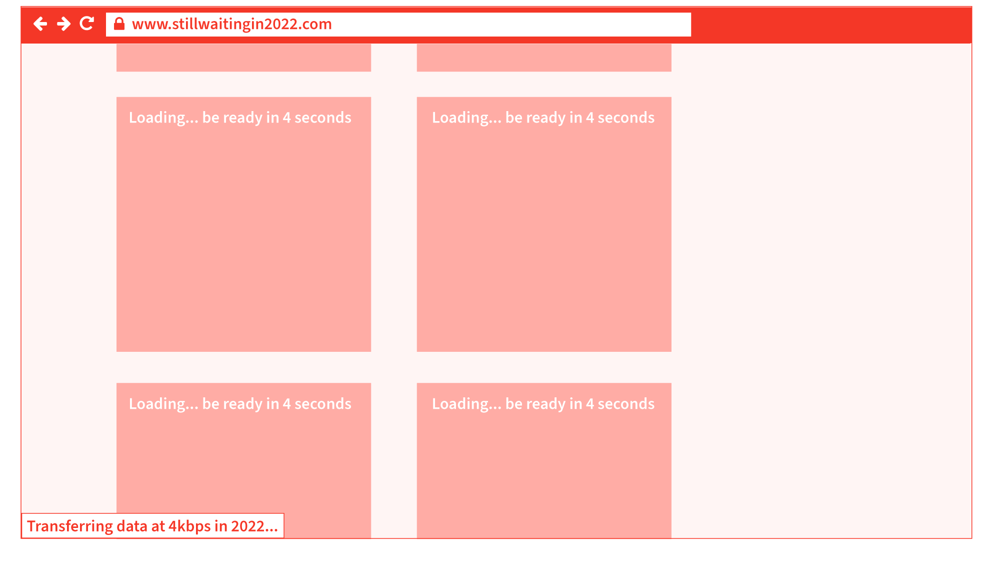
Current times in 2022 are challenging throughout the world (there is no denying that). Over the last few years, we have noticed the truly awful impact, performance, and results of websites for users, because of lazy loading images, infinite scroll, and content shifting on page load to save on internet data bandwidth usage — both on the user’s end and server-side (that delivers the website).

Problem

In essence, lazy loading means that an image or content will not be loaded until it becomes available or requested by the user in the visible screen area. Because of this lazy (late) loading, users frequently have to wait a few seconds for content to load, even with today’s amazing technology.

Infinite scroll is essentially the same principle as lazy load images, but the non-visible vertical webpage content not in the screen’s visible screen area, is not loaded until you scroll down. Lazy load can also be used with painful pagination features (like go to page 1, 2, 3, 4, 5, 6, 7, 8, 9, 10 as seen on large e-commerce websites and as Vitaly Friedman has outlined in his article, “Perfect Infinite Scroll UX”).

Content shifting on page load basically refers to a mixture of lazy loading content (text, images, and webpage layout) being delayed and loaded late, causing the content, when it does load, to load late, shifting the vertical and horizontal height of the web page’s content, cause elements and call-to-action buttons to shift and move around, as also highlighted by Michael Scharnagl on Smashing Magazine. This issue is especially problematic if you are trying to work quickly on a slowish or sluggish machine or device. However, not even a fast machine seems to make a difference regarding this issue.

All of these three issues create really bad user interactions, especially with longer-length web pages, although they are promoted and regarded as good webpage performance techniques.

Solution

Give people the content when it should be there and when they need it, as fast as you can. I understand that for very long webpages, some off-visible screen lazy loading and infinite scroll could be beneficial to save on unnecessary loading of content. But for everything else, just give it to users as fast as possible experience. We have incredible technology these days, and let’s not over-design and overthink.

What Can We Learn?

It could be said that when using lazy loading or infinite scroll in 2022, we are still dialing up with 4 kbps modems just like we did back in the year 2000. The amount of times and the delivery of information and images is the same: very, very slow. Nothing has changed. We are still looking at blank or block-colored images waiting for them to load… while 20 years of the internet have passed. The average speed of a computer and mobile internet in 2022 is 30.78 mbps, and we are still getting the same performance as in the year 2000 — as if on 4kbps modems. User experience is what matters, not technical wizardry.

Total Overload Of User’s First Website Interaction

Problem

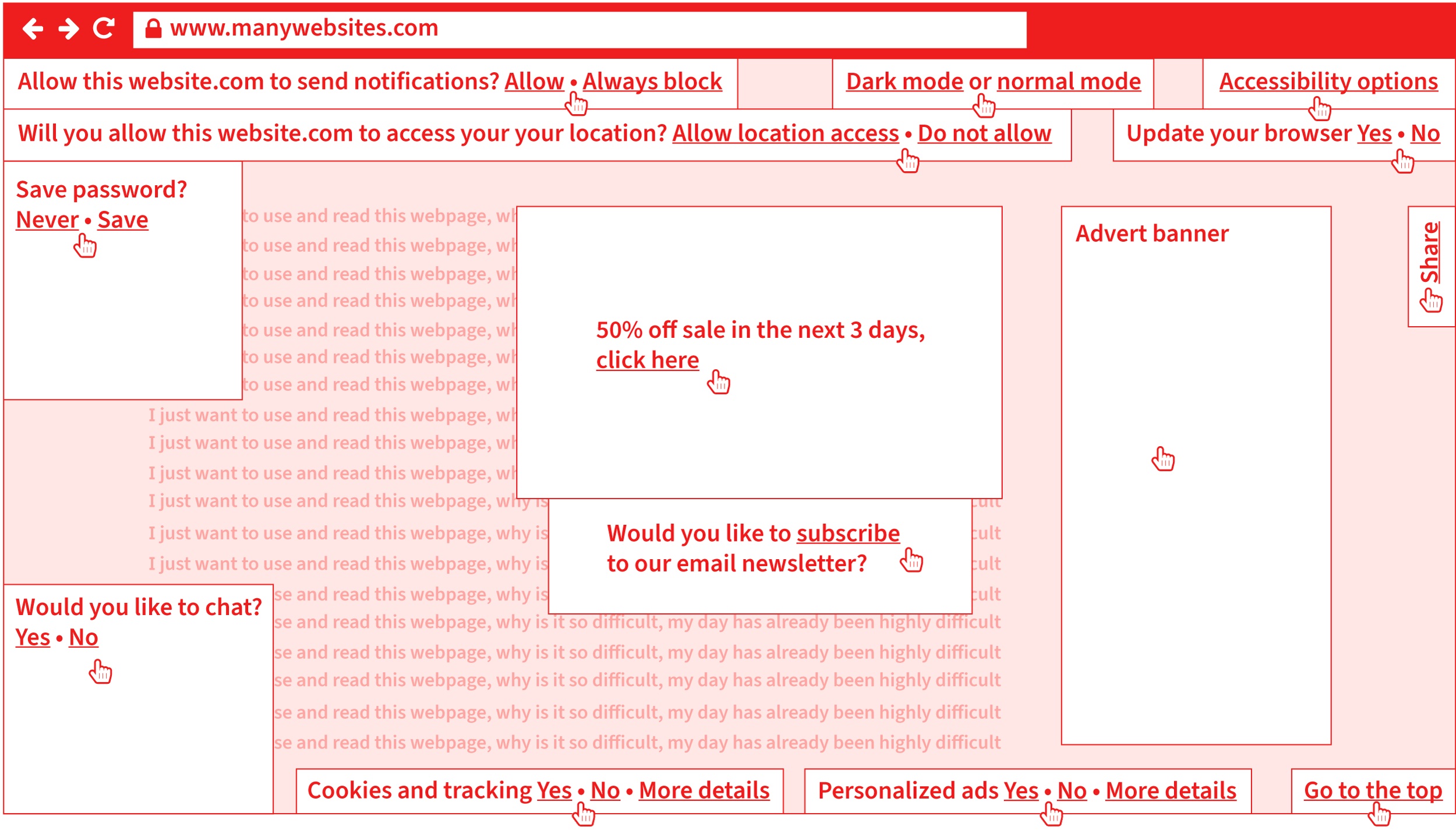
Another example of bad usability is webpages that have very demanding first-visit user requirements. I am sure you all experience and struggle with the following on a daily basis (maybe you are even doing it now, arghhhh go away cookie policy box? Yes, no?):

  1. Cookie policy “accept/deny warning box” pops up when you 1st visit a webpage that distracts and blocks natural use.
  2. Email newsletter box pops up asking if you want to subscribe. That is another thing you have to do, even before you have started to use and read the webpage!
  3. A “do you want to receive update/news notifications” box appears.
  4. “Do you want to allow or block access to your physical location” box appears.
  5. Another box appears asking if you want to save 50% if you order in the next three days.
  6. A chat box appears asking if you want to chat with someone [well, maybe, but not at the moment].
  7. Then, finally, a “do you want to save your password” box appears.

Solution

Do not overcomplicate the 1st interaction with your thing. It is a bit like comparing it to bumping into someone when you are in a hurry and have to go, and all they keep doing is talking to you and telling you their life story. If people find their 1st interaction with you displeasing, they will turn away. If you have to provide options like cookie warning boxes, email newsletter subscribe boxes, and other notifications, leave them optional or in a place that everyone knows they can visit, like a universal options link or button in the top right of a webpage, where they can customize and setup these things, as they like.

What Can We Learn?

All of this creates a hard-to-use and over-demanding graphic communication. That distracts, over-complicates, and creates extra barriers to information that are very costly for your business or organization because it increases the chance of your users leaving and rejecting your item. Say goodbye to your users and customers in less than 3 seconds. It gives your brand a bad feeling and experience, and maybe they decide not to order something through your website. These are the everyday realities of bad usability because of your over-demanding and difficult-to-use design, information, and communication. It is not difficult:

  • Think about how people will want to use your design.
  • Make it as easy and least demanding as possible.
  • Test with them in real time.

Clothing Measurement Sizes On Fashion E-commerce

The next example has to do with measurements such as millimeters (mm), centimeters (cm), and inches (in). It doesn’t bring that much confusion with it, but surprisingly, it can still cause quite a lot of confusion and problems worldwide.

Problem

Measurements such as millimeters (mm), centimeters (cm) and inches (in) may not seem that interesting, but if you were to try to order a polo t-shirt online, you’ll notice that it may take you longer to do than expected. By measuring the width between your armpits across your breast area to get your bust (chest) circumference, and you may have measured 60 cm on the front, i.e. you have to multiply this number by 2 for the whole circumference of 60 cm (front) × 2 (front and back) to get a result of 120 cm.

Let’s say you finally find a polo t-shirt that you really like on a French clothing e-commerce website. You choose the color of the polo t-shirt you like and search for your size (we know that it is 120 cm, this sounds like we’re back in a Maths class, bear with me), but the only available sizes from that French clothing company are the following:

  • 2 – XS
  • 3 – S
  • 4 – M
  • 5 – L
  • 6 – XL
  • 7 – XXL
  • 8 – 3XL
  • 9 – 4XL
  • 10 – 5XL
  • 11 – 6XL

The above measurements are a bit helpful but certainly not accurate. They are not accurate because there is still no measurement information in millimeters, centimeters, or inches. However, the information above is a link titled Size guide. Okay, let’s give that a go and see what it does. A slide-in panel appears, and there is a drop-down list with the following information:

  • 2 – XS = (bust circumference: 87 cm/34 in, pant waist circumference: 73 cm/28 inch).
  • 3 – S = (bust circumference: 90–93 cm/35–37 in, pant waist circumference: 77–81 cm/30–31 in).
  • 4 – M = (bust circumference: 97–101 cm/38–40 in, pant waist circumference: 85–89 cm/33–35 in).
  • 5 – L = (bust circumference: 105–109 cm/41–43 in, pant waist circumference: 93–97 cm/36–38 in).
  • 6 – XL = (bust circumference: 113–117 cm/44–46 in, pant waist circumference: 101–106 cm/39–42 in).
  • 7 – XXL = (bust circumference: 121–125 cm/48–49 in, pant waist circumference: 111–116 cm/44–46 in).
  • 8 – 3XL = (bust circumference: 129 cm/51 in, pant waist circumference: 121 cm/48 in).
  • 9 – 4XL = (bust circumference: 134 cm/53 in, pant waist circumference: 126 cm/50 in).
  • 10 – 5XL = that now, strangely, in the Size guide slide-in panel seems to say 1XG = (bust circumference: 139 cm/55 in, pant waist circumference: 131 cm/52 in).
  • 11 – 6XL = that now, strangely, in the Size guide slide-in panel seems to say 2XG = (bust circumference: 144 cm/57 in, pant waist circumference: 136 cm/54 in).

Are you starting to get a headache? I told you, keep reading and we will find the remedy!

Our bust (chest) circumference, as we know, is 120 cm, so it seems by the information in the above Size guide panel, that this size (entry):

  • 7 – XXL = (bust circumference: 121–125 cm / 48–49 in, pant waist circumference: 111–116 cm/44–46 in).

It is going to be a really good and safe size (because it is slightly larger than 120 cm by 1–4 cm). So it seems that there is no problem here, and in fact, the website has given good and flexible information because measurement sizes have been provided in three different measurements: cm, mm and in.

Another related question is whether all clothing websites display their polo t-shirts measurement like the French clothing company above. Well, no. Here is an example from a British clothing company, and we are going to use our pre-measured bust (chest) circumference, which we know is 120 cm once again, to order a different polo t-shirt from the British clothing company. So I have selected a polo t-shirt from the British clothing company’s e-commerce website, and the sizes that it gives are:

  • 36
  • 38
  • 40
  • 42
  • 44
  • 46

If we look at the drop-down list information from the French clothing company, we really cannot see anything that says 36, 38, 40, 42, 44, 46. However, once again, there is a View guide link on this British clothing website, so we click that, and see what happens (as it might be able to give us some more information).

Two options are available:

  • Top half (bust, chest),
  • Bottom half (waist).

We want the Top half (bust, chest) option because we measured the distance from armpit-to-armpit, then multiplied by 2 to give our total circumference in cm, as previously. The tables say:

Top half (bust, chest)

36 38 40 42 44 46
Chest (inches) 36 38 40 42 44 46
Chest (cm) 92 97 102 107 112 117
XS S M L XL XXL XXXL
Chest (inches) 32–34 35–37 38–40 41–43 44–46 47–49 50–52
Chest (cm) 81–86 89–94 97–102 104–109 112–117 119–124 127–132

We have to remember that the only available sizes in this polo t-shirt are 36, 38, 40, 42, 44, and 46. So it would seem 46 is the largest size they offer, and the circumference in cm of 46 (inches circumference) is 117 cm circumference. As you can see, 117 cm is not large enough. There is not enough flex (leeway) in this size because we know that our already measured armpit-to-armpit circumference in cm is 120 cm.

Solution

The French clothing company provided a good range of measurements in 2 measurements, inches and cm. The British clothing company, however, provided two tables, and it would be more advisable to actually not offer users the second table because it is basically a whole range table for all their clothing and is not valid for the polo t-shirt we selected, where only 36, 38, 40, 42, 44, 46 were available (yes, it is confusing). If we really want to clarify even more, the initial sizes of 36, 38, 40, 42, 44, and 46 would maybe be better written like this:

  • 36 in (92 cm), 38 in (97 cm), 40 in (102 cm), 42 in (107 cm), 44 in (112 cm), 46 in (117 cm).

Then there is much less misunderstanding, and users can relate the values better to their information and size.

What Can We Learn?

Yes, we can learn a lot. The interesting points to note are that the French clothing company’s website offered fairly useful and practical information. The British clothing company initially gave us six measurements in inches (36, 38, 40, 42, 44, 46) that made no sense to us, but when we went to the View guide link, we were able to decode the two tables, although it really was not made blatant (obvious enough) that this range only goes up to 46 inches bust (chest) circumference. And in fact, there were two tables provided, and it could have been very easy to read the second table (one below) and see that there is a size of XXL (119–124). Since the table has been provided, it will be available in XXL (119–124), but, of course, it is not for the polo t-shirt we selected.

Only give information relevant to the product and task, and remove any information that is not applicable or useful, especially when dealing with measurements. Furthermore, and you are going to like this if you are a designer or working in sales, if we consider the further-down-the-line consequences, you could very easily, as people do:

  • Make an order thinking the size will be alright when really it is not (we have all done this, hey).
  • Type in all your details.
  • Pay for it.
  • Wait for it to be delivered (maybe missing a day of work, or picking it up from somewhere else, as no one was in where you live).
  • Try it on, and it does not fit.
  • Get packaging to return it to them undamaged.
  • Complete another refund/return form.
  • Do more paperwork.
  • Send it back to them (maybe missing a day of work, so someone can pick it up from where you live or travel to a post/courier office).
  • Check your bank account over the next 30 days to see if you have been refunded.
  • Oh, I forgot, what about writing the postal address that the return needs to go to? Do you write it on the front in a pen, print out an A4 page, then sellotape it on, or do you do something else?

As you can see, user errors and mistakes are very time-consuming for the users themselves, and even more costly for the supplier of the product who has to process the return, i.e. giving them masses of more work to do. Good design makes a lot of sense for all involved.

Concluding Observations, What Did We Learn From All Of The Examples?

The results of getting good at the accessibility and usability issues previously mentioned are:

  • Be a better designer;
  • Designs will work better for people;
  • Enable people to achieve what they want to with your design and information;
  • Designs will increase business success;
  • Designs will reduce task interaction time and will allow users to achieve what they want to do faster;
  • Reduce stress, confusion, and unnecessary work;
  • Increase customer loyalty and quality perception of the brand.

What We Have Explored And Learned In This Article

  • Microsoft Word Font Menu
    Rather than accepting a design and what is there, we understood and found out how people will want to use the thing. We then looked at a very simple solution to make this as quick and efficient as possible. It leads to increased workflow speed, productivity, better actions, and a reduction in time, stress, and confusion.
  • Font Software
    We saw default operating software that lacked needed features.
  • Map In An Annual Review
    We found out, explored, and understood how people are going to use the thing, interface, content, or system. We then provided a very simple map that improves access to the content to allow easier and more chance of comprehending the information, and to increase the chance of people doing what we intend and enabling it to happen more easily.
  • Electronic Business Card On Websites
    We were able to increase the chances of people doing something (in our case, to contact us) by thinking about how we could make that easier to do by providing different electronic files to help people do this.
  • Modern (considered) good practice web performance techniques
    Current-day website design performance methods, like lazy load and infinite scroll, are rendering websites to load at 4kbps speeds that we had around the year 2000, that is 22 years ago. This makes websites difficult to use and interferes with the user’s original intention and goal.
  • Total Overload Of User’s First Interaction
    We saw many websites requiring a user’s first interaction to deal with, sometimes, 13 option settings and sorting, before they even get a chance to engage and complete their original task. Showing a high amount of information overload and digital information pollution.
  • Seemingly Straightforward And Assumed Easily Usable Information
    When it comes to information, even seemingly very mundane and standard information (if it is not designed, communicated, and provided to users in a logical and easy way) creates masses of problems and work for all involved (as was the case in the online polo t-shirt ordering examples).

Ways To Come Up With New Accessibility And Usability Ideas, For Your Current Project Right Now!

How can you simplify (I mean really reduce) the work, energy, and tasks for users to complete and get something done?

  • Reduce complexity and demands (for instance, by not bombarding them with options, notifications, and things to sort out, even before they have started their originally intended task).
  • Reduce steps, stages, and clicks.
  • Strengthen and reduce the complexity and unnecessary difficulty in design, communication, user interfaces, and systems.
  • Ask for feedback and try to get good-quality questionnaires.
  • Conduct real-time diagnostic user testing.

How would you make your design and information more obvious and easier to access, find, process and scan through for users?

  • Search options on a website (enabling people to search through all of your content)?
  • Sitemap or index (allow people to quickly find what they are looking for)?
  • Navigation menu for a website or contents page for a publication (allows people to get an overview of all of the website or system content).
  • Add a map, graph, or data visualization (to help people envisage and see the content in better and different ways)?
  • Make the content available as audio (either online or able to transfer to a portable physical device)?
  • Could you use heading hierarchy levels like heading 1, heading 2, or heading 3, bullet lists, boxes, or icons to split up, better chunk, and highlight information?
  • Do you provide your communication in a range of different medias like online, print, audio, video, braille, large print, and easy read (that will increase the chances of it being used and being used in different people’s most ideal format?).
  • What about a conclusion, summary, or recap after a lot of information to help reprocess and reinforce the main points from lengthy content?
  • What kind of navigational elements could you use or introduce to help users move and navigate around your system: running heads, breadcrumb navigation, go to the top link, scroll spy elements, where you are a feature, progress indicator, grid or list of thumbnails to give a whole overview?
  • How can you help and make users discover and enjoy more of your hopefully useful content and information?

How can you understand, envisage and get to know more about people and their requirements?

  • Find out, think, explore, ask and watch people using the thing.
  • Ask users and find out what they want to do with your thing.
  • How can you make it easier for them to do what they want and achieve what they want as quickly as possible?
  • Do user testing and set people tasks to do and see where they struggle and if they can do it within a reasonable amount of time.
  • Learn about different people’s needs, like people who are aging, dyslexic, with vision, physical or hearing issues.
  • Find out about different categories of people by reading about user personas.
  • Better sectioning or navigation features.

How can you provide the information people may want in different formats to allow better and easier use of your information?

  • Maybe: HTML, SMS, RTF, PDF, VCARD, TXT, XML?
  • How can you allow people to customize your website, interface, or system:
    • If people use your website or system a lot, maybe they would like to customize the colors, typeface, or layout to avoid boredom.
    • How could you deliver age-specific or more fitting and relevant content (text and images) to this category of users, or other age categories of users?
    • How could you allow people to customize your website so they can use it how they wish and use it in their most ideal presentation?

Thank you for reading. I hope you enjoyed the issues raised in this article and how tools like Extensis can help — some show the latetst strategies and methods (sadly, not that advanced) that we have been using here for the past twenty years. Accessibility and usability are really not that difficult — they just need to be done better.

Categories: Others Tags:

Essential Platforms for any Ecommerce Business

December 20th, 2022 No comments

For all eCommerce businesses, time is money, and every minute you spend unwisely is an opportunity cost. Because if your hands are full trying to stay afloat, you will miss out on market trends and product innovation opportunities that could leave your competition in the dust. Automating and streamlining monotonous tasks with the right platforms is more significant than ever.

Here are some benefits of using eCommerce platforms:

  • Cost savings: With the right eCommerce platform, businesses can save on operational costs associated with hosting their storefront. Additionally, businesses may qualify for discounts when they sign up for an established provider.
  • Increased reach: An effective and reliable platform enables businesses to increase their customer base by reaching a wider range of customers.
  • Improved user experience: Professional eCommerce platforms are designed to provide a seamless, intuitive, and secure user experience for online shoppers. This helps increase customer satisfaction and loyalty.
  • Scalability: eCommerce platforms provide a scalable infrastructure that can meet the needs of any business, from small startups to large enterprises. Additionally, they can also help expand your product line, add new features, offer promotions, and expand their product line or add new features with minimal effort. 
  • Advanced features: Established platforms come equipped with advanced features such as search engine optimization (SEO), payment gateways, mobile commerce, inventory management, and more.  With these tools, businesses can optimize their online store for maximum efficiency and success.

There are countless eCommerce options available for all your business needs!

Team Communication Platforms

Whether you’re running an eCommerce business or a large multinational corporation, team communication can help establish efficient and effective communication between departments, teams, and individuals. 

That’s where specialized team communication tools come in handy!

Why should you invest in these platforms? 

  • Increased Collaboration and efficiency: With eCommerce platforms, your team can collaborate more effectively than ever before. You can assign tasks to specific users, keep track of project progress, and stay connected even when working from different locations. 
  • Enhanced Productivity: According to a recent McKinsey report, effective team communication can increase productivity five times more. So it’s critical for the success of any business.
  • Better Customer Service: eCommerce communication platforms enable your customer service staff to quickly and easily address customer concerns and complaints. This results in enhanced customer loyalty, leading to more sales and increased profitability for your business.

Now how do you pick the best communication platform?

Step 1:  Determine what kinds of features and functions you need. Do you need a platform that can be designed for on-site or work-from-home communication? Do you need a platform that can be used for big or small teams? Do you need file-sharing or storage organization features? Consider all the features and functions that your specific business requires.

Step 2: Read reviews about eCommerce platforms from experts in the field. This can help narrow down your list of potential eCommerce platforms and give you more insights into which one might be best suited for your team’s needs. You can check out reputable sites such as G2, PC Mag, and GetApp to compare software and its features.

Step 3: Look at the different eCommerce platforms and compare them side-by-side. Consider factors like cost, customer service, security, scalability, and more. It’s also a good idea to look for eCommerce platforms with integrations to other tools that you might use regularly.

Step 4: Ask your team what they think about the eCommerce platform you are considering. Your team will be using these features as well and can give you a first-hand perspective on what they need to function optimally, and also bring up points that you may not have considered yet. Asking them what features will benefit them the most will give you valuable insights into which eCommerce platform is most user-friendly for your specific users.

Step 5: Test out the eCommerce platform before making any decisions. This will help ensure that it meets all your team communication needs and provide helpful feedback on how well it works.

Here are our top recommendations for you:

  • Slack is an instant messaging platform that enables eCommerce teams to communicate in real-time. This platform offers features such as searchable conversations, file sharing, one-on-one calls, or group chats with audio or video calls. It also provides admin control over user access levels and channels to ensure security.
Source: Slack
  • Microsoft Teams allows eCommerce companies to collaborate remotely. It enables eCommerce teams to hold meetings, share files, and work on tasks together. The platform also allows eCommerce teams to create custom team channels for topics related to their eCommerce business.
Source: Microsoft Teams

  • Zoom Cloud Meetings is a cloud-based video conferencing tool that eCommerce companies can use for online meetings. This platform allows eCommerce teams to host virtual events such as webinars and presentations. It comes with features such as screen sharing, recording and playback, whiteboard collaboration tools, and more.
Source: Zoom Cloud Meetings

Screenshot from Zoom’s  website

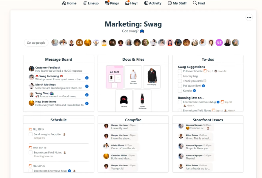
  • Basecamp provides eCommerce teams with project management solutions. It enables eCommerce businesses to manage projects from start to finish by creating tasks and assignments within timelines or due dates, setting reminders, and tracking progress.
Source: Basecamp
  • Trello is an online collaboration tool designed to help eCommerce teams work together. This platform allows eCommerce teams to create project boards and assign tasks, share files and documents, comment on projects, and more. Trello also provides eCommerce businesses with analytics tools that track project progress.
Source: Trello

Warehouse & Fulfillment Platforms

Now that you’ve got your team ready, it’s time for warehouse and fulfillment matchmakers to get on the scene.

They provide essential support such as order processing, inventory management, shipping, and returns – all with the click of a button.

Here are other benefits of using warehouse and fulfillment matchmaking platforms:

  • Optimize eCommerce investments: Warehouse & Fulfillment Matchmaking Platforms help eCommerce businesses to invest their resources optimally in the right eCommerce platforms.
  • Improve customer experience: By integrating with eCommerce platforms, Warehouse & Fulfillment Matchmaking Platforms can improve the customer experience by allowing customers to track shipments and get real-time updates on orders.
  • Streamline operations: Warehouse & Fulfillment Matchmaking Platforms can streamline overall operations and reduce time spent on manual tasks.
  • Increase efficiency: Automation capabilities offered by Warehouse & Fulfillment Matchmaking Platforms help increase efficiency by automating mundane tasks and providing better visibility into order processing.
  • Reduce costs: These platforms can also help utilize the most cost-efficient fulfillment solutions, resulting in significant savings on shipping and storage costs.

Now that you know its value, here is a guide to finding the right one for your eCommerce business:

Step 1: Define Your eCommerce Needs. Before making any decisions, take the time to understand what eCommerce features and functionalities your business needs. Do you need payment processing capabilities? Inventory management tools? Tax compliance solutions? Having a clear understanding of exactly what you need.

Step 2: Research eCommerce Platforms. Take some time to research various eCommerce platforms online that fit your needs and budget. Look at reviews from other businesses that use eCommerce software, compare pricing models and features offered by each platform, assess scalability, and identify which ones have experienced customer service teams available. 

Step 3: Try Out eCommerce Platforms. If possible, it’s always recommended to test eCommerce platforms before signing up. Many eCommerce software providers offer free trials or demos, so take advantage of these to ensure that the eCommerce platform you’re considering meets all of your expectations and can handle the needs of your eCommerce business.

By following these steps, you can rest assured that you’re selecting the right Warehouse & Fulfillment Matchmaking Platforms for your eCommerce business. This will help ensure you stay ahead of the competition in this ever-changing eCommerce industry.

Popular Warehouse & Fulfillment Matchmaking Platforms in the eCommerce space include the following: 

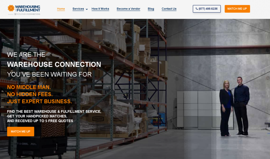
  • Warehousing and Fulfillment connects customers with top-quality companies that meet their needs based on geography, technology, types of services offered, etc. This service is free to customers, with WarehousingFulfillment.com charging a small lead fee of $30 to the companies it connects customers with. Plus, this online service offers a no-spam guarantee.
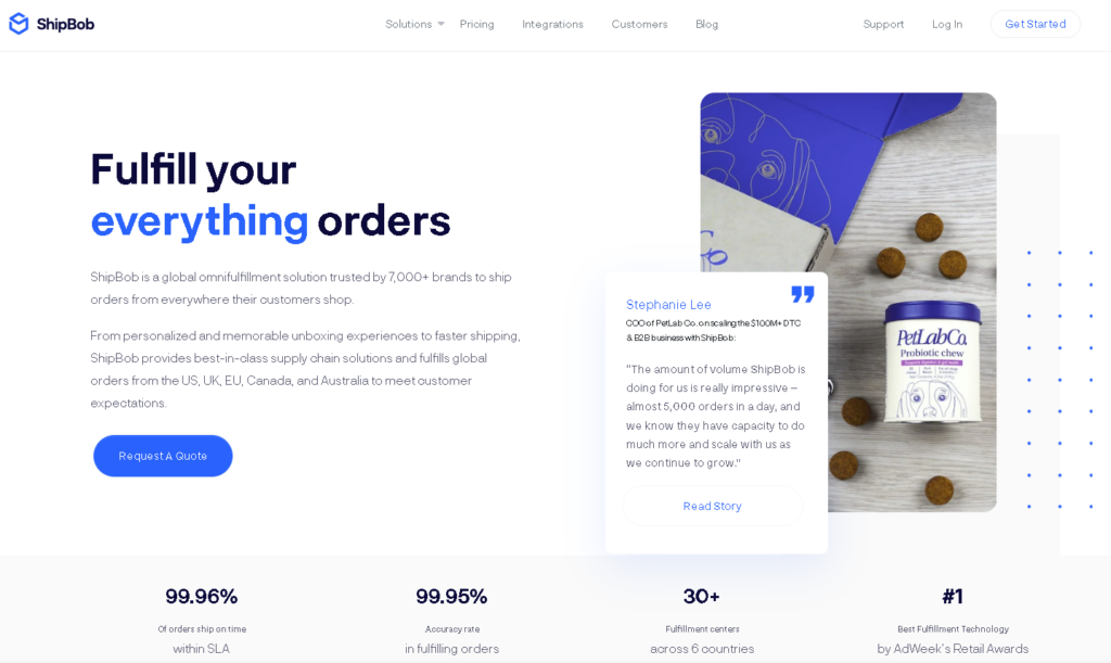
  • ShipBob is an eCommerce fulfillment provider specializing in helping eCommerce businesses fulfill orders quickly and cost-effectively. The platform offers fast shipping times, advanced inventory tracking tools, and flexible pricing plans to meet the unique needs of any business.
Source: Shipbob
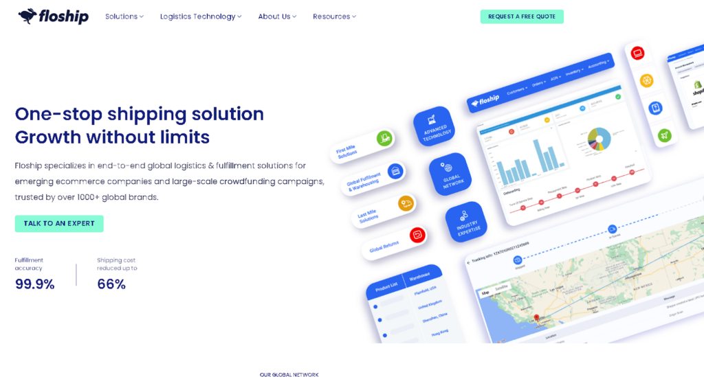
  • Floship is another eCommerce fulfillment provider that offers comprehensive eCommerce services such as shipping, inventory tracking, order fulfillment, eCommerce returns management, and more.
Source: Floship

Recruitment Platforms

Creating a successful eCommerce business requires more than just setting up a website. Because access to the right talent is an essential ingredient for success. That’s why investing in eCommerce recruitment platforms can be invaluable for small and large businesses.

eCommerce recruitment platforms are designed to help business owners quickly and efficiently find reliable eCommerce professionals. eCommerce recruitment platforms make it easier to source the best eCommerce talent from a variety of sources, including both local and international job boards or through one-on-one networking.

Here are more of the benefits you get if you invest in a recruitment platform:

  • Increased Efficiency: eCommerce recruitment platforms provide streamlined, efficient ways for businesses to manage their recruitment and hiring processes. This reduces the amount of time spent on manual tasks such as sifting through resumes and filling out job applications.
  • Cost Savings: eCommerce recruitment platforms can help save costs by automating the process of sourcing and recruiting candidates who are the best fit for their eCommerce openings.
  • Improved Candidate Engagement: eCommerce recruitment platforms enable eCommerce businesses to engage with potential candidates quickly, allowing them to build relationships that can potentially lead to successful hires in the future.
  • Better Talent Pooling: eCommerce recruitment platforms allow eCommerce businesses to access a larger talent pool and source the best candidates for their eCommerce openings.
  • Scalability: Recruitment platforms allow eCommerce businesses to scale up or down depending on their needs. This helps save costs by only hiring the necessary number of personnel.

Here’s a step-by-step guide to finding the right platform for your business:

Step 1: Define what kind of eCommerce roles you need to fill. Are you looking for a platform that offers many different job postings? Or do you need a more niche-focused recruitment platform? Ask yourself probing questions. 

Step 2: Research eCommerce recruitment platforms and compare their offerings. Look at the features, such as job boards, recruitment tools, data analytics, recruiting software, and other services they offer. Compare these to determine which fits your business needs. 

Step 3: Consider what type of support the platform provides. Do they offer customer service or technical support? Additionally, does the eCommerce recruitment platform offer additional services such as training programs, job posting advice, or eCommerce market research?

Step 4: Consider cost. Compare prices for different eCommerce recruitment platforms and make sure you’re getting value for your money. You should also check for any hidden fees associated with using their eCommerce recruitment platform. 

Here are some of the most popular eCommerce recruitment platforms include:

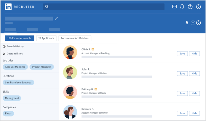
  • LinkedIn Recruiter is a powerful eCommerce-specific recruiting tool that allows companies to engage with potential applicants, manage hiring processes, and access a rich pool of eCommerce talent.
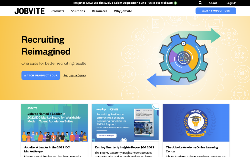
  • Jobvite is a comprehensive platform that offers effective sourcing options, automated resume screening capabilities, and streamlined collaboration between recruiters and hiring teams.
Source: Jobvite
  • Glassdoor provides eCommerce employers with an expansive database of qualified professionals and robust analytics that can help inform smarter hiring decisions. It also includes an employer branding suite, which businesses can use to promote their job openings and attract top talent.
Source: Glassdoor
  • Dice is a recruitment platform that offers an extensive library of resources and co-branded job postings. It also provides access to a large pool of eCommerce professionals with specialized skills.
Source: Dice

These recruitment platforms offer eCommerce companies the ability to find high-quality candidates quickly and efficiently, making them valuable tools for growing businesses. By leveraging these platforms, employers can create more effective hiring processes, resulting in a higher success rate in finding the right person for the job.

Web Hosting Platforms

A web hosting platform is another tool that plays a crucial role in eCommerce businesses. They provide the necessary infrastructure that enables sites to run smoothly and securely. 

With the right platform, you can optimize your website’s performance and create an enjoyable user experience.

Here are just some more of the reasons why you should start considering a web hosting platform of your own: 

  • Faster website speed: eCommerce platforms offer hosting solutions that are specifically optimized for eCommerce websites, ensuring fast loading speeds of your web pages.
  • Increased scalability: eCommerce platforms can easily be scaled up or down to meet the changing needs of a business as it grows and evolves.
  • Improved storage capacity: These platforms also allow businesses to store larger amounts of data, images, and other media files, making it easier to manage large inventories.
  • Enhanced security: eCommerce platform hosting provides enhanced security features such as encryption, secure sockets layer (SSL) certificates, and more to help protect customer information from malicious attacks.
  • Easy integration with third-party applications: eCommerce platforms offer easy integration with third-party applications, making it easier for businesses to take advantage of eCommerce tools and services.
  • Enhanced customer experience: These platforms help businesses create a seamless user experience by providing features such as a one-page checkout process, order tracking, and more.
  • Robust analytics: eCommerce platform hosting offers powerful analytics tools to track website performance and visitor behavior, allowing businesses to make informed decisions about their eCommerce strategy.

Here are the steps to selecting your web hosting platform:

Step 1: Identify eCommerce Platform Requirements: Specifying the eCommerce platform requirements for your business is the first step in selecting the right eCommerce hosting solution. Consider factors such as cost, scalability, reliability, security, and compatibility with existing systems.

Step 2: Research eCommerce Hosting Solutions: Once you have identified your platform requirements, research available eCommerce hosting solutions that match those needs. Compare features and pricing between different providers to determine the best fit for your organization or project.

Step 3: Assess Security Features: Assessing the security features of eCommerce hosting providers is essential to protect customers’ data and ensure compliance with laws and regulations related to industry-specific standards (e.g., HIPAA). Determine what security measures are in place and how they are monitored.

Step 4: Evaluate eCommerce Platforms: Select hosting platforms based on features such as payment gateway support, shopping cart integration, database access, analytics capabilities, customer service options, email marketing tools, and other software integrations.

Step 5: Consider Uptime & Performance Parameters: When selecting an eCommerce hosting provider, it is important to consider factors such as uptime guarantees, server performance, and technical support for outages or downtimes.

Step 6: Analyze Pricing & Payment Options: Compare pricing between eCommerce hosting providers to determine the best value for your organization or project. Evaluate payment models (e.g., monthly vs. annual).

Here are our suggestions:

  • Shopify is a comprehensive eCommerce solution that enables businesses to launch an online store with ease. It offers various features to help customize your store and make it appealing to customers.
Source: Shopify
  • BigCommerce is another eCommerce platform that offers a wide range of features and tools to help businesses build an eCommerce website. It also has several integrations with third-party services, such as payment processors, shipping carriers, and more.
  • Adobe eCommerce is an eCommerce solution that enables businesses to create an online store in minutes. Its intuitive user interface allows you to easily customize and manage your eCommerce store.
Source: Adobe eCommerce
  • Wix eCommerce is a powerful eCommerce solution that offers an array of features to help businesses build an eCommerce website quickly and easily.
Source: Wix eCommerce
  • WooCommerce is designed specifically for WordPress users. It’s easy to use, highly customizable and has many features.
Source: WooCommerce

All five eCommerce platforms offer businesses the ability to manage their stores with ease, so it’s worth researching each one to see which is best for your business.

Payment Platforms

Don’t forget that last but one of the most important platforms your eCommerce business needs.

Payment platforms enable customers to make secure payments quickly and easily.

E-commerce businesses have a variety of payment options available, from traditional credit cards to more modern e-wallets and mobile payment methods. 

Depending on the specific platform used by the business, it is important to choose the right payment providers that offer comprehensive security measures and convenient checkout solutions for customers.

For eCommerce websites built on popular eCommerce platforms like Shopify or Magento, there are typically integrated solutions such as PayPal, Stripe, or Amazon Payments that can be enabled with just a few clicks. 

These services provide easy-to-implement APIs which allow merchants to integrate their eCommerce website with external payment providers easily. Additionally, eCommerce businesses can choose to add more payment options such as Apple Pay, Google Wallet, or Bitcoin.

To keep customers secure and compliant with the Payment Card Industry Data Security Standard (PCI-DSS), eCommerce businesses should ensure that they use a PCI-compliant payment gateway – a vital requirement for any eCommerce business dealing with credit card information securely.

By using payment platforms, you get these benefits and more:

  • Easier and faster payment processing: eCommerce platforms make it easy for businesses to process payments quickly, allowing them to offer customers a secure checkout experience.
  • Lower transaction costs: eCommerce payment platforms help businesses save money on transaction fees by eliminating the need for third-party payment processors.
  • Increased customer loyalty: eCommerce platforms provide customers with an enhanced shopping experience, which can lead to increased loyalty and repeat purchases.
  • Improved security measures: eCommerce payment platforms use advanced encryption methods and other security measures to protect customer data from malicious attacks.
  • Reduced fraud risk: eCommerce payment platforms incorporate sophisticated fraud detection systems that identify suspicious activity and alert business owners in real-time.

Choosing the right eCommerce Payment Platform is an important decision for eCommerce business owners.  Not only will it determine how their customers pay for goods and services, but it will also have a major impact on the success of their eCommerce venture. 

In this step-by-step guide, we’ll provide some tips to help you select the best eCommerce Payment Platforms for your business needs.

Step 1: Identify Your Requirements. Before selecting a payment platform, eCommerce business owners should identify what their requirements are. Do they need a platform that supports multiple currencies? A system with fraud protection or recurring billing capabilities? Knowing your specific needs can help narrow down the list of possible options.

Step 2: Consider Fees. The cost of the eCommerce Payment Platform should also be taken into consideration. Many platforms charge monthly fees, transaction fees, and additional charges for certain services. Knowing what you’re willing to pay will help you refine your options further.

Step 3: Read Reviews. With so many eCommerce Payment Platforms available today, performing a thorough review is essential. Check out customer reviews across multiple websites and social media accounts to get an idea of how well the platform performs in real-life scenarios.

Step 4: Test Drive Platforms. Once you have narrowed down your list of potential eCommerce Payment Platforms, it’s time to test them out. Most eCommerce businesses offer free or discounted trial periods, allowing customers to try the platform before committing to a full subscription.

Researching and evaluating payment platforms can help ensure that your customers have a smooth checkout experience. Here are a few examples of excellent payment platforms:

  • Shopify is a great option for business owners looking for an all-in-one eCommerce solution. It offers a simple setup process, a user-friendly interface, and mobile-friendly themes. It also provides powerful marketing tools that can increase sales with minimal effort.
  • BigCommerce offers many of the same features as Shopify but with more customization options to fit specific needs. It provides over 100 fully customizable themes, eCommerce analytics, and integrations with services like QuickBooks or Amazon.
  • Adobe Commerce is a popular platform for businesses that require more flexibility. It offers features such as multi-store capabilities, custom layouts, and extensive APIs to help businesses grow.
  • WooCommerce is an eCommerce plugin for WordPress websites that provides users with powerful eCommerce tools without any coding experience needed. With WooCommerce, users can quickly start selling online by simply setting up their store on their website.
  • Squarespace is an eCommerce platform that allows businesses to create beautiful online stores using its drag-and-drop builder. It also comes with built-in marketing tools, mobile optimization, and payment processing options making it perfect for small to medium-sized eCommerce businesses.
Source: Squarespace

Conclusion

Let’s recap the important platforms you should start using to get the best out of your eCommerce business:

  • Team Communication Platforms enable businesses to connect, collaborate and communicate with customers, employees, and partners. 
  • Warehouse and fulfillment matchmaking platforms provide eCommerce businesses access an extensive network of warehouses and fulfillment centers, allowing them to optimize order fulfillment speeds, accuracy, and cost-effectiveness.
  • Recruitment platforms are eCommerce solutions that enable businesses to streamline their recruitment process by connecting them with job seekers, simplifying the job discovery and application process, and providing hiring, onboarding, and tracking performance tools. 
  • Web Hosting Platforms enable businesses to securely and reliably host their websites, providing tools for building and managing content, configuring settings, monitoring performance and security, and more.
  • Payment Platforms enable businesses to process payments securely and manage transactions, providing tools for accepting various payment methods, verifying customer identity, monitoring fraud activity, and more.

As eCommerce continues to grow and evolve, eCommerce platforms are the cornerstone of success. Whether it’s a simple e-store or an enterprise eCommerce platform, the right choice can make a big difference in your business.

Make sure to share this with your team – just like yours, their time is gold, and it’s best to put the time they have to good use.

The post Essential Platforms for any Ecommerce Business appeared first on noupe.

Categories: Others Tags:

The Top 10 Trends in Employee Management

December 20th, 2022 No comments

According to Britannica, the past few decades had more development than the whole of previously recorded history, and as we speak, the world keeps evolving faster than ever. 

In the last three years alone, the entire globe was stuck in lockdown, and remote work immediately became the norm, with over 85% of companies introducing a flexible workspace policy. 

Now, AI is making a huge plunge, threatening to eliminate 375 million U.S. jobs by 2030, which equates to 46% of the current workforce or more. 

Everything is changing, and employee management is no exception. If you want to catch up with the trends, then you need to be up-to-date with the latest news. To help you out, here are the top ten employee management trends you probably don’t know. 

Using HR Software To Track Absences 

An absence-tracking system is a computerized tool designed to help employers monitor employee attendance and absences. It is a rising trend in the workplace due to its ability to streamline business processes, reduce costs associated with unplanned absences, and improve employee relations by providing managers with accurate records of leave requests and approvals.

There are numerous methods for tracking employee absences, such as electronic time clocks, paper logs, spreadsheets, calendars, or other scheduling software programs. Here are the five most popular ways:

1. Electronic time clocks: This system automatically records when an employee punches in or out and can be used in-person or remotely. They are cost-effective and provide digital proof that employees were in the office at a particular time.

2. Paper logs: This traditional method of recording employee absences are still widely used today. When employees arrive or leave, paper logs are typically filled out and signed, providing managers with a paper trail of absences for easy reference.

3. Spreadsheets: Spreadsheets offer an easy way to log daily attendance, calculate sick days and other leave types, and track overtime hours. You can find free absence-tracking Excel templates online to help you get started quickly and easily.

4. Calendars: Online calendars are becoming increasingly popular as they allow users to view everyone’s availability at once, making it easier to plan meetings, assign tasks and check in on team progress. Most online calendar tools also offer the ability to set up alerts for important events and deadlines.

5. Software: This system allows users to create and manage employee schedules quickly, assign shifts and holidays, track absences, calculate overtime pay, and more. It is often used with time-tracking systems to ensure accurate payroll calculations.

Automation of Administrative Tasks 

According to a research report by MIT Sloan Management, 87% of global organizations believe that automation through AI technology will give a competitive advantage. So if you’re not utilizing AI right now, you can be sure that you’re eating the dust of your competitors. 

This is especially significant for managers juggling tedious and repetitive tasks like data entry or writing reports. By automating these tasks, you’ll have more time to focus on jobs that genuinely matter, like working on new ideas or connecting with customers.

Here’s how you can automate your administrative tasks

Step 1: First, look at the responsibilities of your role and consider what activities you can feasibly automate. Some examples include email follow-ups, document management, data entry, scheduling meetings, and customer support.

Step 2: Choose the right automation tool for your needs. There are various types of automation tools available on the market today. Consider the tasks you identified in Step 1 to determine which tool is best to achieve them efficiently and cost-effectively.

Step 3: Create a workflow diagram that outlines how each task will run from start to finish using automated systems and software. Using this diagram as a roadmap will help ensure that all steps are completed without snags.

Step 4: Put your automation system into action! Once you’ve tested the workflow, it’s time to reap the time-saving benefits of automation.

Leveraging Technology to Enhance Collaboration among Virtual Teams 

According to Gallup, connecting employees through collaboration tools can increase performance by up to 37% and talent retention by 36%. Yet despite these desirable perks, only 2 out of 10 remote workers feel connected with their co-workers. 

If you’re managing a virtual team, they most likely share the same experience and encounter collaboration issues like…

1. Miscommunication: Virtual teams often rely heavily on emailing, texting, and video conferencing, where simple details like the tone of voice or nonverbal cues can easily get lost in the mix. 

2. Difficulty with collaboration: Sharing projects with time zone differences, technology issues (like video lagging or weak internet connection), and home-life distractions can be challenging too.

3. Lack of trust: It’s more difficult to establish trustworthiness due to the lack of accountability in a remote workspace. The entire workflow depends on everyone’s initiative, so it’s more on individual integrity than teamwork. 

So how do you remedy these issues? It’s simple; you pick the right collaboration tools for your team because it’s the foundation of your company’s communication.

Productivity is the norm with the right platform. 

So how do you make the right choice? 

1. Determine your team’s needs: Before selecting a collaboration platform for your virtual team, it is vital to assess your team’s specific needs first. What type of communication will improve productivity and efficiency? Will the platform need features such as task management, document sharing, or video conferencing capabilities? Understanding what features are required by the team will narrow down your list of potential platforms.

2. Research collaboration platforms: Once you have determined your needs, begin researching which collaboration platforms best suit those needs. Consider user-friendliness, cost, and scalability. Remember to look through online reviews or ask colleagues for advice on the available media.

3. Evaluate a trial version: Try out a few of the collaboration platforms you have narrowed down. Most collaboration platforms offer free trial versions so you can test drive the platform before committing. This will give you an idea of how well the platform performs and its overall usability.

4. Implement and test: Once you have chosen the right collaboration platform for your virtual team, it is time to implement and try it. During this stage, ensure that all team members know how to use the platform. Take note of any issues that arise during testing, such as bugs or slow performance.

5. Monitor feedback: After the platform has been implemented, it is essential to monitor input from your team members and address any issues that may arise. Asking for information on how well the collaboration platform works and what could be improved will help ensure that your virtual team gets the most out of the forum.

Greater Focus on Well-Being and Mental Health Support 

In the modern business climate, it’s becoming increasingly evident that employers need to shift their focus toward supporting employee well-being and mental health

The competitive work environment is often associated with high-stress levels, which can lead to burnout and decreased productivity. So employers must do their part in creating a healthy work environment for their employees.

Here are some actionable steps to help you create an optimal work environment for your virtual team:

1. Establish clear expectations – Make sure that all team members clearly understand their roles and responsibilities and how their tasks fit into the company’s larger goals. This will help them understand how their efforts contribute to the company’s success.

2. Set realistic deadlines –Set achievable deadlines for each project or task and ensure everyone knows when to complete the work. This will help keep everyone organized and on track so that tasks are completed on time.

3. Offer flexible working hours – If possible, let team members set their hours and manage their workloads around their other commitments. This will help ensure that everyone can work in a way that suits them best and still meet deadlines without compromising their personal lives.

4. Encourage communication – Make sure there are open lines of communication between team members so they can discuss questions or issues quickly and easily. This could include virtual meetings or creating online discussion boards for each project or task.

5. Provide support – Make sure everyone has access to the necessary resources to complete their work. This could include training, guidance, coaching, or even technical help if needed.

6. Reward performance – Acknowledge and reward employees when they do a great job to motivate them to continue performing at a high level. You could do this through bonuses, recognition awards, or public praise of their achievements during team meetings.

7. Offer feedback – Regularly offer constructive feedback on how employees are performing so that they know what areas they need to work on and where they can improve. This will help keep everyone motivated and encourage them to strive for success.

8. Respect personal time – Don’t expect employees to be always available. Ensure they are given adequate time off and understand that their private lives still need to be respected.

9. Take regular breaks – Encourage team members to take frequent breaks to stay focused and productive throughout the day, even if it’s just for a few minutes.

10. Keep up morale – Lastly, ensure everyone feels positive and motivated by maintaining an open and supportive environment where everyone can feel safe enough to share their ideas or struggles without fear of judgment.

By implementing these tips, you should be able to create a healthy work environment for your virtual team and ensure that each member feels valued and supported.

Swapping Traditional Performance Reviews for Continuous Feedback Loops 

Swapping traditional performance reviews for continuous feedback loops is becoming increasingly popular among employers. 

By utilizing a continuous feedback loop system, employers can give and receive timely and meaningful feedback from employees on an ongoing basis. 

It also allows for more frequent communication between managers and employees, providing opportunities to discuss successes, areas of improvement, and the actions necessary to make the most out of each individual’s potential. 

Additionally, this type of system helps build trust within the organization by showing that management values employee input and takes it seriously when making performance management decisions. 

If you want to try this out, here’s how you can start: 

1. Assess the current performance review process: Take the time to assess and understand your company’s current performance review system, including how it is structured, what metrics are used, how employees receive feedback, and more. 

2. Identify areas of improvement: After assessing the current performance review process, take note of any areas you would like to improve or change to support employee development and engagement through a continuous feedback loop system.

3. Discuss changes with the team: Once you have identified areas for improvement, it is essential to discuss them with the team. This will ensure that everyone understands the transition and knows what to expect from a continuous feedback loop system.

4. Create processes for gathering feedback: After discussing the transition with your team, create systems and processes for gathering employee feedback on an ongoing basis. This should include methods of collecting both formal and informal feedback, such as surveys or anonymous drop boxes.

5. Strategize how to respond to feedback: As you collect employee feedback, creating strategies for responding promptly is essential. Consider implementing automated responses that can be triggered based on specific reactions or comments and setting up regular review sessions where employees can have more in-depth conversations about their feedback.

6. Train managers on effective feedback: As you roll out the continuous feedback loop system, you must train your managers to provide and receive employee feedback effectively. This should include teaching them how to give constructive criticism and understanding what praise is most effective.

7. Monitor progress and adjust systems: Once the continuous feedback loop system has been implemented, monitor its progress regularly and adapt processes if needed. This will ensure that employees receive timely and actionable feedback that helps them further develop their skills and abilities.

Implementing Fun & Gamification at Work

Implementing fun and gamification in a virtual workplace can be beneficial for many reasons. 

For starters, it can help employees become more engaged with their work by introducing elements of friendly competition that motivate them to achieve goals. 

Additionally, it can create a sense of team spirit and camaraderie among workers who may not normally interact daily. 

Furthermore, gamified tasks are often less intimidating than traditional approaches to completing tasks or assignments, which improves morale and productivity. 

Finally, incorporating game features into the workplace can help teach new skills or training employees since games often focus on problem-solving. This can make learning more accessible and enjoyable for everyone involved.

Overall, introducing fun and gamification can significantly increase engagement, morale, productivity, and learning in the virtual workplace.

Here’s how you can gamify the workplace:

Step 1: Identify the correct game elements for your workplace. Consider what type of audience you have and which features might motivate them the most. Think about using these elements to reward employees or encourage team collaboration.

Step 2: Research available gamification solutions and platforms. Various options can make it easy to bring fun and games into your virtual workplace. Consider factors like cost, integration capabilities, scalability, customization options, and user-friendliness when making your decision.

Step 3: Set up your chosen solution in an organized manner. Make sure to plan how you structure rewards, challenges, tasks, and competitions within the system. Ensure to provide support materials and documentation so employees can quickly get up to speed on how the system works.

Step 4: Test it out! Have a few of your most enthusiastic employees try the system to identify issues before rolling it out to everyone. This will also give you an idea of which game elements are being used and what might need tweaking or removal altogether.

Step 5: Roll it out company-wide! Celebrate this new initiative with your colleagues, and ensure they understand its features and benefits. Encourage people to use the system and have fun with it – be creative in finding ways to engage with each other through these games.

Step 6: Monitor and adjust as needed. Keep an eye on how the system is being used, and make any necessary changes or tweaks to ensure that it’s working for everyone. You can also continue to add new elements or even create different themes for different teams or departments. The possibilities are endless!

Embracing Flexible Working Arrangements 

More and more businesses are beginning to realize that flexible working arrangements are the way forward. 

As such, many of them are now introducing policies that allow their employees to work remotely—either full-time or part-time—with some even offering flexibility in terms of when they can take breaks or vacations. 

The result is a win-win situation for both the employer and employee: increased engagement, improved job satisfaction, and productivity levels, as well as lower costs for the business.

At the same time, employers must also be aware of potential risks associated with remote working arrangements. 

These include data security issues and problems with communication between employees who are not physically present in the same office. To mitigate these risks, businesses must implement appropriate monitoring and security measures and provide regular employee training on how to best use remote working technologies.

Overall, a flexible working arrangement is definitely one of the top trends today, and if you aren’t online yet, then maybe it’s time to be open to it. 

Here’s how you can get started: 

1. Assess your organization’s needs: While flexible working arrangements can benefit employers and employees, they may not be suitable for every business. Carefully consider the type of job roles being offered and determine which ones could potentially benefit from an alternative schedule or location.

2. Reach out to potential candidates: Once you have identified roles that could be shifted to a more flexible working pattern, reach out to potential candidates interested in this arrangement. This will indicate what skills potential employees possess and their level of commitment to the role.

3. Draft an agreement: Once you have identified a suitable candidate, draft a clear and concise agreement that outlines the terms of their flexible working arrangement. This should include details such as work hours, payment structure, and other guidelines that must be adhered to.

4. Train your managers: Managers will play a pivotal role in ensuring that flexible working arrangements are successful. Provide them with all the necessary information on monitoring and managing remote employees so they can check in regularly and provide feedback.

5. Communicate with your team: Regular communication is essential for maintaining morale and productivity levels when introducing a flexible working arrangement into your organization. Encourage open dialogue and ensure that everyone knows what is expected from them.

6. Monitor progress: Make sure to regularly review the success of your flexible working arrangement and take any feedback on board to make necessary adjustments and improvements if needed.

Increasing the Use of Analytics 

Analytics allows HR departments to understand better their employees’ performance, engagement, and well-being. 

By leveraging sophisticated data analysis techniques, they can identify areas where improvements need to be made and develop strategies tailored to each individual’s needs. 

This helps them ensure that all employees have a positive experience while working and makes it easier for companies to meet their organizational objectives.

Additionally, as technology evolves, businesses can access more detailed information than ever to make even more informed decisions about their workforce. 

Analyzing employee data can help uncover hidden insights that improve overall performance and productivity, making it an invaluable tool for HR departments in 2022.

The key to analytics success is ensuring that the data collection and analysis process is correctly aligned with the company’s objectives and values.

Furthermore, you should transparently use analytics so employees understand how their data is used and are comfortable with the results. 

Companies can responsibly leverage analytics to maximize their potential benefits while protecting their employees’ interests.

Overall, using analytics in employee management is one trend that will continue to shape businesses in the future. 

By taking advantage of new insights from data, HR departments can develop better strategies and increase effectiveness overall – all while giving employees more transparency into how their performance impacts the organization’s success.

A step-by-step guide to using analytics in your company:

1. Establish Goals: Before diving into analytics, you must first identify the goals you want to achieve with your data-gathering efforts. Are you looking for ways to increase productivity? Do you need better insights into customer behavior? Determine what areas of your business need improvement relative to employee management and use that as a starting point.

2. Collect Data: Once you’ve identified the goals, it’s time to begin collecting relevant data from sources like surveys, customer feedback forms, and online reviews. Ensure all collected data is categorized correctly and stored securely on an internal server or cloud hosting service for easy access later.

3. Analyze the Data: After all relevant data has been collected, it’s time to analyze it using analytics software. Look for patterns and trends in the data that can provide insights into employee performance, customer satisfaction, and other business metrics.

4. Take Action: Now that you’ve identified any potential areas of improvement, it’s time to act on them! Based on your analysis, determine what changes need to be made to improve employee management and help your organization reach its goals. Be sure to track results to measure how successful these changes were.

Emphasis on Soft Skills Training

Soft skills such as communication, collaboration, creativity, and problem-solving can significantly impact employee productivity and morale. 

Companies should prioritize developing or enhancing soft skills among their employees by providing targeted workshops, seminars, and other learning opportunities that target these areas. 

This can help improve employee engagement and performance while fostering a healthier workplace environment where people from diverse backgrounds can thrive. 

Additionally, organizations should be open to feedback from different stakeholders when designing programs for soft skill development to ensure that all workforce members are represented in the curriculum. 

Employers will create an environment where collaboration is valued, and employees can develop the skills needed to succeed by emphasizing soft skills training. 

Here are some steps to help you develop your team’s soft skills:

1. Identify Your Team’s Learning Objectives – Before beginning any training program, you must identify what skills or knowledge your team needs. Consider their roles and responsibilities and any self-improvement goals they may have. With this information, decide on areas for improvement and create learning objectives accordingly.

2. Choose Appropriate Training Methods – Once you know which skills need to be developed, decide on the best way to teach them. Depending on the skill, this could include lectures, group activities, role-playing scenarios, or simulations. Think about how training can be fun and benefit your team’s growth.

3. Create an Effective Training Plan – Once you’ve decided on the methods of instruction, create a detailed plan that outlines class topics and materials and any assessments to be completed at the end of each session. Test out different approaches before deciding which will work best for your team.

4. Monitor Progress – It’s essential to keep track of how your employees respond to the training and adjust it if necessary. Consider scheduling feedback sessions with individual employees or allowing them time during staff meetings to discuss their progress and offer suggestions.

5. Provide Support – Once the training is complete, make sure that there are mechanisms to support your employees’ ongoing learning. This could include providing access to online resources or a mentor system where experienced staff members help guide newer team members through their development journey. Additionally, consider offering rewards such as bonuses or recognition for mastering new skills or taking on special projects that challenge them further.

6. Measure Success – Finally, track and measure the training program’s success. Ask employees to provide feedback on their experience and assess how well they have been able to apply what they learned in their everyday duties. This will help you identify areas for improvement and ensure that your team stays ahead of the trends in employee management.

Holistic Benefits Packages That Suit Everyone  

Employers are beginning to understand that one-size-fits-all benefits packages don’t work for everyone. 

That’s why employers in 2022 are offering personalized, holistic benefits packages that address the needs of each employee. 

Companies are taking a more customized approach to their benefit plans—offering flexible hours, telecommuting arrangements, and financial counseling services. 

Additionally, companies are focusing on ways to make their employees feel valued beyond just salary or bonuses. 

For example, employers may offer health and wellness programs such as free fitness classes or yoga sessions; childcare support; professional development courses; transportation assistance, and tuition reimbursement. 

By creating an environment where employees feel appreciated, companies can foster loyalty and increase productivity among their workforce. 

Here’s how you can do this:

1. Research – It’s essential to understand what benefits employees prefer and need from their employer. Ensure you investigate different healthcare plans and retirement savings options available on the market and any local laws affecting your industry or region.

2. Assess & Prioritize – Consider your company’s current financial situation before deciding which benefits will be offered to employees. Put together a list of available options, then prioritize them to ensure you’re offering benefits that best suit the needs of your employees.

3. Evaluate & Communicate – Before implementing a new package, it’s essential to test and evaluate its effects on the company and its employees. Ask for feedback from current staff members or involve potential new hires in the process. Once you feel confident about the proposed plan, communicate clearly with everyone affected.

4. Implement & Monitor – Ensure all systems are in place before rolling out your holistic benefits package. Keep monitoring it regularly to ensure that everything is running smoothly and that you can address any issues or concerns quickly.

Emphasis on Continuous Learning & Development 

Employee management in 2022 will place a greater emphasis on continuous learning and development. 

In today’s ever-evolving landscape, employees need to keep up with the latest trends and technology, so companies must provide them with resources to stay ahead of the curve.

Organizations should identify gaps in their current training programs and develop initiatives that encourage lifelong learning. 

Virtual seminars, online tutorials, and trend briefings can help educate employees on different topics, such as industry best practices, emerging technologies, or leadership skills. 

Additionally, they should look into offering tuition reimbursement for classes taken at local universities or institutes related to their field of work. 

This will help employees hone their existing skills and acquire new ones that can be useful in the workplace.

Aside from formal learning, organizations should also consider creating an environment that encourages informal learning. 

This could include collaborative working groups, mentorship programs, or employee knowledge-sharing forums. 

By encouraging socialization and communication between teams, organizations can foster a culture of continuous growth and development.

If you want to follow, then here’s what you should do: 

1. Assess employee needs – Take the time to get to know each of your employees and assess their needs for professional growth. Ask questions about their current skill sets, goals they wish to achieve, and what subjects or areas of expertise interest them. This will help you identify which areas would be most beneficial for them to focus on to reach their goals.

2. Offer training opportunities – Provide employees with resources when looking into additional training or learning opportunities. This could be anything from online courses to attending seminars or workshops. Ensure that the training is tailored to their individual goals and interests to ensure effective learning.

3. Encourage skill-sharing – Create an environment where employees can easily share their skills and knowledge. Offer them the opportunity to collaborate on projects or to teach each other what they know. This will help foster creativity, collaboration, and innovation among your team members.

4. Track progress – Keep track of your employees’ progress in terms of their development goals, either using a project management system or through regular meetings with each employee individually. Doing this will allow you to provide additional support and recognition for achievements.

5. Offer rewards – What better way to motivate your employees than by offering rewards for their efforts? Whether it’s a gift card or an extra paid vacation day, recognize and reward the hard work that your team puts in towards their professional development.

Conclusion

By understanding the top 10 trends in employee management for 2022, employers can equip themselves with the right strategies and tools to create a positive work environment that drives success at every level. 

If you’re interested in staying up-to-date on the latest developments in employee management, be sure to share this blog post with your colleagues and friends!

Let’s continue our learning journey to ensure we are prepared for what lies ahead!

The post The Top 10 Trends in Employee Management appeared first on noupe.
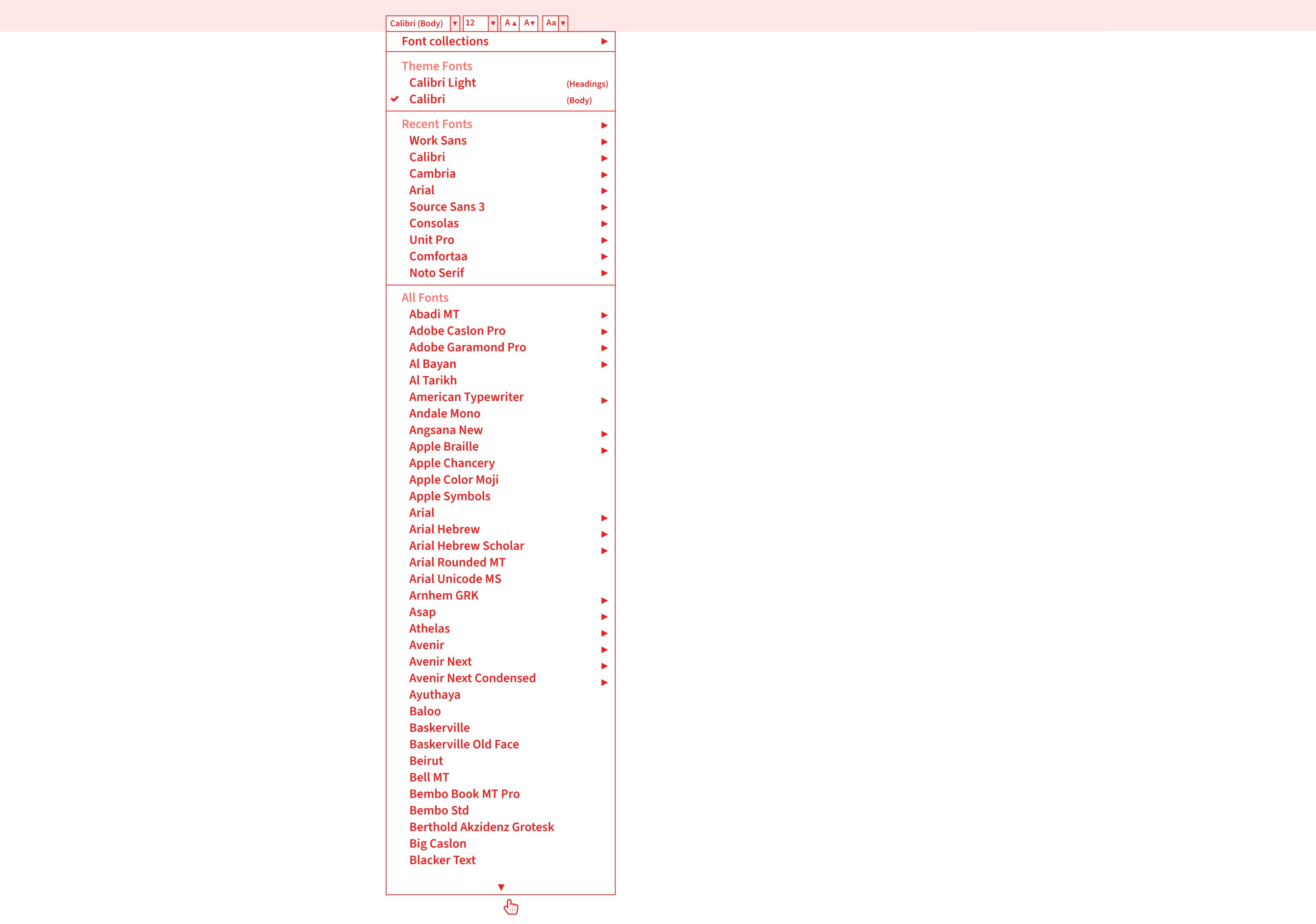
Categories: Others Tags:

These 40+ Eye-Opening Statistics About DevOps Will Blow Your Mind

December 20th, 2022 No comments

DevOps is a term often tossed around in the tech industry, but what does it actually mean?

DevOps is a culture and practice that encourages communication, collaboration, integration, and automation among software developers and IT operations professionals.

It helps break down the silos between these two groups, which can lead to improved efficiency and faster deployments.

DevOps aims to shorten the time it takes to get changes or new features into production.

While there are many benefits to using DevOps, there are also challenges that need to be overcome.

Check out these 40+ eye-opening statistics about DevOps to learn more about this growing trend.

Source: OrangeMatter

The Key Statistics

According to Global Market Insights, DevOps was a booming industry in 2019, having already exceeded the $4 billion mark.

The DevOps market is projected to continue its upward trajectory, with the size of the DevOps market forecasted to reach $10 billion USD by 2026. This trend can be attributed to several factors, including the increasing demand for DevOps tools and services, as well as the growing need to improve DevOps processes.

DevOps is also being further bolstered by cloud computing platforms such as AWS DevOps. AWS DevOps provides a suite of tools that can be used to automate key DevOps processes such as software development, deployment, and testing.

DevSecOps is another practice that has recently gained traction, merging DevOps and security practices such as identity management, access control, and encryption. 

The DevSecOps approach helps to ensure that security measures are implemented in the development process rather than as an afterthought. 

According to Statista, DevSecOps is expected to be the most popular DevOps-related technology by 2023, with a predicted market share of 78%. These DevOps statistics demonstrate the growing demand and importance of DevOps today and in the future.

Market Statistics

The DevOps market sells DevOps solutions and services by entities that refer to software tools used to automate DevOps processes. 

DevOps market characteristics and DevOps market trends and strategies are also explored in this report.

DevOps Market Characteristics

1. The DevOps market was estimated to be worth $7.41 billion in 2020 and is projected to reach $20.83 billion by 2022 at a CAGR of 22.2%.

2. DevOps software is expected to hold the largest share of the DevOps market in 2022, with an estimated value of more than $9 billion.

3. DevOps services are expected to be the fastest-growing segment, with a CAGR of 27.2%.

Key Components of the DevOps Market

The DevOps market is a highly competitive and rapidly growing space, with a wide range of organizations from large enterprises to startups taking advantage of its many benefits. 

The components of the DevOps market includes the following:

Training and Consulting Service Providers: Training and consulting service providers offer comprehensive DevOps services in order to help businesses design, deploy, manage, and optimize their entire IT infrastructure. 

They provide expert advice on how to develop a strategic plan for DevOps adoption.

DevOps Vendors: DevOps vendors are technology companies that provide solutions and tools to help organizations incorporate DevOps into their IT infrastructure. 

They provide automation, monitoring, analytics, and support services that enable businesses to adopt a DevOps strategy quickly and efficiently.

Telecommunications Service Providers: Telecommunications service providers offer dedicated data centers and related services to organizations looking for faster deployment of their applications. 

They also provide secure and reliable DevOps solutions for businesses to help them reduce the cost and complexity of their IT infrastructure.

Systems Integrators: Systems integrators are consultants who provide expertise in managing, integrating, deploying, and maintaining multiple technologies. 

They work closely with organizations to develop a DevOps strategy that can be implemented into the existing IT infrastructure quickly and effectively.

Government Agencies: Government agencies are increasingly utilizing DevOps technologies and practices in order to reduce operational costs, improve IT service delivery, and increase efficiency. 

They often rely on experienced consultants to help them plan a successful DevOps implementation strategy.

DevOps as a Service Provider: DevOps as a Service providers offer businesses an end-to-end DevOps solution. 

They provide managed services such as automation, monitoring, and analytics that help organizations optimize their IT operations for higher efficiency and productivity.

Understanding how different target audiences in the DevOps market work together can be confusing, but with the right resources, it is possible to better comprehend the various roles and functions of each. Here’s a helpful article about what is DevOps as a Service and how it fits into the market.

DevOps Market Trends

4. DevOps adoption rates are expected to grow at a compound annual growth rate of 17.7% between 2021 and 2026.

5. DevSecOps, the combination of DevOps and security practices, is becoming more popular with organizations looking for improved security without sacrificing speed or agility.

6. Companies increasingly rely on cloud-based DevOps tools such as AWS DevOps to automate processes and ensure faster delivery times.

7. Organizations use DevOps strategies such as continuous integration/continuous delivery (CI/CD) pipelines to increase their DevOps maturity level and enable faster releases with fewer errors.

8. DevOps has been found to reduce deployment time by up to 80%.

9. DevOps teams can improve mean time to recovery by as much as 60%.

10. DevOps practices have been shown to increase software quality, reduce cost and accelerate innovation.

DevOps Adoption Statistics

DevOps adoption is growing as organizations realize the benefits DevOps can provide.

According to Statista, DevOps adoption rose from 33% of companies in 2017 to 63% in 2020.

DevOps is also expected to grow as organizations look for ways to improve their DevOps processes and take advantage of the many DevOps-related technologies.

DevOps adoption is driven by the need to reduce costs and increase efficiency.

Now here are some DevSecOps adoption statistics from Statista:

11. DevSecOps is expected to be the most popular DevOps-related technology by 2022, with a predicted market share of 78%.

12. DevSecOps adoption is expected to grow at a compound annual growth rate of 22.9% between 2021 and 2026.

13. DevSecOps is also helping to improve security measures, with 51% of DevSec

14. DevOps adoption is growing across all industries. Still, it is particularly popular in software development, banking and finance, healthcare, and telecoms.

15. DevOps is being adopted by more than 60% of organizations worldwide in 2021, according to Gartner’s IT Professionals survey.

16. Nearly half of DevOps adopters spend more than $100K on DevOps initiatives per year.

Future Trend Statistics

While the market is already huge, it’s still evolving because DevOps has proven beneficial for organizations in terms of increased speed, flexibility, and cost-efficiency.

DevSecOps is expected to be the most popular DevOps-related technology by 2024 and beyond. DevOps adoption is expected to increase across all industries.

Therefore, organizations need to stay up-to-date on DevOps trends and DevSecOps best practices to remain competitive in today’s tech industry.

These DevOps statistics demonstrate the growing demand and importance of DevOps today and in the future.

17. DevOps is expected to continue gaining steam in the coming years as organizations look for ways to increase the speed and efficiency of their IT operations.

18. DevSecOps, cloud-based DevOps tools, and CI/CD pipelines are likely to remain popular DevOps strategies going forward.

19. Organizations will likely focus on improving their DevOps maturity levels to reap the maximum benefits from DevOps initiatives.

20. DevOps is expected to remain popular across all industries, with software development, banking and finance, healthcare, and telecoms continuing to be the leading DevOps adopters.

21. DevOps adoption is expected to grow at a compound annual growth rate of 17.7% between 2021 and 2026, according to market forecasts.

22. DevSecOps is only expected to increase its popularity in the coming years as organizations strive for improved security without sacrificing speed or agility.

23. DevOps initiatives are expected to continue driving organizational benefits such as faster deployment times, improved customer satisfaction, and higher profitability.

24. Cloud-based DevOps tools like AWS DevOps will likely remain popular as companies look for ways to automate processes and ensure faster delivery times.

AWS DevOps Statistics

The AWS DevOps offering is quickly becoming the platform of choice for organizations looking for an efficient and cost-effective way to accelerate their DevOps practices.

25. AWS DevOps services are used by more than 2,000 customers worldwide.

26. AWS DevOps is especially popular with businesses seeking DevOps collaboration and DevSecOps best practices.

27. Amazon Web Services (AWS) dominates the DevOps market, with a 40% market share in 2020, according to Statista.

28. AWS DevOps tools such as CodeBuild and CodePipeline have experienced rapid adoption due to their flexibility and customization options.

29. DevOps teams increasingly rely on AWS DevOps services such as DevOps Consultancy and DevOps Automation to accelerate software development cycles.

30. AWS DevOps is expected to remain the DevOps market leader in the coming years, with a projected 46% market share by 2022.

Engineer Statistics

Using a database of 30 million profiles, Zippia estimates demographics and statistics for DevOps engineers in the United States.

The engineer statistics below highlight DevOps engineers’ educational backgrounds, job experience, and salary information.

31. DevOps engineers are typically college-educated, with almost 50% of DevOps engineers holding a Master’s degree.

32. DevOps engineers typically have 5-7 years of experience in software development and DevOps roles.

33. DevOps engineers earn an average salary of $114,000 per year in the United States, according to Zippia estimates.

34. DevOps engineers are typically found in California, New York, and Texas, where DevOps salaries are the highest.

35. DevOps engineers with experience working in AWS DevOps roles can command an even higher salary of up to $145,000 per year, according to Payscale estimates.

36. DevOps certifications such as the AWS DevOps Engineer Professional certification can help increase DevOps engineer salaries even further by 5-10%.

Impact Statistics

DevOps has significantly impacted the software development industry and is expected to continue transforming how software is delivered in the coming years.

37. DevOps has helped reduce the time to market for new software products from months to weeks or even days in some cases.

38. DevOps has helped increase collaboration and communication between developers and operations teams.

39. DevOps has helped improve software quality by making it easier to identify and fix defects quickly.

40. DevOps has helped increase customer satisfaction by delivering new features and functionality faster.

41. DevOps has helped organizations save money by reducing the need for expensive manual processes and increasing efficiency.

42. DevOps has helped create jobs, with DevOps engineers becoming a highly sought-after job title in the software industry.

43. DevOps is expected to continue driving innovation and transforming how software is developed and delivered in the coming years.

Conclusion

As DevOps continues to mature, more companies will look for ways to implement the process into their operations. 

We hope this blog post has been an insightful resource for understanding the potential impact DevOps can have on your organization. 

If you found this blog post helpful, please feel free to share it with others who may benefit from the knowledge.

The post These 40+ Eye-Opening Statistics About DevOps Will Blow Your Mind appeared first on noupe.
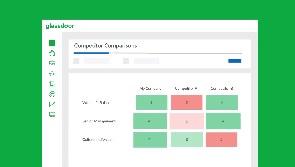
Categories: Others Tags:

WordPress Playground: Running WordPress in the Browser

December 19th, 2022 No comments

Being able to quickly spin up a WordPress instance has been the strength of WordPress ever since its famous “five-minute install”. Upload a few files, configure a few settings, and you’re off.

The friction of uploading files has gotten a lot easier, thanks to plenty of “one-click” install options many hosts offer (including DigitalOcean and Cloudways).

Some companies have tried to abstract the process even more, using the multi-site features of WordPress to fire up disposable instances for testing and demos. WordPress Sandbox and WP Sandbox come to mind. Scaling can be an issue here, as instances run on the same install adding lag to the entire network. I worked on a headless WordPress project that did this in the background for users, and I recall the incredibly long wait it would take users to create a new account as the number of sites in the network piled up.

Enter WordPress Playground. It runs entirely in the browser which is mindblowing to me as a long-time WordPress user. If you’re having a hard time wrapping your head around how it all works like I did, that link to the overview spells it out nicely:

Dang, that’s cool. The move to SQLite is especially interesting, as it could bring huge performance gains to many sites that might not need the full heft of WordPress — a “WordPress Lite” as Chris recently described it in a different context. In fact, that work is already happening in the experimental WordPress performance plugin.

The evolution to a light, frictionless WordPress is a fun space to watch. I imagine there’s a good chunk of existing WordPress sites that stand to benefit from a slimmed-down CMS. The demo offers a glimpse at what an onboarding experience for that sort of thing could look like.

Select a theme, choose your features, and go!

WordPress Playground: Running WordPress in the Browser originally published on CSS-Tricks, which is part of the DigitalOcean family. You should get the newsletter.

Categories: Designing, Others Tags:

5 Best Newsletter Platforms for Startups in 2023

December 19th, 2022 No comments

If you don’t keep in touch with your customer base, it can become easy for them to drift away. Newsletters are an affordable and effective way to check in with your audience.

However, you will need to craft well-designed newsletters to have the desired impact. Your newsletters should include engaging content, including images and written content. They should look highly professional and aesthetically appealing, so people are encouraged to read them. Another thing to consider is the method you want to send the newsletters. Picking the right platform can save you time and energy, especially if you have a large readership. 

The good news is that there are a variety of available platforms that can help you make great-looking emails. These services can also make it easier for you to send newsletters.

Let’s take a look at some of the best newsletter platforms available:

1. HubSpot

This is a name that needs no introduction among digital marketers. HubSpot offers several powerful marketing platforms with valuable tools and features to help any marketing campaign succeed.

HubSpot’s email marketing tool includes easy drag-and-drop tools that make it simple even for novices to write killer newsletters.

When you choose HubSpot’s email marketing tool, you will also have access to its powerful customer relationship management (CRM) platform. HubSpot’s CRM platform includes various email automation tools like follow-up email tools and helps you personalize your newsletters.

HubSpot’s marketing tool includes a free plan that provides access to some of the platform’s powerful email marketing features. The free plan limits users to sending 2,000 emails/month, and paid plans start from $50/month.

2. Mailchimp

Here’s another name that is well known among marketers – particularly concentrated marketers that focus on email campaigns. Mailchimp uses a drag-and-drop email editor that helps just about anybody create professional-looking newsletters and emails.

Mailchimp also has A/B testing tools to help you fine-tune your campaigns and cross-device tools that ensure your newsletters look great on any platform.

The platform offers a selection of newsletter templates to help you get started and make it easy to manage your contact list. The platform allows you to automatically resend newsletters using different subject lines if the recipient didn’t open previous emails.  

Mailchimp offers a free plan that manages up to 2,000 contacts and sends up to 12,000 emails/month with limited access to other features. Paid plans start at just $11/month per 500 contacts with access to more services. Other plans range from $17/month per 500 users to $299/month per 500 users, increasing access to Mailchimp’s tools.

3. AWeber

AWeber is a popular choice because it is so easy to use. It’s another platform that uses drag-and-drop design technology that requires no coding knowledge. The software allows users to add carousels for a truly professional look.

The platform also includes tools that simplify list management and segmentation. AWeber features 6,000 royalty-free stock photos, and it can be integrated with other platforms, including WordPress.

Some people might find that AWeber isn’t as advanced as other options and doesn’t have some of the features they need. However, the platform is ideal for smaller companies and people just getting started with newsletter software applications.

AWeber offers a free plan that lets you add up to 500 contacts. Paid plans start from $16.15/month, and other pricing plans are available to users who need to manage more contacts.

4. Sendinblue

With an expansive template gallery and efficient drag-and-drop design technology, Sendinblue is another platform that helps people create professional, aesthetically pleasing newsletters. It lets users select display conditions that determine which content recipients see.

The software offers a range of features that help automate sending numerous newsletters, including the ability to send them according to the recipients’ time zones. It also provides analytical tools to show how well your newsletters are performing.

Sendinblue offers a free plan that allows you to send up to 300 emails/day. Paid plans start from $25/month for the Lite plan and $65/month for the Premium plan with 20,000 emails/month. Each tier gives you access to more features, and prices increase if you want to send more emails.

5. GetResponse

GetResponse has been around for longer than most other newsletter options, so they’ve had plenty of time to get it right. With the platform’s fluid design features, it’s easy to create impressive newsletters and emails that look professional. 

Other features from GetResponse include segmentation and lead scoring features, autoresponders, and automation workflows. In addition, you can have your newsletters sent at optimal times and take advantage of A/B testing tools.

The platform’s free plan lets you manage up to 500 contacts with unlimited newsletters.

GetResponse also provides a Basic plan from $12.30/month, a Plus plan from $40.18/month, and a Professional plan from $81.18/month, each of which lets you have up to 1,000 contacts. Each plan gives access to more features than the other, and you can pay more to manage more contacts.

Start Sending Professional Newsletters Today

Choosing the best newsletter software for you depends on various factors. These factors include which tools you need from the software, your technical ability, and how much you can afford to spend.

As with any product, it’s a good idea to shop around before making any decisions. Most platforms offer free plans, allowing you to try them out first without paying a penny. If you need more advanced features or hope to scale up at some point in the future, it’s probably best to look at platforms that can do more for you.


Featured image via Pexels.

Source

The post 5 Best Newsletter Platforms for Startups in 2023 first appeared on Webdesigner Depot.

Categories: Designing, Others Tags:

How does Mindfulness Help you Achieve your Daily Goals?

December 19th, 2022 No comments

We all have the same 24 hours daily, but some get much more done than others. So if you’re struggling to check things off your to-do list, you might want to try being more mindful. Mindfulness isn’t about sitting cross-legged on the floor and chanting “om.” Being mindful enables you to focus on the current moment, making it easier to get things done.

You must be spiritually awake to try this

A powerful manifestation technique is to use of affirmations. For example, repeating affirmative statements to yourself daily can change your mindset and outlook on life. 

So, for example, if your goal is to manifest more money, you might say, “I am a magnet for money” or “I am deserving of abundance.” The more you say these affirmations to yourself, the truer they will become, and consequently, you will be better equipped to achieve your goals.

Or Else Start With These Easily Steps:

1. Pay attention to your breath.

When you first start practicing mindfulness, it can be helpful to focus on your breath. This will help you ground yourself and focus on the present moment. As you take deep, slow breaths in and out, pay attention to how your body feels.

2. Don’t get attached to your thoughts.

Your mind will wander—that’s normal. The purpose is not to completely rid your mind of all thoughts but rather watch them without fixating on anyone in particular. 

For example, if you start thinking about what you need to pick up from the grocery store on the way home from work, observe that thought and then let it go. Don’t start making a mental list of everything you need to buy; that will only lead to more thoughts and distractions.

3. Be aware of your senses.

Additionally, you can focus on your breath, other parts of your body, or your surroundings. Notice how your clothes feel against your skin or the temperature of the room around you. 

Listen to the sounds you can hear, both near and far away. Smell anything around you, whether it’s pleasant or not so pleasant! The key is to notice these things without judgment.

4. Accept things as they are.

Mindfulness isn’t easy, especially when we have to accept situations, even if they’re not what we hoped for. For example, you can easily get frustrated and stressed out if your commute to work is completely bogged down by traffic.

But if you can accept this is the current reality, it will be easier to let go of that frustration and be in the moment. Remember, this too shall pass!

5. Let go of judgment.

One of the best things about mindfulness is that it can help you let go of judgment—of yourself and others. When you can watch your thoughts and emotions without destructively criticizing them, you’re less likely to become attached to them. This will lead to more peace and calm in your life.

6. Be kind to yourself.

Mindfulness is a practice, meaning there will be good and bad days. It’s okay if you have trouble focusing or find your mind wandering frequently. Just be patient and keep practicing! With time, it will become easier and more natural to be present in the moment.

7. Practice regularly.

Mindfulness is like any other skill—the more you practice, the better you’ll become at it. Dedicating even a few minutes of each day to mindfulness can be helpful. If you can make it part of your daily routine, it’ll become second nature to you soon.

8. Seek out a teacher.

While it is possible to learn mindfulness on your own, it can be helpful to seek out a qualified teacher. For example, a good teacher can help you learn the basics of mindfulness and offer guidance when needed.

9. Join a group.

Another great way to learn about and practice mindfulness is to join a group. There are often groups available at local community centers or through religious organizations. This can help you make friends and feel supported as you travel.

10. Try a mindfulness app.

If you’re looking for a more hands-on approach, many mindfulness apps can help you get started. Some apps give general tips on how to live more mindfully, while others provide guided meditations.

Mindfulness can help you achieve your daily goals by helping you focus on the present moment and letting go of distracting thoughts. The more regularly you practice mindfulness, the simpler it’ll be to make it a part of every area of your life. Additionally, It can assist you with accepting things as they are instead of being judgmental.

11. Try a mindfulness retreat.

If you’re serious about learning mindfulness, you may want to consider going on a retreat. These retreats can last from a weekend to several weeks and usually involve some form of meditation or other mindfulness practice. This is a great way to deepen your understanding and get away from the distractions of daily life.

12. Read about mindfulness.

Many excellent books are available if you’re interested in learning more about mindfulness. These books can provide valuable insights and tips on being more mindful in your everyday life. Some of our favorites include Wherever You Go. There You Are by Jon Kabat-Zinn and The Miracle of Mindfulness by Thich Nhat Hanh.

Benefits of Mindfulness 

Daily mindfulness can help you achieve your goals, providing structure and focus. That’s because mindfulness helps you stay focused on the present moment, preventing you from getting sidetracked by thoughts about the future or dwelling on past mistakes.

As a result, you’re more likely to make decisions that align with your goals and less likely to let emotions like anxiety or frustration get in the way of progress.

Finally, mindfulness has been shown to boost concentration and memory, which are essential for goal-setting and achievement. So if you’re looking to make some changes in your life, mindfulness is a great place to start.

Conclusion

Practicing mindfulness doesn’t have to be complicated or time-consuming—it can be as simple as paying attention to your breath for a few minutes each day. 

By doing this, you can learn how to focus on the present moment and let go of distractions and stressful thoughts. And when you’re more present and less stressed, you’ll find that you can accomplish much more throughout the day!

The post How does Mindfulness Help you Achieve your Daily Goals? appeared first on noupe.
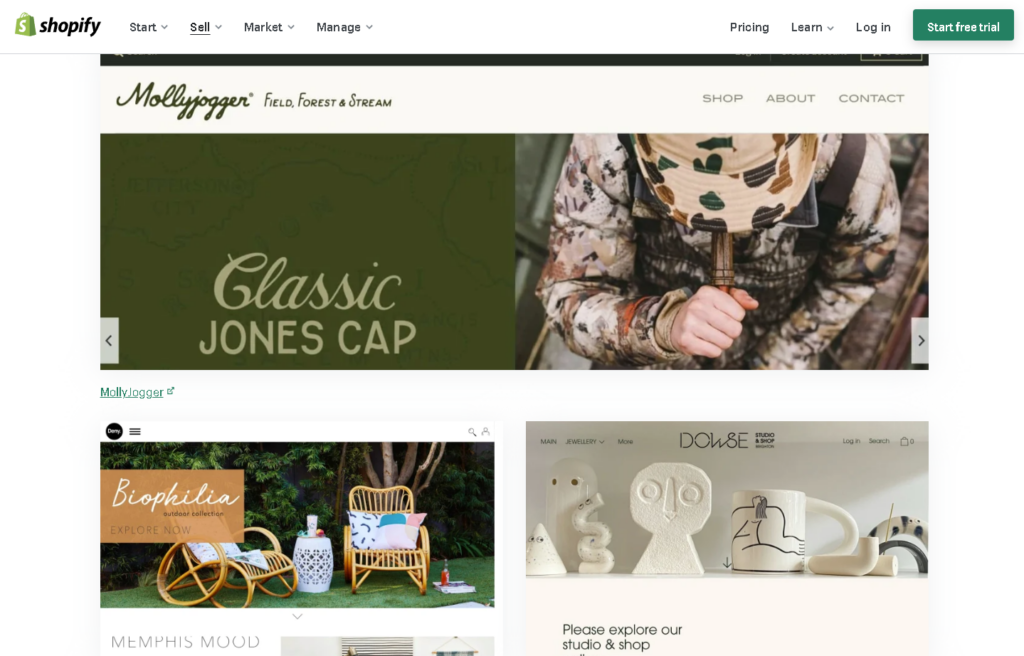
Categories: Others Tags:

How to Attract New Customers for your Ecommerce Business

December 19th, 2022 No comments

Once your eCommerce store is fully functional and live on the internet, you cannot just sit and wait for customers to find you on their own. 

You need to work hard to bring in new customers for your business, which is more challenging than it seems. 

A lot of effort goes into making your business noticeable to your audience. 

But following the eight actionable ways in this article will help you attract new customers to your eCommerce business. 

1. Focus on product images and descriptions. 

When visitors browse your website or any of your business’s profiles online, they should find value in what you are selling. 

If they land on your product page just to see poor images and incomplete information, they’ll immediately return and pick up your competitors. 

And that’s when you attract customers to lose them forever. 

Therefore, product descriptions and images greatly influence buying decisions. 

Make your product pages value-driven. Use catchy images and provide all the necessary information about the product using the right keywords.

2. Run paid advertisements online. 

Now that everything is digitalized, running online ads is a great way to direct visitors to your eCommerce store once they click them. 

You can run paid ads on almost every platform — Google, Facebook, Twitter, LinkedIn, and Instagram…you name it!

When you run a paid advertisement, you first choose a certain platform, like Google Ads or Instagram, and then you specify your target audience based on factors like:

  • Location
  • Keywords
  • Preferences
  • Demographics
  • Purchasing history
  • Other sites they visit

All of these ads are PPC (Pay-Per-Click), meaning you only pay for the number of times your ad gets clicked. 

All you need to do is select how you will advertise your business offerings (through product images, videos, etc.) and then set up a budget for your campaign. 

For instance, if your budget is $100 — your ad will run until all of your budget is used up. 

3. Arrange a giveaway or contest. 

Giveaways and other contests, such as Q&A (Questions and Answers), etc., are great ways to attract new customers since many people would be interested in participating. 

When you host a contest or giveaway, you put up some conditions like: 

  • Mention 3 people who don’t follow us yet
  • Follow this page
  • Refer us to 10 friends and win, etc. 

This way, your online presence is noticed by people who get mentioned, and you generate leads for your business right then and there! 

4. Give out free samples with every purchase.

According to Shopify, free samples have been proven to boost sales by as much as 2,000%!

And you can do the same for your business. What you need to do here is that: 

Every time a customer makes a purchase, send in free samples along with that. 

This way, more and more people will be interested in buying products from you.

It increases your sales, and there’s a fair chance that you will acquire new customers for your online store.

5. Offer discounts and coupons. 

Discounts, sales, and coupons are a customer favorite; about 93% of shoppers in the U.S. use a coupon or discount code throughout the year. (Source: Statista) 

Studies show that discounts and offers psychologically impact buyers and promote impulsive purchases. 

So, to bring in customers, you should consider offering discounts on your store and coupons that customers can use at checkout. 

6. Make short, catchy videos. 

Short videos are gaining popularity across the internet due to their snackable nature and short attention span. 

The audience now prefers watching quick videos on Instagram Reels, TikTok, and Youtube Shorts, allowing them to grasp new stuff without getting into strenuous details. 

You can direct the attention of new customers toward your business through these short videos. 

They are easy to make, and platforms like TikTok and Instagram have a user-friendly interface that makes recording short videos a smooth process. 

7. Turn to influencer marketing. 

Nowadays, many social media influencers have a huge following and subscriptions on social media platforms. 

Their audience is highly influenced by what they endorse. 

A very recent study by the University of Washington found that if firms spent 1% more on influencer marketing, they would see a nearly 0.5% increase in engagement with new audiences. 

You can jump on the bandwagon too, and collaborate with an influencer that you think will best suit your business needs. 

Most of them have “DM for Collaborations/For Work email at …” listed on their social media handles. 

Reach out to them directly and settle on a mutual agreement with the influencer. 

The content they will put up on social media will get noticed, and more and more people will place orders with your store. 

8. Capture pre-built audience on marketplaces. 

Lastly, online marketplaces offer a virtual space for businesses to showcase their products.

These marketplaces have a prebuilt audience, and you don’t have to run that extra mile for marketing.

Whether you’re a small or large business in the B2B or B2C space, these marketplaces allow you to grow and expand your business reach. 

Best Marketplaces to Join 

SeeBiz

SeeBiz is an online B2B wholesale marketplace where 1000+ suppliers have listed 600,000+ products in 10+ categories. It is the only wholesale marketplace that builds, optimizes, and advertises your online store in just a week.

Listing your products on such a diverse marketplace will let you find a buyer for your products easily. 

What differentiates it from other marketplaces is that it’s not just built for trading. It’s also a social media-like business networking platform where you can interact, share and communicate with other wholesalers. 

Amazon 

Amazon is a very popular B2C marketplace where you can start selling your products. 

The marketplace has good traffic, so finding new customers for your eCommerce business will not be difficult. It also implies that the competition is high there. 

Etsy

Etsy is a U.S.-based marketplace where you can sell handmade or vintage items like jewelry, bags, clothing, home décor and furniture, toys, art, and craft supplies and tools.

It’s an excellent platform for small businesses.

The post How to Attract New Customers for your Ecommerce Business appeared first on noupe.
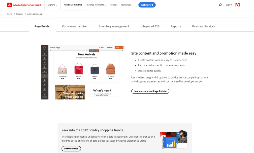
Categories: Others Tags:

CSS Infinite 3D Sliders

December 16th, 2022 No comments
Showing the three phases of the image slider layout.

We first rotate all the images above each other. The angle of rotation depends on the number of images. For N images, we have an increment equal to 360deg/N. Then we translate all of the images by the same amount in a way that makes their center points meet on the sides.

Showing the stack of images arranged flat in a circle with a red line running through the center point of the images.

There’s some boring geometry that helps explain how all this works, but the distance is equal to 50%/tan(180deg/N). We dealt with a similar equation when making the circular slider ( transform-origin: 50% 50%/sin(180deg/N) ).

Finally, we rotate the images around the x-axis by 90deg to get the arrangement we want. Here is a video that illustrates what the last rotation is doing:

Now all we have to do is to rotate the whole container to create our infinite slider.

.gallery {
  transform-style: preserve-3d;
  --_t: perspective(280px) rotateX(-90deg);
  animation: r 12s cubic-bezier(.5, -0.2, .5, 1.2) infinite;
}
@keyframes r {
  0%, 3% {transform: var(--_t) rotate(0deg); }
  @for $i from 1 to $n {
    #{($i/$n)*100 - 2}%, 
    #{($i/$n)*100 + 3}% {
      transform: var(--_t) rotate(#{($i / $n) * -360}deg);
    }  
  }
  98%, 100% { transform: var(--_t) rotate(-360deg); }
}

That code might be hard to understand, so let’s actually step back a moment and revisit the animation we made for the circular slider. This is what we wrote in that first article:

.gallery {
  animation: m 12s cubic-bezier(.5, -0.2, .5, 1.2) infinite;
}
@keyframes m {
  0%, 3% { transform: rotate(0); }
  @for $i from 1 to $n {
    #{($i / $n) * 100 - 2}%,
    #{($i / $n) * 100 + 3}% { 
      transform: rotate(#{($i / $n) * -360}deg);
    }  
  }
  98%, 100% { transform: rotate(-360deg); }
}

The keyframes are almost identical. We have the same percentage values, the same loop, and the same rotation.

Why are both the same? Because their logic is the same. In both cases, the images are arranged around a circular shape and we need to rotate the whole thing to show each image. That’s how I was able to copy the keyframes from the circular slider and use that same code for our 3D slider. The only difference is that we need to rotate the container by -90deg along the x-axis to see the images since we have already rotated them by 90deg on the same axis. Then we add a touch of perspective to get the 3D effect.

That’s it! Our slider is done. Here is the full demo again. All you have to do is to add as many images as you want and update one variable to get it going.

CodePen Embed Fallback

Vertical 3D slider

Since we are playing in the 3D space, why not make a vertical version of the previous slider? The last one rotates along the z-axis, but we can also move along the x-axis if we want.

CodePen Embed Fallback

If you compare the code for both versions of this slider, you might not immediately spot the difference because it’s only one character! I replaced rotate() with rotateX() inside the keyframes and the image transform. That’s it!

It should be noted that rotate() is equivalent to rotateZ(), so by changing the axis from Z to X we transform the slider from the horizontal version into the vertical one.

Cube slider

We cannot talk about 3D in CSS without

In this series, we’ve been making image sliders with nothing but HTML and CSS. The idea is that we can use the same markup but different CSS to get wildly different results, no matter how many images we toss in. We started with a circular slider that rotates infinitely, sort of like a fidget spinner that holds images. Then we made one that flips through a stack of photos.

This time around, we’re diving into the third dimension. It’s going to look tough at first, but lots of the code we’re looking at is exactly what we used in the first two articles in this series, with some modifications. So, if you’re just now getting into the series, I’d suggest checking out the others for context on the concepts we’re using here.

CSS Sliders series

This is what we’re aiming for:

CodePen Embed Fallback

At first glance, it looks like we have a rotating cube with four images. But in reality, we’re dealing with six images in total. Here is the slider from a different angle:

Now that we have a good visual for how the images are arranged, let’s dissect the code to see how we get there.

The basic setup

Same HTML as the rest of the sliders we’ve used for the other sliders:

<div class="gallery">
  <img src="" alt="">
  <img src="" alt="">
  <img src="" alt="">
  <img src="" alt="">
  <img src="" alt="">
</div>

And once again, we’re using CSS Grid to place the images in a stack, one on top of another:

.gallery {
  display: grid;
}
.gallery > img {
  grid-area: 1 / 1;
  width: 160px;
  aspect-ratio: 1;
  object-fit: cover;
}

The animation

The logic for this slider is very similar to the circular slider from the first article. In fact, if you check the video above again, you can see that the images are placed in a way that creates a polygon. After a full rotation, it returns to the first image.

We relied on the CSS transform-origin and animation-delay properties for that first slider. The same animation is applied to all of the image elements, which rotate around the same point. Then, by using different delays, we correctly place all the images around a big circle.

The implementation will be a bit different for our 3D slider. Using transform-origin won’t work here because we’re working in 3D, so we will use transform instead to correctly place all the images, then rotate the container.

We’re reaching for Sass again so we can loop through the number of images and apply our transforms:

@for $i from 1 to ($n + 1) {
  .gallery > img:nth-child(#{$i}) {
     transform: 
       rotate(#{360*($i - 1) / $n}deg) /* 1 */
       translateY(50% / math.tan(180deg / $n)) /* 2 */ 
       rotateX(90deg); /* 3 */
  }
}

You might be wondering why we’re jumping straight into Sass. We started with a fixed number of images using vanilla CSS in the other articles before generalizing the code with Sass to account for any number (N) of images. Well, I think you get the idea now and we can cut out all that discovery work to get to the real implementation.

The transform property is taking three values, which I’ve illustrated here:

We first rotate all the images above each other. The angle of rotation depends on the number of images. For N images, we have an increment equal to 360deg/N. Then we translate all of the images by the same amount in a way that makes their center points meet on the sides.

Showing the stack of images arranged flat in a circle with a red line running through the center point of the images.

There’s some boring geometry that helps explain how all this works, but the distance is equal to 50%/tan(180deg/N). We dealt with a similar equation when making the circular slider ( transform-origin: 50% 50%/sin(180deg/N) ).

Finally, we rotate the images around the x-axis by 90deg to get the arrangement we want. Here is a video that illustrates what the last rotation is doing:

Now all we have to do is to rotate the whole container to create our infinite slider.

.gallery {
  transform-style: preserve-3d;
  --_t: perspective(280px) rotateX(-90deg);
  animation: r 12s cubic-bezier(.5, -0.2, .5, 1.2) infinite;
}
@keyframes r {
  0%, 3% {transform: var(--_t) rotate(0deg); }
  @for $i from 1 to $n {
    #{($i/$n)*100 - 2}%, 
    #{($i/$n)*100 + 3}% {
      transform: var(--_t) rotate(#{($i / $n) * -360}deg);
    }  
  }
  98%, 100% { transform: var(--_t) rotate(-360deg); }
}

That code might be hard to understand, so let’s actually step back a moment and revisit the animation we made for the circular slider. This is what we wrote in that first article:

.gallery {
  animation: m 12s cubic-bezier(.5, -0.2, .5, 1.2) infinite;
}
@keyframes m {
  0%, 3% { transform: rotate(0); }
  @for $i from 1 to $n {
    #{($i / $n) * 100 - 2}%,
    #{($i / $n) * 100 + 3}% { 
      transform: rotate(#{($i / $n) * -360}deg);
    }  
  }
  98%, 100% { transform: rotate(-360deg); }
}

The keyframes are almost identical. We have the same percentage values, the same loop, and the same rotation.

Why are both the same? Because their logic is the same. In both cases, the images are arranged around a circular shape and we need to rotate the whole thing to show each image. That’s how I was able to copy the keyframes from the circular slider and use that same code for our 3D slider. The only difference is that we need to rotate the container by -90deg along the x-axis to see the images since we have already rotated them by 90deg on the same axis. Then we add a touch of perspective to get the 3D effect.

That’s it! Our slider is done. Here is the full demo again. All you have to do is to add as many images as you want and update one variable to get it going.

CodePen Embed Fallback

Vertical 3D slider

Since we are playing in the 3D space, why not make a vertical version of the previous slider? The last one rotates along the z-axis, but we can also move along the x-axis if we want.

CodePen Embed Fallback

If you compare the code for both versions of this slider, you might not immediately spot the difference because it’s only one character! I replaced rotate() with rotateX() inside the keyframes and the image transform. That’s it!

It should be noted that rotate() is equivalent to rotateZ(), so by changing the axis from Z to X we transform the slider from the horizontal version into the vertical one.

Cube slider

We cannot talk about 3D in CSS without talking about cubes. And yes, that means we are going to make another version of the slider.

The idea behind this version of the slider is to create an actual cube shape with the images and rotate the full thing in around the different axis. Since it’s a cube, we’re dealing with six faces. We’ll use six images, one for each face of the cube. So, no Sass but back to vanilla CSS.

CodePen Embed Fallback

That animation is a little overwhelming, right? Where do you even start?

We have six faces, so we need to perform at least six rotations so that each image gets a turn. Well, actually, we need five rotations — the last one brings us back to the first image face. If you go grab a Rubik’s Cube — or some other cube-shaped object like dice — and rotate it with your hand, you’ll have a good idea of what we’re doing.

.gallery {
  --s: 250px; /* the size */

  transform-style: preserve-3d;
  --_p: perspective(calc(2.5*var(--s)));
  animation: r 9s infinite cubic-bezier(.5, -0.5, .5, 1.5);
}

@keyframes r {
  0%, 3%   { transform: var(--_p); }
  14%, 19% { transform: var(--_p) rotateX(90deg); }
  31%, 36% { transform: var(--_p) rotateX(90deg) rotateZ(90deg); }
  47%, 52% { transform: var(--_p) rotateX(90deg) rotateZ(90deg) rotateY(-90deg); }
  64%, 69% { transform: var(--_p) rotateX(90deg) rotateZ(90deg) rotateY(-90deg) rotateX(90deg); }
  81%, 86% { transform: var(--_p) rotateX(90deg) rotateZ(90deg) rotateY(-90deg) rotateX(90deg) rotateZ(90deg); }
  97%, 100%{ transform: var(--_p) rotateX(90deg) rotateZ(90deg) rotateY(-90deg) rotateX(90deg) rotateZ(90deg) rotateY(-90deg); }
}

The transform property starts with zero rotations and, on each state, we append a new rotation on a specific axis until we reach six rotations. Then we are back to the first image.

Let’s not forget the placement of our images. Each one is applied to a face of the cube using transform:

.gallery img {
  grid-area: 1 / 1;
  width: var(--s);
  aspect-ratio: 1;
  object-fit: cover;
  transform: var(--_t,) translateZ(calc(var(--s) / 2));
}
.gallery img:nth-child(2) { --_t: rotateX(-90deg); }
.gallery img:nth-child(3) { --_t: rotateY( 90deg) rotate(-90deg); }
.gallery img:nth-child(4) { --_t: rotateX(180deg) rotate( 90deg); }
.gallery img:nth-child(5) { --_t: rotateX( 90deg) rotate( 90deg); }
.gallery img:nth-child(6) { --_t: rotateY(-90deg); }

You are probably thinking there is weird complex logic behind the values I’m using there, right? Well, no. All I did was open DevTools and play with different rotation values for each image until I got it right. It may sound stupid but, hey, it works — especially since we have a fixed number of images and we are not looking for something that supports N images.

In fact, forget the values I’m using and try to do the placement on your own as an exercise. Start with all the images stacked on top of each other, open the DevTools, and go! You will probably end up with different code and that’s totally fine. There can be different ways to position the images.

What’s the trick with the comma inside the var()? Is it a typo?

It’s not a typo so don’t remove it! If you do remove it, you will notice that it affects the placement of the first image. You can see that in my code I defined --_t for all the images except the first one because I only need a translation for it. That comma makes the variable fall back to a null value. Without the comma, we won’t have a fallback and the whole value will be invalid.

From the specification:

Note: That is, var(--a,) is a valid function, specifying that if the --a custom property is invalid or missing, the var()` should be replaced with nothing.

Random cube slider

A little bit of randomness can be a nice enhancement for this sort of animation. So, rather than rotate the cube in sequential order, we can roll the dice so to speak, and let the cube roll however it will.

CodePen Embed Fallback

Cool right? I don’t know about you, but I like this version better! It’s more interesting and the transitions are satisfying to watch. And guess what? You can play with the values to create your own random cube slider!

The logic is actual not random at all — it just appears that way. You define a transform on each keyframe that allows you to show one face and… well, that’s really it! You can pick any order you want.

@keyframes r {
  0%, 3%   { transform: var(--_p) rotate3d( 0, 0, 0,  0deg); }
  14%,19%  { transform: var(--_p) rotate3d(-1, 1, 0,180deg); }
  31%,36%  { transform: var(--_p) rotate3d( 0,-1, 0, 90deg); }
  47%,52%  { transform: var(--_p) rotate3d( 1, 0, 0, 90deg); }
  64%,69%  { transform: var(--_p) rotate3d( 1, 0, 0,-90deg); }
  81%,86%  { transform: var(--_p) rotate3d( 0, 1, 0, 90deg); }
  97%,100% { transform: var(--_p) rotate3d( 0, 0, 0,  0deg); }
}

I am using rotate3d() this time but am still relying on DevTools to find the values that feel “right” to me. Don’t try to find a relationship between the keyframes because there simply isn’t one. I’m defining separate transforms and then watching the “random” result. Make sure the first image is the first and last frames, respectively, and show a different image on each of the other frames.

You are not obligated to use a rotate3d() transform as I did. You can also chain different rotations like we did in the previous example. Play around and see what you can come up with! I will be waiting for you to share your version with me in the comments section!

Wrapping up

I hope you enjoyed this little series. We built some fun (and funny) sliders while learning a lot about all kinds of CSS concepts along the way — from grid placement and stacking order, to animation delays and transforms. We even got to play with a dash of Sass to loop through an array of elements.

And we did it all with the exact same HTML for each and every slider we made. How cool is that? CSS is dang powerful and capable of accomplishing so much without the aid of JavaScript.


CSS Infinite 3D Sliders originally published on CSS-Tricks, which is part of the DigitalOcean family. You should get the newsletter.

Categories: Designing, Others Tags: