Archive

Archive for December, 2022

Optimizing Your Design Workflow With Tools

December 16th, 2022 No comments

There is a multitude of ways to do anything on a computer — and some are faster than others. As knowledge workers that push pixels on our screens all day, for us, every second saved by working faster is that much more time to do the things that we love, be that spending time with friends and family or simply squeezing in that one more project for the month.

This is probably why I’m obsessed with productivity — finding ways to do things faster and evaluating tools that improve my workflow has been my passion for as long as I’ve used computers in my life. (And I started when MS DOS was a thing, so that’s a very long time!)

Here I’ll share some of my favorite ways to do things faster, better, and probably more fun. We will look at how to improve your day-to-day tasks and the tools that can help you with them. On the desktop front, I switch between my primary Windows computer and a MacBook regularly, so I’ll cover tools on both operating systems. On the smartphone side, I’m primarily an Android user, but I’ll try to include a few iOS-specific tips as and wherever possible.

Note: The article is for designers of all levels working on both Windows and Mac platforms. I know that a designer who prefers Windows and Android over a Mac and an iPhone is a rarity. I’ve been on both sides of the fence over the years, but now I prefer the non-Apple ecosystems for several reasons we won’t need to get into here. (Maybe a topic for another time.)

Superpowered Clipboards

If there’s one trick in here that saves me more time in the most literal sense than all others, it is the ability to access my clipboard history. Given how much we copy-paste on any given day, the ability to copy multiple items from one source and then paste them one after another without going back and forth can make a huge difference.

There are dozens of great clipboard managers out there, so it really comes down to the way you work and hence what features you prefer. For me, the primary clipboard manager I use is an open-source one called Ditto. It is easy, no-nonsense, and plug-n-play on Windows, but with a fair bit of customization available under the hood. On Mac, I use Clipy for pretty much the same set of reasons.

There are fancier options, like Paste on the Mac, but I personally prefer open-source tools and the ones above get the job done just fine without any compromise.

Snippets And More

Copy-pasting multiple items is great, but you don’t always want to do that round-trip for commonly used text. That’s where text expansion apps come into play. Things like email IDs (way too many in my case), phone numbers, addresses, ID card numbers, and so on are all examples of text snippets you will need often.

Most folks I know either type these out or have them in a note or document somewhere on their computer for quick copy/paste access. I prefer to avoid bothering with the extra step of finding and opening that document to be able to do the copy-paste. Instead, I just map them to text shortcuts using an app like Espanso on both my Windows and Mac computers. It may not be for everyone because it involves editing a YAML file to add your snippets, but I like the feature-set — including the ability to set the cursor wherever I want in the phrase.

If you prefer a more UI-focused approach with more bells and whistles, TextExpander or PhraseExpress may be more up your alley.

The sheer power of command panels like these has to be experienced first-hand in order to understand how they can improve your life. Hit a hotkey, start typing what you’re looking for, and the list of suggestions will instantly update; this list will even change over time as the tool learns from you and the things you’re looking for most often. It is not surprising then that many applications and services have started adopting this pattern, from Visual Studio Code to Notion to Obsidian.

Organized Workspaces

A lot of us in the design field use external displays with our laptops, and if you’re like me and like to set the resolution of that fancy 4K monitor to the maximum, there’s lots of screen real estate to arrange a bunch of windows around. Although both Windows and Mac have their own built-in window-snapping tools, those pre-built layouts are not always enough.

This is why on Windows, I like to use the FancyZones feature available in the PowerToys app, which allows me to create a custom set of frames to hold my windows in, suited just right for my workflow. FancyZones even lets you overlap these frames, and you can snap windows to frames by dragging them while holding the Shift key. Since the built-in toolset on the Mac is even more limited than on Windows, on the Mac side, I would highly recommend a third-party app like Rectangle Pro or Magnet for this.

Note: PowerToys for Windows is a toolkit with much more in it than the FancyZone feature I mentioned. You also get a command panel called ‘Run,’ a tool to keep Windows from going to sleep, a color picker, a keyboard remapping tool, a powerful file and folder renaming utility, and much more. This project is open source, and the official Microsoft PowerToys app is just the icing on the cake.

Visual Bookmarking

As a designer, I’m always on the lookout for inspiration. It can come from anywhere, and given how much of an information overload we all deal with every day, it can be hard to keep track of all the bits and pieces, so you have quick access when you really need them.

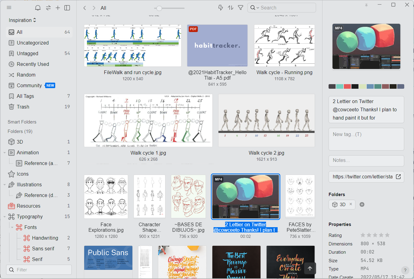
I like to keep all such visual elements neatly organized and available by using a very underrated app called Eagle. It is available on both Windows and Mac and can keep your image library synced across computers using any cloud storage platform like Dropbox, Google Drive, iCloud, and others. It is a great way to keep tons of images organized and searchable.

Since it supports pretty much every image format out there (and also animated GIFs, videos, PDFs, and more), I use it as my one-stop shop for managing inspiration, source files, templates, and other resources. Each image can have a description, source URL(s), and an automatically generated color palette, making it super-easy to find exactly what I’m looking for when I need it.

Note: It is weird how the landscape for applications like this one has changed over the years. Many apps that designers used to swear by have ceased development during the last few years, so I’m glad this app is still being actively developed and updated.

Collaboration And Sharing In The Era Of Remote Work

One of the biggest outcomes of the COVID-19 pandemic was the huge boost to remote work. As some companies struggle to bring people back to the offices full-time, one thing that is becoming very clear is that remote work is here to stay. And with that, new ways to collaborate virtually with teammates and clients have become more important than ever.

While some companies continue to thumb their noses at The Great Resignation and insist that employees come back into the office, data scientists at Ladders insist that the writing is on the wall. Remote work is here to stay. According to their projections, 25% of all professional jobs in North America will be remote by the end of 2022, and remote opportunities will continue to increase through 2023.

— Forbes, “Remote Work Is Here To Stay And Will Increase Into 2023

Using Zoom, Meet, or Microsoft Teams for calls is fine, but when it comes to communicating asynchronously, I find myself relying on screenshots and screen recordings to share with my colleagues. Personally, I use the open-source app Sharex for this on Windows. On the Mac, the app that comes closest to what I need is CloudApp. They both let you take screenshots and annotate them or record a video of the screen and then share it with your team or clients.

Almost all the clients we work with use Slack, so that’s the primary way my team and I communicate. It wasn’t great with audio and video chat early on, but the recent addition of huddles has changed that and reduced the need to get on to Zoom calls for quick conversations or shareouts.

Extending The Toolset

To wrap things up on the desktop apps front, I want to mention a few tools that don’t have many features and instead are really, really good at only one thing. I need such tools daily, too, so here’s a rundown of those:

  • Caesium (Windows) or ImageOptim (Mac) to quickly compress images before adding them as assets for web projects.
  • Soundswitch on Windows to quickly switch between audio input and output devices with keyboard shortcuts. It is especially great for when you have multiple speakers and microphones, each for a specific use case. I haven’t found a Mac equivalent for this yet.
  • Eartrumpet (Windows) or Background Music (Mac) for setting different volumes for each app — to keep music on Spotify playing in the background on low volume while I’m reviewing a Zoom recording.
  • X Mouse Button (Windows) to remap those extra buttons on my 6-button mouse. BetterTouchTool (Mac) does this and a lot more. How I wish it was available on Windows!
  • Quicklook on Windows to replicate Mac’s built-in press-space-to-preview feature.
  • One Commander (Windows) or Path Finder (Mac) to replace the built-in file managers with something more powerful, with a lot of extra features that I simply can’t lose now that I’m used to them.

Faster And Easier Web Browsing

As more and more computing moves to the cloud, we’re spending more time and doing more work in our web browsers. If you had told me ten years ago that my primary design application (Adobe Photoshop at that time) would be replaced by a web app (Figma), I wouldn’t have believed you for one second. Yet, that is exactly what today looks like. And it is not just design — my animation app, video editor, office apps, email client, and more are all web apps now!

Chrome is great, but I prefer Vivaldi as my primary browser. It is based on the same Chromium engine) that Chrome (and Edge, Opera, Brave, and so on) are built on, so it supports all the same browser extensions. I like it because of some of the built-in functionality that I’ve become used to, particularly the following things:

  • The ability to split multiple tabs in the same view.
    It is great for copy-pasting between two Figma files without having to switch between tabs and also when comparing two documents or keeping a checklist visible while reviewing a document.
  • Quick Commands, which is like Spotlight for the browser.
    A command line interface that you can use to find and switch to open tabs, open bookmarks, write notes that are saved in the built-in notepad, run simple math calculations, and even execute multiple actions as a single command chain.
  • Web panels, which let you open websites in the sidebar as an overlay.
    I use this to keep a mobile view of my todo list app (Todoist), my Twitter feed, the Material Design color palette for quickly copying the color codes, and so on.

I also use quite a few browser extensions in addition to the built-in features; these should work on Chrome, Edge, Opera, Brave, or any Chromium-based browser. And if you prefer Firefox, most of these are also available as add-ons:

  • Most images you see on web pages are actually larger than what you see. I use an extension called Imagus that automatically pops up the larger image when hovering over it (I’ve set this, so it works only when I press the Shift key and hover). This is great if I want to copy or save the image or just to see the image details better.
  • I use the Material theme a lot, and one of the most repetitive things I used to do was go to the color palette to copy/paste the color values. The Simple Material Design Palette solves this by adding the palette in the browser header: click the extension icon, scroll to the color I’m looking for, and click-to-copy the #hex code to the clipboard.
  • If you prefer to use the keyboard over the mouse wherever possible, here’s a great time-saver. I use an extension called Vimium to browse the web with just my keyboard. It lets me open links on a site, scroll through the page, switch tabs, quickly get to the input fields, select and copy text, and much more without the need to move the mouse at all. This is one of the first extensions I install whenever I’m working with a new browser.
  • I prefer reading articles on my laptop, so Pocket comes in handy when I find something on my phone and want to save it for later reading. The problem is that you need to open the Pocket site to see the list. Instead, I prefer using an extension called IwillriL, which shows your saved articles in a small popup for quick access. There’s also Toby for managing tab overload by saving tabs and tab sessions for later.

Conclusion

There are many more apps and browser extensions I have installed, but these are what I find most useful on a day-to-day basis. They’re what I’ve settled on because they suit the way I work. Not everything will work for you, but I’m hoping this gave you some ideas for what you can do to optimize your time on the computer and save some time here and there.

Remember that if you have a problem, it is more than likely that many others had it, too, and some enterprising folks decided to solve it by creating an app or an extension for it. So be sure to look around, try things out, and build your own toolbox with tools that work for you. Happy exploring!

Resources

Here’s a highlight list of some of the key apps mentioned in the article:

Categories: Others Tags:

So, you’d like to animate the display property

December 15th, 2022 No comments

The CSS Working Group gave that a thumbs-up a couple weeks ago. The super-duper conceptual proposal being that we can animate or transition from, say, display: block to display: none.

It’s a bit of a brain-twister to reason about because setting display: none on an element cancels animations. And adding it restarts animations. Per the spec:

Setting the display property to none will terminate any running animation applied to the element and its descendants. If an element has a display of none, updating display to a value other than none will start all animations applied to the element by the animation-name property, as well as all animations applied to descendants with display other than none.

That circular behavior is what makes the concept seemingly dead on arrival. But if @keyframes supported any display value other than none, then there’s no way for none to cancel or restart things. That gives non-none values priority, allowing none to do its thing only after the animation or transition has completed.

Miriam’s toot (this is what we’re really calling these, right?) explains how this might work:

We’re not exactly interpolating between, say, block and none, but allowing block to stay intact until the time things stop moving and it’s safe to apply none. These are keywords, so there are no explicit values between the two. As such, this remains a discrete animation. We’re toggling between two values once that animation is complete.

This is the Robert Flack’s example pulled straight from the discussion:

@keyframes slideaway {
  from { display: block; }
  to { transform: translateY(40px); opacity: 0;}
}

.hide {
  animation: slideaway 200ms;
  display: none;
}

This is a helpful example because it shows how the first frame sets the element to display: block, which is given priority over the underlying display: none as a non-none value. That allows the animation to run and finish without none cancelling or resetting it in the process since it only resolves after the animation.

This is the example Miriam referenced on Mastodon:

.hide {
  transition: opacity 200ms, display 200ms;
  display: none;
  opacity: 0;
}

We’re dealing with a transition this time. The underlying display value is set to none before anything happens, so it’s completely out of the document flow. Now, if we were to transition this on hover, maybe like this:

.hide:hover {
  display: block;
  opacity: 1;
}

…then the element should theoretically fade in at 200ms. Again, we’re toggling between display values, but block is given priority so the transition isn’t cancelled up front and is actually applied after opacity finishes its transition.

At least that’s how my mind is reading into it. I’m glad there are super smart people thinking these things through because I imagine there’s a ton to sort out. Like, what happens if multiple animations are assigned to an element — will none reset or cancel any of those? I’m sure everything from infinite animations, reversed directions, and all sorts of other things will be addressed in time.

But what a super cool first step!


So, you’d like to animate the display property originally published on CSS-Tricks, which is part of the DigitalOcean family. You should get the newsletter.

Categories: Designing, Others Tags:

How To Prioritize User Security When Collecting Offline Data

December 15th, 2022 No comments

This article is a sponsored by Flatfile

With the explosive growth of cloud computing over the last decade, unprecedented volumes of data — customer data, product data, statistics, financials, and so on — are being shared between organizations every day. While it would be great if there were a universal API that could guarantee secure and accurate transfer of data, the reality is much more primitive.

Most data that is being shared between companies these days is contained in CSV (comma-separated values) files. While CSVs are generally easy to create, they’re notoriously difficult to secure.

Because of this, the exchange of CSV files has the potential to cause serious problems for companies. And when it comes to user security and privacy, companies can’t afford to gamble on such liability.

How To Create A Secure Data Importer For Your Clients

TechRepublic recently published the findings from a KPMG report regarding data privacy. 64% of respondents said that they don’t believe that companies do much in the way of securing and protecting the data that’s been shared with them.

We know what the solution to this is and how to reduce those justifiable concerns. The first piece is to handle customer data responsibly and be transparent about what you’re doing with it. Regulations like GDPR and HIPAA provide the framework for this.

The other solution is to use technology that prioritizes user security. Just as you’d only add secure data handling features to your digital product — like contact forms, payment processors, and so on — the same applies to your data importer.

CSV importers are already a step in the right direction when it comes to security. Rather than sending email files back and forth over insecure email platforms, companies pass their data through CSV importers. The trick is to build or use a data importer that prioritizes security.

Next, you can find some things your importer will need in order for that to be true.

Protect Your Data With A Secure Infrastructure

When you build a website or app, there are certain measures you take to secure it. One of the most important measures is choosing a hosting provider with the proper infrastructure to support, stabilize and secure your digital product and the data that moves through it.

If you’re building your own data importer, then your product hosting will serve as the underlying infrastructure for it. Just make sure that it is capable of protecting the integrity of your product as well as securing the data transmissions that take place through your importer.

If you’re going to use a pre-built data importer solution, then spend some time reviewing the technology and systems that power it. Your users — and their customers — won’t be too happy if a data breach occurs and you try to put the blame on an external solution.

Here are some things that a secure data importer needs in terms of infrastructure:

Built In The Cloud

Cloud hosting offers a high degree of protection. When reviewing data importer options, take a look under the hood of each to confirm that they’re running in the cloud.

For instance, Flatfile’s servers are built on Amazon Web Services (AWS) cloud infrastructure. As a result, data that passes through Flatfile’s systems is fully encrypted using the AES-256 block cipher. This encryption protects data while it passes through the data importer as well as once it’s stored.

Security Testing And Monitoring

You and your clients aren’t the only ones who should be keeping an eye on what’s going on with your data importer. The company that devised the solution should be doing so, too.

There are a number of ways to ensure that the data importer and its infrastructure haven’t been compromised:

  • Application monitoring;
  • Continuous logging;
  • User action tracing;
  • Penetration testing;
  • Malicious activity monitoring;
  • Automated blocking.

It’s also important to find a data importer solution and provider that will be transparent about detected issues and alert you to any they’ve found.

Resource Management

Application performance goes hand-in-hand with security. This is critical for companies like EmployUS who promise users that their data will be secured, compliant and available.

In addition to reviewing your data importer solution for security features, also look for what it’s doing to optimize performance and uptime.

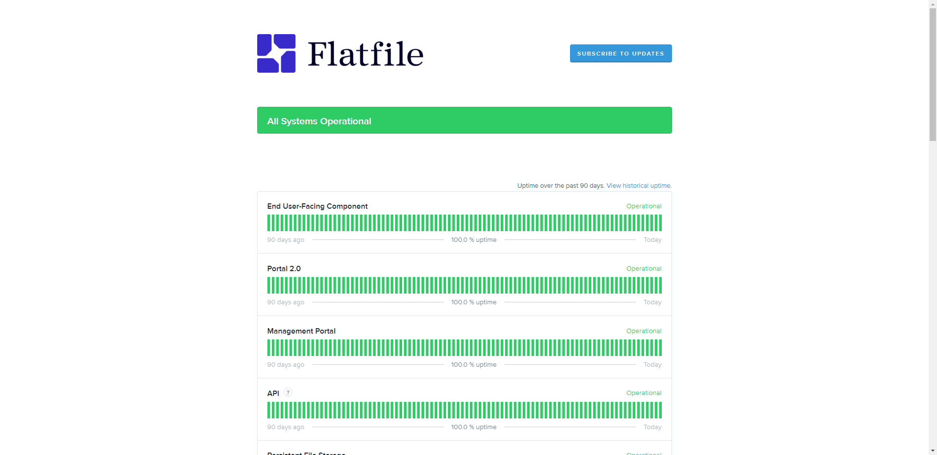
Load balancing and resource scaling are two things to look for. Another thing you should do is check out the company’s “Status” page. Here’s an example of what the “Status” page looks like for Flatfile:

If there are issues with any aspect of the data importer technology, you’ll find proof of it on this page. Users can also subscribe for real-time updates. Having this level of visibility and transparency is essential when you outsource a critical piece of your application to another provider’s solution.

Ensure Regulatory And Legal Compliance

Different types of digital products have to maintain certain levels of compliance. This can be due to the types of data they handle (like in the medical and financial industries) or because of where they or their users are located in the world.

Whether you’re building your own importer or using a pre-built solution, your technology and data handling processes need to be compliant with all relevant security and privacy regulations.

For example, Flatfile’s solution maintains compliance with the following:

  • GDPR
    Although this data security and privacy regulation was passed to protect EU citizens’ personal data, it has far-reaching effects. Because many businesses these days serve customers all around the world, GDPR compliance is essential for anyone doing business online.
  • AICPA SOC 2 (Types I and II)
    The Association of International Certified Professional Accountants has its own regulations related to data privacy and protection. SOC and SOC 2 refer to the audit that service providers must pass in order to ensure they’re securely handling employee and customer data.
  • EU/U.S. Privacy Shield
    The U.S. Department of Commerce put together this framework in conjunction with the European Commission and the Swiss Administration. It provides companies that conduct transatlantic commerce with a set of data protection requirements to follow when transferring data.
  • HIPAA
    HIPAA is a U.S. law concerned with the protection of sensitive patient data. It ensures that their health information is private and secure. It also gives patients more control over how their information is used and to whom it is disclosed.

With so many regulations to stay on top of, a data importer can become a huge chore to maintain and update. This is why many developers and companies choose to use a pre-built data importer solution.

Osmind, for instance, not only streamlined its data transfer process with Flatfile Workspaces, but it enabled them to achieve HIPAA compliance — something that’s critical when working with sensitive health records.

Bottom line: By finding a data importer that maintains various regulatory compliances, you won’t have to spend time down the road looking for alternative solutions to fill in the missing gaps. Plus, a provider that keeps its systems updated as regulations and standards change will greatly reduce the risk of your data importer falling out of compliance.

Prevent Your Importer From Breaking So Easily

Whether you are populating databases for a warehouse catalog, an ERP, or just a list of every town in which you operate, your importer needs to be strong.

For instance, let’s say a user ignores your file preparation instructions and rushes to import the files they have. Before it even gets to the point of cleaning up the data, you want to make sure the importer is able to process it without breaking down.

A broken data importer can leave users with a bad impression of the product they’re using and the company behind it. It doesn’t matter if it’s their fault for not reading the instructions or for poorly formatting their file. Encountering a broken feature is frustrating and can quickly lead to concerns with regard to security and privacy.

“What happened?”
“Did my data even go through?”
“Should I try it again, or is it too risky?”

With how advanced technology has gotten today, users will likely wonder why you hadn’t anticipated these kinds of issues and sorted them out already. So, in order to prevent end users from encountering a broken data importer, it will need to be smart and flexible.

This means using a data importer that:

  • Provides no more than a few guidelines so that users don’t have to read an entire manual in order to prepare their files;
  • Moves massive amounts of files with thousands of rows of data without erroring out;
  • Accepts files just as the customer has prepared them;
  • Easily maps and validates data no matter how inconsistent or varied the formats are;
  • Detects and notifies you (or your users) of serious errors before uploading.

An importer that breaks down all the time is going to cause issues for everyone involved. So too will one that brings tons of garbled data into your system — especially when that data is mission-critical.

By creating or using a strong and agile data importer, you can reduce the frequency with which errors occur. This will make your data importer more reliable and valuable to your users and help them instill greater trust in their own customers.

Wrapping Up

User security — as well as the perception of how secure the products are that they use — should matter a good deal to companies who collect data from their customers. That’s why it’s essential for developers to use CSV importers that they trust and that won’t put their clients or their end users in harm’s way.

As for whether you should build or buy a data importer, that decision is yours to make. However, if security and compliance are top priorities, then purchasing a pre-built importer like Flatfile would be the more economical and practical choice.

Categories: Others Tags:

Some Links on AI-Related Stuff

December 14th, 2022 No comments

Every so often, I find that the links I save to read later fall into natural groups or patterns that reveal common threads of interest. The past couple of weeks have produced a lot of thoughts about ChatGPT, an AI-powered interface that responds to requests in a chat-like exchange. Sorta like a “Hey Siri” request, but in a Discord channel.

ChatGPT is just one of several AI-flavored tech, including GitHub’s CoPilot (writing code) and Dall-E (generative images and art).

Is it the end of human development? A new and exciting way to produce art? Just cocktail party conversation fodder? There are lots of opinions…

  • A Conversation With ChatGPT (Matthias Ott) — Matthias has a conversation with ChatGPT about typography that delves into deeply theoretical thoughts on design process. My favorite is in response to whether designers should learn to code: “Ultimately, whether or not designers should learn to code is a decision that each individual designer must make for themselves, based on their own goals and circumstances. Some designers may benefit from learning to code, while others may be better served by focusing on design principles and concepts.”
  • They were supposed to replace the creative jobs last (Dave Rupert)“As interesting a future this creates, I’m a member of an old caste of people that still believes massive gains don’t come without realized costs; or more explicitly, electricity isn’t the only cost. What if the cost we’re paying is our perception of reality itself? It’s increasingly likely that the next thing you read or watch is the product of a content extruder.”
  • I just used ChatGPT to help with a complicated equation. — A reddit user used ChatGPT to write a complex equation in Notion. There were a couple hiccups, but it worked in the end.
  • ChatGPT Creates a Working WordPress Plugin – On the First Try (WP Tavern) — Sarah Gooding reporting on a ChatGPT experiment where Johnathon Williams was able to spit out a fully-functional WordPress plugin with a simple chat command. This is the sort of thing that both terrifies me but also blows my mind-hole.
  • ChatGPT Is a Smart Computer’s Impression of a Know-It-All (Pixel Envy) — Nick Heer points to an article on The Atlantic about ChatGPT that opens with three paragraphs written by ChatGPT. It’s crazy that it comes off as naturally as it does, even if it smells slightly fishy at first.
  • Use of ChatGPT1 generated text for content on Stack Overflow is temporarily banned. (Stack Overflow) — A mild dose of #HotDrama as far as Stack Overflow users posting ChatGPT-produced code as answers.
  • Midjourney vs. human illustrators: has AI already won? (Evil Martians) — I love the experiment in this post because it’s a clear example that AI doesn’t *just* work. In its current state, at best, AI is a junior designer when put to the task of creating an image: “After two and a half hours of back and forth with the AI, I was completely exhausted and decided to just upscale the most promising result.” A bonus is that the post concludes with a list of situations where AI might realistically help the team with future work — and it ain’t an entire person’s job.
  • Quick Thoughts on AI (Collaborative Fund) — Ha! Crazy to see a chart comparing how fast ChatGPT reached one million users to other popular services. It took Facebook 10 months, but only five days for ChatGPT.

Dall-E, I want a photo of a developer sitting at a desk with his head exploding while having a chat conversation on a desktop computer with an artificial intelligence algorithm.

Not bad, not bad.


Some Links on AI-Related Stuff originally published on CSS-Tricks, which is part of the DigitalOcean family. You should get the newsletter.

Categories: Designing, Others Tags:

21 Best CRM Software

December 14th, 2022 No comments

The best CRM (Customer Relationship Management) software solutions help sales teams streamline critical processes to improve productivity, track customer interactions and gain actionable insights to deliver a personalized experience to sell smarter, shorten the sales cycle and drive better retention rates.

This article reviews the 21 best CRM software to help you streamline your searches. We’ll cover the key features, user experience, pricing plans, strengths, and weaknesses. So, let’s get to it.

1. Salesforce Sales Cloud CRM
Salesforce Sales Cloud is a cloud-based customer relationship management solution that supports large sales teams and every customer touchpoint.

Over 150,000 companies, including world-leading brands like IBM, NBCUniversal, and Sonos, use the CRM system to streamline workflow automation. 

Key Features

Project Management — The software natively integrates with Slack, allowing you to seamlessly manage your Salesforce tasks in one central location and collaborate remotely with colleagues, customers, and partners in real-time. 

Sales Forecasting — Salesforce can estimate your future sales revenue using your current and historical pipeline data. Again, integrating with apps like revVana helps you gain better revenue insights.

Flexible and Scalable — This CRM software helps small businesses and enterprises meet their growing needs without sacrificing performance. Salesforce CRM is entirely cloud-based, supports over 8,700 integrations, and has an open API, making it highly extensible.

User Experience
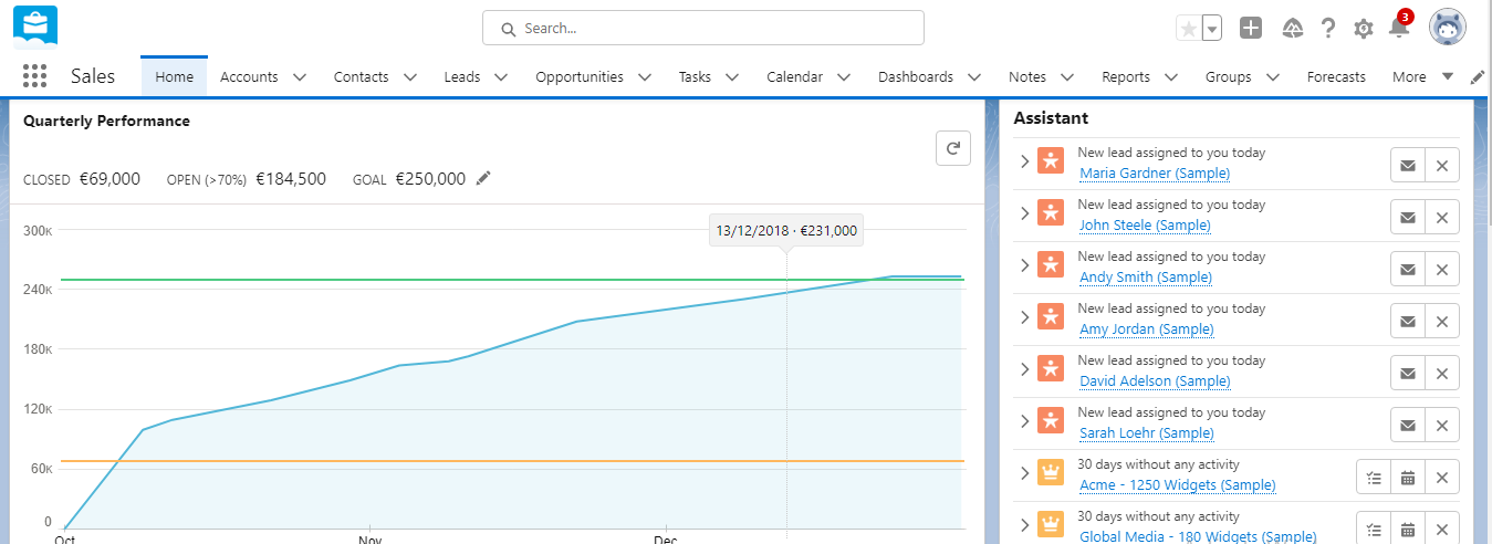
Setting up an account only takes three steps.

The dashboard is clean and straightforward, making it easy to use. You can click the modules on the navigation menu to use its features. Additionally, the CRM software displays information in graphs, pie charts, and tables in an easy-to-understand way.

Salesforce Sales Cloud has a robust knowledge base to hit the ground running immediately.

Pricing
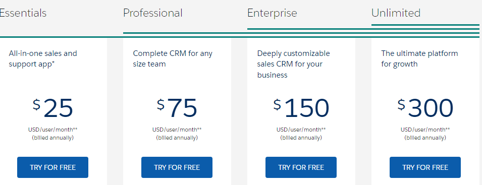
Salesforce offers four subscription plans, billed annually:

  • Essential $25 per user per month
  • Professional $75 per user per month
  • Enterprise $150 per user per month
  • Unlimited $300 per user per month

Strengths

  • It’s fully cloud-based (you don’t need to install anything)
  • 30-day free trial
  • Customer relations management automation
  • Supports over 8,000 integrations and apps
  • Multilingual and multi-currency support
  • Open API
  • Leads management and business intelligence tools
  • Round-the-clock support
  • Multiple appointment scheduling
  • Mass emailing capability

Weaknesses

  • It doesn’t support live chat
  • Not suitable for on-premise deployment

2. Pipedrive
Pipedrive is one of our top options for the best CRM software today. The cloud-based solution helps marketers set up their pipelines, track progress in real-time and automate routine tasks. Over 100,000 companies in 179 countries use the software.

Key Features
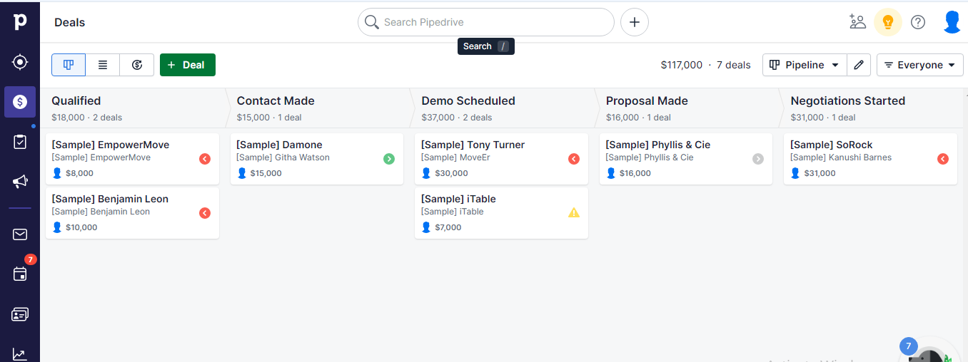
Real-Time Alerts — Pipedrive has a built-in reminder that keeps you posted on all your sales activities so you don’t miss a follow-up.

Reporting — The CRM provides detailed reports on pipeline performance. With this insight, you can measure your progress against your business goals.

Revenue Forecasting — The software can forecast your sales volume and revenue using your pipeline data. It automatically updates the estimate when a lead’s status changes.

Leads Capture — Pipedrive has a customizable web form that helps you capture leads for your pipeline. Also, you can segment the leads for personalized communications.

User Experience
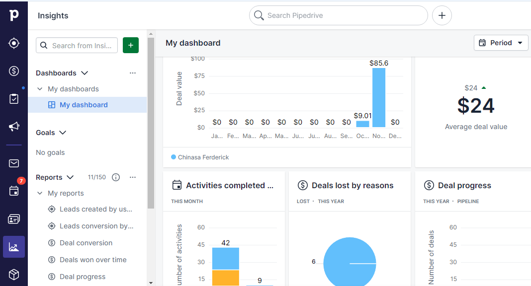
Pipedrive is user-friendly. New users will be able to get the hang of it quickly. Also, the CRM software has a robust help center to help users set up and customize their accounts.

It features a visual pipeline that lets you see your sales strategies and process and update a lead status by dragging and dropping it. Additionally, it presents reports in easy-to-understand ways.

The software offers live chat and round-the-clock email support for quick resolutions. 

Pricing

Pipedrive offers four plans, billed monthly and annually.

  • Essential $11.90 per user per month
  • Advanced $24.90 per user per month
  • Professional $49.90 per user per month
  • Enterprise $74.90 per user per month

Strengths

  • Faster deal closing
  • Omnichannel lead generation
  • Efficient customer relationship management
  • Free trial (no credit card required)
  • Goal setup and tracking
  • Sales forecast
  • Over 350 integrations
  • 14-days free trial
  • API support
  • Real-time support

Weaknesses

  • No free plan
  • The dashboard could feel overwhelming

3. Oracle Netsuite CRM
Oracle NetSuite Customer Relationship Management software promises to deliver the real-time data you need to manage interactions with potential customers, existing customers, and suppliers, deliver exceptional customer experiences and drive sales.

Over 32,000 customers use Oracle NetSuite products.

Key Features
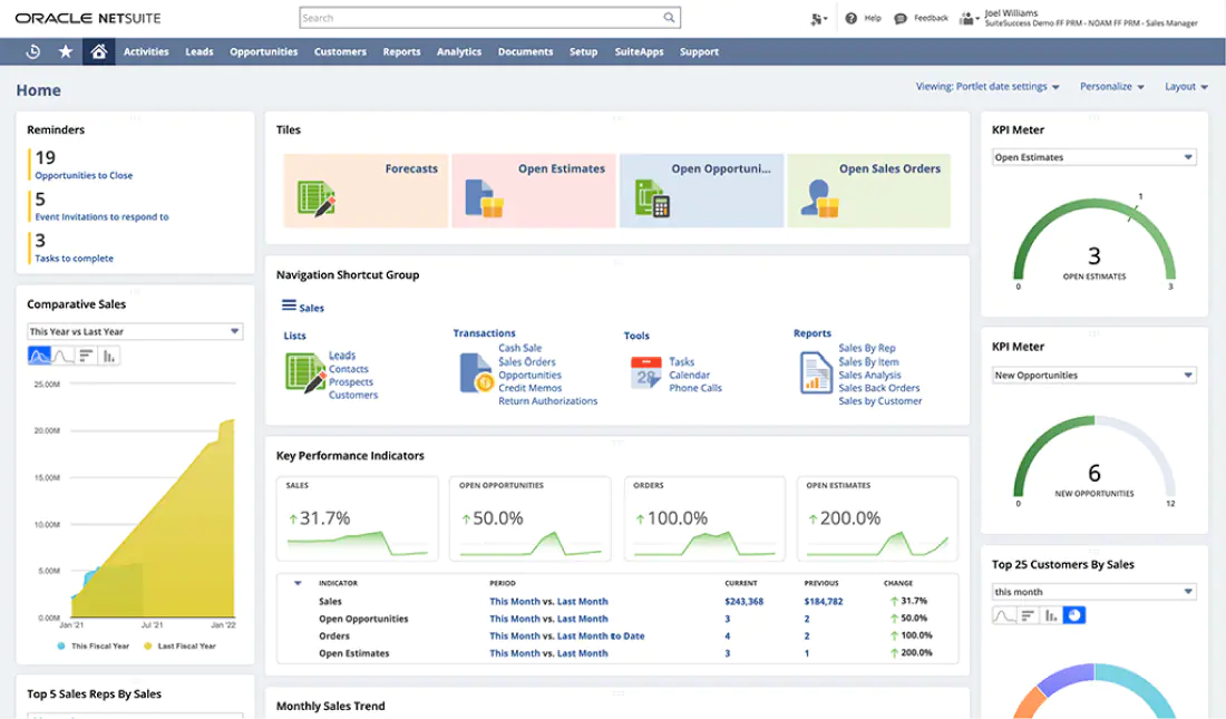
Sales Force Automation — NetSuite CRM SFA unifies your sales processes and provides unprecedented insights into every aspect of your customer relationship to supercharge your sales performance.

Marketing Workflow — You can create and launch targeted marketing campaigns to grow your leads pool. Also, the CRM lets you segment your leads to deliver a personalized experience, shortening the sales cycle.

Customer Service Management — NetSuite automates customer service management, allowing users to focus on other pressing day-to-day activities. For example, it can review the status of submitted tickets and reply with follow-up communications.

Partnership Relationship Management — NetSuite CRM is not just a customer relationship management software. Instead, the platform is a complete business management tool that helps you manage relationships with partners, share real-time information, and maintain control over partner-focused sales processes.

User Experience
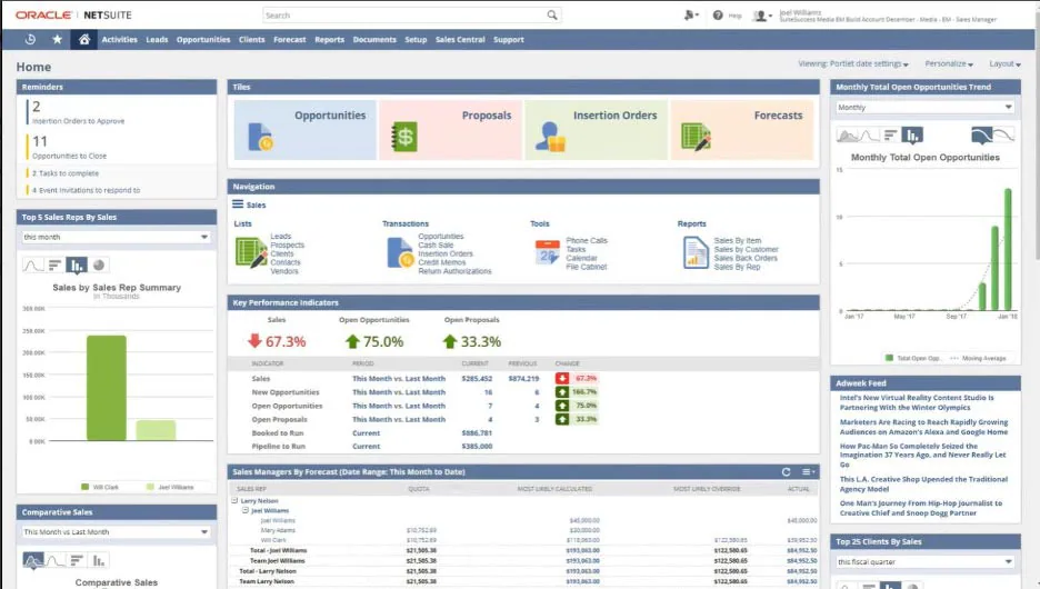
This CRM could be more beginner-friendly if not for its many features and advanced functionalities. However, the software offers a search feature to help users find things faster. Another user experience challenge is Netsuite’s time-demanding customization.

Plus, some users have reported crashes and downtime.

Besides these challenges, NetSuite has an excellent user interface that makes it exciting. Also, it offers live chat support, helpful resources, and a comprehensive knowledge base.

Pricing 

NetSuite charges an annual license fee but doesn’t provide any pricing plans. You must contact their customer support to learn about the deployment needs of their CRM systems.

Strengths

  • A centralized data source that gives users unprecedented visibility into their sales process
  • Salesforce, marketing, and customer service automation
  • Partner relationship management
  • Advanced reporting and analytics
  • Great user interface
  • Sales forecasting
  • Mobile 

Weaknesses

  • No monthly subscription plans
  • Not-too-great user experience
  • Expensive compared to other CRM solutions

4. Zoho CRM  
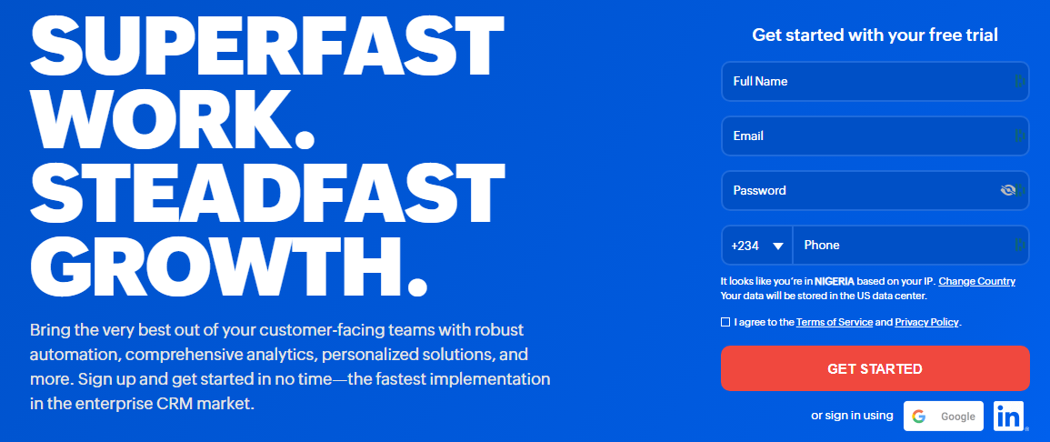
Over 250,000 businesses worldwide use Zoho CRM software solutions. It helps management, marketing, support, and sales teams address their customer relationship management and omnichannel engagement needs.

The platform empowers users to deliver personalized experiences and drive sales through multiple channels.

Key Features
Sales Force Automation — You can create workflows to reduce manual data entry, eliminate redundancies and automate repetitive sales, marketing, and customer service functions. 

Journey Orchestration — Zoho CRM lets users create personalized customer journeys and track each prospect’s path to identify delays or loopholes and optimize the sales process.

Omnichannel — With the Zoho CRM software, you can engage and track customer interactions across multiple channels, including email, social media, phone, and the self-service channel. 

Sales Enablement — Zoho CRM enables frictionless sales processes. You can generate quotes, invoices, and orders within the CRM software. Also, it lets you set up partner portals to grow your business and manage relationships with stakeholders.

User Experience
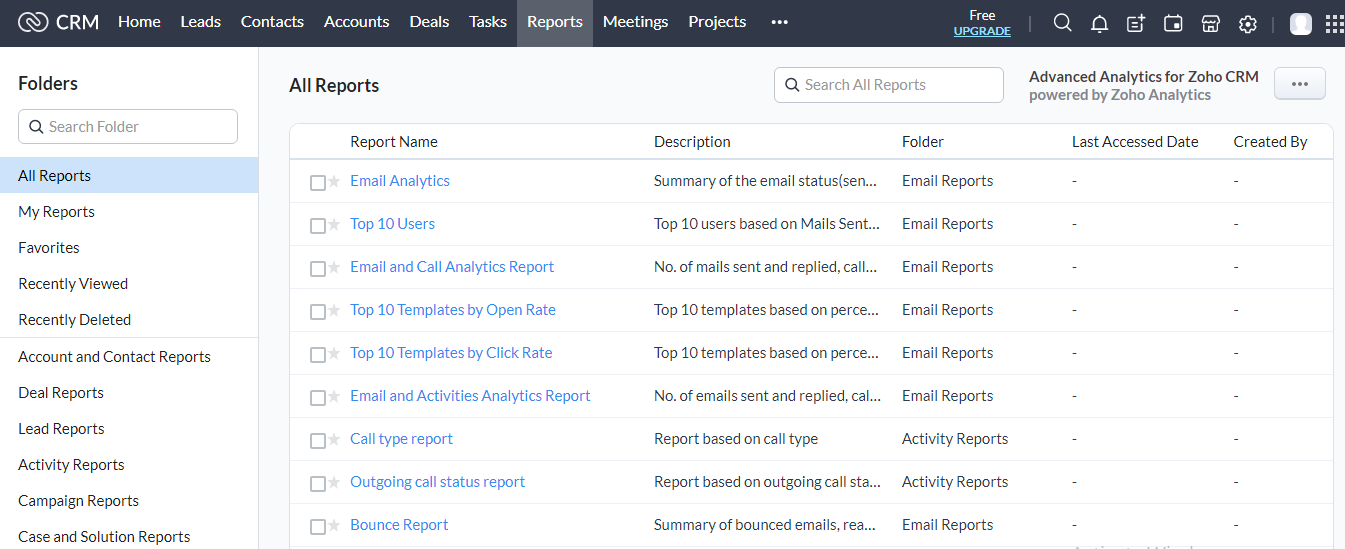
The Zoho CRM dashboard is clean, straightforward, and user-friendly. So, you can use all of its features as a first-time CRM user.

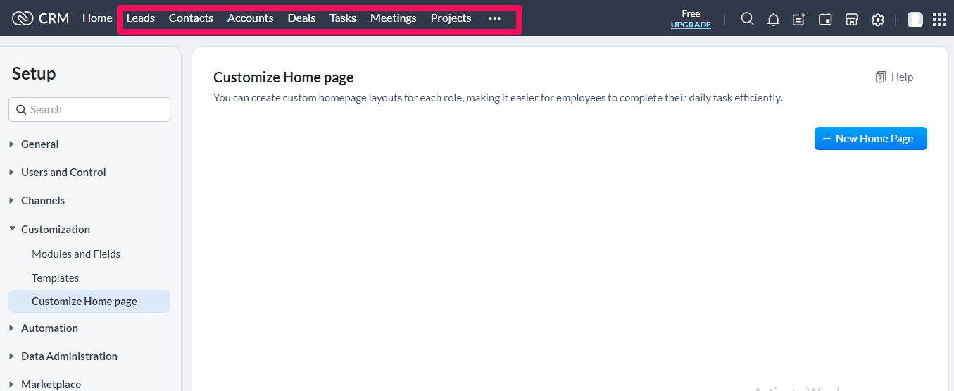
For example, the software lays the module tabs above the fold at the top bar, making them easily accessible. The reports are also less overwhelming as you can drill into the report you want to see, one at a time.

Zoho CRM offers webinars, tutorials, free eBooks, and documentation for easy setup and customization. No live chat support.

Pricing
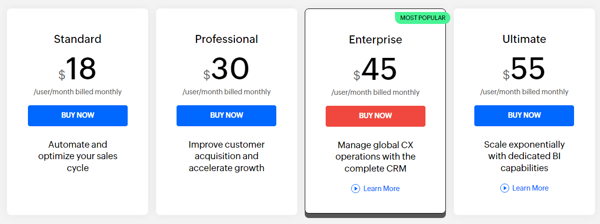
Zoho CRM offers four subscription plans billed monthly and annually:

  • Standard $18 per user per month
  • Professional $30 per user per month
  • Enterprise $45 per user per month
  • Ultimate $55 per user per month

Strengths

  • Mobile
  • Marketing and sales automation
  • Advanced template and layout customization
  • Insightful reporting and analytics
  • Team collaboration
  • Support customer self-service portal
  • Predictive sales and intelligence
  • Voice assistant
  • Multilingual and multi-currency support
  • App marketplace with several third-party developers
  • REST API support
  • Activity reminders and sticky notes
  • 15-days free trial

Weaknesses

  • No live chat support
  • Limited native marketing automation (needs extensions)

5. HubSpot CRM 
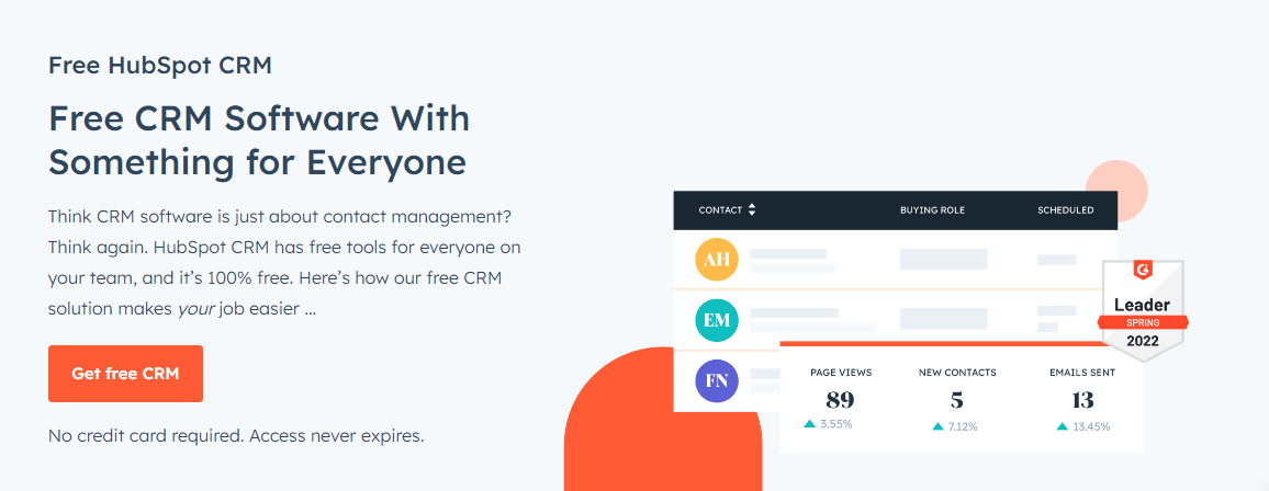
HubSpot CRM is a cloud-based customer relationship management solution for salespeople, marketers, customer service agents, operations managers, and business owners. Top global brands like Atlassian, Doordash, and Wistia use the HubSpot CRM software.

Key Features
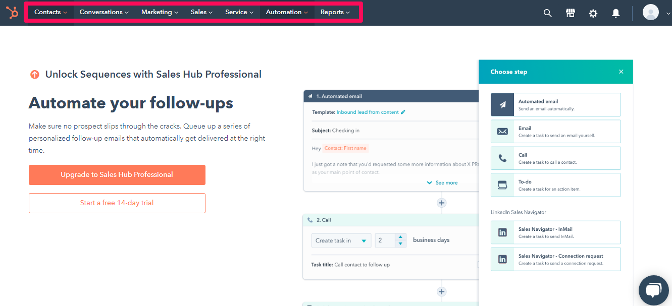
Multiple Hub — HubSpot CRM offers five hubs—marketing, sales, customer service, CMS, and Operations—that lets you pay for your needs. In addition, you can integrate up to five hubs into a single CRM to streamline your business processes. 

Email Marketing — The software has a built-in email marketing capability for targeted campaigns to your audience. In addition, you can create customized emails with the intuitive drag-and-drop editor.

Lead Generation — With the built-in lead-capturing forms, ad management tools, and landing pages, you can generate leads online, feed them directly into the CRM and convert them to customers.

Customer Support Portal — You’ll get a customer support portal to manage customer services and support requests, minimizing the burden on your customer service team. With the portal, you can also set up your knowledge base.

SEO Advisor — The SEO Advisor provides actionable SEO tips which can help you rank essential keywords on Google search results. It comes in handy when creating blog posts or developing landing or website pages.

User Experience
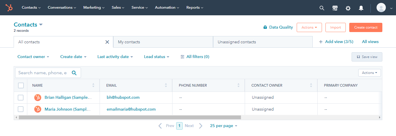
You can set up HubSpot CRM quickly and get it running immediately.

The CRM is easy to use and has an excellent user interface. You can customize your dashboard to quickly view your sales pipeline all in one place to enhance your user experience. Also, HubSpot presents its reports in an easy-to-understand way.

It also integrates seamlessly with other tools. In addition, HubSpot offers onboarding services and multiple support channels—phone, email, live chat, and online community.

Pricing
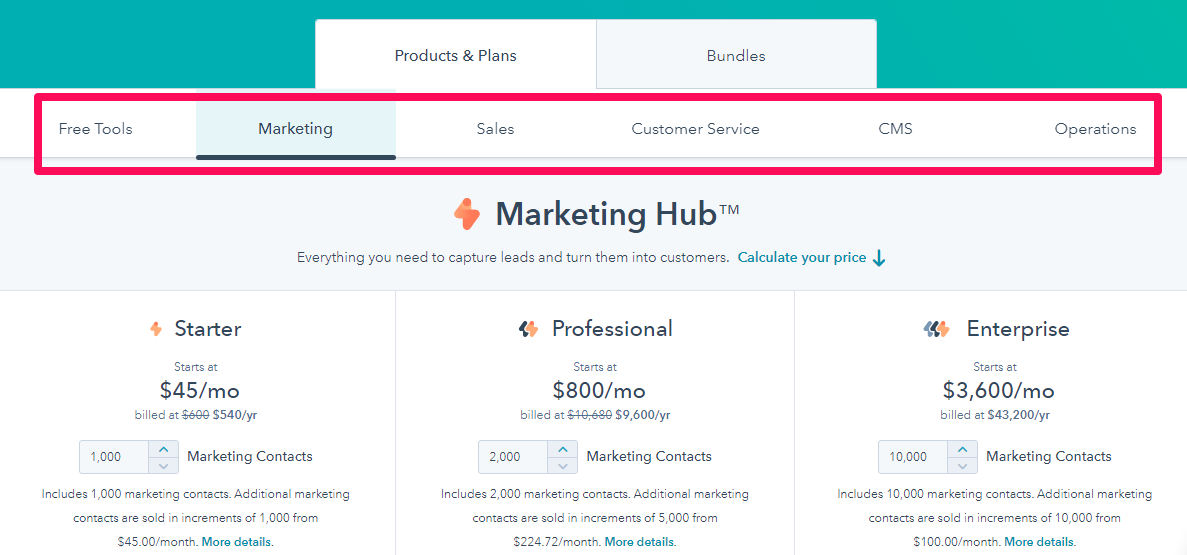
HubSpot offers a free version but with limited access to its tools. You can extend its functionality based on your needs by subscribing to a plan in the appropriate hub.

Marketing Hub

  • Starter $45 per month
  • Professional $800 per month
  • Enterprise $3,600 per month

Sales Hub

  • Starter $45 per month
  • Professional $450 per month
  • Enterprise $1,200 per month

Customer Service Hub

  • Starter $45 per month
  • Professional $450 per month
  • Enterprise $1,200 per month

CMS Hub

  • Starter $23 per month
  • Professional $360 per month
  • Enterprise $1,200 per month

Operations Hub

  • Starter $45 per month
  • Professional $720 per month
  • Enterprise $32,000 per month

Strengths

  • Powerful collaborative tool, Integrating marketing, sales, customer service, CMS, and operations in a single CRM solution.
  • A free version
  • User-friendly and intuitive
  • Large CRM database
  • Sales and marketing workflow
  • Insightful reporting and analytics
  • Lead management 
  • Seamless third-party integration
  • Social posting from the CRM
  • Meeting scheduling
  • Mobile app

Weaknesses

  • Limited features that could push to acquire other HubSpot licenses
  • HubSpot licenses are on the high side.

6. Freshworks
Freshsales is a sales CRM software that promises to help you gain a 360-degree view of your customers, deliver personalized engagement, shorten the sales cycle and accelerate revenue with context-driven sales. Brands like Klarna, Blue Nile, and PharmEasy use the CRM system.

Key Features
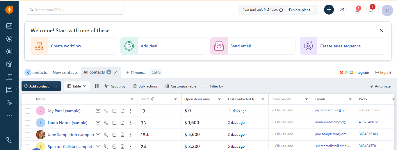
Lead Generation and Scoring — Freshwok offers CRM tools to help you run personalized campaigns and generate leads from your website visitors. You can also score the leads based on their engagement level.

Deal Management — Freshworks provides a birds-eye view of the deals in your pipeline, making it easy to prioritize and work on them immediately. You can also collaborate with multiple salespersons on the same deal., 

Workflow Automation —The software’s built-in workflow automation lets users automate repetitive tasks to save and boost the sales force’s productivity. You can quickly create automation with the pre-set templates.

AI-Powered Insights —Freshworks’ algorithm, Freddy AI, does the heavy lifting so that you can focus on only deals that convert. Additionally, it delivers AI-powered insights that help you drive faster deal closure. 

Omnichannel — The software enables users to reach customers on their preferred channel without exiting the CRM software. For instance, you can connect with your contacts via email, phone, live chat, WhatsApp, SMS, and Zoom.

User Experience

You can set up an account in three simple steps and connect your email account to the CRM software.

The dashboard is clean and less overwhelming. As a result, you are likely to crack the software at first use without facing many challenges. Also, you can import your sales data and start using the CRM tools immediately without starting from scratch.

You can use the FAQ, help center, or live chat for quick resolutions when you run into issues.

Pricing
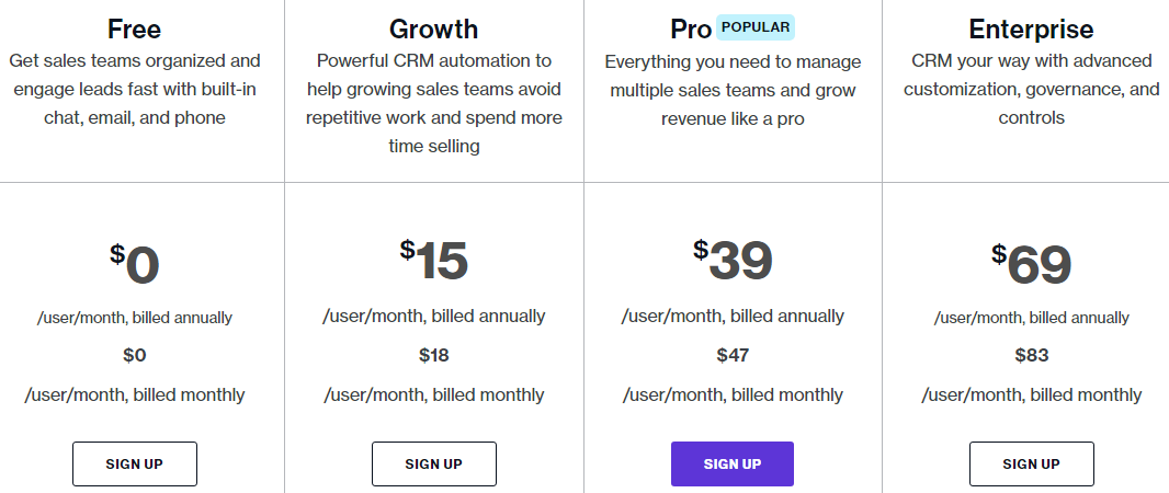
Freshworks offers the best free CRM software with basic features—ideal for beginner users. In addition, you can subscribe to a paid plan to access more tools.

  • Growth $15 per user per month
  • Pro $39 per user per month
  • Enterprise $69 per user per month

Strengths

  • Email marketing within the CRM software
  • AI-powered deal insights
  • Built-in lead generation capability
  • Seamless sales process automation
  • Multilingual and multi-currency support
  • Territory management
  • Omnichannel customer engagement
  • Over 30 reports
  • A free plan
  • Mobile app
  • 21 days free trial of the highest tier plan
  • Provides a 360-degree view of the business
  • AI-based leads scoring
  • Pipeline visualization

Weaknesses

  • Hard-to-reach support
  • Limited third-party integrations

7. Monday

Monday CRM software is one of the best CRM software in the industry. Over 125,000 businesses use it to generate leads from multiple sources, qualify them in a central location, and track and manage all aspects of the sales cycle, from pre-sales to post-sales, all in one place.

Key Features
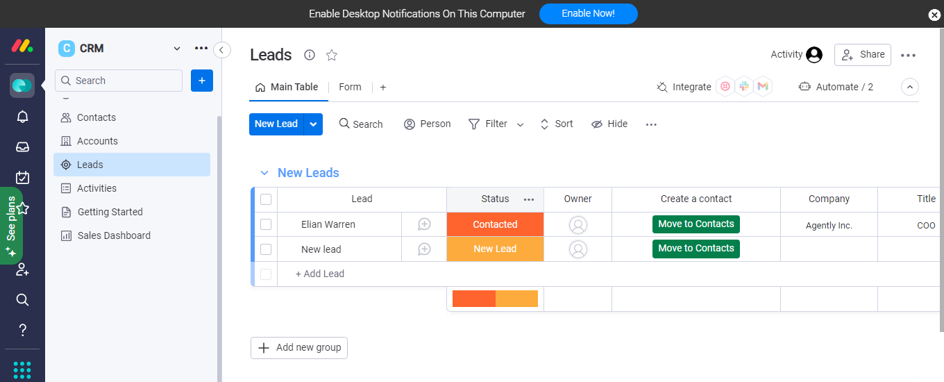
Email Tracking — With Monday, you can centralize your email communications and track essential email metrics to learn when to reach out, saving you time on cold leads. It also lets you create personalized emails with built-in templates.

Sales Process Automation — You don’t have to waste time on repetitive sales processes. It’s one of the best CRM software for automating your workflows, enabling you to focus on essential things. For instance, it can assign leads to sales reps, notifies you when a prospect opens an email, and more.

Leads Capturing — You can feed your sales pipeline with steady streams of qualified leads collected from multiple sources, qualify them on the CRM, and automatically score them based on pre-set criteria.

Post-Sales Management — Monday’s post-sales management capability lets you continuously manage customer relationships and drive after-sales customer satisfaction to boost customer retention.

User Experience
You can quickly sign up with Gmail and set up your account in a few more steps.

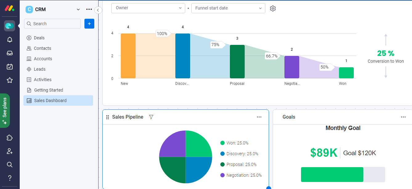
You can sell your sales pipeline and customer journey at a glance. Also, the user interface is excellent, and the software presents information in ways anyone can quickly grasp. In addition, it has a desktop notification feature that keeps you updated on your sales activities in real-time.

Users can customize their dashboards to see only the things they like. Unfortunately, the support doesn’t provide live chat support; however, it tries to compensate for this with a robust help center and round-the-clock email support.

Pricing

Monday offers a free plan for its CRM software and four premium subscription plans.

  • Basic $10 per month
  • Standard $14 per month
  • Pro $24 per month
  • Enterprise (custom package)

Strengths

  • Free and custom plans
  • Workflow automation
  • Email tracking and centralized communication
  • Pipeline visualization
  • Customizable reporting dashboard
  • Built-in lead management (capturing and auto-scoring)
  • Post-sales customer relationship management
  • Third-party integrations
  • Mobile app
  • Online community and robust help center

Weaknesses

  • Limited native marketing automation
  • No live chat support

8. Keap

Keap is one of the leading sales CRM solutions that cater to small businesses. The software promises to help them grow their leads, improve revenue and drive customer retention through enhanced customer relationship management and marketing workflows.

Key Features
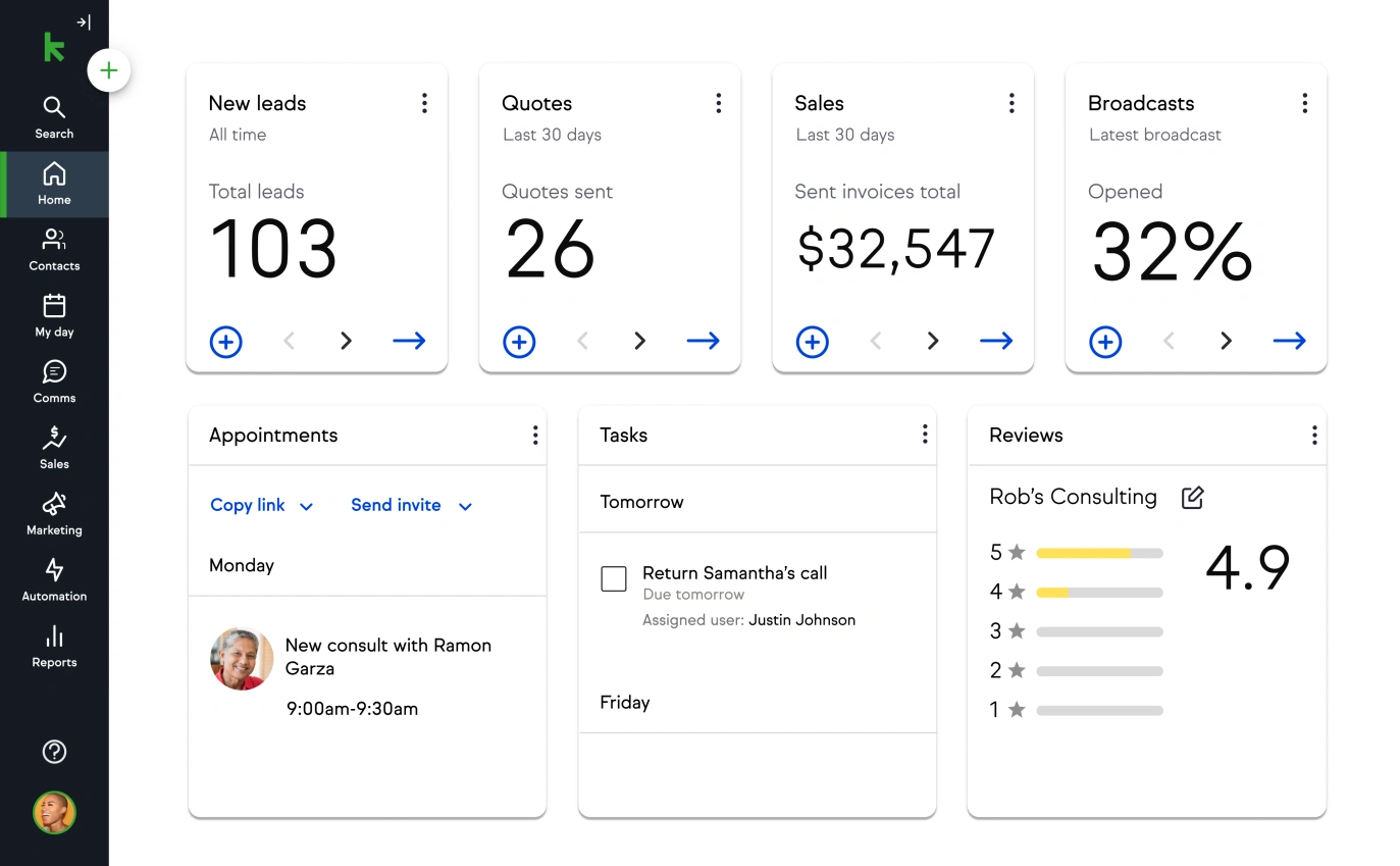
Email and Text Marketing — It’s the right CRM software for small businesses seeking to bring email and SMS marketing into their marketing mix and manage them in one place. They can quickly create email and SMS campaigns with built-in templates and send them to their segmented lists.

Sales and Marketing Automation — With Keap, small business sales teams can automate critical sales and marketing processes to deliver a personalized experience to customers and drive targeted business growth while saving valuable time and human resources. 

Lead Capturing — You can acquire and track leads at every touchpoint. This CRM software comes with CRM tools for capturing leads like landing pages, dedicated sales funnels, forms, and appointment schedulers, which you leverage to generate consistent leads. 

eCommerce — Keap supports payment processors like Stripe, PayPal, and Wepay, allowing you to send and receive payments within your CRM software. The platform has facilitated over $2.6 billion in online sales since its launch.

User Experience
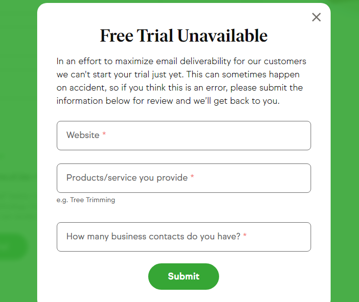
Keap promises a 14-day free trial. But I need help accessing the feature after signing up; the offer is only available to randomly selected businesses.

If the software can deliver on its promises, it will be great for the user experience. 

Pricing

Keap offers three subscription plans, billed monthly and yearly.

  • Pro $129 per month
  • Max $199 per month
  • Max Classic (custom plan)

Strengths

  • A referral program that pays up to 30% commission
  • A high-reaching user community
  • Knowledge base and help center
  • Native payment platform
  • Built-in email and SMS marketing
  • Advanced automation
  • Expert assistance

Weaknesses

  • No mobile app
  • Limited subscription plan
  • Expensive annual packages
  • The free trial is often unavailable
  • unreliable

9. Sage

Sage integrates sales, marketing, and service modules to deliver world-class customer relationship management software.

It’s one of the best CRM software in the market. With this solution, you can gain valuable insights into where your business stands to make better business decisions.

Key Features
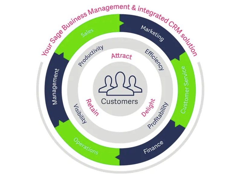
Service Module — This module brings customer service management functionality within the CRM, enabling you to deliver an exceptional experience to prospects and customers, nurture them into long-term relationships and generate repeat businesses.

Sales Modules — With this module, you can automate your sales processes to accelerate sales performance and boost productivity. The company’s customer data shows that sales reps using this feature improved productivity by up to 40%.

Marketing Module — You can plan and run omnichannel, targeted marketing campaigns within the CRM and optimize campaigns to deliver more results with the built-in insightful reports.

User Experience
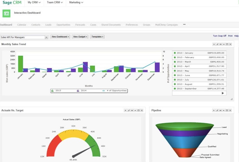
Sage doesn’t offer its pricing plans upfront. Also, you can’t sign up online. Instead, you’ll need to leave your business information online and wait for their support team to call, which might take time to come.

The user interface is excellent, but the CRM software integrates with only limited applications. In addition, real-time case resolution still needs to be improved. However, the software offers a community forum.

Pricing

Sage doesn’t have public pricing information. 

However, the software license could cost approximately $600 annually for each user. In addition, one-time initial implementation and related services could take the total cost to about $8,000. 

Strengths

  • Single modules to fully Integrated solution
  • Powerful real-time insights 
  • Team collaboration
  • Sales and marketing automation
  • Customer service management

Weaknesses

  • No straightforward signup
  • No subscription plan
  • Limited integration

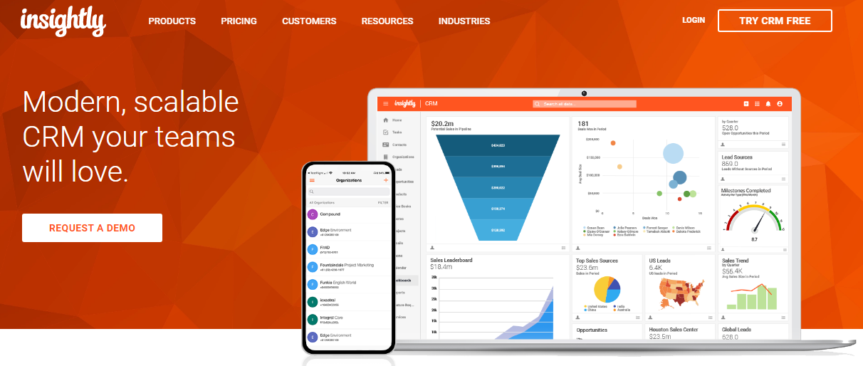
10. Insightly CRM

Insightly is a popular CRM tool developed to help businesses streamline their processes, collaborate across teams, and integrate all the applications they need to drive sustainable growth.

Over 25,000 companies, including Bloomberg, Bosch, and Sanofi, use the platform, making it one of the best CRM software platforms today.

Key Features

Relationship Mapping — You can link your customer data to existing contacts to map and understand how your customers relate. This feature helps you get a high-definition picture of your customers.

Marketing  — Insightly’s unified marketing platform enables marketing teams to build sales pipelines, attract and engage ideal customers with intelligent and segmented campaigns and automate marketing processes to grow the business faster.

Sales  — You can centralize your customer data in one place, managing leads and spotting and prioritizing those most likely to convert. You can also create and send emails within Insightly and automate your workflows.

Service  — Insightly empowers customer service teams to solve customer challenges more effortlessly. You can receive customer support tickets in one place, quickly share information across the organization and receive actionable insights to improve customer experience.

Integrations  — You can connect all the tools you need to grow your business and manage them under one app. Also, Insightly’s AppConnect supports this CRM’s users in building custom integrations and workflows.

User Experience
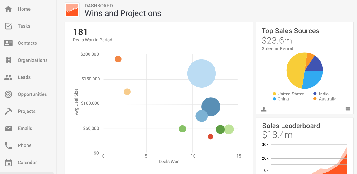
Insightly has a clean design with a user-friendly interface. 

Some users complained that it could be challenging to grasp all its possibilities fully. However, it features a knowledge base, videos, and tutorials that could bring you up to speed as quickly as possible. The platform also offers live chat support.

The filters and bulk email could be better.

Pricing

Insightly’s CRM systems come in three plans, billed annually:

  • Plus, $29 per month
  • Professional $49 per month
  • Enterprise $99 per month

Strengths

  • Custom integration and workflow builder
  • Project management and team collaboration
  • Sales and marketing automation
  • Module for customer service teams
  • Scalable CRM
  • Live chat support
  • Free trial
  • Low-entry cost
  • Mobile app
  • Customer relationship mapping

Weaknesses

  • Annual billing
  • Learning curve

11. SugarCRM

SugarCRM is one of the best CRM platforms in the market. It delivers CRM solutions that help companies gain a comprehensive high-definition view of their customers in the past, present, and future to enable predictability, boost situational awareness and reach new levels of business performance. 

Key Features
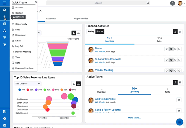
Predictive Forecasting — SugarCRM leverages historical and real-time data from multiple points to identify issues, root causes, and opportunities and deliver actionable sales insights. In addition, it offers automatic alerts for fast response.

Sales and Marketing Automation — You can automate anything with SugarCRM, from data collection, leads routing, and quote approval to leads scoring and marketing to deliver meaningful buying experiences, shorten the sales cycle, and drive revenue.

Customer Service Management —SugarCRM native customer service management support enables you to deliver a personalized, positive experience to customers at every touchpoint. In addition, the software automates critical processes to reduce the burden on your customer support team. 

User Experience
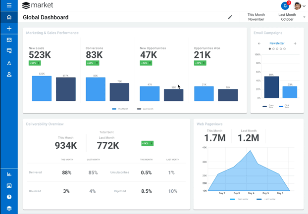
SugarCRM has a solid user interface.

However, you must pay for at least three users before you sign up for any plan, making the software expensive. Also, the CRM software offers a more complex signup process. You’ll need to fill out an online form to contact support.

SugarCRM has a user community and resource center that can help you quickly set up your account and learn how to make the most of the CRM software. Also, phone support is available in four languages.

Pricing
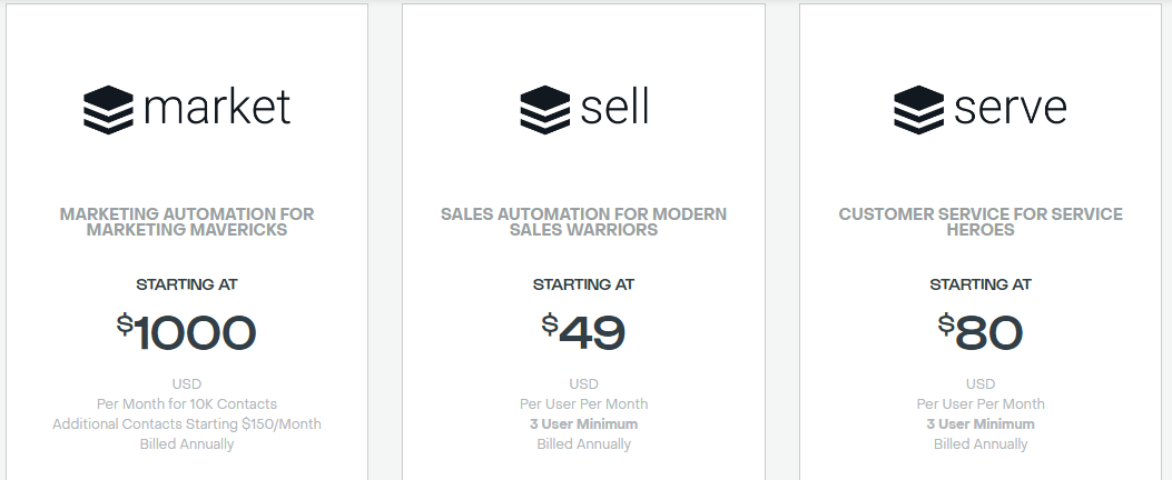
SugarCRM has four monthly plans, billed annually and requiring a minimum of three users.

  • Market $1000 per month/user
  • Sell $45 per month/user
  • Serve $80 per month/user
  • Enterprise $85 per month/user

Strengths

  • AI-Powered prediction
  • Full situational awareness
  • Sentiment assessment
  • Powerful automation and workflow
  • The built-in customer service solution
  • On-premises deployment
  • Omnichannel customer engagement

Weaknesses

  • No complimentary or trial plan
  • Lacks a mobile app
  • Expensive plan

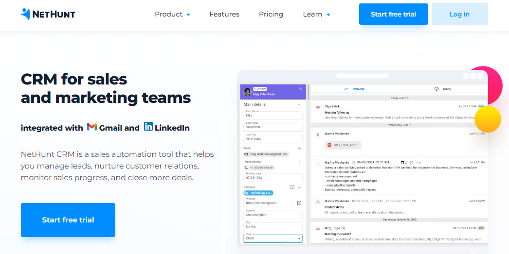
12. NetHunt

NetHunt is one of the best CRM platforms built for Gmail and Google Workspace users, designed to help them manage leads, nurture prospects, and stay on top of their sales performances. The solution also plays well with LinkedIn and eight other tools.

Key Features
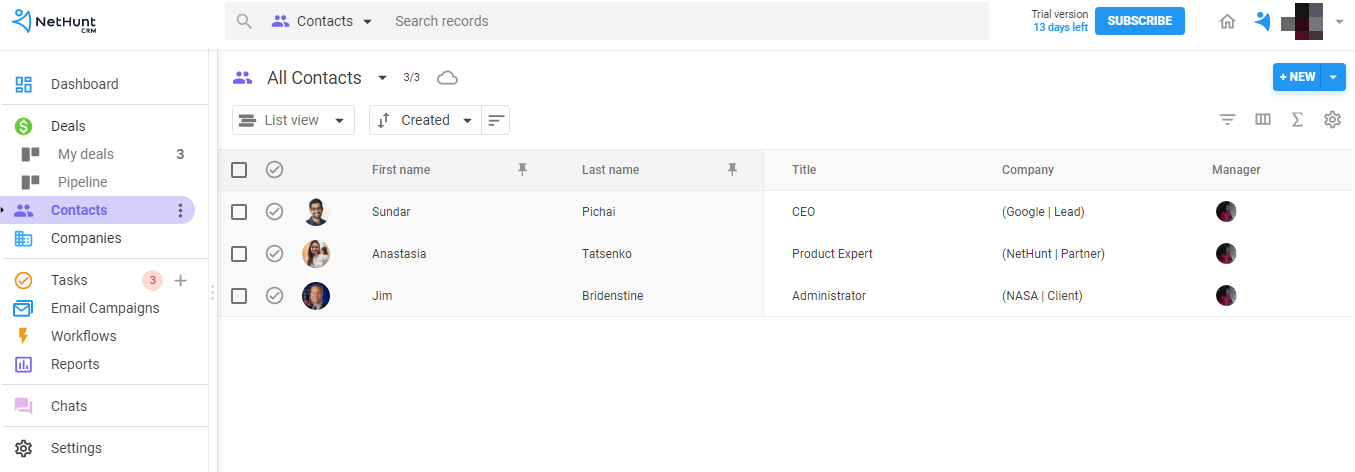
Data Organization  — With NetHunt, you can organize your business data effectively and productively. Also, the solution organizes your deals and sales pipelines in an easy-to-understand manner, providing insights into what works and doesn’t.

Sales Force Automation  — Using this sales CRM means your sales team won’t have to waste time on repetitive tasks. Instead, the solution automates key sales processes like leads capturing and nurturing, contact updates, and others so they can focus on other things.

Centralized Communication  — You can centralize your business communications, regardless of your customer’s preferred channel, whether social media, email, telephone, messenger, or live chat, and manage everything on the go under one app roof.  

User Experience
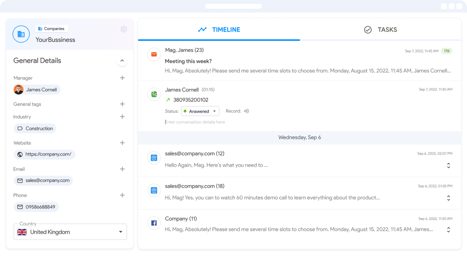
You can create an account in three clicks. The interface is clean and user-friendly. You can quickly update your deals by dragging and dropping them and visualize your pipeline to see your entire sales process and performance at a glance.

Also, you can set up workflows and integrations in a few minutes. Both processes are intuitive and might not require any learning curve. In addition, NetHunt has a help center and offers live chat support.

Pricing
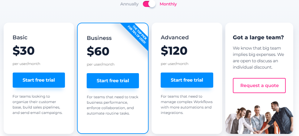
NetHunt is available via four subscription plans, billed monthly and annually.

  • Basic $24 per month
  • Business $48 per month
  • Advanced $96 per month
  • Custom plan

Strengths

  • Zapier integration
  • Advanced data organization and visualization
  • Workflow automation
  • Omnichannel communication
  • Mobile apple
  • Live chat and phone support
  • Code-free web form for leads capture
  • Low-entry fee
  • Free trial and custom plan
  • Chrome browser extension
  • Open API
  • Cancel anytime

Weaknesses

  • Available only to Gmail and Google Workplace users
  • Limited integration options
  • Limited marketing automation 

13. FreeAgent

FreeAgent CRM helps teams collaborate more effectively to get things done. The software promises to help users track their progress in real-time and gain actionable insights to optimize their performance. Over 1,000 businesses worldwide use the platform.

Key Features
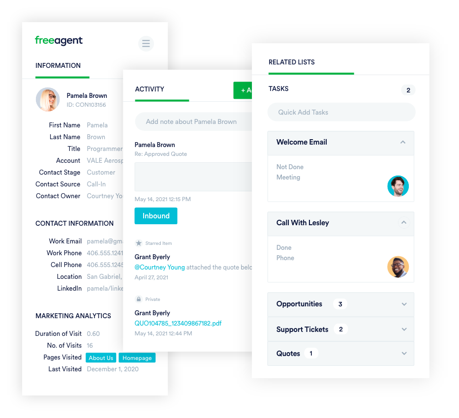
All-In-One Solution — With FreeAgent CRM, you won’t need to open multiple browser tabs to get your job done. Instead, you get everything done in one place. You can also automate repetitive tasks to get more done in less time. 

Workflow Optimization — You can streamline business processes to complete more work efficiently. The CRM tool can help you organize and prioritize deals so you can focus on those most likely to move the needles for your business.

Code-Free Customization — FreeAgent code-free customization enables you to set your account to meet your business’s unique needs. The software also integrates with other apps, making it highly extensible.

User Experience
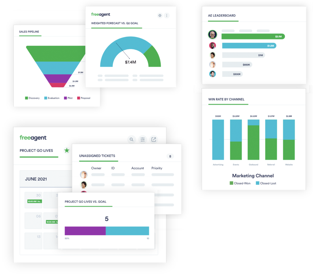
FreeAgent CRM is easy to use and has a visually appealing user interface. The software enables complete funnel visualization and presents reports in ways anyone can understand.

You can quickly connect with the company’s in-house CRM experts to set up and customize your account to explore its full possibilities. The solution also offers live chat and helpful resources.

Pricing
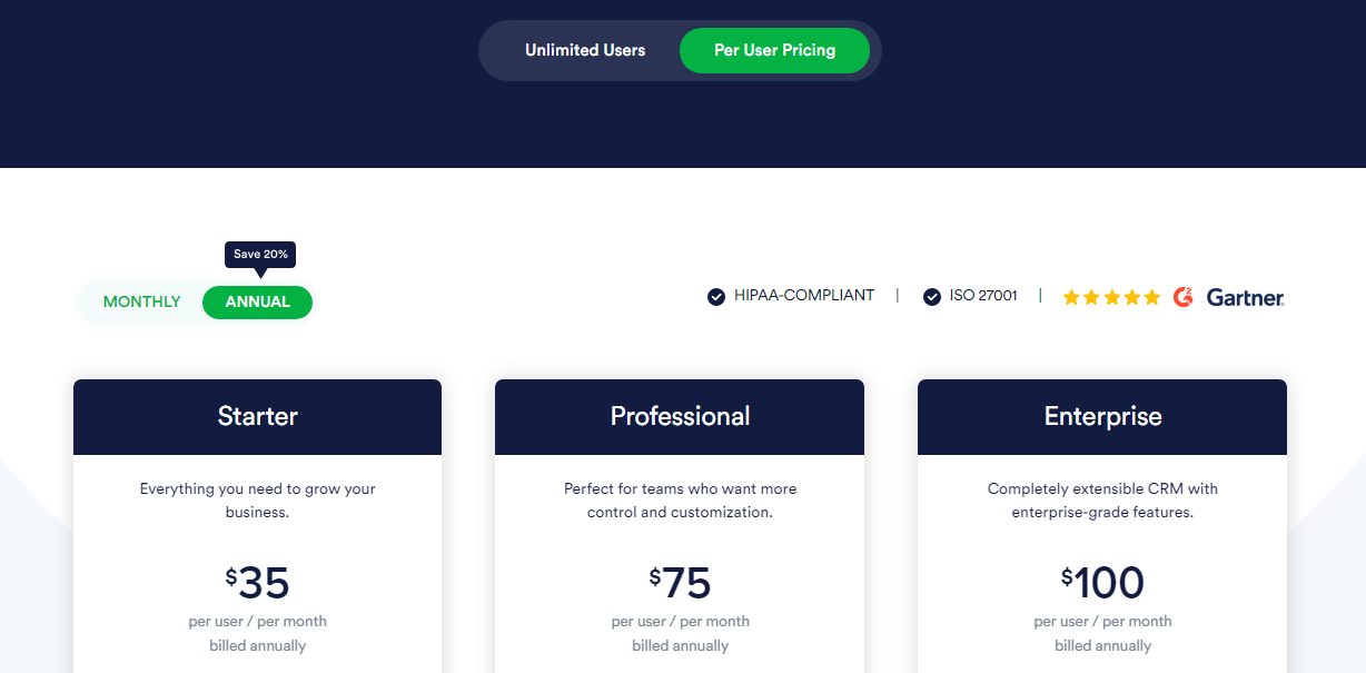
FreeAgent offers “Unlimited Users” and “Per User” pricing packages with different plans, billed monthly and annually. The Per User package has three plans.

  • Starter $45 per month
  • Professional $90 per month
  • Enterprise $120 per month

Strengths

  • Highly extensible
  • All-in-one solution
  • Fully cloud-based
  • Code-free customization
  • Workflow automation
  • Full funnel visualization
  • Customer service management
  • Third-party integrations
  • Live chat support
  • Custom app
  • ISO 27001 compliant

Weaknesses

  • No mobile app
  • Poor search and filter

14. Creatio CRM
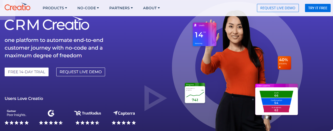
Creatio CRM is one of the best CRM software used by small and medium-sized businesses in over 100 countries to automate end-to-end customer journeys with no code. You can purchase separate modules or deploy the software as a unified CRM tool. 

Key Features
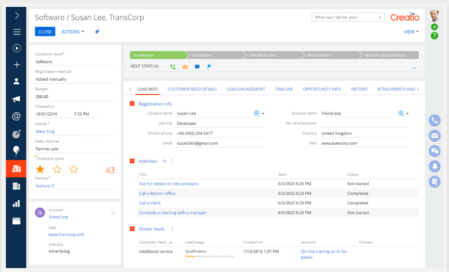
Marketing Creatio — With this module, you can automate your marketing campaigns, lead management, and deliver personalized omnichannel communication to boost business revenue and drive customer retention.

Sales Creatio — Creatio supports sales teams to collaborate across boards and automate mission-critical sales processes to get more things done. The software also provides a 360-degree view of customer journeys to personalize their experience.

Service Creatio — You can automate and manage customer service workflows on Creatio to save the support team valuable time and deliver an enhanced, personalized experience to customers. The software uses AI to streamline the handling of service cases.

Studio Creatio — Creatio’s no-code UI builder helps non-technical users build business applications and processes with maximum freedom using easy-to-use drag-and-drop visual design tools.

User Experience
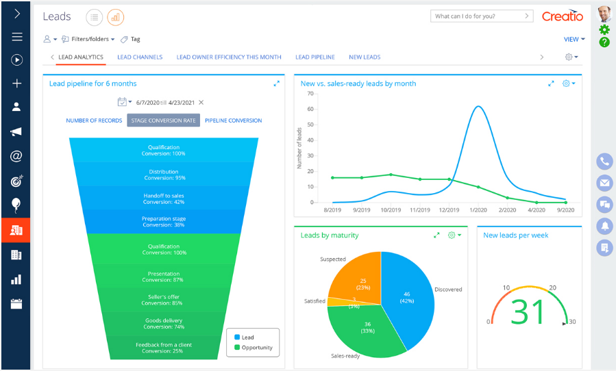
The analytics and reporting are insightful, and you can quickly visualize the data in a few clicks.

The software’s no-code capability means you can complete projects that usually take months or even days. In addition, support is multilingual, so you’ll always get assistance whenever the need arises in your preferred language. 

Also, the platform has helpful resources for quick self-help.

Pricing

Creatio has different subscription packages for each module (Creatio). 

The monthly sales and service modules subscriptions range between $25 and $60, while Marketing Creatio goes for a $1,000 to $100,000 yearly fee. You’ll need to contact support to understand the cost of deploying its unified CRM solutions.

Strengths

  • Cost Calculator
  • Cloud and on-site deployment
  • 360-degree customer view
  • Unlimited no-code customization
  • End-to-end workflow automation
  • Real-time analytics
  • Trial plan
  • Custom plan

Weaknesses

  • Expensive plan
  • No mobile app

15. Close

Close is a cloud CRM solution for remote salespeople. As one of the best CRM software in the industry, it makes team onboarding a breeze, automates and analyzes workflows, and helps you grow revenue quickly. It also integrates well with some of your tools, bringing your software stack to one place.

Key Features
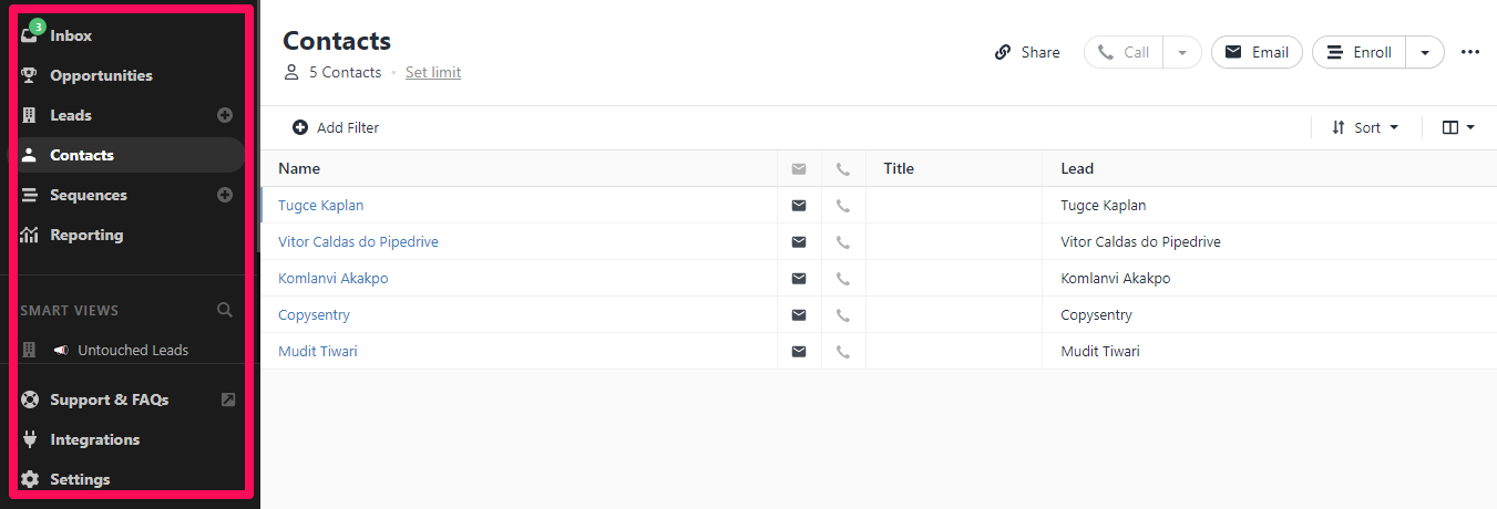
Calling — Close has built-in call software to help you reach more people effortlessly and double your call volume and velocity. With the predictive dialer, you can call multiple numbers at once, and the software automatically routes answered calls to available reps.

Video — Close natively support Zoom, enabling remote selling with videos. The software can connect your Zoom account and sync your previous recordings with the CRM software. It also alerts you five minutes before every meeting, and you can add notes during the meeting for context.

Call Coaching — With Close, you can train your sales team, no matter where they are, all within the CRM without needing to invest in expensive online training tools.

Workflow Automation — The CRM solution offers in-app email and calls automation that can simplify your workflow and help you get more work done. Also, you can save and share winning templates with team members to boost the reach rate and close deals faster.

User Experience
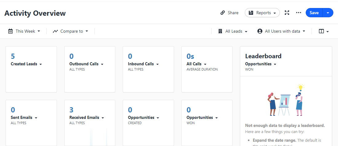
Close is an easy-to-use CRM software for busy salespeople with no learning curve. 

You can quickly create an account, set up your workflow sequences, and immediately put the CRM to work. The software also has dynamic smart views that let you prioritize your leads and quickly find what you need.

Close offers free migration and support, so you can get assistance whenever needed. However, it might not be real-time since the software doesn’t offer live chat.

Pricing
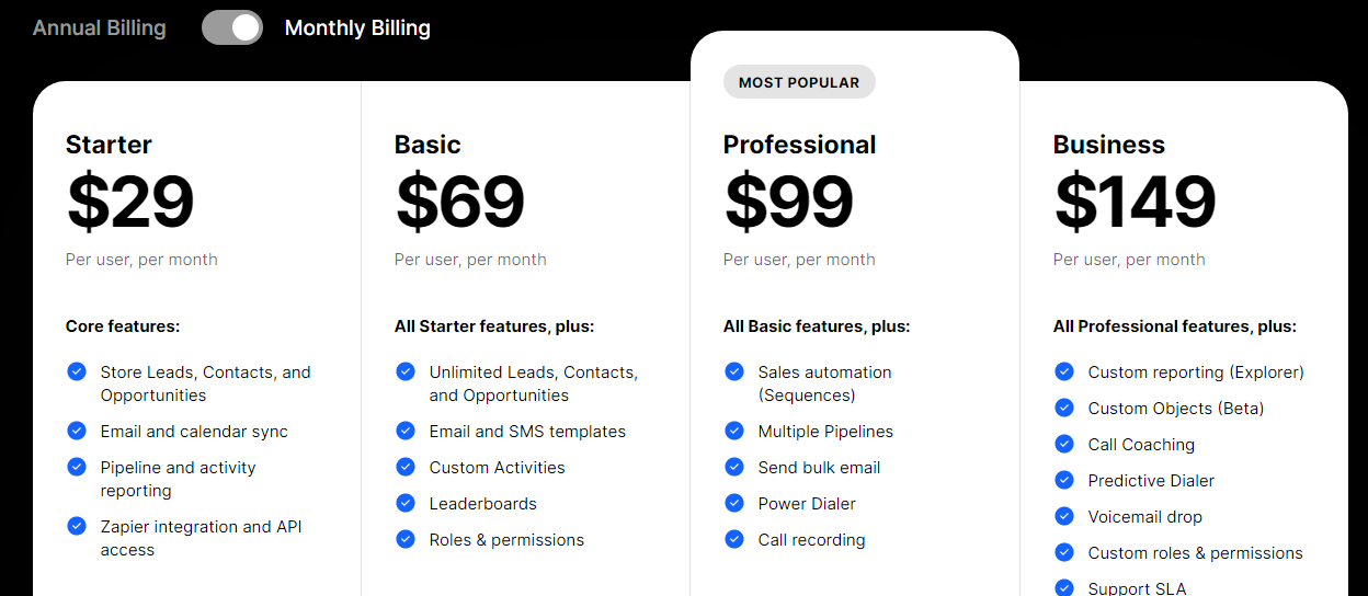
Close offers four subscription plans billed monthly and annually.

  • Starter $25 per month
  • Basic $59 per month
  • Professional $89 per month
  • Business $129

Strengths

  • Remote selling
  • Power and predictive dialer
  • Built-in email and SMS marketing
  • Powerful reporting insights
  • Free trial, migration, and support
  • Sales force automation
  • Phone and email support
  • Pipeline visualization

Weaknesses

  • No mobile app
  • No live chat support

16. Nutshell

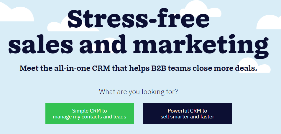
Nutshell is an all-in-one B2B CRM software designed to help teams manage contacts and leads, sell smarter and gain valuable insights to track performance and optimize the sales process. Over 30,000 sales and marketing professionals use the software to streamline their workflow.

Key Features
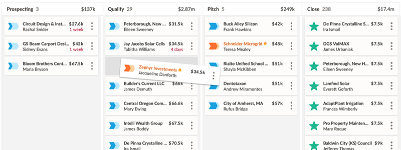
Pipeline Management — Like most CRM, you can visualize your customer’s journey at a glance. With this feature, you can view, manage and prioritize leads for a faster closing.

Sales Automation — From lead assignments to scoring, task reminders, and more, Nutshell automates these tasks at the snap of a finger, allowing your team to focus on actual closing. 

Email Marketing Campaigns— Nutshell helps you send targeted, beautifully designed marketing emails. You can save time with the built-in template and see who engages with the email in real time. 

Leads Capturing  — The CRM has a native web form to capture leads and feed them directly to your pipeline. In addition, you can embed the form on your website to generate leads from web visitors.

User Experience
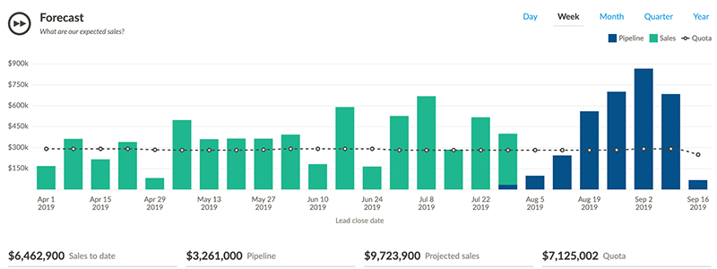
Nutshell reporting is top-notch, with an excellent interface. 

However, some users complained the email builder is subpar and could need improvement. Also, it offers limited customization.

Besides these, the software is excellent for quickly connecting all your software tools and accessing them in one place. The company doesn’t charge for customer support, and they can help you migrate your data to hit the ground running immediately.

The CRM offers several helpful resources to help you resolve issues and put the software to full use. 

Pricing
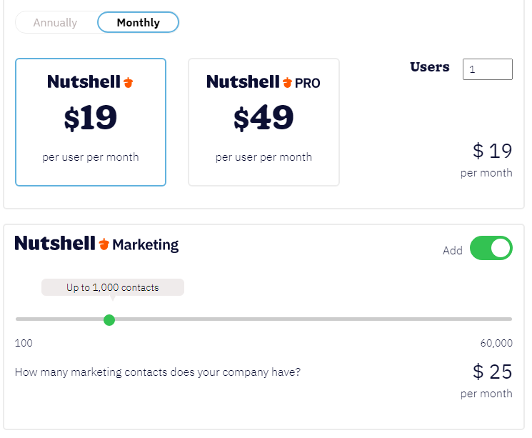
Nutshell offers two plans, billed monthly and annually. Here’s the cost per user per month:

  • Nutshell $19
  • Nutshell PRO $49
  • Nutshell Marketing (custom plan)

Strengths

  • Open API
  • Mobile apps
  • Free Migration
  • Sales force  automation
  • Leads generation
  • Pipeline visualization
  • Email marketing campaigns
  • Sales forecasting
  • Dependable support 
  • Custom marketing plan

Weaknesses

  • No live chat

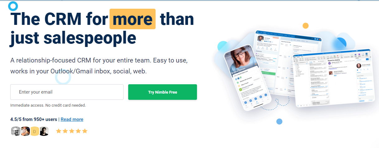
17. Nimble

Nimble is one of the best CRM software for small and midsize businesses, used by over 140,000 professionals. Also, world-leading brands like UpWork, GoDaddy, and Flexjobs use the platform. 

Key Features
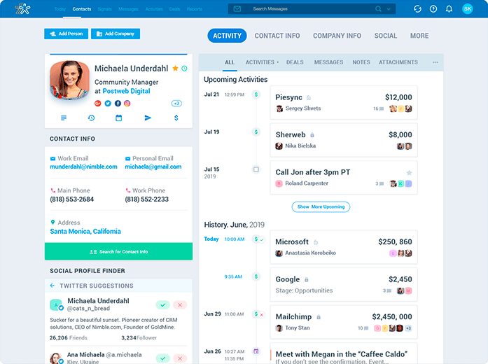
Nimble Prospector — With Nimble, you can efficiently prospect leads on any social site, website, or cloud application and connect with them in less time. The prospector is available as a browser extension, making it readily available.

Relationship Management — The software helps users manage customer contact details, automate key business processes, enable social listening and gain valuable business intelligence to deliver superior customer experience.

Email Marketing — The built-in email campaign management functionality means you won’t need to switch tabs or need third-party services to engage customers via personalized emails and track your progress.

Smarter Actions — Nimble provides actionable business and customer intelligence to take more intelligent actions to gain complete control of your sales process. For example, you can visualize your sales funnel, gain social insights to prepare for meetings, and discover engagement opportunities.

User Experience
You’ll likely start your Nimble experience by importing a CSV file of your existing contact database; thankfully, the software makes this process very straightforward. Also, the CRM makes importing and syncing data with other apps seamless.

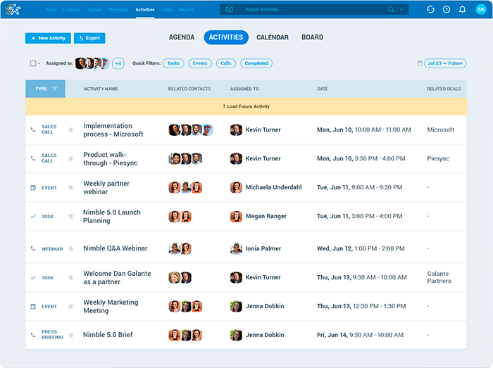
Additionally, Nimble’s “Today Page” feature provides an overview of all your upcoming activities, deals, and engagement opportunities from social mentions and essential contacts to reach out to, making prioritizing more effortless.

The software has a support center and a live chat for quick assistance.

Pricing
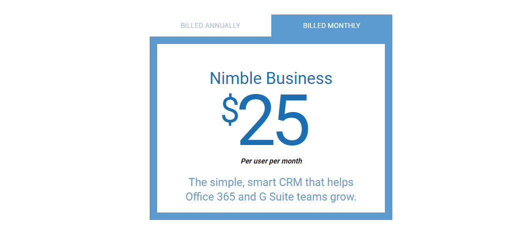
Nimble offers only one subscription plan—Nimble Business, available for $25 monthly for a user. However, you’ll pay only $19 if you opt for the annual plan.

Strengths

  • App Marketplace
  • Native leads prospector
  • Browser extension
  • Activity tracking and team tasks management
  • Built-in calendar
  • Pipeline management
  • 360-degree view of customers and leads
  • Marketing automation
  • Contact management
  • Live chat
  • Business and customer intelligence
  • Office 365 and Google Workspace integration
  • Low entry fee
  • Social listening and mentions

Weaknesses

  • No mobile app
  • Limited subscription plan

18. MailChimp
Mailchimp is not just an email service provider. It’s also one of the best CRM software for small businesses. With this solution, you can build better customer relationships and sell to them more creatively. In addition, the CRM is scalable and can support your business growth and needs.

Key Features
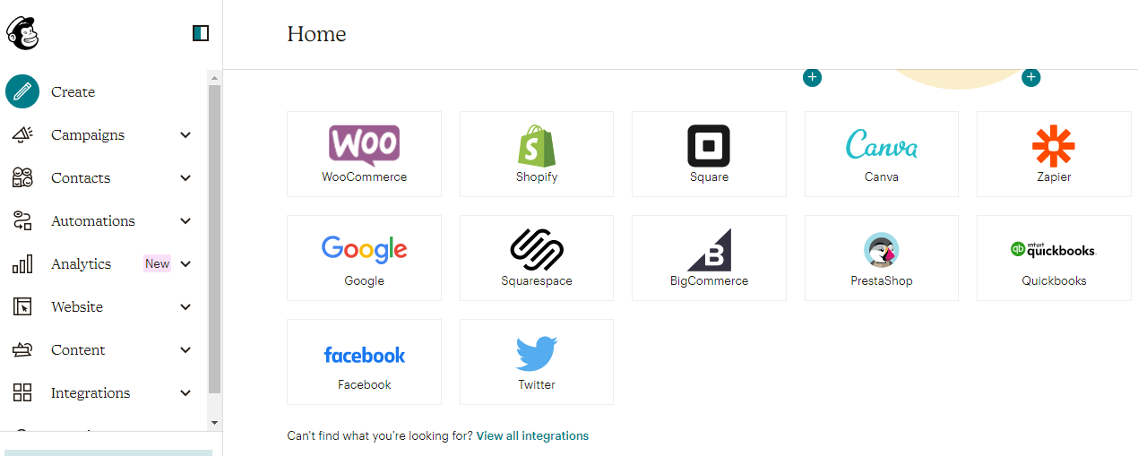
Contact Management — Whether importing an existing contact database or building from scratch, MailChimp helps you manage them all from one location. Also, you can create or use the built-in segments to organize your contacts.

Email Marketing — Email marketing and campaign management are probably MailChimp’s best selling point and are natively supported in the CRM, meaning you can run effective email campaigns. Also, it comes with pre-built email templates, and you can run A/B tests in-app.

Behavioral Targeting and Personalization — MailChimp can predict customers buying behaviors, enabling you to segment your contact effortlessly to launch campaigns that feel like a one-on-one conversation at the right time or deliver personalized product recommendations. 

User Experience
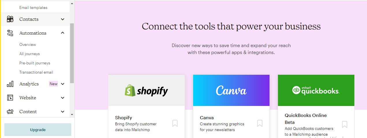
You’ll only need to fill out three fields to sign up. However, it would have been better if users could create accounts automatically with their Gmail. It’ll save you the stress of logging into your email to activate the MailChimp account.

Mailchimp’s user interface is excellent, with many white spaces, but I don’t find the yellow background and black font colors easy on the eyes while signing up. Also, the software can integrate neatly with other tools, so you can easily manage your stack in one place.

MailChimp support is excellent, and case resolution is always fast.

Pricing
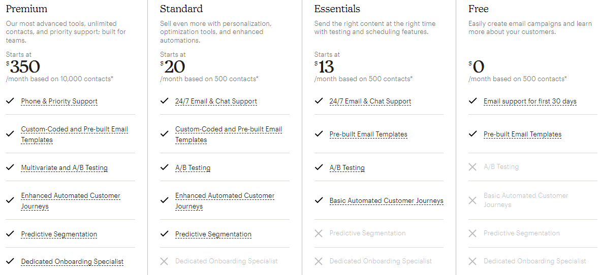
MailChimp CRM offers free, and three paid plans.

  • Premium $350 per month
  • Standard $20 per month
  • Essentials $13 per month

Strengths

  • Highly scalable
  • Mobile app
  • Predictive segmentation and behavioral targeting
  • Holistic audience view
  • Live chat support
  • Seamless contact management
  • Actionable customer insight
  • Free plan
  • Low-priced starting plan
  • Extensive third-party integrations

Weaknesses

  • Limited native Salesforce automation

19. Apptivo
Apptivo is a CRM software used by over 200,000 businesses, including Sephora, UNAIDS, Exult, and Los Angeles Times. The solution simplifies customer relationship management so sales and marketing teams can be more efficient and close deals effortlessly.

Key Features
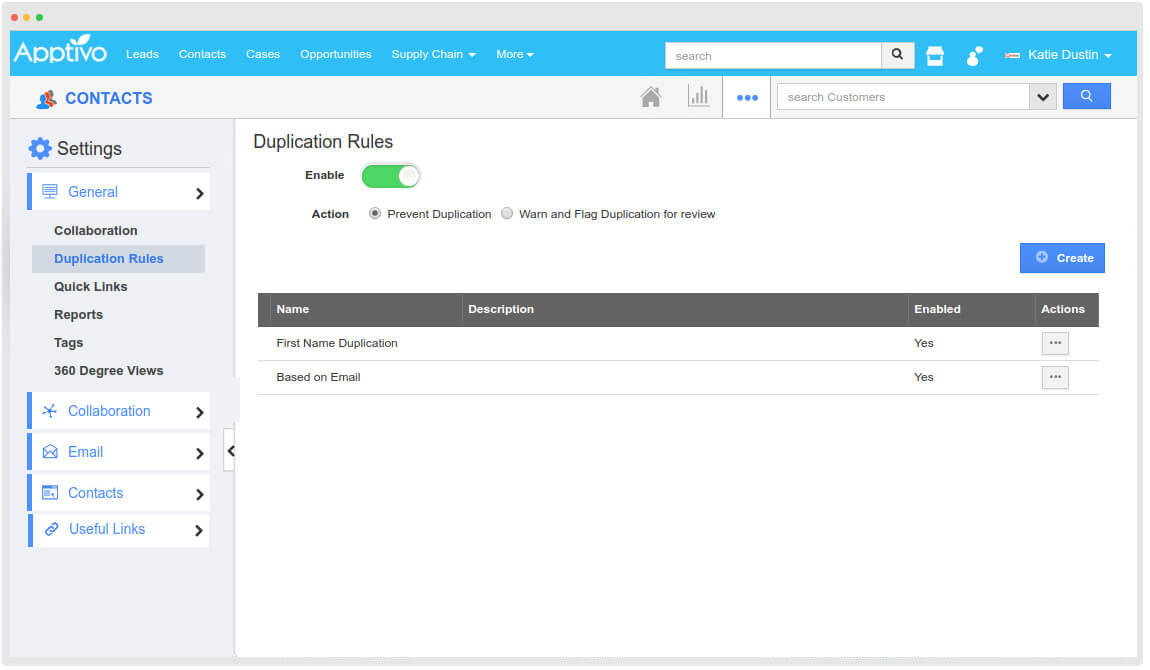
Win and Loss Analysis — You can track the sales opportunities your sales team prospected and analyze the employees that contributed to winning the opportunity. Additionally, the app can help you analyze lost opportunities and the reasons behind them.

Territory management — You can quickly delineate and manage your sales territories to boost team collaboration, improve sales efficiency, and maximize territorial benefits. With the built-in assignment rules, you can automatically segment leads based on territories.  

Sales Planning — With Apptivo, you’re sure you won’t be tracking your sales targets with spreadsheets. Instead, the software comes with a sales planning app to measure your team members’ KPIs and implement scalable sales processes to facilitate faster deal closing.

User Experience
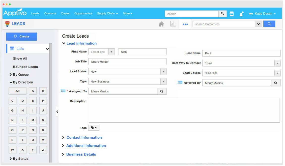
Apptivo has an excellent user interface.

But new users might need help navigating the software. Also, the customization and app integrations are not a walk in the park. 

However, the CRM system offers an extensive knowledge base for self-help. 

Pricing
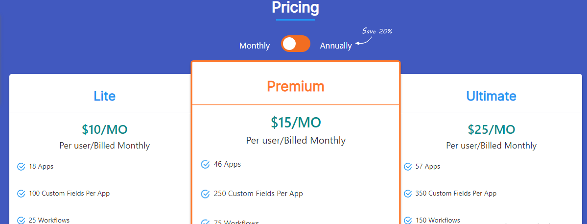
Apptivo offers three subscription plans.

  • Lite $10 per month
  • Premium $15 per month
  • Ultimate $25 per month

Strengths

  • Project management
  • Integrated CRM software
  • Activity tracking
  • Performance analysis
  • Pipeline visualization
  • Contact Marketing
  • Email campaigns
  • Leads management
  • Salesforce automation
  • Sales planning
  • Territory management
  • 30-day free trial
  • Mobile apps

Weaknesses

  • Hard customization
  • No real-human live chat

20. Act! CRM

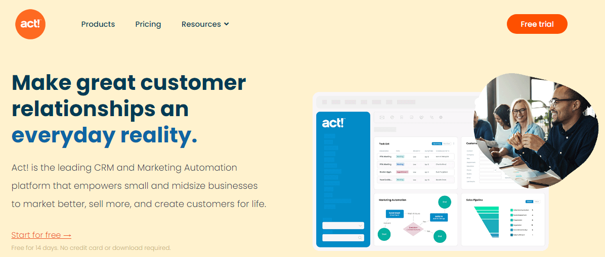
Act! is a cloud-based CRM software designed for small and midsize businesses to manage customer relationships and sell better seamlessly. The CRM system has been in play for over 35 years, powering over 800,000 users worldwide.

Key Features
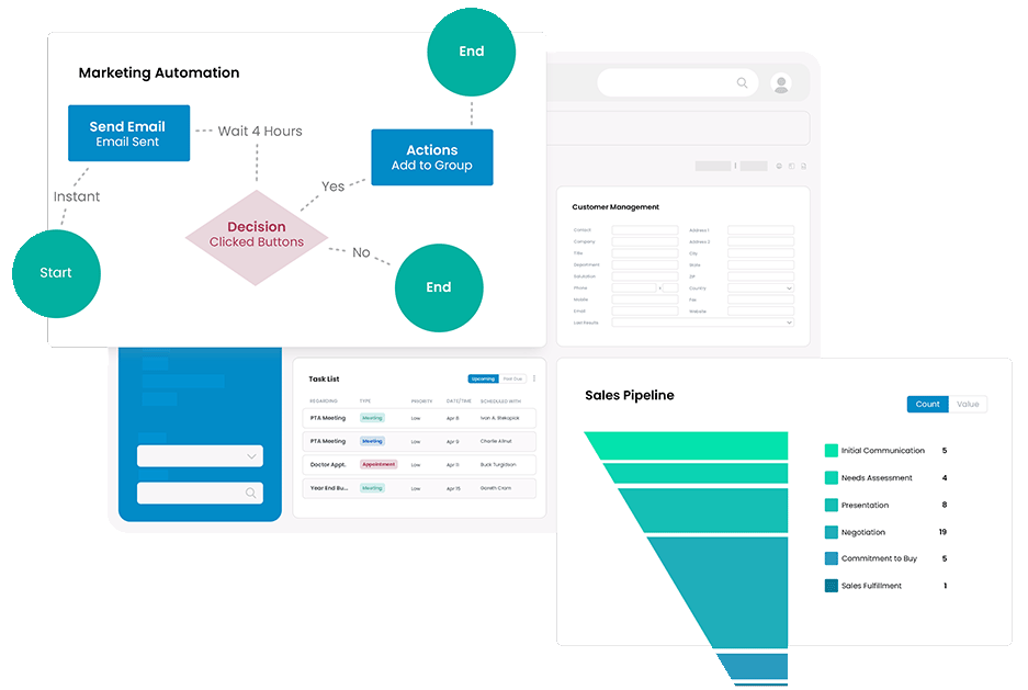
Marketing Automation — Using Act! means you won’t need to spend much hiring and maintaining an in-house marketing team. Instead, this CRM software can handle most of your crucial marketing processes effectively.

Sales Pipeline Management — With Act! built-in sales pipeline management, you can automate your sales tasks and maintain a 360-degree view of your customers and their journey to close deals faster.

Activity Management — Act! helps you stay on top of all the happenings around you, including critical projects, enabling you to prioritize and stay more productive.

User Experience
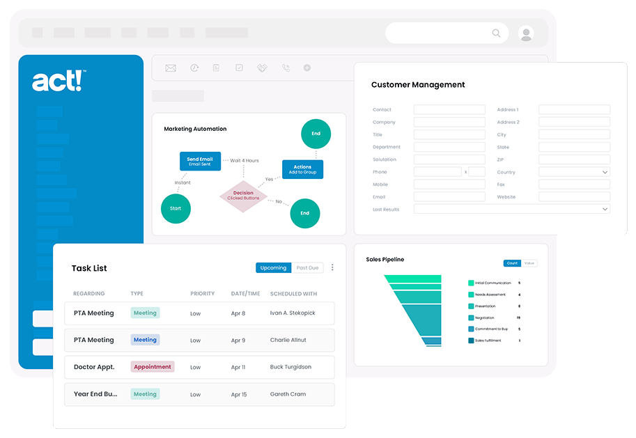
Act! offers a user-friendly interface and intuitive customization. 

However, some users complained that each new update tends to drag the software backward. Additionally, you might need help setting up custom reports and dashboards. 

Also, I can’t vouch for their support. You might struggle to reach them whenever the need arises. However, there is an extensive resource you can always fall back on for self-help.

Pricing
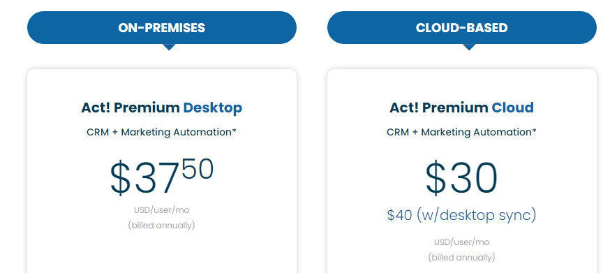
Act! offers two plans billed annually.

  • Act! Premium Desktop $37.50 per user per month
  • Act! Premium Cloud $40 per user per month

Users opting for the Premium Cloud plan pay an additional $10 monthly for desktop sync.

Strengths

  • Sales and marketing automation
  • Customer management
  • Sales pipeline visualization
  • Activity tracking
  • Advanced reporting capabilities
  • 14-day free trial
  • Live chat support
  • Flexibility and Extensibility
  • Cloud and on-premises deployment

Weaknesses

  • No mobile app
  • Limited pricing plans
  • Annual billing

21. Agile CRM

Agile CRM is one of the best CRM services in the market. It promises to help you sell and market like Fortune 500 companies. In addition, the software packs several core CRM features like sales enablement, marketing automation, and customer service.

Key Features

Sales — The CRM system can help your sales teams manage their contacts in one place, track deals to keep the sales process on track, and automate sales calls. The CRM system also lets you manage appointments and gamify sales.

Marketing — Agile CRM has an intuitive drag-and-drop builder to set up a marketing workflow and build landing pages in minutes. It also extends its CRM capabilities with social media, email, and SMS features for multichannel marketing campaigns. 

Service — The software streamlines your customer service management so that your support can focus on only tasks that matter. It also allows you to provide pre-formatted replies for faster and more consistent responses.

User Experience
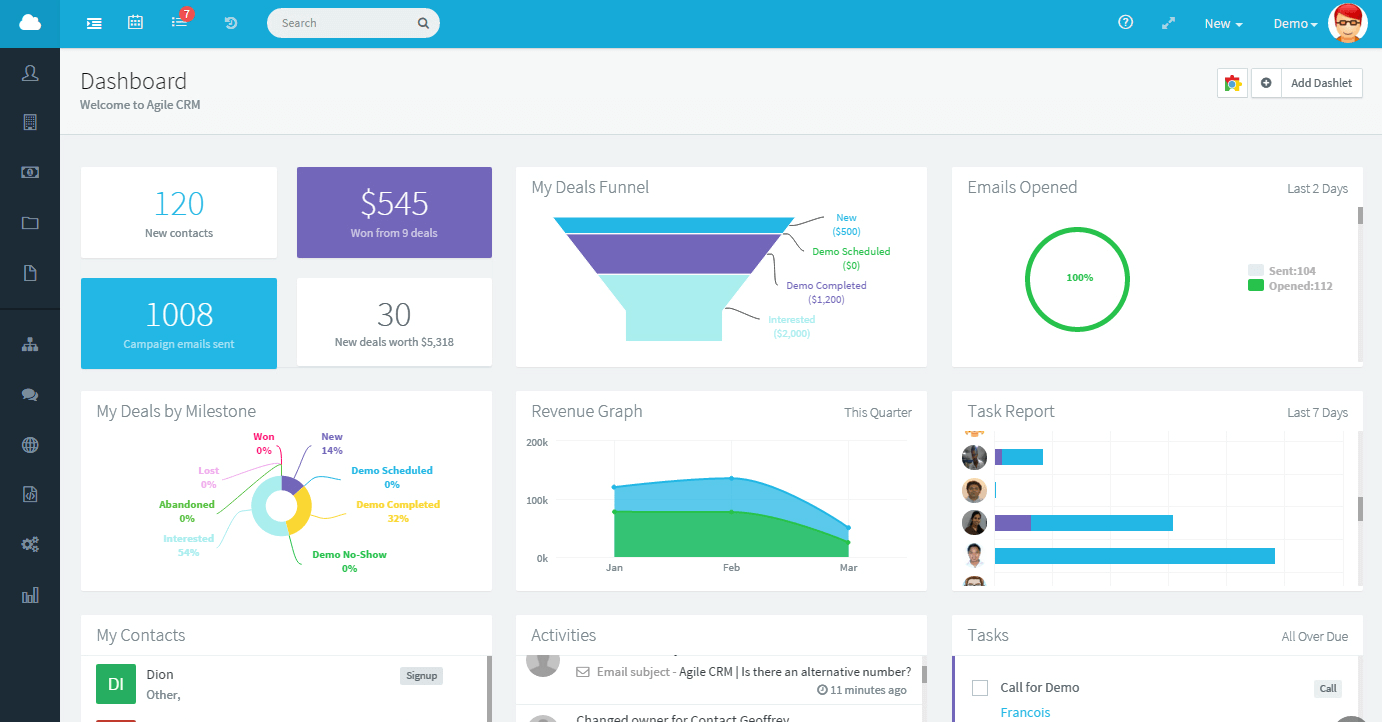
Agile CRM has a clean and intuitive dashboard. Using the features doesn’t require any learning curve. Also, the CRM software displays information in an easy-to-understand way.

The customer relationship management software has a robust knowledge base. Also, you can schedule a chat with any of their specialists within a few minutes.

Pricing
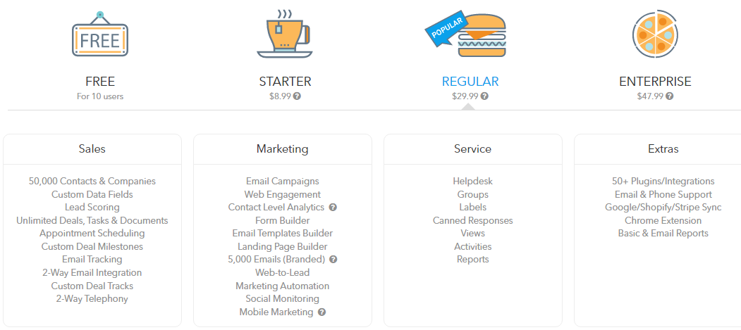
AgileCRM has free CRM software alongside three premium packages, billed monthly, yearly, and bi-annually. If you go for the bi-annual plans, you’ll pay the following:

  • Starter $8.99 per user per month
  • Regular $29.99 per user per month
  • Enterprise $47.99 per user per month

Strengths

  • Free plans with ten users
  • Yearly and bi-annual subscription plans
  • Lead management
  • Appointment scheduling
  • Two-way telephony
  • Contact management
  • Email and SMS marketing
  • Marketing automation with exit intent.
  • Social monitoring
  • Project management
  • Landing page builders
  • Chrome extension
  • Post-call automation
  • Push notification

Weaknesses

  • No mobile app
  • No live chat support

Choosing the Best CRM Software

The right CRM software providers for your business would offer you the best customer relationship management and engagement solutions. So, consider only CRM software vendors that offer you business solutions to meet your specific needs within your budget and integrate seamlessly with all your business tools.


Featured image via Unsplash.

Source

The post 21 Best CRM Software first appeared on Webdesigner Depot.

Categories: Designing, Others Tags:

Unchain My Inaccessibly-Labelled Heart

December 14th, 2022 No comments

Suzy Naschansky from the HTMHell Advent Calendar:

<h2 id="article1-heading">All About Dragons</h2>  
<p>I like dragons. Blah blah blah blah blah.</p>  
<p>
  <a id="article1-read-more" aria-labelledby="article1-read-more article1-heading">Read more</a>  
</p>  

See that aria-labelledby attribute? It chains two IDs from the markup, one for the heading (#article1-heading) and one for the link (#article1-read-more). What happens there is a screenreader will replace the existing semantic label between the link tags and use the content from both elements and announce them together as a single string of text:

Read more All About Dragons

I’m always sheepish when realizing there’s something I think I should know but don’t. This is definitely one of those cases and I’m thankful as all heck that Suzy shared it.

I was actually in a situation just recently where I could’ve should’ve done this. I always try to avoid a bunch of “Read more” links on the same page but coming up with different flavors of the same thing is tough when you’re working with something like a loop of 15 posts (even though there are resources to help). And if we need to keep labels short for aesthetic reasons — design requirements and whatnot — it’s even more challenging. The aria-labelledby attribute gives me exactly what I want: consistent visual labels and more contextual announcements for assistive tech.

And this is only a thing when the text you want to use for the accessible label already exists on the page. Otherwise, you’d want to go with aria-label and with the caveat that it’s purely for interactive elements that are unable to label things accessibly with semantic HTML.

If you are working in a CMS like WordPress (which I am), you might need to do a little extra work. Like when I drop a Button block on the page, these are the options I have to work with:

Some nice options in there, but nothing to do with accessible labelling. If you’re wondering what’s buried in that Advanced panel:

Close, but no cigar.

Instead, you’ll need to edit the button in HTML mode:

But before doing that, you gotta add an ID to the heading you want to use. The Heading block has the same Advanced panel setting for adding an anchor, which’ll inject an ID on the element:

Then you can go edit the Button block in HTML mode and add the accessible-labels ID as well as an ID for the button itself. This is an example of the edited markup:

<div class="wp-block-buttons">
  <!-- wp:button -->
  <div class="wp-block-button">
    <a id="read-more-button" aria-labelledby="read-more-button heading-accessible-labels" class="wp-block-button__link wp-element-button" href="https://webaim.org/projects/million/">
      Read Report
    </a>
  </div>
  <!-- /wp:button -->
</div>

Great! But WordPress just ain’t cool with that:

You can try to resolve the issue:

Le sigh. The Button block has to be converted to a Custom HTML block. Kinda defeats the whole visual editing thing that WordPress is so good at. I did a super quick search for a plugin that might add ARIA labelling options to certain blocks, but came up short. Seems like a ripe opportunity to make one or submit PRs for the blocks that could use those options.


Unchain My Inaccessibly-Labelled Heart originally published on CSS-Tricks, which is part of the DigitalOcean family. You should get the newsletter.

Categories: Designing, Others Tags:

Holiday Snowtacular 2022

December 13th, 2022 No comments

We’ve got ourselves a real holiday treat! Join host Alex Trost from the Frontend Horse community for the Holiday Snowtacular 2022 this Friday, December 16.

There’s a lineup of 12 awesome speakers — including Chris Coyier, Cassidy Williams, Kevin Powell, and Angie Jones — each discussing various front-end and web dev topics. It’s like the 12 days of Christmas, but wrapped up in a four-hour session for web nerds like us.

It’s a real good cause, too. The event is free, but includes fundraising Doctors Without Borders with a goal of reaching $20,000. You can donate here any time and anything you give will be matched by the event’s sponors. So, come for the front-end fun and help a great cause in the process.

To Shared LinkPermalink on CSS-Tricks


Holiday Snowtacular 2022 originally published on CSS-Tricks, which is part of the DigitalOcean family. You should get the newsletter.

Categories: Designing, Others Tags:

Understanding Privacy: Protect Your Users, Protect Yourself

December 13th, 2022 No comments

Q. Did any part of your education require you to read the building regulations?
A. No, I don’t recall, but I don’t think so.
Q. What about fire safety of building materials?
A. No.

— Witness testimony, the Grenfell Tower inquiry, day 22

As the hard copies of Understanding Privacy begin to ship all over the world, the brilliant team at Smashing, who helped me bring my book to life, have asked me to share a few thoughts on what it might achieve in the months and years to come.

I wrote the book for two broad audiences, and if you’re reading this, you probably fall into one of them. The first audience is designers, developers, and project managers already working on the open web, either professionally or in side projects. The second audience is students and future professionals in those fields, whether they are in secondary schools, undergraduate courses, vocational training, or code academies.

The reason I structured the book in the way I did is that these two audiences, and you, tend to have something in common: you’ve never received any previous training or education on positive foundational privacy, either as a concept, a legal issue, or a professional practice, either in your formal education (assuming you had any) or in your workplaces.

What you have been told about privacy, by contrast, has been defined by a lot of high-level legalese jargon, compliance scaremongering, and terrifying headlines about the surveillance society that exists around us — whether we know it or not.

That means that an entire generation of professionals like you have been introduced to privacy by being thrown into advanced legal compliance headaches or reactive fixes to the problems created by others, with no knowledge of the basic concepts and principles about what privacy actually is and how to achieve it.

I hope that Understanding Privacy can go some way towards giving people like you a confident understanding of those foundational concepts. Indeed, it’s my hope that teachers and educators will use it as the basis for a curriculum on privacy so that a healthy approach to privacy becomes baked-in from the start rather than retrofitted at the end.

That, of course, raises two further issues.

  1. The first is how teachers and educators find the book in the first place;
  2. The second is how the lessons in it reach developers (both current and future ones) who have never had a teacher and never will.

The question of how we teach privacy, what we teach, and where we teach it, has troubled me for years. That’s a hard enough problem to crack. After all, web development is an unorganized field. In fact, in the strictly legal sense, it is not a profession.

What do I mean by that? Professions are defined by industry-based organisations, common paths of entry, common educational requirements, continuing professional development, and even certifications that require refresher training every few years. Being a professional, in the strictly legal sense, means that there is a body made up of your peers who make sure that you bring a common body of knowledge to the work you put into the world and that the work you do meets externally verifiable standards.

Web development, on the other hand, is an unorganized and unstructured field that anyone can enter, at any time, with any form of formal training or with none at all, and without any external certifications or approval. A software engineer who went through a four-year bachelor’s degree program in computer science can be working on the same team, doing the same work, as a former airline pilot who learned code for fun. It’s that occupational diversity that has contributed to the growth of the open web as a whole; indeed, I find that the best teams contain people who approach their work from the diverging perspectives they gained doing something completely different.

But it also means that the knowledge of privacy that we bring to our work is, quite simply, all over the place. If that knowledge is there at all. And without a common pathway of education, whether that’s access to training and continuing professional development or work towards a standard of foundational knowledge, we will continue to bring the contrasting social, legal, and cultural differences to privacy which I discuss in Part One to the work we put into the world.

And our users will continue to pay the price for that.

As I write in the book, we can’t wait for educators, employers, and institutions to fill the gaps in our knowledge. Educating ourselves on privacy has never been more important. It pains me to know that the book is the first and only education on privacy that most of its readers will ever have, but something is better than nothing. Unfortunately, it won’t be enough.

Because the dilemma of how we teach a positive foundational approach to privacy — in an unorganized and open industry — has taken on a whole new urgency through my pivoted career into the politics of tech. And that situation is far scarier than you can imagine.

Much of my time in recent years has been spent retorting various regulatory plans for personal liability regimes in digital regulation. That means that politicians increasingly want to hold the people who make the open web legally and even criminally responsible for any misuse or unintended consequences of their work.

Some of this is born out of pressure to “do something” about the mess that the open web is today; sometimes it’s about “reining in the tech giants” (and I can tell you that politicians absolutely think Facebook is the Internet); sometimes it’s about barefaced moves for political power (hello from Brexit Britain); and sometimes it’s about cracking down on public discourse and interaction, delegating the requirement for censorship and control to the tech sector and therefore to workers like you.

Whatever reasons are behind these proposals, they are not going away. In fact, they’re only getting louder.

Many of these proposed liability regulations have been borrowed from traditional health and safety regimes. But these draft regulations, and those who support them, fail to understand that human discourse cannot be regulated as if it was fire-retardant cladding on a building that wasn’t fire-retardant at all (as I noted in the quote which began this article). By trying to shoehorn human interactions into a “risk assessment” model, these regimes risk creating an unworkable legal standard where a person who misuses a service is not deemed liable, but the person who built the service is.

These proposed liability regimes, for what it’s worth, have been drafted in a highly obsessive and vindictive manner to target a handful of high-profile American billionaires and celebrities in a handful of American big tech companies. (To be precise, these proposed regimes target three specific individuals in two companies, as if their arrests and imprisonment would fix all the problems on the Internet.) For the purposes of this discussion, those men’s guilt or complacency is neither here nor there.

That’s because, for a range of obvious reasons, once those laws are on the books, the celebrity billionaires will be able to afford to duck and dodge the charges. But because politicians insist that “something has to be done” and “someone needs to pay for this”, those laws will be used, instead, to go after the little guys and the easy targets. That means you.

What I am saying is that policymakers across all societies and cultures are turning their attention to people like you, the knowledge you bring to the table, and the work you put into the world. They’re not doing that because they want to support you into the next phase of your career. They’re doing that because they’re looking for someone to blame. They need someone to blame.

In fact, I have encountered politicians who are desperate to actually arrest, prosecute, and imprison developers, hopefully in front of the TV cameras, as punishment for the sins of their celebrity bosses. Those policymakers are in ascendancy, and they are not going away.

And when they’re looking for someone to blame for the problems on the open web today and need an easy target to take down for a quick political “win,” there you are, with no qualifications or foundational training or formal education, making things that millions of people use.

I think you see where this is going.

I wrote Understanding Privacy to contribute to a better open web, and I wrote it in the most positive and constructive tone possible (and hey, that was hard going in lockdown). But I would not be serving the people I wrote it for if I pretended that the book’s teachings exist in a happy bubble where the fixes are easy. The book’s teachings exist in a political climate where the people who make the web, including you, are now a target.

I want the book to contribute to a better standard of privacy for the people we build the web for. By reading the book, you’ll learn how to protect them in everything you do, regardless of the presence or absence of any privacy legislation. But in the political climate that exists around us all, by reading the book, you’ll learn how to protect yourself too.

In the absence of any formal curricular and educational path, workplace training, professional body, or legal standard, the book will help you to create an accountable and documented framework around privacy in your work — no matter who employs you or what you’re working on. That framework, and for that matter, the book, can’t protect you on its own. But the lessons you learn from it might just help you when the day comes that it’s you and your team in your co-working lounge, and not the celebrity billionaires and their teams in Silicon Valley, who become the target for an ambitious politician’s campaigning.

During life in lockdown, we all became familiar with the “oxygen mask” rule: secure your own mask before putting one onto someone else. In other words, you can’t support others if you’re not supporting yourself. As you use Understanding Privacy to build a better web for your users, take some time to think about the ways you can use its lessons to protect yourself, especially in light of policymakers’ obsession with getting ad-hominem revenge on Big Tech celebrities — an obsession which views you as expendable collateral damage. And as I write in Part Four, think about the developers who will come after you and what sort of world they can build if they are given a better education in foundational privacy.

Or, at the very least, given more than just one book.

Details About The Book

  • Quality hardcover, stitched binding, ribbon page marker.
  • Free worldwide shipping from Germany.
  • eBook is available as PDF, ePUB, and Amazon Kindle.
  • ISBN: 978-3-945749-64-7 (print)
  • Get the book (Print Hardcover + eBook)

<a target="_blank" href="“https://www.smashingmagazine.com/provide/eBooks/understanding-privacy/understanding-privacy-sample-chapter.pdf” title= “Tap for a large preview of the book.”>

Categories: Others Tags:

Accessible Front-End Patterns For Responsive Tables (Part 2)

December 13th, 2022 No comments

In Part 1, we explored general patterns of creating responsive and accessible tables depending on the design, use case, and data complexity. In this article, we’ll cover a few more complex and more specific examples, check out how we can improve performance on larger tables, and cover some JavaScript libraries that can further enhance tables with various functionalities like pagination, filtering, search, and others.

A quick note on accessibility before we start: The following examples lean more toward the design aspect of responsiveness compared to the previous article. I’ve used the same approach to accessibility as I did in the examples from the previous article. Still, as these are more complex and specific examples, further testing and adjustments might be required for these use cases, and I strongly encourage them.

That being said, let’s dive into the examples.

Working With Complex Enterprise Tables

Enterprise data tables display a large amount of complex data across lots of columns, and they rely on searching and filtering to quickly find the data we’re looking for. We’re not going to cover those actions in this article because they do not affect responsiveness and only serve to reduce the number of displayed rows.

The responsive patterns that we covered in the previous article won’t completely solve the UX issue here. The stacking and accordion pattern, for this case, might be too clunky for mobile use, and the scrolling pattern would make the table unusable and difficult to scan.

Lalatendu Satpathy suggests in his article about designing enterprise tables to use the stacking context but display only the critical data that the user will most likely want to search for.

Once users have found a row they were looking for, either by scanning, searching, or filtering, they can open up the details view by tapping the row.

Notice how we’re utilizing the limited screen space to the fullest extent for each operation — we’re showing as many data rows as possible, which contain only primary information, and then we are using an off-canvas element, a full-page element to display all data for a single row.

We’re using the recommended markup for the table element and ARIA labels that we’ve covered in the previous article, so let’s focus on the off-canvas element. First, let’s create a hidden off-canvas element and add empty elements where we’ll append row data for the row that has been clicked on.

<aside id="offcanvas" class="offcanvas" aria-hidden="true">
  <header class="offcanvas-header">
    <button tabindex="-1" onclick="closeOffcanvas()" aria-label="Return to table"><!-- ... --></button>
</header>
  <div><strong id="slot-1"></strong></div>
  <h1 id="slot-2"></h1>
  <dl>
    <dt>Available stock</dt>
    <dd id="slot-3"></dd>
   <!-- ... -->
  </dl>
</aside>

We’re using CSS to make sure that this element only displays on smaller viewports. On larger viewports, even though the off-canvas element could be activated, it won’t be displayed. Alternatively, we could have also used JavaScript’s match media element to prevent the function from running.

@media screen and (max-width: 1260px) {
  .offcanvas {
    display: block;
  }
}

Let’s move onto the row click handle function, which populates off-canvas element slots and applies an active class. We are populating the off-canvas slots by iterating over columns and using an index to target the id-s. Additionally, we are removing the aria-hidden attribute and moving the focus onto the element. We can also use focus trapping to prevent the user from leaving the off-canvas element while it’s opened.

function openAndPopulateAside() {
  if(offcanvas.classList.contains("offcanvas-active")) {
    return;
  }

  const row = window.event.target.closest("tr");
  const columns = Array.from(row.children);

  columns.forEach(function (child, i) {
    const id = `slot-${i + 1}`;
    document.getElementById(id).innerHTML = child.innerHTML;
  });

  offcanvas.classList.add("offcanvas-active");
  offcanvas.removeAttribute("aria-hidden",);
  offcanvas.querySelector("button").tabIndex = undefined;
  offcanvas.focus();
}

We also need to have a way to close the off-canvas element and undo the changes we applied when we activated the modal.

function closeOffcanvas() {
  offcanvas.setAttribute("aria-hidden", "true");
  offcanvas.classList.remove("offcanvas-active");
  offcanvas.querySelector("button").tabIndex = -1;
  document.getElementById("table-wrapper").focus();
}

In these examples, we’re relying on additional elements outside of tables (like our off-canvas element) to help us make full use of the available screen space to fully display table data. Check out the following CodePen example and see how these elements work together to improve table UX on smaller screens.

Comparing this to the previous example, the only primary column is the title & platform column. We cannot pick any other column to include for comparison since they are equally important and depend on user preference. Using a stacked column approach is also not an option, as we want users to compare the review scores to different games and between the review sites. This table is also too complex for a scrollable table, as both the primary column and table headers are equally important. It would take too much screen space if we used the fixed-column approach.

Let’s tackle this problem with the approach described in Joe Winter’s article. First, let’s focus on vertical scanning.

Let’s give users an option to choose the additional column they’ll use for comparison — their preferred review game review site. We’ll use a select element in this case, but tabs and other similar controls work well. We can store their preference in local storage if we want to keep track of user preferences and store it for future use.

<form>
  <label for="filter">Review site</label> 
  <select onchange="filterChange()" id="filter">
    <option value="1">GameSpot</option>
    <option value="2">IGN</option>
    <option value="3">Dexerto</option>
    <option value="4">GameInformer</option>
    <option value="5">VG247</option>
  </select>
</form>
const allBodyRows = document.querySelectorAll("tbody > tr");
const mainHeadCols = document.querySelectorAll("thead > tr:last-child > th");

function filterChange() {
  const value = parseInt(select.value);

  mainHeadCols.forEach(function (col, i) {
    const colIndex = i + 1;

    // Skip the first (primary column).
    if (i == 0) {
      return;
    }

    if (colIndex === 1 || colIndex === value + 1) {
      col.classList.remove("hidden");
    } else {
      col.classList.add("hidden");
    }
  });

  allBodyRows.forEach(function (row) {
    const cols = row.querySelectorAll("td");

    cols.forEach(function (col, i) {
      const colIndex = i + 1;

      if (colIndex === value) {
        col.classList.remove("hidden");
      } else {
        col.classList.add("hidden");
      }
    });
  });
}

Next, we’ll implement the same off-canvas element as we did in the previous example to cover the horizontal scanning, where we display all column data for a selected row.

We’ll use a very similar function and go through the same motions of opening, populating, and closing the off-canvas element.

function openAndPopulateAside() {
  const row = this.window.event.target.closest("tr");
  const columns = Array.from(row.children);

  columns.forEach(function (child, i) {
    const id = `slot-${i + 1}`;
    document.getElementById(id).innerHTML = child.innerHTML;
  });

  offcanvas.classList.add("offcanvas-active");
  offcanvas.removeAttribute("aria-hidden");
  offcanvas.querySelector("button").tabIndex = undefined;
  offcanvas.focus();
}

function closeOffcanvas() {
  offcanvas.setAttribute("aria-hidden", "true");
  offcanvas.classList.remove("offcanvas-active");
  offcanvas.querySelector("button").tabIndex = -1;
  document.getElementById("table-wrapper").focus();
}

We’ve improved upon the previous example by giving users an option to select an additional primary column alongside the “Title & Platform” so users can select which column will be used for comparison between the rows.

But what about more complex calendars used for planning and schedule? They can contain a variable amount of information within the cells, and scaling them down for mobile is not always viable.

We could either use the stacking pattern or scrolling pattern, but they’re not ideal for this calendar project. User needs to see their schedule for today and at least for the next day and have a general overview (a summary) for a wider timespan.

We can divide the large calendar app into two elements on the smaller screens:

  • List element: the schedule for today and the next day;
  • Table element: general, high-level, 5-day overview.

There are too many differences between the large screen and small screen views, so there is no smart way of using CSS to transform between the two. We need to duplicate the element and make sure to hide the inactive element with CSS. This will also hide it from screen readers and make the element not accessible with the keyboard.

<figure class="table-wrapper">
  <figcaption id="caption">
    <h1>Consultation schedule</h1>
  </figcaption>

  <table aria-labelledby="caption" class="table-full">
    <!-- ... -->
  <table>

  <ol class="list">
    <!-- ... -->
  </ol>

  <table aria-labelledby="caption" class="table-map">
    <!-- ... -->
  </table>
</figure>
@media screen and (min-width: 960px) {
  .table-map, .list {
    display: none;
  }
}

@media screen and (max-width: 959px) {
  .table-full {
    display: none;
  }
}

These two views can be easily generated with JavaScript or JavaScript frameworks like React and Svelte, but also with static HTML generators.

However, pagination is not an ideal fit for all tables and data types. Sometimes we just want to display the whole table and allow users to scroll the entire data table without restrictions or interruptions. What can we do if we need to display the whole table regardless of the number of rows and columns?

Virtualization

We can use virtualization. We keep the entire table data in memory but dynamically render table rows and columns that are currently visible to the user. We update the state while the user is scrolling and interacting with the table, all the while maintaining the illusion that every row and column is present by changing inner dimensions to compensate for missing elements.

This can be seen in the example below, where we render out only a handful of rows in DOM out of a total of 100,000 rows! Notice the inlined height style attribute on the second tr element.

The same approach can be used for large lists and various other HTML elements. There are some specialized virtualization libraries like Clusterize.js if you’re looking to implement just that in your project, but many popular JavaScript table libraries like Tabulator and component libraries support this out of the box.

If you want to read more about the effectiveness of table virtualization, Robert Cooper of Basedash published a case study on how table virtualization introduced significant improvements to their React project.

The root cause of the problem was that we were trying to render the entire table at once, even if most of the data for the table was off the screen/viewport. Also, the React code for rendering a single table cell was quite inefficient, so when we needed to render thousands of table cells on initial load, all those inefficiencies compounded. (…)

Overall, after implementing both virtualization and improvements to our table cell, we were able to speed up table load times by 4-5x in most cases and over 10x in extreme cases. All while increasing the default page size from 50 rows to 100.

Depending on the approach you choose, either by implementing virtualization yourself or by using an existing library, make sure to test if the solution is accessible for your use-case — both for keyboard navigation and for assistive devices.

CSS approach

Interestingly enough, there is a non-JS way to optimize table render performance. We can try to apply CSS contain: strict to the table element to signal that the massive table won’t affect the style or layout of any other elements on the page.

This is exactly how Johan Isaksson improved the performance (on his machine) of Google Search Console, which wasn’t using virtualization at the time, after experiencing issues browsing a table with 500 rows (which resulted in over 16,000 DOM elements being rendered).

However, this is not a universal and perfect solution, and depending on your use case, it might cause visual bugs, especially if you are dealing with a dynamic table that can be filtered, search, and reordered.

As the “strictest” of the containment values, this value should be used with careful consideration. This is due to the dimension requirements it imposes on the contained element. With these requirements, this containment value does offer the most potential performance benefits of containment.

If you are working with dynamic tables, which is often the case with enterprise data, you’d want to either use pagination or virtualization, depending on the design and use case, to create fully optimized complex data tables that perform optimally.

JavaScript Libraries For Enhancing Tables

Additional table features like searching, filtering, ordering, and others can improve table UX even on smaller screens by allowing users to easily scan the table and quickly find the information that they’re looking for. There are so many JavaScript-based solutions out there, both specialized and as part of a larger UI components library, and I’d like to highlight some of them here.

Tabulator is a zero-dependency vanilla JavaScript library for enhancing tables with a plethora of aforementioned functionalities and more. It also features separate NPM packages for React, Angular, and Vue. If you are working on a project that heavily features tables and requires lots of features and interactions, Tabulator can do a lot of heavy lifting for you.

As for the framework-specific libraries, I’ve only used react-table, which worked wonderfully on the projects I’ve worked on. It’s fully implemented with React hooks, so it’s fully customizable and doesn’t enforce any markup, design, or HTML structure.

As for table virtualization specifically, Clusterize.js is a solid vanilla JS solution that works well and has been recently updated in the last year at the time of writing. As for the framework-specific library, there is react-virtualized, but it hasn’t been updated for a while so make sure to test if it fits your use case before committing to using it on your project.

Keep in mind that you should always consult Bundlephobia to see package size and dependencies, and make sure to check out the package repository to see if the package is currently being maintained and if the issues raised are being actively addressed.

Conclusion

Creating responsive and accessible tables requires a careful and thoughtful approach, so the table remains usable even on smaller screen sizes. In this article, we’ve covered some highly specific use cases and approaches like an enterprise data table and a calendar. Large & complex data tables may introduce performance issues due to the DOM tree growing too large, so we need to use either pagination or table virtualization to avoid the potential issues. In conclusion, make sure that, regardless of the design and use case, your tables are responsive, usable, accessible, and performant on various types of devices and screen sizes.

References

Categories: Others Tags:

A Few Times Container Size Queries Would Have Helped Me Out

December 13th, 2022 No comments
A four-by-three grid of card elements as a grayscale mockup.

CSS Container Queries are still gaining traction and many of us are getting our hands wet with them, even if it’s for little experiments or whatnot. They’ve got great, but not quite full, browser support — enough to justify using them in some projects, but maybe not to the extent where we might be tempted to start replacing media queries from past projects with shiny new container size queries.

They sure are handy though! In fact, I’ve already run into a few situations where I really wanted to reach for them but just couldn’t overcome the support requirements. If I had been able to use them, this is how it would have looked in those situations.

All of the following demos will be best viewed in Chrome or Safari at the time of this writing. Firefox plans to ship support in Version 109.

Case 1: Card grid

You kind of had to expect this one, right? It’s such a common pattern that all of us seem to run into it at some point. But the fact is that container size queries would have been a huge time-saver for me with a better outcome had I been able to use them over standard media queries.

Let’s say you’ve been tasked with building this card grid with the requirement that each card needs to keep it’s 1:1 aspect ratio:

It’s tougher than it looks! The problem is that sizing a component’s contents on the viewport’s width leaves you at the mercy of how the component responds to the viewport — as well the way any other ancestor containers respond to it. If, for example, you want the font size of a card heading to reduce when the card hits a certain inline size there’s no reliable way to do it.

You could set the font size in vw units, I suppose, but the component is still tied to the browser’s viewport width. And that can cause problems when the card grid is used other in contexts that may not have the same breakpoints.

In my real-world project, I landed on a JavaScript approach that would:

  1. Listen for a resize event.
  2. Calculate the width of each card.
  3. Add an inline font size to each card based on its width.
  4. Style everything inside using em units.

Seems like a lot of work, right? But it is a stable solution to get the required scaling across different screen sizes in different contexts.

Container queries would have been so much better because they provide us with container query units, such as the cqw unit. You probably already get it, but 1cqw is equal to 1% of a container’s width. We also have the cqi unit that’s a measure of a container’s inline width, and cqb for a container’s block width. So, if we have a card container that is 500px wide, a 50cqw value computes to 250px.

If I had been able to use container queries in my card grid, I could have set up the .card component as a container:

.card { 
  container: card / size;
}

Then I could have set an inner wrapper with padding that scales at 10% of the .card‘s width using the cqw unit:

.card__inner { 
  padding: 10cqw; 
} 

That’s a nice way to scale the spacing between the card’s edges and its contents consistently no matter where the card is used at any given viewport width. No media queries required!

Another idea? Use cqw units for the font size of the inner contents, then apply padding in em units:

.card__inner { 
  font-size: 5cqw; 
  padding: 2em;
} 

5cqw is an arbitrary value — just one that I settled on. That padding is still equal to 10cqw since the em unit is relative to the .card__inner font size!

Did you catch that? The 2em is relative to the 5cqw font size that is set on the same container. Containers work different than what we’re used to, as em units are relative to the same element’s font-size value. But what I quickly noticed is that container query units relate to the nearest parent that is also a container.

For example, 5cqw does not scale based on the .card element’s width in this example:

.card { 
  container: card / size; 
  container-name: card; 
  font-size: 5cqw; 
}

Rather, it scales to whatever the nearest parent that’s defined as a container. That’s why I set up a .card__inner wrapper.

CodePen Embed Fallback

Case 2: Alternating layout

I needed yet another card component in a different project. This time, I needed the card to transition from a landscape layout to a portrait layout… then back to landscape, and back to portrait again as the screen gets smaller.

Showing four states of a card element changing between portrait and landscape layouts at various breakpoints.

I did the dirty work of making this component go to portrait at those two specific viewport ranges (shout out to the new media query range syntax!), but again, the problem is that it is then locked to the media queries set on it, its parent, and anything else that might respond to the viewport’s width. We want something that works in any condition without worrying about wondering where the content is going to break!

Container queries would have made this a breeze, thanks to the @container rule:

.info-card {
  container-type: inline-size;
  container-name: info-card;
}

@container info-card (max-width: 500px) {
  .info-card__inner {
    flex-direction: column;
  }
}

One query, infinite fluidity:

CodePen Embed Fallback

But hold on! There’s something you might want to watch out for. Specifically, it could be difficult to use a container query like this within a prop-based design system. For example, this .info-card component could contain child components that rely on props to change their appearance.

Why’s that a big deal? The card’s portrait layout might require the alternate styling but you can’t change JavaScript props with CSS. As such, you risk duplicating the required styles. I actually touched on this and how to work around it in another article. If you need to use container queries for a significant amount of your styling, then you may need to base your entire design system around them rather than trying to shoehorn them into an existing design system that’s heavy on media queries.

Case 3: SVG strokes

Here’s another super common pattern I’ve recently used where container size queries would have resulted in a more polished product. Say you have an icon locked up with a heading:

<h2>
  <svg>
    <!-- SVG stuff -->
  </svg> 
  Heading
</h2>

It’s pretty straightforward to scale the icon with the title’s size, even without media queries. The problem, though, is that the SVG’s stroke-width might get too thin to be noticed all that well at a smaller size, and perhaps catch too much attention with a super thick stroke at a larger size.

I’ve had to create and apply classes to each icon instance to determine its size and stroke width. That’s OK if the icon is next to a heading that’s styled with a fixed font size, I guess, but it’s not so great when working with fluid type that constantly changes.

A lockup of a hexagon icon and heading at three different sizes, from large to small.

The heading’s font size might be based on the viewport’s width, so the SVG icon needs to adjust accordingly where its stroke works at any size. You could make the stroke width relative to the heading’s font-size by setting it in em units. But if you have a specific set of stroke sizes that you need to stick to, then this wouldn’t work because it otherwise scales linearly — there’s no way to adjust it to a specific stroke-width value at certain points without resorting to media queries on the viewport width.

But here’s what I would have done if I had the luxury of container queries at that time:

.icon {
  container: icon / size; 
  width: 1em; 
  height: 1em; 
}

.icon svg {
  width: 100%; 
  height: 100%; 
  fill: none; 
  stroke: #ccc; 
  stroke-width: 0.8; 
}

@container icon (max-width: 70px) {
  .icon svg {
    stroke-width: 1.5; 
  }
}
@container icon (max-width: 35px) {
  .icon svg {
    stroke-width: 3;
  }
}

Compare the implementations and see how the container query version snaps the SVG’s stroke to the specific widths I want based on the container’s width.

CodePen Embed Fallback

Bonus: Other types of container size queries

OK, so I haven’t actually run into this on a real project. But as I was combing through information on container queries, I noticed that there are additional things we can query on a container that are related to the container’s size or physical dimensions.

Most examples I’ve seen query the width, max-width, and min-width, height, block-size, and inline-size as I’ve been doing throughout this article.

@container info-card (max-width: 500px) {
  .info-card__inner {
    flex-direction: column;
  }
}

But MDN outlines two more things we can query against. One is orientation which makes perfect sense because we use it all the time in media queries. It’s no different with container queries:

@media screen (orientation: landscape) { 
  .info-card__inner {
    /* Style away! */
  }
} 

@container info-card (orientation: landscape) { 
  .info-card__inner {
    /* Style away! */
  }
} 

The other? It’s aspect-ratio, believe it or not:

@container info-card (aspect-ratio: 3/2) { 
  .info-card__inner {
    /* Style away! */
  }
} 

Here’s an editable demo to play around with both examples:

CodePen Embed Fallback

I haven’t really found a good use case for either of these yet. If you have any ideas or feel like it could’ve helped you in your projects, let me know in the comments!


A Few Times Container Size Queries Would Have Helped Me Out originally published on CSS-Tricks, which is part of the DigitalOcean family. You should get the newsletter.

Categories: Designing, Others Tags: