Archive

Archive for December, 2022

Setting up a screen reader testing environment on your computer

December 12th, 2022 No comments

Sara Soueidan with everything you need, from what screen reading options are out there all the way to setting up virtual machines for them, installing them, and confguring keyboard options. It’s truly a one-stop reference that pulls together disparate tips for getting the most out of your screen reading accessibility testing.

Thanks, Sara, for putting together this guide, and especially doing so while making no judgments or assumptions about what someone may or may not know about accessibility testing. The guide is just one part of Sara’s forthcoming Practical Accessibility course, which is available for pre-order.

To Shared LinkPermalink on CSS-Tricks


Setting up a screen reader testing environment on your computer originally published on CSS-Tricks, which is part of the DigitalOcean family. You should get the newsletter.

Categories: Designing, Others Tags:

50 Best Websites of 2022

December 12th, 2022 No comments

We’ve seen some incredible websites in 2022. There have been more than the usual number of sites with a political mission, and plenty that made us want to travel. The big design trends were brutalism, huge typography, and bold positive color. We’re looking forward to what the web will bring in 2023, but in the meantime, take a look back at the best 50 websites of 2022. Enjoy!

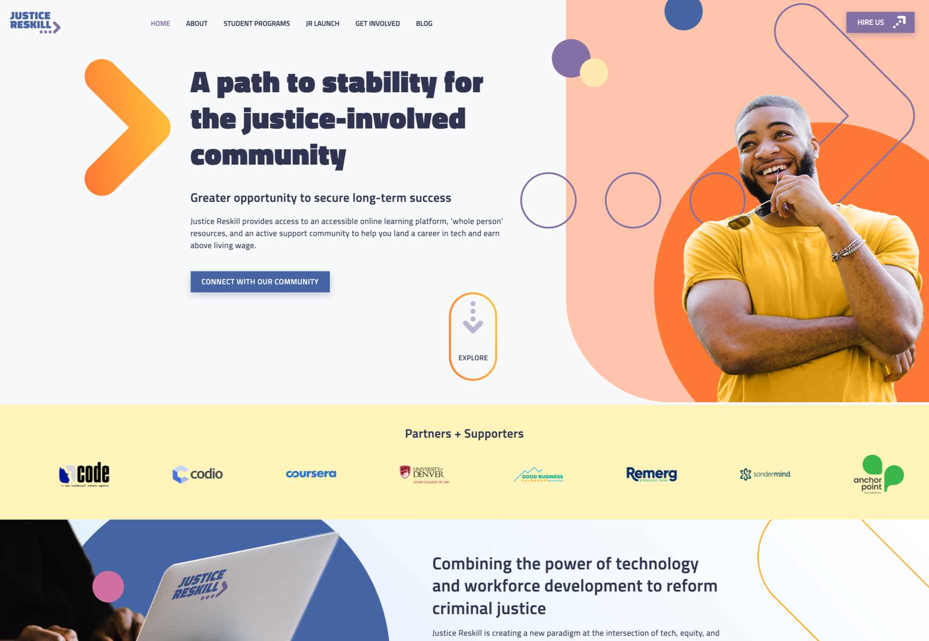
Justice Reskill

Justice Reskill used bright colors and positive, uplifting artwork to create a supportive platform for people who’ve been through the justice system.

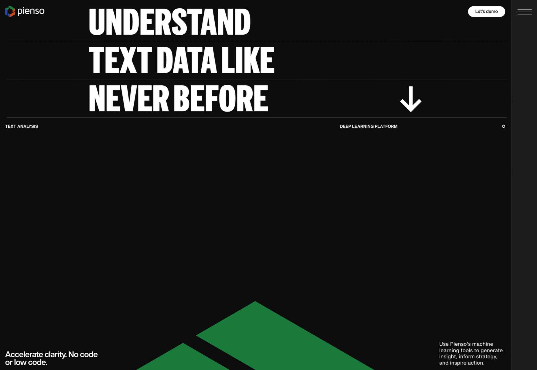
Pienso

Bold type and plenty of on-scroll animation made this site for Pienso stand out back in January.

Gazelle No.1

The promotional site for Gazelle No.1 used innovative scroll-activated video to sell the electric bike.

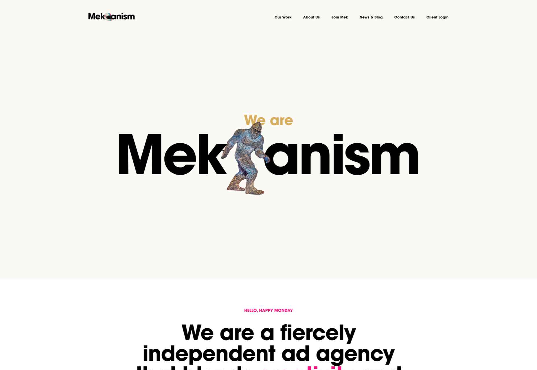
Mekanism

Mekanism’s site was the first agency redesign to impress us in 2022. Super-polished then, super-polished now.

Redbrick

Redbrick was well ahead of the trend for brutalism with a twist when it released this site promoting its coffee.

SOS Foods

Ethical and sustainable goods were top of the sales charts in 2022, and SOS Foods did a great job capitalizing on the style.

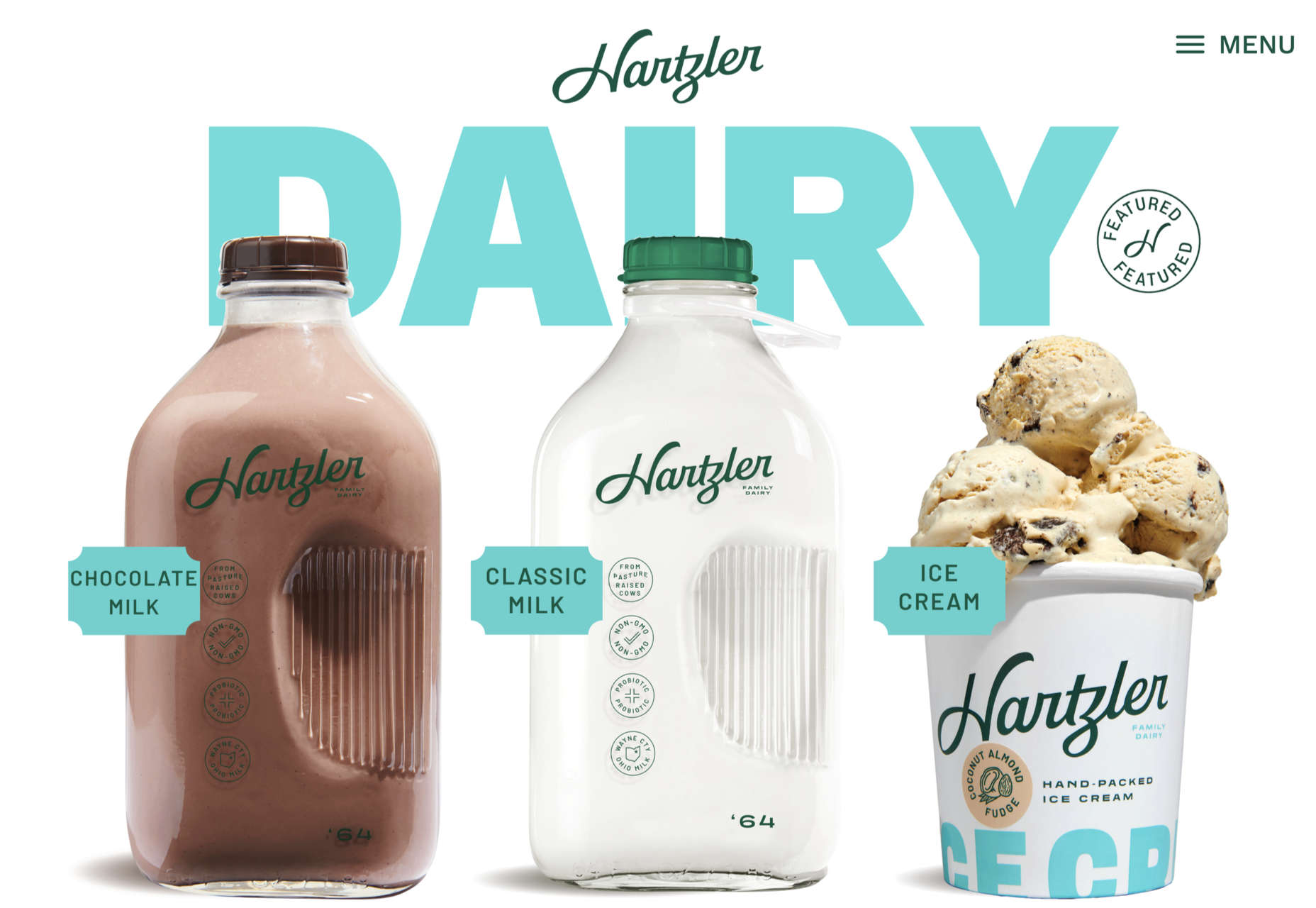
Hartzler Dairy

Hartzler Dairy embraced its mid-20th-century branding with a nostalgia-infused site.

Engineered Floors

Even in 2022, designers are still paying mobile short shrift, but this site for Engineered Floors is excellent on mobile.

Emi Ozaki

We loved the quirkiness of Emi Ozaki’s phone-style interface for her portfolio back in February.

I Killed A Cactus

I Killed A Cactus is a beautiful 3D site designed to help people care for houseplants.

Aris Hotel

We were tempted in the direction of Crete by this stunning luxury site for Aris Hotel on the island.

Milton Textiles

Milton Textiles is a big, bold site for a product that is usually an afterthought in the interior design world.

MAAP

The site for MAAP is predictably excellent, modern, and efficient. It encapsulated the apparel brand’s values perfectly.

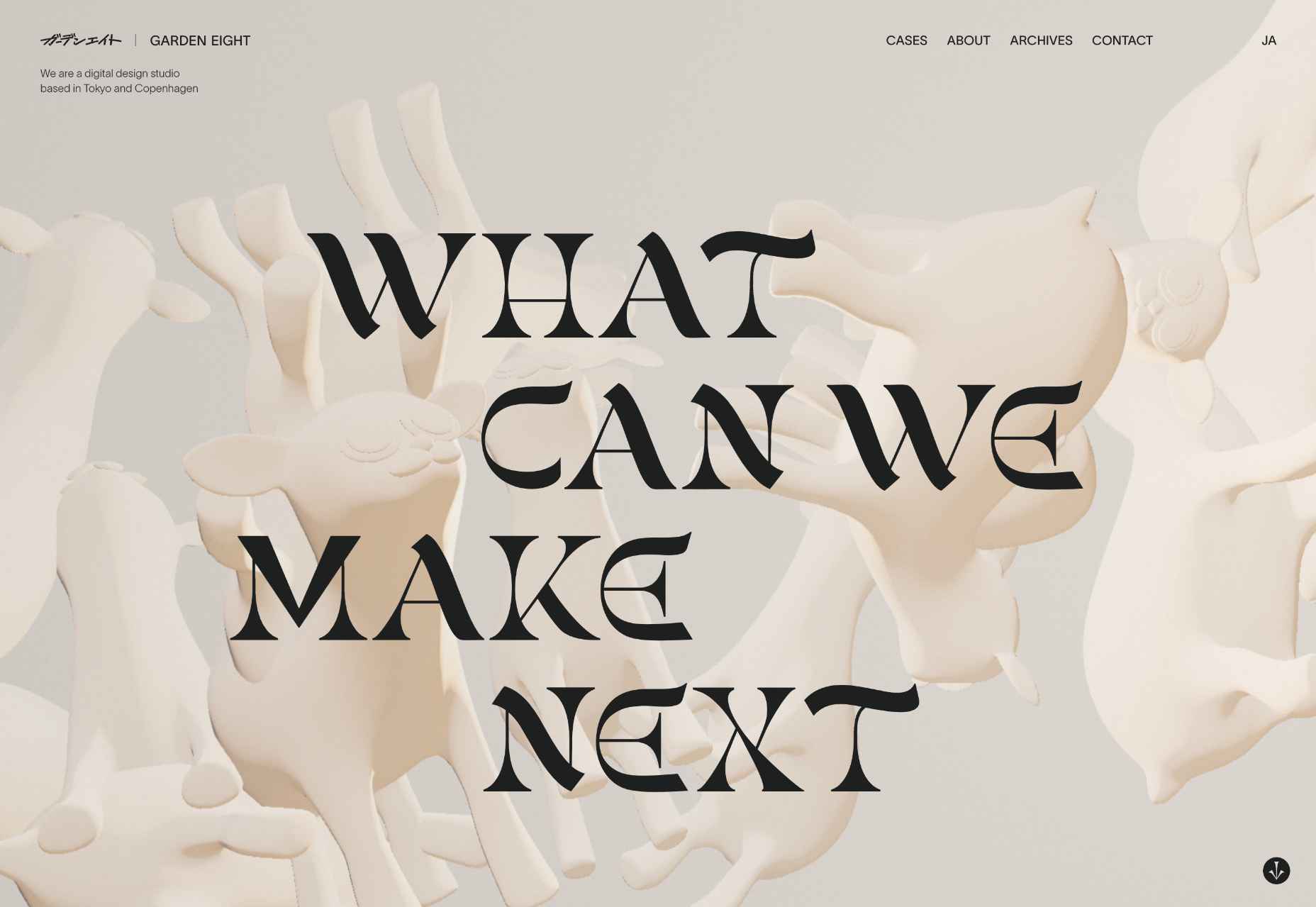
Garden Eight

The promotional site for Garden Eight, a digital design studio in Tokyo and Copenhagen, was suitably standout eccentric.

Circus Shanghai

Circus Shanghai used a mid-century illustration style to reference the solar system and the Chinese flag.

Normand

Normand took the bold decision to step away from the typical law firm design strategy.

SND

Designing a site for UI sound kits is challenging, but SND pulled it off perfectly with this minimal site.

Polybion

We saw lots of brutalism in 2022, and Polybion’s site was a standout example of how to make the trend work.

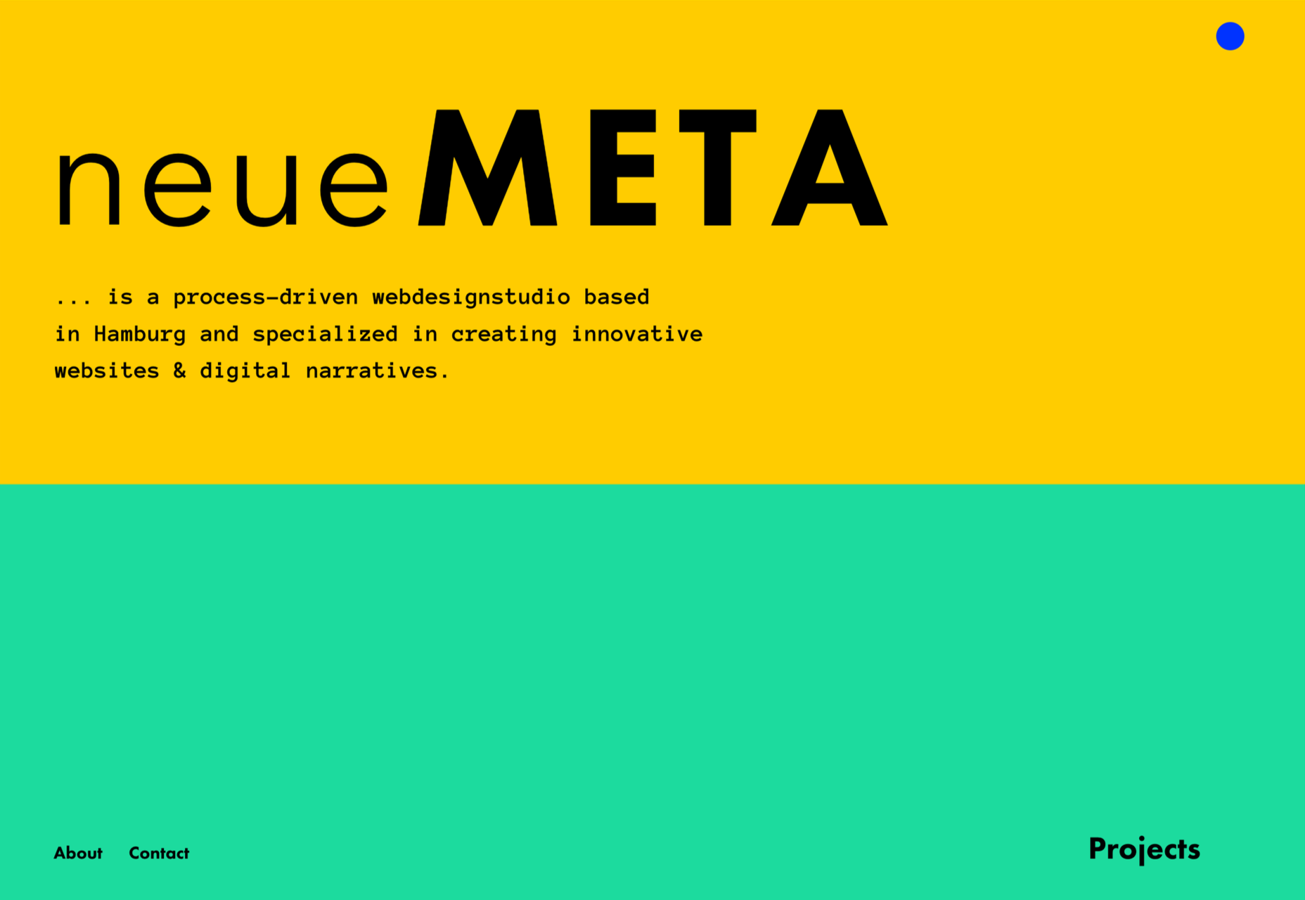
neueMeta

Bold block coloring added depth and interest to this portfolio site for design studio neueMeta.

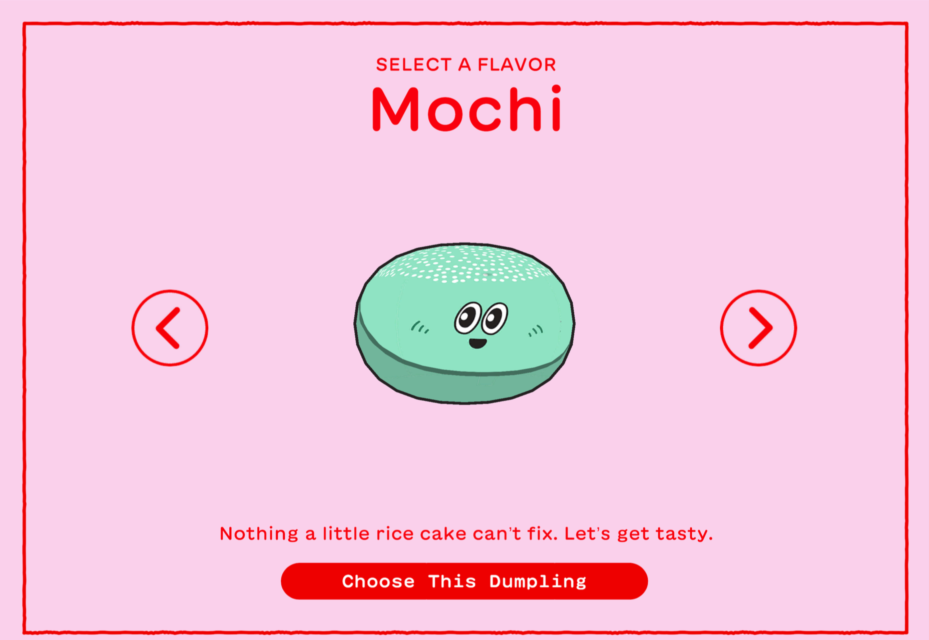
Dumpling Delivery

OK, we confess we spent waaay too much time playing this dumpling delivery game from Mailchimp back in May.

Nowhere Bakery

Nowhere Bakery succeeded in making vegan, paleo, gluten-free cookies seem appealing.

Triniti

We were mesmerized by the perpetual motion video for the pan-Baltic law firm Triniti.

Kim Kniepp

Kim Kniepp’s site impressed us with interconnected navigation and a superbly coded masonry grid.

Feed The 300

Feed The 300 is one of dozens of great sites to combat Russia’s invasion of Ukraine. In this case, it was aimed at feeding zoo animals.

Icons By Menu

Icons By Menu is a stunning minimalist site that is a pleasure to browse.

Museum Of Pink Art

The Museum of Pink Art is an immersive experience celebrating the color pink. It was easy to lose hours wandering around.

BelArosa Chalet

2022 was the year of illustrations, and BelArosa Chalet’s site used them to significant effect to sell a venue still under construction.

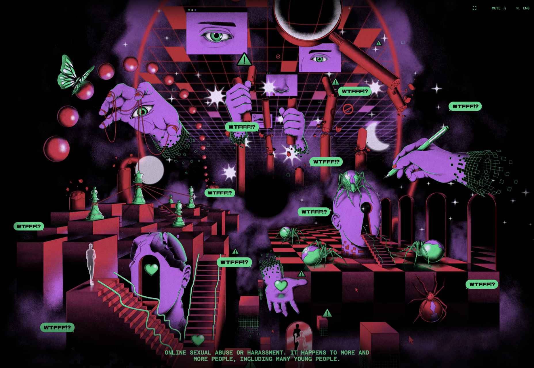
WTFFF

Online sexual abuse and harassment are particularly appalling when directed at young people. WTFFF tackled the issue sensitively.

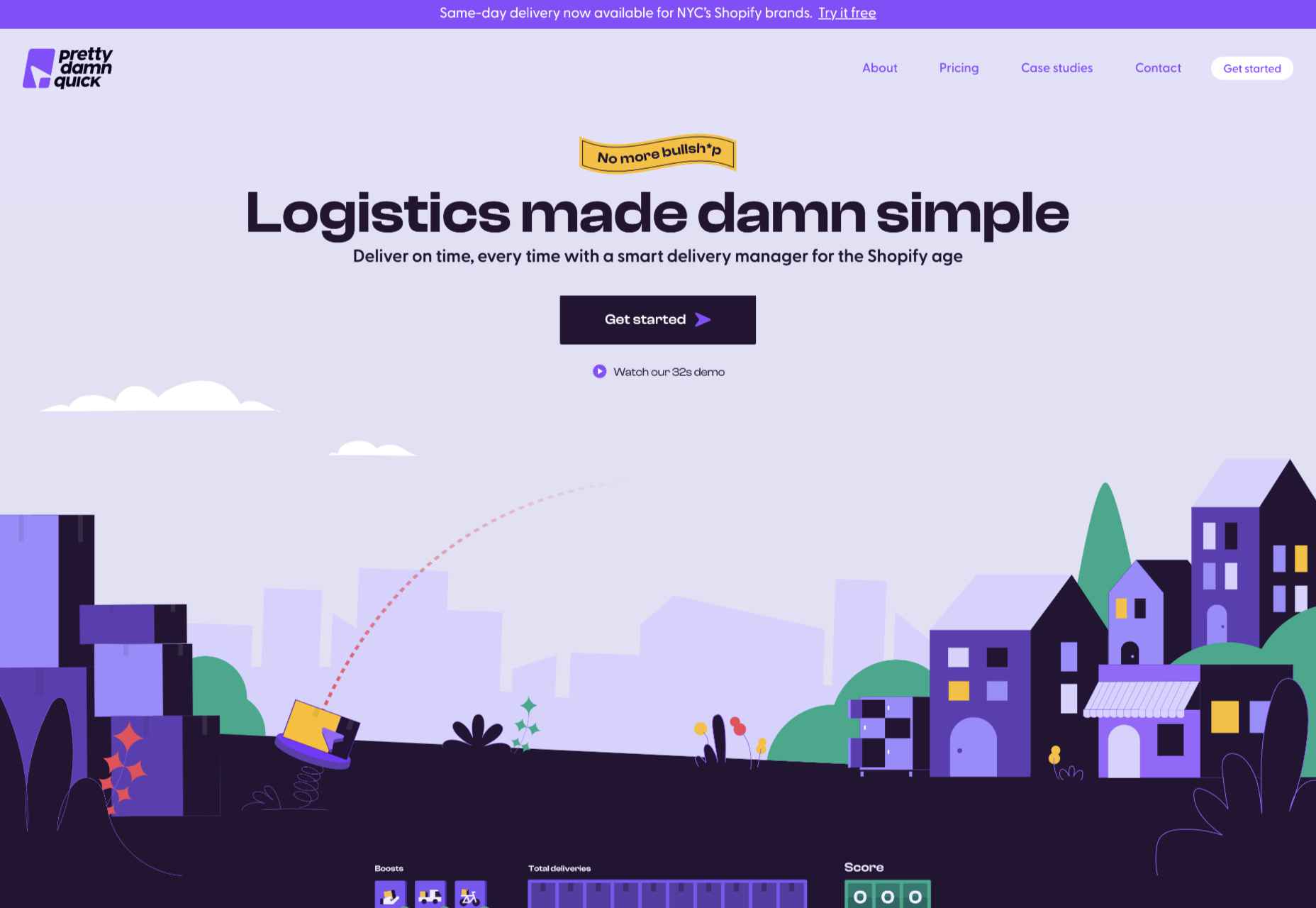
Pretty Damn Quick

Logistics aren’t the most engaging topic, but this friendly, illustrated site for Pretty Damn Quick grabbed us immediately.

Norwegian Soda Co.

This site for the Norwegian Soda Co. uses beautiful photography to create an engaging one-page site.

Fornasetti Profumi

Fornasetti Profumi wowed us with its long-form videos used to emphasize stillness and calm.

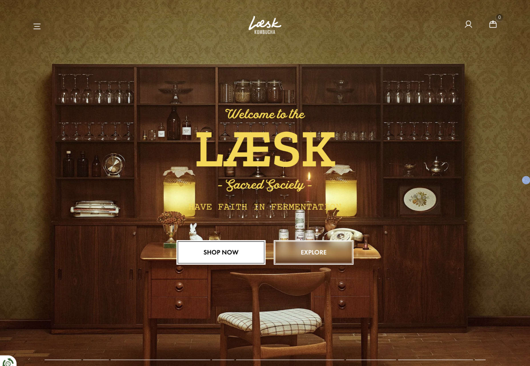
Laesk Kombucha

We were convinced this site for Laesk Kombucha had been produced by Wes Anderson.

Cased In Time

Single-product sites are often underwhelming, but this excellent ecommerce site bucks that trend.

DS & Durga

Eschewing the well-trod approach of flowers and pretty models, this perfume site for DS & Durga fully embraces the brutalist trend.

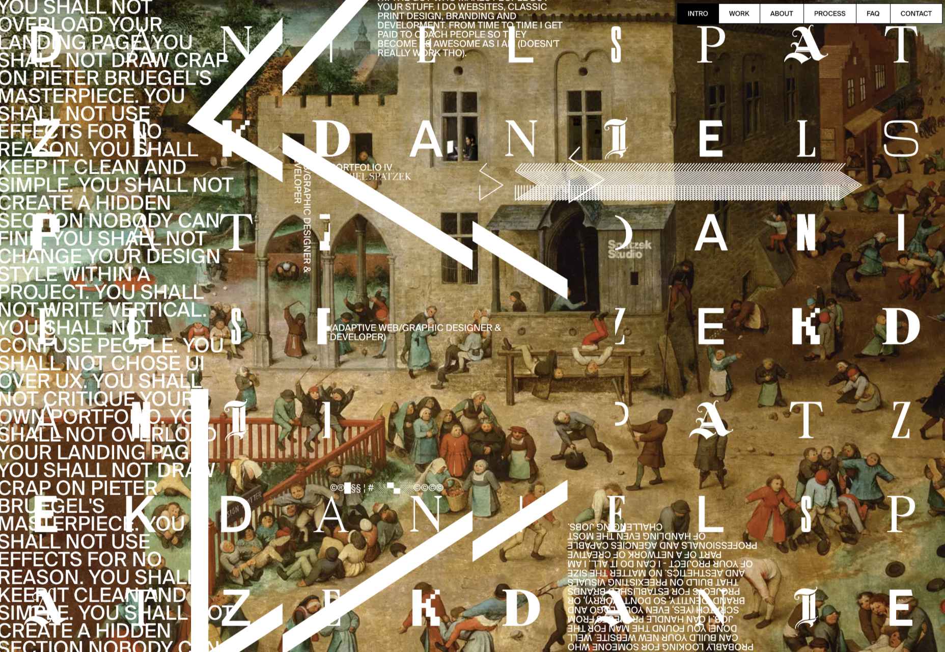
Daniel Spatzek

We loved the way Daniel Spatzek’s portfolio site broke all the rules and still managed to be informative and engaging.

Aro

Aro kept minimalism alive with a simple site that exudes luxury while selling a simple concept.

Think Packaging

Think Packaging took a case study approach to present its products, and it worked really well.

Steffie de Leeuw

Giant typography intertwined with botanical illustrations created a memorable site for Steffie de Leeuw.

Anna Jóna

The prelaunch teaser site for the Ana Jóna café and cinema was elegant and modern and had us eyeing a long weekend in Reykjavik.

Das Salz

More wanderlust courtesy of the fresh, enticing site for the Das Salz hotel and café.

Jono Pandolfi

This simple-to-use site for US tableware and cookware brand Jono Pandolfi sold us on hand-made ceramics.

LolaVie

We still can’t get over the fact that it took until 2022 for Jennifer Aniston to produce a haircare range.

Nathan Riley

Another big trend in 2022 was masonry-style sites, and this portfolio for Nathan Riley was one of our favorites.

Capsul’in Pro

With the excellent application of animation and careful use of color, this site for Capsul’in Pro transformed coffee pods into luxury items.

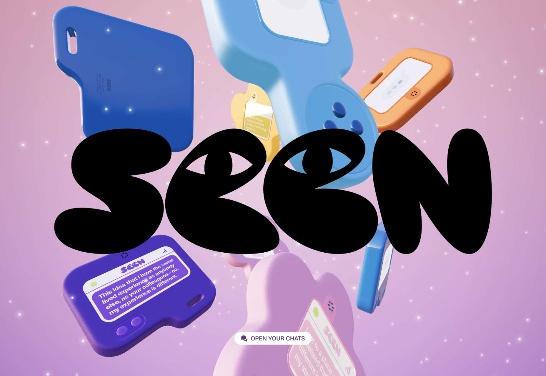
Seen

Seen is an essential site that explores themes of prejudice and racism in creative fields. It’s a strong approach to a difficult subject.

Glasfurd & Walker

Glasfurd and Walker’s superb portfolio site sets itself apart by over-extending the viewport. It’s a highly original idea.

The Other Side Of Truth

The Other Side of Truth is the standout site of 2022. It used the web expertly to present two interpretations of the facts surrounding the Russian invasion of Ukraine.

Bannach

Back in October, we fell in love with the pixel-block animation loading for the Bannach furniture brand.

Karina Sirqueira

Karina Sirqueira’s portfolio was a joy to browse through. The morphing shapes imposed simplicity on a series of beautifully presented case studies.

Joshua’s World

We were amazed by Joshua’s World, a little island that can be titled and rotated to power the little cyclist along his career.

Source

The post 50 Best Websites of 2022 first appeared on Webdesigner Depot.

Categories: Designing, Others Tags:

Saving Settings for a Custom WordPress Block in the Block Editor

December 12th, 2022 No comments
The block added to a post in the block editor with DevTools open showing the saved attributes.

Look closer at that screenshot. The values are stored in attributes.settings. We are able to see it happen live because React re-renders every time we make a change in the settings, thanks to the useState() hook.

Displaying the values in the blocks settings UI

It isn’t very useful to store the setting values in the control options themselves since each one is dependent on the other setting value (e.g. rankings by league depends on which season is selected). But it is very useful in situations where the settings values are static and where settings are independent of each other.

Without making the current settings complicated, we can create another section inside the settings panel that shows the current attributes. You can choose your way to display the settings values but I am going to import a Tip component from the @wordpress/components package:

// LeagueSettings.js
import { Tip } from "@wordpress/components";

While I’m here, I am going to do a conditional check for the values before displaying them inside the Tip component:

<Tip>
  {country && league && season && (
    <>
      <h2>Current Settings: </h2>
      <div className="current-settings">
        <div className="country">
          Country: {attributes.settings.country}
        </div>
        <div className="league">
          League: {attributes.settings.league}
        </div>
        <div className="season">
          Season: {attributes.settings.season}
        </div>
      </div>
    </>
  )}
</Tip>

Here’s how that winds up working in the block editor:

API data is more powerful when live data can be shown without having to manually update them each and every time. We will look into that in the next installment of this series.


We’ve accomplished a bunch of stuff in this series! We created a custom WordPress block that fetches data from an external API and renders it on the front end. Then we took that work and extended it so the data also renders directly in the WordPress block editor. After that, we created a settings UI for the block using components from the WordPress InspectorControls package.

There’s one last bit for us to cover and that’s saving the settings options. If we recall from the last article, we’re technically able to “save” our selections in the block settings UI, but those aren’t actually stored anywhere. If we make a few selections, save them, then return to the post, the settings are completely reset.

Let’s close the loop and save those settings so they persist the next time we edit a post that contains our custom block!

Working With External APIs in WordPress Blocks

Saving settings attributes

We’re working with an API that provides us with soccer football team ranking and we’re using it to fetch for displaying rankings based on country, league, and season. We can create new attributes for each of those like this:

// index.js

attributes: {
  data: {
    type: "object",
  },
  settings: {
    type: "object",
    default: {
      country: {
        type: "string",
      },
      league: {
        type: "string",
      },
      season: {
        type: "string",
      },
    },
  },
},

Next, we need to set the attributes from LeagueSettings.js. Whenever a ComboboxControl is updated in our settings UI, we need to set the attributes using the setAttributes() method. This was more straightfoward when we were only working with one data endpoint. But now that we have multiple inputs, it’s a little more involved.

This is how I am going to organize it. I am going to create a new object in LeagueSettings.js that follows the structure of the settings attributes and their values.

// LeagueSettings.js

let localSettings = {
  country: attributes.settings.country,
  league: attributes.settings.league,
  season: attributes.settings.season,
};

I am also going to change the initial state variables from null to the respective settings variables.

// LeagueSettings.js

const [country, setCountry] = useState(attributes.settings.country);
const [league, setLeague] = useState(attributes.settings.league);
const [season, setSeason] = useState(attributes.settings.season);

In each of the handle______Change(), I am going to create a setLocalAttributes() that has an argument that clones and overwrites the previous localSettings object with the new country, league, and season values. This is done using the help of the spread operator.

// LeagueSettings.js

function handleCountryChange(value) {
  // Initial code
  setLocalAttributes({ ...localSettings, country: value });
  // Rest of the code
}

function handleLeagueChange(value) {
  // Initial code
  setLocalAttributes({ ...localSettings, league: value });
  // Rest of the code
}

function handleSeasonChange(value) {
  // Initial code
  setLocalAttributes({ ...localSettings, season: value });
  // Rest of the code
}

We can define the setLocalAttributes() like this:

// LeagueSettings.js

function setLocalAttributes(value) {
  let newSettings = Object.assign(localSettings, value);
  localSettings = { ...newSettings };
  setAttributes({ settings: localSettings });
}

So, we’re using Object.assign() to merge the two objects. Then we can clone the newSettings object back to localSettings because we also need to account for each settings attribute when there a new selection is made and a change occurs.

Finally, we can use the setAttributes() as we do normally to set the final object. You can confirm if the above attributes are changing by updating the selections in the UI.

Another way to confirm is to do a console.log() in DevTools to find the attributes.

Look closer at that screenshot. The values are stored in attributes.settings. We are able to see it happen live because React re-renders every time we make a change in the settings, thanks to the useState() hook.

Displaying the values in the blocks settings UI

It isn’t very useful to store the setting values in the control options themselves since each one is dependent on the other setting value (e.g. rankings by league depends on which season is selected). But it is very useful in situations where the settings values are static and where settings are independent of each other.

Without making the current settings complicated, we can create another section inside the settings panel that shows the current attributes. You can choose your way to display the settings values but I am going to import a Tip component from the @wordpress/components package:

// LeagueSettings.js
import { Tip } from "@wordpress/components";

While I’m here, I am going to do a conditional check for the values before displaying them inside the Tip component:

<Tip>
  {country && league && season && (
    <>
      <h2>Current Settings: </h2>
      <div className="current-settings">
        <div className="country">
          Country: {attributes.settings.country}
        </div>
        <div className="league">
          League: {attributes.settings.league}
        </div>
        <div className="season">
          Season: {attributes.settings.season}
        </div>
      </div>
    </>
  )}
</Tip>

Here’s how that winds up working in the block editor:

API data is more powerful when live data can be shown without having to manually update them each and every time. We will look into that in the next installment of this series.


Saving Settings for a Custom WordPress Block in the Block Editor originally published on CSS-Tricks, which is part of the DigitalOcean family. You should get the newsletter.

Categories: Designing, Others Tags:

The Future Of Design: Human-Powered Or AI-Driven?

December 12th, 2022 No comments

This article is a sponsored by STUDIO

For years, reports have been warning of technology taking away jobs, particularly in fields like food preparation, truck driving, and warehouse operations. These jobs are often considered “blue-collar” and involve repetitive manual labor. However, many in the creative community believed their careers were immune to automation. After all, a designer’s craft is anything but monotonous. While computers can crunch numbers quickly, how are they going to be able to design?

Then something surprising happened: Artificial intelligence (AI) made inroads into the design. In product design, Mattel is using AI technology for product design. In interior design, designers are creating mockups with AI that can detect floors, walls, and furniture and change them. In graphic design, Nestle used an AI-retouched Vermeer painting in marketing to sell one of its yogurt brands. Advertising agency BBDO is experimenting with producing materials with Stable Diffusion.

But how about fields with a distinctly defined medium, like web design? Turning the focus to web design, this article will provide a brief history of AI in web design, explore its current implications for creativity, and offer suggestions for how web designers can stay ahead of the curve.

The Road Leading Here

AI’s capabilities outlined are a result of development dating fifty years ago and have rapidly accelerated in recent years with advanced computation models, additional training data that goes into improving the models, and improved computing power to run the models.

In 1950, Alan Turing, known as the Father of modern computer science, asked the famous question: Can machines think? Research began by attempting to teach machines human knowledge with declarative rules, which eventually proved to be difficult given the many implicit rules in our daily lives.

In the 90s, the above knowledge-feeding approach transitioned to a data-driven approach. Scientists began creating programs for computers to learn from large amounts of data with neural network architectures, much as how a human brain functions. This shift accelerated progress, producing breakthroughs, including IBM’s Deep Blue beating the world champion at chess in 1997, and Google Brain’s deep neural network learning to discover and categorize objects.

Recently, advancements in neural network model sophistication, data availability, and computing power further accelerated machines’ capabilities. In 2014, Ian Goodfellow created the first generative adversarial neural network, which allowed machines to generate new data with the same statistics as the original data set. This discovery readies the stage for AI models like DALL·E 2, StableDiffusion, and MidJourney in 2022, which demonstrate original creations abilities outlined at the beginning of the article.

Next, we will explore the implications of these technologies for web designers.

Today’s Implications

Today, designers and clients typically go through six stages together before arriving at a new website. The term “client” is used loosely and can refer to inter-departmental teams working on in-house websites or the individual responsible for building a website on their own.

  • Forming
    The designer works with the client to assess the context for a website design.
  • Defining
    The designer extracts the complete set of requirements and drafts a project plan to meet expectations.
  • Ideating
    The designer generates tailored ideas meeting the requirements.
  • Socializing
    The designer presents the ideas to the client and supports in choosing one to proceed.
  • Implementing
    The designer creates high-fidelity designs, which are then turned into code for deploying.

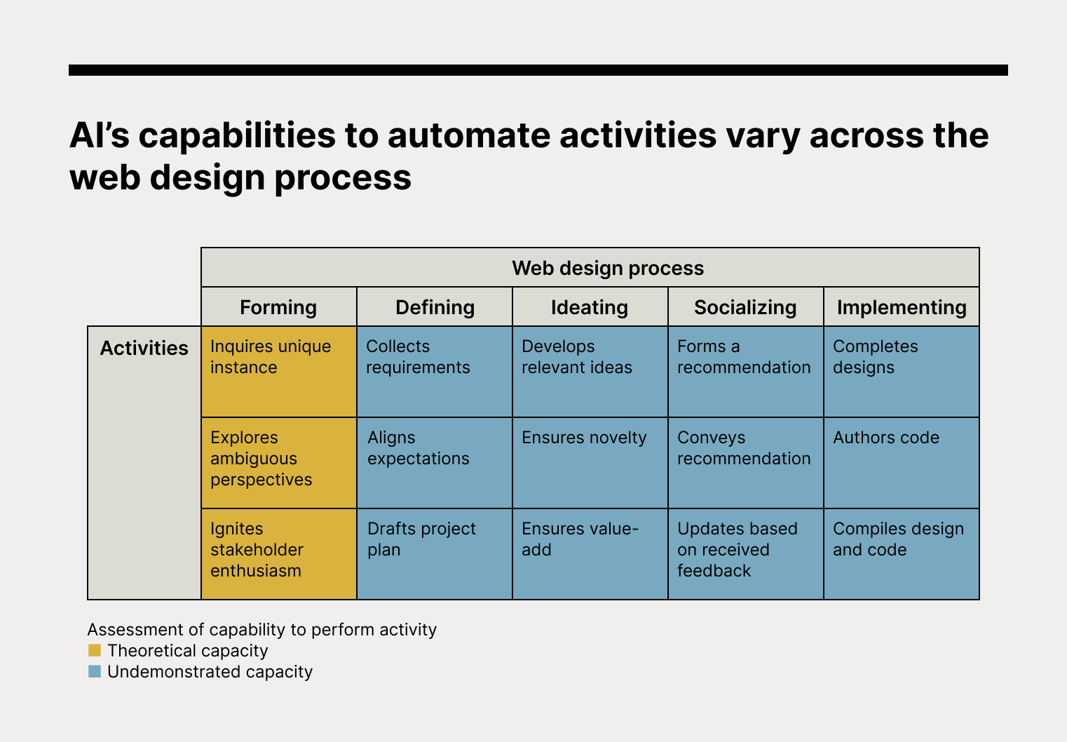
In order to better understand the impact of AI, we will break down the six stages of the web design process and examine the specific activities involved. Using the latest academic research and deployment examples, we will assess AI’s theoretical capabilities to perform activities in each stage. Our team will also create a webpage with AI technologies that everyone has access to today and compare it with the manual process for a practical perspective.

Forming

Forming calls for the designer to inquire about the unique instance, explore ambiguous perspectives, and ignite stakeholder enthusiasm.

  • Inquires unique instance: Undemonstrated capacity.
    When taking on a new client, it’s crucial to evaluate their unique context and determine whether web design is the right solution to meet their business goals. However, current AI models often struggle with analyzing subjects that aren’t included in their training data sets. With it being impossible to pre-collect comprehensive data on every business, it’s clear that current AI models lack the ability to be inquisitive about each unique instance.
  • Explores ambiguous perspectives: Undemonstrated capacity.
    At the beginning of the engagement, it is essential to consider multiple perspectives and use that information to guide exploration. For example, a designer might learn about the emotional roots of a client’s brand and use that knowledge to inform the website redesign. While AI models from institutions like MIT and Microsoft have shown early promise in recognizing abstract concepts and understanding emotions, they still lack the ability to fully adopt human perspectives. As a recent article from Harvard Business Review pointed out, empathy is still a key missing ingredient in today’s AI models.
  • Ignites stakeholder enthusiasm: Undemonstrated capacity.
    In order to set up a project for success, both the client and designer must be enthusiastic and committed to seeing it through to completion. While AI has shown potential in creating copy that resonates with consumers and motivates them to make a purchase, it remains unproven when it comes to sparking motivation for long-term business engagements that require sustained effort and input.

The AI Experiment

Designers
In preparation for a product launch, our designers evaluated the different launch approaches and decided to build a landing page. They intuitively decided to focus on nostalgic emotions because of the emotional connection many designers have with their tools. The team worked closely with product managers to get them excited.

AI
For the purpose of this article, the design team also attempted to use AI for the same tasks. General conversational models like ChatGPT were unable to diagnose a website’s necessity for us and only offered generic advice. When it came to generating early directions, models mostly produced results that skewed towards functional differentiation, failing to consider empathy and emotions that could make designers and stakeholders enthusiastic.

Defining

Defining calls for the designer to collect detailed requirements, set expectations, and draft a project plan.

  • Collects requirements: Theoretical capacity
    To ensure that all detailed requirements are collected, clients should be encouraged to verbalize their needs in terms of technical specifications, page count, and launch dates. AI models are now capable of performing these requirement-collection tasks. Thanks to examples of human exchanges fed to the models, Natural Language Processing (NLP) and Natural Language Understanding (NLU) have enabled AI to parse, understand, and respond to inputs. One of the latest models, OpenAI’s ChatGPT, can ask for additional context, answer follow-up questions, and reject inappropriate requests. AI models are already being deployed for customer service and have shown positive results in terms of trust and satisfaction.
  • Aligns expectations: Theoretical capacity
    The client and designer should align on criteria such as acceptance standards and future communication schedules. To help facilitate this alignment, AI models are now capable of handling negotiations autonomously. In academia, research from Meta (formerly Facebook) shows how AI models can use simulation and prediction to complete negotiations on their own. In the business world, companies like Pactum are helping global retailers secure the best possible terms in B2B purchases with their proprietary AI models.
  • Drafts project plan: Theoretical capacity
    To ensure that a project stays on track, it’s important for the designer to establish milestones and deadlines. AI models are now capable of estimating task durations and sequencing activities in a project. In 2017, researchers demonstrated the use of a machine learning algorithm called Support Vector Machine for accurate forecasting of project timelines. Further research has also established the use of Artificial Neural Networks for defining task relationships and creating work breakdown structure (WBS) charts.

The AI Experiment

Designers
Designers collected requirements from the product team using a tried-and-true questionnaire. The landing page needs to match the product launch date, so the teams chatted about the scope. After some frustrating back-and-forth where both teams accused the other of not having a clue, they finally came to a mutual agreement on a project plan.

AI
Designers tried the same with ChatGPT. Designers have AI role-play as the design team to collect requirements from the product team. AI performed admirably, even inspiring the team to add new items to their questionnaire. Designers then asked it to create a project plan while feeding it the same concerns received from the product team. Though the designers did not expect to use the produced schedule as-is, as factors like the team’s current workload were not considered, they still thought it performed reasonably well.

Ideating

Ideating calls for the designer to develop ideas relevant to previously defined criteria, ensure they are novel to contribute to the client’s differentiation and ensure they are of value to support the client’s business outcomes.

  • Develops relevant ideas: Theoretical capacity
    Ideas generated should align with consensus from earlier stages. Today’s AI models, like OpenAI’s DALL·E 2, can generate output that aligns with prompt criteria by learning the relationship between prompts and outputs through training data. This allows the AI to produce design ideas, including for UI design, that reflect the prompt criteria.
  • Ensures novelty: Theoretical capacity
    Ideas generated should offer fresh impressions and not a mere copy of existing executions. Today’s AI models can generate novel output using diffusion techniques. By scrambling and reassembling learned data in new ways, AI can create new data that resembles the learned data. This allows the AI to combine aspects of what it has learned in order to generate new ideas, similar to how humans combine known concepts to create new ideas. Imagen Video by Google, Make-a-Video by Meta, MidJourney, and Stable Diffusion are all examples of how AI models can generate completely new output.
  • Ensures value-add: Theoretical capacity
    Ideas generated should offer value-add to the client. AI models can compete with or surpass humans in this area thanks to their ability to learn from large amounts of data and their unmatched computational power for identifying patterns. This makes AI a strong candidate for inspiring, deriving, and supercharging ideas, providing value that may be difficult for humans to achieve on their own alone.

The AI Experiment

Designers
Designers brainstormed a couple of ideas for the hero based on “nostalgia” directions discussed in earlier stages.

AI
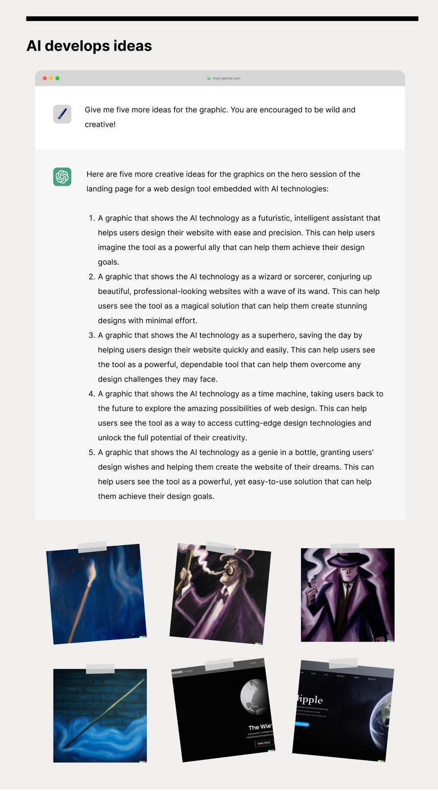
Next, designers tried to put ChatGPT to the test to generate design ideas. They were positively surprised at the “wizard” and “time machine” approaches. They then turned to DALL·E 2 to generate visuals. Obviously, some additional work in UI design tools is still necessary before the ideas can be presented. See the samples generated below.
Socializing

Socializing calls for the designer to form a recommendation, convey the recommendation, and respond to feedback.

  • Forms a recommendation: Theoretical capacity
    A designer should develop a point of view on the ideas presented. AI models have attained the ability to sort options based on scoring. By using datasets that track design and attention, AI models can be trained to evaluate and rank design options according to their potential for improving conversions. However, the ability of AI models to evaluate more subjective, emotionally-charged objectives has yet to be proven.
  • Conveys recommendation: Theoretical capacity
    A designer should provide a persuasive narrative to aid the client’s decision. AI models have proven to be capable of creating persuasive narratives that can aid in decision-making, much like a human. For example, IBM Research’s Project Debater is able to generate relevant arguments that support positions held. However, the ability of AI models to strike a balance between assertiveness and overbearingness in practical use cases remains an area of study.
  • Updates based on received feedback: Theoretical capacity
    A designer should take in the client’s feedback as a source of input for course correction. AI models like DALL·E 2 and ChatGPT are able to adapt and improve their output based on feedback. By updating the input prompts with feedback, these models are able to generate more accurate, aligned outputs. In cases where the feedback includes new or unrecognized concepts, textual inversion techniques can be used to help the model learn and incorporate these concepts into its output.

The AI Experiment

Designers
Designers gathered the latest design ideas, prioritized them by aesthetic intuition and conversion best practices, and prepared a review deck.

AI
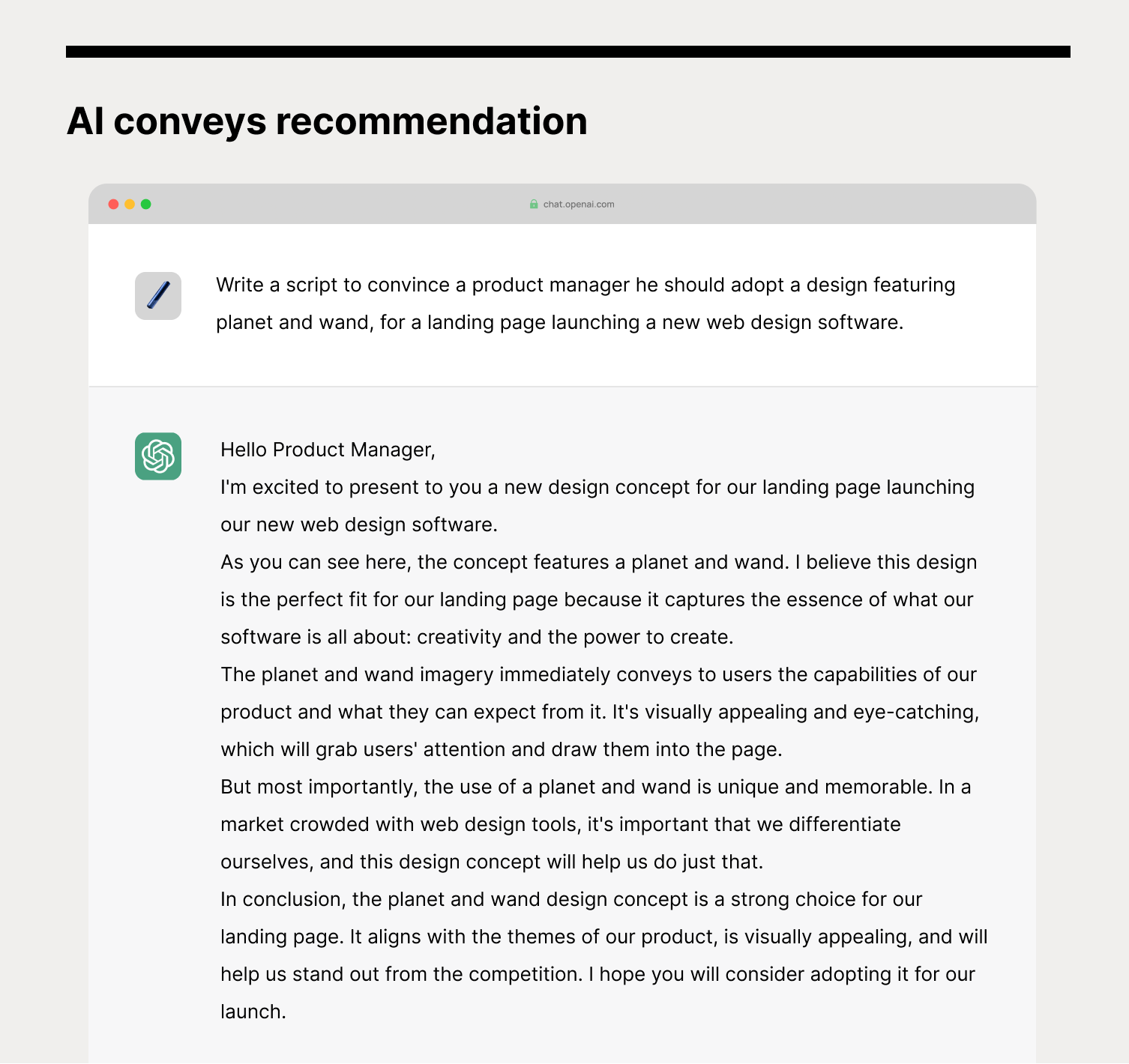
With AI, designers sorted the earlier ideas from DALL·E 2 through models trained on design and attention data. The model provided designers with a simulated course of gaze, giving them confidence in a particular idea. However, they would still like to put it through an actual usability test if selected. They then enlisted ChatGPT to generate a script to sell the idea. With feedback received, they updated the prompt to DALL·E 2. Designers agreed that the ability to quickly and mostly effortlessly iterate felt productive.
Implementing

Implementing calls for the designer to complete designs, author code, and compile both into a functioning website.

  • Completes designs: Theoretical capacity
    Creative directions should be fleshed out based on the aligned decision. Today’s AI models are capable of completing designs based on textual or pictorial input. These AI models use machine learning techniques to identify connections between input prompts and outputs and, based on your input instance, interpolate a completed design output. Under research, there are already models which can return medium-fidelity mockups by detecting and brushing up UI elements on low-fidelity sketches. In deployment, OpenAI’s Outpainting feature allows extensions of original designs, producing stunning results such as extensions of Johannes Vermeer’s Girl with a Pearl Earring scene. The ability to automatically generate web page designs based on the style of a specific section from a design proposal isn’t too far-fetched, given the demonstrated capabilities of current models.
  • Authors code: Theoretical capacity
    HTML, CSS, and JavaScript should be produced to realize the design. Today’s AI models have shown early capabilities to produce code from functionality descriptions. This capability is made possible as these models have been trained on large amounts of data that demonstrate the relationship between descriptions of functionality and code that implements it. By learning from this data, AI models are able to generate code that accurately implements the desired functionality. Models in use today include the assistive feature in Microsoft’s PowerApps software, where the feature turns natural language into ready-to-use code for querying. At GitHub Next, which researches emerging technologies in software development, its VP predicts in the next couple of years, coders “will just be sketching the architectural design, (where) you’ll describe the functionality, and the AI will fill in the details.” Although output from models today still requires human review, the implementation of feedback loops is expected to lead to a continual improvement in quality.
  • Compiles design and code: Theoretical capacity
    For compilation, design and code need to be aligned to complete the chosen idea. As AI models possess the above-mentioned design and coding capabilities, automatic generation and alignment may not be too far-fetched. In a recent interview, engineers at OpenAI have already demonstrated technologies that let anyone produce simple apps just by describing what they want, such as “Make me a personal website with PayPal embedded for payments.” This “Gutenbergian” future, in which anyone with an idea can bring it to fruition, is on the brink of erupting.

The AI Experiment

Designers
Designers fine-tuned the design, handed them off to developers and went through two rounds of reviews.

AI
With AI, designers called in developers and worked together to try code-generation services available today. Both designers and developers were surprised complete syntaxes were generated and agreed the experience felt futuristic. However, they were not comfortable with deploying the code as-is and would like to further explore its compatibility with their existing codebase.

A Glimpse Of The Future

The advent of technology in the realm of design is a well-known phenomenon, and designers have long been at the forefront of leveraging its potential to innovate and push the boundaries of their craft. Just as in the late 15th century the rise of the printing press has encouraged scribe artists, in the 19th century textile machines encouraged artisans, and more recently, photo-editing software has encouraged darkroom artists to shift their creative focus, it is not far-fetched to expect a similar shift triggered by AI in the 21st century.

As we consider AI’s potential to take on various tasks throughout the web design process, it is evident that later stages of the design process will be particularly susceptible to automation. Accordingly, productive designers will shift to focus their creativity on earlier stages in order to differentiate from replaceable tasks.

Day-to-day activities will move from pixel-pushing and software operation to strategizing and forming intents with clients.

The future of creativity is heading upstream.

We don’t expect this creative shift to happen overnight but gradually in three waves. While the AI models outlined have demonstrated signs of capabilities related to web design, for trusted deployment, the models will need to be trained with additional industry data. The quantity of training data will help the models develop higher accuracy toward addressing the field’s most abstract and generalized problems. Considering abstraction and scope, we will expand on the discussed automation of the web design process by forecasting effects on a time scale. With the ability to measure, we hope this will help practitioners manage the approaching future.
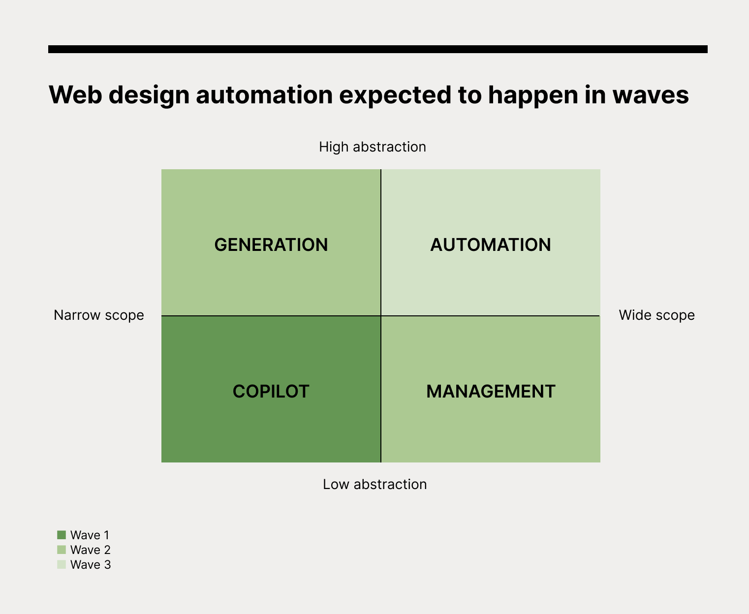
Wave 1: Design Copilot

The wave refers to the ability of AI models to assist designers in once manual and time-consuming tasks. These tasks will mainly be of low abstraction within a narrow scope. This specificity requires less training data, and the controlled output domain will allow AI models to meet expectations consistently. We are currently at the onset, with technology previews from Adobe and upstarts like us. Plausible examples in the future may include tools helping designers to automatically adapt one design for different screen sizes, implement suggested animations to make designs interactive, or complete technically-complex format adjustments with descriptive prompts.

Wave 2: Generation and Management

The next wave refers to the ability of AI models to generate semi-completed web designs based on prompts, as well as assist in client relationship management. Generation tasks include Ideating and Implementing output ideas, which involve higher abstractions in a narrow scope. While existing models like ChatGPT and DALL·E 2 are already capable of generating design suggestions and outputs as images, additional pattern-learning with web design-specific datasets will be required to improve variation and quality. Furthermore, there are still concerns that must be addressed, such as issues related to copyright and ethics.

On the other hand, Management tasks include Defining and Socializing ideas, which involve lower abstraction despite a wider scope. While use cases in adjacent industries have proven successful, implementation in everyday account management will require further oversight. For example, the ability to strike a balance between persuasion and tactful communication during the process will need additional monitoring.

Wave 3: Automation

The third wave refers to end-to-end automation of the web design process, including support of strategy and intent development in the Forming stage. There have been attempts at a leapfrog, including AI modules in website builders. However, it will take additional time and effort to overcome the hurdles mentioned earlier, particularly the ability to incorporate uniquely human perspectives, such as empathy, before AI can fully replace a designer’s contribution.

Your Next Step

As AI enters the world of design, it opens up a whole new realm of possibilities. Applications such as generative models are already demonstrating some theoretical capabilities and even practical applications across multiple stages of web design.

While AI still lacks uniquely human capabilities, such as inquisitiveness and empathy, opportunities abound for designers to collaborate with technology to unlock new levels of creativity. Like a brush stroke on an empty canvas, designers and AI have the potential to create something truly extraordinary. Together, they will paint a brighter future for the world of design.

Interested in leveraging AI in your web designs today? Sign up today!
Categories: Others Tags:

Email Copywriting Formula for High Conversions

December 12th, 2022 No comments

Writing an impactful email copy is of paramount importance. You ought to stand out in the subscriber’s inbox inundated with hundreds of emails. Email copywriting is an art and science that works on the fundamentals of understanding customer psychology and facilitating their decision-making. The foundation of an engaging copy is brevity, clarity, and relevance.  

There are a number of email copywriting formulae that can help you win over your customers and make their purchases from you.

Let’s delve deeper into the most powerful copywriting formulae to create high-converting emails.

PAS Formula

Problem-Agitate-Solve is the simplest of all formulae. It is easy to learn and apply. Marketers use it extensively in emails, social media posts, and practically every material. 

Here are the components that make up the PAS formula. 

P: Problem —- Make the reader aware of the problem

A: Agitate —- Get the user to realize how the problem affects their life and business

S: Solve —- Let the person know how your products can work as a solution to their problem

FAB Formula

FAB formula refers to Features-Advantages-Benefits. More often than not, marketers focus on talking about the features in the email copy. They include technical jargon that might not be comprehensible for an average reader. Through this formula, you can promote a new product in the email and talk about your unique value proposition.

FAB represents:

F: Features —- The unique and useful features that you want to promote

A: Advantages —- How the feature can help the users

B: Benefit —- How is the advantage relevant to your target audience

BAB Formula

FAB formula is all about the product features while BAB formula taps into the emotional instinct of the users. Here’s an explanation of this formula.

BAB represents:

B: Before —- Present the problem faced by your target audience

A: After —- Let the users know the status after resolving the problem

B: Bridge —- Explain the solution that helped overcome the issue

AIDA

The oldest copywriting formula is AIDA (Attention, Interest, Desire, and Action). Elmo Lewis invented it nearly a century ago. 

AIDA stands for:

Attention: Hook the reader and bring their attention with a compelling statement

Interest: Sustain their attention with an interesting statement

Desire: Let the user know how the product will make lives easier for them and pique their desire

Action: Inform them about the action to be taken to experience the same

Take a look at this email by Dau Relationship Marketing that nails the AIDA copywriting formula. 

ACCA

ACCA stands for:

A: Awareness of the problem

C: Comprehending the problem with the help of an explanation

C: Conviction to combat the challenge

A: Action that will help resolve it

It works on the principle of empathy. It works wonders for non-profit organizations looking forward to raising donations for their noble cause.

4 Ps

Just like the screenplay of a movie follows the three-act structure, namely the setup, midpoint, and resolution, email copywriting can conform to the 4 Ps formula. 

4 Ps refers to:

Problem: What is the user’s primary challenge?

Picture: After the resolution of the issue, what does the prospect wish to achieve?

Proof: Offer evidence that you will be able to solve the problem

Proposal: Let the reader know how they will be able to reach the solution.

Storytelling

We are naturally more receptive to stories. Tell a relevant story through your email and your subscribers will surely be inspired to take action. You can use client success stories as social proof to make your emails more engaging for the readers. Such testimonials will encourage more users to purchase from you.

4 Cs

Another formula that comes in handy for creating emails is the formula of 4 Cs. 

It stands for Clear, Concise, Compelling, and Credible. 

Your email should be able to convey the message clearly without beating around the bush. Also, it should exude authenticity and be compelling enough for the readers to take action. 

Nine-word formula

This formula by Dean Jackson is especially useful for re-engagement emails. It uses a nine-word template that reminds the user if they are still looking for the service. 

For example, Travel agencies can send out an email saying: “Are you still looking for a hotel in Chicago?”

It will instantly trigger the recipient’s thought process and persuade them to take action. 

Take a look at this email by Animoto that makes perfect use of this formula.

These are nine of the most popular email copywriting formulas. Besides these, there are some generic copywriting tips and tricks that you must remember to create an effective email marketing strategy. 

Always have a definite goal

Whether it is generating webinar attendees or conversions for your eCommerce store, have a specific goal for your emails. It will help you write meaningful and effective copy that will be relevant for the readers and drive faster business growth. Define the tone of the email according to its purpose and target audience. Is it for a potential client, existing customer, or dormant lead? The subject line, the language of the copy, CTA, and graphics should be in line with the action you expect from the subscribers. 

Personalize the email copy

Consider the user’s past purchases, resources downloaded, and products searched for. Accordingly, personalize the email copy with valuable information that will appeal to the users. Creating tailor-made emails is of paramount importance to cut through the noise and get more click-throughs. 

Write an engaging subject line

Many marketers consider the email subject line an afterthought. That’s a huge mistake. Pay attention to your email subject lines; give yourself enough time to craft a catchy subject line that makes the users open your email. 

Proofread before hitting the send button

Before you send out the email, proofread for any grammatical errors or typos. Use apps like Grammarly and Hemingway App Editor so that you don’t miss out on any mistakes. 

Wrapping Up

Your guide to writing high-converting email copy is right here. Although AI writing tools are getting immensely popular in recent times, email copywriters and a humanized approach will never go out of style. Make sure you follow all these tips to create emails that bring business growth and conversions.

The post Email Copywriting Formula for High Conversions appeared first on noupe.

Categories: Others Tags:

Download Free Xmas Patterns

December 9th, 2022 No comments

Christmas is just around the corner, and these free Xmas patterns are a great way to get into the Christmas spirit!

There are so many different ways to enjoy these Christmas patterns, from cards to ornaments, and everything in between. Why not design your own custom wrapping paper, or print garlands to hang throughout the house?

These illustrated Christmas patterns are also the perfect way to add some holiday cheer to your business’ marketing. Create a festive email signature, add banners to your website, or just post a message of peace and goodwill on your social media. The happy snowmen and cheerful Santa characters are sure to bring a smile to the face of the staunchest Grinch, so download them now.

You may use these patterns for personal and commercial purposes. You MUST add a link to our site www.webdesignerdepot.com wherever you use these patterns online. If you use them for print, you must clearly credit us somewhere in your product with written text crediting our website www.webdesignerdepot.com If you can’t or don’t want to add a link to our site, please contact us for a special commercial license that doesn’t require any kind of linking or attribution. Licensing fees start at only $15 but may be more expensive in certain situations. Please reach out for more details. These files cannot be distributed in any shape or form on their own.

Source

The post Download Free Xmas Patterns first appeared on Webdesigner Depot.

Categories: Designing, Others Tags:

How to Repurpose Content for Social Media

December 9th, 2022 No comments

If you are a social media marketer, then you obviously understand the feeling of too many to-dos and too little time to do! With so much competition around, there is this perennial need for creating fresh and unique content that meets the objective since it’s one of the highest-paying freelance jobs. In order to make your job simpler and less time-consuming, there is this concept of content repurposing. 

Introduction to Content Repurposing 

Content Repurposing refers to using existing social media content and presenting the same in a new format. In other words, it is content recycling. This helps expand the reach of the existing content. 

Some people may take content repurposing as cheating the system, but it is not. You might fear that your audience might find out that your content is repetitive. You don’t want to project your image as someone who doesn’t care about creating new content.  

The topic of the blog post is “guide on choosing a logo font”. 

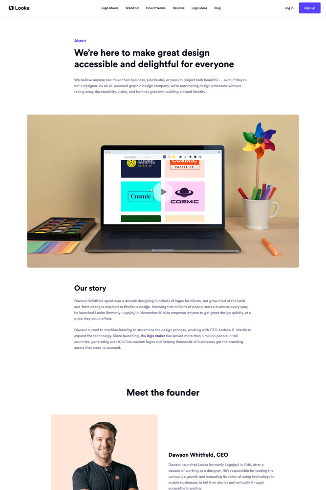
Looka is an online logo design and brand identity platform for entrepreneurs. It created a YouTube video from its existing blog post to reach a new audience. They simply repackaged and refurbished the old content and changed its format. They posted the video on YouTube keeping the title intact. 


Why Resort to Content Repurposing?

Content repurposing refers to the concept wherein you lease a new life to the content. This is something that you have already created for your social media channel. Content repurposing lets your audience get additional benefits from the same content. 

Time-saver: Time is money and when you save time, you save money, don’t you? Repurposing old content helps save valuable time. You already have the data for the content, you just need to tweak it and redistribute it. 

SEO: Who doesn’t love a good SEO boost? Content repurposing boosts Search Engine Optimization. The credibility of the content in the search engine increases when there are several pieces of the same content that center around similar keywords. 

Audience Reach: Repurposing content helps you maximize the reach of the content. When you redistribute the content, you reach out to a new set of audience. Your blog post is read by all those people who like reading long-form content. However, the same content in the format of a newsletter reaches people who like reading crisp content. 

7 Ways to Repurpose Social Media Content

When you are creating content for a long time, there are a number of informative and interesting ideas on your Instagram page, Blog, or even YouTube channel. Your audience might have missed seeing the content on your page. When you repost the same content with a twisted idea, the same concept gets a new lease of life. 

Reworking on present written content

Sometimes we feel restricted due to the media format. Social media platforms like YouTube and Instagram are all about videos and visuals, respectively. However, if you want to repurpose your blog content on these sites, you can try some popular methods. Written content can be published on Instagram through visuals. Still confused? Take a look at this image. 

Your existing blog post content can be turned into little snippets of information in the visual format, just like in the Instagram carousel post displayed above.

It is advisable not to copy and paste the content as an Instagram post. Instead, consider extracting interesting points and building a narrative around the same. 

Similarly, a YouTube video can take the viewers around your website letting them know that there exists such an interesting post to read. 

Twitter to your rescue

Short and engaging content on Twitter helps catch the attention of the audience. A single blog post can be turned into several tweets and posted on Twitter. You can even create infographic content based on key statistics sourced from an Ebook. These key statistics need to have good hits on social media. 

Presented here is a screenshot of the video meeting arranged by Labnol. The meeting image was repurposed on Twitter to give information on a topic. This one is for the target audience that is interested in learning something fast.   

Maximize the life of your Livestream

Content refurbishing can help you extend the life of Livestream. You just need to save your live video and upload it on YouTube. Now, share some snippets of the Livestream on Twitter or Instagram. Such ideas can help you get the attention of your audience. 

Livestream offers a lot of possibilities when it comes to content refurbishing. It can be posted on Instagram, LinkedIn, Twitter, Snapchat, and other similar social media channels. 

Turn your old content into GIF

There are some videos on your social media channel that have garnered immense popularity. Such video clips and animations can be turned into a GIF. 

Yes!, you read it right! The World Wide Web is brimming with tools that will help you do that. The most interesting thing is that GIFs instantly grab the attention and also, make for shareable content. They are relatable and spike the interest level of the audience

Questions and Curiosity 

If one of your high-quality videos ends with a question, then you can benefit from it. Questions are mostly answered by the audience. If they know something or want to participate in the conversation, they will definitely answer. Such questions can be repurposed on other social media platforms. 

Social Media Platforms have such sections. For instance, LinkedIn has LinkedIn Q&A. There are polls on Twitter and Facebook as well. 

All this creates different opportunities that help in engaging your audience with the content that already exists. It might even spike curiosity for something that is yet to be released.  

Answers and Solutions

While there are many questions that still need to be asked, there are some that still need to be answered. 

Such unanswered questions are the opportunity that you need to tap on. 

Find your blog post that has a good number of visits. Now, ask a question that your blog answers. Search this question on other social media platforms. Further, answer that question with a link to your blog post or YouTube video, or Instagram post. 

This is a snapshot from quora.com. Someone has asked this question regarding confidence. If yours is a self-help blog post, then you can answer this question with a link to your blog. You can even search Facebook and LinkedIn communities for questions that your existing content answers. 

Through content repurposing or linking the content in the comments section, you establish relationships. This further increases the chances of getting noticed by the audience that has asked similar questions.

Tap the world of SlideShare

You have a huge treasure of blog posts sitting and smiling at the audience., turn it into a presentation format. This is one of the best ways to repurpose blog posts. For this, identify high-performing blog content. Next, reproduce the blog content into a SlideShare.  

SlideShare has become quite popular because it is easy to share. The same blog content is introduced to the audience in a new easy-to-comprehend format. With presentations, there are a plethora of possibilities including graphic elements, infographics, caricatures, etc. Presentations make the blog content very interesting. 

Conclusion

You know that your content is great and hence, you have a good following on social media. However, it is a little difficult to create high-quality content in a short time. Good content requires adequate time, lots of research, and a plethora of resources. All this makes content creation a tedious process. Repurposing your old content is not a shortcut. It is a strategy that helps you revive your old high-quality content and offer your audience relevant information.

The post How to Repurpose Content for Social Media appeared first on noupe.

Categories: Others Tags:

8 Best Web Crawlers To Get Better Data

December 9th, 2022 No comments

Crawlers are such essential tools on the Internet today that imagining a world without them would make navigating the web a different experience. Web crawlers assist in the operation of search engines, serve as the brains behind web archives, assist content creators in finding out what content is copyrighted, and assist website owners in identifying which pages on their sites require attention.

You can accomplish a lot with web crawlers that would be difficult or impossible without them. If you need to collect data from the Internet, you might need to use web crawlers at some point as a marketer. However, choosing a suitable web crawler for your needs may be difficult. It is because, unlike web scrapers, you can find a lot of general-purpose scrapers; you will need to dig deeper to find web crawlers. The reason is that most popular web crawlers are usually specialized.

We’ve compiled the top 8 web crawler tools with their features and pricing for you in this article.

1. Crawlbase

Source: Crawlbase

Crawlbase provides crawling and scraping services to people who wish to crawl data at a large scale and maintain the most significant level of anonymity throughout the process. The Crawler allows you to crawl any website or platform on the Internet. You will be able to benefit from proxy support, captcha bypass, as well as the ability to crawl JavaScript pages with dynamic content.

The crawler is a pay-as-you-go model with no hidden fees, so you only pay for successful requests. The first 1,000 requests are free, and you will be informed of the exact cost based on how many requests you make. A monthly pricing calculator makes calculating your price relatively easy, as you only pay for successful requests, and if there are any unsuccessful requests, you will not be charged.

Features:

  • The company provides a wide range of scraping services
  • A headless browser is supported for rendering JavaScript
  • They only charge you for successful crawling
  • Geo-targeting supported by a lot of countries
  • It has a pool of over one million IP addresses
  • Smart rotation of IP address
  • The number of successful requests determines the price
  • 1000 Free requests for new users

2. Nokogiri

Source: Nokogiri

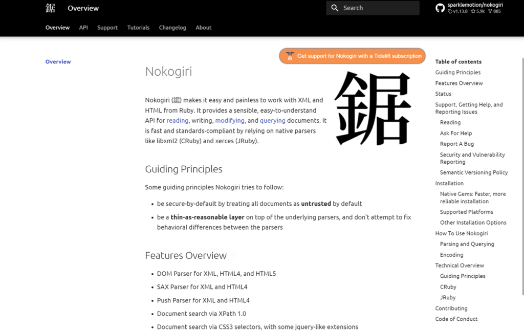
Nokogiri is an open-source software library for parsing HTML and XML in Ruby. Libxml2 and libxslt provide the functionality of the library.

Nokogiri provides a comprehensive API for reading, writing, editing, and querying documents. The tool simplifies the process of working with XML and HTML for Ruby developers. Nokogiri is based on two fundamental principles. As a first step, it automatically treats all documents as suspicious. Second, it does not attempt to correct the behavioral differences detected between parsers.

Features:

  • DOM Parser for XML, HTML4, and HTML5
  • SAX Parser for XML and HTML4
  • A document search tool based on CSS3 selectors, with some jQuery-like extensions
  • Validation of XSD Schemas
  • XSLT transformation
  • ” Builder” DSL for XML and HTML
  • Push Parser for XML and HTML4
  • Completely free.
  • Good XML and HTML parser for Ruby.
  • Superior security.

3. UiPath

Source: UiPath

UiPath is an end-to-end robotic process automation tool. It provides solutions to automate routine office activities to accelerate business change. 

UiPath has built-in capabilities for performing additional crawls. It is particularly effective when dealing with complex user interfaces. It can easily extract data in tabular or pattern form from multiple different web pages. The screen scraping tool can extract individual text components, groups of text, blocks of text, and data in a table format.

Features:

  • By streamlining processes, identifying efficiencies, and providing insights, we can achieve fast digital transformation at reduced costs.
  • A UiPath robot follows your exact requirements to ensure compliance. Using Reporting, you can view your robot’s documentation at any time.
  • If you standardize your methods, your outcomes will be more effective and successful.
  • Crawling of web and desktop data with intelligent automation.
  • It is not necessary to have any programming knowledge in order to create web agents.
  • It is capable of handling both individual and group text elements.
  • Easily manages complex user interfaces.

4. Webharvy

Source: Webharvy

The Webharvy tool includes a point-and-click interface for scraping web pages. It is designed for people who aren’t programmers. Using WebHarvy, you can automatically scrape text, images, URLs, and emails from websites. You can access target websites via proxy servers or a VPN.

Features:

  • Pattern Detection.
  • You can save it to a file or a database.
  • Keyword submission.
  • Handle pagination.
  • It is easy to use.
  • Keyword-based extraction.
  • VPN support is included.
  • The crawling scheduler is impressive.

5. Import.io

Source: Import.io

Import.io is a platform that facilitates the conversion of semi-structured web pages into structured data, which can be used for a variety of purposes, ranging from business decision-making to integration with apps.

They provide real-time data retrieval through their JSON REST-based and streaming APIs and support integration with a variety of common programming languages and data analysis tools. 

It is great for businesses and marketing research that wants organized data. There are multiple programming languages that can be used with the software. The crawler’s point-and-click interface makes it easy to use.

Features:

  • Point-and-click training
  • Automate web interaction and workflows
  • Easy Schedule data extraction
  • Support almost every system
  • The integration of multiple languages is seamless.
  • Pricing flexibility.

6. Zyte 

Source: Zyte

Zyte is another web crawler designed for developers who are proficient in coding. The tool offers several features that enable users to quickly extract information from websites across the Internet.

Crawlera, a sophisticated proxy rotator utilized by Zyte, allows users to crawl large sites and bot-protected pages without worrying about bot countermeasures. Users can crawl from multiple IP addresses and locales through a simple HTTP API without maintaining proxy servers.

Features:

  • Content Planning
  • Keyword tracking
  • Website accessibility testing
  • Content auditing
  • Automatically build sitemaps.

7. Open Search Server

Source: OpenSearchServer

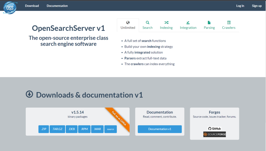
The OpenSearchServer software is based on Lucene and is a powerful, enterprise-class search engine solution. You can easily and quickly integrate full-text search capabilities into your application by utilizing the web user interface, crawlers, and JSON web services.

It is a good tool for crawling websites and building search indexes. Additionally, it provides text extracts and auto-completion features that can be used to create search pages. Depending on your needs, the software will allow you to select from six different scripts to download.

Features:

  • Crawlers can index everything.
  • The classifications are made automatically.
  • This is a free, open-source tool.
  • There is a wide range of search functions available.

8. Dexi.io

Source: Dexi.io

The Dexi.io web scraping tool allows businesses to extract and transform data from any web source through advanced automation and intelligent mining technologies. 

You can scrape or interact with data from any website using Dexi.io. You can use three types of robots: Extractors, Crawlers, and Pipes. An advanced feature set and APIs enable you to combine and transform data into robust datasets.

Features:

  • Automatic Data Capture.
  • Location-based analytics.
  • Category Analytics.
  • Highly customizable.
  • you can create your own agents
  • The data is automatically deduplicated before it is sent to your systems.

Conclusion

We discussed some of the best Crawlers available in marketing with their top features to help you crawl available online data according to your own needs. Let us know which crawler tool worked the best for you in the comments below. 

The post 8 Best Web Crawlers To Get Better Data appeared first on noupe.

Categories: Others Tags:

Why SaaS Product Management Is Crucial

December 9th, 2022 No comments

Product management plays a major role in defining UI/UX, product usability, features, and vis-à-vis the success of a SaaS business. Project managers often lead the baton to strive and enhance user experience, the product development team follows scrum to achieve milestones, and the design team iterates solutions and makes changes if needed. All such departments collaborate to deliver the product on time.

All such efforts are clubbed to provide a cohesive product experience to customers, making way for product management.

Product management involves making multiple iterations of SaaS products, which is responsible for increasing the project’s scope. One research found that a skilled product manager may boost profitability by as much as 34%

In all, product management and customer-led product development are crucial to the success of SaaS businesses when product-led growth (PLG) is a must for SaaS businesses.

What does SaaS Product Management Include?

Product management is a complex process that includes the product operations’ who, what, when, where, and what. The project manager gets into the nitty-gritty using a product management platform to get all possible answers that enhance the product. 

SaaS businesses must ensure their employees are pulling in the same direction as that product manager’s vision. 

Typically, it involves —

1. Leveraging market study: Successful product management aims to make the product market fit and meet customer requirements. Therefore, it includes marketing research based on the SaaS business audience and refining products that enhance UX.

2. Brainstorming product ideas: A SaaS product needs a vision that defines the product. Project management involves discussing ideas that open ways to achieve them, assigning responsibilities, and offering scope for innovation.

Once done, the product manager oversees idea management, where the team brainstorms the new product (or features of an existing one) based on the idea. If there are existing ideas, the focus would be on improving them.

3. Building bonds with partners: Some SaaS companies have customers who work with them to use their software on a large scale. The scope of product management here involves collaborating directly with such groups and building strong ties for recurring business.

4. Creating a SaaS product strategy: This involves planning and segmenting the development phases based on the product’s complexity and breadth. The product update tasks will follow epics, user stories, and features in a secure iterative development methodology.

5. Enhancing collaboration: Plenty of agile SaaS organizations work collaboratively to design and implement strategies for early delivery. Therefore, product management also includes constant refinements in collaboration across different departments.

Why is SaaS Product Management Crucial?

A report by Allied Market Research estimates that the worldwide SaaS market will expand from its 2020 valuation of $121.33 billion to reach $702.19 billion by 2030. This means a compound annual growth rate (CAGR) of 18.82% between 2021 and 2030. Therefore, a product management strategy is necessary to improve operations in an increasingly challenging business environment. 

Product management is a pivotal part of the SaaS business as it helps provide a better customer experience, ensure a sustainable growth plan, and integrate sales and B2B SaaS content marketing with product support to take the business a notch above. The marketing element would also include creating effective communication copy for different media. It may require a business to hire a professional content writer who can create engaging content for its audience. Once done, comprehensive product management involving experts across verticals can drive desired results.

In all, here are some of the reasons that serve testament to why product management is important.

1. Match customer expectations

Getting customer input and implementing feedback is key to successful product management. This ensures innovation and creativity, which keeps SaaS businesses ahead of the curve. Therefore, product management can help tap into user expectations and help design goods with the consumer in mind, thus offering them unmatched services. 

Product management helps the manager to find a product market fit by understanding customers’ requirements using market research, cohort analysis, creating a user persona, etc. Once identified, everyone implements them into the company’s products or services.

Businesses primarily use project management while launching new software or refining an existing one to monitor performance. Moreover, it helps collect and implement feedback while paving the way for future research and development.

2. Leverage data for product strategy

Both quantitative and qualitative data play a role in good product management. Begin with measuring the product’s usability which helps improve SaaS product metrics (more on it later).

With data at their disposal, project managers can make better product-related judgments and provide stronger proof for those choices. Data-driven project management makes way for performance measurement, tracking the number of relevant contacts a product manager has with clients each week, driving productivity, etc.

3. Creating a product roadmap

SaaS businesses yearn for a long product lifecycle. Therefore, maintaining a market share demands a well-defined strategy. Product managers draw up a detailed plan for the product area to free up resources for R&D, facilitating goal completion.

Such groundwork helps create a product roadmap — including customer feedback, leveraging available resources, defining product update timelines, etc. This ensures effective resource utilization while catering to customer expectations.

4. Intelligent product management improves its conception and development

Prioritizing customer satisfaction requires SaaS businesses to consider in-depth details of their users at every stage of development. Therefore, knowing how users feel after using the product is crucial since it impacts their loyalty to the brand.

If managing a portfolio of products, B2B SaaS businesses may leverage such connections when a product is dwindling in the life cycle.

5. Improves sales strategies

Every SaaS business thrives on effective sales techniques. It is the key to expanding the customer base and selling more products.

Pivoting resources to product management enables the sales department to streamline and become more productive as it gets a stable platform to build new strategies. 

Sales teams drive efforts based on the collected data about customer demands, behavior, and trends. Such data can help develop sales arguments that matter to your audience. 

This will help the sales team create meaningful connections with prospective users and simplify their buying decision.

6. Tracking for metrics

The most important aspect of product management is metric tracking. It is necessary to analyze what happens after the product is launched in the market. 

Here are some key metrics that SaaS product management considers — 

  • Monthly recurring income or other financial parameters to determine monthly revenue.
  • User engagement indicators like the percentage of users who stick around after an initial trial period.
  • The qualitative metric involves gauging product success based on the frequency of user interaction.
  • User satisfaction indicators, such as the net promoter score, quantify the proportion of happy consumers who would suggest the product to others.
  • Key stats indicating the percentage of consumers canceling their subscriptions after a certain time frame are known as “customer churn rate.”
  • Determine the cost per acquisition, where businesses may see how much it costs to bring in new customers.
  • Measure customer lifetime value (LTV) to determine how much a customer is worth to a SaaS business over their engagement.

Wrapping up

Many B2B SaaS businesses are recognizing the significance of product management. Ultimately, it helps get an edge over the competition, ensures operational efficiency, and provides a better user experience.

Efficient product management helps drive better revenue, redefine advertising messages, update product features, enhance customer support and improve finances. It works as a central repository for product and market data. 

Running a successful SaaS business needs considering a range of factors, including users, the industry, technology, rivals, platforms, press, experts, market dynamics, etc. And that’s where product managers can create a difference. They run the show by keeping all activities in tandem.

The post Why SaaS Product Management Is Crucial appeared first on noupe.

Categories: Others Tags:

Animated Background Stripes That Transition on Hover

December 8th, 2022 No comments
Perfect square with a pale green background color.

How often to do you reach for the CSS background-size property? If you’re like me — and probably lots of other front-end folks — then it’s usually when you background-size: cover an image to fill the space of an entire element.

Well, I was presented with an interesting challenge that required more advanced background sizing: background stripes that transition on hover. Check this out and hover it with your cursor:

CodePen Embed Fallback

There’s a lot more going on there than the size of the background, but that was the trick I needed to get the stripes to transition. I thought I’d show you how I arrived there, not only because I think it’s a really nice visual effect, but because it required me to get creative with gradients and blend modes that I think you might enjoy.

Let’s start with a very basic setup to keep things simple. I’m talking about a single

in the HTML that’s styled as a green square:

<div></div>
div {
  width: 500px;
  height: 500px;
  background: palegreen;
}

Setting up the background stripes

If your mind went straight to a CSS linear gradient when you saw those stripes, then we’re already on the same page. We can’t exactly do a repeating gradient in this case since we want the stripes to occupy uneven amounts of space and transition them, but we can create five stripes by chaining five backgrounds on top of our existing background color and placing them to the top-right of the container:

div {
  width: 500px;
  height: 500px;
  background: 
    linear-gradient(black, black) top right,
    linear-gradient(black, black) top 100px right,
    linear-gradient(black, black) top 200px right,
    linear-gradient(black, black) top 300px right,
    linear-gradient(black, black) top 400px right, 
    palegreen;
}

I made horizontal stripes, but we could also go vertical with the approach we’re covering here. And we can simplify this quite a bit with custom properties:

div {
  --gt: linear-gradient(black, black);
  --n: 100px;

  width: 500px;
  height: 500px;
  background: 
    var(--gt) top right,
    var(--gt) top var(--n) right,
    var(--gt) top calc(var(--n) * 2) right,
    var(--gt) top calc(var(--n) * 3) right,
    var(--gt) top calc(var(--n) * 4) right, 
    palegreen;
}

So, the --gt value is the gradient and --n is a constant we’re using to nudge the stripes downward so they are offset vertically. And you may have noticed that I haven’t set a true gradient, but rather solid black stripes in the linear-gradient() function — that’s intentional and we’ll get to why I did that in a bit.

One more thing we ought to do before moving on is prevent our backgrounds from repeating; otherwise, they’ll tile and fill the entire space:

div {
  --gt: linear-gradient(black, black);
  --n: 100px;

  width: 500px;
  height: 500px;
  background: 
    var(--gt) top right,
    var(--gt) top var(--n) right,
    var(--gt) top calc(var(--n) * 2) right,
    var(--gt) top calc(var(--n) * 3) right,
    var(--gt) top calc(var(--n) * 4) right, 
    palegreen;
  background-repeat: no-repeat;
}

We could have set background-repeat in the background shorthand, but I decided to break it out here to keep things easy to read.

Offsetting the stripes

We technically have stripes, but it’s pretty tough to tell because there’s no spacing between them and they cover the entire container. It’s more like we have a solid black square.

This is where we get to use the background-size property. We want to set both the height and the width of the stripes and the property supports a two-value syntax that allows us to do exactly that. And, we can chain those sizes by comma separating them the same way we did on background.

Let’s start simple by setting the widths first. Using the single-value syntax for background-size sets the width and defaults the height to auto. I’m using totally arbitrary values here, so set the values to what works best for your design:

div {
  --gt: linear-gradient(black, black);
  --n: 100px;

  width: 500px;
  height: 500px;
  background: 
    var(--gt) top right,
    var(--gt) top var(--n) right,
    var(--gt) top calc(var(--n) * 2) right,
    var(--gt) top calc(var(--n) * 3) right,
    var(--gt) top calc(var(--n) * 4) right, 
    palegreen;
  background-repeat: no-repeat;
  background-size: 60%, 90%, 70%, 40%, 10%;
}

If you’re using the same values that I am, you’ll get this:

CodePen Embed Fallback

Doesn’t exactly look like we set the width for all the stripes, does it? That’s because of the auto height behavior of the single-value syntax. The second stripe is wider than the others below it, and it is covering them. We ought to set the heights so we can see our work. They should all be the same height and we can actually re-use our --n variable, again, to keep things simple:

div {
  --gt: linear-gradient(black, black);
  --n: 100px;

  width: 500px;
  height: 500px;
  background: 
    var(--gt) top right,
    var(--gt) top var(--n) right,
    var(--gt) top calc(var(--n) * 2) right,
    var(--gt) top calc(var(--n) * 3) right,
    var(--gt) top calc(var(--n) * 4) right, 
    palegreen;
    background-repeat: no-repeat;
    background-size: 60% var(--n), 90% var(--n), 70% var(--n), 40% var(--n), 10% var(--n); // HIGHLIGHT 15
}

Ah, much better!

CodePen Embed Fallback

Adding gaps between the stripes

This is a totally optional step if your design doesn’t require gaps between the stripes, but mine did and it’s not overly complicated. We change the height of each stripe’s background-size a smidge, decreasing the value so they fall short of filling the full vertical space.

We can continue to use our --n variable, but subtract a small amount, say 5px, using calc() to get what we want.

background-size: 60% calc(var(--n) - 5px), 90% calc(var(--n) - 5px), 70% calc(var(--n) - 5px), 40% calc(var(--n) - 5px), 10% calc(var(--n) - 5px);

That’s a lot of repetition we can eliminate with another variable:

div {
  --h: calc(var(--n) - 5px);
  /* etc. */
  background-size: 60% var(--h), 90% var(--h), 70% var(--h), 40% var(--h), 10% var(--h);
}
CodePen Embed Fallback

Masking and blending

Now let’s swap the palegreen background color we’ve been using for visual purposes up to this point for white.

div {
  /* etc. */
  background: 
    var(--gt) top right,
    var(--gt) top var(--n) right,
    var(--gt) top calc(var(--n) * 2) right,
    var(--gt) top calc(var(--n) * 3) right,
    var(--gt) top calc(var(--n) * 4) right, 
    #fff;
  /* etc. */
}

A black and white pattern like this is perfect for masking and blending. To do that, we’re first going to wrap our

in a new parent container and introduce a second

under it:

<section>
  <div></div>
  <div></div>
</section>

We’re going to do a little CSS re-factoring here. Now that we have a new parent container, we can pass the fixed width and height properties we were using on our

over there:

section {
  width: 500px;
  height: 500px;
} 

I’m also going to use CSS Grid to position the two

elements on top of one another. This is the same trick Temani Afif uses to create his super cool image galleries. The idea is that we place both divs over the full container using the grid-area property and align everything toward the center:

section {
  display: grid;
  align-items: center;
  justify-items: center;
  width: 500px;
  height: 500px;
} 

section > div {
  width: inherit;
  height: inherit;
  grid-area: 1 / 1;
}

Now, check this out. The reason I used a solid gradient that goes from black to black earlier is to set us up for masking and blending the two

layers. This isn’t true masking in the sense that we’re calling the mask property, but the contrast between the layers controls what colors are visible. The area covered by white will remain white, and the area covered by black leaks through. MDN’s documentation on blend modes has a nice explanation of how this works.

To get that working, I’ll apply the real gradient we want to see on the first

while applying the style rules from our initial

on the new one, using the :nth-child() pseudo-selector:

div:nth-child(1) { 
  background: linear-gradient(to right, red, orange); 
}

div:nth-child(2)  {
  --gt: linear-gradient(black, black);
  --n: 100px;
  --h: calc(var(--n) - 5px);
  background: 
    var(--gt) top right,
    var(--gt) top var(--n) right,
    var(--gt) top calc(var(--n) * 2) right,
    var(--gt) top calc(var(--n) * 3) right,
    var(--gt) top calc(var(--n) * 4) right, 
    white;
  background-repeat: no-repeat;
  background-size: 60% var(--h), 90% var(--h), 70% var(--h), 40% var(--h), 10% var(--h);
}

If we stop here, we actually won’t see any visual difference from what we had before. That’s because we haven’t done the actual blending yet. So, let’s do that now using the screen blend mode:

div:nth-child(2)  {
  /* etc. */
  mix-blend-mode: screen;
}
CodePen Embed Fallback

I used a beige background color in the demo I showed at the beginning of this article. That slightly darker sort of off-white coloring allows a little color to bleed through the rest of the background:

CodePen Embed Fallback

The hover effect

The last piece of this puzzle is the hover effect that widens the stripes to full width. First, let’s write out our selector for it. We want this to happen when the parent container (

in our case) is hovered. When it’s hovered, we’ll change the background size of the stripes contained in the second

:

/* When <section> is hovered, change the second div's styles */
section:hover > div:nth-child(2){
  /* styles go here */
}

We’ll want to change the background-size of the stripes to the full width of the container while maintaining the same height:

section:hover > div:nth-child(2){
  background-size: 100% var(--h);
}

That “snaps” the background to full-width. If we add a little transition to this, then we see the stripes expand on hover:

section:hover > div:nth-child(2){
  background-size: 100% var(--h);
  transition: background-size 1s;
}

Here’s that final demo once again:

CodePen Embed Fallback

I only added text in there to show what it might look like to use this in a different context. If you do the same, then it’s worth making sure there’s enough contrast between the text color and the colors used in the gradient to comply with WCAG guidelines. And while we’re touching briefly on accessibility, it’s worth considering user preferences for reduced motion when it comes to the hover effect.

That’s a wrap!

Pretty neat, right? I certainly think so. What I like about this, too, is that it’s pretty maintainable and customizable. For example, we can alter the height, colors, and direction of the stripes by changing a few values. You might even variablize a few more things in there — like the colors and widths — to make it even more configurable.

I’m really interested if you would have approached this a different way. If so, please share in the comments! It’d be neat to see how many variations we can collect.


Animated Background Stripes That Transition on Hover originally published on CSS-Tricks, which is part of the DigitalOcean family. You should get the newsletter.

Categories: Designing, Others Tags: