Archive

Archive for January, 2023

Better ROI For Your Digital Products: Why Continuous Research Is Key

January 26th, 2023 No comments

This article is a sponsored by Maze

Although you might be able to map out the development of a new product with a definitive start and end date, there really is no end point.

The most successful digital products are the ones continually being debugged, updated and enhanced. By extension, the most successful brands are ones that draw valuable lessons from the development of one product and apply it to other products as well as the organization as a whole.

Today, I’m going to dig into Maze’s Continuous Research Report: Trends to Watch in 2023. Developed in partnership with Atlassian, the report presents data from over 600 product professionals and explores how product teams conduct research to inform their decision-making.

In the following post, we’re going to explore the current state of product research, the trends shaping the future of the industry and the benefits of continuous discovery and research. Then we’ll look at some tips for making continuous discovery part of your process going forward.

The Current State of Product Research

A product doesn’t become successful simply because a great product team builds it and a savvy marketing team promotes it. A digital product has to be well-built, align with user expectations, and effectively solve their problems. It also needs to evolve over time as customer needs evolve.

This is why user input is so critical in the grand scheme of product development.

More and more organizations understand how valuable this data is, with 83% of Maze’s survey respondents agreeing that research should be conducted at every stage of product development.

However, data suggests that only 36% of digital product teams perform research post-launch. In addition, 60% connect with customers only once a month (if that), despite making product-related decisions on a daily basis.

Gathering user input during both the Discovery and Delivery phases is essential. Without user input early on, product teams end up building products based on generalizations, assumptions, and biases. Concrete data and feedback, on the other hand, provide product professionals with a clearer roadmap of what to build along with validation that what they’re building is on the right track.

Here’s what the continuous product discovery process looks like:

According to the report, 78% of respondents believe that their company isn’t doing enough research or could be doing it more frequently. When asked what’s keeping them from doing continuous discovery and research or doing enough of it, limitations related to time, budget, respondent recruitment and tooling were the most common reasons.

The good news is that companies are starting to involve users continuously throughout the product development process. One way they’re doing this is by democratizing research. In addition to researchers, designers (69%), product managers (54%), marketers (28%), and engineers (10%) conduct research at their companies.

By empowering every team to engage in research, product organizations can uncover customer needs and motivation and constantly improve their product as they build.

While there are still some challenges holding product teams back, continuous discovery and research is becoming a more established practice.

The Benefits of Doing Continuous Discovery and Research for Your Digital Products

We’ve all felt the strain that the above limitations can put on our work. To relieve that strain, we often look for ways to cut corners or to do without, at least for the time being.

But can you afford to cut corners when it comes to product research?

Let’s have a look at some of the things that happen when you perform continuous research on your product. Then you can decide if this is something you can afford to cut short or limit resources to.

1. Eliminate Assumptions in Product Decision-making

Rachel Lynch, the Research Manager for Productboard, had this to say about continuous discovery:

“Many research resources are being put into the design process, problem discovery and solution testing, but not so much into post-launch reviews. I think that’s a huge gap and a missed opportunity because you only know if something will work once you launch it. You should be using those same research tactics to try and figure out if you were successful once something has gone live.”

Data collection in the first stage of the product development journey can reveal a lot about your target users along with their needs, expectations and hesitations. It also helps you to uncover what you should be building.

However, a product is never really done. Because of this, there’s always more to discover about your product and users, which is why the process needs to extend throughout the entire development lifecycle.

The only way to ensure that you’re building the best products and experiences is to perform continuous research and gather meaningful insights from real users long after your product launches.

2. Keep Products in Sync with User Needs

According to Xiangyi Tang, the Head of User Research over at Pitch, continuous research allows products to remain valuable and useful to users over time:

“Product organizations need to truly understand their customers to be competitive. With continuous research, they can constantly course-correct to work on the right problem and provide the right solution.”

Users change over time. Brands change over time. So too do the products they build. It’s natural for user needs and desires to evolve. In some cases, it happens because of a shift in how the industry operates. In others, it’s because the industry or economy as a whole has been disrupted.

Take product organizations that build software for restaurants, for instance. The restaurant industry has gone through major changes over the past few years. If product organizations weren’t regularly reviewing market changes or conducting research with users, they might not have known how to keep their restaurant software products up to date or have been able to pivot sooner than the competition.

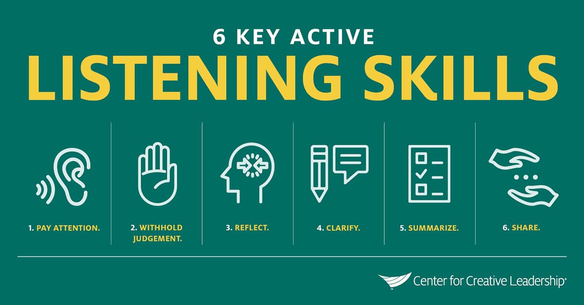
Continuous research is basically a form of active listening. By paying attention to how things are changing all around you and your product, you can proactively develop new features, pivot your product or develop new ones entirely in response to what you’re “hearing”.

3. Validate Your Concepts Before Development

A minimum viable product (MVP) is a scaled-back version of a product. Developers initially build it with just the core features that users need in order to use and derive value from it. It’s through the process of continuous research that product teams are able to validate and refine their product ideas pre-development.

Because of this methodical and iterative approach, an MVP greatly reduces how much time and money is spent developing a digital product. For instance, fixing an error after a product launch can cost up to 100 times more than if it’s caught during development.

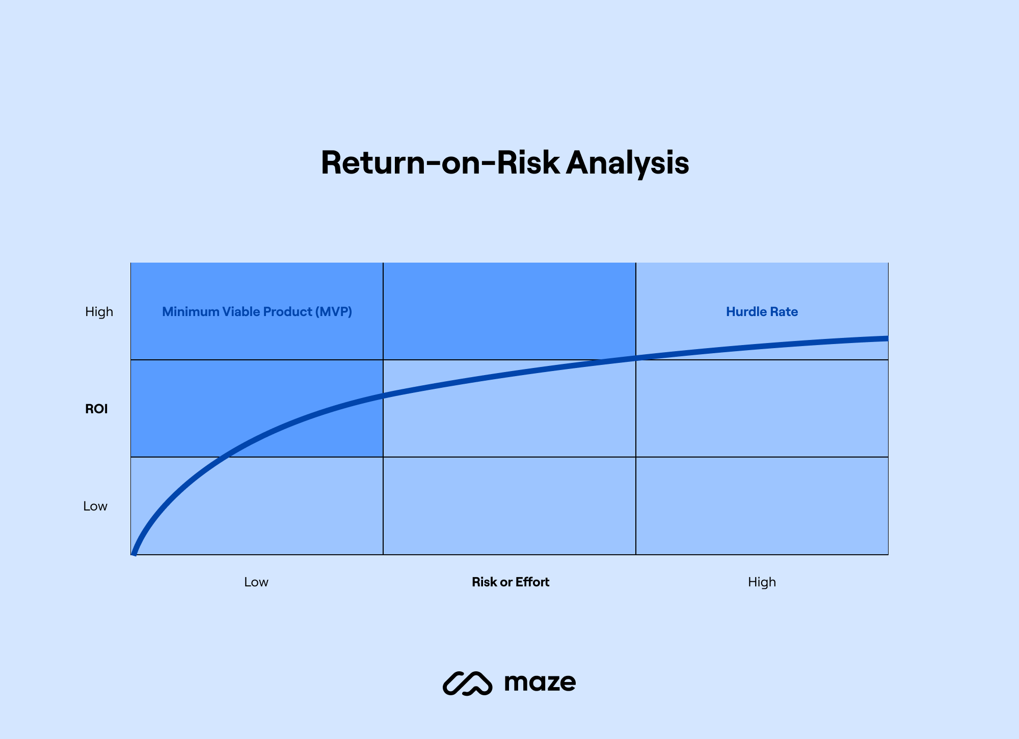
Productboard has an illustration that perfectly sums up how a lower monetary investment in a product keeps risks low. And how the effort to recover from and rebuild a faulty product remains low as well.

This is one of the strongest arguments for doing research. You can save yourself so much wasted time and energy during initial product builds by focusing on developing core features that make the product usable and useful. Continuous research and testing will then allow you to naturally evolve a product into its best self.

4. Create More Satisfying User Experiences

With ongoing research, you can gather real-time insights and test new features that allow users to have more meaningful and valuable interactions with your product. This in turn translates to greater company success. Basing decisions on real user data — at the product, team and corporate level — ensures that customers’ needs are always at the center of what you’re building.

According to respondents, product research has a positive impact on:

  • Customer satisfaction score (57%);
  • Product/feature adoption (55%);
  • Active users (46%);
  • Revenue/profitability (42%).

Products informed by user input lead to greater customer satisfaction. Not only that, they hold onto their users for longer. This alone is good for boosting user satisfaction through product development. Long-term data gathered from the same user set can be much more meaningful than data from a steady stream of new and random users.

It’s also important to consider that satisfied long-time users cost much less to manage and maintain. This means you won’t have to spend as much time or effort on marketing to attract as many new customers.

Also, product bugs and security breaches are less likely to occur when you’re keeping a close eye on your product. This results in less money spent on putting out fires and dealing with PR fiascos.

5. Make More Effective Decisions Company-Wide

Data is valuable for organizations and their product teams.

According to Maze’s respondents, 74% of product professionals believe research is effective or partially effective in determining decision-making at their organizations, and 14% say it’s highly effective.

In particular, the report shows that product teams who conduct research more often (weekly or daily) report more effective decision-making than those who conduct research less often (quarterly or yearly).

Respondents also reported that this data can enable different types of decision-making. For instance:

  • 42% of product professionals leverage data to inform all of their product decision-making.
  • 49% of organizations use research findings to make strategic decisions.
  • 60% of product professionals say that recommendations from research findings inspire new product opportunities.

It appears as though the research conducted on one product isn’t just valuable for the product in question but for the organization as a whole when it comes to making strategic decisions. And it’s even more valuable when it comes to inspiring new products.

Continuous research can have a positive impact on more than just product and executive leadership teams. Lucy Denton, the Head of Design at Dovetail, says:

“Today, research is really focused on understanding the user experience, which directly fits into the experience design of the product. It would be interesting to see how companies evolve to focus more on the customer in other functions like marketing, sales or customer support. They all talk to customers and need to understand the customers to do their job.”

By making this data readily available to the organization at large, imagine what it could do for sales, marketing and customer service. An ongoing stream of real user feedback could improve every aspect of the company.

How to Make Continuous Discovery Part of Your Process

In a recent interview, product discovery coach Teresa Torres explains how and why a continuous discovery mindset in product development is important today:

“Historically, businesses made discovery decisions by just sitting in a room and thinking ‘what should we build?’ Over the last 20 years, we’ve seen an evolution toward including the customer a lot more in the process.”

Human-centered design is what we’re all striving for today. The only way to ensure that products continue to meet and exceed user expectations is to gather continual feedback from them and test new hypotheses and concepts on them.

If you want to make continuous discovery part of your process, here are some tips to get you started:

Tip #1: Schedule Time for It

If you make time for it, then you’ll have no excuse not to do it. As for how much time you should devote to continuous discovery, the more frequently it’s done, the better.

According to Maze’s analysis, product teams doing research on a monthly or more frequent basis rated it as more effective than those who only did it quarterly or yearly. Teresa Torres suggests that weekly is best:

“At a minimum, weekly touchpoints with customers by the team building the product, where they’re conducting small research activities in pursuit of a desired product outcome.”

Block off a weekly recurring time for discovery. You can start with as little as 30 minutes before increasing the frequency of customer interactions.

Tip #2: Make It Part of Your Project Proposal

Research is a marathon that extends across the entire product life cycle. If you’re not in the habit of considering post-launch activities as part of your project proposal, timeline or budget, now is a good time to start doing so.

Research should never be considered an “extra” or an afterthought. By building it into your process from the beginning, you’ll ensure research is not seen as a set of individual studies but as a continuous learning cycle.

Tip #3: Implement the Right Research Tools

One of the biggest limitations product teams have in adopting a continuous mindset and approach is tooling.

The UX tools landscape has grown a lot in recent years. Each platform offers a unique collection of features and functionalities that product and UX researchers are looking for.

Maze, for instance, is a continuous product discovery platform that offers unified solutions for discovery — from prototype testing and surveys to card sorting and video recordings. You can also use it to recruit participants and generate automated reports for every piece of research you run.

The key is to find the right platforms for your product development lifecycle and the various research and testing methods you plan to use. Here are 13 UX research tools to explore now.

Tip #4: Mix-and-Match Methods

Just because there are dozens of types of product research and testing methods, that doesn’t mean you have to do them all in order to get meaningful results. The trick is to choose the right research methods — i.e. ones that help you reach your research goals more effectively. For instance:

Primary vs. Secondary:

  • Primary data directly comes from your end users.
  • Secondary data comes from already existing data related to the industry.

Qualitative vs. Quantitative:

  • Qualitative data relates to the user’s opinions and feelings. This type of research is key to developing a deep understanding of a problem or uncovering the ‘why’ behind actions.
  • Quantitative data relates to the statistical/numerical data gathered from users to answer research questions such as ‘what’, ‘where’ or ‘when’.

Evaluative vs. Generative:

  • Evaluative research is used to evaluate a product or concept and collect data that helps improve your solutions.
  • Generative research is used to develop a deep understanding of your users and the problem you’re trying to solve for them.

Using different types of research will give you a more well-rounded idea of what’s going on with your users and can make your research more cost-effective. Depending on your project objective and resources, for example, you can opt for more unmoderated studies and panels as opposed to moderated ones that require live control and monitoring in the data gathering sessions.

Tip #5: Get Everyone Involved

Everyone in your organization can benefit from and contribute to product research — for example: product managers, designers, marketers, salespeople, customer support representatives and so on. So why should a dedicated UX researcher or team be the only one to gather insights?

Caitlin McCurrie, the Research Lead at Atlassian, discusses why research democratization is a must to scale the impact of research:

“While I strongly believe that dedicated research professionals are a necessary component for a successful tech company, there will never be enough researchers to cover the range and volume of research needs within an organization. We will always need our teammates to engage in some form of research—whether collaborating with a dedicated researcher or running their own studies.”

It’s not just an issue of data volume. People in different roles will view the research from their unique perspectives, which can lead to additional discoveries and suggestions than you might otherwise get.

Wrapping Up

While a lot of product teams conduct research at the product discovery stage or validation and testing stage, only a few continue with the process after launch. However, think of all the benefits that come from doing product research. Now multiply those results by every time you connect with users to discover new ways to improve your product.

If you’d like more research on the benefits of continuous research, read the full Continuous Research Report from Maze now.

Categories: Others Tags:

13 Awesome Tools & Resources for Designers and Agencies for 2023

January 26th, 2023 No comments

Web design tools and resources, both free and premium, are designed to help you take full advantage of your creativity. Thereby enhance your ability to create stunning websites. There is a huge variety of products and services to choose from. They are ranging from complete platforms to specialized software applications. Just like design frameworks, wireframing tools, and UI enhancements.

We’re not going to pretend that creating wow-worthy websites is easy. Your creative talents can sometimes take you only so far. You can get to the point where you need a particular tool or resource to do some of the heavy lifting and help you work efficiently. Or, complete your projects on time, and exceed clients’ expectations.

Having the right design tools can even help you bring your creative visions to life. With this in mind, here are 13 Awesome Tools & Resources for Designers and Agencies.

  1. Be – Best Multipurpose WordPress Theme

Are you in the midst of stocking up on web design tools to add to your design toolbox? You won’t have to look far beyond BeTheme to get most of what you need. This popular (250,000+ customers) and powerful (40+ core features) multipurpose WordPress theme places an abundance of site-building tools, aids, and options at your fingertips.

5 “must have” features you won’t find anywhere else:

  • Be Builder, the fastest, lightest, and most intuitive website builder for WordPress.
  • Be Blocks, a workflow-reducing library of pre-designed sections.
  • Be Builder Woo, a simple and effective way to create an online store.
  • Be’s Header Builder 2.0 makes it easy to quickly create the pixel-perfect header you need.
  • Be’s library of 650+ Pre-Built Websites; each one is customizable, responsive, and features basic UX functionality.

You will find the Set-up Wizard on Be’s completely reorganized dashboard. Click on the banner to learn more about BeTheme or check out this free Live demo.

  1. Trafft – Service Business Management Software You Can Count On

Trafft allows a business to manage appointment bookings operations with a single tool. The operations include, but are not limited to:

  • managing, client appointments, events, group bookings, and staff schedules including special days for employees, as well as on-site and virtual meeting schedules.
  • sending reminders to clients and accepting payments from them online via MailChimp and SendFox.

Other Trafft features clients, employees, or management can take advantage of include:

  • selecting custom domains and custom fields for assignment to the Trafft platform.
  • Coupons and other service extras.
  • integration with Google Calendar, Google Meet, and Outlook Calendar when tracking appointment and event scheduling
  • integration with Zoom to conduct virtual meetings
  • Stripe, PayPal, Mollie, and Authorize.net payment options

Click on the banner for more information. 

  1. wpDataTables – The Best Tables & Charts WordPress Table Plugin

wpDataTables is the best tables and charts WordPress plugin you could possibly select for your design toolbox. It enables you to create charts and tables that up to now you’ve may have been hesitant to try building.

Tables and charts that –

  • are informative, responsive, easily maintainable, and attractive.
  • are precisely what a client is looking for, and in minutes, even if huge amounts of complex data are involved.
  • require data from a variety of sources and in a variety of formats including nested JSON

wpDataTables does all the above quickly and efficiently with its –

  • ability to organize and process huge amounts of data.
  • powerful chart-building engines, filtering and sorting tools, and features that allows users to edit their own entries
  • conditional formatting feature that allows you to color-code key data.

Click on the banner to learn more about this time and labor saving plugin. 

  1. Uncode – Creative & WooCommerce WordPress Theme

The Uncode creative WordPress theme is one of Envato’s all time best-sellers with more than 100,000 sales. The reasons for this are many, and include the ability to build incredible WooCommerce websites with features that include:

  • an advanced Drag & Drop Product Builder, configurable Ajax product filters with Variations Swatches, and impressive Shop layouts.
  • 70+ Carefully crafted mix-and-match importable pre-made designs, and 550+ Wireframes plugin section templates. 
  1. Pixpa – Easy & affordable website builder for designers

Is an easy website builder for beginning designers suitable for more advanced web designers? With Pixpa, the answer is a definite yes. Pixpa is the top-rated website builder on Capterra and Trustpilot, with a 4.8/5 rating based on its:

  • 150+ Customizable templates that allow designers to create unique and professional-looking websites.
  • affordable plans starting at under $5/mo.
  • a drag-and-drop editor that makes it easy for users to design their website
  • blog platform, responsive design, and more.
  1. Amelia – Appointments & Events WordPress Booking Plugin

Add Amelia WordPress booking plugin functionality to a WordPress-designed website and good things happen. The website’s user now owns an automated booking system that will flawlessly manage an unlimited number of appointment bookings at multiple locations from a single platform and dashboard.

  • Amelia is an excellent choice for beauty, healthcare, fitness, consulting, educational, and other client-oriented businesses.
  • both appointments and events can be booked
  • Amelia supports PayPal, Stripe, Mollie, and Razor payments. 
  1. Slider Revolution – not just a WordPress slider plugin

Slider Revolution has been the leading WordPress slider plugin for a long time, but it is more than a WordPress slider plugin now. Trusted by more than 9 million users worldwide, Slider Revolution gives you the ability to create visuals your clients and visitors love with its:

  • 250+ website and slider templates designed to impress.
  • website animation effects and other innovative features that push the boundaries of what is possible in web design.
  1. WoodMart – WooCommerce WordPress Theme

Woodmart enjoys the distinction of being ThemeForest’s most highly regarded WooCommerce WordPress theme.

It is loaded with features you won’t find in most other eCommerce-oriented themes including –

  • 75+ premade websites and 400+ templates that can also be used for quick prototyping
  • 15 special pages together with a valuable selection of product page display options.

Note: You can’t order furniture from Wordmart’s website, even though you might be tempted.

  1. Getillustrations Web and app illustrations bundle

Once a popular new website design trend, it appears that UI illustrations are here to stay. Even though the popularity of certain illustration styles may vary with time, the opportunities for innovation and creativity remain limitless.

Getillustrations brings to the table:

  • 14,000+ ready-to-use illustrations in nearly 200 different categories.
  • Illustrations for web, apps, presentations, and other purposes.
  • Available in PNG, SVC, Ai, Figma, & Sketch formats.

Use coupon code ULTIMATE30 to receive a 30% discount. 

  1. Mobirise – Website Building Software

Mobirise is a free downloadable website building software app for Windows, Mac, and Linux. Mobirise is especially well suited for creating  small/medium websites, landing pages, and simple web stores.

  • Mobirise is perfect for non-techies who may not be familiar with the intricacies of web design.
  • Mobirise is great for fast prototyping and small customers’ projects.
  • Mobirise features a minimalistic, extremely easy-to-use interface, it is Mobile & Google-friendly, and can be hosted anywhere. 
  1. The Essential Grid WordPress plugin

Essential Grid is hands down the best WordPress grid plugin you could have in your web design toolkit. Essential Grid’s –

  • easy-to-use drag and drop builder makes it possible to bring your creative vision to life in minutes rather than hours.
  • 50+ impressive, customizable templates make it easy to complete projects at lightning-fast speeds.

With Essential Grid, you can create any gallery design you can think of without writing a single line of code. 

  1. Blocksy – Best Free Ecommerce WordPress Theme

Blocksy is packed with dozens of hyper-intuitive features and options, yet it is both lighter and faster than most similar WordPress themes.

  • Features include advanced WooCommerce integration, a header builder, a footer builder, custom post types, and dynamic data support.
  • Options include White Label, layout, header and footer options, and a customizer Dark Mode.

This best free eCommerce WordPress theme gives you complete control over your page and web designs. 

  1. Total WordPress Theme

This aptly named WordPress theme has all the flexibility you could ask for, yet it is surprisingly easy to work with, even for a beginner. Total’s features include –

  • an extended version of the WPBakery page builder
  • 90+ ready to use section templates plus quick import demos, unlimited color options, and custom fonts.
  • WooCommerce integration, full support for Elementor (with custom widgets), live customizer theme settings, and dynamic template and layout functionality.

*******

Creating a stunning website is not always easy. Your creative talents can sometimes only take you to a point. You will need a particular tool or resource to do some heavy lifting.

Website design has become easier, however. More and more new web design tools and resources are being introduced the marketplace. Many older ones are being upgraded to make assembling a well-rounded tool kit a relatively easy task for any web designer.

Having the right design tools can help you bring your creative visions to life. With this in mind, here are 13 Essential Tools & Resources for Designers and Agencies.

Read More at 13 Awesome Tools & Resources for Designers and Agencies for 2023

Categories: Designing, Others Tags:

Animating CSS Grid (How To + Examples)

January 25th, 2023 No comments

I’m pleased to shine a light on the fact that the CSS grid-template-rows and grid-template-columns properties are now animatable in all major web browsers! Well, CSS Grid has technically supported animations for a long time, as it’s baked right into the CSS Grid Layout Module Level 1 spec.

But animating these grid properties only recently gained supported by all three major browsers. Shall we take a look at a few examples to get the creative juices flowing?

Example 1: Expanding sidebar

First of all, this is what we’re talking about:

CodePen Embed Fallback

A simple two-column grid. Now, before, you might not have built this using CSS Grid because animations and transitions weren’t supported, but what if you wanted the left column — perhaps a sidebar navigation — to expand on hover? Well, now that’s possible.

I know what you’re thinking: “Animating a CSS property? Easy peasy, I’ve been doing it for years!” Me too. However, I ran into an interesting snag while experimenting with a particular use case.

So, we want to transition the grid itself (specifically grid-template-columns, which is set on the .grid class in the example). But the left column (.left) is the selector that requires the :hover pseudo-class. While JavaScript can solve this conundrum easily — thanks, but no thanks — we can accomplish it with CSS alone.

Let’s walk through the whole thing, starting with the HTML. Pretty standard stuff really… a grid with two columns.

<div class="grid">
  <div class="left"></div>
  <div class="right"></div>
</div>

Putting the cosmetic CSS aside, you’ll first need to set display: grid on the parent container (.grid).

.grid {
  display: grid;
}

Next, we can define and size the two columns using the grid-template-columns property. We’ll make the left column super narrow, and later increase its width on hover. The right column takes up the rest of the remaining space, thanks to the auto keyword.

.grid {
  display: grid;
  grid-template-columns: 48px auto;
}

We know we’re going to animate this thing, so let’s go ahead and throw a transition in there while we’re at it so the change between states is smooth and noticeable.

.grid {
  display: grid;
  grid-template-columns: 48px auto;
  transition: 300ms; /* Change as needed */
}

That’s it for the .grid! All that’s left is to apply the hover state. Specifically, we’re going to override the grid-template-columns property so that the left column takes up a greater amount of space on hover.

This alone isn’t all that interesting, although it’s awesome that animations and transitions are supported now in CSS Grid. What’s more interesting is that we can use the relatively new :has() pseudo-class to style the parent container (.grid) while the child (.left) is hovered.

.grid:has(.left:hover) {
  /* Hover styles */
}

In plain English this is saying, “Do something to the .grid container if it contains an element named .left inside of it that is in a hover state.” That’s why :has() is often referred to as a “parent” selector. We can finally select a parent based on the children it contains — no JavaScript required!

So, let’s increase the width of the .left column to 30% when it is hovered. The .right column will continue to take up all the leftover space:

.grid {
  display: grid;
  transition: 300ms;
  grid-template-columns: 48px auto;
}

.grid:has(.left:hover) {
  grid-template-columns: 30% auto;
}

We could use CSS variables as well, which may or may not look cleaner depending on your personal preferences (or you might be using CSS variables in your project anyway):

.grid {
  display: grid;
  transition: 300ms;
  grid-template-columns: var(--left, 48px) auto;
}

.grid:has(.left:hover) {
  --left: 30%;
}

I love that CSS grids can be animated now, but the fact that we can build this particular example with just nine lines of CSS is even more astounding.

Here’s another example by Olivia Ng — similar concept, but with content (click on the nav icon):

CodePen Embed Fallback

Example 2: Expanding Panels

CodePen Embed Fallback

This example transitions the grid container (the column widths) but also the individual columns (their background colors). It’s ideal for providing more content on hover.

It’s worth remembering that the repeat() function sometimes produces buggy transitions, which is why I set the width of each column individually (i.e. grid-template-columns: 1fr 1fr 1fr).

Example 3: Adding Rows and Columns

CodePen Embed Fallback

This example animatedly “adds” a column to the grid. However — you guessed it — this scenario has a pitfall too. The requirement is that the “new” column mustn’t be hidden (i.e. set to display: none), and CSS Grid must acknowledge its existence while setting its width to 0fr.

So, for a three-column grid — grid-template-columns: 1fr 1fr 0fr (yes, the unit must be declared even though the value is 0!) transitions into grid-template-columns: 1fr 1fr 1fr correctly, but grid-template-columns: 1fr 1fr doesn’t. In hindsight, this actually makes perfect sense considering what we know about how transitions work.

Here’s another example by Michelle Barker — same concept, but with an extra column and lot more pizzazz. Make sure to run this one in full-screen mode because it’s actually responsive (no trickery, just good design!).

CodePen Embed Fallback

A few more examples

Because why not?

This “Animated Mondrian” is the original proof of concept for animated CSS grids by Chrome DevRel. The grid-row‘s and grid-column‘s utilize the span keyword to create the layout you see before you, and then the grid-template-row’s and grid-template-column‘s are animated using a CSS animation. It’s nowhere near as complex as it looks!

CodePen Embed Fallback

Same concept, but with more of that Michelle Barker pizzazz. Could make a nice loading spinner?

CodePen Embed Fallback

Wrapping up with a bit of nostalgia (showing my age here), the not-very-griddy animated CSS grid by Andrew Harvard. Again — same concept — it’s just that you can’t see the other grid items. But don’t worry, they’re there.

CodePen Embed Fallback

Animating CSS Grid (How To + Examples) originally published on CSS-Tricks, which is part of the DigitalOcean family. You should get the newsletter.

Categories: Designing, Others Tags:

How To Build an App Like Netflix?

January 24th, 2023 No comments

Netflix has seen an exponential rise in its user base after it expanded its operations to online video streaming services. The platform currently serves around 223 million subscribers and generated revenue of around $30 billion in 2021. Even after getting tough competition from Disney, Paramount, and other key players in the market, Netflix has successfully maintained its growth with time.

Though several on-demand video streaming platforms are introduced every year, the market still looks positive for new entrants to bridge certain gaps. A study from future market insights concludes that the video streaming market will grow to $750 billion by 2031 from $60 billion in 2020, registering an exceptional CAGR of around 24%. 

In this article, we take you through a business model and process of building a video streaming app like Netflix.

The Story Behind Netflix’s Success

Netflix initially started as a DVD mail service business in 1997. By 1999, customers could place their orders on Netflix’s website and DVDs were then mailed to them. And finally, in 2007, Netflix started streaming movies online directly to customers’ homes.

From delivering DVDs to streaming wholly-owned shows, Netflix has emerged as a leader in streaming services after a long struggle.

 Here are some stats regarding Netflix’s usage and growth:-

  • Netflix was the first international streaming service provider.
  • 75 million adults from the US and Canada have Netflix subscriptions.
  • An average Netflix user spends around 3.2 hours daily streaming the content. 
  • Netflix gained around 15.77 million users during the Covid-19 pandemic.
  • Netflix is one of the biggest clients of Amazon Web Services. The company pays around $9.5 million per month for cloud data usage to Amazon.

Business And Revenue Model of Streaming Apps Like Netflix

Netflix works with a subscription-based model where users subscribe to the application to watch the content for a fixed period depending upon the package availed. Netflix has no free subscription for its content, meaning that every user has to avail of the subscription to access the video content. However, Netflix does allow password sharing for its subscribers and a large number of users benefit from this relaxation provided by the company. The company recently announced that it will revisit its password-sharing policy in the coming times.

Further, Netflix has different monetization methods to generate revenue depending on its target location and audiences.

Some of the most used monetization models used by businesses in the similar domain are:-

  • Subscription Video On-Demand (SVOD)
  • Transactional Video On-Demand (TVOD)
  • Ad-supported Videos (ASOD)

Recently, Netflix has come up with a basic plan with ads for users in a few countries at more affordable rates.

Features checklist For a Streaming App Development

Registration

Your video streaming application should have an easy registration process for users. A new user can become impatient and depart if they can’t complete the task in a short amount of time. The process can be made as quick and easy as possible by including a sign-up through social media networks.

Watch Lists

Analyzing customer behavior is one of the key features of making your app user-friendly. Your Netflix-like app should have a watch list feature that recommends videos to the viewers that match their interests.

Multi-Language Support

Multilingual and multi-currency support help in targeting a wider audience across multiple regions. This also helps in building a connection with users to the next level and allows you to promote your services with more flexibility. Only 25% of internet users are native English speakers, so it becomes important to cater to the remaining 75% as well. 

Payment gateway

Most users abandon their purchases and subscription if they don’t get their preferred way to make their payments. It’s important to have a payment gateway with multiple payment options including wallets and cards integrated into your Netflix-like mobile app to provide ease of payments to the users.

10 Countries With Highest Netflix Users

Though Netflix enjoys a huge fan base across the globe, there are some countries where Netflix is significantly popular among users. Below is a list of 10 countries with the highest numbers of Netflix users.

10. The United Kingdom

The United Kingdom accounts for 33.8% of Netflix’s user penetration. Black Mirror, End of the f**king world, and Collateral are the most-watched originals in the UK. 

9. Germany

Germany has a 35.5% user penetration for Netflix. Dark and Babylon Berlin are the notable original series watched in Germany. 

8. Finland

Finland has a 39.7% user penetration for Netflix with a population of 5.97 million. The most popular series in the country is Bordertown.

 7. Australia

Australia has a large number of Netflix users. The current user penetration for Netflix in Australia is 42.7%. The most binge-watched originals in the state are Glitch and Letdown.

6. The Netherlands

The country has 43.6% user penetration for Netflix with a total population of around 17 million. As per Statista, around 4.2 million households paid for Netflix subscriptions, and the rest relied on password sharing. 

5. Sweden

Sweden has around 50% user penetration for Netflix. Bonus family is one of the most-watched originals in Sweden.

4. Denmark

Denmark has 59.4% user penetration for Netflix. Rita is the most-watched web series on Netflix in Denmark. The total population of the country is 59.03 million. In November 2021, around 52 thousand users downloaded Netflix actively through the App Store. In comparison, Netflix’s active downloads through the Play Store amounted to about 57 thousand in that same month.

3. Canada

Canada with 56.3% user penetration comes as the country with the third highest user penetration for NetFlix. Alias Grace, Anne with E, Travelers, and many more web series are popular in the country. Canada as we know is also the second-largest country in the world.

2. Norway

Norway is the second-highest country with the highest user penetration of 62.4 % for Netflix. The country has a population of only 5 million. The most-watched originals in Norway are Lilyhammer, Borderliner, and Nobel.

1. The United States

The United States, where Netflix was actually born has 64.5% user penetration for Netflix. The country has the highest number of users for video streaming applications. Notably, the country also has a large population of 325.7 million. The most popular video content on Netflix watched in the United States includes Stranger Things, House of Cards, and many more.

Required Technology Stack For Creating An App Netflix

It might be difficult to create an application that appears exactly like Netflix as they have some unique in-house services to support its operations. Netflix uses a complex and diverse tech stack with multiple technologies for streamlined operations and better user experience.  

The existing tech stack used by Netflix includes

  • Programming Languages: Java, JavaScript, Python, Kotlin, Swift
  • Framework: React, NodeJS, WinJS
  • Databases: DynamoDB
  • Server: Amazon EC2 and RDS

However, you can frame your own tech stack after listing out the features and creating the final software requirement document for your mobile app. 

Steps To Create An App Like Netflix 

Find Your Niche

Video content has gained popularity in multiple categories and video platforms targeting micro niches have huge potential in current times. Netflix mainly focuses on entertainment-based content and most of the shows on the platform had an existing fanbase which helped it flourish.

You can select a content category for your video streaming app depending on your target audience. Furthermore, you can go for content categories that you can distribute easily among the audience.

Choose The Monetization Model

Due to the fact that videos are easy to consume and attract more attention from the audience, it gets easier to monetize the videos with multiple options. The widely practiced monetization methods by video streaming platforms are Subscription Video On-Demand (SVOD), Transactional Video On-Demand (TVOD), and Ad-supported Videos (ASOD).

Study The Video Streaming App Requirements

Checking out the features list for video streaming apps mentioned above, you can narrow down your video app requirements depending on your target audience and region. The key requirements for building an app like NetFlix can include:

  • Stable network connectivity
  • Security
  • User experience
  • Capabilities of app
  • Develop An MVP for an On-Demand Video Streaming App

Before entering the market with a full-fledged product with all your money invested into it, you should try testing your business idea with a minimum viable product. MVP allows you to experiment with multiple tweaks and features for your business idea and app with optimized risks. For developing an MVP you will require to list out the basic and essential features of your application and then hire an MVP development company to get the job done.

Gather Feedback

After you launch your MVP app in the market, you can start onboarding users through various advertising mediums. This will also help you in creating awareness about your app among your target audience and region.

Following, you ask the most active users of your mobile application to fill out surveys regarding app performance and required enhancements in terms of features and user experience. 

How To Select a Mobile App Development Company For Your Video Streaming Business Idea

A reliable development partner plays a crucial role in developing a mobile app similar to Netflix. Always choose a company with relevant experience in mobile app development for video-streaming apps. The company you select should have in-house teams of expert developers, business analysts, and marketers to build a competitive solution for your business idea.

Furthermore, make sure the company employs a transparent process for all development projects and uses proper tools to track the progress of the development process. This helps in the efficient use of hours purchased by you for the project. 

The Final Word

Netflix has been constantly improving its services and often tests new features for better user experiences. When developing a video streaming app like Netflix, industry-specific requirements such as cloud infrastructure, responsiveness to devices, etc play a major role in the capable end product. Post analyzing the business model of Netflix you can also modify it and frame your own business model.

The post How To Build an App Like Netflix? appeared first on noupe.

Categories: Others Tags:

Smashing Podcast Episode 55 With Tejas Kumar: Is Technology Making Us Redundant?

January 24th, 2023 No comments

In this episode, we ask whether technology is making us redundant; will we all soon be replaced with AI? Vitaly Friedman talks to Tejas Kumar to find out.

Show Notes

Weekly Update

Transcript

Vitaly Friedman: He has been writing code since the age of eight and still continues to do so today. He’s a DevRel leader, YouTuber, advisor, mentor, influencer, and has very, very strong opinions about pretty much everything.
Previously, he’s worked with G2L, Vercel, Spotify etc picking up things along the way, sometimes as a developer and sometimes as a manager.

Vitaly: Now he lives in Berlin, Germany, but most of the time travels the world equipping and encouraging developers to do their best work, aiming to make the world a better place for quality software. Beyond that, he’s extremely kind, passionate, friendly, and smart. And not that a passes by that him sharing his opinions again on everything Tailwind, JavaScript and people on Twitter.

Vitaly: Now we know he’s a great product engineer and a kind human being, but did you know that he can easily type faster than 100 words per minute when writing code without a single mistake, especially if it’s a life coding session in front of thousands of developers? My smashing friends, please welcome Tejas Kumar. Hello, Tejas. How are you doing today?

Tejas: What’s up? I’m doing good. I’m smashing. I’m smashing things as we speak. I’m also doing smashing.

Vitaly: Oh, well—

Tejas: Smashing enough.

Vitaly: You always look smashing. Always. I always feel smashing when I see you being smashing in some way or the other.

Tejas: Yes, that’s what my grandpa always used to say. Smash them with kindness.

Vitaly: Oh, really? Wow. This is just the perfect beginning of the interview. Now it’s so nice to have you here. I remember everything from our strange bus trips to our walks in somewhere between Croatia and Germany, and what not, it’s always so, I don’t know. It’s so much fun to be around because you always have, again, opinions about things.

Tejas: Yes.

Vitaly: You always express them with a very strong kindness. Why is that, Tejas? Where is it coming from?

Tejas: Yeah, it comes from a lot. So when I do talks and things at conferences, a lot of people tell me… they come to me after and they’re like, “Hey, that was so genuine. I felt like that was very genuine.”
And it comes from that. I’m a strong believer in speaking truth in love or kindly, and I guess that’s where it comes from. I do have strong opinions about things, right, but I feel like they have to come under an umbrella of kindness and respect. Otherwise, nobody wants to listen to some angry person with strong opinions who’s not friendly.

Vitaly: Well, you don’t know. I mean, I’m very happy to hear maybe not angry people, but like whenever someone has a very strong opinion, I’m totally fine with that. Actually, there is Lex Friedman, who is a podcaster. He’s doing all these videos with people on YouTube like you do as well. We’ll talk about it in a moment. But he had just posted recently one thing. He applauded to all the people who are attentive enough to listen to other people’s opinions and their arguments and be willing to change their minds.

Tejas: Yeah.

Vitaly: So I think that if you have a very strong opinion about things, as long as you are willing and open minded to change your mind based on the arguments that come your way, right? I think this is fine for me. This is actually a very important skill to have.

Tejas: Yes. Yes. I think the underlying skill there is critical thinking and being open and receptive. 100%. I was just watching the Welcome to Chippendales. I don’t know if you’ve heard of this show, right?

Vitaly: Not yet, no.

Tejas: It’s a great show. I can recommend it. And in that show you watch the founder of Chippendales repeatedly screw up his company and go into bankruptcy. And the common thread in his mistakes is that he just has a lot of this entrenched, close minded pridefulness where he refuses to have his mind changed despite his strong opinions.
So I agree with you. I think that’s something I try. I work hard at and try to maintain, and so I appreciate that you called it out here on this conversation.

Vitaly: Yeah, sure. Well, the reason why I wanted to have you on the show as well, because you have all these incredible experiences and stories you can share, right? And you also are very public about things that are important to you and you’re not afraid of strong words as well by doing so. And so maybe just for everybody to be kind of following your story to know who you are and what you’re coming from and so on, maybe you could just share a little bit of insight about how did you end up in this front end madness? Where is it coming from?
Did you wake up one day when you were eight and thought, “This is it. I went to write HTML, CSS, JavaScript for living now for the rest of my life.”

Tejas: When I was eight years old, react was actually a thing. I’m joking. It wasn’t.

Vitaly: Oh, who knows? Who knows?

Tejas: Yeah. No, but yeah, no, I was born with a disease that was really limiting and there’s a lot of things I couldn’t do. I had a ton of physical limitations. I made a whole 48 minute YouTube video about it, which you can watch if you’re more just interested or we could talk about it here. I don’t really care. But with the limitations I had, I couldn’t go to school every day. I couldn’t carry a backpack. I couldn’t open doors. I couldn’t walk upstairs. I couldn’t do a lot of things. The only thing I could do was take my fingers and type on keyboards with them. And thankfully my family was relatively low income at the time. I grew up quite poor, but we had just enough privilege to where we had a computer and a keyboard. And since this was the only thing I could do in many ways I feel like coding found me. And I was drawn to, I have a YouTube video coming about this coming out about this on Thursday, I was drawn to the quick feedback loop of JavaScript where you just write a little bit of code in your browsers console and it executes. And I was like, whoa. And it’s that kind of whoa, that kind of I found when I was eight just kind of playing with browsers and code. And it’s the same whoa that I chased today.

Vitaly: That’s interesting. So would you say that this was specifically then JavaScript that kind of spoke to you, or would you say that this just, if Flash was still a thing it’d still be running around building Flash websites?

Tejas: That’s an excellent question. No, it’s definitely not JavaScript at all. It was, well, it started with Photoshop, so I was-

Vitaly: Photoshop. What is Photoshop, Tejas?

Tejas: Yeah, I know, right? Nowadays with Sigma and stuff, Photoshop’s a bit lost, but when I was young, Photoshop was the design tool. It wasn’t just for photo editing and manipulation, it was for at least I used it for creating stuff because Vector wasn’t so recommended at the time. And so when I was younger, Vitaly, we had Macro S Factor.

Vitaly: Even younger.

Tejas: Yeah?

Vitaly: Even younger.

Tejas: No, no, not even younger. When I was younger than I am now. When I was kind of just getting into it, Mac OS Aqua, the design principle aqua thing, was very in vogue and everybody was trying to design these shiny balls.

Vitaly: I remember them vividly, yeah, yeah. I remember.

Tejas: Yeah. The shiny balls. And so I did tutorials on Photoshop. I was like, I want to make a really shiny ball. And then from there I moved to Tux. They made these penguins with gloss effects, and that’s where I started and I was like, wow, this is so beautiful. And then I found the slicing tool where I could design something and make it html, and I was like, whoa. And then I was like, okay, this is cool, but how do I make it interactive? And then I found JavaScript. So the draw was really creating stuff without any physical damage to myself and without any financial requirement. I was able to create stuff without any barriers to entry other than the crappy old keyboard and computer we had. So that was it.

Vitaly: Yeah, the magic thing for me was really this moment when I realized that I can actually make it available to everybody else. That was that magic thing. I mean, I remember FTPing all the way, and-

Tejas: Yes.

Vitaly: I mean there were plenty of free servers out there with all the kind of advertising and all of that. And I was just, wow, there are 12 people who visited my website in the last three months. It was incredible. That was just really mind changing, like mind blowing, life changing for me. Yeah, that’s really incredible. And if I look at the industry now, the industry is so mature. There are so many incredible things. Like the thing that we’re building on the internet, on the web, it’s just unbelievable. It’s just the level of software engineering and all.

Tejas: Yeah but you know, Vitaly, I feel a bit sad that it’s so mature now that it’s … when I was younger, not younger than when I started …

Vitaly: I assumed that, yeah.

Tejas: As I was growing, I’ll put it this way, I was often terrified of being a mature adult because when I was younger and rebellious, being mature was being boring for me. I was like, oh, I have to put on a suit and tie and kind of be bored. Like my childlike wonder was lost in my definition of maturity many years ago. And I liken that to today.
You say the web is mature and I agree with you. It kind of makes me sad because I feel like in this maturity we’ve lost a lot of the awesome whimsy that we used to have. I don’t know if you remember these Geo cities, angel fire type of websites with under construction banner and like all of, you know?

Vitaly: I mean, you can still have them on the web. It’s just not many people do.

Tejas: Right. But it’s because it’s not cool anymore. And I want to bring that back. I remember the dancing baby for no … like every website just had a dancing baby and a cursor that was a clock that would follow your cursor. Anyways, so all of this I feel like we’ve lost, and I’d like to see more of that. Anyway, sorry. Just a little rant.

Vitaly: No, I think that’s actually, in many ways, it’s like we’re always moving in circles. I have a very strong feeling that in many ways when I look at e-commerce websites, you probably don’t want to have it there necessarily unless it’s, I don’t know. Maybe it’s a brand with a personality and things like that. That might be okay. But I do feel like we are a little bit too used to getting things done in a certain way. And I mean, very often we think about we have to be conventional. We need to follow particular guidelines and rules. And we probably should if you want to be conventional and we want to follow the rules and want things to be familiar to everyone.
But I mean, there’s also this notion of surprising people, and I’m not talking about delight necessarily, but just surprising them. Just making them think a little bit about where they are and what they’re doing. I mean, if I look at your website, well every time I come to the site for some reason I see a slightly different and sometimes slightly strange photo of yourself. Sometimes in very different outfits.

Tejas: Yes.

Vitaly: So is that the whimsical that you are kind of mentioning there? Speaking about?

Tejas: Yeah, yeah. If you drag your cursor, if you move your cursor around, you just cycle through a bunch of random photos of me. It’s open source. So I’ve lost control of … so people will add pictures of me dressed as a flower, pictures of some muscular guy.

Vitaly: Look fantastic as a flower, if I may say.

Tejas: So. Yeah, thanks. Yeah, they’ll do some muscular guy shirtless with just my face photoshopped on him. They’ll do all kinds of weird things.
This is not me, this is the community who feel the need to add weird pictures of me on my website. But it’s exactly the whimsy I’m talking about. And as you drag your cursor across, you’ll see some of these. And I like that. And I feel like, to your point, smashing does the perfect balance of this with the cats. The cats are not … like if you’re talking about content and great content, great tips, great, whatever smashing does, the cats are really non-essential. But I feel like they are essential because they bring that awesome whimsy. So I like that y’all do that as well. I think it’s much needed.

Vitaly: Yeah. So I think we do like cats. I mean it’s been quite a journey with all the cats. I mean, I don’t even know where they have been and have not been at this point, right?

Tejas: Yeah.

Vitaly: But also speaking about you, where you have been and where you have not been yet. I mean you’ve been working on so many different really cool companies. I mean, I look at Vercel, Spotify, Xata recently, right?
Maybe, I don’t know if you could share some insights about what did you learn from each of those things? Maybe there was some really interesting insights that you wish you’d known earlier in your career.

Tejas: Yeah, definitely. I was just talking to my good friend Fabian. I just had lunch with him and he mentioned he’s reading this book by an ex-Google engineer called Solve for Happy. Great book. And in that book he talks about how really nothing is really good or bad or happy or sad. It’s just what’s our perception of it. And I feel this way about the jobs that I’ve left because there’s lessons in there from each of them. Most recently from Zeta, I learned the, actually from Zeta and G2I, both of these companies combined, I’ve learned the value and importance of urgency, ownership and autonomy. I think that’s really important.

Tejas: In fact, there’s an old Steve Jobs interview when he was much younger. He had hair and was alive, but he said people tend to leave when they feel like they can’t have ideas. And I saw that, I saw it executed very, very well at G2I where I was reporting to the CTO. And he was just like, he would talk to me on Monday and ask me what my plan is. We’d align and he’d be like, “Awesome, make it happen. Goodbye. Come to me if you need anything, but I trust you.”
And this phrase, “I trust you.” I learned how powerful that can be in a position of leadership. And then I would continue to have multiple management leadership roles there, even as director of developer relations at Zeta. And that’s something I carried with me from G2I was this, “I trust you. Make it happen.” So I would talk to my team on Monday. We’d kind of plan for the week and then by Friday, well on Monday I would tell them, I would say, “See you Friday. Come to me if you need anything, but I trust you.” And then we’d go to Friday where we would have just an end of week, what did we do, how do we feel check in. And this was excellent. We came up with this really nice rhythm that facilitated this kind of urgency and ownership without stress, urgency without stress. It was really, really nice.

Vitaly: I mean, one thing that I noticed recently is that many companies try to be very careful about how, on the one hand, to give people this sort of autonomy to just trust them and do the work. Because again, when you think about micromanagement, it’s such a bad kind of really bad pattern to use. And I mean there are probably plenty of companies that are still my micromanaging on some level. But I think there is this way of crystallizing, I guess in some way, those things that really work and things that do not work.
One thing that I saw companies were using, and it works seems to be working really well. This idea of, maybe you’ve heard about this as well, is the idea as a manual for me.

Vitaly: That means, for example, where you say, okay, every single individual contributor or anybody, manager. It doesn’t matter really. Every single person who is working in the company, you better go ahead and try to prepare a little Google Doc on Notion document or anything like that where you describe how do you work comfortably, what is important to you, like your calendar, your preferences, when do you work best? So is it okay to disturb you in the morning? Is it better to disturb you slightly later when it comes to an urgent meeting or things like that. And so everybody’s encouraged to create this as long as it can be a mural board or mural board or anything like that. And so everybody’s encouraged then to put the link to it in their Slack profile. And so everybody knows, okay, I don’t know who that person is. And especially in a big corporation, a big company, we have maybe tens of thousands of people working.

Vitaly: It might be very, very comfortable to be able to say, okay, I need to reach out to that person, that position from the team, but I don’t want to come across as in kind of pushing my ideas or whatever I want through their agenda in some way the other disrupting them. But I wanted to be more respectful. So that was really magical when I saw that and I thought, wow, I really appreciate it, especially in the remote first environment that where we are working.

Tejas: We did that at G2I as well. We had social contracts, they were called. These documents. And I remember them working really, really well.

Vitaly: Would you say that for your perspective would you… now I assume that you are looking, I don’t know, either maybe building something on your own, maybe kind looking what’s around and all. Is it important for you that you’re working remote first, remote only, or would you say that’s not a problem for me to go to the office every day?

Tejas: Yeah, it depends. It really depends on a number of factors. I could honestly make the office thing work if the other factors were appropriate. But, yeah, no, I don’t think remote’s a hard line for me.
I was, again, to cite my friend Fabian. I asked him the same question. I said, “Do you prefer remote or onsite?” And his response was a third option, which he tends to think outside the box. He is like, well, honestly, I prefer a choice. Being able to do a remote for a season and then onsite for a season. Like the choice is the magic to him. And I kind of agree with that. But I could do office if it’s required for sure.

Vitaly: But also looking in general at the IT industry, I know with a big eye and a big T, I guess at this point there is a lot of stuff going on and many people are concerned layoffs, and there isn’t a sense of uncertainty about where we’re going with … Is it still a thing to be a project engineer? Is it a good thing to be a project engineer? I’m pretty sure it is, right? But where do you see all of this kind of being today? Is it just a natural way of the economy is not in a good shape, so sure there are layoffs after a season of hiring, or do you see this kind of becoming a trend where we have to be careful and cautious about not losing our jobs for AI by any means? What’s the take on this?

Tejas: Yeah, my take on this is it’s normal. I feel like look at the GDP curve of any country of any year and you’ll see is dips recessions are normal and predictable and they happen. And when recessions happen, layoffs happen. I feel like a recession is a sign of economic normalcy. If it lasts very long, then it’s a depression. That’s a huge problem. But I feel like it’s expected. I feel like layoffs unfortunately have their time and place. They’re not good. They affect families. I mean, I had the privilege of quitting, but I also feel the squeeze of unemployment. So I don’t think they’re good. But I think it happens. I don’t think the jobs will be taken by machines yet because machines and AI is being designed now to kind of be a helper.

Tejas: So I feel like it’ll help us. But I do think you give chat GPT, access to the internet, which it doesn’t have, and then it gets extra superpowers and gets more threatening. But I feel like there’s human beings with a vested interest in preserving human beings with jobs. So I’m not so sure the AI will take our jobs, but the state of the industry now I think is actually pretty cool, Vitaly, because when you and I started and I mean you probably started way before me, so I’ll just say when I started. I’m not calling you old. I’m just calling you experience.

Vitaly: That’s okay. That’s okay. We’re all friends here.

Tejas: No, but when I started, there was no front end and backend. There was webmaster. There was a web dev and it was the one guy or girl who would design, develop, and then drag things over to the FTP thing to upload to some shared hosts. Some of this is quite common.
But then over time you and I have had the privilege of watching higher specializations develop. So we went from webmaster to now front end and backend to DevOps. And then from that to now machine learning engineers, data scientists, and then an emerging part of this is DevRel, is developer relations, I feel like is still pretty young, but I think the industry has kind of a tree root with branches, has kind of branched off into specializations and I see more of them occurring.

Tejas: And I think it’s pretty great because that means more options for people to get jobs to maybe start at an abstract level, but I think it’s better for humanity. One fear of mine is that the world is becoming, the tech industry is taking over the world, right? We used to have clothing stores, now we have online companies that sell clothes. We used to have travel agents, now we have websites that sell tickets. Like everything’s becoming tech. And this is part of the reason why I used to have strong opinions. This is part of the reason why I campaign really hard for diversity, equality and inclusion because Plan A was heavily unequal of the world, so to speak.

Tejas: I watched a documentary on Columbus yesterday and made me hate the world a little bit more, right? And so I feel like if we’re undergoing some type of tech revolution where more companies are tech companies advocating for fairness, equality, diversity and inclusion is massively important so that people don’t get left out and equality doesn’t get as skew as it has been historically.

Vitaly: I think it’s also this notion in general of I think us focusing a bit too much on speed. I remember vividly having this conversation a while back about, “Oh wow, the technology is moving fast, so fast and we’re going to do less, which is going to do less because the technology is going to take over.” It’s the same way we see AI now like oh ChatGPT can do so much. It can be giving us answers, better answers, faster answers, and—

Tejas: Can write code.

Vitaly: You can actually quote … yeah, you can write code, it can debug and everything. So we are going to do less. But I think that reality, I mean at least in my life so far it has been very different. It becomes faster, but then we tend to do much more. We always find a way to fill in not necessarily the gaps, because these gaps don’t even have a chance to appear, right? We are just moving. It’s like it’s everything. I have the strong feeling in the past. Maybe it’s kind of similar to you as well, maybe not. I have a feeling that I was doing one thing and I was doing it interruptedly, and then I would spend two, three hours on that and I would be kind of done more or less. Now it seems like, well, maybe 23 things. And yeah, we don’t do them in peril. I don’t really believe in multitasking or maybe I’m just really bad at multitasking while other people are much better. But I do have a strong feeling that it’s all so fragmented and we do so many different things at the same time. And so I don’t believe that technology is making us redundant in any way. It’s just we are doing certain different things, right?

Tejas: Exactly.

Vitaly: But talking about that, one thing I do have to ask because we probably, I expect probably can hear the voices in the back asking, “Tejas, what about those frameworks and front? Let’s talk about phone time landscape in 2023.” And one question that people ask me, and I want you to answer it is, we came from times when Jake worry was a big thing and it still is a big thing on many websites and legacy website and many websites in general. Do you expect this world of frameworks to change or are we at some level of maturity where a react is going to stay, view is going to stay, angle is going to stay? I mean, it’s impossible to answer that. That’s why I’m asking you now. What’s your take on this in general? Should we be talking … like imagine 20 years from now we’re sitting in a podcast like this thinking, “Remember when React was a thing and look now?”

Tejas: Yeah, you say 20 years, I feel like one year from now someone’s going to listen to this and be like, “Oh my gosh, this stage Tejas was so wrong about his answer.”

Tejas: No. So I think first of all, I think the web is held up by giants who are underappreciated. And by that I mean specifically jQuery and WordPress power more of the internet than React period.
So a lot of them people talk about, “Oh, they’re not cool.” No, no, they power most of the internet and I think they should be acknowledged. But there was a time in the React story where React had enough momentum and critical mass to look cooler than jQuery.
It’s the new thing, it’s the new industry standard. And then jQuery kind of got diminished even though it’s usage didn’t, but it’s I guess perceived value got diminished and reacted over.
And I think in 2023 we’re starting to see some of that as well with React. Where React is used a lot. I mean I just put out a YouTube video about why React is unbeatable. And I do think it is unbeatable because here’s the deal: jQuery and WordPress have not been beaten.

Tejas: They’re also unbeatable to some degree. And now especially you have teams at Google investing in React, investing in how React works in Chrome, et cetera. So I think React is here to stay, but I think it’s perceived value is diminishing in 2023. And I feel like it will diminish further with the advent of awesome tools like Quick and solid specifically.

Vitaly: Right, right.

Tejas: And, of course, View and Svelt and Angular are around, so I think they’ll all stay. It’s always looking for this newer shinier thing. The big appeal, right, with the newer stuff with Solid and Quick is that they don’t ship a whole virtual dom implementation to the browser, which is heavy and slow. So React is objectively slower and heavier than Solid and Quick. And so there’s two sides, now it’s divided. Some would say, okay, but it’s just milliseconds. They don’t matter that much. It’s not true. It’s been proven by Google, by Chrome, that milliseconds make millions. And so I do think React is seeing its decline, maybe not in usage but in the popular vote in 2023.

Vitaly: But at the same time also see that there are all this kind of fine tuning almost coming in where, I don’t know when was that? I can’t track drug time anymore. But five, 10 years ago, oh, we have React and we have this full client side thing and off we go.
But then now when we can run React on the server, we can now be a bit more clever I guess, about what is going to happen on the server, how much of it do we need to ship to the client and when and when not, and all those things.

Vitaly: I think this is, in many ways we moved away from this notion of let’s have one single React application to let’s have, I don’t know, hundreds. Every single component we have might be a single standalone React application with its own life cycle and all that.
And it kind of really changes it. But I also think that, I don’t know, I learned that’s probably, there is no way to know for sure. So maybe just tomorrow there will be somebody coming up with a chat GPT query and this is going to take over both J query and also React. I don’t know.

Tejas: Yeah.

Vitaly: Do you feel like something like ChatGPTQuery it could exist or help us in some way? Like bending in body and making, I don’t know what can I do everything.

Tejas: I would be interested to ask chat GPT to write code for the best fastest UI library on earth. See what it comes up with. But on a more serious note, I feel like a big contributor to this shift from we’re doing things on the client to we’re doing things on the server that then influences the development of React and Solid and all the others to be more server oriented is these serverless platforms – Versa, Netlify, CloudFlare. These platforms have led to what I’m calling server liberation. Like nobody server rendered before, Veril, Netlify, CloudFlare, et cetera. Because servers were inaccessible. They were hard to configure for client side apps. You would need to do a rewrite on a 404 to go to your index or HTML so you can download the client.

Tejas: It was very complicated. And then these companies stepped in there like, “Hey wait, we’ll make servers easy.” And then if deploying a node server is easy, now you’re like, “Oh, now I can render on the server.” And so they kind of unlocked this. So I feel like if we want to predict where the libraries and frameworks will go next, we can kind of look at what is the adjacent surrounding supporting tech that would lead them. And I think that’s kind of a good indicator. But I’m not in a position to make such predictions accurately.

Vitaly: Well of course you are. Of course you are. You’re here on a podcast. You can predict anything, you can see the future. I’m sure you’ve seen it. So here we go. You can definitely report on that. But also moving maybe to slightly different topic, just to explore the landscape. I always fascinated by this feeling of community and by this feeling of bringing people together, the conferences, and we’ve been running conferences for many years now. And you’ve been to so many conferences as well, and I heard rumors, and maybe they’re not true, but I don’t know. I heard rumors that you might even be thinking about setting up a conference one day?

Tejas: Yeah, I’m actually starting ContagiousCon. It’s where everybody comes together and tells me how much they like me.

Vitaly: It’s like a contaga of the SmashingConfs. Thank you for that. But, dude, I’ve been to so many conferences, experienced so many things that I’ve kind of developed an intuition for what attendees want, what speakers want, and the pains that organizer. I’ve spoken to Charis also the pains that organizers have to deal with.

Vitaly: And so bringing this triquetra of experiences, kind of working in coordination with the organizers to provide something very rich for people. I think that’s something that I’m very excited for. Also connecting organizers to sponsors. A lot of conferences don’t have the privilege of money and with the amount of companies I talk to and et cetera, it looks like connecting the right sponsors to the right conferences for the best experience for attendees really. Right. But do you feel like we are at this point where in-person conferences are back for good?

Tejas: Yes, 100%.

Vitaly: Yeah. It feels like different parts of the world maybe, I don’t know, maybe it’s just me. Things a little bit slower. But I do know for sure is that there is this sense of enough of online stuff. We do so much stuff online anyway. If we do something then we do it in person. Now you having attended so many conferences last year, I think both virtually and in person, would you say that kind of online conferences are here to stay? There are still plenty of them around. We had to do it for a while and now we’re probably going to keep it as a live livestream in addition to an in-person? Or is it a good replacement still?

Tejas: I don’t think it’s a good replacement. Nothing will ever replace face-to-face interactions. I said, I’m not in a position to make predictions about front end stuff. I can make 100% an accurate prediction about this. Nothing will ever replace an in-person interaction face-to-face. No screen can substitute a warm flesh and blood person in front of you. And so I think in-person is here to stay, but a lot of companies and organization teams have invested time and money into getting the online part, right? That why should we throw it away? We have it now.

Tejas: So I feel like it will be a fallback and a second track, as it were. And it’s not bad for business. You can sell a lot of tickets by volume for just some livestream and people will join. And I think it’s good because there’s people who can’t travel that you get to include now, right? So it’s good. So yeah, I think that’s the future is in person, but also virtual.

Vitaly: What is your future though? So I mean, I’m very curious. You always have these ideas of things you want to do in general. I mean, again, having learned so much from all the different companies. There must have been some things that where you said to yourself, “Okay, I would’ve done it differently.”

Tejas: Oh man, you can’t imagine.

Vitaly: Oh, yeah, please go ahead. I’m very curious to hear that.

Tejas: I’ve been in positions where I’ve been micromanaged to death, right, and I’m very, I look back at those and go like, oh my gosh, I would do this so differently the way I’ve done it by not micromanaging people. I think that’s probably the strongest one.
But also conferences. I’ve seen conferences do things wrong. I think the biggest mistake I’ve seen there is overselling. They’ll show you a venue that’s packed full of sunlight and everything and you get there and it’s just someone’s dark basement.

Vitaly: There is no sunlight.

Tejas: No, yeah, they turn off the sun for this one conference. So I’ve seen conferences that will just not record talks and they won’t tell you ahead of time. So I think the biggest mistake conference organizers have made is a lack of communication about important things. I want to know if I’m not going to be recorded, so then I don’t make the effort of going there. Because a big draw is this thing’s going to be recorded and visible for everybody after. And some conferences have made it known not at all that your thing’s not recorded and then months go by and you’re like, where’s that video? Oh, they didn’t record it. Oh no.

Tejas: So I would do those things differently, but what’s next for me? It’s funny you ask literally, because it’s a new year and I’ve dedicated this week, so I’m unemployed in case listeners are unaware.
And I’ve started to feel the squeeze of being unemployed, put it that way. And I don’t know what’s next. I’ve decided to take this week and figure it out. I think I do want to spend time creating YouTube content because I like communicating with people and reaching people and really, yeah, this will sound a bit narcissistic, but blessing them with whatever I can bless them with. So I think YouTube is one thing I want to keep. But really, I don’t know, man, do I join a company as an employee? Do I start my own company? Do I just remain a freelancer? I don’t know.
So I’m taking this week to talk to good friends and have them speak into my life and give me the best advice, who know me well. I’m currently leaning more towards starting a… I can’t say a company for legal reasons, but starting a type of company.

Vitaly: And enterprise.

Tejas: Sure, yes. Start starting an enterprises. Starting an enterprise somewhere around DevRel. That seems really attractive to me. And really you are an inspiration for that. Watching you lead smashing, right?
I want to be able to do that. To give people a place where they can be creative and do their best work, et cetera, while also earning a good amount of money. I want to create something like that. So I’m kind of leaning towards that. I don’t know if it’s sustainable or if I’m skilled enough to do that, but that’s kind of … Plan B, listen to this privilege. Vitaly, listen to how ridiculous this sounds.

Tejas: My worst case scenario, my like fallback is I get a job at some tech company and earn a decent salary. That’s unbelievable. But that’s kind of plan B is just take a job somewhere. Of course, it would have to be in a field I’m passionate about, that I care about, et cetera. But yeah, that’s kind of where I’m at.

Vitaly: Where would you see yourself in general? I mean there are many companies, many people who are trying to get to the fan club, the big ones, the Facebook, the Apple, the Google, the Amazon and so on so forth.
Did you ever think about, okay, I’m going to do whatever is needed? And I know that, again, looking that you started coding back when you were eight, right? And you’re a software engineer.
I assume that that might be on your agenda to get to this top five, top 10 other companies on the world. Is it interesting to you or would you rather work in a smaller company?

Tejas: That’s a great question. Yeah, so it was interesting. I feel like the closest I’ve got to big company energy is Spotify. And just by virtue of working at Spotify with 4,000 employees, I learned very quickly that this isn’t for me. So maybe, but I’m leaning more towards, no, with the larger tech empire-type companies. I feel like it would be great if I had three children in a very busy personal life to go to work and kind of have that much structure and rigidity. But at this point in life it’s a no for me.

Vitaly: I think it’s interesting because I’m being asked that as well. And actually I was under a very strong impression at some point in my life when I was thinking that if I want to make a good career, I have to work in one of the big ones. I have to do whatever it takes.
But you know me a little bit. I like my freedom and I don’t want to be sitting day and night working or anything. I mean the work-life balance and I mean everybody’s talking more or less about work-life balance. But I mean it in a very … it’s been hard to explain in a very personal way. Meaning I want to be able to say to myself, and this is kind of the ultimate test that I put for myself.

Vitaly: Never want to be in a position where at 2:00 PM on any given day, I have to tell me myself, “Okay, I don’t want to do this and I have to, no matter what it takes, I have to do it for the next four hours, whatever it takes.” And I kind of always wanted to be in a position to say, okay, you know what? I’m going to go to cinema at 10:00 AM on Monday morning. Frankly, if I’m being very honest, it really never happened to me that I actually wanted that. And it never really happened to me that I made it or I did it. But I mean, this kind of sense of freedom is very important here, but not everybody can afford that. And it’s a lot of risk too.

Tejas: Yeah, it’s also an emerging trend in the industry. Zeta works this way when I was there at least. It’s more results-based than time-based. So on paper you have a 40 hour kind of work week, but you distribute those 40 hours. However, you could do two days straight and then the next day go to a movie theater in the morning. So they don’t care about when you work, it’s just that stuff gets done. I see that. That happens with full-time employment too. I feel like with the fan club, everyone I talked to at fan companies. My own experience at Spotify was, and this is not to speak ill of these companies, there are big companies with lots of things happening.
There’s a lot of meetings, a lot of meetings to where you will have a meeting blocked-

Vitaly: And you don’t like meetings.

Tejas: Me? I like meetings, but I feel like look, too much of any good thing becomes a bad thing. And I feel like, respectfully, Spotify when I was there, had too many meetings. It did. And it’s not their fault. There was a pandemic and they’re used to working in office. They were not remote ever. So the pandemic made them go remote. But then there was a lot of learning to do about how to be remote. And I joined just in the middle of that where async meetings were not really a thing and it was very complicated. And so I was just at my laptop all day in video calls because it’s kind of being in an office.

Tejas: So no, I didn’t enjoy the meetings. And I found not just me, but I have friends at Google, at Meta, they’ll accidentally around me be like, “Hey, look at my phone.” And they’ll show me a photo from their vacation, and I see notifications pop up, “Oh, you have meeting at 10 minutes?” And they tap on the notification, go to the calendar app and “Oh my God, the carnage in this calendar app.” You look at that once you’re like, okay, I do not envy you. So—

Vitaly: Yeah, I mean surely meetings are necessary, but it’s also a matter of how to organize it because for me, or for us and at Smashing for example, we don’t have many meetings. But also, most importantly, everybody can set boundaries in a way. So I like to have, for example, like for this call, right? I like to have two or three days blocked out when there are no meetings.

Tejas: Yes.

Vitaly: No meetings. Just almost, I mean, something must happen, something bad, or too good must happen for the day to have a meeting, right? And it’s also really just about having proper boundaries in place of this is when we work, and this is when we have meetings. Although of course meetings also work.

Tejas: Yeah. One lesson I learned working at so many different places is people. I say people because I know people, but even just speaking of myself, people suck at creating good and healthy boundaries in the workplace. I do. I did more when I was more inexperienced, but still it’s a struggle to have good, strong boundaries. I feel like it could work better if the employer enforced and enabled people to think more about boundaries and even suggested, “Hey, maybe you should do a no meeting day.”

Tejas: If managers push, not push boundaries, but how do you say? Establish boundaries on behalf of their people. Yeah, and that’s something I’d like to see more of. I haven’t seen the opposite. I’ve seen the lack of people’s ability to set boundaries be exploited far more often than I’ve seen healthy boundary setting from the top.

Vitaly: Right. Well, now I do have to ask though, I’m just curious at this point, do you then have a dream project that you’d like to work on one day, maybe, I don’t know, be building a, I don’t know, some sort of software for rocket ship or anything? Do you have any particular ambitions in that regard?

Tejas: I’m really thankful, Vitaly, to say that this year I’m actually spending all of my unemployed time working on three dream projects of my own. One of them is a secret. I can’t tell you about that.

Vitaly: Oh, come on. Just give us a little of a spoiler then.

Tejas: It’s a very social thing. There is the spoiler. But the other one is working on this DevRel startup co consultancy thing. I’m thinking of starting is the second one. And that’s really excited about that. Worst case, it fails and then I join a company as it were. But that’s something I’m excited about. And the third dream project is my YouTube channel, which I’ve wanted to be a YouTuber for years, mainly honestly, because I like reaching people, but also I’ve speaking about this Mac OS 10 Aqua Ball thing. I get to do that with video, create beautiful videos, and I’m really into cameras and making nice shots and everything. And that’s a cool project. It’s a dream project actually to be a good YouTuber, emphasis on the good because I don’t want to be an average YouTuber. And also to be able to turn it into a living. I feel like my dream would be to just kind of be a full-time YouTuber. Yeah.

Vitaly: But what about TikTok? We don’t see you on TikTok yet.

Tejas: Yeah, sadly. I’m not so good at dances.

Vitaly: Well, maybe that should be the next skill to learn.

Tejas: That could be my New Year’s resolution. Get good at shuffling. Every day I’m shuffling.

Vitaly: So we’ve been learning a little bit about front end and JavaScript and AI and the other companies and so on, but what have you been learning about lately, Tejas? What have you been reading or kind of the skill that you’ve been trying to get acquainted with recently?

Tejas: That’s a good question. For me, communication is probably the thing that I enjoy the most based on conference speaking and stuff. And one thing I’ve been learning is the difference in mode of communication.
What I mean by that is like what makes a great in-person conference talk does not actually make a great YouTube video. And I find this fascinating that when it’s a different modality of communication, people have different preferences. So like what I mean by that is if I come out at Smashing Conf New Yorker, Freiburg, and I’m on stage and I’m like, “What’s up everybody?” High energy. People are like, wow, that’s awesome. But if I do the same thing on YouTube, they’re like, dude, what are you on? And that’s something I’ve been learning how to communicate effectively on different platforms. I’ve yet to learn the TikTok one, but I think it’s mostly through dance.

Vitaly: You’ll get there. I have no doubt about that. All right. Well if you, dear listener, would like to hear more from Tejas you can find him on Twitter where he’s at Tejas Kumar underscore.
We’ll probably have to have another call about why underscore. By the way, why underscore?

Tejas: Because the other one was taken. You know what—

Vitaly: That’s reasonable.

Tejas: If that Tejas could delete their handle and then email me I’d appreciate it.

Vitaly: Excellent. So that would be Tejas Kuma underscore. On YouTube where he’s just at Contagious K and potentially on TikTok, where he’s going to show his best dance moves and tips around Svelt and React eventually. But also on his website, Teg.as Where-

Tejas: T E J

Vitaly: T E J. Yes, indeed. T E J dot, yes. You can also find plenty of photos of Tejas as well. Well, thank you so much for joining us today, Tejas.
Do you have any parting words of wisdom you’d like to send to the universe for people who are going to watch us 20 years from now?

Tejas: Yes. I would say this: kindness and compassion is the most important.
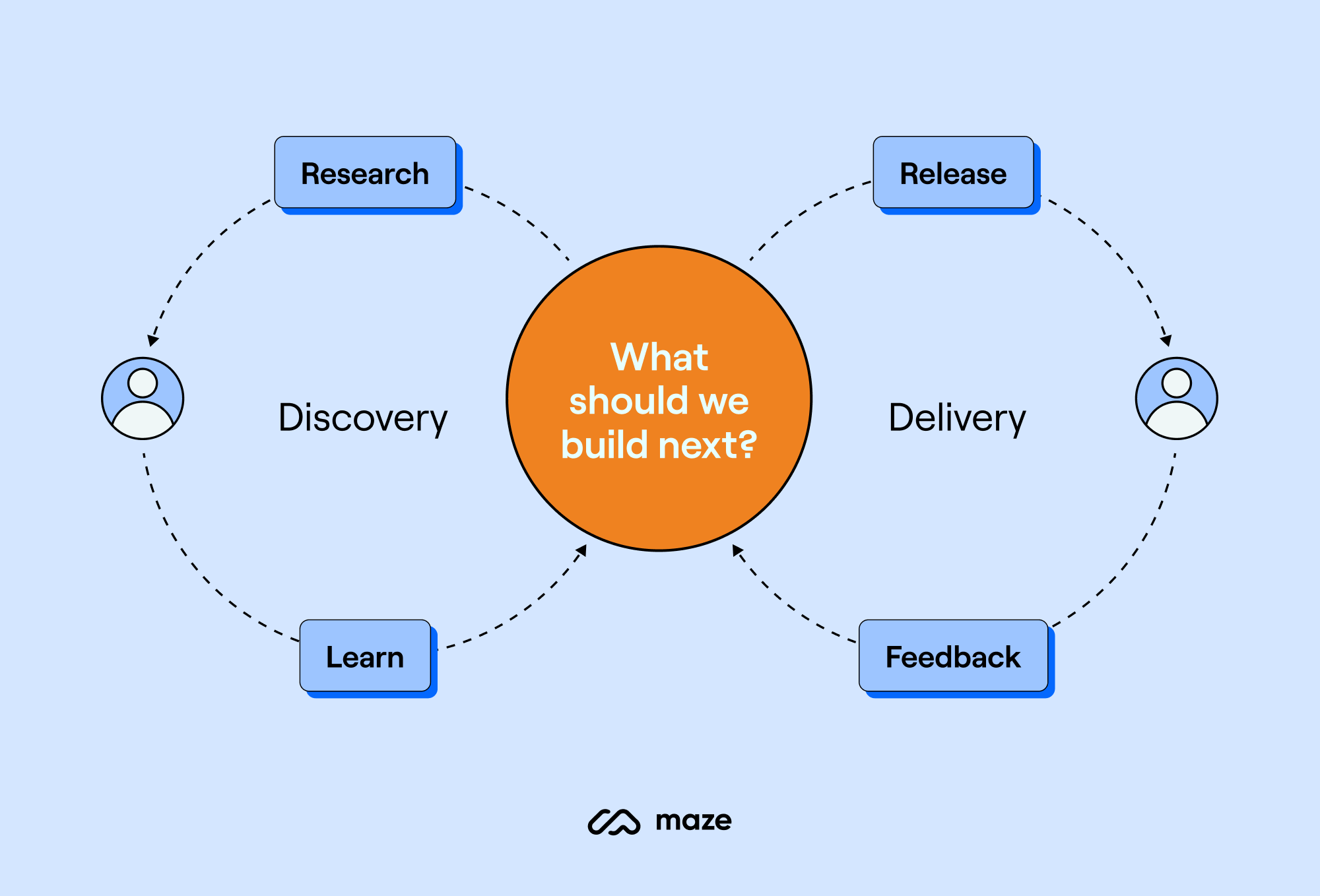
Categories: Others Tags:

9 pros and cons of being an online business owner

January 24th, 2023 No comments

Most people know that being an online business owner can be lucrative, but few actually grasp just how much money is being made out there in the e-commerce world. According to a top investment firm, e-commerce in 2022 is worth a staggering $3.3 trillion worldwide, and is projected to rise to $5.4 trillion over the next four years. While that’s a stunning growth rate, what’s more amazing is how easy it is to get into the game. 

In some cases, you can launch an online business in a single day using only your laptop. Of course, that doesn’t mean you’re destined to start the next Amazon. It’s extremely competitive out there, and if your business fails, it can take the rest of your financial security down with it, especially if you rack up a lot of debt.

The bottom line is that there are pros and cons to being an online business owner, and whether it’s the career path for you is going to depend on your goals, your talents, and, let’s face it, a lot of luck. Let’s look at some of the positive and negative aspects of being an online business owner!

Pros

Mobility

One of the most extraordinary quality-of-life benefits of being an online business owner is that you aren’t chained to a desk in an office — you can work from anywhere in the world. And with amazing countries such as Costa Rica, the Bahamas, Croatia, and many others offering “digital nomad” visas to international remote workers, you can easily run your dream business from a dream location. 

Low startup costs

Before the internet, starting a business meant leasing a storefront and commercial space, outfitting the space, hiring employees, and a lot of other expensive “behind the scenes” work. Today, starting an online business can be done for as little as registering a website and paying a freelancer to whip up some copy. Using Shopify to manage your online storefront is affordable, and if you use dropshipping or a fulfillment service, you won’t need to lease expensive warehouse space to store your inventory. 

The fact that you don’t have to lay out a lot of cash on a physical space can have a multiplying effect on your prospects for success. After all, brick-and-mortar businesses have to factor all those overhead costs into their prices. Since you don’t have the same expenses, you can beat them on price!

Global reach

When you have a brick-and-mortar business, the conventional wisdom is that you’ll pull in customers from within a 25-mile radius. In some businesses, or in super dense areas, you may pull customers from an even smaller area.

With an online business, you can potentially win any customer who sees your ads or marketing — which, in the social media era, means you can pull in business from nearly anywhere in the world.

Optimization through tech

In the pre-internet days, it was tough to find out what customers wanted. You either had to convene a focus group or physically survey customers. Both methods were expensive, time-consuming, and unreliable since there’s a disconnect between what people will tell you they want and what they actually want.

Today, it’s much easier to learn about customer behavior. Data collection and analytics can reveal actual customer preferences and map out their behavior in real-time, while new online management tools can help you mobilize efficiently. This is all incredibly useful when it comes to helping you optimize the customer experience, and customize your ads and marketing material.

Cons

A slow launch

Opening a brick-and-mortar store can be slow in the beginning, but most businesses can still get business just from foot traffic. In the beginning of your online business venture — before your website is fully indexed and ranked by Google — it’s going to be very difficult for you to drum up any business. Typically, Google takes 6 to 12 months to index a new website, so you should plan on the first year being pretty slow — and make plans to earn money on the side.

Extremely competitive

We just touched on how easy it is to start an online business. Well, the downside of that accessibility is that a lot of other people have started online businesses — and you’re competing with all of them. There are so many other online businesses right now that your chief concern shouldn’t be competing with them on quality — but just figuring out how to stand out from the huge crowd. That’s why many experts suggest building your business up a little before you take the plunge and abandon your day job.

You need some tech skills

If you open a brick-and-mortar business, you’ll have to either build the space out yourself or pay someone else to do it. The same applies to an online business. 

You’ll need to build an attractive, functional website where your customers can see your product and communicate with you. This website is likely going to be how you make your initial impression on customers, so it has to look legitimate, and convey your values and aesthetic. 

You need to be nimble and responsive

If you’re active on social media, you probably know that everything moves faster in the internet age. Trends that used to last years may only last for a single season now, and customer behavior can change, en masse, in the blink of an eye. For example, if a real estate startup begins offering home buyer rebates, all of its competitors have to adapt, or they’ll rapidly start losing business.

You’ll have the data to track these shifts, but you’ll also need the confidence and decisiveness to change course when you think you see the winds shifting. Hesitate, and you could lose your entire market to your competitors.

Customers appreciate solidity

It’s not that online businesses lack credibility — it’s more like brick-and-mortar businesses benefit from having a tangible, physical presence. The fact that a customer of a brick-and-mortar establishment can go to the store, browse and handle the merchandise, and talk to an employee (or a manager) can give them a peace of mind that might be lacking when they deal with an online-only business. 

There’s also the credibility issue. A physical business represents a history and a real investment, while an online business, especially if it’s new (and most are), could just be a slick website with nothing behind it. This is why online reviews are so important — they’re the closest thing an online business can get to proof of legitimacy.

The post 9 pros and cons of being an online business owner appeared first on noupe.

Categories: Others Tags:

3 Essential Design Trends, January 2023

January 23rd, 2023 No comments

Minimal styles with big, bold text is the biggest trending website design element of 2023 so far. There are many projects out there that are text-heavy without a lot of other embellishments or imagery. You’ll see a lot of that here, with a few other goodies mixed in.

Here’s what’s trending in design this month.

1. White On Black

Black and white styles are a timeless classic. Designers use this simple color(less) duo because it is simple, elegant, and works with practically any content. What we are seeing right now is a move to create design aesthetics that feature bold white sans serif typography on stark black backgrounds.

The result is a design that you have to read. The words are often so in-your-face and concise that you can help but get the message the design is trying to convey.

Each of these examples takes a similar but varied approach to this design trend.

Bond Agency has more words than the other options, with a little more description of who and what they are. There is an animated accent as well to help keep you on the design long enough to read the words and generate interest.

Savage Jerky goes big and bold with its brand name and very little else. The shop button is featured in a white highlight. This design is made to get your interest and facilitate a purchase, especially for those that already know the brand.

We Are Heavy goes super simple with three big letters and some smaller accent type. It’s so stark that it probably piques your interest. Then there’s the fun little smiley face at the bottom, begging you to click and learn more. It jumps off the screen because it is the only color besides the matching mouse pointer.

2. Orange Accents

Orange isn’t a color we often talk about in design. The associations with the hue can be somewhat fragmenting, but as these examples show, it can make a great accent color.

As an option that’s a little less harsh than red – a common accent color – orange feels a little less intimidating.

There are a lot of variations, from a traditional orange to something more peachy to a rust hue. The great thing is that, for the most part, oranges will stand in contrast on light or dark-colored backgrounds and can be an excellent container for text elements.

Because this color isn’t as commonly used, it is also an immediate attention grabber.

Ventriloc uses orange against a brownish-maroon background to bring focus and attention to keywords on the screen, buttons, and navigational elements. Below the scroll, orange continues as the primary accent color, even when the primary hues shift, helping to carry the visual theme.

Briteweb uses a simple orange geometric shape to highlight branding and add an element of interest to a page that would otherwise be mostly a video reel. The shape helps draw the eye from the branding/logo to the headline on the homepage header. The color is continued below the scroll for clickable elements.

Hackney Locksmiths uses orange as a primary brand color but more of an accent for the website design. This approach has a classic feel and easy-to-read effect. The orange banner at the top of the screen also ties to company to the logo if you don’t know them or see their distinct color choice in a real-life environment.

3. Text-Only Homepages

This trend builds a lot and is reminiscent of the first collection of examples in this post. Text-only homepages are everywhere. What’s different here is that there’s no color requirement and the typography styles are kind of all over the place.

These designs are created in a distinct effort to be read. You are supposed to think about the words and how the message pertains to you. And if it isn’t relevant, there’s little chance you will scroll or further engage with the design.

That makes this a risky choice, but one that can pay off with the right audiences.

The Design Threads report homepage provides a simple introduction to the report and what it is. Notice that even the call to action – “continue scroll” – is text-based. The complete design is very text heavy, although there are a few pops of color and artwork deeper into the report (which is also a relevant read for designers).

Arazzi Contemporanei uses an almost hard-to-read text design scheme. Words overlay other words – note the down page navigation – and there’s a green highlight that can help or hurt readability (you choose). It’s one of those trend designs that you get stuck in “is this great?” or “do I hate it?”

Simple Flair is a bit like the example above but is easier to read. There are no design elements on the homepage other than text with some accenting in underlines and italics. Again, do you love it or hate it? It seems to be a very thin line between the two here.

Conclusion

The one thing all these trends have in common is more of a shift back toward minimalism. That’s an overall design construction that never completely goes away but comes in and out of fashion regularly. These projects lean toward a trend of minimalism making a significant return in 2023.

Source

The post 3 Essential Design Trends, January 2023 first appeared on Webdesigner Depot.

Categories: Designing, Others Tags:

Getting Started With SvelteKit

January 23rd, 2023 No comments

SvelteKit is the latest of what I’d call next-gen application frameworks. It, of course, scaffolds an application for you, with the file-based routing, deployment, and server-side rendering that Next has done forever. But SvelteKit also supports nested layouts, server mutations that sync up the data on your page, and some other niceties we’ll get into.

This post is meant to be a high-level introduction to hopefully build some excitement for anyone who’s never used SvelteKit. It’ll be a relaxed tour. If you like what you see, the full docs are here.

In some ways this is a challenging post to write. SvelteKit is an application framework. It exists to help you build… well, applications. That makes it hard to demo. It’s not feasible to build an entire application in a blog post. So instead, we’ll use our imaginations a bit. We’ll build the skeleton of an application, have some empty UI placeholders, and hard-coded static data. The goal isn’t to build an actual application, but instead to show you how SvelteKit’s moving pieces work so you can build an application of your own.

To that end, we’ll build the tried and true To-Do application as an example. But don’t worry, this will be much, much more about seeing how SvelteKit works than creating yet another To-Do app.

The code for everything in this post is available at GitHub. This project is also deployed on Vercel for a live demo.

Creating your project

Spinning up a new SvelteKit project is simple enough. Run npm create svelte@latest your-app-name in the terminal and answer the question prompts. Be sure to pick “Skeleton Project” but otherwise make whatever selections you want for TypeScript, ESLint, etc.

Once the project is created, run npm i and npm run dev and a dev server should start running. Fire up localhost:5173 in the browser and you’ll get the placeholder page for the skeleton app.

Basic routing

Notice the routes folder under src. That holds code for all of our routes. There’s already a +page.svelte file in there with content for the root / route. No matter where in the file hierarchy you are, the actual page for that path always has the name +page.svelte. With that in mind, let’s create pages for /list, /details, /admin/user-settings and admin/paid-status, and also add some text placeholders for each page.

Your file layout should look something like this:

You should be able to navigate around by changing URL paths in the browser address bar.

Browser address bar with localhost URL.

Layouts

We’ll want navigation links in our app, but we certainly don’t want to copy the markup for them on each page we create. So, let’s create a +layout.svelte file in the root of our routes folder, which SvelteKit will treat as a global template for all pages. Let’s and add some content to it:

<nav>
  <ul>
    <li>
      <a href="/">Home</a>
    </li>
    <li>
      <a href="/list">To-Do list</a>
    </li>
    <li>
      <a href="/admin/paid-status">Account status</a>
    </li>
    <li>
      <a href="/admin/user-settings">User settings</a>
    </li>
  </ul>
</nav>

<slot />

<style>
  nav {
    background-color: beige;
  }
  nav ul {
    display: flex;
  }
  li {
    list-style: none;
    margin: 15px;
  }
  a {
    text-decoration: none;
    color: black;
  }
</style>

Some rudimentary navigation with some basic styles. Of particular importance is the tag. This is not the slot you use with web components and shadow DOM, but rather a Svelte feature indicating where to put our content. When a page renders, the page content will slide in where the slot is.

And now we have some navigation! We won’t win any design competitions, but we’re not trying to.

Horizontal navigation with light yellow background.

Nested layouts

What if we wanted all our admin pages to inherit the normal layout we just built but also share some things common to all admin pages (but only admin pages)? No problem, we add another +layout.svelte file in our root admin directory, which will be inherited by everything underneath it. Let’s do that and add this content:

<div>This is an admin page</div>

<slot />

<style>
  div {
    padding: 15px;
    margin: 10px 0;
    background-color: red;
    color: white;
  }
</style>

We add a red banner indicating this is an admin page and then, like before, a denoting where we want our page content to go.

Our root layout from before renders. Inside of the root layout is a tag. The nested layout’s content goes into the root layout’s . And finally, the nested layout defines its own , into which the page content renders.

If you navigate to the admin pages, you should see the new red banner:

Red box beneath navigation that says this is an admin page.

Defining our data

OK, let’s render some actual data — or at least, see how we can render some actual data. There’s a hundred ways to create and connect to a database. This post is about SvelteKit though, not managing DynamoDB, so we’ll “load” some static data instead. But, we’ll use all the same machinery to read and update it that you’d use for real data. For a real web app, swap out the functions returning static data with functions connecting and querying to whatever database you happen to use.

Let’s create a dirt-simple module in lib/data/todoData.ts that returns some static data along with artificial delays to simulate real queries. You’ll see this lib folder imported elsewhere via $lib. This is a SvelteKit feature for that particular folder, and you can even add your own aliases.

let todos = [
  { id: 1, title: "Write SvelteKit intro blog post", assigned: "Adam", tags: [1] },
  { id: 2, title: "Write SvelteKit advanced data loading blog post", assigned: "Adam", tags: [1] },
  { id: 3, title: "Prepare RenderATL talk", assigned: "Adam", tags: [2] },
  { id: 4, title: "Fix all SvelteKit bugs", assigned: "Rich", tags: [3] },
  { id: 5, title: "Edit Adam's blog posts", assigned: "Geoff", tags: [4] },
];

let tags = [
  { id: 1, name: "SvelteKit Content", color: "ded" },
  { id: 2, name: "Conferences", color: "purple" },
  { id: 3, name: "SvelteKit Development", color: "pink" },
  { id: 4, name: "CSS-Tricks Admin", color: "blue" },
];

export const wait = async amount => new Promise(res => setTimeout(res, amount ?? 100));

export async function getTodos() {
  await wait();

  return todos;
}

export async function getTags() {
  await wait();

  return tags.reduce((lookup, tag) => {
    lookup[tag.id] = tag;
    return lookup;
  }, {});
}

export async function getTodo(id) {
  return todos.find(t => t.id == id);
}

A function to return a flat array of our to-do items, a lookup of our tags, and a function to fetch a single to-do (we’ll use that last one in our Details page).

Loading our data

How do we get that data into our Svelte pages? There’s a number of ways, but for now, let’s create a +page.server.js file in our list folder, and put this content in it:

import { getTodos, getTags } from "$lib/data/todoData";

export function load() {
  const todos = getTodos();
  const tags = getTags();

  return {
    todos,
    tags,
  };
}

We’ve defined a load() function that pulls in the data needed for the page. Notice that we are not await-ing calls to our getTodos and getTags async functions. Doing so would create a data loading waterfall as we wait for our to-do items to come in before loading our tags. Instead, we return the raw promises from load, and SvelteKit does the necessary work to await them.

So, how do we access this data from our page component? SvelteKit provides a data prop for our component with data on it. We’ll access our to-do items and tags from it using a reactive assignment.

Our List page component now looks like this.

<script>
  export let data;
  $: ({ todo, tags } = data);
</script>

<table cellspacing="10" cellpadding="10">
  <thead>
    <tr>
      <th>Task</th>
      <th>Tags</th>
      <th>Assigned</th>
    </tr>
  </thead>
  <tbody>
    {#each todos as t}
    <tr>
      <td>{t.title}</td>
      <td>{t.tags.map((id) => tags[id].name).join(', ')}</td>
      <td>{t.assigned}</td>
    </tr>
    {/each}
  </tbody>
</table>

<style>
  th {
    text-align: left;
  }
</style>

And this should render our to-do items!

Five to-do items in a table format.

Layout groups

Before we move on to the Details page and mutate data, let’s take a peek at a really neat SvelteKit feature: layout groups. We’ve already seen nested layouts for all admin pages, but what if we wanted to share a layout between arbitrary pages at the same level of our file system? In particular, what if we wanted to share a layout between only our List page and our Details page? We already have a global layout at that level. Instead, we can create a new directory, but with a name that’s in parenthesis, like this:

File directory.

We now have a layout group that covers our List and Details pages. I named it (todo-management) but you can name it anything you like. To be clear, this name will not affect the URLs of the pages inside of the layout group. The URLs will remain the same; layout groups allow you to add shared layouts to pages without them all comprising the entirety of a directory in routes.

We could add a +layout.svelte file and some silly

banner saying, “Hey we’re managing to-dos”. But let’s do something more interesting. Layouts can define load() functions in order to provide data for all routes underneath them. Let’s use this functionality to load our tags — since we’ll be using our tags in our details page — in addition to the list page we already have.

In reality, forcing a layout group just to provide a single piece of data is almost certainly not worth it; it’s better to duplicate that data in the load() function for each page. But for this post, it’ll provide the excuse we need to see a new SvelteKit feature!

First, let’s go into our list page’s +page.server.js file and remove the tags from it.

import { getTodos, getTags } from "$lib/data/todoData";

export function load() {
  const todos = getTodos();

  return {
    todos,
  };
}

Our List page should now produce an error since there is no tags object. Let’s fix this by adding a +layout.server.js file in our layout group, then define a load() function that loads our tags.

import { getTags } from "$lib/data/todoData";

export function load() {
  const tags = getTags();

  return {
    tags,
  };
}

And, just like that, our List page is rendering again!

We’re loading data from multiple locations

Let’s put a fine point on what’s happening here:

  • We defined a load() function for our layout group, which we put in +layout.server.js.
  • This provides data for all of the pages the layout serves — which in this case means our List and Details pages.
  • Our List page also defines a load() function that goes in its +page.server.js file.
  • SvelteKit does the grunt work of taking the results of these data sources, merging them together, and making both available in data.

Our Details page

We’ll use our Details page to edit a to-do item. First, let’s add a column to the table in our List page that links to the Details page with the to-do item’s ID in the query string.

<td><a href="/details?id={t.id}">Edit</a></td>

Now let’s build out our Details page. First, we’ll add a loader to grab the to-do item we’re editing. Create a +page.server.js in /details, with this content:

import { getTodo, updateTodo, wait } from "$lib/data/todoData";

export function load({ url }) {
  const id = url.searchParams.get("id");

  console.log(id);
  const todo = getTodo(id);

  return {
    todo,
  };
}

Our loader comes with a url property from which we can pull query string values. This makes it easy to look up the to-do item we’re editing. Let’s render that to-do, along with functionality to edit it.

SvelteKit has wonderful built-in mutation capabilities, so long as you use forms. Remember forms? Here’s our Details page. I’ve elided the styles for brevity.

<script>
  import { enhance } from "$app/forms";

  export let data;

  $: ({ todo, tags } = data);
  $: currentTags = todo.tags.map(id => tags[id]);
</script>

<form use:enhance method="post" action="?/editTodo">
  <input name="id" type="hidden" value="{todo.id}" />
  <input name="title" value="{todo.title}" />

  <div>
    {#each currentTags as tag}
    <span style="{`color:" ${tag.color};`}>{tag.name}</span>
    {/each}
  </div>

  <button>Save</button>
</form>

We’re grabbing the tags as before from our layout group’s loader and the to-do item from our page’s loader. We’re grabbing the actual tag objects from the to-do’s list of tag IDs and then rendering everything. We create a form with a hidden input for the ID and a real input for the title. We display the tags and then provide a button to submit the form.

If you noticed the use:enhance, that simply tells SvelteKit to use progressive enhancement and Ajax to submit our form. You’ll likely always use that.

How do we save our edits?

Notice the action="?/editTodo" attribute on the form itself? This tells us where we want to submit our edited data. For our case, we want to submit to an editTodo “action.”

Let’s create it by adding the following to the +page.server.js file we already have for Details (which currently has a load() function, to grab our to-do):

import { redirect } from "@sveltejs/kit";

// ...

export const actions = {
  async editTodo({ request }) {
    const formData = await request.formData();

    const id = formData.get("id");
    const newTitle = formData.get("title");

    await wait(250);
    updateTodo(id, newTitle);

    throw redirect(303, "/list");
  },
};

Form actions give us a request object, which provides access to our formData, which has a get method for our various form fields. We added that hidden input for the ID value so we could grab it here in order to look up the to-do item we’re editing. We simulate a delay, call a new updateTodo() method, then redirect the user back to the /list page. The updateTodo() method merely updates our static data; in real life you’d run some sort of update in whatever datastore you’re using.

export async function updateTodo(id, newTitle) {
  const todo = todos.find(t => t.id == id);
  Object.assign(todo, { title: newTitle });
}

Let’s try it out. We’ll go to the List page first:

List page with to-do-items.

Now let’s click the Edit button for one of the to-do items to bring up the editing page in /details.

Details page for a to-do item.

We’re going to add a new title:

Changing the to-do title in an editable text input.

Now, click Save. That should get us back to our /list page, with the new to-do title applied.

The edited to-do item in the full list view.

How did the new title show up like that? It was automatic. Once we redirected to the /list page, SvelteKit automatically re-ran all of our loaders just like it would have done regardless. This is the key advancement that next-gen application frameworks, like SvelteKit, Remix, and Next 13 provide. Rather than giving you a convenient way to render pages then wishing you the best of luck fetching whatever endpoints you might have to update data, they integrate data mutation alongside data loading, allowing the two to work in tandem.

A few things you might be wondering…

This mutation update doesn’t seem too impressive. The loaders will re-run whenever you navigate. What if we hadn’t added a redirect in our form action, but stayed on the current page? SvelteKit would perform the update in the form action, like before, but would still re-run all of the loaders for the current page, including the loaders in the page layout(s).

Can we have more targeted means of invalidating our data? For example, our tags were not edited, so in real life we wouldn’t want to re-query them. Yes, what I showed you is just the default forms behavior in SvelteKit. You can turn the default behavior off by providing a callback to use:enhance. Then SvelteKit provides manual invalidation functions.

Loading data on every navigation is potentially expensive, and unnecessary. Can I cache this data like I do with tools like react-query? Yes, just differently. SvelteKit lets you set (and then respect) the cache-control headers the web already provides. And I’ll be covering cache invalidation mechanisms in a follow-on post.

Everything we’ve done throughout this article uses static data and modifies values in memory. If you need to revert everything and start over, stop and restart the npm run dev Node process.

Wrapping up

We’ve barely scratched the surface of SvelteKit, but hopefully you’ve seen enough to get excited about it. I can’t remember the last time I’ve found web development this much fun. With things like bundling, routing, SSR, and deployment all handled out of the box, I get to spend more time coding than configuring.

Here are a few more resources you can use as next steps learning SvelteKit:


Getting Started With SvelteKit originally published on CSS-Tricks, which is part of the DigitalOcean family. You should get the newsletter.

Categories: Designing, Others Tags:

7 Logistics Technology Trends to Watch Out for in 2023

January 23rd, 2023 No comments

Logistics is changing industry that is always fiercely competitive and requires organizations to improve and optimize constantly. Delivery management is a complex process, the effectiveness of which today can only be ensured by the implementation of state-of-the-art technologies.

Due to rapid changes in the global economic landscape, recent years have been difficult for logistics companies. Many had to speed up the digitalization process to avoid losing customers and stay afloat. The need for modern solutions will remain in the coming years, and several main trends deserve special attention.

What Software Is Used in Logistics?

A modern logistics system consists of such components as storage and warehousing, unification and packaging, inventory, transportation and path optimization, and information and control. Depending on these parameters, we can distinguish several of the most popular types of software in the logistics industry.

  • Software for transportation and supply chain management: The main task is to control the transportation of products and track this process in real-time. This also includes software for planning and optimizing routes.
  • Inventory management: Control and tracking of deliveries, planning of new purchases based on historical trend analysis, etc.
  • Warehouse management: Such software uses intellectual storage tools to control the functioning of the warehouse in real-time and optimize and improve the visibility of work processes.
  • CRM or Customer relationship management. System for automated coordination of clients, storage of their data, personalized service, marketing campaigns, informing, etc.
  • Demand forecasting and analytics tools: These are systems for advanced data processing, product life cycle analysis, historical trends, demand, customer satisfaction, etc.

Such software often follows logistics technology trends and can combine several goals and be multitasking or solve problems in a specific direction.

What Are the Key Elements of Design for Logistics?

The requirements and essential elements of any digital product are constantly changing, and this also applies to the latest trends in logistic software design. However, there are several stable things to follow.

Easy Navigation and Onboarding

The onboarding and adaptation process is extremely important in logistics apps, especially in supply chain management, where it is necessary to have quick access to many features and clearly understand their purpose.

That is why simple and intuitive navigation, as well as an effective user onboarding system, are critical design elements in logistics. It helps structure information, direct users in the right direction, facilitate staff work, and provide transparency for the company’s customers.

Cross-Platform Adaptation and Responsive Design

Modern logistics applications are used not only on personal computers but also on tablets or smartphones. That is why cross-platform adaptation and responsive design are a must.

Brand Consistency and Business Value

Professional design is also a way to stand out among numerous competitors who also follow the latest logistics trends and have access to digital tools.

The product’s appearance should preserve the brand identity and convey the company’s unique values. Only in this case, the user will pay attention to the logistics services it offers.

Optimized User Flows

The logistics industry is complex, and applications contain a lot of data, forms, and features, making the user feel confused. Proper UX and UI design clearly outline user flows and gently directs them along the fastest way to the desired service.

Human-Centred Logistics

The task of any software is to serve customers’ needs. Products for logistics companies are no exception. All design elements must support users’ desires and work to meet their needs. Special UX research is conducted to achieve this.

Intuitive Interface and Unique User Experience

The design of an application or website is the first thing users pay attention to, which is why they must meet modern standards. An aesthetic, simple, and responsive interface is a must, as well as quality graphics, accessibility of every element, inclusiveness, and a unique user experience. Good design is the invisible design that is nonetheless memorable for its ease of use, uniqueness, and utility.

The Importance of Keeping up With Transportation and Logistics Trends

Logistics digitalization is an inevitable process requiring unique solutions and non-standard approaches. Logistics companies that want to stay ahead and be able to compete in a harsh environment must use all possible tools to improve service and research the target audience’s needs.

The main condition for the success of any business is customer satisfaction. In the field of transportation and logistics, this can only be achieved with the help of efficient and flexible offers, which, at the same time, must be profitable. This is where logistics industry trends come into play, helping to automate core work processes and improve service visibility, thereby ensuring customer loyalty and reducing costs for business owners.

Blockchain Technology

Blockchain has long become an integral part of automation and security systems in many fields. As for the logistics industry, blockchain has extraordinary potential within the functions of both enterprise software and applications for general use.

This technology solves the most disturbing challenges by creating an encrypted digital record. In this way, goods can be tracked with the highest accuracy in every supply chain, and all breaches and errors become visible and can be resolved quickly.

Blockchain also allows logistics companies to take full advantage of decentralized ledgers and manage inventory more efficiently and intelligently. In addition, improving the tracking of various data forms helps to strengthen data security significantly. At the same time, the technology is quite flexible in use and leaves room for improvement.

Another important use of the blockchain is the automation of logistics operations, which reduces human intervention and, accordingly, the risk of errors, and speeds up the document flow process.

Today, this technology is used in the following components of the logistics business:

  • Fraud detection: Blockchain improves the visibility of transactions and changes, helps achieve transparency by tracking document modifications, etc.
  • Authentication: The technology helps to authenticate documents and data and, thanks to encryption, ensures a secure exchange.
  • Real-time supply chain visibility improvements: Users can receive information about the state of transport, schedule changes, and events in real-time.
  • Performance monitoring: It helps collect reliable data on the productivity and performance of carriers or employees.

Also, with the help of blockchain, logistics companies can confirm the origin of goods, provide guarantees of compliance with security standards, and control processes throughout the supply chain.

Supply Chain Transparency and Collaboration Mandate

Collaboration mandate in the supply chain is an important trend of recent years, the essence of which is to create coordination between internal departments and external partners with the aim of optimizing the flow through the supply chain, providing better service and timely delivery. 

Why is this trend so crucial? The scale of data and transactions, as well as the scope of logistics services, are becoming larger every year. Organizations need help to cope with such a load and maintain the quality of services.

Cooperation mandates allow you to set up data exchange from a unified platform, track minimal errors and immediately eliminate them. In general, each participant receives the following benefits:

  • end-to-end supply chain visibility and real-time data exchange;
  • customization and optimization of work processes;
  • reduction of the cost of delivery in general.

Effective collaboration and supply chain transparency are inseparable concepts and key logistics industry trends.

Internet of Things

Connecting a large number of vehicle sensors to the cloud discovers new opportunities for using the Internet of Things in delivery, logistics processes optimization, transportation, data analysis for logistics management software, etc.

In the coming years, it is worth paying attention to the following IoT points.

  • Telematics: Collecting data from vehicle sensors, analyzing the state and behavior of drivers, planning maintenance, etc.
  • Detailed tracking: Data helps businesses move in the right direction, and it’s essential for logistics companies. IoT tracks assets, provides delivery transparency and visibility, and indicates risks and ways to solve them.
  • User-based insurance: IoT helps to form optimal insurance policies like UBI, PAYD, PHYD, etc.

It is also worth considering the possibilities of ADAS (camera systems to assist the driver and analyze his behavior) and autonomous driving.

Customers Demand Data and Real-Time Visibility

Service transparency and visibility are indispensable parts of customer satisfaction. The availability of logistics data forms the reputation of the company and its customers’ loyalty and helps to make purchase decisions more quickly.

The logistics industry trends and tools listed above contribute to the formation of service transparency, as well as professional software development and proper UX/UI design. Transport business owners should consider the best options regarding this list to be able to compete.

Digital Twins

Images of real objects or processes in digital space are called digital doubles. They are formed from data (including historical, real-time data collected by sensors) and algorithms. This is an essential component of the “Industry 4.0” concept, which is used for digitizing entire life cycles of products or services.

In logistics and supply chain management, digital twins are used in combination with AI and augmented, mixed, or virtual reality apps. Basically, they are tested on such tasks as picking warehouses vehicles loading. However, DT can be used for the following purposes.

  • Optimization of packaging: Digital twins can be detailed models of containers. This helps predict potential problems (dents and cracks) and determine the terms of use for containers and the optimal size and distribution of the container fleet. They can also be useful in developing more sustainable packaging materials.
  • Optimization of space and transportation conditions: Digital twins are useful for determining certain goods’ transportation conditions and optimal distribution space.
  • Planning of warehouses and dispatch centers: It is a convenient tool for inventory warehouse planning.

Additionally, digital twins can be used to validate and automate workflows.

Artificial Intelligence for Transportation

Artificial intelligence is one of the key logistics technology trends. It significantly changes the transportation picture. The integration of AI and ML systems is used not only in inventory and warehouse management but also for analyzing routes, their optimization, vehicle control and tracking, sensor data collection, etc.

Also, these technologies are part of state-of-the-art business analytics tools that help quickly identify risks and determine ways to reduce them, evaluate productivity, customer satisfaction, etc. on the basis of these data, the transformation of the service system and optimization of business processes takes place.

In addition, AI is an integral tool for automating work processes and preventing fraud in logistics companies. 

Cloud Computing

Cloud computing in general, improves the availability of any software and its features, not to mention reducing operating costs. For the transportation industry and logistics management software, especially, they are key because they help to quickly optimize work processes and securely collect, store and transfer data.

Such technologies are indispensable for logistics and transport companies that plan to grow and scale in the future. They may be needed to improve visibility (updating data in real-time), convenient collaborations with partners (the ability to easily share data on one platform), etc. In addition, it is one of the main logistics technology trends for improving financial control.

Conclusion

In summary, the digitalization of logistics is an inevitable step without which it is simply impossible to stay afloat in a challenging competitive environment. The concept of “Industry 4.0” is becoming more and more real, and it applies not only to manufacturing enterprises but also to transport and logistics companies.

Such logistics technology trends as collaboration mandate, real-time visibility, digital twins, cloud computing, AI, and blockchain help to automate work processes, reduce costs, improve transparency and security, and increase the efficiency of companies as a whole. These are dynamic technologies, the implementation of which helps gradually develop and scale the business along with technological progress. That is why paying attention to them and considering options for their use in your own business is essential.

The post 7 Logistics Technology Trends to Watch Out for in 2023 appeared first on noupe.

Categories: Others Tags:

Introverted Design: Building Better UX Experiences

January 19th, 2023 No comments

Living in a highly extroverted world, everyone is expected to outshine the rest to succeed and grow. Meeting people, talking, and generally being an outspoken person will be noticeable. However, we all tend to reflect on our inner worlds when we need to disconnect and be with ourselves. It helps us refocus or be safe from external factors affecting our tranquility. Introverts linger more than often in that internal world. Famous personalities such as Bill Gates, Warren Buffet, and Steven Spielberg, to mention a few, are successful introverts. They are excellent at what they do because of a few things:

  • They are keen observers.
    For introverts, the spotlight is not important. Anyone but them can run the show.
  • Introverts think carefully before speaking.
    In a discussion, they would participate but would not speak up unless it was necessary.
  • Potential leaders.
    Introverts let others run with their ideas and contribute only when needed. It is a great trait since it allows others to be more creative than directive.

Two relevant sources discuss introversion. First, the book titled Quiet by Susan Cain, American author and lecturer, where she discusses what the extrovert ideal is: “the omnipresent belief that the ideal self is gregarious, alpha, and comfortable in the spotlight.” In contrast, she discusses introversion as an undervalued asset in today’s society, being often confused with shyness. However, confidence and competence happen with experience and expertise, and introverts possess them.

The second source comes from a study called the “Lemon Juice Experiment” conducted by H.J. Eysenck, Professor of Psychology at King’s College in London, along with Sybil B.G. Eysenck. The researchers observed that introverts salivate more compared to extroverts when a drop of lemon juice is placed on their tongues. They theorized that introverts get triggered by their surroundings since they have naturally higher arousal levels. Because of this, they prefer less socially intensive activities such as reading, writing, or biking, usually by themselves. Their inward-orientedness makes them unique.

The quiet traits of an introverted personality inspired me with the idea of Introverted Design. This design style would create an excellent balance to the existing experiences that scream for attention. A known example of these experiences is Instagram. Instagram used to be a simple photo and video-sharing app that everyone easily got hooked on. However, now it has grown with a multitude of features such as a marketplace, reels, a highly sophisticated editor, filters, and so on. If we look back to the start of Instagram and where it is now, it is a much busier and more complicated experience than it used to be.

Similar to how Instagram has positioned itself, most designs tend to be bold. However, there are also plenty of very subtle products where the experience itself does all the heavy lifting impeccably. Spotify is a good example. Spotify offers a plethora of music based on the choices the user has already made in their playlists. Basically, there is less scope creep while directly centered around listening. They have kept their focus on music sharing over creation, for example. Due to this, its recommendation engine is hyper-focused on music, unlike Instagram, which is trying to do many things at once.

But you may ask, what is Introverted Design?

It is a design process inspired by introverted traits that will aid designers in building highly functional and minimalistic products. Imagine if the behavior of introversion is married to the existing design process.

  • What will happen if the research is equipped with insightful information on top of the conventional way of “ask and answered”?
  • Will learning how introverts think help in ideating or brainstorming?
  • Introverts evaluate situations before speaking. Can this be translated to identify various risks and edge cases before designing?
  • We will look into additional traits that can be translated to incentivize the existing design process.

I am sure we all have experienced “a mental block” at some point in time when it becomes challenging to develop new ideas. Usually, it happens because we are short on research. Inculcating a new way of thinking and a new way of solving problems would aid us at various points of the design thinking and execution process. It will hopefully create a habit of grasping more information and better evaluation that would otherwise go unnoticed or overlooked and directly help to remove that mental block.

Now that we know a bit more about quiet traits, let’s look into some ways to incorporate these traits to create an introverted design.

Identify The Nuances Of User Behavior: Subtle Discomforts

A study done by Kirby M. Jaeger, Austin H. Cox, David Philip Arthur Craig, and James W. Grice, called “An auditory startle response predicts introversion”, at the University of Tennessee at Chattanooga showed that introverts tend to be more sensitive to incoming stimuli on a physiological level. The human brain has an innate ability to block unnecessary information to prevent cognitive overload is called sensory gating or sensory-motor gating. It makes introverts good observers, and they tend to notice details that would otherwise go unnoticed. Also, it occurs naturally to them.

Though the study remarks observation as quality introverts possess, it is not unique to them. Everyone can achieve it by training their mind to observe intently. This trait can be applied in user research to identify information that is not necessarily shared verbally, like body language, nuances in pitch, dialog delivery, eye contact, and so on.

For example, a few years back, I conducted a user study while working at Teltech Systems. The study was to gain insights from the users to develop an app’s spam call-blocking feature. One participant, in particular, articulated their thoughts very well. They mentioned the spam call-blocking feature was helpful and had been very beneficial in blocking most spam calls. Although the participant answered, I could sense discomfort in their voice, and they had no eye contact with me. These nuances would have gone unnoticed had I not been paying attention. My unease with the participant’s responses urged me to probe them further. As a result, I realized that the spam-blocking feature was incomplete. The probing revealed that the user would have to open the app to report any number as spam.

At the end of the interviews, one of the significant findings was that the end-users would appreciate it if the spam blocking feature would allow them to report and block spam calls on the call screen itself instead of reporting it through the app. After I shared this finding with the team, there was an immediate agreement, and a feature enhancement was soon released.

According to the author of Human Communication: The Basic Course, Joseph DeVito, listening has five stages: receiving, understanding, remembering, evaluating, and responding. Listening carefully helps us identify those hidden messages that are commonly overlooked since listening is restricted to just what falls on the ears. Training ourselves to observe body language, the pitch of sound, metaphors, and so on could help identify the nuances in human behavior that might point to the real truth in the conversation. As designers, we could create a habit of detecting these subtle changes and ask follow-up questions to validate our observations.

Once the validation is complete, the next step is to strategize ideas and actions based on the research.

Overthinking An Action

Overthinking is often considered to be a negative trait because it means thinking too much and for too long, for example, second-guessing and constantly analyzing the decision that is already made. Is overthinking always a negative behavior? Probably not.

In a positive state of mind, overthinking can be taking a step back to reconsider something and looking at it as a tool to devise better strategies. For instance, doing more research before writing an article or planning the specifics of a trip can result in much better experiences. It gives us time to evaluate situations better by looking into the details. Another advantage is being able to generate multiple solutions to consider different angles, which provides a wider perspective and it helps to validate or negate assumptions as well as devise backup plans.

According to Jenn Granneman, an educator and journalist, as well as the author of The Secret Lives of Introverts, “overthinking doesn’t necessarily need to be wrong.” She mentions a research study carried out by Dr. Laurie Helgoe, an American psychologist. In it, Dr. Helgoe mapped the electrical activity in participants’ brains and found that introverts have higher levels of electrical activity, thus, greater cortical arousal. It does not matter what emotional state they are in, as they tend to think more. In other words, introverts process more information making them prone to overthinking.

I, myself, being prone to overthinking, created a thought process that mirrors critical thinking. Identify the problem, analyze it by being open-minded, and solve the problems by creative and critical thinking — using various tools such as mind mapping, checklist, lateral thinking, and so on. By breaking overthinking into a much more digestible thinking process, I can evaluate the problems and situations better.

I can translate those same three steps for research as well. Usually, after conducting my first interview for any research, I listen to it to identify if I need to re-evaluate my strategy, identify any mistakes I made and tidy up the script. These are some of the questions I ask myself:

  • If there is hesitation, what made them hesitate while answering?
  • Did I make them uncomfortable?
  • If I made them a bit uncomfortable, would they share more?
  • How can I probe them further to get better answers or more in-depth answers?
  • Can I ask this question in a different way? How would they react?

This overthinking process provides me with insights to evaluate a better strategy for the remaining interviews.

Overthinking also allows you to foresee particular possibilities. A friend was working on promotional content for their upcoming mobile app update. The business requirement was to push this quickly since the holiday season was around the corner. After an extensive session and design thinking, he came up with plenty of ideas and presented those to the stakeholders. In that working session, he identified the various cases to name a few:

  • The changes required for implementation.
  • Will these changes affect any future work?
  • Will this change bring in more updates after the promotion ends?
  • Does it support all the other feature changes?
  • Are there any possibilities for reverting to the older version?
  • What are the pros and cons of the ideas?
  • Identify any outstanding questions or follow-up questions.
  • Can a design define the promotion and also pave the path for future enhancements?

However, the business stakeholders had already agreed upon a direction. After presenting possible options to the stakeholders, my friend was able to convince and steer the focus toward one of the options because he had thought it through and had all the answers the stakeholders would ask and even more with what the direction would bring for the future of the app. Overthinking is prone to take a quick negative turn. So it is important to keep two things in mind.

  1. Identify where to stop.
  2. Identify if you have developed any patterns and prevent them from happening.

Overthinking, if done positively, allows us to ideate more than expected and gives a clear direction with multiple points to discuss or defend a direction.

Overthinking could help achieve or see more possibilities sooner. It can be a strategy applied to look for additional insights while clustering ideas together in a brainstorming session.

Identify Risks

A risk is choosing a path, knowing that it is uncertain. In contrast, introverts take calculated risks because their overthinking has already led them through multiple outcomes, the pros and cons, allowing them to choose the one with the slightest possibility of failure.

A risky decision should also entail meticulous thinking about the risk itself. Since introverts tend not to need instant gratification, they take their time to evaluate. They prefer to have control over the decisions. It means they pick an option they are comfortable and confident pursuing. It does not mean they choose a safe and easy option. On the contrary, their thinking has led them to choose a path with a higher probability of success.

For example, a brainstorming session about implementing a product and a risk evaluation session would help identify some of the difficulties the user flow might run into. Once identified, it would be easier to find a way to fix it. A well-thought user flow, with all the use cases considered, would help us share with the rest of the team. Identifying risk and overthinking go well together. Overthinking allows us to look for possibilities, and risk analysis helps us evaluate and find the best path forward. In addition, all the edge cases, error states, and deadends can be identified in advance.

Make It Objective By Practicing Active Listening

Ironically, making objective decisions is a very subjective process. Crazy, right? But think about it, we all have unconscious biases. Unconscious biases are the judgments and assessments we carry outside our conscious awareness. For example, imagine we are just looking at a person; our brain builds a persona about their personality. But, in actuality, it could be very different. Introverts are no exception to the bias; they succumb to it as well. However, they have an edge, a trait that can be used to reduce this bias: active listening.

Multiple research papers have been published about introverts being active listeners. One such thesis paper, written by Amari-Mall and Nakhaie, both lecturers of English at Islamic Azad University, compared the performance of participants of English as a foreign language and noticed that introverts are better listeners. In a nutshell, introverts tend to be less reactive in a conversation; they listen intently and speak only when they are confident or know enough to share.

Active listening was coined by Carl Rogers and Richard Farson. According to them, active listening has six stages, such as paying attention, withholding judgment, reflecting, clarity, summarizing, and sharing. Unconscious bias usually occurs just after receiving the information and making a snap judgment without reflection. We start to connect the dots based on experiences, social acceptance, inherited knowledge, and so on to develop a belief or an assertion that could be construed as biased. So, being objective becomes difficult.

I was working with my product owner on enabling a paperless experience for one of our products. It took a lot of work to execute this experience due to the complexity involved in the types of documents available for paperless; the rest were mailed. It was a time-sensitive update that had to go out in the larger scheme. However, I dug deeper to understand the expectation for the design. I spent quite some time designing the solution. Eventually, my product owner was unhappy and frustrated when I presented the options to the team. I failed as a designer to pay attention, the first step in active listening, causing a chain reaction in loss of time, that too in a time-sensitive design fix. If I had paid attention and listened to the expectation without bias, the result would have been different.

According to the Hubspot Customer Service Survey 2019, almost 42% of companies do not listen to their customers. The balance is tipped toward business requirements, and customer expectations are funneled out. As a result, the final designs are heavily influenced by the bias of what the team feels the customer wants, but none of it gets validated. Unconscious bias has a higher probability of being introduced, not just by the designer but by the team as well. As a result, it becomes even more pressing for the designer to be vigilant about what is being designed.

It is critical to make decisions towards any design implementation unbiased or, at the very least, make an honest attempt. A business that is partially fulfilling customer expectations will fail. Another responsibility that designers have is to make sure the design is validated by customers. An informed design would serve not just the business requirements, but it would also help the users.

Make It Invisible

So far, we have seen a few introverted traits focused on research and design thinking. The next step is more practical; making it invisible means making the experience so attuned to users’ expectations that it is perceived easily. By not introducing a shed of cognitive load, it will make the experience of the product simple. Even if the product is complicated, the experience should be easily maneuverable so that users can go from point A to B without any hassle.

Introverts prefer social engagements but tend to limit them to a certain extent. They need some alone time to recharge. Even after being selectively social, they get mentally drained. To help themselves recover, they enjoy their own company. Likewise, humans are always highly stimulated, for instance, reading a book, watching TV, cooking, thinking about what to do next, and so much more. In all this chaos, we, as designers, have a moral obligation to make the experiences of all the products highly intuitive by not introducing additional cognitive load. Make it invisible.

Many Indie game development companies do not have the budget to market or advertise their games; they hardly get an opportunity to show them to the world. Yet some of the most popular games on the market are made by small studios or even individuals.

One such example is Flappy Birds. Flappy Birds is a game where the player has to simply tap to make the bird fly. The objective is to avoid obstacles in this infinite scroll game (technically, it is not, however, it is very difficult to beat it by reaching 9,999 points). It became an overnight sensation. The artist and programmer Dong Nguyen, who created this game, took it down because he never imagined it would become this popular and addictive. The game had very simple graphics and deceptively simple interaction, yet it became one of the most downloaded games on Appstore and Google Play. Similarly, a design for any app could also be as simple as Flappy Bird to fulfill user expectations.

“Good design, when it’s done well, becomes invisible. It’s only when it’s done poorly that we notice it.”

Jared Spool, an expert in the field of design and research

In other words, “making it invisible” means creating an experience that does not make the user think. It is so intuitive that it feels natural. Imagine someone reading your mind and giving you precisely what you want at the exact time.

Another great example is the app Citi Bike, which is mostly used by New Yorkers and tourists alike to commute or explore. It allows the user to easily book a bike for the next 30 mins by undocking it from their generously placed docks throughout the city. If you look at the app, nothing seems to be missing, and everything is easy and intuitive, but it can be invisible.

The moment the app opens, the user sees their location and a button to scan the QR code. Once they scan the code on the bike, it is unlocked. They can then enjoy their ride for the next 30 mins. This is all great, but can the experience be made invisible? Can it be made even better? Of course, it can. Imagine the app would detect the proximity of the user and show the scan code screen directly when they are near a dock. The experience is far more attuned to users’ needs. Just making this small adjustment to the flow would reduce the additional action and make the product, well, invisible.

Currently, Jetblue’s mobile app shows points and additional featured content to make up the homepage. However, the main goal is to either view their booking or make a reservation. The user then has to navigate to the book section to make any reservation. This process could be enhanced by simply introducing a search bar that is less intrusive on the homepage.

A design does not need to use bright colors, flash call to action (CTA), or jargon words to make it sound smart. It could be very simple but effective with colors, transitions, easy-to-track CTAs, and simple sentences so that anyone can understand it.

Any design decisions we make as designers should help the user quickly complete the task they had in mind when they opened the app. Empathy articulation is a way of understanding the user’s expectations, foreseeing user interaction issues, and translating them into an effortless, actionable, invisible, and affordable design by being mindful. The more we practice invisible design, the better user experiences we can create.

Help The User When Needed

Introverts have a hard time asking for help even if they need it. When others ask them to reach out if they need help, chances are introverts will not reach out. The inherent need to ask for help gets buried because reaching out is difficult for them. Some form of proactivity is needed from others to get them to speak. Of course, this does not mean they are shy. That also does not mean they will never reach out, shifting all the effort onto others. Introverts would find ways to solve the problem by themselves, but they would reach out if nothing worked. However, they would certainly appreciate a nudge.

Help can be needed at any given time, and it should be available. If the idea of “checking with someone” is used in digital media, it will help users to get the needed help when they need it the most. It will give them comfort and improve the experience in general. Imagine a user is trying to find something, and the product identifies their struggle. It would be helpful to push a chatbot or a popover to ask if they need any help. Use the space to assist them. What if there could be an easy way to identify a problem and provide a few options to resolve the issue? What if the control system could help them in their moment of need by recommending a choice?

Here is a good example: you visit the Canyon bikes website looking for a brand-new bike for your next adventure, but you have a hard time differentiating between them. All the scrambling and looking for the right model puts you in a paradox of choice. Which bike to pick? However, the website has solved it quite elegantly. After a while, the chat bubble automatically opens up, asking if you want to chat. This feature puts you in line to talk to a representative who can help you locate the exact bike that will satisfy your needs. Here if you notice, the website realized you could not find the bike and surged up to help. It was at the right time and was not invasive, keeping you, as the customer, rooted in the experience.

The help should also be accurate and precise, with actionable items or connecting you to a live agent like in the above example. Otherwise, as much as help is needed, it might pile on more confusion than reduce it. That brings us to the next and final trait.

Subtlety

Introverts enjoy speaking directly yet deftly. They think talking elaborately would stretch the conversation further and make it exponentially longer than they would prefer and also stir up confusion. Introverts believe that a minimal set of words can make a high impact. Similarly, being subtle can bolster a user experience even further. The user experience can be precise to what the user wants instead of creating a visually complicated path. Craigslist, for instance, has no visual design elements compared to many products out there, but it still fulfills customer expectations because the website has a good UX. The arrangement and categorization are well thought out, making the entire experience far smoother.

The implementation of the language is also a part of the user experience, and it should be simple and easy to comprehend. Complex and complicated language tends to alienate users and cause them to overlook important information.

Likewise, keeping a design minimalistic will make the entire experience better, including the language. Subtlety is about keeping the experience to the bare minimum; it should not be overdramatic. Burdening users with too much information or too many interactions puts them in a paradox of choice.

User experience is about building pleasure around expectation.

Shazam is a compelling app that identifies the tune to help you learn more about the song you liked but do not know the name of. They have made using the tool even simpler by integrating it with Siri. “Hey, Siri, which song is this?” will bring up Shazam to help identify the song. Now that is subtlety.

Introverted design is pulled from introverted traits that elegantly influence designs. I firmly believe that using these traits and converting them into appropriate skills could help designers with a different outlook. To practice introverted design, we need to perform the same process with additional intentions that are driven like an introvert:

  1. Identify nuances of human behavior: Introverts are expert observers.

    • Skill: Exceed the obvious.
  2. Overthinking an action: Introverts are prone to overthink.

    • Skill: Ponder and analyze data beyond the convention.
  3. Identify Risks: Introverts take calculated risks.

    • Skill: Carefully consider decisions to pave the path with the slightest possibility of failure.
  4. Make it objective by practicing active listening: Introverts are great listeners.

    • Skill: Active listening will help designers comprehend and build better products.
  5. Make it invisible:Introverts prefer alone time to recharge.

    • Skill: Create highly intuitive products by focusing on the need.
  6. Help the user when needed: Due to their inwardness, introverts have a hard time asking for help.

    • Skill: Intervene and provide necessary information when needed.
  7. Subtlety: Introverts prefer using precise words to convey thoughts.

    • Skills: Drive high impact by being eloquent.

The design does not need to be bold, but it needs to be elegant. To use an introverted design, we first need to understand the introverted personality. I am a proud introvert, so I highly recommend a great resource — Jenn Granneman’s ‘Introvert, Dear,’ an award-winning community of introverts. Commonly mistaken for shyness, introverts are highly effective people.

The way introverts deal with and interact with the world is nimble. Observe your surroundings, and you will notice so much information that you usually do not perceive. Be articulate using appropriate words and real examples. Listen first, talk later; it helps formulate thoughts better. Speak only when you have something to contribute; otherwise, you are not adding any value to the conversation. Be a critical thinker. All this will help you learn more about how introverts look at the world.

Sometimes a different perspective is all we need to make a difference.

Categories: Others Tags: