Archive

Archive for January, 2023

20 Best New Websites, January 2023

January 16th, 2023 No comments

With the new year comes a host of new websites. Some of these sites have been brewing for months, and others were developed over the holidays, but they’re all having a big impact this month.

Here’s our roundup of the twenty best new websites released in the past four weeks. Enjoy!

MCO

Millor Creative Office uses scroll detection to pull in a burst of color thanks to a video of ink in water. Keep scrolling, and you’ll find the site is filled with some luscious gradients.

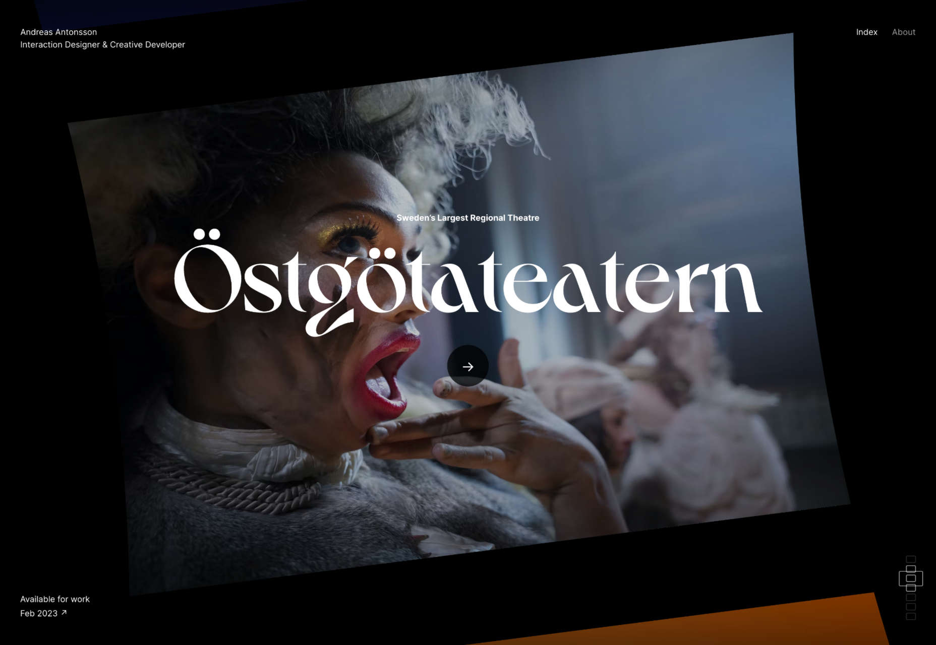
Andreas Antonsson

Andreas Antonsson’s portfolio is a rotating drum of case studies that spins as you scroll. It’s a great reinvention of a well-worn design pattern.

Herzog.law

The site for Herzog.law is more like a startup than a law practice. The marble-run style illustrations add visual interest to the persuasive copy.

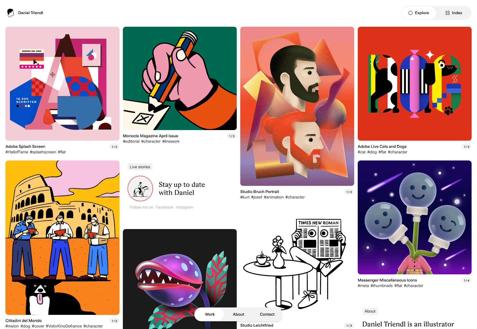
Daniel Triendl

Daniel Triendl’s awesome portfolio looks more like a Pinterest board than a personal site. You’ll find yourself browsing before you realize it.

Raca

Raca Design Studio specializes in architecture, interiors, and product design. Its site uses monotone filters to create a stylish look.

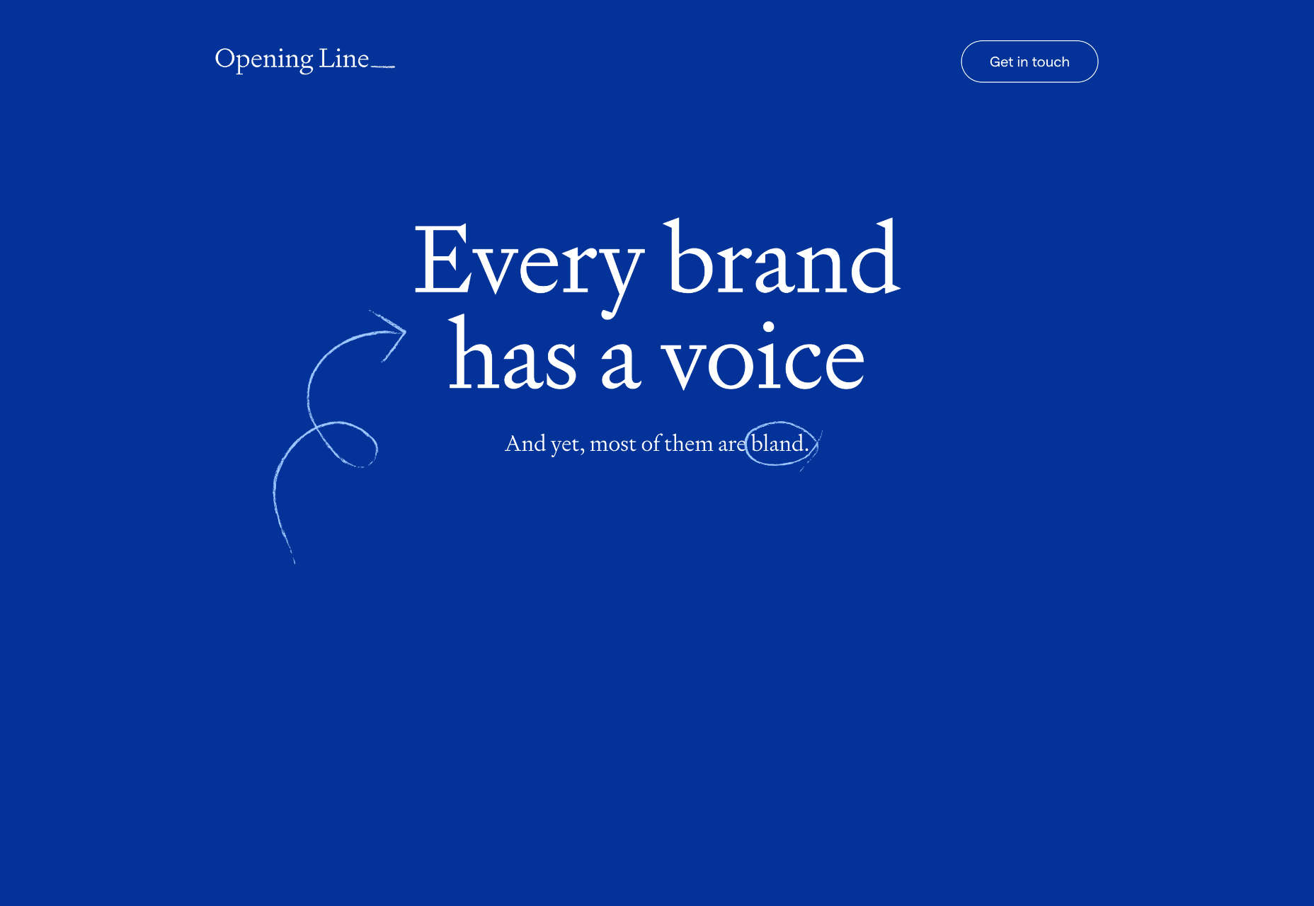
Opening Line

Opening Line is a great one-pager for a copywriting agency. The simple illustrations and the animated stroke are delightful.

Women Rise

Now that the crypto winter seems to be easing towards spring, there’s renewed interest in NFTs. Women Rise is one of the best NFT projects we’ve seen.

DCoast

DCoast jumps aboard the 3D-graphics trend with a tiny tropical island. It’s an eye-catching way to disguise a small portfolio while the jobs build up — which they surely will.

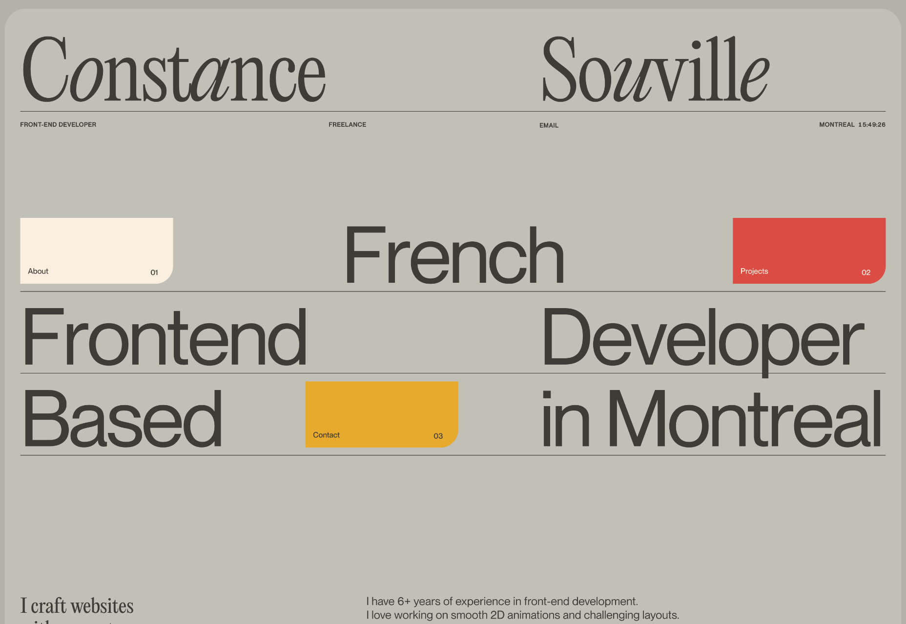
Constance Souville

Constance Souville is a freelance front-end developer. Her portfolio is simple and smooth, with some lovely detailing.

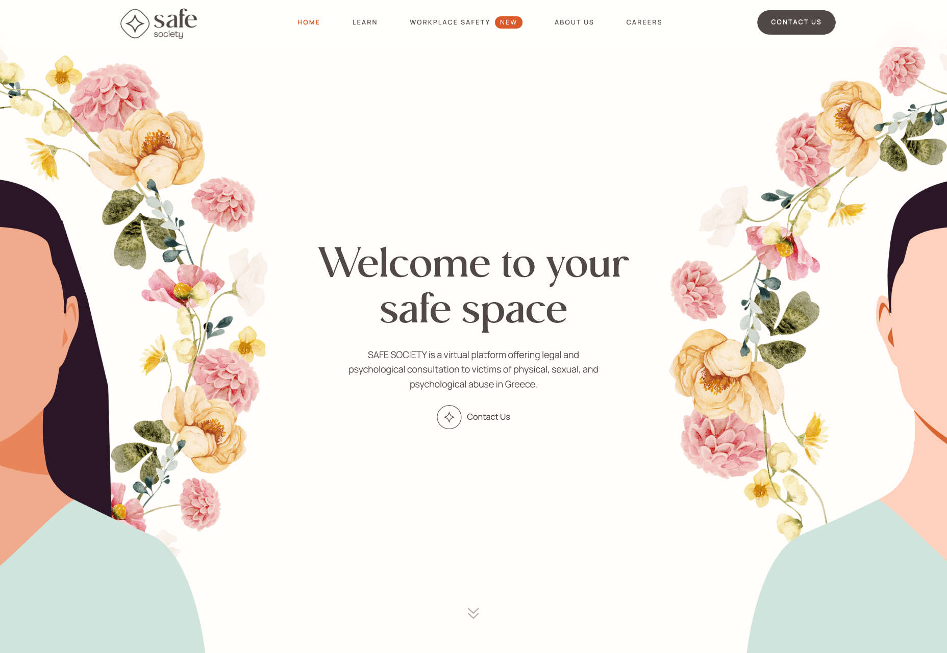
Safe Society

Safe Society is a platform to support victims of all forms of abuse in Greece. It uses delicate illustrations to talk about difficult issues sensitively.

Little Clothbound Classics

Penguin Classics publishes some of the greatest works in English literature, and this lovely one-pager introduces us to some lesser-known classics.

Marc Hanslin

The personal site for Marc Hanslin is a fantastic one-pager with stark black-and-white contrast. It’s far slicker and more engaging than a typical lawyer’s site.

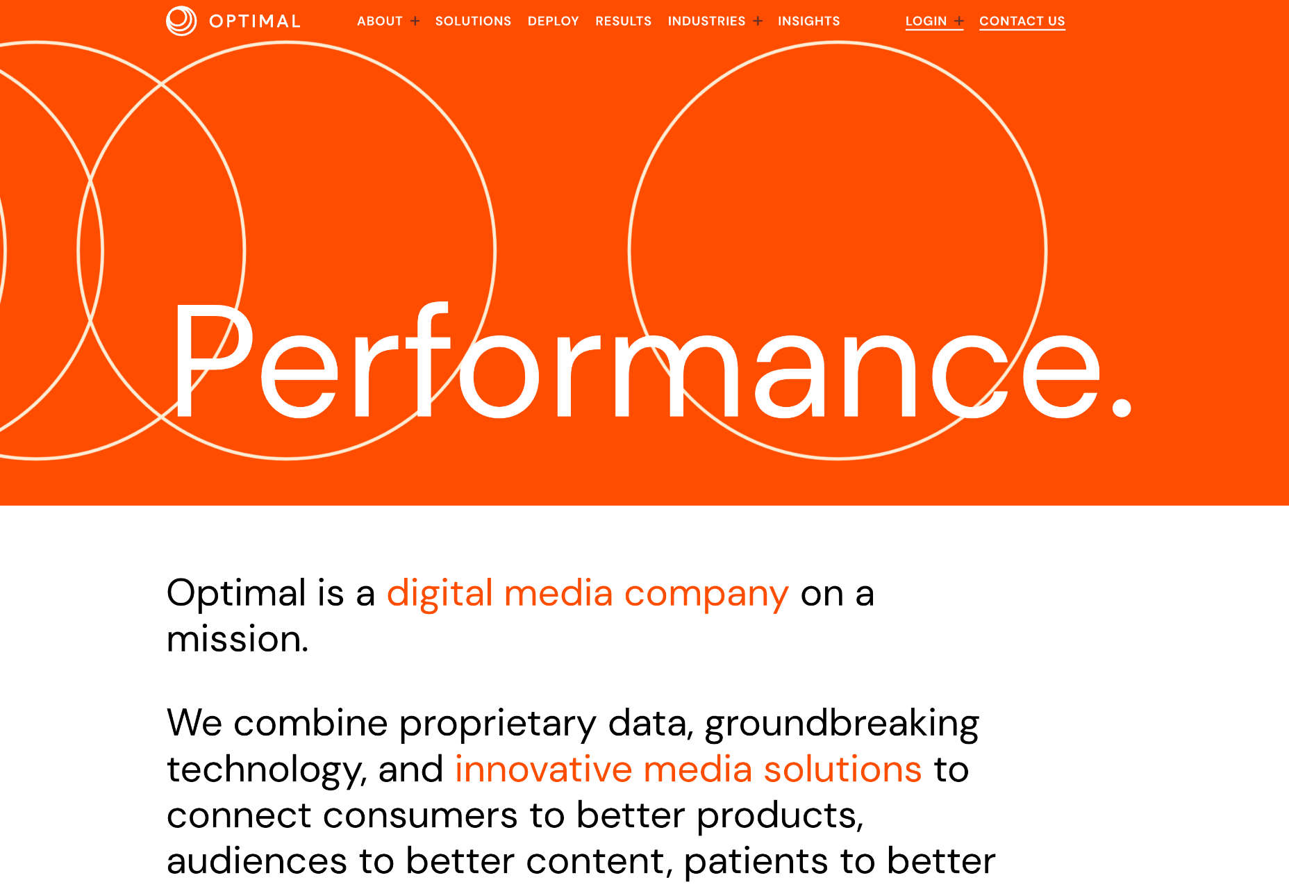
Optimal

Optimal is a digital media company with a simple approach to business problems online. It’s an interesting text-based approach.

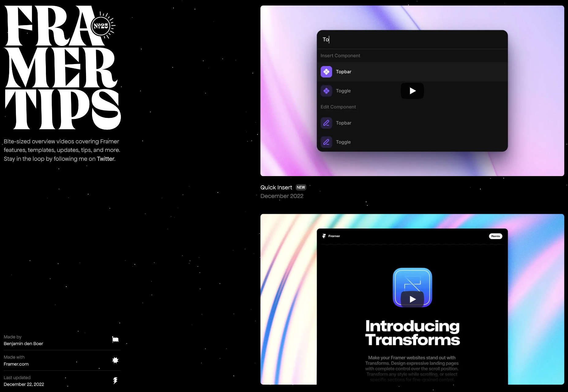
Framer Tips

Framer Tips is a collection of tips for Framer, created, surprisingly enough, in Framer. It’s a level above the normal tips-n-tricks sites.

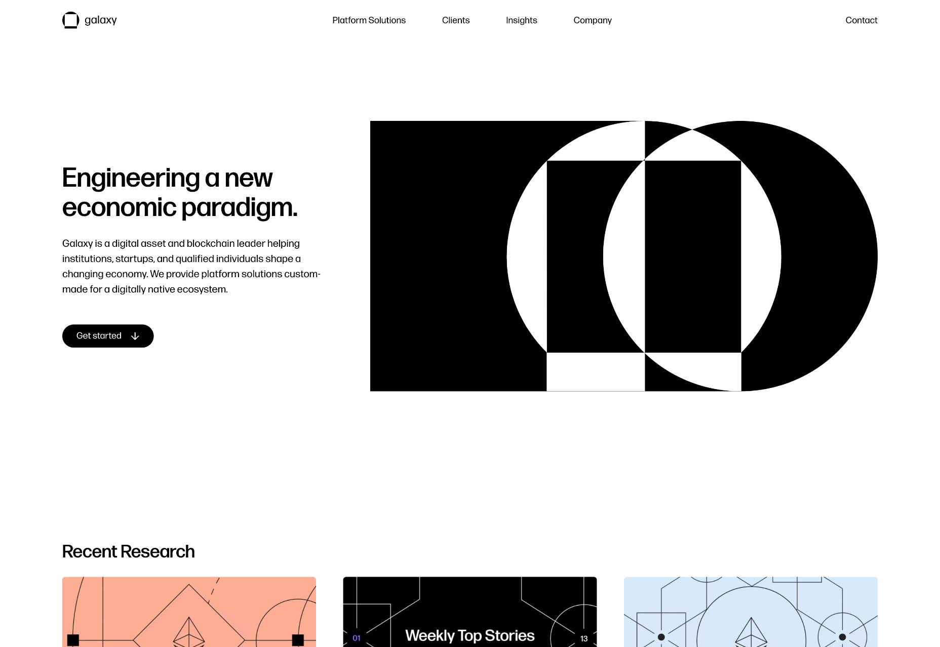
Galaxy

It’s not easy creating sites for blockchain companies because the technology is so new and changing rapidly. Galaxy does a great job with bold black and white.

Italamp

Italamp is a slick site filled with stunning lighting products. The design uses carefully positioned gradients to emphasize the lighting qualities of its products.

Revanesse

Cosmetic surgery isn’t the easiest sell, no matter how minor, but the site for Revanesse does a great job by focusing on confidence, not aesthetics.

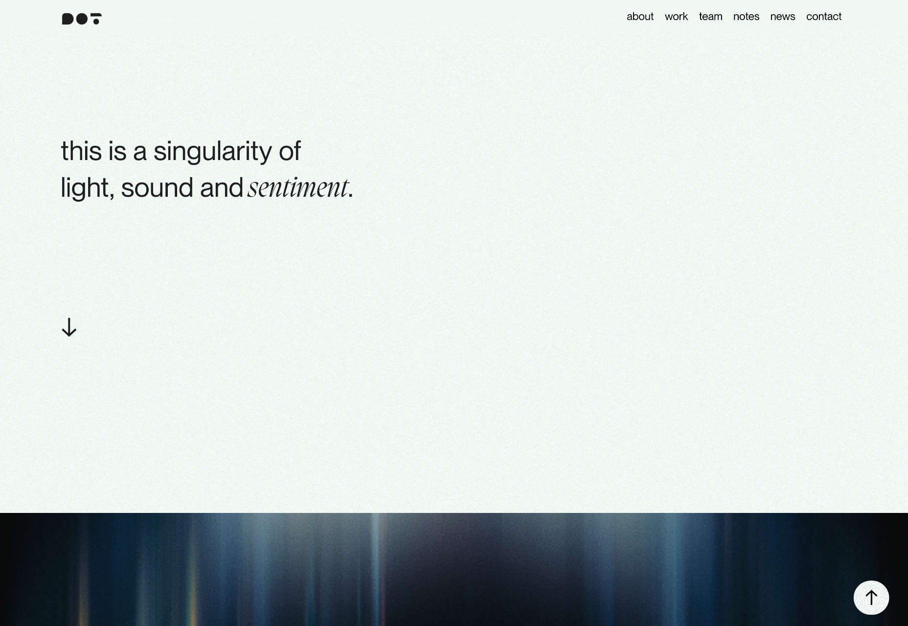
Dot Films

There’s tons to like about this site for Dot Films, from the neat little animated logo to the bold typography. It’s confident without over-selling it.

chrls.design

Charles is a designer and developer with an impressive portfolio. His site is beautifully realized with a simple slideshow that encourages you to dip in and out.

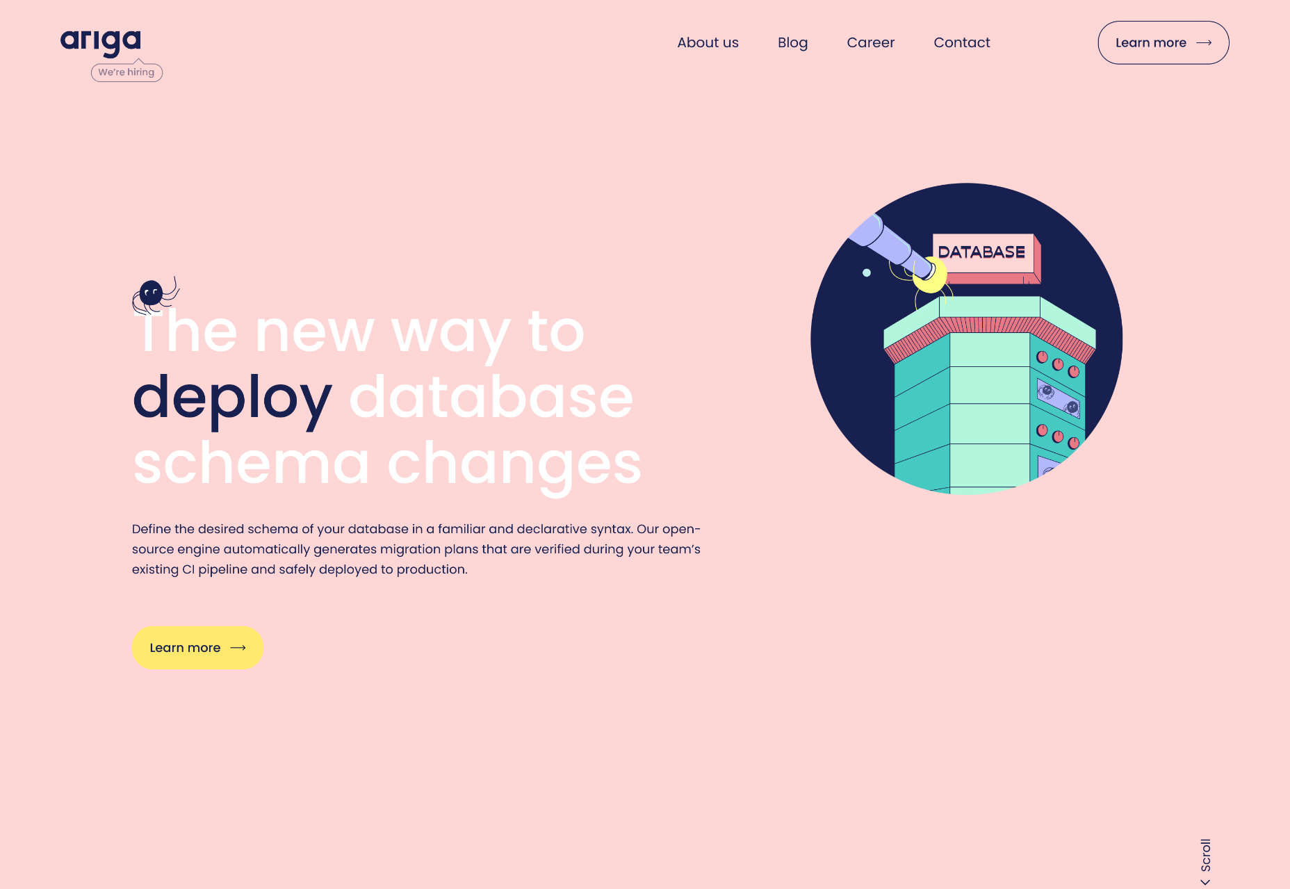
Ariga

Ariga offers a new way to manage database schema changes. And while that may be a dry topic, the awesome reactive illustrations on its site are anything but.

Source

The post 20 Best New Websites, January 2023 first appeared on Webdesigner Depot.

Categories: Designing, Others Tags:

5 Ways To Increase Value From Your Ecommerce Pop-Up Store

January 16th, 2023 No comments

Pop-up stores can be a fantastic way to test out new products, reach new customers, and generate buzz for your business. In this article, we will be sharing four practical strategies that you can use to increase the value of your pop-up store and drive success for your eCommerce business.

Whether you’re just starting out, or looking for new ways to optimize your existing strategy, we’re confident that these helpful pointers will maximize your store’s success. So without further ado, let’s get started — here are five ways to squeeze more value from the pop-up store model:

Provide a Full Hybrid Shopping Experience

Though making some money from in-person buys is obviously important, the core purpose of a pop-up store should be to raise awareness of your brand and drive traffic to your store. After all, that’s where most of your buys will always be. Accordingly, to maximize the effectiveness of your pop-up, you need to entwine the experience with online activity. 

The average visitor to your pop-up store should leave enthused to start buying through your online store — but if you want to make that happen, you’ll need to incentivize it. There are several ways in which you can manage this. Let’s go through them:

Firstly, you should provide an offline buying experience that’s reflective of your online experience. This is what hybrid selling is all about. Instead of simply grabbing some products and asking for cash in an amateur fashion, you should use your online system to process all your offline sales, essentially meaning that an offline customer is also an online buyer.

Secondly, you can distribute relevant marketing material at the event to entice people to visit your store. Giving visitors cards with discount codes and special offers on them is a great way to proceed: if they want to take advantage of those codes and offers, they’ll have to head to your store. This can actually be enough to set you apart from a competitor. The point of conversion presents a particularly-strong opportunity for presenting offers, but that’s not all: you can also use it to prompt email newsletter signups by having email-exclusive deals. 

Thirdly, you want to encourage customers to share their experiences at the store on social media — ideally, live from the store. One way you can do this is by having a stand in front of which customers can take photos, offering each person who does so entry into a prize draw. This can give your online engagement an instant boost and further expose your brand to everyone affiliated with those you’ve already been able to attract. 

Collaborate with Other Brands and Influencers

No matter how you feel about influencer culture or using outside figures to promote your brand, collaborations continue to be one of the pillars of effective marketing. This is particularly true for pop-up stores, success with which can often hinge on the notable names attached to their launches.

Where possible you should look to feature influencers, brand advocates, and other social media stars as part of your pop-up store experience. This reliably pushes their audiences to attend in an effort to meet them (and possibly talk to them), helping to attract people who might not previously have been familiar with your brand.

You can use these figures to promote future pop-up store events online. Influencers can talk about upcoming events in their Instagram stories, and you can even encourage them to write blog posts covering their links with your brand. Content marketing always matters, and it’s even better when you work with a partner.

Likewise, you should look to collaborate with other brands, even to the extent of opening a shared pop-up store selling products from both of your lineups. Many huge brands have found success through limited-time pop-up store collaborations, helping to draw their audiences together. This is particularly useful for growing brands because being associated with established brands leads people to view them as legitimate.

Collaborations are a fantastic way of supporting causes that share a similar ethos with your own, too. For instance, if you sell reusable water bottles, partnering with an organization that cleans the oceans of plastic would be a great idea. There must be things you care about beyond money, so show that. The result will be that you’ll profit in both ways.

Focus on limited-time offers and products

Part of what makes a pop-up store so successful and compelling is its ephemeral nature. If you’re a customer, any chance you get to visit it could be your only opportunity to enjoy the unique experience. When running a pop-up store, you need to capture that sense of exclusivity and run with it. 

Offer a subscription service through your online store? Why not provide an exclusive subscriber benefit by granting early access to your pop-up store? The subscription-based business model has seen a huge rise in popularity in recent years, and implementing a recurring revenue strategy can prove incredibly lucrative. 

Provided it’s feasible to distill part of your store’s offerings into a subscription service, doing so is relatively simple; if you run your store through Shopify, for example, all you have to do is choose a compatible subscription app and a subscription management platform. Once that’s taken care of, be sure to add all your subscribing customers to a separate, members-only mailing list, and distribute unique ‘access codes’ for your physical store. 

There are a huge number of businesses, particularly in the fashion market, that have made their names by producing limited runs of products to drive up prices, create a sense of urgency and make their brands feel more exclusive. Even if you generally operate with a consistent product range (and don’t want to introduce artificial scarcity), it can help to produce at least one exclusive item or collection for your pop-up store. 

Most importantly, this kind of exclusivity will give your pop-up shop one more unique element that can be promoted on social media. Take the opportunity to match a one-off event with a one-off product. Social ads targeted at the locations of your future stores can help you drum up further interest ahead of schedule. 

Promote the idea of posting these special-edition items in ways that will add to their sense of exclusivity. You could, for instance, give each one a unique number: this is something that often tacks on a huge amount of value, particularly for collectors. Get it right and many people who don’t attend a given release will feel regretful, leading them to commit to attending future events.

Use Some Attention-Grabbing Themes

The modern incarnation of the pop-up store hasn’t been around for that long, but even so: it’s been done. All the elements have been featured before. No one will be rendered agog upon discovering that an eCommerce brand is selling things in person. If you want to stand out, you need to make your store different, and having a theme is one way to do that.

Research what themes have worked for other brands of similar stature in the past. It also helps to research your fanbase, seeing if there is an obvious crossover between your audience and that of other brands, themes, and social causes. Working with a charity, for example, can help raise awareness for a cause your audience cares about and bring in more possible customers. 

If you’re running the store for multiple days (unlikely, yes, but possible), then you can even have a different theme for each day. You could focus on budget-friendly buys one day, for instance, and concentrate on luxury products the next. This is a great way to keep everything feeling different and encourage multiple visits. It can also bring diversity to the overall attendance by catering to various people interested in different things.

Set a Specific Goal Before you Deploy

It’s a persistent truism that you need to have a clear goal before you commit to a business project. Most things are iterative, and pop-up stores are no different. How your first attempt goes is almost insignificant. What matters is how your subsequent efforts work out — and if you don’t know how to rate the success of each attempt, then you won’t be able to make the next one better by addressing any deficiencies.

Are you mostly looking to make direct sales through your store? Use it as part of an audience-building exercise. Expose your brand to new markets? Promote exclusive products? Whatever you land on, you need to have a concrete aim to make your pop-up store feel coherent and not confuse customers who may have simply stumbled upon it.

Your decision will help guide your marketing approach and dictate the kind of content you produce in anticipation of your pop-up store. An essential part of yielding success is to ensure that the entire operation is as professional as it is unique and creative. Doing something different and interesting is great, but it won’t matter if prospective customers feel that they can’t rely on you to offer a good buying experience and service.

Despite everything that’s happening in the world today, the humble pop-up shop remains a viable option — and it’s one that many brands still choose to ignore, leaving a lot of room to take advantage. If you decide to go ahead with running a pop-up store, these tips will help you make the most of it.

The post 5 Ways To Increase Value From Your Ecommerce Pop-Up Store appeared first on noupe.

Categories: Others Tags:

5 Things to Focus on While Revamping Your Website

January 13th, 2023 No comments

A website is one of the most important elements in a business owner’s arsenal. When used well, it can help them grow their business to new heights efficiently. And one of the prerequisites for using it well is designing it smartly in the first place. When you design a website well, the first thing it does is convey your brand voice and message more clearly to the audience. 

And that is the entire purpose, isn’t it? The exact reason why most businesses require a website in the first place. So let’s say that you have discovered that your current website isn’t fulfilling its purpose now, and you’ve decided to revamp it.

What are the factors that will help you build a better website? And how can you monitor your new website to ensure that this doesn’t happen again in the future? Let’s dive in and discover what it takes to redesign your website to help you connect better with your audience.   

Define Your Marketing Goals

The first, and arguably the most important thing you have to do, is identify your marketing needs. That is because they are the driving force that is dictating why you need to revamp your website. So, start out by identifying and recording your marketing requirements.

Doing so will help you design the strategy for what to revamp, and how to do it. Moreover, it would also allow you to set the KPIs or metrics according to which you will be able to judge the success of your new website. 

Generally, your marketing goals will need to reflect your brand’s nature and personality. To put it simply, you cannot have the same revamp strategy for an eCommerce website, as you would for a personal website for a life coach. Therefore, you will have unique KPIs for your website in question, as well as goals that are based on those KPIs. 

So now that you have identified your goals and KPIs, you will be able to identify the type of user actions to focus on and promote, such as:

  • Signing up
  • Filling out a contact form
  • Purchasing a product or service
  • Downloading a piece of content exclusive to your brand

Using these actions, you will be able to track how well your revamped site is progressing, depending on the KPIs that it is fulfilling. 

Perform a Website Audit

It is rare that when you revamp a site, you change everything about it. Most of the time, a few elements need to be changed for the website to gain new life. However, the question is; how can you know what needs changing?

One thing we can all agree on is the fact that your website revamps should be based on hard, data-driven facts, and not your gut feelings. And in order to get those necessary data-driven insights, you need to conduct an audit of your website. That will help you recommend the necessary changes and justify them too. 

Tools like Google Analytics are a great source of information on this subject and can help you monitor and review various aspects of your website easily and quickly, such as design audit, SEO & URL audit, and more. Some of the most common elements and items that pop up in website audits include:

  • Pages visited frequently
  • Pages with very little or no traffic
  • Performance of primary keywords on SERPs
  • Performance of different CTAs on your website
  • CTAs with little to no interaction
  • Ease of navigation on your website
  • How effective is your user journey in keeping a user on your site engaged

These factors and more are what dictate the changes that need to be made to your website. And if you manage to answer these questions properly, then you will be able to come up with some interesting and actionable change suggestions. 

Set Up Google Analytics on Your Website

Continuing from the last point, you need analytics tools to monitor and assess your website’s performance, current, and post-revamp. Therefore, if your website has no analytics tool set up, the first thing you have to do is to integrate one for your website.

We highly recommend Google Analytics’ latest version, called the GA4, as the preferred option for your web analytics tool. The reason we recommend adding an analytics tool is that it would allow you to identify potential issues long before they become full-fledged problems, such as page load speeds and more. Moreover, it would also help you achieve your goals by aiding you in making the right changes based on the results of your successes and failures. 

Now, if you’ve outsourced your website’s SEO to a marketing agency, the addition of web analytics tools and website monitoring will often be included in the project. However, no matter whether you are building the site on your own, or have outsourced it to an agency, you need to understand the analytics tools and study the data and insights generated each month. 

Plan the User Experience for Your Website’s New Design

Whenever we create a website’s design or revamp it, one of the most important aspects we need to consider from the consumer’s end is the user experience. Frankly, one of the biggest factors that affect the likelihood of a user returning to your website is whether they enjoyed going through it the first time. 

We often see businesses with great offerings failing to generate traffic to your websites. That is because they do not offer the kind of experience that a user expects. And when there are other options to choose from in the market, why would a user choose one that doesn’t have an experience they enjoy?

One of the simplest ways to keep your design user-friendly is to keep it simple and minimalist. Cluttered screens tend to get confusing, for both you and your customers. Moreover, it is also helpful in making your website friendlier in terms of search engine optimization. That means that the better the UX of your website, the better the chances of your website ranking higher in the SERPs. 

Adopt a Phased Rollout Approach To Your Revamp at a Time

This is one of the most important aspects to focus on when revamping your website, especially if it is a big revamp. Often, websites behave differently during the testing they do when deployed live. Now, if that happens to your revamped website, it might result in some users experiencing issues, which could lead to a bad user experience. 

One of the hallmarks of a well-planned project that sets it apart from bad website examples is that it is deployed in phases to ensure that there are no problems site-wide. Using a rolling deployment instead of a one-shot deployment would help you weed out any potential issues while reducing the chances of negatively affecting the user experience. 

Summing Up

There are many elements you need to tweak when reworking an outdated website. And based on your site’s specific shortcomings, you might work on different elements to get it back up to the level of impact desired. 

However, there are some key areas that most websites being revamped need to focus on. And if you consider those within your revamp strategy, there is a higher chance that your new website will be a resounding success. 

The post 5 Things to Focus on While Revamping Your Website appeared first on noupe.

Categories: Others Tags:

Top Front-End Tools Of 2022

January 12th, 2023 No comments

Over the past 12 months, we continue to see new free and open-source projects shared around the developer community. In my newsletter, Web Tools Weekly, I feature more than two dozen tools every week. As I do every year, I’ve gone through the numbers and put together what were the most popular tools according to my readers.

Some of these tools are interesting in a curious kind of way, but almost all of them are practical tools you can use in your projects today. Enjoy!

Related Articles on SmashingMag

WebGi Camera Landing Page

WebGi Camera Landing Page is a landing page template that uses GSAP, ScrollTrigger, and WebGI engine to create beautiful animated, scrollable one-page sites. The example website is impressive! It’s a mock Canon camera website with big graphics and animation.

Due to the potential for performance problems, this is obviously not for every kind of website. But it’s an option to consider if you want something bold and eye-catching.

CSS Fingerprint

Over the past few years, the concept of tracking users via nothing but CSS has been covered a lot. You can search the web for various articles on the topic, but CSS Fingerprint is somewhat of an all-in-one resource on the subject.
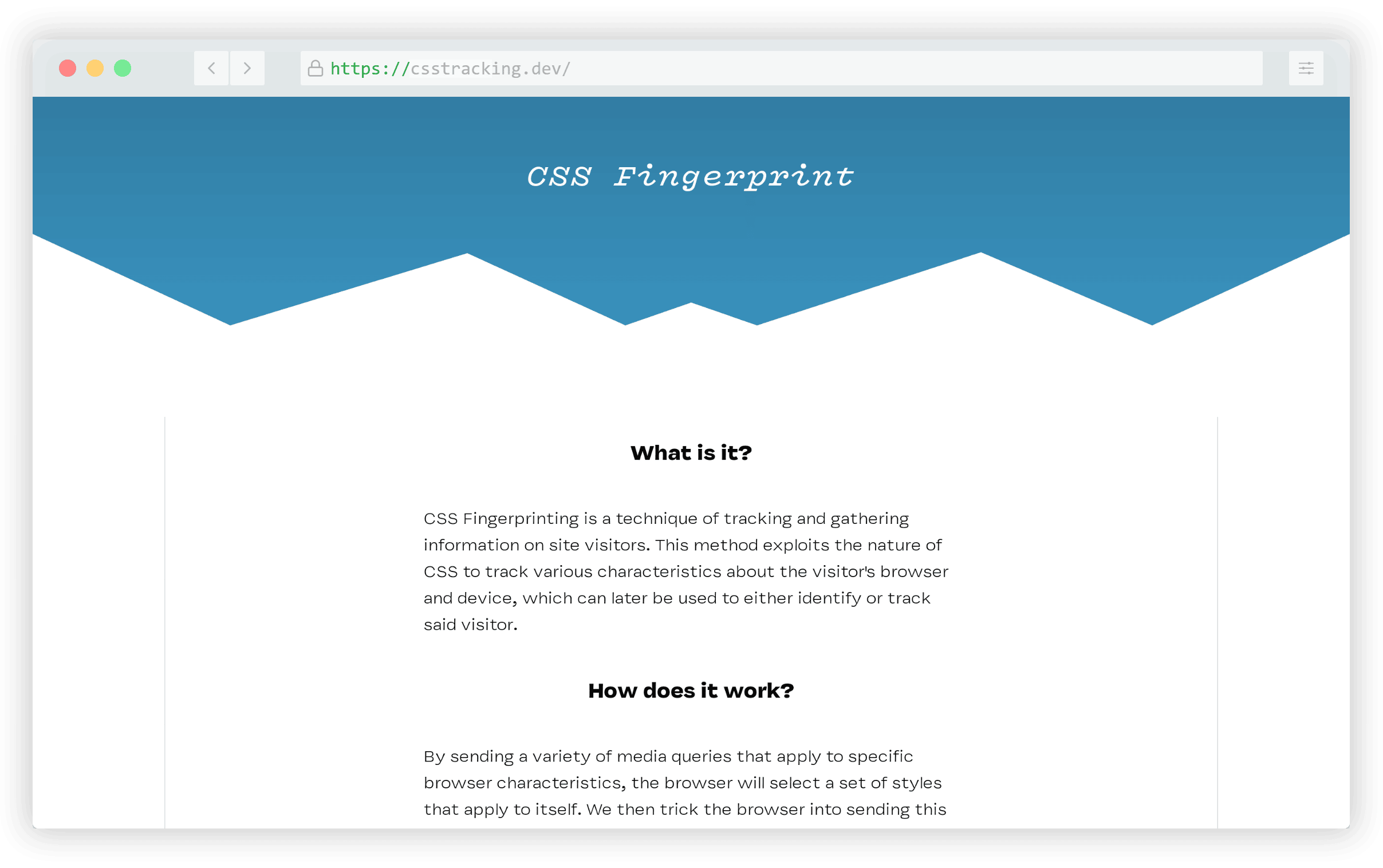
You can agree to visit a test page where you can view your own “CSS fingerprint” and the associated GitHub repo has a little more technical info.

PostSrc Tailwind Components

Component libraries are always popular and anything associated with Tailwind tends to do well. PostSrc Tailwind Components includes more than 50 components divided into more than a dozen categories.
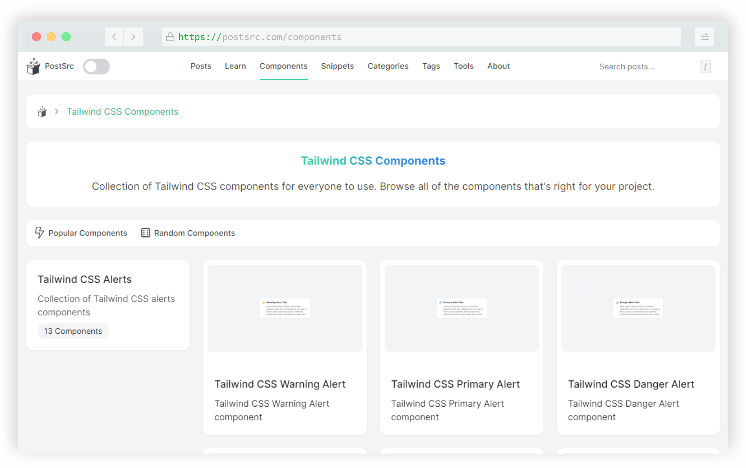
Includes components for UI elements like alerts, badges, buttons, breadcrumb navs, cards, CTAs, charts, forms, and more.

Almond.CSS

Almond.CSS is the first of three “class-less” CSS frameworks that made this year’s list. Even with the popularity of utility libraries like Tailwind, it’s interesting to see these kinds of projects do so well.
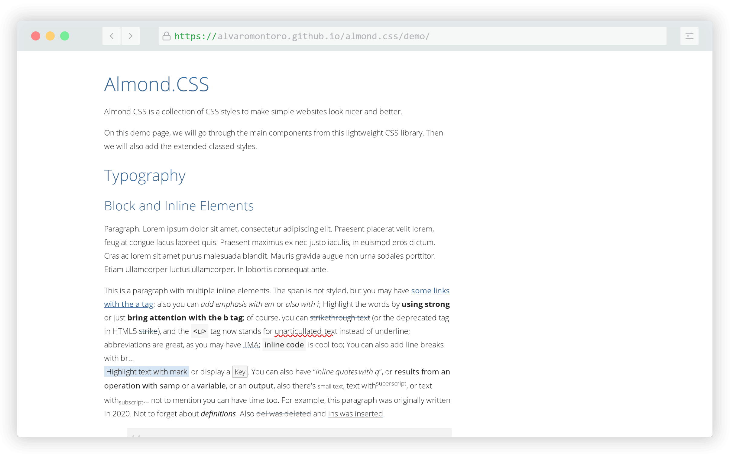
These libraries work similarly to a CSS reset or normalizer, but are a little more opinionated in terms of applied styles.

Piling.js

Piling.js is a JavaScript library that allows you to build interfaces where large amounts of items can be dragged and dropped into “piles”.
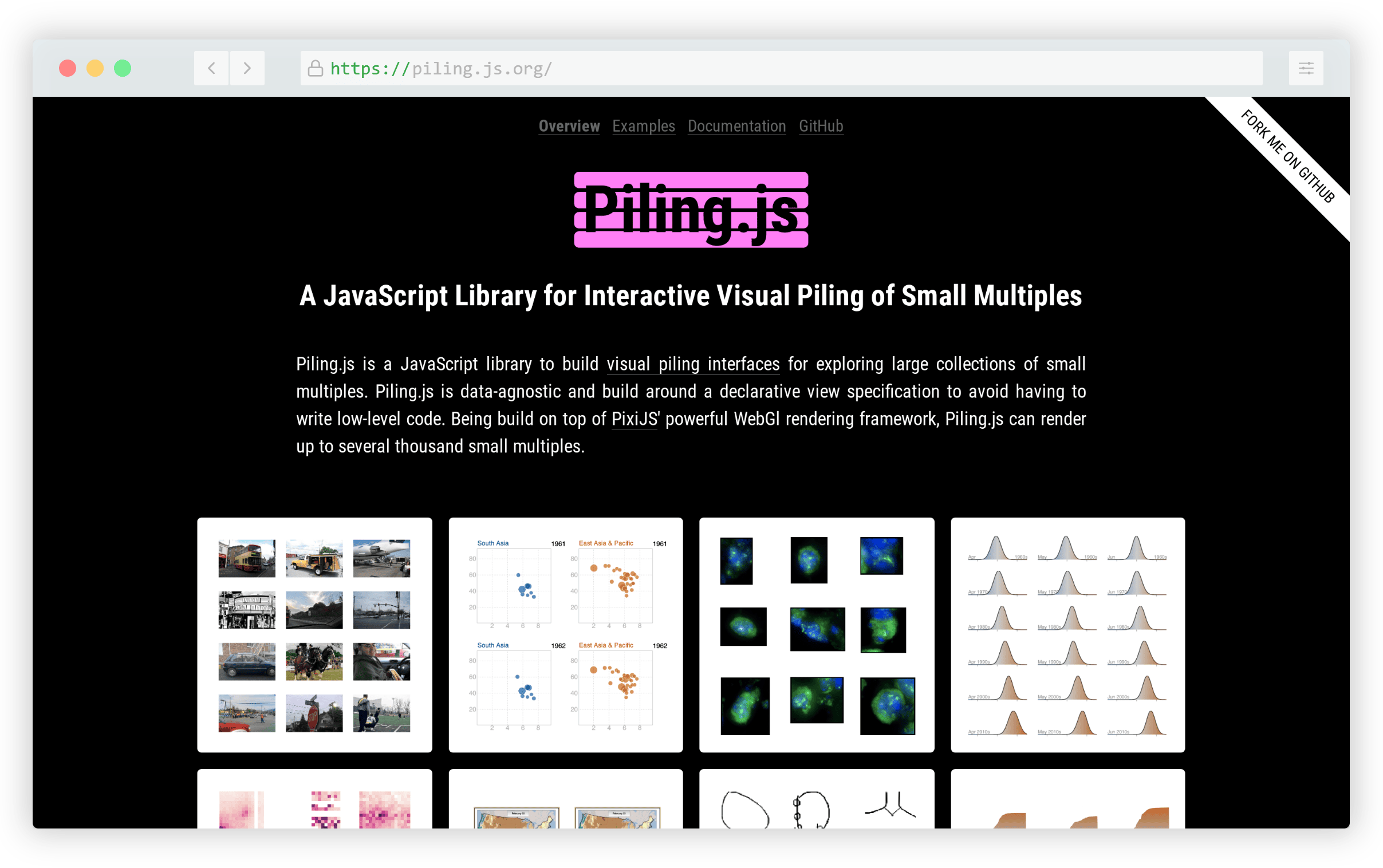
It’s built on top of PixiJS, a 2D WebGL renderer and the demos allow you to easily customize the number of items on a page along with a number of other settings and configurations.

Virgo

Virgo is a free HTML template from the folks at CodyHouse. It’s compatible with CodyHouse’s own framework and Tailwind and doesn’t have any third-party dependencies out-of-the-box.
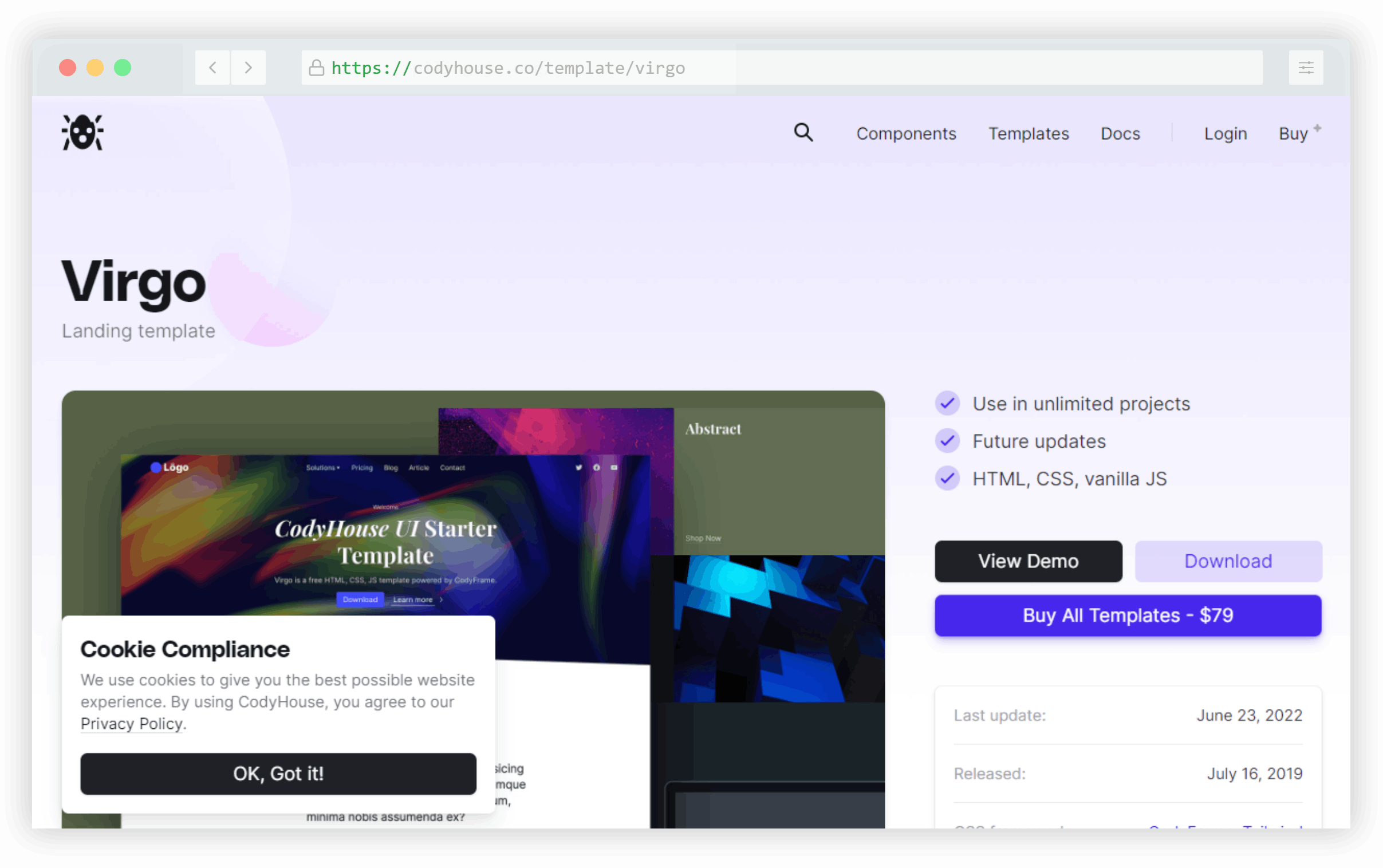
Although it’s described as a “landing page template”, it includes six pages and can be used freely in any project with some minor restrictions.

Onion

Onion is a utility based on the most popular article on my personal blog. In that piece, I discuss a potential solution for animating “display: none” to “display:block” in CSS, which isn’t technically possible.
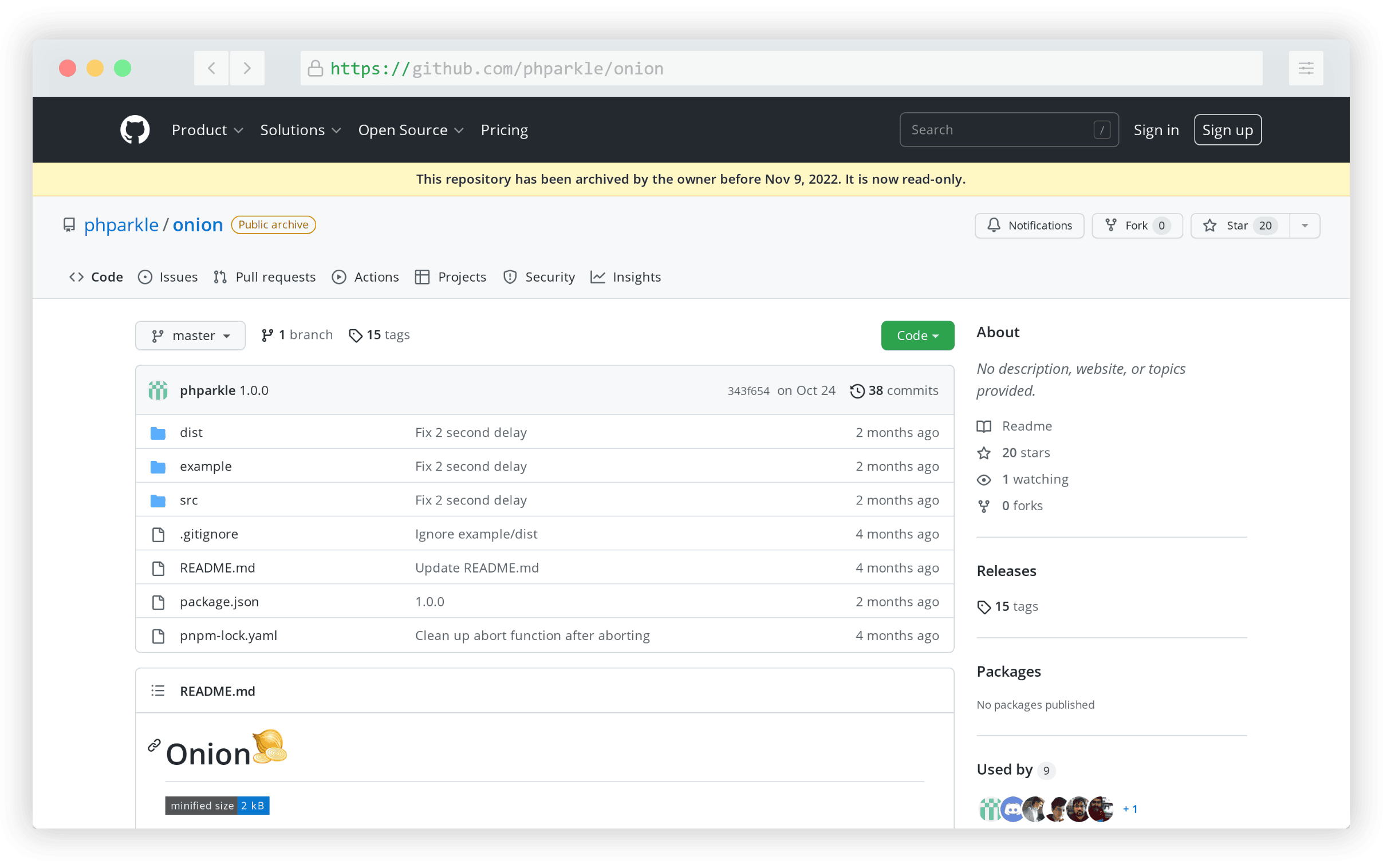
My solution uses a little bit of JavaScript to mimic the effect. This project, built by Parkle Lee, encapsulates the code from that article into an easy-to-use JavaScript utility.

MingCute

I probably come across at least 20 new icon libraries every year. MingCute is one of those and it seemed to gain traction due to its promise of simplicity and the sheer number of available icons.
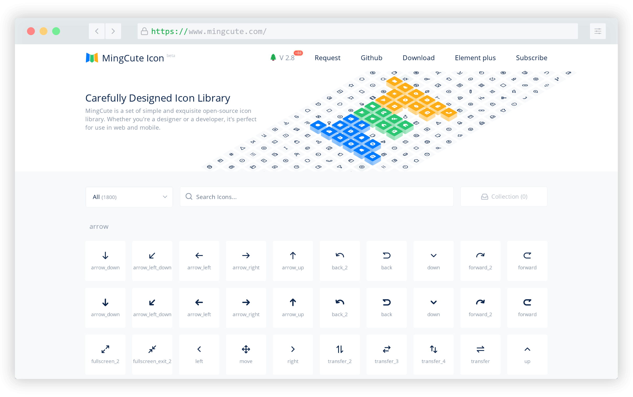
It currently includes 1,800 icons in SVG or PNG formats and the website allows you to add icons to a live “collection” after which you can download all your selections at once.

Lightning Builder

Lightning Builder is a free website mockup and wireframes builder that includes galleries of common components you can choose from. It requires signing up if you want to save your project and design multiple pages.
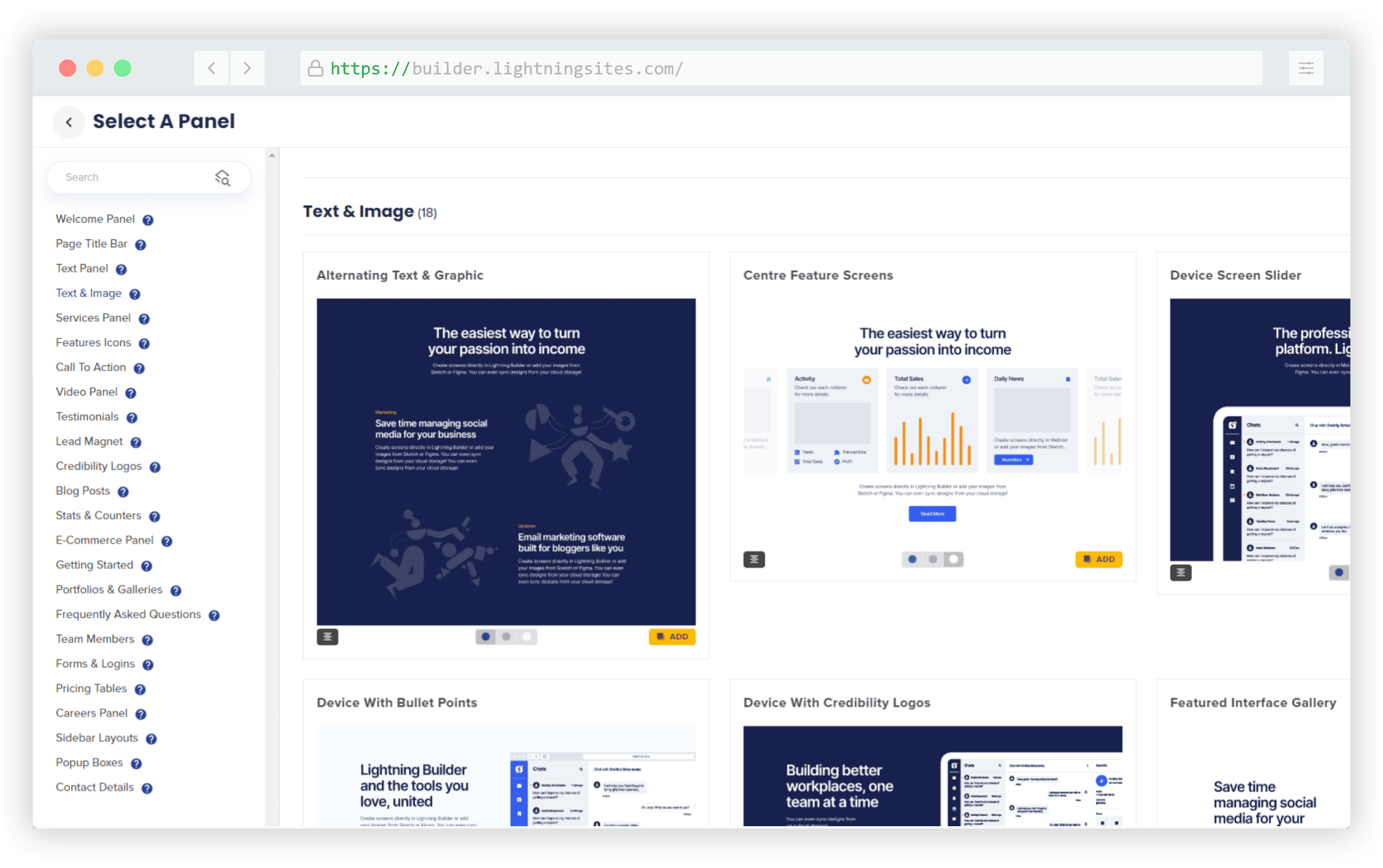
The builder boasts hundreds of components that can be customized and the entire experience of the builder’s UI is fairly smooth.

Scroll Btween

Scroll Btween is sort of like a cross between an animation library and a parallax script. It allows you to ‘tween’ any CSS value for any element on the page relative to its position in the viewport.
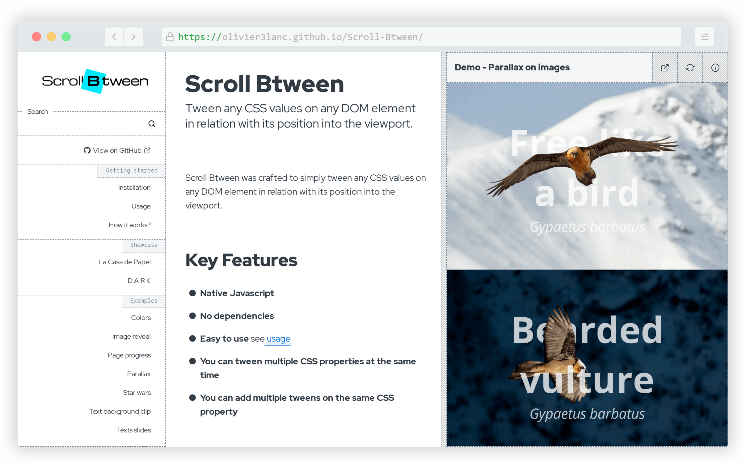
There are lots of demos you can try out showing a diverse number of ways you can utilize it in your projects.

Text Cleaner

Text Cleaner is an all-in-one text formatting tool that lets you deal with whitespace and special characters using various settings.
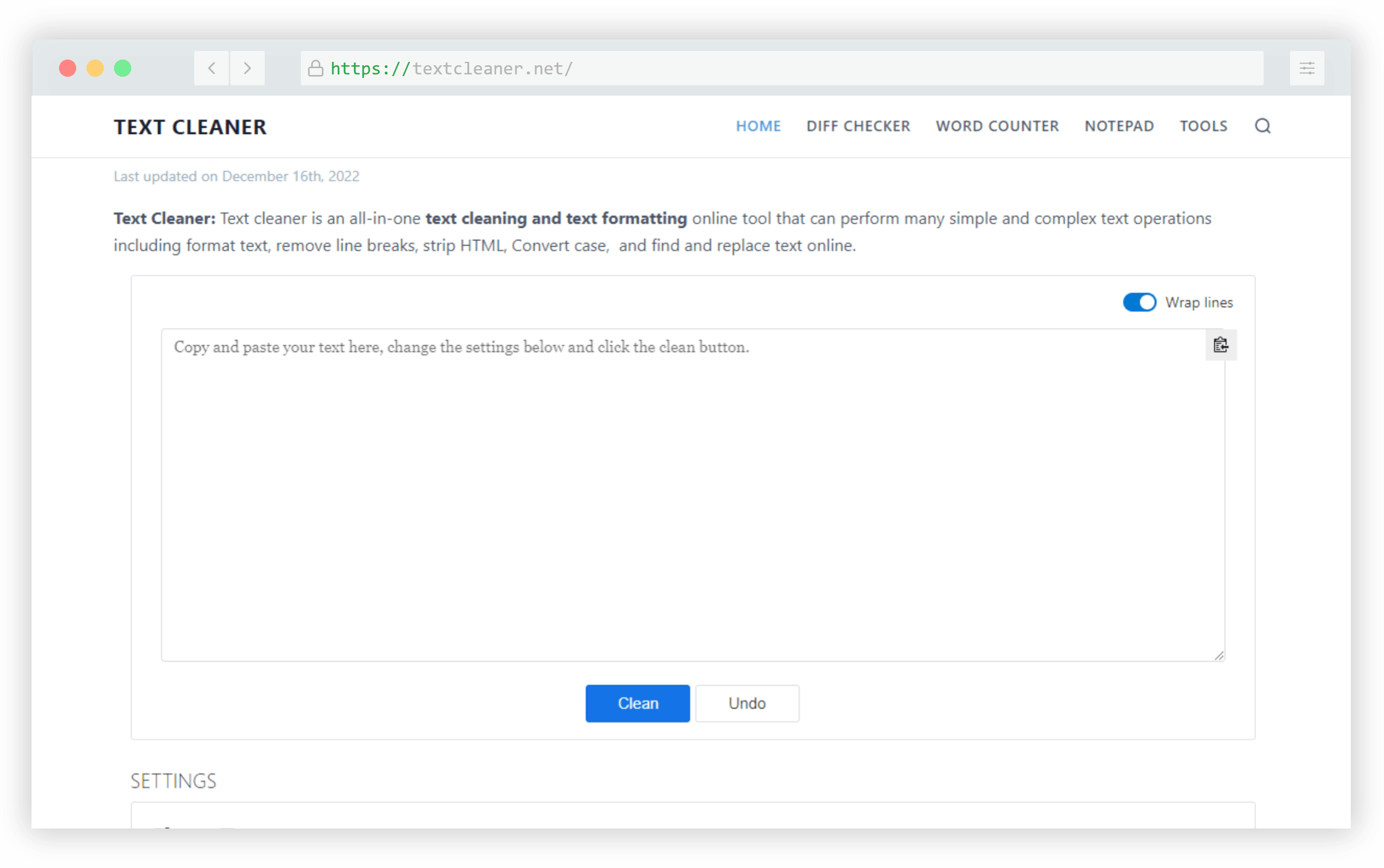
Paste in your text, then choose what you’d like to do — remove leading and trailing space, replace tabs with spaces, convert multiple spaces to single, remove non-ASCII characters, strip emojis, and lots more.

uiverse

uiverse is a repository of community-built HTML and CSS components, free for personal and commercial use.
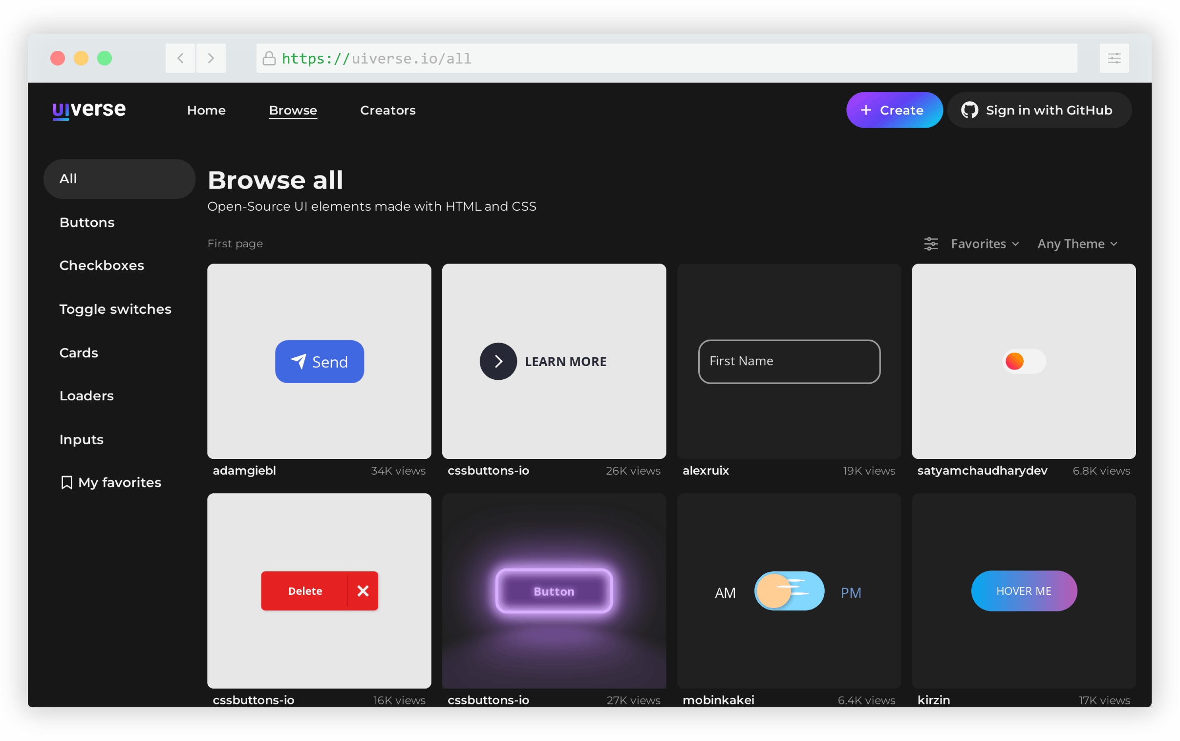
It currently includes more than 640 components in various categories including buttons, custom checkboxes, toggles, cards, loading animations, and inputs.

Fonoster

Fonoster is an open-source alternative to Twilio, the popular communication API platform.
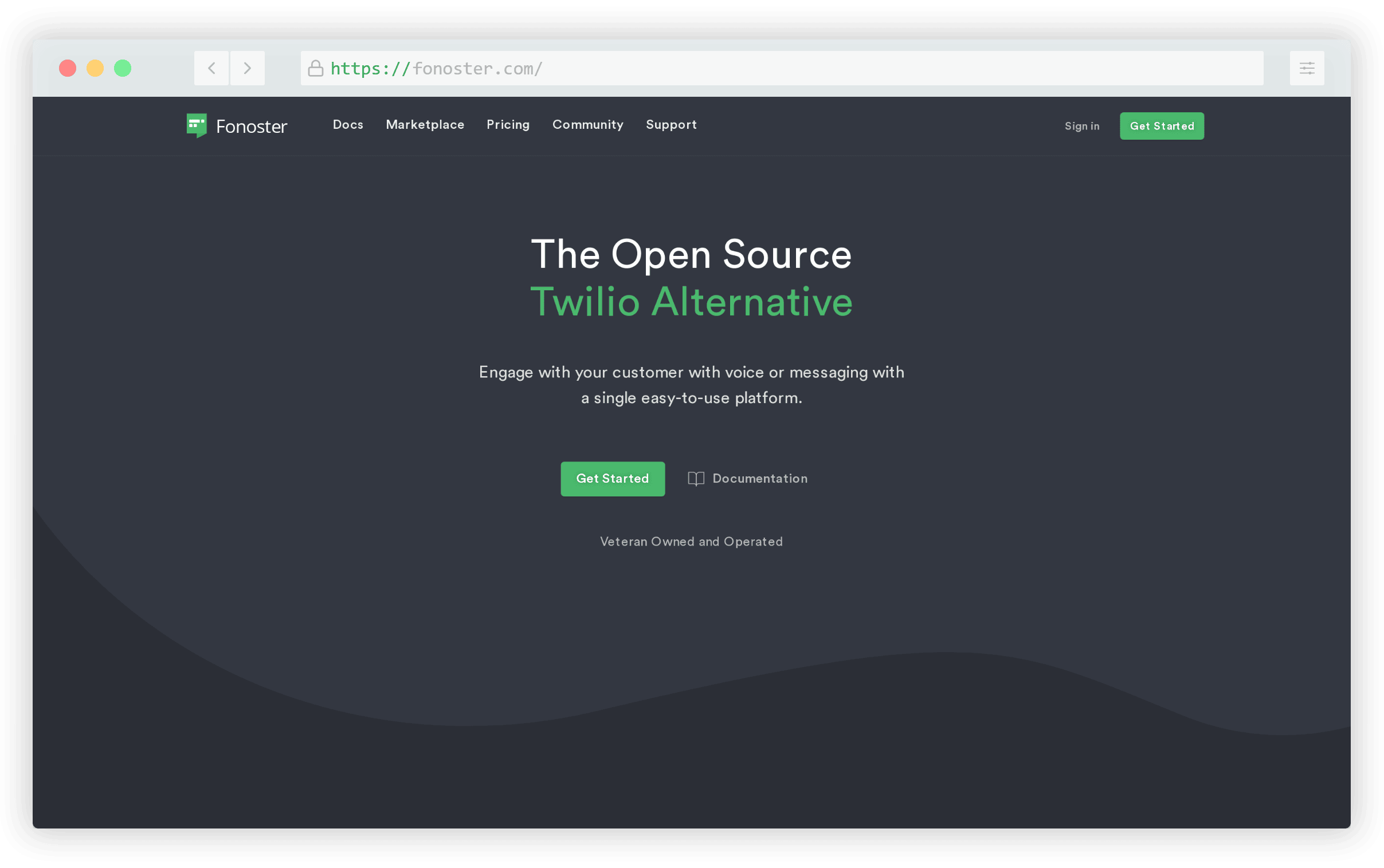
Fonoster also has its own pricing plan, with a modest free tier, but because it’s open-source, you have the option to host it yourself with no extra cost outside of your own infrastructure.

Zag

Zag is a library of framework-agnostic UI components that currently houses 20+ interactive components including a popover, slider, accordion, combobox, and lots more.
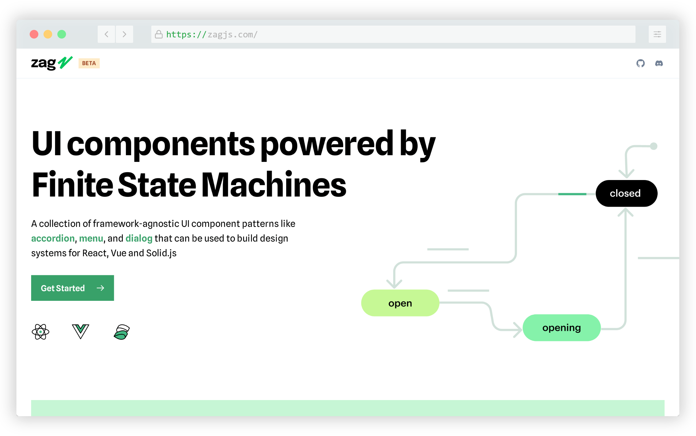
Each of the components can be easily integrated with React, Vue, or Solid.js, with info in the docs on how you can deal with each framework.

Allinone.tools

Allinone.tools is probably one of the largest collections of online utilities that I’ve come across. This includes tools for image manipulation and conversion, PDF tools, various text and list formatting options, CSS and JS minifiers and beautifiers, and lots more.
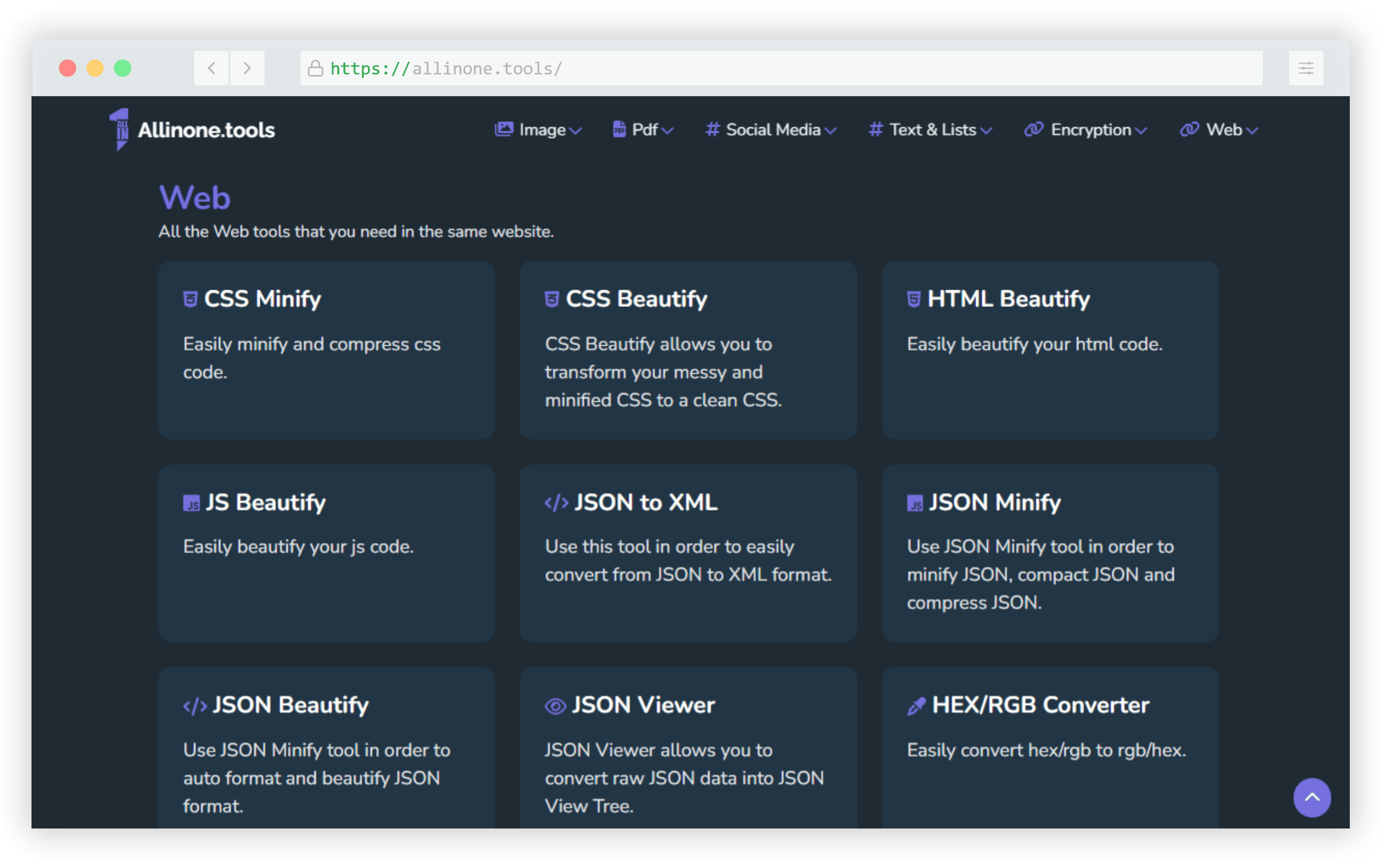
It also includes tools for carrying out various encryption-related tasks like encoding, decoding, decrypting, and so forth.

Martian Mono

Martian Mono is the only font that made this list, and it’s a nice one. It’s a monospaced version of another font called Martian Grotesk, hence it’s useful for coders.
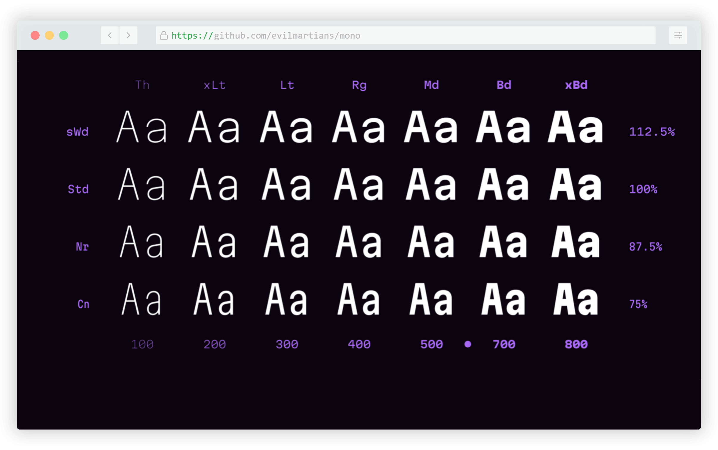
This one consists of a variable font and 28 styles ranging from condensed to semi-wide and thin to extra-bold.

AnimatiSS

AnimatiSS is a collection of unique CSS animations, similar to other popular animation libraries that allow you to add animations to elements on the page using a class name.
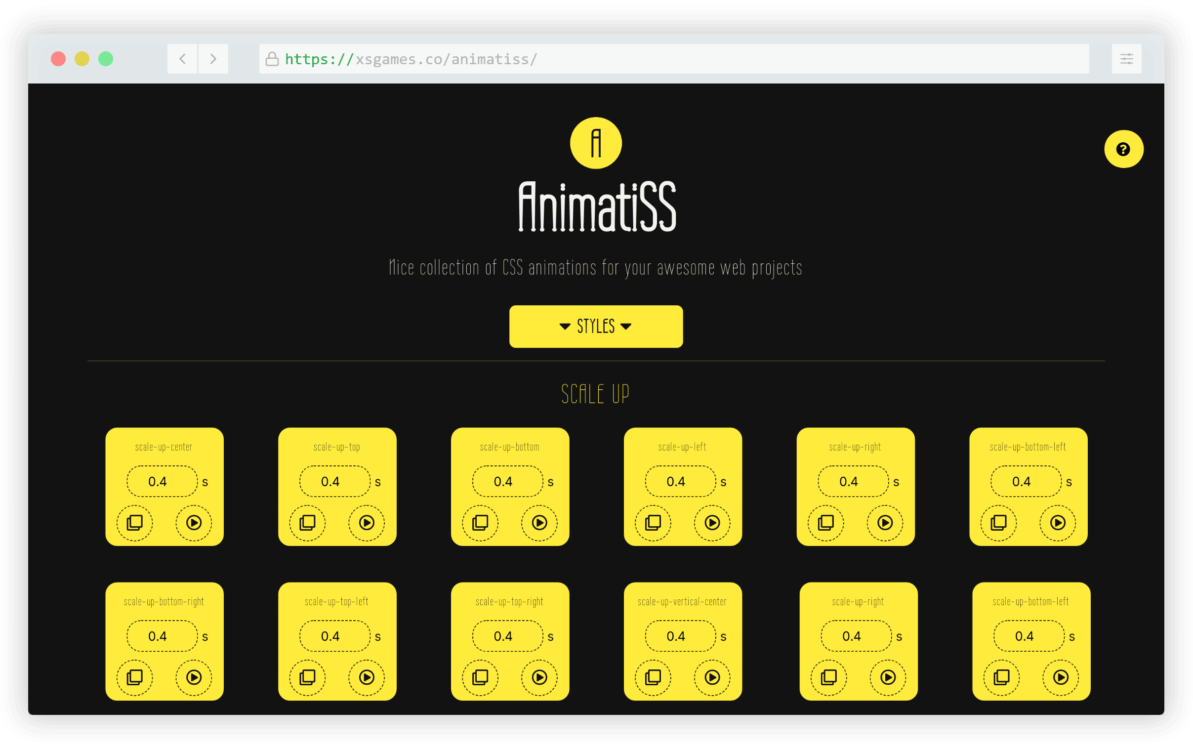
This library includes animations under 10 style categories and you even adjust the duration of each one directly on the page.

HTMLShell

HTMLShell is a simple tool you can use for generating a copy-and-paste customized HTML template for a landing page or other project. The tool includes a number of toggles that allow you to add or remove various elements in the section.

For example, you can include or exclude a CSS reset, Twitter social cards, viewport meta tag, Google Analytics, and lots more.

Formation

Formation is a React and TypeScript-based library of 20+ components that feature accessible features like focus management and color contrast out-of-the-box.

The collection includes buttons, cards, modals, overlays, spinners, toast notifications, tooltips, and lots more.

Vanta.js

Vanta.js is a JavaScript library that produces WebGL-based effects that are cool to look at but should rarely be used, if ever, due to potential performance problems. This tool allows you to create custom animated backgrounds with a few lines of code.

The website allows you to customize different background effects directly on the page using an interactive sidebar, after which you can grab the code.

Kumiko Creator

Kumiko Creator made the list this year probably mostly due to curiosity clicks rather than practicality. This online generator allows you to upload your own photo to convert it to generate customized kumiko patterns.
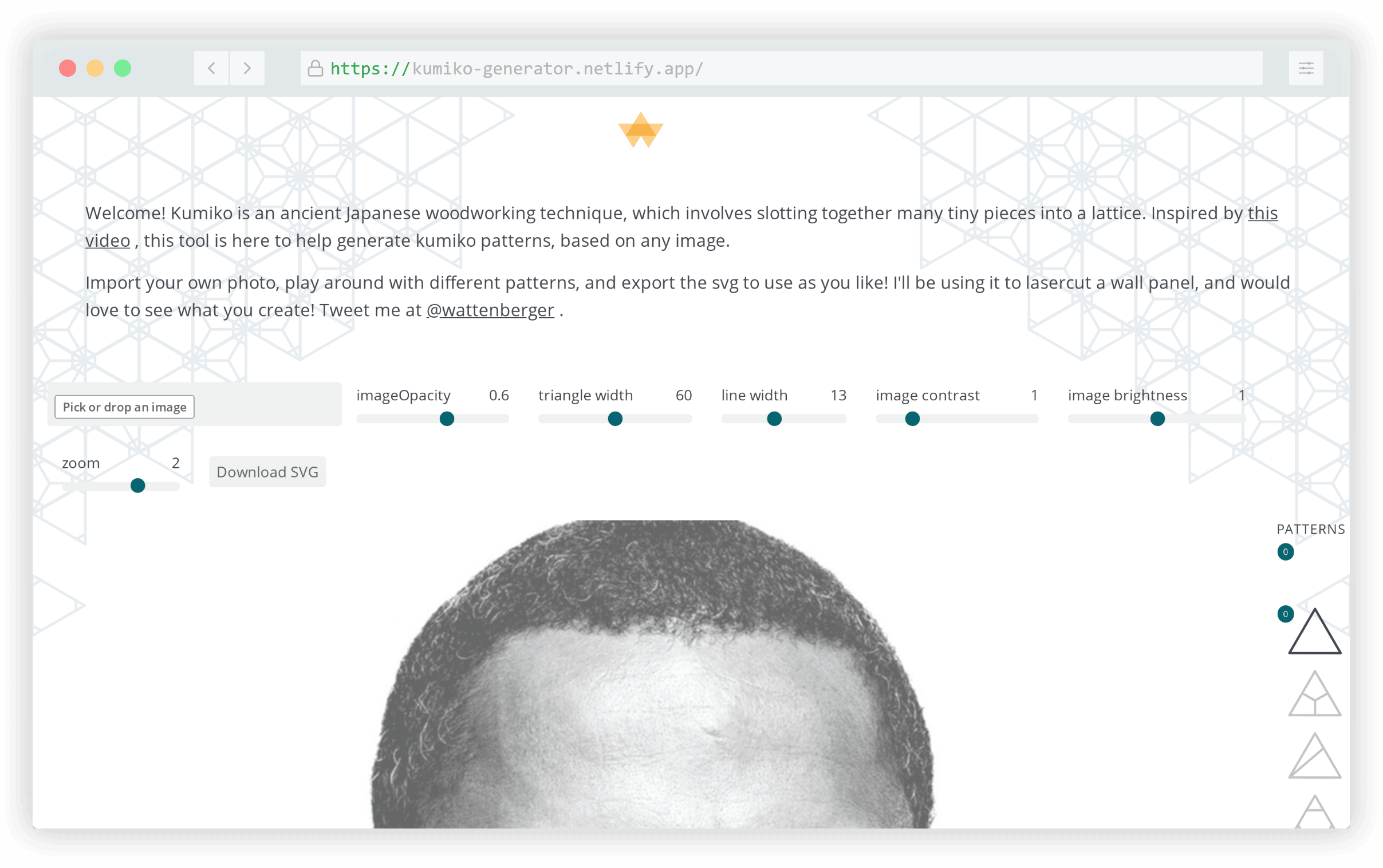
As the site explains, the term “kumiko” refers to “an ancient Japanese woodworking technique, which involves slotting together many tiny pieces into a lattice.”

Atomico

Atomico is a micro-library for creating UI components, similar to projects like React and Vue, with a React-inspired syntax. It’s compatible with those libraries as well as Svelte and Angular.
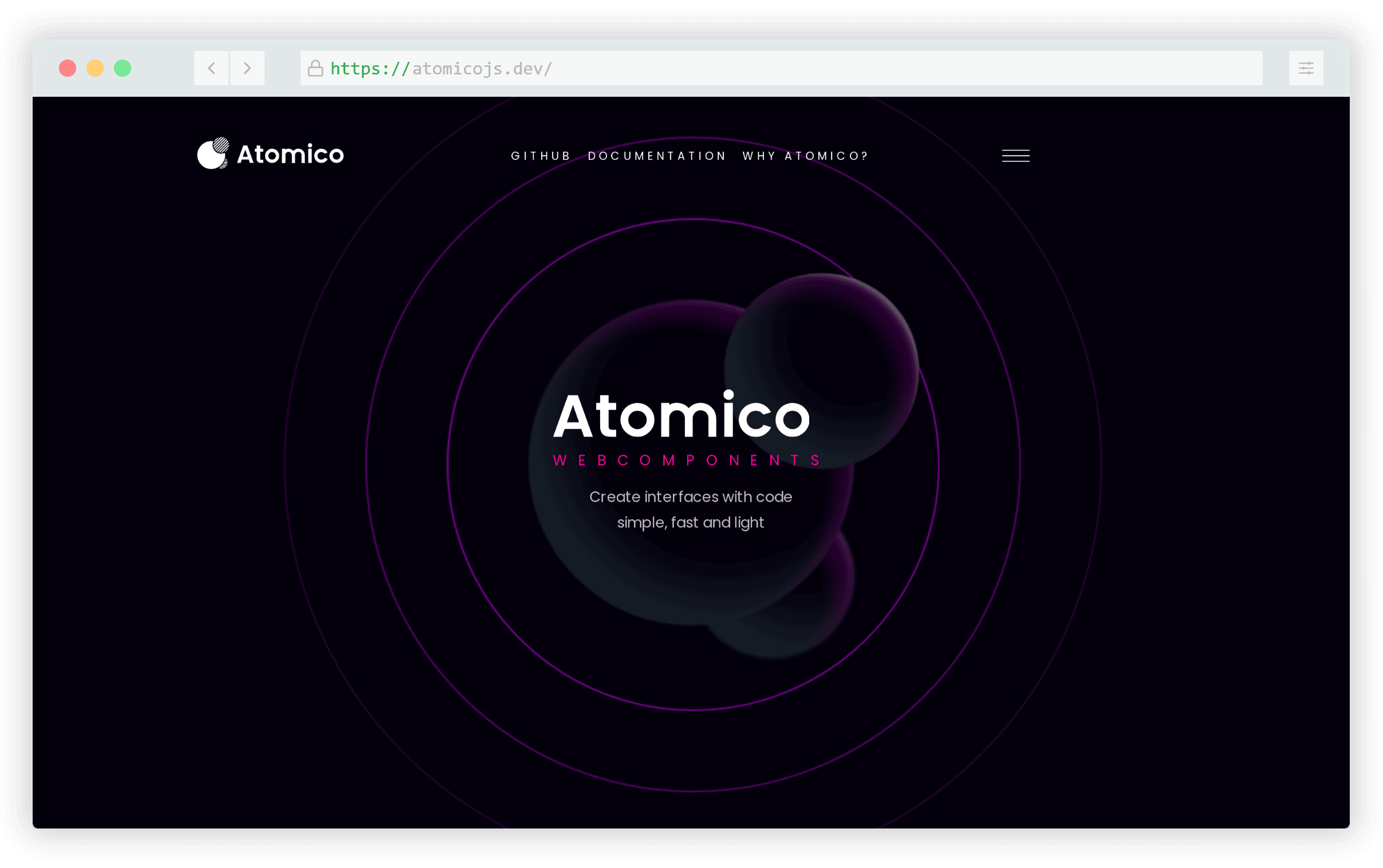
The library has scored high on performance tests, uses virtual DOM, props, hooks, and more making it an easy solution to transition to if you’re already familiar with other popular solutions.

mmmotif

mmmotif is one of the many useful online generators created by Sébastien Noël. This one allows you to create and customize SVG-based 3D-like isomorphic patterns for use as backgrounds.

The generator allows you to select a base shape for the background, after which you can adjust angle, scale, skew, and the position of the repeated pattern.

DevToys

DevToys is a native offline Windows app that’s a “Swiss army knife” for developers. It includes 20+ tools are useful for various development-related tasks.
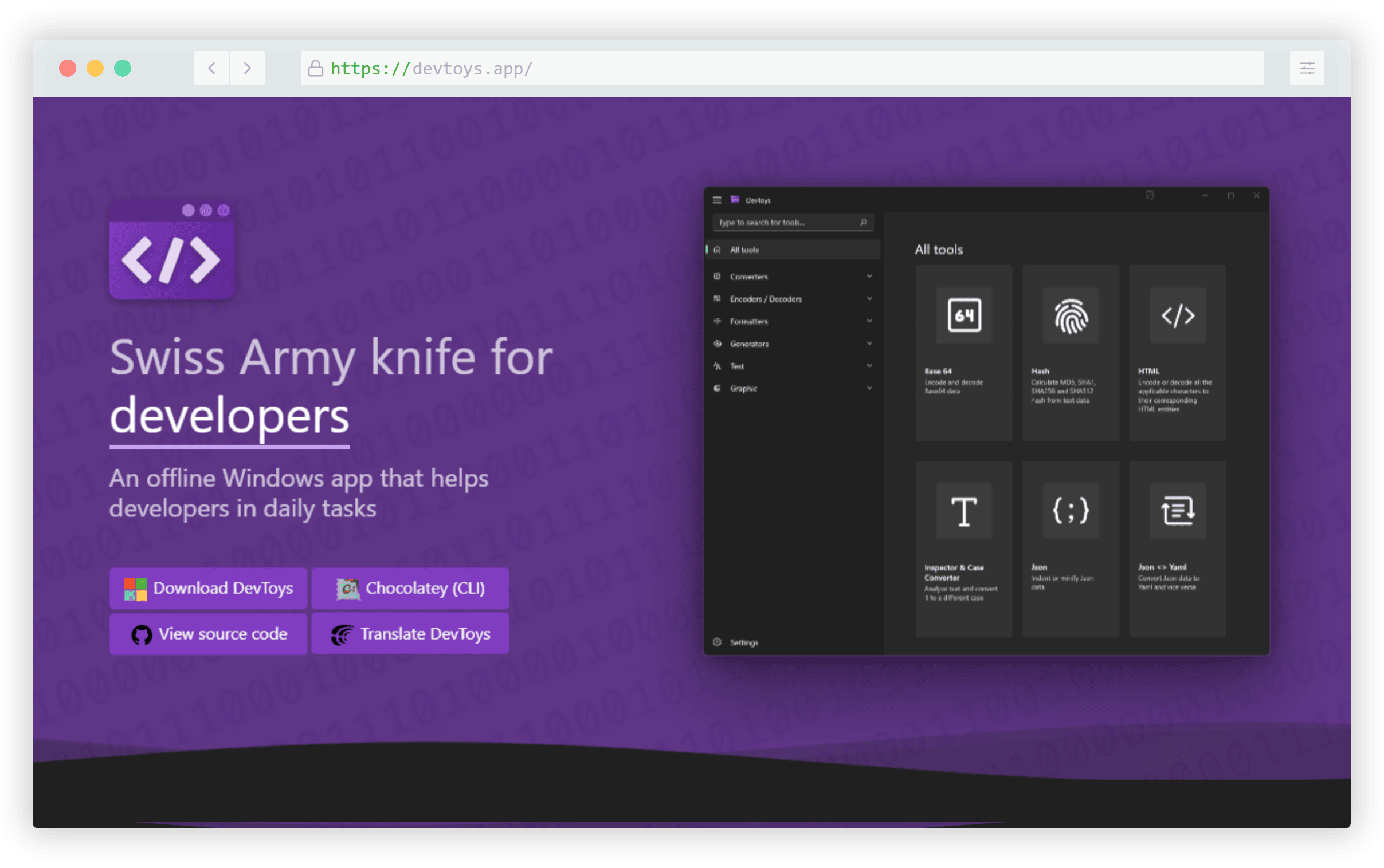
There are decoders, encoders, converters, hash generation, text diffing, and much more.

mediaquery.style

mediaquery.style is a simple little online code resource for quickly copying and pasting the most commonly used CSS media query snippets.
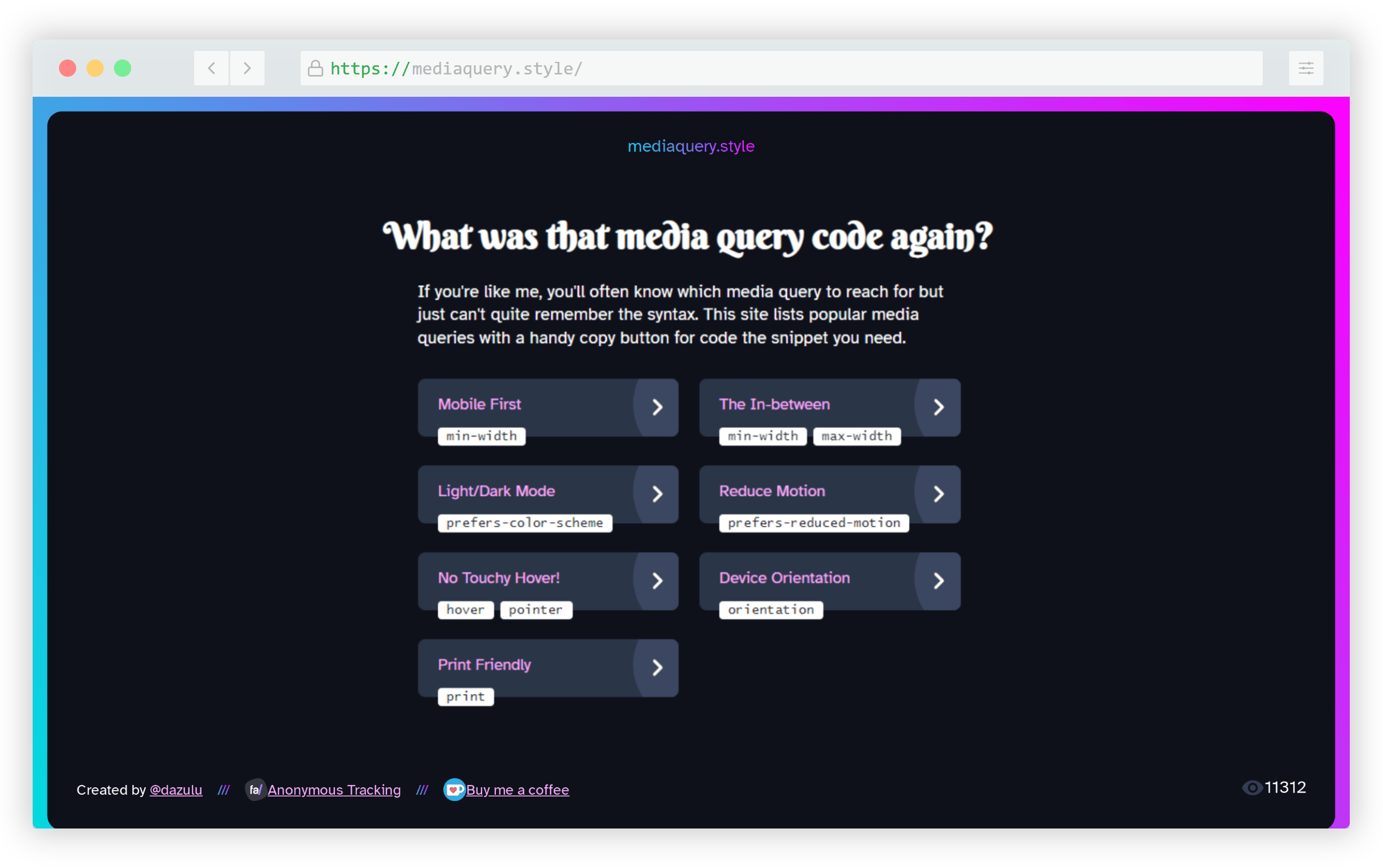
The website allows you to grab code for mobile first media queries, range queries, light/dark, reduced-motion, hover/pointer, orientation, and print.

Lyra

Lyra is an open-source, dependency-free, full-featured full-text search engine for your site that can run in any JavaScript runtime including the browser, server, React Native, and more. It’s written in TypeScript and boasts strong performance in comparison to its competitors.
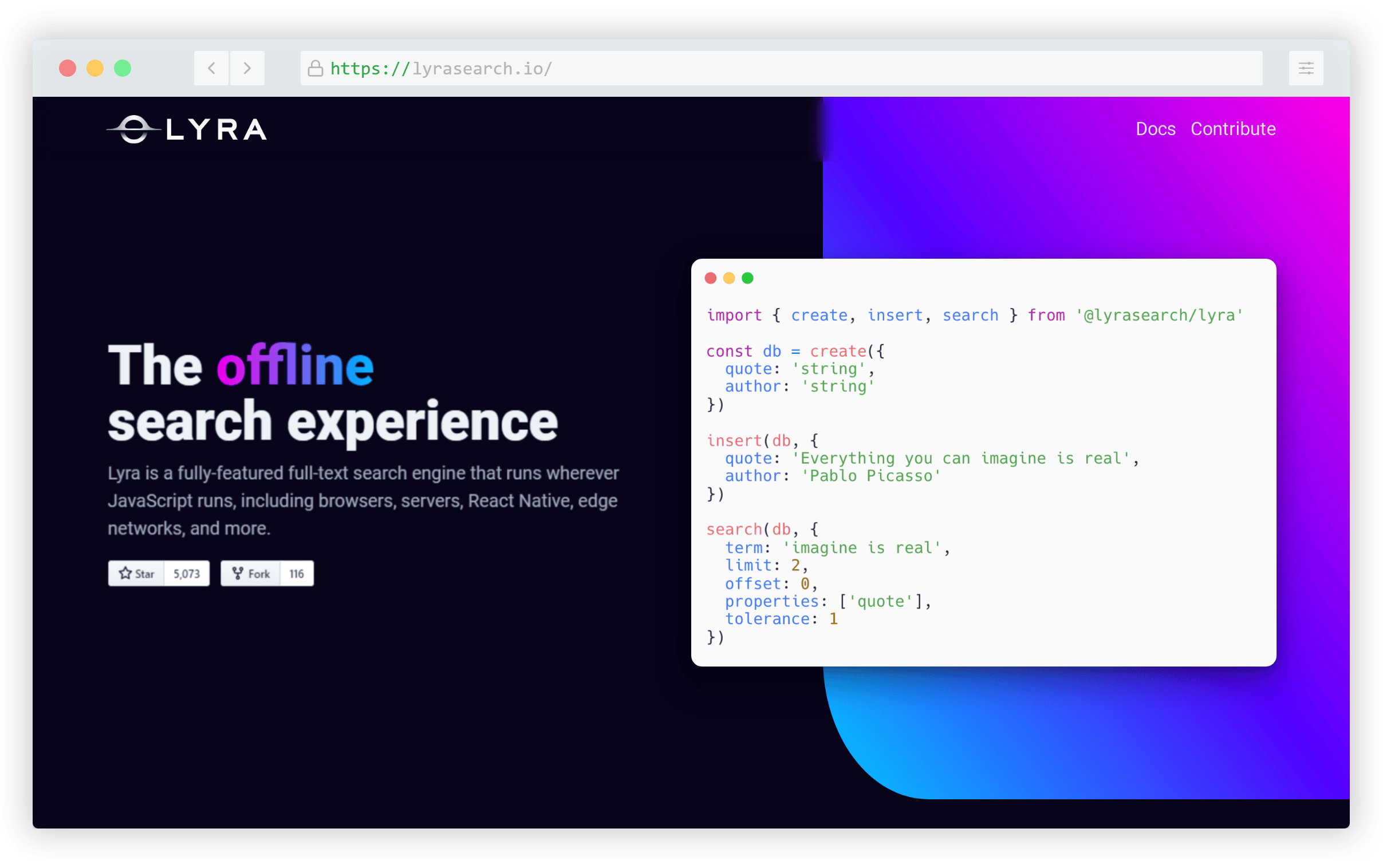
You can try it out directly on the page, which has enabled movie search engine on the page that allows you to search for recent film titles.

W3.CSS

W3.CSS is one of the few tools on this list that isn’t actually new. Apparently it’s been around in some form since 2015 but I only discovered it this past year. It’s a modern, responsive, mobile-first CSS framework similar to Bootstrap, made by the team at W3Schools.
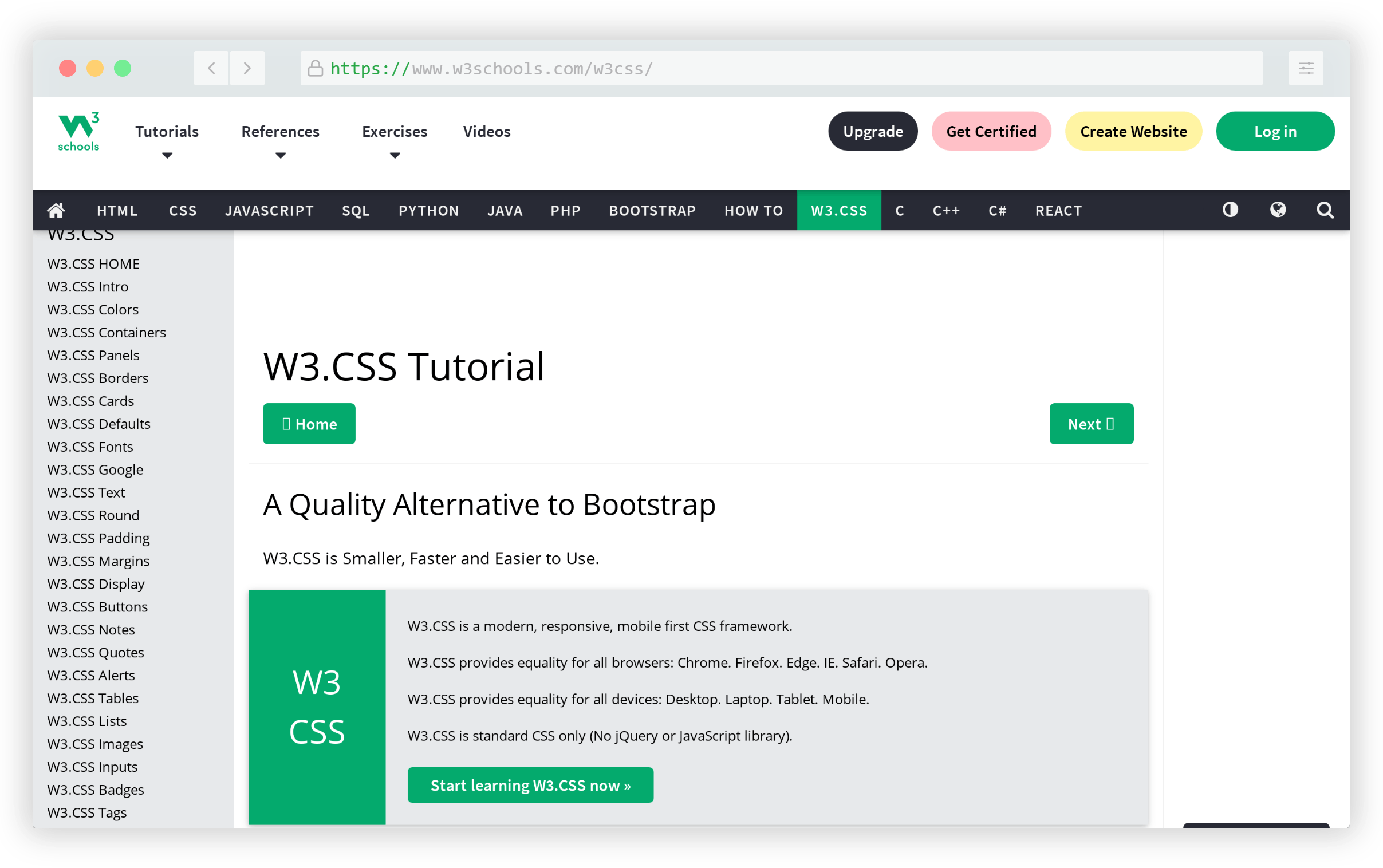
Although W3Schools has received criticism over the years, they remain a popular resource for web developers and everyone seems to love their easy-to-digest documentation. This framework is also well document and includes 50+ components and various tools and utilities.

Animatize

Animatize is a unique interactive animation builder that allows you to create simple CSS animations by dragging your mouse over a scene on the page.
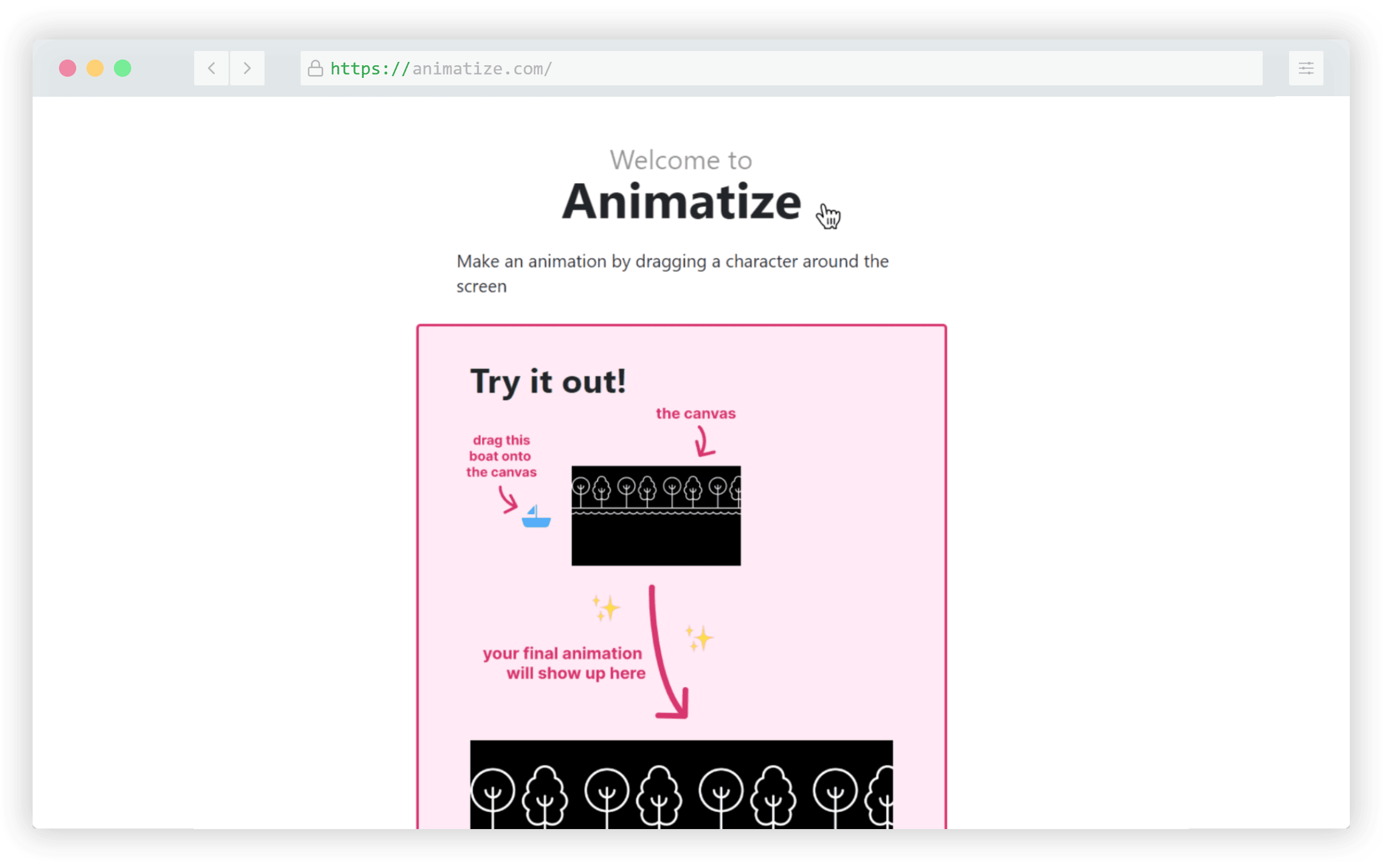
Upload a background along with a character image, then drag the character over the background to define your animation. The site will generate the CSS code for you using data URIs for the images.

MetaliCSS

MetaliCSS is a JavaScript library that allows you to add a sleek CSS-based metallic look to elements on the page.
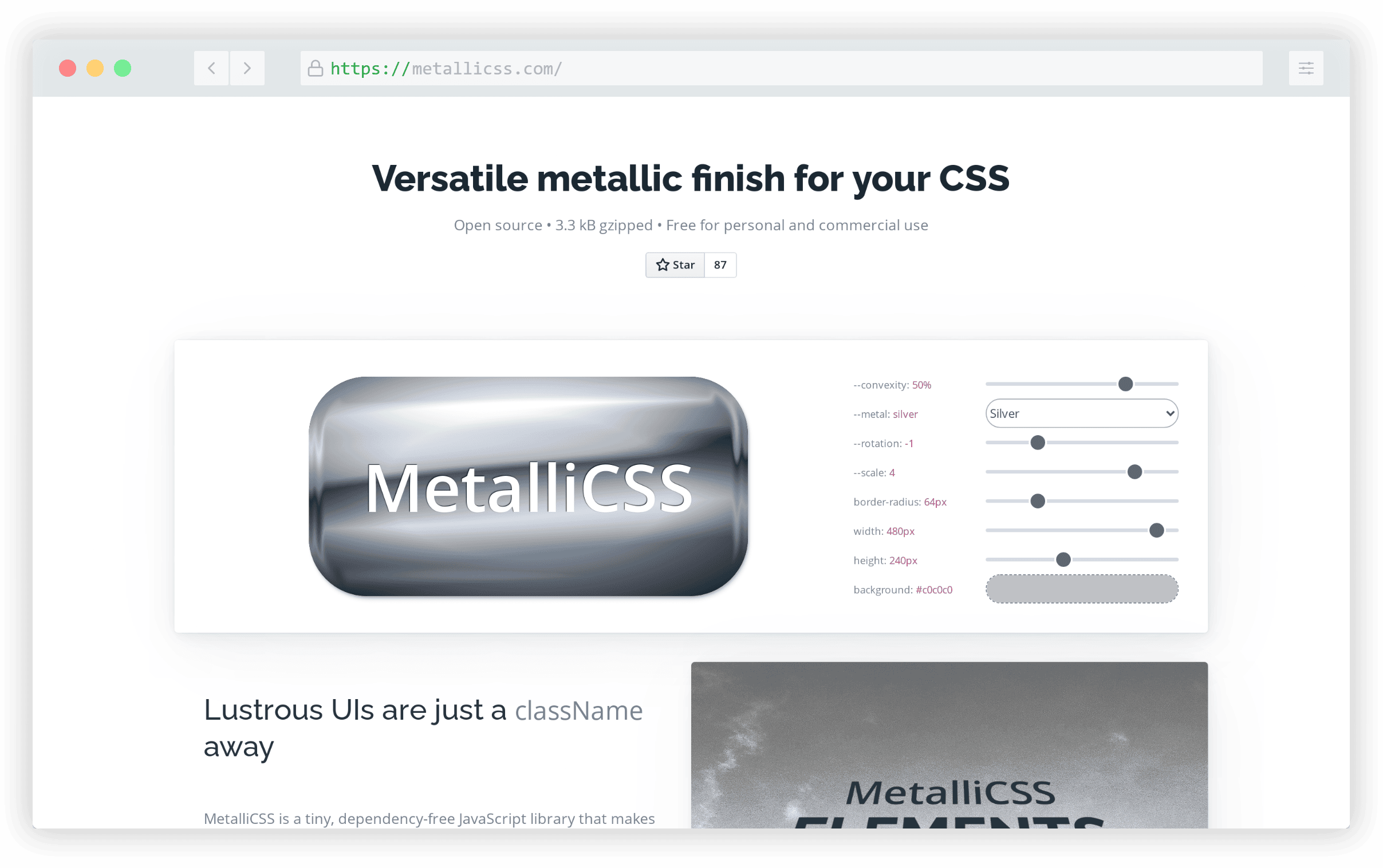
After adding the library, use the class metallicss after which you can make any customizations directly in the CSS using three custom properties.

Paper Prototype CSS

Paper Prototype CSS is CSS framework that mimics paper prototyping, sort of like a handdrawn look but a little more ransom-note-ish, with the help of two informal-looking free fonts.
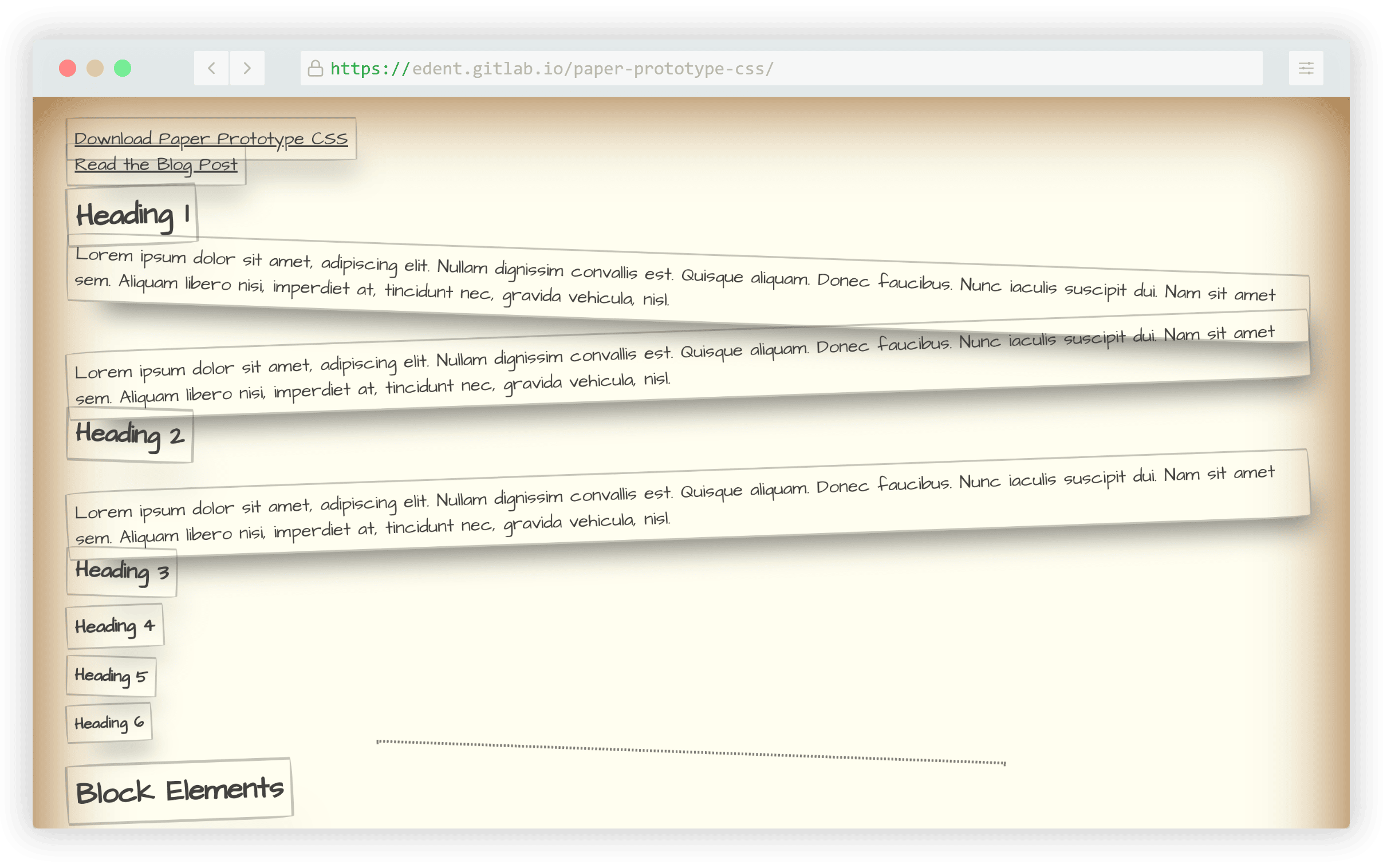
It’s inspired by other hand-drawn CSS frameworks and the home page shows you all the HTML elements in the Paper Prototype style so you can see how they each look.

Ava Maker

Custom avatars always seem to be a popular trend. Ava Maker is an avatar generator that allows you to choose from a variety of styles to build your own custom avatar.
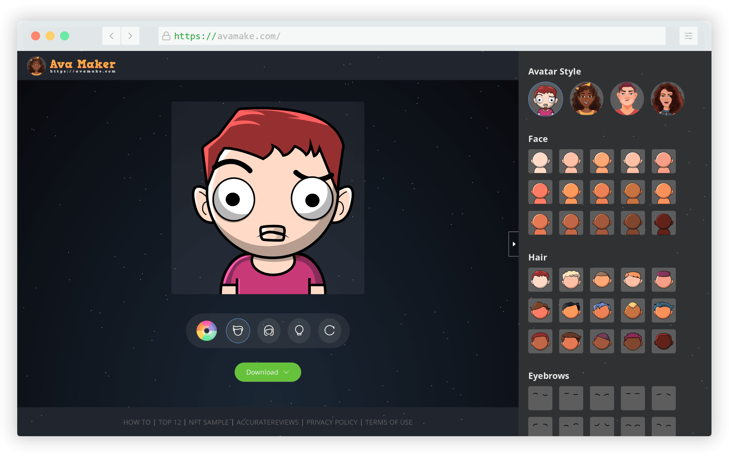
You can customize the hair, skin color, eyebrows, eyes, mouth, clothing, and more, before exporting the SVG or PNG file.

HopeUI

HopeUI is a production-ready open-source admin dashboard based on Bootstrap 5. You can choose a version for Vue, React, Laravel, Tailwind, Figma, and more.

It offers 400+ components, 60+ menu styles, 20+ special plugins, and includes light/dark modes and RTL support.

Amigo CSS

Amigo CSS is described as a “simple, custom-first and intuitive CSS framework” that’s tailored for beginners, building on some of the ideas present in other frameworks.
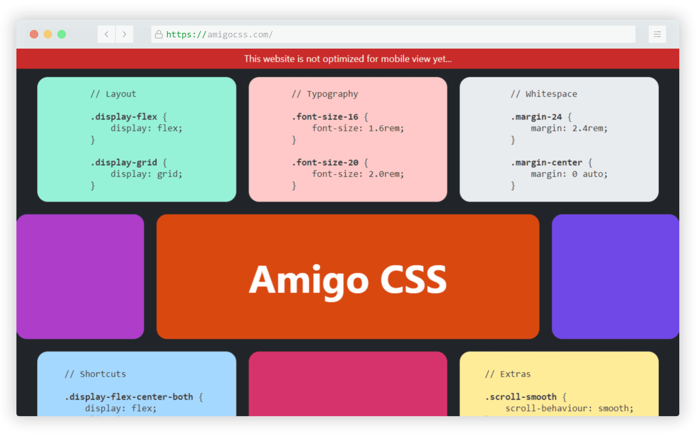
The framework encourages a custom class (which isn’t required) along with up to a maximum of seven utility classes per element. For the full details, check out the philosophy section of the website.

Hibiki HTML

Hibiki HTML is an HTML-friendly JavaScript framework geared towards all levels of JavaScript developers and doesn’t require any boilerplate setup, scaffolding, build tools, and so on.
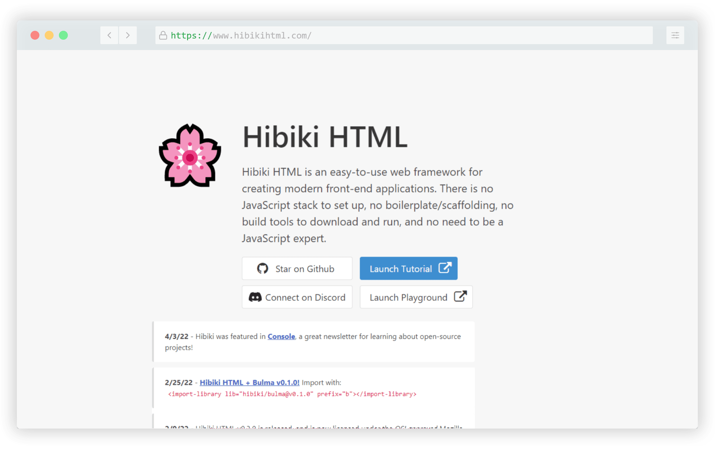
The main website includes an interactive tutorial and playground you can use to get accustomed to the syntax. Hibiki’s features are based around the use of the HTML element, with concepts similar to popular libraries like Turbo and Hotwire.

Stylo

Rich text editors that you can embed in a page or app are plenty and Stylo is the one in this category that made this year’s list. It has no dependencies, is framework agnostic, and can be customized to your app’s needs.
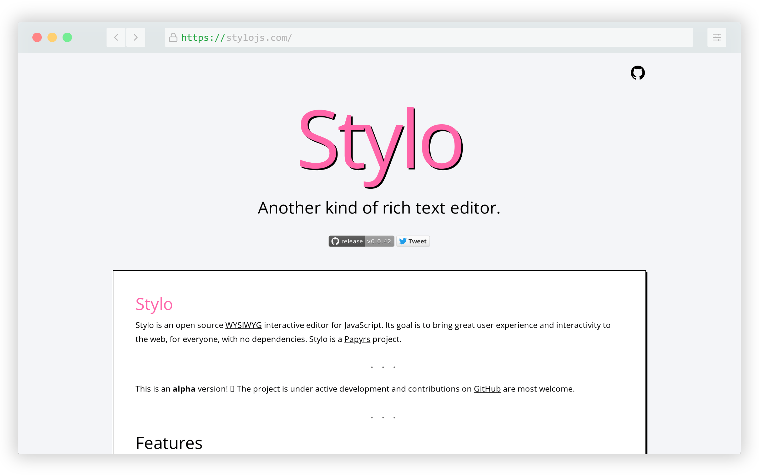
Try it out live on the page, it works smoothly and seems to be very user friendly.

CSS.GUI

CSS.GUI is a free visual tool that’s CSS-based, to help you build components that you can export as HTML/CSS code.
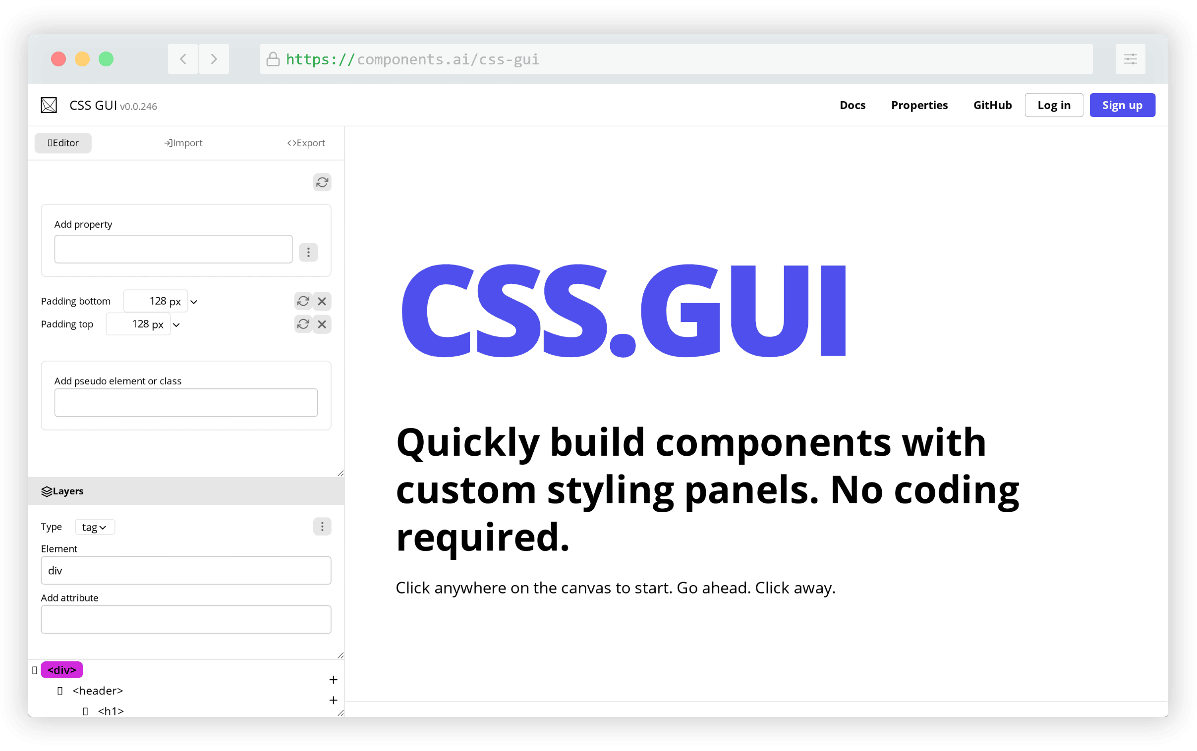
You can do just about anything you can do with raw CSS, including adding pseudo-elements, and you also get a tree view of the page’s HTML that allows you to easily select elements before customizing them.

Simple.css

Simple.css is yet another option for a classless CSS framework that provides an attractive starting point for your HTML elements.
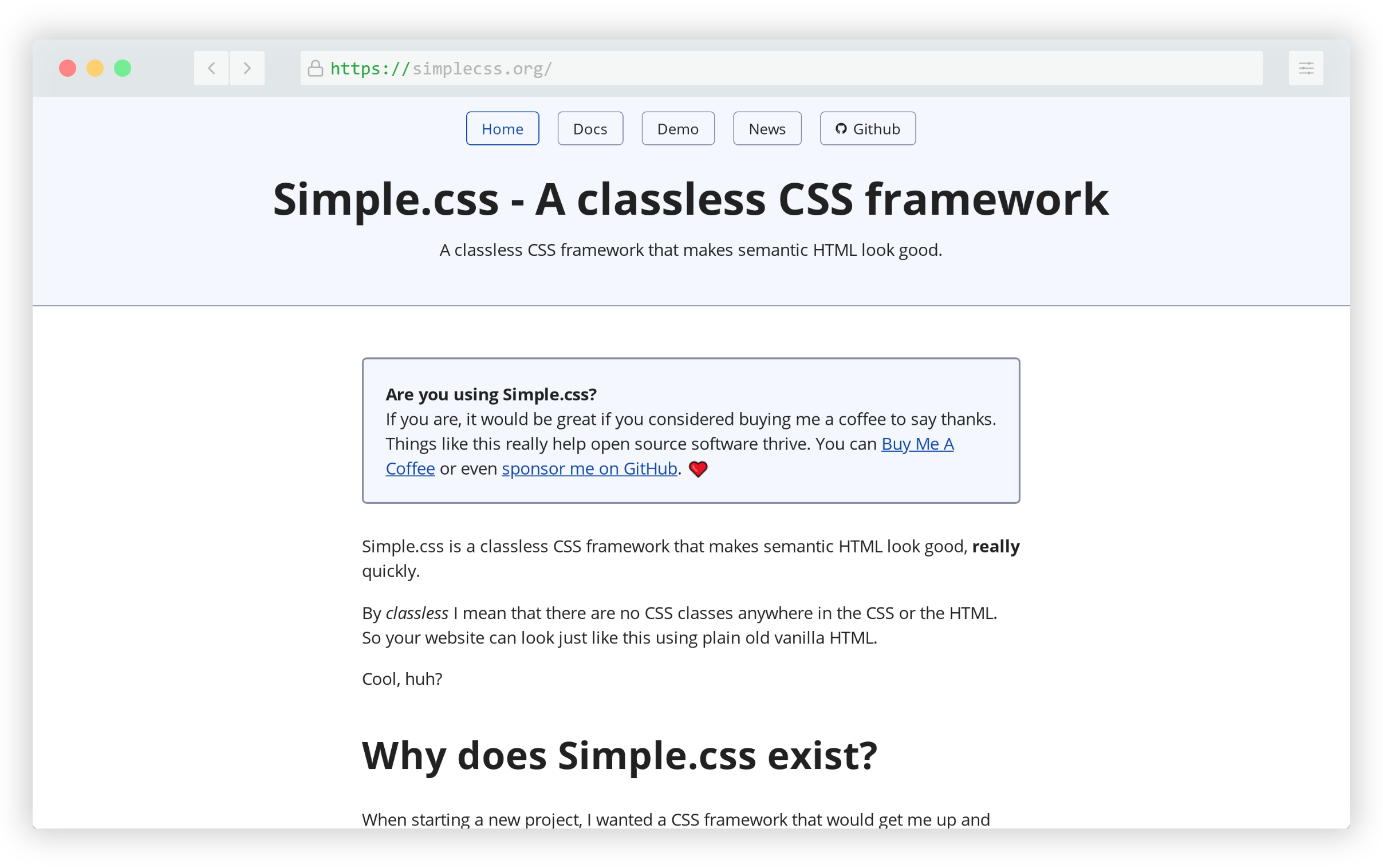
Similar to other classless frameworks, this one’s goal is to go beyond merely a reset or normalizer. It makes your elements look good by default without adding any extra bloat associated with larger frameworks.

Reasonable Colors

Reasonable Colors is open-source color system for building color palettes that are both accessible and attractive. This means you get high-contrast combinations that are designer-friendly.
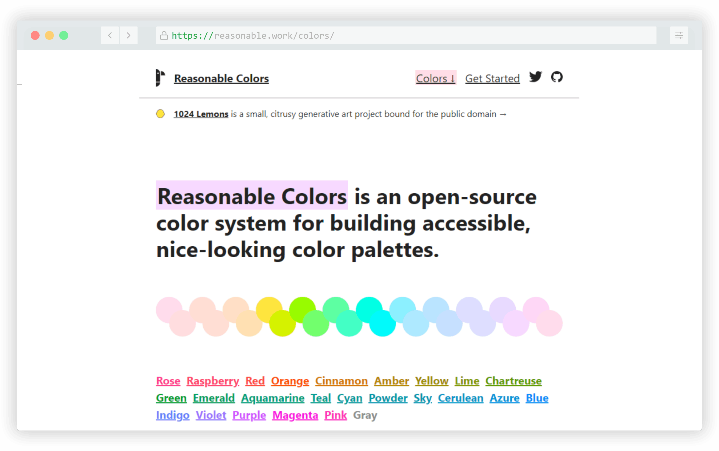
Select a color, after which you can choose your colors from the shades included for each. Choosing accessible colors is possible as long as there is a shade difference of 2 between the selections.

PlainAdmin

PlainAdmin is a Bootstrap 5 admin dashboard template that includes 100+ UI components and 15+ HTML pages.
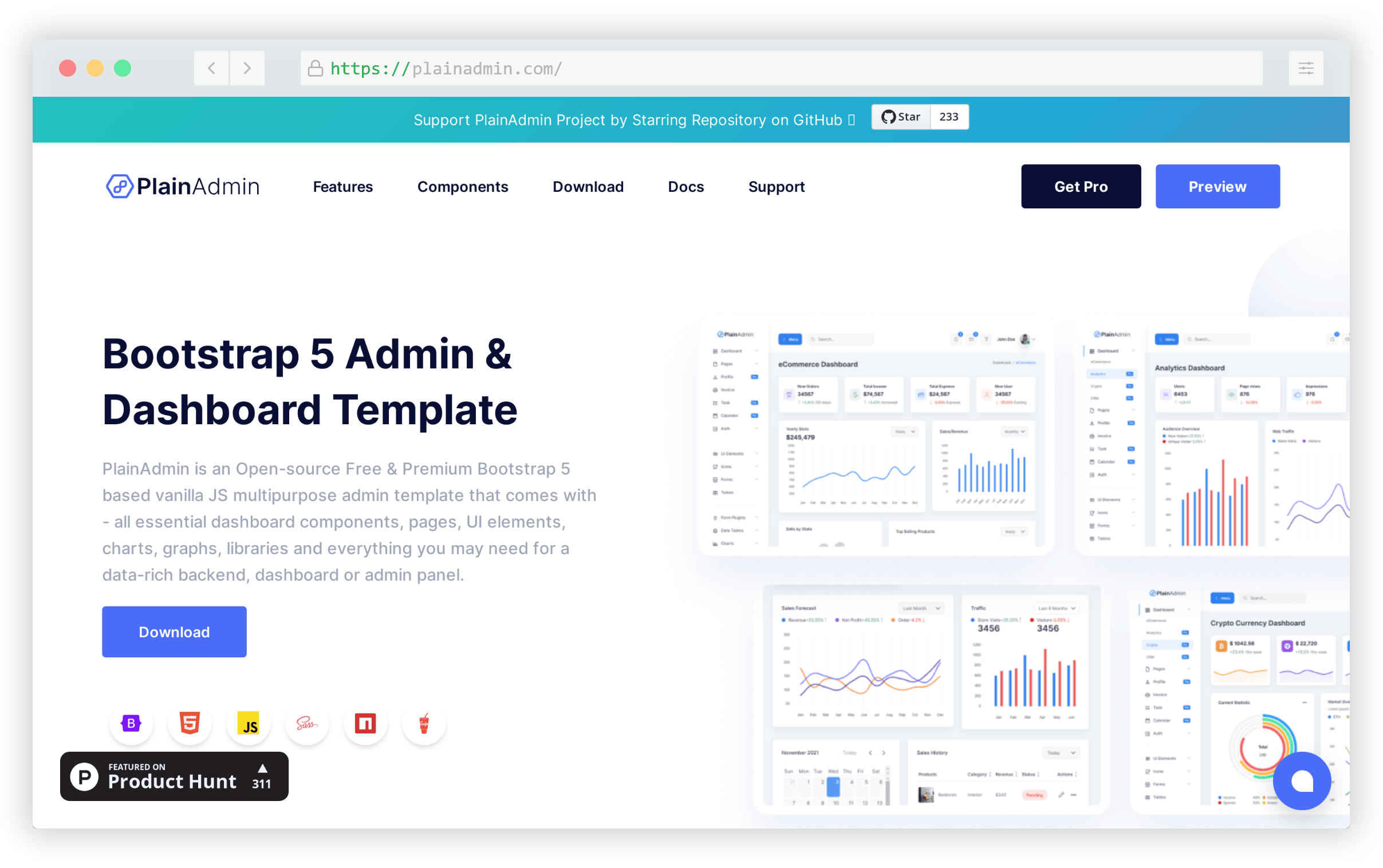
There’s also a paid version with more components and features but the free version alone is a decent starting point for a solid dashboard template.

Meshy

Meshy is a “mesh” gradient generator that includes a gallery of predefined mesh gradients, along with the ability to customize any of the gradient options. You can also randomize the “meshing” effect for any of the selected gradients, each of which uses 4 colors.
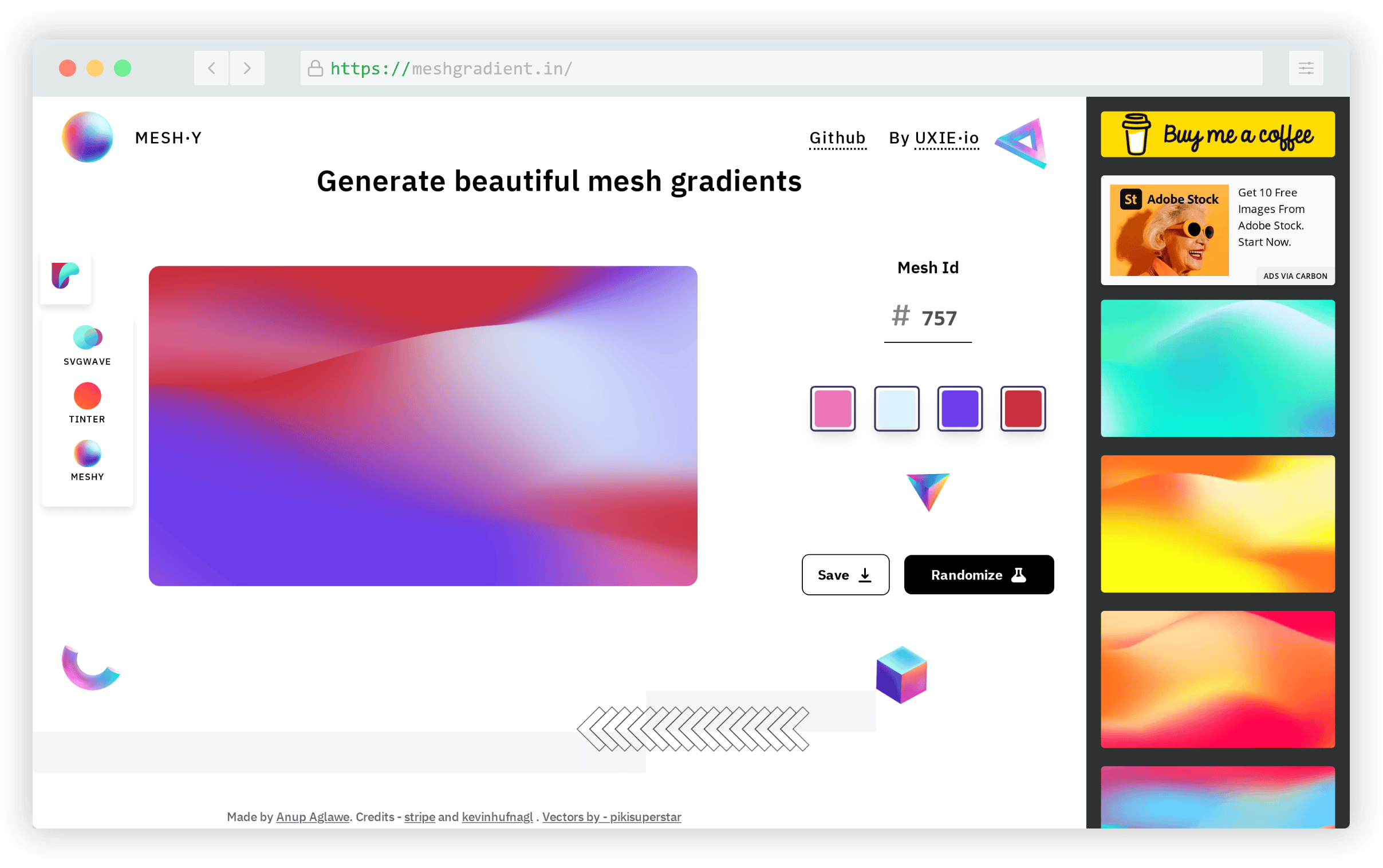
Any of the gradients can be downloaded in PNG format and the file can be sized to up to 3000x3000px for high resolution exports.

Bunny Fonts

Bunny Fonts is a platform of open-source fonts that works as a drop-in replacement for Google Fonts. It has the same API format but with a focus on privacy and being GDPR-friendly.
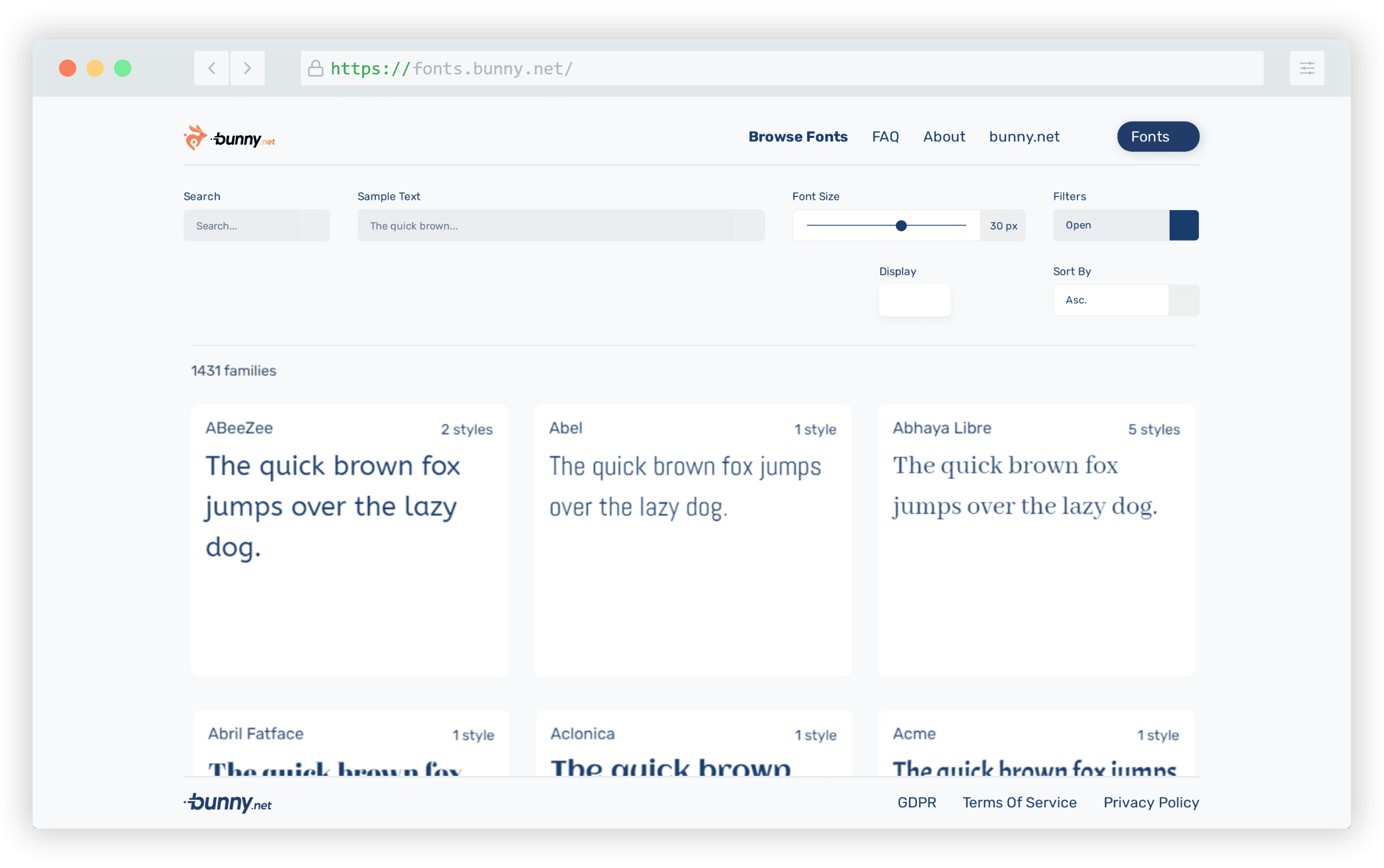
The site works similarly to the Google Fonts UI and it currently includes over 1,400 fonts, about the same as the number available on Google Fonts.

Stylify

Stylify is a library that generates optimized CSS based on syntax that’s identical to real CSS.
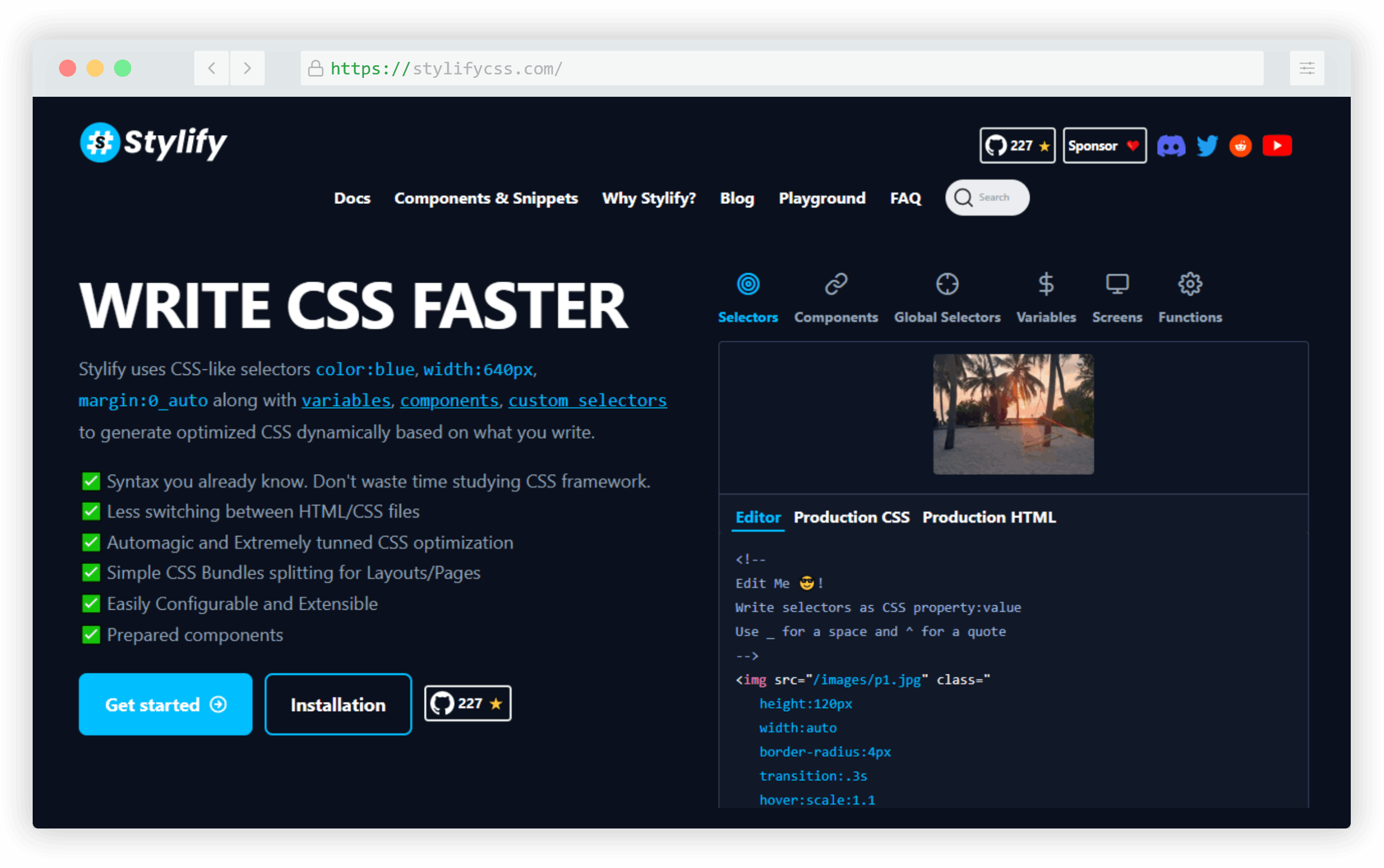
The idea here is that your “classes” are actually CSS property/value pairs, then the library will generate the equivalent styles. This way you don’t have to learn the syntax of the framework, you simply use regular CSS.

Wanda

Wanda is a design system from the team at Wonderflow that includes 40+ components along with a gallery of 360+ vector symbols.
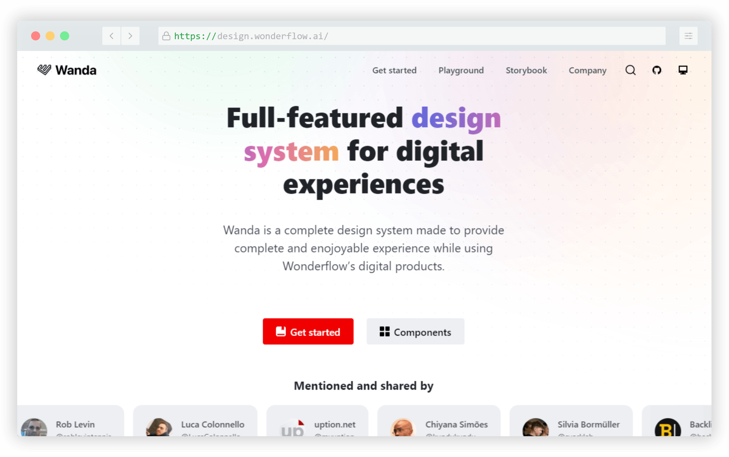
The Wanda system has a focus on accessibility and the concept of form follows function. Both of these contribute to a set of UI components that are usable and accessible to as wide an audience as possible.

Symbols to Copy

Symbols to Copy is a one-stop resource of copy/paste symbols to include in your websites, apps, or documentation.
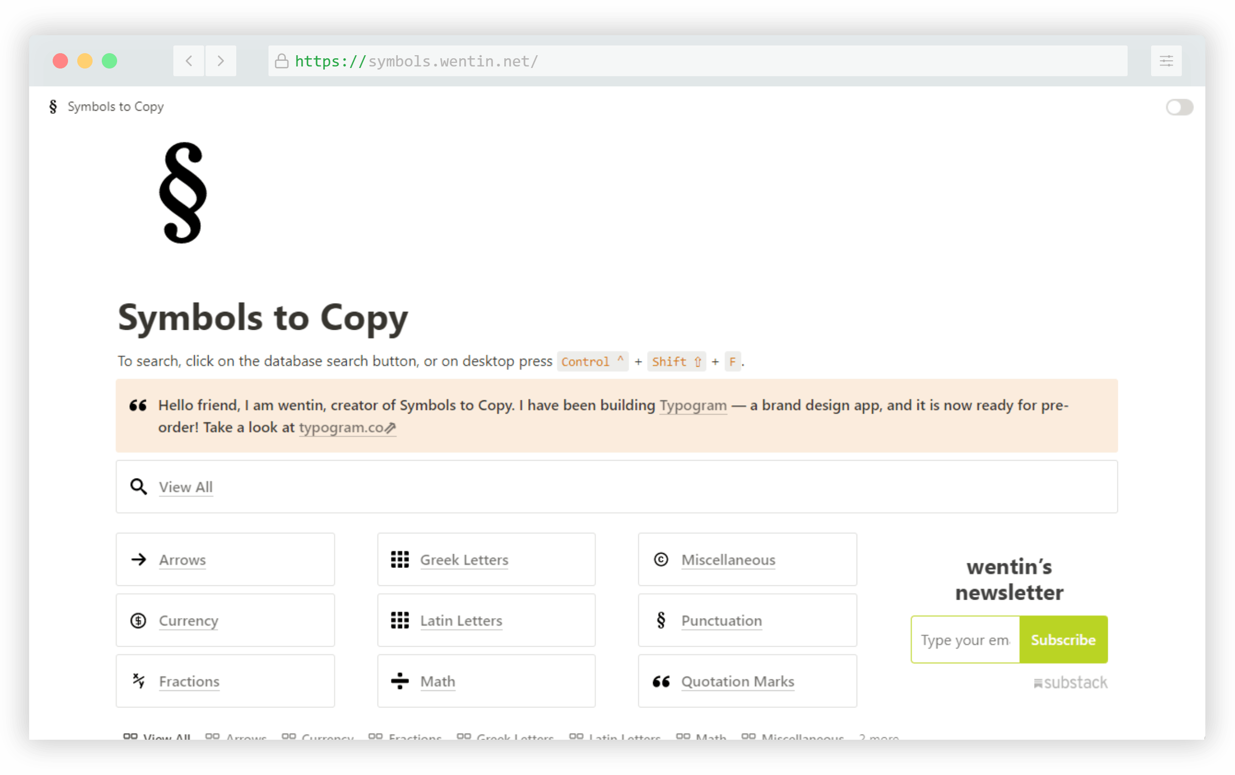
Includes arrows, currency symbols, fractions, Latin and Greek letters, Math symbols, punctuation and more. I also like that you can click any symbol to get the full code info including Unicode, HTML entity, and more.

Open UI

Open UI isn’t exactly a framework but an industry standard set of guidelines to define how developers can style and extend built-in web UI controls, such as checkboxes, radio buttons, select dropdowns, and so on.
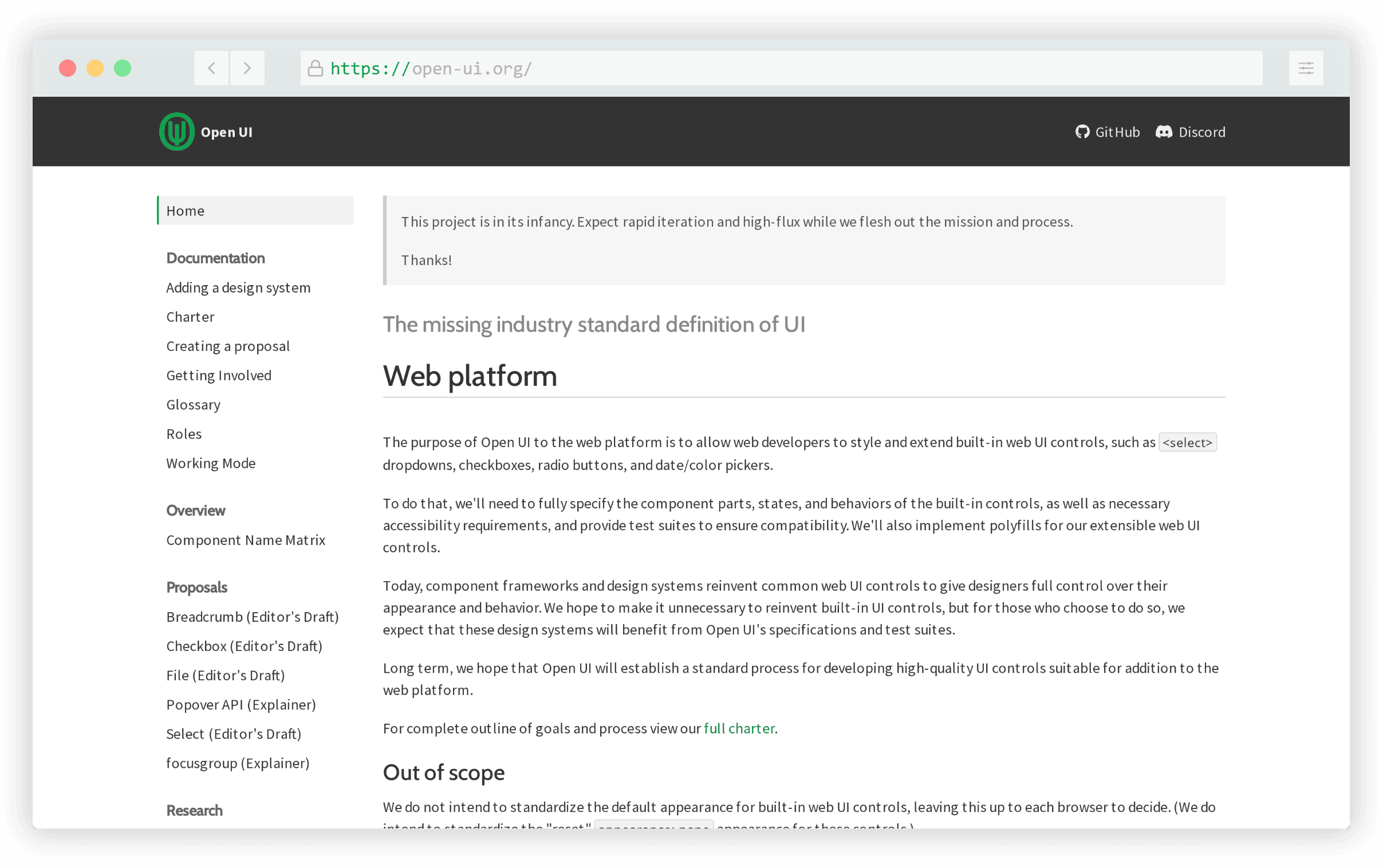
The idea behind the project is to create initiatives that help developers avoid having to reinvent the wheel in the library and framework space, but instead to encourage these components to move to universal standards that everyone can benefit from.

California Design System

The California Design System is a resource for developers and designers building digital products in the state of California, in the U.S.A.
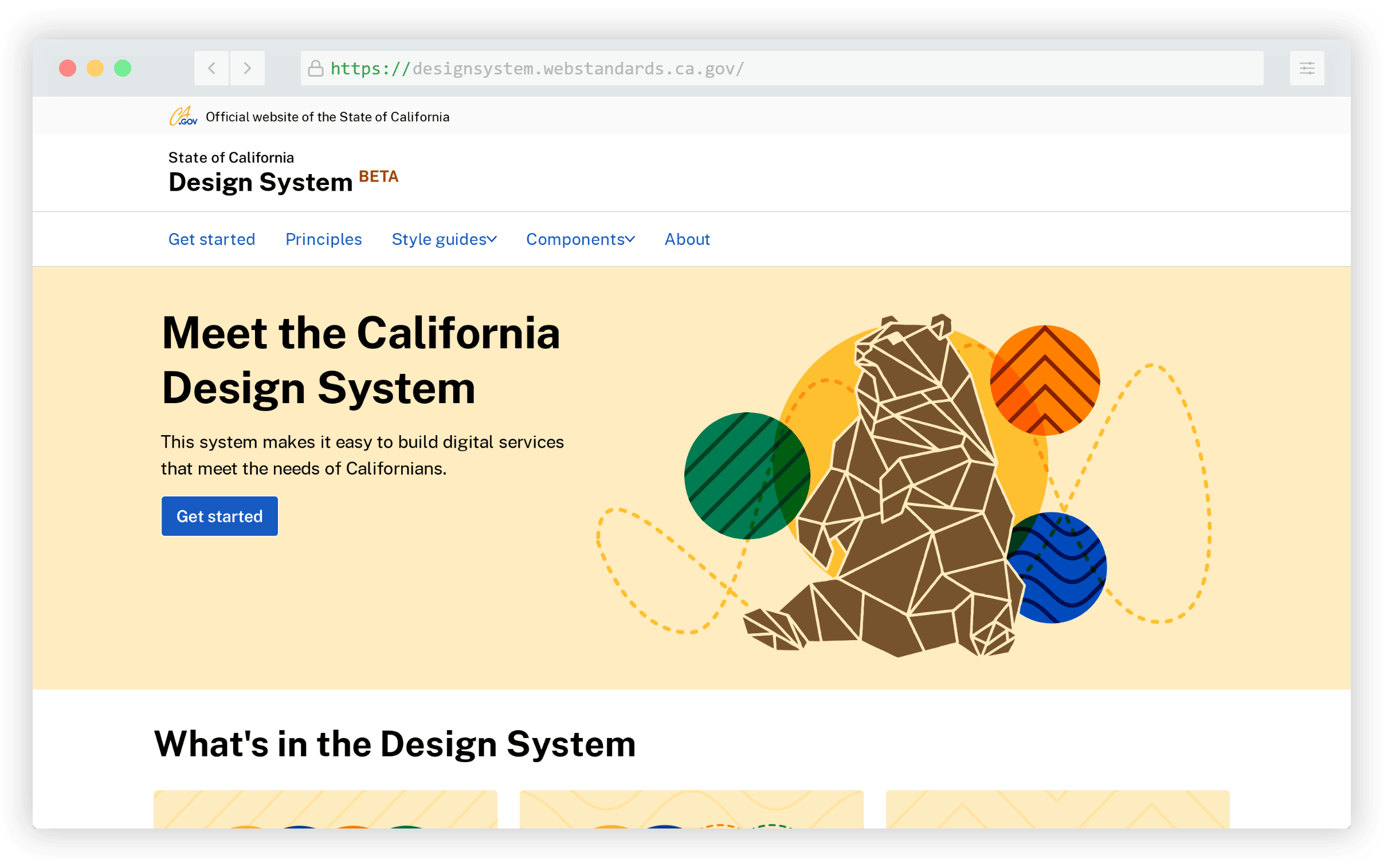
The design system includes principles, style guides, and components with guidelines on use, all for the benefit of filling the needs of customer-facing state websites in California.

Bamboo CSS

Bamboo CSS is yet another option for a classless CSS framework. This one’s source code is written in SCSS and also borrows from a few CSS normalizers.

It includes support for light and dark themes based on user OS settings and includes a small set of CSS variables that you can use for theming, if needed.

IT Tools

IT Tools is another all-in-one resource that includes dozens of tools and utilities useful for web developers and programmers.
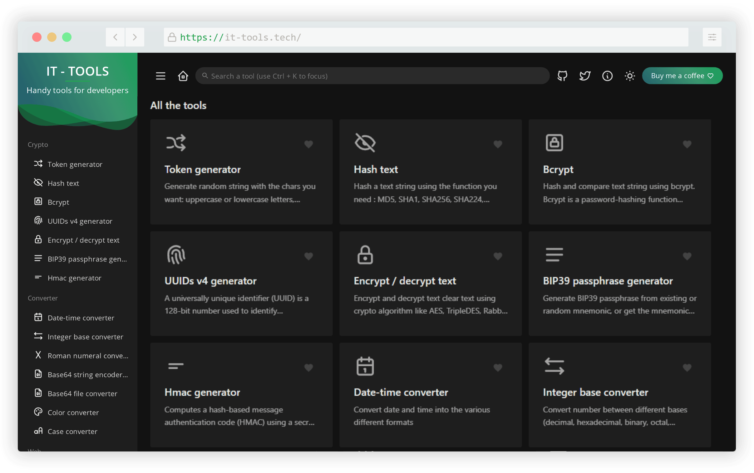
This one includes crypto-based tools, conversion tools, miscellaneous web tools, image tools, and text tools. All the tools in this one are well-designed and easy to use.

Qwik

Qwik is described as an “HTML-first” framework with performance at its core due to a small JavaScript footprint and on-demand component loading.
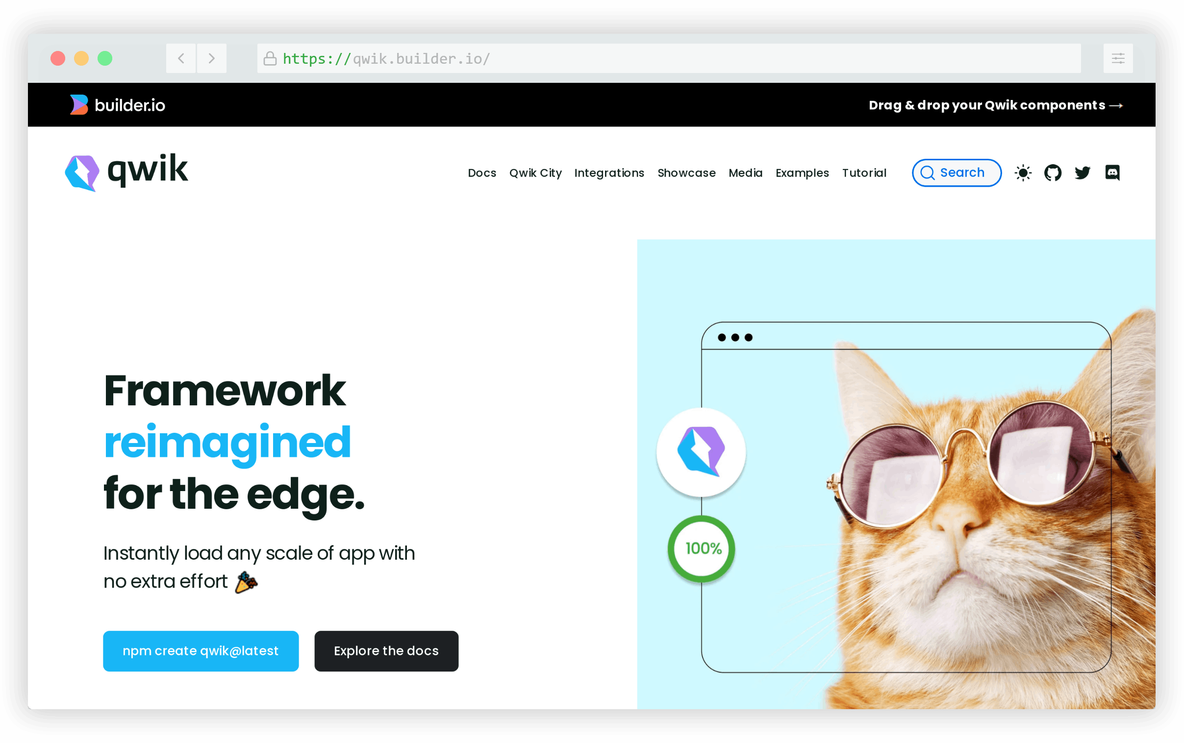
The docs include links to production sites built with the framework that have high page performance scores, demonstrating the real-world benefits.

Siimple

Siimple is a CSS toolkit, or framework, that includes lots of modules, components, and helpers. The components come with a default minimal design that can easily be customized.
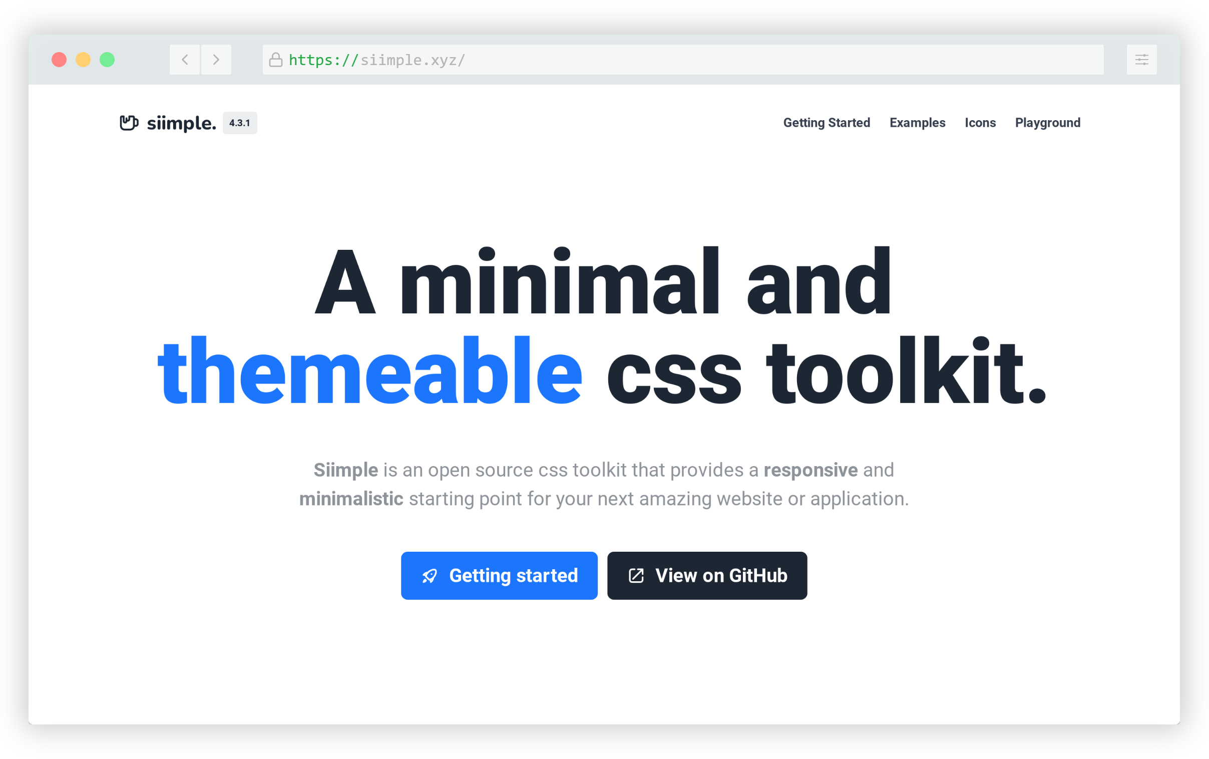
The name is based on its simplicity of use by means of official presets and the ability to easily customize colors, fonts, sizes, design accents, and lots more.

Lorem Faces

Lorem Faces is a gallery of free AI-generated photos of people that you can use for mockups and as design placeholders.
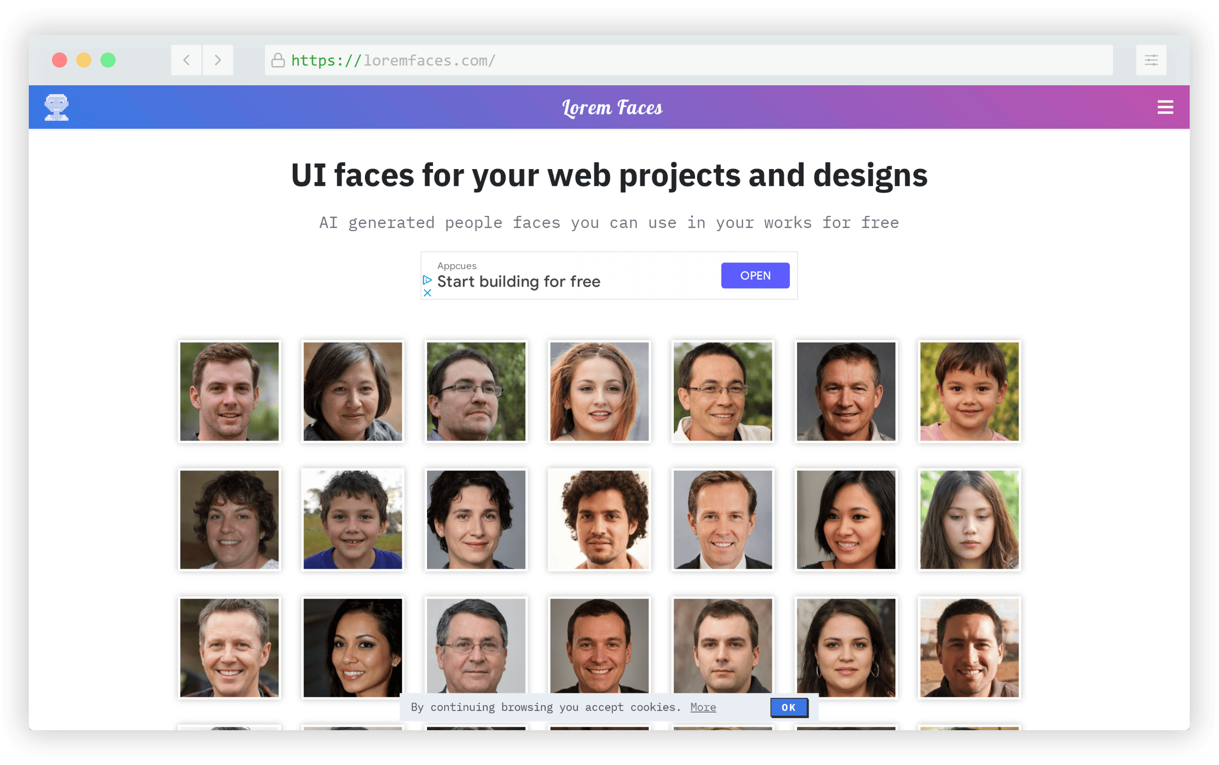
You can choose square, rounded, or circular photos and color, greyscale, or sepia for the image’s tone.

HTTP Status Dogs

HTTP Status Dogs is a gallery of HTTP status codes each matched with an appropriate dog photo. You can use these for your own site or apps status messages if you like.

There have been similar projects like this one in the past, but this one includes a few more status codes and many of the matching photos are quite humourous!

Clay.css

Clay.css is a CSS utility for adding a claymorphism style to page elements. This is definitely not going to be used on many projects, but the effect is nice and might come in handy in a children’s project or something else that requires a fun and informal look.
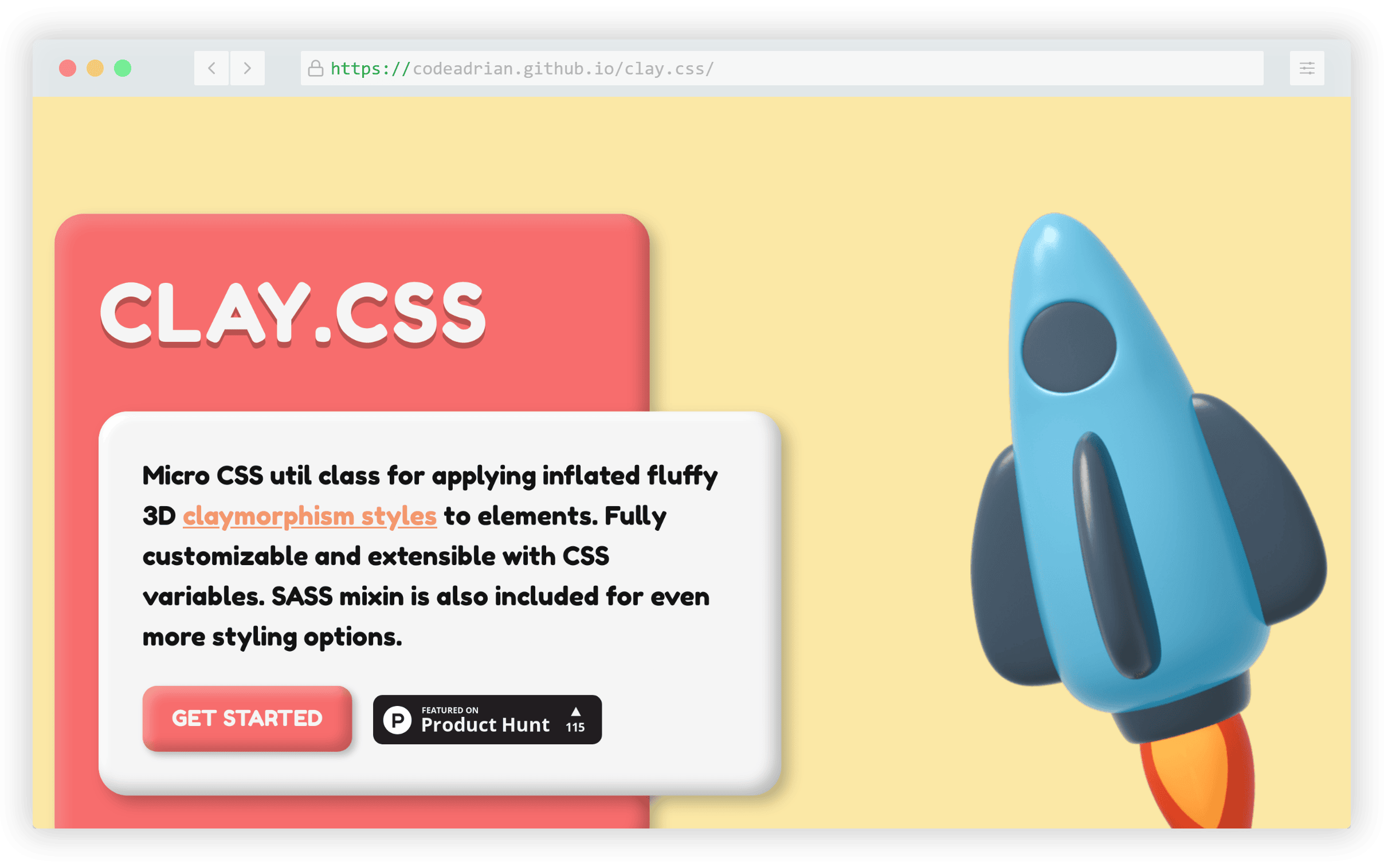
You can include and customize the styles using a utility class, CSS variables, or by means of a Sass mixin.

john-doe

john-doe is a concept for a one-page website that was first put out in late 2020, but I only came across it this past year. The idea behind this one is the use of CSS’s :target pseudo-class, which allows you to display different page content based on hash URLs (e.g. #home, #about, #contact, etc) and IDs on page elements.

The only drawback to this method is the fact that search engines generally don’t recognize hash-based URL changes as separate pages. So this is a novelty-type thing that you probably wouldn’t use on anything important.

Mdash

Mdash is a UI library of components that’s 100% standards-based. The components are all based on HTML and Custom Elements and thus can work along with any web framework.
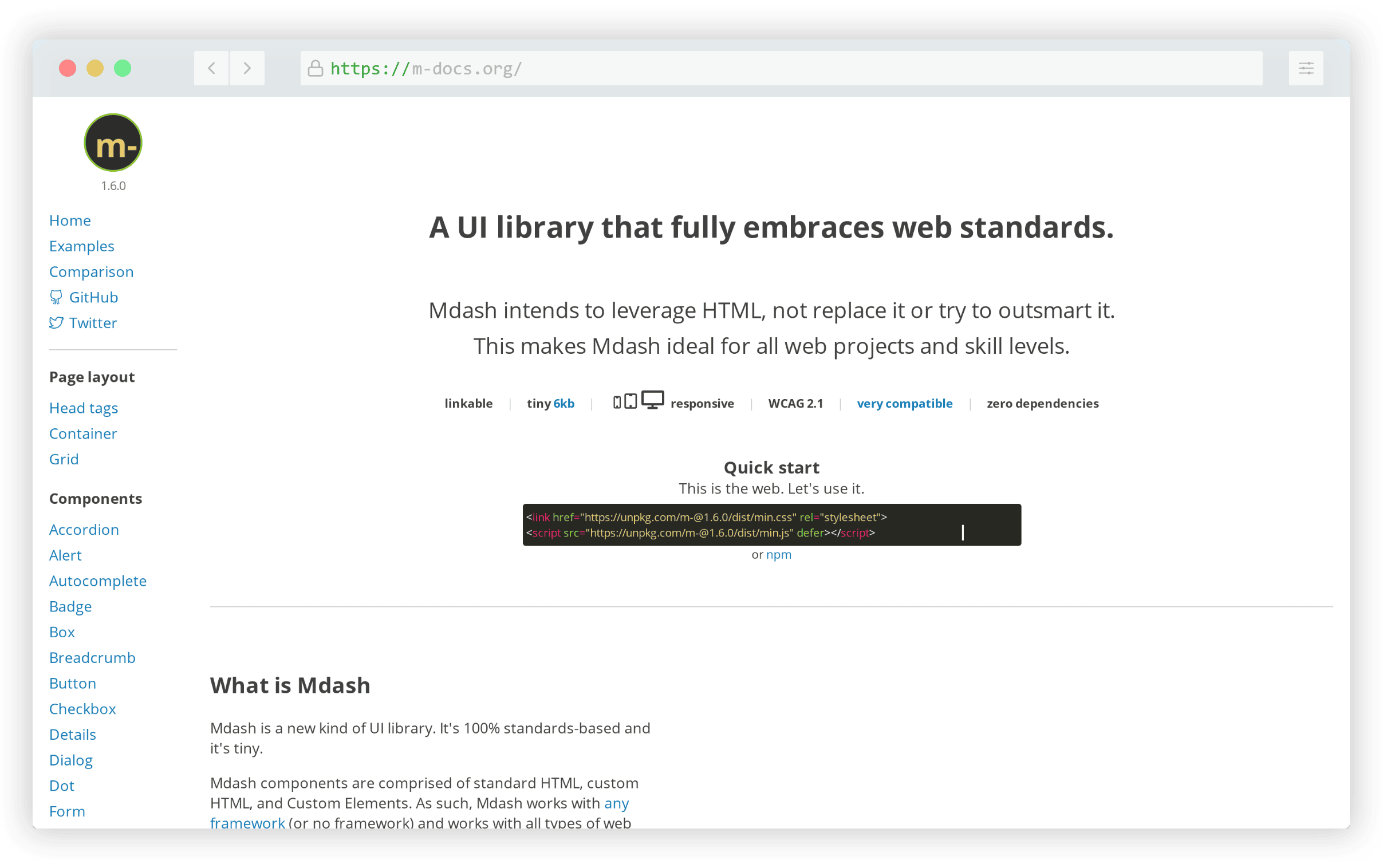
Many of the components are simply pure HTML with some sensible defaults, while others are a little more interactive depending on the component.

Preline UI

Preline UI is an open-source set of ready-to-use components built on Tailwind CSS. It’s a huge collection of more than 250 components compatible with React and Vue or a plain HTML + Tailwind project.
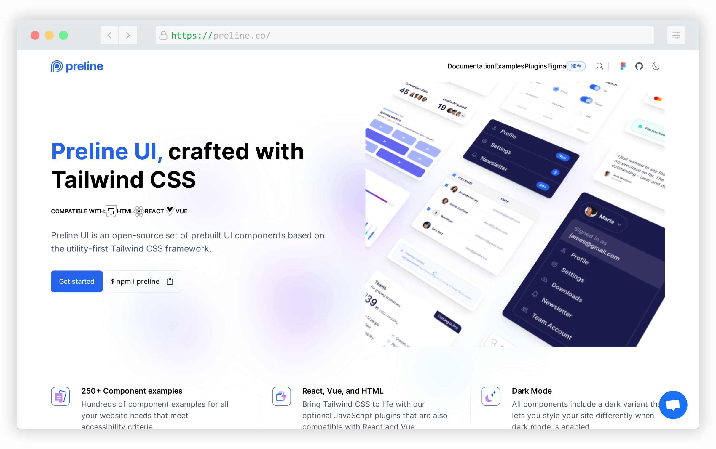
All components include dark mode and there are base components (buttons, lists, etc.), navigation components, form components, overlays, and tables. All components are beautifully designed and the docs are quite extensive in demonstrating the different ways the components can be used.

UI Buttons

UI Buttons is a unique collection of 100 buttons that feature styles and hover effects you may not have seen elsewhere.
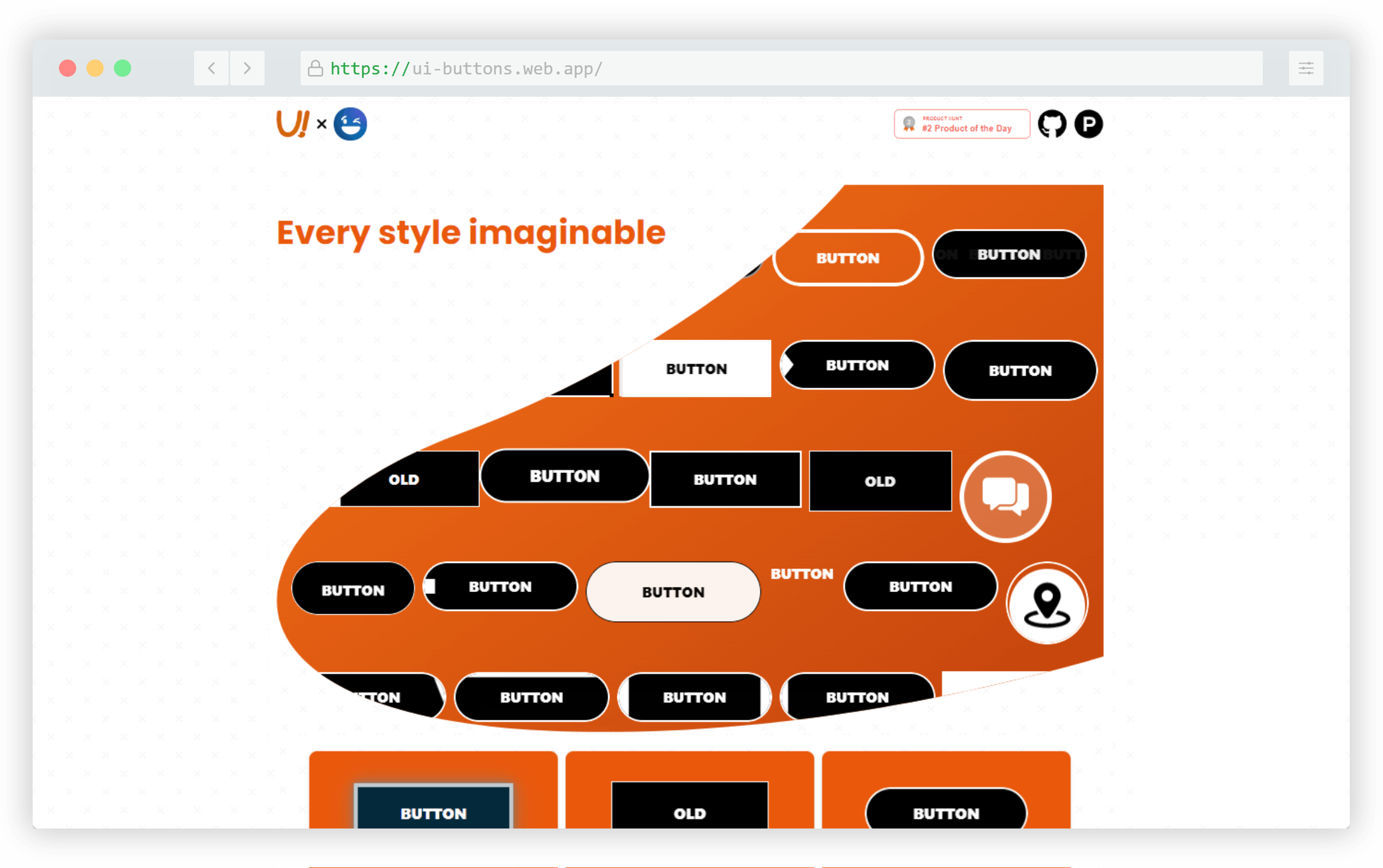
The CSS for each button is easy to grab and you can easily customize the colors and overall look while maintaining the interactive effects.

AgnosticUI

AgnosticUI is a set of framework-agnostic UI components that work in React, Vue, Angular, Svelte, and vanilla JavaScript.

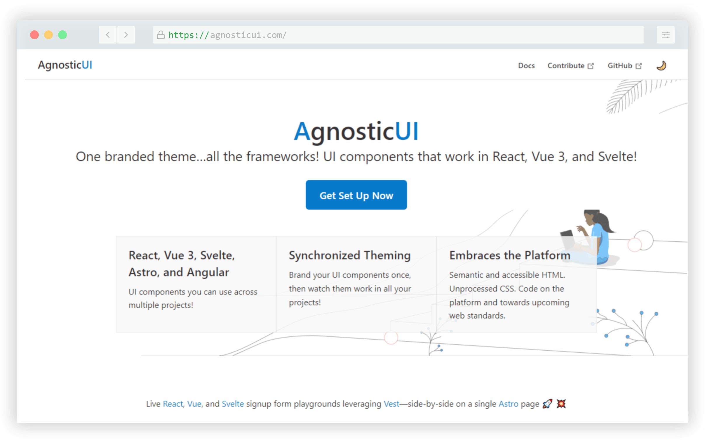
The components allow customization and theming via CSS custom properties and include about 30 common UI patterns along with guidelines for use in the different frameworks or as pure CSS.

TimelineJS

TimelineJS is an open-source JavaScript library and spreadsheet tool that allows you to embed an interactive timeline component on a web page.
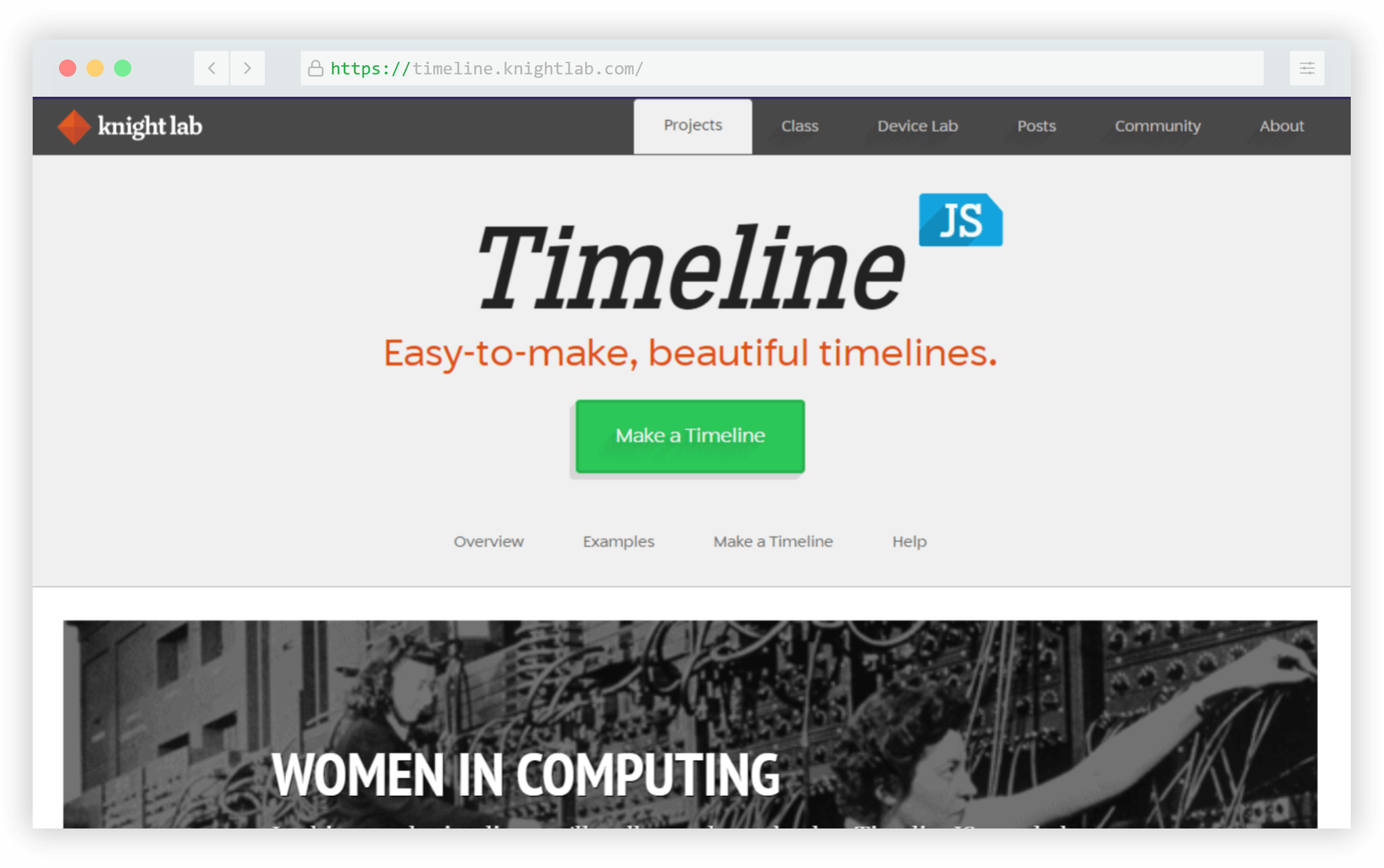
You can build the timeline based on data from a Google Sheet template that the site provides, then you can generate the timeline by entering the URL to your sheet. There’s also the option to use JSON as the data source, which would be more privacy-friendly.

JSON Crack

And finally, JSON Crack was the most popular tool of year according to the unique click stats in my newsletter. This was originally referred to as “JSON Visio” and it’s a visualization tool and formatter for your JSON data.

Paste your data into the editor and the tool will display it in an easy-to-read flowchart format that you can customize or even embed on your own pages. There’s a search feature to find data in large files and there’s an associated VS Code extension.

What Was Your Favourite Tool of 2022?

I hope you enjoyed this list of the most popular tools of the past year! While you may not be able to use all of these in your projects today, maybe these will inspire you to build something yourself in 2023. This certainly gives us a good idea of the kinds of things developers today are looking for.

I’m always on the lookout for the latest in tools for front-end developers, so feel free to post your favourites in the comments and you can subscribe to my newsletter if you want to keep up with the latest every week!

Categories: Others Tags:

11 Best WordPress Themes for 2023

January 11th, 2023 No comments

Have you been searching in vain to find a great WordPress theme that you can use to create a website that will perfectly match your brand and vision?

Building a top-of-the-line website is no longer the complicated process you had to contend with only a few short years ago. More often than not, it was something best left to the developers. The WordPress platform has changed all that with its thousands of quality WordPress themes to choose from.

Finding the best WordPress theme to fit your needs is still not easy. The search to find that ideal WordPress theme can put your patience to the test.

We’ve tried out best to simplify your search. We believe we have succeeded with this listing of 11 Best WordPress themes.

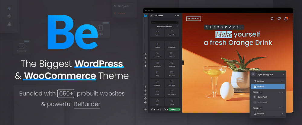
1. Be – Multipurpose WordPress Theme

This big, beautiful, and powerful multipurpose WordPress theme is among the best in the business. 250,000+ satisfied users attest to its popularity. With respect to size, which readily translates into flexibility, BeTheme’s 40+ core features take care of that issue.

Those core features include a 650+ pre-built website library, a host of design elements and options, and the most advanced page and website-building tools on the market.

Powerful website-building tools BeTheme places at your fingertips include –

  • Be Builder is a fast, light, and super-intuitive website builder for WordPress. One of the Builder’s most practical page-building capabilities is viewing an element as you customize it.
  • Be Builder Blocks is a growing library of time-saving pre-built sections.
  • Be Builder Woo offers a quick and convenient way to design an online store with customer-centric shopping features like product previews, cart, checkout, etc.
  • Be Theme’s Header Builder 2.0 features 14 pre-build headers, including mobile-ready and interactive titles.

A setup wizard and helpful tutorial are included. You’ve been invited to test the stunning Be Builder’s capabilities in this Live Demo.

2. Total WordPress Theme

“Build it your way.” could serve as Total’s slogan. Flexibility rules in terms of providing users everything they could ask for to build attractive, engaging, and performant websites.

Total accomplishes this with its multiplicity of design options, customizer settings, layout choices, navigation options, dynamic template functionality, and the popular WPBakery frontend drag-and-drop page builder.

  • Total’s page builder blocks and extra modules, post entry cards, animations, layout options, and custom backgrounds make building a website a quick and easy undertaking.
  • Total fully integrates with WooCommerce, it features clean, developer-friendly code, and is RTL and translation ready.
  • The popular Slider Revolution plugin is included, and Total is compatible with many other popular plugins, including bbPress, Uber Menu, Easy Digital Downloads, and WPML, to name a few.

Click on the banner to learn more about everything that has delighted Total’s 48,000 users.

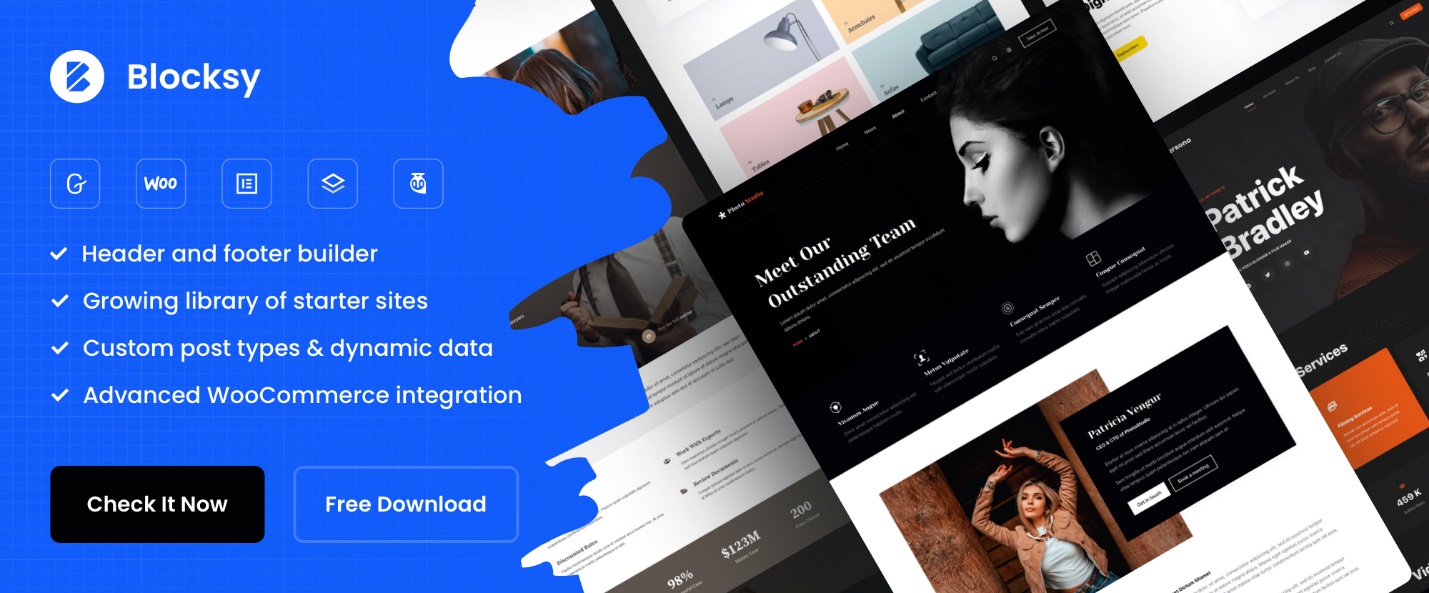
3. Blocksy Free Ecommerce WordPress Theme

Blocksy’s prioritization of flexibility, extensibility, and speed has resulted in a WordPress theme that gives you complete control to create and customize your website’s appearance and functionality as you build it.

These major Blocksy priorities find their way into this theme’s key features, which consist of –

  • an easy-to-use options interface and integration with WooCommerce, Gutenberg, Elementor, Brizy & Beaver, and Tutor LMS will provide you with a wealth of design approaches and options.

Blocksy’s other features of note include –

  • a Header Builder with a host of customized elements
  • a Footer Builder complete with a menu, social icons, and a widget area.
  • Five types of Content Blocks

And not to forget, Blocksy is free! Click on the banner to check it out. There is a Pro version of Blocksy, but the free version offers plenty.

4. Avada WordPress Theme

The fact that Avada, with more than 750,000 users, is the #1 best-selling WordPress theme of all time should be reason enough to give it a closer look.

  • This ultimate WordPress theme was created with speed and exceptional performance in mind.
  • Its WooCommerce builder is just what you need to create a shop, cart, checkout, and product layouts customized to match your brand.
  • features include 400+ pre-built web pages and 120+ design and layout elements.

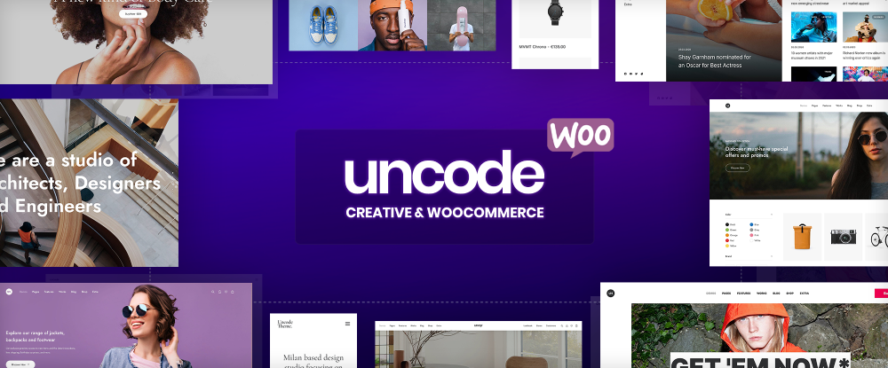
5. Uncode – Creative & WooCommerce WordPress Theme

There is no limit to what you can build in the way of attractive and engaging websites and online stores when you have Uncode’s Creative and WooCommerce theme at your back.

Uncode places at your fingertips –

  • its advanced Drag & Drop Product Builder, high-performance Ajax product filters, swatches, and outstanding shop layouts
  • 70+ professionally designed pre-made designs you can mix and match, and 500+ Wireframes carefully designed section templates.

6. TheGem – Creative and WooCommerce WordPress Theme

TheGem creative WordPress theme is a Swiss Army knife of web design tools with its creative modern layouts, super-fast loading times, and easy-to-use tools for building a professional website that will leave the competition in the dust.

Key features include –

  • Theme Builder for building headers, footers, products, popups, etc., in Elementor or WPBakery
  • 400+ pre-built importable websites and TheGem Blocks collection of 600+ pre-built page sections  
  • Extended WooCommerce tools for building pixel-perfect online shops.

7. Woodmart Woocommerce WordPress Theme

If building an online store is on your mind, you won’t go wrong with WoodMart, ThemeForest’s highest-rated eCommerce theme. Woodmart’s customization options are virtually unlimited, while its drag-and-drop builder can reduce your workflow to a minimum.

WoodMart design features include –

  • 80+ pre-built websites
  • Elementor shop and product page builders with a multiplicity of product page display options and Elementor’s custom checkout
  • An AJAX shop complete with AJAX shop filters and product swatches.

8. Rey WordPress WooCommerce Theme

The Rey WooCommerce theme takes building a WooCommerce site to an exciting new level with its powerful Elementor and WooCommerce integrations coupled with WordPress’s sophisticated engine.

Rey’s other key features include:

  • A valuable selection of pre-made designs
  • A selection of Elementor widgets designed to cover most website design situations
  • Ajax Navigation and Filters designed to simplify your site’s page browsing and navigation functionality.

Rey is performance-oriented, responsive, developer, and SEO-friendly. 

9. Litho – WordPress Elementor Theme

Litho is creative and modern, and it’s highly customizable. This WordPress Elementor theme is totally integrated with Elementor, the world’s #1 free page builder.

  • With Litho, you have the tools to easily create any type of business niche, portfolio, blog, or eCommerce website.
  • Litho’s design features include 37+ ready home pages, 200+ creative elements, 300+ templates, and the popular Slider Revolution plugin.
  • Online detailed documentation is also included.

10. Vault – Multi-Purpose Elementor WordPress Theme

Vault’s multiplicity of design tools and design options packed into a single framework make website building as simple as one-two-three.

  • Start with selections from Vault’s 50+ full websites, 1200+ template blocks, and 230+ premium widgets.
  • Put into play the next-generation Theme Options Panel with its beautiful interactions and animations.
  • Pull everything together with Vault’s interactive design tools and customization options.

And you’ll end up with a modern, engaging, high-performance website.

11. KnowAll – WordPress Knowledge Base Theme

KnowAll is simply the most powerful WordPress Knowledge Base theme on the market. All the tools are there to help you build a high-performance and easy-to-use knowledge base.

  • KnowAll’s advanced analytics will give you an excellent awareness as to how visitors use your knowledge base.
  • KnowAll’s visitor feedback will give you a better grasp as to which content visitors find to be valuable and engaging and which articles may be less helpful.

*******

Each of the 11 best WordPress themes listed here are noted for their high-quality designs. Also, for their impressive selections of demos, pre-built layouts, and templates. Each offers a wealth of customization settings, options, and other genuinely useful features. They are designed to make your website serve its purpose effectively and efficiently.

These highly popular WordPress themes were selected for a reason. No matter which one you choose, you’ll be well on the way to creating an outstanding product.


[– This is a sponsored post on behalf of BAW Media –]

Source

The post 11 Best WordPress Themes for 2023 first appeared on Webdesigner Depot.

Categories: Designing, Others Tags:

:has is an unforgiving selector

January 11th, 2023 No comments

A little thing happened on the way to publishing the CSS :has() selector to the ol’ Almanac. I had originally described :has() as a “forgiving” selector, the idea being that anything in its argument is evaluated, even if one or more of the items is invalid.

/* Example: Do not use! */
article:has(h2, ul, ::-scoobydoo) { }

See ::scoobydoo in there? That’s totally invalid. A forgiving selector list ignores that bogus selector and proceeds to evaluate the rest of the items as if it were written like this:

article:has(h2, ul) { }

:has() was indeed a forgiving selector in a previous draft dated May 7, 2022. But that changed after an issue was reported that the forgiving nature conflicts with jQuery when :has() contains a complex selector (e.g. header h2 + p). The W3C landed on a resolution to make :has() an “unforgiving” selector just a few weeks ago.

So, our previous example? The entire selector list is invalid because the bogus selector is invalid. But the other two forgiving selectors, :is() and :where(), are left unchanged.

There’s a bit of a workaround for this. Remember, :is() and :where()are forgiving, even if :has() is not. That means we can nest either of the those selectors in :has() to get more forgiving behavior:

article:has(:where(h2, ul, ::-scoobydoo)) { }

Which one you use might matter because the specificity of :is() is determined by the most specific item in its list. So, if you need to something less specific you’d do better reaching for :where() since it does not add to the specificity score.

/* Specificity: (0,0,1) */
article:has(:where(h2, ul, ::-scoobydoo)) { }

/* Specificity: (0,0,2) */
article:has(:is(h2, ul, ::-scoobydoo)) { }
CodePen Embed Fallback

We updated a few of our posts to reflect the latest info. I’m seeing plenty of others in the wild that need to be updated, so just a little PSA for anyone who needs to do the same.


:has is an unforgiving selector originally published on CSS-Tricks, which is part of the DigitalOcean family. You should get the newsletter.

Categories: Designing, Others Tags:

Latest Technology Innovations That Can Help You Do More with Less

January 10th, 2023 No comments

Getting up to date with the latest technology trends and innovations is important for any business. The latest technology innovations can help improve your productivity, cut costs, and make your work easier. Here are some examples of the latest innovations that can help you do more with less.

AI

Whether it is digital assistants, ride-sharing apps, or smart homes, artificial intelligence is one of the latest technological innovations. These technologies are being used to improve healthcare, stroke detection, and more. They also help new businesses assess the competition.

As Computer vision and AI continues to evolve, the scope of their impact will continue to broaden. It will be used to analyze connections, predict trends, and enhance personalized experiences. The benefits to any organization are extensive. These benefits are driven by the ability to detect changing patterns in customer behavior.

The latest applications include language translation, medical diagnosis, and interactive personal assistance. This means that users can interact with machines in a natural manner, similar to how humans do.

Quantum computing

Whether you’re a science enthusiast or a businessman, quantum computing is probably one of the biggest technological breakthroughs of the century. It’s been touted as a key contributor to the future of manufacturing, artificial intelligence, and machine learning. It could also speed up the design of drugs, aid in climate change research, and provide accurate weather forecasts. It may even be able to solve some of the most difficult molecular simulation problems.

Many companies are already exploring the potential of quantum computing. Some are making bold claims about how they are using technology to improve their businesses. These include Google, Microsoft, and IBM. Despite the hype, none of these companies have launched a dedicated quantum computing service yet. However, a few smaller companies are experimenting with the technology.

Robotics

Increasingly, companies are developing robotics. They are used in a variety of situations, including agriculture, transport, manufacturing, and social care. The advantages of using robots include: minimizing errors and downtime, improving efficiency, and reducing the risk of accidents.

The use of digital technologies such as gas imaging cameras, satellite- and drone-mounted sensors, and sniffer robots has created new ways to quantify emissions and monitor environmental conditions in oil and gas operations. The Internet of Things has also enabled robotic systems to become mobile sensors.

Robots are capable of performing repetitive tasks and handling heavy materials. They are often used in hazardous environments and can fit where human hands can’t reach.

Extended reality

Across the board, organizations are integrating XR technology to drive new business opportunities. However, while technology has the potential to transform the way people interact with each other, it also has some challenges. For example, consumers are not yet clear on the security measures involved, making it difficult for brands to make a splash with this technology.

Luckily, experts are anticipating that the benefits of extended reality will soon outweigh the shortcomings. The industry is expected to grow to $800 billion by 2024. In addition, studies have shown that learners are able to retain information more effectively when they are in an immersive environment.

5G network subscriptions by 2027

Almost half of all mobile subscriptions are expected to be 5G by 2027, according to a recent Ericsson Mobility Report. The Swedish networking company predicts that there will be 4.4 billion 5G subscriptions worldwide by that time. This is three times more than the 1.4 billion 4G subscriptions projected in 2015. The report also shows that 5G will cover more than half the world’s population.

In the first quarter of 2022, 70 million new 5G subscriptions were added to the market. This represents a 31% increase from the previous quarter. The growth is expected to continue, despite the ongoing global economic slowdown.

Recognition technology

Among the latest technology innovations, facial recognition is one of the most promising. It can identify people in real-time and is more efficient than other biometric techniques. It is also used to prevent identity theft.

This new technology is causing widespread alarm. Some argue that it violates an individual’s right to privacy. Others are excited about the potential of this innovative tech.

The technology can detect if a person is a known shoplifter or burglar. It can also help police track down suspects. The system can automatically capture images and identify faces from videos.

Big data

Investing in big data and technology innovations can be an effective way to boost revenues and decrease costs. It can also help you create a competitive advantage. But you must know how to choose the right use case. Choosing the wrong one can lead to wasted resources and missed goals.

Identifying the right business areas to invest in will help you achieve positive results faster. It can also help you avoid overwhelm. However, choosing the right use case is not always easy.

Using data visualization to analyze and optimize your data can improve your bottom-line performance. It can also help you get a better understanding of your customers.

The post Latest Technology Innovations That Can Help You Do More with Less appeared first on noupe.

Categories: Others Tags:

Faking Min Width on a Table Column

January 10th, 2023 No comments

The good ol’

tag is the most semantic HTML for showing tabular data. But I find it very hard to control how the table is presented, particularly column widths in a dynamic environment where you might not know how much content is going into each table cell. In some cases, one column is super wide while others are scrunched up. Other times, we get equal widths, but at the expense of a column that contains more content and needs more space.

But I found a CSS tricks-y workaround that helps make things a little easier. That’s what I want to show you in this post.

The problem

First we need to understand how layout is handled by the browser. We have the table-layout property in CSS to define how a table should distribute the width for each table column. It takes one of two values:

  • auto (default)
  • fixed

Let us start with a table without defining any widths on its columns. In other words, we will let the browser decide how much width to give each column by applying table-layout: auto on it in CSS. As you will notice, the browser does its best with the algorithm it has to divide the full available width between each column.

CodePen Embed Fallback

If we swap out an auto table layout with table-layout: fixed, then the browser will merely divide the full available space by the total number of columns, then apply that value as the width for each column:

CodePen Embed Fallback

But what if we want to control the widths of our columns? We have the

element to help! It consists of individual

elements we can use to specify the exact width we need for each column. Let’s see how that works in with table-layout: auto:

CodePen Embed Fallback

I have inlined the styles for the sake of illustration.

The browser is not respecting the inline widths since they exceed the amount of available table space when added up. As a result, the table steals space from the columns so that all of the columns are visible. This is perfectly fine default behavior.

How does

work with table-layout: fixed. Let’s find out:

CodePen Embed Fallback

This doesn’t look good at all. We need the column with a bunch of content in it to flex a little while maintaining a fixed width for the rest of the columns. A fixed table-layout value respects the width — but so much so that it eats up the space of the column that needs the most space… which is a no-go for us.

This could easily be solved if only we could set a min-width on the column instead of a width. That way, the column would say, “I can give all of you some of my width until we reach this minimum value.“ Then the table would simply overflow its container and give the user a horizontal scroll to display the rest of the table. But unfortunately, min-width on table columns are not respected by the

element.

The solution

The solution is to fake a min-width and we need to be a bit creative to do it.

We can add an empty

as the second column for our

in the HTML and apply a colspan attribute on the first column so that the first column takes up the space for both columns:


<table>
  <colgroup>
    <col class="col-200" />
    <col />
    <col class="col-input" />
    <col class="col-date" />
    <col class="col-edit" />
  </colgroup>
  
  <thead>
    <tr>
      <th colspan="2">Project name</th>
      <th>Amount</th>
      <th>Date</th>
      <th>Edit</th>
    </tr>
  </thead>
  
  <!-- etc. -->
</table>

Note that I have added classes in place of the inline styles from the previous example. The same idea still applies: we’re applying widths to each column.

The trick is that relationship between the first

and the empty second

. If we apply a width to the first

(it’s 200px in the snippet above), then the second column will be eaten up when the fixed table layout divides up the available space to distribute to the columns. But the width of the first column (200px) is respected and remains in place.

Voilà! We have a faux min-width set on a table cell. The first cell flexes as the available space changes and the table overflows for horizontal scrolling just as we hoped it would.

CodePen Embed Fallback

(I added a little sticky positioning to the first column there.)

Accessibility

Let’s not totally forget about accessibility here. I ran the table through NVDA on Windows and VoiceOver on macOS and found that all five columns are announced, even if we’re only using four of them. And when the first column is in focus, it announces, “Column one through two”. Not perfectly elegant but also not going to cause someone to get lost. I imagine we could throw an aria-hidden attribute on the unused column, but also know ARIA isn’t a substitute for poor HTML.


I’ll admit, this feels a little, um, hacky. But it does work! Let me know if you have a different approach in the comments… or know of any confusions this “hack” might bring to our users.


Faking Min Width on a Table Column originally published on CSS-Tricks, which is part of the DigitalOcean family. You should get the newsletter.

Categories: Designing, Others Tags:

How to Prevent Cyber Attacks and Keep Your Business Safe

January 10th, 2023 No comments

It has never been more important to prevent cyber attacks. Every company relies on the internet at some point in their business model, so it is vital to protect your technology.

We’ll explain the best simple security measures that will help you prevent cyber attacks and keep your business safe.

Why is Cybersecurity Essential?

No modern business can run without cybersecurity measures. It is as essential as a business license to your company’s day-to-day operations. 

To keep your business safe, invest in cybersecurity measures at every level of the company’s system. Employee phones, office computers, and company-wide servers all play a role in data protection for businesses and in keeping sensitive information safe. 

The strongest strategies value openness and interoperability in cybersecurity. Cloud technology means you need good security across the entire network, including other companies’ infrastructure, not just your local devices.  

Interoperable solutions allow each company to have its own cybersecurity strategy without compromising the network’s security as a whole. Otherwise, incompatible systems might conflict with each other and make the whole process less secure.

Source: Cybersecurity Ventures

What is a Cyber Attack?

A cyber attack is any malicious attempt to damage or steal information from a business or private individual. They can cause huge amounts of damage to a company’s infrastructure and reputation. This damage can cost thousands, or even millions of dollars, to fix!

So it’s easy to see why cybersecurity measures are a priority for business owners. Before putting up defenses against cyber attacks, you first need to know what you’re facing.

Types of cyber attacks

There are several different types of cyber attacks. Understanding the differences between these attacks is the first step to preventing them. 

The most common cyber threats are system intrusion attacks, social engineering (like phishing), and denial of service attacks. 

System intrusion

System intrusion attacks do damage to your computer’s basic web applications through things like malware. Malware is any kind of program or file that deliberately damages a computer or compromises data. 

Ransomware attacks are when cybercriminals use malware to encrypt your data, then refuse to unlock it until you pay them the money they demand. 

You should carry out regular security assessments to make sure that it’s difficult (ideally impossible) for a system intrusion to happen. Identifying bugs and carrying out regression testing with Global App Testing, for example, help strengthen any weak points.

Social engineering

Many cybersecurity strategies focus on devices and their software. However, 82% of cyber attacks involve the human element — social attacks, errors, and misuse.  Many of these attacks rely on real people, who have legitimate access to those devices, to find a way in.

Phishing is when a user enters their credentials into what they think is a trusted website, but it’s really a fake site set up by cybercriminals. 

Employees should look out for any suspicious emails – typos, incorrect domains, and phrases like ‘URGENT’ or ‘ACT NOW’ are all common signs of a phishing email. 

You can double-check when a domain was registered by looking it up on a domain registry.

Denial of Service attacks

Denial of Service (DoS) attacks overwhelm servers with a huge wave of requests, making them inaccessible to real users.

Of course, your servers might crash because of a surge in genuine web traffic, but DoS attacks are on a much larger scale and deliberately damage a network. 

You can make your website less vulnerable to DoS attacks by scaling up the amount of traffic your servers can process, but this can be expensive. A cloud-based security system can reduce the impact of a DoS attack by spreading the demand across multiple servers.

Using unlimited bandwidth residential proxies can also provide online privacy, by acting as an additional boundary between your computer and the websites you visit. 

Best Security Measures to Keep your Business Safe

Okay, so you know what you’re up against. We’ve explained the basic security measures to prevent each of the major types of cyber attacks, but now let’s take a more holistic view.

These strategies can be implemented at every level of your company’s system and defend against a range of threats. 

Complex passwords 

Authentication is about proving you have the right to access certain information. Authentication procedures generally fall into three categories: what you know, what you have, and who you are. An effective cybersecurity protocol will use a mix of techniques.

Passwords and security questions are classic “what you know” measures. But not all passwords are equally secure. All company passwords should be at least eight characters long and contain a mix of symbols to make them harder to guess. 

A 12-character password with a mix of numbers, letters, and special characters takes approximately 62 trillion times longer to crack than a password with just six lower-case letters. You can use a password manager if you think it is too hard to remember all the tricky passwords.

These complex passwords add an extra layer of security for your business, without any extra cost. 

Multi-factor authentication

But what if a password isn’t secure enough? Multi-factor authentication relies on the user having access to two or more authentication methods. 

For example, a user entering their password on a desktop will automatically receive a text to their phone with a secondary passcode. If a hacker does know that user’s password, it is extremely unlikely that they’ll also have their phone!

Other authentication strategies include facial recognition and fingerprint locks (if the device supports it), a verification email, and security questions.  

Identify unusual activity 

Passwords and security answers aren’t the only way to identify a user. Everyone has their own individual patterns and behaviors when they use technology, whether at work or at home. 

Using AI and machine learning is a great way to spot common behaviors. Just like how social media algorithms learn what type of content we like, cybersecurity AI technology can recognize patterns in how a customer uses a service.

Then, if a user makes an out-of-character purchase or an unusual amount of requests, the AI will alert you of a possible cyber attack. 

Train employees to be security-aware

People are the key to accessing sensitive information, so you need to train everyone in your company to be aware of cyber threats. This will make your business less vulnerable to socially engineered cyber attacks like phishing. 

Regularly review these employee training programs and ensure they’re kept up to date. Foster a culture of learning when it comes to cybersecurity to keep everyone’s skills sharp. 

Independent testing and validation

The security measures we’ve mentioned so far are things you can do internally. External service providers offer a high level of expertise and can assess how effective your cybersecurity measures really are.

The best outsourced software testing agencies and cyber risk assessors provide an outsider perspective on your company’s security. Like employee training, cybersecurity tests should happen regularly and inform future protocols. 

Summary 

The cybersecurity landscape is changing every day and every year new threats emerge and new tech to combat them is unveiled at the Cyber World Congress event. By using the simple security measures we’ve explained here, you can prevent cyber attacks and keep your business safe.

So, let’s review:

  • System intrusion, social engineering, and denial of service attacks are some of the most common cyber threats
  • Complex passwords with a mix of characters are much harder to crack
  • Multi-factor authentication combines passwords with other security measures like biometrics
  • Algorithms that notice patterns in users’ regular activity can alert you to cyber threats before they happen
  • Employee training is key to preventing socially engineered attacks

We hope you’ve found this article on how to prevent cyber attacks useful. Good luck with your cybersecurity strategy and remember to share these tips with your network!

The post How to Prevent Cyber Attacks and Keep Your Business Safe appeared first on noupe.

Categories: Others Tags:

Making Your Collaboration Problems Go Away By Sharing Components

January 10th, 2023 No comments

This article is a sponsored by UXPin

Is it controversial to say deep integration of design systems, removing the need to maintain both a code and design version of each component, is the current Holy Grail of Web Design?

Traditionally the “Holy Grail” was the full-height three-column layout, but that is now consigned to history. Similarly, vertical centering can no longer be the punchline of a CSS joke. Even Container Queries, often considered an impossible task, are making their way into browsers.

This historical precedence gives me optimism. People throughout the web industry worked together, both in collaboration and competitively, to gradually, step-by-step, improve the web. To fundamentally improve the way we all work. The same is happening now with design systems. For all the advantages there are, we still have many things to solve. UXPin is focused on the goal of removing the gap between design and development tools.

Introducing UXPin’s npm Integration

We’ve written about our friends at UXPin before, and it’s been really great watching them iterate their product towards bringing designers and engineers closer. Recently UXPin have extended their powerful Merge functionality by adding npm integration, allowing designers to sync React component libraries without requiring any developer input.

Previously Merge required engineers to export the components to UXPin in the build/deployment pipeline… That’s not required when importing components from npm packages.

To understand how this works, we need to step back and look at how UXPin differs from other design tools. Usually, the canvas on which you design is an image. In the past, these were raster and, nowadays, vector, a step in the right direction, but you are still drawing images that are supposed to represent the direction of your product’s look and feel.

When you use your components on the canvas in UXPin, you aren’t drawing rectangles styled to look about right — you are placing the real components the developers will use in the end product. This means you can easily prototype fully interactive high-fidelity designs that would previously require coded prototypes, without any coding using the exact same components as the end product. This reduces the gap between designers and developers both in terms of overlapping effort as well as the gap between what’s designed and what the users interact with.

But npm Is For Developers, Isn’t It?

Let’s be clear: you do not need to install anything on your computer to import component libraries into UXPin using npm integration. You don’t need to write any code. All you need is an existing package hosted on npm. This may be a package that is open source and widely used, such as Ant UI or Material, or it may be specific to your company and already in use by developers.

Node Package Manager (npm) is a tool for importing specified versions of code. Developers use this for managing versions of “packages” of code that someone else has written. For example, they would tell it which version of React to download, and if a new version is released, they can update it when they are ready. This is basically an automated way to avoid copying and pasting zip files everywhere.

With UXPin’s npm integration, you can grab the components from npm packages and use them within the design tool.

Okay… How Do I Use It?

Within UXPin, you define the UI component library by adding a new library to the “Merge: Component Manager” section. You will be given options and need to select “Import React Components with npm integration.” Here you will be asked to write the name of the library, and this can be anything. You will also need the package name and version (which can be latest), the path to the styling assets, and any permissions you wish to set up. For a more thorough explanation, see the documentation.

Import npm package with UI component on UXPin’s trial.

Once that’s complete, you will have imported your component library from npm into UXPin!

This is not the end of the process, however. With the components imported, you need to configure the Merge Component Manager for the library you’ve imported. You need to specify each component individually and set up each of the properties that relate to it.

Although the setup, especially of a large library, can be quite a lot of effort, it really is worth putting in the time upfront to reap the rewards of an integrated design system. At this point, you will be able to build prototypes that are as realistic and true to the medium of the web as any prototype can be. If you want to avoid the integration process and use open-source solutions, you can also use built-in libraries of Ant design and MUI.

Try code-based libraries that are built-in in UXPin.

This Sounds Great, But Is It Suitable For My Team?

Your Developers Already Have An npm Package For Your Design System

This is the perfect situation for an integrated design system. A common situation is to create components both in code and a design tool and aim to sync them. Documentation tools such as Storybook are often used to provide shared knowledge and a source of truth between designers and developers. With npm integration, you are able to further reduce the handover process by literally using the same technologies without the step in the middle.

Designing Without Access To Developers

If you’re in the discovery phase for a new project and don’t yet have access to any developers just yet, UXPin gives you an advantage. You can prototype using open-source component libraries (for example MUI) and adjust them to your needs. When developers join the team those components can be swapped out for the ones you design from scratch and developers then code.

Fully-Fledged Team With Existing Practices

In a seasoned team, changing your tools can be the last thing anyone wants to do and can be hard to agree on. But even for these teams, the reward of having a consistent, integrated solution for sharing components between designers and developers is likely worth the investment.

Conclusion

The team at UXPin has taken an impressive step towards making their Merge technology more accessible with npm integration. With each new Merge release, we can see their vision of how teams can work more closely together with their design systems integrated throughout their process. We can see the future, and gradually we are getting there just as we did with their walking away from the vector-based design standard into working closer with devs. It was a long journey, but worth it in the end.

Try the npm integration by signing up to an UXPin trial or test other collaborative integrations by requesting access here.

Further Reading

Categories: Others Tags: