Archive

Archive for January, 2023

Exciting New Tools for Designers, January 2023

January 9th, 2023 No comments

It’s the start of a new year, and product designers are already launching thousands of new apps, tools, and resources.

In January’s edition of our monthly roundup of the most exciting new downloads for designers and developers, there’s everything from full-blown applications to helpful little side projects. Enjoy!

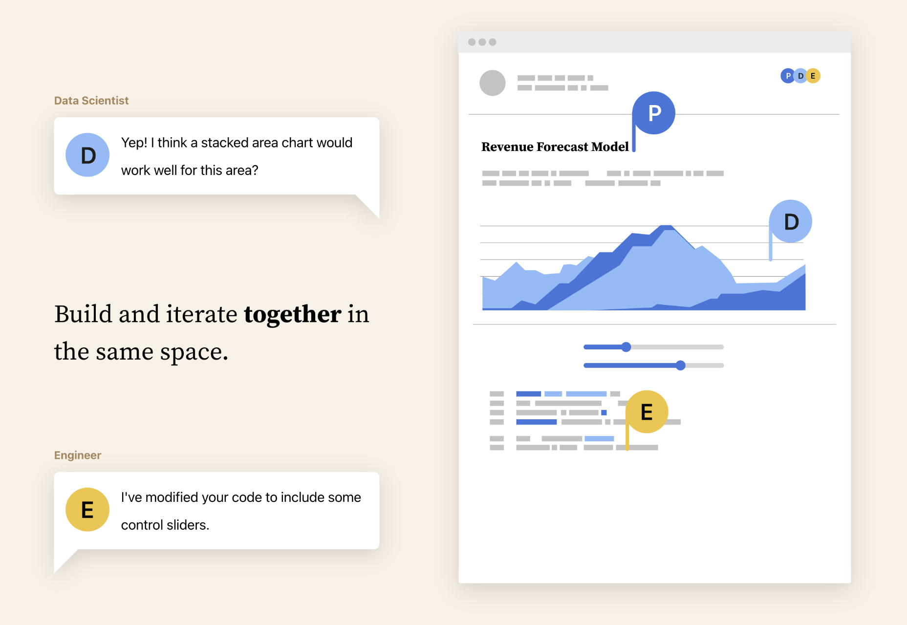
Observable

Observable lets you explore, analyze, and explain data as a team to uncover insights, and make better decisions. Build fresh data visualizations with drag-and-drop components or JavaScript.

Blocs

Blocs is a no-code website builder based on Bootstrap 5. It has a whole heap of templates, so all you need to do is pick one, customize it, and add your content.

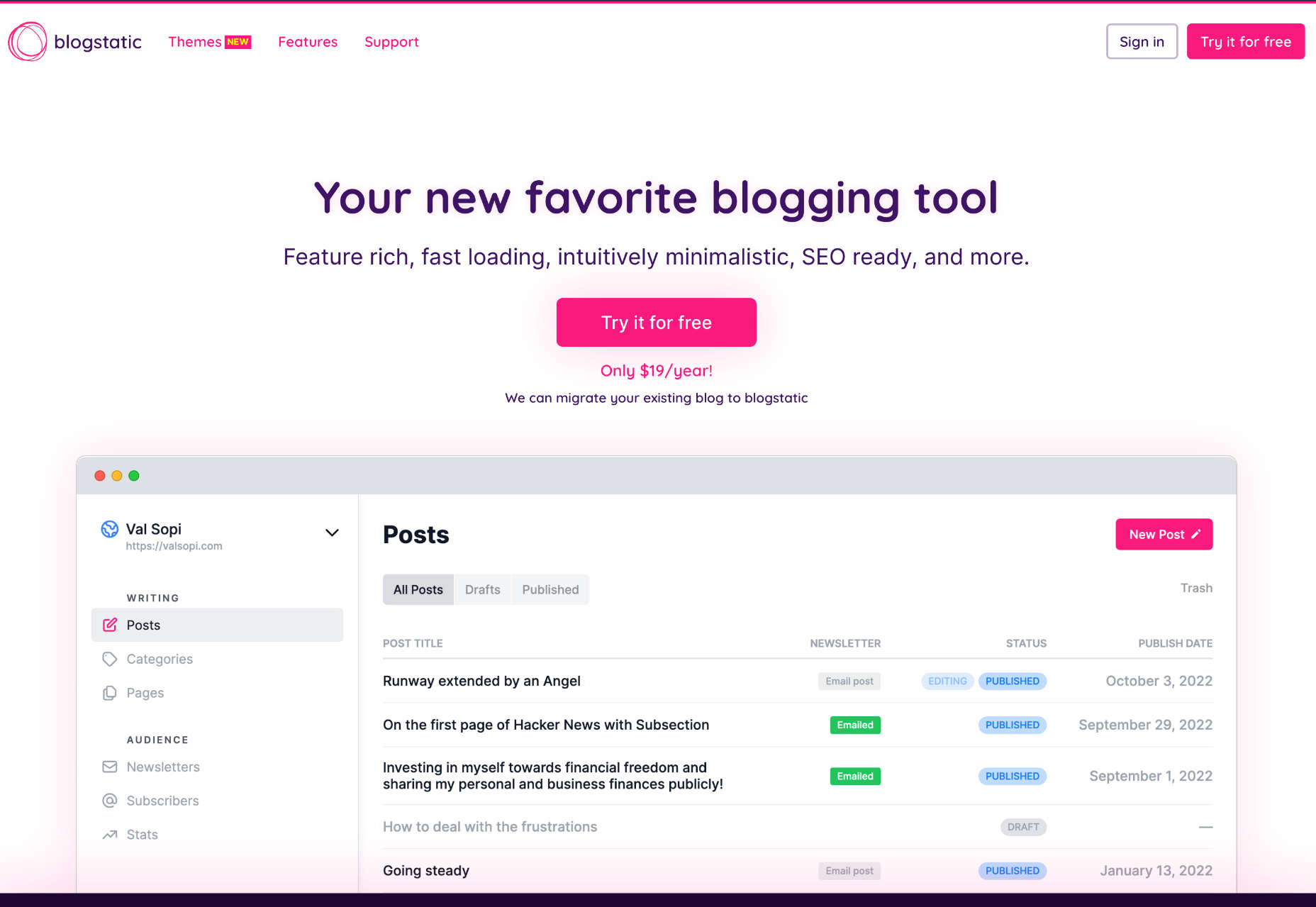
blogstatic

blogstatic is a fantastic no-code blogging platform with a minimal UI that lets you focus on nothing but your content. There’s built-in SEO, plus themes and hosting is included.

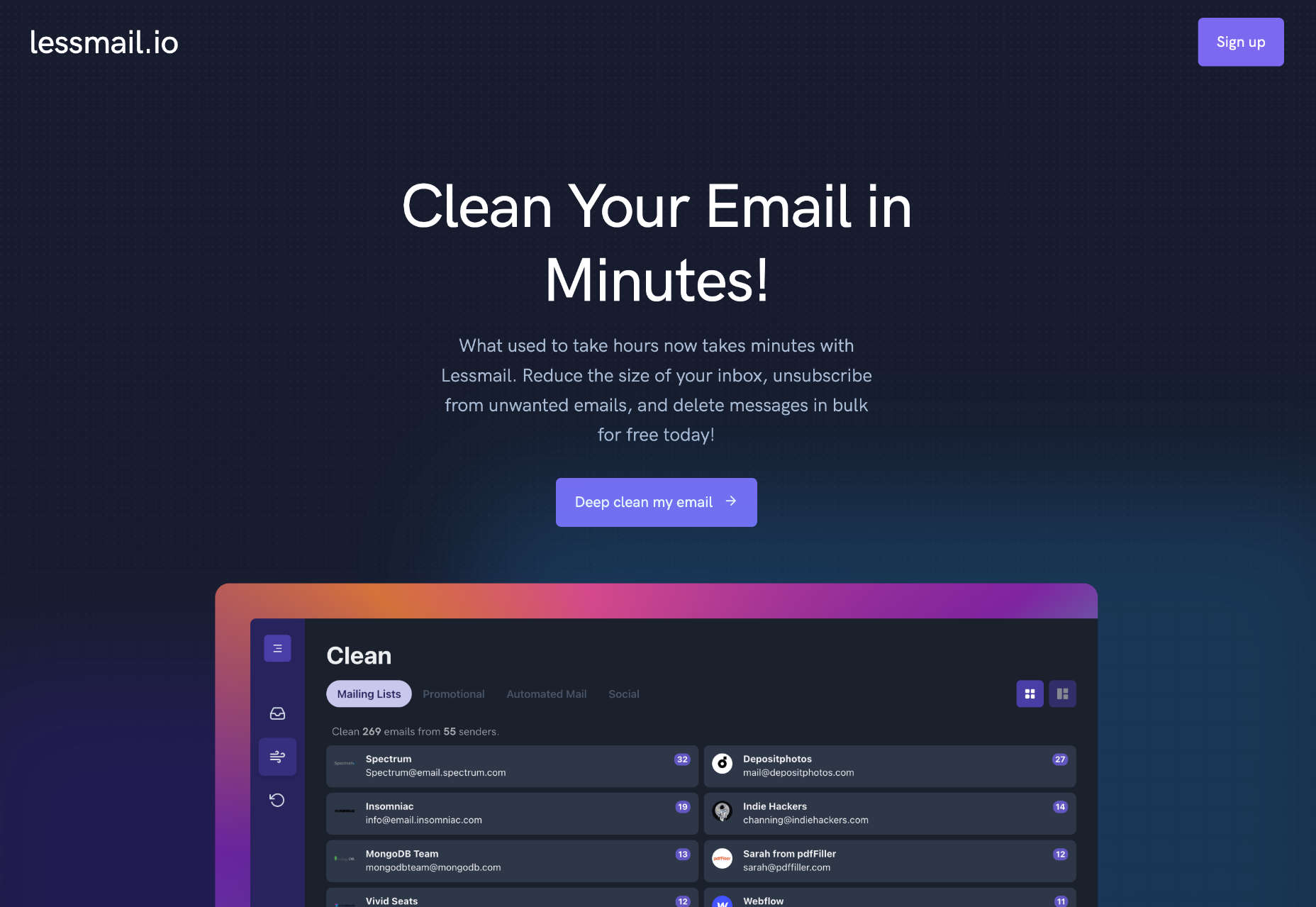
Lessmail

Lessmail is an excellent way to clean out your inbox for the new year. Unsubscribe from unwanted newsletters, delete old messages and focus on the mail you want.

Ultimate Side Projects Playbook

Is 2023 the year you’ll launch a web-conquering side project? Give yourself the best chance with the free Ultimate Side Projects Playbook to guide you through the process.

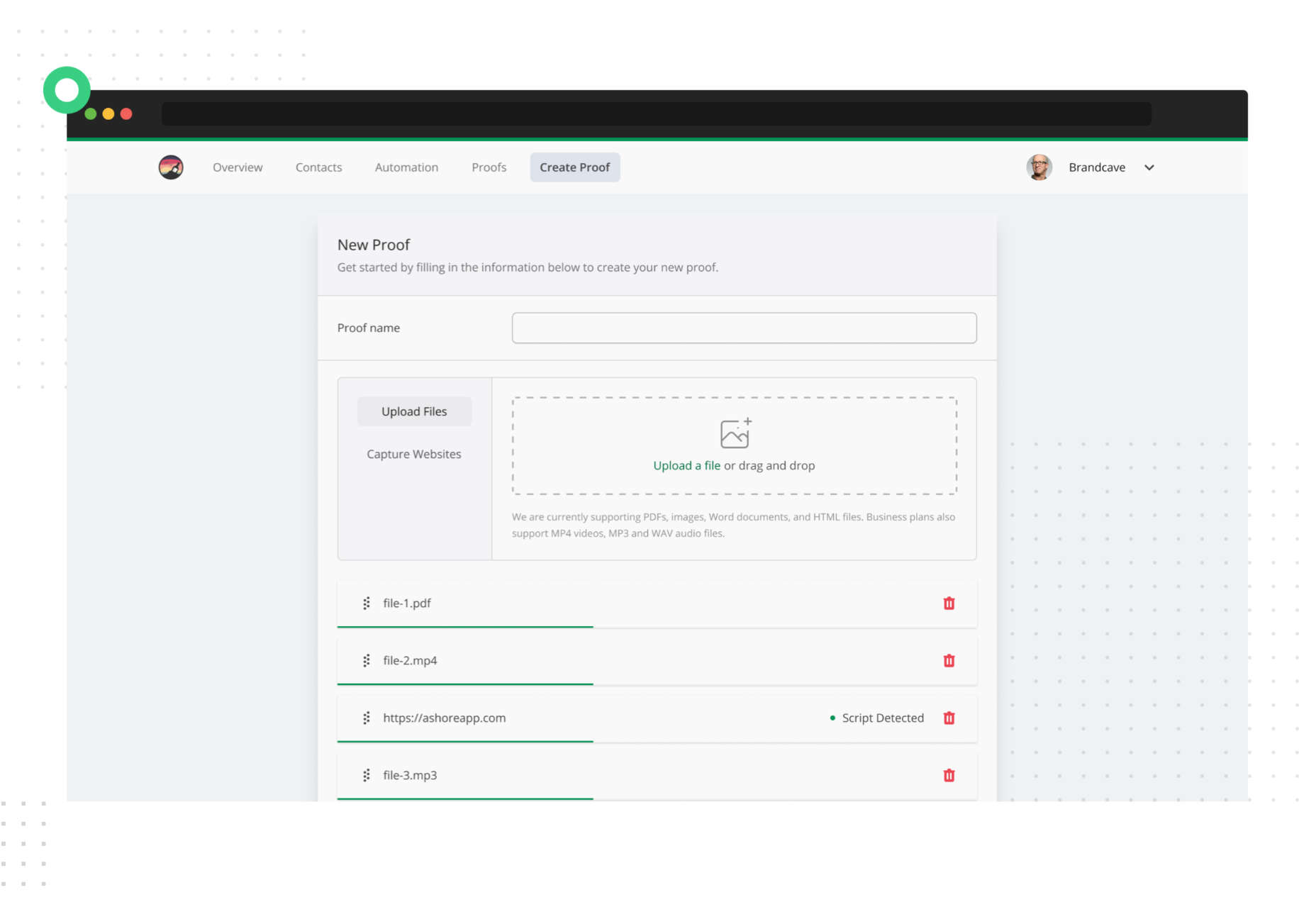
Ashore

Get your web designs, prototypes, and other creative work sign-off fast using Ashore. Upload your files, share them with stakeholders, and track when your designs are approved.

Frase

Frase is an AI tool for researching, writing, and optimizing content with high-quality SEO keywords. Write anything from content briefs to blog posts in a fraction of the usual time.

Uiverse

Uiverse is a collection of UI elements designed by the community that you can use on your site for free or even submit your own designs for others to use.

Rive

Rive is an excellent app for building fast, small, interactive animations and motion graphics for the web. Animations built-in Rive can run on the web or in native apps.

Vuestic UI

Vuestic UI is an excellent UI framework for Vue. All aspects are fully customizable, and Vuestic UI seamlessly integrates with other component libraries for even more options.

Localfonts.xyz

Localfonts.xyz is a simple way to browse the fonts installed on your local machine in your browser. It’s a fast solution for choosing fonts for your designs.

PixelBin

PixelBin is a tool for optimizing and delivering images. It uses AI to transform your assets and allows you to use larger, higher-quality images without bloated load times.

EarlyBird

EarlyBird is a no-code landing page generator perfect for teams launching an early-stage website. You can get your product online fast and start validating it with real users.

RippleUI

RippleUI is a toolkit for UI design that improves on the Tailwind approach by simplifying classes to reduce the amount of code you need. In addition, it includes components and utility classes to speed up your web development.

No Code AI Model Builder

If you want to build your own AI models but you don’t know how to code, you can use No-Code AI Model Builder to generate AI models in minutes.

Templatify

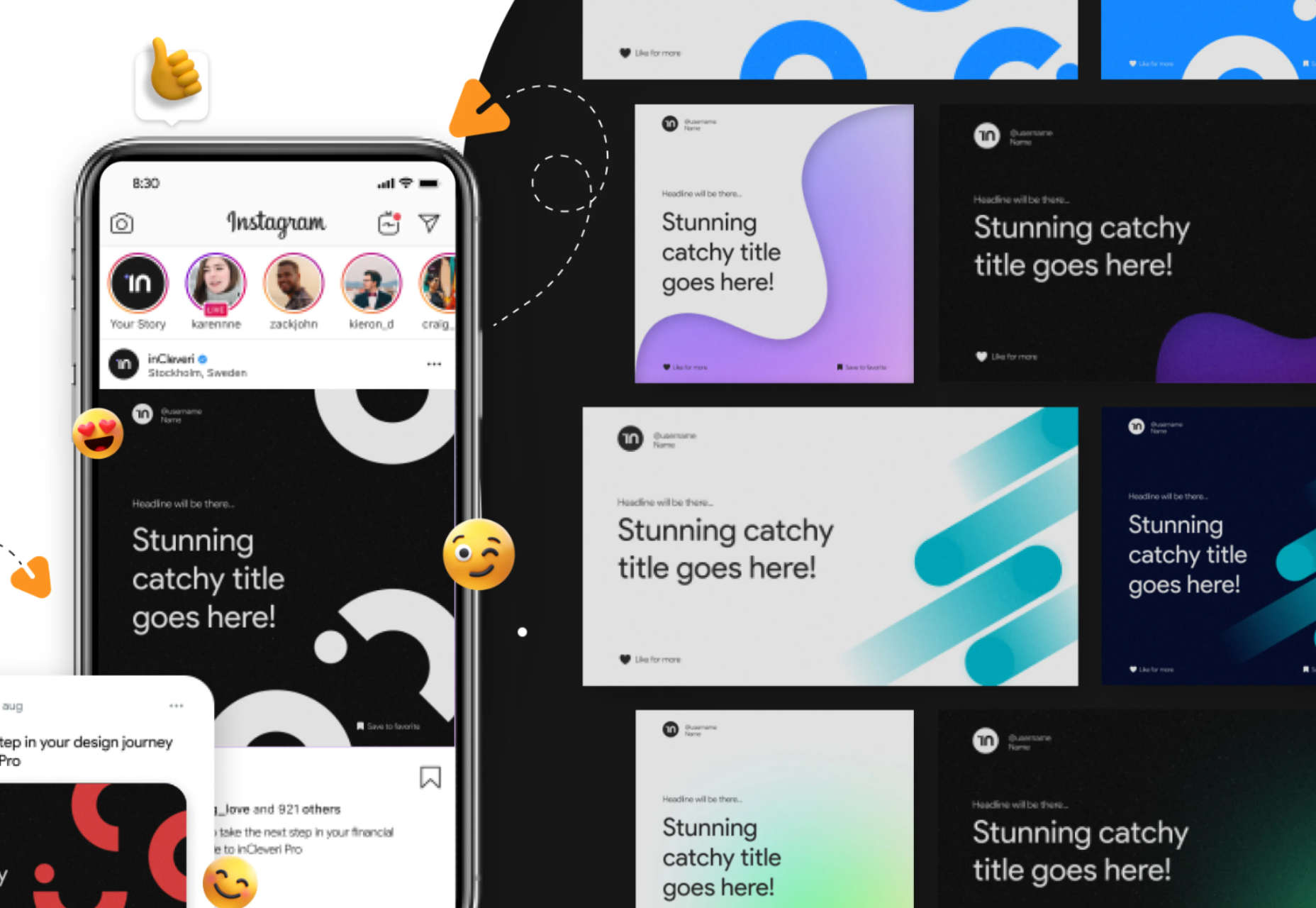
Save hours creating social media templates with Templatify, a collection of 201 templates for Twitter and Instagram. There are dark and light versions, and a full video tutorial shows you how to customize them.

Detangle

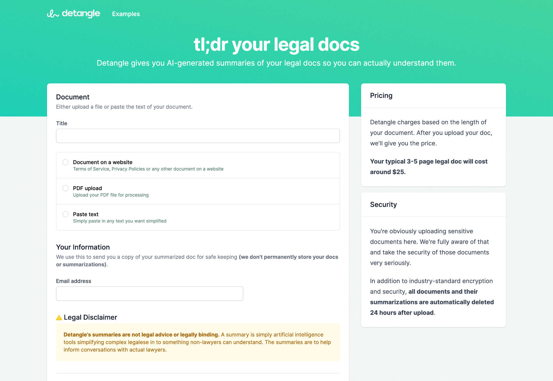
Detangle beats small print by using the power of AI to generate human-readable summaries of legal documents so you can understand what you’re signing.

Mesher

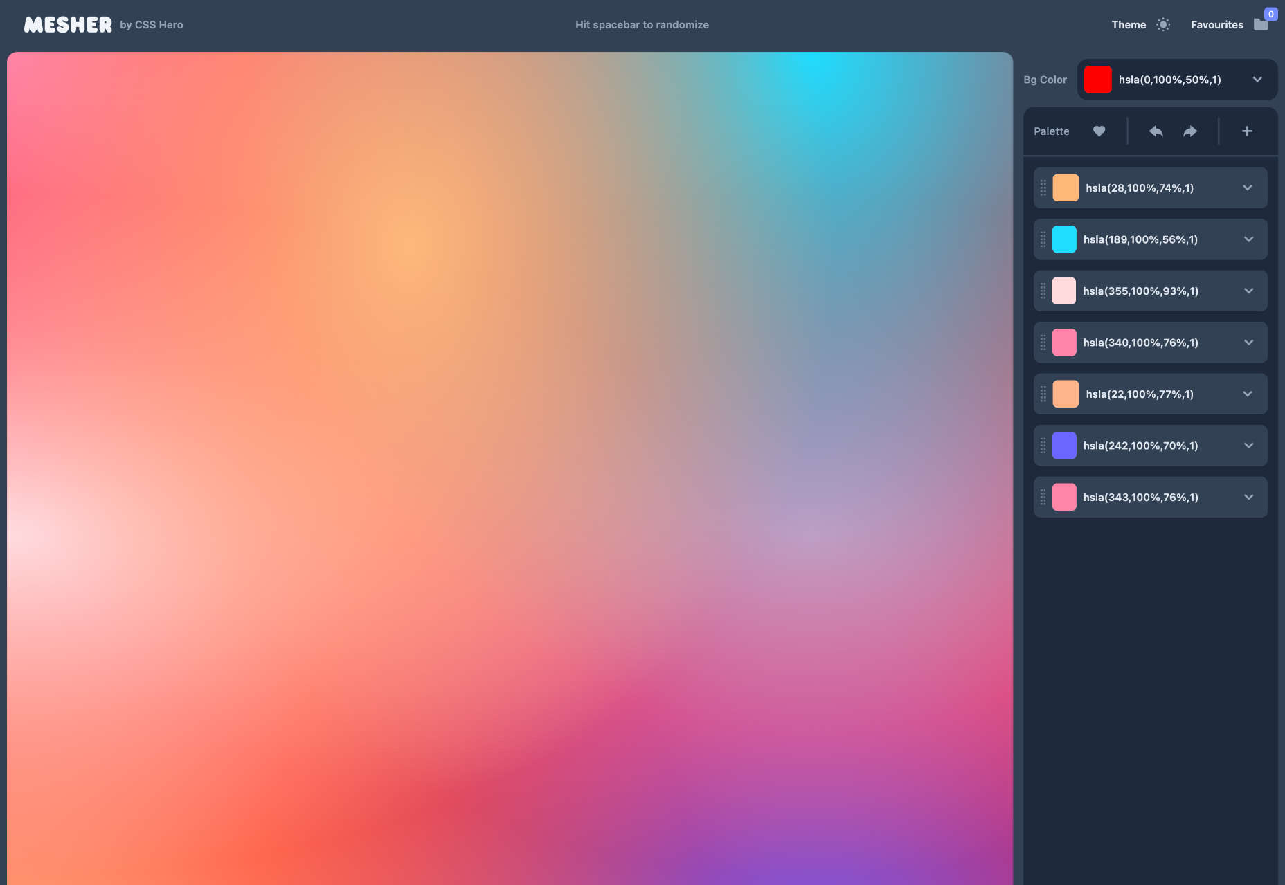
CSS Hero’s Mesher creates incredible multicolor gradients that can be customized and exported to CSS for use in your projects.

OldestSearch.com

OldestSearch.com is a fascinating look at the web that was. Enter any search term, and it will return the oldest matching links available on Google Search.

Detect GPT

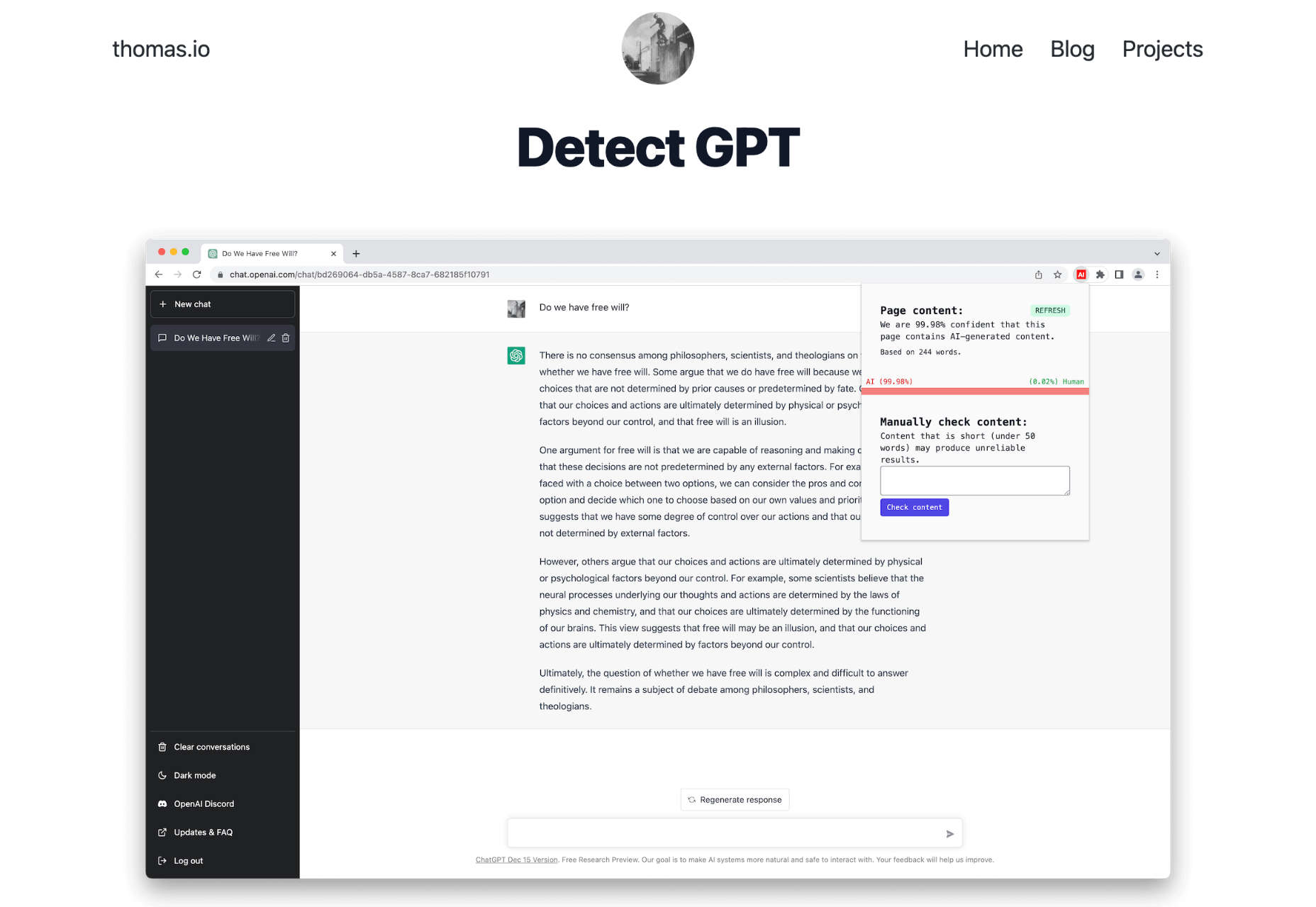
Detect GPT is a helpful Chrome extension that scans the content of web pages and determines if the content has been auto-generated by AI. It’s very handy for checking the validity of blog posts.

Source

The post Exciting New Tools for Designers, January 2023 first appeared on Webdesigner Depot.

Categories: Designing, Others Tags:

Styling Buttons in WordPress Block Themes

January 9th, 2023 No comments
A black button above a comment form that also contains a black button.

A little while back, Ganesh Dahal penned a post here on CSS-Tricks responding to a tweet that asked about adding CSS box shadows on WordPress blocks and elements. There’s a lot of great stuff in there that leverages new features that shipped in WordPress 6.1 that provide controls for applying shadows to things directly in the Block Editor and Site Editor UI.

Ganesh touched briefly on button elements in that post. I want to pick that up and go deeper into approaches for styling buttons in WordPress block themes. Specifically, we’re going to crack open a fresh theme.json file and break down various approaches to styling buttons in the schema.

Why buttons, you ask? That’s a good question, so let’s start with that.

The different types of buttons

When we’re talking about buttons in the context of the WordPress Block Editor, we have to distinguish between two different types:

  1. Child blocks inside of the Buttons block
  2. Buttons that are nested inside other block (e.g. the Post Comments Form block)

If we add both of these blocks to a template, they have the same look by default.

But the markup is very different:

<div class="wp-block-button">
  <a class="wp-block-button__link wp-element-button">Button 1</a>
</div>
<p class="form-submit wp-block-button">
  <input name="submit" type="submit" id="submit" class="wp-block-button__link wp-element-button" value="Post Comment"> 
</p>

As we can see, the HTML tag names are different. It’s the common classes — .wp-block-button and .wp-element-button — that ensure consistent styling between the two buttons.

If we were writing CSS, we would target these two classes. But as we know, WordPress block themes have a different way of managing styles, and that’s through the theme.json file. Ganesh also covered this in great detail, and you’d do well giving his article a read.

So, how do we define button styles in theme.json without writing actual CSS? Let’s do it together.

Creating the base styles

theme.json is a structured set of schema written in property:value pairs. The top level properties are called “sections”, and we’re going to work with the styles section. This is where all the styling instructions go.

We’ll focus specifically on the elements in the styles. This selector targets HTML elements that are shared between blocks. This is the basic shell we’re working with:

// theme.json
{
  "version": 2,
  "styles": {
    "elements": {
      // etc.
    }
  }
}

So what we need to do is define a button element.

={
  "version": 2,
  "styles": {
    "elements": {
      "button": {
        // etc.
      }
    }
  }
}

That button corresponds to HTML elements that are used to mark up button elements on the front end. These buttons contain HTML tags that could be either of our two button types: a standalone component (i.e. the Button block) or a component nested within another block (e.g. the Post Comment block).

Rather than having to style each individual block, we create shared styles. Let’s go ahead and change the default background and text color for both types of buttons in our theme. There’s a color object in there that, in turn, supports background and text properties where we set the values we want:

{
  "version": 2,
  "styles": {
    "elements": {
      "button": {
        "color": {
          "background": "#17a2b8",
          "text": "#ffffff"
        }
      }
    }
  }
}

This changes the color of both button types:

A light blue button above a comment form that also contains a light blue button.

If crack open DevTools and have a look at the CSS that WordPress generates for the buttons, we see that the .wp-element-button class adds the styles we defined in theme.json:

.wp-element-button {
  background-color: #17a2b8;
  color: #ffffff;
}

Those are our default colors! Next, we want to give users visual feedback when they interact with the button.

Implementing interactive button styles

Since this is a site all about CSS, I’d bet many of you are already familiar with the interactive states of links and buttons. We can :hover the mouse cursor over them, tab them into :focus, click on them to make them :active. Heck, there’s even a :visited state to give users a visual indication that they’ve clicked this before.

Those are CSS pseudo-classes and we use them to target a link’s or button’s interactions.

In CSS, we might style a :hover state like this:

a:hover {
  /* Styles */
}

In theme.json, we’re going to extend our existing button declaration with these pseudo-classes.

{
  "version": 2,
  "styles": {
    "elements": {
      "button": {
        "color": {
          "background": "#17a2b8",
          "text": "#ffffff"
        }
        ":hover": {
          "color": {
            "background": "#138496"
          }
        },
        ":focus": {
          "color": {
            "background": "#138496"
          }
        },
        ":active": {
          "color": {
            "background": "#138496"
          }
        }
      }
    }
  }
}

Notice the “structured” nature of this. We’re basically following an outline:

  • Elements
    • Element
      • Object
        • Property
          • Value

We now have a complete definition of our button’s default and interactive styles. But what if we want to style certain buttons that are nested in other blocks?

Styling buttons nested in individual blocks

Let’s imagine that we want all buttons to have our base styles, with one exception. We want the submit button of the Post Comment Form block to be blue. How would we achieve that?

This block is more complex than the Button block because it has more moving parts: the form, inputs, instructive text, and the button. In order to target the button in this block, we have to follow the same sort of JSON structure we did for the button element, but applied to the Post Comment Form block, which is mapped to the core/post-comments-form element:

{
  "version": 2,
  "styles": {
    "elements" {
      "button": {
        // Default button styles
      }
    }
    "blocks": {
      "core/post-comments-form": {
        // etc.
      }
    }
  }
}

Notice that we’re no longer working in elements anymore. Instead, we’re working inside blocks which is reserved for configuring actual blocks. Buttons, by contrast, are considered a global element since they can be nested in blocks, even though they are available as a standalone block too.

The JSON structure supports elements within elements. So, if there’s a button element in the Post Comment Form block, we can target it in the core/post-comments-form block:

{
  "version": 2,
  "styles": {
    "elements" {
      "button": {
        // Default button styles
      }
    }
    "blocks": {
      "core/post-comments-form": {
        "elements": {
          "button": {
            "color": {
              "background": "#007bff"
            }
          }
        }
      }
    }
  }
}

This selector means that not only are we targeting a specific block — we’re targeting a specific element that is contained in that block. Now we have a default set of button styles that are applied to all buttons in the theme, and a set of styles that apply to specific buttons that are contained in the Post Comment Form block.

A light blue button above a comment form that contans a bright blue button.

The CSS generated by WordPress has a more precise selector as a result:

.wp-block-post-comments-form .wp-element-button,
.wp-block-post-comments-form .wp-block-button__link {
  background-color: #007bff;
}

And what if we want to define different interactive styles for the Post Comment Form button? It’s the same deal as the way we did it for the default styles, only those are defined inside the core/post-comments-form block:

{
  "version": 2,
  "styles": {
    "elements" {
      "button": {
        // Default button styles
      }
    }
    "blocks": {
      "core/post-comments-form": {
        "elements": {
          "button": {
            "color": {
              "background": "#007bff"
            }
            ":hover": {
              "color": {
                "background": "#138496"
              }
            },
            // etc.
          }
        }
      }
    }
  }
}

What about buttons that are not in blocks?

WordPress automagically generates and applies the right classes to output these button styles. But what if you use a “hybrid” WordPress theme that supports blocks and full-site editing, but also contains “classic” PHP templates? Or what if you made a custom block, or even have a legacy shortcode, that contains buttons? None of these are handled by the WordPress Style Engine!

No worries. In all of those cases, you would add the .wp-element-button class in the template, block, or shortcode markup. The styles generated by WordPress will then be applied in those instances.

And there may be some situations where you have no control over the markup. For example, some block plugin might be a little too opinionated and liberally apply its own styling. That’s where you can typically go to the “Advanced” option in the block’s settings panel and apply the class there:

A WordPress block settings panel with the Advanced settings expanded highlighting the CSS classes section in red.

Wrapping up

While writing “CSS” in theme.json might feel awkward at first, I’ve found that it becomes second nature. Like CSS, there are a limited number of properties that you can apply either broadly or very narrowly using the right selectors.

And let’s not forget the three main advantages of using theme.json:

  1. The styles are applied to buttons in both the front-end view and the block editor.
  2. Your CSS will be compatible with future WordPress updates.
  3. The generated styles work with block themes and classic themes alike — there’s no need to duplicate anything in a separate stylesheet.

If you have used theme.json styles in your projects, please share your experiences and thoughts. I look forward to reading any comments and feedback!


Styling Buttons in WordPress Block Themes originally published on CSS-Tricks, which is part of the DigitalOcean family. You should get the newsletter.

Categories: Designing, Others Tags:

Understanding Authentication In Websites: A Banking Analogy

January 9th, 2023 No comments

There is a strange ritual that web developers around the world have been perpetuating from the dawn of computers to modern days. Without this ritual, the web application cannot really exist. It is not “ready to go live,” a web developer would say. This ritual is the implementation of authentication.

You may have been through this ritual multiple times. But do you really understand what is happening?

This article is my attempt at making this ritual less obscure. It shouldn’t have to take a wizard to implement a good authentication system. Just a good banker!

Your Password Matched. Now What?

Authentication is the process of attributing a given request to a unique entity, usually a person. It then enables authorization, the process of allowing (or not) said person to access a resource, be it a web page or an API endpoint.

I will focus on the part I’ve always found the most difficult to understand: what happens after the user just submitted the login form and their credentials were confirmed as valid by the backend.

  app.post("/login", async (request, response) => {
    const { body } = request;
    const user = await getUserByCredentials(body.username, body.password);
    if (user) {
      // NOW WHAT???
    }

Your typical login endpoint. This article is about what happens afterward.

We are going to talk about tokens, CORS, cookies, and headers. Those concepts are sometimes quite abstract. To make them more real, I’ll take a shot at a banking analogy.

Authentication Relies On Tokens Like Banks Rely On Money

Let’s consider two common patterns:

  • JSON Web Tokens aka JWT.
    It’s an open standard. You’ll find useful resources at the bottom of this article if you want to go further.
  • Session-based authentication.
    It’s a pattern more than a standard. So the implementation may vary, but I’ll try to give an overview of how it works.

As a front-end developer, you may have no control over this design decision, so it’s important that you understand how both work.

As a full-stack or backend developer, you have control over this choice, so it’s even more important that you understand what you are doing. I mean, it’s kinda your job 🙂

A JWT Is Like A Banknote

With JSON Web Token-based authentication (JWT), during the login step, the server will pass the client a token that contains encrypted information, a “claim.” When the client makes a request, they pass this token alongside the request.

The server verifies that this token is indeed a valid token that it itself generated earlier. Then the server reads the token payload to tell who you are, based on a user ID, username, email, or whatever the payload is. Finally, it can authorize or refuse access to the resource.

Think of tokens as banknotes. A banker can print new banknotes like a server can create tokens. Money lets you buy things, or if I rephrase, it lets you access paid goods and services. The JWT lets you access secure services the same way.

If you want to use your money, either at the bank to credit your account or in a store, people will double-check that your banknotes are real. A real banknote is one that has been created by the bank itself. When the banknote is confirmed to be legit, they can read the value on it to tell how many things you can buy.

JWTs work the same, the server can verify that they indeed created this token earlier, so it’s a real one, and then they can read the payload it contains to confirm who you are and what your permissions are.

Revoking a token can be hard. The server has to maintain a list of blacklisted tokens that are no longer valid, like the bank would need to list robbed banknotes’ unique numbers.

Session-Based Authentication Is Like A Credit Card

From the front-end developer standpoint, the main difference between JWT and session-based authentication lies in what the server will return in case of a successful login.

In session-based authentication, instead of having a claim full of user information, you just get a “session id.”

From the backend developer’s standpoint, session-based authentication involves an additional database collection or table to store the sessions. A session is just an object very similar to the JWT, which can contain, for instance, a user id and an expiration date.

This means that the server keeps a lot of control over the authentication. It can log a user out by removing the session from the database, whereas it cannot destroy JWTs, since it doesn’t store them.

Session-based authentication is comparable to credit cards. You go to the bank to open your account. The banker will check your id and issue a credit card with an expiration date. This is the authentication process.

The credit card itself has barely any value: it’s just plastic and a microchip whose purpose is to uniquely identify your account. It can easily be revoked by the bank, usually after a certain period of time, but also when you declare your card stolen.

When you want to pay for something, the store will communicate with your bank to check that your credit card is valid and has a positive balance.

When you access an authenticated resource, the server will check if the session id matches an open session and then if this session matches a user that is authorized to access this resource.

Tokens Are As Precious As Banknotes And Credit Cards. Don’t Get Them Stolen!

It’s easy for companies and banks to store money. They have those big reinforced-steel safes with alarms and sometimes even dragons. Likewise, it’s easy for servers to talk securely to one another.

But websites are like private persons. They can’t have dragons, so they have to imagine specific approaches to store their precious tokens.

Where Do You Store Your Money?

Whatever the pattern you pick to authenticate users, JSON web tokens and session ids are precious things. In the remainder of this article, I will treat them similarly, apart from a few technical subtleties. I’ll call either of them the “authentication token,” the thing you show the server to prove that you are authenticated, like money for paying stuff.

Since you have to pass the token alongside every request you make to the server — you need to store it somewhere on the client side.

Here, I’d like to focus more specifically on the case of websites, where the web browser is in charge of sending the requests. You’ll find many articles and documentation in the wild that do not clarify whether they apply to server-server communication or browser-server. The latter is a trickier, uncontrolled context that deserves its own specific patterns.

So, the banker just handed you either a new credit card or a bunch of banknotes. Where do you stash them? In a compartment concealed in the heel of your shoe, in your mailbox, beneath your mattress, or maybe, in your fancy fanny pack?

Not All Requests Are Born Equal: Loading A Web Page vs. Calling An API

We can divide authenticated content into two categories: web pages and API endpoints. From a technical standpoint, both are server endpoints. The former returns HTML content or files, the latter — any kind of content, often JSON data. They differ in the way they are consumed.

Web pages are accessed via a web browser that triggers GET requests automatically, depending on the current URL.

APIs are called using JavaScript code. This reliance on APIs and JavaScript is at the core of the Jamstack, REST, and Single-Page-Application philosophies.

Thus, let’s differentiate two use cases:

  1. You want to secure access to the web page itself. Meaning the user can’t even see the structure of your page or any HTML.
  2. You want to secure calls from your web page to your API. Anyone can see your web page structure, but they can’t get any data.

If you combine both, unauthenticated users can’t see the page structure and can’t get any data from your API.

Use Case 1: Securing A Web Page Access With Cookies

I’ll cut it short, to secure web page access, you have no other choice but to use cookies, ideally HTTP-Only, secure cookies.

From a technical standpoint, a cookie is a piece of data that should be sent alongside every request to a specific domain. They are part of the HTTP protocol.

That’s a pretty broad scope. When a website cookie popup differentiates “essential cookies” from other cookies, those essential cookies are often dedicated to authentication. The others are just a way to keep track of the product pages you’ve visited to later shove them in your face to the point of literally optimizing the billboard displays in your neighborhood as if you really, really wanted to buy two freezers within the same month.

Setting a cookie is possible in both directions. Client-side JavaScript can set cookies to be sent to the server. That’s how advertisement tracking works (though GDPR is forcing advertisers to use server-side logic more and more these days).

But the server can also tell the browser to store a cookie using the Set-Cookie header in the response.

This convenient feature lets the backend set what we call “HTTP-only” cookies: cookies that cannot be read by JavaScript. And “secure” cookies are only set through HTTPS for better security.

Important note: Using HTTP-only cookies prevents XSS attacks (script injection to steal the token) but not CSRF attacks (forging requests on behalf of your authenticated users, basically impersonating them). You need to combine multiple strategies to parry all possible attacks. I invite you to read more on these topics if you manage a non-trivial website.

During the authentication process, the Set-Cookie header should be used in response to the “login” request so the client becomes authenticated via a token.

Cookies are like a wallet. You can store fidelity cards in it and a picture of your cat, but also duller things, like your money. It’s in your pocket or your handbag, so it’s hard to access for other people (HTTP-only, no JavaScript access) if you don’t take it out in unsafe places (secure). Yet, you always have your token with you if needed.

Browsers rely a lot on cookies, and they send them automatically alongside every request they trigger as long as the domain and path match, so you don’t have to worry about them. If you carry your wallet with you anytime you go out, you’re always ready to pay.

Use Case 2: Securing API Calls. The Cookie Scenario

Now, let’s authenticate calls to our API, which feeds the website with data. The easiest option would be to use a cookie, as we did in the previous section, to secure web pages. But contrary to the web page, there is also another option — using web storage. Which one is the most suited is debatable. Let me start with cookies.

The cookie that contains the auth token is sent automatically alongside requests triggered by the browser when you navigate a website or when you submit a form.

But requests triggered by JavaScript code do not fall into this category. When you trigger a request programmatically, you need a bit more configuration to send cookies.

Remember that the cookie should be HTTP-only, so you can’t read the cookie content with JavaScript nor inject your token in the Authorization header. You could do that with a cookie that is not HTTP-only, but then using a cookie doesn’t make sense in the first place.

All existing libraries capable of sending requests have to be based on the browser JavaScript API aka the “Browser Object Model,” which means either XMLHttpRequest or fetch. You have to rely on their configuration to enable sending HTTP-only cookies alongside the request.

In the case of fetch, this option is named credentials. Hopefully, for you, fellow front-end developers, it’s very easy to use.

fetch(
"http://localhost:8000/account/signup", 
{ 
  method: "POST",
  body: JSON.stringify({username:"foo", password:"barbar"}), 
  // This will include credentials (here, cookies) in the request
  credentials: "include"
})

With XHR, the option is named withCredentials and behaves similarly.

Note: Your server must also confirm that it indeed accepts credentials by setting the Access-Control-Allow-Credentials header to true in the responses. This option is symmetrical. It controls both sending cookies to the server, but also accepting the Set-Cookie header from it. So don’t forget to set it to true for the call to the login endpoint.

If the credentials option is not set and the server answers with a Set-Cookie header… the browser will silently ignore this attempt to set the cookie without even a warning. When this happens, start by double-checking your credentials option and then CORS if applicable (see next section).

Oops, I’ve almost forgotten your banking analogy! It’s a tough one but let’s say that you probably have your credit card or a few banknotes always there in your wallet. But some services expect a prepaid card, and you may need to explicitly remember to take them with you. That’s the best analogy I could achieve. Comment if you can do better!

Return Of Use Case 2: Securing API Calls. The Web Storage Scenario

Remember, I said earlier that for API calls, you have the choice to either store the token in an HTTP-only cookie, like you would do to secure a web page, or to store the token in the web storage. By web storage, we mean either sessionStorage or localStorage.

I’ve seen and used both approaches, cookies and web storage, but I sincerely don’t have the expertise to assert that one is better than the other. I’ll stick to describing how it works so you can make an enlightened decision.

Codewise, they are much easier to use than HTTP-only cookies because web storage is available to JavaScript code. You can get the token from the login response payload, store it in localStorage, and insert it into the Authorization header in later requests. You have full control of the process without relying on some implicit browser behavior.

headers: {
    “Authorization”: `Bearer ${window.localStorage.get(“auth_token”)}`
}

Web storage is immune to certain attacks, namely Cross-Site Request Forgery. That’s because, contrary to cookies, they are not automatically tied to requests, so an attacker will have trouble forcing you to give your token. Think of a piggy bank. You can’t just get money out of it. It’s, however, very sensitive to script injection, where an attacker manages to run JavaScript and reads the token.

Therefore, if you go the web storage way, you’ll want to explore strategies that prevent XSS attacks from happening in the first place.

JWT Specifics: What Information They Should Contain And How To Handle The Refresh Token

You should avoid storing critical information in a JSON web token, even when using HTTP-only cookies. If someone still manages to steal and decrypt the token, they will be able to impersonate the user, but at least they won’t be able to get much information from the token itself.

You can afford to lose a five-dollar banknote; it’s more problematic to lose a $5,000 banknote. By the way, if such a thing as a $5,000 banknote exists, please send me a specimen to prove it. Thank you.

JWTs are meant to be short-lived, like banknotes, which would wear quickly when used a lot. Since they are hard to revoke, giving them 5-minute lifetime guarantees that even a stolen JWT token cannot be a big problem.

Since you don’t want the user to log in again every 5 minutes, the token can be combined with a longer-lived refresh token. This second token can be used to get a new JWT.

A best practice is to store the refresh token in a cookie on a very specific path like /refresh (so it’s not sent with all requests, contrary to the JWT) and to make it a one-time-only token.

A refresh token is like bringing your ID card to get more money from your bank account. You don’t do that often, and you probably want to store your ID even more safely than your banknotes.

CORS Is How Shops Communicate With Their Bank

Formally, CORS (Cross-Origin Resource Sharing) is a protocol used by servers in order to instruct browsers to selectively relax some of the Same-Origin Policy (SOP) restrictions on network access for some trusted clients.

Less formally, the server can tell your browser that the request you send is legit based on the request’s origin. If the server says it’s not legit, the browser won’t send the request.

For instance, https://www.foobar.com, https://qarzed.fake, and http://localhost:8080 are possible origins. The port and protocol matter.

An API hosted on https://api.foobar.com will most often allow requests only from https://www.foobar.com and https://mobile.foobar.com.

I will focus here on API calls triggered with fetch in JavaScript, and only if the API lives in another Web origin. CORS also affects more advanced use cases like embedding images from another website in your own website, iframe, navigating from one site to another, and so on, but that’s beyond the scope of authentication per se.

Websites are like stores. People can enter them and try to buy things. But the store also has its own complicated internal back office logic. Namely, it relies on a bank to process payments.

Any shop owner can try to connect to any bank. Any website can try to connect to any API. But the payment won’t be processed by the bank if they don’t have a company account there.

Likewise, if you host the website on www.foobar.com and the API on www.foobar.com/api, there is one origin only www.foobar.com. No need for CORS because there is no “cross-origin” call involved. You’ll need to bother about CORS if, instead, you host the API on api.foobar.com. We have two distinct origins, api.foobar.com and www.foobar.com.

This also applies to using different ports on localhost during development. The IP 127.0.0.1 is even different from localhost, as origins are compared directly as strings and not based on their actual IP address.

Some big companies, like car sellers, have their own internal bank. It’s easier for them to communicate with this bank if it’s literally located in the same office. They are like full-stack monolithic applications.

But if this internal bank is located in a different country (API separate from the website), this doesn’t work anymore. It could as well be a traditional bank with multiple clients (a third-party API). CORS is needed either way.

CORS is a concept specific to browser-server communication. When a server talks to another server, the Same-Origin Policy doesn’t apply. The API may either block those requests with no origin completely or, on the contrary, accept them, or filter them based on IP and so on.

Banks have specific patterns of communicating with each other that are different from how they communicate with their client companies.

A Polite Cross-origin Discussion Between A Server And A Client, Using Preflight Requests

Here’s a more concrete vision of what happens during a cross-origin request and how the server response headers should be set.

From the browser standpoint, whenever a website sends a “non-simple” request to an API, the browser will first send a preflight request. It’s a request to the same URL but using the OPTIONS method, which is dedicated to checking whether you can actually consume this API endpoint.

Fetching JSON data falls into this “non-simple” category in standard browsers, as well as calling your login endpoint if the auth API doesn’t live on the same domain as your website, so this step is extremely important.

The server receives this request, which includes an Origin header. It checks its own list of accepted origins. If the origin is allowed, it will respond with the right Access-Control-Allow-Origin header.

This server header should match the website’s origin. It can also be a wildcard * if the API is totally open, but that works only for requests without credentials, so forget about this if your API requires authentication.

If the response header doesn’t match, the browser will trigger an error at this point because they already know that they can’t call this API. Otherwise, they will keep going and send the actual request.

A store (the API) can decide to accept only certain types of credit cards. Some stores accept only their own card, and they don’t even use CORS (same-origin scenario). Some stores accept only Visa or Mastercards (cross-origin scenario). The cashier (the browser) won’t let you pay if they are told your card is not accepted by the store.

There are a few other Access-Control headers that provide more information, like accepted methods or headers. Allow-Origin is the most basic one, as well as Allow-Credentials, so cookies and Set-Cookie headers are properly enabled when using fetch.

Access-control-allow-origin: https://www.foobar.com
Access-control-allow-credentials: true

Expected response headers for an authenticated call (or the “login” form submission) if the website lives on https://www.foobar.com and the API is on another domain or port.

Note: The server specifies the CORS policy, and the browser enforces it. If suddenly everyone used an unsafe browser run by pirates, they could swarm your server with forged requests. Hopefully, people usually don’t use a shady browser they found in a USB key itself found lying on the ground of a dark alley at 3 am.

The header things and the browser behavior are just politeness. The browser is an excessively polite software. It will never spam the server with requests that will be rejected anyway. And it won’t talk to rude servers that don’t set the proper headers. That’s why the Accept-Control-Allow-Origin response header must be correctly set for cross-origin requests to work.

Before going as far as aiming a customer with a shotgun, the banker will probably tell you, “sir, you entered the wrong bank office,” and the customer will probably answer, “oh, sorry, my mistake. I will leave immediately!”.

Cookies Or Not Cookies: The SameSite Option

Setting the credentials attribute in your fetch request is not enough for sending the cookie, plus it doesn’t apply to pages, only to programmatic requests. The SameSite attribute of cookies lets you configure when a cookie should be sent, depending on the current site.

The concept of “Site” is slightly different from the concept of domain:

  • https://api.foobar.com and https://www.foobar.com are 2 different domains.
  • They are, however, the same site. Nowadays, the scheme matters, too (HTTP vs. HTTPS).
  • There is an exception to this rule, e.g., in multi-tenant architectures: foo.github.io and bar.github.io will be different sites despite having the same domain, and the server owner can configure that to their will.

If the Access-control response headers are correctly set, and the preflight request succeeds, the browser will proceed with the actual request.

But if SameSite is not set with the right value in the cookie containing the authentication token, this cookie won’t be sent to the server. When loading a page, you will be considered unauthenticated by the server just because it literally doesn’t have your cookie.

The SameSite: Lax value is usually the most appropriate. It will only send cookies to the same site but also when the user comes from another site and is redirected to your page (only for top-level navigations). This is the current default in most browsers.

With SameSite: Lax, the website www.foobar.com will automatically include the authentication cookie when it sends requests to api.foobar.com, which is part of the same site. Authentication will work as expected.

Sec-Fetch Helps Detecting Cross-origin Requests But Are Not Standard Yet

Related to CORS, you may also hear about the Sec-Fetch request headers. They provide information about the request context to the server. For instance, if Sec-Fetch-Site is same-origin, there is no need to check the Origin header. It’s slightly more intuitive than manually checking the request origin against predefined rules. If it’s same-site, you still need to add the required CORS headers in the response because the site and the origin are different concepts.

However, those headers are not sent by all browsers. Namely, Safari doesn’t support them at the time of writing. Therefore, they can only act as a secondary solution to identify a request’s origin.

A bank can identify you via your passport, but not everybody has a passport, so you will always need to resort to a good old ID card. Passports are still a cool way to identify people when available. That’s what the Sec-Fetch headers are.

Keep in mind that attackers may trick users into sending requests they don’t want to, but they still have no control over which browser will send the request. Thus, Sec-Fetch headers are still useful despite being supported only by some browsers. When they are present, they are a reliable piece of information.

More broadly, cross-origin and cross-site security patterns are based on the fact that users are using legitimate browsers that should never try to voluntarily mislead servers about the origin. Beware of more elaborate attacks, such as subdomain takeover, that can still bypass these security measures.

You may think, what about servers, then? Server requests are able to spoof a request origin, effectively bypassing CORS. Well, that’s right: CORS is a browser-server security mechanism; it simply doesn’t apply to server-server calls. Someone can build an API that calls your own API and serve the result to another website. True.

However, the thief will have to host a server, which isn’t free, so they will pay actual money for this API call, and the server IP may be traced back to them. It’s way less attractive than forcing browsers to send the request directly to your API, which would be free and trace back to the first victim, your user, and not to the attacker. Thanks to CORS, this worst-case scenario is not possible.

No, We Don’t Take Checks: Don’t Confuse A Web Page Access And An API Call

If you’ve stumbled upon this article, you have probably read a lot of documentation before that. You might have encountered various patterns that seem very different from one another and may be very different from what I’ve been describing so far.

I’d like to point out that this article is about authentication for websites. This is, I believe, the root of all confusion. First, the requests are sent by a browser, not by another server. Then, a page of a website can be accessed via the URL bar, and the website can send calls to an API via JavaScript; that’s two very different situations.

We have detailed the technical differences between each scenario earlier in this article. But let’s recap again to better understand the most common sources of confusion.

Using Browser Storage (Session, Local, And Friend) Is Like Using Your Mailbox As A Piggy Bank

Setting your token in localStorage is like storing money in your physical mailbox. Well, technically, it’s safe. It’s even used to temporarily store your mail. Session storage is similar; it’s just like getting your mail every day instead of letting it rot for weeks. Be nice to the postman!

But either way, the storage is accessible to JavaScript. It’s not open like your mailbox most probably has a lock. But it’s still lying outside.

Someone who is really mean could craft a key and go as far as discreetly stealing your mail for days. That’s what would happen to your users if someone manages to run a script injection attack in your application. They can craft a JS script that reads the localStorage, and sends them the tokens of any of your users affected by the breach!

There are ways to prevent cross-scripting attacks. It’s not a fatality, and some would argue that it’s still better than using an HTTP-only cookie! But if you go the web storage way, don’t forget to protect your mailbox.

JWTs Passed As Header: It’s A Pattern For API Calls Only

I’d like to go one step further and understand why so many developers are tempted to use the browser storage without even considering the cookie option.

I think there are two main reasons:

  1. The API doesn’t use Set-Cookie during the login step. It often happens in APIs that were not specifically designed to be accessed from a browser, and they use an authentication pattern that works for servers, too (so no cookies). Your back-end developer will claim it was a “design choice.” Don’t trust them.
  2. The client needs to set an Authorization header with the token. That’s just the symmetrical issue; the API chose not to rely on cookies.

You’ll meet a lot of documentation in the wild that shows headers like this:

Authorization: Bearer <token>

Setting the Authorization header implies you cannot use an HTTP-Only cookie. Of course, you can set the headers of a request using JavaScript. However, this means that the token must be available to JavaScript in the first place. Let’s repeat it once again: it’s ok not to use a cookie and prefer web storage, but be very careful with XSS attacks!

Moreover, this pattern works only for programmatic requests with fetch and XHR. You can’t secure access to the web page itself because the browser won’t set this header automatically during navigation. You just really can’t.

If you need to secure web pages, the backend of your website (which may differ from your actual API that serves data) should use HTTP-only cookies, or you should set a non-HTTP-only cookie manually. Either way, be careful that by using cookies, you are introducing a new vector of attacks.

Not all websites need to be secured this way, though. It’s actually pretty uncommon for public-facing websites. Remember Blitz.js’ motto “secure data, not pages.” But the cookie way is still a pattern you must be aware of.

If you really need to secure a web page, reach out to your backend developer and explain to them that cookies are good. They won’t contradict this claim.

If it’s really not possible to improve the API, you might want to adopt a pattern named “backend-for-frontend” (BFF). Basically, have a tiny server owned by the front-end team that takes care of calling authenticated APIs server-side, among other things. It works pretty well with frameworks like Remix or Next.js that have built-in server-oriented features.

Side Note On Basic Auth: Looks Like A Header, Behaves Like A Cookie
Of course, every rule must have its exceptions. There is only one common scenario I know where the token can be passed as a request header without using JavaScript: using basic authentication.

Basic authentication is an unsafe pattern, as identifiers are sent alongside every request, not just a token but the actual username and password. It’s a bit like asking your local drug dealer to pay your rent and give them your ID card and 2000$ that they should kindly bring to your landlord. It’s only ok if this is a fake ID. Actually, no, fake IDs and drug dealers are not ok. But you get the point!

It’s still interesting for a few use cases, like quickly securing the demo of a website. As long as you can accept the password to be stolen without that many consequences, typically if the password has been generated by an admin for a temporary occasion (NOT a user-set password that could be reused for multiple services!).

In basic authentication, the browser sets the Authorization header for you. You still need to set the credentials option properly when using fetch programmatically so that the header is also set in this case. But you don’t have to manually tweak the header. It really behaves like a cookie.

That’s actually one reason why this fetch option is named “credentials” and not just “cookies”: it also applies to the basic authentication header.

Conclusion

Wow, if you’ve read this far, you definitely earned your right to a quick summary!

But before that, I have another gift for you: an open-source demo of authentication with Deno and HTMX for the front end!

This is a very basic setup, but it puts the concepts described in this article into action using the “cookie way.”

Here is your well-deserved TL;DR:

  • JWT is like banknotes, and sessionId is like credit cards. They are two authentication patterns, but either way, you want to store those tokens safely client-side.
  • One safe place to store tokens in a browser is an HTTP-only and secure cookie, set via the Set-Cookie header of the login response. It cannot be stolen by malicious JavaScript code. Web storage is another possibility if you only secure API calls and not web page access. If you pick web storage, then be very careful with XSS attacks.
  • Cookies are automatically sent alongside every request provided you use the right options, namely the path and SameSite attributes of the cookie. Like a wallet, you would carry it on you all the time and take it out of your bag only in safe places when a payment is needed.
  • When navigating via URL, the browser takes care of sending the cookie containing the auth token (if properly set). But you may also need to call authenticated APIs using JavaScript code. Fetch credentials and XHR withCredentials options have to be configured correctly, so cookies are also sent alongside those programmatic requests. Don’t forget to set the Access-Control-Allow-Credentials response header as well.
  • Auth is about politeness: the server must set the proper headers for everything to work. You can’t enter a bank and yell at people to get your money.
  • This is particularly true for cross-origin requests. Companies must have secure and polite discussions with their bank, which can be separate organizations or located in a distant country. That’s what CORS is for websites and APIs. Don’t forget to properly set the Access-Control-Allow-Origin and Access-Control-Allow-Credentials headers in the response.
  • If you store your savings in your mailbox, put a camera on top of it, and if you store your token in the web storage, protect it against XSS attacks.
  • Banks don’t treat people like they treat other banks. Don’t confuse webpages patterns (have to rely on cookies and browser’s built-in features) and API patterns (relying on headers, which can be implemented using client-side JavaScript).
  • Basic auth is a fun pattern that blurs the line, as it uses an Authorization header like for APIs, but it can be used for webpages too. It’s a specific and very insecure pattern that is only meant for a handful of limited use cases. Basic auth headers are a reason why fetch and XHR options are named “credentials” and not just “cookies.”

Resources

Categories: Others Tags:

5 Ways That Recruiters Can Scoop Up Top Talent from the Class of 2023

January 9th, 2023 No comments

It’s never too early to start planning as a business leader. That’s especially the case when you’re planning to add talent to your company in the coming year. One of the best places to snag tomorrow’s managers and executives is on college campuses. But you need to plan your strategy to source, recruit, and retain high performers soon. That way, you can stay ahead of your competition.

Before you lay out your process for wooing freshly degreed Gen Z employers, you need to keep a few things in mind. First, this generation is eager to make their mark. As noted in a Girls With Impact Report from 2019-2020, nearly two-thirds of Gen Z would like to change the world. Beyond being a lofty goal, it shows how determined your youngest workers could be. Secondly, Gen Z knows it’s a buyer’s labor market. Even though jobs aren’t as plentiful as they were, candidates still have a bit of an upper hand. This is particularly true in high-demand industries like tech.

With these considerations in mind, your objective is to find creative ways to scoop up fresh talent from 2023’s graduating cohorts. Below are some suggestions to help guide your hiring roadmap.

1. Get your company in front of prospective graduates early and often.

Don’t wait until late spring to put on a recruitment push at colleges. By then, the best people will already either have job offers on the table. Consider the 2021 graduates at High Point University (HPU) in North Carolina. The institution doesn’t just boast a 98% employment rate for its grads within six months. Quite a few graduates have roles waiting for them after all the celebrating is over. It’s not surprising, given HPU’s commitment to focusing on enhancing its student population’s career and professional development skills.

How can you start getting noticed by college seniors? Most colleges have career-related departments or offices. Contact them and find out if the school will be hosting virtual or in-person fairs or events. Or, find out how you can get your job postings in front of soon-to-be grads. Making a connection with schools is a terrific way to start the recruitment process.

2. Make the candidate journey as digital as you can.

Generation Z is the first generation to be considered “digital natives.” They’re accustomed to doing everything on their devices, including applying for jobs. The last thing they want is to have to fill out a paper form or make an unnecessary phone call. And remember that they’re studying hard, so they may prefer to apply when it’s convenient for them.

How can you ramp up the digital aspects of your hiring experience? For one, be sure that it’s simple to submit an application and supporting documents online. Next, keep all communication fast and digital, at least initially. Emails and text messages are good ways to acknowledge that you’ve received information or two set up meetings. For your first round or two of interviews, consider making Zoom or Teams your format of choice. This makes it easier for you to source candidates from anywhere and for candidates to practice their online interviewing. The more touchpoints you can turn digital, the more intuitive the workflow will be for your applicants.

3.  Offer continuing development opportunities for new employees.

When asked, almost three-quarters of Generation Z and Millennial workers said they were considering leaving their employers. The reason for their discontent might surprise you: They wanted opportunities to keep learning. Unfortunately, they didn’t feel they were getting them from their current company. So they were looking around for a place that would help them upskill and, if needed, reskill. 

New graduates might be a little burned out on writing papers and taking tests. Nevertheless, they’re typically still enthusiastic about gaining knowledge. With this in mind, you should come up with robust training beyond the onboarding period. The training could be anything from covering the cost of certification programs to setting up formal executive-employee mentorships. Just make sure that you let all candidates know about the continuing education they can expect as team members.

4. Add student loan repayment assistance as a corporate benefit.

What do Aetna, Carvana, and Google have in common? Aside from being big businesses, they all help employees pay off their student loans. The average college graduate who took out loans owes more than $28,000. Though that number might not seem terribly high, it can seem daunting. Offering a little assistance to new employees may make top talent think twice about saying yes.

In addition to student loan repayment offers, think about other benefits you might add as well. These could include flexible work schedules, pet health insurance, generous parental leave, unlimited (or liberal) paid time off, and plenty of retirement options. Why retirement vehicles? Gen Z was brought up during the Recession of 2008 and 2009. As a result, many college grads want to start planning for financial freedom later when they retire. 

5. Lead with your corporate purpose.

Think back to all those Generation Z graduates who want to do something big during their lifetimes. One way to show you support them is by telling them about your company’s purpose. A strong purpose can have swaying power with Gen Z job seekers. For example, let’s say your business is passionate about moving toward lowering its carbon footprint. That type of purpose could be attractive to a recent graduate who cares about the environment. 

If you don’t already have a corporate purpose, it’s time to come up with one. Your purpose won’t just be a beacon to applicants. It will send a message to customers, too. Consumers have changed the way they shop. More than ever, they want to support mission-driven organizations. By creating and advertising your company’s purpose, you may simultaneously attract terrific young workers and improve buyer loyalty. Talk about a win-win!

It won’t be long before the next round of college graduates enters the workforce. With some planning, you can ensure the brightest members of the class of 2023 start their careers on your payroll. 

The post 5 Ways That Recruiters Can Scoop Up Top Talent from the Class of 2023 appeared first on noupe.

Categories: Others Tags:

A Guide To Getting Data Visualization Right

January 5th, 2023 No comments

Data visualizations are everywhere; from the news to the nutritional info on cereal boxes, we’re constantly being presented with graphical representations of data. Why? Data visualization is a method of communication. Using the right type can help you quickly convey nuanced information to your audience in a visually appealing way. However, the diversity of styles used in both digital and print formats can be overwhelming. In this article, we will break down the most common visualization types to help guide you through selecting the best choice for your specific needs.

Before getting into the content of the article, let’s briefly address language usage. “Graph” and “chart” are often used interchangeably, but specificity is important. In this article, the term “graph” refers to visual representations of data on a Cartesian plane (they often look like a grid and have an x-, y-, and sometimes z-axis). “Chart” is used as a catchall word for visual representations of data. It’s like the relationship between squares (graphs) and rectangles (charts); all graphs are charts, but not all charts are graphs.

With this understanding, we can dive into the considerations involved in selecting a chart type.

How To Choose The Right Chart Type

There are some questions you should consider when choosing the right data visualization for your purposes, and we’ll dive into each of these in turn:

  • What message am I trying to communicate with the data?
  • What is the purpose of the data visualization?
  • Who is the audience?
  • What type and size of data set am I working with?

What Message Am I Trying To Communicate With The Data?

Each data visualization should have a primary message. Having a clear idea of what you want to communicate and focusing on that will increase the overall quality of your data visualization, and it will help you narrow down chart types based on the complexity of the message and/or the amount of information being communicated.

For instance, sometimes, a simple table is enough to communicate a singular idea. However, if the message is more complex and/or meant to empower or motivate the audience to take action, it is worth thinking about more dynamic chart types. The following example of this guidance is based on a dataset created by Stetson Done on Kaggle.

The pared-down dataset is shown as a table. In one column, there’s a categorical variable (genre) and in the other is a quantitative variable (sales). The categories are sorted by sales rather than alphabetically by genre. This makes it easy to glance at the table and get an idea of what the most popular genres are. As an added bonus, the table takes up relatively little space. If the purpose of the data visualization is to communicate simple information about the popularity of various video game genres from 1980-2020, the table in Figure 1 is a good choice. But what if the information is more complex?

The following chart shows a table created with the same dataset but which shows slightly different information. Instead of eight genres, this table shows five, and instead of the total worldwide sales for each genre, it presents sales figures for two regions: the European Union and North America. The message this table is trying to communicate is twofold: the data speaks to the sales of various video game genres in two regions and presents a comparison of the sales across these two regions.

In this format, comparing sales for a genre between the two regions is very straightforward. However, comparing sales across all genres for each region is more complicated. The result is that the latter part of the message isn’t being communicated as effectively.

By changing the type of data visualization we use, we can effectively communicate more information. The following figure displays the same data and the table but in the form of a grouped bar graph.

The bar graph allows the audience to compare each genre across the two regions and to compare sales of all the genres for each region. Because the bar graph communicates more information than the table in Figure 2, it’s a better choice for this data.

Keep in mind that less is more. When selecting a chart type, try to create a data visualization that’s as simple as possible while effectively communicating your intended message(s) to your audience.

What Is The Purpose Of The Data Visualization?

In the field of data visualization, there are four largely accepted categories of data visualization that relate to different purposes:

  1. Comparison
  2. Composition
  3. Distribution
  4. Relationship

Comparison

How are the elements similar or different? This can be among items and/or over time.

Example: Comparing the sales of two different brands of dog food in a single retail location.

Comparison charts include alluvial diagrams, area graphs (stacked), bar graphs (simple, floating, grouped, and stacked), box and whisker plots, bubble graphs, bullet charts, donut charts, gauge charts, line graphs, parallel coordinates, pie charts, proportional area charts, proportional symbol maps, radar charts, radial bar charts, tree maps, Venn diagrams, and word clouds. To learn more about each of these charts, check out the Chart reference guide, one of two resources provided as a companion to this article.

Composition

What parts make up the whole? The composition can be static or change over time.

Example: Showing the breakdown of the diet of Pallas cats.

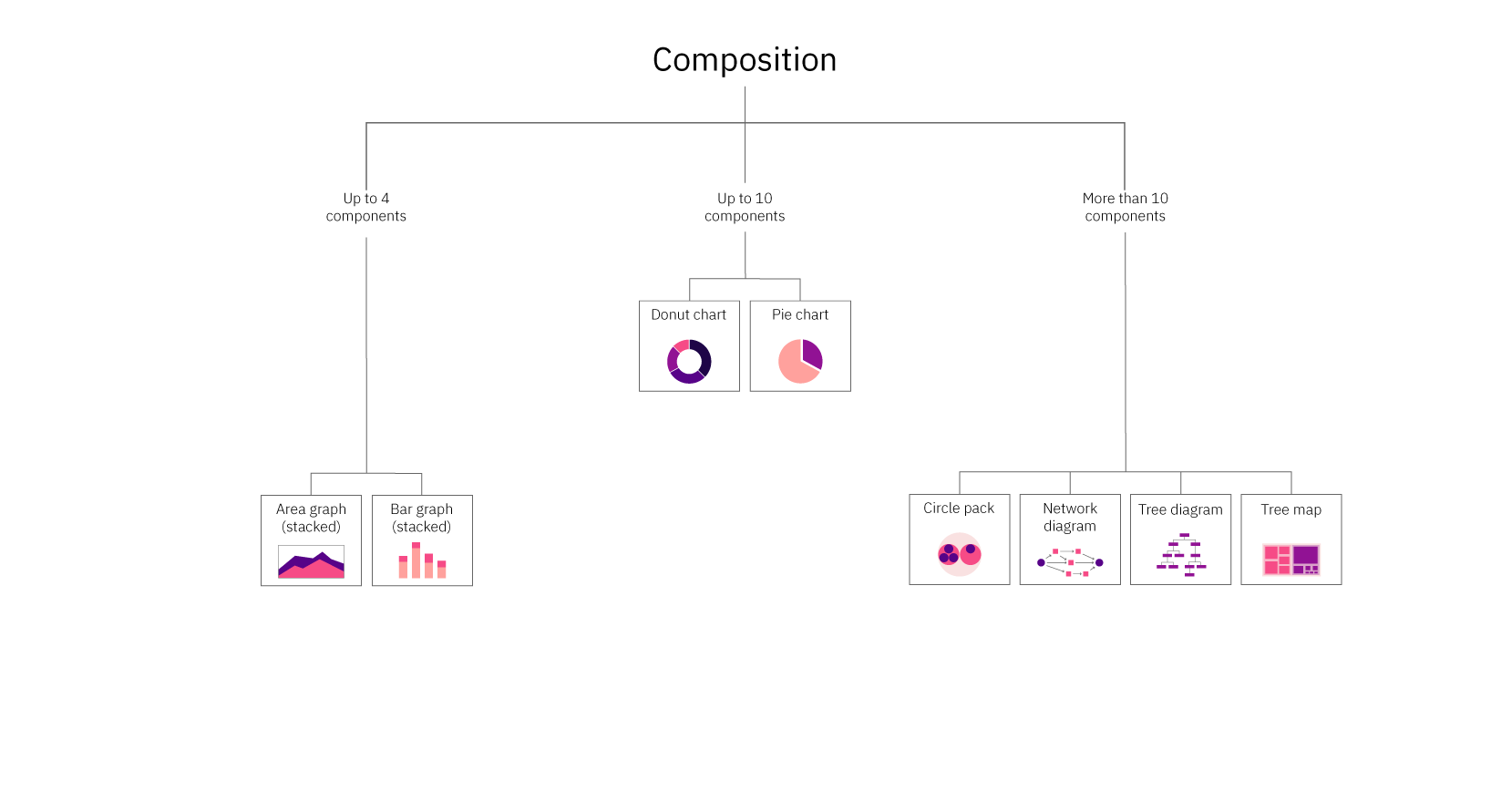
Composition charts include area graphs (stacked), bar graphs (stacked), circle packs, donut charts, network diagrams, pie charts, tree diagrams, and tree maps. To learn more about each of these charts, check out the Chart reference guide.

Distribution

Where do the values in a data set fall? Are there outliers?

Example: Communicating the distribution of grades within a middle school class, including the average and outliers.

Distribution charts include alluvial diagrams, bar graphs (floating), box and whisker plots, bubble graphs, bullet charts, circle packs, choropleth maps, connecting line maps, histograms, proportional area charts, proportional symbol maps, scatterplots, and word clouds. To learn more about each of these charts, check out the Chart reference guide.

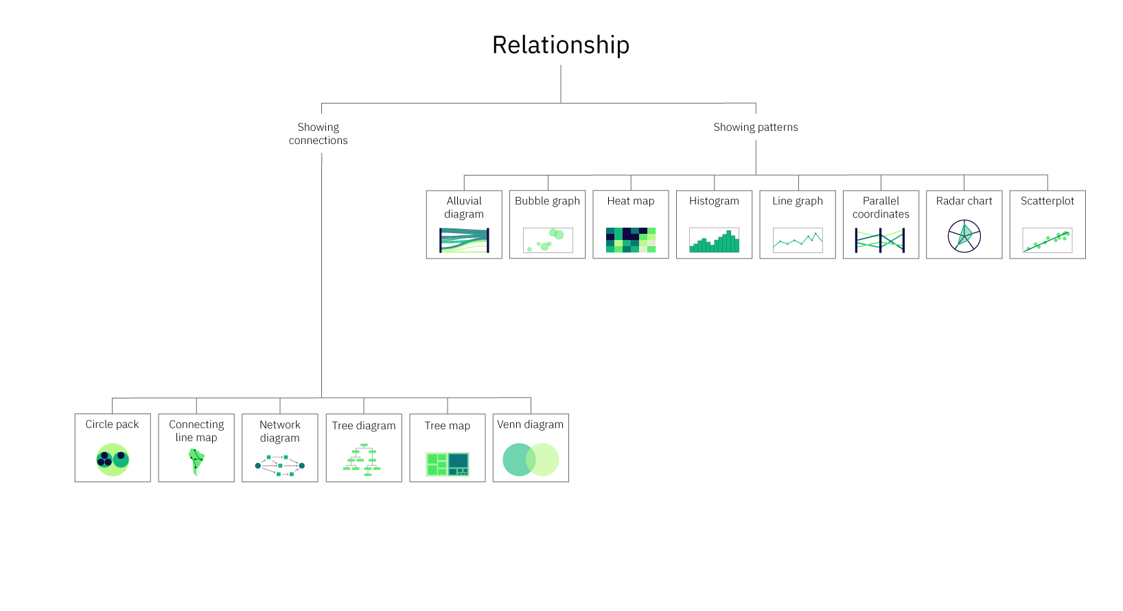
Relationship

How do the elements relate to each other? Is there a correlation?

Example: Showing how colder temperatures are correlated to fewer ice cream sales.

Relationship charts include alluvial diagrams, bubble graphs, circle packs, connecting line maps, heat maps, histograms, line graphs, network diagrams, parallel coordinates, radar charts, scatterplots, tree diagrams, and venn diagrams. To learn more about each of these charts, check out the Chart reference guide.

Some chart types fall into multiple categories. For instance, tree diagrams can provide information both on what elements make up a category and on the relationships between those elements. A classic example is a site map. Site maps communicate a list of the pages within a site (composition) and the relationships between the pages.

A donut chart is another good example. Figure 5 shows the results of a second-grade class being asked what their favorite animal is.

Not only does Figure 5 give you a complete listing of the favorite animals selected by the class, but it also allows you to compare the popularity of those animals. Thus, it achieves both comparison and composition.

Multi-purpose charts don’t have to be used for multiple purposes, but when you do want a single chart that can do more than one thing, these types of charts can be a good choice. You can learn more about which chart types are multi-purpose, including what types of variables they use in the Data visualizations table, one of two resources provided as a companion to this article (reference Figure 12).

Knowing what the purpose of the data visualization is will help narrow the options down significantly. If you find that you have multiple purposes and/or messages that can’t be communicated in a single multi-purpose chart, consider using multiple charts, especially if your audience is less familiar with data visualizations and may have trouble reading a more complex chart type. For more information on different chart types, including their purpose, when to use each, and an example, refer to the Chart reference guide.

That brings us to the next consideration in choosing a chart type — audience.

Who Is The Audience?

Knowing your audience is key to effective communication. For our purposes, knowledge about your audience will be immensely helpful in both selecting the type of data visualization you’ll use as well as deciding various aspects of the design.

When considering your audience, it’s important to think about things like:

  • How familiar they are with the subject matter of your data.
  • How much context they already have versus what you should supply.
  • Their familiarity with various methods of data visualization.

This information should help inform your selection of chart type. For instance, some data visualization types are quite complex and should only be used with high-level experts in the field and/or individuals who are very familiar with data visualizations. For more information on which chart should only be used with this type of audience, refer to the “When to use” sections of the reference guide. The following is an example of one set of data communicated with two different chart types.

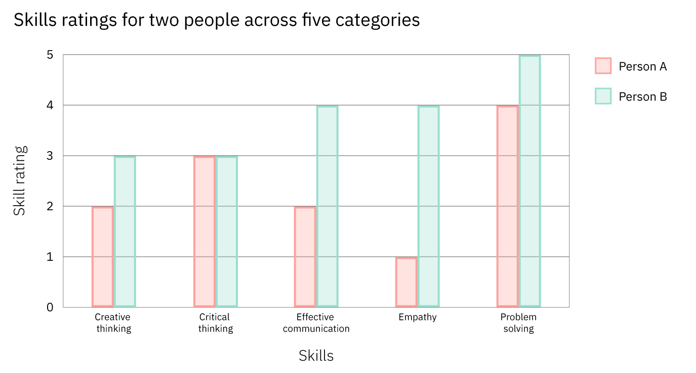
Both charts communicate the same skill ratings for two individuals across five categories. Figure 6 uses a radar chart. While these can be a good tool to communicate comparative data, many audiences aren’t familiar with this chart type or with the circular format in which they present the data. As such, Figure 6 may be more difficult for many people to read than Figure 7.

Figure 7, on the other hand, uses a grouped bar graph to display the same data. Since grouped bar graphs are familiar to most people regardless of their familiarity with data visualization, it’s more likely to be easier to understand by a larger audience.

If you’re wondering, “Why not always opt for the simpler chart type,” you’re not alone. Simplicity is key, but it should be looked at from the perspective of the bigger picture. Some chart types, while more complicated for a general lay audience to understand, communicate information more successfully for audiences that are familiar with them. This is evident in Figures 6 and 7. While radar charts are likely more difficult for a random person to read, in this case, the radar chart, for someone who can easily read it, does a better job of allowing for a comparison across the two people.

Considering your audience will be important after you’ve selected your chart type as well. For a general audience — not composed of experts — you should use simple, straightforward language and avoid using jargon or technical terminology. Additionally, for general audiences without a lot of background knowledge on the topic of your data, you may want to include more contextual information before introducing the data visualization or provide context and additional information within the visualization.

A stacked area graph is a good example of this. Stacked area graphs are like simple area graphs. The difference is that they show two or more data series stacked on one another. Each data series after the first one starts where the one before it ends. In other words, if point A for data series 1 stops at $18 million, then point A for data series 2 will begin at $18 million.

For this reason, they can be a bit confusing if you’re not familiar with them, and if they aren’t labeled, reading them can require some math. However, the benefit of using them is that they show the values for each series as well as the totals (for each point, the top of the stack is the total). Figures 8 and 9 demonstrate this.

Both Figures 8 and 9 show a stacked area graph with the same data. However, Figure 9 provides additional information by labeling the values for each region for each quarter. This not only eliminates the need for the audience to calculate the figures, but it also helps to illuminate a characteristic of stacked area graphs. Because of the way they’re laid out, it can be difficult to compare the values for the different data series (in this case, regions) at a single point, for instance, Quarter 1. Adding the values to the graph helps with that. However, it’s not always a good idea to label every element in a graph. Doing so with large data sets often results in a graph that’s overcrowded and harder to read (see Figure 10).

By this point, the types of charts still under consideration should have narrowed significantly based on your message, purpose, and audience. Based on your remaining options, it’s now largely a matter of matching up the details of your data set, including the type and number of variables for the remaining options.

What Type And Size Of Data Am I Working With?

There are different types of data and variables:

  • Quantitative: numerical (like population size or temperature).

    • Continuous: numerical data can take any value between two numbers (ex: weight or temperature).
    • Discrete: numerical data that, unlike continuous data, has a limited number of possible values and includes finite, numeric, countable, non-negative integers (ex: the number of people who have been to space).
  • Ordinal: non-numerical data that has a natural order (ex: days of the week or spiciness levels on a menu (mild, spicy, very spicy)).
  • Categorical (aka nominal): categories that don’t have an inherent order or numerical values (ex: oak, ash, and elm trees; pink, purple, and blue).

Knowing what type of data you plan to use in your data visualization will help you eliminate some chart types. For instance, if your data consists of a categorical and a quantitative variable, you can’t use a histogram because they show frequency and quantitative variables split into intervals.

Similarly, the size of your data set can help you to eliminate some chart types. Certain data visualization types like bar graphs and pie charts only lend themselves to being used with a small set of data. The reason is that charts should communicate a message in a way that’s easy to understand. A bar graph with eighteen bars or a pie chart with twenty slices is not going to be easy to read. However, there are chart types that can be used with large data sets. Figures 10 and 11 demonstrate this.

Both charts are based on the same data, but when presented as a pie chart, the information takes longer to process than when presented in a table. Because the pie chart has so many slices, it’s not possible to label each one with the movie title, so we have to use a key. This means that the audience will have to keep scanning from right to left over and over again to look from the key to the pie chart. The table, on the other hand, has the number of votes presented beside the movie title, making it easy to understand not only the popularity of the movies but the exact number of votes each one received.

For more information on which charts work with large data sets and other information about over 30 of the most popular chart types, refer to Figure 12.

Conclusion

We’ve covered the most important considerations when choosing a chart type, as well as what to look out for. To learn more about data visualizations, refer to the resources linked at the bottom of the article.

Hopefully, you now feel empowered with the knowledge you need to create a stellar data visualization! If you want to try out some of the tips in the article and don’t have a data set to work with, you can browse sites like Kaggle, World Bank Open Data, and Google Public Data Explorer. As a final reminder, keep it simple and focus on your message — you’ve got this!

Resources

General Info

Narratives And Data Visualization

How To Choose A Chart

Design Tips For Data Visualizations

Data Visualization Inspiration

Ethics And Data

Categories: Others Tags:

Top 12 WordPress Themes for 2023

January 5th, 2023 No comments

You may have an excellent business plan together with a good product or service to sell. But, the look and feel of your digital storefront doesn’t perfectly represent your brand. Then it simply isn’t going to contribute all that much to your business’s success.

That’s what makes WordPress such a vital element when building your website. WordPress’s website building tools and themes can give you what you’re looking for in your quest to achieve a seamless user experience.

There’s certainly no shortage of good WordPress themes out there. Themes that offer layouts for blogs, portfolios, an online store or a digital presence for a business.

Finding a top-quality WordPress theme can be a challenge. The following selection of 12 top WordPress themes for 2023 should make it easy for you to find one that best fits your needs. 

  1. Be – Multipurpose WordPress Theme

BeTheme is a supremely popular (250,000+ customers) multipurpose WordPress theme that features 40+ core features that gives users quick and easy access to an impressive array of powerful site-building tools, design aids, and options.

This, the biggest multipurpose WordPress theme of them all, features the responsiveness, flexibility, and performance you need to create websites that will showcase your business while leaving the competition in the dust.

  • Be’s library of 650+ customizable, responsive, and UI friendly pre-built websites make website building quick and easy
  • Be’s fast and user-friendly Be Builder enables you to view each element while customizing it
  • With Be’s WooCommerce Builder you can create shop and single product page layouts that feature impressive customer-centric options including product previews and sticky menus
  • The BeBuilder, Header Builder, Shortcode Generator, and a ton of design options give users all the flexibility they may need

BeTheme is Elementor ready, it is updated frequently, and its owners receive free lifetime updates. Click on the banner to find out more about this amazing theme’s powerful core features.

  1. Total WordPress Theme

Being able to easily create a website that does justice to your business is naturally a good thing. Being able to build your site your way makes everything even better, and that is what the Total WordPress theme does for you.

  • This aptly named theme features 50+ ready to use demos, 90+section templates, hundreds of live customer settings, and 100+ site builder elements together with an extended version of the WPBakery page builder.
  • Slider Revolution is included. Total integrates seamlessly with WooCommerce and features a multiplicity of WooCommerce styling options.
  • Layout options include boxed and full-width layouts, dynamic layouts, one-page sites, page and post designs, and advanced page settings
  • Total is compatible with most popular plugins, including bbPress, Uber Menu, Easy Digital Downloads, WPML, Yoast, and Ultimate Addons.

Click on the banner to learn more.

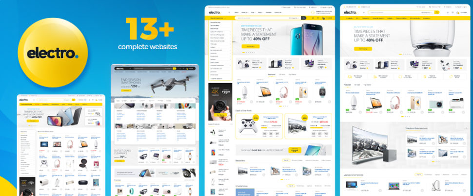
  1. Electro – WooCommerce Theme for Affiliates, Dropship and Marketplace Websites

The Electro WooCommerce theme gives you a complete design platform from which you can take your design vision and transform it into a pixel-perfect website. To help you along, Electro provides selections of home pages, dedicated mobile layouts, and multi-vendor marketplace pages.

  • Visual Composer is the page builder/editor of choice
  • The intuitive Admin Panel provides a choice of innovative WooCommerce layouts to showcase your product, show reviews, and add accessories that simplify user checkout
  • Choose from 9 awesome pre-defined colors, easily change, and arrange them, or make your own.
  • Electro features fast (1.25 sec) page loading times.
  • Electro was created for affiliate, dropship, and marketplace sites and is compatible with WPBakery and Elementor page builders.

Click on the banner to find out more. Be prepared to be impressed.

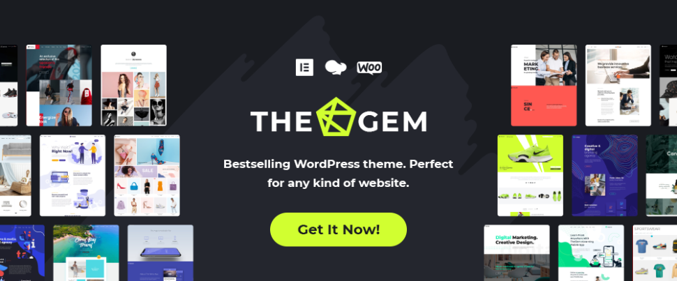
  1. TheGem – Creative and WooCommerce WordPress Theme

TheGem is a versatile creative WordPress theme with unlimited customizations, plenty of design & marketing focused features, collection of 400+ pre-built websites and fastest loading times.

  • TheGem’s versatile Theme Builder enables you to build every part of your website with Elementor or WPBakery
  • TheGem Blocks feature will speed up your site-building with huge library of 600+ page sections
  • Extensive toolbox with WooCommerce Builder, AJAX filters, advanced product grids will help you to create any kind of online shop

You’ll love the 5-star user support, as have 60,000 others. 

  1. Vault – Multi-Purpose Elementor WordPress Theme

Vault has no problem living up to its claim of being a next-generation website builder, starting with upscale selections of 50+ full websites, 1200+ templates, and 230+ premium widgets

  • Add the next-generation Theme Options Panel plus beautiful interactions and animations.
  • This theme’s interactive design tools and customization options will also impress.

The Vault framework enables you to easily create an outstanding online presence that features customer-engaging pages. 

  1. Uncode – Creative & WooCommerce WordPress Theme

This creative WordPress theme has everything you’ll need to build incredible websites and WooCommerce online stores. Uncode’s features include –

  • 70+ professionally crafted and easily importable pre-made designs you can mix and match to your heart’s desire
  • 500+ wireframes sections, an advanced Drag and Drop builder, shop layouts, and configurable Ajax product filters

Uncode’s 100,000+ sales have made it an Envato top seller. 

  1. Blocksy Free Ecommerce WordPress Theme

Blocksy is a free eCommerce WordPress theme that also gives you lightning fast performance, is completely eCommerce ready, and is absolutely loaded with intuitive website building features.

  • Blocksy’s Content Blocks features allow you to insert a piece of content anywhere throughout your site.
  • Blocksy’s Header Builder, Footer Builder, custom post types, dynamic data support, and content blocks provide all the flexibility you’re apt to need.

White Label is also offered. 

  1. Avada WordPress Theme

Avada is the #1 best selling WordPress theme of all time, which might suggest there is really nothing more to say about why it would make a good choice.

Still, checking out Avada’s website is the best way to see for yourself what this Swiss Army Knife of WordPress themes has to offer like its –

  • 400+ pre-built web pages
  • 120+ design and layout elements

And not to forget, its 750,000 happy users. 

  1. Rey WordPress WooCommerce Theme

The innovative Rey WooCommerce theme is loaded with user-friendly features and is performance oriented, developer friendly, and easy to use.

  • Rey features the popular and powerful Elementor page builder together with a useful selection of Elementor widgets that will cover almost any situation
  • Quickview, Ajax search, and smart search help site visitors find exactly what they want
  • Headers are eCommerce customized, and site visitors will love Rey’s advantageous shopping cart, wish list, and checkout features.
  1. Impeka – Creative WordPress theme

Impeka gives you complete freedom to build an engaging website that is user friendly, fast, fully responsive, and professionally optimized for SEO.

  • Impeka-built websites get noticed by the right people and give them what they want.
  • Choose Elementor, Gutenberg, or the enhanced WPBakery as your page builder.
  • Build an online shop with WooCommerce.

You can select among Impeka’s 37+ detailed demos to get a project underway.

  1. KnowAll – WordPress Knowledge Base Theme

KnowAll, the #1 knowledge base theme for WordPress, gives you a powerful tool for building an intuitive to work with knowledge base.

  • KnowAll’s advanced analytics lets you gain valuable insights into what your visitors are looking for and how they go about it.
  • KnowAll gives you a better perspective as to what content visitors find useful from the feedback they provide.
  • KnowAll can be personalized to match your company’s brand.
  1. XStore – WooCommerce WordPress Theme

XStore has provided users with an easy approach to building online stores from the get-go. An Envato favorite for the past 10 years, XStore gets projects off to a rapid start with its –

  • collection of 120+ awesome shops and multi-vendor marketplace building tools and features
  • high converting eCommerce features
  • header and single product page builders together with 60+ Elementor widgets

*******

The top WordPress themes that have been included in the above listing share a number of things in common.

Each features high quality designs, plenty of customization settings and options. Also, other useful features that have been incorporated with success in mind.

These top WordPress themes are popular for a reason. They make it easy to get the job done and get it done well. They are truly the best of the best.

No matter your choice, you will not be disappointed.

Read More at Top 12 WordPress Themes for 2023

Categories: Designing, Others Tags:

Experts’ Advice on eCommerce Website Design

January 3rd, 2023 No comments

E-commerce came along with the advent of the internet as marketers soon found the secrets of marketing using digital platforms. The E-commerce industry never looked back and is bestowing companies with huge profit growths that use e-commerce websites for their business.

It also means that competition is tougher than ever. If you run an e-commerce website or are thinking about starting one, you should know the ingredients of a successful online presence.

One of the most important ingredients in the recipe for e-commerce success is website design.

Do you know that 78% of customers want e-commerce stores to add more pictures to their product pages? 

Shoppers prefer user-friendly and attractive websites with neat and detailed product pages along with clear images of the products. 

We researched what web design experts recommend for e-commerce websites and created this piece. Without further ado, let’s start learning e-commerce web design together.

Expert Tips to Design A Successful E-commerce Website?

1- Use the Magic of Simplicity

Designers often love to include numerous engaging features or visual aspects to a website. But these may overwhelm the visitors and repel them.

Simplicity is the key to any website design, especially for e-commerce. Put yourself in your customers’ shoes and think about how you would like your website to look and feel.

As everybody is busy these days, you want to reach your desired product ideally in one or two clicks. Too many buttons, menus, and content on the homepage might feel mind-boggling to you.

Similarly, you would love to have a proper navigation menu on the website from which you are shopping to ensure seamless navigation. And surely, you would hate annoying pop-ups appearing on your face now and then.

Though your marketing team may tell you these pop-ups are necessary, it’s your duty to keep your site’s design clutter-free and viewer-oriented. Neglect of this can result in abandoned carts and loss of revenue.

Aspects of Neat Web Design

  • Readable and unpretentious fonts
  • Scimmable content
  • Use of complementing colors
  • Easily visible navigation elements
  • Seamless navigation of product categories

2- Let Pictures Convert Visitors

Any website design is incomplete without a color palette and images. But only a few web designers know how to leverage them to impress visitors and turn them into customers.

We are going to teach you how to do that. Firstly, adorn your site with top-quality large pictures of products to let them do the job of the sales guys.

They say a picture is worth a thousand words, and you will notice it’s true in web design too. Need proof? Images boost conversions by up to 40%.

A 360 product view allows shoppers to move the product around using their mouse. Shoot your products’ images with a white backdrop to increase clarity. Include products clicked from various angles with closeups to help the visitor get a near-physical experience. 

3- Choose The Color Scheme Wisely

Customers can’t touch, feel or view the product online like they can in physical stores. Thus, you should try to make up for that live experience using color psychology.

Believe it or not, colors can increase your conversion rate. For example, your CTA button’s color should be high-contrast with other colors on the page.

A case study conducted by Dmix showed that a red-colored CTA button can boost click-through rates by as much as 34%.

Pick colors that are in line with the taste of your target audience. People in some countries believe blue invokes trust, while some think red indicates passion, danger, and energy. 

Sit with your team and set your brand’s tone if you don’t already. The colors in your website design should represent your brand tone which can be serious, eccentric, or playful. 

Also, you should align your site’s color palette with your brand value. If you sell high-end items, you might want to use gleamy golden or shiny black colors to indicate luxury. 

You may use hues to offer futuristic or classic vibes to convey your brand voice. These points may seem minor, but they can make a huge difference in inspiring consumers to take action. 

4- Optimize E-commerce Website Design for Mobile

Most people nowadays use the internet on their smartphones, so a website that functions disastrously on mobile devices can take a toll on your sales.

Generation Z and millennials, especially, shop using their mobile devices and want lightning bolt speed of websites. Not convinced? A study suggests that a website loses 25% of visitors within 4 seconds of load time.

Many people browse the internet exclusively on their mobile devices as they don’t own laptops or computers. If you want to retain your target customers among those people, ensure your site is mobile-responsive.

Your website should fit all sizes of mobile screens instantly, and pictures should look as clean as they do on desktops. Check if the buttons and menus are working fine, and as effortlessly as they do on laptops, especially on the checkout page.

How do we achieve this responsiveness? Say no to maximal web design and add each element thoughtfully. Images should be in file formats that contain as fewer data as possible.

We recommend using JPG format and avoiding enormous PNG files as they increase loading time. 

4- Design The Checkout Page for Simplicity and Smoothness

Have you ever visited an e-commerce website where you reached the checkout page to buy something and found a long data form?

How did you feel at that time? You might feel agitated as nobody has time to fill numerous information fields when they ditch physical shopping only to save time and retain their peace of mind.

It is how your customers will feel if you don’t optimize your checkout page’s design. If you are anything like us, you might not want to create an account when you try to purchase a product from a platform for the first time.

Many potential customers abandon their carts if they can’t checkout as a guest, and the business loses a first-time potential customer. Ask your designers to add as few information fields as possible to the checkout form and clearly label them.

Also, the design should include a product preview with a description in the cart, so buyers can recheck what is in their cart.

Mention the shipping options, their fees, delivery, or other charges above the fold to build trust. Also, keep the link to your return and refund policy at the top so that shoppers know if and when they can return an item, whether they get a refund, and in what conditions.

Bottom Line

You see that designing your e-commerce site to win is not at all difficult. You only need to apply a few simple tips to outperform your competitors.

Keep in mind that you still need to keep testing multiple variants of designs and improving according to customer feedback. Your e-commerce store should look tidy and simple yet alluring to catch visitors’ attention. Functionality is the most essential aspect of e-commerce websites, and design plays a big role here.

A well-thought-out design can incite emotions in the viewers and compel them to hit the buy button. Intelligent web design can elevate user experience, increasing sales and conversions.

The post Experts’ Advice on eCommerce Website Design appeared first on noupe.

Categories: Others Tags:

6 Predictions for Web Design in 2023

January 2nd, 2023 No comments

Welcome to our annual guessing game of what the next twelve months will bring.

As ever, the design world isn’t isolated from the world in which it exists, so when events shape our lives, they impact our work, the work clients ask for, and the work that inspires us. According to Collins Dictionary, the word of the year for 2022 was permacrisis. And frankly, 2023 doesn’t look any less turbulent, with some good and some bad things already on the horizon.

Russia seems all but certain to retreat to Crimea and claim its objectives in Ukraine have been achieved; Ukraine may not accept that end, but it will probably be enough to end sanctions against Russia, which will significantly impact the economy worldwide. Brazil may have been forced to watch Argentina lift the FIFA World Cup, but it has a new (old) president and fresh hope for the survival of the Amazon rainforest. Crypto has weathered a series of storms (although there may be more to come), and historical precedence suggests the bear market has run its course; 2023 will see stagnation, with an upward trend taking hold toward the end of the year. The former Pope has died, potentially paving the way for the retirement of the current Pope and the election of a new Pope, bringing with it either renewed liberalism or renewed conservatism to the world’s largest religion. Oh, and the IMF thinks a third of the world will be in recession at some point in 2023; the UK and Russia already are, and policymakers in the US are looking nervous.

And that’s just the obvious. Of course, there will be surprises, too, because there always are.

Against this backdrop, designers must not only navigate a problematic jobs market but produce designs that respond to the needs and desires of their clients’ users.

How Did I Do in 2022?

Before diving into this year’s predictions, let’s take a look at how I thought 2022 would play out.

I predicted that 2022 would be the year of blockchain, with decentralized data storage taking over. Well, I got the decentralized part right, but not so much the blockchain aspect (feel free to tell me I’m wrong on Mastodon because I’m not checking Twitter anymore). I’ll call that half a point.

I said design would be positive, playful, and accessible. I think design did emerge from its obsession with corporate minimalism, but positive and playful? Unfortunately, I’m calling that a miss.

I said everything would be green. Again, that’s a miss. If there was a color for 2022, it was a pink-purple gradient.

I predicted hero text would replace hero images, and in the third quarter of 2022, that’s exactly the trend we saw; tick.

Finally, I suggested that illustration would adopt a grainy texture. Well, some designers did, but it was hardly a dominant trend, so I’m going to have to call that a miss.

So for my 2022 predictions, I scored 30%. Way worse than last year’s clean sweep. Let’s see if we can’t beat that in 2023…

1. We’ll Stop Freaking Out Over AI

By now, you’ve probably tried AI, freaked out, and Googled how to start a small holding in the mountains.

The truth is that AI is just a tool. And a good one at that. AI is really good at derivative work. But it’s entirely incapable of improvising, holding opinions, having an agenda, or thinking outside the box.

AI will not replace your job — unless your job is deleting the background from photos, in which case it already has. Since when did Stephen King get replaced by a spellchecker?

If you haven’t tried an AI tool yet, I’d encourage you to try it. It does the small repetitive tasks well.

2. We’ll Embrace the Real World

One of the reasons AI can’t be creative is that it doesn’t have the same number of input sensors we have. We can smell, hear, feel, and experience the world in a multitude of different ways.

Most of us spent a year in lockdown working remotely. Then rushed back to the office, only to discover that our teamwork didn’t actually improve. With the worsening economic outlook, big companies are looking to budget, and the simplest way to cut costs is to ask staff to work remotely.

When your commute is a five-second walk to the spare bedroom, you find yourself with more free time. Sure, you could probably learn Python, but wouldn’t you be happier learning to paddleboard?

As we open ourselves to new experiences, our design work will inevitably become more diverse and natural.

3. We’ll Reject Brutalism

It had a good run, but Brutalism isn’t a good fit for most UI projects. The trend of 2021–22 will vanish as quickly and as unexpectedly as it arrived.

4. We’ll Reject Darkmode

It has had a good run, and dark mode is a perfect fit for most UI projects. But we’re all kinda sick of it.

I hope I’m wrong about this one; not only is dark mode genuinely better for both your eyes and the environment, but the rich, warm blackness is the perfect antidote to sterile white corpo-minimalism.

Dark mode options are built into our OS, so it’s doubtful that it’s going to vanish anytime soon. However, dark mode as a design trend for its own sake is probably on the wane.

Typically trends come and go in symmetrical waves. Dark mode has been a dominant trend for years, so it should take as long to vanish completely.

5. We’ll Embrace Personal Retro

Every year we get the exciting job of guessing which decade the zeitgeist will rip off next. Will 2023 be the year of ’80s retro, ’90s retro, ’00s retro, or maybe (somebody shoot me) ’10s retro?

The retro trends we’ve seen over the last few years have been poor pastiches of their associated decades. If last year’s ’90s retro was inspired by the ’90s, it was a ’90s someone else was living.

In 2023 we’ll move beyond someone else’s ideas of what the past was like, to a personal vision of what came before. One in which the sunbleached colors of eternal Summers in the suburbs dominate.

6. We’ll Fall For Borecore

We’re all guilty of designing with our egos from time to time, and there is a tendency to hit users between the eyes with the biggest type, the loudest gradient, and the flashiest animation.

If you truly want to impress users in 2023, stop inserting pop-ups, adverts, cookie notices, and the other extraneous detritus that stops them from doing whatever it is they arrived on your site for. Impressing users in 2023 means clean typography, low-distraction art direction, and helpful content. Boring design just isn’t as boring as it used to be.

In 2023, the best thing designers can do for their users is get out of the way.

Happy New year! We hope it’s a good one.


Featured image by myriammira on Freepik

Source

The post 6 Predictions for Web Design in 2023 first appeared on Webdesigner Depot.

Categories: Designing, Others Tags: