Archive

Archive for February, 2023

How to Set Up a Community Platform for your Product

February 27th, 2023 No comments

To convince people to try your solutions, you can’t simply pitch them your product and expect it to work. 

Customers don’t make buying decisions on a whim anymore. So, despite the brilliance of your marketing campaigns, it’d be difficult for you to dictate the buying decisions of your target audience by defining what’s best for them.

Around 50% of customers prefer brands that offer inclusive experiences. And that’s why businesses today strive to engage their respective audiences via two-way communication rather than sending bland marketing messages.

This is where the concept of a community comes into play. Building a community enables you to engage your respective audience by helping them find answers to their questions or the information that they seek.

With a community built around your product, you’re not pitching your product directly to your customers but rather catering to the concerns of the intended audience and helping them find a solution fitting their needs.

This helps you gain the trust of your target audience and build authority in your respective niche.

Here’s how you set up a community platform for your product.

Set Clear Goals

The first step to creating a community for your product is identifying what you wish to achieve from it and setting clear goals in accordance with that.

There can be multiple goals that you pursue but it’s highly recommended that you keep the list short. This will make it easier for you to translate your efforts into outcomes and gauge the impact of the community in general.

For this, you’d have to design and deploy well-thought-out key performance indicators to assess the value generated by your community and its contribution to the buyer’s journey.

Since we are setting up a community for a product, the core objectives here would be getting traction from a relevant audience and capturing quality leads to fuel conversions.

Furthermore, you can also minimize churn and maximize retention by addressing the queries and concerns of the existing customers through your community.

Define Community Guidelines

When creating a community for your product, it’s essential to lay out some ground rules to be followed by members or participants.

For this, you’d need a team of trusted and reliable moderators whose responsibility would be to make sure that the rules are justly implemented and followed by community members.

The goal here is to create a platform where your current and potential customers can interact and share their experiences concerning your product. This is user-generated content and it has the power to influence the buying decisions of 90% of customers.

However, for this to work, you have to ensure that your community is an ideal place for healthy interactions and discussions about your product by implementing certain rules.

The rules would apply to members, moderators, and other administrative roles in the community clearly defining the do’s and don’ts of community participation and management.

Select Community Type

Before setting up a community for your product, you should select the type of community best suited to your needs.

There are two types to choose from. The first one is a social community platform. Here, you leverage social media platforms like Facebook or Reddit to create a community around your product.

The second type is becoming a branded community platform. Here, you don’t rely on third-party platforms but rather create an independent community.

There’s no right or wrong here as there are pros and cons associated with each type you choose to go with. So, it all comes down to which method serves you the best.

You’re not charged a single penny for leveraging social media platforms to build your community. So, creating a community can be cost-effective. Plus, Facebook alone has over 2.45 billion active users – making it easier for you to reach out to the masses.

However, there’s a flip side to this. You’d have minimal control or authority over things as you may be the owner of your community but you don’t own the platform it’s hosted on. So, you’d have to play by the rules set by platform owners to keep things going.

The same goes for the second option. Setting up an independent community can be costly and may require a lot of effort to attract new members. However, you’d have complete control and authority over the platform.

You can also choose to go with both options. However, managing an independent and social community at the same time can be overwhelming. So, it all depends on what your requirements and preferences are.

Define the Roles

If you’re a startup or just getting started with your business, you can create a community from the ground up and start managing it yourself. Here, you’d be wearing multiple hats and be the only stakeholder.

However, as your operations grow, you’d have to create different roles for your community to keep the needle moving.

This generally happens when you realize that you’re spending more time managing your community than growing your business. So, it’s best that you start delegating.

You’d need moderators for your community from the get-go. For this, you can turn to your reliable veteran community members and assign the said roles. However, to grow your community and manage its operations, you may need to hire a community manager.

You’d also have to engage personnel representing your marketing, sales, and support teams. The marketing team would be responsible for promotional activities, sales personnel would be striving to generate and convert leads, and the support team would be catering to product queries.

Set Up the Community

With the completion of all aforesaid steps, the setup process for your community officially begins.

As per the set parameters and the options you’ve chosen to go with, you’d start setting up your community as an independent entity or by leveraging a third-party platform. In either scenario, here are a few things to consider when setting up the community:

  • Tell people your story
  • Showcase the community’s essence by adding a brief description
  • Add contact details
  • Add a cover image with your message, tagline or visual identity. 
  • Add community guidelines
  • Add answers to FAQs
  • Add an announcement section
  • Add tags for relevant topics
  • Display association with your business page or site
  • Add call to action
  • Test the signup process
  • Setup onboarding or welcome messages

Activate the Community

When you create a community for your product, you don’t just set it up and leave it there. You have to activate it by engaging a relevant audience. And for that, you’d need a stellar content strategy.

According to 72% of marketers, content creation is the most effective SEO tactic. So, it enables you to get noticed and bring traction to your community organically, especially if it’s an independent platform.

Content not just helps you attract new members but also keeps the community alive by facilitating discussions among the members.

Just ensure that the content you share in the community is relevant and exclusive. This would make people stay active in the community and keep coming back for more.

It’s a Wrap

There you have it. The 6 easy steps for you to set up a community platform for your product. Creating a community around your product enables you to connect with a relevant audience and generate awareness.

So, it’s highly recommended that you have one and with the aforesaid steps, you can easily get started.

The post How to Set Up a Community Platform for your Product appeared first on noupe.

Categories: Others Tags:

3 Essential Design Trends, February 2023

February 27th, 2023 No comments

There’s a common theme in this month’s collection of website design trends – typography. All three of these trends showcase popular type elements that seem to be exploding in popularity.

Here’s what’s trending in design this month.

1. Focus on Typography

Admittedly this trend seems a little vague, but we think you’ll know it when you see it. Plenty of projects are being designed with an emphasis on typography.

This includes big, bold lettering, interesting typefaces, big variances in size or color, tiny type animations, and an overall stripping of strong imagery from the screen. You won’t see many photos or videos here (and if you do, they are probably small).

After that, almost anything is allowed. And the designs are quite stunning!

These projects include all kinds of typography, from experimental to bold. (You can even find it in the new typography animation in the new design for this website in the homepage banner.)

Here are three examples of three very different directions on this website design trend:

IGZIST combines an oversized slab serif with a handwriting style that takes the whole screen. With a black-and-white aesthetic and red accent, everything has an in-your-face feel. There’s a glitch animation that also layers on top of everything to keep it interesting.

Contra Bureau combines a too-close-for-comfort headline in “CONTRA” with sideways text, a sub-headline with underlines, and multiple typefaces in a bold red and beige color scheme to make you hang on to every word. Immense contrast in style and size contribute to the effectiveness of this typographic gem.

Readymag uses an interesting typeface in a color variable animation to make you ready and get your attention. The green-on-white pattern isn’t common and is a bit of a disruptor in itself. The most graphic elements on the screen are the navigation buttons and the brackets for small text elements.

Readymag

2. Heroes with Very Little Text

This typography trend actually includes very little text. Many designers are creating hero headers with almost no text at all aside from simple navigation.

How does this work? How does a user engage when there isn’t anything to read?

The images have to be super engaging. And even then, this design style can still be a risk. Look at the examples below; is there enough to make you click or scroll?

Mathijs Hanenkamp’s portfolio site uses a big photo with a small headline in the bottom left corner. But there’s an interesting top layer with animation that makes you think are little more. Then when you realize it is for a photographer’s portfolio, everything kind of comes together.

Mathijs HanenKamp

AB Yachts has no text on the home hero besides the name brand. If you know the company, the video is probably enough to keep you going, but if not, it could be more of a stretch for unfamiliar users to continue engaging.

AB Yachts

Edlewerke focuses on an unusual image (there’s also a tiny animation here) and navigation to help you move through the site. It’s visually striking, but is it enough? Tracking analytics on a design like this would definitely hold the answer to that question.

Edlewerke

3. Serifs Everywhere

For designers that came up in the world of print, this website design trend can be a breath of fresh air – serifs everywhere!

While serifs have become much more common with websites, they still don’t come close to the usage of sans serifs. The right serifs can be beautiful and highly readable.

They can also be used in various ways to create a design with a nice focus on typography that isn’t the only focus of the design. This trend is more of a middle ground between the two more extreme examples above.

Momset uses a somewhat larger condensed modern serif for the primary headline in the hero area as well as other headers throughout the design. Color adds an extra element of interest here, and the use of space keeps this typeface readable.

Momset

Mbau goes super simple with a full-screen video that rolls behind a simple serif headline that never moves. This design feels elegant and classy, perfect for a travel site. Using “exclusive” in italics almost jumps off the screen because the design pulsates with that feeling.

Mbau

Caddis Eye Appliances uses a large serif headline and subheaders balanced by smaller sans serif elements for other text elements. What’s fun about his entire design is that it is about being different – they use the term “nonconformists” – and the serif helps exemplify that mantra visually.

Caddis Eye Appliances

Conclusion

Typography trends are an exciting design element because, depending on your brand – and style guide – you may or may not be able to take advantage of these elements. How do you balance incorporating a trend and maintaining brand identity?

There’s not always an obvious answer, but many brands do find a way to create just the right elements to keep themselves looking fresh without losing who they are. Look at your brand rules to decide what constraints you have to work within and how you can bend to be both on-brand and on-trend.

Categories: Designing, Others Tags:

5 Ways to Improve Your Marketing Project Management

February 27th, 2023 No comments

Every noteworthy CEO considers sales their business’s lifeblood; you won’t have said sales without strong marketing project management.

Ineffective marketing managers tend to tunnel their vision on micromanagement, such as content and goal creation, which shouldn’t be the case. More often than not, teams that execute different tasks with consistent levels of high efficiency generate the most increased traction.

To excel in your campaigns’ marketing strategies, we’ve compiled ways on how you can improve your marketing project management.

Initiate Your Marketing Project

You should always initiate your marketing projects with goals and requirements in mind, whether for the holidays or advertising campaigns. Below are some of the steps to do this.

Define Your Goals for Projects 

Any project, not just those concerning marketing, should always begin with goal setting. A 2022 marketing report revealed that marketing teams that set practical goals have a 376% chance of being more successful. 

This step can include general goals, such as choosing the right lead generation strategy or social media traction.

You’d also be wise to keep your goals specific, measurable, accurate, realistic, and time-bound, or SMART for short. These goal qualities ensure you don’t bite what you can’t chew.

For example, you want your current marketing campaign to increase your website’s conversion rates. Instead of simply saying that, try putting it this way: increase our website conversion rate by 75% by the third week of the project’s implementation.

Define Project Requirements

After setting goals for your project, you should now define the necessities to attain those goals. This could include staffing, software, and other logistics. You should also try to look at contingency requirements such as additional funding, as it could be handy for unexpected events.

Try inflating the number of countable necessities by a bit for emergencies. If you think you’ll need ten reams of bond papers for your posters, you can add one more in case one ream gets wet, or you misprint something.

Plan Your Marketing Project 

This step is where you include the nitty-gritty bits of initial project management, such as resource assessment, project scheduling, and task allocation.

Assess Your Resources

After you’ve defined your project’s requirements, you should check if your present resources can fill the necessities. If not, you should check for possible adjustments without compromising the quality of the outcomes.

These adjustments could come from hiring new staff or purchasing new software to accommodate your project. Think of them as investments that could benefit your company in the long run.

You should also never cheap out on crucial components of a marketing campaign since the outputs heavily reflect your company’s image. 

Seek Investments to Complete Your Project  

Of course, you’ll need funds to fulfill any type of project. There are many different types of investments that you may seek.

For example, you can try directly investing in a high-yield savings account that provides interest rates significantly more than the national average. The higher interest rates enable you to save up for your project’s long-term necessities.

Alternatively, you can opt for a conventional savings account should some of its perks, such as ease of access, be important to you.

You can also invest in a certificate of deposit (CD). This savings account is among the safest ways of investing since it pays interest to the issuing bank in exchange for holding a specific amount of money for a particular time.

CDs are particularly useful if you know that your project will go on for a period long enough for you to need some additional funds after the maturity date set forth.

Then, there are money-market funds, mutual funds that invest in fixed-income assets with short maturities and minimal credit risk. These are good if you’re looking for higher returns than a high-yield savings account with comparable risk. The short maturity also makes it suitable for immediate marketing campaigns.

Suppose you’re looking for more immediate funding solutions. In that case, you can try taking a business line of credit, a revolving loan that provides you access to a pool of money you can gradually use to cover short-term company requirements.  

You can also take other loans, such as business loans. Contrary to a business line of credit, a loan immediately gives you a lump sum of money instead of having the funds gradually.

Schedule Your Projects

Setting a timetable to keep track of things is also an effective way to manage your marketing projects. You could do this via a physical calendar in your office or a virtual calendar through productivity-boosting applications such as Trello or Google Workspace.

You should also ensure that your team accomplishes their tasks before the deadlines. You could ask your team about their initial expectations on how long they can finish their tasks, giving you a better time projection.

You can also look at past time frames to give you a better idea of how fast the team can accomplish one task. Was a two-day leeway not enough to finish a design template? Consider adding a day or more to it.

Break Out Your Projects Into Tasks

Keeping bigger tasks into bite-sized deliverables keeps your team from feeling overwhelmed. This also makes it easier to track overdue tasks and solve them as soon as possible.

For example, you could break your advertising campaign project into smaller tasks such as initial brainstorming, email creation and sending, and design creation. If this still proves overwhelming for them, keep it even smaller.

Assigning tasks to the most appropriate person should also be your team’s norm. You wouldn’t give graphic design tasks to those without experience in the field, right?

If you don’t know your team’s strengths yet, it won’t hurt to ask them directly about it. After all, including them in the planning process makes things easier for you.

You can still assign untrained teammates to tasks that they have no initial experience with. However, this can only be efficient if you schedule a training period before your campaign starts. Training them in the middle of your campaign can put things on hold. 

Execute Your Marketing Project

Once you’ve finished planning your project, it’s time for its execution. Below are some steps on how you can do it.

Create, Publish, and Share Your Content

Creating your content shouldn’t be your main focus if you’re the project manager. After all, you must have a more unmistakable look at the bigger picture. You should only direct your assigned members with what you want to see in the final content while also considering their insights. 

After refining the drafts, you can now publish them through the proper avenues. It can be a good idea to share it with your partnered companies, personalities, or retailers online. Alternatively, you can send them physical posters for distribution if you’ve included that in your marketing deck. 

Monitor Marketing Project Progress

You should keep Murphy’s Law in mind when monitoring your project’s progress. It says that “anything that can go wrong will go wrong,” and unfortunately, this is true most of the time.

Practice reviewing your marketing project’s progress every day. You can designate some members as task leaders if you have a big enough team to report daily progress. This way, you can solve a problem at its roots before it grows so much that it halts your operations.

You could also use tests to gauge your content’s effectiveness. You could try heatmap testing to show you which part of your website gets the most traction.

Try to look at the available metrics to see which content gets you the most interaction, and try focusing on that. 

Close Your Marketing Project

Once you’re content with your goals or have finished your targeted timeframe, it’s time to close your project and move on to a new one. 

Measure the Project’s Impact on Your Goals

After a closed marketing project, you should measure its effects on your company. Examine all available metrics since Day 1 and compare them with your previous marketing projects and this project’s initial goals. 

Ask yourself if you’ve met this project’s initial goals, if this project is more effective than the last one, and if there are other improvements you can work on.

Try also to see your posted content and look at what got you the highest web traffic and interactions, generated the most lead conversions, and sold the most products. If you’ve already adjusted your efforts while monitoring your marketing progress, try to compare the differences before and after. 

Taking Marketing Project Management to Another Level

Project management, more so with marketing, can be challenging. Fortunately, the tips we’ve shown you today make you better equipped to handle a marketing project. 

However, there isn’t a one-size-fits-all in project management– you’ll learn which styles suit you best along the way. Nonetheless, you’d do well to start with these tips as your framework. 

You should also remember that keeping communication lines open with your team will benefit you more than any project management tools. 

The post 5 Ways to Improve Your Marketing Project Management appeared first on noupe.

Categories: Others Tags:

Free Download: Education Icons

February 24th, 2023 No comments

Icons are essential for successful web design. They provide an eye-catching, unobtrusive way to communicate important information and improve user experience. With icons, websites become more interesting and easier to navigate.

These Free Education Icons are designed to help you add visual appeal and emphasize key ideas that complement the content of your website.

The simple, colorful modern design of these line icons make them perfect for use by students, teachers, and institutions. They’re a fun way to represent education-related topics like mathematics or chemistry. Each icon is supplied in vector format as a .ai and a .svg file, so you can scale them to fit your designs without losing quality.

Download these Free Education Icons now to add visual interest and bring life to your educational website!

Categories: Designing, Others Tags:

How To Use Recurring Emails to Bring Consistent Revenue

February 23rd, 2023 No comments

Recurring emails are an essential part of any email marketing strategy. They are a powerful tool for marketers looking to build long-term relationships for their businesses with their customers. Recurring emails keep the communication ongoing, thus contributing to recurring revenue generation. In addition, these emails are automated, that is, sent automatically at pre-determined intervals, making them a convenient and efficient way for businesses to engage with customers. In this article, we will explore the benefits of recurring emails and tips on leveraging them to scale up the revenue generated from your email marketing efforts. 

Benefits Of Recurring Or Periodic Emails 

In order to understand the purpose of a solid recurring email strategy, let’s first explore the many benefits of sending recurring or retention emails. These emails offer a wide range of benefits for businesses, including:

  1. Build Long-Term Relationships

Recurring emails allow you to build long-term relationships with your customers. By staying in touch with your customers on a regular basis, you can foster brand loyalty and trust. In addition, you can use recurring emails to share updates, provide valuable content, and offer promotions and discounts to customers.

  1. Maximize Customer Lifetime Value

Recurring emails can maximize customer lifetime value. Keeping customers engaged and interested in your brand can encourage repeat purchases and generate recurring revenue. In addition, you can use these emails to promote subscription-based products, offer loyalty rewards, and share personalized offers relevant to your customer’s interests.

  1. Save Time And Resources

Recurring emails are automated, which means they require minimal time and resources to execute. Once the email campaign is set up, you can sit back and let the emails do the work. This frees up time and resources that can be allocated to other areas of the business and strategy.

  1.  Promote Consistency

Regular communication through recurring emails helps maintain consistency, both in the timing of the communication and in the messaging. This can help build trust and loyalty with customers, members, as well as employees.

How to Leverage Recurring Emails for Maximum Revenue

  1. Use Personalization

Personalization is a key factor in the success of any email campaign. Take advantage of customer data to create personalized emails relevant to the customer’s interests and behavior. This can include personalized product recommendations, offers, and content. Personalized emails lead to higher open rates, click-through rates, and conversion rates.

  1. Offer Subscription-Based Products

Subscription-based products are an effective way for businesses to generate recurring revenue. You can offer monthly subscriptions, online courses, or software-as-a-service (SaaS) products. Recurring emails can be used to promote these products, offer discounts and promotions, and share updates with subscribers.

  1. Share Valuable Content

Email marketing goals can be achieved not only through promotional content but also by sharing content that will be a takeaway for your customers. Recurring emails should not be limited to promotional content. You can also use them to share valuable content that is relevant to the customer’s interests. This can include blog posts, how-to guides, newsletters, industry news, and educational content. Valuable content can help you establish yourself as a thought leader in your industry, build brand awareness, and keep customers engaged.

  1. Offer Loyalty Rewards

Loyalty rewards are a powerful way to incentivize customers to remain loyal to your brand. Marketers use recurring emails to offer loyalty rewards, such as discounts, free gifts, or exclusive access to products or content. Loyalty rewards help your business build long-term relationships with its customers and encourage repeat purchases.

  1. Optimize Email Frequency

Email frequency is an important factor to consider when sending out recurring emails. You should strike a balance between staying in touch with customers and avoiding email fatigue. These emails should be sent at regular intervals, such as once a week or once a month, an interval that is best suited for your business and marketing goals. You should also monitor email open and unsubscribe rates to ensure that your recurring emails are effectively communicating with your customers.

  1. Test and Analyze Results

Testing and analyzing recurring email campaigns is critical to their success. A/B testing to test different elements of email campaigns, such as subject lines, email copy, and calls to action, is an effective way to ensure better email engagement. You should also analyze your email marketing campaigns to track open rates, click-through rates, and conversion rates to identify areas for improvement.

Tips For Maximizing Email ROI With Emails 

You can leverage these retention emails in various forms, including: 

Newsletters: Many businesses and organizations send out regular email newsletters templates to their subscribers. These newsletters can be set up as repetitive emails that are sent out at a set frequency, such as weekly or monthly.

Marketing: You can set up a series of emails that are sent out on a regular schedule to promote your products or services.

Billing and payment reminders: You can send out your monthly invoice to a customer on the same day each month through automation.

Overall, these emails can be a useful tool for businesses and organizations to stay in touch with their customers on a regular basis, which can help improve communication, engagement, and ultimately conversions in the long run.

Wrapping Up

In today’s competitive business landscape, recurring emails can be the difference between a one-time customer and a lifelong customer. These emails are a powerful tool for your business to generate consistent revenue and build long-term relationships with your customers. Furthermore, by leveraging the power of email automation, you can create personalized email campaigns for your customers. 

We hope the tips shared above will help you achieve your recurring email goals. It’s time to harness the power of recurring emails and take your email marketing strategy to the next level.

The post How To Use Recurring Emails to Bring Consistent Revenue appeared first on noupe.
Categories: Others Tags:

5 Ways A Business Leader Can Inspire Action Through Speech

February 21st, 2023 No comments

“I Have a Dream….”

A line familiar to many, taken from a famous speech by Dr. Martin Luther King Jr. Taken from Dr. King’s famous “March on Washington” address on August 28, 1963, this phrase has become iconic with people looking for a better, brighter, and more tolerant future. 

Although seemingly an insignificant collection of words, this phrase and the speech it was used in have been a driving force behind those campaigning for freedom and fundamental human rights. Words can be a powerful driving force, and as a business owner, a CEO, or a manager, you too need to find the right words that motivate and boost your employees’ morale. 

A good leader knows how to inspire their followers using the power of words. and what better way to do that, than through a strong speech that inspires action? Using a mix of proper structuring and planning, hard-hitting content, and eloquent delivery, you can guarantee that your next speech will influence your audience to act the way you desire. 

The Three W’s to Writing a Great Inspirational Speech

When answering the question “How to write a speech?”, the first step is to study the three W’s – why, who, and what. Once you find the answer to these questions, it’ll help you develop a speech that will resonate with your listeners. 

Each of these three W’s, asks a few questions designed to help us figure out:

WHY?

  • Why am I writing this speech?
  • Why will my followers listen to my speech?

WHO?

  • Who is my ideal audience?
  • Who will I be representing on the dais?

WHAT?

  • What message is my speech meant to portray?
  • What would my listeners like and expect to hear in my speech?

The questions listed above cover the most important aspects required for a leader to write a speech that connects with their followers. 

Writing a Speech That Inspires Your Followers

Writing an effective speech as a leader is about two factors – making sure that the audience remembers the key points of your address, and that your words motivate them into working towards your expected action. Essentially, it is your job as a leader to ensure that your speech is exciting and structured well enough to keep the listener’s attention. 

Let’s look at a few ways you can influence your listeners and inspire them through your speech. 

  1. Find Out What Attracts Your Listeners

To understand what attracts your listeners, you need to discover their likes and dislikes. A good motivational or inspirational speech informs, educates, and, most importantly, influences its audience. If you cannot fulfill these needs, you will fail to connect with your audience. 

To create a strong copy for your speech, you need to find out what speaks to your audience. To do that, you need to understand your audience’s personality and write your speech accordingly.

Moreover, it would help if you found out where and how your speech will be shared online to structure your content in a way that will help you connect with all your audience. 

  1. Use Stories to Drive Your Message Home

Audiences today are easily distracted due to a short attention span averaging 8 seconds. Raw data and facts tend to confuse them, which quickly turns to boredom. It results in your listeners missing the point of your speech, wasting both their and your valuable time. As someone looking to inspire, having little to no impact on your address is something you want to avoid at all costs.

To make your speech engaging, use stories and anecdotes. This will help your audience remember a large portion of that information, as the stories help them relate to the speech better. In fact, a few motivational speakers and life coaches guide their followers with personal stories and anecdotes. 

To find good stories to drive your points home, talk to your followers and observe them learn stories that can help you convey your message more effectively. Tony Robbins and Gary Vaynerchuk are great personal branding examples who have built a brand around helping people through their life experiences. 

  1. Structure Your Content Appropriately

A speech is quite different from an article or an essay. Unlike a report, the most critical sections in a speech are the beginning and the end. These two sections of a speech are those where your audience pays the most attention. So if you want to leave your audience with some key takeaways, this is where they need to go. 

Moreover, speech focuses on the natural flow of language. So while you still need to be careful about the grammar and syntax of your content in an address, you can be a little versatile in structuring your speech according to your oratory style or the level of passion required for the topic. 

Short sentences, everyday phrases and words, and easy-to-follow flow are the hallmarks of good speech. Studies suggest that a speechwriter needs to dedicate at least 70% of their time writing and structuring their content to ensure that the audience likes it. 

  1. Ensure That the Speech Embodies Your Passion

An inspirational speech that motivates your followers into action is all about passion. Your audience will quickly pick up on the energy you exude during the speech, and will respond accordingly. If your words lack passion, then you cannot expect the audience to respond to them. 

Speak from the heart using simple words, add personal touches like your life stories to connect with the audience, and connect with your audience on a personal level. This will humanize you and the issue you are defending and make them more sympathetic to your perspective. 

  1. Keep Your Speech Short and To-the-point

A good speech that makes an impact is short and goes straight to the point. It ensures that your audience remembers the majority of what you say, thus maximizing the impact and efficiency of your words. 

An average speech uses short phrases and relies on passion and strategic pauses to get its point across. Essentially, this can be one of the most challenging tasks, as you need to portray your point sufficiently while being concise. 

To eliminate filler content from your speech, you need to be your own harshest critic. You need to eliminate everything that doesn’t add value to the message of the address to reduce the bulk of irrelevant content that a listener might be exposed to. 

Giving Your Speech

No matter how great a speech you write, it’ll only have the intended impact if you deliver it properly. The first thing to do to ensure a good delivery is to practice, practice, practice. This will help you remember the focal points of your speech, which will aid you in conveying those points successfully—moreover, this way, you will need to consult your notes sparingly, boosting your speech’s authority. 

Secondly, deliver your speech in front of a mirror to know your body language. Visual cues are essential in helping a listener pay attention. If you give a powerful speech, yet your body language is one of nervousness and confusion, then the audience will be able to pick up on that, and your message would not make the impact you intended. 

Many people today are scared of speaking in front of an audience. But if you focus on the two tips above, you will focus on delivering your message without worrying about what the audience thinks of you. 

Other Duties as a Leader

Remember, as a leader, you will be required to speak at various events. Your employees may ask you to speak at their weddings, or you may be asked to speak at a funeral. If you follow the simple guidelines listed above, you will be able to adapt them to all manners of speech. 

All you would need to do is look up what goes into that specific speech. There are many inspirational addresses, wedding toasts, and eulogy examples available online, which will help you understand the structure.

Ready to Deliver Your Speech?

Before you start writing your speech to inspire your employees, we suggest listening to some of the best orators from history, such as Dr. King, John F. Kennedy, and others like them. Besides being efficient speakers, they were highly effective leaders who inspired and motivated hundreds of thousands to millions of people. Doing so will help you understand how to capture your audience’s attention and get them to act the way you want, an essential skill for any business leader.

The post 5 Ways A Business Leader Can Inspire Action Through Speech appeared first on noupe.

Categories: Others Tags:

How to Choose the Right Social Media Channels for Your Business

February 21st, 2023 No comments

The first step to any successful social media marketing strategy is choosing the right channels to focus on. 

You have many different social media channels available, but adding them all into your marketing mix would be silly. This would require loads of time and effort, possibly resulting in lower-quality content that doesn’t help your brand achieve its goals. 

Instead, select a few of the most relevant channels to focus on, and you’ll create a far greater impact. 

Are you unsure where to start or which platforms will offer the best possible ROI? To choose the right social media channels for your business, consider your target audience, the type of content you plan to share, and your marketing goals. We’ll break this all down for you.

Here are some of the main considerations to make when choosing the right social media channels for your business. 

1. Establish Your Social Media Marketing Goals

Before creating a social media strategy, it’s crucial to establish clear objectives. This will help you avoid posting aimlessly and failing to achieve desired results. 

Objectives may include increasing website traffic, product sales, audience growth, engagement, or email list growth. Defining a clear social media goal helps you plan and post more effective content on relevant platforms. You can do this to achieve measurable outcomes. 

Once you have clear social media marketing goals in place, you’ll be able to choose which social media platforms best align with these goals. 

For example, if you want to generate serious B2B sales leads, LinkedIn is likely the best platform. However, if your goal is to build an engaged audience and show off your brand’s fun side, you might consider TikTok. Facebook is great for local businesses looking to gain more foot traffic. 

Start with the end in mind, and figure out what platforms can help you get there. 

2. Identify Your Target Audience 

Possibly the most important step to establishing what social media platforms are best for your brand is knowing who your target audience is. As long as you know who you’re trying to reach and what online behaviors this group has, you’ll be in a great position to reach them. 

When it comes to choosing the right social media platforms for your brand, your goal is to focus on the social media platforms that your target audience uses. Otherwise, you’ll be wasting time on channels communicating with people who won’t become customers. 

Remember, your goal with social media marketing isn’t only to build a large audience. Instead, it’s to build an audience of prospective customers who end up making sales. 

So, understand who these customers are if you’re going to know how to target them. 

A key step in establishing your target audience is to create detailed target customer personas that include your target customers’ age, interests, and online habits. This will help you align your social media strategy with the right channels. 

Then, understand the different demographics, groups, and online behaviors of the different social media channels. For example, TikTok is largely focused on a younger demographic, while you may have more success attracting an older crowd on Facebook.

3. Know What Type of Content You Plan to Share

Different social media platforms are created for different types of content. It’s important that you have an idea of what kind of content you plan to create first. This way, you’ll be able to choose social media channels that best align with your content strategy and style. 

If you post the wrong type of content on a social media platform, chances are the platform’s audience won’t engage with the content much. 

So, understand what kind of content you plan to create and choose a channel that matches this. 

For example, your content could be aimed at:

  • Introducing yourself and your personality
  • Showing customer success stories
  • Creating entertaining content o build an audience
  • Sharing client testimonials
  • Displaying product images
  • Sharing shoppable products

And so on. Each social media platform lends itself best to these different kinds of content. 

4. Understand Your Strengths and Resources

Social media marketing requires time, effort, and possibly some money too. When choosing what channels are best for your brand to focus on, it’s important that these factors align with what you have available. 

In order to be successful on social media, you need to produce high-quality content. To do this, you need to have the right resources and abilities to create this content. 

For example, some people are great at producing Instagram Reels and TikTok videos, while others are less comfortable in front of the camera. While this should necessarily limit your social media options, it should play a role in determining what channels you’ll be able to create the best content on. 

Of course, ensure you have all the resources available to create the best possible content on your chosen channels. This is essential for using social media channels that do more for your business. 

5. Consider Paid Advertising Possibilities

One of the best ways to use social media to grow your brand is through running paid advertising campaigns. All social media platforms offer versions of paid ads; some could work better for your brand than others. 

If you plan to run ads, think about what action you want to get out of the ad and what social media platforms best support this. 

For example, if you’re promoting eCommerce products, you could run shoppable product ads on TikTok or Instagram. If you’re a local business, then Facebook offers some of the best location-based ad targeting options. 

The great thing about social media ads is that the different platforms have so much data on their users, so you can get very specific about how you target the ads. 

6. Consider Special Features

Different social media platforms offer different special features, trends, and functions. For example, eCommerce stores can actually sell products on certain platforms through in-app shopping experiences. 

Instagram offers awesome content possibilities with Stories, Stickers, and Reels. Facebook is a great place to establish a local business page (like in a directory), TikTok has a unique algorithm that can help you go viral, and LinkedIn has some awesome lead-generation tools. 

Whatever your goals are for social media, consider each platform’s unique characteristics and possibilities. This could help you find the social media platform that lets you grow your brand most efficiently. 

You should also consider the different groups on social media platforms. These can be great places to find and engage with your target audience. 

7. Start Small 

Start with one or two social media platforms and build a strong presence before expanding to others. This is important because it will help you create a greater impact on your social media marketing efforts. 

If you try to cover too many channels and do too much, you might spread yourself too thin and end up not making an impact on any channel. Instead, focus on building a highly engaged audience on one or two channels, and you’ll end up gaining far more value from this. 

Remember, effective social media marketing is not about building the biggest possible audience; instead, it’s about developing a highly engaged audience of potential customers. This will greatly impact your sales, which is what your marketing strategy is about. 

8. Monitor Your Social Media Marketing Efforts

Continuously evaluate your social media strategy to ensure it aligns with your goals and meets the needs of your audience. This is important to ensure you’re always focusing on the right channels and that your strategy and social media marketing goals are on track. 

Set clear KPIs alongside your goals that you can measure, and pay attention to these over time. This will help you understand what channels are helping your brand, what channels are not offering a great ROI, and where you might want to focus more of your attention. 

By consistently paying attention to the right metrics, you’ll be able to refine and adjust your social media strategy to get better results for your business. 

Conclusion

Choosing the right channels is essential to any social media marketing strategy. Get this right, and any of your social media marketing efforts will have a far greater impact.

Research each platform’s features and demographics to determine which aligns with your marketing goals. Understand your marketing goals, and make sure that any platforms you use offer the features and functionalities you are after. Most importantly, ensure you have everything you need to create killer content on these platforms. 

This is all about marketing smarter. Forget about trying to do too much and focus on too many channels. Instead, focus on the channels that matter and produce great social media content. This is the only way to achieve true success with social media marketing.

The post How to Choose the Right Social Media Channels for Your Business appeared first on noupe.

Categories: Others Tags:

15 Best New Fonts, February 2023

February 20th, 2023 No comments

The fonts you embed in your website transform the design and can mean the difference between an extraordinary brand experience and a high bounce rate.

And so, every month, we put together this roundup of the fifteen best new fonts that have caught our eye over the past four weeks. Enjoy!

Dewey Decimal

Dewey Decimal is a modern take on the typewriter style of typeface. It’s proportional, with a large x-height and open counters, making it ideal for use on the web.

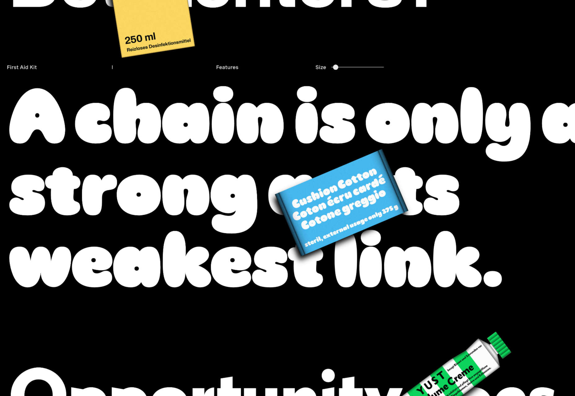
First Aid Kit

First Aid Kit is an interesting take on a typeface because each weight is a different style. It’s a smorgasbord of options that hands you plenty of bang for your buck.

Vangeda

Vangeda is a display font that’s perfectly on trend for the Art Nouveau revival that’s been gathering pace since last year. It’s ideal for branding or large print work.

Mint Grotesk

Mint Grotesk is a quirky sans serif with an extensive range of options, including stylistic alternatives and tabular figures. It’s a great workhorse and ideal for UI designs.

Ada

Ada is a contemporary calligraphic script font based on the Ruq’ah Arabic style. It includes Arabic and Latin characters and has three variations: sharp, flat, and round.

Sterlington

Sterlington is an ornate script with numerous flourishes referencing the grandiose style of the Victorian era. It’s crying out to be used on a Sherlock Holmes anthology.

Vinco

Vinco is a curvaceous serif with elegant strokes and a subtle organic flourish in letters like a, f, and y that reduces its formality, especially in the bolder weights.

Marige

Marige is a chunky serif with minutely flared terminals. Its confident but informal shape is excellent for editorial design or branding work.

Similar

Similar is a workhorse sans serif that looks pretty, well, similar to a lot of corporate sans serifs you’ve seen before, except for some lovely details that emphasize the baseline.

Ravera

Ravera is a brush script that leans into its hand-drawn look. It’s available in regular or texture, the latter of which adds a nice woodblock print effect for extra grunge.

Baste

Baste is a sans serif that was inspired by southern France, reflecting the softness of the shoreline and the edginess of cities like Marseilles.

Artusi

Artusi is a delicious serif font that’s inspired by an influential Italian cookbook writer. It’s available as a variable font, and the refined style is carried through all weights.

Parnaso

Parnaso is a high-contrast serif with fine details and a solid rhythm. Its italic is lively and playful. It’s ideal for running text, and its display variation is excellent at larger sizes.

Fitzgerald in Berlin

Fitzgerald in Berlin is a retro serif with contemporary details. Its shapes verge on the calligraphic, and it’s a solid choice for branding projects that need a touch of heritage.

Rockers Garage

Everyone loves a good brush script, and Rockers Garage fits the bill perfectly. Its clear rhythm provides excellent legibility, and the texture is nice and subtle.

Source

The post 15 Best New Fonts, February 2023 first appeared on Webdesigner Depot.

Categories: Designing, Others Tags:

Keys To An Accessibility Mindset

February 20th, 2023 No comments

How many times have you heard this when asking about web accessibility? “It’s something we’d like to do more of, but we don’t have the time or know-how.”

From a broad perspective, web accessibility and its importance are understood. Most people will say it’s important to create a product that can be used by a wide array of people with an even wider range of needs and capabilities. However, that is most likely where the conversation ends. Building an accessible product requires commitment from every role at every step of the process. Time, priorities, and education for all involved, so often get in the way.

Performing an accessibility audit can cost a lot of time and money. The results can cost even more with just design, development, and QA (Quality Assurance). An audit becomes even more expensive when considering the other heavy investment. For every role, the learning curve for accessibility can be steep.

There’s so much nuance and technical depth when learning about web accessibility. It’s easy to feel lost in the trees. Instead, this article will take a look at the forest as a whole and demonstrate three keys for approaching accessibility naturally.

The POUR Principles of Web Accessibility

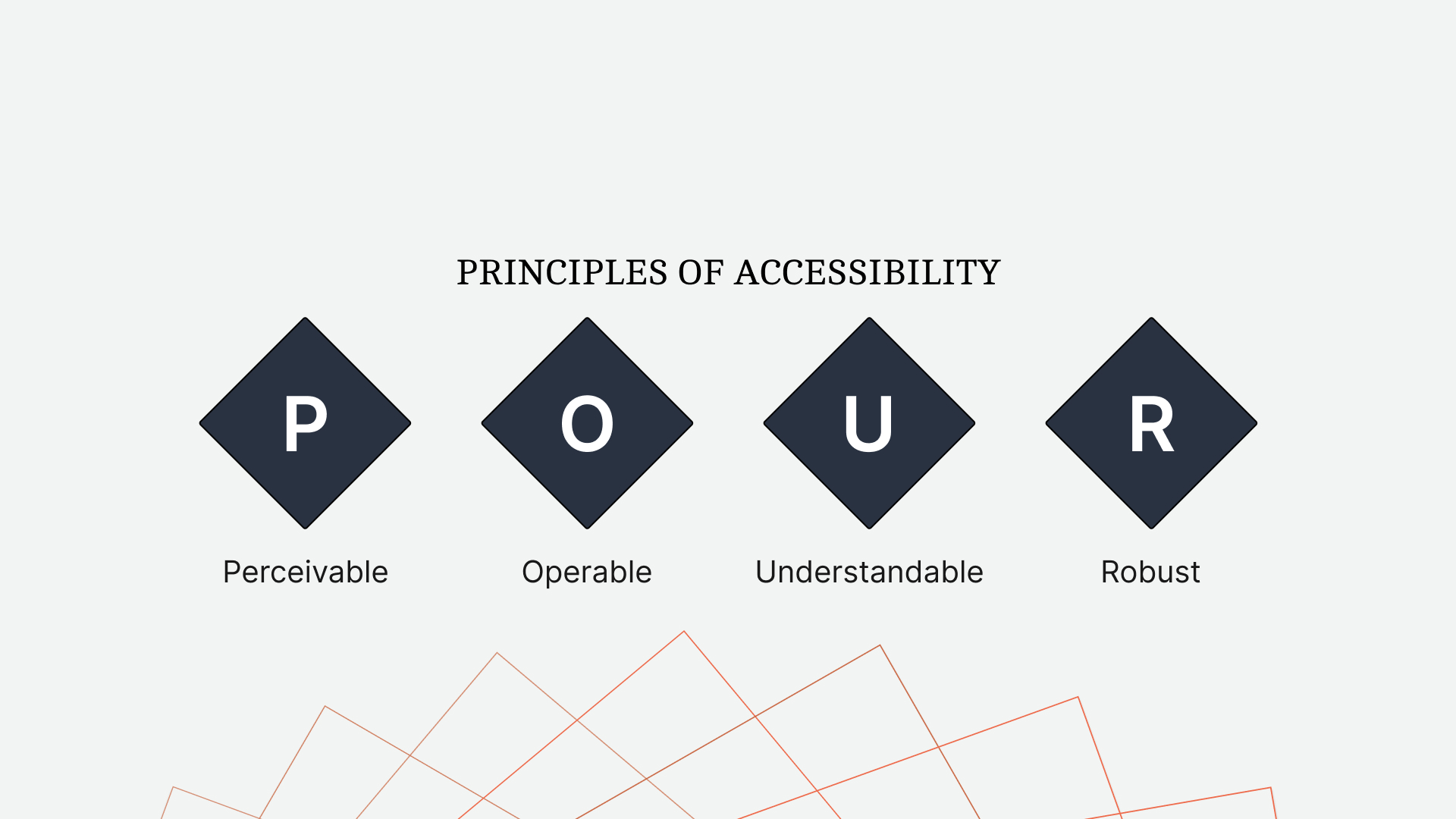
It may sound too simple, but we can break web accessibility down into four core principles: Perceivable, Operable, Understandable, and Robust. These principles, known as POUR, are the perfect starting point for learning how to approach accessibility.

Perceivable

What does it mean for content to be perceivable?

Let’s say you’re experiencing this article by reading it. That would mean the content is perceivable to people who are sighted. Perhaps, you’re listening to it. That would mean the content is perceivable by people who engage with content audibly.

The more perceivable your content is, the more ways people can engage with it.

Common examples of perceivable content would be:

  • Images with alternative descriptive text,
  • Videos with captions and/or subtitles,
  • Indicating a state with more than just color.

A terrific real-world example of perceivable content is a crosswalk. When it is not safe to cross the street, there is a red icon of a standing figure and a slow, repeating beep. Then, once the streetlights change and people can cross safely, the icon changes to a green figure walking, and the beeping speeds up. The crosswalk communicates with understandable icons, colors, and sound to create a comprehensive and safe experience.

Operable

Operable content determines whether a person can use a product or navigate a website.

It is common for the person developing a product to create one that works for themselves. If that person uses a mouse and clicks around the website, that’s often the first, and sometimes the only, experience they develop. However, the ways for operating a website extend far beyond a traditional mouse and keyboard.

Some important requirements for operable content are the following:

  • All functionality available by mouse must be available by the keyboard.
  • Visible and consistent keyboard focus for all interactive elements.
  • Pages have clear titles and descriptive, sequential headings.

Understandable

What good is creating content if the people consuming it can not understand it?

Understandable content is more than defining acronyms and terms. A product must be consistent and empathetic in both its design and content.

Ways to create an understandable experience would include:

  • Defining content language(s) to allow assistive technologies to interpret correctly.
  • Navigations that are repeated across pages are in the same location.
  • Error messages are descriptive and, when possible, actionable.

In Jenni Nadler’s article, “When Life Gives You Lemons, Write Better Error Messages”, she describes her team’s approach to error messaging at Wix. With clear language and an empathetic tone, they’ve created a standard in understandable messaging.

Robust

In a way, many of us are already familiar with creating robust content.

If you’ve ever had to use a compiler like Babel to transpile JavaScript for greater support, you’ve created more robust content. Now, JavaScript is just one piece of the front end, and that same broad, reliable approach should be applied to writing semantic HTML.

Ways to create robust markup include:

  • Validating the rendered HTML to ensure devices can reliably interpret it.
  • Using markup to assign names and roles to non-native elements.

The POUR principles of web accessibility lay a broad (if a bit abstract) foundation. Yet, it can still feel like a lot to consider when facing roadmaps with other priorities. This depth of information and considerations can be enough to turn some people away.

Web accessibility is not all or nothing.

Even small improvements can have a big impact on the accessibility of a product. In the same way software development has moved away from the waterfall approach, we can look at web accessibility with the same incremental mindset.

Even so, sometimes it’s easier to learn more about something you already know than to learn about something anew. At least, that’s what this entire article relies upon.

With slight adjustments to how we approach the design and development of a product, we can create one that more closely aligns with the POUR principles of accessibility but in a way that feels natural and intuitive to what we already know.

Keys To An Accessibility Mindset

There’s a lot to learn about web accessibility. While the POUR principles make the process more approachable, it can still feel like a lot. Instead, by applying these keys to our approach, we can dramatically improve the accessibility of a product and reduce the risk of exhaustive refactors in the future.

Markup Must Communicate As Clearly As The Design

When working from a design, it’s common to build what we see. However, visual design is only one part of creating perceivable content.

Let’s consider the navigation of a website. When a person is on a specific page, we highlight the corresponding link in the navigation with a different background color. Visually, this makes the link stand out. But what about other methods of perception?

The content becomes more perceivable when its markup communicates as clearly as its design.

When dealing with the navigation, what exactly are we communicating with the contrasting styles? We’re trying to say, “this is the page you’re on right now.” While this works visually, let’s look at how our markup can communicate just as clearly.

<a aria-current="page" href="/products">Products</a>

By setting aria-current="page" on the anchor of the current page, we communicate with markup the same information as the design. This makes the content perceivable to assistive technologies, such as screen readers.

In this demo, we’ll hear the difference perceivable markup can make.

Even though navigation items often look like buttons, we understand that they function as links or anchors instead. This is the perfect example of marking up an element based on its function and not its appearance.

When using an anchor tag, we receive several expected functional benefits by default. The anchor will support keyboard focus. Hovering or focusing on an anchor will reveal the URL to preview. Lastly, whether with a keyboard shortcut or through the context (right-click) menu, a link can be opened in a new window or tab.

If we marked up a navigation item like it appeared, as a button, we would lose the last two expected behaviors of anchor tags. When we break the expectations of an element, accessibility will suffer the most.

The following demo highlights the functional differences when using the a, button, and div elements as a link. By navigating the demo with our keyboard, we can see the differences between each variation.

Without first looking at the altitude and ground speed values, I couldn’t tell which system was active. Maybe the imperial option was active since it was the same color as the data. But maybe the metric option was active because it was a different color.

While it may take us a moment to figure out which option is active, it’s an unnecessary one caused by indicating a state with only color.

In the following mockup, we underline the active option and increase its font weight. With these details, it’s now easier to understand the active state of the screen.

So much of creating perceivable content comes down to communicating in layers. When we write perceivable markup, we’re creating an extra layer of information. Designing is no different. If we indicate a state with only color, that’s one layer. When we add an underline and font weight, we add additional layers of communication.

People learn and experience in different ways. Consider a book that has an audio version and a movie adaptation. Some people will read the book. Others will listen to it. Others still will watch the movie. When we communicate in layers, more people benefit.

Review

Most people will agree that web accessibility is important. But they will also agree that it can be difficult. With so many combinations of hardware and software and so many nuances with each, accessibility can feel overwhelming.

It’s easy to become lost in the weeds of code samples and articles trying to help. One article may suggest an approach, while a second article suggests another. If we’re not able to test each scenario ourselves, it can often feel like guessing. Guessing can be disheartening, even discouraging. It can turn people away from accessibility.

Instead, we can have a dramatic impact on the accessibility of our work by not focusing on specific details but by adjusting how we approach a design from the start. One of the most challenging areas of accessibility is knowing when and where it’s needed. With the keys to an accessibility mindset, we can identify those areas and understand what they need. We may not know how to provide a perceivable or operable experience, but it’s easier to find the answer when you understand the question.

I should note, though, that applying these keys will not ensure your work is accessible. Will it make a positive impact? Yes. But accessibility extends far beyond design and development. For as long as a product is changing, a commitment to accessibility must remain at every step and in every role, from leadership on down.

Ensuring markup communicates as clearly as its design will help provide perceivable content. Writing functional markup instead of visual will help make that content operable. If the functional markup cannot be styled, then return to the first key, and make it perceivable.

Remember, creating an accessible experience for some doesn’t take away from others.

If we think back to the crosswalk example, who are some people who benefit from their design? Of course, those who are blind, even partially, can benefit. But what about a person looking down at their phone? The audible cue can grab their attention to let them know when it’s safe to cross. I’ve benefited from crosswalks in this way. How about a parent using the lights to teach their child how to cross? Everybody can benefit from the accessible design of a crosswalk. Of course, if a person wants to cross when they feel comfortable, regardless of the state of the crosswalk, they can. The accessible design does not prevent that experience. It enables that experience for others.

Accessible design is good design, and it all starts with our mindset.

Resources

Categories: Others Tags:

Unlocking the Power of Design to Help Users Make Smart Decisions

February 17th, 2023 No comments

Users are faced with decision-making on websites every day. The decision-making process can be far more complex than it appears, and poor decision-making can lead to user dissatisfaction, decreased sales, and damage to brand value. For this reason, it’s imperative that designers focus on decision-making throughout the entire UX workflow.

UX, from a decision-making perspective, means focusing on a user’s context and individual needs. How does the immediate decision fit into the user’s broader goals? What is influencing their decision? Do they have enough information to make an informed decision they won’t regret?

Decision-making can be complex, and it’s made all the more problematic when users don’t have enough information to make a decision. UX designers can address this by communicating all options and potential outcomes and providing visual cues to make decision-making more intuitive.

Tip 1: Structure Decisions Around The User’s Needs

A decision structure is a framework within which a user can make a choice. For example, should they keep exploring a site or abandon it? A good decision structure is transparent (meaning that the available options and the consequences of each option are clear) and consistent so that making one decision makes it easier to make the next.

The mistake that too many designers make is to create a decision structure around a company’s needs rather than the user’s.

Consider the issue of online flower sales. From a florist’s perspective, an order is received and then dispatched based on the customer’s preferred shipping options. From a company point of view, it makes sense to offer a range of bouquets, followed by the available delivery options. And that is how most e-commerce sites structure the decision-making process.

However, from the perspective of a person who has forgotten Valentine’s day, what matters most are the delivery options because day-late flowers are worse than gas station flowers. In that case, the shipping options — specifically confirmation that delivery in a specific time frame is possible — should precede product selection.

You’re more likely to deliver a positive user experience by designing decision structures around a customer’s needs.

Tip 2: Make Decisions Clear

Data doesn’t affect human beings in the same way that it affects algorithms, but if designers can communicate data in a way that makes sense to the human brain, we’ll have more information, and we’ll be able to make decisions in a more logical, algorithmic fashion.

This is where UI design comes into its own. Effective UI design can make sense of complex data with color and hierarchy to highlight data that is critical to the customer’s current task. What designers need to do is constructively editorialize the data.

One important technique is to focus on context. Presenting data in context makes it easier for a person to comprehend the information being conveyed. For example, if you sell a product at a discount, always present the original price alongside the discounted price, and even better, highlight how much the user is saving.

Tip 3: Reward Decision-Making

Human beings are pretty easy to manipulate — hence the prevalence of black-hat UX techniques littering the web. Different chemicals are released into a user’s system when good things happen — which is why gambling machines light up when you put money into them. One of the simplest ways to encourage users to take action is to reward them with positive chemicals in their system each time they do so.

Because we’re not using black-hat techniques, we don’t want to reward a particular choice — that would be coercive — we want to reward the decision (any decision), no matter how small. Even something as simple as a pretty hover state on a link can reward a user for engaging with the UI and build positive feelings.

When users feel good about small decisions (like reading more details about a product), they’re more likely to make big decisions (like purchasing the product).

Tip 4: Repeat Critical Information

The human brain excels at fast decision-making. This is because it evolved that way as a defense mechanism — the faster you decide something is dangerous, the more likely you are to survive long enough to procreate.

Unfortunately, the human brain is also finite, and we somehow have to make up for this speed. And so the brain sacrifices memory recall in favor of speed. As a result, we tend to make decisions based on what is in front of us when we make the decision. That’s not to say we don’t rely on experience at all, but the human brain prefers current input over recalled input.

If you want a user to make an informed decision, make sure that all of the most critical information is in front of them all the time. For instance, if you want to reduce cart abandonment on an e-commerce site, ensure the product list is sufficiently detailed so that the user doesn’t need to rely on the memory of why they chose to add the item to their cart to complete the checkout.

Tip 5: Boost Confidence With Graceful Error Handling

Error handling is one of the most critical aspects of UI design because try, as you might, you will never be able to design an interface that a user can’t abuse, misuse, or break. Anyone who has conducted extensive user testing will tell you that users often break things simply to see if they can. They are like infants, testing boundaries to discover where their limits lie.

And so, if you design a website that handles errors gracefully, you enable users to explore without fear of doing irreparable damage, and they will be far more likely to make a decision.

It can be as simple as giving the user a way to undo a decision. A simple pop-up that asks, “Are you sure?” Is an excellent way of reassuring a user that their choices won’t have lasting consequences.

Helping Users Make Smart Decisions

Decision-making is a complex process — there’s no one-size-fits-all solution. The key to making decision-making easier for your users is to remember that good UX isn’t about forcing decisions; it’s about giving the user the information they need to make an informed decision of their own.

By structuring decisions around user needs, presenting information clearly, rewarding decision-making, repeating critical information, and handling errors gracefully, you can help users make decisions that benefit both them and your client’s business goals. It all starts with understanding the decision-making process — then it’s a question of finding ways to work within those parameters.


Featured image by storyset on Freepik

Source

The post Unlocking the Power of Design to Help Users Make Smart Decisions first appeared on Webdesigner Depot.

Categories: Designing, Others Tags: