Archive

Archive for April, 2023

How to Effectively Measure the Progress of your Project

April 12th, 2023 No comments

While a project plan can give project managers more profound insights into a project, measuring its progress keeps it going in the right direction. 

Monitoring a project from a close distance can yield timely and high-quality results and keep Key Performance Indicators (KPIs), like team progress, budget overruns, and obstacles, in check. To understand the term better, let’s talk more about project progress. 

What Is Project Progress Tracking?

Project progress tracking, also referred to as collecting actuals, is a project management method that’s used to follow the progress of tasks in a project. 

It indicates the actions that project managers take regularly to observe the work going on in a project so that desired results are obtained. This action involves the following-

  • Building project status reports from the project tracking systems in use
  • Monitoring resources that were used at any point during the project
  • Cross-checking the completion of tasks and their dependencies according to the project timeline
  • Regular meetings with teams and stakeholders
  • Tracking project time to keep track of time spent on the project

In the beginning, team members may not be comfortable with you asking them regularly about their actions. Yet, project managers must drive motivation while also being sensitive to team concerns to always receive accurate information. 

Challenges in Measuring Project Progress

Team resistance may be one of the challenges that project managers will come across while tracking project progress. But there’s more to be prepared for. Below are some of the most common hurdles that are faced by project managers.

  1. Inadequate Risk Analysis 

This is a vital segment of a project lifecycle as it can foretell potential factors that can jeopardize a project’s timeline. However, risk analysis comes with its vulnerabilities, which can result in flaws in the project plan. For instance, if the analysis is rushed at some point in the project, it could result in monetary issues or failure in the overall project plan.

Tip: Improve risk analysis strategies by researching potential issues that your team might encounter while also devising control measures to prevent them. Also, make sure you have access to real-time data.

  1. Communication Gaps

Are you effectively communicating with your team and stakeholders? If not, then it’s high time to start doing so. Without communication, getting an accurate portrayal of a project’s progress can be hard. 

Communication skills, verbal or written, can assist project managers in instructing team members more effectively and relaying any gathered information to the stakeholders. 

Tip: Having a robust project management tool can help you with proper reporting communication. Such tools can make sense of all the data and send scheduled reports to the required stakeholders in the format they need. Also, project managers must remember to adjust their communication methods to adjust different communication styles.

  1. Vague Goals or Criteria 

Most projects fail because they never started with a clear purpose. If you want your projects to be successful then you should have clear and measurable goals to work towards. Imagine what an endless road trip you’d have if you did not know your destination. It’s the same for a project without a goal. 

Tip: Define your project’s KPIs as well as the timeline before the implementation phase to have clearer goals.

  1. The Danger of Scope Creep 

When a project starts, changes might crop up in the deliverables or goals of a project, which may deviate its focus from the original plan. This can affect the project outcome. Some common instances of scope creep are as follows.:

  • Changes in the number of deliverables
  • Increase in the number of features required in a project
  • Changes in client’s needs
  • Instances where the client asks for incorrect deliverables
  • A change of the project’s end goal by the stakeholder 
  1. Resistance

The project manager will not always be the line manager for all resources and there might be some resistance from teams when tasks are tracked. To avoid this, it’s important to prepare them for the idea of project progress measurements right from the start. This can be done by explaining how it can help them streamline their activities. 

Once teams are aware that their progress will be measured from time to time to make things easier for them, you’ll surely receive the most accurate estimates from them.

How to Measure Project Progress Effectively 

Project managers must keep a few simple tips in mind to help them successfully observe a project’s progress. This must also be conveyed to the concerned team managing the projects from the start to the end making the information exchange easier throughout the project.

Having said that here are some tips that can aid in measuring a project’s progress effectively for the successful completion of tasks:

  1. Choose the Right Methods for Project Tracking

Project progress tracking methods can either be quantitative or qualitative. While the former focuses on metrics like any turning point in a project, the costs, and the time, the latter concentrates on data and information from team meetings. Both methods are different but ensure great results.

The quantitative variables may include tracking of time, costs, etc. which gives objective data points to work with. The qualitative tracking could include regular check-ins with the team to analyze the ‘WHY’ behind the data to deal with any issues.

  1. Build Project Status Reports 

It’s wise to begin projects by deducing information that would be useful for measuring a project’s progress and understanding its usefulness for someone else. 

Status reports aim at providing an overview of all activities happening in a project as well as the reason for the activities. That is why status reports have to be easily understandable so that team members can make decisions on how to proceed with the project.

Tip: Making reports manually may seem like a standard but for accurate progress tracking, it’s always better to have data in real-time and avoid working in silos. Also, too much data never help so make sure you have a reporting system that’s comprehensive but can be easily customized as well.

  1. Recognize the Project Goals and Adhere to Them

Knowing your project goals is key to tracking your performance. Your team must also be informed of the same to be able to deliver the target objective. Have a SMART goal in place to deal with this. Such goals are Specific, Measurable, Achievable, Relevant, and Time-Bound, meaning that you can easily track the goals vs. progress of a project in tangible terms.

Once your goals meet the criteria mentioned above, you can get your team members in on the plan as well and ensure that they stick to them.

Tip: Ensure you have a system in place to have a complete view of estimates vs. actuals. This should include data on the management of all assets that are contributing to the project, especially human resources.

  1. Always Use Checklists

Having an inventory right in front of your eyes aids project managers in breaking down tasks into phases like

  • client onboarding 
  • project ideation and planning 
  • execution
  • submission
  • final review & edits 

Each of these phases can further be divided into actionable tasks that can be further allocated to different team members. 

  1. Keep Stakeholders in the Loop

Always share your project progress with all relevant stakeholders. This makes you, the project manager, responsible, and stakeholders aware of issues that might arise during the project. 

Stakeholders will know what to expect upon project completion, and project managers will have more options to assess the costs involved and project timelines in real time if required.

  1. Let Communication Always Be Constructive

If you aren’t able to communicate effectively with your team then it may not be possible to provide stakeholders with correct information about the overall progress of the project. 

Remember to always keep all communication channels transparent and clear, not overburdening your team members in the process. Constructive communication encourages efficient data exchange in a simpler form so that everyone gets at least a gist of the project’s progress. 

Guarantee Project Success With Progress Tracking

Tracking project progress might not seem important at first, but the truth is that it’s critical in determining the success or failure of a project. For this, many project tracking software is available for project managers to leverage and efficiently manage projects on an intuitive and flexible platform. 

Does it look like your project is not going as planned and diverting from the plan of action? If your answer is yes, then it’s time for you to start reaping the benefits of project progress tracking today.

Image by rawpixel.com on Freepik

The post How to Effectively Measure the Progress of your Project appeared first on noupe.

Categories: Others Tags:

How To Design An Effective User Onboarding Flow

April 11th, 2023 No comments

This article is a sponsored by Feathery.io

What is it that causes users to give up on an app before ever stepping inside or really giving it a fair chance? It could be the onboarding process.

Sometimes half the battle in getting users to adopt the products you build is to first get them in them so they can see how awesome they are. With a high-quality user onboarding flow, you can easily increase conversions, user satisfaction, and user activation within the product.

In this post, we’re going to look at what it takes to design an effective user onboarding flow that maximizes how many engaged users you get inside your web app. We’ll be using Feathery — a powerful, no-code onboarding form builder — to demonstrate how to do this.

What Can You Accomplish With An Onboarding Process?

The onboarding flow is a multi-step process that helps users get started with a new SaaS product. In most cases, the flow appears right after signup and bridges the user into the app. And for more complex SaaS, onboarding flows can appear as tooltips and guided tours inside the product.

With a particularly effective onboarding flow, you’ll be able to:

  • Increase conversion rates.
  • Reduce user abandonment.
  • Increase user activation within the product.
  • Improve overall user satisfaction.
  • Decrease churn.

Ultimately, your user onboarding process sets the tone for what’s to come.

You can personalize the product based on user responses, demonstrate how easy it is to get started, or reinforce the overall value of adopting the product into their workflow.

How To Design A Great User Onboarding Flow With Feathery

As I break down the steps below, I’ll demonstrate how to use Feathery to create an effective user onboarding flow similar to Duolingo’s popular onboarding flow.

Note: After you sign up for Feathery, you’ll have a short onboarding process of your own to complete. In the end, you can choose to use a template or start with a blank canvas. For the purposes of this walkthrough, I’ll be starting from scratch.

Step 1: Design The Container Style

Although each step in the flow will contain different content, you want the general design and format to remain consistent throughout. Not only should this design improve the usability of the onboarding process, but it should give users an idea of what your app will look like.

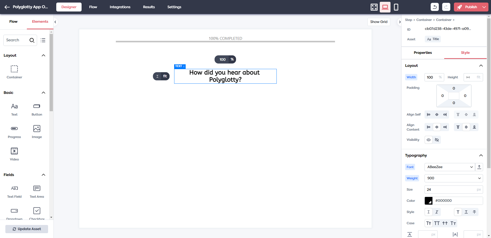
To make changes to the appearance of your onboarding screens, click on the container in Step 1. A “Style” panel will open on the right.

From this panel, you can modify the following:

  • Layout,
  • Background color or imagery,
  • Corner radius,
  • Shadows,
  • Hover-triggered transformations,
  • Click-triggered transformations.

Note: If you plan on making extensive customizations to the style of your container, I’d recommend deleting any subsequent steps that were included with your template if you’re using one. It’ll be much easier if you duplicate this first container for subsequent steps and save yourself time replicating the styles. Alternatively, Feathery offers the ability to build and save reusable styles and components using themes.

Step 2: Create The Steps In Your Flow

People can really only hold about five to seven items in their short-term working memory.

If you want to get as many users through the onboarding process as possible, only give them as much information or ask them as few questions as needed.

That means capping your onboarding steps at no more than seven steps. Five would be better, but if they’re super short and not overly complicated requests, you might be able to stretch it a bit.

To build out your steps, first, decide what type of onboarding flow would be the most beneficial for your app. For example:

  • A product setup walkthrough to help users personalize their experience or get started;
  • A series of questions that help identify what type of user they are;
  • A preview of the core features;
  • A video or GIF intro that welcomes the user and shows them how easy the app is to use;
  • Powerful statistics that reinforce the transformative effects of your product.

Then start piecing them together.

To add a new screen to the flow, use the “Flow” tab on the left. Use the “+Step” button at the bottom to add a new step, or you can click the plus sign that appears beneath your existing step button when you hover over it.

In Feathery’s ‘Flow’ control tab, users can add new steps with ease. (Source: Feathery) (Large preview)

You can rename the labels of each step by double-clicking on each block. Alternatively, if you hover over the block, three vertical dots appear to the right, which gives you the ability to duplicate, rename or delete it.

Step 3: Customize The Content

In terms of what makes an onboarding flow effective, you generally want to keep the design simple — lots of white space, concise and easy-to-follow language, and motivational imagery and colors.

Each step will include a combination of imagery and text. You’ll find all of the mix-and-match components you need under the “Elements” tab in the left sidebar.

Let’s go through an example of what you might put on one of these screens from top to bottom.

Step 3a: Add a Progress Indicator

To start, place a “Progress” element at the top of the page. Whenever you have a multi-step process, providing users with visibility into their progress is a must.

You can customize everything about this progress indicator, including:

  • Length,
  • Alignment,
  • Visibility,
  • Color,
  • Font,
  • Text placement,
  • Text styling.

When designing your progress bar, consider its prominence in terms of the rest of the design. You want it to be easy to find, but not so overpowering that it distracts from the actual message on the page.

Step 3b: Customize The Text

Before adding any imagery, lay down your text layers. Ideally, each screen should contain no more than 50 words or so.

Another thing to think about with text is a hierarchy. If all of the text is the same size and styling, it could end up looking like one long block of text (even if it’s only 50 words).

To keep onboarding screens easy to read:

  • Limit the amount of text,
  • Keep it simple and jargon-free,
  • Choose a readable font,
  • Use headings at the top of the page,
  • Add bolding and italics for emphasis,
  • Place single- or multiple-choice options into blocks with visual companions.

In Feathery, use the “Text” field to add individual text layers.

You’ll have total control over how the text looks from the “Style” panel.

Step 3c: Add Imagery

With Feathery, you can add images and videos to your onboarding step designs using the corresponding elements — images you’ll have to upload from an external source, and videos will need to be hosted on YouTube and then embedded with a link.

For more complex configurations (like text and image blocks), use the element that most closely resembles what you need.

For instance, I want to create nine clickable blocks so that users can tell us how they found the app. For this, I’ll use the “Button Group” element:

You can edit the labels, add images, customize the layout and spacing, change the font, apply a border and shadow, and more.

The three side-by-side button blocks have been transformed into a colorful, custom-labeled grid of options. If they’re going to be clickable options like in this example, you’ll be able to program in hover effects to make them respond to your users’ touch.

Step 3d: Add Other Elements

You can add all kinds of interactive and attractive elements to your onboarding flows. For example:

  • Account setup/login forms;
  • File uploaders;
  • Slider selections;
  • Rating requests;
  • Payment forms.

It all depends on your goal for that step and what the easiest way to get that information across or to collect it from your users is.

Step 4: Add Navigation Buttons

Giving your users full control over their onboarding experience is going to be crucial in getting as many of them through the process as possible.

Although it’s common to place a single “Continue” button at the bottom of each onboarding step, it might be a good idea to give them extra navigation options.

For instance, let’s say the step we designed above is the first in a series of six. We can place a “Next” button on the right side of the step. A “Previous” button wouldn’t make sense, but a “Skip” button would be useful. While it’s nice to find out how people discovered our apps, it’s not totally necessary, so giving them the option to skip is good.

Both buttons are placed side-by-side here. However, the “Skip” button has been designed as a plain text link as opposed to “NEXT,” which is more prominent. You can play around with how you present the various button options to your users.

Step 5: Enable Interactivity and Connectivity

Every step you build will have at least one element of interactivity. To configure your clickable elements, use the “Properties” setting on the right toolbar.

Let’s start with the “Button” elements.

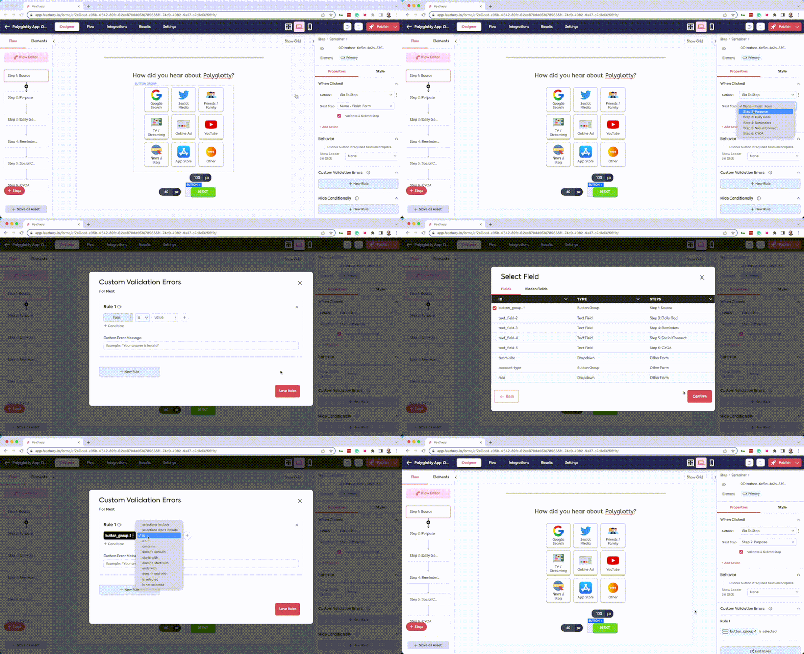
You can configure more than just links to the next steps or pages in your app. You also have the ability to:

  • Set multiple actions.
  • Disable the button if the fields aren’t submitted.
  • Create custom validation rules that need to be met.
  • Set conditional logic that determines when the button appears in the flow.

In Feathery, users can program multiple actions for button elements and force certain rules to be met. (Source: Feathery) (Large preview)

When it comes to other clickable elements in Feathery, you’ll have similar options with regard to validation rules and conditional logic. However, the other settings will differ based on what the element is.

For example, the “Button Group” element asks you to set constraints. You can allow for multiple responses. You can also make the response optional, which you’ll need if you include a “Skip” button on that screen. When it comes to form fields, on the other hand, you may need to set limits on what can be entered or uploaded.

Interactivity is an important piece of the user onboarding flow. If there are any issues with getting through the process, you’re going to lose users before they get inside your app. The rest will likely expect the app to be just as confusing or difficult to use, which won’t bode well for user attrition. So spend extra time on this step to make sure you get it right.

Step 6: Create The Flow

Depending on how you added new steps to your user onboarding flow, you might not need to do much in this step. However, it’s still a good idea to check.

To see what your flow looks like, click on the “Flow” tab on the left. Then click on the “Flow Editor” button to open your flow chart.

If you set up the steps initially to connect together, you’ll see them connected here. Additionally, if you programmed buttons to connect to other slides, you’ll see that reflected in the chart.

In addition to visualizing your flow, you can:

  • Create a new step,
  • Add new connections between steps,
  • Set the connecting element between two steps,
  • Add a condition so that different actions take users to different steps.

When you’re done, click the “Designer” button in the top-left to return to the main editor.

Step 7: Add Integrations (Optional)

There are different reasons to integrate other apps with your onboarding flow. For instance, you might want to track user engagement with a tool like Google Analytics. This would be helpful in keeping an eye on how many users are getting through each step. If they’re dropping out around the same point, your data will at least indicate where the greatest friction point is.

There are other tools that Feathery integrates with as well. Go to the “Integrations” tab at the top of your screen to find them.

You’ll be able to add a wide variety of functionality to your onboarding flows with integrations. Analytics is just the start.

For example, you can integrate with the following:

  • Firebase or Stytch to add an authenticated login step;
  • Stripe to collect one-off or recurring payment from new users;
  • Plaid to automatically collect user financial information;
  • Slack to notify your team when a new user has completed the process;
  • HubSpot to add new users to your CRM and automated email marketing campaigns.

A user onboarding form is a great way to get users into your app without the need for a sales rep or customer service associate to contact them. Adding integrations will allow you to streamline the onboarding and engagement process even more.

Step 8: Publish

When you’ve finished designing your user onboarding steps, hit the “Publish” button in the top-right corner. Use the down arrow to open a preview or the live form to see how your new onboarding flow looks and to test it out.

To add the new onboarding process to your app, use the “Publish” dropdown one more time to retrieve the JavaScript or React code.

The code will automatically be copied to your clipboard. Go into your CMS and add it wherever you want the element to appear — like in a pop-up at startup.

Wrapping Up

Is a user onboarding flow necessary? If you want to maximize conversions or collect necessary user information for other purposes, then yes.

Despite the critical role that onboarding plays in product adoption, designing a great onboarding experience for your users doesn’t have to be difficult. Whether you build it from scratch, use another app’s onboarding flow for inspiration, or start with a template, you can have a well-thought-out and beautifully designed user onboarding flow set up in no time at all.

Sign up for Feathery to start creating effective user onboarding flows of your own.

Categories: Others Tags:

Top 8 Proxy Services For Data Collection in 2023

April 7th, 2023 No comments

Choosing the best proxy service provider is complex. Luckily, we’ve made it easy by scouring the market and bringing you the best proxy providers.

Have you ever bought proxies from the wrong provider? I wasted my time and money. Trust me, I’ve been there before, and I can tell you how frustrating and exhausting it can be.

If you’ve never experienced it, you know that hearing it is better than experiencing it. With the help of our proxy experts, you will never fall for the wrong proxy provider again as long as you follow all the guides in this article until later.

That’s why we’ve researched and scoured the market to find the best proxy providers. Our recommendations apply to all consumer, mobile, and data center proxy categories proxies. Whatever business you need proxies for, you will get the most out of this article. If you’re looking for the best residential proxies providers, you can check out this compilation of the best residential proxies.

What Are Proxy Services?

Image by Freepik

A proxy service is a server or computer program that acts as a go-between for a user’s device and the Internet. It enables users to access websites and other online resources without disclosing their IP address, location, or other identifying information.

Proxy services intercept and forward Internet traffic between your device and the website you wish to visit. The website sees the proxy’s IP address rather than the user’s, preserving user privacy and anonymity.

Top 8 Proxy Services for Data Collection in 2023

We thoroughly researched and evaluated around 70 proxy services to develop the top 8 recommendations based on our comprehensive analysis.

Crawlbase

Crawlbase’’s Smart Proxy API is a web scraping and knowledge extraction tool that allows you to get data at scale while utilizing the latest algorithms, services, and infrastructure customizable as per your data extraction needs.

pasted image 0.png

Crawlbase’s Smart Proxy uses a distributed structure that enables it to scrape websites at scale, ensuring it does not get blocked with anti-scraping measures. It has a gigantic rotating ip address pool that it manages on it’s end in order to enable users to avoid IP blocking during CAPTCHA challenges.
Moreover, it presents integrations with standard knowledge evaluation instruments like Google Sheets, Excel, and SQL databases, making importing the extracted data into different techniques effortless with its API.

Features of Crawlbase
Crawlbase is an internet scraping and data extraction tool that offers the following features:

  • Crawlbase provides web crawling services to gather data from websites, including dynamic and JavaScript-heavy sites.
  • Crawlbase provides residential and data center proxies
  • Crawlbase allows users to extract HTML, JSON, and XML data.
  • Crawlbase has built-in data cleansing and transformation tools to extract standardized data easily.
  • Crawlbase incorporates 3rd party APIs and databases to provide information such as geolocation, sentiment analysis, and social media metrics.
  • Crawlbase allows users to schedule crawling and data extraction concurrently.
  • Crawlbase provides real-time data regarding APIs, webhooks, and cloud storage services.
  • Crawlbase proxy management prevents blocking by websites
  • Crawlbase can easily handle large-scale data scraping, including processing and analyzing huge data sets

Bright Data

Bright Data offers an online data gathering and analysis platform for organizations to access and gather publically available data at scale. The platform leverages a P2P network of more than 72 million residential IP addresses and more than 2 million mobile proxies to collect data from practically any country and device.

pasted image 0.png

The platform also offers data validation, cleaning, and integration options to guarantee quality and accuracy. Fortune 500 organizations, e-commerce enterprises, and startups in retail, finance, travel, and healthcare sectors make up Bright Data’s clientele. With offices in the US and the UK, Bright Data has its main headquarter in Israel.

Features of Bright Data

Bright Data is a platform for web data extraction that enables companies to get information from the Internet. Bright Data has several features:

  • Over 72 million residential and mobile proxies comprise the platform’s extensive network in more than 200 nations and territories.
  • Bright Data is compatible with various applications and programming languages.
  • Users can collect data from various sources, including e-commerce sites, social media platforms, and news sites.
  • Bright Data offers automated data extraction tools for efficient and quick data extraction.
  • The platform provides tools for data quality control and compliance with data privacy.
  • Customer support is available through email, phone, and live chat.

Oxylabs

Oxylabs offers businesses access to a global network of proxies for web scraping and provides a range of solutions for automating data collection and analysis processes.

pasted image 0.png

Its services include data scraping and extraction, data parsing and cleaning, data enrichment, schedule-based crawling, customized solutions, proxy management, and data security and privacy. Oxylabs offers a user-friendly interface and flexible pricing plans, and its proprietary residential proxy pool ensures anonymity and avoids detection by websites.

Features of Oxylabs

Oxylabs is a web scraping and proxy service provider that offers the following features:

  • With over 195 locations worldwide and over 100 million residential and data center proxies, Oxylabs has a sizable proxy network.
  • A huge proxy network exists at Oxylabs. Real-time data transmission provides immediate access via APIs and webhooks
  • Data scraping and extraction services to gather data from various sources such as HTML, JSON, and XML formats
  • Users can clean and organize extracted data using the built-in data cleaning and parsing tools.
  • Capability to handle large-scale data extraction projects, including processing and analyzing big data sets
  • Adherence to best data security and privacy standards, such as SSL encryption, password protection, and data encryption.

Smartproxy

Smartproxy is a web scraping and proxy service provider enabling businesses to access a global network of residential and data center proxies for data collection. The services offered by Smartproxy include data scraping, extraction, parsing, cleaning, enrichment, schedule-based crawling, proxy management, and data security and privacy.

pasted image 0.png

Smartproxy provides a user-friendly interface and flexible pricing plans for businesses of all sizes. One of the unique features of Smartproxy is its ability to provide session control to maintain the same IP address for the duration of a session, ensuring consistency and reliability in data collection.

Features of Smartproxy

  • With more than 40 million residential and data center proxies in more than 195 locations worldwide, Smartproxy offers a sizable proxy network.
  • Real-time data delivery through APIs and webhooks is available.
  • Smartproxy supports data scraping and extraction from various sources
  • Built-in data parsing and cleaning tools in parsing and cleaning extracted data.
  • Supports schedule-based crawling, allowing users to specify a recurring schedule for crawling and data extraction.
  • Smartproxy can handle large-scale web scraping and data extraction projects
  • Smartproxy follows data security and privacy best practices, including data encryption, password protection, and SSL encryption, to ensure secure data transmission.

Netnut

NetNut provides web scraping and proxy services to businesses, allowing them to collect data from the web using a global network of residential and data center proxies.

pasted image 0.png

It offers solutions to bypass IP blocking and access data undetected, with services including data scraping, extraction, parsing, cleaning, enrichment, schedule-based crawling, customized solutions, proxy management, and data security and privacy.
NetNut’s services are usually designed for businesses of all sizes and feature a user-friendly interface and flexible pricing plans. The unique feature of NetNut is its ability to provide static residential IPs, which are ideal for activities requiring persistent identification.

Features of NetNut

  • NetNut has an extensive proxy network with over 10 million residential and data center proxies
  • Real-time data delivery through APIs and webhooks
  • Built-in data parsing and cleaning tools to help users parse and clean the extracted data
  • Allows users to integrate with third-party APIs and databases to provide information
  • Supports schedule-based crawling for recurring data extraction
  • Can handle large-scale web scraping and data extraction projects
  • Follows data security and privacy best practices, including encryption, password protection, and SSL encryption

Proxy Cheap

Businesses that use Proxy-Cheap’s scraping and proxy services have access to a massive network of residential and datacenter proxies for data collection.

pasted image 0.png

With services including data scraping, extraction, parsing, cleaning, enrichment, schedule-based crawling, tailored solutions, proxy administration, and data security and privacy, Proxy-Cheap assists organizations in automating data collecting and analysis operations.
It offers ways to overcome IP restrictions and access data from numerous websites unnoticeably. The services offered by Proxy-Cheap have a user-friendly interface and numerous price options and are suitable for companies of all sizes.

Features of Proxy-Cheap

Proxy-Cheap is a web scraping and proxy service provider that offers a range of features to help businesses to collect data from the web. Some of the critical features of Proxy-Cheap include the following:

  • Proxy-Cheap provides web scraping and proxy services to businesses for data collection and analysis.
  • Proxy-Cheap has an extensive proxy network with over 6 million residential and datacenter.
  • Real-time data delivery is possible through APIs and webhooks.
  • Data scraping and extraction supports HTML, JSON, and XML formats.
  • Schedule-based crawling is available for recurring data extraction.
  • Supports large-scale web scraping and data extraction projects.
  • Advanced proxy management often routes web scraping requests through different IP addresses.

Shifter

The Shifter is a platform for web scraping and automation that allows businesses to collect and analyze data from the web without coding experience. It supports data extraction from various sources and provides built-in data parsing and cleaning tools.

pasted image 0.png

Users can enrich the extracted data by integrating it with third-party APIs and databases. Shifter offers advanced features like browser automation and JavaScript execution to scrape dynamic and interactive websites. Its services specifically automate data collection and analysis processes to make informed decisions.

Features of Shifter

  • 7Shifter is a platform for web scraping and automation.
  • It allows businesses to collect and analyze data from the web without coding experience.
  • Shifter supports data extraction from various sources and provides built-in data parsing and cleaning tools.
  • Users can use third-party APIs and databases to enrich the extracted data.
  • Use services to automate data collection and analysis processes to make informed decisions.

Proxyrack

A huge network of residential and data center proxies is available to enterprises through Proxyrack, a web scraping and proxy service provider. Its products assist organizations in automating data collecting and analysis procedures and making wise judgments.

pasted image 0.png

Data enrichment, schedule-based crawling, bespoke solutions, proxy administration, data scraping, parsing, and cleaning are all services provided by Proxyrack in addition to data protection and privacy.

Features of Proxyrack

  • 2M+ residential and data center proxies in 140+ locations across the globe
  • Distribution of real-time data is feasible by APIs and webhooks.
  • Integrating third-party databases and APIs for the enrichment of data.
  • Advanced proxy management allows requests routed across many IPs to evade detection.
  • Best data security and privacy standards to follow, including SSL transmission and encryption.

Conclusion

The above article emphasizes the importance of considering reliability, security, speed, and geolocation capabilities when selecting a data-collection proxy service. Some top proxy services may offer advanced features like automatic IP address rotation, data center proxies, and mobile proxies. These can help users collect data efficiently while avoiding detection or blocking by websites.

In addition to technical considerations, it is essential to ensure that using proxy services for data collection is legal and ethical. Some websites and platforms prohibit using proxy servers, and users should avoid violating any terms of service or user agreements.

Overall, by carefully evaluating options and choosing a reliable and secure proxy service, users can effectively collect data for their needs while maintaining ethical and legal standards.

Featured Image by pikisuperstar on Freepik

The post Top 8 Proxy Services For Data Collection in 2023 appeared first on noupe.

Categories: Others Tags:

How To Protect Your App With A Threat Model Based On JSONDiff

April 5th, 2023 No comments

Security changes constantly. There’s a never-ending barrage of new threats and things to worry about, and you can’t keep up with it all. It feels like every new feature creates expanding opportunities for hackers and bad guys.

Threat model documents give you a framework to think about the security of your application and make threats manageable. Building a threat model shows you where to look for threats, what to do about them, and how to prevent them in the future. It provides a tool to stay safe so you can focus on delivering a killer application, knowing that your security is taken care of.

This article will show you how to create a threat model document. We’ll review JSONDiff.com and build a threat model for it, and we’ll show how small architectural changes can have a gigantic impact on the security of your application.

Who Do You Trust?

Every time you use a computer, you trust many people. When you make an application, you’re asking other people to trust you, but you’re also asking them to trust everything you depend on.

Your threat model makes it clear who you’re trusting, what you’re trusting them with, and why you should trust them.

What Is A Threat Model?

A threat model is a document where you write down three things:

  1. The architecture of your application,
  2. The potential threats to your application,
  3. The steps you’re taking to mitigate those threats.

It’s really that simple. You don’t need complex tools or a degree in security engineering. All you need is an understanding of your application and a framework for where to look for threats.

This article will show how to build your own threat model using JSONDiff as a sample. You can also take a look at the complete threat model for JSONDiff to see the finished document.

Threat Models Start With Architecture

All threat models start with a deep understanding of your architecture. You need to understand the full stack of your application and everything it depends on. Documenting your architecture is always a good idea; you can start anytime. You’re architecting from the moment you start picking the tools you’ll use.

Here are some basic questions to answer for your architecture:

  • Where does my application run?
  • Where is my application hosted?
  • What dependencies does my application have?
  • Who has access to my application?
  • Where does my application store data?
  • Where does my application send data?
  • How does my application manage users and credentials?

Give a brief overview of your application and then document how it works. Start by drawing a picture of your application. Keep it simple. Show the major pieces that make your application run and how they interact.

Let’s start by looking at the overall architecture of JSONDiff.

JSONDiff is a simple application that runs in a browser. The source code is stored on GitHub.com, and it’s open source. It can run in two modes:

  1. The public version is at JSONDiff.com.
  2. A private version users can run in a Docker container.

We’ll draw the architecture in relation to what runs in the client and what runs on the server. For this drawing, we won’t worry about where the server is running and will just focus on the public version.

Drawing your architecture can be one of the trickiest steps because you’re starting with a blank page and have to choose a representation that makes sense for your application. Sometimes you’ll want to talk about larger pieces; other times, you’ll want to focus on smaller chunks and user actions. Ask yourself what someone would need to know to understand your security, and write that.

JSONDiff is a single-page web application using jQuery. In this case, it makes sense to focus on the pieces that run on the server, the pieces that run in the browser, and how they work.

The first step to any architecture is a brief description of what the application is. You need to set the stage and let anyone reading the architecture know some basic information:

  • What does the application do?
  • Who’s using it?
  • Why are they using it?

JSONDiff is a browser-based application that compares JSON data. It takes two JSON documents, compares them semantically, and shows the differences. JSONDiff is free for anyone and anywhere. It’s used by developers to find differences in their JSON documents that are difficult to find with a standard text-editor diff tool or in GitHub.

The architecture diagram looks like this:

The architecture is simple: Nginx hosts the site, and most of the code is in the jdd.js file. But it brings up many good questions:

  • How does JSONDiff load JSON data?
  • Does it ever send the data it loads anywhere?
  • Does it store the data?
  • Where do the ads come from?

Write down all of the questions your architecture diagram brings up, and answer them in your threat model. Having those questions written down gives you a place to start understanding the threats.

Let’s focus on the first question and show how to dig into it with a security mindset.

There are two ways to load the JSON data you want to compare. You can load it in the browser by copying and pasting it or by choosing a file. That interaction is very well understood, and there isn’t much of a threat there. You can also load the JSON data by specifying an URL, which opens a big can of worms.

Specifying a URL to load the data is a very useful feature. It makes comparing large documents easier, and you can send someone else a URL with the JSON documents already loaded. It also brings up a lot of issues.

The same-origin policy prevents JavaScript applications running in browsers from loading random URLs. There are very good reasons that this policy exists. JSONDiff is subverting the policy, and that should make your security spidey-sense tingle.

JSONDiff uses a proxy to enable this feature. The proxy.php file is a simple proxy that will load JSON data from anywhere.

Loading random data sounds like a recipe for a cross-site request forgery (CSRF) attack. That’s a risk.

All applications have risks; we manage those risks with mitigations. In this case, the proxy risk has two mitigations:

  1. The proxy can only load data that are already publicly available on the Internet.
  2. The file that’s loaded by the proxy is never executed.

Our threat model will include this risk and show how we mitigated it. In fact, each threat needs to show how much risk there is and what we did to mitigate each risk.

Let’s take a look at where threats appear in your application.

Threats

There are many categories of threats through the development and deployment lifecycles. It’s helpful to split threats into different categories and document those potential threats for our application, while we’re starting to plan, design, implement, deploy, and test that software or service.

For every threat we identify, we need to describe two pieces:

  • The threat
    What is the specific threat we’re worried about here? How could it be exploited in our application? How serious could that exploit be?
  • Mitigation
    How are we going to mitigate that threat?

Code Threats

Many threats start with the code you write. Here are a few categories of coding issues to think about:

Weak Cryptography

“Does your application use SSL or TLS for secure network connections?”

If you are, make sure that you’re using the latest recommended versions.

“Does your application encrypt data or passwords?”

Make sure you’re using the latest hashing algorithms and not the older ones like MD5 or SHA-1.

“Did you implement your own encryption algorithm?”

Don’t. Just don’t. There’s almost never a good reason to implement your own encryption.

SQL Injection

SQL injection attacks happen when a user enters values in an application that are sent directly to a database without being sanitized (like Bobby Tables). This can inject malicious code that alters the original SQL query to retrieve, change, or delete data inside the SQL database.

Avoid injection attacks by not trusting any inputs coming from users. Your threat model should address any place you’re taking user input and saving it anywhere.

JSONDiff never saves any of the JSON data it compares. If we added that feature, we’d be open to many types of injection attacks. It doesn’t matter if we saved the JSON to a SQL database like PostgreSQL, a NoSQL database like MongoDB, or a file system. We’d mitigate that threat by making sure to sanitize our inputs and never trusting data from users.

Cross-Site Scripting (XSS)

Malicious scripts can be injected into web applications, making browsers run those scripts in a trusted context; that allows them to steal user tokens, passwords, cookies, and session data. This injection attack happens when a user saves or references code from somewhere else and gets that code to run in the application security context.

JSONDiff doesn’t let users save anything, but you can build URLs to preload the documents to compare like this:
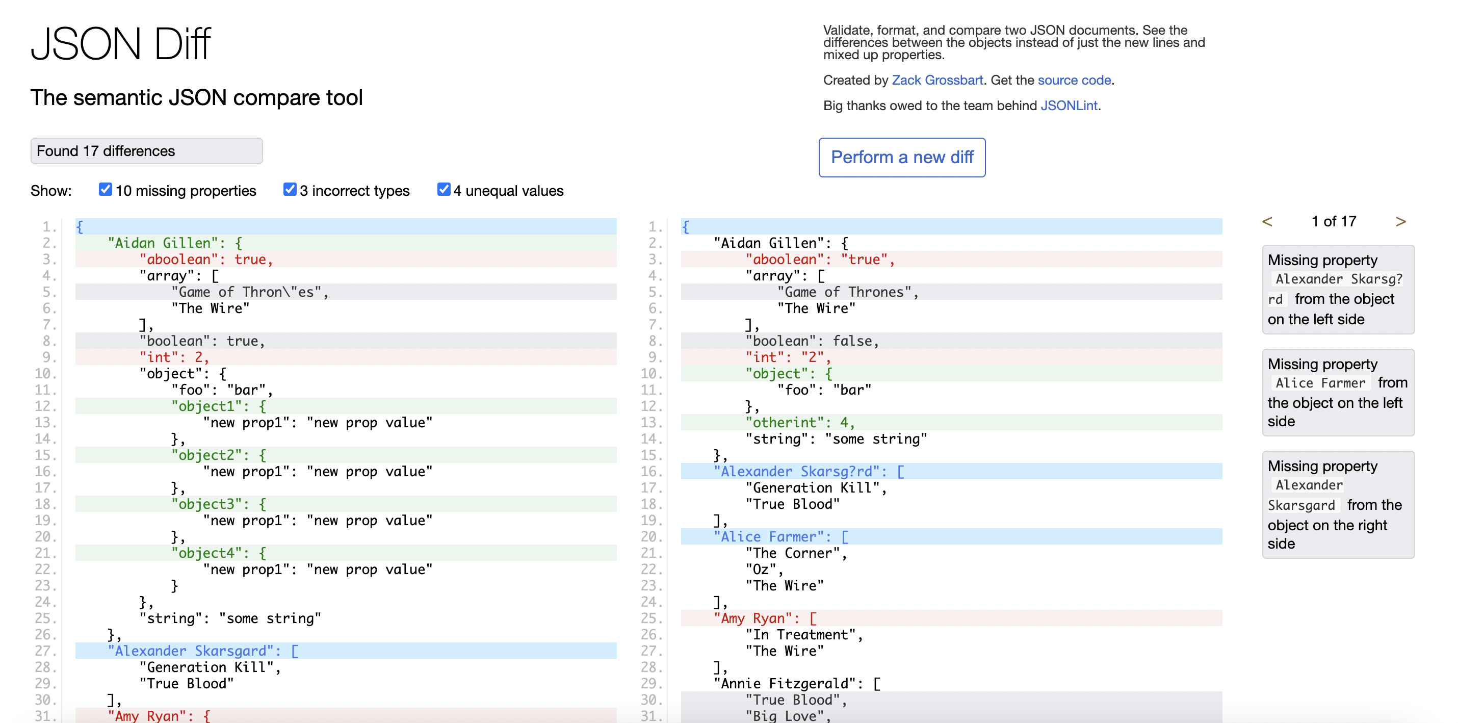
This is a clear threat to address in the threat model. If someone referenced malicious code in an URL like this and sent it to someone, they could run it without realizing the risk. JSONDiff mitigates this threat by using a custom parser for the inputs and making sure that none of them get executed. We can test that with ‘evil’ JSON and JavaScript files like this:

Consider all of the inputs to your application and how you’re making sure they can’t cause problems.

Cross-Site Request Forgery (CSRF)

CSRF attacks wait for you to log in and then use your credentials to steal data and make changes. Session-based unique CSRF tokens can be used to prevent such an attack. Examine everywhere your application uses sessions. What are you doing to make sure sessions can’t be shared or stolen?

JSONDiff doesn’t have sessions, so there’s nothing to steal. Adding the ability to manage sessions and login would create a large set of new threats. The threat model would need to address protecting the session token, making sure that sessions can’t be reused, and ensuring that sessions can’t be stolen, among other things.

Logging Sensitive Information

Your logs aren’t secure, so don’t put any sensitive information there. Logging passwords or other sensitive customer information is the most common security issue in building an application: developers log some activity or error, and that contains the token or password information or personal information about the user.

What are you doing to make sure that developers don’t log sensitive information? Make sure your code review includes looking at logging output. There are also password scanners you can run over your log files to find likely passwords.

Code Review And Separation Of Duties

Trust, but verify, as some people on your team will be malicious. Everyone on your team makes mistakes — trust your team, but verify.

The best way to verify this is to separate the roles within your team. Allowing one person to change code, test it, and push it to production without any oversight presents a risk. Separation of duties splits the stages of your pipeline to production into multiple stages. There are four clear stages in every application that you should separate as much as possible:

  1. Writing the code,
  2. Reviewing the changes,
  3. Testing the functionality,
  4. Deploying the application.

For small projects, these roles may overlap or be part of an automated process. Even when the pipeline is fully automatic, you can still separate the functions. For example, making sure that the owner of a given area didn’t write all the tests for that area ensures that someone else is verifying the functionality. In well-run projects, these roles can switch so everyone gets a turn to write code as well as review it or write tests as well as do deployments.

JSONDiff is an open-source application that makes review much easier. For closed-source applications, you can use the Pull Request mechanism in Git to ensure all code is reviewed for the issues mentioned above. Spend time with your team and teach them what they should look for during code review.

Static code analysis tools also help detect security threats and other issues. These tools include linters and code checkers like JSHint, along with more comprehensive security scanners. These tools look at your source code and find problems based on the specific programming language you’re using. OWASP maintains a list of static analysis tools.

Many security scanners use common vulnerabilities and exposures (CVE) databases to know what issues to look for. Integrating these tools into your build process ensures that all your changes will be scanned.

The code for JSONDiff was scanned by JSHint, and all issues were fixed, or so I thought. It turned out that I scanned the JavaScript, but I missed the server side. My co-author Terry ran the SonarQube lint scanner and found an error in the PHP proxy:

This small fix is a great example of how a second pair of eyes can help you find problems.

Third-Party Threats

Your application has dependencies and probably a lot of them. They may be from other groups or open-source projects. The list of all these dependencies and the versions they use makes up a Software Bill of Materials (SBOM).

When the teams who maintain the projects you depend on find security issues, they report them in a CVE database. Other security professionals report CVEs as well. Third-party scanners look at those databases and make sure you aren’t using dependencies with known security issues.

Static application security testing (SAST) tools like Snyk can also scan third-party threats and report vulnerabilities in the libraries you’re using. Those vulnerabilities are then scored by severity, so you know how seriously to take each threat.

Tools like NPM have built-in vulnerability checking for dependencies. Integrating vulnerability checks in your build process mitigates that threat.

Data Security Threats

Protecting your application means protecting the application data. Always make sure your data is transmitted and stored with confidentiality, integrity, and availability.

Here are some of the risks to data security:

  • Accidental data loss or destruction,
  • Malicious access to confidential data like financial data,
  • Unauthorized access from various partners or employees,
  • Natural disasters or uncontrollable hazards like earthquakes, floods, fire, or war.

To mitigate those risks, we can implement these actions:

  • Protect the data with strong passwords, and define the policy for password expiration.
  • Categorize the data with different classes and usage, and define the different roles that can access different levels of data.
  • Always do an authorization check to make sure only a permitted user with the corresponding role can access that level of data.
  • Deploy various security tools like firewalls and antivirus software.
  • Encrypt your data at rest (when it’s stored somewhere).
  • Encrypt your data in transit (when it’s moving between two points).

JSONDiff doesn’t store any data. Let’s think about the in-transit threat:

  • The threat
    JSONDiff loads data from any URL to compare. How are we protecting that data?
  • Mitigation
    JSON uses SSL encryption when loading data if it’s available and always uses SSL to encrypt data sent to the browser.

Runtime Threats

After the application is deployed and running, we need to consider the runtime threats.

The best way to find runtime threats is a penetration test from a team of experts. Pen-test teams pretend they’re hackers and attack your application. They attack your external interfaces and look for SQL injection, cross-site scripting, denial of service (DDOS) attacks, privilege escalation attacks, and many more problems.

If you can afford an external pen-test team, then use one, but you can also do this yourself. Pen-test tools like the OWASP ZAP proxy perform dynamic scanning on your application endpoints and report common threats.

Threats To Stability

Availability attacks try to disrupt your application instead of hacking it. High availability and redundant designs mitigate the threat of these attacks.

There are several things we can consider to build up plans for those threats:

  • High-availability infrastructure, including the network and server. If we deploy the application via the cloud, we can consider using multiple regions or zones and set up a load balancer.
  • Redundancy for the system and data. This will improve stability and availability, but the cost will be high. You can balance stability and cost: Only make your most critical components redundant.
  • Monitoring of system and setup alerts if the system might be running at capacity in various components. There could be a malicious activity that will destroy your infrastructure, and monitoring the health of your system availability will be critical.
  • Backup and restore plans. If security threats take the system down, how can we quickly bring it back up? We need to build a plan for backing up and restoring.
  • Handling outages of dependent services. We need to build up some fallback plans, design and implement circuit breakers, and keep dependent services from breaking the entire application.

Building A Data Recovery Plan

What can disrupt your application or system? Think about human error, hardware failure, data center power outages, natural disasters, and cybersecurity attacks.

Business continuity and disaster recovery (BCDR) design will be critical to ensure that your organization, users or customers, and employees can do business with minimal disruption.

For an organization like a company, you’ll need to create a business continuity plan. That means first assessing your people, IT infrastructure, and application. Identify people’s roles and responsibilities for your business continuity plan and recovery solutions.

If you’re deploying your application in a cloud-based environment, you need to deploy it across multiple regions or multiple cloud providers. The critical part is the data storage for the system and application: All data should have point-in-time replication, allowing your application or service to be restored soon from a secondary data center or a different country or continent.

Your BCDR solution should be regularly tested every year (or even more often), and your plan should be frequently reviewed and improved by the people in your organization.

The Worst-Case Scenario

Threat models provide a framework to imagine the worst-case scenario, which helps you think outside the box and come up with novel threats.

So what’s the worst-case scenario for JSONDiff? It probably involves the proxy.php script. We already know to focus on the proxy, and there have been some severe PHP exploits in the past. The proxy.php file is also the only part that runs on the server side. That makes it the weakest link.

If I was able to hack the proxy, I could change the way it works. Maybe I could fool it into returning different content. I can’t run malicious code with that content, but I could trick someone into thinking two JSON documents were the same when they weren’t; I might be able to do something malicious with that.

I could go even further and think about what would happen if someone hacked into the server and changed the contents of the code, but now I’m just back to credential management, which is already covered in the threat model.

This reminds us to keep up to date with PHP versions, so we get the latest security fixes.

Thinking of the worst-case scenario sends you in different directions and improves your threat model.

We’re Just Scratching The Surface

We’re just scratching the surface of all the threats to think about when building a threat model. Mitre has an excellent matrix of threats to think about when building your own threat model. OWASP also maintains a Top 10 list of security risks and a Threat Modeling Cheat Sheet that everyone should be familiar with.

The most important takeaway is that you should think about all the ways people interact with your application and all the ways your application interacts with other systems. Any time you can simplify those interactions, you’re reducing your vulnerability to threats.

For more complex threat models, making a threat diagram is also useful. Tools like draw.io have specific shapes for threat modeling diagrams:

What If I Can’t Mitigate A Threat?

You can’t mitigate every threat. For JSONDiff, a threat I have no control over is Google AdSense, which adds dynamic content to JSONDiff.com. I don’t get to check that content first. I can’t verify every ad that Google might show. I also can’t force Google to go through a security review process for my site. In the end, I just have to trust Google.

In the rare cases when you have a threat you can’t mitigate or minimize, the best you can do is settle for transparency. Be as open and honest about that threat as possible. Document it. Let your users or customers know, so they can make their own choices about whether the risk is worth it.

Build Your Threat Model Early

Threat models help the most when begun early in the process. Start putting your threat model together as soon as you pick technologies. Decisions about how you’ll manage users, where you’ll store data, and where your application runs all have a major impact on the threat model of your application.

Working on the threat model early, when it’s easier to make architectural changes, makes it easier to fend off threats.

Communicating Your Threat Model

The previous section showed you how to start creating your threat model. What should you do with it once you’re done?

There are a few potential audiences for your threat model:

  • Security reviewers
    If you create an application for any security-conscious company, it will want to do a security review. Your threat model will be a requirement for that process. Having a threat model ahead of time will give you a giant head start.
  • Auditors
    Security auditors will always look for a threat model. They want to make sure you’ve thought through the threats to your application.
  • Yourself
    Use your own threat model to manage your threats. Have the team keep it up to date while you’re adding new features. Making sure that team members update the threat model will force them to think of any potential threats they’re adding when they make changes.
  • Everyone
    If your project allows it, then share your threat model with everyone. Show the people who trust your application the potential threats and how you’re handling them. Openness reassures them and helps them appreciate all the work you’ve done to make your application secure.

Keep Improving Your Threat Model

We talked about the most important steps in constructing a threat model, but threats are a constantly moving target. We need to build up a management plan for security incidents, defining how to respond to any threats we learn about from internal or external sources.

Every incident you find should end up in your threat model. Document how you found it, how you fixed it, and what you did to make sure it never happens again. Every application has security issues; what matters is how well you handle them. This is a continuous process of improvement:

  1. Build the architecture to understand what the application is for.
  2. Identify the application threats.
  3. Think about how to mitigate the identified vulnerabilities.
  4. Validate the threat model with other experts in your area.
  5. Review the threat model, and make updates every time you find a new threat.

Threat Models Let Me Sleep At Night

I make threat models for myself. I want to sleep at night instead of staring at the ceiling and wondering what security holes I’ve missed. I want to focus on delighting my users without constantly worrying about security. Threat models give me a framework to do that.

I make threat models for my customers. I want them to know that I take their security seriously, and I’m thinking about keeping them secure. I want to show them what I’m doing and help them understand so they can judge for themselves.

Threat models are flexible and grow or shrink as much as you need. They provide a tool for you to reassure your users about security and allow you to sleep at night. Now you know why you need one for your application, too.

Categories: Others Tags:

How To Design a Marketing Campaign that Reflects Your Company’s Values

April 5th, 2023 No comments

Marketing is about more than selling a product or service. Today’s consumers crave more from the brands they trust. They want relationships and human qualities. With the average person dealing with thousands of advertisements each day, one of the best ways for your campaign and company to stand out is to reflect your values in everything you do. 

If you’re a marketing professional, you already understand the importance of connecting with your target audience. One of the best ways to do that is by being transparent about who you are and what you stand for. 

So, how can you design an effective marketing campaign that reflects your company’s values? 

First, let’s take a look at why value-based marketing matters, especially when you’re trying to connect with growing audiences like Generation Z. Then, we’ll take a closer look at how you can merge your company’s core values into your marketing campaigns with sincerity. 

The Benefit of Value-Based Marketing

While your company should always focus on having top-quality products, services, and experiences, advertising those things isn’t enough to entice today’s average consumer — especially when it comes to younger generations. 

Today, Gen Z makes up 40% of global consumerism. Their shopping habits are different from previous generations in a variety of ways. First, they’ve grown up surrounded by technology. They’ve never known a world without mobile phones and the Internet. So, they have certain expectations when it comes to UX, social media, and digital accessibility. 

They also have expectations regarding company values and beliefs. So much so that values tend to drive their buying behavior. They’re considered a critical consumer group and tend to focus on things like authenticity, sustainability, and transparency. Affordable, high-quality products are still important, but if that’s all your company offers, there’s a good chance this generation of shoppers will look elsewhere.  

Chances are, your company already stands on several strong values. Maybe you have a mission statement everyone lives by, or you support causes that mean a lot to your brand. But, are you marketing those values effectively? Does your target audience know what you stand for? If not, highlighting those values in your marketing campaigns can make a big difference in how people view your brand, and the type of loyal customer relationships you foster for years to come. 

How To Market Your Company’s Core Values

If you want to successfully include your company’s values in your marketing campaigns, you first have to define them. When considering how to decide on what your brand values are, take the following steps: 

  1. Assign a leader;
  2. Get team input;
  3. Get industry inspiration;
  4. Decide what your values mean for your business;
  5. Create a new company culture based on those values.

Consider what’s most important to you, and how that might resonate with today’s consumers. Some of the top issues people are interested in include sustainability, fast fashion, climate change, and waste production. If you’re also passionate about something like sustainability, make sure you establish a company culture that allows your consumers to see you’re taking the necessary steps to “go green”. 

Digital marketing, itself, is a more sustainable way of doing things. It allows greater access to information, can be used on devices backed by solar energy, and requires less paper use than traditional marketing forms. By making as many areas of your business as digital as possible, you can boost your sustainability and cut back on energy use. 

Don’t be afraid to capitalize on current trends when it comes to how you market your brand values. Things like hand-drawn illustrations, minimalism, 3D design, and vibrant nostalgia are all popular in the graphic design world. If you’re going through a shift in your company culture or you want your future campaigns to reflect your values in a new and exciting way, it might be time to change your design work – including your logo. Jumping on current design trends will help you stand out and get noticed, and will make it easier for your audience to see the effort you’re putting in to express your values. 

Most importantly, however, make sure you know your market and what they’d be most interested in. Following a trend only works if it makes sense for your audience. The more your interests and values align with your audience, the easier it will be to boost engagement — especially on social media. 

Avoid Purpose-Washing

If you’ve been in the marketing industry for any length of time, chances are you’ve heard of greenwashing. It’s an important thing to avoid, especially if you’re trying to promote values like sustainability. But, have you heard about purpose-washing? 

Purpose-washing occurs when a company claims to have a meaningful purpose and strong values, but they do nothing to back those values up. For example, if a business creates a marketing campaign suggesting that they’re dedicated to the health of the environment and waste reduction, but they don’t follow through, it is essentially lying to its audience. It’s misleading, and if your brand gets “caught” doing it, you could damage your reputation beyond repair. 

Because today’s consumers want transparency and relationships with the brands they frequent, a strong PR campaign and crafty marketing aren’t enough to entice people. Furthermore, if your business makes purpose promises and doesn’t live up to them, you’ll come across as deceitful. Not only will your audience be less likely to trust you, but your overall brand image will be tainted. 

Thankfully, it’s easy to avoid purpose-washing by choosing to practice what you preach. Keep the following tips in mind to remain transparent and genuine with your values: 

  • Be authentic with every change you make;
  • Make sure your marketing strategies align with your values;
  • Use evidence;
  • Participate in causes and social movements;
  • Engage with your audience.

While you shouldn’t completely change your marketing campaigns solely to appeal to the next generation, now is a good time to consider the importance of highlighting your company values. Not only can it help your future marketing endeavors, but it could end up creating a completely different, positive company culture within your business. Talk to your leaders about your company values and come up with honest, transparent ways to make them a part of your future campaigns without having to rely on splashy advertisements and unrealistic promises.

Photo by Dylan Gillis on Unsplash

The post How To Design a Marketing Campaign that Reflects Your Company’s Values appeared first on noupe.

Categories: Others Tags:

Top Whiteboard Animation Software

April 4th, 2023 No comments

Marketers have been using whiteboard videos for a long time. The first ever whiteboard videos were created by recording an actual hand drawing on a whiteboard. Over the years, brands added animation to whiteboard videos to make them more engaging. 

Animated whiteboard videos are one of the most effective ways of explaining your product or services. These videos combine animation, characters, and voiceover on a white background, creatively presenting ideas and stories.

The popularity of whiteboard animation videos resulted in the launch of many amazing whiteboard animation softwares. This software enables brands to create professional whiteboard videos quickly and affordably. 

Video editing software is an excellent idea for creating videos independently. 

Here we have brought you a list of the most popular software for creating whiteboard animated videos. 

Let’s get started.

Top Whiteboard Animation Software in 2022

Mango Animate

Mango Animate lets users create complex messages into an engaging whiteboard explainer video. With exceptional tools and an easy-to-use dashboard, the animation is easier for beginners. Users can leverage the pro version features and make the best videos with a one-time fee.

Features of Mango Animate

  • Customized templates.
  • User-friendly dashboard to seamlessly create whiteboard explainers.
  • Live animation effect.
  • Library of hands with various sizes and gestures.
  • Caption and audio features.
  • Three output options are provided: online video, offline video, and Gif.

Pricing

One-time payment of $39

VideoScribe

What makes VideoScribe popular among video editors is its stunning features. It is an easy-to-use software with pre-built templates for professionals and beginners. 

For example, one can drag and drop animation to create engaging whiteboard videos within a few minutes.

Features of VideoScribe Whiteboard Animation 

  • Library of over 11k images and Gifs
  • Choose from a wide range of pens, erasers, and drawing hands.
  • Innovative features like effects, move-in fade-in with an automatic draw when hit play.
  • Over 190 royalty-free tracks and voice-over recording
  • Canvas sizes for every occasion

Pricing

The monthly Plan starts at $20.65/month

Annual Plan at $10/ month

Team Plan (Quote based)

Explaindio

Explaindio is a great tool for creating explainer videos without any technical expertise. The software allows videos for ads, social media, and animated explainers for YouTube in the easiest way possible.

Features of Explaindio

  • Ideal for professional-looking whiteboard animation and 2D and 3D animated videos.
  • Premade voice-overs.
  • Multiple editing features.
  • Royalty-free stock images.
  • Unlimited images and animated graphics for paid members.

Pricing:

Monthly Plan – $37/month

Annual Plan – $67/month

One-time Plan – $497

My Simple Show

Mysimpleshow lets users create unique whiteboard animations within a few minutes. The tool makes a complex topic simple and empowers beginners to create professional videos.

Features of MySimpleShow

  • Step-by-step video creation assistance for beginners.
  • Users can upload a pre-designed PowerPoint file.
  • Templates and auto-sync voice recording.
  • Easy distribution of files across channels.
  • Intelligent explainer engine

Pricing

Premium Fun Plan – $5.99/month

Business Plan – $129/month

Pro Plan – $499/month

RenderForest

Created by an Armenia-based company, RenderForest is among the most used video editing software for professionals and beginners. With dozens of video examples and a template library creating whiteboard animation videos is easy and fast.

Features of RenderForest

  • Graphic logo design.
  • Tools to build websites.
  • Undo and redo options.
  • Music recommendations.
  • New scene suggestions while creating videos.
  • AI-based video creation dashboard.

Pricing

Free Plan with limited features

Lite – $11/ Month

Pro – $18/ Month

Business – $20/ Month

Animaker

Animaker is one of the rapidly growing software in video editing and marketing, with more than 9 million users across the world. From 2D drawings to commercial videos, it delivers impressive results for startups and brands.

Features of Animaker

  • Simple drag and drop builder
  • Animated character creator
  • 100M+ Stock Videos and Photos
  • Upload and Edit Videos at 4K Video quality
  • Instant resizing for social media

Pricing

Basic- $10/month

Starter – $19/month

Pro- $49/month

Doodly

If you search for the best whiteboard animation software in 2022, Doodly will be among the top 5 names that industry experts suggest. The easy drag-and-drop option allows users to sit back and let the software draw animated videos.

Features of Doodly

  • 1000+ custom-drawn images.
  • Drag & Drop button using the Smart draw technology.
  • Royalty-free music.
  • Whiteboard, green board, glass board, and blackboard images.
  • Various human and cartoon hand styles.

Pricing

    Standard – $39/month

    Enterprise– $69/month

Vyond

Vyond allows users to create animated characters as per video context. From workplaces to casual environments, whiteboard animations are easy for hundreds of settings. The company has over 12 million registered users all across the world.

Features of Vyond

  • Create MP4s or animated GIFs for social media with a click.
  • Customization for characters and environments.
  • Simple and easy-to-understand interface.
  • Royalty-free audio files.

Pricing

Essential – $49/Month

Premium – $89/Month

Professional – $549/Month

Enterprise- Customized

Camtasia

If you are looking for professional whiteboard animation software, Camtasia is the best option. Powered by TechSmith, the Camtasia tool offers an excellent layout for beginners and professional video editors. 

Features of Camtasia

  • Royalty-free images and music tracks.
  • Built-in animation for logos, text, and graphics.
  • Multiple timelines and preview window for editing.
  • Instant access to frequently used tools and projects.
  • Easy transitions and animation.

Pricing

Along with the free trial, the entire software costs around $270 as a one-time fee.

You might have to pay for upgrades for additional features.

Biteable

Whether for a presentation or a landing page, Biteable has the most incredible user interface, allowing for the creation of whiteboard animation. From beginners to professionals, users can use its easy-to-understand features and create error-free explainers within a few minutes.

Features of Biteable

  • Premade templates for different environments and needs.
  • Built-in elements & effects .
  • Choose the purpose option before creating videos (Sales, social media, and presentation)

Pricing

Biteable Free – Free Download

Ultimate Plan – $49 / Month 

Teams – $249/ Month

Easy Sketch Pro

Easy Sketch allows making whiteboard explainers, animated whiteboards, and Doodle videos for all users without any technical experience. The Doodle videos created within the software make the explainers look more appealing in no time.

Features of Easy Sketch Pro

  • Easy to create full HD videos.
  • Built-in music library.
  • Real-time doodles.
  • Video analytic tool.

Pricing

The Plan starts at $37.

Moovly 

Moovly is one of the most trusted whiteboard animation software in 2022. Web-based software offers excellent customer support, pre-built templates, and transitions at no additional charge. It is a highly optimized tool providing video creation services to millions of people.

Features of Moovly

  • HD quality videos.
  • Provides timestamped in-video feedback and video collaboration for the projects.
  • Has over 1 million video assets.
  • All features could be used with just one click.
  • Works well with Chrome or Firefox.
  • Broadcast videos straight to YouTube, Vimeo, and other platforms.

Pricing 

Free sign-up with limited features

Pro Plan – $49/month

Max Plan – $99/month

Enterprise- Customized

Final Words

Whiteboard animated videos are a need for every brand’s video marketing strategy in 2022. These videos are known for being professional, engaging, and educational at the same time. Whiteboard videos can efficiently explain products and services and motivate customers to purchase within minutes. All it takes is great software and production team to back up the video.  

These were the top 12 software to choose from. Based on the features, pricing, and quality, select any software and produce professional videos for video marketing or presentation.

Featured image by Rostislav Uzunov

The post Top Whiteboard Animation Software appeared first on noupe.

Categories: Others Tags:

Why is Rebranding Important?

April 4th, 2023 No comments

Logo designing is important, you cannot give a face to your brand unless you have designed an authentic logo for your brand. It is important to have brand recognition, and you cannot have it unless you have designed an attractive and relatable logo for your brand. Logo designing is one essential part of the whole branding, without any effective branding you cannot really create a brand and develop a brand for your organization. It is time to conduct an activity for you, give your mind a rest, and think of every brand that you can think of? You may have KFC, McDonald’s, NIKE, or Apple in your mind. One of the main reasons why these are the only brands that we had in our heads is because their logos are pretty much etched in our minds.

Rebranding a logo is a bold step, not many brands go for it as they fear they might get forgotten by their audience. This is the legit concern and an entirely new logo for a brand can result in people forgetting them. However, the small changes in the logo can go a long way, people do notice small changes and make a whole new image and picture of the brand in their mind. However, the main question arises, when is the perfect time to rebrand your logo? When do we know it is the time, we should do it? As we have to make sure we are not making any hasty decisions and doing everything smartly.

When Should We Rebrand the Logo?

The answer is you can never be 100% sure that your decision of rebranding is going to work, there are always some concerns and risks that are going to be with your brand. However, there are some instances that tell you it might be the time for you to bring some changes to your brand, or revisit your overall brand strategy. The rebranding includes a whole lot more things than just a logo, it includes your color, your aura, the message you are sending, or changing your brand strategies as well.

Reasons to Rebrand Your Brand

In case you are still confused as to at what stage you think you should go for rebranding, here we are to make things much easier for you. You can choose the one that suits your brand the most and get onto it.

1. Difference in Brand Perception

This is one of the most famous types of problems that most organizations face and most times they do not even recognize it as a problem. Organizations launch their brands and services, without devising any strong brand strategy, something that can go with their target audience perfectly. 

No matter how good the flow of sales is with time their overall brand personality is changed and is perceived differently. Whatever your initial brand strategy, corporate image, or personality was, your audience perceives it differently, it is shaped according to their own experience, and this is where the problem comes. Not realizing what your brand needs and how its personality should be at the initial stage is the problem. However, if you realize this problem midway you can do rebranding to establish a new image of your brand in the market.

2. Target Market is Undefined

One of the biggest mistakes that most organizations make is they do not realize their target market, they do not define them and then later fail to market them effectively. Saying “we target everybody out there” is such a lazy statement. You need to make sure your target market is properly defined, there has to be a proper strategy behind it with reasoning. When your target market is defined, you cannot know who you are communicating to? Or what your audience really needs from your brand.

You are a brand and your job is to please your customers either with your service or the product that you are offering. In order to develop a connection with your audience, you have to make sure you know the audience that you are catering to. Get out of your comfort zone and be ready to make sacrifices to please your audience. 

There is a constant change in your audience, therefore keeping a tab on them and knowing them is one important factor. When you think you are losing that touch and connection with your audience, you have to start building it or maybe to build it you can start with rebranding. 

3. Brand Losing Relevance

When you think your brand is losing its relevance and you need a big upgrade it is time to rebrand your whole brand. Many known and catchy brands have done this scheme and have effectively done it. Tiffany & Co. is the perfect example of it, they did not only change their target audience but also change the resonance they had with their customers. 

One of the main recognition points of Tifanny & Co. is its blue color, initially; it was more focused on the older women like mothers and the older sisters. Today, the target audience is young people buying jewelry. However, they did not make any substantial changes to their brand, but whatever changes they brought to the brand they were quite bold. 

4. Change in the Product/Service

This is one pretty obvious stage, when you have changed your whole brand or whatever you are offering you have got to change the branding as well. What is the point of having a logo showing you are a pasta place when you are now introducing pizza and other Italian cuisines as well? It means you are misguiding your audience and providing them with incomplete information. When you are providing new experiences to the customers you have to make sure your brand is communicating it too. 

When you have a strong brand strategy you define and explain that the new space is important and vital. Your brand should rebrand itself and show the change that you have brought in your strategies through your branding. 

How many successful rebranding stories are you aware of? 

Featured Image by Brad Neathery on Unsplash

The post Why is Rebranding Important? appeared first on noupe.

Categories: Others Tags:

Beyond Algorithms: Skills Of Designers That AI Can’t Replicate

April 3rd, 2023 No comments

At the start of the Coronavirus pandemic, I led the redesign of a tablet app used by sales representatives of the world’s largest food & beverage company. Never having been a sales representative, nor having ever played one on TV, I was curious about their typical workday. Adapting the first rule of design — Know Thy User — our lockdown approach was to conduct video interviews. As soon as company restrictions allowed, I met two sales representatives at a local Walmart.

Masked and socially distant, I walked a mile in their shoes through the dairy, pet food, and freezer aisles. This single visit uncovered many insights that had not come up in the video interviews and online walkthroughs. I shared this with the team, spread across the world, and everyone could empathize with the sales representatives: juggling multiple devices and printouts, struggling to make technology work in extreme conditions like a low-lit walk-in freezer, and trying to work without hindering harried shoppers. The sales reps would repeat these tasks between twenty and thirty times a day, five days a week, which sounds about as fun as it is.

Our team used these insights to experiment with different concepts, refine them based on feedback from sales representatives, and launch a redesigned app that received glowing feedback from the representatives and praise from the company stakeholders.

Curiosity, empathy, and collaboration were some of the designer-like or designerly behaviors we used to transform the sales representatives’ experience. These behaviors are a few of the behaviors and skills that designers use throughout the design process. Design researcher and educator Nigel Cross first used the word designerly to refer to underlying patterns of how designers think and act.

Designers spend years learning technical design skills, and as they use those hard skills to do their jobs, their designs are impactful when they actively use these non-technical designerly skills and behaviors. Designerly skills and behaviors make us creative and innovative and distinguish us from machines and technology like Artificial Intelligence (AI).

Yes, the same AI that you can’t avoid reading or hearing about on social media or in the news. Stories and posts about people being equally worried about layoffs and AI taking over their jobs, and some even suggesting that AI is why those jobs won’t come back. Creators and people traditionally considered creative, like artists, writers, and designers, seem especially concerned about AI making them redundant. Guesstimates of when AI will perform tasks better than humans just add to the frenzy.

The assumption that AI will replace people is based on the premise that both have the same qualities, abilities, and skills. But that’s just not true. Artificial intelligence is simply technology that is taught to mimic human intelligence to perform tasks. It is trained on large amounts of data — by some estimates, the equivalent of a quarter of the Library of Congress, the world’s largest library.

AI is better than humans in certain tasks that involve processing and analyzing large amounts of data quickly, accurately, rationally, and consistently. Artificial Intelligence may create, but it can’t be creative. It cannot match humans in areas that rely on skills and behaviors that are distinctly human, like intuition, emotional intelligence, cultural context, and changing situations.

Humans are conscious beings with a subconscious mind that can influence decisions and change those decisions based on experience, context, environment, wisdom, and understanding. This takes us years, decades, and even a lifetime to learn and apply, and it cannot be programmed in machines, no matter how sentient they may appear to be. Not for the foreseeable future.

Being designerly takes thinking, feeling, and acting like a designer. I’ve been thinking about and observing what it means to be designerly, and by using six such skills and behaviors, I will discuss how humans have an advantage over AI. I used the head, heart, and hands approach for transformative sustainability learning (Orr, Sipos, et al.) to organize these designerly skills related to thinking (head), feeling (heart), and doing (hands), and offer ways to practice them.

Using our head, heart, and hands together to make a transformative difference is what distinguishes us from AI and makes us human, creative, and innovative.

Head

The skills, behaviors, and habits to help you think like a designer and create a designerly mindset include curiosity and observation.

Cultivate Curiosity

Curiosity is the desire to know. It is a pleasure to ask, explore, experiment, discover, learn, and understand. We see this relentless curiosity in small children, who explore everything novel around them. As they grow up, that curiosity starts getting stifled in many, partly because they are taught to look for an answer instead of exploring questions.

This curiosity stifler of focusing on the answer is what AI is programmed to do. AI is also limited by its knowledge and understanding of the world, unable to explore beyond those boundaries. Also, without physical senses, AI cannot experience the world and be curious about things we see, hear, touch, taste, and smell around us.

This gives us a leg up on AI if we can overcome other curiosity-stiflers like self-consciousness, the shame of not knowing, and the fear of ridicule.

Let’s deconstruct curiosity to understand different types of curiosity we can nurture and build in ways AI cannot. In the 1950s, British-Canadian psychologist Daniel Berlyne presented a model distinguishing between two types of curiosity: perceptual, based on stimulation, and epistemic, driven by a genuine desire for knowledge. He also distinguished between two types of behaviors to address that curiosity: diversive exploration, motivated by a need for novel stimulation or a desire to explore, and specific exploration, motivated by curiosity and a search for new information.

This gives us four dimensions of curiosity, which have their time and place, but the quadrant we are discussing lies at the intersection of the desire to explore and the desire for knowledge. Diversive-Epistemic curiosity is where people use the desire to explore and apply it to learning new things. TED Talks are an example of knowledge exploration, where people can learn about just about any topic they care to explore.

You can cultivate curiosity by being intentional in developing the joy of exploration. Set some time aside every day to learn something new, and pick topics that interest you. Start small and gradually increase the time you spend learning something daily as well as for expanding the topics. I would suggest starting with just 10–20 minutes a day. That’s enough time to watch a TED talk, read a book summary, or start learning a new skill. Reading multiple book summaries on a topic is an easy way to identify the next book you should read cover to cover over a few days or weeks.

Curious exploration broadens the mind to new ideas, perspectives, and approaches, lays the foundation for the cross-pollination of ideas, and leads to creative and innovative solutions.

Advantage: People

Notice & Observe

While often used as synonyms, noticing is seeing something for the first time, while observing is paying close attention to something or someone. Being creative begins with noticing what others have overlooked, followed by closer, intentional observation when warranted.

In traditional ethnography, researchers observe people and cultures in an immersive manner. Design ethnography or digital ethnography is not as extreme; researchers and designers only spend days or weeks observing users, instead of years. The operative word is observing — watching and listening. The payoff is that ethnography can inform and improve design decisions. You don’t need to wait for your next project to observe people. Instead, make it an everyday habit, and you will not only hone your powers of observation, but it will also gradually become second nature.

AI cannot do this because it relies on the limited data it is trained with, unlike people who have an unlimited ability to notice and observe new things all the time. Even if it could overcome that hurdle, without emotions and context, AI would not be able to understand the feelings and emotions involved in the people or situation being observed. We can observe a situation and understand the context and meaning behind it as we process what we are noticing and observing.

We can build our power of observation by taking the time to pay attention to people and their behavior. You can do this anytime — while you are in a coffee shop or waiting in the grocery checkout line. Get your nose out of that glowing rectangle, remove your headphones, and look around. While you may end up seeing others captivated by their own glowing rectangles, start observing the details:

  • What type of phones are they using?
  • Are they passively consuming content or actively interacting with a game or person?
  • What emotions do you notice?

When you start paying attention, you will be surprised by things you may have seen but not noticed or observed in the past. And the more you practice, the more natural it will become. Noticing and observing the world around you in new and different ways provides inspiration and helps reveal issues and patterns, leading to better ideas and solutions.

Advantage: People

Heart

The skills, behaviors, and habits to help you feel like a designer and create a designerly attitude include empathy and advocacy.

Be Empathetic

My favorite definition of empathy is by Roman Krznaric in his book, Empathy: Why It Matters, and How to Get It:

Empathy is the art of stepping imaginatively into the shoes of another person, understanding their feelings and perspectives, and using that understating to guide your actions.
— Roman Krznaric

There are three types of empathy, according to psychologists Daniel Goleman and Paul Ekman:

  1. Cognitive,
  2. Emotional,
  3. Compassionate.

The empathy that results in thinking, feeling, and doing are all important and have their place in our lives, but the empathy that results in doing, compassionate empathy, goes beyond understanding others and sharing their feelings by driving us to do what we can to help them. This helps us make a difference in people’s lives. I am talking about genuinely employing empathy, not doing it as lip service or checking a box off in the process.

Successful designers routinely use empathy in human-centered design. They start with an understanding of the people they are designing for by observing them and immersing themselves in their users’ environments. Designers then apply that deep understanding to design products and experiences that work for those users.

While AI can measure people’s emotions from their expressions and is being trained to mimic human emotions, AI machines and tools don’t have consciousness and cannot understand or experience emotions. AI also lacks personal, shared experiences that allow us to show empathy to varying degrees.

Even if you are not empathetic by nature, try building it over the coming days with one or more interactions with others:

  • Suspend judgment.
    It is difficult to be empathetic if you are mentally judging the other person. If you voice that judgment, you will not be able to be empathetic, and the other person may stop sharing with you.
  • Listen attentively with your eyes and ears.
    Engage more than one sense to listen actively so that you can respond deeply. Pay attention to what the other person is saying, not how you need to respond. Be completely present with the other person, putting aside our modern distractions.

Being empathetic takes practice for most of us. Be empathetic.

Advantage: People

Advocate For Others

User advocacy is at the heart of designerly skills and behaviors. The skills and behaviors of curiosity, observance, and empathy create a deep understanding of users and their needs, but that is only the beginning. User advocacy brings all of the above to life and turns that respect for the user into action to address their needs. It also shares that understanding with others involved so they, too, can identify with users.

Being a user advocate means representing the interests of users in an ocean of competing interests. A user advocate represents the user throughout the design process, giving the user a voice, bringing them to life, and making the impersonal user personal.

Without curiosity, observation, and empathy, AI is unable to use those skills and behaviors to be an advocate. AI also lacks the creativity to come up with solutions to address the needs of others. AI can be programmed to follow rules and guidelines to protect people, an increasingly important area of ethical AI. If you’ve been following the news, this has led to mixed results, sometimes going off the deep end in some instances. No points for guessing that AI cannot make ethical judgment calls on its own.

However, people can do that. And we can manifest it in design by doing what’s right for users. I previously wrote about principles for designers; two of them summarized below:

  • Do no harm.
    Your decisions may affect the minds, behavior, and lives of your users and others around them, so be alert and guard against misusing the influence of your designs. Ask yourself: Would you be comfortable with someone else using your design on you, your parents, or your child?
  • Be aware of your responsibility to your intended users, unintended users, and society at large.
    Accept appropriate responsibility for the outcomes of your design. During design, follow up answers to “How might we…?” with “At what cost?”

Remind yourself that you are not the user and use your knowledge of the user to represent the user when they are absent. Advocate for them.

Advantage: People

Hands

The skills, behaviors, and habits to help you act like a designer are brought to life through visual communication and collaboration.

Communicate Visually

Storytelling is an important skill that vividly paints a picture in people’s minds, driving them to action. It converts words to a visual that people will remember, but even then, different people may all visualize the same thing differently. This happens whether you’re listening to your favorite inspirational speaker or reading your favorite fiction author. No matter how painstakingly a speaker or author describes a character or a situation, chances are high that two people sitting right next to each other both have different images in their minds. However, when there is an accompanying image or visual, people are literally on the same page (or slide, graph), which slashes the risk of them imagining different things. That’s the power of thinking and communicating visually.

Not all designers are artistic, but you don’t have to be artistic to be a visual thinker or communicator. Even a rough sketch on a whiteboard or a notepad can often communicate information faster than the written or verbal form. The aim is to make ideas tangible quickly, to get to the right idea faster. User researchers and designers commonly use visualizations to help them make sense of data and come up with new ideas.

Without physical senses, AI cannot think or communicate visually. Without emotions, the ability to understand context, and creativity, AI cannot ‘read the room’ or come up with ideas outside its dataset and communicate outside its current language abilities, making visual communication impossible. However, people can use AI as a tool to communicate visually, especially with tools that convert text prompts to images.

Next time you describe something, instead of writing a page of instructions or talking it out, use a quick sketch. Describing a process? Boxes and arrows are very powerful. Talking about a screen or two? A rough layout, highlighting the important parts, along with an arrow showing how you get from one to another, is more powerful. Or a quick screen recording. Sketching not your thing? Use images. I’ve been known to use LEGO photography in my articles and presentations. You can also mock up something without advanced design tools. For instance, I had a non-designer boss who communicated visually using PowerPoint. And if you are in the mood to explore and experiment, try one of the many AI text-to-image generators.

Show. Don’t only tell.

Advantage: People

Collaborate

We can achieve much more, much faster, working together. It is uncommon for a single person to come up with the best solution by themselves. Gone are the days of the lone designer working on a solution by themselves. No single person or discipline has the answer to all problems, design or otherwise. It usually takes a team from different disciplines and backgrounds to solve big problems.

A multi-disciplinary team working together toward a common goal is an example of collaboration. This brings different perspectives into the creation process, from idea generation to providing feedback and validation during the creation process.

Collaboration relies on understanding and navigating social dynamics. While some people struggle with that, AI fails. Ditto for the ability to negotiate or compromise. Some people struggle with that too, but AI cannot unless specifically programmed to. Collaboration also requires the ability to adapt based on live inputs, feedback, or the situation, which traditional AI has limited capability to do beyond its training phase.

That said, AI can support collaboration if you think about people collaborating with AI tools. We’ve seen how AI tools can generate designs, logos, layouts, code, write content, do homework, and generate legal documents. But there are enough examples of it being plain wrong, which is why we should use them as assistants in our workflow.

AI tools can support the efforts of designers and researchers by reducing manual human effort (e.g., transcribing), making people more efficient and saving time (e.g., text-based video editing), providing machine learning-based insight (e.g., attention prediction), and augmenting human effort (e.g., AI evaluation). Just remember that AI is not perfect, and there are plenty of mistakes and errors, as shown below (I’m not India-based, did not write The UX Book, and never taught at the schools mentioned).

Next time you are working on a project, get others involved. These could be different departments, different specialties, different backgrounds, and, where appropriate, even customers — maybe even AI.

Advantage: People

Conclusion

I’ll use an analogy from the restaurant industry of chefs and cooks to draw parallels between humans and AI. Chefs can cook meals by themselves, but they are more effective when they focus on the strategic work of planning the menu, overseeing the cooks who tactically follow recipes, sometimes improvising, and applying the finishing touches before the meal is served to customers. Robots have replaced parts of what cooks do and technology that may suggest recipes and meals, but it still needs the chef to make the final decisions.

Artificial Intelligence is changing the way we work and live, making us more efficient. As designers, we can use AI to support ideation, analyze data, generate variations, and predict behavior based on patterns. This will free us up to focus on more strategic aspects of design, using the designerly skills above which are impossible to duplicate, and for which people have the advantage over AI. We can use AI to make us more efficient and allow us to do what we do best — understand our users, stakeholders, and real-world constraints and then collaborate with others to design successful solutions. What we do won’t change as much as how we do it, with AI augmenting, instead of replacing us.

Advantage: People

AI cannot be trained to mimic these designerly skills the way we can practice and develop them because it is not conscious, cannot adapt, and does not have the experiences, emotions, or intuition that we have. AI can artificially mimic some but cannot match human abilities in these areas. Skills like curiosity, observation, empathy, advocacy, visual communication, and collaboration are key non-technical skills to help us use the head, heart, and hands together to be more designerly and thrive in a world of AI.

Resources:

Links

Books

Categories: Others Tags: