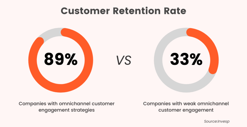
In today’s business landscape, creating a seamless and personalized customer experience across multiple channels is a necessity. A report states that businesses that use omnichannel strategies retain 89% of their customers compared to those that don’t.
This is where an email strategy comes in handy. By integrating email marketing into your omnichannel strategy, you can create consistent and nurturing experiences for customers. In this guide, we’ll explore the role of email marketing in boosting omnichannel customer experience.
Understanding Omnichannel Customer Experience
When it comes to serving customers, “all channels equal,” or “omnichannel,” is the gold standard. The components include physical stores, online/ecommerce platforms, social media, mobile apps, and email.
Omnichannel ensures that customers can interact with your brand in the way that suits them best, and all channels work together cohesively to provide the customer with a consistent brand experience.
The Challenges of Creating an Omnichannel Experience
The main challenge of creating an omnichannel experience is to synchronize all channels, ensuring that they work in harmony. Poor integration can result in unstructured, disconnected communication with the customer. Other challenges of creating an omnichannel experience include:
Integrating disparate systems and technologies
Ensuring consistency across all channels
Providing a unified customer view
For example, a customer has a different experience using the brand’s website versus their mobile app, and their purchase history does not carry over between channels.
Email marketing can play a critical role in overcoming these challenges. Using an omnichannel email strategy, you can connect with customers at every stage of their journey. By crafting effective email campaigns, you can deliver targeted and relevant messages, thereby promoting engagement and sales.
The Role of Email Strategy in Boosting Omnichannel Customer Experiences
Customers still prefer using email as a means of contact. According to the Global Messaging Engagement Report, email was cited as one of the top three communication channels by 18% of respondents. What’s more, 77% of respondents check their email inbox daily or even more often.
Due to its effectiveness and high return on investment (ROI), email remains the backbone of most marketers’ omnichannel marketing campaigns. In fact, the average ROI for an email marketing campaign is $36 for every $1 spent.
Let’s take a look at how you can use the strengths of email marketing to build omnichannel client interaction.
1. Adapt email targeting based on recipients’ actions on other channels.
You can boost your customer engagement and drive revenue to your brand by leveraging user data from various channels. The data can then be used to trigger automated email campaigns. For example, sending personalized and timely emails based on customer actions can significantly increase their interaction with your brand. Here are a few ideas:
If a customer abandons their cart, send an email reminder to encourage them to complete their purchase.
After a successful interaction with your web chat support team, follow up with an email asking for feedback and a review of the service.
Show appreciation to customers who make a purchase by sending a personalized thank-you email and offering a coupon code for their next purchase.
By utilizing these automated email campaigns, you can efficiently nurture customer relationships and drive conversions for your products and services.
2. Gather customer data to supercharge your marketing.
Email and data go together like peanut butter and jelly, complementing each other perfectly.
Acquiring first-party data is essential for building a robust customer profile, and email is one of the most effective methods for collecting such data. For instance, when a user joins your email list, you can start collecting information about them for behavior-based targeting. After they sign up, you can even ask for additional information by inviting them to finish their profile or change their email settings.
Emails can then be tailored to each recipient based on this information and other data collected from customers across multiple channels. For instance, you can personalize the email based on the customer’s location, demographic information, the products they browsed on your site, and much more.
3. Keep communication flowing between relevant channels.
Customers may be unaware of the new channels you’ve added to your communication strategy. Use the following methods to invite subscribers to contact you in new ways by leveraging the widespread use of email:
Offer a special discount to consumers who sign up for both email and SMS at the same time. To do this, simply add a phone number input field to your email signup form.
Tell your email list subscribers to get the app so they may participate in the loyalty program and enjoy other benefits.
You can improve your customer service response time by including a link to live chat in your emails.
Best Practices for Using Email in Omnichannel Customer Experience
Get your customers out of the mobile maze!
We live in a world where mobile devices have become an extension of our lives, and customers expect businesses to meet their mobile engagement needs. However, many businesses are falling short, leaving customers frustrated and disengaged.
Recent research shows that over half of customers are deterred from doing business with a company if they have a poor mobile experience. That’s a lot of potential business lost!
So, what can businesses do to avoid losing customers? It’s simple: prioritize mobile.
Ensure that your website is mobile-friendly in terms of viewing and navigation and that your customer service support is easily accessible on mobile. By providing a seamless mobile experience, you’ll not only keep your customers happy but also stand out from your competition.
Avoid keeping your clientele waiting.
While email may be perceived as a slower communication channel for customer service, it doesn’t diminish the importance of providing prompt resolutions.
Email conversations may not have the real-time nature of phone calls or live chats, but customers still expect timely and satisfactory resolutions to their inquiries or issues. Failing to address customer concerns promptly can lead to frustration, dissatisfaction, and even negative word-of-mouth.
Automation is one approach to fulfilling these requirements. By setting up automated email responses for common queries, businesses can acknowledge the customer’s message and provide relevant information within seconds, even outside regular business hours.
Maintain data across all platforms.
For a consumer, nothing is more frustrating than being passed around from platform to platform, only to have to rehash their story each time. Customer frustration can be reduced by enhancing knowledge management across all platforms and teams.
“Customer service, social media, chatbot Platform, and other channels must be coordinated with email to deliver a consistent experience.”
There’s a good chance you’ll lose a customer if they call and are routed around to a different channel just to be asked to repeat themselves. Instead, offer a direct line of contact, and make it such that the support staff may quickly access the customer’s previous messages when prompted with a reference (such as the customer’s name). With this in place, things should go more easily.
To have a place that collects all data from each channel, you can hire a Node.js developer, that will maintain the company server and will build algorithms that allow organizing and use of data appropriately.
Test, Test, Test…
Many companies who invest in an omnichannel customer service strategy forget the most crucial step: testing.
The omnichannel experience can be evaluated in terms of success and failure by using the customer service software you already have in place.
This paints a crucial big picture for you. However, there is no better way to find out if everything is operating smoothly than to start a live chat or tweet and wait to see the speed and quality of the answer.
Conclusion
The future belongs to companies that implement omnichannel customer service.
To grow a robust email support system, it’s important to learn why your customers prefer email and to keep your cross-channel support standards at a high level.
Keep in mind that the human element is the glue that holds everything together. The secret to offering excellent customer service is having well-trained personnel who can solve customer problems and make a good impression.
Ultimately, the goal of any customer service channel is to deliver a positive and trustworthy experience that will strengthen your bond with the people who use it.
Developing and implementing a reliable and carefully considered business security system remains a top priority for modern employers, with dedicated security teams expected to identify and neutralize sophisticated physical and cybersecurity threats with the aid of proactive and intelligent technologies.
Commercial security systems have been revolutionized in recent years as industry professionals seek to better address novel risks, provide employees with a more convenient way to access core facilities, and markedly improve incident response times with support from integrated remote-access systems.
With data suggesting that the number of recorded significant cyber-attacks may have risen globally by as much as 38% in the last year alone, and crimes against property account for over 60% of all reported crimes in recent times, business leaders must have plans in place to deter common threats.
To help achieve this, here are 4 commercial security trends to consider in your company’s strategy.
Ensuring that access to all company facilities is appropriately secured behind considered physical security devices is essential to protect businesses from instances of physical violence and theft, but choosing to operate traditional access control systems may no longer provide adequate protection.
Legacy solutions such as RFID, NFC, and pin code access systems may hinder unauthorized persons from gaining property access to some degree, though in many cases, unauthorized intruders are able to compromise such systems by simply stealing, duplicating, or brute-forcing relevant permissions.
Businesses can lessen these risks and markedly strengthen on-site security policies by choosing to develop smart commercial access control systems configured to accept secure digital credentials. Rather than issuing easily lost and hard-to-monitor key cards and fobs, mobile systems allow security teams to send staff unique digital credentials to be stored and managed within a smartphone application.
Mobile systems offer touch-free property access, allow users to secure their credentials behind extra protections like in-device multi-factor authentication (MFA) and biometric locks, and allow security teams to remotely adjust or revoke permissions if they suspect a credential has been compromised, providing businesses with reliable 24/7 protection to deter physical intrusions and property crime.
Advanced AI technologies and machine learning algorithms are currently transforming a number of modern industries, with commercial security providers being just one of many to benefit from these novel solutions. Recently published data indicates as many as 77% of businesses are currently using or exploring the use of AI systems, with 61% believing AI tools to be necessary for security purposes.
One of the primary benefits presented by the integration of AI technology alongside traditional security devices is the application of automated smart data analytics used to improve the efficacy of installed video security cameras. For example, AI-informed object detection software can be used to identify suspected weapons or contraband items, instantly alerting on-site security staff to provide a response.
Modern AI software tools are able to apply intelligent machine learning algorithms to recorded data, meaning active systems can be configured to automatically detect anomalous events such as crowds forming in unusual areas, and instantly notify teams of disturbances via cloud-based communications.
Installing and operating such solutions enables on-site security teams to better focus their efforts only on matters of immediate importance, removing the need for staff to constantly monitor live video feeds and ensuring that no potentially harmful incidents or significant threats go undetected or ignored.
Typically, when businesses choose to install and operate modern security technologies such as mobile access control systems and AI-informed video security cameras, teams will also choose to develop a cloud-based security management platform used to provide a holistic view of all active devices.
Cloud-based security management allows security staff to view and adjust connected security devices remotely from within a single easily navigated platform, with further benefits found in the ability to link a range of Internet Protocol (IP) and Internet of Things (IoT) devices to the same system, enabling the creation of automatic security responses triggered by the activation of specific devices in the network.
In practice, this means if a suspected intruder is detected by installed security cameras or IoT motion sensors, this information can be used to automatically engage all nearby access control devices and locking mechanisms, sealing the property and instantly notifying security staff of the unfolding event.
Developing such a system allows for the creation of bespoke security responses as staff can choose which devices should be programmed to inform the operation of connected systems. Considering that 94% of enterprises already use cloud services, upgrading existing networks will often be achievable.
Modern businesses aren’t only expected to contend with a myriad of physical security threats, in fact, recent reports indicate as many as 96% of executives consider cybersecurity resilience to be a top priority with regards to internal operations. As many organizations now operate physical security devices capable of communicating with digital systems, security convergence is likely to become increasingly essential.
Physical and cybersecurity convergence describes a considered approach to enterprise security in which all relevant digital systems and all physical security devices are subject to dedicated policies and procedures, specifically designed to protect integrated networks from both physical and cyber-attacks.
This means physical security staff and IT teams will work together to assess all active systems and ensure that all settings and operational policies are configured to detect and respond to both physical and digital threats, typically via the deployment of combined risk assessments and training programs.
Choosing to implement converged security policies ensures that all security professionals within an organization understand how to identify and address gaps and vulnerabilities in essential systems, reducing the risks associated with cross-platform breaches and strengthening wider security policies.
Summary
Developing a reliable and proactive commercial building security system remains a top priority for organizations across all major industries, though to appropriately prepare for and defend against modern threats, security, and IT teams must prioritize adaptive systems and policies to improve their security posture.
By investing in smart technology systems and integrated cloud-based management platforms, business leaders are able to provide security staff with a more holistic view of all installed systems and assist teams in creating automated incident responses, helping to strengthen commercial security strategies.
Tables are one of the most popular ways to visualize data. Presenting data in tables is so ubiquitous — and core to the web itself — that I doubt many of you reading this have any trouble with the basics of the
Though, I’d even go so far as to say that tables are an integral part of our daily life.
That’s why we need to start thinking about making tables more inclusive. The web is supposed to be designed for everybody. That includes those with impairments that may prevent access to the information in the tables we make and rely on assistive technology to “read” them.
For the last several months, I’ve been working on this scientific project around inclusive design for people with cognitive disorders for my university degree. I’ve mostly focused on developing guidelines to help educational platforms adapt to such users.
I also work for a company that has developed a JavaScript library for creating pivot tables used for business analysis and data visualizations. At one point in my research, I found that tables are a type of popular data representation that can simultaneously be a lifesaver and a troublemaker, yes, for people with learning and cognitive problems, but for everyone else as well. Remember, we are all temporarily “abled” and prone to lose abilities like eyesight and hearing over time.
Plus, a well-executed inclusive table design is a pathway to improving everyone’s productivity and overall experience, regardless of impairment.
Cognitive disorders are defined as any kind of disorder that significantly impairs an individual’s conscious intellectual activity, such as thinking, reasoning, or remembering.
ADHD is one example that prevents a person from remaining focused or paying attention. There’s also dyslexia , which makes it tough to recognize and comprehend written words. Dyscalculia is specific to working with numbers and arithmetic.
For those without this condition, it is difficult to understand what exactly can be wrong with the perception of written information. But based on the descriptions of people with the relevant deviations, simulators were created that imitate what people with dyslexia see.
Currently, you can even install a special browser extension to estimate how difficult your site will be to perceive by people with this deviation. It is much more difficult to understand the condition of people with ADHD, but certain videos with ADHD simulations do exist, which can also allow you to evaluate the level of difficulty in the perception of any information by such people.
These are all things that can make it difficult for people to use tables on the web. Tables are capable of containing lots of information that requires a high level of cognitive work.
The first stage toward helping users with such deviations is to understand their condition and feel its details on themselves — in other words, practicing empathy.
The second stage is to systematize the details and identify specific usability problems to solve.
Please indulge me as we dive a bit into some psychological theory that is important to understand when designing web pages.
Cognitive Load
Cognitive load relates to the amount of information that working memory can hold at one time. Our memory has a limited capacity, and instructional methods should avoid overloading it with unnecessary activities and information that competes with what the individual needs to complete their task.
UX professionals often say complex tasks that require the use of external resources may result in an increased cognitive load. But the amount of the load can be affected by any additional information, unusual design, or wrong type of data visualization. When a person is accustomed to a particular representation of certain types of data — like preferred date format or where form input labels are positioned — even a seemingly minor change increases the processing time of our brain.
Here’s an example: If a particular student is from a region where content is presented in a right-to-left direction and the software they are provided by their university only supports a left-to-right direction, the amount of mental work it takes to comprehend the information will be greater compared to other students.
I also want to call special attention to cognitive biases, which are systematic errors in thinking that become patterns of deviation from rationality in judgment. When people are processing and interpreting information around them, it often can influence the decisions a person makes without even noticing.
For example, the peak-end rule says that people judge an experience by its “peak” and last interactions. It’s easy to prove. Try to reflect on a game you used to play as a kid, whether it’s from an arcade, a computer console, or something you played online. What do you remember about it? Probably the level that was hardest for you and the ending. That’s the“peak” of your experience and the last, most “fresh” one, and they create your overall opinion of the game. For more examples, there is a fantastic resource that outlines 106 different types of cognitive biases and how they affect UX.
Signal-to-noise Ratio
Last but not least, I’d like to touch on the concept of a signal-to-noise ratio briefly. It is similar to the engineering term but relates to the concept that most of the information we encounter is noise that has nothing to do with a user’s task.
Relevant and necessary information is a signal.
The ratio is the proportion of relevant information to irrelevant information.
A designer’s goal is to achieve a high signal-to-noise ratio because it increases the efficiency of how information is transmitted. The information applied to this ratio can be anything: text, illustrations, cards, tables, and more.
The main idea about cognitive disabilities I want you to take away is that they make individuals very sensitive to the way the information is presented. A font that’s too small or too bright will make content unperceivable. Adding gratuitous sound or animation may result in awful distractions (or worse) instead of nice enhancements.
I’ll repeat it:
A good user experience will prevent cognitive overload for everyone. It’s just that we have to remember that many out there are more sensitive to such noises and loads.
Focusing on individuals with specific considerations only gives you a more detailed view of what you need to solve for everybody to live a simpler life.
Considering Cognitive Disorders In UX Design
Now that we have defined the main problems that can arise in a design, I can sum up our goals for effective UX:
Reduce the cognitive load.
Maximize the signal-to-noise ratio.
Use correct cognitive biases to boost the user experience.
“Design” is a loaded term meaning lots of different things, from colors and fonts to animations and sounds and everything in between. All of that impacts the way an individual understands the information that is presented to them. This does not mean all design elements should be excluded when designing table elements. A good table design is invisible. The design should serve content, not the other way around.
With the help of lots of academic, professional, and personal research, I’ve developed a set of recommendations that I believe will result in cognitive-friendly and easy-to-perceive table designs.
Color Palettes And Usage
We should start by talking about the color because if the colors used in a table are improperly implemented, subsequent decisions do not really matter.
Many people consider colors to have their meanings, which differ from culture to culture. That’s certainly true in a sociological sense, but as far as UX is concerned, the outcome is the same — colors carry information and emotions and are often unnecessary to mean something in a design.
Rule 1: Aim For A Minimalist Color Palette
When you see a generous use of color in a table, it isn’t to make the table more functional but to make a design stand out. I won’t say that using fewer colors guarantees a more functional table, but more color tends to result in individuals losing attention from the right things.
Accordingly, bright colors and accents should highlight information that has established meaning. This isn’t to say that interesting color schemes and advanced color palettes are off-limits. This means using colors wisely. They are a means to an end rather than a splash of paint for attention.
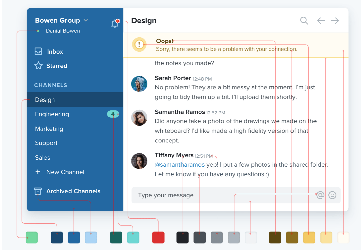
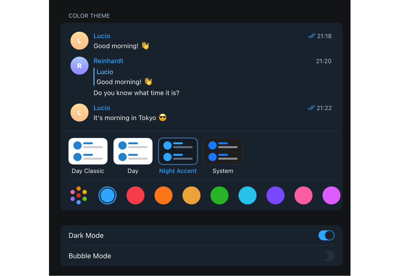
Adam Wathan & Steve Schoger offer a perfect example of color usage in a design study of customized Slack themes. Consider the two following interfaces. It may not seem like it at first, but the second UI actually has a more extensive color palette than the first.
The difference is that the second interface applies shades of the core color defined in the palette and that brighter and more vibrant shades are only used to highlight the important stuff.
You can explore this phenomenon by yourself and test your perception of the colors in the design by changing the look of your messenger. For example, Telegram has some interface customization options, and while playing with that, I noticed I read and navigate between my chats in the “Night Accent” mode rather than the plain “System” mode.
Of course, both designs were designed for people with different preferences and characteristics, but such a personal experiment led me to the following thought. Even though the second option uses fewer colors, the uniformity of information is a bit confusing. From this, I concluded that too few colors and too minimal a design is also a bad choice. It is necessary to find a balance between the color palette and its usage.
That said, I suggest using a “shading” monochromatic approach for tables. It means defining a base color in a palette, then expanding it with different shades in dark and light directions. In other words:
Choose a primary color.
Define an evenly darker and lighter shade of that primary color.
This produces two more colors to which you can apply the previous technic to create colors that are a perfect compromise between the shades on either side. Repeat this process until you reach the number of colors you need (generally, 7–9 shades will do).
Rule 2: Embrace The Power Of Whitespace
I find that it’s good to offer a fair amount of “breathing room” around elements rather than trying to crowd everything in as close as possible. For example, finding a balance of space between the table rows and columns enhances the legibility of the contents as it helps distinguish the UI from the information.
I’ll qualify this by noting that “breathing room” often depends on the type of data that’s being presented, as well as the size of the device on which it’s being viewed. As such, it sometimes makes sense to enhance a table’s functionality by allowing the user to adjust the height and width of rows and columns for the most optimal experience.
If you are worried about using too few or too many colors, apply the 60/30/10 rule. It’s a basic pattern for any distribution selection. People use this strategy when budgeting assets like content and media, and it’s applicable to design. The rule says the color usage should be distributed as follows:
60% for neutral colors,
30% for primary colors,
10% for secondary colors (e.g., highlights, CTAs, and alerts).
Rule 3: Avoid Grays
Talking about neutral colors, in color theory, gray represents neutrality and balance. Its color meaning likely comes from being the shade between white and black and often is also perceived as the absence of color. You can not overdo it; its light shades do not oppress, so gray is just “okay.”
However, gray does carry some negative connotations, particularly when it comes to depression and loss. Its absence of color makes it dull. For this reason, designers often resort to it to de-emphasize an element or certain bits of data.
But maintaining such a philosophy of gray color will only work in black and white designs, such as on the Apple website. Though, as I mentioned before, it actually works really well as grey is the tone of black or a shade of white.
The problem, however, comes up when other colors are added to the color palette, which leads to a change in a color’s roles and functions. In the case of gray, putting it next to brighter colors makes the design pale and dull.
Having no color of its own, gray seems to eat away the brightness of neighboring elements. Instead of maintaining balance, gray makes the design cloudy and unclear. After all, against the background of already illuminated elements, gray makes the elements not just less significant but unnecessary for our perception.
That does not mean you should totally give up gray. But highlighting some information inherently de-emphasizes other information, negating the need for gray in the first place.
The easy way out is to replace gray with lighter shades of a palette’s base color on a table cell’s background. The effect is the same, but the overall appearance will pop more without adding more noise or cognitive load.
Rule 4: Know What’s Worthy Of Highlighting
Designers are always looking for a way to make their work stand out. I get the temptation because bold and bright colors are definitely exciting and interesting.
Blogs can be considered a good example of this problem as their variety is wide and growing, and a lot of platforms prioritize exclusive design over inclusive design.
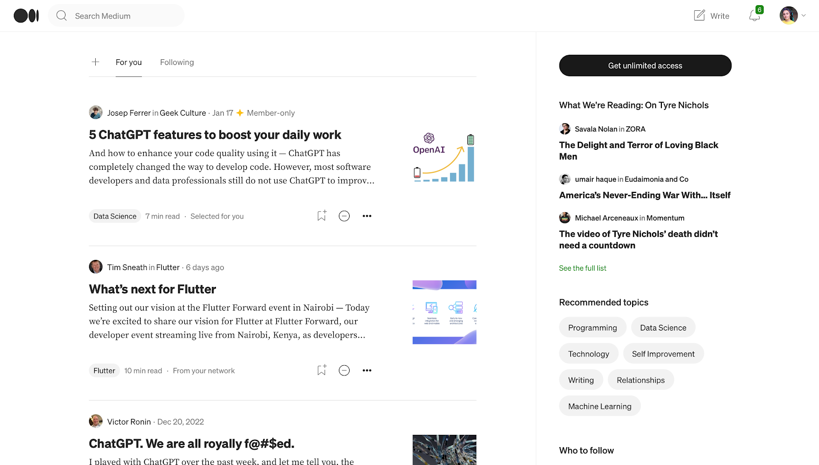
For example, Medium uses only black and shades of it for a color palette, which significantly facilitates even simple tasks like reading titles. Hackernoon, although looking interesting and drawing attention, requires more concentration and does not allow you to “breathe” as freely as on Medium.
In analytical software, that only leads to a table design that emphasizes a designer’s needs ahead of the user’s needs.
Don’t get me wrong — a palette that focuses on shades rather than a large array of exciting colors can still be exciting and interesting. That provides a discussion about which grid elements benefit from color. Here are my criteria for helping decide what those are and the colors that add the most benefit for the given situation.
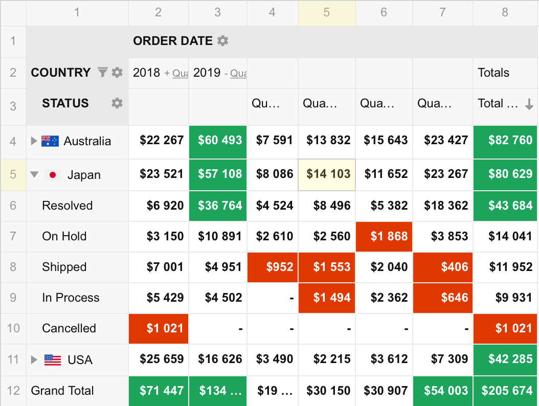
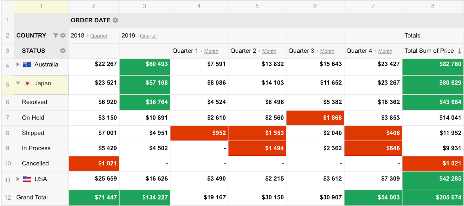
Active cells: If the user clicks on a specific table cell or selects a group of cells, we can add focus to it to indicate the user’s place in the data. The color needs to call attention to the selection without becoming a distraction, perhaps by changing the border color with a base color and using a light shade of it for the background so as to maintain WCAG-compliant contrast with the text color.
Tip!It’s also good to highlight the row and column that a focused cell belongs to, as this information is a common thing to check when deciphering the cell’s meaning. You can highlight the entire row and column it belongs to or, even better, just the first cell of the row and column.
Error messaging: Error messages definitely benefit from color because, in general, errors contain critical feedback for the user to take corrective action.
A good example might be an injected alert that informs the user that the table’s functionality is disabled until an invalid data point is fixed. Reds, oranges, and yellows are commonly used in these situations but bear in mind that overly emphasizing an error can lead to panic and stress. (Speaking of error messaging, Vitaly Friedman has an extensive piece on designing effective error messages, including the pitfalls of relying too heavily on color.)
Outstanding data: I’m referring to any data in the table that is an outlier. For example, in a table that compares data points over time, we might want to highlight the high and low points for the sake of comparison. I suggest avoiding reds and greens, as they are commonly used to indicate success and failure. Perhaps styling the text color with a darker shade of a palette’s base color is all you need to call enough attention to these points without the user losing track of them.
The key takeaway:
Data-heavy tables are already overwhelming, and we don’t want any additional noise. Try to remove all unnecessary colors that add to a user’s cognitive load.
Tip!Remember the main goal when designing a table: reliability, not beauty. Always check your final decisions, ideally with a variety of target users. I really recommend using contrast checkers to spot mistakes quickly and efficiently correct them.
Typographical Considerations
The fonts we use to represent tabular data are another aspect of a table’s look and feel that we need to address when it comes to implementing an inclusive design. We want the data to be as legible and scannable as possible, and I’ve found that the best advice boils down to the typography of the content — especially for numerics — as well as how it is aligned.
Rule 1: The Best Font Is A “Simple” Font
The trick with fonts is the same as with colors: simplicity. The most effective font is one that takes less brainpower to interpret rather than one that tries to stand out.
No, you don’t need to ditch your Google Fonts or any other font library you already use, but choose a font from it that meets these recommendations:
Sans-serif fonts (e.g., Helvetica, Arial, and Verdana) are more effective because they tend to take up less space in a dense area — perfect for promoting more “breathing room” in a crowded table of data.
A large x-height is always easier to read. The X-height is the height of the body of a lowercase letter minus any ascenders or descenders. In other words, the height of the lowercase “x” in the font.
Monospace fonts make it easier to compare cells because the width of each character is consistent, resulting in evenly-spaced lines and cells.
Regular font weights are preferable to bolder weights because the boldfacing text is another form of highlighting or emphasizing content, which can lead to confusion.
A stable, open counter. The counter is a space in the letter “o” or the letter “b.” Fonts with distorted counters render poorly in small sizes and are hard to read.
Fonts that fulfill these criteria are more legible and versatile than others and should help whittle down the number of fonts you have to choose from when choosing your table design.
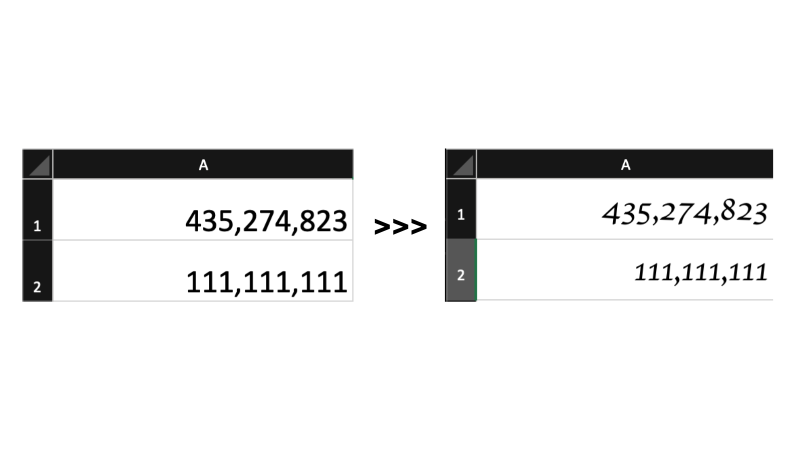
Rule 2: Number Formatting Matters
When choosing a font, designers often focus on good legible letters and forget about numbers. Needless to say, numbers often are what we’re displaying in tables. They deserve first-class consideration when it comes to choosing an effective font for a good table experience.
As I mentioned earlier, monospace fonts are an effective option when numbers are a table’s primary content. The characters take up the same width per character for consistent spacing to help align values between rows and columns. In my experience, finding a proportional font that doesn’t produce a narrow “1” is difficult.
If you compare the two fonts in the figure above, it’s pretty clear that data is easier to read and compare when the content is aligned and the characters use the same amount of space. There’s less distance for the eye to travel between data points and less of a difference in appearance to consider whether one value is greater than the other.
If you are dealing with fractions, you will want to consider a font that supports that format or go with a variable font that supports font-variant-numeric features for more control over the spacing.
Rule 3: There Are Only Two Table Alignments: Left And Right
Technically there are four alignments: left, right, center, and justify. We know that because the CSS text-alignment property supports all four of them.
My personal advice is to avoid using center alignment, except in less-common situations where unambiguous data is presented with consistently-sized icons. But that’s a significant and rare exception to the rule, and it is best to use caution and good judgment if you have to go there.
Justified content alters the spacing between characters to achieve a consistent line length, but that’s another one to avoid, as the goal is less about line lengths than it is about maintaining a consistent amount of space between characters for a quick scan. That is what monospaced fonts are effective for.
Data should instead be aligned toward the left or right, and which one is based on the user’s language preference.
Then again, at school, we’re taught to compare numbers in a right-to-left direction by looking first at single units, then tens, followed by hundreds, then thousands, and so forth. Accordingly, the right alignment could be a better choice that’s universally easier to read regardless of a person’s language preference. You may notice that spreadsheet apps like Excel, Sheets, and Notion align numeric values to the right by default.
There are exceptions to that rule, of course, because not all numbers are measurements. There are qualitative numbers that probably make more sense with left alignment since that is often the context in which they are used. They aren’t used for comparison and are perceived as a piece of text information written in numbers. Examples include:
Dates (e.g., 12/28/2050),
Zip/Postal code (e.g., 90815),
Phone number (e.g., 555-544-4349).
Table headings should be aligned to the same edge as the data presented in the column. I know there could be disagreement here, as the default UA styling for modern browsers centers table headings.
The screenshots above are examples of bad and good headers. When looking at the first screenshot, your initial focus is likely drawn to the column headers, which is good! That allows you to understand what the table is about quickly. But after that initial focus, the bold text is distracting and tricks your brain into thinking the header is the most important content.
The header in the second screenshot also uses bold text. However, notice how changing the color from black to white emphasizes the headers at the same time. That negates the impact bolding has, preventing potential cognitive load.
At this point, I should include a reminder to avoid gray when de-emphasizing table elements. For example, notice the numbers in the far left column and very top row. They get lost against the background color of the cells and even further obscured by the intense background color of surrounding cells. There’s no need to de-emphasize what is already de-emphasized.
I also suggest using short labels to prevent them from competing with the data. For example, instead of a heading that reads “Grand Total of Annual Revenue,” try something like “Total Revenue” or “Grand Total” instead.
Table Layout Considerations
There once was a time when tables were used to create webpage layouts because, again, it was a simple and understandable way to present the information in the absence of standardized CSS layout features. That’s not the case today, thankfully, but that period taught us a lot about best practices when working with table design that we can use today.
Rule 1: Fewer Borders = More White Space
Borders are commonly used to distinguish one element from one another. In tables, specifically, they might be used to form outlines around rows and columns. That distinction is great but faces the same challenge that we’ve covered with using color: too much of a layout can steal focus from the data, making the design busy and cluttered. With the proper design and text alignment, however, borders can become unnecessary.
Borders help us navigate the table and delimit individual records. At the same time, if there are many of them in a grid, it becomes a problem in large tables with a lot of rows and columns. To prevent the cells from being too densely connected, try adding more space between them with padding. As I have mentioned before, negative space is not an enemy but a design saver.
That said, the law of diminishing returns applies to how much space there should be, particularly when considering a table’s width. For example, a table might not need to flex to the full width of its parent container by default. It depends on the content, of course. Avoiding large spacing between columns will help prevent a reader’s eyes from having to travel far distances when scanning data and making mistakes.
I know that many front-enders struggle with column widths. Should they be even? Should they only be as wide as the content that’s in them? It’s a juggling act that, in my mind, is not worth the effort. Some cells will always be either too wide or too narrow when table cells contain data points that result in varying line lengths. Embrace that unevenness, allowing columns to take up a reasonable amount of space they need to present the data and scale down to as little as they need without being so narrow that words and numbers start breaking lines.
Lines should be kept to a minimum. Add them if adjusting the alignment, joining cells, and increased spacing is not enough to indicate the direction — or keep them as light as possible.
Allow multi-line wrapping when you really need it, such as when working with longer data points with just enough room around them to indicate the alignment direction. But if you caught yourself thinking of using multi-line wrapping in a grid, then first of all, analyze whether there is a more practical way to visualize the data.
Rule 2: Stylish rows, stylish columns
When deciding how to style a table’s rows, it’s important to understand the purpose of the table you are developing. Reducing visual noise will help to present a clear picture of the data on smaller datasets but not for large datasets.
It’s easy for a user to lose their place when scrolling through a table that contains hundreds or thousands of rows. This is where borders can help a great deal, as well as zebra striping, for a visual cue that helps anchor a user’s eyes enough to hold focus on a spot while scanning.
Speaking of zebra striping, it’s often used as a stylistic treatment rather than a functional enhancement. Being mindful of which colors are used for the striping and how they interact with other colors and shades used for highlighting information will go a long way toward maintaining a good user experience that avoids overwhelming color combinations. I often use a slightly darker shade of the table’s default background color on alternating rows (or columns) when establishing stripes. If that’s white, then I will go with the lightest shade of my palette’s base color. The same choice should be made while maintaining the borders — they should be marked but remain invisible.
Typically, row density gravitates around 40px-56px with a minimum padding of 16px on both the right and left edges of each column.
Feature Enhancements
Tables are often thought of as static containers for holding data, but we’ve all interacted with tables that do lots of other things, like filtering and reordering.
Whatever features are added to a table, it’s important to let users customize the table themselves based on their preferences. Then the user experience you create can become even better by conforming to the user’s comfort level. As with everything else, there is a line. Smaller datasets may not need the same enhancements for filtering data that large datasets do, for example, because they may wind up causing more confusion than convenience and raise the threshold for understanding the data.
In addition to the ability to customize a table’s elements, such as colors, fonts, conditional formatting, value formatting, and cell sizing, there are a few questions you can ask to help determine the enhancements a table might need for a better experience.
Could A User Lose Context When Scrolling?
We’ve already discussed how a table with hundreds of rows or columns can lead to many user scrolling and cognitive errors. Striping is one way to help users remain focused on a particular spot, but what if there’s so much scrolling that the table’s headers are no longer available?
If that’s a possibility, and the headers are important for establishing the context of the presented data, then you might consider sticky positioning on the headers so they are always available for reference. Chris Coyier has a nice demo that implements sticky headers and a sticky first column.
Who Can Have Problems Using My Design? (Accessibility Support)
Of all the points, this is the most difficult to implement, but at the same time, in our context, it is the most important. People with diagnosed abnormalities and disorders have a much stronger impact on their work process due to their condition. Therefore, supporting an additional — and optional — accessibility mode is necessary. Each element must be adapted for screen readers, navigable via keyboard, and contain the most semantic markup possible. This will help people who use assistive technology without a loss in performance.
Conclusion
Thanks for letting me share my best practices for presenting tabular data on the web. It’s amazing how something as seemingly simple as a table element can quickly grow in scope when we start considering user needs and enhancements to include as many of those needs as possible.
We discussed a great number of things that get in the way of an inclusive table design, including our own cognitive biases and design choices. At the same time, we covered strategies for tackling those obstacles from a wide range of considerations, from design choices all the way to determining possible features for enhancing a user’s experience when interacting with the table and the data it contains.
There can be a lot of headwork that goes into a table implementation, but not everything in this article has to be considered for every situation. A lot of the advice I’ve shared — like so many other things on the web — simply depends on the specific case. That’s why we spent a good amount of time defining the goals for an effective table experience:
Reduce the cognitive load.
Maximize the signal-to-noise ratio.
Use correct cognitive biases to boost the user experience.
But if you only take one thing away from this, I’d say it is this: in data analytics data > than everything else. Keeping that idea in mind throughout the development process prevents spoiling your design with frivolous designs and features that work against our goals.
With the evolution of technology, customer preferences have evolved, changed, and expanded. You have to work harder than your biggest competition to grab their low attention span. This is why you require innovative technologies to stand out in your customer’s inboxes.
The inboxes of your audiences are already crowded. How do you then engage with your subscribers and make them click, read and take action?
One of the best approaches is AMP (Accelerated Mobile Pages) in email marketing. What is AMP and how do you use AMP email marketing to accelerate growth for your business? Let us understand in detail.
What are Accelerated Mobile Pages in Email Marketing?
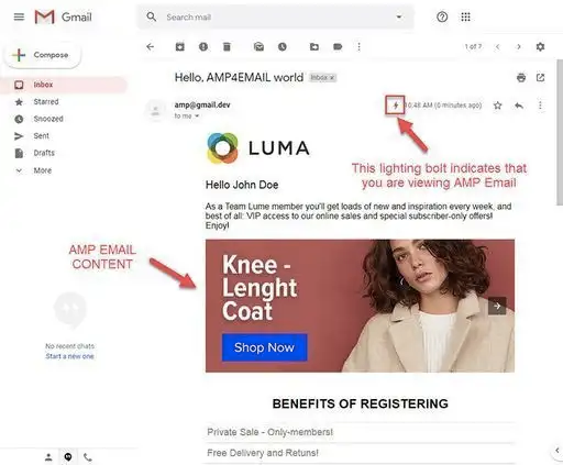
AMP aka Accelerated Mobile Pages in email marketing is an integration (initially developed by Google) for a web page-like experience inside emails. It allows your marketing team to create interactive and dynamic digital experiences for your users within those emails and enhances engagement.
Using the power of AMP, you can directly embed interactive elements like image galleries, forms, carousels, etc. These components are what will make your users click and engage with you.
These elements also make it easier for the users to engage and interact without having to leave the inbox on a different app. This way, the results would lean towards higher engagement, improved customer experience, and increased brand visibility.
How to Leverage the Power of AMP in Your Email Marketing Strategy?
Here are some of the major benefits of AMP that you can get an advantage out of for your email marketing strategy:
Increase in Conversions
The longer a prospect takes to make a decision, the lower the likelihood of conversion. AMP email addresses this issue by allowing subscribers to complete transactions directly within the email itself, reducing decision-making time. This functionality proves instrumental in generating leads and increasing conversion rates, ultimately transforming prospects into customers.
Real-Time Updates
You can also include live, real-time updates in your emails using AMP. This feature was specifically developed for displaying real-time pricing, showcasing inventory availability, publishing event updates, and overall ensuring that your users get the correct and relevant information timely.
Personalization at Scale
Also, when you are using AMP, it allows the dynamic content to adapt to the user patterns and their interactions. This capability actually helps marketers for delivering personalized recommendations.
Such tailored experiences resonate with the users and eventually drive revenue for your business.
Now, let us explore how to best utilize AMP for your email marketing strategy.
Best Practices for Implementing AMP
When you are utilizing AMP, you need to leverage the maximum potential out of it to get the best ROI for your brand. How can you do that?
Get started with segmentation
In order to get the maximum impact of AMP for your email marketing strategy, you have to categorize emails into different groups based on various criteria, such as past purchase history, level of engagement, geographical location, and more.
This personalization tactic proves effective as it enables the delivery of valuable and pertinent messages to specific groups, fostering higher customer engagement and boosting email-driven conversions.
Use interactive elements
AMP provides a range of interactive components and elements and if used wisely and thoughtfully, they can make a significant impact. You must focus on the components that align with interactive emails, email marketing strategy, and objectives.
Forms: You can embed interactive forms within emails, allowing recipients to submit information, provide feedback, or participate in surveys and polls directly from the email.
Carousels: Carousels enable you to display multiple images or content blocks within a single space, allowing recipients to scroll or swipe through the carousel to view different offerings or information.
Accordion Menus: Accordion menus allow you to present collapsible content sections within an email. Recipients can expand or collapse these sections to access additional details or navigate through different sections of the email.
Countdown Timers: Countdown timers can be added to create a sense of urgency or to promote time-sensitive offers. These timers visually display the time remaining for a particular event or offer.
Ratings and Reviews: You can include interactive rating and review elements within emails, allowing recipients to provide feedback or rate products, services, or experiences directly from the email.
Continuously test and optimize
As with any process or strategy, even when you are using AMP, testing and optimization are crucial to the process. A/B testing, multivariate testing, and optimization through improvements are a must.
Through A/B testing, you can understand the impact of AMP components and elements on the open rates, click-through rates, as well as conversions. You can use the insights gained through testing for refining your approach.
By doing this, you can achieve continuous improvement in the performance of your email marketing campaigns.
Always provide support for non-AMP versions
There are email clients that do not support AMP. Here, you need to ensure that you have a fallback option. This way, the clients and recipients who are not compatible with AMP can also still access your content, and engage with your brand.
Always comply with the best practices and follow the guidelines
When it comes to using AMP, you have to comply with the guidelines set by the email service providers along with the AMP specifications. Ensure that the email client supports and enables AMP for email functionality. Not all clients may offer support for AMP (like Outlook and Amazon Simple Email Service), so it’s crucial to confirm compatibility beforehand.
This will ensure that the emails you send out as a part of your campaign are properly rendered, and compatible with the recipients, and improves client engagement by also following the best practices and guidelines.
Conclusion
Integrating AMP into your email marketing strategy can boost your engagement significantly. When you are leveraging the interactive capabilities of AMP, you are offering a dynamic, personalized, and immersive experience to your users.
Of course, it is important to always follow the best practices to get the maximum output out of AMP technology. AMP comes with a list of benefits that you must take advantage of for your email marketing strategy. By following the best practices, you ensure that it makes a significant impact on your brand.
An Apple VR headset has been one of the most widely-rumored devices of the last few years, and it was finally settled as Apple unveiled its AR headset at WWDC today.
Social media marketing has changed the way that businesses connect with consumers. Businesses that use social sites like Instagram, TikTok, and Facebook can post trending, engaging content that piques the interest of potential customers and builds a buzz around their brand.
However, creating content that connects with your audience can be difficult. Consumer trends change quickly in the digital world and it’s easy to look out of touch if businesses aren’t constantly updating their approach.
Companies that want to improve their social reach can connect with customers by tailoring their content to meet the genre expectations of each social platform. This can help marketers build a connection with a multi-generational audience, too, as different demographics have vastly different preferences in the digital world.
Characteristics of Social Media Marketing
Understanding the difference between traditional marketing and digital marketing is key for any business that wants to improve its social following. While traditional marketing can be repurposed for social content, it’s usually best to adopt an entirely different strategy to target social sites.
Digital marketing is an innately audience-focused approach to content creation. It’s less expensive than traditional marketing and can help businesses reach a global audience. Digital marketing on social media can significantly improve consumer connection, too, as social platforms offer businesses a two-way conversation in the form of direct messages, comments, and shared content.
However, no two social platforms are the same. Each site has its own unique conventions and norms that dictate consumer preferences and content creation. These platforms can be categorized into five types of social media, including:
Social networking (LinkedIn, Facebook, and Twitter);
Photo sharing (Instagram and Pinterest);
Video sharing (YouTube and Vimeo);
Interactive media (TikTok and Snapchat);
Blogging and Community Building (Reddit and Tumblr).
While there is overlap between these categories, distinguishing between them can help marketers produce creative content that connects with users. Once marketers understand the differences between social sites, they can start to plan and produce content that redirects users to omnichannel services for improved customer communication.
Embracing Creativity
Creativity is a skill that can be refined with practice and the right approach. Businesses that want to be more creative with their content marketing should adopt an honest, research-driven approach to ideation. Even small changes, like encouraging internal collaboration, can have a huge impact on reach and engagement online.
Marketing departments that have run out of creative marketing ideas can use the “Wonderland” game to produce unique and engaging content. The “Wonderland” game is an ideation technique used to discover connections between unrelated things. Marketers use Lewis Caroll’s iconic brain teaser “Why is a raven like a writing desk?” as inspiration to form their own questions. This can result in remarkable, eye-catching content ideas like:
“What I learned about content marketing from my grandma”
“How I increased my open rate by 174% with a roll of duct tape”.
Even if marketing departments take a different direction, the “Wonderland” game is a great way to spark conversation and generate ideas. Ideally, the “Wonderland” game should be used in tandem with other social media trends like influencer marketing and video-based content. This ensures that posts are relevant to current consumer preferences.
Embracing creativity is particularly important for businesses trying to reach a multi-generational audience. Content creators will have to get creative to adopt a Gen-Z or baby-boomer mindset when crafting digital content.
Generational Marketing Tactics
Generational differences have a huge impact on customer preferences and digital behavior. Trend-driven marketing content may resonate with younger users but will likely put off older consumers who are looking for easy-to-understand posts.
Ideally, businesses should use their social presence to target one or two generations online. This simplifies the content creation process and maximizes the impact of a business’s social media strategy. This is particularly important for businesses that want to use social media to break into a new market segment.
Companies that want to connect with new users should use high-profile social pages to direct their content creation strategies. For example, if a business wants to create a buzz amongst Gen-Z consumers, it can follow Doritos’ example and post content that utilizes trending sounds and content.
Using high-performing pages as a guide is a great way to streamline the content-generation process and create materials that connect with audiences. This will free up time for engagement and ensure that marketers can spend most of their time tracking key metrics and utilizing analytic data.
Utilizing Analytics
Social media is a treasure-trove for consumer data. Content creators who want to produce materials that connect with consumers must use data analytics to refine their approach and spot emerging trends. To get started, marketers should familiarize themselves with the basics of:
TikTok Analytics;
Google Trends;
Instagram Insights;
Meta Business Suite.
These services are in-built analytic services that track key metrics like follower count, growth, engagement rate, and views. They’re largely user-friendly and can be used to direct future marketing strategies based on the performance of previous posts.
Marketing professionals that want to amplify the impact of their social media content can look to external services like HootSuite, SproutSocial, and Brandwatch to improve their consumer connection. These sites help businesses track useful metrics and improve common key performance indicators (KPIs) like:
Growth rate percentage;
Theoretical reach;
Social share of voice;
Engagement rate percentage.
These KPIs give marketers quantitative data to track and measure consumer connection. They give content creators a benchmark to measure performance and can even be used to plan future posts. This is particularly important today when stiff competition makes capturing a piece of the social pie harder than ever before.
Conclusion
Creativity is key to successful social media marketing. Adopting an honest, research-driven approach to ideation and content generation can help businesses produce unique and engaging content that resonates with a multi-generational audience.
Today’s marketers must become savvy data analysts, too. Data analytics are essential when refining existing campaigns and measuring performance. By tracking KPIs, businesses can improve their social media campaigns and produce content that authentically connects with consumers.
So, you’ve created a thing. That thing could be anything, say a product the world never knew it needed or maybe a stellar SaaS app that makes everyone way more productive. You had a brilliant idea and took the initiative to make it happen. It’s time to put it on the market!
But wait… how much money are you going to charge for this thing? That’s often a way more difficult question to answer than it might seem. I mean, slap a price on the tin, and that’s it, right?
The truth is that pricing a product or service is one of the more challenging aspects of product development. Pricing is an inexact science, and chances are you will not get it right the first time. But where do you even begin?
That’s where the team at Information Architects — commonly known as iA — found itself when tasked with pricing a new product called iA Presenter. iA already had a hit product on its hands, the popular iA Writer app, with its claim to fame being a minimal, distraction-free writing interface. iA Writer is already a mature offering, having been available for many years and having undergone several significant iterations since its initial release. How does a new offering like iA Presenter fit into the picture?
Let’s use iA Presenter to study the considerations that go into product pricing. Its status as a brand-new product that sits alongside an existing product with an established history makes iA Presenter an interesting case study on pricing. Plus, the iA team was generous enough to share a bunch of the research and work that went into their pricing for iA Presenter.
Finding Pricing Parallels
The first step to pricing might be looking at what others are doing. Chances are that you are not the only player in the market, and you can certainly learn by observing what others are doing. I know that’s what I did when getting into the pricing of a SaaS-based app. There were plenty of competitors in that particular market, and mapping them out in a spreadsheet was a nice way to compare the similarities and differences — not only in the prices themselves but the pricing models as well. Some were one-time purchases, but many were recurring subscriptions. Some offered free trials, while others relied on a generous return policy. Some required a credit card upfront, and others allowed you to jump right into the app. You get the idea. There’s more to pricing than meets the eye.
The key is to find parallels between what others are doing and what aligns with what you’re doing. If everyone else is selling subscriptions, then maybe that’s clear enough for you to do the same. Or perhaps it’s more of an opportunity to differentiate your product, offering a pricing model that might appeal to an overlooked segment of the market.
The purpose of finding parallels is to prevent sticker shock by setting a price that is far outlier from what the rest of the market has already set.
“As you can see, the pricing ranges from $5 to $25 per user. There are outliers on the upper scale. Some of them offer a free model for individuals or low-usage cases. As you already know, they can do that because they have venture capital or run on an ad-based model (Google). Google and PowerPoint come as part of a suite.” —iA, “Presenter Pricing (I)”
Ah! There’s always a story lurking in the details. Outliers can exist, and they might actually be on the low end of the spectrum. Competing on price alone always feels like a risky call; just ask any company that’s had to play along with Walmart’s aggressive tactics to be a low-price leader.
Identifying Opportunities
Perhaps the most important lesson from my own pricing research is that finding parallels in the market will also provide a clearer picture of what value your product provides. Does your product do something that the others don’t? Is it so much easier to use than the rest that the user experience is where the value comes from?
Add those things to the spreadsheet! The spreadsheet becomes more of a matrix than a competitor list. You can use it to surface what’s unique about your product and lean into it when determining the overall value your product offers compared to everyone else.
Again, the iA team throws a bit of a curveball based on its recent experience:
“Whether a price is low, high, or right depends on what [customers] compare it to. Customers will compare apples and oranges”. —iA, “Presenter Pricing (I)”
Did you catch that last point? You may need to find pricing parallels with products that are tangentially related to your market because you can’t control what you might be compared to. My own pricing journey was on a hosted calendar, and while it has way less in common with something like Google Calendar, customers would inevitably compare our offering to it because Google Calendar is such a common point of reference when talking about anything related to online calendars.
Starting The Conversation
The topic of pricing usually comes up during product development but could certainly come much sooner. The closer the finish line for development gets, the more the reality sets in that there’s work to do to get the product to market, and pricing is one step that simply cannot be skipped — how else will customer compensate you for the pleasure of getting their hands on a product?
You could start spewing numbers until one resonates with you, but that’s rather subjective. Will your customers see the same value in the product that you do? It’s worth checking, and sometimes it works to directly ask your customers — whether it’s existing customers or a target audience you’ve identified.
That’s what iA did when they published the question “How Much Would You Charge for iA Presenter?” in the aforementioned blog post from November 2022. The post provides oodles of context for readers to get an idea of what the iA team was already considering and what they’ve learned from an initial round of research on different pricing models.
What I like about this approach is the transparency, sure, but also how it leads to two other things:
Setting expectations iA had already introduced iA Presenter in another post that precedes the call for pricing opinions. But in bringing pricing to the forefront, the team is giving existing and potential customers a heads-up of what’s to come. So, even if they settled on a high price point that is an outlier in the market, at least everyone is already familiar with the thinking behind it.
Data Posing the question means they had opened the door for customers to weigh in. That’s the sort of feedback that can be designed as a survey, with the data helping inform pricing experiments and identify insightful patterns.
Parsing Information
Have you ever had to design a survey? Good gosh, that can be a frustrating experience. The challenge is to get useful feedback that leads to insights that allow you to make better decisions. But the process is all too easy to mess up, from choosing the wrong type of form input for a particular question or, worse, injecting your own biases into how things are worded. Surveys can be as much a balancing act as product pricing!
That’s why I find iA’s approach so interesting. They had the idea to ship not one version of the survey but three. This is what they shared with us:
“We divided our newsletter’s subscribers into different groups of roughly 5000 people each and sent them different versions of the form. The first group received the Version 0 of the form, and each time we updated this one, we sent it to a different group.
In retrospect, it’s clear why, but we didn’t expect the form design to affect the price suggestions so much. A lot has been written about A/B testing, form design, and questionnaire design. But here we were right in the middle of a form/questionnaire experiment and saw how directly the design affected the results. It was amazing to see all of this happening in real-time.”
It was a genius move, even if it wasn’t obvious at first. Sending three versions sent to different segments of the audience does a few things:
It considers different scenarios. Rather than asking its audience what pricing model they prefer, iA assumed a pricing model and put it in front of users. This way, they get a reaction to the various pricing scenarios they are considering and gain a response that is just as useful as directly asking.
It challenges assumptions. The iA team put a lot of legwork into researching pricing models and evaluating their pros and cons. That certainly helped the team form some opinions about which strategies might be the most effective to implement. But even all the research digging in the world doesn’t guarantee a particular outcome. Evaluating responses from a clearly defined target audience using three versions of the form allowed iA to put its assumptions to the test. Is a subscription-based model really the best way to go? Now they know!
It reveals customer biases. Anything you ask will have a degree of bias in it, so why not embrace that fact and let the customers show you their biases in the process? One version of the iA Presenter survey was based on a subscription pricing model, and the team found that some users hate subscriptions so much that they refused to fill out this form and were quite vocal about it.
I love the way iA sums up the patterns they found in the survey results and how those results were influenced by differentiating the surveys:
“We offered a form that required you to fill out monthly and yearly subscriptions plus ownership. […] We offered a second version that didn’t require you to fill out all fields. What happened there raised brows. The price suggestions changed. They got lower. We continued changing the form, and every time, the result changed.”
And with that, iA had unlocked what they needed to determine a price for iA Presenter. From a follow-up blog post that reports their findings:
“All data combined, you decided that iA Presenter should charge the industry standard of 5.- for a single license. Multiplying 5.- times twelve for a year and times three to make it worthwhile would make iA Presenter make a 150.- app.” —iA, “Presenter Pricing (II)”
Aligning Data With Strategy
Great! iA was able to determine a specific price point with some level of scientific certainty. It would be easy enough to slap that on a price tag and start selling, but that doesn’t do justice to the full picture the data provides. Specifically, iA learned that the price point they determined would not align with all of the audience segments they surveyed.
Here’s more of what they were willing to share with us about their audience’s feelings on pricing:
The collective audience suggested charging the industry standard of $5 for a single license.
Some think that the $50 price for the existing iA Writer app is high. $100 is not that much in Switzerland, but in some countries, $100 can be a big chunk of a monthly salary. That means local pricing adjustments ought to be considered.
Suggestions for business subscriptions varied between $10 and $20 per month per license.
Students want a free tier of access.
iA is lucky enough to have an internal source of useful data, thanks to the long sales history it has with iA Writer. They found that new customers tend to prefer a subscription model, while existing (or “convinced”) customers show a preference for a single purchase.
So, it’s more like they were looking at different pricing tiers instead of a flat rate. Their audience is all over the map as far as what their pricing expectations are, and a pricing model that offers choices based on the type of customer you are (e.g., business vs. student) and where people are geographically is likely to cast a wider net to attract more customers than they would get from a single price point. So, even if verified students are able to get the product for free, that should be offset by the price points for single-license customers and businesses.
Wrapping Up
What we’ve looked at are several important considerations that go into product pricing. The work it takes to determine a price goes way past subjective guesses. Pricing is one of the “Four Ps of Marketing” that influence a product’s market position and how customers perceive it.
Setting a price is a statement of the product’s quality and the value it adds to the market.
That’s the sort of thing you can’t leave to chance.
That said, it’s clear that determining a product price is far from an exact science. The challenge is to elicit the right information that leads to insights that are more reflective of and aligned with the expectations of the target audience. Will they pay the price you want?
There are many other considerations that go into pricing, to be sure. You might discover that the price the market is willing to pay is unsustainable and does not cover enough of the costs that went into product development or the ongoing costs of maintenance, developing new features, marketing, support, salaries, and so on. You don’t want to enter yourself in a race to the bottom, after all.
iA Presenter makes for a great case study on product pricing. The fact that it’s the type of software that those of us in the web design and development community often work on makes it an extremely relevant example. Plus, iA put so much effort into research and was generous enough to share it with us that it provides a nice recent snapshot of a real-world situation.
And, hey, now that you know everything that went into setting prices for iA Presenter, you should check it out. Do you think they made the right choice? Will the multi-tier pricing strategy work next to market competitors who are more mature and are able to practically give away their stuff for free, like Google Slides? We’ll find out soon as iA Presenter is officially out of beta and has been released to the public on June 1st. You can follow along with their ongoing journey of shipping a new product on their blog or by signing up for their newsletter.
No doubt you’ve had to style a menu before. And when you do, you often have had to reach far down in your CSS arsenal of tricks or rely on JavaScript to get anything near the level of customization you want. It’s a long-running headache in the front-end world.
Well, thanks to the efforts of the Open UI community, we have a new element to look forward to, and its purpose is to provide CSS styling affordances to selection menus in ways we’ve never had before.
We’re going to demonstrate an initial implementation of in this article. But we’ll throw in a couple of twists while we’re at it. What we’re making is a radial select menu, something we could never have done with CSS alone. And since we’re working with experimental tech, we’re going to toss in more experimental features along the way, including images, the HTML Popover API, and the CSS Anchor Positioning API. The result is going to wind up like this:
: This is the selector itself. It holds the button and listbox of menu options.
button: This part toggles the visibility of the listbox between open and close.
selected-value: This displays the value of the menu option that is currently selected. So, if you have a listbox with three options and the second option is selected, the second option is what matches the part.
marker: Dropdown menus usually have some sort of downward-facing arrow icon to indicate that the menu can be expanded. This is that part of the menu.
listbox: This is the wrapper that contains the options and any elements that group certain options together inside the listbox.
: We already let the cat out of the bag on this one, but this part groups options together. It includes a label for the group.
: A value that the user is able to select in the menu. There can be one, but it’s much more common to see a — and, by extension — a with multiple options.
The other way is to slot the content ourselves in HTML. This can be a nice approach since it allows us to customize the markup any way we like. In other words, we can replace any of the parts we want, and the browser will use our markup instead of the implicit structure. In fact, this is the approach we’ll use in the radial menu we’re making.
The way to replace parts in the HTML is to use the slots. The markup we use for a slot lives in a separate tree in the Shadow DOM, replacing the contents of the DOM with what we specify in the Shadow DOM.
Here’s an abbreviated example in HTML. Notice how the and listbox are both contained in slots that represent the HTML we want to use for those parts.
By using slots and behavior as attributes, we can tell the browser how it should behave and how it should interact with keyboard navigation. If managed carefully, this will also mean that we get good accessibility out of the box because the browser will know how to behave based on what we define.
Ready? OK, let’s start by setting up our markup for our radial .
The Radial Selectmenu Markup
We will start by creating our own markup for this basic example. We will use pretty much the same approach as used in the explainer of the Selectmenu element because I think it demonstrates the vast flexibility we have to style this element using similar markup.
You might notice from the markup that we’ve added the selected-value behavior in the button. This is perfectly fine, as our button will always show the selected value by doing this.
And, just like the example in the explainer, we are using the Popover API inside of our listbox slot. When we look at what we have in Chrome Canary, and see that it already works fine. Take note that even keyboard navigation already seems to be handled for us!
We can add the following formula for our options when the popover is open by adding a transform to our options:
[popover]:popover-open option {
  /* Half the size of the circle */
  --half-circle: calc(var(--circle-size) / -2);

  /* Straighten things up and space them out */
  transform:
      rotate(var(--deg))
      translate(var(--half-circle))
      rotate(var(--negative-deg));
}
Now, when the popover-open state is triggered, we will rotate each option by a certain number of degrees, translate them along both axes by half the circle size, and rotate it once again by a negative amount of degrees. The order of the transforms is important!
I said we would rotate the options “by a certain number of degrees” because we have to do it for each individual option. This is totally possible in vanilla CSS (and that’s how we’re going to do it), but it could also be done with a Sass loop or even with JavaScript if we needed it.
Let’s add this to our popover style rules:
[popover] {
  --rotation-divide: calc(180deg / 2);

  /* etc. */
}
This will be our default rotation, and it’s a special case for when we only have one option. We’ll use 360deg for the rest in a moment.
For now, we can select the first option and set the --rotation-divide variable on it:
Here’s a live demo of what this produces. Remember, Chrome Canary is the only browser that currently supports this, as long as the experimental features flag is enabled.
For this demo, however, you might still want to limit the --children custom property to a maximum of 6. I’ve found that’s the sweet spot before the circle gets too crowded and needs additional tweaks.
There are a few more CSS features coming up that will make animating popovers a lot easier. But they’re not ready for us yet, even for this example.
We can get around that with a little trick. But please keep in mind that what we’re about to do will not be the best practice when we get the new animating features. I wanted to give you the information anyway because I think it’s a nice enhancement for what we’re making.
First, let’s add the following to our popover selector:
[popover] {
  display: block;
  position: absolute;
  /* etc. */
}
This makes it so our popover will always be displayed block and ready to go wherever it is placed, and we have established a stacking context.
We will lose the benefit of our top layer popover and will have to play around with a z-index to get the effect we want. Juggling z-index values — especially with a large number of items — is never fun. It gets messy fast. That’s one of the ways popovers were designed to help us.
But let’s go ahead and give our button a z-index:
.selected-button {
  z-index: 2;
  /* etc. */
}
Now we can use animations to reveal the options by using the :not() pseudo-class. This is how we can reset the transform when the popover is in its closed state:
There was quite a bit of discussion about this in the Open UI community, but the selected value does not take innerHTML as an option as, for one, this could result in IDs being duplicated. But I sure do love a good old role-playing game, and I decided to use the as a potion selector.
This is completely based on everything we just covered, only adding images to demonstrate that it is possible:
With a sprinkle of JavaScript (for this totally optional enhancement), we can select the innerHTML of the element and pass it to our .selected-value button:
I don’t know about you, but all of this gets me super excited for the future. Everything we looked at, from the Selectmenu element to the CSS Anchor Position API, is still a work in progress. Still, we can already see the great number of possibilities they will open up for us as designers and developers.
The fact that all of this is coming by way of built-in browser features is what’s most exciting because it gives us a standard way to approach things like customized menus, popovers, and anchoring to the extent that it could eliminate the need for frameworks or libraries that we use today for the same things. We win because we get more control, and users win because they get lighter page loads.
If you’d like to do a bit of research on Selectmenu or even get involved with the Open UI community, you’re more than welcome, as we need more developers to create demos and share their struggles to help make these features better if — and when — they ship.
Let’s face it. We’re currently living in some turbulent times, under a constantly expanding shroud of volatility and uncertainty. Today, it’s becoming more difficult to manage personal and household expenses on a single income stream. But if you’re working online, you’re in luck.
Cutting corners and trying to create a reasonable budget may help. But it isn’t a permanent solution. What you need is to diversify your online income stream. And if you’re a freelancer or trying to find multiple passive income streams online, you can do that in many legitimate ways.
In light of this, we’re going to talk about how to build multiple income streams online along with managing those income streams. We will also talk about how you can track and manage your earnings.
So, without further ado, let’s get to it!
Some Brilliant Ways You Can Maximize Your Online Income Stream
Become an online tutor
If you want to multiply your earnings as a freelancer, there’s nothing better than offering services as an online tutor.
The market size for online tutoring in the US currently stands at $2.1 billion and is rapidly growing. Plus, compiling your knowledge into digestible online lectures will be easier if you’re good at something.
Additionally, there are plenty of authentic and reputed teaching websites where you can teach at flexible hours. After gradually building your target audience, you can easily create your independent website to convert your lead traffic directly. If you picture yourself working as an online tutor but want to move on to coaching or online training later on, you might want to invest in the right set of tools. With that in mind, know that online coaching software might prove useful later on to assist you in keeping all information and activities in one location, making running the business simpler.
Sell the photos you take
Selling digital artwork, stock images, and photos is another way to earn money online. Some reputed and globally embraced websites allow you to subscribe, upload pictures, and earn commissions when sold.
Moreover, you can even introduce this service on your website for interested parties. With the number of content people churn out daily, everybody needs high-quality stock images.
So, this can be a great way of earning money. However, keep in mind that you won’t get rich overnight.
Do micro-jobs
Micro jobs are an excellent way of augmenting your online income. Plus, they’re less demanding and less time-intensive. And over time, you can rack up quite a decent penny. A great example of a micro job can be filling out online surveys. Some survey platforms may even pay up to $50 per survey.
Similarly, another excellent and passive way of earning money is to subscribe to a data-sharing app. However, unlike micro jobs, the best thing about using a data-sharing app like Honeygain is that you won’t have to do anything actively.
The app pays you for using your internet. It’s crowdsourced, secure, and even has a good referral program that pays great commissions to users.
Powerful Financial Planning Strategies for Beginners
Understand where the money flows
The best way to start building a long-term and successful financial plan is to understand where your money goes 365 days a year.
One of the best ways to do this is using credit or debit cards. You see, it is challenging to track cash payments. With credit/debit cards, you can track where you’ve spent money and how to save money.
Utilize separate bank accounts
If you have multiple income streams, keeping savings and salary account separate for your expenditure and the other for saving and tracking your expenses is wise. Using one bank account could make things a bit tricker and potentially messy when drafting a budget.
Don’t forget to pay yourself
Whenever you receive your revenue, pay yourself the profits first. Then keep the rest of the money in a different checking account.
Don’t just go spending your profits on paying bills, shopping, or other miscellaneous expenses. Do all this from the percentage your pay yourself. This is how you will build financial discipline.
Important Tips for Tracking and Managing Your Finances
Develop a realistic budget for your monthly expenses
One of the most effective ways to stay atop your finances is via precision-based, realistic budgeting.
You’ll be able to track your spending habits and will learn to make do with the money you pay yourself. Apart from becoming better at financial planning, budgeting also instills a sense of responsibility.
You become more accountable and aware of what you’re spending and where you’re spending it. Gradually, you will learn how to control your impulses and, instead, route all that money back into your business.
Minimize recurring expenses
If you’ve subscribed to multiple services (and you don’t use most of them), it’s time to disconnect. Monthly subscriptions can rack up quite an amount if not checked or used—an amount you can save.
And do it just for the general principle. Why waste money on things you don’t use?
Bottom Line
All in all, these are some excellent ways you can increase your online income and learn how to stay financially responsible.