It may seem obvious to state that the brand should be properly reflected and showcased in all applications, whether it is an app, a website, or social media, but it’s surprising how many well-established businesses fall short in this regard. Maintaining brand consistency can be a challenge for many teams due to issues like miscommunication, disconnect between graphic and web design teams, and management missteps.
Establishing a well-defined digital brand identity that includes elements like logos, typography, color palettes, imagery, and more ensures that your brand maintains a consistent presence. This consistency not only builds trust and loyalty among your customers but also allows them to instantly recognize any of your interfaces or digital communication.
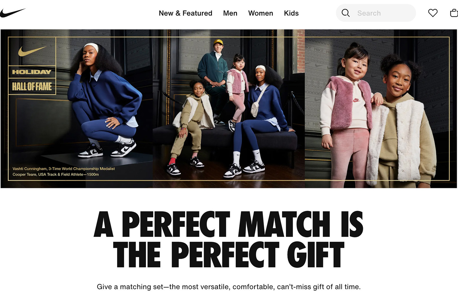
It’s also about creating an identity for your digital experience that’s a natural and cohesive extension of the overall visual style. Think of Headspace, Figma, or Nike, for example. Their distinctive look and feel are instantly recognizable wherever you encounter them.
Maintaining visual consistency also yields measurable revenue results. As per a Lucidpress survey, 68% of company stakeholders credit 10% to more than 20% of revenue growth to the consistency of their brand. This underscores the significance of initiating and integrating design systems to promote brand consistency.
Brand Strategy
In an ideal world, every new product would kick off with a well-thought-out brand strategy. This means defining the vision, mission, purpose, positioning, and value proposition in the market before diving into design work. While brand strategy predominantly addresses intangible aspects, it’s one of the fundamental cornerstones of a brand, alongside visuals like the logo and website. Even with stunning design, a brand can stumble in the market if its positioning isn’t unique or if the company is unsure about what it truly represents.
However, let’s face it, we often don’t have this luxury. Tight timelines, limited budgets, and stakeholders who might not fully grasp the value of a brand strategy can pose challenges. We all live in the real world, after all. In such cases, the best approach is either to encourage the stakeholders to articulate their brand strategy elements or to work collaboratively to uncover them through a series of workshops.

Defining a brand’s core strategy is the crucial starting point, establishing the foundation for future design work. The brand strategy serves as a robust framework that shapes every aspect of a brand’s presence, whether it be in marketing, on the web, or within applications.
Brand Identity Research
The research phase is where you unearth the insights to distinguish yourself in the vast arena of competitors. By meticulously analyzing consumer trends, design tendencies, and industry landscapes, you gain a deeper understanding of the unique elements that can set your brand apart. This process not only provides a solid foundation for strategic decision-making but also unveils valuable opportunities for innovation and differentiation.
Typically, the research initiates with an analysis of the brand’s existing visual style, especially if it’s already established. This initial exploration serves as a valuable starting point for team discussions, facilitating a comprehensive understanding of what aspects are effective and what needs refinement.
Moving on, the next crucial step involves conducting a comprehensive industry analysis. This process entails an examination of key brand elements, such as logos, colors, and other design components utilized by competitors. This step serves as the strategic guide for making precise design decisions.
When performing industry analysis as part of brand research, aim for specificity rather than generic observations. For instance, when crafting a brand identity for a product brand, a focused investigation into app icon designs becomes imperative. The differentiation of colors among various apps emerges as a potent tool in this endeavor. According to a study conducted by the Pantone Color Institute, color plays a pivotal role, boosting brand recognition by a substantial 80%.
Moreover, it’s essential to consider app icon designs that, while not directly competitors, are ubiquitous on most phones (examples include Google apps, Chrome/Safari, Facebook, Twitter, and so on). It’s crucial that your app icon stands out distinctly, even in comparison to these widely used icons.

To bring in more innovation and fire up creativity in future designs, it’s a good call to widen your scope beyond just your competition. For instance, if sustainability is a core value of the brand, conducting a thorough examination of how brands outside the industry express and visually communicate this commitment becomes pivotal. Similarly, exploring each value outlined in the brand strategy can provide valuable insights for future design considerations.
A highly effective method for presenting research findings is to consolidate all outcomes in one document and engage in comprehensive discussions, whether in-house or with the client. In my practice, research typically serves as a reference document, offering a reliable source for revisiting and reassessing the uniqueness of our design choices and verifying alignment with identified needs. It’s also a perfect argument point for design choices made in the following phase. Essentially, the research phase functions as the guide steering the brand toward a distinctive and unique look and feel.
Brand Identity Concepts
Now, to the fun part — crafting the actual visuals for the brand. A brand concept is a unifying idea or theme. It’s an abstract articulation of the brand’s essence, an overarching idea that engages and influences the audience. Brand concepts sometimes come up organically through the brand strategy; some of them need elaborate effort and a deep search for inspiration.
There are various methods to generate unique brand ideas that seamlessly connect brand strategy, meanings, and visuals.
The ultimate goal of any brand is to establish a strong emotional connection with users, which makes having a powerful brand idea that permeates the identity, website, and app crucial.

-
Mind mapping and association
This is a widely used approach, though it looks quite different between various creatives. Start with a diagram listing the brand’s key attributes and features. Then, build on these words with your associations. A typical mind map for me is like a tangled web of brand values, mission, visual drafts, messaging, references, and sketches, all mixed in with associations. Try to blend ideas from totally different parts of the mind map. For example, in the design of an identity for a database company, contrary segments of the mind map may include infinity symbols and bytes. The combination of these elements results in a unique design scalable to both the brand symbol and identity.

-
Reversal
Sometimes, a brand calls for an unexpected symbol or even a mascot that doesn’t have direct ties to the industry, for example, using a monkey as the symbol for a mailing platform or a bird for a wealth management app. Delving into the process of drawing parallels between unrelated objects, engaging all our senses, and embracing a creative and randomized approach helps to generate fresh and innovative concepts.
-
Random stimuli
There are instances when tapping into randomness can significantly boost creativity. This approach may involve anything from AI-generated concepts to team brainstorming sessions that incorporate idea shuffling and combinations, often resulting in surprising and inventive ideas.

-
Real-world references
Designers can sometimes find themselves too deeply immersed in their design bubble. Exploring historical references, natural patterns, or influences from the tangible world can yield valuable insights for a project. It’s essential not to confine yourself solely to your workspace and Pinterest mood boards. This is particularly relevant in identity design, where these tangible parallels can provide rich sources of inspiration and meaning.
Imagine I’m crafting an identity for the adventure tours app. The last place to seek inspiration from is other tour companies. Why? Because if the references are derivatives, the work will be too. Begin at the roots. Adventure tours are all about tapping into nature and connecting with your origins. The exploration would kick off by delving into the elements of nature. What sights, smells, sounds, and sensory details do these adventures offer?
That’s the essence that both clients and non-designers appreciate the most — finding tangible connections in the real world. When people can connect not just aesthetically but also emotionally or intellectually to the visuals, they become much more loyal to the brand.
Condense your design concept and ideas to highlight brand identity across diverse yet fitting contexts. Go beyond conventional applications like banners and business cards.
If you’re conceptualizing brand identity for restaurant management software, explore ways to brand the virtual payment card or create merchandise for restaurant employees. When crafting a style for a new video conferencing app, consider integrating the brand seamlessly into commonly used features, such as the ‘call’ button, and think of a way to brand the interface so that users can easily recognize your app in screenshots. Consider these aspects as you move through this project phase. Plus, taking a closer look at the industry can spark some creative ideas and bring a more down-to-earth feel to the concept.
Once the core brand visual concept gains approval and the general visual direction becomes clear, it’s time to create the assets for the brand application. It’s essential to note that no UI work should commence until the core brand identity elements, such as the logo, colors, typography, and imagery style, are developed.
Brand Identity Design And Key Assets For A Digital Product
Now, let’s delve into how you actually apply the brand identity to your interfaces and what the UI team should anticipate from the brand identity design team. One key thing to keep in mind is that users come to a website or app to get things done, not just to admire the visuals. So, we need to let them accomplish their tasks smoothly and subtly weave our brand’s visual identity into their experience.
This section lists assets, along with specific details tailored for digital applications, to make sure your UI colleagues have all they need for a smooth integration of the brand identity into the digital product.
Logo
When crafting a logo for a digital product, it’s essential to ensure that the symbol remains crisp and scalable at any dimension. Even if your symbol boasts exceptional distinctiveness, you’ll frequently require a simplified, compact version suitable for mobile use and applications like app icons or social media profile pictures. In these compact logo versions, the details take on added prominence, with negative space coming to the forefront.
Additionally, it’s highly advisable to create a compact version not just for the symbol but also for the wordmark. In such instances, you’ll typically find a taller x-height, more open apertures, and wider spacing.

One logo approach is pairing a logotype with a standalone symbol. The alternative is to feature just the logotype, incorporating a distinctive detail that can serve as an app icon or avatar. The crucial point is to maintain a strong association with the main logo. To illustrate this point, consider the example of Bolt and how they ingeniously incorporated the negative space in their logo to create a lightning symbol.

Another factor to take into account is to maintain square-like proportions for your logomark. This ensures that the logomark can be seamlessly integrated into common digital applications such as app icons, favicons, and profile pictures without appearing awkward or unbalanced within these placeholders. Ensure your logomark isn’t overly horizontal or vertical to maximize its impact across all digital platforms.
The logo and symbol are core assets of any digital brand. Typically, the logotype letter shapes take roots from the primary font.
Typography
Typography plays a pivotal role in shaping a brand’s identity. The selection of a typeface is particularly crucial in the brand identity design phase. Unfortunately, the needs of the UI/UX team are sometimes overlooked by the brand team, especially when dealing with complex products. Typography assets can be categorized into several key components:
Primary Font
Choosing the right typeface can be a challenging task, and finding a distinctive one can be even trickier. Beyond stylistic elements like serifs, non-serifs, and extended or condensed styles, selecting a primary font for a digital product involves considering various requirements. Questions to ponder include the following:
- How many languages will your product support?
- Will the brand use special symbols such as arrows, currency symbols, or math symbols?
- What level of readability will the headings need, and what will be the smallest point size the headings are used at?

Body Font
Selecting the body font for a digital product demands meticulous attention. This decision can significantly impact readability and, as a result, user loyalty, especially in data-rich environments like dashboards and apps that contain numerals, text, and spreadsheets. Designers must be attentive and responsible intermediaries between users and data. Factors to consider include the following:
- Typeface’s x-height,
- Simplified appearance,
- Legibility at small sizes,
- Low or no contrast to prevent readability issues.
Fonts with large apertures and open shapes are preferable to keep similar letters distinct, such as ‘c’ and ‘o’. Increased letter spacing can enhance legibility, and typefaces should include both regular and monospaced digits. Special symbols like currency or arrows should also be considered for the brand use.

Fallback fonts
In the realm of digital branding, there will be countless situations where you may need to substitute your fonts. This can include using a body font for iOS or Android apps to save on expensive licensing costs, creating customizations for various countries and scripts, or adapting fonts for other platforms. The flexibility of having fallback fonts is invaluable in ensuring consistent brand representation across diverse digital touchpoints.

Layout Principles
Typography isn’t just about choosing fonts; it’s also about arranging them to reflect the brand uniquely. Employing the same fonts but arranging them differently can distort the brand perception.
Getting the right layout is all about finding that sweet spot between your brand’s vibe and the ever-changing design scene.
When crafting a layout, one can choose from various types that translate different brand voices. Grid-based layouts, for instance, leverage a system of rows and columns to instill order, balance, and harmony by organizing and aligning elements. Asymmetrical layouts, on the other hand, rely on contrast, tension, and movement to yield dynamic and expressive designs that command attention. Modular layouts utilize blocks or modules, fostering flexibility and adaptability while maintaining variety, hierarchy, and structure. Choosing one of the types or creating a hybrid can effectively convey your brand identity and message.
Attention to technical details is crucial, including line spacing, consistent borders, text density, and contrast between text sizes. Text alignment should be clearly defined. Creating a layout that accurately represents your brand requires applying design principles that designers intuitively understand, even if others may sense them without articulating why.

Color
Color is undoubtedly one of the most significant elements for any identity, extending beyond products and digital realms. While a unique primary color palette is vital, it is important to recognize that color is not just an aesthetic aspect but a crucial tool for usability and functionality within the brand and the product. This chapter highlights key areas often overlooked during the brand design process.
-
Call to Action(CTA) Color
Brand designers frequently present an extensive palette with impressive color combinations, but this can leave UI designers unsure of the appropriate choice for Call to Action (CTA) elements. It is imperative to establish a primary CTA color at the brand identity design phase. This color must have a good contrast both with light and dark backgrounds and does not unintentionally trigger associations, such as red for errors or yellow for alerts.
-
Contrast
Brand identity tends to have more flexibility compared to the strict industry standards for legibility and contrast in screens and interfaces. Nevertheless, brand designers should always evaluate contrast and adhere to WCAG accessibility standards, too. The degree of contrast should be determined based on factors like target audience demographics and potential usage scenarios, aiming for at least AA compliance. Making your product accessible to all is a noble mission that can enhance your brand’s meaning.

-
Extended Color Palette
To effectively implement color in user interfaces, UI designers need not only the primary colors but also various tints of these colors to indicate different UI statuses. Semantic colors, like red for caution and green for positive connotations, are valuable tools for emphasizing critical elements or providing quick visual feedback. Tints of CTA colors and other hues are essential for indicating states such as hover, click, or visited elements. It’s preferable to define these nuanced details in the brand identity guideline. This ensures the uniform use of the same colors, whether in marketing materials or the product interface.

-
Color proportions and usage
The proportion and use of colors have a substantial impact on how a brand is perceived. Usually, the brand’s primary color should serve as an accent rather than dominate most layouts, especially in the interface. Collaborating with UI colleagues to establish a color usage chart can help strike the right balance. Varying the proportions of colors creates visual interest and allows you to set the mood and energy level in a design or illustration by choosing dominant or accent colors wisely.

-
Color compensation
Colors may appear differently on dark and light backgrounds and might lose contrast when transitioning between dark and light themes. In the modern context of platforms offering both dark and light UI versions, this factor should be considered not only for interface elements but also for logos and logomarks. Logos designed for light backgrounds typically have slightly higher brightness and saturation, while logos for dark backgrounds are less bright.

Color leads to another component of brand identity — the illustration style — where its extensive application in various shades plays a significant role both emotionally and visually.
Scalable Illustration System
An illustration style includes pictograms, icons, and full-scale illustrations. It’s important to keep the whole system intact and maintain consistency throughout the project, ensuring a strong connection with the brand and its assets. This consistency in the illustration system also enhances the user interface’s intuitiveness.
In the context of an illustration system, “style” refers to a collection of construction techniques combined into a unified system. Pictograms and icon systems are made of consistent and reusable elements, and attention to detail is crucial to achieving uniformity. This includes sticking to the pixel grid, ensuring pixel precision, maintaining composition, using consistent rounding, making optical adjustments for intersecting lines, and keeping the thickness consistent.
Stylistically, illustrations can employ a broader arsenal compared to icons, utilizing a wider range of features such as incorporating depth effects, a broader color palette, gradients, blur, and other effects. While pictograms and icons serve more utilitarian purposes, illustrations have the unique ability to convey a deeper emotional connection to the brand. They play a crucial role in strengthening and confirming the brand message and positioning.

The elements discussed in the article play a vital role in enabling the web team to craft the UI kit and contribute to the brand’s success in the digital space. Supplying these assets is the critical minimum. Ensure that all components of your brand are clearly outlined and explained. It’s advisable to establish a guideline consolidating all the rules in one workspace with UI designers (commonly in Figma), facilitating seamless collaboration. Additionally, the brand designer should oversee the UI kit used in interfaces to ensure alignment with all identity components.
Uniform Mechanism
Your digital brand should effectively communicate your broader brand identity, leaving no room for doubt about your values and positioning. The brand acts as the cornerstone, ensuring consistency in the digital product. A well-designed digital product seamlessly integrates all its components, resulting in a cohesive user experience that enhances user loyalty.
Ensure you maintain effective communication with the UI team throughout the whole project. From my experience, despite things appearing straightforward in the brand guidelines and easy to implement, misunderstandings can still occur between the brand identity team and the UI team. Common challenges, such as letter spacing in brand typography, can arise.
The consistent and seamless integration of brand elements into the UI design ensures the brand’s effectiveness. Whether you have a small or large design team, whether it’s in-house or external, incorporating branding into your digital product development is crucial for achieving better results. Remember, while a brand can exist independently, a product cannot thrive without branding.


