Archive

Archive for February, 2024

Why Should Startup Founders Care about Quiet Quitting?

February 6th, 2024 No comments

It started as a social media buzzword. Soon enough, though, research revealed that quiet quitting is a real, global phenomenon. Just considering the US, quiet quitters reportedly make up about half of the country’s workers, according to a Gallup study from 2023.

Quiet quitting affects companies of all sizes, including startups. Its impact goes beyond the high risk of losing valuable employees. Companies worldwide can lose up to $1.5 trillion each year just from employees’ disengagement. 

Read on and find out why quiet quitting should be on your radar and what the usual signs are.

Why Should You Care about Quiet Quitting?

1. Quiet Quitting Can Be a Silent but Deadly Business Threat

The typical portrait of a quiet quitter implies an employee whose focus is only on their everyday, standard 9 to 5 tasks and who doesn’t go above and beyond or drive their responsibilities forward. According to a recent study on quiet quitting in customer success, quiet quitting is an issue across the business spectrum – from small teams under 10 members to large companies with over 500 employees.

But the situation is even more dire for startups where employees need to be, first of all, adaptable to change and willing to wear multiple hats every now and then.

Startups usually rely on a small workforce, and each team member’s performance can significantly impact business outcomes. 

Let’s just take the example of the CS team. When you have CS staff, especially a Customer Success Manager, who no longer strives to provide great customer experiences, this could lead to high customer churn and overall lower ROI.

For SaaS companies, in particular, the effects of disengaged staff can include a lack of innovation, lower-quality work, poor performance KPIs, decreased productivity, and even increased employee churn.

2. Quiet Quitting Implies Unclear and Mismatched Expectations

According to the same study, the no.1 reason why employees decide to quiet quit is due to “unclear and mismatched job expectations.” This can be a pressing issue, particularly for startups since it’s not always easy to define job roles and responsibilities. 

Sometimes the mismatch appears from the beginning. The startup founder creates a job description that doesn’t accurately and comprehensively describe what the organization expects from an employee.

Source: Quiet Quitting in Customer Success Report 2023

Employees get hired for that position but ultimately discover it’s different from what they initially thought they’d signed up for.

In other cases, employees accept taking up additional tasks outside their job description after gaining some company experience. As is often the case with startups, this leads to even more extra work and as it piles on, employees become more overwhelmed and eventually quiet quit. Most times, managers create these extra tasks without clear details, explanations, or KPIs regarding the desired outcomes.

If the extra work is out of the employees’ control or doesn’t match their skills and expertise, they’ll underperform and become frustrated and stressed.

3. Many Cases of Quiet Quitting Happen Due to Poor Compensation or Increased Workload

Extending the above example, there’s a fine line between extra work and burnout. In fact, one of the main signs of quiet quitting is when people refuse to reach a burnout state. 

While higher burnout rates were already a growing trend, the shift to remote work along with the pandemic led to an all-time high burnout and stress level across all professions, according to the American Psychological Association’s (APA) 2022 report; 79% of workers reported they had experienced work-related stress.

If employees face burnout due to more responsibilities at work for the same pay, they’ll feel stuck and undervalued. They will no longer see their workplace as a place to prosper and become disengaged and unmotivated.

In a vicious cycle, quiet quitters could create a real imbalance in your team. Their engaged and motivated co-workers and managers will have to pick up the slack and handle what quiet quitters refuse to take on. 

While some will struggle to deliver the same quality at increased velocity, others will take it as an opportunity to be recognized and advance to a new role within the company. If their efforts don’t end with a promotion or more benefits, many will ultimately become quiet quitters too.

4. Your Team May Already Have Quiet Quitters

Considering the rising number of quiet quitters based on the latest findings, it’s very possible you have at least a few of them in your team. And with the advent of remote or hybrid work, it may be difficult to notice any signals of quiet quitting due to reduced or lack of face-to-face interactions. 

But you should take note of some of the most common signs of quiet quitting, which include one or more of the following:

  • not attending meetings;
  • arriving late or leaving early;
  • reduced productivity;
  • less contribution to team projects;
  • not participating in planning or meetings; 
  • lack of passion or enthusiasm.

The sooner startup founders or managers identify the red flags, the better. The typical signs of quiet quitting aren’t necessarily a bad thing. Sometimes, people may be temporarily discontent about some aspect of their workplace; they may encounter a bottleneck while working on a project, but they’re afraid to admit it in front of others openly. Other times, people want their managers to recognize and praise their efforts. 

When quiet quitters were asked what would motivate them to become re-engaged at the workplace, these were their answers:

Source: Quiet Quitting in Customer Success Report 2023

Startup founders should have frequent and open discussions with all their employees.  Questions like “Is everything ok in your work?” or “Is there anything I can help you with?” are good for the start of the conversation. But they should also be willing to ask more uncomfortable questions like: 

  1. “Are you happy with your work?”
  2. “Do you feel appreciated in the team?”
  3. “Are you doing the things/tasks that you want to do?”

By showing empathy and support, managers and founders can find solutions to ensure employees are satisfied. These conversations are crucial to avoid having quiet quitters outright leave their jobs.

5. The Issue Tends to Hide in Management Practices

Clearly, quiet quitting doesn’t refer to those individuals with low levels of intrinsic motivation and productivity. Quiet quitters more or less consciously decide to focus only on doing the bare minimum at work. They’d sacrifice more time and effort at the job but don’t find a strong reason to do it. 

Many of their workplace frustrations stem from issues with their managers.

Identifying quiet quitters in your team is a good first step. But startup founders should also take a good look at their management practices. Quiet quitting is often the staff’s response to an unwelcoming workplace. If managers don’t try to build strong internal relationships and don’t create an inclusive culture, employees won’t feel motivated to be at their best.

Employees these days, particularly Gen Z and Millennials, demand trust and autonomy in their workplace. In this regard, managers should take a step back and see if the issue is with them and if their micromanagement style is frustrating their team.

Gen Z and Millennials are also more reluctant to become quiet quitters if they’re repeatedly overlooked for a promotion or realize there’s a lack of career development opportunities within the company.

There’s also a clear generational divide regarding the “do the work that you’re paid for” motto:

Source: Statista

A good manager constantly supports, trains, and coaches their team and treats employees equally. That’s why you should speak with all employees about a career progression plan and ensure they don’t feel stuck on routine, difficult, or undesirable tasks.

The whole point of quiet quitting is that workers want to feel heard and valued by leaders who genuinely consider their well-being.

Summing Up

A company’s success is directly linked with employees’ level of engagement, satisfaction, and their feeling of belonging in the workplace. By starting with clear role expectations and ending with proactive management and honest conversations, startup founders can avoid having quiet quitters in their team. 

Ultimately, the best way to counter quiet quitting is with sustainable working practices where the entire staff is treated fairly. There’s little reason to fear as long as you build a culture of trust with autonomy and respect for your employees.

Featured image by Alexander Possingham on Unsplash

The post Why Should Startup Founders Care about Quiet Quitting? appeared first on noupe.

Categories: Others Tags:

The Benefits of Progressive Web Apps and How to Build Them

February 6th, 2024 No comments

A progressive web application (PWA) combines the best features of web and mobile apps, offering users a smooth, app-like experience. Built with standard web technologies (like HTML, CSS, and JavaScript), they function like native applications, complete with custom splash screens. The hallmark of PWAs is their speed, reliability, and seamless user experience, even on varying mobile devices and network conditions.

This guide will:

  • Explore the six most impactful benefits of PWAs.
  • Explain how PWAs are built.

Improved performance

PWAs are designed to load quickly and provide smooth interactions, making the user experience more efficient and enjoyable. This speed is achieved through techniques like caching essential resources, which means that once a PWA is loaded, it can display content and respond to user interactions almost instantly.

This enhanced performance is crucial, especially in a mobile-first world where users expect quick and responsive applications. Such efficiency keeps users engaged and contributes to higher satisfaction and retention rates.

The longer it takes for your app to load, the more likely users will give up and possibly never come back
Image source

Offline capability

PWAs use cached data and resources to enhance users’ offline experiences. The cached resources allow the app to avoid network requests and work offline. 

Enabled users can access key features and view previously loaded information without being online. This comes in handy, particularly in areas with poor connectivity, for those trying to conserve data usage, or for anyone stuck in an area with no connectivity (like an airplane).

OAuth and SAML are two protocols that can help with offline capability, but they have some key differences and similarities.

screenshot of Jotform homepage

Image Source

OAuth vs. SAML is a common topic of discussion among web developers, as they both offer ways to integrate web applications with various identity providers, such as Google, Facebook, or Microsoft, and enable users to sign in with their existing credentials. OAuth is an open standard for authorization that allows users to grant access to their online accounts without sharing their passwords. 

SAML is a secure XML-based protocol for exchanging authentication and authorization data between an identity provider and a service provider. Both OAuth and SAML can leverage the benefits of progressive web apps, such as fast loading, push notifications, home screen icons, and offline functionality.

Cost-effective compared to native apps

PWAs require less time and resources, as they’re built using standard web technologies that work across multiple platforms. This approach removes creating separate versions for different operating systems, significantly reducing development and maintenance costs. This affordability makes PWAs an attractive option for businesses seeking to maximize their reach while minimizing expenses.

Easy to update

Unlike native apps, where users must download updates from an app store, updates for PWAs are deployed directly on the web server. This means that any changes or enhancements to the PWA are immediately available to users without requiring them to take additional action. 

This server-side update mechanism simplifies maintenance and makes life easier for users by giving them effortless access to the latest features.

Responsive design

PWAs automatically adjust their layout to fit the screen size and resolution of various devices, from smartphones to tablets and desktops. This adaptability ensures an optimal user experience and eliminates the need to create separate app versions for different devices.

Secured through HTTPS

PWAs prioritize security using HTTPS–the same secure protocol websites use to protect data. This protocol encrypts the data between the server and the user’s device, preventing data security breaches. This feature is crucial for maintaining the data’s integrity and the users’ trust.

How to build a PWA in four steps

Photo by Christopher Gower on Unsplash - computer on desk showing code

Image by Christopher Gower on Unsplash

1. Create a web app structure

Start with establishing a basic web application structure using HTML. HTML provides the framework for your content and layout and then moves on to CSS for styling things like the background color and general theme colors.

Use JavaScript to add functionality to your app. JavaScript enables interactive features, making your app dynamic and user-friendly. 

In creating the structure, ensure your app is responsive to different screen sizes and devices.

2. Create a web app manifest

The app manifest file is a JSON file that dictates how your app appears to users and how it’s launched. It includes vital metadata such as the app icon, name, and the start URL. The manifest lets you specify the home screen icons, the app’s full-screen mode, and its orientation. This file provides users with a more app-like interface when the PWA is accessed from a mobile device. It also plays a key role in the ‘Add to Home Screen’ feature, making your PWA feel more like a native app. 

For the manifest file to work, you need to add it to the HTML file. To do this, include a link to the manifest file within the section of your HTML document.

3. Service workers for offline support

Service workers are scripts that run in the background, separate from the web page, and provide functionalities that don’t need a web page or user interaction.

They play a pivotal role in supporting features like offline use. This is achieved by caching important resources during the first visit so they can be accessed later.

Service workers also allow the app to synchronize data in the background when connectivity is restored and implement push notifications–which all add to a pleasant user experience.

4. Test and deploy

Make sure to test the PWA on a variety of devices and browsers to ensure that it is responsive, reliable, and passes all necessary quality assurance requirements. This process involves checking how the app performs on different screen sizes under various network conditions and ensuring all features work correctly across platforms.

Once testing is complete and errors fixed, the PWA is deployed onto a server. 

It’s important to keep your carbon footprint in mind throughout the development and maintenance of your PWA. You can do this by keeping your computers, servers, operating systems, and all IT assets in a sustainable data center that uses energy-efficient technology such as cooling systems, modern servers, and LED lights to reduce energy consumption.

Wrapping up

PWAs have strong advantages over native apps that can’t be ignored. They’re easy to update, cheaper to develop, and work offline–that alone should tempt any business into building a PWA or converting their website into a PWA.

Featured Image by Arnold Francisca on Unsplash

The post The Benefits of Progressive Web Apps and How to Build Them appeared first on noupe.

Categories: Others Tags:

Why B2C Appointment Setting Services Are Vital for Modern Businesses?

February 6th, 2024 No comments

In the dynamic landscape of business-to-consumer (B2C) interactions, appointment setting has emerged as a critical component. This process, at its core, involves scheduling meetings between businesses and potential customers, often leading to sales opportunities. 

The evolution of B2C interactions has shifted from traditional in-person meetings to more digital and telephonic engagements. 

In the B2C context, appointment setting is not just about managing calendars; it’s about creating opportunities for personalized interaction and building relationships with customers.

The Importance of B2C Appointment Setting

B2C appointment setting plays a pivotal role in enhancing customer engagement. By securing a time slot with potential customers, businesses can ensure focused attention, leading to more meaningful interactions. 

This method streamlines the sales process by filtering and targeting interested individuals, thereby boosting conversion rates. The direct communication facilitated by appointment setting aids in understanding customer needs better, enabling businesses to tailor their offerings effectively. 

Cold calling is often the first step in the B2C appointment-setting process. While it may seem like an outdated method, cold calling can still be effective when done correctly. 

By using a targeted approach and tailoring the pitch to the individual customer, appointment setters can successfully secure appointments and move the sales process forward. However, it’s important to note that cold calling should be just one part of a broader appointment-setting strategy that includes other methods like email, social media, and referral-based outreach.

How Does B2C Appointment Setting Benefit Modern Businesses?

Appointment setting in the B2C sector offers numerous benefits. Personalizing the customer experience is paramount in today’s market, and appointment setting allows for tailored conversations and solutions. 

The use of technology, such as automated scheduling tools and CRM integrations, further enhances the efficiency and effectiveness of these interactions. Modern businesses benefit from improved sales efficiency, as appointment setting helps in prioritizing leads and focusing on high-potential prospects.

Strategies for Effective B2C Appointment Setting

To maximize the effectiveness of B2C appointment-setting services, businesses must focus on several key strategies. Training and developing skilled appointment setters is crucial, as they are the first point of contact with potential customers. 

A data-driven approach helps understand customer behavior and preferences, leading to more successful interactions. The integration of Customer Relationship Management (CRM) systems streamlines the entire process, from lead generation to follow-up.

Challenges in B2C Appointment Setting

While offering numerous benefits, B2C appointment setting also presents unique challenges. Managing customer expectations requires a delicate balance between persistence and respect for their time and preferences. 

High volumes of appointments necessitate efficient scheduling and follow-up systems. Additionally, in an era where data security is paramount, businesses must ensure the privacy and security of customer information.

Innovations in B2C Appointment Setting

The field of B2C appointment setting is constantly evolving, with innovations like AI and automation revolutionizing the way appointments are set and managed. 

Social media and digital platforms also play an increasingly significant role in reaching and engaging potential customers. These innovations are shaping the future of appointment setting & all other related jobs making it more efficient and effective. This is why day by day people are wanting to be virtual assistants or appointment setters.

B2B vs. B2C Appointment Setting

The world of appointment setting varies significantly between business-to-business (B2B) and business-to-consumer (B2C) sectors. Understanding these differences is crucial for businesses to tailor their strategies effectively.

Target Audience and Approach

B2B Appointment Setting:

  • Audience: In B2B, the target audience is other businesses, typically involving decision-makers like managers, executives, or business owners.
  • Approach: The approach is more formal and data-driven. Emphasis is placed on the value proposition and ROI (Return on Investment). Conversations are often detailed, focusing on long-term relationships and strategic partnerships.

B2C Appointment Setting:

  • Audience: The focus is on individual consumers or end-users.
  • Approach: Here, the approach is more personalized and emotional. It often involves understanding individual needs, and preferences, and offering solutions that resonate on a personal level. The interaction is usually quicker and more direct, aiming to capture the consumer’s interest promptly.

Sales Cycle and Decision-Making

B2B Appointment Setting:

  • Sales Cycle: B2B sales cycles are generally longer, as the decision-making process involves multiple stakeholders and larger financial commitments.
  • Decision-Making: The process is more complex and often requires approval from several layers within an organization. It involves more in-depth discussions and negotiations.

B2C Appointment Setting:

  • Sales Cycle: The B2C sales cycle is typically shorter, with decisions made more rapidly.
  • Decision-Making: Consumers usually make decisions based on immediate needs, personal preferences, or budget considerations. The decision-making process is less complex and usually involves fewer people.

Content and Messaging

B2B Appointment Setting:

  • Content: The content in B2B settings is more detailed, focusing on product specifications, business benefits, and industry-specific jargon.
  • Messaging: It’s more about building a business case, demonstrating expertise, and establishing credibility.

B2C Appointment Setting:

  • Content: The content is generally more straightforward and relatable to everyday needs and lifestyles.
  • Messaging: Messaging in B2C is more about creating an emotional connection, convenience, and immediate benefits. It’s often more narrative and storytelling-based.

Follow-up and Relationship Management

B2B Appointment Setting:

  • Follow-Up: Follow-up in B2B is more persistent and involves nurturing relationships over time. It often includes multiple touchpoints and follow-up meetings.
  • Relationship Management: Long-term relationship building is key in B2B. The focus is on creating lasting partnerships and continuous engagement.

B2C Appointment Setting:

  • Follow-Up: Follow-ups are typically quicker and more direct, aiming for an immediate response or sale.
  • Relationship Management: While long-term relationships can be beneficial, the focus is often on the immediate sale. However, maintaining customer relationships through loyalty programs and regular communication can also play a role.

Measuring the Success of B2C Appointment-Setting Services

The success of B2C appointment-setting services can be measured through various Key Performance Indicators (KPIs). 

Tracking metrics such as conversion rates, customer satisfaction rates, and the number of appointments set provides insights into the effectiveness of these services. Customer feedback is also crucial in gauging the success and areas for improvement.

Conclusion

B2C appointment-setting services are vital for modern businesses, offering a strategic approach to enhance customer engagement, streamline sales processes, and boost conversion rates. The value of these services in the current business environment cannot be overstated, as they provide a direct and personalized way to connect with potential customers.

FAQs

  1. What is a B2C appointment setting?

B2C appointment setting involves scheduling meetings between businesses and potential customers to discuss products or services, often leading to sales opportunities.

  1. Why is appointment setting important in B2C?

It enhances customer engagement, streamlines the sales process, and boosts conversion rates by ensuring focused and personalized interactions with potential customers.

  1. How does technology impact B2C appointment setting?

Technology, such as automated scheduling tools and CRM systems, enhances the efficiency and effectiveness of appointment setting by managing schedules and customer data more effectively.

  1. What are some challenges in the B2C appointment setting?

Challenges include managing customer expectations, handling high volumes of appointments, and ensuring data security and privacy.

  1. Can the B2C appointment setting be automated?

Yes, parts of the appointment-setting process, like scheduling, can be automated using AI and other technological tools, though human interaction remains crucial for personalized service.

  1. What future trends are expected in B2C appointment setting?

Future trends include increased use of AI and automation, greater integration of social media and digital platforms, and adapting strategies to changing consumer behaviors.

Featured image source

The post Why B2C Appointment Setting Services Are Vital for Modern Businesses? appeared first on noupe.

Categories: Others Tags:

Exciting New Tools for Designers, February 2024

February 5th, 2024 No comments

2024 is well underway and shaping up to be an interesting year. So, to help you keep your focus on working hard and getting stuff done, we’ve collected another bunch of helpful bits and pieces from across the web.

Categories: Designing, Others Tags:

8 Mistakes to Avoid When Saving For Your Child’s College

February 5th, 2024 No comments

Saving for college is quite a daunting task. We all want to set our kids up for success, right? But, the path to financing their dreams can feel like a maze of decisions and uncertainties. While there’s no “right” way to save for your child’s education, there are a few mistakes that you can avoid to make the most of your efforts and give your kids a solid cushion to help them along the way.

Mistake #1: Getting Started Too Late

Time is on your side for any type of savings. The earlier you get started, the better. 

Starting early makes it much more manageable to make consistent contributions each month without disrupting your budget. The longer your money is invested, the more time it has to grow through compound interest. By making smart choices with your money early on, even a little can go a long way.

Mistake #2: Saving Without a Plan

When it comes to the price tag of college, the sticker shock is real. With everything from tuition to room and board to books, figuring out how to help your kids pay for college is a goliath of a task. Crafting a clear, realistic plan helps make it feel much more achievable. 

Think about how much you would like to save for your children. Being realistic here is key—you don’t have to do it all. Even a small bit can be a big help for your kids. 

Make room in your budget for college savings, and make it a priority to make consistent contributions among your other savings goals.

Mistake #3: Relying On A Standard Savings Account

While a traditional savings account is a good starting point, you have other options to help your money go much further and open opportunities for tax benefits. Investing your money in other options can give you better growth potential for your money. In a tax-advantaged account, like a 529 plan or a Coverdell ESA, your money grows tax-free whereas any interest earned on a savings account may be considered taxable income. Do some research on different account types and their benefits to make sure you’re putting your money in the best possible places for growth.

Mistake #4: Narrowing Your Investments

Diversifying your assets is always a smart decision, and that’s true for your college savings too. Different investment types—stocks, bonds, mutual funds—respond differently to certain market conditions. While one might dip, another could soar. Adding some diversity cushions your savings from major market swings. 

ESAs and 529 plans are solid college savings tools, but you might consider pairing them with a UGMA account for some added flexibility. UGMA accounts hand you the reins when it comes to your investment options. You can invest in stocks, bonds, and mutual funds, making it easy to balance out your portfolio. 

UGMA accounts provide another layer of flexibility as there aren’t as many restrictions for using the funds. Since 529 plans and ESAs are designed to help with education expenses, your kids could face a pretty high penalty for using funds for non-qualified expenses should they not need all of it. Spreading your funds to other accounts can financially support your children through college and beyond. 

Mistake #5: Investing More Than You Can Afford

We all want to be superheroes for our kids, but at the end of the day, you need to be realistic. Be real about what your family can comfortably contribute. Life is full of surprises. Be sure to reassess your financial goals as your financial situation shifts.

Your contributions may ebb and flow over time but remember to give yourself grace even if you have to change your savings goals.

Mistake #6: Neglecting Your Retirement

While saving for your child’s education is undeniably important, overlooking your own retirement savings can be a costly mistake. Much like college, retirement is expensive, too. It’s like a balancing act—you want to fund your child’s education without letting your own financial security wobble. Make retirement savings a non-negotiable part of your financial plan alongside college savings. Work out a way to prioritize both without sacrificing the other.

Retirement may seem far away, but the years always fly by—it’s vital to be prepared for it.

Mistake #7: Overlooking Other Financial Aid Options

The sticker shock of college can send shivers down any parent’s spine. But here’s the thing—there are avenues beyond personal savings that can lighten the load. 

Other financial aid options like scholarships, grants, and work-study programs exist to ease the financial burden of college.

As your child gears up for college, sit down together and research scholarships, grants, and aid programs tailored to their interest and qualifications. Encourage them to excel academically—merit-based scholarships are often within reach for high achievers. 

Mistake #8: Forgetting To Educate Your Kids

As you build your child’s college fund, don’t overlook the golden opportunity to impart some financial wisdom. Get your kids involved in the college savings process in age-appropriate ways. 

Money isn’t always the most fun conversation, but make it a natural part of conversations. Share stories, discuss financial goals, and always encourage your kids to ask questions. Creating a healthy relationship with money can go a long way for their financial independence. 

Saving for college lays a secure financial foundation for our children. Armed with this knowledge, you’re better equipped to navigate the tricky financial waters and craft a secure future for your children. So, take a breath, take those learnings to heart, and approach college savings with confidence. 

Featured image by Evan Mach on Unsplash

The post 8 Mistakes to Avoid When Saving For Your Child’s College appeared first on noupe.

Categories: Others Tags:

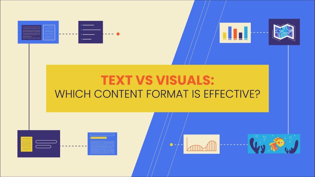
Text vs. Images: Which Content Format is Effective?

February 2nd, 2024 No comments

When we talk about using different ways to share information, it’s like picking the one that fits what you need! Words, pictures, and mixes of both have their strengths and weaknesses. Words tell a story with details and facts. 

Pictures catch your eye and say a lot at a quick glance. The trick? Figure out who you’re talking to and why you’re talking, and you’ll see good results. So, communicate accordingly, try everything, find the right mix, and make your message match what your friends like!

The Power of Text

Let’s talk about text—it’s like the superhero of content! Here are some cool and not-so-good perks in text format

Advantages

  • Text is like flexible content; you can change to share all the little details easily.
  • Ever heard of SEO? Well, text loves it! It’s the golden ticket to be found online. Search engines like it, making your things easier to discover.
  • Some people are used to screen readers. Text is their best buddy. It makes digital information readable and accessible to everyone.

Disadvantages

  • Text is just words. It’s not as exciting as pictures or videos, which have colors and movement.
  • Sometimes, there’s a lot of text at once. It’s like having too many words on a page, and it might feel a bit complex.
  • Some people find the plain text a bit boring. Pictures and videos can be more interesting and capture attention better.
  • People speak and read in different ways. Text may be hard for some to understand if it is fancy or in a different language. In such cases, paraphrasing is useful for restating text in other words, which can make the meaning more accessible to different audiences.

The Power of Images

Image content is the visual media of communication, whether it’s photographs, illustrations, charts, or videos. These visuals grab attention and talk to our brains in a language they understand. It’s like a shortcut for understanding complex textual information. Here is some cool and not-so-good perks content in image format: 

Advantages

  • Images pop with color and catch the eye more than plain text
  • Strong visuals deliver messages faster than long paragraphs
  • Photos and illustrations convey emotional content effectively
  • Images remove language barriers and increase understanding globally

Image source: freepik.com

Disadvantages

  • Pictures can’t use words to show up in search engines like text can.
  • Images can be visually appealing but lack the detail that text provides. An image-to-text converter could help extract more descriptive information from photos.
  • Image content might only show simple stuff, and you might miss the deeper information.

Hybrid Approaches

If we use only words or only pictures, it can be a bit boring. But when we mix them, magic happens. Pictures make words interesting and easy to remember. And words give more details and meaning to pictures. It’s like teamwork to make our messages better for everyone.

Image source: freepik.com

Now, let’s look at some cool ways to mix things up:

1. Infographics

Posters that mix numbers, words, and cool designs. They turn boring facts into colorful visuals! Pictures grab your attention, and words explain what everything means.

2. Image-Enhanced Text

Imagine reading a story, and suddenly, there are pictures helping you understand the important parts. That’s what we call image-enhanced text. It’s like having a guide along with your words, making it easier to read and understand.

3. Multimedia Content

This means using videos, podcasts, and animations altogether. That is a fun show where some people like to see things, some like to hear, and some like to read. Multimedia helps everyone learn in their favorite way.

So, in simple words, mixing words and pictures is magic. It makes our messages not just heard but also seen and remembered. 

Content Relevancy

So, when it comes to creating awesome content, you’ve got to think about who you’re talking to and what you want to achieve. It’s like picking the right subject for the right profession, you know?

  •  Audience Considerations

Let’s chat about your audience’s choices, background knowledge, cultural factors, and what will most engage them. If you’re talking to intelligent policy experts, maybe complex reports may work for policy experts but not for the general public. But if you’re searching for cool kids on social media, think of beautiful visuals.

  • Communication Purpose

Also, think about what you want to do with your message. Do you want to make people happy or get them to do something? If you’re sharing scientific facts, use graphs and charts. But if you want to touch hearts and get donations, a strong photo could work.

In simple terms, understand who you’re talking to, achieve your goals, and pick the right way to share your message. Be clever, and interesting, and hit the right points!

Future Trends

Let’s talk about what’s coming up in the world of content. Technology is doing some pretty cool things!

  • New Technology for Content

Advanced technology keeps changing how content looks. Virtual reality, 3D stuff, and pictures that you can play. But today they are making content really exciting. Short videos and podcasts with people are getting a lot of attention.

  • Images Dominating 

If you’re always on Instagram or TikTok, people engage most with photos and short videos instead of text. Pictures and quick videos are the stars, grabbing everyone’s attention. They’re fast, and they’re attractive, but sometimes they don’t tell the whole story.

But you know what is more interesting? Written words are still important. While pictures catch your eye, words are like the brain behind beauty. They give you details and the meaning of the text. 

Looking ahead, creators, pay attention. Keep up with what’s cool, sure, but remember your goals. Fancy tools might be tempting, but the real magic happens when you mix pictures and words like a pro. Words bring the smarts, and pictures bring the feelings. Put them together. You’ve got content that teaches and entertains. 

Wrapping Up

Words and pictures are both great for telling stories, but when we use them together, it makes things even better. Mixing them up really grabs the attention of the audience. As new ideas come along, it’s still important to balance cool pictures that catch your eye with words that have meaning. 

One thing alone can’t do everything; think of it like teamwork.  Pictures attract attention like magnets, and words build a connection that stays. Always think about your goals and your audience. Using both pictures and words isn’t just about looking nice; it’s about making your message clear, easy to share, and something people truly connect with.

The post Text vs. Images: Which Content Format is Effective? appeared first on noupe.
Categories: Others Tags:

Learn AI for Design: 5 Online Resources  

February 2nd, 2024 No comments

We are pretty sure that in the last couple of years, you have found yourself amazed at how quickly the world of design is evolving. It’s like every time we blink, there’s a new tool or technique that’s changing the game.

And right now, the biggest game-changer of all is AI – Artificial Intelligence. It’s not just a buzzword; it’s reshaping how we approach design in ways we never imagined.

Whether you’re sketching logos or coding websites, integrating AI into your work can elevate your designs from great to mind-blowing.

But where do you start? That’s the question we found asking not too long ago. Well, after diving into the world of online learning, we’ve surfaced with some treasures.

From beginners to those looking to add new skills, these resources are your gateway to becoming a part of this incredible AI-driven design revolution. So, let’s dive in and explore these tools that are just waiting to unleash your creative potential in ways!

As per the finding from a recent survey report on ‘How AI is Impacting the Design Industry in 2024?‘, clearly, AI is rapidly transforming design, bringing in new tools, techniques, and perspectives. Here’s what a senior designer at HDFC Bank has to say about the role of AI in design –

(source: AI in Design Report)

As we see, it is an exciting time for designers to embrace these changes. And speaking of embracing changes…Why Designers Should Learn AI?
Let’s talk about why it’s crucial for designers to get on board with AI.

Why Should Designers Learn AI?

Let us break down why it is super important for designers to jump into learning AI.

Staying Relevant in a Changing Industry

The design world is like a fast-moving train, and AI is its latest locomotive. If you’re a designer, learning AI is not just about adding a new skill; it’s about keeping up with the industry. Without it, you risk falling behind while others embrace these new technologies.

Enhancing Creativity and Innovation

AI opens up whole new possibilities in design. It’s like being handed a new set of colors you never knew existed. With AI, you can explore design options that might not occur in a traditional process, pushing your creative boundaries.

Improving Efficiency and Productivity

What if you could reduce the time spent on repetitive tasks, allowing you to concentrate more on the creative aspects of your work? AI has the power to automate certain parts of the design process, such as resizing images or generating color schemes, freeing you up for more exciting and innovative tasks.

Data-Driven Design Solutions

Design decisions need to be backed by data, In today’s world. AI helps you understand user behaviors and preferences, allowing you to create designs that are not just aesthetically pleasing but also highly functional and user-centric.

Better Problem-Solving Skills

AI in design isn’t just about making things look good; it’s also about solving problems in smarter ways. By understanding AI, you get better at identifying and addressing the challenges in your design projects, making your solutions more effective and impactful.

Career Growth and Opportunities

As AI becomes more prevalent, the demand for designers who understand and can work with AI is skyrocketing. By learning AI, you’re not just enhancing your current skill set; you’re opening doors to new career opportunities.

learning AI is no longer a nice-to-have for designers; it’s a must-have. It’s about staying relevant, being more creative, and efficient, and opening up new career paths. And the best part? There are plenty of resources out there to get you started.

Meanwhile, the results from the AI in Design survey report suggest these top skills –

Now that we’ve talked about why it’s essential for designers to learn AI and the important skills around AI in the design world, let’s look at where you can actually start learning.  

Top 5 Online Resources to Learn AI for Design 

Embracing AI can be a game-changer, and the best way to start is through education. There are plenty of courses available but below is a compiled list of the top online resources, each tailored to different facets of design. Let us now go through the first course.

AI for Everyone

This course is perfect if you are just stepping into the world of AI. Taught by Andrew Ng, a big name in the AI field, it breaks down complex concepts into digestible chunks.

You won’t be coding here, but you’ll gain a solid understanding of what AI can (and can’t) do, which is crucial for applying it to design.

Enrolment: Free

Difficulty Level: Beginner

Pros

  • Covers AI basics applicable across various industries, including design.

Cons

  • More general in AI concepts, with less focus on specific design applications.

Course link: Coursera – AI for Everyone

AI for Graphic Designers

Now, this is where things get more specific to design. This course is a gem for graphic designers eager to explore AI.

It covers how AI tools can enhance graphic design work, from automating tasks to creating more personalized designs. It is a practical course that gets you hands-on with AI in your field.

Enrolment: Varies; Udemy frequently offers discounts.

Difficulty Level: Intermediate

Pros:

  • Tailored specifically for graphic designers, practical applications.

Cons:

  • We couldn’t really find any cons

Course link: AI for Graphic Designers

Product Design in AI

It is a specialized course designed for professionals and enthusiasts interested in blending the innovation of artificial intelligence with product design. This course typically offers a comprehensive dive into how AI can be utilised to enhance and streamline the product design process, exploring creative AI applications for innovative product solutions.

Ideal for designers looking to expand their skill set or anyone curious about the intersection of AI and design, this course aims to equip learners with the knowledge and skills to push the boundaries of traditional product design using AI technology.

Enrolment: Access through LinkedIn Learning subscription.

Difficulty Level: Intermediate

Pros:

  • Practical focus, typically with real-world examples.
  • Usually includes lifetime access to course materials.

Cons:

  • Might require some basic understanding of both product design principles and AI fundamentals.

Course link: Product Design in AI

AI for Designers

This course is likely designed to introduce designers to the fundamentals of Artificial Intelligence (AI) and how it can be applied in various design fields, such as UX/UI, product design, and more.

It is probably aimed at design professionals and enthusiasts who want to integrate AI into their design practices, as well as those curious about the potential of AI in enhancing user experiences.

Enrolment: IxDF usually operates on a membership model, providing access to all courses for a subscription fee.

Difficulty Level: Beginner

Pros:

  • Practical insights into incorporating AI into design projects.

Cons:

  • Again, some courses are just perfectly crafted. At least, we couldn’t find any cons.

Course link: AI for Designers

Using AI in the UX Design Process

Using AI in the UX Design Process” on LinkedIn Learning is a course tailored for UX designers interested in integrating Artificial Intelligence into their design workflows.

This course likely dives into how AI can be leveraged to enhance user experience design, covering topics such as utilizing AI for user research, automating repetitive tasks, and creating more personalized user experiences.

Enrolment: Free

Difficulty Level: Beginner

Pros:

Cons:

  • It covers the basics of AI and how it can be used to improve the design and development of digital products.

Course link: Using AI in the UX Design Process

Each of these courses offers a unique perspective on AI in design, catering to different aspects of the field. So whether you’re a graphic designer, a web developer, or a product designer, there’s something here for you.

Remember, when choosing a course, consider your current skill level, specific learning needs, and how the course content aligns with your goals in AI and design.

Now that you are armed with resources/ courses around AI in Design, let’s talk about how you can start implementing AI in your design work. The next section of the blog will focus on practical tips and strategies to integrate AI into your design projects.

5 Ways to Integrate AI into Your Design Process 

Here are some key areas where AI can make a big difference, along with some real-time tools you can use.

  1. Automating Repetitive Tasks

One of the biggest perks of AI is taking the grunt work off your plate. Tools like Adobe Sensei are revolutionizing the way designers work by automating time-consuming tasks like cropping images or creating patterns.

It’s like having a personal assistant who knows exactly what you need and does it in a fraction of the time.

  1. Data-Driven Design Decisions

AI can analyze user data to inform design choices, making your work not just beautiful, but smart. For example, Google Analytics offers insights into how users interact with your website.

This data can be invaluable in understanding what works and what doesn’t, helping you make designs that are both aesthetically pleasing and functionally effective.

  1. Enhanced User Experience

Tools like ChatGPT (from OpenAI) can be integrated into your designs to provide real-time, AI-powered user assistance.

Just imagine having a website that not only looks good but can interact with visitors, answer their questions, and guide them through your site. It’s like adding a new level of interactivity to your designs.

  1. Personalization

AI can help tailor the user experience to individual preferences. Dynamic Yield, for instance, is a tool that allows you to personalize websites based on user behavior.

This means your design can adapt to show users more of what they like, making their experience feel more personal and engaging.

  1. Prototyping and Testing

Lastly, AI can streamline the prototyping and testing phases of design. Look at Adobe XD’s auto-animate feature, which allows you to create and test interactive prototypes quickly. It means less time building and more time refining and perfecting your designs.

By integrating these AI tools and techniques into your workflow, you can enhance efficiency, creativity, and the overall effectiveness of your design projects.

Featured image by Tim Mossholder on Unsplash

The post Learn AI for Design: 5 Online Resources   appeared first on noupe.

Categories: Others Tags:

10 Color Inspiration Hacks Revealed by Web Design Experts 

February 2nd, 2024 No comments

In web design, colors are more than eye candy. They shape your feelings, guide your attention, and even tell a brand’s story. Have you ever noticed that 85% of online shoppers pick products based on color? It’s not about looks; it’s about making their online experience memorable. Think of them as the mood-setters and storytellers in the digital world.? 

Imagine you have a toolbox with ten easy tricks to pick the perfect colors for your website. These hacks, from understanding feelings behind colors to following trends, are here to make your digital design good-looking but also exciting and memorable. Let’s make your site pop with personality! 

Exploring Web Design 

Effective web design creates positive first impressions, ensuring seamless navigation. It establishes a consistent brand identity. It adapts to various devices and optimizes loading speed for user satisfaction and search engine visibility. This professional edge sets the website apart, impacting conversions and integrating analytics for insights. It connects with social media, extending content reach. While providing a competitive edge, the upfront investment in professional design proves cost-effective, ensuring long-term success and minimal maintenance needs. 

Let’s use our knowledge of color in digital design. Complementary colors can jazz up buttons; analogous colors create a smooth, connected feel. It’s like choosing the right ingredients for a tasty recipe. Using colors to guide your visitors and make your website a treat for the eyes. Complementary colors, like pieces fit perfectly and bring excitement. Analogous colors, the neighbors on the color wheel, create a chill and coordinated vibe. It’s like learning the ABCs of colors to make your designs sing. 

  • UI UX Design 

The dynamic duo known as UI UX design comprises two essential components. UI (User Interface) ensures your website looks fantastic, while UX (User Experience) ensures visitors have a blast exploring it. Think of them as your website’s best buddies, working together to keep things cool and accessible. It’s a smart move for a website people love using again and again. 

  • Understanding Color Psychology 

Colors on websites are like emotions in a movie—they make you feel things. Warm colors like red can excite you, while cool colors like blue bring a calm vibe. It’s like choosing the right mood for your website visitors. Think of color psychology as your website’s mood magic—it helps you pick colors that speak to people in a way they understand and enjoy. 

  • Contrast Techniques 

Think of contrast in web design, like making essential things bold and exciting. It makes your website look cool. Imagine dark text on a light background—like magic for your eyes. Using vibrant colors next to each other is another trick to catch attention. The contrast makes everything unforgettable. 

  • Utilizing Color Wheel Tools 

Color wheel tools are the go-to magic for web designers. They unlock a world of inspiration and simplify the color selection process. From the trusted Adobe Color Wheel to the interactive features of Colors, these online tools introduce creative exploration. Designers can experiment with different color schemes, preview their combinations, and receive color theory-based suggestions, making choosing colors an efficient and enjoyable journey. 

  • Extracting Colors from Nature 

Nature is like a secret color guide for web designers. It’s about grabbing colors from sunsets, forests, or lakes and giving your designs fresh air. Imagine taking the magic colors you see in nature and using them in your creations. Nature-inspired palettes make your designs not only colorful but also refreshing. 

  • Cultural Influences on Color 

Colors have stories in different parts of the world, like a particular language. Red might mean luck in one place, and blue could stand for trust in another. It’s like learning the incredible tales behind colors. Whether it’s the excitement of a festival in bright red or the calm vibes of blue, using colors that mean something to different cultures makes your designs like a friendly conversation. Everyone understands it, regardless of their location. 

Graphic Design Hacks 

Discovering cool tricks in graphic design can make creating stuff easier and look even better. Check out these favorite design hacks: 

  1. Grid Power: Use grids for neat layouts and organized designs. 
  1. Contrast Rule: Mix colors, sizes, or fonts for attention-grabbing designs. 
  1. White Space Magic:?Keep designs clean and readable with some breathing room. 
  1. Font Friends: Pair fonts that go well together for a polished look. 
  1. Color Vibes: Pick colors based on feelings you want to share in your design. 
  1. Brand Style: Stick to the same colors and logos for a recognizable look. 
  1. Shortcut Savvy: Learn quick keyboard tricks to speed up your work. 
  1. Mockup Preview: Show your designs in realistic mockups for a wow factor. 
  1. Smart Editing: Use smart objects to change things without messing up. 
  1. Gradient Fun: Play with gradients for incredible depth and style. 
  1. Layout Balance: Try both balanced and playful layouts for different vibes. 
  1. Image Speed-up: Make pictures load faster on the web without losing quality. 
  1. Blend Mode Fun: Mix layers in different ways for cool effects. 
  1. Personal Touch: Use special brushes or textures to make your designs unique. 

Differences Between Web Design and UI/UX Design 

Aspect  Web Design  UI/UX Design 
Scope  Broader skills for website creation  Focus on enhancing digital user interfaces 
Visual Design  Aesthetics, layout, and look  UI elements like buttons, icons, and navigation 
Responsibilities  Appearance and feel of the website  User journey, usability, and experience. 
Tools  Adobe Photoshop, Sketch, Figma  Sketch, Figma, Adobe XD, InVision.? 
Collaboration  Works with UI/UX designers.  Collaboration ensures cohesive design. 

Responsive Color Design 

Colors can look different on your computer, phone, or tablet. It’s like they have a little adventure on each screen. Figuring out how colors play on other devices is essential. You want your design to look awesome everywhere! Now, the trick is to pick cool and vibrant colors no matter where someone sees your design—whether on a big computer screen or a tiny phone. It’s like a secret recipe for ensuring your colors always shine, and your design looks fantastic, no matter the device.? 

  • Experimenting with Shades and Tints 

Think of colors like a big box of crayons. Adding shades (darker colors) and tints (lighter colors) is like using different shades of your favorite crayon to make your drawing more exciting. It’s about playing with the darker and lighter versions to make your picture pop. For example, using a darker blue for the background can make your words stand out, or adding more delicate tones of green can give a little extra flair. It’s like coloring with style, making your designs look cool and exciting. 

  • Staying Updated with Trends 

Think of keeping up with color trends, like catching the cool vibes in design. It’s like having a design radar to know what colors are in style. Trendy colors are like adding stylish accessories to your favorite outfit. You want your designs to be fresh. But here’s the trick: blend in the right amount of trendy colors to keep things cool without losing that classic charm. It’s like having a style guide to ensure your designs look up-to-date and have a timeless touch that lasts.? 

Conclusion 

These ten color hacks within web design offer a gateway to a world of creative possibilities. From understanding harmonies to exploring emotional impacts and staying updated with trends, they provide a simple roadmap for designers to infuse their work with personal flair. Your unique color journey is the key to crafting designs that tell your story energetically and distinctly. So, let your imagination rise, experiment, and watch your designs come to life with a splash of your style. 

Featured image by Dulcey Lima on Unsplash

The post 10 Color Inspiration Hacks Revealed by Web Design Experts  appeared first on noupe.
Categories: Others Tags:

Cybersecurity and SEO: Balancing Protection and Accessibility

February 1st, 2024 No comments

The rise of remote work and rapid advancements in internet technology have made cybersecurity vital, especially for small- and medium-sized businesses (SMBs).

According to a recent study by BlackFrog, 61% of SMBs suffered at least one cyberattack in 2022. Even more alarming is that 87% of these respondents reported suffering multiple cyberattacks within a year.

The problem is that even though SMB owners and decision-makers are fully aware of the importance of cybersecurity measures, they don’t have the human or financial resources to make this happen.

That’s why, in this article, we’ll provide you with actionable cybersecurity tips and strategies to keep your business safe from cybercriminals without breaking the bank.

The SEO Implications of Website Security Breaches

What makes a cyber attack devastating for SMBs is that the consequences are as significant as they are far-reaching.

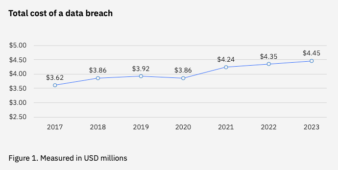
For starters, an average data breach resulting from a cyberattack costs a company $4.45 million. 

Source: IBM Cost of a Data Breach 2023 Report

And that’s only the beginning!

Search engines will blocklist domains they consider suspicious, malicious, or dangerous to keep their users safe and prevent them from appearing in their search result pages (SERPs). 

Browsers will also prevent people from visiting a website by displaying a message like this.

Not only will this cause a significant dip in SEO traffic, but it’ll also damage a brand’s reputation and credibility, so much so that new and existing customers will be discouraged from doing business with them.

The good news is that there are cybersecurity measures you can immediately implement to significantly minimize – if not eliminate – your chances of becoming a cyber attack victim. 

Let’s take a look at these right now.

HTTPS: Enhancing Website Security and SEO Simultaneously

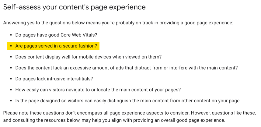
Website security is one of the SEO principles Google considers when evaluating your website’s page experience, which, in turn, impacts your search rankings.

Screenshot from Google Developer’s Page Experience Documentation

One of the easiest ways to keep your website secure from cyber threats is by ensuring your website URL begins with HTTPS.

Unlike HTTP, HTTPS uses a specific protocol called an SSL/TLS certificate that encrypts all requests and responses happening on your website’s front and back end. 

This ensures the information your website visitors and customers provide can’t easily be read and deciphered by cyber criminals, making it more difficult for them to hack your website and steal your customers’ data.

Optimizing SSL/TLS Certificates for Improved SERP Rankings

SSL/TLS certificates ensure that websites adhere to data confidentiality and privacy required in specific industries like finance and healthcare.

More importantly, SSL/TLS certificates assure your visitors and customers that your website—and their information—are secure. 

In addition to checking your website’s URL, a website with an SSL/TLS certificate will show up with a padlock on Apple’s Safari.

Cyptnox’s website’s SSL/TLS certificate on Safari browser (left) and Google Chrome (right) 

There are three SSL/TLS certificate types:

Domain Validation (DV) Certificate

This is the lowest SSL/TLS certificate and provides only basic security for your website. 

As such, it’s also the easiest to get because all you’ll need to do is confirm that you own your website’s domain through a phone call or via email.

Organization Validation (OV) Certificate

Compared to DV certificates, OV SSL/TLS certificates provide websites with a higher level of security, including the ability to encrypt sensitive information like credit card details and purchase history. 

If you’re planning to apply for an OV certificate, be prepared to go through a screening process that involves providing proof of your business’s physical address and ownership. 

Extended Validation (EV) Certificate

As you may have guessed, this SSL/TLS certificate has the highest security level. Financial institutions, hospitals, insurance companies, and healthcare providers commonly use it. 

It’s also the most expensive and requires applicants to undergo an extremely stringent verification process.

On top of the security features available in the first two, EV certificates also protect your website and its users from unauthorized access from third parties. 

This protects users when performing various online transactions requiring them to provide sensitive information like filing an insurance claim or requesting medical records.

Having the correct SSL/TLS certificate ensures that you’re providing your website visitors the level of protection and security they expect from businesses within your industry. 

In turn, visitors will be more confident doing business with you, and search engines will reward you with higher SERP rankings and more SEO traffic.

Preventing Negative SEO Through Cybersecurity Measures

Negative SEO (aka “black hat SEO”) uses sneaky tactics to boost a website’s search rankings by damaging its competitors’ online reputation and rankings.

One of the most common tactics is link farming. 

This negative SEO tactic creates backlinks from sites tagged as dangerous or malicious by Google and other search engines. 

Tools like Ahrefs can help you identify and remove these potentially dangerous backlinks from your website.

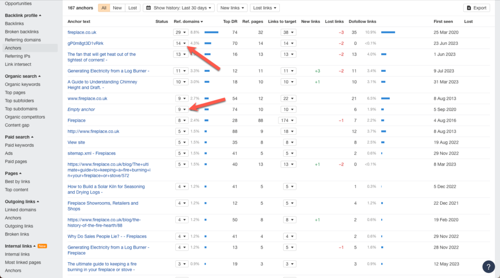
Although you won’t find any specific tags specifying that backlinks from a particular domain are toxic, there are a couple of red flags to watch out for.

One is the referring domain’s site traffic. 

If the website’s traffic is 0, it may be a sign that search engines and browsers are blocking users from visiting it.

Another red flag to check is the URL anchor text pointing to your website.

A properly executed link-building strategy uses descriptive anchor texts with targeted keywords. 

Link farming tactics don’t. 

So, if you see random letters and “Empty Anchor” anchor texts listed, these could potentially be toxic backlinks.  

You can further check this by clicking on the dropdown menu next to the anchor text in the “Ref Domains” column.

This will display a list of all the domains with backlinks to your site using that specific anchor text.

Again, check the Traffic column to see if any domains are not receiving traffic. If so, these may potentially be toxic backlinks.

You can then use Ahrefs’ Disavow Tool to submit these to Google so that search bots will ignore these backlinks so that they won’t be factored into your overall search rankings.

Secured Structured Data: Boosting Trust and SERPs

Schema markups help structure the different pages on your website in a way that search bots can easily access and understand its content. 

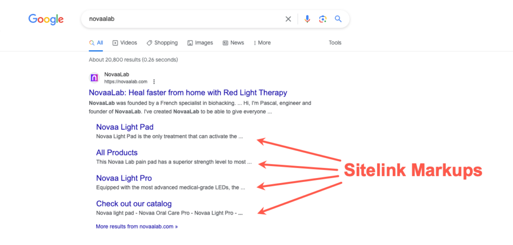
Google uses this information to provide users with links to specific pages on your website under your homepage URL.

Take Novaalabs, for example.

Notice how its structured data allows Google to display multiple product pages underneath its homepage URL on its SERP.  

This makes the checkout process quicker and easier for Novaalabs’ new and existing customers. 

And since Google would often list sites with sitelink schema markups at the top of their SERPs, Novaalabs increases its chances of its target customers visiting them instead of their customers.

If your business has a brick-and-mortar establishment, schema markups allow you to display detailed information about your business and appear on local search results.

The French Laundry, for example, uses schema markups that allow them to display both sitelink markups and local business profile information that includes customer reviews.

This allows them to transform the entire above-the-fold of Google’s SERP into one giant digital billboard promoting the restaurant, significantly reducing their target customers to dine elsewhere.

More importantly, displaying customer reviews and ratings helps the restaurant build a level of trust that will convince them to dine at this restaurant. It also increases the chances that diners will spend more once they get there.

However, schema markups are still code your SEO specialist creates for your website or generated by a plugin. This makes them prone to errors and vulnerabilities that cybercriminals are eager to exploit.

That’s why, before using it, make it a point to test it using Google’s Rich Results Test Tool to check your schema markup for errors, warnings, and vulnerabilities.

Source: Semrush

You can then fix the flagged areas directly on the tool. That way, you can be sure that your schema markup will help boost your search rankings and keep you protected at the same time. 

Balancing Mobile Security with Google Mobile-First Indexing

Mobile security in the post-pandemic workplace should no longer be limited to cell phones and tablets.

With businesses adopting remote work and Bring-Your-Devices (BYOD) policies to help boost job satisfaction and reduce overhead costs, ensuring that your cybersecurity policies align with these changes is critical.

Here are some tips to help you update your mobile cybersecurity policies to keep your business protected:

Employ Multifactor Authentication

At first, multifactor authentication can be a nuisance because it’ll require you and everyone else in your business to undergo several verification steps before accessing the tools you use at work.

However, these additional steps mean that different layers of security are put in place on your devices, making them more secure for you and your employees to use at home, in a co-working space, or at your favorite coffee shop.

Secure Your Online Forms

Mobile device users make up 56.2% of the traffic visiting websites, including yours!

Unfortunately, mobile devices also account for 73% of significant cybersecurity breaches experienced by businesses.

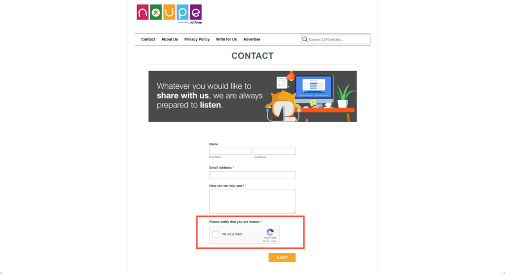
That said, it’s vital to ensure your website is user-friendly for mobile device users and secure to prevent malware from getting into your website through your contact forms.

One way to secure your online forms is by adding data encryption and security tokens like reCaptcha.

This helps prevent your business from getting flooded with spammy responses, including malware cybercriminals can use to steal sensitive information and hostage your website for ransom.

Be Diligent When Granting Internet Access

This is particularly important if you’re implementing a hybrid work model and BYOD policy in your business.

Since cybercriminals know that personal devices are less secure than those furnished by companies, they would use these as an entry point to hack your system. 

Restricting the number of devices that can access your internet can help significantly reduce the chances of this happening. 

Ensuring Cybersecurity During SEO-Focused Site Migration

Migrating your website to a new web hosting provider is risky and should never be taken lightly. 

For starters, you must take down your site to begin the process. 

When that happens, your target audience and search bots won’t be able to access you’re website, causing your search and domain rankings to drop.

Part of the site migration process involves temporarily disconnecting any security measures you have in place, leaving your website and business vulnerable to data breaches and other cyber attacks.

On top of that, you run the risk of potentially losing content and valuable data about your customers.

Before starting the site migration process, back up your entire website onto an external drive. That way, you eliminate any chance that cybercriminals can get access to it.

Also, conduct a comprehensive website and SEO audit once the site migration is finished and before you bring your website back up. This allows you to thoroughly check your website to ensure there are no errors and vulnerabilities that’ll serve as a backdoor for cybercriminals to enter and wreak havoc.

Finally, submit your sitemap and robots.txt to Google through your website’s Search Console account. This will prompt Google bots to start crawling and indexing your newly migrating site and display it on its SERPs again.

The Interplay of AI in Future Cybersecurity and SEO Strategies

Artificial intelligence (AI) technology advancements are both a blessing and a curse.

On the one hand, AI has made it easier for businesses to adapt their SEO strategies to ever-changing industry trends and customer behaviors. It’s also helped streamline workflow processes, increasing employee productivity and job satisfaction.

These same advancements, however, equipped cybercriminals to become more sophisticated in their infiltration techniques.

AI writing tools like ChatGPT are a perfect example of this.

ChatGPT can help businesses and cybercriminals write personalized and compelling email copy to convince readers to act. 

Not surprisingly, the number of people and businesses victimized by email phishing spiked by a whopping 1,265% since ChatGPT launched.

That’s why cybersecurity professionals are deploying and enhancing AI-powered cybersecurity solutions that recognize patterns in malware code and scripts used by cyber criminals, allowing them to block these before they can do any damage.

AI-powered cybersecurity solutions can also help identify and address negative SEO tactics like link farming, artificial traffic, and bots filling out forms on your website.

Conclusion

As long as the internet exists, cybercriminals will always be out there, ready to attack your website when the opportunity presents itself.

The tips and strategies shared in this article won’t eliminate the threat of a cyber-attack. But they can significantly reduce the chance of your business becoming a victim if you diligently put them into practice.

The war against cybercrime can’t be won’t a few people within your business. Everyone has a role to play. Creating a cybersecurity policy and having open communication with your employees ensures that everyone will do their part in protecting your website and themselves from cyber criminals. 

Featured image by Dan Nelson on Unsplash

The post Cybersecurity and SEO: Balancing Protection and Accessibility appeared first on noupe.

Categories: Others Tags: