Archive

Archive for April, 2024

Longing For May (2024 Wallpapers Edition)

April 30th, 2024 No comments

Inspiration lies everywhere, and as a matter of fact, we discovered one of the best ways to spark new ideas: desktop wallpapers. Since more than 13 years already, we challenge you, our dear readers, to put your creative skills to the test and create wallpaper calendars for our monthly wallpapers posts. No matter if you’re into illustration, lettering, or photography, the wallpapers series is the perfect opportunity to get your ideas flowing and create a small artwork to share with people all around the world. Of course, it wasn’t any different this month.

In this post, you’ll find desktop wallpapers created by artists and designers who took on the creativity challenge. They come in versions with and without a calendar for May 2024 and can be downloaded for free. As a little bonus goodie, we also compiled a selection of favorites from our wallpapers archives at the end of the post. Maybe you’ll spot one of your almost-forgotten favorites from the past in here, too? A big thank-you to everyone who shared their designs with us this month! Happy May!

  • You can click on every image to see a larger preview,
  • We respect and carefully consider the ideas and motivation behind each and every artist’s work. This is why we give all artists the full freedom to explore their creativity and express emotions and experience through their works. This is also why the themes of the wallpapers weren’t anyhow influenced by us but rather designed from scratch by the artists themselves.
  • Submit a wallpaper!
    Did you know that you could get featured in our next wallpapers post, too? We are always looking for creative talent.

A Symphony Of Dedication On Labour Day

“On Labour Day, we celebrate the hard-working individuals who contribute to the growth of our communities. Whether in busy urban areas or peaceful rural settings, this day recognizes the unsung heroes driving our advancement. Let us pay tribute to the workers, craftsmen, and visionaries shaping our shared tomorrow.” — Designed by PopArt Studio from Serbia.

Navigating The Amazon

“We are in May, the spring month par excellence, and we celebrate it in the Amazon jungle.” — Designed by Veronica Valenzuela Jimenez from Spain.

Popping Into Spring

“Spring has sprung, and what better metaphor than toast popping up and out of a fun-colored toaster!” — Designed by Stephanie Klemick from Emmaus Pennsylvania, USA.

Duck

Designed by Madeline Scott from the United States.

Cruising Into Spring

“When I think of spring, I think of finally being able to drive with the windows down and enjoying the fresh air!” — Designed by Vanessa Mancuso from the United States.

Lava Is In The Air

Designed by Ricardo Gimenes from Sweden.

Love Myself

Designed by Design-Studio from India.

Bat Traffic

Designed by Ricardo Gimenes from Sweden.

Springtime Sips

“May is a month where the weather starts to warm and reminds us summer is approaching, so I created a bright cocktail-themed wallpaper since sipping cocktails in the sun is a popular warm weather activity!” — Designed by Hannah Coates from Baltimore, MD.

Hello May

“The longing for warmth, flowers in bloom, and new beginnings is finally over as we welcome the month of May. From celebrating nature on the days of turtles and birds to marking the days of our favorite wine and macarons, the historical celebrations of the International Workers’ Day, Cinco de Mayo, and Victory Day, to the unforgettable ‘May the Fourth be with you’. May is a time of celebration — so make every May day count!” — Designed by PopArt Studio from Serbia.

ARRR2-D2

Designed by Ricardo Gimenes from Sweden.

May Your May Be Magnificent

“May should be as bright and colorful as this calendar! That’s why our designers chose these juicy colors.” — Designed by MasterBundles from Ukraine.

The Monolith

Designed by Ricardo Gimenes from Sweden.

Blooming May

“In spring, especially in May, we all want bright colors and lightness, which was not there in winter.” — Designed by MasterBundles from Ukraine.

The Mushroom Band

“My daughter asked me to draw a band of mushrooms. Here it is!” — Designed by Vlad Gerasimov from Georgia.

Poppies Paradise

Designed by Nathalie Ouederni from France.

Lake Deck

“I wanted to make a big painterly vista with some mountains and a deck and such.” — Designed by Mike Healy from Australia.

Make A Wish

Designed by Julia Versinina from Chicago, USA.

Enjoy May!

“Springtime, especially Maytime, is my favorite time of the year. And I like popsicles — so it’s obvious isn’t it?” — Designed by Steffen Weiß from Germany.

Celestial Longitude Of 45°

“Lixia is the 7th solar term according to the traditional East Asian calendars, which divide a year into 24 solar terms. It signifies the beginning of summer in East Asian cultures. Usually begins around May 5 and ends around May 21.” — Designed by Hong, Zi-Cing from Taiwan.

Stone Dahlias

Designed by Rachel Hines from the United States.

Understand Yourself

“Sunsets in May are the best way to understand who you are and where you are heading. Let’s think more!” — Designed by Igor Izhik from Canada.

Sweet Lily Of The Valley

“The ‘lily of the valley’ came earlier this year. In France, we celebrate the month of May with this plant.” — Designed by Philippe Brouard from France.

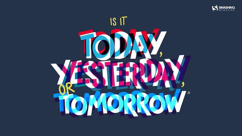
Today, Yesterday, Or Tomorrow

Designed by Alma Hoffmann from the United States.

Add Color To Your Life!

“This month is dedicated to flowers, to join us and brighten our days giving a little more color to our daily life.” — Designed by Verónica Valenzuela from Spain.

The Green Bear

Designed by Pedro Rolo from Portugal.

Lookout At Sea

“I wanted to create something fun and happy for the month of May. It’s a simple concept, but May is typically the time to adventure out into the world and enjoy the best of Spring.” — Designed by Alexander Jubinski from the United States.

Tentacles

Designed by Julie Lapointe from Canada.

Spring Gracefulness

“We don’t usually count the breaths we take, but observing nature in May, we can’t count our breaths being taken away.” — Designed by Ana Masnikosa from Belgrade, Serbia.

Geo

Designed by Amanda Focht from the United States.

Blast Off!

“Calling all space cadets, it’s time to celebrate National Astronaut Day! Today we honor the fearless explorers who venture beyond our planet and boldly go where no one has gone before.” — Designed by PopArt Studio from Serbia.

Colorful

Designed by <a target="_blank" href="https://www.lotum.de>Lotum from Germany.

<a target="_blank" href="https://archive.smashing.media/assets/344dbf88-fdf9-42bb-adb4-46f01eedd629/e8daeb22-0fff-4b2a-b51a-2a6202c6e26e/may-12-colorful-31-full.png>

Who Is Your Mother?

“Someone who wakes up early in the morning, cooks you healthy and tasty meals, does your dishes, washes your clothes, sends you off to school, sits by your side and cuddles you when you are down with fever and cold, and hugs you when you have lost all hopes to cheer you up. Have you ever asked your mother to promise you never to leave you? No. We never did that because we are never insecure and our relationship with our mothers is never uncertain. We have sketched out this beautiful design to cherish the awesomeness of motherhood. Wishing all a happy Mothers Day!” — Designed by Acodez IT Solutions from India.

Asparagus Say Hi!

“In my part of the world, May marks the start of seasonal produce, starting with asparagus. I know spring is finally here and summer is around the corner when locally-grown asparagus shows up at the grocery store.” — Designed by Elaine Chen from Toronto, Canada.

May The Force Be With You

“Yoda is my favorite Star Wars character and ‘may’ has funny double meaning.” — Designed by Antun Hirsman from Croatia.

Birds Of May

“Inspired by a little-known ‘holiday’ on May 4th known as ‘Bird Day’. It is the first holiday in the United States celebrating birds. Hurray for birds!” — Designed by Clarity Creative Group from Orlando, FL.

Categories: Others Tags:

Lessons Learned After Selling My Startup

April 29th, 2024 No comments

August 2021 marks a milestone for me. That’s when we signed an acquisition agreement to sell Chatra, a profitable live chat platform. I co-founded it after shutting down my first startup after a six-year struggle. Chatra took me and the team six years to finish — that’s six years of learning, experimenting, sometimes failing, and ultimately winning big.

Acquisitions happen all the time. But what does it look like to go through one, putting the thing you built and nurtured up for sale and ceding control to someone else to take over? Sometimes, these things are complicated and contain clauses about what you can and can’t say after the transaction is completed.

So, I’ve curated a handful of the most valuable takeaways from starting, growing, and selling the company. It took me some time to process everything; some lessons were learned immediately, while others took time to sink in. Ultimately, though, it’s a recollection of my personal journey. I hope sharing it can help you in the event you ever find yourself in a similar pair of shoes.

Keeping The Band Together

Rewind six years before the Chatra acquisition. My first startup, Getwear, ran out of steam, and I — along with everyone else — was ready to jump ship.

But we weren’t ready to part ways. My co-founder-partner was a close childhood friend with whom I would sell pirated CDs in the late 90s. Now, I don’t think it’s the most honest way to make a living, but it didn’t bother us much in high school. It also contributed to a strong bond between us, one that led to the launch of Getwear and, later, Chatra.

That partnership and collaboration were too precious to let go; we knew that our work wasn’t supposed to end at Getwear and that we’d have at least one more try together. The fact that we struggled together before is what allowed us to pull through difficult times later. Our friendship allowed us to work through stress, difficulties, and the unavoidable disagreements that always come up.

That was a big lesson for me: It’s good to have a partner you trust along for the ride. We were together before Chatra, and we saw it all the way through to the end. I can’t imagine how things would have been different had I partnered with someone new and unfamiliar, or worse, on my own.

Building Business Foundations

We believed Getwear would make us millionaires. So when it failed, that motivation effectively evaporated. We were no longer inspired to take on ambitious plans, but we still had enough steam to start a digital analog of a döner kebab shop — a simple, sought-after tech product just to pay our bills.

This business wasn’t to be built on the back of investment capital; no, it was bootstrapped. That means we made do with a small, independent, fully-remote team. Remember, this is in 2015. The global pandemic had yet to happen, and a fully remote team was still a novelty. And it was quite a change from how we ran Getwear, which was stocked with an R&D department, a production office, and even a factory in Mumbai. A small distributed team seemed the right approach to keep us nimble as we set about defining our path forward as a company.

Finding our purpose required us to look at the intersection of what the market needs and what we know and can do well. Building a customer support product was an obvious choice: at Getwear, we heavily relied on live chat to help users take their body measurements and place their orders.

We were familiar with existing products on the market. Besides, we already had experience building a conversational support product: we had built an internal tool to facilitate communication between our Mumbai-based factory and an overseas customer-facing team. The best thing about that was that it was built on a relatively obscure framework offering real-time messaging out of the box.

There were maybe 20 established competitors in the space back in 2015, but that didn’t dissuade us. If there was enough room for 20 products to do business, there must be enough for 21. I assumed we should treat competition as a market validation rather than an obstacle.

Looking back, I can confidently say that it’s totally possible to compete (and succeed) in a crowded market.

Product-wise, Getwear was very innovative; no one had ever built an online jeans customizer as powerful as ours. We designed the UX from scratch without relying much on the best practices.

With Chatra, we went down a completely different route: We had improved the established live chat product category via features that were, at that time, commonly found in other types of software but hadn’t made their way to our field. That was the opportunity we seized.

The existing live chat platforms felt archaic in that the interfaces were clunky and reminiscent of Windows 95, the user flows were poorly thought out, and the dated user experience resulted in lost conversation histories.

Slack was a new product at this time and was all the rage with its fresh approach to user interfaces and conversational onboarding. Products like Facebook Messenger and Telegram (which is popular in Eastern Europe and the Middle East) were already standard bearers and formed user expectations for how a messaging experience should work on mobile. We learned a lot from these products and found in them the blueprint to design a modern chat widget and dashboard for agents.

We certainly stood on the shoulders of giants, and there’s nothing wrong with stealing like an artist: in fact, both Steve Jobs and Bill Gates did it.

The takeaway?

A product does not have to be new to redefine and disrupt a market. It’s possible to lead by introducing modern standards and designs rather than coming up with something radically different.

Making A Go-To-Market Strategy

Once we were clear about what we were building and how to build it, the time came to figure out a strategy for bringing our product to market.

Two things were very clear and true to us up front:

  1. We needed to launch and start earning immediately — in months rather than years — being a bootstrapped company and all.
  2. We didn’t have money for things like paid acquisition, brand awareness, or outbound sales representatives to serve as the front line for customer engagement.

Both conclusions, taken together, helped us decide to focus our efforts on small businesses that need fewer features in a product and onboard by self-service. Marketing-wise, that meant we’d need to find a way around prohibitively expensive ads.

Enter growth hacking! The term doesn’t resonate now the way it did in 2015: fresh, aggressive, and effective. As a user-facing website widget, we had a built-in acquisition channel by way of a “powered by Chatra” link. For it to be an effective marketing tool, we had to accumulate a certain number of customers. Otherwise, who’s going to see the link in the first place?

We combined unorthodox techniques to acquire new customers, like web-scraping and email address discovery with cold outreach.

Initially, we decided to go after our competitors’ customers. But the only thing we got out of targeting them with emails was their rightful anger.

In fact, a number of customers complained directly to the competitors, and the CEO of a prominent live chat company demanded we cease communicating with their users.

More than that, he actually requested that we donate to a well-known civil liberty NGO, something we wholeheartedly agreed to, considering it was indeed the right thing to do.

So, we decided to forget about competition and target potential customers (who owned e-commerce websites) using automation for lead research, email sending, and reply processing. We managed to do it on a massive scale with very few resources. By and large, cold outreach has been the single most effective marketing tool we have ever used. And contrary to common assumption, it is not a practice reserved purely for enterprise products.

Once we acquired a significant user mass, the widget link became our Number One acquisition channel. In lean startup terminology, a viral engine of growth is a situation when existing customers start generating leads and filling the marketing funnel for you. It’s where we all want to be, but the way to get there is often murky and unreliable. But my experience tells me that it is possible and can be planned.

For this strategy to work, it has to be based on natural user interactions. With widgets, the mechanic is quite apparent, but not so much with other products. Still, you can do well with serious planning and running experiments to help make informed decisions that achieve the best possible results.

For example, we were surprised that the widget link performed way better in tests when we changed it from “Powered by Chatra” to “Get Chatra!”. We’re talking big increases with minor tweaks. The small details really do matter!

Content marketing was another avenue we explored for generating leads. We had already done the cold outreach and had a good viral engine going with the widget link. Content marketing, in contrast, was an attempt to generate leads at the “top” of the funnel, independent of any outbound marketing or our customers’ websites. We produced books and guides that were well-researched, written, and designed to bring in potential customers while supporting existing ones with resources to get the most out of Chatra.

Sadly, these efforts failed to attract many new leads. I don’t want to say not to invest in quality content; it’s just that this is not a viable short-term growth strategy.

Increasing Lifetime Customer Value

It took six months of development to launch and another year to finally break even. By then, we had achieved a product-market fit with consistent organic growth; it was time to focus on metrics and unit economics. Our challenge was to limit customer churn and find ways to increase the lifetime value of existing customers.

If there’s an arch-enemy to SaaS, it’s churn. Mitigating churn is crucial to any subscription business, as longer subscriptions generate more revenue. Plus, it’s easier to prevent churn than it is to acquire new customers.

We found it helpful to distinguish between avoidable churn and unavoidable (i.e., “natural”) churn. The latter concerns customer behavior beyond our control: if an e-commerce store shuts down, they won’t pay for services. And we had nothing to do with them shutting down — it’s just the reality of life that most small businesses fail. No quick-fix strategy could ever change that; we just had to deal with it.

Chatra’s subscription pricing was fairly inexpensive, yet we enjoyed a relatively high customer lifetime value (cLTV). Many customers tended to stay for a long time — some, for years. Our high cLTV helped us justify higher customer acquisition costs (CAC) for paid ads in the Shopify app store once we decided to run them. Running the ads allowed us to improve our Shopify app store search position. And because of that, we improved and kept our position as a top app within our category. That, I believe, was one of the factors that the company Brevo considered when they later decided to acquire our business.

We tried improving the free-to-paid subscription conversion rate by targeting those who actively used the product but remained on a free plan for an extended period. We offered them an upgraded plan subscription for just one dollar per year. And to our surprise, that failed to convince many people to upgrade. We were forced to conclude that there are two types of customers: those who pay and those who do not (and will not).

From that point forward, things got even weirder. For example, we ran several experiments with subscription pricing and found that we could increase subscription prices from $11 per seat to $19 without adversely affecting either the visitor-to-user or the free-to-paid conversion rates! Apparently, price doesn’t matter as much as you might think. It’s possible to raise prices without adversely affecting conversions, at least in our experience with a freemium pricing model.

We also released additional products we could cross-sell to existing customers. One was Livebar, an app for in-browser notifications on recent online shopping purchases. Another was Yeps, a simple announcement bar that sticks to the top of a webpage. Product-wise, both were good. But despite our efforts to bring awareness to them in all our communications with Chatra customers, they never really took off. We’ve closed the first and sold the second for a price that barely justified the development and ongoing support we were putting into it. We were wrong to assume that if we have a loyal audience, we could automatically sell them another product.

Contemplating An Exit

Chatra was a lean company. As a SaaS business, we had a perfect cost-revenue ratio and gained new customers mainly through viral dynamics and self-onboarding. These didn’t increase our costs much but did indeed bring in extra subscription dollars. The engine worked almost without any effort on our side.

After a few years, the company could mostly function on auto-pilot, giving us — the founders — time and resources to pay our bills and run business experiments. We were enjoying a good life. Our work was a success!

We gave up on an exit strategy even before starting, so we didn’t pay much attention to the acquisition offers we routinely received; most weren’t enticing enough to pull us away. Even those sent by people known in the industry were way too small: the best offer we got was a valuation of 2.5 times our Annual Recurring Revenue (ARR), which was a non-starter for us.

Then, we received an email with another offer. The details were slim, but we decided to at least entertain the idea and schedule a time to chat. I replied that we wouldn’t consider anything lower than an industry-standard venture-backed SaaS valuation (which was about eight times ARR at the time). The response, surprisingly, read: “Let’s talk. Are you ready to sign a non-disclosure agreement?”

My biggest concern was that transferring ownership might lead to the Chatra team being laid off and the product termination. I didn’t want to let down our existing customers! The buyer understood the situation and assured us that Chatra would remain a separate line of business, at least for an extended period. No one on the team would lose their job. The buyer also planned to fork Chatra rather than close it, at least initially.

Still, letting go of it was difficult, and at times, I even felt the urge to blow up the negotiations.

So, why sell at all? We did it for three reasons:

  • First, we felt stuck in the mature stage of the business lifecycle and missed the feeling of creating new things.
  • Second, we (rightfully) knew that the good times could not last forever; we would be wise to avoid putting all our eggs in one basket.
  • Third was a bit of pride. I genuinely wanted to go through the acquisition process, which has always seemed like a rite of passage for entrepreneurs.

Chatra was growing, cash-flow positive, and economic tailwinds seemed to blow our way. On the flip side, however, we had little left to do as founders. We didn’t want to go upmarket and compete with massive players like Intercom and Drift. We were happy in our niche, but it didn’t offer enough growth or expansion opportunities. We felt near the end of the line.

Looking back, I see how fortunate we were. The market took a huge hit soon after the acquisition, to the extent that I’m sure we would not have been able to fetch equally enticing offers within the next two years.

I want to stress that the offer we got was very, very generous. Still I often kick myself for not asking for more, as a deep-pocketed buyer is unlikely to turn away simply because we were trying to increase the company’s valuation. The additional ask would have been negligible to the buyer, but it could have been very meaningful for us.

Different acquisitions wind up looking different in the end. If you’re curious what a transaction looks like, ours was split into three payouts:

  1. An initial, fixed payment on the closing date;
  2. Several flexible payouts based on reaching post-acquisition milestones;
  3. An escrow amount deposited with an escrow agent for the possibility of something going wrong, like legal claims.

We assumed this structure was non-negotiable and didn’t try to agree on a different distribution that would move more money to the initial payment. Why? We were too shy to ask and were sure we’d complete all requirements on time. Accepting a significant payment delay essentially credited the buyer for the amount of the payouts while leaving me and my co-founder vulnerable to uncertainty.

We should’ve been bold and negotiated more favorable terms. After all, it represented the last time we’d have to battle for Chatra. I consider that a lesson learned for next time.

Conclusion

Parting ways with Chatra wasn’t easy. The team became my second family, and every product pixel and bit of code was dear to my heart. And yes, I do still feel nostalgia for it from time to time. But I certainly enjoy the freedom that comes with the financial gains.

One thing I absolutely want to mention before closing this out is that

Having an “exit” under my belt actually did very little to change my personal well-being or sense of self-worth. The biggest lesson I took away from the acquisition is that success is the process of doing things, not the point you can arrive at.

I don’t yet know where the journey will take me from here, but I’m confident that there will be both a business challenge and a way of helping others on their own founder journey. That said, I sincerely hope that my experience gives you a good deal of insight into the process of selling a company. It’s one of those things that often happens behind closed doors. But by shedding a little light on it — at least this one reflection — perhaps you will be more prepared than I was and know what to look for.

Categories: Others Tags:

The End Of The Free Tier

April 26th, 2024 No comments

I love free tiers, and I am not the only one. Everyone loves free things — they’re the best thing in life, after all. But maybe we have grown too accustomed to them, to the extent that a service switching from a “freemium” model to a fully paid plan would probably feel outrageous to you. Nowadays, though, the transition from free to paid services seems inevitable. It’s a matter of when a service drops its free tier rather than if it will.

Companies need to make money. As developers, we probably understand the most that a product comes with costs; there are startup funds, resources, and salaries spent to maintain and support the product against a competitive globalized market.

If I decided to take something I made and ship it to others, you darn well know I would charge money for it, and I assume you’re the same. At the same time, I’m typically more than happy to pay for something, knowing it supports the people who made it.

We get that, and we surely don’t go walk into a grocery store complaining that nothing they have is free. It’s just how things work.

What exactly, then, is so infuriating about a service offering a free tier and later deciding to transition to a priced one?

It’s Positioning, Not Money

It’s not so much about the money as it is the positioning. Who wouldn’t feel somewhat scammed, having invested time and resources into something that was initially advertised as “free” only to be blindsided behind a paywall?

Most of the time, the feeling is less anger than it is mildly annoying. For example, if your favorite browser suddenly became a paid premium offering, you would most likely switch to the next best option. But what happens when the free tier for a hosted product or service is retired? Switching isn’t as easy when hundreds of thousands of developers server their projects in a free-tier hosting plan.

The practice of offering a free tier only to remove it seems like a common practice on the web that won’t go away any time soon. It’s as though companies ditch them once (1) the product becomes mature enough to be a feature-rich offering or (2) the company realizes free customers are not converting into paid customers.

It has been a source of endless complaints, and one only needs to look back at PlanetScale’s recent decision to remove its free-tier database plan, which we will get deeper into in a bit. Are free tiers removed because of their unsustainable nature, or is it to appease profit-hungry companies? I want to explore the why and how of free tiers, better approaches for marketing “free” services, and how to smoothly retire a free tier when it inevitably goes away.

Glossary

Before we wade further into these waters, I think it’s worth having a baseline understanding of pricing concepts that are relevant to the discussion.

A free tier is one of several flavors:

  • Free trial opt-in
    Permits users to try out the product for a limited period without providing payment details. Once the trial ends, so does access to the product features.
  • Free trial opt-out
    Requires users to provide payment information during registration en route to a free trial that, once it ends, automatically converts to a paid account.
  • Freemium model
    Offers access to a product’s “core” features but requires upgrading to a paid account to unlock other features and benefits.
  • Reverse trial model
    Users start with access to the premium tier upon registration and then transition to a freemium tier after the trial period ends.

Case Study: PlanetScale

Let’s start this conversation by looking at PlanetScale and how it killed its free tier at the beginning of the year. Founded in 2018, PlanetScale launched its database as a service in 2021 and has raised $105 million in venture capital and seed funding, becoming one of the fastest-growing tech companies in North America by 2023. In March of this year, CEO Sam Lambert announced the removal of PlanetScale’s hobby tier.

In short, the decision was made to provide “a reliable and sustainable platform for our customers” by not “giving away endless amounts of free resources to keep growing,” which, of course, leaves everyone in the freemium tier until April 8 to either pay for one of the next plans at the outrageous starting price of $39 per month or migrate to another platform.

Again, a company needs steady revenue and a reliable business plan to stay afloat. But PlanetScale gave mixed signals when they stated in the bespoke memo that “[e]very unprofitable company has a date in the future where it could disappear.” Then they went on to say they are “the main database for companies totaling more than $50B in market cap,” and they “have been recognized […] as one of the fastest growing tech companies in the US.”

In non-bureaucratic speak, PlanetScale says that the product is failing from one side of its mouth and that the company is wildly successful from the other.

The company is doing great. In November 2023, PlanetScale was ranked as the 188th fastest-growing company in North America by Deloitte Technology Fast 500™. Growth doesn’t necessarily equal revenue, but “to be eligible for Technology Fast 500 recognition, […] [c]ompanies must have base-year operating revenues of at least US $50,000, and current-year operating revenues of at least US $5 million.”

PlanetScale’s decision can only be interpreted as “we want more money,” at least to me. There’s nothing about its current performance that suggests it needs the revenue to keep the company alive.

That’s a punch below the waist for the developer community, especially considering that those on the free tier are likely independent bootstrappers who need to keep their costs low. And let’s not overlook that ending the free tier was accompanied by a round of layoffs at the company.

PlanetScale’s story is not what worries me; it’s that retiring freemium plans is becoming standard practice, as we have seen with the likes of other big PaaS players, including Heroku and Railway.

That said, the PlanetScale case is perhaps the most frustrating because the cheapest alternative to the free tier they now offer is a whopping $39 per month. Compare that to the likes of others in that space, such as Heroku ($7 per month) and Railway ($5 per month).

Is This How A Free Tier Works?

With zero adoption, the value of a new service can’t be seen behind a paywall. Launching any kind of product or service with a freemium pricing model is often used to bring awareness to the product and entice early adopters who might convert into paying customers to help offset the costs of those on the free plan. It’s the old Pareto, or 80/20, rule, where 20% of paying customers ought to pay for the 80% of free users.

A conversion rate is the percentage of users that upgrade from a free tier to a paid one, and an “average” rate depends on the type of free tier or trial being offered.

In a freemium model — without sales assist — a good conversion rate is somewhere between 3–5%, but that’s optimistic. Conversion rates are often way lower in reality and perhaps the toughest to improve for startups with few or no customers. Early on, startups often have so few paying customers that they will have to operate at a loss until figuring out a way to land paying customers who can subsidize the ones who aren’t paying anything.

The longer a company operates at a loss, the more likely it races to generate the highest possible growth before undoubtedly having to cut benefits for free users.

A lot of those free users will feel misled and migrate to another service, but once the audience is big enough, a company can afford to lose free customers in favor of the minority that will switch to premium. Take Evernote, for example. The note-taking app allowed free users to save 100,000 notes and 250 notebooks only to do an about-face in 2023 and limit free users to 50 notes and one notebook.

In principle, a free tier serves the same purpose for SaaS (Software as a System) and PaaS (Product as a System) offerings, but the effects differ. For one, cloud computing costs lots of money, so offering an AWS wrapper in a free tier is significantly harder to sustain. The real difference between SaaS and PaaS, however, is clear when the company decides to kill off its free tier.

Let’s take Zoom as a SaaS example: there is a basic tier that gives you up to 40 minutes of free meeting time, and that is plenty for people who simply don’t need much beyond that. If Zoom were to remove its free tier, free users would most likely move to other freemium alternatives like Google Meet rather than upgrade to one of Zoom’s paid tiers. Those customers have invested nothing in Zoom that locks them in, so the cost of switching to another meeting app is only the learning curve of what app they switch to.

This is in contrast to a PaaS; if the free tier is removed, switching providers introduces costs since a part of your architecture lives in the provider’s free tier. Besides the effort needed to migrate to another provider, moving data and servers can be an expensive operation, thanks to data egress fees. Data egress fees are obscure charges that cloud providers make customers pay for moving data from one service to another. They charge you to stop paying!

Thankfully, there is an increased awareness of this issue through the European Union’s Data Act that requires cloud providers located in Europe to remove barriers that prevent customers from easily switching between companies, including the removal of artificial egress fees.

The Ethics Of The Free Tier

Is it the developer’s fault for hosting a project on a free pricing tier, considering that it can be rolled out at any moment? I have two schools of thought on this: principle and consequential.

  • Principle
    On the one hand, you shouldn’t have to expect a company to pull the rug out from under you by removing a free tier, especially if the company aims to be a reliable and sustainable platform.
  • Consequential
    On the other hand, you don’t expect someone to cut a red light and hit you when you are driving, but you still look at both sides of the street. So it is with using a free tier. Even if it is “immoral” for a company to remove the tier, a developer ought to have a backup plan in the event that it happens, especially as the disappearance of free tiers becomes more prevalent in the industry.

I think it boils down to a matter of transparency. No free tier is advertised as something that may disappear, even if it will in the future. In this case, a free tier is supposed to be another tier with fewer benefits than the paid plan offerings but just as reliable as the most expensive plan, so no user should expect to migrate their projects to other providers any time soon.

What’s The Alternative?

Offering customers a free tier only to remove it once the company gets a “healthy enough” share of the market is just wrong, particularly if it was never attached to an up-front sunset date.

Pretending that the purpose of a free tier is the same as a free trial is unjust since it surely isn’t advertised that way.

If a company wants to give people a taste of how a product or service works, then I think there are far better and more sincere alternatives to the free-tier pricing model:

  • Free trials (opt-in)
    Strapi is an open-source CMS and a perfect example of a service offering a free trial. In 2023, the company released a cloud provider to host Strapi CMS with zero configuration. Even though I think Strapi Cloud is on the pricey side, I still appreciate having a 14-day free trial over a free tier that can or maybe will be removed later. The free trial gives users enough time to get a feel for the product, and there’s no credit card required that would lock someone in (because, let’s face it, some companies count on you forgetting to cancel your free subscription before payments kick in).

  • Free credits
    I have used Railway to host Node.js + Postgres in the past. I think that its “free tier” is the best example of how to help customers try the service: the cheapest plan is a relatively affordable $5 per month, and a new subscriber is credited with $5 to start the project and evaluate the service, again, without the requirement of handing over credit card information or pulling any rugs out from under people. Want to continue your service after the free credits are exhausted? Buy more credits!

Railway is a particular case because it used to have a free tier, but it was withdrawn on June 2, 2023. However, the company removed it with a level of care and concern for customers that PlanetScale lacked and even gave customers who relied on the free tier a trial account with a number of free credits. It is also important to note (and I can’t get over it) that PlanetScale’s new cheapest plan is $39 per month, while Railway was able to limit the damage to $5 per month.

Free Tiers That I Use

I don’t want this article to be just a listicle of free services but rather the start of a conversation about the “free-tier dilemma”. I also want to share some of the free tiers I use, even for small but production-ready projects.

Supabase

You can make pretty much any imaginable web app using Supabase as the back-end since it brings a PostgreSQL database, authentication, real-time subscriptions, and storage in a central dashboard — complete with a generous allocation of database usage in its free tier.

Railway

I have been using Railway to host Strapi CMS for a long time. Aside from its beautiful UI, Railway includes seamless deployment workflows, automatic scaling, built-in CI/CD pipelines, and integration with popular frameworks and databases thanks to its hundreds of templates. It doesn’t include a free tier per se, but you can get the full feel of Railway with the $5 credit they offer.

GitHub Pages

I use GitHub Pages the way I know many of you do as well: for static pages and technical demos. I have used it before to make live examples for my blog posts. So, it’s more of a playground that I use to make a few artifacts when I need to deploy something fast, but I don’t rely on it for anything that would be of consequence if it were to suddenly go away.

Netlify

Beyond hosting, Netlify offers support for almost all modern frameworks, not to mention that they toss in lots of additional perks, including solid documentation, continuous deployment, templates, an edge network, and analytics — all of which are available in a free tier that pleases almost anyone’s needs.

Conclusion

If it isn’t totally clear where I fall on the free pricing tier situation, I’m not advocating that we end the practice, but for more transparency on the side of the companies that offer free tier plans and increased awareness on the side of developers like myself.

I believe that the only way it makes sense to offer a free tier for a SaaS/PaaS is for the company providing it to view it as part of the core product, one that cannot be sunset without a clear and transparent exit strategy, clearly communicated up-front during any sort of registration process. Have a plan for users to painlessly switch services. Allow the customer to make an informed choice and accept responsibility from there.

Free tiers should attract users rather than trap them, and there is an abysmal difference between replacing a free tier for $5 per month with one that costs nearly $40. Taking away the service is one thing; charging exorbitant rates on top of it only adds insult to injury.

We can do better here, and there are plenty of alternatives to free tiers for effectively marketing a product.

Further Reading On SmashingMag

Categories: Others Tags:

Furthering Your Education: Top Resources for Going Back to Grad School After Working

April 26th, 2024 No comments

The traditional path of going straight from undergrad to graduate school isn’t for everyone. Many people choose to enter the workforce first to gain real-world experience before deciding to pursue an advanced degree. If you’ve been working for several years and are now considering going back to school at 30 (or any age really), there are plenty of resources available to help make that transition smoother.

Start With Your Employer

Your current company may actually be one of the best resources for going back to graduate school. Many employers, especially larger corporations, offer tuition assistance programs that can help cover a portion of the costs for approved degree programs. Even if you plan to use the degree to change careers afterwards, taking advantage of this benefit while still employed can save you thousands of dollars that would otherwise need to be paid out-of-pocket or through loans. 

The first step is to check with your HR department or review your company’s benefits policies regarding tuition reimbursement or assistance. You’ll likely need to submit a proposal for why the degree is relevant to your current role or the company’s needs. Having your manager’s support can go a long way in getting approval. 

Additionally, your manager and colleagues who have pursued further education can provide helpful insight into balancing coursework with your current job responsibilities. Get their advice on realistic course loads, how to discuss priorities with professors when deadlines conflict with work, and strategies for staying productive when juggling it all. They can also give you a realistic preview of what to expect in terms of your workload capacity.

Some employers may allow more flexible schedules or the option to go part-time while you’re in school. However, recognize that work responsibilities and client/customer needs will still likely take priority. You may need to get creative about making up hours earlier in the week or putting in evening/weekend time to account for classes and studying during normal business hours. Discussing expectations upfront with your boss can help ensure you have their full support when responsibilities occasionally overlap.

University Resources

Once you start researching and applying to graduate programs, the schools themselves become a valuable resource. Admissions counselors can fill you in on credential requirements for each program, accepted work experience that may count toward application requirements, program formats (part-time, evening, online options), and other support services for students returning to academia after a break.  

Most universities now have educational resources dedicated specifically to “non-traditional” or “adult” students who are coming back to school after years in the workforce. These offices can connect you with advisors who understand the unique challenges of being a “re-entry” student. They can help you get up to speed with the latest instructional technologies, refresh your academic writing skills, provide tutoring, and point you toward financial aid and scholarship opportunities for returning students.

Having a built-in community of people in similar circumstances can make the transition much easier. Most schools will have student organizations, mentorship programs, and peer networks specifically for non-traditional and adult learners. Being able to share experiences, swap tips on balancing life and coursework, or simply vent with others in the same situation can provide a huge support system.

Professional Associations

If you’re staying in your current field, professional associations related to your industry can point you toward recommended graduate programs and alternative credentials that may be valued by employers. For example, if you work in finance, an organization like the CFA Institute can steer you toward respected credentials like the Chartered Financial Analyst certification.

Many of these associations also offer continuing education courses, live and online seminars, training programs and other resources that can help bridge the gap between working full-time and going back to the classroom. You can start updating your academic skills and reintroducing concepts through these lower-stakes offerings before committing to a full graduate program. They also provide great networking opportunities to connect with other professionals interested in going back to school.

Student Loan Resources  

Of course, paying for graduate school is one of the biggest considerations when going back after years of earning a steady paycheck. After exhausting all avenues for employer tuition benefits and researching extensive grant and scholarship offerings for “non-traditional” grad students, you may still need to take out loans to cover costs.

Resources like the U.S. Department of Education’s Federal Student Aid website can walk you through the FAFSA process for grants and federal loans. They provide loan calculators to estimate borrowing needs, help compare lender options, and look into potential loan forgiveness programs based on your future career plans. 

There are also extensive private student loan options to supplement federal aid packages. Sites like Credible.com allow you to compare interest rates and terms across multiple private lenders at once. Different university websites, such as the University of Phoenix’s, provide detailed pages on the options available to students to finance their education. University financial aid offices are another great resource, as counselors can provide the most up-to-date information on aid packages, work-study options, graduate assistantships, and tuition payment plans specific to their school.

Building Your Support System

In addition to the concrete resources from employers, universities, professional groups and lenders, one of the most important things to establish when going back to grad school after years of working is a personal support system. Pursuing an advanced degree while working full-time is extremely demanding. You’ll need a strong network of friends, family, colleagues, and fellow students who understand the unique pressures you’re facing.

Rely on them for everything from pep talks during crunch times to helping cover household responsibilities when your schedule is overloaded. Let your inner circle know upfront that you’ll be making temporary sacrifices and may need to pass on some social events to focus on academics. But also schedule little breaks and rewards along the way to avoid burnout. Having a strong cheering squad to lean on can make all the difference in persevering through the journey.

Time Management Strategies

One of the biggest challenges of being a working student is finding enough hours in the day for all your responsibilities. Developing strong time management skills is crucial. Utilize tools like calendar blocking to dedicate set times exclusively for your classes, studying, work projects, and personal time. Eliminate distractions like social media during your designated academic blocks.

It can also be helpful to try different study tactics to maximize efficiency – techniques like working in timed intervals, or active recall with flashcards instead of just re-reading notes. Over time you’ll find the specific strategies that help you stay focused and retain more information in less time.

Don’t be afraid to ask for help or accommodations when you need them. Most professors understand the workload adult students are balancing and are willing to be flexible on deadlines in cases of work obligations or personal emergencies. Set realistic expectations with periodic breaks built in, so you can make it through each semester at a manageable pace.

Don’t let a few years out of the classroom deter you from pursuing a graduate degree and advancing your career. While it may require strategic planning and self-discipline, going back to school at 30 or anytime after entering the workforce is absolutely achievable. With some diligent research into all the available support services, resources, and financial assistance, you can map out the path that works best for your lifestyle and professional goals. The temporary balancing act of being a working student will in all likelihood pay off in the long run.

Featured image by Redd F on Unsplash

The post Furthering Your Education: Top Resources for Going Back to Grad School After Working appeared first on noupe.

Categories: Others Tags:

Conducting Accessibility Research In An Inaccessible Ecosystem

April 25th, 2024 No comments

Ensuring technology is accessible and inclusive relies heavily on receiving feedback directly from disabled users. You cannot rely solely on checklists, guidelines, and good-faith guesses to get things right. This is often hindered, however, by a lack of accessible prototypes available to use during testing.

Rather than wait for the digital landscape to change, researchers should leverage all the available tools they can use to create and replicate the testing environments they need to get this important research completed. Without it, we will continue to have a primarily inaccessible and not inclusive technology landscape that will never be disrupted.

Note: I use “identity first” disability language (as in “disabled people”) rather than “people first” language (as in “people with disabilities”). Identity first language aligns with disability advocates who see disability as a human trait description or even community and not a subject to be avoided or shamed. For more, review “Writing Respectfully: Person-First and Identity-First Language”.

Accessibility-focused Research In All Phases

When people advocate that UX Research should include disabled participants, it’s often with the mindset that this will happen on the final product once development is complete. One primary reason is because that’s when researchers have access to the most accessible artifact with which to run the study. However,

The real ability to ensure an accessible and inclusive system is not by evaluating a final product at the end of a project; it’s by assessing user needs at the start and then evaluating the iterative prototypes along the way.

Prototype Research Should Include Disabled Participants

In general, the iterative prototype phase of a project is when teams explore various design options and make decisions that will influence the final project outcome. Gathering feedback from representative users during this phase can help teams make informed decisions, including key pivots before significant development and testing resources are used.

During the prototype phase of user testing, the representative users should include disabled participants. By collecting feedback and perspectives of people with a variety of disabilities in early design testing phases, teams can more thoughtfully incorporate key considerations and supplement accessibility guidelines with real-world feedback. This early-and-often approach is the best way to include accessibility and inclusivity into a process and ensure a more accessible final product.

If you instead wait to include disabled participants in research until a product is near final, this inevitably leads to patchwork fixes of any critical feedback. Then, for feedback not deemed critical, it will likely get “backlogged” where the item priorities compete with new feature updates. With this approach, you’ll constantly be playing catch-up rather than getting it right up front and in an elegant and integrated way.

Accessibility Research Can’t Wait Until The End

Not only does research with disabled participants often occur too late in a project, but it is also far too often viewed as separate from other research studies (sometimes referred to as the “main research”). It cannot be understated that this reinforces the notion of separate-and-not-equal as compared to non-disabled participants and other stakeholder feedback. This has a severe negative impact on how a team will view the priority of inclusive design and, more broadly, the value of disabled people. That is, this reinforces “ableism”, a devaluing of disabled people in society.

UX Research with diverse participants that include a wide variety of disabilities can go a long way in dismantling ableist views and creating vitally needed inclusive technology.

The problem is that even when a team is on board with the idea, it’s not always easy to do inclusive research, particularly when involving prototypes. While discovery research can be conducted with minimal tooling and summative research can leverage fully built and accessible systems, prototype research quickly reveals severe accessibility barriers that feel like they can’t be overcome.

Inaccessible Technology Impedes Accessibility Research

Most technology we use has accessibility barriers for users with disabilities. As an example, the WebAIM Million report consistently finds that 96% of web homepages have accessibility errors that are fixable and preventable.

Just like websites, web, and mobile applications are similarly inaccessible, including those that produce early-stage prototypes. Thus, the artifacts researchers might want to use for prototype testing to help create accessible products are themselves inaccessible, creating a barrier for disabled research participants. It quickly becomes a vicious cycle that seems hard to break.

The Limitations Of Figma

Currently, the most popular industry tool for initial prototyping is Figma. These files become the artifacts researchers use to conduct a research study. However, these files often fall short of being accessible enough for many participants with disabilities.

To be clear, I absolutely applaud the Figma employees who have worked very hard on including screen reader support and keyboard functionality in Figma prototypes. This represents significant progress towards removing accessibility barriers in our core products and should not be overlooked. Nevertheless, there are still limitations and even blockers to research.

For one, the Figma files must be created in a way that will mimic the website layout and code. For example, for screen reader navigation to be successful, the elements need to be in their correct reading order in the Layers panel (not solely look correct visually), include labeled elements such as buttons (not solely items styled to look like buttons), and include alternative text for images. Often, however, designers do not build iterative prototypes with these considerations in mind, which prevents the keyboard from navigating correctly and the screen reader from providing the necessary details to comprehend the page.

In addition, Figma’s prototypes do not have selectable, configurable text. This prevents key visual adjustments such as browser zoom to increase text size, dark mode, which is easier for some to view, and selecting text to have it read aloud. If a participant needs these kinds of adjustments (or others I list in the table below), a Figma prototype will not be accessible to them.

Table: Figma prototype limitations per assistive technology

Assistive Technology Disability Category Limitation
Keyboard-only navigation Mobility Must use proper element type (such as button or input) in expected page order to ensure operability
Screen reader Vision Must include structure to ensure readability:

  • Including elements in logical order to ensure correct reading order
  • Alternative text added to images
  • Descriptive names added for buttons
Dark mode/High contrast mode Low Vision
Neurodiversity
Not available
Browser zoom Low Vision
Neurodiversity
Mobility
Not available
Screen reader used with mouse hover
Read aloud software with text selection
Vision
Neurodiversity
Cannot be used
Voice control
Switch control device
Mobility Cannot be used

Inclusive Research Is Needed Regardless

Having accessibility challenges with a prototype doesn’t mean we give up on the research. Instead, it means we need to get creative in our approach. This research is too important to keep waiting for the ideal set-up, particularly when our findings are often precisely what’s needed to create accessible technology.

Part of crafting a research study is determining what artifact to use during the study. Thus, when considering prototype research, it is a matter of creating the artifact best suited for your study. If this isn’t going to be, say, a Figma file you receive from designers, then consider what else can be used to get the job done.

Working Around the Current State

Being able to include diverse perspectives from disabled research participants throughout a project’s creation is possible and necessary. Keeping in mind your research questions and the capabilities of your participants, there are research methods and strategies that can be made accessible to gather authentic feedback during the critical prototype design phase.

With that in mind, I propose five ways you can accomplish prototype research while working around inaccessible prototypes:

  1. Use a survey.
  2. Conduct a co-design session.
  3. Test with a similar system.
  4. Build your own rapid prototype.
  5. Use the Wizard of Oz method.

Use a Survey Instead

Not all research questions at this phase need a full working prototype to be answered, particularly if they are about the general product features or product wording and not the visual design. Oftentimes, a survey tool or similar type of evaluation can be just as effective.

For example, you can confirm a site’s navigation options are intuitive by describing a scenario with a list of navigation choices while also testing if key content is understandable by confirming the user’s next steps based on a passage of text.

Image description

+

Acme Company Website Survey

Complete this questionnaire to help us determine if our site will be understandable.

  1. Scenario: You want to find out this organization’s mission statement. Which menu option do you choose?
    [List of radio buttons]
    • Home
    • About
    • Resources
    • Find an Office
    • Search
  2. The following describes directions for applying to our grant. After reading, answer the following question:

    The Council’s Grant serves to advance Acme’s goals by sponsoring community events. In determining whether to fund an event, the Council also considers factors including, but not limited to:

    • Target audiences
    • Alignment with the Council’s goals and objectives
    • Evaluations measuring participant satisfaction

To apply, download the form below.

Based on this wording, what would you include in your grant application?
[Input Field]

Just be sure you build a WCAG-compliant survey that includes accessible form layouts and question types. This will ensure participants can navigate using their assistive technologies. For example, Qualtrics has a specific form layout that is built to be accessible, or check out these accessibility tips for Google Forms. If sharing a document, note features that will enhance accessibility, such as using the ribbon for styling in Microsoft Word.

Tip: To find accessibility documentation for the software you’re using, search in your favorite search engine for the product name plus the word “accessibility” to find a product’s accessibility documentation.

Conduct Co-design Sessions

The prototyping phase might be a good time to utilize co-design and participatory design methods. With these methods, you can co-create designs with participants using any variety of artifacts that match the capabilities of your participants along with your research goals. The feedback can range from high-level workflows to specific visual designs, and you can guide the conversation with mock-ups, equivalent systems, or more creative artifacts such as storyboards that illustrate a scenario for user reaction.

For the prototype artifacts, these can range from low- to high-fidelity. For instance, participants without mobility or vision impairments can use paper-and-pencil sketching or whiteboarding. People with somewhat limited mobility may prefer a tablet-based drawing tool, such as using an Apple pencil with an iPad. Participants with visual impairments may prefer more 3-dimensional tools such as craft supplies, modeling clay, and/or cardboard. Or you may find that simply working on a collaborative online document offers the best accessibility as users can engage with their personalized assistive technology to jot down ideas.

Notably, the types of artifacts you use will be beneficial across differing user groups. In fact, rather than limiting the artifacts, try to offer a variety of ways to provide feedback by default. By doing this, participants can feel more empowered and engaged by the activity while also reassuring them you have created an inclusive environment. If you’re not sure what options to include, feel free to confirm what methods will work best as you recruit participants. That is, as you describe the primary activity when they are signing up, you can ask if the materials you have will be operable for the participant or allow them to tell you what they prefer to use.

The discussion you have and any supplemental artifacts you use then depend on communication styles. For example, deaf participants may need sign language interpreters to communicate their views but will be able to see sample systems, while blind participants will need descriptions of key visual information to give feedback. The actual study facilitation comes down to who you are recruiting and what level of feedback you are seeking; from there, you can work through the accommodations that will work best.

I conducted two co-design sessions at two different project phases while exploring how to create a wearable blind pedestrian navigation device. Early in the project, when we were generally talking about the feature set, we brought in several low-fidelity supplies, including a Braille label maker, cardboard, clay, Velcro, clipboards, tape, paper, and pipe cleaners. Based on user feedback, I fashioned a clipboard hanging from pipe cleaners as one prototype.

Later in the project when we were discussing the size and weight, we taped together Arduino hardware pieces representing the features identified by the participants. Both outcomes are pictured below and featured in a paper entitled, “What Not to Wearable: Using Participatory Workshops to Explore Wearable Device Form Factors for Blind Users.”

Ultimately, the benefit of this type of study is the participant-led feedback. In this way, participants are giving unfiltered feedback that is less influenced by designers, which may lead to more thoughtful design in the end.

Test With an Equivalent System

Very few projects are completely new creations, and often, teams use an existing site or application for project inspiration. Consider using similar existing systems and equivalent scenarios for your testing instead of creating a prototype.

By using an existing live system, participants can then use their assistive technology and adaptive techniques, which can make the study more accessible and authentic. Also, the study findings can range from the desirability of the available product features to the accessibility and usability of individual page elements. These lessons can then inform what design and code decisions to make in your system.

One caveat is to be aware of any accessibility barriers in that existing system. Particularly for website and web applications, you can look for accessibility documentation to determine if the company has reported any WCAG-conformance accessibility efforts, use tools like WAVE to test the system yourself, and/or mimic how your participants will use the system with their assistive technology. If there are workarounds for what you find, you may be able to avoid certain parts of the application or help users navigate past the inaccessible parts. However, if the site is going to be completely unusable for your participants, this won’t be a viable option for you.

If the system is usable enough for your testing, however, you can take the testing a step further by making updates on the fly if you or someone you collaborate with has engineering experience. For example, you can manipulate a website’s code with developer tools to add, subtract, or change the elements and styling on a page in real-time. (See “About browser developer tools”.) This can further enhance the feedback you give to your teams as it may more closely match your team’s intended design.

Build a Rapid Website Prototype

Notably, when conducting research focused on physical devices and hardware, you will not face the same obstacles to inaccessibility as with websites and web applications. You can use a variety of materials to create your prototypes, from cardboard to fabric to 3D printed material. I’ve sewn haptic vibration modules to a makeshift leather bracelet when working with wearables, for instance.

However, for web testing, it may be necessary to build a rapid prototype, especially to work around inaccessible artifacts such as a Figma file. This will include using a site builder that allows you to quickly create a replica of your team’s website. To create an accessible website, you’ll need a site builder with accessibility features and capabilities; I recommend WordPress, SquareSpace, Webflow, and Google Sites.

I recently used Google Sites to create a replica of a client’s draft pages in a matter of hours. I was adamant we should include disabled participants in feedback loops early and often, and this included after a round of significant visual design and content decisions. The web agency building the client’s site used Figma but not with the required formatting to use the built-in screen reader functionality. Rather than leave out blind user feedback at such a crucial time in the project, I started with a similar Google Sites template, took a best guess at how to structure the elements such as headings, recreated the anticipated column and card layouts as best I could, and used placeholder images with projected alt text instead of their custom graphics.

The screen reader testing turned into an impromptu co-design session because I could make changes in-the-moment to the live site for the participant to immediately test out. For example, we determined that some places where I used headings were not necessary, and we talked about image alt text in detail. I was able to add specific design and code feedback to my report, as well as share the live site (and corresponding code) with the team for comparison.

The downside to my prototype was that I couldn’t create the exact 1-to-1 visual design to use when testing with the other disabled participants who were sighted. I wanted to gather feedback on colors, fonts, and wording, so I also recruited low vision and neurodiverse participants for the study. However, my data was skewed because those participants couldn’t make the visual adjustments they needed to fully take in the content, such as recoloring, resizing, and having text read aloud. This was unfortunate, but we at least used the prototype to spark discussions of what does make a page accessible for them.

You may find you are limited in how closely you can replicate the design based on the tools you use or lack of access to developer assistance. When facing these limitations, consider what is most important to evaluate and determine if a paired-down version of the site will still give you valuable feedback over no site at all.

Use Wizard of Oz

The Wizard of Oz (WoZ) research method involves the facilitators mimicking system interactions in place of a fully working system. With WoZ, you can create your system’s approximate functionality using equivalent accessible tools and processes.

As an example, I’ll refer you to the talk by an Ally Financial research team that used this method for participants who used screen readers. They pre-programmed screen reader prompts into a clickable spreadsheet and had participants describe aloud what keyboard actions they would take to then trigger the corresponding prompt. While not the ideal set-up for the participants or researchers, it at least brought screen reader user feedback (and recognition of the users themselves) to the early design phases of their work. For more, review their detailed talk “Removing bias with wizard of oz screen reader usability testing”.

This isn’t just limited to screen reader testing, however. In fact, I’ve also often used Wizard of Oz for Voice User Interface (VUI) design. For instance, when I helped create an Alexa “skill” (their name for an app on Amazon speech-enabled devices), our prototype wouldn’t be ready in time for user testing. So, I drafted an idea to use a Bluetooth speaker to announce prompts from a clickable spreadsheet instead. When participants spoke a command to the speaker (thinking it was an Alexa device), the facilitator would select the appropriate pre-recorded prompt or a generic “I don’t understand” message.

Any system can be mimicked when you break down its parts and pieces and think about the ultimate interaction for the user. Creating WoZ set-ups can take creativity and even significant time to put together, but the outcomes can be worth it, particularly for longer-term projects. Once the main pieces are created, the prototype set-up can be edited and reused indefinitely, including during the study or between participants. Also, the investment in an easily edited prototype pays off exponentially if it uncovers something prior to finishing the entire product. In fact, that’s the main goal of this phase of testing: to help teams know what to look out for before they go through the hard work of finishing the product.

Inclusive Research Can No Longer Wait

Much has been documented about inclusive design to help teams craft technology for the widest possible audience. From the Web Content Accessibility Guidelines that help define what it means to be accessible to the Microsoft Inclusive Design Toolkits that tell the human stories behind the guidelines, there is much to learn even before a product begins.

However, the best approach is with direct user feedback. With this, we must recognize the conundrum many researchers are facing: We want to include disabled participants in UX research prior to a product being complete, but often, prototypes we have available for testing are inaccessible. This means testing with something that is essentially broken and will negatively impact our findings.

While it may feel like researchers will always be at a disadvantage if we don’t have the tools we need for testing, I think, instead, it’s time for us to push back. I propose we do this on two fronts:

  1. We make the research work as best we can in the current state.
  2. We advocate for the tools we need to make this more streamlined.

The key is to get disabled perspectives on the record and in the dataset of team members making the decisions. By doing this, hopefully, we shift the culture to wanting and valuing this feedback and bringing awareness to what it takes to make it happen.

Ideally, the awareness raised from our bootstrap efforts will lead to more people helping reduce the current prototype barriers. For some of us, this means urging companies to prioritize accessibility features in their roadmaps. For those working within influential prototype companies, it can mean getting much-needed backing to innovate better in this area.

The current state of our inaccessible digital ecosystem can sometimes feel like an entanglement too big to unravel. However, we must remain steadfast and insist that this does not remain the status quo; disabled users are users, and their diverse and invaluable perspectives must be a part of our research outcomes at all phases.

Categories: Others Tags:

How to Design and Launch a Successful Online Course with WordPress

April 24th, 2024 No comments

Creating an online course is more difficult than it seems. The real challenge is standing out in a sea of quality online courses. Every day, countless courses pop up, so yours needs to shine if it has any chance of success.

Feeling the heat yet? Now think about the tech hurdles. Picking the right tools can be a maze. And then there’s engaging your audience. It’s tough to keep learners glued to the screen.

Here’s the good news: WordPress is your secret weapon. With its easy-to-use features and powerful plugins, launching a standout online course is within reach. 

In this article, we’ll teach you how to design and launch an online course using the WordPress platform. 

Ready to get started? 

Keep reading to learn more.

Understand your audience and course objectives 

Before you can get started in creating a successful online course, there are a few questions you’ll need to ask. 

Who’s your audience? What’s your goal? 

Thankfully, you’re designing this online course with WordPress, so this process just got a lot easier. Think of WordPress as more than just a platform. It’s your ally on every step of this journey.

(Image Source)

For instance, you can use plugins like Jotform, WPForms, or Quiz and Survey Master to survey your audience and find out essential information like:

  • Average budget for online learning
  • What they want to learn
  • Gender breakdowns
  • Their occupations
  • Their age range
  • Where they live
  • Marital status

This feedback shapes your course. By knowing who you’re marketing to, you’ll have a much easier time choosing plugins and crafting course content. 

This is also when you need to set goals for your course — WordPress shines here, too. 

With plugins like LearnDash or LifterLMS, you can map out the entire course with these goals in mind. These tools let you design a clear path from start to finish. They offer quizzes, lesson plans, and progress tracking.

In short, WordPress equips you with the tools to understand your audience and craft courses that deliver results. It’s not just about content — it’s about creating a learning journey that resonates.

Choose the right WordPress tools and plugins

It’s vital to identify and install the right WordPress tools and plugins for your course to succeed. 

First up, you’ll need a Learning Management System (LMS) plugin. This software creates, manages, and delivers educational courses and training programs online. 

When integrated with WordPress, an LMS plugin transforms a standard website into a fully functional e-learning platform.

Popular LMS plugins for WordPress include LearnDash, LifterLMS, and Sensei, each offering a range of features tailored to different educational needs, from simple courses to complex training programs.

The dashboard for Learndash.

(Image Source)

Next up, payment gateways. They make buying courses easy. WooCommerce or Easy Digital Downloads work well here — they’re also secure and straightforward.

To build your email list, OptinMonster or MailChimp for WordPress can help. With personalized email marketing sequences, you can keep your students engaged and coming back for more.

If adding unlimited courses with advanced features, look into a membership plugin like MemberPress. It sets up exclusive areas that offer advanced content to subscribers or members who pay for access.

In addition to choosing the right plugins, consider enhancing your course with interactive live sessions. A robust video conferencing software can seamlessly integrate into your WordPress site, enabling real-time collaboration and dynamic learning experiences. 

This tool is particularly useful for courses that benefit from live discussions, Q&A sessions, and group projects.

You can also enhance engagement with tools like Jotform and Quiz and Survey Master. They can help you craft engaging quizzes and feedback forms. Jotform and WPForms can also help you create intuitive contact forms, registration pages, and more. 

For content protection and membership management, MemberPress allows you to restrict access to courses, manage subscriptions, and even create community forums. 

Combining these tools with your WordPress site can lead to more engaging, interactive, and professionally managed online courses.

Design engaging educational content 

Now it’s time to craft content for your online course. You’ll need to make it pop to succeed in a crowded marketplace. 

Start with a solid lesson plan. Break down complex ideas into bite-sized, digestible pieces to keep your learners hooked.

You can also use WordPress to bring your lessons to life. Add videos, infographics, and interactive quizzes. Just make sure you mix it up. Variety keeps learners engaged and eager for more.

Remember, your content is more than text on a screen. It needs to be an experience. Use a premium WordPress theme to make your course visually appealing. 

Make navigation easy, too. Your students need to find what they need with no fuss.

And don’t overlook SEO. Optimize your content for search engines to make it easy for learners to find your course through a simple Google search. WordPress plugins like Yoast SEO are essential here.

??An image of Yoast SEO.

(Image Source)

Build your course structure on WordPress

When starting your online course on WordPress, the first step is to map out the course’s structure. As we mentioned before, use an LMS plugin like LearnDash. It’s an intuitive course builder that can simplify your lesson plans. 

This is essential for hosting unlimited courses with ease.

When crafting your content through the LMS, create modules that guide learners through each lesson. Make it engaging. Add quizzes and assignments to test their knowledge.

Don’t forget about the user experience — a premium theme on WordPress makes your course appealing and easy to navigate. And with the right hosting plan, your online course platforms run smoothly, no matter the traffic. 

Test and optimize your course

Ready to launch your WordPress course? First, you’ll need to test it by creating sample courses. Gather a sample group from your target audience demographic for feedback. 

If you spot any snags, then it’s time to optimize. Make sure your lesson content is clear and engaging. Your hosting plan needs to support smooth, fast access. This keeps learners happy and engaged.

Use WordPress to adjust your course based on feedback. Are the quizzes in your lesson plan hitting the mark? Is your course structure intuitive? Make the necessary tweaks before launching.

You can also leverage WordPress analytics tools to monitor progress. These can help you spot where learners get stuck. 

This is the step where you test, refine, and adapt. Your WordPress site isn’t just hosting your course—it’s an evolving online learning platform. By continuously improving, you guarantee your course remains relevant and practical. Outsource software development if you need help with your website optimization process. 

Market your course to the right audience

Once your course is ready, it’s time to spread the word. WordPress is the perfect platform for this. Make use of the plugins we discussed earlier for the best results.

Start with SEO. Make sure your course pops up in search engines. Use a plugin like Yoast SEO to nail those keywords.

Next, tap into your email list. Send promotional teasers to your course. Excite your audience. Plugins like MailChimp for WordPress can automate this process, making your life easier.

Mailchimp for WordPress

(Image Source)

Don’t forget social media. Share your course on all platforms. Use WordPress plugins like Social Media Share Buttons & Social Sharing Icons to link your site with social accounts. This boosts visibility.

Consider offering a sneak peek with sample courses or free lessons. This gives potential students a taste of what’s to come.

In short, market smart. Use WordPress tools to reach a wide audience. Make your online course the talk of the town. With the right strategy, your enrollment numbers can soar.

Launch your course and foster a learning community

Use WordPress to schedule launch posts and build anticipation. Tease your audience with snippets of course content.

As you prepare to launch your course, consider your business’s legal structure. Establishing an LLC can provide a safeguard, as it shields your personal assets, like your home and savings, from potential liabilities associated with your online course.

On launch day, hit that publish button. Announce it everywhere. Email your list. Post on social media. And use the WordPress plugins from the last section to amplify your reach.

Be sure to also engage with your audience. Answer questions and address any concerns. Your first students are critical as their feedback shapes your course’s future.

Measure success and scale up

Track your course’s impact. Use WordPress analytics to see who’s enrolling and completing it. If you notice trends, then act on them.

Is your content hitting the mark? Check your student feedback and make updates accordingly. Doing this regularly can keep your course fresh and relevant.

When you’re ready to grow, add more courses. Explore new topics identified through trends and feedback. Return to the first step of this guide and use WordPress to manage them all with ease.

Success in online education isn’t static. It’s about adapting and expanding. With WordPress, you have the tools to scale up and keep your learners engaged. Keep pushing. Your course’s potential is limitless.

Wrap up

You’ve now got the blueprint for online course creation success with WordPress as your foundation. The platform can help you craft engaging lessons and push the course out to the right audience.

Remember, the first step is deciding to take action. Don’t wait on it. Dive in and build your course. WordPress makes it manageable — and even fun.

So … got a course idea simmering? Bring it to life. Turn knowledge into impact. Your audience awaits.

Ready for more insights? Head to noupe.com. It’s your go-to for digital tips and tricks. Let’s make learning unstoppable. See you there!

Featured Image by Thought Catalog on Unsplash

The post How to Design and Launch a Successful Online Course with WordPress appeared first on noupe.

Categories: Others Tags:

Using AI For Neurodiversity And Building Inclusive Tools

April 24th, 2024 No comments

In 1998, Judy Singer, an Australian sociologist working on biodiversity, coined the term “neurodiversity.” It means every individual is unique, but sometimes this uniqueness is considered a deficit in the eyes of neuro-typicals because it is uncommon. However, neurodiversity is the inclusivity of these unique ways of thinking, behaving, or learning.

Humans have an innate ability to classify things and make them simple to understand, so neurodivergence is classified as something different, making it much harder to accept as normal.

“Why not propose that just as biodiversity is essential to ecosystem stability, so neurodiversity may be essential for cultural stability?”

— Judy Singer

Culture is more abstract in the context of biodiversity; it has to do with values, thoughts, expectations, roles, customs, social acceptance, and so on; things get tricky.

Discoveries and inventions are driven by personal motivation. Judy Singer started exploring the concept of neurodiversity because her daughter was diagnosed with autism. Autistic individuals are people who are socially awkward but are very passionate about particular things in their lives. Like Judy, we have a moral obligation as designers to create products everyone can use, including these unique individuals. With the advancement of technology, inclusivity has become far more important. It should be a priority for every company.

As AI becomes increasingly tangled in our technology, we should also consider how being more inclusive will help, mainly because we must recognize such a significant number. AI allows us to design affordable, adaptable, and supportive products. Normalizing the phenomenon is far easier with AI, and it would help build personalized tools, reminders, alerts, and usage of language and its form.

We need to remember that these changes should not be made only for neurodiverse individuals; it would help everyone. Even neurotypicals have different ways of grasping information; some are kinesthetic learners, and others are auditory or visual.

Diverse thinking is just a different way of approaching and solving problems. Remember, many great minds are neurodiverse. Alan Turing, who cracked the code of enigma machines, was autistic. Fun fact: he was also the one who built the first AI machine. Steve Jobs, the founder and pioneer design thinker, had dyslexia. Emma Watson, famously known for her role as Hermione Granger from the Harry Potter series, has Attention-Deficit/Hyperactivity Disorder (ADHD). There are many more innovators and disruptors out there who are different.

Neurodivergence is a non-medical umbrella term.) used to classify brain function, behavior, and processing, which is different from normal. Let’s also keep in mind that these examples and interpretations are meant to shed some light on the importance of the neglected topic. It should be a reminder for us to invest further and investigate how we can make this rapidly growing technology in favor of this group as we try to normalize neurodiversity.

Types Of Neurodiversities

  • Autism: Autism spectrum disorder (ASD) is a neurological and developmental disorder that affects how people interact with others, communicate, learn, and behave.
  • Learning Disabilities
    The common learning disabilities:

  • Attention-Deficit/Hyperactivity Disorder (ADHD): An ongoing pattern of inattention and/or hyperactivity-impulsivity that interferes with functioning or development.

Making AI Technology More Neuro-inclusive

Artificial Intelligence (AI) enables machines to think and perform tasks. However, this thinking is based on algorithmic logic, and that logic is based on multiple examples, books, and information that AI uses to generate the resulting output. The network of information that AI mimics is just like our brains; it is called a neural network, so data processing is similar to how we process information in our brains to solve a problem.

We do not need to do anything special for neurodiversity, which is the beauty of AI technology in its current state. Everything already exists; it is the usage of the technology that needs to change.

There are many ways we could improve it. Let’s look at four ways that are crucial to get us started.

Workflow Improvements

For: Autistic and ADHD
Focus: Working memory

Gartner found that 80% of executives think automation can be applied to any business decision. Businesses realized that a tactical approach is less successful than a strategic approach to using AI. For example, it can support business decisions that would otherwise require a lot of manual research.

AI has played a massive role in automating various tasks till now and will continue to do so in the future; it helps users reduce the time they spend on repetitive aspects of their jobs. It saves users a lot of time to focus their efforts on things that matter. Mundane tasks get stacked in the working memory; however, there is a limit: humans can keep up to 3–5 ideas simultaneously. If there are more than five ideas at play, humans ought to forget or miss something unless they document it. When completing these typical but necessary tasks, it becomes time-consuming and frustrating for users to focus on their work. This is especially troublesome for neurodivergent employees.

Autistic and ADHD users might have difficulty following through or focusing on aspects of their work, especially if it does not interest them. Straying thoughts is not uncommon; it makes it even harder to concentrate. Autistic individuals are hyper-focused, preventing them from grasping other relevant information. On the contrary, ADHD users lose focus quickly as their attention span is limited, so their working memory takes a toll.

AI could identify this and help users overcome it. Improving and automating the workflow will allow them to focus on the critical tasks. It means less distractions and more direction. Since they have trouble with working memory, allowing the tool to assist them in capturing moments to help recall later would benefit them greatly.

Example That Can Be Improved

Zoom recently launched its AI companion. When a user joins a meeting as a host, they can use this tool for various actions. One of those actions is to summarize the meeting. It auto-generates meeting notes at the end and shares them. AI companion is an excellent feature for automating notes in the meeting, allowing all the participants to not worry about taking notes.

Opportunity: Along with the auto-generated notes, Zoom should allow users to take notes in-app and use them in their summaries. Sometimes, users get tangent thoughts or ideas that could be useful, and they can create notes. It should also allow users to choose the type of summary they want, giving them more control over it, e.g., short, simplified, or list. AI could also personalize this content to allow participants to comprehend it in their own way. Autistic users would benefit from their hyper-focused attention in the meeting. ADHD users can still capture those stray thoughts, which the AI will summarize in the notes. Big corporations usually are more traditional with incremental improvements. Small tech companies have less to lose, so we often see innovation there.

Neurodivergent Friendly Example

Fireflies.ai is an excellent example of how neuro-inclusivity can be considered, and it covers all the bases Zoom falls short of. It auto-generates meeting notes. It also allows participants to take notes, which are then appended to the auto-generated summary: this summary can be in a bullet list or a paragraph. The tool can also transcribe from the shared slide deck within the summary. It shares audio snippets of important points alongside the transcription. The product can support neurodivergent users far better.

Natural Language Processing

For: Autistic, Learning Disabilities, and ADHD
Focus: Use simple words and give emotional assistance

Words have different meanings for all. Some might understand the figurative language, but others might get offended by the choice of it. If this is so common with a neurotypical, imagine how tricky it will be for a neurodivergent. Autistic users have difficulty understanding metaphorical language and empathizing with others. Learning disabilities will have trouble with language, especially figurative language, which perplexes them. ADHD users have a short attention span, and using complex sentences would mean they will lose interest.

Using simple language aids users far better than complex sentence constructions for neurodivergent. Metaphors, jargon, or anecdotal information might be challenging to interpret and frustrate them. The frustration could avert them from pursuing things that they feel are complex. Providing them with a form of motivation by allowing them to understand and grow will enable them to pursue complexities confidently. AI could help multifold by breaking down the complex into straightforward language.

Example That Can Be Improved

Grammarly is a great tool for correcting and recommending language changes. It has grammatical and Grammarly-defined rules based on which the app makes recommendations. It also has a feature that allows users to select the tone of voice or goals, casual or academic style, enhancing the written language to the expectation. Grammarly also lets organizations define style guides; it could help the user write based on the organization’s expectations.

Opportunity: Grammarly still needs to implement a gen AI assistive technology, but that might change in the future. Large learning models (LLM) can further convert the text into inclusive language considering cultural and regional relevance. Most presets are specific to the rules Grammarly or the organization has defined, which is limiting. Sentimental analysis is still not a part of their rules. For example, if the write-up is supposed to be negative, the app recommends changing or making it positive.

Neurodivergent Friendly Example

Writer is another beautiful product that empowers users to follow guidelines established by the organization and, obviously, the grammatical rules. It provides various means to rewrite sentences that make sense, e.g., simplify, polish, shorten, and so on. Writers also assist with sentence reconstruction and recommendation based on the type of content the user writes, for instance, an error or a tooltip. Based on those features and many more under the gen AI list, Writer can perform better for neurodivergent users.

Cognitive Assistance

For: Autistic, Learning Disabilities, and ADHD
Focus: Suggestive technology

Equality Act 2010 was established to bring workplace equality with legislation on neurodiversity. Employers need to understand the additional needs of neurodivergent employees and make amendments to existing policies to incorporate them. The essence of the Equality Act can be translated into actionable digital elements to bring equality of usage of products.

Neurodiverse or not, cognitive differences are present in both groups. The gap becomes more significant when we talk about them separately. Think about it: all AI assistive technologies are cognition supplements.

Cognoassist did a study to understand cognition within people. They found that less than 10% of them score within a typical range of assessment. It proves that the difference is superficial, even if it is observable.

Cognition is not just intelligence but a runway of multiple mental processes, irrespective of the neural inclination. It is just a different way of cognition and reproduction than normal. Nonetheless, neurodivergent users need assistive technologies more than neuro-typicals; it fills the gap quickly. This will allow them to function at the same level by making technology more inclusive.

Example That Can Be Improved

ClickUp is a project management tool that has plenty of automation baked into it. It allows users to automate or customize their daily routine, which helps everyone on the team to focus on their goals. It also lets users connect various productivity and management apps to make it a seamless experience and a one-stop shop for everything they need. The caveat is that the automation is limited to some actions.

Opportunity: Neurodivergent users sometimes need more cognitive assistance than neuro-typicals. Initiating and completing tasks is difficult, and a push could help them get started or complete them. The tool could also help them with organization, benefiting them greatly. Autistic individuals prefer to complete a task in one go, while ADHD people like to mix it up as they get the necessary break from each task and refocus. An intelligent AI system could help users by creating more personalized planned days and a to-do list to get things started.

Neurodivergent Friendly Example

Motion focuses on planning and scheduling the user’s day to help with their productivity goals. When users connect their calendars to this tool, they can schedule their meetings with AI by considering heads-down time or focused attention sessions based on each user’s requirement. The user can personalize their entire schedule according to their liking. The tool will proactively schedule incoming meetings or make recommendations on time. This AI assistive technology also aids them with planning around deadlines.

Adaptive Onboarding

For: Learning Disabilities and ADHD
Focus: Reduce Frustration

According to Epsilon, 80% of consumers want a personalized experience. All of these personalization experiences are to make the user’s workflow easier. These personalized experiences start from the introduction to the usage of the product. Onboarding helps users learn about the product, but learning continues after the initial product presentation.

We cannot expect users to know about the product once the onboarding has been completed and they need assistance in the future. Over time, if users have a hard time comprehending or completing a task, they get frustrated; this is particularly true for ADHD users. At the same time, users with learning disabilities do not remember every step either because they are too complex or have multiple steps.

Adaptive onboarding will allow everyone to re-learn when needed; it would benefit them more since help is available when needed. This type of onboarding could be AI-driven and much more generative. It could focus on different learning styles, either assistive, audio, or video presentation.

Example That Can Be Improved:

Product Fruits has a plethora of offerings, including onboarding. It offers personalization and the ability to tailor the onboarding to cover the product for new users. Allowing customization with onboarding gives the product team more control over what needs attention. It also provides the capability to track product usage based on the onboarding.

Opportunity: Offering AI interventions for different personas or segments will give the tool an additional layer of experience tailored to the needs of individuals. Imagine a user with ADHD who is trying to figure out how to use the feature; they will get frustrated if they do not identify how to use it. What if the tool intuitively nudges the user on how to complete the task? Similarly, if completing the task is complex and requires multiple steps, users with learning disabilities have difficulty following and reproducing it.

Neurodivergent Friendly Example

Onboarding does not always need to be at the start of the product introduction. Users always end up in situations where they need to find a step in the feature of completing a task but might have difficulty discovering it. In such cases, they usually seek help by asking colleagues or looking it up on the product help page.

Chameleon helps by offering features that let users use AI more effectively. Users can ask for help anytime, and the AI will generate answers to help them.

Considerations

All the issues I mentioned are present in everyone; the difference is the occurrence and intensity between neurotypical and neurodiverse individuals. Everyday things, discussions, conclusions, critical thinking, comprehension, and so on, are vastly different. It is like neurodiverse individuals’ brains are wired differently. It becomes more important to build tools that solve problems for neurodiverse users, which we inadvertently solve for everyone.

An argument that every human goes through those problems is easy to make. But, we tend to forget the intensity and criticality of those problems for neurodiverse individuals, which is far too complex than shrugging it off like neuro-typicals who can adapt to it much more quickly. Similarly, AI too has to learn and understand the problems it needs to solve. It can be confusing for the algorithm to learn unless it does not have multiple examples.

Large Language Models (LLM) are trained on vast amounts of data, such as ChatGPT, for example. It is accurate most of the time; however, sometimes, it hallucinates and gives an inaccurate answer. That might be a considerable problem when no additional guidelines exist except for the LLM. As mentioned above, there is still a possibility in most cases, but having the company guidelines and information would help give correct results.

It could also mean the users will be more dependent on AI, and there is no harm in it. If neurodiverse individuals need assistance, there cannot be a human present all the time carrying the patience required every time. Being direct is an advantage of AI, which is helpful in the case of their profession.

Conclusion

Designers should create efficient workflows for neurodivergent users who are having difficulty with working memory, comprehending complex language, learning intricate details, and so on. AI could help by providing cognitive assistance and adaptive technologies that benefit neurodivergent users greatly. Neurodiversity should be considered in product design; it needs more attention.

AI has become increasingly tied in every aspect of the user’s lives. Some are obvious, like conversational UI, chatbots, and so on, while others are hidden algorithms like recommendation engines.

Many problems specific to accessibility are being solved, but are they being solved while keeping neurodiverse issues in mind?

Jamie Diamon famously said:

“Problems don’t age well.”

— Jamie Diamon (CEO, JP Morgan)

This means we have to take critical issues into account sooner. Building an inclusive world for those 1.6 billion people is not a need for the future but a necessity of the present. We should strive to create an inclusive world for neurodiverse users; it is especially true because AI is booming, and making it inclusive now would be easy as it will scale into a behemoth set of features in every aspect of our lives in the future.

Categories: Others Tags:

How To Start A Rental Business On A SaaS Platform?

April 22nd, 2024 No comments

Starting a rental business on a SaaS platform is a lucrative venture, towards the growing trend of the sharing economy and digital transformation. 

Whether you plan to rent out properties, equipment, vehicles, or other goods, a SaaS platform is the helpful one to streamline operations, manage bookings, process payments, and scale your business efficiently. 

In this comprehensive guide, we’ll cover the steps needed to launch and grow a successful rental business on a SaaS platform, along with key strategies and tips.

What Is A SaaS Platform?

A Software as a Service (SaaS) platform is a cloud-based software delivery model where applications are hosted by a third-party provider and made available to customers over the Internet. 

In this model, users access the software through a web browser or application interface, rather than installing and maintaining it on their local devices.

7 Key Characteristics of SaaS Platforms

  1. SaaS platforms are easily accessible. You only need internet access. This accessibility allows users to access the rental software from any location and on any device, including computers, tablets, and smartphones. 
  2. The SaaS marketplace business model works on a subscription basis. Customers pay a recurring fee (monthly or annually) for access to the software. This pricing model often includes updates, maintenance, and support services.
  3. SaaS applications are built to serve multiple customers (tenants) from a single shared instance of the software. This multi-tenancy architecture allows for efficient resource utilization and scalability.
  4. SaaS providers are responsible for managing and maintaining the underlying infrastructure, including hardware, software, and security updates. This relieves customers of the burden of software maintenance and ensures they always have access to the latest features and enhancements.
  5. SaaS platforms are designed to scale easily to accommodate changes in user demand. Providers can quickly allocate additional resources to meet growing customer needs without requiring users to upgrade or install new software.
  6. SaaS platforms often offer customization options and integrations with other software systems to meet the specific needs of individual customers. This flexibility allows businesses to tailor the rental marketplace software to their unique workflows and requirements.
  7. SaaS providers implement robust security measures to protect customer data and ensure compliance with industry regulations. This includes encryption, access controls, data backups, and regular security audits.

Getting SaaS platforms from skilled and long-term SaaS companies is essential to becoming a trendy player in the marketplaces. 

Why B2B SaaS Company?

Let’s delve into reasons to prefer the B2B SaaS Company. 

  1. Facilitating quick launches of marketplaces across diverse industry domains, offering options for rental, selling, services, classifieds, and multi-niche platforms on a country-specific basis.
  2. Feature-rich white-label SaaS marketplace platform empowering users to create online marketplace websites and mobile apps without extensive technical knowledge, tailored for peer-to-peer rentals, services, and product sales.
  3. Enabling businesses and entrepreneurs to build and customize their online marketplaces, versatile for e-commerce, rental services, booking platforms, and more.

Overall, SaaS platforms from the familiar B2B SaaS companies offer businesses a cost-effective and flexible solution for accessing and managing software applications, enabling them to focus on their core operations and drive business growth.

How To Start A Rental Business Using SaaS Platform

Starting a rental business using a SaaS platform has great advantages. Also, you have to be careful when starting it, because a blunder mistake will cost you a lot.

Step 1: Define Your Niche

Identifying your niche is the first critical step in establishing a successful rental business. 

Your niche will not only determine what kind of items you are renting but also whom you are renting to. 

Consider factors such as market demand, competition, profitability, and your interests and expertise. 

For example, you might choose to focus on luxury vacation rentals, professional camera equipment, or party supplies.

Research and Analysis:

Conduct market research to validate your ideas. Look at market size, growth trends, competitor analysis, and customer demographics. Tools like Google Trends, industry reports, and surveys can be invaluable in this phase.

Step 2: Understand Regulatory Requirements

Every rental business must comply with local, state, and national regulations. These may include zoning laws, health and safety codes, licensing requirements, and insurance obligations.

Legal Framework:

Consult with a lawyer to understand the specific legal requirements for your chosen niche. You might need specific permits or licenses depending on the type of items you are renting.

Insurance:

Insurance protects both your business and your inventory. Consider what types of insurance (like liability, property, and loss of income insurance) are necessary for your operation.

Step 3: Set Up Your Business Model

Set up your rental marketplace business model. This will help you to decide how to structure prices and manage your inventory. 

Will you charge per day, per hour, or project? What kind of deposits, if any, will you require?

Pricing Strategy:

Your pricing should reflect the value of your offerings, and market demand, and cover your costs while ensuring profitability. Consider dynamic pricing models where prices adjust based on demand and seasonality.

Inventory Management:

Effective inventory management is crucial, especially as your business scales. Your SaaS platform should help you track item availability, maintenance schedules, and turnover rates.

Step 4: Choose the Right SaaS Platform

Selecting the appropriate SaaS platform for your rental marketplace software is critical. 

Because it will host your inventory, manage bookings, process payments, and serve as the interface for your customers.

Website and Integration:

Design a short-term rental software that is visually appealing, easy to navigate, and mobile-friendly. Ensure that it integrates seamlessly with your chosen SaaS platform for a smooth customer experience.

Key Features To Look For SaaS Rental B2B Marketplace Builder:

  • User-friendly interface for both you and your customers
  • Scalability to grow with your business
  • Robust security features to protect your data and customer information
  • Comprehensive booking management tools
  • Integrated payment processing
  • Support for mobile devices

Comparison and Trials:

Evaluate several platforms based on these features, costs, and reviews. Many SaaS Rental B2B Marketplace Builder providers offer free trials, which you can use to test their solutions before committing.

Step 5: Build an Effective Online Presence

Your online presence is your business’s face in the digital world. A strong, professional web presence can attract more customers and establish your brand’s credibility.

SEO and Content Marketing:

Implement search engine optimization (SEO) strategies to improve your website’s visibility in search results. Regularly publish relevant content, such as blog posts and articles, that addresses your target audience’s interests and needs.

Step 6: Marketing Your Rental Business

Effective marketing is key to attracting and retaining customers. Utilize both online and offline marketing strategies to reach a broader audience.

Digital Marketing:

Leverage social media, email marketing, PPC advertising, and influencer partnerships to promote your rentals. Tailor your messages according to the platforms and the audiences they reach.

Traditional Marketing:

Depending on your market, traditional methods like flyers, local newspaper ads, and partnerships with local businesses can be highly effective.

Customer Engagement:

Build relationships with your customers through excellent customer service, loyalty programs, and regular communication. Listen to their feedback and continuously improve your offerings based on their suggestions.

Step 7: Analyze and Optimize

Use analytics to monitor the performance of your rental business. Analyze data on sales, customer behavior, website traffic, and marketing campaign effectiveness.

Performance Metrics:

Key performance indicators (KPIs) might include occupancy rates, average rental duration, customer acquisition cost, and customer lifetime value. Use these metrics to make informed decisions about pricing, marketing, and inventory management.

Continuous Improvement:

Based on your analytics, refine your business processes and marketing strategies. Experiment with different approaches to see what works best for your business and customer base.

Conclusion

Starting a rental business on a SaaS platform involves careful planning and execution but can lead to significant rewards. 

By choosing the right niche, complying with legal requirements, selecting a robust SaaS platform, and effectively marketing your business, you can establish a successful rental enterprise that grows and evolves. 

Remember that the key to success in the rental industry lies in understanding your customers’ needs and continuously adapting to meet them. With dedication and strategic planning, your rental business can thrive in the dynamic and ever-expanding market landscape.

The post How To Start A Rental Business On A SaaS Platform? appeared first on noupe.

Categories: Others Tags:

3 Essential Design Trends, May 2024

April 22nd, 2024 No comments

Integrated navigation elements, interactive typography, and digital overprints are three website design trends making waves this month. Let’s take a look at each design trend with some fun examples.

Categories: Designing, Others Tags:

AI-Powered Customer Insights: A Game-Changer for Businesses

April 22nd, 2024 No comments

Customer research is an essential part of any business process. It gives companies insight into how the audience interacts with their specific products or services while also discovering key information about their user experience. Since user research has always been a long and complex process, many businesses have started implementing AI technology to take the workload off their shoulders. That’s why, this article will focus on the use of AI-powered customer insights, their benefits, and best practices in using them. 

By elaborating on the use of artificial intelligence in this field, businesses can discover which options best suit their needs and how to utilize this technology to their advantage. Furthermore, the article will focus on the impact these AI-powered customer insights have and how they affect the overall user experience. Continue reading to discover how to incorporate AI into customer research and its advantages.

Understanding AI in Customer Research

AI technology has experienced a consistent rise in popularity and effectiveness. With dozens of available online tools, such as User Evaluation, businesses aim to reduce the manual efforts in customer research by automating the most time-consuming aspects of this process.

Since artificial intelligence can mimic real-life cognitive functions, it’s constantly developing its learning and problem-solving abilities. When gathering precise and reliable customer insights, AI tools can utilize advanced algorithms and techniques to seamlessly process large volumes of data. By doing so, businesses can uncover valuable trends and patterns that may otherwise be missed or misinterpreted.

While it’s possible to manually analyze such data, researchers may overlook crucial information due to the vast amount of material. To minimize errors, AI utilizes sophisticated machine-learning models capable of classifying data, identifying correlations, and predicting behaviors based on previous results and patterns.

Furthermore, this technology uses natural language processing to aid in customer sentiment tracking and feedback analysis. This way, they can retrieve real-time insights into customer satisfaction gathered through various research methods and highlight potential areas for improvement.

The Impact of AI-Powered Customer Insights

So, how do AI-powered insights impact the user research process? Here are the main advantages researchers gain from implementing such technology:

  • Time-saving
  • Improved efficiency
  • Customer-centric design

Time-saving

The main goal of utilizing artificial intelligence in user research is to relieve the burden of researchers. Instead of spending hours gathering and organizing research findings manually, this technology can review large volumes of data in seconds. 

Improved efficiency

Furthermore, AI minimizes the chances of human error and ensures fast and efficient results. Although these tools still require manual input for optimal results, businesses can rely on AI to minimize the risk of overlooking key information. Since the AI will take care of the most time-consuming aspects of the process, researchers can focus on analyzing the results and crafting appropriate strategies based on their findings.

Customer-centric design

With detailed insights into the user experience, many businesses can tailor their products to fit their customer’s needs. Moreover, by identifying the key pain points and recurring patterns, it’s easier to make data-driven decisions for enhanced customer experience. 

Understanding the target audience allows businesses to develop personalized marketing strategies that resonate better with customers. Alongside sentiment analysis features, they can deliver real-time customer feedback, enabling organizations to identify emerging issues and promptly respond to customer concerns. As a result, organizations can cultivate strong customer relationships, fostering greater satisfaction and loyalty.

Best Practices for Implementing AI in Customer Research

Having explored the use and power of AI in customer research, it’s also important to acknowledge the best practices for implementing such technology in the process. The first step for every business is to choose the right tool tailored to their unique circumstances. With numerous options found online, it’s of utmost importance to seek those that have features designed for customer research. 

Next, it’s important for companies to set clear research goals and objectives beforehand. Doing so will allow them to focus on the most important business matters and keep their research straightforward. By determining the specific insights they wish to uncover, businesses can select the appropriate research methods to achieve the desired results more effectively.

Lastly, it’s essential for companies to monitor and analyze their research efforts and findings. Even the most advanced AI technology won’t be of any use if the business doesn’t keep track of its results. By comparing the latest research findings with past ones, companies can easily determine if their strategies are effective or if there are improvements needed.

Conclusion

Having discussed the use and benefits of AI-powered customer insights, it’s important to remember that this technology is still evolving. While most functions still require human input and review, artificial intelligence can greatly accelerate the process and ensure efficient results. By aiding in the most time-consuming aspects of the process, it allows researchers to focus on more important matters, such as research analysis and crafting data-driven solutions.

Featured image by Adrien Delforge on Unsplash

The post AI-Powered Customer Insights: A Game-Changer for Businesses appeared first on noupe.

Categories: Others Tags: