4 Beautiful Pre-built Portfolios Examples and Basic Rules To Follow
Having an online portfolio is important in so many ways that selecting the right portfolio content and presenting that content in the best possible way is vital. Portfolios may not be the only way to attract clients and convince them to work with you, but when presenting your work or accomplishments online they are by far the most effective.
A professionally designed portfolio labels you as a professional. It tells prospective clients that you are in business, that you are not an amateur, and that what you are doing is not merely a hobby. If you are a website designer, it doesn’t matter if you are running a large design company, or if you are a freelancer.
Let prospective clients speculate about the size of your operation if they wish. What your portfolio tells them is the breadth of your services or your niche, and your skills. This applies to creative industries’ representatives as well.
Examples of Good Pre-designed Portfolios
Image Source: Be Theme B&W Pre-made portfolio
The portfolio concept is somewhat of a newcomer in the IT world, and it is definitely so in the UX sector, but having one has become almost imperative.
Having the right tool to assist you in building an attention-grabbing online portfolio is important, but there are several rules that you need to take into account before you begin the portfolio design process.
- A solid portfolio is one that gives the viewer sufficient information to assess the scope and quality of your work. Too few items may brand you as a beginner – or worse yet, as being too lazy to put much effort into the task. A portfolio consisting of dozens, if not hundreds, of examples could overwhelm a viewer, and end up serving no useful purpose. 15-20 quality examples is optimum.
- Never include mediocre work, even if you can’t make your portfolio as large as you would like. Mediocre work will stick out like a sore thumb and can leave an impression that is the opposite of what you are hoping to covey.
- Categorize your portfolio. If a potential client is looking for a particular topic or theme, make it easy to find.
- Testimonials never hurt. Look through your testimonials and include the best ones.
- Make the layout simple. Too many clicks can cost you a potential client.
Here are several examples of well-designed portfolios.
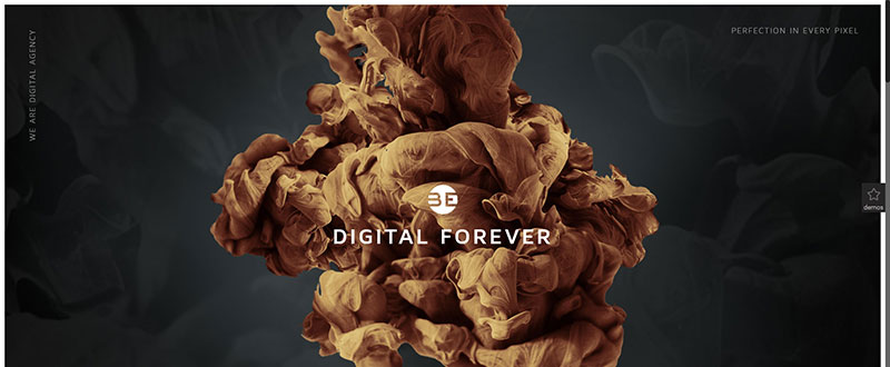
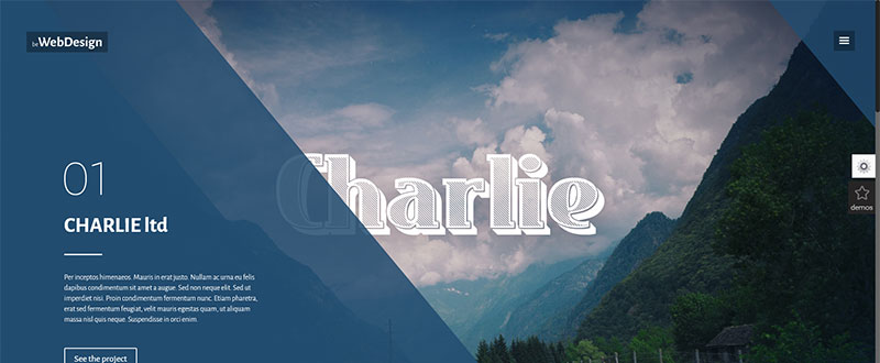
In these two Be Theme examples, you’ll note the pre-built websites used are well organized. They offer good examples of what web designers or creative agencies look for in terms of a layout’s organization.
This includes space to introduce their unique value proposition without fear of distraction, smart menus, and well organized portfolios. Be Theme purposefully created these pre-built websites that focus on portfolios and services with the knowledge that UX designers are not necessarily also visual designers.
How do clients or recruiters analyze your portfolio?
Given suggestions on how to build a portfolio, you still need to take into account how its content will be viewed.
- Let your content show the journey, and not just the destination. Explain the workings behind your deliverable. Tell the story. Explain the problem, and how you solved it. That is what your potential client is looking for.
- Present your brand’s key elements. You are not settling in for a 30-minute interview. You have about one minute to present the pertinent information, hook the viewer, and land a job. Design the portfolio for skim reading, because that’s what is going to happen.
- Focus on detail. Be Theme will help you present the details that matter by resolving technical issues and issues of perspective, information you can refer to in your portfolio.
Why Be Parallax?
Because using it is a clever, and extremely persuasive way to show your best stuff as a UX designer and an innovator. Parallax is admittedly an illusion, but it is an extremely effective one, and it offers a delightful way to introduce or tell a story, and good online marketing involves storytelling.
One of the challenges of UX design is determining how to capture and hold a user’s interest. Parallax provides an excellent means of doing so. It is immersive, not intrusive. Be Theme’s parallax feature will be a welcome addition to your UX design toolkit.
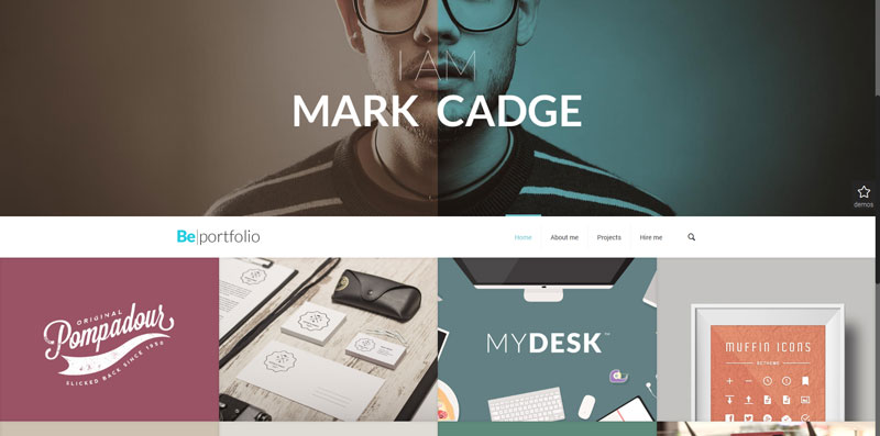
Here is an extremely clear and straightforward example of how Be Theme helps make it possible to design a portfolio that tells a story. You could for example introduce yourself with an image and a four-word line of text; much better than a page of text. You may want to say more, but keep it simple. Once the viewer enters your portfolio, inform and entertain that user with sharp images, video, parallax, and text, while continuing on with your story.
Be Theme – the pre-Designed Websites People Love
The pre-defined website examples shown here are but a few of the many that Be Theme offers. There are in fact over 170 to choose from. Whether you are designing a portfolio, a blog, or multiple websites covering a range of themes or topics, Be Theme is the best choice you can make when looking for a premium WordPress theme to do the job.
Be, the biggest WordPress theme ever, has a vast array of useful and powerful features. You will love what the combination of features such as the Powerful Admin Panel, Muffin Builder 3 or Visual Composer, and the Layout Configurator and Shortcode Generator can do for you. You will also love that fact that you can design anything you want without any need for coding skills.
Be’s pre-built websites, many of which are multipage affairs, can get any project off to a rapid start. You always have the option of starting from scratch given the grid, header, and layout options open to you. Visit the Be Theme‘s website, browse through the library of pre-built websites, check out the demos, and explore the many features.
Soon you’ll be creating a portfolio that will knock prospective client’s socks off!
Read More at 4 Beautiful Pre-built Portfolios Examples and Basic Rules To Follow


