You ever find yourself in bumper-to-bumper traffic? I did this morning on the way to work (read: whatever cafe I fancy). There’s a pattern to it, right? Stop, go, stop, go, stop… it’s almost rhythmic and harmonious in the most annoying of ways. Everyone in line follows the dance, led by some car upfront, each subsequent vehicle pressed right up to the rear of the next for the luxury of moving a few feet further before the next step.
Have you tried breaking the pattern? Instead of playing shadow to the car in front of me this morning, I allowed space between us. I’d gradually raise my right foot off the brake pedal and depress the gas pedal only once my neighboring car gained a little momentum. At that point, my car begins to crawl. And continue crawling. I rarely had to tap the brakes at all once I got going. In effect, I had sacrificed proximity for a smoother ride. I may not be traveling the “fastest” in line, but I was certainly gliding along with a lot less friction.
I find that many things in life are like that. Getting closest to anything comes with a cost, be it financial or consequence. Want the VIP ticket to a concert you’re stoked as heck about? Pony up some extra cash. Want the full story rather than a headline? Just enter your email address. Want up-to-the-second information in your stock ticker? Hand over some account information. Want access to all of today’s televised baseball games? Pick up an ESPN+ subscription.
Proximity and speed are the commodities, the products so to speak. Closer and faster are what’s being sold.
You may have run into the “law of diminishing returns” in some intro-level economics class you took in high school or college. It’s the basis for a large swath of economic theory but in essence, is the “too much of a good thing” principle. It’s what AMPM commercials have been preaching this whole time.
I’m embedding the clip instead of linking it up because it clearly illustrates the “problem” of having too many of what you want (or need). Dude resorted to asking two teens to reach into his front pocket for his wallet because his hands were full, creeper. But buy on, the commercial says, because the implication is that there’s never too much of a good thing, even if it ends in a not-so-great situation chockfull of friction.
The only and only thing I took away from physics in college — besides gravity force being 9.8 m/s2 — is that there’s no way to have bigger, cheaper, and faster at the same time. You can take two, but all three cannot play together. For example, you can have a spaceship that’s faster and cheaper, but chances are that it ain’t gonna be bigger than a typical spaceship. If you were to aim for bigger, it’d be a lot less cheap, not only for the extra size but also to make the dang heavy thing go as fast as possible. It’s a good rule in life. I don’t have proof of it, but I’d wager Mick Jagger lives by it, or at least did at one time.
Speed. Proximity. Faster and slower. Closer and further. I’m not going to draw any parallels to web development, UX design, or any other front-end thing. They’re already there.
A client asked if we could mimic the “rubber band” scrolling behavior on many mobile devices. I’m sure you know what I’m talking about. It’s a behavior that already exists and happens automatically in most browsers. In iOS Safari, for example, you’re allowed to scroll beyond the top or bottom edge of the viewport by a few hundred pixels, and letting go snaps the page back in place.
I had heard of some instances where someone might want to prevent the bounce from happening but no one had asked me to implement it, especially in a way that supports devices without a touch interface. I was actually a bit surprised there isn’t an existing CSS property for this. There’s the non-standard -webkit-overflow-scrolling property but that’s for a different type of “momentum” scrolling. Nor would I want to rely on a non-standard property that’s not on track to become part of the specifications.
OK, so what if we want to force this sort of rubber banding in our work? For starters, we’d need some sort of element acting as a container for content that requires scrolling. From there, we could reach for JavaScript, of course, but that involves adding scroll listeners or a combination of pointerDown, pointerUp, and pointerMove events, not to mention keeping track of positions, inertial movement, etc.
Let’s get some baseline styles in place, specifically to create a situation where we’re guaranteed to overflow a parent container.
/* Parent container with fixed dimensions for overflow */
.carousel {
  width: 200px;
  height: 400px;
  overflow-x: hidden;
  overflow-y: auto;
}

/* Wrapper for slides, stacked in a column */
.slides {
  display: flex;
  flex-direction: column;
  flex-wrap: wrap;
  width: 100%;
  height: fit-content;
}

/* Each slide is the full width of the carousel */
.slide {
  width: 100%;
  aspect-ratio: 1;
}
Let’s start by adding some vertical margins. If your container has only one long item, add it to the top and bottom of the child element. If the container has multiple children, you’ll want to add margin to the top of the first child element and the bottom of the last child element.
Great! We can now scroll past the edges, but we need something to snap it back after the user lifts their finger or pointer. For this, we’ll need the scroll-snap-type and scroll-snap-align properties
Note that the same applies to a horizontally scrollingelement. For that, you’d change things up so that margin is applied to the element’s left and right edges instead of its top and bottom edges. You’ll also want to change the scroll-snap-type property’s value from y mandatory to x mandatory while you’re at it.
That’s really it! Here’s the final demo:
CodePen Embed Fallback
I know, I know. This isn’t some Earth-shattering or mind-blowing effect, but it does solve a very specific situation. And if you find yourself in that situation, now you have something in your back pocket to use.
Creating and managing forms are a crucial part of gathering information and streamlining workflows, whether for collecting data, registrations, or feedback; but the process can sometimes be complicated, time-consuming, and prone to human error. Traditional methods of form creation and data collection can lead to inefficiencies, missed details, and repetitive tasks that take up valuable time.
Fortunately, the landscape is changing. With advancements in AI, form builders have become significantly more intuitive and efficient. Modern AI-powered form builders simplify the creation process, allowing users to design, customize, and deploy forms with ease. These tools not only expedite the form-building process but also enhance accuracy and data quality.
At Noupe, we’ll explore the top AI form builders of 2024, highlighting the features and benefits that make them stand out. Discover how these cutting-edge tools can transform your approach to form management and help you stay ahead of the curve.
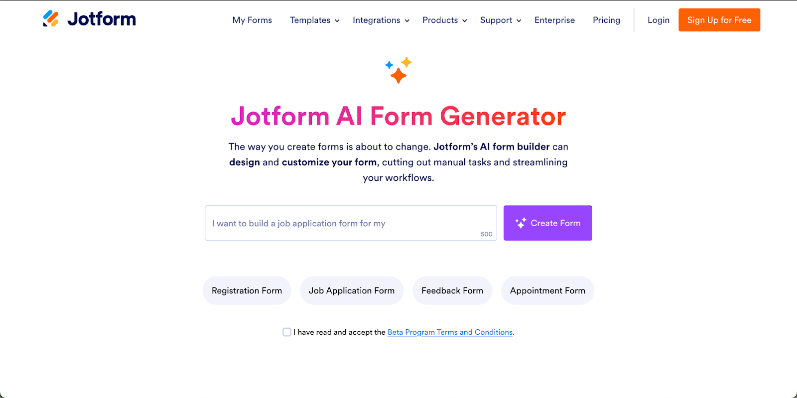
Jotform
Jotform’s new AI Form Generator is an advanced no-code tool designed to make form creation easier by allowing you to describe the form you need to create and making it for you. The tool offers extensive customization options, letting you specify the number of fields and pages, select the form’s language, add conditional logic and choose the types of input fields you want.
If you need to make changes to a field, the Jotform AI Form Generator can automatically adjust it for you. You can also personalize your form further by adding or removing fields as needed, integrating with various helpful widgets and payment gateways, and more. Once your AI-generated form meets your requirements, you can easily share or embed it to start collecting responses efficiently. The generator’s intuitive features ensure that form creation is not only faster but also aligned with your specific needs and preferences.
involve.me‘s AI Form Generator brings a new level of efficiency and personalization to creating forms. Developed with an emphasis on user-friendly design, this tool allows you to enter simple prompts or your website’s URL and turn them into branded forms. The AI integrates your company’s fonts, colors, and logos automatically, ensuring that every form you create is aligned with your brand identity.
With involve.me’s AI Form Generator, you can easily customize forms by adding or removing fields, conditional logic, or other elements like videos and images. The drag-and-drop editor makes fine-tuning your forms simple, even if you have no coding experience. Once your form is ready, it can be shared or embedded on your website.
Fillout is a no-code form builder designed to streamline the creation of forms with ease and efficiency. The platform allows users to generate customizable forms in a few minutes, making it a good choice for an AI form tool.
With Fillout, you can drag and drop elements to build forms without any coding knowledge. The platform supports many customizable question types, integrates with popular tools like Airtable, Google Sheets, and HubSpot, and allows you to accept payments via Stripe. Whether you’re looking to gather feedback, process registrations, or collect payments, Fillout’s features make it a solid choice.
Forms.app offers an intuitive platform for creating forms. With its user-friendly drag-and-drop builder, it simplifies the process of designing forms, making it possible even for those with no technical expertise. The platform supports a wide range of form fields and templates, allowing you to collect various types of data, including payments via PayPal and Stripe.
One of its best features is the ability to create multi-page forms with conditional logic, displaying only relevant questions based on previous answers. The platform also integrates with tools like Google Sheets, Slack, and HubSpot, making it easy to automate workflows and manage data.
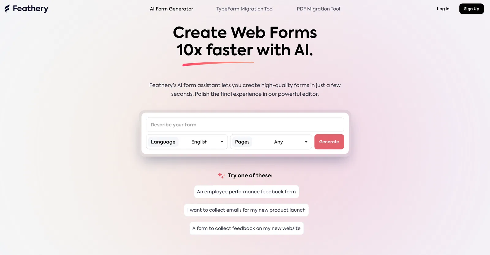
Feathery is a no-code platform designed for creating custom forms and workflows. The platform offers a range of advanced features, making it a good choice for businesses looking to streamline data collection and automate processes.
Key features include a visual form designer that allows for easy customization, conditional logic, and integrations with tools like HubSpot, Stripe, and Salesforce. Additionally, Feathery’s Document Intelligence can extract data from uploaded documents, and its automation capabilities allow for easy workflow management from form submission to final processing.
Makeforms.io is an AI-driven form builder designed to streamline the creation of custom forms across various industries. The platform offers a drag-and-drop interface that allows users to design forms without coding. With built-in security features, Makeforms.io ensures that sensitive data is handled securely, making it a good choice for businesses that require strict data protection.
Makeforms.io also integrates with third-party applications like Google Drive and Salesforce. Users can take advantage of templates, multi-page forms, and advanced logic features to create forms tailored to their needs. Whether you’re processing payments or collecting detailed information, Makeforms.io offers the flexibility to meet a wide range of business requirements.
Forms have become essential tools across education and business, serving as a means for data collection and engagement. As the demands of daily work increase, creating forms can often become time-consuming and repetitive, leading to missed details or overlooked important fields. However, the advent of AI-powered form generators has offered a more efficient and streamlined approach.
With modern AI form generators, you can now design, customize, and share forms easily, without the need for extensive manual effort. We hope you were be able to choose the best tool that fits your specific needs from our curated list.
A couple of weeks ago I was super excited about publishing my first CSS-Tricks post: “Letter Spacing is Broken. Forget about that though, what’s important is the post’s topic: letter spacing is broken and doesn’t work as the CSS Specification says it should. In a nutshell, instead of spacing the characters evenly, it leaves an unpleasant space at the end of the element.
While this inconsistency between the web and the spec is just a quirk for a Spanish/English speaker like me, for speakers of right-to-left (RTL) languages like Arabic or Hebrew, an annoying space is left at the start or end of a word. Firefox (Gecko) kinda fixes it and rearranges the unnecessary space at the end (in the reading order), but Google and Safari (Blink and Webkit) leave it at the start.
Of course, I wanted to demo this major pain point, but styling RTL content was beyond my CSS power. That’s when I found this life-saver guide by Ahmad Shadeed that covers every major aspect of styling RTL content on the web and best practices to easily internationalize an LTR webpage. A resource that, I think, is a must-read if you are interested in i18n and accessibility in the web.
I may have discovered warm water since this guide goes back to 2018, but I hope those like me who didn’t know about it have fun learning something new!
The designing of a website should always be done keeping in view the perspective of users. It is one of the key UX principles that stands valid for all types of websites. If the user experience of any website isn’t up to the mark, then its chances of holding incoming attention are said to be very minimal. It is therefore advised to design websites carefully and avoid mistakes that are detrimental to their layout. There are a few specific things that often ruin the user experience of a website. These mistakes should be strictly avoided so that you can build a user-centric web design effectively.
In this blog, we will point out all those things that can negatively affect the user experience of your website. By keeping these things in mind, you will be able to design websites that are visually appealing having zero UI/UX errors. Let’s take a look at them in detail below.
Key Mistakes that Affect the Website’s User Experience
There are some specific things that often bring a negative impact on the user experience of a website. Due to not being overly prominent, they aren’t noticed by web designers most of the time. If you don’t want to ruin the experience of your website due to these mistakes, pay attention to the points defined below.
Disappearing Menus
Dropdown menus that disappear quickly often make people frustrated. This usually happens when your cursor quickly hovers in and out from the dropdown menu. Feature like this should be avoided in the web design, because people want to see the whole menu options briefly. If they keep seeing the menu disappearing frequently, they will become irritated and might leave the website quickly.
So, try to create dropdown menus for the website with better response time. These menus should also display sub-page names clearly, so that people can easily understand all the options defined in the menu.
Slow Loading Images
When a user comes on to a website, he generally wants to see everything on the landing page quickly. This is a normal experience that should be provided to the people who are visiting the website to get some information. If somehow, the images on the landing page will take time to load, then visitors will perceive it as a slow-loading website. This will create a bad impression that will force people to leave the website.
The problem of slow image loading can happen due to a variety of reasons. It is best recommended to find those fixes quickly, so that people can stay on your website for a brief period of time.
Irritating Pop-ups
Using pop-ups on the main landing page is a good strategy to showcase your core offerings to the visitors. But, if these pop-ups keep appearing on every page, then they become a bit irritating for the people. It is therefore recommended to strike a balance while using pop-ups on the website, because no one wants to see sudden promotional alerts on every page.
When using pop-ups on the website, make sure to design their banners creatively. You can use different shades of blue or any other color to design these banners, keeping in view the core theme and branding identity of your company.
Unwanted Advertisements
When a user comes on to a website, he wants to explore every required information smoothly. While scrolling down, if he sees any irrelevant advertisement displayed in the middle of the page, then his attention will be quickly distracted. It can build a negative impression of the website in his mind, which will force him to leave the website in frustration.
So, always try to keep your website clean and free from all sorts of irrelevant advertisements. They can not only distract the visitors’ attention but could also spoil your web content flow pretty badly.
Broken Links
If someone is coming to your website to find a specific set of information, make sure to facilitate him properly with the right info that can become useful for him. Creating your website with proper internal links is termed very important in this regard. Always make sure to check these links from time to time, so that it can be confirmed that they are working properly.
Websites with broken or invalid links always present a bad impression of the overall platform. It irritates people when they click on the broken links, as they don’t perform any kind of action. So, keep a practice of checking your links regularly, as that will allow you to fix broken links timely.
Non-responsive Layout
Due to the convenience and flexibility, many people prefer to use smartphones instead of desktops to surf the internet. This is the core reason why many websites are continuously witnessing surging traffic from mobile devices. To manage such traffic on your website, you need to create a responsive layout that can facilitate the mobile app user experience.
If your website is built with a non-responsive layout, then it will lose a huge chunk of traffic that is coming from the mobile channel. So, try to create a responsive layout for your website, as that will make your platform accessible to everyone.
Broken Search Bar
Another thing that presents a bad image of the website is a broken search bar. Whenever a user wants to search for anything on the website, he always heads over to the search bar. If that search bar is broken and unable to process queries, then people will immediately leave the website. They get the impression that the website does not have the relevant information, and hence it is pretty useless.
To avoid having such a situation, try to regularly check the working status of the search bar. It should always work properly as per the best practices. The time to process such requests should also be monitored smartly so that users won’t have to wait to see the required results.
Continuous Scrolling
It is generally noted that websites with precise and to-the-point information always score more conversions. People these days don’t want to waste time reading irrelevant content. They need crisp and accurate information, one that could drive their final decisions. If they have to scroll a lot more on the website to find specific information, they will certainly feel annoyed after some time.
This is a small but important point that is often ignored by web design companies. They need to understand that too much scrolling on the webpage only ruins the user experience. This thing should be precisely avoided by keeping the page small with to-the-point user-centric information.
Excessive Call to Actions
If you place too many call to actions on your website, it will confuse the visitors. This is one of those mistakes that often increases the bounce rate of a website. It makes the visitors confused about where they should click next because there are a lot of CTA banners being displayed on the website.
Ideally, a website should have one big call-to-action banner describing the trending promotion or discount offer. It makes the decision-making process simple, giving visitors exact knowledge of where they should go next to find the required information.
Final Words
That brings us to the end of this blog in which we have discussed different factors that ruin the user experience of a website. Having a clear understanding of these things is pretty important because they often break the overall impression of the platform. It is best recommended to avoid these mistakes by designing the website with the right UX strategy. These little mistakes can cause a lot of harm to your website, so always make sure to address them correctly by working with the correct layout optimization methods.
I can’t say I would have ever expected to see Jeremy Keith performing the Yeah Yeah Yeahs song “Maps”, but then again, I don’t know what I expected to happen at Frostapalooza.
The Event
Brad Frost, web designer, author of Atomic Design, and an absolute maniac on the bass, celebrated his birthday by putting together a one-night-only benefit concert featuring musical performances by himself and his talented family and friends.
Frostapalooza, held at Mr. Smalls Theatre in Pittsburgh, PA, was an all-ages event where 100% of the proceeds are headed towards two great causes:
NextStep Pittsburgh: Helping provide accessible rehabilitation for folks with spinal cord injuries and paralysis in Pittsburgh.
Project Healthy Minds: Providing research and resources to help tackle mental health.
Performances
The variation of musical performances sprawled across the night, covering tracks by Fleetwood Mac, Radiohead, David Bowie and so much more, check out this setlist of all 31 tracks on Spotify.
I loved the performance of Pink Floyd’s classic song, “Money.” As a Floyd fan who will never get to see them live, this was easily the best rendition I could ask for, which included the full lineup of instrumental sections.
Brad was joined on stage by none other than CSS-Tricks founder, Chris Coyier. Chris picked banjo on a few songs, such as Johnny Cash’s “Folsom Prison Blues” and The Band’s “The Weight,” both fantastic.
The stage background prominently displayed visuals out of CodePen demos made by CodePen community members during the set. Check out the Frostapalooza tag on CodePen to see everything that was projected.
Another favorite moment was Brad’s version of “Wake Up” by Arcade Fire, which felt like a perfectly matched song for the evening.
Musicians
If you haven’t caught on yet, many of the folks lending their musical talents to Frostapalooza also happen to be web designers and developers Brad has met and worked with during his career. At times it felt like the Wu-Tang Clan of CSS on stage.
Brad’s family and musicians from his other bands pitched in, such as Elby Brass. Ridiculously impressive! I had never seen a tuba-playing lead vocalist until this night.
You can see the full lineup on the event’s website. But I’ll drop a screenshot in here just for posterity.
Photos! Videos!
Mike Aparicio captured a great video of a group jam on Queen’s “Bohemian Rhapsody” that you’ve got to watch on YouTube. Brian Kardell nabbed this gem of Chris pickin’ on “The Weight”:
The end
Plain and simple, this was a super fun night celebrating music and friends. Happy birthday, Brad, and thanks for putting on an awesome show!
Every programming language has loops. Loops perform an operation (i.e., a chunk of work) a number of times, usually once for every item in an array or list, or to simply repeat an operation until a certain condition is met.
JavaScript in particular has quite a few different types of loops. I haven’t even used all of them, so for my own curiosity, I thought I’d do a high-level overview of them. And as it turns out, there are pretty good reasons I haven’t used at least a couple of the different types.
So, for now let’s spend a while exploring the different types of loops, what we can do with each of one, and why you might use one over another. (You’ll think that little play on words is absolutely hilarious by the end.)
The while and do...while loops
First up is the while loop. It’s the most basic type of loop and has the potential to be the easiest to read and the fastest in many cases. It’s usually used for doing something until a certain condition is met. It’s also the easiest way to make an infinite loop or a loop that never stops. There is also the do...while statement. Really, the only difference is that the condition is checked at the end versus the beginning of each iteration.
// remove the first item from an array and log it until the array is empty
let queue1 = ["a", "b", "c"];

while (queue1.length) {
  let item = queue1.shift();

  console.log(item);
}

// same as above but also log when the array is empty
let queue2 = [];

do {
  let item = queue2.shift() ?? "empty";

  console.log(item);
} while (queue2.length);
The for loop
Next is the for loop. It should be the go to way to do something a certain number of times. If you need to repeat an operation, say, 10 times, then use a for loop instead. This particular loop may be intimidating to those new to programming, but rewriting the same loop in the while-style loop can help illustrate the syntax make it easier to stick in your mind.
// log the numbers 1 to 5
for (let i = 1; i <= 5; i++) {
  console.log(i);
}

// same thing but as a while loop
let i = 1; // the first part of a for loop

// the second
while (i <= 5) {
  console.log(i);

  i++; // the third
}

("end");
The for...of and for await...of loops
A for...of loop is the easiest way to loop through an array.
let myList = ["a", "b", "c"];

for (let item of myList) {
  console.log(item);
}
They aren’t limited to arrays though. Technically they can iterate through anything that implements what is called an iterable protocol. There are a few built-in types that implement the protocol: arrays, maps, set, and string, to mention the most common ones, but you can implement the protocol in your own code. What you’d do is add a [Symbol.iterator] method to any object and that method should return an iterator. It’s a bit confusing, but the gist is that iterables are things with a special method that returns iterators; a factory method for iterators if you will. A special type of function called a generator is a function that returns both a iterable and iterator.
let myList = {
  *[Symbol.iterator]() {
    yield "a";
    yield "b";
    yield "c";
  },
};

for (let item of myList) {
  console.log(item);
}
There is the async version of all the things I just mentioned: async iterables, async iterators, and async generators. You’d use an async iterable with for await...of.
async function delay(ms) {
  return new Promise((resolve) => {
    setTimeout(resolve, ms);
  });
}

// this time we're not making an iterable, but a generator
async function* aNumberAMinute() {
  let i = 0;

  while (true) {
    // an infinite loop
    yield i++;

    // pause a minute
    await delay(60_000);
  }
}

// it's a generator, so we need to call it ourselves
for await (let i of aNumberAMinute()) {
  console.log(i);

  // stop after one hour
  if (i >= 59) {
    break;
  }
}
One unobvious thing about for await...of statement is that you can use it with non-async iterables and it will work just fine. The reverse, however, is not true; you can’t use async iterables with the for...of statement.
The forEach and map loops
While these are not technically loops per se, you can use them to iterate over a list.
Here is the thing about the forEach method. Historically it was much slower than using a for loop. I think in some cases that may not be true anymore, but if performance is a concern, then I would avoid using it. And now that we have for...of I’m not sure there is much reason to use it. I guess the only reason that it still may come up is if you have a function ready to use as the callback, but you could easily just call that same function from inside the body of for...of.
forEach also receives the index for each item though, so that may be a thing you need too. Ultimately, the decision to use it will probably come down to whether any other code you’re working with uses it, but I personally would avoid using it if I’m writing something new.
let myList = ["a", "b", "c"];

for (let item of myList) {
	console.log(item);
}

// but maybe if I need the index use forEach
["a", "b", "c"].forEach((item, index) => {
  console.log(`${index}: ${item}`);
});
Meanwhile, map essentially converts one array into another. It still has the same performance impact that forEach has, but it is a bit nicer to read than the alternative. It’s certainly subjective though, and just like with forEach you’ll want to do what the rest of your other code is doing. You see it a ton in React and React-inspired libraries as the primary way to loop through an array and output a list of items within JSX.
This list of loops in JavaScript wouldn’t be complete without mentioning the for...in statement because it can loop through the fields of an object. It visits fields that are inherited through the object’s prototype chain too, though, and I’ve honestly always avoided it for that reason.
That said, if you have an object literal, then for...in might be a viable way to iterate through the keys of that object. Also it’s worth noting that if you’ve been programming JavaScript for a long time, you may remember that the order of keys use to be inconsistent between browsers, but now the order is consistent. Any key that could be an array index (i.e., positive integers) will be first in ascending order, and then everything else in the order as authored.
let myObject = {
  a: 1,
  b: 2,
  c: 3,
};

for (let k in myObject) {
  console.log(myObject[k]);
}
Wrapping up
Loops are something that many programmers use every day, though we may take them for granted and not think about them too much.
But when you step back and look at all of the ways we have to loop through things in JavaScript, it turns out there are several ways to do it. Not only that, but there are significant — if not nuanced — differences between them that can and will influence your approach to scripts.
Welcome to August’s roundup of the best fonts we’ve found over the last few weeks. 2024’s trend for flowing curves and retro-inspired scripts continues apace this month. We’ve also included some very flexible sans serifs. Enjoy!
If you’re a freelancer, marketplaces like Upwork, Freelancer, and Fiverr might be all too common to you.
Upwork had a golden star reputation in the past, known for providing freelancers with steady, high-paying, and quality gigs.
However, after its acquisition and rebrand in 2015, many freelancers have wondered if the platform still has any potential or if it’s just another mill for low-quality, highly competitive work.
On that note, let’s dive in and:
Understand some of the pros and cons of Upwork in 2024.
Find insights from actual freelancers who have operated from the platform.
Learn some practical tips and tricks to succeed on Upwork.
How Upworks Works
Upwork operates as a marketplace where social media freelancers, agencies, consultants, etc., can provide services to global clients from the comfort of their homes.
The platform stays viable by charging freelancers and clients a service fee to operate on it (the fee is much larger for the freelancers than the clients). In return, the platform handles all the finances, invoices, verification, and job satisfaction.
If you need to apply for any jobs as a freelancer, you need to pay for “Connects” to send your proposals. If your job proposal is accepted, the client must invest initially (which Upwork protects until the job is completed).
Pros of Upwork
A majority of freelancers who we spoke to said the biggest pro of Upwork is that it’s easy to get started on the platform. You don’t need to pay any registration fees—all you need to do is fill in your profile details and get verified.
Says Raquel Gonzalez, a freelance SEO consultant and translator, “Upwork is great if you are starting as a freelancer and find it challenging to reach potential clients. You can apply to many job opportunities, and your payment is protected through them.”
Aside from this, some of the other pros of the platform are:
You can pick and choose projects to your convenience, cadence, and liking; there are no specific limits to anything.
You’re also not restricted to any particular area. Upwork allows remote freelancers to connect with clients and work on projects from around the globe.
It supports plenty of services, so regardless of whether you specialize in writing, SEO consultancy, designing, marketing, web development, etc., there are plenty of readily available gigs for everyone.
It’s extremely easy to navigate and added features like work tracking tools, talent badges, customer ratings, job search filters, etc., can improve your efficiency and portfolio.
They’ve also got a thriving community wherein you can get help from Upwork professionals and other freelancers and agencies operating on Upwork.
Cons of Upwork
Unfortunately, these days, the cons of Upwork far precede the pros.
Amongst the list of cons, one of the major complaints most freelancers have is that the platform now has way too many low-paying gigs, which is creating a race-to-the-bottom situation for many.
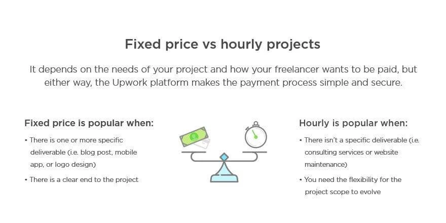
In addition, they charge a hefty service fee (5-20% of the project value).
Peace Akinwale, a freelance writer who used to operate from Upwork, says, “Before I deleted my account in 2022, I noticed that most of the jobs on my Upwork feeds are always low-paying jobs (with jobs paying as less as $15 for 1500 words for technical writing).
They also charge a flat 10% service fee on all new contracts regardless of my lifetime billing with a client. If my client ends a copywriting contract and opens a B2B case study writing contract with me, I’ll still be billed 10% of my income.
I rejoined Upwork recently and found that the service fee for hourly projects and fixed-price projects is now 20% of total earnings.
Aside from the service fee, withdrawal to payment platforms like PayPal/Payoneer attracts significant charges, with Payoneer incurring extra bills from my local bank, too.”
Raquel also agrees with Peace’s opinion by saying, “It’s hard to find a decent-paying job on Upwork (at least at the beginning when you don’t have much portfolio to show your experience), and sometimes the job can be scammy.”
She adds to this point by stating, “The other con is that as a Spanish citizen, we must include essential information on each invoice according to our client’s country, like the Business Registration Number or the TAX percentage. But Upwork automatically creates an invoice in your name and doesn’t add those things, resulting in burdensome bureaucracy.”
These are not the only cons of Upwork, however. Here are a few more cons of the platform according to seasoned users:
Upwork is extremely competitive and doesn’t have enough great gigs to fulfill the requirements of all freelancers on the platform. Due to the increased competition, it’s also more difficult to get noticed.
You need to purchase “Connects” to connect with a potential lead. These Connects are paid and cost 15 cents to purchase every Connect. The kicker is that the number of Connects you need to use varies depending on the gig you’re applying to, and you may very well end up using 8-10 Connects per job.
Upwork is more favorable to clients than users and always considers their side of the story before providing a solution.
Tips for Succeeding on Upwork
Use these four simple tips to get the most out of Upwork.
1. Be crystal clear in your offer
The best way to stand out on Upwork is to be as specific as possible about your offer and what makes you qualified enough to be trusted with the job.
For example, the top freelancers increase trust in their profile by using professional images, highlighting reviews and testimonials, offering a sustainable rate that works for them, using a strategic offer that hits on customer pain points, etc.
As a reference, an ideal freelancer profile (a boosted profile) on the platform looks like this:
Another tip would be to create separate accounts as a freelancer to segregate all your business and personal expenses.
For example, you could consider opening a business account and using your business credit card for all your freelance-related expenses to earn extra rewards, cashback, and other perks that would otherwise not be possible.
3. Manage your freelance finances
Adding to our previous point, it’s important to keep track of all the finances associated with Upwork and not just money going out of your business (aka expenses).
As your freelance career grows on Upwork, you might consider opening a joint checking account with a partner or spouse. This can help you manage your increasing income more effectively.
You can use it to set aside money for taxes, track business expenses, and give your loved one visibility into your freelance success. It’s a great way to organize your finances as you build your business on the platform.
4. Enhance your service offering
A freelancer’s rule for providing exceptional client service is to always go above and beyond when it comes to the simplest of assignments.
On a platform like Upwork, where you can access a worldwide network of peers, leads, and clients, you need to set yourself apart by using tools to improve your service offering.
For example, you can use project management tools to keep track of deadlines, AI translators to converse with leads who use a different language, time-tracking tools to increase productivity, etc.
Next Steps
In this guide, we discussed some of Upwork’s pros and cons and a few tips for making a maximum impact as a freelancer, boosting your hourly rate, and landing prospective clients.
If you wish to gain more such insights, especially as a designer or developer, the Noupe blog has tons of them and expert-led articles for you. Head to the Noupe blog to get access to this information! It’s time to stand out from the millions of freelancers out there.
I was just going over the latest CSSWG minutes (you can subscribe to them at W3C.org) and came across a few interesting nuggets I wanted to jot down for another time. The group discussed the CSS Values, CSS Easing, and Selectors modules, but what really caught my eye was adding triggered delays to CSS for things like hover, long taps, and focus states.
The idea stems from an OpenUI proposal, the same group we can thank for raising things like the Popover API and customizable select element. The concept, if I understand it right, is that anytime someone hovers, taps, or focuses on, say, a for a certain amount of time, we can invoke some sort of thing. A tooltip is the perfect illustration. Hovering over the trigger element, the reasoning goes, is an expression of interest and as web authors, we can do something with that interest, like displaying a tooltip.
Whoa, right?! There’s long been chatter about CSS encroaching on JavaScript territory (isn’t it ironic, don’t you think?). Firing events in response to interaction is quite literally the only thing I use JavaScript for. There’s no mistake about that in the CSSWG, as documented in the minutes:
So. Does this belong in CSS? Or should it be elsewhere? Does the approach make sense? Are there better ideas? Most interested in the last.
[…]
Other question; does this belong in CSS or HTML… maybe this is just a javascript feature? In JS you can determine MQ state and change things so it wouldn’t necessarily be in CSS.
And shortly later:
As you were talking; one thing that I kept thinking of; should developers be customizing the delay at all? Original use case for delay is that hover shouldn’t be instant. But if we don’t allow for customizing we can align to platform delay lengths.
But there’s an excellent point to be made about the way many of us are already doing this with CSS animations (animation-delay) and transitions (transition-delay). Sometimes even applying those globally with the Universal Selector or a prefers-* query.
Things get even hairier when considering how values are defined for this. Are they explicit delays (800ms), generic keywords (none/short/medium/long), a custom property, a pseudo-class… something else? I’m glad there’re incredibly smart folks noodling on this stuff.
I think here it would be good to go with time values. CSS is a good place to put it. We have all the ergonomics. The right declarative place to put it.
Whatever the eventual case may be:
I think this sounds reasonable and I’d like to explore it. Unsure if this is the exact shape, but this space seems useful to me.