Adam’s such a mad scientist with CSS. He’s been putting together a series of “notebooks” that make it easy for him to demo code. He’s got one for gradient text, one for a comparison slider, another for accordions, and the list goes on.
One of his latest is a notebook of scroll-driven animations. They’re all impressive as heck, as you’d expect from Adam. But it’s the simplicity of the first few examples that I love most. Here I am recreating two of the effects in a CodePen, which you’ll want to view in the latest version of Chrome for support.
CodePen Embed Fallback
This is a perfect example of how a scroll-driven animation is simply a normal CSS animation, just tied to scrolling instead of the document’s default timeline, which starts on render. We’re talking about the same set of keyframes:
@keyframes slide-in-from-left {
  from {
    transform: translateX(-100%);
  }
}
All we have to do to trigger scrolling is call the animation and assign it to the timeline:
li {
  animation: var(--animation) linear both;
  animation-timeline: view();
}
Notice how there’s no duration set on the animation. There’s no need to since we’re dealing with a scroll-based timeline instead of the document’s timeline. We’re using the view() function instead of the scroll() function, which acts sort of like JavsScript’s Intersection Observer where scrolling is based on where the element comes into view and intersects the scrollable area.
It’s easy to drop your jaw and ooo and ahh all over Adam’s demos, especially as they get more advanced. But just remember that we’re still working with plain ol’ CSS animations. The difference is the timeline they’re on.
And so, this is how the chatbots revolutionized the beauty care industry…
This is the disruption that experts were talking about. Yet, many experts were skeptical of how an AI chatbot could add the human element to the beauty industry. Today chatbots have become a reality with leading beauty brands such as Sephora, L’oreal Paris, Covergirl, and Kiehl’s using it in their process, with other brands on their way of doing so. And if you’re planning to do the same, there are many chatbot providers in the market that you can look for.
But what exactly are chatbots? If you don’t have precise knowledge about it, read on for absolute information.
It is one of the latest technologies; the programs that facilitate communication with humans over the internet. There are chiefly two types of chatbots: rule-based chatbots and AI chatbots. The rule-based chatbots convey the repetitive answers to common queries, while AI chatbots can carry out human-like conversations. Therefore, these AI bots are popular in the customer service, marketing, and sales departments.
Now a crucial question- Have you contacted a customer representative by phone or asked queries in chat?
Many people have, at some point. For instance, we have inquired with agents about banking services, mobile services, and so on. But have you noticed the services aren’t as instant as those provided by bots?
And why is that? The agents are humans, and they take their time to execute the process. In this scenario, the chatbot’s role comes into play. These bots are really fast as they are intelligently designed. They are the AI employees on their toes, willing to go the extra mile to make the customer happy (without themselves knowing it) ?
A happy customer means you won the business game in the long run.
A quote by Tim Horst, an online marketing expert, perfectly fits the context:
“Chatbots are similar to WhatsApp. If you don’t use technology wisely, you won’t be successful. However, when chatbots are well made and help customers, they’re extremely well-received by customers.”
Tim Horst
So, how exactly would chatbots revolutionize the beauty care industry?
Every person is unique. We can’t use the same beauty products for all, as it could worsen the existing conditions.
AI chatbots in the customer service sector of beauty care companies are here to provide customized beauty solutions. It includes planning skin regimen, matching hair color, and many others. In the future, we could expect even more advanced solutions that might eliminate physical visits.
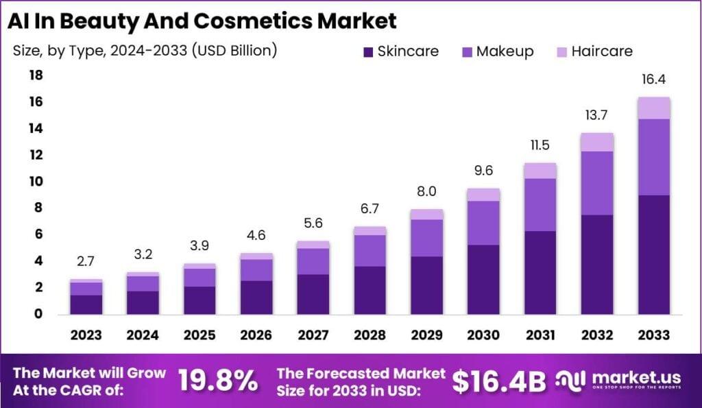
Below you can see the global growth of AI (AI chatbot) in the beauty and cosmetics market:
Source: market.us
As you can see here, the global AI (which chatbots are part of) in the beauty and cosmetics market is expected to grow at a CAGR of 19.8%. The forecasted market size for 2033 is USD $16.4B. That’s an impressive rate; don’t you think so?
Now, we’d talk about how exactly it works and would change the entire work structure in the beauty care industry:
1. Prediction of future trends
Chatbots could accurately predict future trends where even some human service agents fail. This happens because these intelligent chatbots can record past trends, interests, queries, and others.
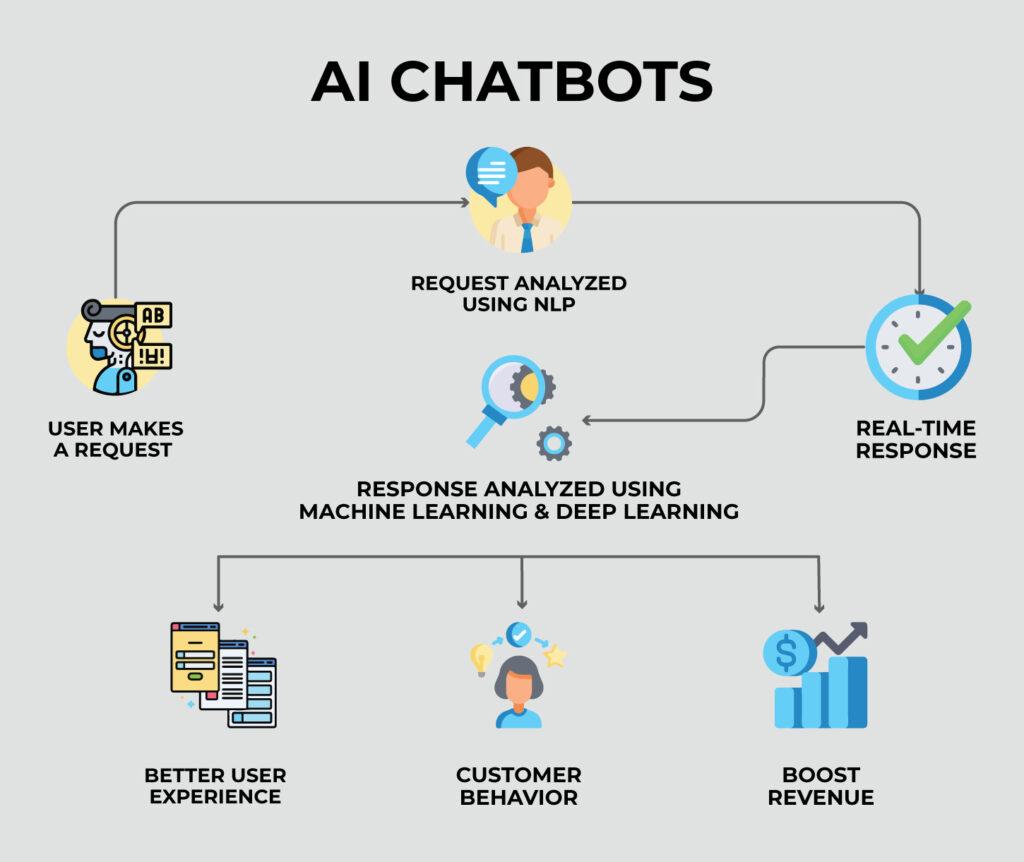
In the below image, you can see how an AI chatbot works:
Source: successive.tech
Here the user initiates a request, which is then analyzed using NLP (natural language processing). It further leads to a real-time response, further analyzed using machine learning and deep learning- components of artificial intelligence. This technology facilitates a better user experience and boosts revenue.
AI chatbots analyze the pulse of the customer and interact accordingly. The customer receives personalized information on the latest and upcoming trends. With accurate predictions and suggestions, it makes the customer satisfied.
The AI could anticipate required beauty solutions in a short time.
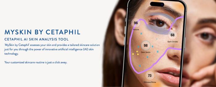
This is a breakthrough and useful for the customer service department in the beauty care industry. The entire process becomes fast and streamlined. In the below image, you can see how it analyzes the solutions for a customer:
Source: miquido.com
Cetaphil is a well-known brand and is popular among users. The brand has a skin analysis tool. The process starts when the customer needs to upload her/his selfie, then the brand moves onto the next stage of providing the right solutions such as recommendations for sensitive skin, what skincare products not to use, how many times to use a product in a day, etc.
The brand celebrates individuality and meets the needs of customers.
3. Reduce costs by planning the entire beauty regimen with bots
Just imagine a scenario, where you provide training to human agents and they leave after a few months. Isn’t that a loss for the company?
In the case of chatbots, they aren’t going anywhere- you could say they are your loyal employees and need some updates at a specific time!!
Additionally, they reduce costs by working for various beauty services and different customers concurrently.
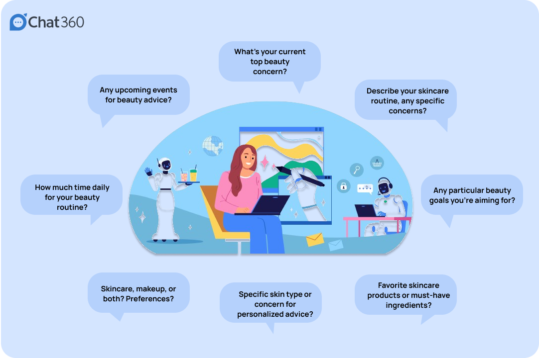
Find the below image to understand how a chatbot could handle multiple tasks in this industry:
Source: chat360.io
In the above image, you can see chatbots interacting with customers for different services through questions and answers such as:
What’s your current top beauty concern? How much time daily do you need for your beauty routine? Specific beauty goals an individual is looking for? Favorite skincare products or must-have ingredients? Specific skin type or concern for personalized advice and so on.
The entire work structure shows how smart these chatbots are. Organizations now don’t need a high number of professionals to handle such queries. That doesn’t imply you could entirely eliminate the human role; you still need professionals for critical customer services.
Conclusion
Chatbots have already revolutionized the process in various departments of reputable organizations. With further advancement in technology, we’d see high performance of these bots.
Loading your website HTML quickly has a big impact on visitor experience. After all, no page content can be displayed until after the first chunk of the HTML has been loaded. That’s why the Time to First Byte (TTFB) metric is important: it measures how soon after navigation the browser starts receiving the HTML response.
Generating the HTML document quickly plays a big part in minimizing TTFB delays. But actually, there’s a lot more to optimizing this metric. In this article, we’ll take a look at what else can cause poor TTFB and what you can do to fix it.
What Components Make Up The Time To First Byte Metric?
TTFB stands for Time to First Byte. But where does it measure from?
Different tools handle this differently. Some only count the time spent sending the HTTP request and getting a response, ignoring everything else that needs to happen first before the resource can be loaded. However, when looking at Google’s Core Web Vitals, TTFB starts from the time when the users start navigating to a new page. That means TTFB includes:
The server response time here is only 183 milliseconds, or about 12% of the overall TTFB metric. Half of the time is instead spent on a cross-origin redirect — a separate HTTP request that returns a redirect response before we can even make the request that returns the website’s HTML code. And when we make that request, most of the time is spent on establishing the server connection.
Connecting to a server on the web typically takes three round trips on the network:
DNS: Looking up the server IP address.
TCP: Establishing a reliable connection to the server.
TLS: Creating a secure encrypted connection.
What Network Latency Means For Time To First Byte
Let’s add up all the network round trips in the example above:
2 server connections: 6 round trips.
2 HTTP requests: 2 round trips.
That means that before we even get the first response byte for our page we actually have to send data back and forth between the browser and a server eight times!
That’s where network latency comes in, or network round trip time (RTT) if we look at the time it takes to send data to a server and receive a response in the browser. On a high-latency connection with a 150 millisecond RTT, making those eight round trips will take 1.2 seconds. So, even if the server always responds instantly, we can’t get a TTFB lower than that number.
Network latency depends a lot on the geographic distances between the visitor’s device and the server the browser is connecting to. You can see the impact of that in practice by running a global TTFB test on a website. Here, I’ve tested a website that’s hosted in Brazil. We get good TTFB scores when testing from Brazil and the US East Coast. However, visitors from Europe, Asia, or Australia wait a while for the website to load.
What Content Delivery Networks Mean for Time to First Byte
One way to speed up your website is by using a Content Delivery Network (CDN). These services provide a network of globally distributed server locations. Instead of each round trip going all the way to where your web application is hosted, browsers instead connect to a nearby CDN server (called an edge node). That greatly reduces the time spent on establishing the server connection, improving your overall TTFB metric.
By default, the actual HTML request still has to be sent to your web app. However, if your content isn’t dynamic, you can also cache responses at the CDN edge node. That way, the request can be served entirely through the CDN instead of data traveling all across the world.
If we run a TTFB test on a website that uses a CDN, we can see that each server response comes from a regional data center close to where the request was made. In many cases, we get a TTFB of under 200 milliseconds, thanks to the response already being cached at the edge node.
How To Improve Time To First Byte
What you need to do to improve your website’s TTFB score depends on what its biggest contributing component is.
A lot of time is spent establishing the connection: Use a global CDN.
The server response is slow: Optimize your application code or cache the response
Redirects delay TTFB: Avoid chaining redirects and optimize the server returning the redirect response.
Keep in mind that TTFB depends on how visitors are accessing your website. For example, if they are logged into your application, the page content probably can’t be served from the cache. You may also see a spike in TTFB when running an ad campaign, as visitors are redirected through a click-tracking server.
Monitor Real User Time To First Byte
If you want to get a breakdown of what TTFB looks like for different visitors on your website, you need real user monitoring. That way, you can break down how visitor location, login status, or the referrer domain impact real user experience.
DebugBear can help you collect real user metrics for Time to First Byte, Google Core Web Vitals, and other page speed metrics. You can track individual TTFB components like TCP duration or redirect time and break down website performance by country, ad campaign, and more.
Conclusion
By looking at everything that’s involved in serving the first byte of a website to a visitor, we’ve seen that just reducing server response time isn’t enough and often won’t even be the most impactful change you can make on your website.
Just because your website is fast in one location doesn’t mean it’s fast for everyone, as website speed varies based on where the visitor is accessing your site from.
Content Delivery Networks are an incredibly powerful way to improve TTFB. Even if you don’t use any of their advanced features, just using their global server network saves a lot of time when establishing a server connection.
We’ve been able to get the length of the viewport in CSS since… checks notes… 2013! Surprisingly, that was more than a decade ago. Getting the viewport width is as easy these days as easy as writing 100vw, but what does that translate to, say, in pixels? What about the other properties, like those that take a percentage, an angle, or an integer?
Think about changing an element’s opacity, rotating it, or setting an animation progress based on the screen size. We would first need the viewport as an integer — which isn’t currently possible in CSS, right?
What I am about to say isn’t a groundbreaking discovery, it was first described amazingly by Jane Ori in 2023. In short, we can use a weird hack (or feature) involving the tan() and atan2() trigonometric functions to typecast a length (such as the viewport) to an integer. This opens many new layout possibilities, but my first experience was while writing an Almanac entry in which I just wanted to make an image’s opacity responsive.
Resize the CodePen and the image will get more transparent as the screen size gets smaller, of course with some boundaries, so it doesn’t become invisible:
CodePen Embed Fallback
This is the simplest we can do, but there is a lot more. Take, for example, this demo I did trying to combine many viewport-related effects. Resize the demo and the page feels alive: objects move, the background changes and the text smoothly wraps in place.
CodePen Embed Fallback
I think it’s really cool, but I am no designer, so that’s the best my brain could come up with. Still, it may be too much for an introduction to this typecasting hack, so as a middle-ground, I’ll focus only on the title transition to showcase how all of it works:
CodePen Embed Fallback
Setting things up
The idea behind this is to convert 100vw to radians (a way to write angles) using atan2(), and then back to its original value using tan(), with the perk of coming out as an integer. It should be achieved like this:
:root {
  --int-width: tan(atan2(100vw, 1px));
}
But! Browsers aren’t too keep on this method, so a lot more wrapping is needed to make it work across all browsers. The following may seem like magic (or nonsense), so I recommend reading Jane’s post to better understand it, but this way it will work in all browsers:
Don’t worry too much about it. What’s important is our precious --int-width variable, which holds the viewport size as an integer!
CodePen Embed Fallback
Wideness: One number to rule them all
Right now we have the viewport as an integer, but that’s just the first step. That integer isn’t super useful by itself. We oughta convert it to something else next since:
different properties have different units, and
we want each property to go from a start value to an end value.
Think about an image’s opacity going from 0 to 1, an object rotating from 0deg to 360deg, or an element’s offset-distance going from 0% to 100%. We want to interpolate between these values as --int-width gets bigger, but right now it’s just an integer that usually ranges between 0 to 1600, which is inflexible and can’t be easily converted to any of the end values.
The best solution is to turn --int-width into a number that goes from 0 to 1. So, as the screen gets bigger, we can multiply it by the desired end value. Lacking a better name, I call this “0-to-1” value --wideness. If we have --wideness, all the last examples become possible:
/* If `--wideness is 0.5 */

.element {
  opacity: var(--wideness); /* is 0.5 */
  translate: rotate(calc(wideness(400px, 1200px) * 360deg)); /* is 180deg */
  offset-distance: calc(var(--wideness) * 100%); /* is 50% */
}
So --wideness is a value between 0 to 1 that represents how wide the screen is: 0 represents when the screen is narrow, and 1 represents when it’s wide. But we still have to set what those values mean in the viewport. For example, we may want 0 to be 400px and 1 to be 1200px, our viewport transitions will run between these values. Anything below and above is clamped to 0 and 1, respectively.
Besides easy conversions, the --wideness variable lets us define the lower and upper limits in which the transition should run. And what’s even better, we can set the transition zone at a middle spot so that the user can see it in its full glory. Otherwise, the screen would need to be 0px so that --wideness reaches 0 and who knows how wide to reach 1.
CodePen Embed Fallback
We got the --wideness. What’s next?
For starters, the title’s markup is divided into spans since there is no CSS-way to select specific words in a sentence:
<h1><span>Resize</span> and <span>enjoy!</span></h1>
And since we will be doing the line wrapping ourselves, it’s important to unset some defaults:
h1 {
  position: absolute; /* Keeps the text at the center */
  white-space: nowrap; /* Disables line wrapping */
}
The transition should work without the base styling, but it’s just too plain-looking. They are below if you want to copy them onto your stylesheet:
CodePen Embed Fallback
And just as a recap, our current hack looks like this:
OK, enough with the set-up. It’s time to use our new values and make the viewport transition. We first gotta identify how the title should be rearranged for smaller screens: as you saw in the initial demo, the first span goes up and right, while the second span does the opposite and goes down and left. So, the end position for both spans translates to the following values:
h1 {
  span:nth-child(1) {
    display: inline-block; /* So transformations work */
    position: relative;
    bottom: 1.2lh;
    left: 50%;
    transform: translate(-50%);
  }

  span:nth-child(2) {
    display: inline-block; /* So transformations work */
    position: relative;
    bottom: -1.2lh;
    left: -50%;
    transform: translate(50%);
  }
}
Before going forward, both formulas are basically the same, but with different signs. We can rewrite them at once bringing one new variable: --direction. It will be either 1 or -1 and define which direction to run the transition:
The next step would be bringing --wideness into the formula so that the values change as the screen resizes. However, we can’t just multiply everything by --wideness. Why? Let’s see what happens if we do:
As you’ll see, everything is backwards! The words wrap when the screen is too wide, and unwrap when the screen is too narrow:
CodePen Embed Fallback
Unlike our first examples, in which the transition ends as --wideness increases from 0 to 1, we want to complete the transition as --wideness decreases from 1 to 0, i.e. while the screen gets smaller the properties need to reach their end value. This isn’t a big deal, as we can rewrite our formula as a subtraction, in which the subtracting number gets bigger as --wideness increases:
And now everything moves in the right direction while resizing the screen!
CodePen Embed Fallback
However, you will notice how words move in a straight line and some words overlap while resizing. We can’t allow this since a user with a specific screen size may get stuck at that point in the transition. Viewport transitions are cool, but not at the expense of ruining the experience for certain screen sizes.
Instead of moving in a straight line, words should move in a curve such that they pass around the central word. Don’t worry, making a curve here is easier than it looks: just move the spans twice as fast in the x-axis as they do in the y-axis. This can be achieved by multiplying --wideness by 2, although we have to cap it at 1 so it doesn’t overshoot past the final value.
Look at that beautiful curve, just avoiding the central text:
CodePen Embed Fallback
This is just the beginning!
It’s surprising how powerful having the viewport as an integer can be, and what’s even crazier, the last example is one of the most basic transitions you could make with this typecasting hack. Once you do the initial setup, I can imagine a lot more possible transitions, and --widenesss is so useful, it’s like having a new CSS feature right now.
I expect to see more about “Viewport Transitions” in the future because they do make websites feel more “alive” than adaptive.
The rollout of 5G networks marks a very big step in technology evolution. With its promise of faster speeds, ultra-low latency, and enhanced connectivity, 5G is transforming how businesses operate and individuals access technology. The field that is set to gain from this greatly is SaaS or Software as a Service.
Modern business cannot be imagined without SaaS applications. Everything from customer service to data management support is available in SaaS applications. Therefore, 5G brings improvements in performance, accessibility, and the adoption of SaaS applications. What impact does 5G have on SaaS applications, the benefits it brings, the challenges it faces, and the implications for future business operations are all discussed here in this blog.
What is 5G and How Does It Work?
Understanding 5G
5G, which is the fifth generation of wireless technology, comes with much better features as compared to the previous generation that is 4G. It has a much better data transfer rate and a low latency level in comparison with the 4G. A much larger number of devices can be connected compared to 4G. Such advances are much in demand for technologies like IoT, AR, and AI-driven platforms.
Key Features of 5G
Speed: Much faster speed up to 10 Gbps, thereby downloading and uploading at a much lesser time.
Ultra-Low Latency: Latency as low as 1 millisecond; this implies real-time communication.
Increased Connectivity: Simultaneous support for connections of a vast number of devices.
Better Reliability: Stable and jitter-free connections even in crowded areas or during peak usage.
SaaS and Its Role in Business
What is SaaS?
SaaS is a model of cloud computing software delivery wherein applications are provided on remote servers and accessed via the Internet. The difference between traditional software, which requires installation on local devices, is that SaaS is a fully online software delivery model. It is thus flexible and eliminates hardware costs.
Why SaaS is Popular
Cost-Effectiveness: Does not require costly infrastructure.
Accessibility: Allows access to applications from anywhere.
Scalability: Accommodates increasing or decreasing business needs.
Automatic Upgrades: The provider controls the upgrades of the software, thus minimizing downtime.
Examples of popular SaaS applications include Google Workspace, Salesforce, and Zoom, which have revolutionized businesses in their mode of operations.
How 5G Improves SaaS Application Performance
1. Faster Speeds for Better Efficiency
5G improves the speed of data transfer significantly. SaaS applications, which usually involve large datasets exchange, are highly benefited by this improvement. File uploads, real-time collaboration, and data synchronization become faster and more efficient.
Example: Dropbox and Google Drive enable users to upload and download large files almost instantly with 5G, thus improving productivity.
2. Low Latency for Real-Time Applications
Low latency ensures minimal delays in communication, making 5G ideal for real-time SaaS applications. This is especially crucial for industries where time-sensitive decisions are essential, such as telemedicine, live trading, or customer support.
Example: Telemedicine platforms like Doxy.me can deliver high-quality video consultations without lag, enabling real-time diagnostics.
3. Improved Mobile SaaS Performance
With 5G, mobility of mobile users in accessing SaaS applications even in transit and in remote places will be without disruptions. In general, mobility helps industries with logistics, sales, and field services.
Example: Using a CRM from HubSpot, a sales team could input client information live so that a good customer service could be attained.
4. Stronger Integration of IoT
5G supports simultaneous connections of numerous devices, thereby improving SaaS platforms that rely on IoT. This enables real-time data collection, automation, and better device management.
Example: Smart home management platforms based on SaaS can monitor energy usage and change the devices in real-time to optimize efficiency.
5. Scalability for High-Traffic Applications
SaaS platforms are usually challenged during peak traffic. 5G ensures that platforms are reliable even in case of high volumes of users, which means a better experience for the end user.
Example: An e-commerce platform can handle a traffic surge in holiday sales without slowdowns to ensure customer satisfaction.
The Impact of 5G on SaaS Adoption
1. Boosting Remote Work Solutions
The COVID-19 pandemic sped up the demand for remote work tools such as Slack, Zoom, and Asana. 5G enables applications that were earlier unable to work at all due to historically poor connectivity in many areas. This keeps businesses productive regardless of location.
2. Driving Digital Transformation
Many organizations have resisted the adoption of SaaS mainly because of connectivity issues.5G removes the fear as connectivity is now reliable, fast, and stable, meaning that organizations can change to cloud without any hitches.
3. Growth in AI-Driven SaaS Tools
5G opens up SaaS applications to run large data inputs in real time, thus promoting AI-based solutions. According to recent software development statistics, AI-driven SaaS tools are witnessing significant adoption across industries, improving automation and decision-making processes. These tools generate insights, automates repetitive tasks, and provides a unique user experience.
Example: AI-powered customer support chatbots can respond to queries in real-time, enhancing customer satisfaction.
4. SaaS Adoption in Emerging Markets
The infrastructure for widespread SaaS adoption is usually lacking in emerging markets. 5G wireless connectivity fills this gap, making cloud-based solutions more accessible in regions with limited broadband availability.
Challenges of 5G in SaaS
Although the integration of 5G with SaaS has its benefits, it also presents some challenges:
1. High Implementation Costs
The 5G infrastructure is a very capital-intensive activity. For companies and regions with very tight budgets, this slows down adoption.
2. Security and Privacy Risks
The faster connectivity and more devices connected mean that the risk of cyberattacks increases. SaaS providers need to implement robust security measures, such as encryption and multi-factor authentication, to protect user data.
3. Compatibility Issues
Older devices and systems do not support 5G, and hence, businesses have to invest in hardware upgrades.
4. Uneven Deployment
5G rollout is uneven across regions, creating disparities in access to its benefits. Businesses in some places may not have access to the benefits brought about by 5G.
Practical Applications of 5G-Enabled SaaS
1. Healthcare
The 5G low-latency and high-speed ability allows telemedicine platforms to undertake real-time video consultations and remote monitoring of patients.
Example: Telehealth solutions like Amwell can provide uninterrupted services.
2. Education
E-learning platforms can stream interactive and high-quality content without buffering, hence offering a better experience for the students.
Example: Platforms such as Coursera can stream live classes and multimedia-rich courses with great efficiency.
3. Retail and E-Commerce
5G supports a personalized shopping experience, real-time inventory tracking, and seamless payment processing for online merchants.
Example: SaaS tools like Shopify Plus can provide better customer experiences even in the times of high-traffic events.
4. Manufacturing
IoT-enabled SaaS platforms also enable the real-time monitoring and control of machines and production processes.
Example: Operational efficiency can be improved with the use of platforms such as Siemens MindSphere.
Future Perspective of 5G on SaaS
1. Advanced Analytics and Automation
Real-time analytics and predictive automation could be monitored on SaaS platforms because of the speed and connectivity of 5G to take an informed decision at every level of a business.
2. Increased Applications of AR and VR
5G would enable SaaS platforms to implement augmented and virtual reality in sectors like real estate, gaming, and retail.
3. Smarter Cities
With IoT and SaaS platforms based on 5G, the urban infrastructure would include better energy management, traffic flow, and public safety.
4. Improved Customer Experience
The quicker response time and no lagging performance would make the user experience better, and SaaS would become a must-have for organizations.
Conclusion
Introduction to 5G SaaS applications is a game-changer as it increases performance, reliability, and accessibility while it boosts speeds, lowers latency, and raises bandwidth. Possibilities now lie open for health and education to manufacturing and retail industries.
However, with extreme price and security issues and uneven global deployment, much is still in store so that the full potential of 5G can be delivered. The more businesses take on further adoption in terms of 5G, the faster they would be in their pace of innovating and facilitating greater efficiency and scalability.
Some Amazon app users are noticing a new design, with the navigation bar and the company logo now missing. Instead, a large search bar greet users, raising questions about whether this change is part of a broader redesign or a test for a future logo-less interface.
I’m trying to come up with ways to make components more customizable, more efficient, and easier to use and understand, and I want to describe a pattern I’ve been leaning into using CSS Cascade Layers.
I enjoy organizing code and find cascade layers a fantastic way to organize code explicitly as the cascade looks at it. The neat part is, that as much as it helps with “top-level” organization, cascade layers can be nested, which allows us to author more precise styles based on the cascade.
The only downside here is your imagination, nothing stops us from over-engineering CSS. And to be clear, you may very well consider what I’m about to show you as a form of over-engineering. I think I’ve found a balance though, keeping things simple yet organized, and I’d like to share my findings.
The anatomy of a CSS component pattern
Let’s explore a pattern for writing components in CSS using a button as an example. Buttons are one of the more popular components found in just about every component library. There’s good reason for that popularity because buttons can be used for a variety of use cases, including:
performing actions, like opening a drawer,
navigating to different sections of the UI, and
holding some form of state, such as focus or hover.
And buttons come in several different flavors of markup, like , input[type="button"], and . There are even more ways to make buttons than that, if you can believe it.
On top of that, different buttons perform different functions and are often styled accordingly so that a button for one type of action is distinguished from another. Buttons also respond to state changes, such as when they are hovered, active, and focused. If you have ever written CSS with the BEM syntax, we can sort of think along those lines within the context of cascade layers.
Okay, now, let’s write some code. Specifically, let’s create a few different types of buttons. We’ll start with a .button class that we can set on any element that we want to be styled as, well, a button! We already know that buttons come in different flavors of markup, so a generic .button class is the most reusable and extensible way to select one or all of them.
.button {
  /* Styles common to all buttons */
}
Using a cascade layer
This is where we can insert our very first cascade layer! Remember, the reason we want a cascade layer in the first place is that it allows us to set the CSS Cascade’s reading order when evaluating our styles. We can tell CSS to evaluate one layer first, followed by another layer, then another — all according to the order we want. This is an incredible feature that grants us superpower control over which styles “win” when applied by the browser.
We’ll call this layer components because, well, buttons are a type of component. What I like about this naming is that it is generic enough to support other components in the future as we decide to expand our design system. It scales with us while maintaining a nice separation of concerns with other styles we write down the road that maybe aren’t specific to components.
/* Components top-level layer */
@layer components {
  .button {
    /* Styles common to all buttons */
  }
}
Nesting cascade layers
Here is where things get a little weird. Did you know you can nest cascade layers inside classes? That’s totally a thing. So, check this out, we can introduce a new layer inside the .button class that’s already inside its own layer. Here’s what I mean:
So far, we’ve established a .button class inside of a cascade layer that’s designed to hold any type of component in our design system. Inside that .button is another cascade layer, this one for selecting the different types of buttons we might encounter in the markup. We talked earlier about buttons being , , or and this is how we can individually select style each type.
We can use the :is() pseudo-selector function as that is akin to saying, “If this .buttonis an element, then apply these styles.”
/* Components top-level layer */
@layer components {
  .button {
    /* Component elements layer */
    @layer elements {
      /* styles common to all buttons */

      &:is(a) {
        /* <a> specific styles */
      }

      &:is(button) {
        /* <button> specific styles */
      }

      /* etc. */
    }
  }
}
Defining default button styles
I’m going to fill in our code with the common styles that apply to all buttons. These styles sit at the top of the elements layer so that they are applied to any and all buttons, regardless of the markup. Consider them default button styles, so to speak.
What should our default buttons do when they are hovered, clicked, or in focus? These are the different states that the button might take when the user interacts with them, and we need to style those accordingly.
I’m going to create a new cascade sub-layer directly under the elements sub-layer called, creatively, states:
/* Components top-level layer */
@layer components {
  .button {
    /* Component elements layer */
    @layer elements {
      /* Styles common to all buttons */
    }

    /* Component states layer */
    @layer states {
      /* Styles for specific button states */
    }
  }
}
Pause and reflect here. What states should we target? What do we want to change for each of these states?
Some states may share similar property changes, such as :hover and :focus having the same background color. Luckily, CSS gives us the tools we need to tackle such problems, using the :where() function to group property changes based on the state. Why :where() instead of :is()? :where() comes with zero specificity, meaning it’s a lot easier to override than :is(), which takes the specificity of the element with the highest specificity score in its arguments. Maintaining low specificity is a virtue when it comes to writing scalable, maintainable CSS.
/* Component states layer */
@layer states {
  &:where(:hover, :focus-visible) {
    /* button hover and focus state styles */
  }
}
But how do we update the button’s styles in a meaningful way? What I mean by that is how do we make sure that the button looks like it’s hovered or in focus? We could just slap a new background color on it, but ideally, the color should be related to the background-color set in the elements layer.
So, let’s refactor things a bit. Earlier, I set the .button element’s background-color to darkslateblue. I want to reuse that color, so it behooves us to make that into a CSS variable so we can update it once and have it apply everywhere. Relying on variables is yet another virtue of writing scalable and maintainable CSS.
I’ll create a new variable called --button-background-color that is initially set to darkslateblue and then set it on the default button styles:
Now that we have a color stored in a variable, we can set that same variable on the button’s hovered and focused states in our other layer, using the relatively new color-mix() function to convert darkslateblue to a lighter color when the button is hovered or in focus.
Back to our states layer! We’ll first mix the color in a new CSS variable called --state-background-color:
/* Component states layer */
@layer states {
  &:where(:hover, :focus-visible) {
    /* custom property only used in state */
    --state-background-color: color-mix(
      in srgb,
      var(--button-background-color),
      white 10%
    );
  }
}
We can then apply that color as the background color by updating the background-color property.
/* Component states layer */
@layer states {
  &:where(:hover, :focus-visible) {
    /* custom property only used in state */
    --state-background-color: color-mix(
      in srgb,
      var(--button-background-color),
      white 10%
    );

    /* applying the state background-color */
    background-color: var(--state-background-color);
  }
}
Defining modified button styles
Along with elements and states layers, you may be looking for some sort of variation in your components, such as modifiers. That’s because not all buttons are going to look like your default button. You might want one with a green background color for the user to confirm a decision. Or perhaps you want a red one to indicate danger when clicked. So, we can take our existing default button styles and modify them for those specific use cases
If we think about the order of the cascade — always flowing from top to bottom — we don’t want the modified styles to affect the styles in the states layer we just made. So, let’s add a new modifiers layer in between elements and states:
/* Components top-level layer */
@layer components {

  .button {
  /* Component elements layer */
  @layer elements {
    /* etc. */
  }

  /* Component modifiers layer */
  @layer modifiers {
    /* new layer! */
  }

  /* Component states layer */
  @layer states {
    /* etc. */
  }
}
Similar to how we handled states, we can now update the --button-background-color variable for each button modifier. We could modify the styles further, of course, but we’re keeping things fairly straightforward to demonstrate how this system works.
We’ll create a new class that modifies the background-color of the default button from darkslateblue to darkgreen. Again, we can rely on the :is() selector because we want the added specificity in this case. That way, we override the default button style with the modifier class. We’ll call this class .success (green is a “successful” color) and feed it to :is():
If we add the .success class to one of our buttons, it becomes darkgreen instead darkslateblue which is exactly what we want. And since we already do some color-mix()-ing in the states layer, we’ll automatically inherit those hover and focus styles, meaning darkgreen is lightened in those states.
/* Components top-level layer */
@layer components {
.button {
/* Component elements layer */
@layer elements {
--button-background-color: darkslateblue;
background-color: var(--button-background-color);
/* etc. */
/* Component modifiers layer */
@layer modifiers {
  &:is(.success) {
    --button-background-color: darkgreen;
  }
}
/* Component states layer */
@layer states {
&:where(:hover, :focus) {
--state-background-color: color-mix(
in srgb,
var(--button-background-color),
white 10%
);
background-color: var(--state-background-color);
}
}
}
}
Putting it all together
We can refactor any CSS property we need to modify into a CSS custom property, which gives us a lot of room for customization.
P.S. Look closer at that demo and check out how I’m adjusting the button’s background using light-dark() — then go read Sara Joy’s “Come to the light-dark() Side” for a thorough rundown of how that works!
What do you think? Is this something you would use to organize your styles? I can see how creating a system of cascade layers could be overkill for a small project with few components. But even a little toe-dipping into things like we just did illustrates how much power we have when it comes to managing — and even taming — the CSS Cascade. Buttons are deceptively complex but we saw how few styles it takes to handle everything from the default styles to writing the styles for their states and modified versions.
Stationery Pad is a handy way to nix a step in your workflow if you regularly use document templates on your Mac. The long-standing Finder feature essentially tells a file’s parent application to open a copy of it by default, ensuring that the original file remains unedited.
This works for any kind of file, including HTML, CSS, JavaScriprt, or what have you. You can get there with CMD+i or right-click and select “Get info.”
Opera Air is a newly launched browser that integrates mindfulness features like guided meditations and stretch reminders to promote a balanced and focused browsing experience.
I don’t know how it is for other designers, but when I start a new project, there’s always this moment where I just sit there and stare. Nothing. No idea. Empty.
People often think that “creativity” is some kind of magic that suddenly comes out of nowhere, like a lightning strike from the sky. But I can tell you that’s not how it works — at least not for me. I’ve learned how to “hack” my creativity. It’s no longer random but more like a process. And one part of that process led me to create what we now call the “Hero Section.”
The Birth Of The Hero Section
If I’m being honest, I don’t even know exactly how I came up with the name “Hero.” It felt more like an epiphany than a conscious decision. At the time, I was working on the Brooklyn theme, and Bootstrap was gaining popularity. I wasn’t a huge fan of Bootstrap, not because it’s bad, but because I found it more complicated to work with than writing my own CSS. Ninety-five percent of the CSS and HTML in Brooklyn is custom-written, devoid of any framework.
But there was one part of Bootstrap that stuck with me: the Jumbotron class. The name felt a bit odd, but I understood its purpose — to create something big and attention-grabbing. That stuck in my mind, and like lightning, the word “Hero” came to me.
Why Hero? A hero is a figure that demands attention. It’s bold, strong, and memorable, which is everything I wanted Brooklyn’s intro section to be. At first, I envisioned a “Hero Button.” Still, I realized the concept could be much broader: it could encompass the entire intro section, setting the tone for the website and drawing the visitor’s focus to the most important message.
The term “Banner” was another option, but it felt generic and uninspired. A Hero, on the other hand, is a force to reckon with. So, I committed to the idea.
From Banner To Hero Section
Back in 2013, most websites called their intro sections a “Banner” or “Header.” At best, you’d see a single image with a title, maybe a subtitle, and a button. Sliders were also popular, cycling through multiple banners with different content. But I wanted Brooklyn’s intro to be more than just a banner — it had to make a lasting impression.
So, I redefined it:
HTML Structure I named the section . This wasn’t just a banner or a slider; it was a Hero Section.
CSS Customization Everything within the section followed the Hero concept: .hero-slogan, .hero-title, .hero-description, .hero-btn. I coded it all from scratch, making sure it had a cohesive and distinct identity.
Marketing Language I didn’t stop at the code. I used the word “Hero” everywhere, including Brooklyn’s documentation, the theme description, the landing page, and the featured images.
At the time, Brooklyn was attracting tens of thousands of visitors per day on ThemeForest, which is the storefront I use to make the theme available for sale. It quickly became a top seller, selling like hotcakes. Naturally, people started asking, “What’s a Hero Section?” It was a new term, and I loved explaining the concept.
The Hero Section had become sort of like a hook that made Brooklyn more alluring, and we sold a lot of copies of the theme because of it.
What I Didn’t Know About The Hero’s Future
At the time, I intentionally used the term “Hero” in Brooklyn’s code and marketing because I wanted it to stand out. I made sure it was everywhere: in the
tags, in class names like .hero-title and .hero-description, and on Brooklyn’s landing page and product description.
But honestly, I didn’t realize just how big the term would become. I wasn’t thinking about carving it into stone or reserving it as something unique to Brooklyn. That kind of forward-thinking wasn’t on my radar back then. All I wanted was to grab attention and make Brooklyn stand out.
Over time, we kept adding new variations to the Hero Section. For example, we introduced the Hero Video, allowing users to add video backgrounds to their Heroes — something that felt bold and innovative at the time. We also added the Hero Slider, a simple image slider within the Hero Section, giving users more flexibility to create dynamic intros.
Brooklyn even had a small Hero Builder integrated directly into the theme — something I believe is still unique to this day.
Looking back, it’s clear I missed an opportunity to cement the Hero Section as a signature feature of Brooklyn. Once I saw other authors adopting the term, I stopped emphasizing Brooklyn’s role in popularizing it. I thought the concept spoke for itself.
How The Hero Went Mainstream
One of the most fascinating things about the Hero Section is how quickly the term caught on. Brooklyn’s popularity gave the Hero Section massive exposure. Designers and developers started noticing it, and soon, other theme authors began adopting the term in their products.
Brooklyn wasn’t just another theme. It was one of the top sellers on ThemeForest, the world’s largest marketplace for digital goods, with millions of users. And I didn’t just use the term “Hero” once or twice — I used it everywhere: descriptions, featured images, and documentation. I made sure people saw it. Before long, I noticed that more and more themes used the term to describe large intro sections in their work.
Today, the Hero Section is everywhere. It’s a standard in web design recognized by designers and developers worldwide. While I can’t say I invented the concept, I’m proud to have played a key role in bringing it into the mainstream.
Lessons From Building A Hero
Creating the Hero Section taught me a lot about design, creativity, and marketing. Here are the key takeaways:
Start Simple: The Hero Section started as a simple idea — a way to focus attention. You don’t need a complex plan to create something impactful.
Commit to Your Ideas: Once I decided on the term Hero, I committed to it in the code, the design, and the marketing. Consistency made it stick.
Bold Names Matter: Naming the section “Hero” instead of “Banner” gave it a personality and purpose. Names can define how users perceive a design.
Constantly Evolve: Adding features like the Hero Video and Hero Slider kept the concept fresh and adaptable to user needs.
Don’t Ignore Your Role: If you introduce something new, own it. I should have continued promoting Brooklyn as a Hero pioneer to solidify its legacy.
Inspiration Isn’t Magic; It’s Hard Work
Inspiration often comes from unexpected places. For me, it came from questioning a Bootstrap class name and reimagining it into something new. The Hero Section wasn’t just a product of creative brilliance — it was the result of persistence, experimentation, and a bit of luck.
What’s the one element you’ve created that you’re most proud of? I’d love to hear your stories in the comments below!