Tommy Hilfiger eCommerce Website: Trends & Analysis
Clothing & accessory brands traditionally earned profit from in-store sales. But in recent times we’ve seen a lot of transactions move from department stores & shopping malls onto the web.
This is why it’s crucial for every clothing manufacturer to offer some type of online shopping experience. Customers want to purchase goods but may not always find what they’re looking for on store shelves.
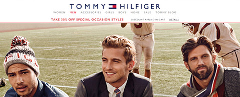
One great example of online shopping is the Tommy Hilfiger shop. Their website and store is rolled into one layout with an elegant design style. And while aesthetics are important, usability and UX design are the most important aspects of an eCommerce experience.
I’d like to delve into Tommy Hilfiger’s website to examine some of the trends used for their online eCommerce solution.
Inferred Usability
Perhaps the best aspect of Tommy’s layout is the accessibility of everything. Right from the first pageload you’re able to recognize everything from new products to sales and fashion trends.
The site is very easy to browse and all links offer a clear description of the products. Their navigation is also stylish but easy to use. Links are clean and straightforward. Hover effects are perceptible yet not overly flamboyant.

Since Tommy Hilfiger’s layout is so clean, it requires lots of graphics and typography to draw attention. Thankfully this layout has plenty of typography in spades. All the text is crisp, easy to read, and blends ever-so-carefully into the layout.
Also consider the website’s content structure and how that plays a role in the shopping experience. If you land on the page looking for scarves you can go to Accessories > Scarves & Hats.

Everything is organized clearly so that browsing is almost effortless. This is the reason most people prefer to shop online because it makes browsing products much simpler than wandering around a store.
Spacious Room for Shopping
All items in the shop are organized on a grid system. This means items are displayed equidistant between each other, creating a level playing field for each product.
Your eyes naturally gravitate towards asymmetry or items that particularly stand out from the crowd. Tommy Hilfiger’s design is meant to bring attention toward all products.

Also the shopping card itself offers a stylish 2-column layout. The left column is much wider with a focus on the products themselves(items, quantity, etc).
The right column is where you’ll find a total for all products and can move on to checkout. Font choices help a lot while also integrating differences with colors.
Fonts, colors, and white space create a salubrious shopping experience for customers of all ages.
Live Product Previews
When viewing any product page you’re given the option to check out details in a quick modal popup window. This can save a lot of time instead of forcing you onto many different pages without reason.
The thumbnails act as selling points whereby you can check out small details, or view the whole product with reviews and features.
On the product page you’ll get to view a fullscreen zoom preview with the magnifying glass effect.

Also you can switch between product colors and they’ll update in real time. Dynamic effects always add to the shopping experience and bring about more trust in new customers who have never used the website before.
Interwoven Tommy Branding
It may not seem like branding plays a very big role, but when it comes to branded products you really want people to remember the company. A good name will always stick but it’ll be more sticky with a clean branding.
Tommy uses their typical red white & blue colors sporadically in the layout. One great example is their footer which turns dark blue with crisp white text.

Also the header stays fixed at the top no matter what page you’re on. This header includes the Tommy logo which offers a quick reference to the brand at all times.
Branding is like marketing which means it can be rather capricious. There is such a thing as “too much” branding and it’s not good. But too little branding isn’t useful, either.
Tommy does an excellent job of working their colors into the site without being patently obnoxious or excessive.
Closing Ideas
Anyone who’s looking for eCommerce design ideas should look no further than Tommy Hilfiger. This design is clean & easy to use without a boring or bland aesthetic. Finding this middle ground is tough, especially for very large eCommerce projects, but it is possible.
Read More at Tommy Hilfiger eCommerce Website: Trends & Analysis
