Building Battleship in CSS
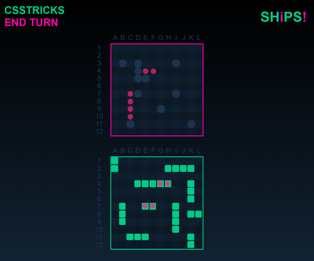
This is an experiment to see how far into an interactive experience I can get using only CSS. What better project to attempt than a game? Battleship seemed like a good challenge and a step up from the CSS games I’ve seen so far because it has the complexity of multiple areas that have to interact with two players.
Wanna see the complete game?
Oh, you wanna learn how it works? Let’s dig in.
I could tell right away there was going to be a lot of repetitive HTML and very long CSS selectors coming, so I set up Pug to compile HTML and Less to compile CSS. This is what all the code from here on is going to be written in.
Interactive elements in CSS
In order to get the game mechanics working, we need some interactive elements. We’re going to walk through each one.
HTML checkboxes and :checked
Battleship involves a lot of checking to see whether a field contains a ship or not, so we’re going to use a boatload of checkboxes.
[type*='checkbox'] {
  // inactive style

  &:checked {
    // active style
  }
}
To style checkboxes, we would first need to reset them using appearance: none; which is only poorly supported right now and needs browser prefixes. The better solution here is to add helper elements. tags can’t have children, including pseudo elements (even though Chrome will render them anyway), so we need to work around that using the adjacent sibling selector.
[type*='checkbox'] {
  position: relative;
  opacity: none;

  + .check-helper {
    position: absolute;
    top: 0;
    left: 0;
    pointer-events: none;
    // further inactive styles
  }

  &:checked {
    + .check-helper {
      // active styles
    }
  }
}
If you use a for the helper element, you will also extend the click area of the checkbox onto the helper, allowing you to position it more freely. Also, you can use multiple labels for the same checkbox. Multiple checkboxes for the same label are not supported, however, since you would have to assign the same ID for each checkbox.
Targets
We’re making a local multiplayer game, so we need to hide one player’s battlefield from the other and we need a pause mode allowing for a player to switch without glancing at the other player’s ships. A start screen explaining the rules would also be nice.
HTML already gives us the option to link to a given ID in the document. Using :target we can select the element that we just jumped to. That allows us to create an Single Page Application-like behavior in a completely static document (and without even breaking the back button).
- var screens = ['screen1', 'screen2', 'screen3'];
body
  nav
    each screen in screens
      a(href='#' + screen)

  each screen in screens
    .screen(id=screen)
      p #{screen}
.screen {
display: none;
&:target {
display: block;
}
}Visibility and pointer events
Rendering elements inactive is usually done by using pointer-events: none; The cool thing about pointer-events is that you can reverse it on the child elements. That will leave only the selected child clickable, but the parent stays click-through. This will come in handy later in combination with checkbox helper elements.
The same goes for visibility: hidden; While display: none; and opacity: 0; make the element and all it’s children disappear, visibility can be reversed.
Note that a hidden visibility also disables any pointer events, unlike opacity: 0;, but stays in the document flow, unlike display: none;.
.foo {
  display: none; // invisible and unclickable
  .bar {
    display: block; // invisible and unclickable
  }
}

.foo {
  visibility: hidden; // invisible and unclickable
  .bar {
    visibility: visible; // visible and clickable
  }
}

.foo {
  opacity: 0;
  pointer-evens: none; // invisible and unclickable
  .bar {
    opacity: 1;
    pointer-events: all; // still invisible, but clickable
  }
}| CSS Rule | Reversible opacity | Reversible pointer events |
|---|---|---|
display: none; |
? | ? |
visibility: hidden; |
? | ? |
opacity: 0;pointer-events: none;
|
? | ? |
OK, now that we’ve established the strategy for our interactive elements, let’s turn to the setup of the game itself.
Setting up
We have some global static variables and the size of our battlefields to define before we actually start:
@gridSize: 12;
@zSea: 1;
@zShips: 1000;
@zAbove: 2000;
@seaColor: #123;
@enemyColor: #f0a;
@playerColor: #0c8;
@hitColor: #f27;

body {
  --grid-measurements: 70vw;
  @media (min-aspect-ratio: 1/2) {
    --grid-measurements: 35vh;
  }
}
The grid size is the size of the battlefield: 12×12 fields in this case. Next, we define some z-indexes and colors.
Here’s the Pug skeleton:
doctype html

head
  title Ships!
  link(rel="stylesheet", href="style.css")
  meta(charset="UTF-8")
  meta(name="viewport" content="width=device-width, initial-scale=1, shrink-to-fit=no")
  meta(name="theme-color" content="#000000")

body
Everything HTML from this point on will be in the body.
Implementing the states
We need to build the states for Player 1, Player 2, pause, and a start screen. We’ll do this like it was explained above with target selectors. Here’s a little sketch of what we’re trying to achieve:
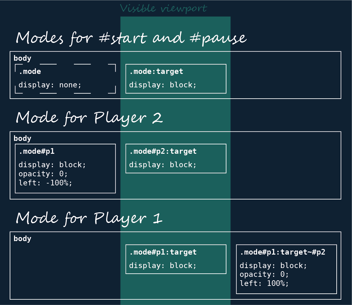
We have a few modes, each in its own container with an ID. Only one mode is to be displayed in the viewport—the others are hidden via display: none;, except for player modes. If one player is active, the other needs to be outside of the viewport, but still have pointer events so the players can interact with each other.
.mode#pause

each party in ['p1', 'p2']
  .mode(id=party)

.mode#start

.status
  each party  in ['p1', 'p2']
    a.player-link.switch(href='#' + party)
  a.status-link.playpause(href='#pause') End Turn

h1
  Ships!
The .status div contains the main navigation. Its entries will change depending on the active mode, so in order to select it properly, we’ll need put it after our .mode elements. The same goes for the
, so it ends up at the end of the document (don’t tell the SEO people).
.mode {
  opacity: 0;
  pointer-events: none;

  &:target,
  &#start {
    opacity: 1;
    pointer-events: all;
    z-index: 1;
  }

  &#p1, &#p2 {
    position: absolute;
    transform: translateX(0);
    opacity: 1;
    z-index: 2;
  }

  &#p1:target {
    transform: translateX(50vw);

    +#p2 {
      transform: translateX(50vw);
      z-index: 2;
    }
  }

  &#p2 {
    transform: translateX(50vw);
    z-index: 1;
  }

&#pause:target {
    ~ #p1, ~ #p2 {
      opacity: 0;
    }
  }
}

#start {
  .mode:target ~ & {
    display: none;
  }
}
.mode {
opacity: 0;
pointer-events: none;
&:target,
&#start {
opacity: 1;
pointer-events: all;
z-index: 1;
}
&#p1, &#p2 {
position: absolute;
transform: translateX(0);
opacity: 1;
z-index: 2;
}
&#p1:target {
transform: translateX(50vw);
+#p2 {
transform: translateX(50vw);
z-index: 2;
}
}
&#p2 {
transform: translateX(50vw);
z-index: 1;
}
&#pause:target {
~ #p1, ~ #p2 {
opacity: 0;
}
}
}
#start {
.mode:target ~ & {
display: none;
}
}The .mode div never has pointer events and always is fully transparent (read: inactive), except for the start screen, which is enabled by default and the currently targeted screen. I don’t simply set it to display: none; because I still need it to be in the document flow. Hiding the visibility won’t work because I need to activate pointer events individually later on, when hitting enemy ships.
I need #p1 and #p2 to be next to each other because that’s what’s going to enable the interaction between one players hits and the other players ships.
Implementing the battlefields
We need two sets of two battlefields for a total of four battlefields. Each set contains one battlefield for the current player and another for the opposite player. One set is going to be in #p1 and the other one in #p2. Only one of the players will be in the viewport, but both retain their pointer events and their flow in the document. Here’s a little sketch:
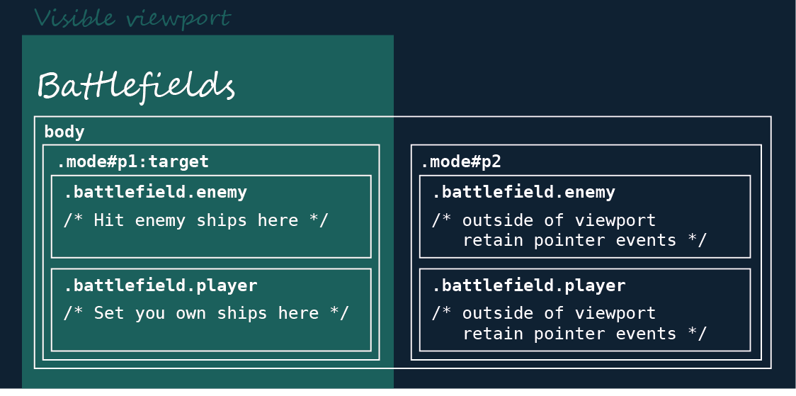
Now we need lots of HTML. Each player needs two battlefields, which need to have 12×12 fields. That’s 576 fields in total, so we’re going to loop around a bit.
The fields are going to have their own class declaring their position in the grid. Also, fields in the first row or line get a position indicator, so you get to say something cool like “Fire at C6.”
each party in 'p1', 'p2']
  .mode(id=party)
    each faction in 'enemy', 'player']
      .battlefield(class=faction, class=party)
        each line in 1, 2, 3, 4, 5, 6, 7, 8, 9, 10, 11, 12]
          each col, colI in 'A', 'B', 'C', 'D', 'E', 'F', 'G', 'H', 'I', 'J', 'K', 'L']
            div(class='field-x' + (colI+1) + '-y' + line)
              if (col === 'A')
                .indicator-col #{line}
              if (line === 1)
                .indicator-line #{col}
The battlefield itself is going to be set in a CSS grid, with its template and measurements coming from the variables we set before. We’ll position them absolutely within our .mode divs and switch the enemy position with the player. In the actual board game, you have your own ships on the bottom as well. Note that we need to escape the calc on the top value, or Less will try to calculate it for you and fail.
.battlefield {
  position: absolute;
  display: grid;
  grid-template-columns: repeat(@gridSize, 1fr);
  width: var(--grid-measurements);
  height: var(--grid-measurements);
  margin: 0 auto 5vw;
  border: 2px solid;
  transform: translate(-50%, 0);
  z-index: @zSea;

  &.player {
    top: calc(var(--grid-measurements) ~"+" 150px);
    border-color: transparent;

    :target & {
      border-color: @playerColor;
    }
  }

  &.enemy {
    top: 100px;
    border-color: transparent;

    :target & {
      border-color: @enemyColor;
    }
  }
}
We want the tiles of the battlefield to be a nice checkerboard pattern. I wrote a mixin to calculate the colors, and since I like my mixins separated from the rest, this is going into a components.less file.
.checkerboard(@counter) when (@counter > 0) {
  .checkerboard(@counter - 2);

  &[class^='field-'][class$='-y@{counter}'] {
    &:nth-of-type(odd) {
      background-color: transparent;

      :target & {
      background-color: darken(@seaColor, 3%);
    }
  }

  &:nth-of-type(even) {
    background-color: transparent;

    :target & {
        background-color: darken(@seaColor, 4%);
      }
    }
  }
}
When we call it with .checkerboard(@gridSize);, it will iterate through every second line of the grid and set background colors for odd and even instances of the current element. We can color the remaining fields with an ordinary :odd and :even.
Next, we place the indicators outside of the battlefields.
[class^='field-'] {
  position: relative;
  display: flex;
  justify-content: center;
  align-items: center;
  width: 100%;
  height: 100%;
  background-color: transparent;

  .checkerboard(@gridSize);
  :target &:nth-of-type(even) {
    background-color: darken(@seaColor, 2%);
  }

  :target &:nth-of-type(odd) {
    background-color: darken(@seaColor, 1%);
  }

  [class^='indicator-'] {
    display: none;

    :target & {
      position: absolute;
      display: flex;
      justify-content: center;
      width: calc(var(--grid-measurements)~"/"@gridSize);
      height: calc(var(--grid-measurements)~"/"@gridSize);
      color: lighten(@seaColor, 10%);
      pointer-events: none;
    }

    &.indicator-line {
      top: -1.5em;
      align-items: flex-start;
    }

    &.indicator-col {
      left: -2.3em;
      align-items: center;
    }
  }
}
Implementing the ships
Let’s get to the tricky part and place some ships. Those need to be clickable and interactive, so they’re going to be checkboxes. Actually, we need two checkboxes for one ship: miss and hit.
- Miss is the bottom one. If nothing else is on that field, your shot hits the water and triggers a miss-animation. The exception is when a player clicks on their own battlefield. In that case, the ship animation plays.
- When an own ships spawns, it activates a new checkbox. This one is called hit. It’s placed at the exact same coordinates as its corresponding ship, but in the other players attack field and above the checkbox helper for the miss. If a hit is activated, it displays a hit animation on the current player’s attack field as well as well as on the opponent’s own ship.
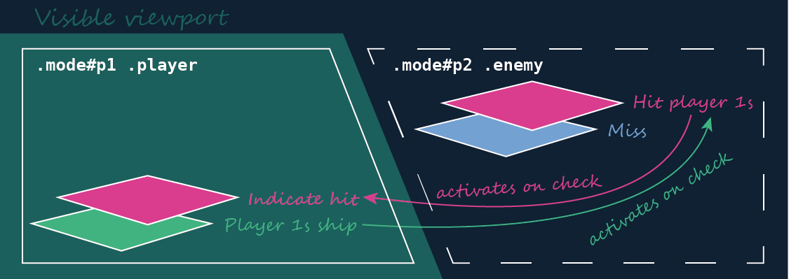
This is why we need to position our battlefields absolutely next to each other. We need them aligned at all times in order to let them interact with each other.
First, we’re going to set some styles that apply to both checkboxes. We still need the pointer events, but want to visually hide the checkbox and work with helper elements instead.
.check {
  position: absolute;
  top: 0;
  left: 0;
  width: 100%;
  height: 100%;
  margin: 0;
  opacity: 0;

  + .check-helper {
    position: absolute;
    top: 0;
    left: 0;
    width: 100%;
    height: 100%;
    pointer-events: none;
  }
}
We’ll also write some classes for our events for later use right now. This will also go into components.less:
.hit-obj {
  position: absolute;
  visibility: visible;
  left: 0;
  top: 0;
  width: 100%;
  height: 100%;
  border-radius: 50%;
  animation: hit 1s forwards;
}

.ship-obj {
  position: absolute;
  left: 0;
  top: 0;
  width: 90%;
  height: 90%;
  border-radius: 15%;
  animation: setShip 0.5s forwards;
}

.miss-obj {
  position: absolute;
  left: 0;
  top: 0;
  width: 100%;
  height: 100%;
  border-radius: 50%;
  animation: miss 1s forwards;
}
Spawning and missing ships
Those two events are basically the same. If you hit the sea in your own battlefield, you create a ship. If you hit the sea in the enemy battlefield, you trigger a miss. That happens by calling the respective class from our components.less file within a pseudo element of the helper class. We use pseudo elements here because we need to place two objects in one helper later on.
If you spawn a ship, you shouldn’t be able to un-spawn it, so we make it lose its pointer events after being checked. However, the next hit-checkbox gains it pointer events, enabling the enemy to hit spawned ships.
.check {
  &.ship {
    &:checked {
      pointer-events: none;
    }

    &:checked + .check-helper {
      :target .player & {
        &::after {
          content: "";
          .ship-obj; // set own ship
        }
      }

      :target .enemy & {
        &::after {
          content: "";
          .miss-obj; // miss enemy ship
        }
      }
    }

    &:checked ~ .hit {
      pointer-events: all;
    }
  }
}
Hitting ships
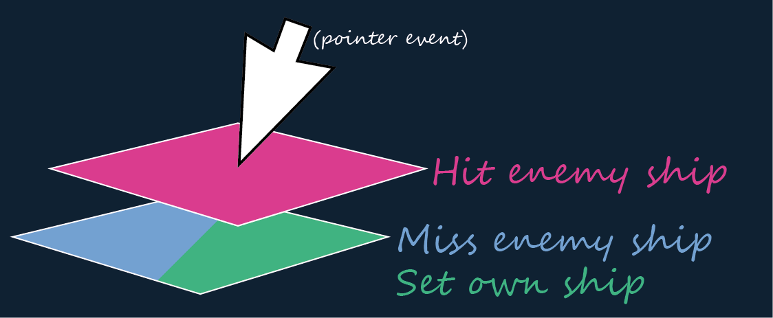
That new hit checkbox is positioned absolutely on top of the other player’s attack field. For Player 1 that means by 50vw to the right and by the grid height + 50px margin to the top. It has no pointer events by default, they are going to be overwritten by those set in .ship:check ~ .hit, so only ships that are actually set, can be hit.
To display a hit event, we need two pseudo elements: one that confirms the hit on the attack field; and one that shows the victim where they have been hit. :checked + .check-helper::after calls a .hit-obj from components.less onto the attacker’s field and the corresponding ::before pseudo element gets translated back to the victim’s own battlefield.
Since the display of hit events isn’t scoped to the active player, we need to remove all unnecessary instances manually using display: none;.
.check {
  &.hit {
    position: absolute;
    top: ~"calc(-1 * (var(--grid-measurements) + 50px))";
    left: 50vw;
    width: 100%;
    height: 100%;
    pointer-events: none;

    #p2 &,
    #p1:target & {
      left: 0;
    }

    #p1:not(:target) & + .check-helper::before {
      left: 50vw;
    }

    &:checked {
      opacity: 1;
      visibility: hidden;
      pointer-events: none;

      + .check-helper {
        &::before {
          content: "";
          .hit-obj; // hit enemy ships
          top: ~"calc(-1 * (var(--grid-measurements) + 50px))";
      }

        &::after {
          content: "";
          .hit-obj; // hit own ships
          top: -2px;
          left: -2px;
        }

        #p1:target &::before,
        #p1:target ~ #p2 &::after,
        #p1:not(:target) &::after,
        #p2:target &::before {
          display: none;
        }
      }
    }

    #p1:target .battlefield.p1 &,
    #p2:target .battlefield.p2 & {
      display: none;
    }
  }
}
Animating the events
While we did style our miss, ship and hit objects, there’s nothing to be seen yet. That’s because we are still missing the animations making those objects visible. Those are simple keyframe animations that I put into a new Less file called animations.less.
@keyframes setShip {
  0% {
    transform: scale(0, 0);
    background-color: transparent;
  }

  100% {
    transform: scale(1, 1);
    background-color: @playerColor;
  }
}

@keyframes hit {
  0% {
    transform: scale(0, 0);
    opacity: 0;
    background-color: transparent;
  }

  10% {
    transform: scale(1.2, 1.2);
    opacity: 1;
    background-color: spin(@hitColor, 40);
    box-shadow: 0 0 0 0.5em var(--shadowColor);
  }

  100% {
    transform: scale(.7, .7);
    opacity: .7;
    background-color: @hitColor;
    box-shadow: 0 0 0 0.5em var(--shadowColor);
  }
}

@keyframes miss {
  0% {
    transform: scale(0, 0);
    opacity: 1;
    background-color: lighten(@seaColor, 50);
  }

  100% {
    transform: scale(1, 1);
    opacity: .8;
    background-color: lighten(@seaColor, 10);
  }
}
Add customizable player names
This isn’t really necessary for functionality, but it’s a nice little extra. Instead of being called “Player 1” and “Player 2,” you can enter your own name. We do this by adding two to .status, one for each player. They have placeholders in case the players don’t want to enter their names and want to skip to the game right away.
.status
  input(type="text" placeholder="1st Player").player-name#name1
  input(type="text" placeholder="2nd Player").player-name#name2
  each party  in ['p1', 'p2']
      a.player-link.switch(href='#' + party)
  a.status-link.playpause(href='#pause') End Turn
Because we put them into .status, we can display them on every screen. On the start screen, we leave them as normal input fields, for the players to enter their names. We style their placeholders to look like the actual text input, so it doesn’t really matter if players enter their names or not.
.status {
  .player-name {
    position: relative;
    padding: 3px;
    border: 1px solid @enemyColor;
    background: transparent;
    color: @playerColor;

    &::placeholder {
      color: @playerColor;
      opacity: 1; // Reset Firefox user agent styles
    }
  }
}
On the other screens, we remove their typical input field styles as well as their pointer events, making they appear as normal, non-changeable text. .status also contains empty links to select players. We style those links to have actual measurements and display the name inputs without pointer events above them. Clicking a name triggers the link now, targeting the corresponding mode.
.status {
  .mode#pause:target ~ & {
    top: 40vh;
    width: calc(100% ~"-" 40px);
    padding: 0 20px;
    text-align: center;
    z-index: @zAbove;

    .player-name,
    .player-link {
      position: absolute;
      display: block;
      width: 80%;
      max-width: 500px;
      height: 40px;
      margin: 0;
      padding: 0;

      &:nth-of-type(even) {
        top: 60px;
      }
    }

    .player-name {
      border: 0;
      text-align: center;
      pointer-events: none;
    }
  }
}
The player screens only need to display the active player, so we remove the other one.
.status {
  .mode#p1:target ~ & #name2 {
    display: none;
  }

  .mode#p2:target ~ & #name1 {
    display: none;
  }
}
Some notes on the Internet Explorer and Edge: Microsoft browsers haven’t implemented the ::placeholder pseudo element. While they do support :-ms-input-placeholder for IE and ::-ms-input-placeholder, as well as the webkit-prefix for Edge, those prefixes only work if ::placeholder is not set. As far as I played around with placeholders, I only managed to style them properly in either the Microsoft browsers, or all the other ones. If someone else has a workaround, please share it!
Putting it all together
What we have so far is a functional, but not very handsome game. I use the start screen to clarify some basic rules. Since we don’t have a hard-coded win condition and nothing to prevent players to place their ships wildly all over the place, I created a “Play fair” note that encourages the good ol’ honor system.
.mode#start
  .battlefield.enemy
    ol
      li
        span You are this color.
      li
        span Your enemy is
        span this
        span color
      li
        span You may place your ships as follows:
        ul
          li 1 x 5 blocks
          li 2 x 4 blocks
          li 3 x 3 blocks
          li 4 x 2 blocks
I’m not going into the detail of how I went about getting things exactly to my liking since most of that is very basic CSS. You can go through the end result to pick them out.
When we finally connect all the pieces, we get this:
See the Pen CSS Game: Battleships by Daniel Schulz (@iamschulz) on CodePen.
Wrapping up
Let’s look back at what we’ve accomplished.
HTML and CSS may not be programming languages, but they are mighty tools in their own domain. We can manage states with pseudo classes and manipulate the DOM with pseudo elements.
While most of us use :hover and :focus all the time, :checked goes by largely unnoticed, only for styling actual checkboxes and radio buttons at best. Checkboxes are handy little tools that can help us to get rid of unnecessary JavaScript in our more simple front end features. I wouldn’t hesitate to build dropdown or off-canvas menus in pure CSS in real life projects, as long as the requirements don’t get too complicated.
I’d be a bit more cautious when using the :target selector. Since it uses the URL hash value, it’s only usable for a global value. I think I’d use it for, say, highlighting the current paragraph on a content page, but not for reusable elements like a slider or an accordion menu. It can also quickly get messy on larger projects, especially when other parts of it start controlling the hash value.
Building the game was a learning experience for me, dealing with pseudo selectors interacting with each other and playing around with lots of pointer events. If I had to build it again, I’d surely choose another path, which is a good outcome for me. I definitely don’t see it as a production-ready or even clean solution, and those super specific selectors are a nightmare to maintain, but it has some good parts in it that I can transition to real life projects.
Most importantly though, it was a fun thing to do.
The post Building Battleship in CSS appeared first on CSS-Tricks.