20 Freshest Web Designs, October 2018
Fall is truly upon us in the Northern hemisphere, and Spring is in bloom in the Southern hemisphere. Bright colors, uplifting gradients, and bold color blocking have been evident through much of 2018, and October’s ramping it up another notch. This month you’ll find luxury goods, ethical concerns, large scale images and videos, and designers playing with the grid. Enjoy!
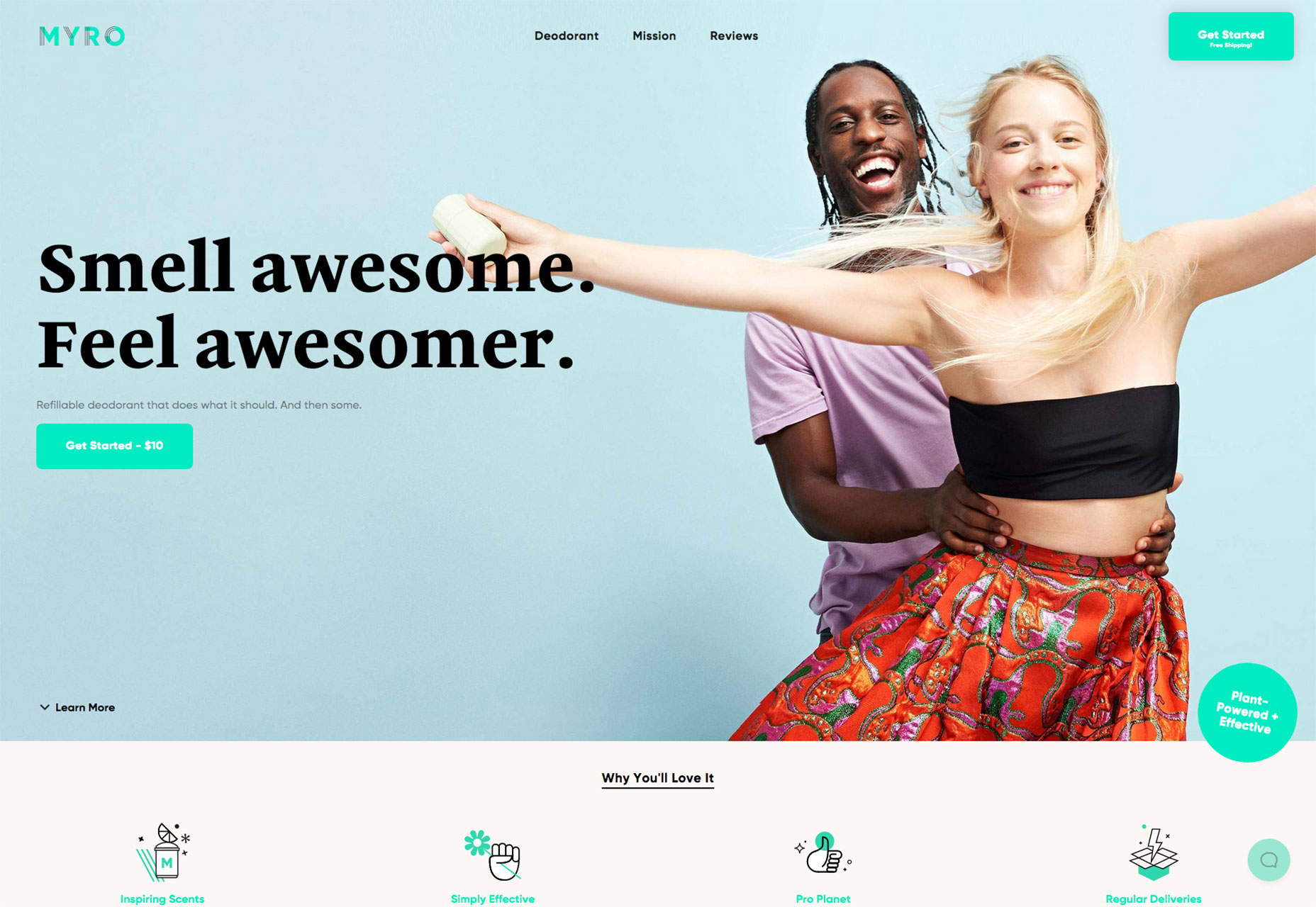
Myro
Some products are easy to sell, and some are not. Myro is the latter, a refillable deodorant. This site does an exceptional job of putting an aspirational spin on a product that many of us simply use and forget about.
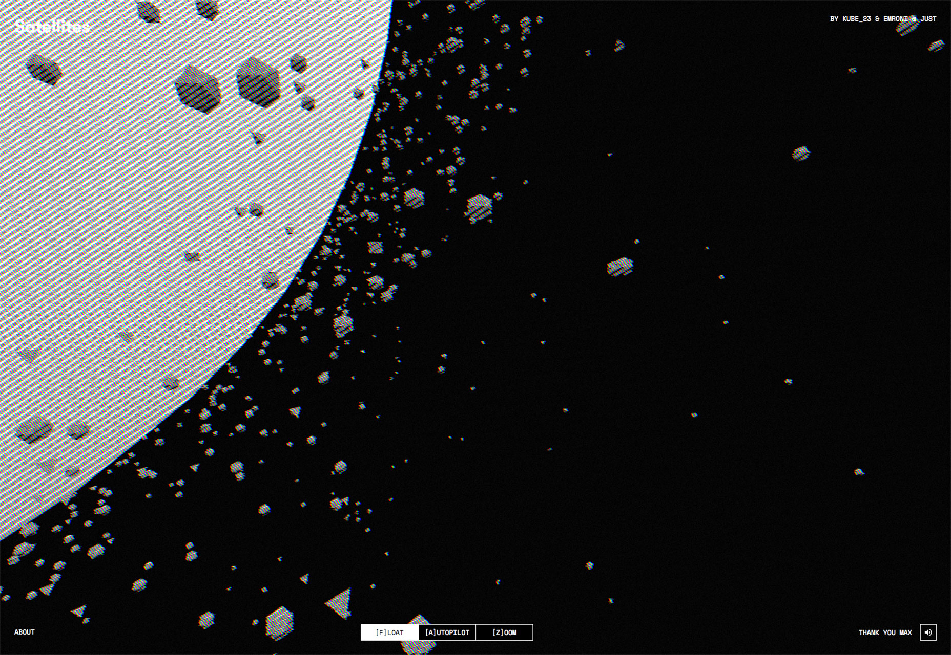
Satellites
There are hundreds of thousands of objects orbiting the earth, from natural debris to parts of rockets from past space missions. Satellites is an absorbing ambient visualization of them all.
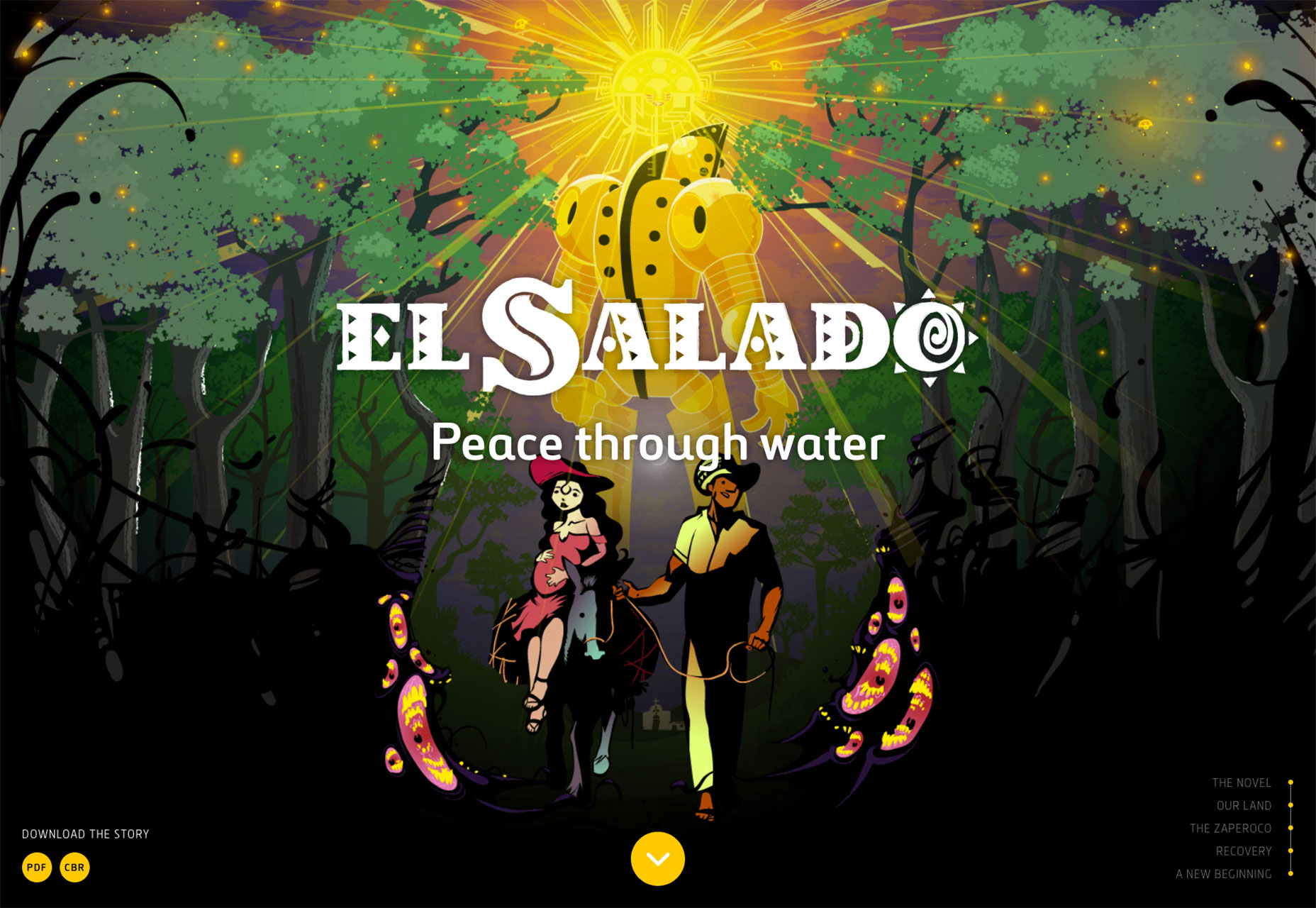
El Salado
Following in the long tradition of art tackling big issues, El Salado is a graphic novel themed around social problems in provincial Columbia. The site tells the story behind the novel, and you can even download the novel.
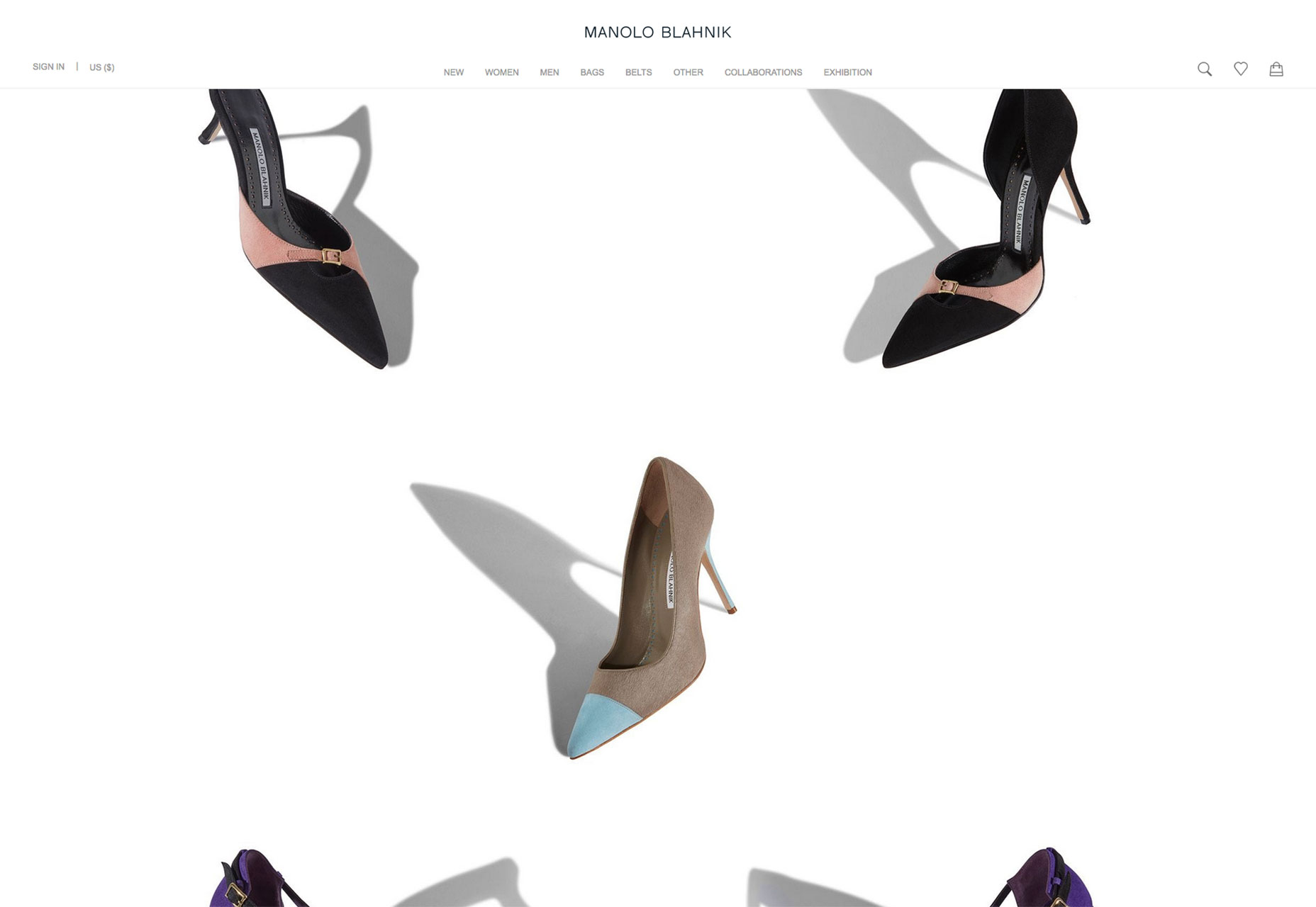
Manolo Blahnik
Manolo Blahnik’s minimal site presents its wares on a minimal white background. It may seem like any other minimal fashion site, but the shoes are presented outside of the grid, at angles. This simple approach feels free and emphasizes the luxury on offer.
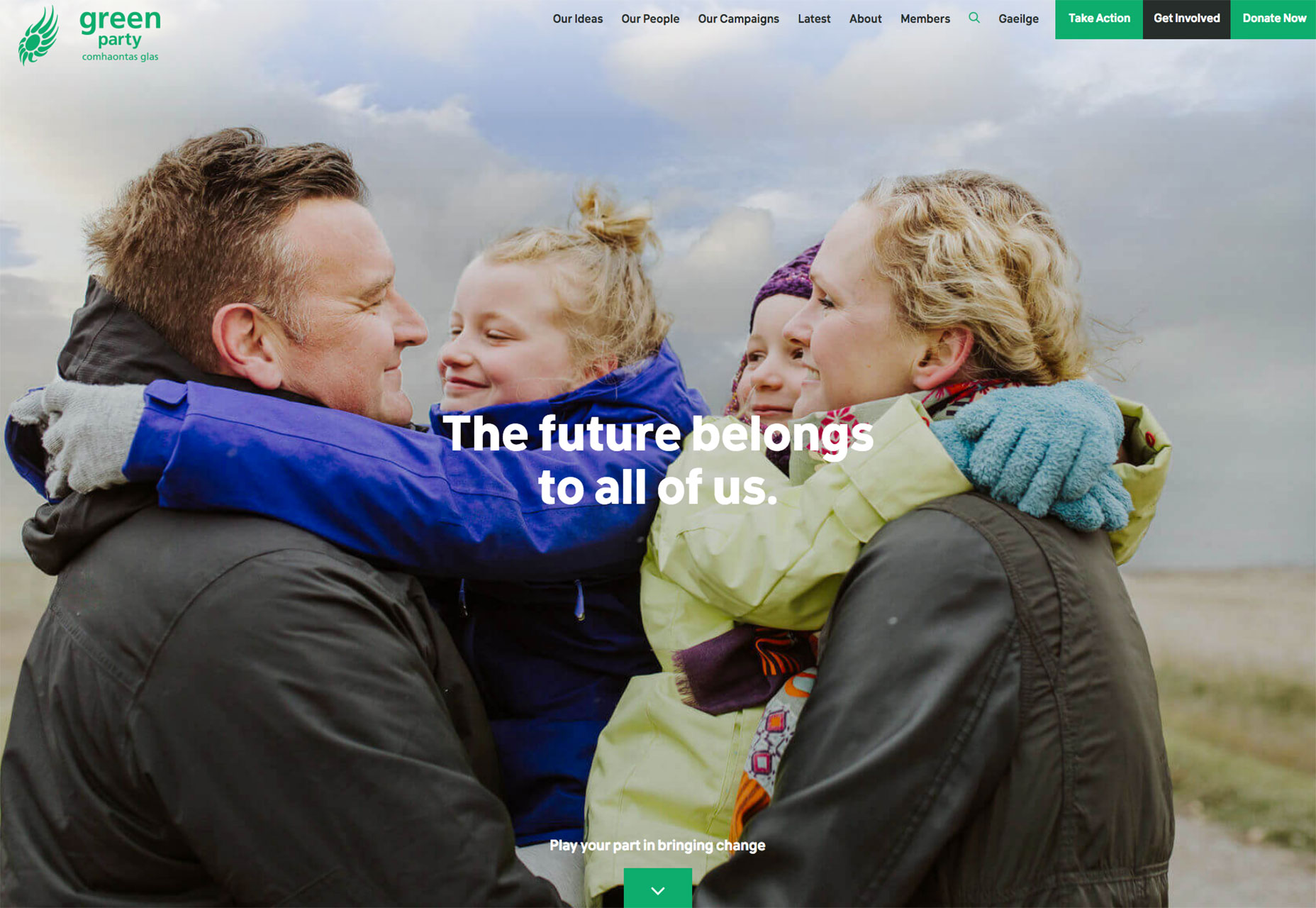
Green Party of Ireland
The Green Party of Ireland is the sister party of many Green parties across Europe, seeking to build a sustainable future for everyone. Their site is an exemplary example of how a non-profit can promote itself well online.
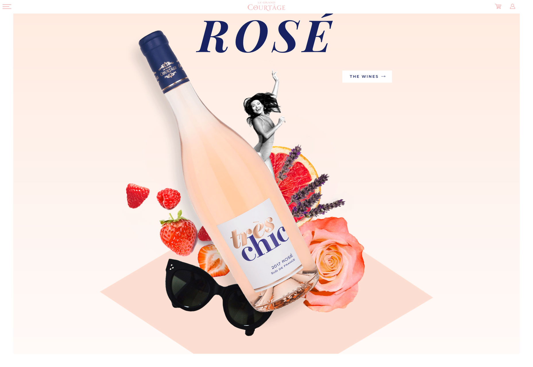
Le Grand Courtage
A site selling wine to women, Le Grand Courtage features some tres chic typography, glamorous photography, and subtle pastel tones that reflect the color of the wines on offer.
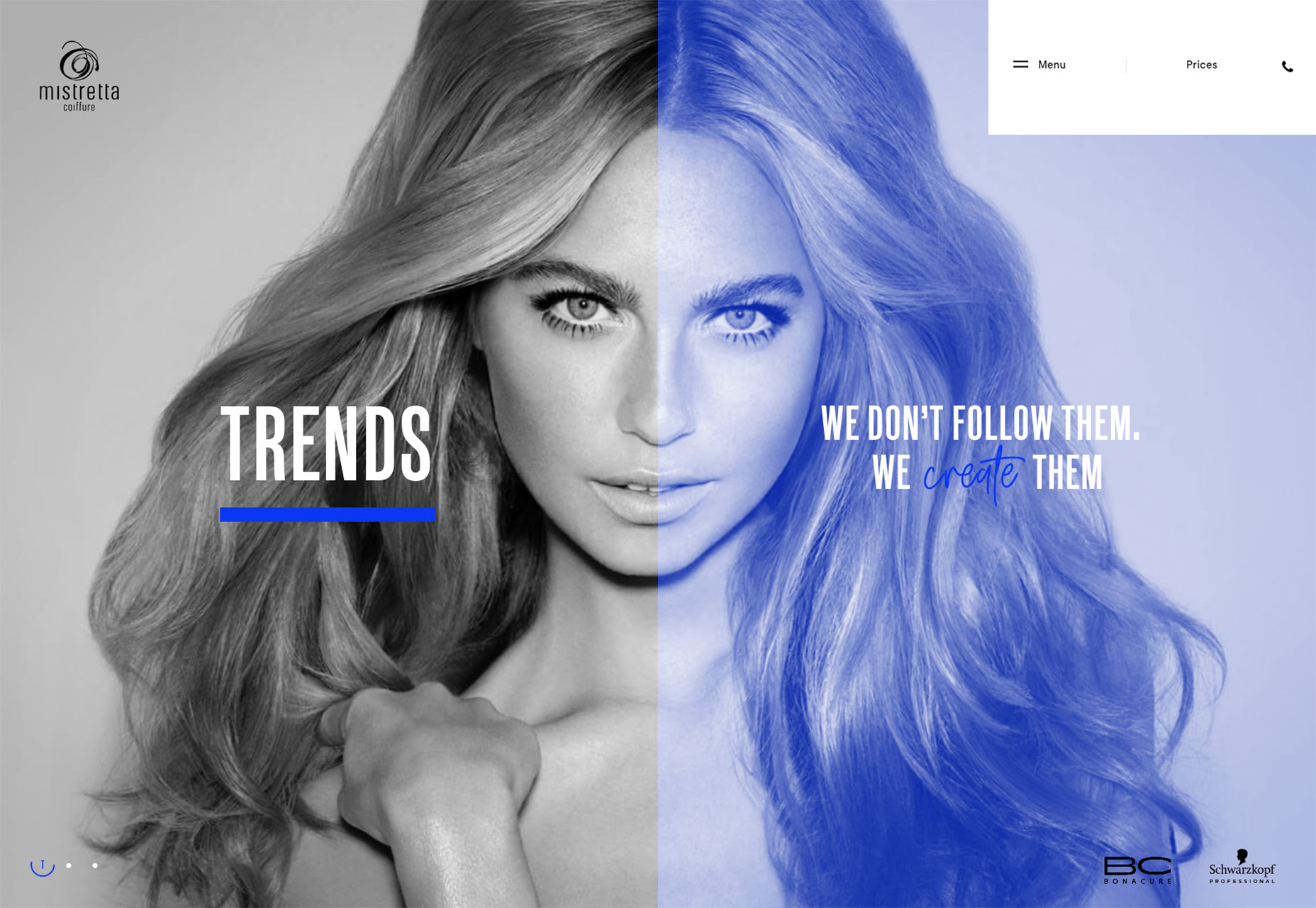
Mistretta Coiffure
Mistretta Coiffure is a fabulous site for a hair dresser. A bold grid matches a bold color palette and the home page features a really attention-grabbing liquid effect.
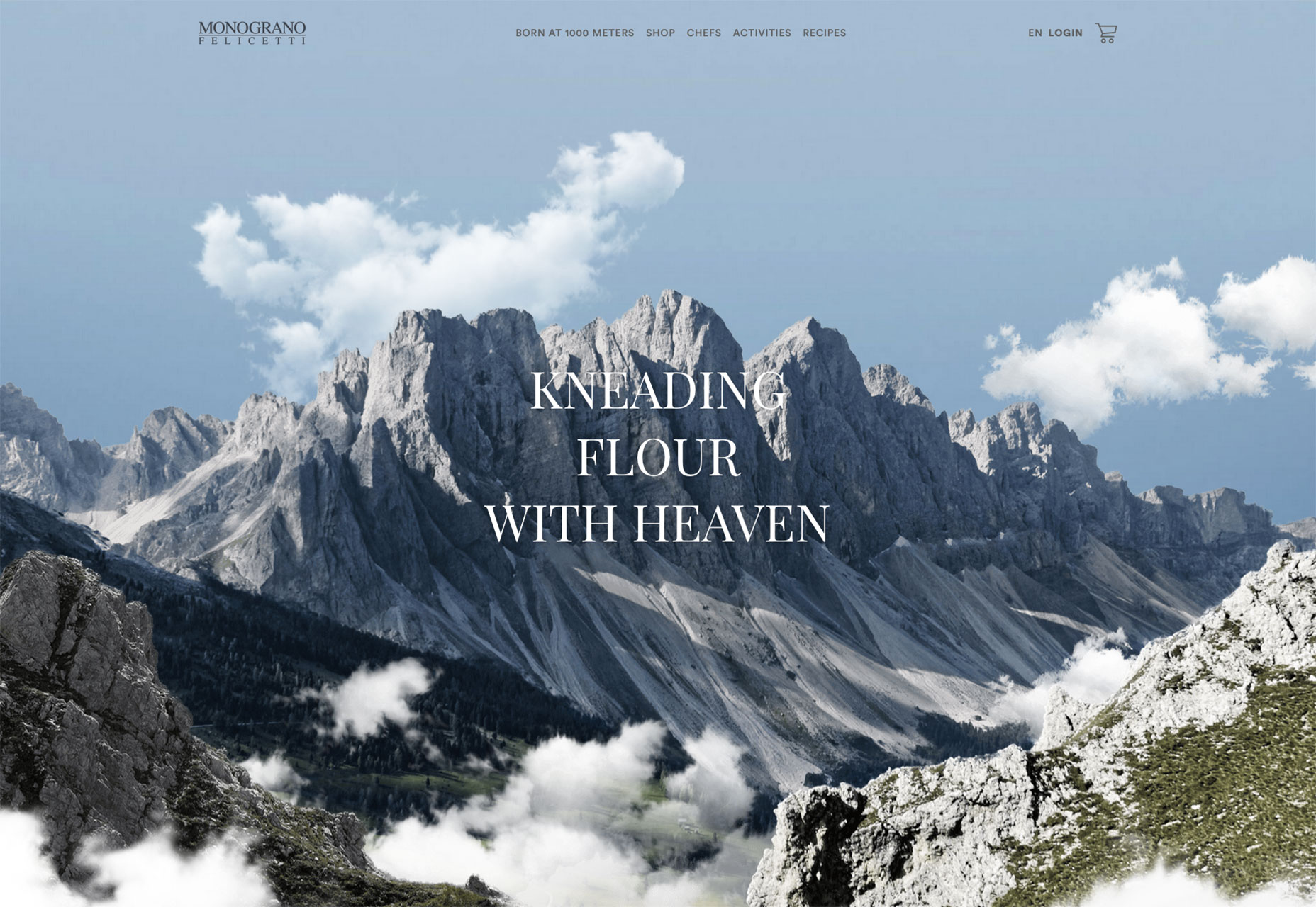
Monograno
Who knew that the highest quality pasta comes from 1km above sea-level… Monograno’s site features beautiful imagery and typography to sell its vision of the world’s best pasta, direct from the Italian alps.
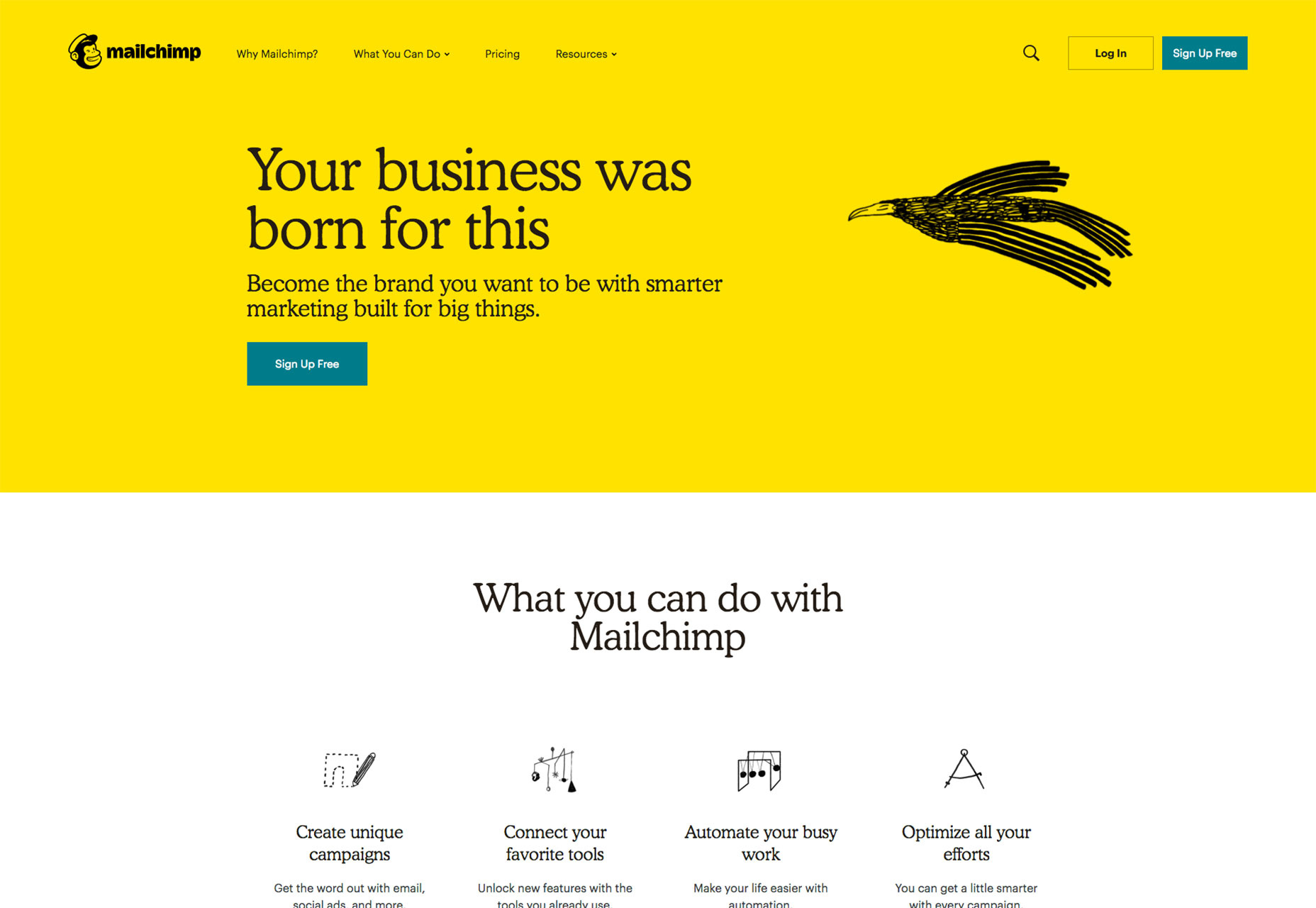
Mailchimp
Mailchimp’s redesign has been everywhere this month. The bold new color, coupled with incredible original illustrations is a brave approach to take and fits the personality of the company perfectly.
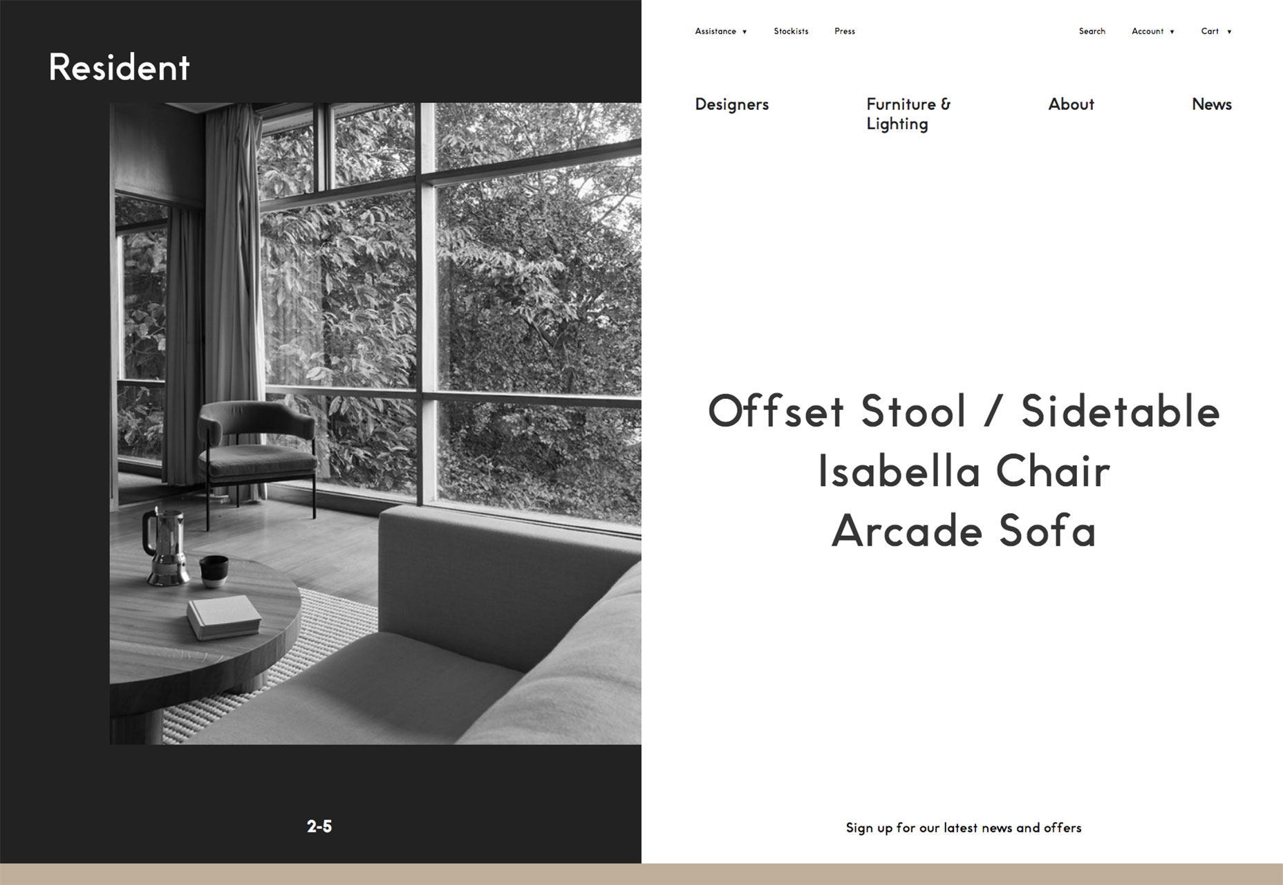
Resident
Resident is a furniture and lighting store from New Zealand. The high-design products are beautifully complemented by the strict geometric grid that underpins the asymmetrical layout.
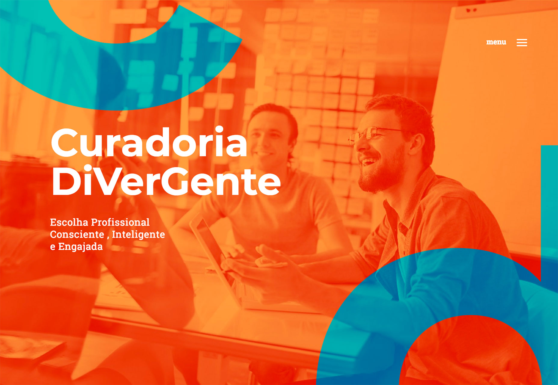
Curadoria DiVerGente
Greeting you with an acid orange slap in the eyeballs, Curadoria DiVerGente has a nice subtle segue effect from one page to another with its initials sliding sideways on the screen. It’s great to see some bold color use.
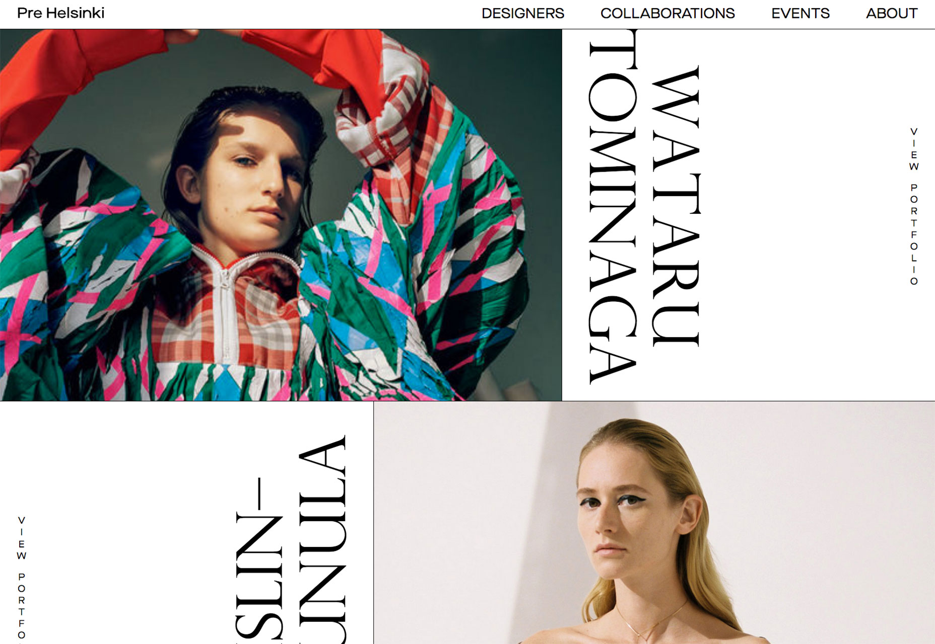
Pre Helsinki
Celebrating the unique vision of Finland’s burgeoning fashion scene, Pre Helsinki features huge edge-to-edge videos, a superb range of fashion photography, and large-scale typography.
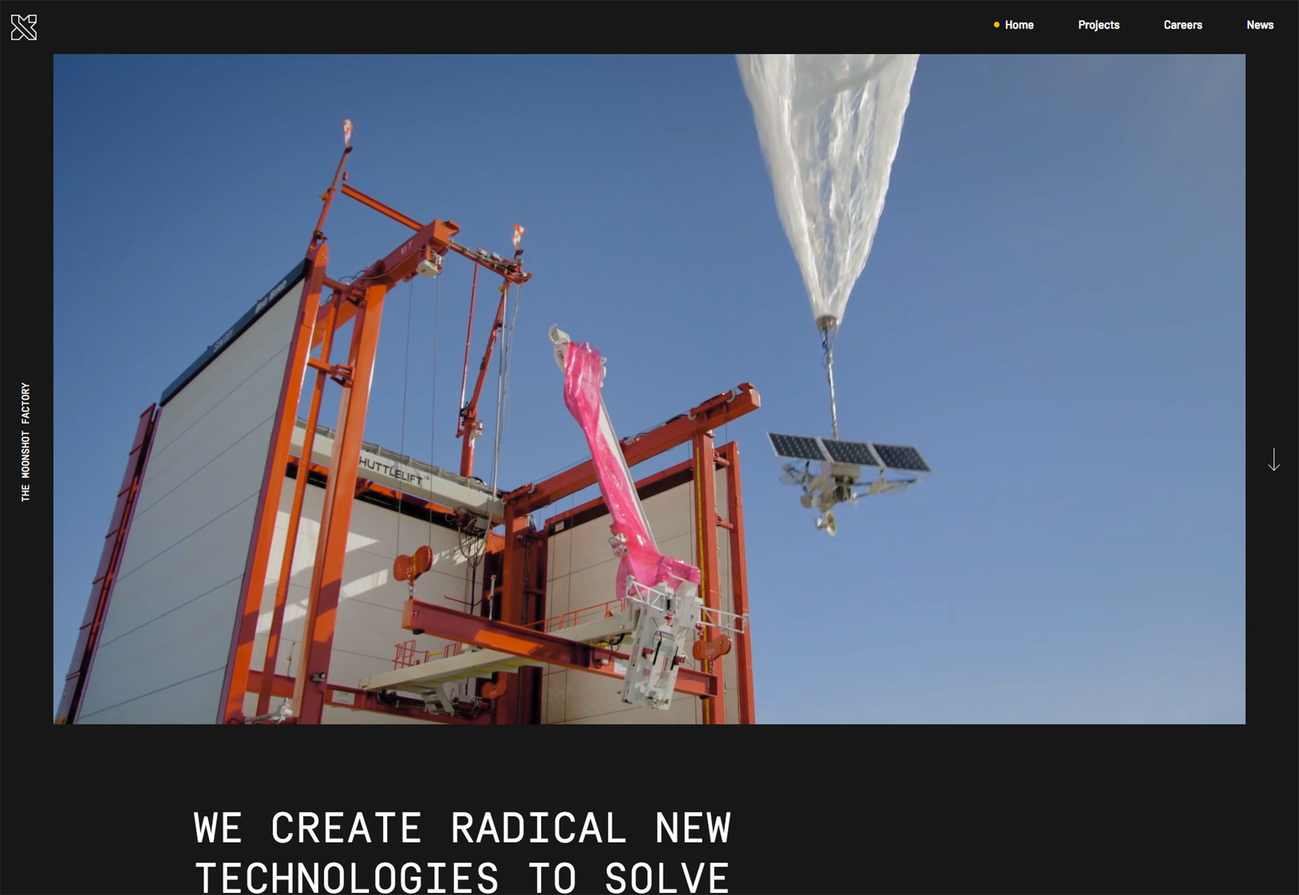
X
Describing itself as a diverse group of investors and entrepreneurs who are seeking to use technology to solve humanity’s problems, X’s site features inspiring videos and images, and an exceptional logomark.
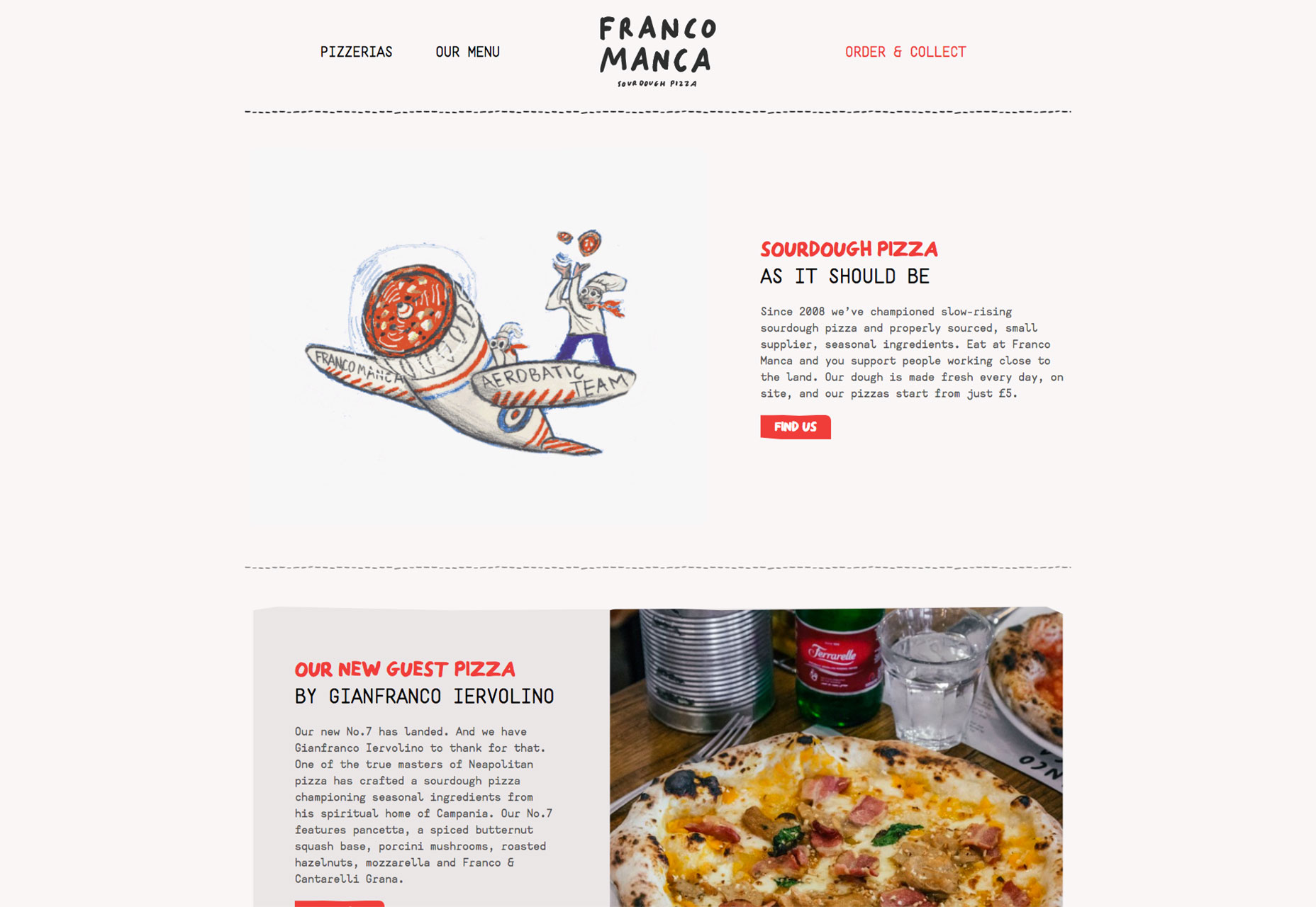
Franco Manca
There’s no pizza as enjoyable as sourdough pizza, and Franco Manca offers some of the best. The quirky site perfectly captures the offbeat approach of this growing eatery brand.
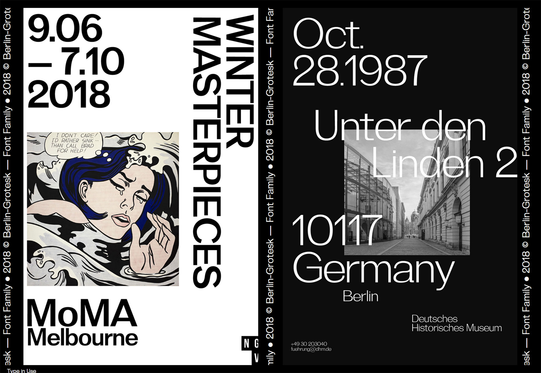
Berlin Grotesk
Berlin Grotesk is a site promoting yet another sans-serif workhorse typeface. The bold black and white design is impactful, and does a great job of selling a font family in a saturated market.
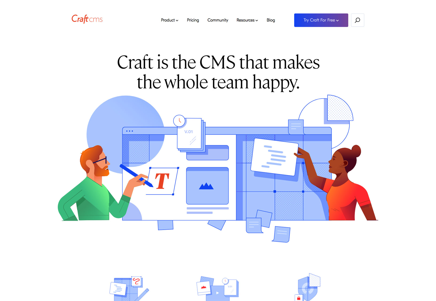
CraftCMS
Craft CMS is one of the best premium content management systems available, and its new site does a great job of walking the line between familiar design patterns, and its own unique brand approach.
FJ 1857
FJ 1857 opens with an intrusive interstitial, but skip it and you’ll be rewarded with a high-class site featuring bold typography and edge-to-edge video, all carefully integrated with a well crafted sales funnel.
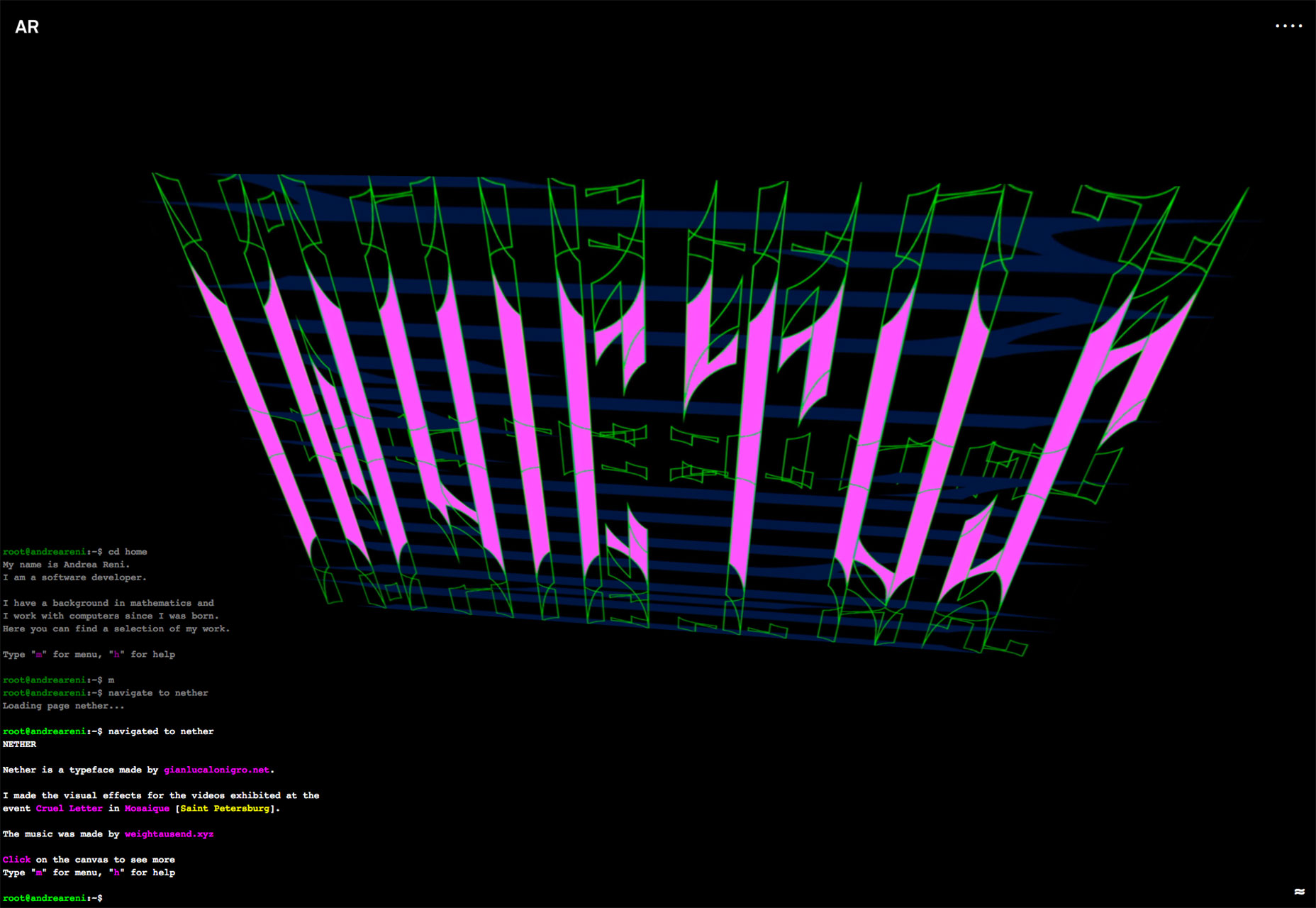
AR
Andrea Reni’s site is presented as a terminal, which might be intimidating for a layman, but tells his intended audience (other developers) exactly who he is. It’s refreshing to see an unusual approach.
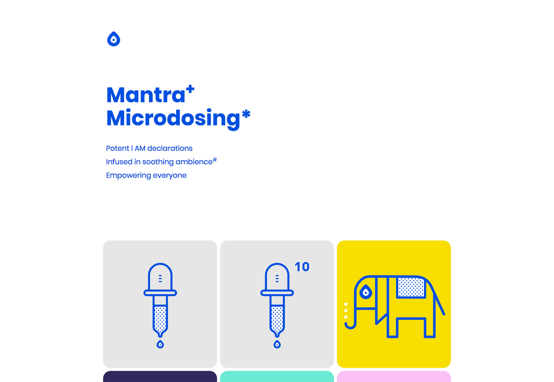
Tonik
Tonik is an app site with a difference. Rejecting the usual, screenshot of an iphone and the stock image of a girl in a coffeeshop, Tonik uses bold type, a bold blue color, and some simple illustrations to sell itself.
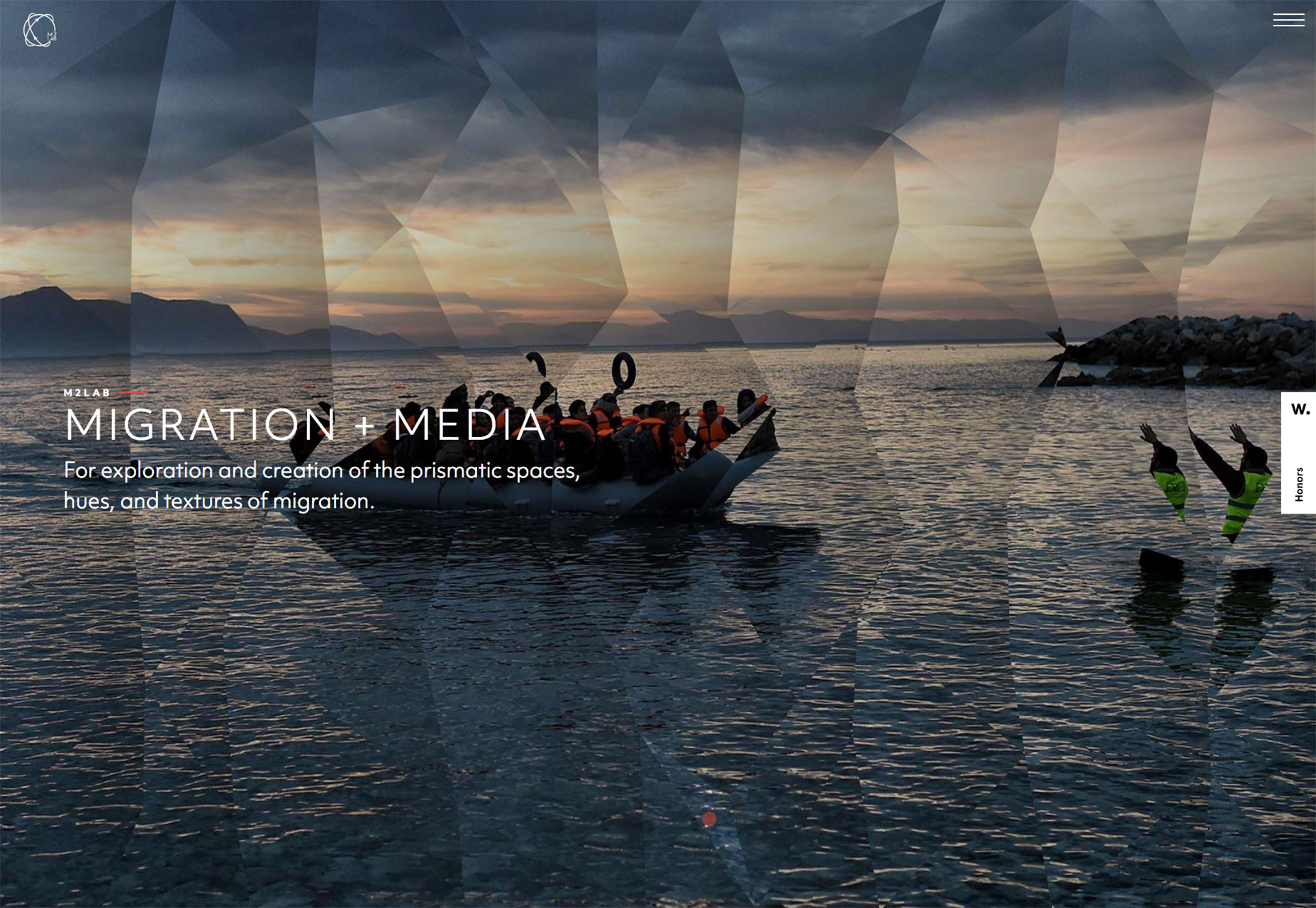
M2Lab
M2Lab is an attempt to engage thinkers, writers, the media, and the community to think differently about immigration and refugees by visualizing the movement of people across cultures in new ways.
| Add Realistic Chalk and Sketch Lettering Effects with Sketch’it – only $5! |
|
