Perfect Image Optimization for Mobile with Optimole
(This is a sponsored post.)
In 2015 there were 24,000 different Android devices, and each of them was capable of downloading images. And this was just the beginning. The mobile era is starting to gather pace with mobile visitors starting to eclipse desktop. One thing is certain, building and running a website in the mobile era requires an entirely different approach to images. You need to consider users on desktops, laptops, tablets, watches, smartphones and then viewport sizes, resolutions, before, finally, getting to browser supported formats.
So, what’s a good image optimization option to help you juggle all of these demands without sacrificing image quality and on-page SEO strategy?
Say hello to Optimole.
If you’ve ever wondered how many breakpoints a folding screen will have, then you’ll probably like Optimole. It integrates with both the WordPress block editor and page builders to solve a bunch of image optimization problems. It’s an all-in-one service, so you can optimize images and also take advantage of features built to help you improve your page speed.
What’s different about Optimole?
The next step in image optimization is device specificity, so the traditional method of catch and replace image optimization will no longer be the best option for your website. Most image optimizers work in the same way:
- Select images for optimization.
- Replace images on the page.
- Delete the original.
They provide multiple static images for each screen size according to the breakpoints defined in your code. Essentially, you are providing multiple images to try and Optimized? Sure. Optimal? Hardly.
Optimole works like this:
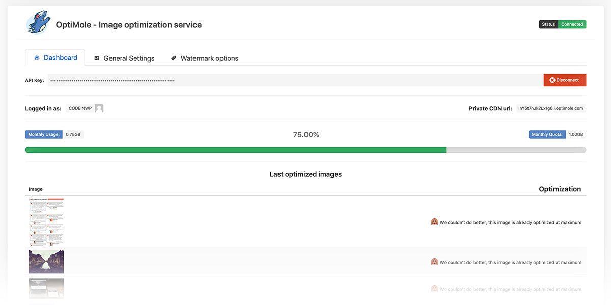
- Your images get sucked into the cloud and optimized.
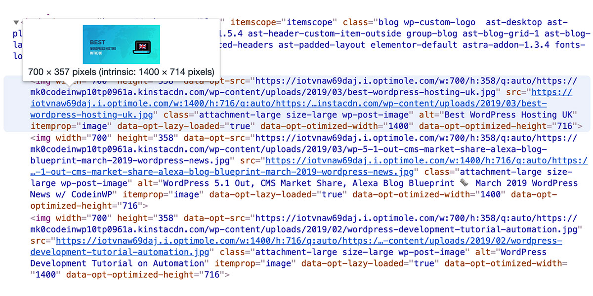
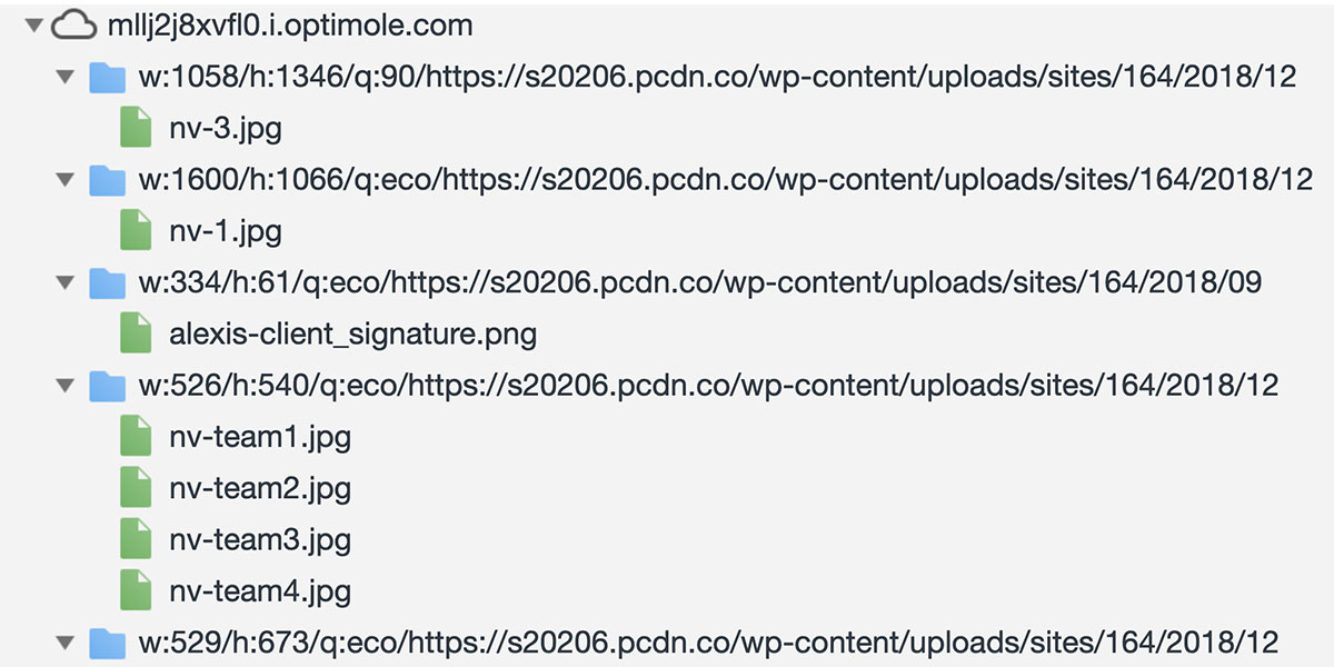
- Optimole replaces the standard image URLs with new ones – tailored to the user’s screen.
- The images go through a fast CDN to make them load lightning fast.

Here’s why this is better: You will be serving perfectly sized images to every device, faster, in the best format, and without an unnecessary load on your servers.
A quick case study: CodeinWP
Optimole’s first real test was on CodeinWP as part of a full site redesign. The blog has been around for a while during which time is has emerged as one of the leaders in the WordPress space. Performance wise? Not so much. With over 150,000 monthly visitors, the site needed to provide a better experience for Google and mobile.
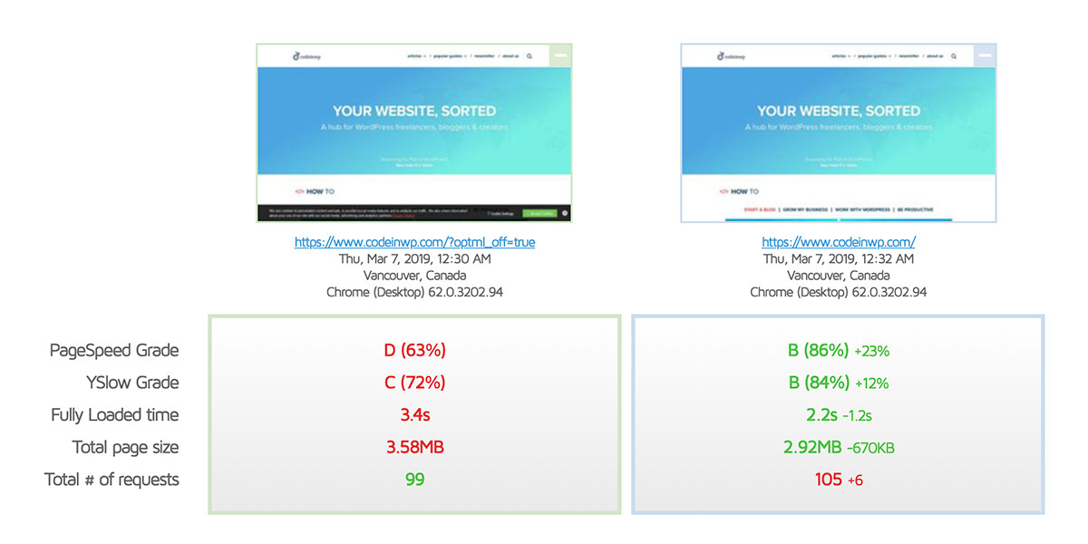
Optimole was used as one part of a mobile first strategy. In the early stages, Optimole helped provide a ~0.4s boost in load time for most pages with it enabled. Whereas, on desktop, Optimole is compressing images by ~50% and improving pagespeed grades by 23%. Fully loaded time and the total page size is reduced by ~19%.
Improved PageSpeed and quicker delivery
Along with a device-specific approach, Optimole provides an image by image optimization to ensure each image fits perfectly into the targeted container. Google will love it. These savings in bandwidth are going to help you improve your PageSpeed scores.
It’s not always about the numbers; your website needs to conform to expected behavior even when rendering on mobile. You can avoid content jumping and shifting with any number of tweaks but a container based lazy loading option provides the best user experience. Optimole sends a blurred image at the exact container size, so your visitors never lose their place on the page.
We offer CDNs for both free and premium users. If you’re already using CDN, then we can integrate it from our end. The extra costs involved will be balanced out with a monthly discount.
Picking the perfect image for every device
Everyone loves and but it is time for an automated solution that doesn’t leak bandwidth. With client hints, Optimole provides dynamic image resizing that provides a perfectly sized image for each and every device.
Acting as a proxy service allows Optimole to deliver unique images based on supported formats. Rather than replace an image on the page with a broad appeal, Optimole provides the best image based on the information provided by the browser. This dynamism means WebP and Retina displays are supported for, lucky, users without needing to make any changes.
Optimole can be set to detect slower connections, and deliver an image with a high compression rate to keep the page load time low.
Industrial strength optimization with a simple UI
The clean and simple UI gives you the options you need to make a site; no muss no fuss. You can set the parameters, introduce lazy loading, and test the quality without touching up any of the URLs.

You can reduce the extra CSS you need to make page builder images responsive and compressed. It currently takes time and a few CSS tricks to get all of your Elementor images responsive. For example, the extra thumbnails from galleries and carousels can throw a few curve balls. With Optimole all of these images are picked up from the page, and treated like any other. Automatically.
One of the reasons to avoid changing image optimization strategies is the, frightening, prospect of going through the optimization process again. Optimole is the set-and-forget optimization option that optimizes your images without making changes to the original image. Just install, activate and let Optimole handle the rest.
Set. Forget. Work on important things.

Try it today
Get some insight into how Optimole can help your site with the speed test here.
If you like what you see then you can get a fully functional free plan with all the features. It includes 1GB of image optimization and 5GB of viewing bandwidth. The premium plans start with 10GB of image optimization, and 50GB of viewing bandwidth, plus access to an enhanced CDN including over 130 locations.
If you’re worried about making a big change, then rest assured Optimole can be uninstalled cleanly to leave your site exactly as before.
Direct Link to Article — Permalink
The post Perfect Image Optimization for Mobile with Optimole appeared first on CSS-Tricks.
