How To Start Using Sketch And Framer X
How To Start Using Sketch And Framer X
Martina Pérez2019-06-05T12:30:59+02:002019-06-07T15:06:32+00:00
When it comes to showing the transition, interaction and animation of elements in the user interface, a prototyping tool like Framer X can make a difference in the way you communicate your vision to the team and stakeholders and as a result, boost your efficiency as a designer.
With the following example, I will illustrate how you can add interaction to static designs. To profit the most from this tutorial, some basic experience with Framer X are welcome.
To get started, you will need the following tools and assets:
- Framer X
- Sketch
- A sample Sketch file: This Sketch file contains the design screens that we will use in the tutorial. The designs are part of the Velocity UI Kit created by InVision.
Note: This tutorial is for designers using MacOS, as Framer X is for Mac (although this may change in the near future), and Sketch app is also only for Mac.
Bringing Your Designs From Sketch
We will bring our designs from Sketch into Framer X. You might also create your designs in Framer X as there is a full bunch of layout tools to do so, but there are some reasons whereby you can be interested in continuing designing your interfaces in Sketch:
- You are used to Sketch and not willing to learn a new design tool.
- You have already some designs in Sketch and you want to build the interaction for them.
- Sketch works much better with large files. Framer X seems to have some problems when moving elements around.
- Framer X is still in his early stages as a design tool and there are not many tutorials about how to create some elements of design. On the other hand, there are plenty of tutorials about Sketch and also many plugins such as the Craft plugin for Sketch which allows you to speed up your design process.
- You will find many more web design resources for Sketch than for Framer X.
- There is still a lack of tutorials about some of the options available in Framer X, especially about how to use the Code components.
So first of all, let’s create a new file in Framer X. The first thing we will do is to bring the design screen we have in Sketch into Framer X. To do so, just copy the Static artboard from Sketch and paste it in Framer X.

As you can see in the Layers panel, we’ve got the same layers we had in Sketch.
Note: Sometimes, when bringing your designs into Framer X, some properties may be lost — in this case, it’s the border radius of the thumbnails. This is because we used a Mask in Sketch and Framer X doesn’t recognize it. To solve this, you can either select the Group in Sketch and Flatten it to Bitmap before pasting it into Framer X, or once you have brought the design into Framer X, double-click to reach the Frame element and manually change the Radius in the Properties panel.
Organize The Layout In Framer
To work on the interaction of the elements in Framer X, we need to create a new Frame.
Note: A frame is similar to an Artboard in Sketch (or to the HTML
To create a new Frame, go to the Layout tool panel, select Frame and drag and drop in any part of the canvas; or simply press F.
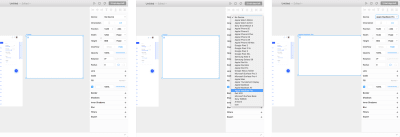
Second, we will set a device for the Frame. Select the Frame and in the Properties panel, Device, choose Apple MacBook Pro.
Take a look at the Static frame we’ve imported. We will build the following interactions:
- Header: Fade in when scrolling through the content.
- Floating Action Button (FAB): Default, hover and pressed states.
- Nav: It is displayed from right to left when clicking the FAB.
- Content: It is resized when clicking the FAB.
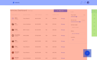
First, create new Frames on top of the layers in such a way that you end up having one Frame for each of the abovemention interaction elements. For instance, we will add a new Frame to group all the layers that are part of the Header (Cmd + Enter) and name the Frame as header.
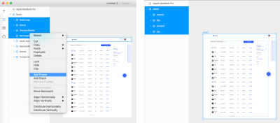
For the sake of clarity, change the name of the Apple MacBook Pro frame to Interactive. In the following section we will create a Scroll component.
Scroll Through The Content
First, we will duplicate (Cmd + D) the Content frame and take it out of the Static frame. Change the name of the new frame to i_content.
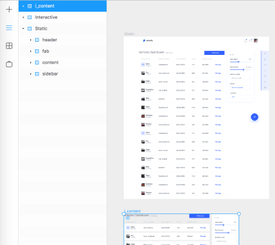
Secondly, we will create a Scroll component in our Interactive frame. To do so, go to the Interactive tool panel and select Scroll. Drag and drop in any part of the Interactive frame.
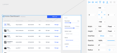
In addition to that, modify the width of the Scroll component to 1141px (same as the Content) and position it in the same coordinates as the Content is on the Static frame (left: 149px, top: 140px). Apart from that, increase the height of the Scroll component as it reaches the bottom of the Interactive frame.
Next, we will connect the Scroll component to our i_content. To do so, click on the connector and connect it to i_content.
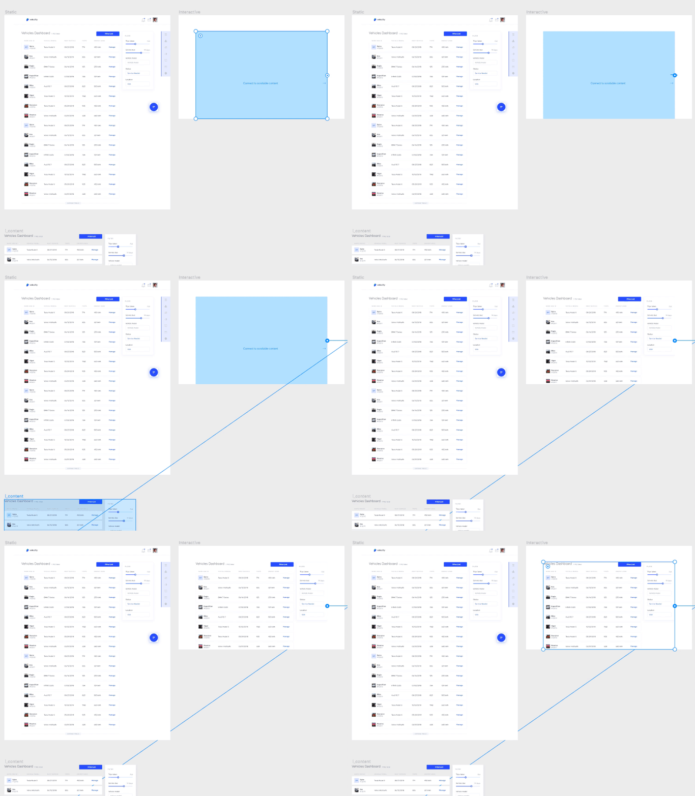
i_content. (Large preview)Lastly, select the Interactive frame and Cmd + P to enter the Preview Mode. You should be able to scroll through the content now.
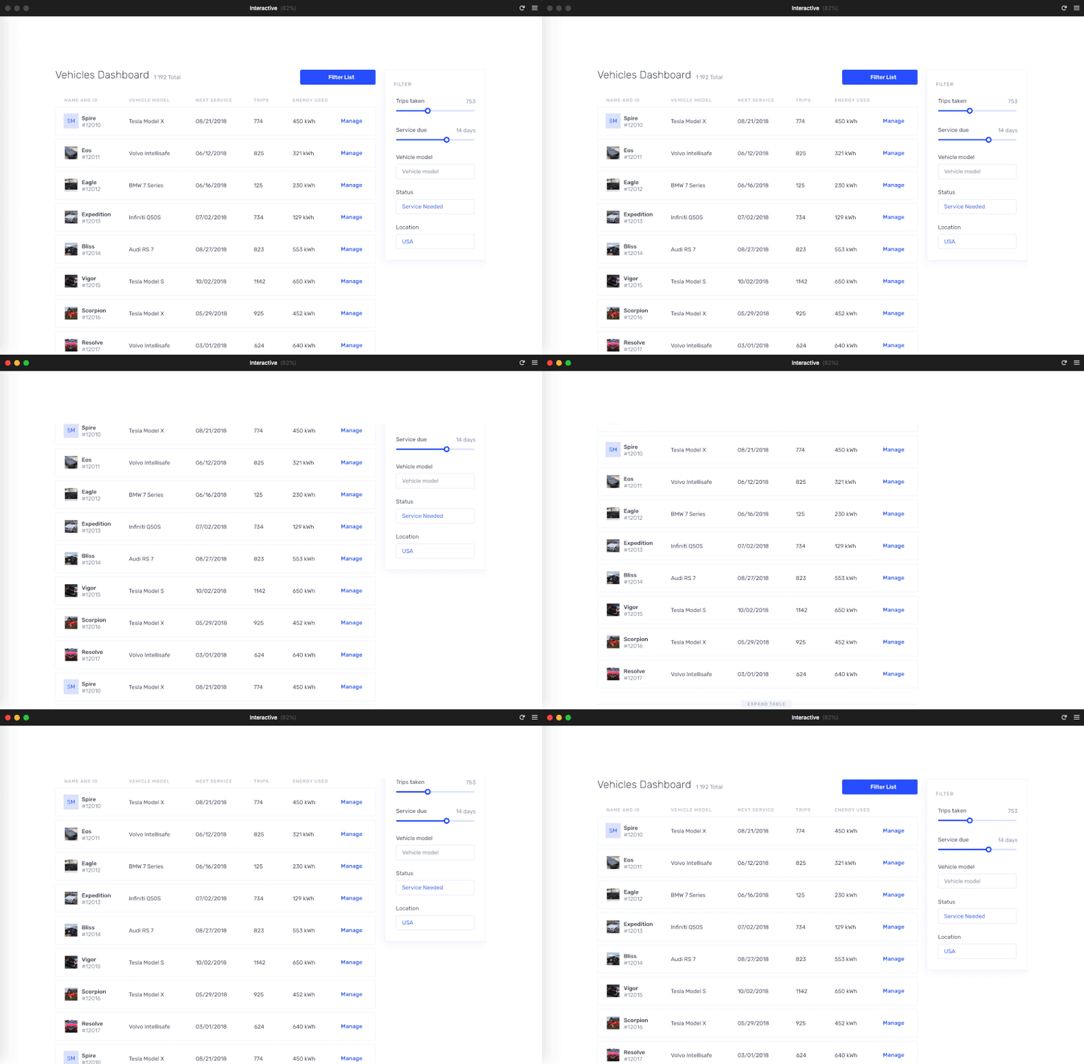
Cmd + P. (Large preview)Next, I will explain how to position the Header and the FAB (Floating Action Button) button to make them fixed while scrolling with no need for any special coding.
Fixed Elements
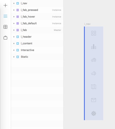
We will position the elements so as they remain fixed when scrolling through the page. To that end, duplicate the Header frame and position it in the Interactive frame. As before, change the name to i_header. Do the same with the Floating Action Button button. Your Layers panel should look like this.
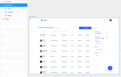
As the Header and the FAB are out of the Scroll component, they will remain fixed while scrolling.

In the next section, I will explain how to build the transition of the Header.
Header Transition
To build the transition of the Header we will make use of the Scroll away component created by Lukas Guschlbauer. To start using this component, go to the Framer Store, search for Scroll and install the Scroll Away component.

Next, go to the the Components panel, click the Scroll Away and drop it onto the canvas. Take the Header frame out of the Interactive frame and position the Scroll away component where the Header was. Change the component size as to be the same as the Header (1440x80px).
Now, select the Scroll Away component and connect it to your i_header frame. You can change multiple properties of the component such as alignment, effect, direction, easing or timing in the Properties panel. We will change the effect to Fade Move. Once that is done, the options below will change accordingly.
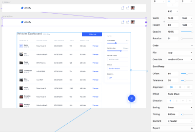
For the effect to work, we need one more thing. Select the Scroll Away Component and click the Override in the Properties panel. Click File and select New File. Then, click Override and select useScrollData. Next, click the Scroll component of your Interactive frame. Click Override again and select getScrollData in Override. To preview the result, press Cmd + P.
Note: Overrides are a unique concept to Framer X. Code overrides are functions that allow components to communicate with each other. You can write them yourself in code and apply them to any Frame or component on your canvas. These functions allow you to override visual properties like opacity and fill, and allow for interactivity and animation. Code overrides can live in any code file in your project. Framer X interprets these based on the type. You can apply any code override to any Frame or component on the canvas by selecting Override from the Properties panel.
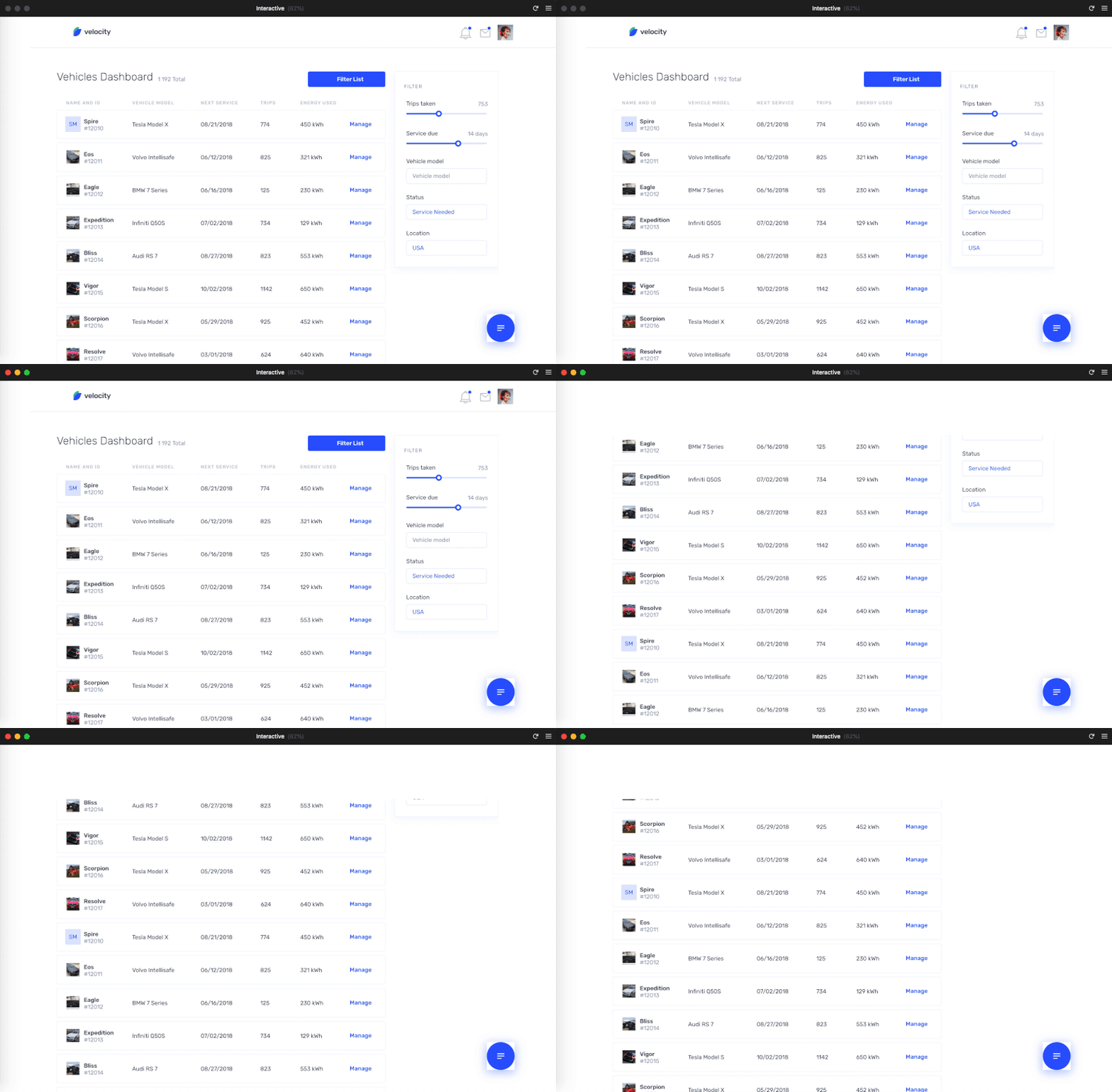
The transition works, but you will notice that there is a white space at the top. This is because the Scroll component is positioned at y: 140. Let’s change this. Increase the height of the Scroll component to occupy the whole height of the Interactive frame. Next, go to your i_content frame and position the elements 140px from the top of the frame.
Your interaction should be now similar to this one.

Note: If you need it, download the source file for this step.
Next, I will explain how to change the state of a button when interacting with it.
States For Buttons
In this section, we will work on the different states for the Floating Action Button (FAB). We will make use of the Magic Move component created by Henrique Gusso. So first of all, go to the Framer store and install this component. In the Components panel, select the component and drop it on the canvas.
At first, select the Floating Action Button frame and take it out of the Interactive frame. Next, position the Magic Move component where the FAB was. Change its size to 72×72px.
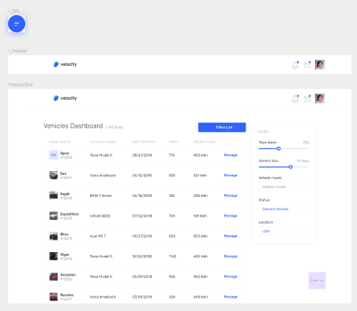
For some reason, the graphic imported from Sketch doesn’t work with this component, so we will create our own circle. In the i_fab frame, remove the frame that contains the graphic and create a circle with the same color and properties instead.
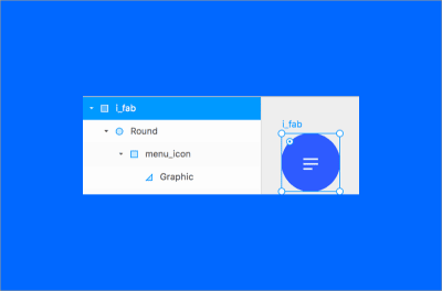
For the different states of the FAB, we need to create a Master and three Instances (default, hover, and pressed states). To do so, select the i_FAB, right-click on it, and select Create component.
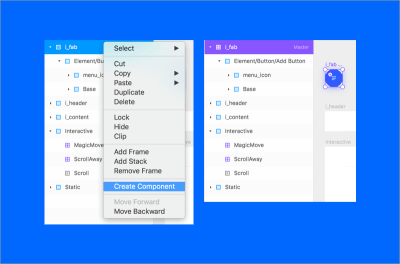
Note: Design Components are similar to Symbols in Sketch. So if you want to create reusable components for your Design System this is a very useful tool. To change the properties of your instances all at once, just select the Master and modify the properties you want. For further information, take a look at the Framer X guide to create Design Components.
Now, duplicate the i_fab Master frame 3 times to get the instances. Change the name of the new frames to i_fab_default, i_fab_hover, and i_fab_pressed.

Next, we need to connect the Magic Move component to the instances. Connect Initial to i_fab_default, Hover Start to i_fab_hover, Tap to i_fab_pressed and Hover End to i_fab_default.
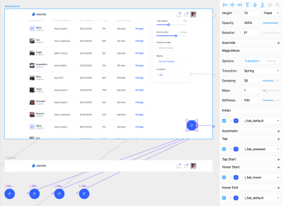
Finally, we have to go into each one of the states and change the color and scale. Go into the i_fab_hover and change its color to #2244BF. To do so, double click until you see the Fill option in the Properties panel. Next, go into the i_fab_pressed, reduce its size to 56px and change its color to #172E80. Check the result in the Preview Mode.
Note: If you see a black screen in the Preview Mode, check the compatibility of the component with your Framer Library Version. To do so, go to the page of the component in the Framer Store. If the package is not compatible with your version you will see a warning message. To change your Framer Library, navigate to File ? Framer Library Version.

Cmd + P. (Large preview)In the next section I will explain how to display the nav from right to left by clicking the FAB button.
Note: If you need it, download the source file for this step.
Open The Nav When Clicking A Button
Now, we will work on the interaction to display the Nav when clicking the FAB button. We will make use of the Link to and the Magic Move component again for the transition.
Go to the Static frame and duplicate the Nav frame. Position it in any part of the canvas and change its name to i_nav.
Now, we need to create two different states for the Nav. First, the initial state (no nav is shown) and second state, the nav is displayed. To do so, create a new Master with the i_nav (right-click and select Create component, or use the shortcut Cmd + K). Once you have the Master, duplicate two times to get the Instances. Name them i_nav_default and i_nav_displayed.
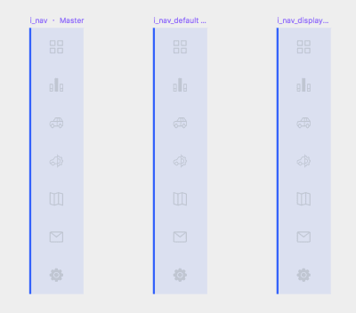
Next, position the elements of the i_nav_default out of the frame (Right: -80px).
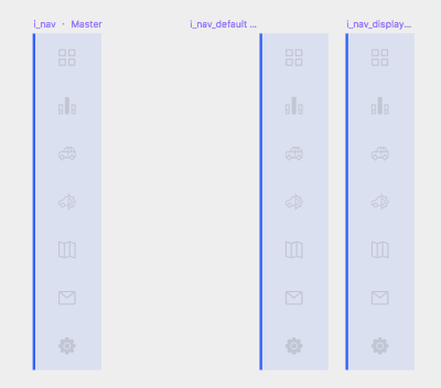
So, the Nav will be displayed automatically from right to left when clicking the FAB. To build this animation, we need to create a new Frame. Duplicate the Interactive frame. Change the name of the new Frame to Interactive02.
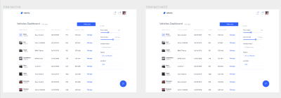
To display the Nav in this new Frame we will create a new Magic Move component. The size (80x392px) and the position (Top: 140, Right: 0) need to be the same as the Nav.
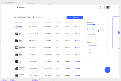
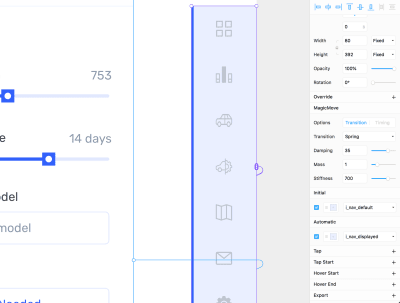
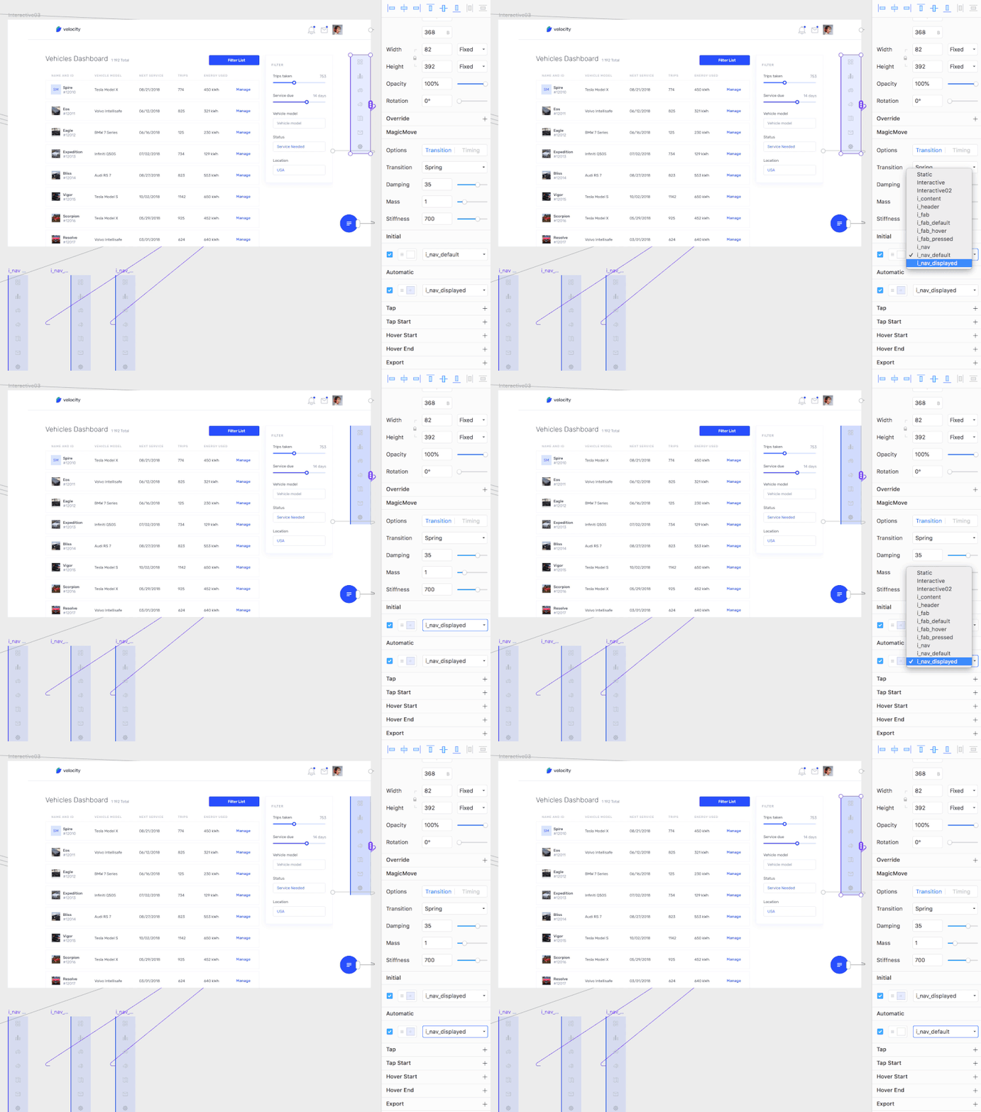
Next, go to Interactive02 frame, select the Magic Move Component and connect it to the instances. i_nav_default to the Initital state and i_nav_displayed to the Automatic state. By doing so, when entering on this second Frame, the Nav will be displayed automatically.
Now, we will build the interaction between screens by linking the Frames. Go to the Interactive frame, select the FAB, right-click ? Add Frame. Change the name of the new frame to interactive_fab. Press L (Link to) and connect it to the Interactive02 frame.
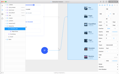
Change the transition to Instant and preview it. You can change the transition effect between screens in the Properties panel.
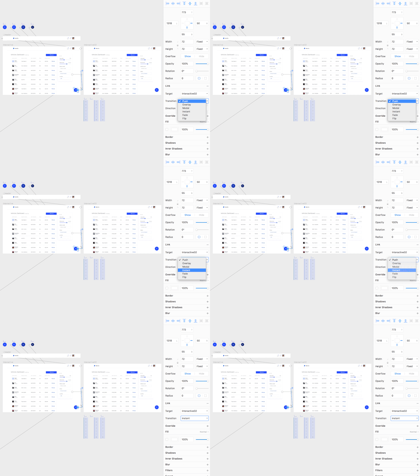
If you go to Preview Mode you will see that the Nav is shown when clicking the FAB button, but we need to reverse the interaction when clicking again on it. To do so, duplicate the Interactive02 frame (give the name Interactive03 to the new Frame).
On Interactive03 frame, select the Magic Move component and assign i_nav_displayed to the Initial State and i_nav_default to the Automatic State.
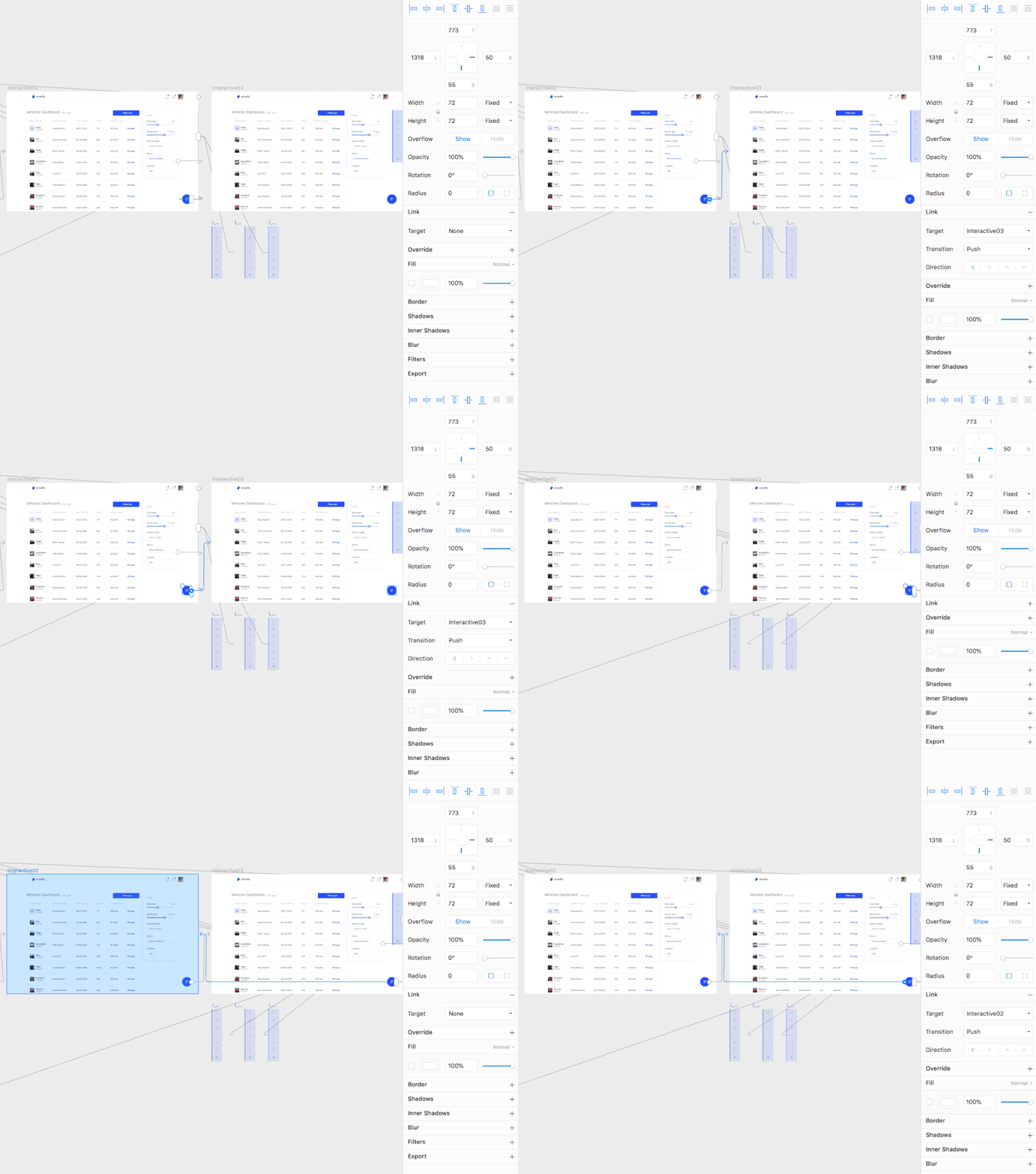
Finally, press L (Link to) the interactive_fab in the Interactive02 frame to Interactive03 frame and the interactive_fab in Interactive03 frame to the Interactive02 frame. Remember to change the transition effect in the Link properties to Instant.
Preview the interaction from the Interactive frame. The result should be as the one below:
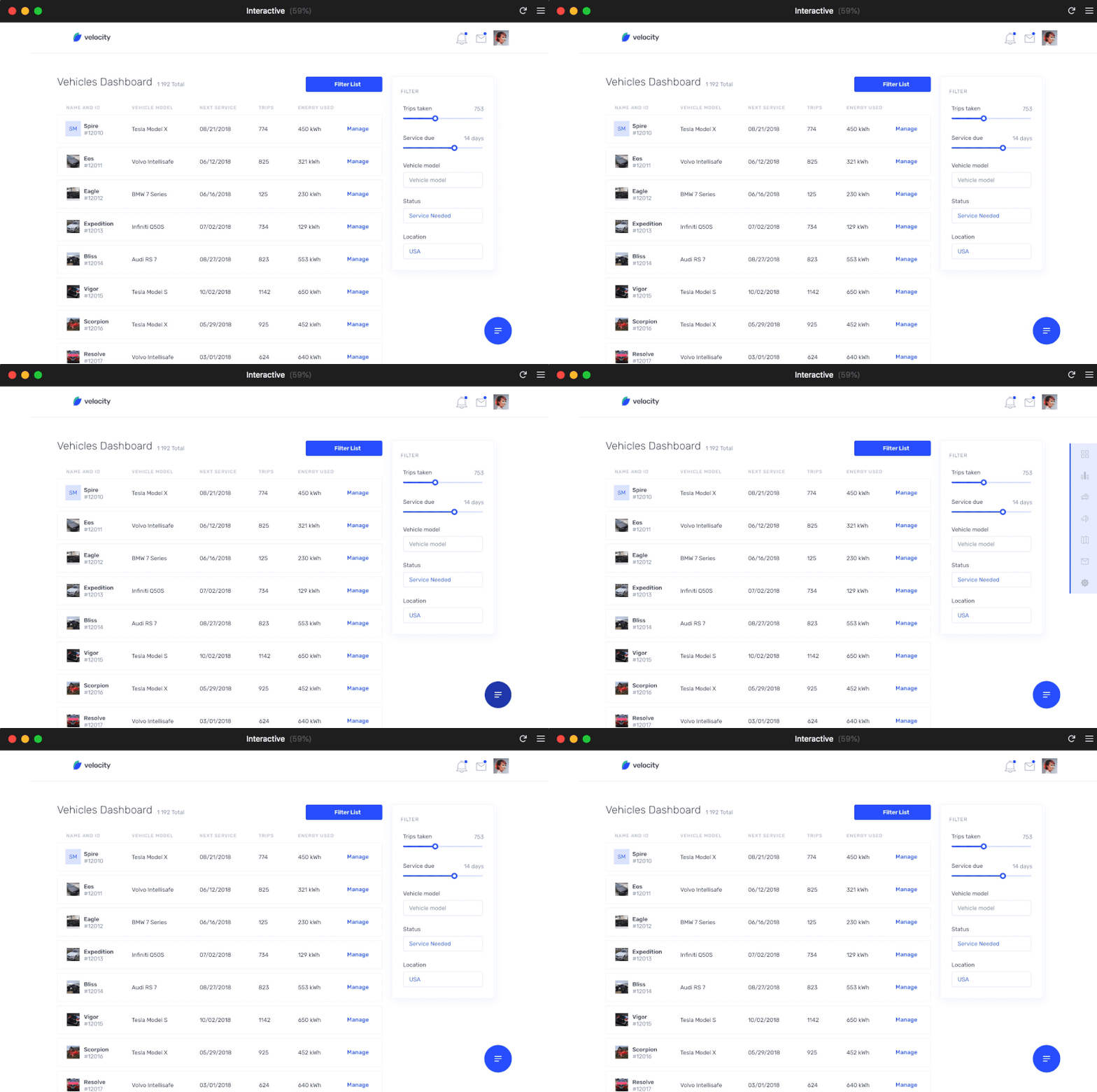
Note: If you need it, download the source file for this step.
Next, I will explain how to resize the content when clicking the FAB button.
Resize The Content When The Nav Is Displayed
To resize the content when the Nav is displayed we will write some React code. We will use Playground (a code editor integrated in Framer X) that allows you to play with some React and HTML code to build advanced animations.
Note: If you are not familiar with React, you may be interested in taking a look at some React tutorials.
So first, go to each of the interactive frames, select the Scroll component and add a Frame on top of it.
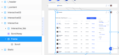
Next, go to the Properties panel and click Override. On File, select App. If you don’t see it, select New file. Then, click Edit Code. The Playground will be opened automatically.
Make sure your App file has the following line at the top. If not, add it:
import { Data, animate, Override, Animatable } from "framer"
Note: (*) This code works with Framer v. 25 and the latest API version v. 1.0.7. While this code works, keep in mind that Framer is now encouraging users to use React Hooks functions instead of class components. Learn more at the new Framer API documentation pages.
We will declare a variable called contentScaleValue and indicate that it can be animated. Also, we will set the default toggle state as true.
//Value by default
const contentScaleValue = Animatable(1);
let toggle = true;
Then, we will create a function ResizeContent for the Content to be scaled when clicking the FAB. Besides that, we have to set its originX and originY as so it scales from top left.
//Assign to content
export const ResizeContent: Override = props => {
 return {
   scale: contentScaleValue,
   originX: 0,
   originY: 0
 };
};
Next, we will create a second function togglePosition for the FAB. We will say that onTap, if toggle is true, Content will be rescaled and the toggle state will change to false. Otherwise, do the reverse animation.
//Assign to FAB
export const togglePosition: Override = props => {
 return {
   onTap: () => {
     if (toggle) {
       animate.ease(contentScaleValue, 0.9, {duration: 0.2});
       toggle = false;
     } else {
       animate.ease(contentScaleValue, 1, {duration: 0.2});
       toggle = true;
     }
   }
 };
};
After writing this code, select the Frame you created on top of your Scroll components, go to the Override section in the properties panel and select File: App, Override: ResizeContent. Next, select the FAB, File: App, Override: togglePosition.

Check that the result works as the following.

Cmd + P. (Large preview)Note: If you need it, download the source file for this step.
Prototyping
Go to the the Sketch file and import (copy and paste) the User profile artboard into Framer X. Once in Framer, duplicate the Frame. Give it the name Interactive_user_profile.

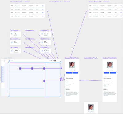
We will build automatic transitions for the right sidebar, the boxes at top and the content. Take each of the Frames out of the Interactive_user_profile frame.
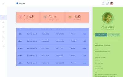
Create a Magic Move component for each of the elements and position them in the Interactive_user_profile frame.

Next, create a Master and two instances for each of the components. For the sidebar, position the first instance out of the Frame. For the boxes and the content, change the opacity of the first instance to 0.
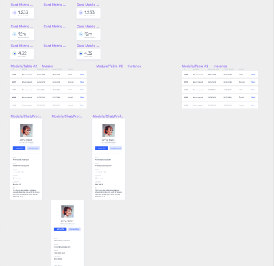
Connect the Magic Move component to each of the instances. Assign the first instance to the Initial State and the second instance to the Automatic State.
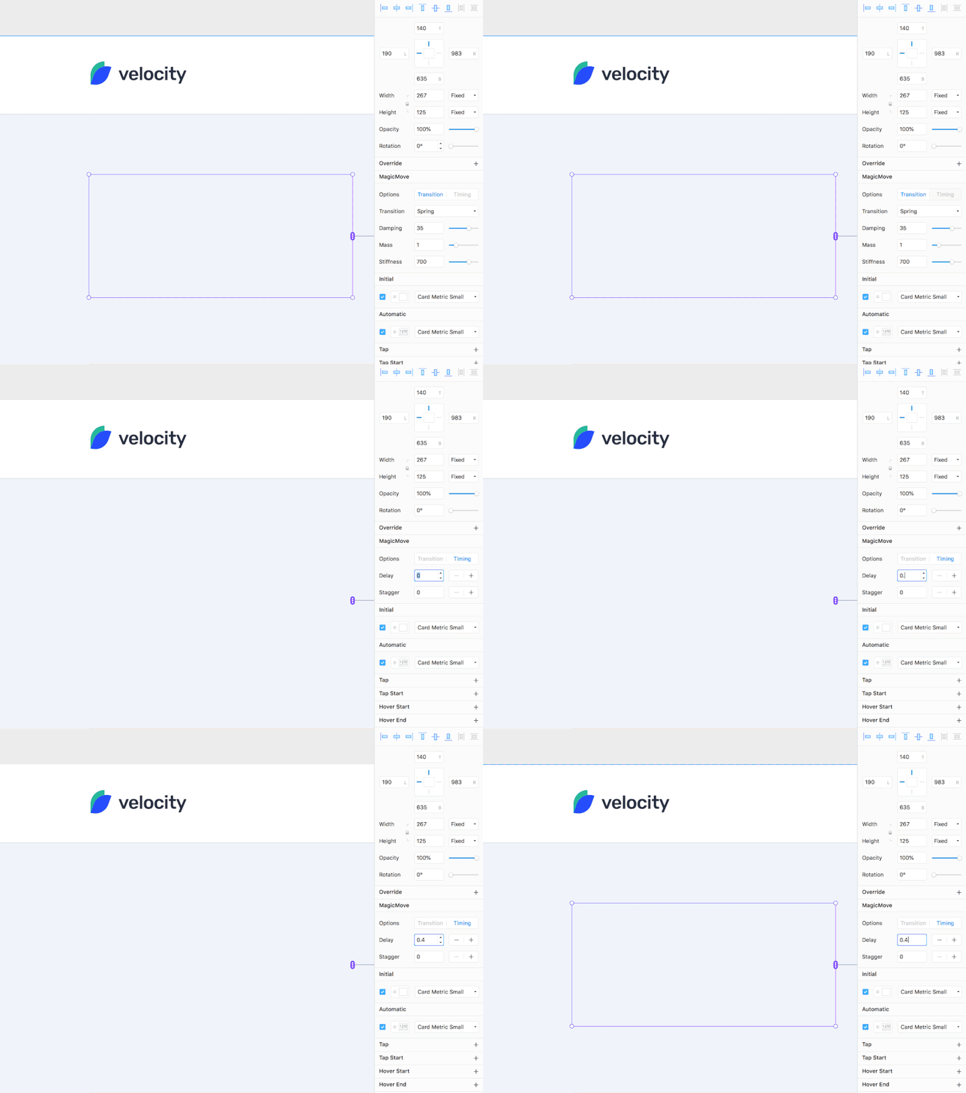
In the Properties panel, you can change the delay of each of the Move Magic components to set up the order to be shown. Assign the next delays:
- Sidebar: no delay
- First box: 0.4 delay
- Second box: 0.6 delay
- Third box: 0.8 delay
- Content: 1 delay.
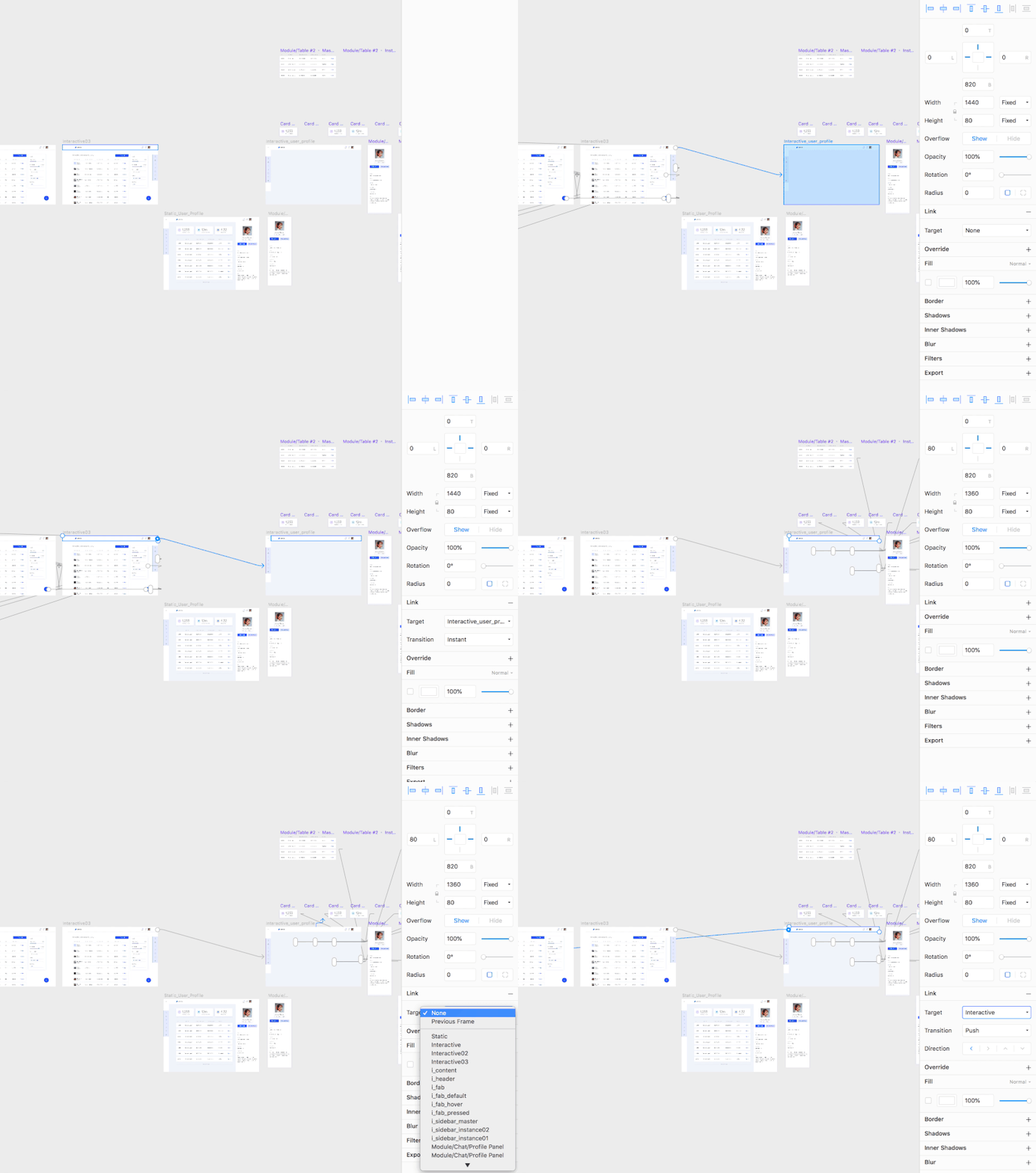
Go to the Interactive03 frame, select the header and Link to the Interactive_user_profile frame. In this frame, select the header and Link to Interactive frame. Remember to change the transition between the screens to Instant. Check the results.
Note: If you need it, download the source file for this step.

Cmd + P to check the result. (Large preview)Sharing The Prototype
To share the prototype, click File ? Export Web Preview (Cmd + E). To see the prototype, open the index.html. It will launch the prototype in a web browser.
Conclusion And Takeaways
If you are looking for a design tool specialized in interaction, Framer X is the perfect one. Framer X allows you to build simple transitions between screens, micro interactions, but also to design complex interactions making use of React code.
By using Framer X, you will speed up your design process and will be able to better communicate the interaction of your designs to the team and stakeholders.
- You can still design the interface in Sketch and paste your designs into Framer X to build the interaction of the elements there.
- For this tutorial, I have have been using a design imported from Sketch, but you can create your layouts in Framer X as well.
- There are multiple UI kits available in the Framer Store to help you build your design systems.
- There is no single approach on how to build an interaction in Framer X. Experiment and learn.
- To build some quick interactions faster, make use of the pre-built components in the Framer Store.
- You just need a minimal coding knowledge in order to start building complex interactions in Framer X and there are multiple tutorials available online to start learning how to do it.
 (mb, yk, il)