Using DevTools to Improve the UX Design to Development Process
I’d like to tell you how I see code and design intersect and support one another. Specifically, I want to cover how designers can use code in their everyday work. I suggest this not because it’s a required skill, but because even a baseline understanding of coding can make designs better and the hand-off from design to development smoother.
As a UX Designer, I am always looking for good ways to both explore my UX design problems and communicate the final designs to others. Over the past 30 years, my work has always involved working alongside developers, but generally there has been a great divide between what I do and what developers do.
I can code at a basic level. For example, I’ve helped teach C to undergraduates back when I was a post-graduate student. I’ve worked on the usability of JDeveloper Oracle’s Integrated Development Environment (IDE) for Java. I also worked for a very short while on simplifying the UX of a WordPress content management environment to make it accessible to less technical users. This required a good understanding of HTML and CSS. I also volunteered on the design of the PHP website and had to develop some understanding of the server side of web development.
But even given these experiences, I am not a developer in any true sense of the word. If I happen to be looking at code, it’s in a “just in time” learning model — I look up what I need and then hack it until it works. Learning this way has often been frowned upon, a bit like learning to drive without lessons. You pick up bad development habits but maybe that’s OK for the work I do.
So, no I don’t develop or write code. My day-to-day work is mostly been spent drawing, talking and gathering requirements. As far as design goes, I’ll start by sketching concepts in a notebook or using Balsamiq. Then I draw up UX wireframes and prototypes using tools like Axure, Adobe XD, InVision Studio, Figma and Sketch. By the time I’m ready to hand off my deliverables to development, all the visual assets and documentation have been defined and communicated. But I don’t step over the line into code development. That is just not my area of expertise.
So, why should designers know code?
We’ve already established that I’m no developer, but I have recently become an advocate for designers getting a good feel for how design and code interact.
In fact, I’d call it “playing with code.” I am definitely not suggesting that UX designers become developers, but at the very least, I think designers would benefit by becoming comfortable with a basic understanding of what is currently possible with CSS and best practices in HTML.
Being experimental is a huge part of doing design. Code is just another medium with which we can experiment and build beautiful solutions. So, we’re going to look at a couple of ways designers can experiment with code, even with a light understanding of it. What we’re covering here may be obvious to developers, but there are plenty of designers out there who have never experimented with code and will be seeing these for the first time.
So, it’s for them (and maybe a refresher for you) that we look at the following browser tools.
DevTools: The ultimate code playground
One of the concerns a UX designer might have is knowing how a design holds up once it’s in the browser. Are the colors accurate? Are fonts legible throughout? How do the elements respond on various devices? Will my grey hover state work with the white/grey zebra striping on my application grids in practice? These are some of the styling and interaction issues designers are thinking about when we hand our work off for development.
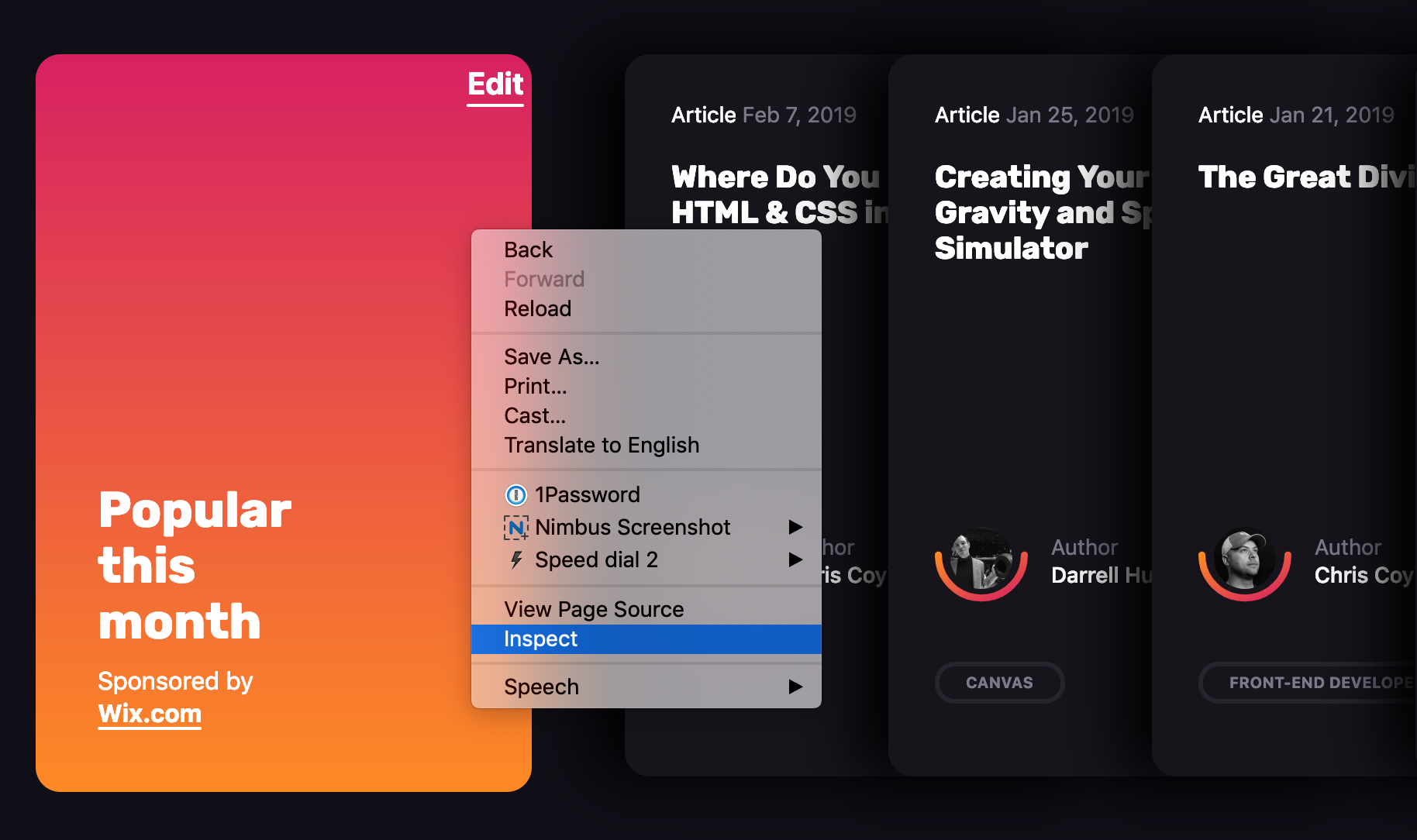
This is where DevTools can be a designer’s best friend. Every browser has its own version of it. You may have already played with such tools before. It’s that little “Inspect” option when right clicking on the screen.
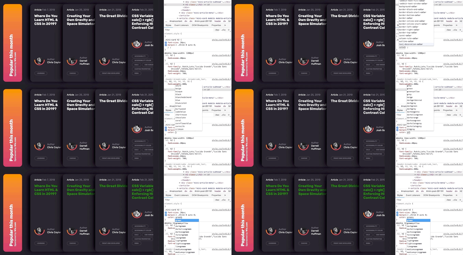
What makes DevTools such a wonderful resource is that it provides a way to manipulate the code of a live website or web application without having to set up a development environment. And it’s disposable. Any edits you make are for your eyes only and are washed away the very moment the browser refreshes.
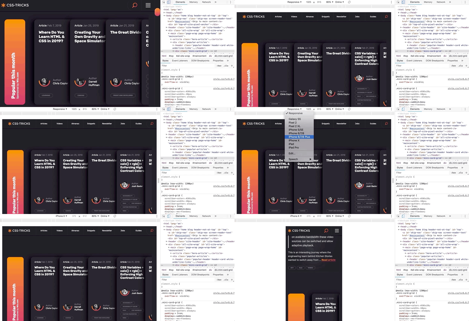
Further, DevTools can mimic other devices.
And, if you haven’t seen it yet, Firefox released a wonderful new shape path editor that’s very valuable for exploring interesting designs.
Over the past few months, I have been working on a complex web client for an enterprise-level application. Last sprint, my UX design story was to explore the look of the entry page of the web application and how to introduce a new color scheme. It was hard to envision how the changes I was making were going to impact the tool as a whole as some of the components I was changing are used throughout the product.
One day, when discussing a design decision, one of the developers tested out my suggested change to a component using the latest DevTools in his browser. I was amazed by how much DevTools has grown and expanded since I last remember it. I could immediately see the impact of that change across our whole web application and how different design decisions interacted with the existing design. I started to experiment with DevTools myself and was able to preview and experiment with how my own simple CSS changes to components would impact the whole web application. Super helpful!
However, it was also a little frustrating to not be able store my experiments and changes for future reference. So, I went exploring to see what else was out there to support my design process.
Chrome browser extensions
DevTools is are amazing right out of the box, but experimenting with code gets even more awesome when browser extensions are added to the mix. Chrome, in particular, has a couple that I really like.
Chrome Extension 1: User CSS
User CSS is a Chrome browser extension that allows you to save the changes you make in DevTools in an editable CSS code tab. These CSS changes are automatically executed on that page if User CSS is enabled. This means that you can set up CSS overrides for any page on the web, view them later, and share them with others. This can be an incredible tool when, say, doing a design review of a staging site prior to release, or really any design exploration for a web application or website that is viewable in a browser.
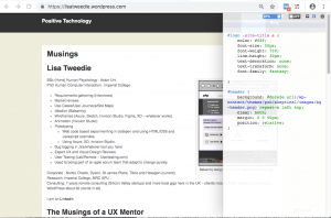
The first thing I do with User CSS is make the changes in the Chrome elements panel. Then, I simply cut and paste the CSS changes from Chrome’s DevTools to the User CSS code tab as I am going along. This video shows in detail the different ways to edit CSS, HTML and Javascript in Chrome DevTools and how I use UserCSS.
User CSS has a nice built-in code editor, so my code is always well formatted and includes syntax highlighting so I don’t have to worry about that sort of thing. I particularly like the fact that overrides are executed immediately so you can see changes on the fly. It also has a useful switch that allows you to turn your overrides on and off. This makes it very simple to demonstrate a set of changes to a team. This extension has allowed me to easily present a comparison between an existing page design and proposed changes. I’ve even used it to make a simple video demonstrating the proposed design changes.
In this video I make some simple edits to my web page and then show how I can turn on and off the edits by simply clicking the on/off button on User CSS:
This extension is a perfect if you all you need to do is edit CSS, particularly if you have some very simple design changes to make want to those changes to persist. However, the complexity of a design increases, I have found myself wanting to save more than one snippet of code at a time. Copying and pasting code in and out of the User CSS editor was becoming a pain. I wanted something with more flexibility and freedom to experiment. I also wanted to be able to look at simple changes to the HTML of my web application and even play with a bit of JavaScript.
That’s where the next extension comes into play.
Chrome Extension 2: Web Overrides
The second Chrome extension I found is called Web Override and it provides a way to override HTML, CSS and JavaScript. All of them! This is presented as three tabs, much the same way CodePen does, which makes it a very powerful tool for creating rough working design prototypes.
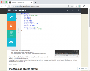
Web Overrides also allows you to save multiple files so that you can switch different parts of a design on or off in different combinations. It also quickly switches between the different options to show off different design concepts.
This video shows how I added an HTML element into a page and edited the new element with some basic CSS:
Using the HTML tab makes it possible to edit any element on the page, like swap out a logo, remove unnecessary elements, or add new ones. The JavaScript tab is similar in that I can do simple changes, like inject additional text into the website title so that I can test how dynamic changes might affect the layout — this can be useful for testing different scenarios, such as differences with internationalization.
These edits may be trivial from a coding perspective, but they allow me to explore hundreds of alternative designs in a much shorter time and with a lot less risk than scooting pixels around in a design application. I literally could not explore as many ideas as quickly using my traditional UX prototyping tools as I can with this one extension.
And, what is more, both me and my team have confidence in the design deliverables because we tested them early on in the browser. Even the most pixel-perfect Photoshop file can get lost in translation when the design is in the browser because it’s really just a snapshot of a design in a static state. Testing designs first in the browser using these extensions prove that what we have designed is possible.
On the flip side of this, you might want to check out how Jon Kantner used similar browser extensions to disable CSS as a means to audit the semantic markup various sites. It’s not exactly design-related, but interesting to see how these tools can have different use cases.
What I’ve learned so far
I am excited about what I have learned since leaning into DevTools and browser extensions. I believe my designs are so much better as a result. I also find myself able to have more productive conversations with developers because we now have a way to communicate well. The common ground between design and code in rapid prototypes really helps facilitate discussion. And, because I am playing around with actual code, I have a much better sense about how the underlying code will eventually be written and can empathize a lot more with the work developers do — and perhaps how I can make their jobs easier in the process.
It has also created a culture of collaborative rapid prototyping on my team which is a whole other story.
Playing with code has opened up new ideas and encouraged me to adapt my work to the context of the web. It’s been said that getting into the browser earlier in the design process is ideal and these are the types of tools that allow me (and you) to do just that!
Do you have other tools or processes that you use to facilitate the collaboration between design and code? Please share them in the comments!
The post Using DevTools to Improve the UX Design to Development Process appeared first on CSS-Tricks.
