5 Steps to Building an Amazing App Website With 20 Examples for Inspiration
If you’re thinking of turning your focus more toward app website design, we have both good news and bad news for you.
The good news is, there’s a growing need for app websites, which could mean plenty of work for you. The bad news is, as more and more app websites are being built, visitors are beginning to suffer from “app website fatigue”. If your site looks like all the others, you’ll be lucky if you can keep a visitor interested for more than 5 seconds – not anywhere long enough to make a sale, much less convince that visitor to stick around.
The solution is pretty straightforward. Build a better website.
Easier said than done, right?
Follow the steps below, and you can start creating app websites that are not only attention-getting, but potential conversion powerhouses.
5 steps to Creating “Take Your Breath Away” App Websites
Step 1: Choose a “can hardly stop looking at it” color palette
Your choice may to some extent be a matter of taste. You’ll find it helpful to view a few examples, like those presented here. Whatever color palette you choose; it should follow these three simple rules:
– It should instantly attract a visitor’s attention
– It needs to be on-brand, and
– It also needs to visually support your website’s message
Over utilizes BOLD color touches in a way that instantly attracts attention.
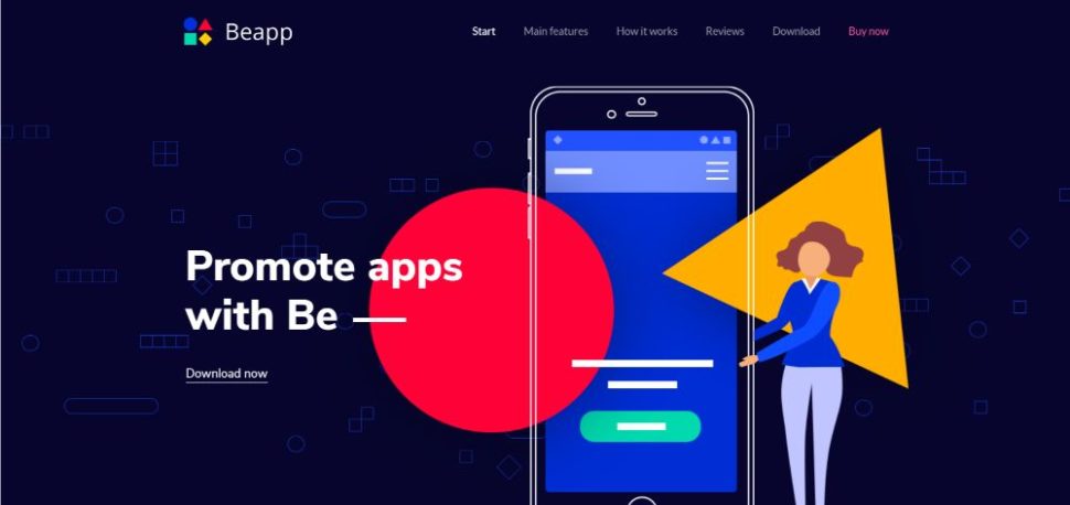
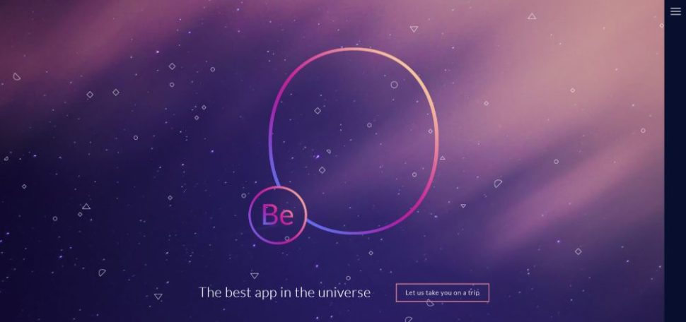
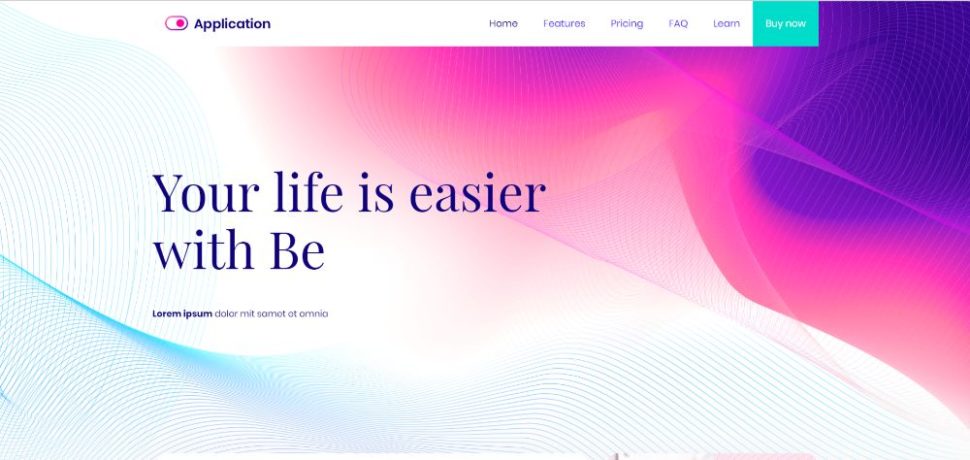
This Be Theme pre-built website provides another excellent example of an eye-grabbing color palette.
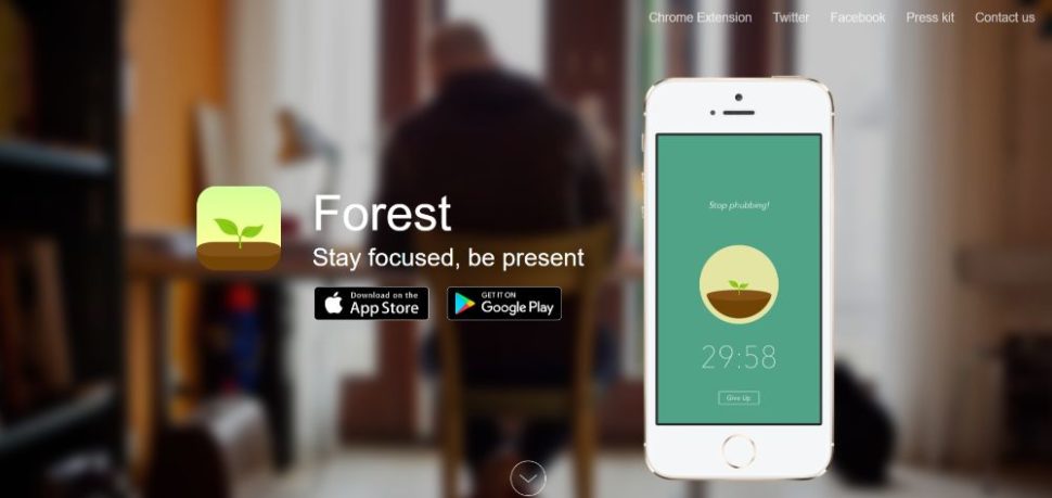
Forest aligns its color palette with its brand with earth colors like greens and browns; a color scheme that makes the app visually memorable.
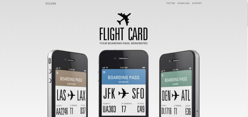
FlightCard uses a subtle, cold color palette to reinforce the message that boarding passes are so easy to use that you almost forget you’re even carrying one.
Looking for a color palette that will appeal to a larger audience? BeApp2 is a perfect example.
Step 2: Display crystal-clear product pics
If people can’t immediately see what the app looks like, the 5-second rule is going to kick in. They can usually tell at a glance if it will be easy to use or involves a not-so-flat learning curve. They can also see how it differs, if it does, from the other 400 or so apps on the market.
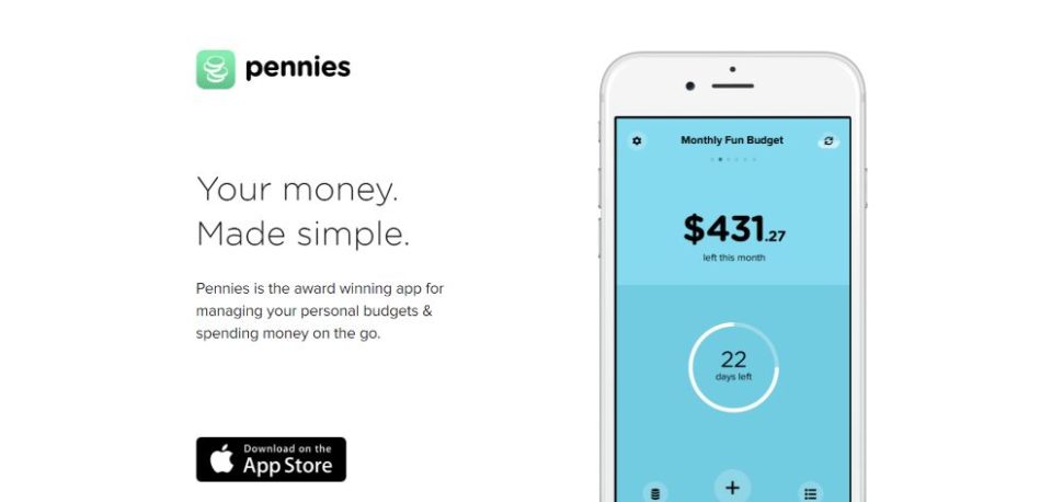
Pennies emphatically displays what their app looks likes on a smartphone. At a glance, you can tell how intuitive it is to use and even figure out how the color codes function.
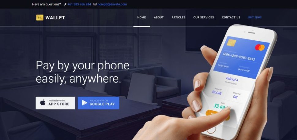
You can create a similar app website with BeWallet as your starting point. This pre-built website was designed from scratch for financial apps; a potential gold mine since there are SO many financial apps out there in dire need of a decent website – and you can do much better than “decent”.
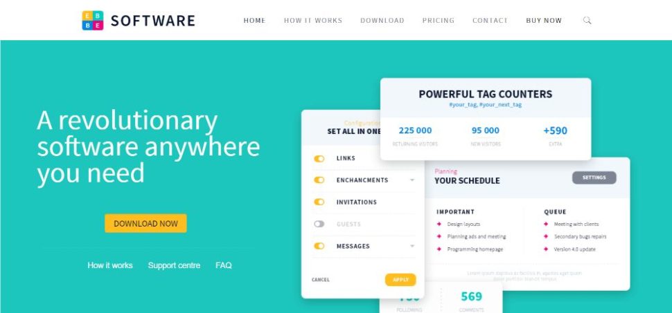
Or, you could choose a more general pre-built website like BeSoftware if you want to display crystal-clear pics from inside the app.
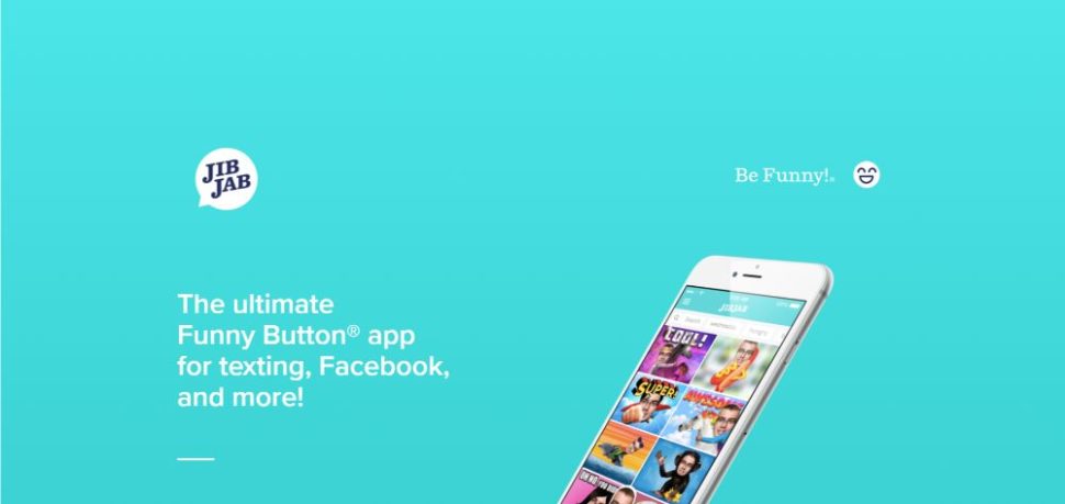
JibJab takes things one step further by employing a simple yet persuasive tactic to show what its app does. It shows the before and after.
Step 3: Show visitors how the app works
If people can’t tell how an app works, they’re less likely to become interested. Helping them image themselves as actual users is a powerful marketing tactic
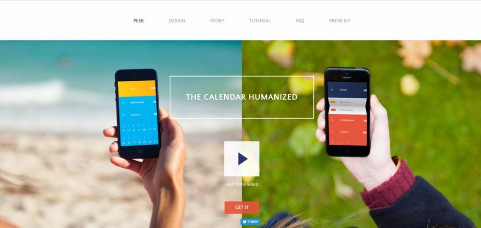
PeekCalendar has placed a video on its hero section. It demonstrates how people can use their app to better organize their lifestyle.
BeApp3 allows you to give visitors the full app experience by adding product images and a video that shows exactly how the app looks and works.
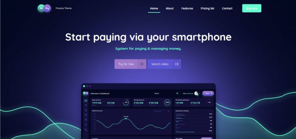
BePay has placed a Watch Video CTA button right above the fold, so visitors can immediately go to their product demo video.
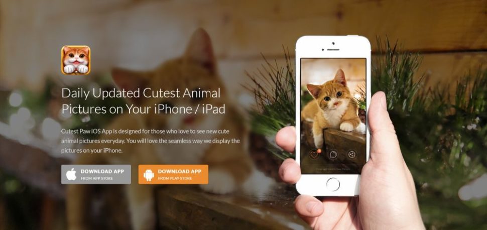
CutestPaw is a pet-lover’s dream app. Everything is cleverly rolled up into a single hero image that shows how the app works AND what it looks like on a smartphone. Anyone who likes little kittens might be tempted to purchase the app.
Step 4: (Over)use “white” space
White space is sometimes a design element you just can’t use too much of. A page that’s 95+% white space can often do the best job of highlighting a message. White space is so important that it’s an app website’s #1 visual element.
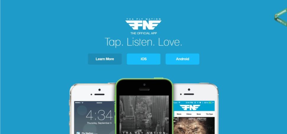
Tha Fly Nation offers a clean, airy design that directs the eye toward focusing on the site’s key elements.
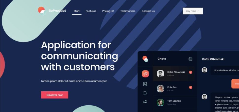
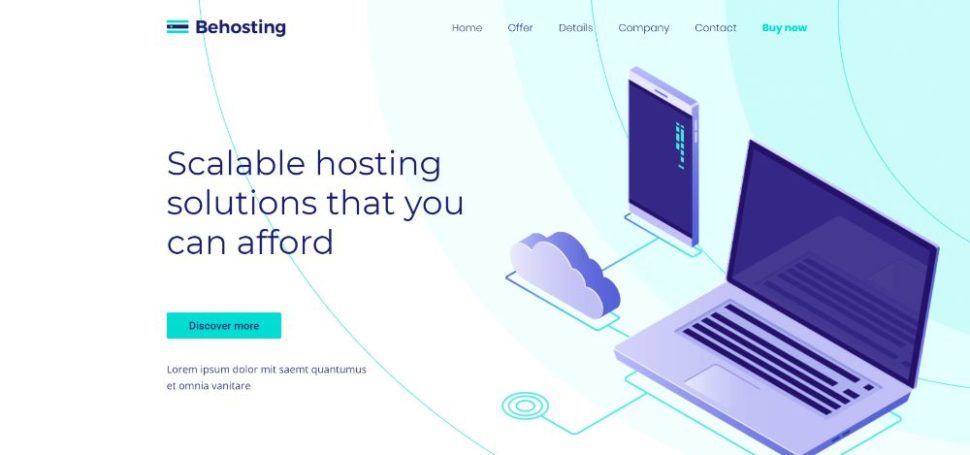
You can create a similar experience with BeProduct4 or BeHosting2— two pre-built websites where white space is effectively used to enhance the visitor’s experience and emphasize the critical elements on the page.
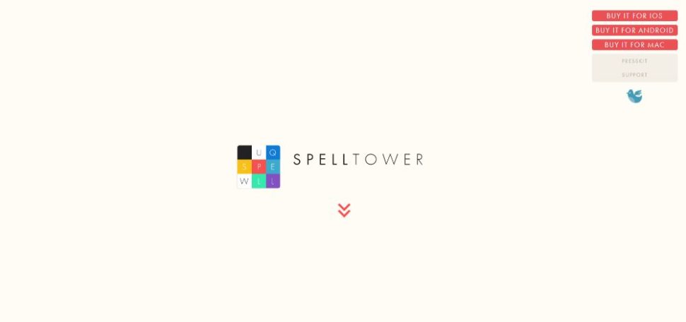
SpellTower is perhaps THE most extreme when it comes to white space. It’s part of their brand and it drives the message home like no other. Now, you can understand why 95% whitespace can be so effective.
Step 5: Make your CTAs grab them by the eyeballs
The next worst thing to forgetting to include a CTA button is to have one that doesn’t stand out—really stand out. A CTA button has to be so big, bright, and bold that a visitor simply can’t resist clicking it.
Big, bright, and bold hints at greater things to come.
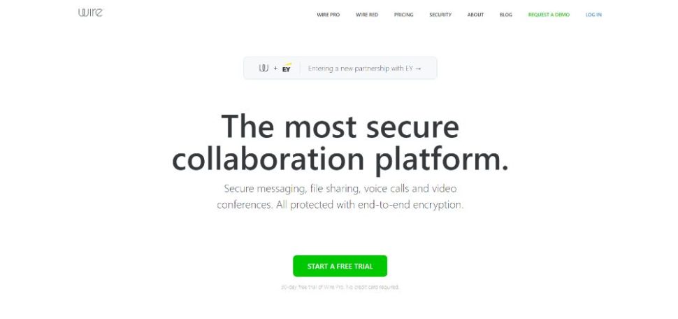
Wire‘s CTA button clearly stands out above the fold: it’s big and bold enough to draw your attention to it the instant you’ve finished reading the headline. It’s centered on the page, like a “gate” you can’t move around, but need to click if to move forward.
BeERP uses precisely the same bright-green button for its main CTA. A secondary, somewhat nondescript optional button is on the right.
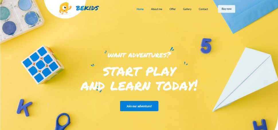
You can also direct attention to your CTA by having it match other elements on the page. BeKids is a great example of this. You can see how the blue of the CTA button matches several of the hero section’s visual elements.
Summary
As you can see, these steps are not complicated at all. They give you a surefire means of building an app website that’s eye-catching. It will stand out from the competition and is built for conversion.
Use the most stunning visuals you can get your hands on, don’t skimp on the use of white space. You need to know what your audience wants, and you’ll be off and running.
As simple as these steps are, building a quality website takes time. That’s true for app websites as well. You might be juggling multiple projects and facing one emergency deadline after another. Then, you might try the following approach.
You’ll find a large and impressive gallery of 400+ pre-built websites on Be Theme. You can select from it and customize it to your liking. You’ve seen several in the foregoing examples.
They are functional and visually impressive. They feature interactive elements, stunning effects, and intuitive navigation. Personalize one to fit your app and you’re good to go!
Read More at 5 Steps to Building an Amazing App Website With 20 Examples for Inspiration
