Menus with “Dynamic Hit Areas”
Flyout menus! The second you need to implement a menu that uses a hover event to display more menu items, you’re in tricky territory. For one, they should work with clicks and taps, too. Without that, you’ve broken the menu for anyone without a mouse. That doesn’t mean you can’t also use :hover. When you use a hover state to reveal more content, that means an un-hovering state needs to hide them. Therein lies the problem.
The problem is that if a submenu pops out somewhere on hover, getting your mouse over to it might involve moving it along a fairly narrow corridor. Accidentally move outside that area, the menu can close, and it can be an extremely frustrating UX moment.
We’ve covered this before in our “Dropdown Menus with More Forgiving Mouse Movement Paths” article.
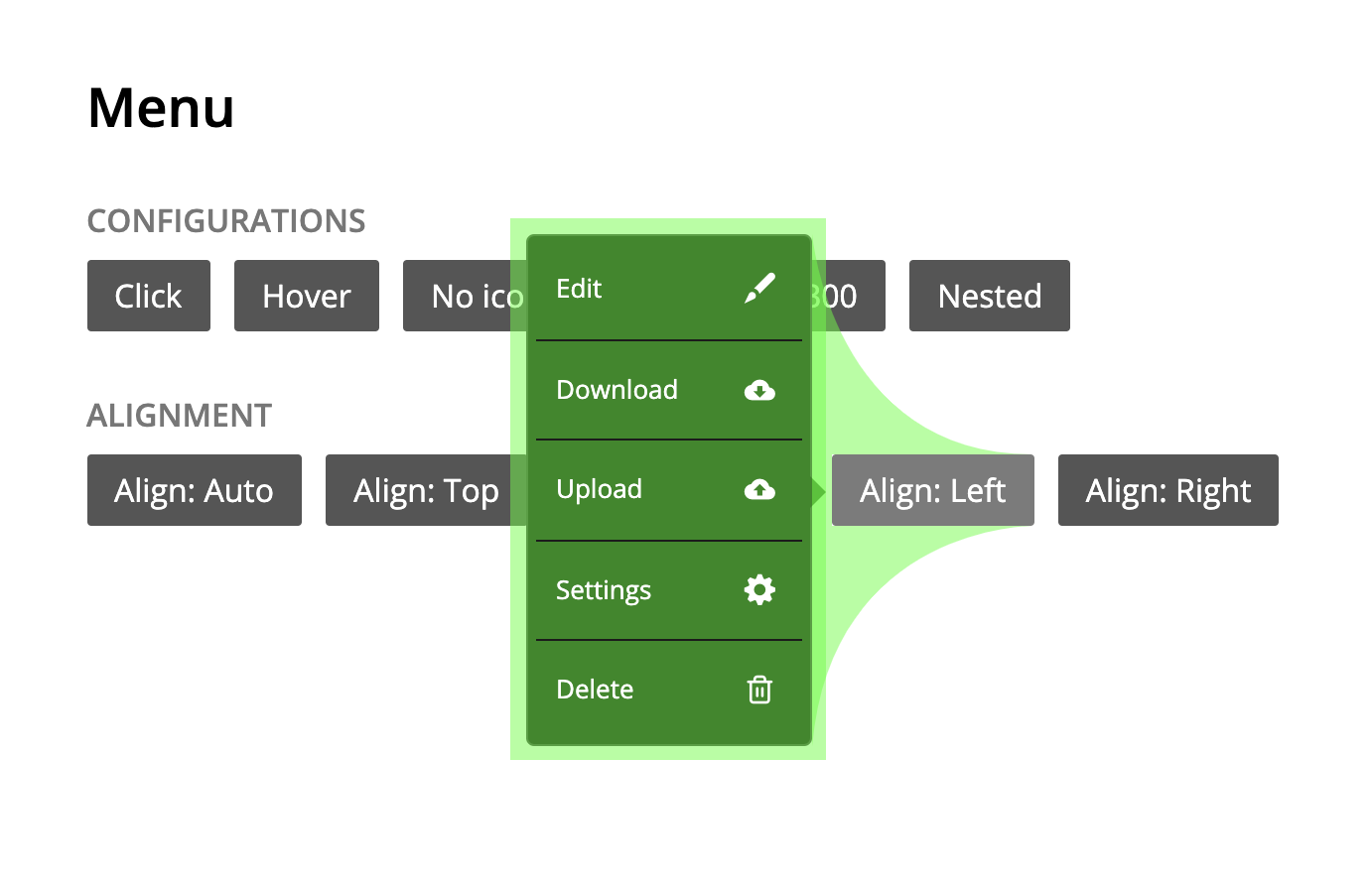
:hover, or a mouseleave or a mouseout occurs.The most compelling examples that solve this issue are the ones that involve extra hidden “hit areas.” Amazon doesn’t really have menus like this anymore (that I can see), and perhaps this is one of the reasons why. But in the past, they’ve used this hit area technique. We could call them “dynamic hit areas” because they were drawn based on the position of the parent element and the submenus:

I haven’t seen a lot of implementations of this lately, but just recently, Hakim El Hattab included a modern implementation of this in his talk at CSS Day 2019. The implementation leverages drawing the areas dynamically with SVG. You don’t actually see the hit areas, but they do look like this, thus forming paths for that prevent hover-offs.

I’ll include a YouTube embed of the talk starting at that point here:
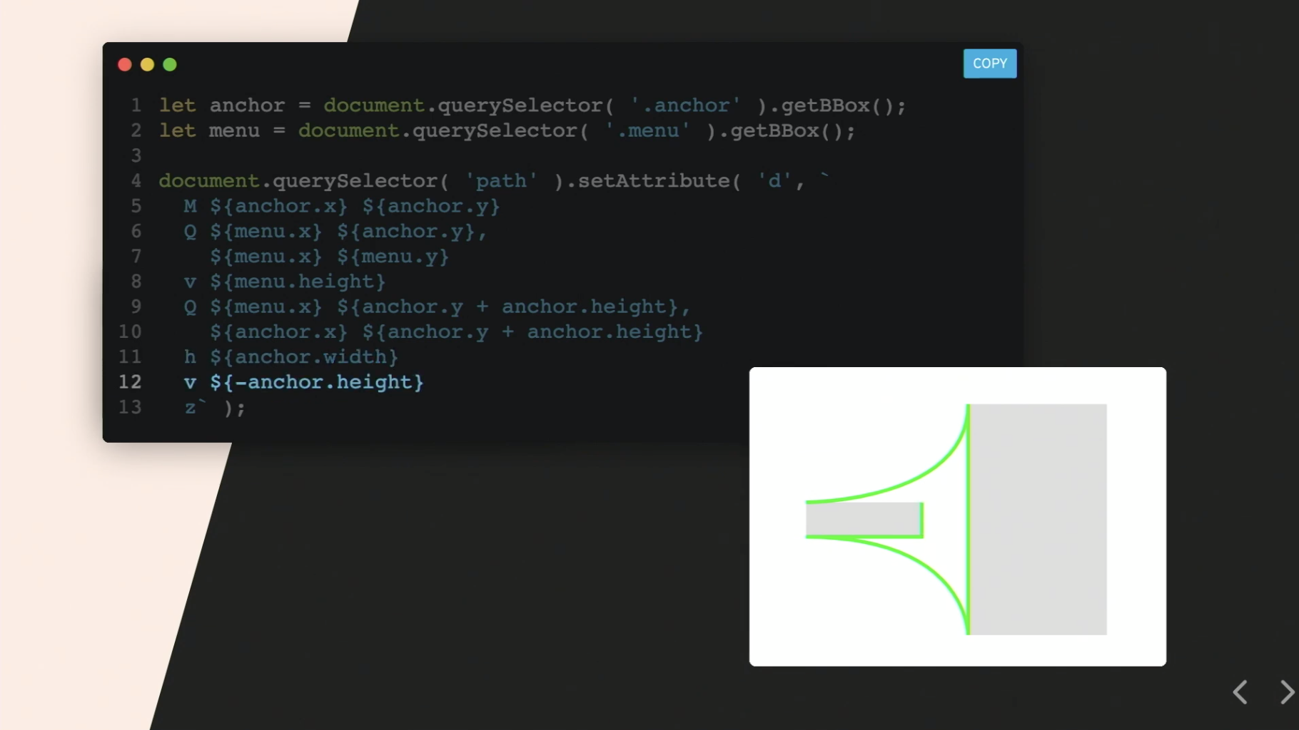
The way he draws the hit area is so fancy it makes me all kinds of happy:

The live demo of it is up on the Slides.com pattern library thingy.
The post Menus with “Dynamic Hit Areas” appeared first on CSS-Tricks.