10 Best Design Systems for 2019
A design system helps everyone in your business to maintain brand consistency. It’s a collection of guidelines that explains how your branding assets should be used in everyday communication and marketing efforts.
A design system usually consists of general brand guidelines, color usage, brand tone and voice, typography, patterns, and any other visual element that helps convey your brand principles. Use them as an inspiration and a learning material to help you create a cohesive design system for your own business and brand.
1. Material
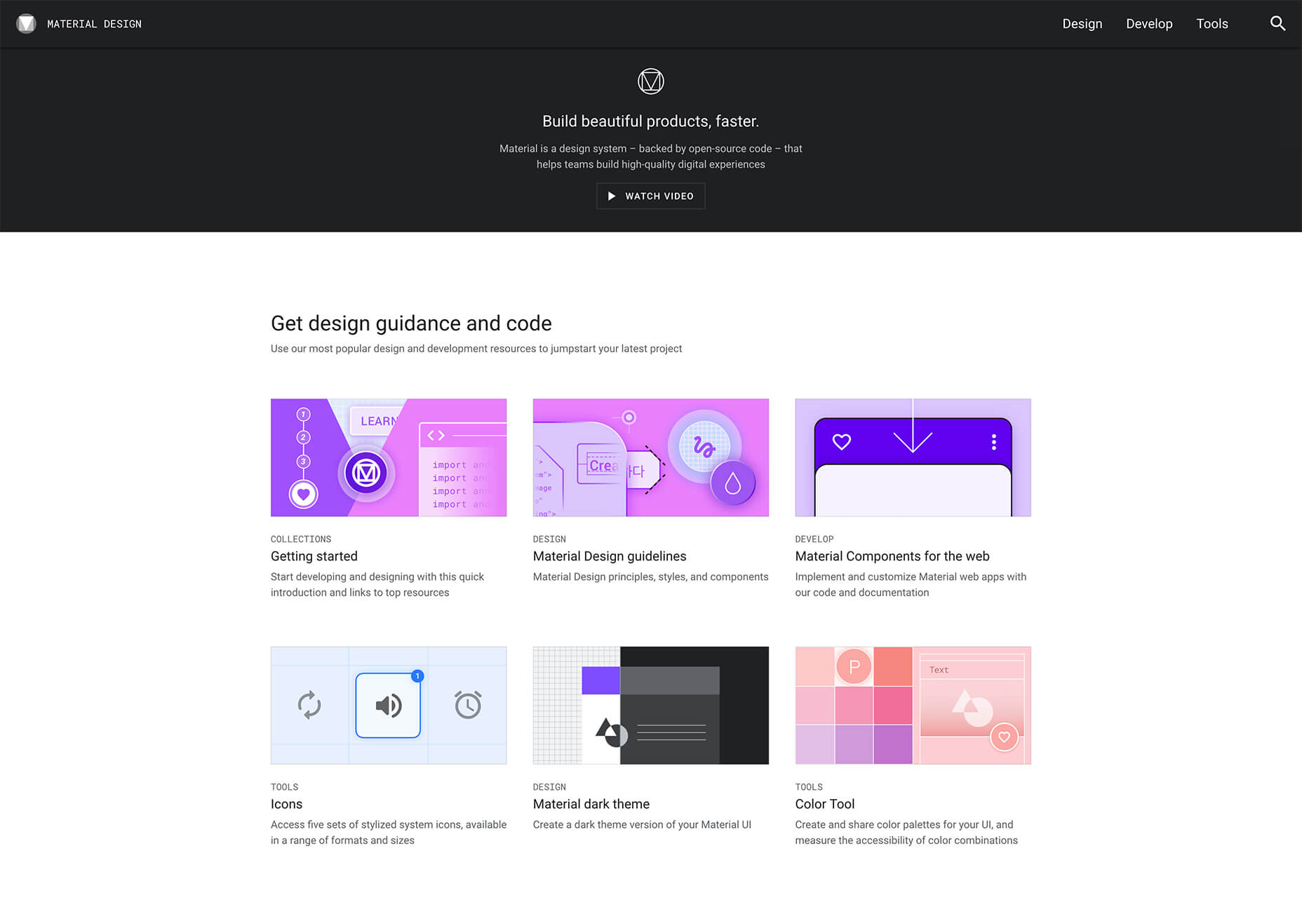
Material is a modern design system developed by Google. The design system itself is a treasure trove of useful guides and helpful tools that can be used by app developers to design an app that adheres to Material style as well as anyone else that wants to create a modern and trendy design. You will find a color palette picker, typography guidelines, icon design best practices, the ability to create a dark material theme, and much more.
2. Fluent
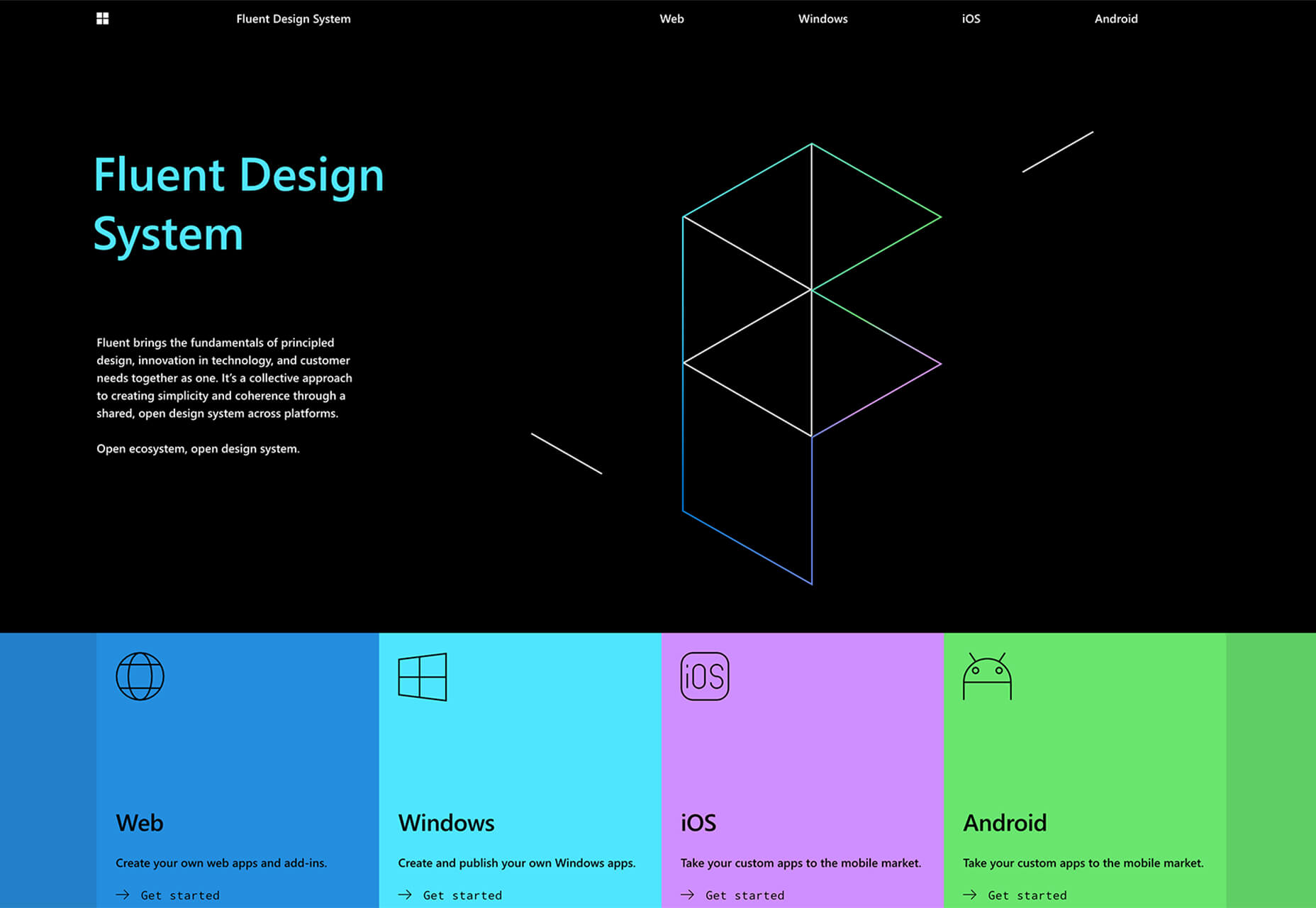
The Fluent design system was developed by Microsoft and it aims to create simplicity and coherence through open design systems developed for all the platforms. It focuses on uniting the fundamentals of principled design, tech innovation, and customer needs. The system is based around five key components: light, depth, motion, material, and scale. It also lays out guidelines for developing apps for Windows, Android, and iOS devices.
3. Shopify Polaris
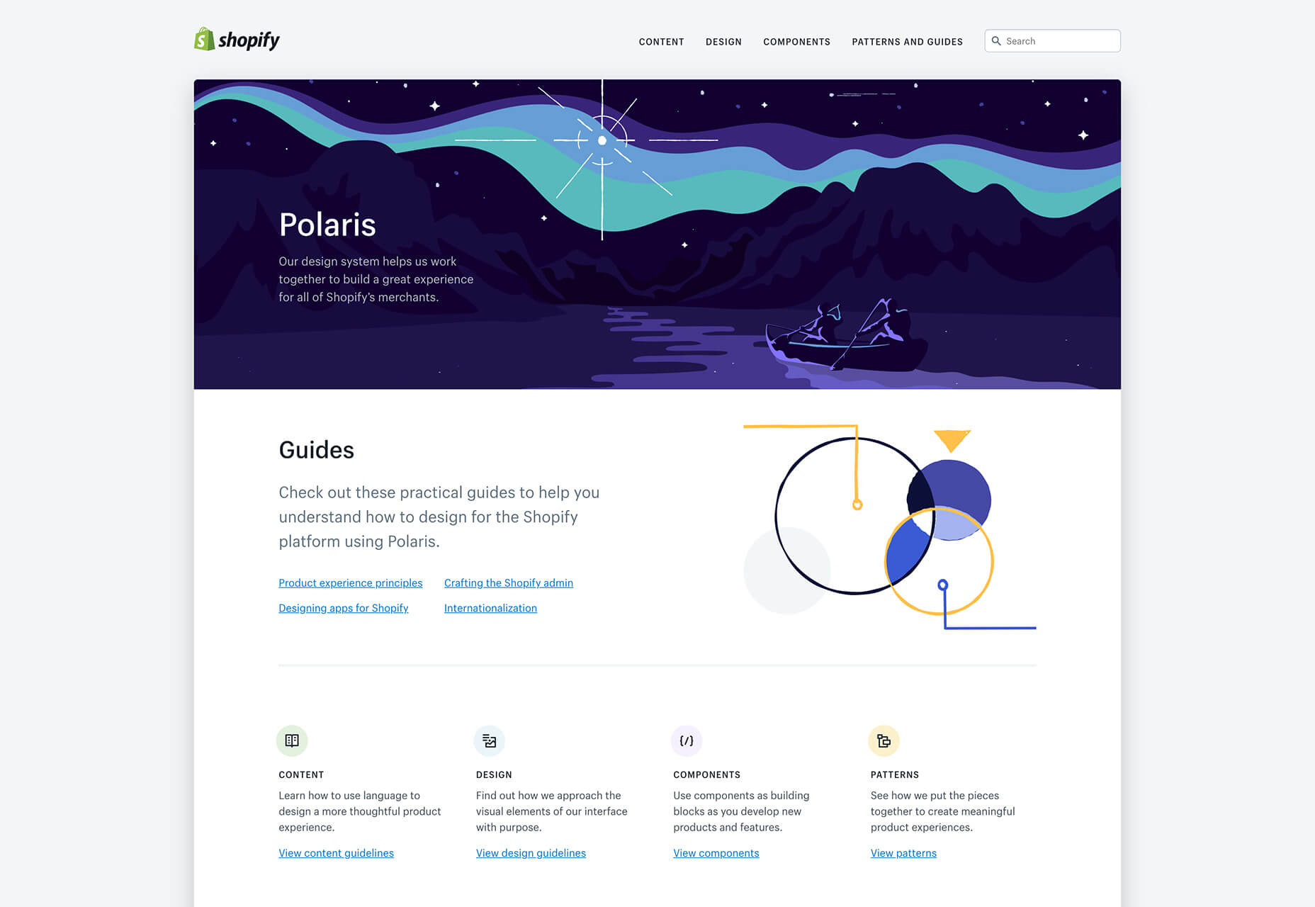
Shopify Polaris was developed so all Shopify merchants could enjoy a great experience and benefit from a beautiful store design. This design system has guidelines for crafting every part of the Shopify experience; from admin screens down to product experience and various apps for Shopify. It covers content, components, design, and pattern guidelines. You will also find helpful links to third-party tools that can serve as an inspiration or help you learn how to effectively design for Shopify.
4. Mailchimp
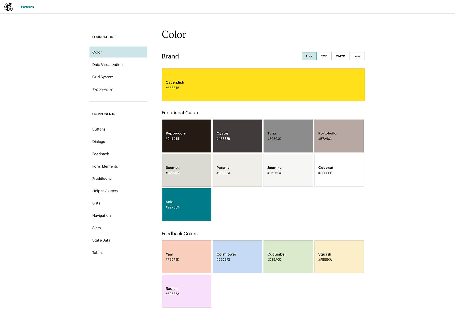
Mailchimp is always cited as one of the best examples for a detailed company brand tone and voice guide but they also have a pretty thorough design system that is focused on a pattern library. You can find detailed guidelines for colors, buttons, alert messages, and every other aspect of their marketing platform. What’s more, the guidelines have plenty of examples and explanation that break down the most important concepts.
5. Atlassian
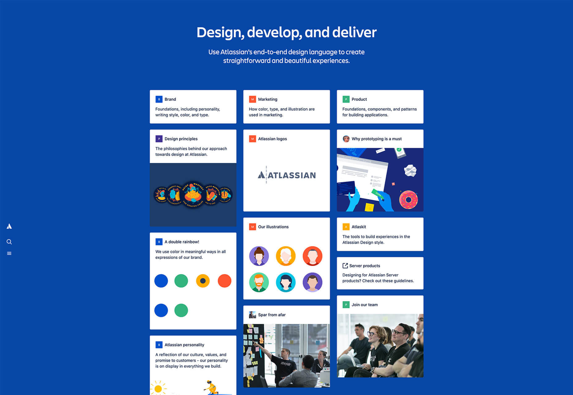
Atlassian is an Australian software company best known for their issue tracking application, Jira. Their design system describes not only how to use their logo, brand colors, fonts, and other design elements but they also let their brand personality shine through. With color names such as Dragon’s Blood and Herky Jerky, it’s easy to see why they describe their style as bold, optimistic, and practical with a wink.
6. Apple
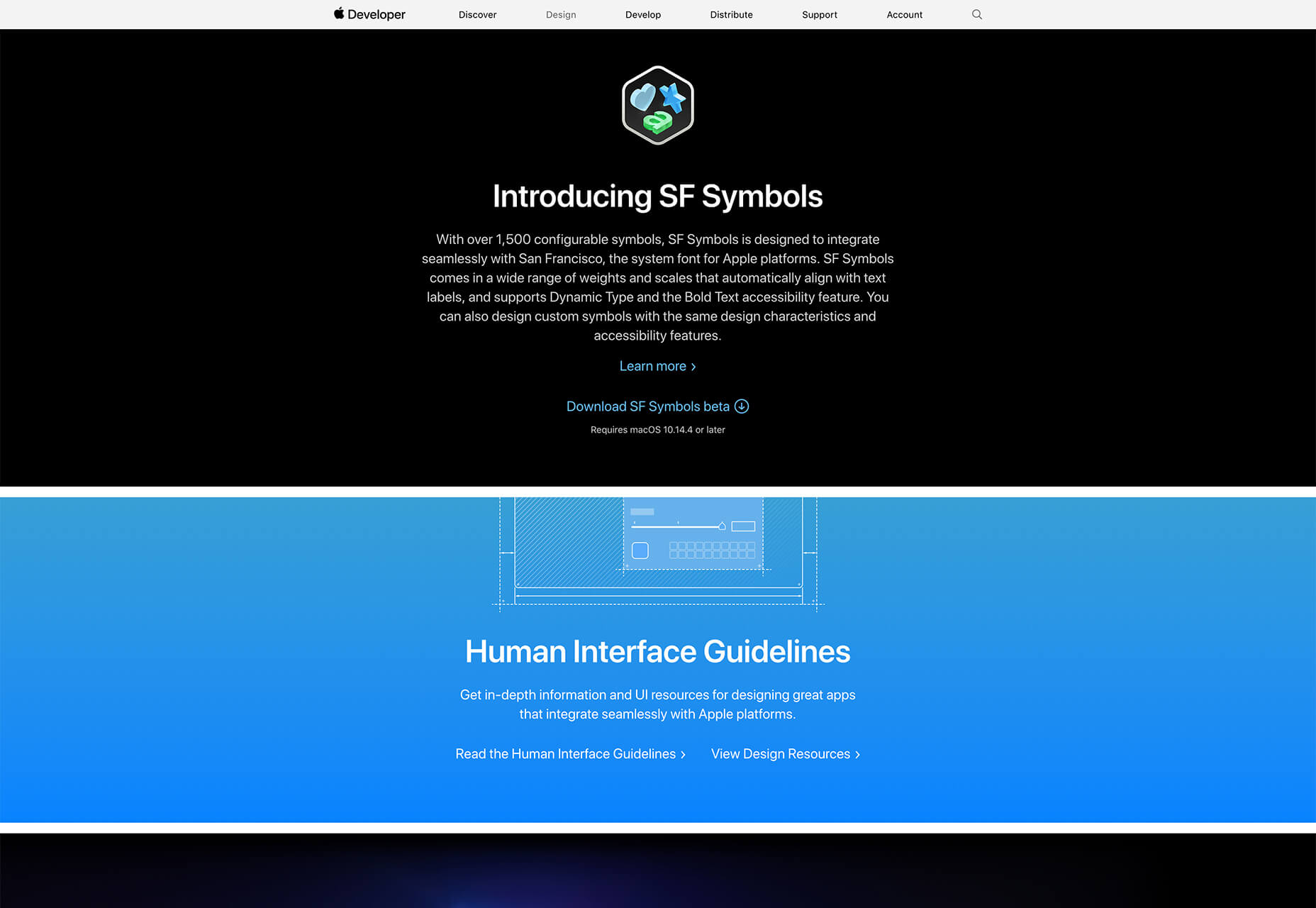
Apple’s design system is meant to facilitate the design of apps and Apple’s suite of products but there’s plenty to learn and admire in their style guide. For starters, you can download the SF icons which are meant to complement the system font for Apple’s devices. You will also find guidelines and instructions for UX design, making apps more accessible, and accessories.
7. IBM Design Language
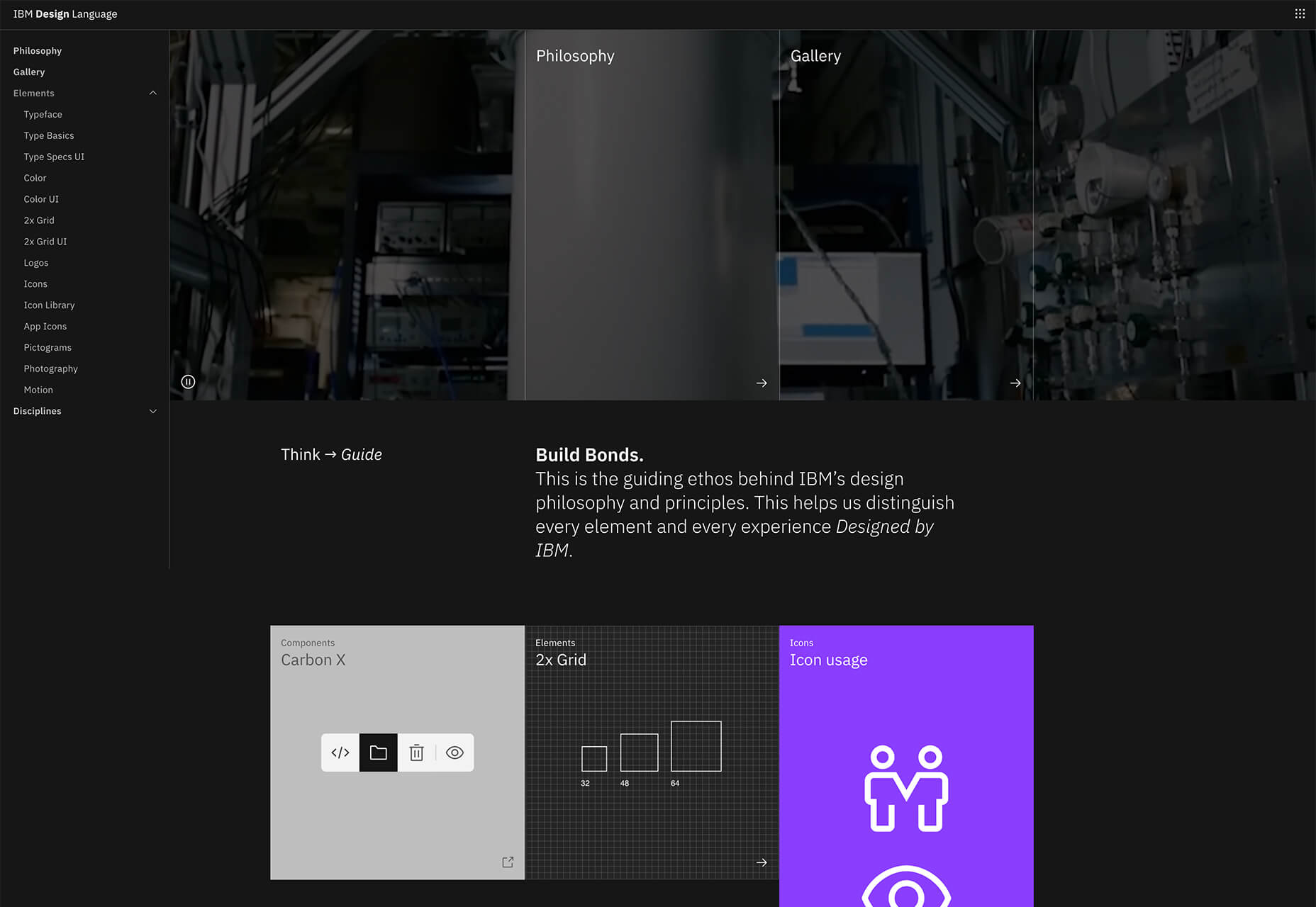
The guiding principle behind IBM’s design system is building bonds. Their design system goes beyond documenting their style guidelines and brand assets usage; they also share their philosophy as well as a gallery full of examples of their design system in action. The design system itself covers colors, typography, logos, icons, pictograms, photography, and motion.
8. AirBnB
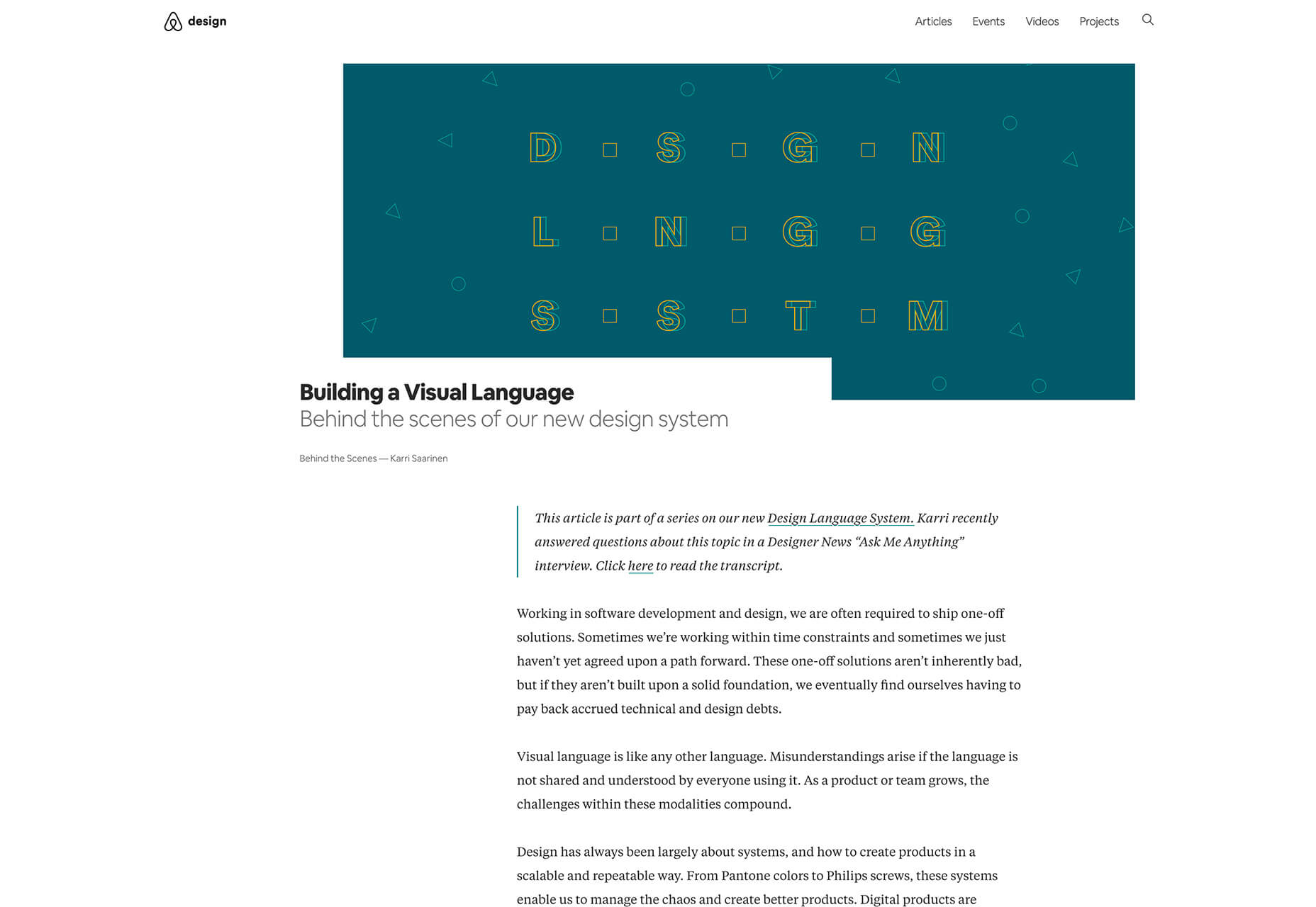
AirBnB shares a comprehensive overview of their design system through a series of articles that go in-depth about the decisions behind each design choice as well as practical application examples and lessons learned from it. The main characteristic of their design language is that each component can live on its own as a separate entity and even evolve further while also being a part of a larger cohesive unit, comparing their design system to a living, breathing organism.
9. Uber
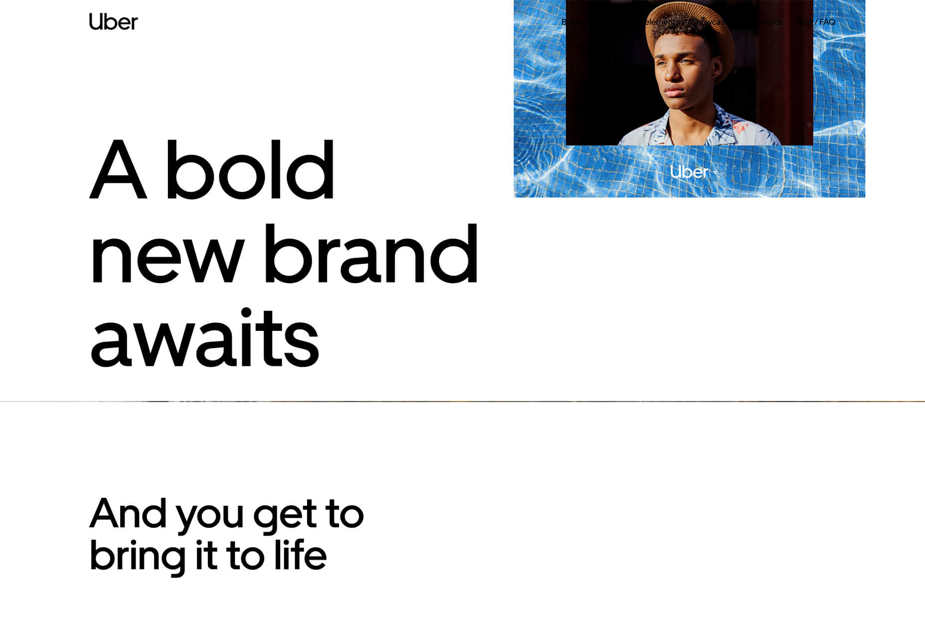
Uber describes its brand as a bold, new brand and their design system does an excellent job of portraying those principles. The design system covers the entirety of their brand visuals, from logo usage to color, composition, and even photography, and motion. Uber’s design system revolves around elegant simplicity and subtly recreating the famous U wherever possible.
10. Lightning Design System
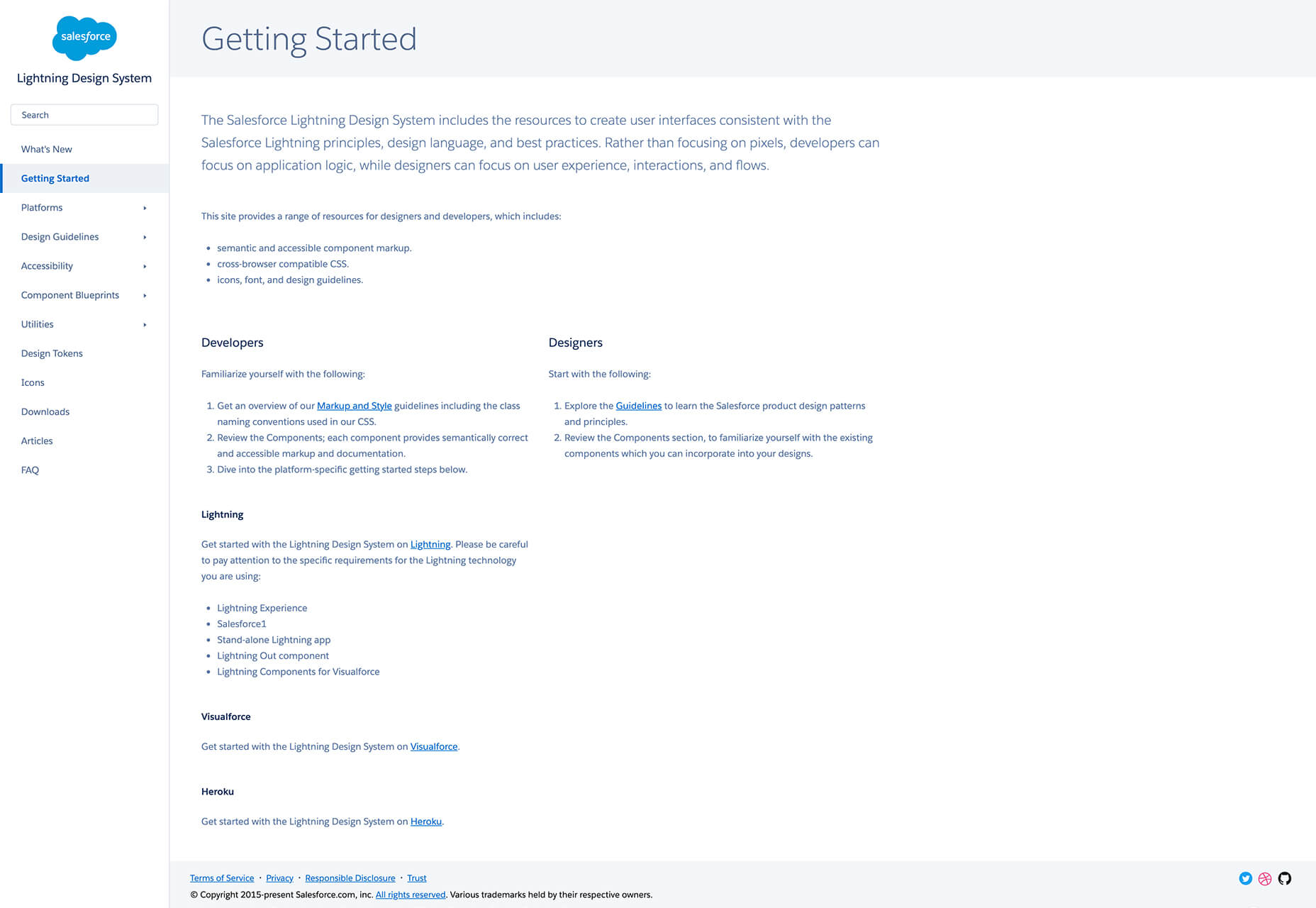
Lastly, the Lightning Design System was developed by Salesforce as a way to keep everything unified and easy to access for anyone designing for the platform. Instead of focusing on pixels, the design system focuses on application logic, user experience, interactions, and flows. You will find in-depth guidelines and examples that cover not only design guidelines but also accessibility issues and component blueprints.
