How To Build A Real-Time Multiplayer Virtual Reality Game (Part 1)
How To Build A Real-Time Multiplayer Virtual Reality Game (Part 1)
Alvin Wan2019-08-20T15:30:59+02:002019-08-20T17:57:15+00:00
In this tutorial series, we will build a web-based multiplayer virtual reality game in which players will need to collaborate to solve a puzzle. We will use A-Frame for VR modeling, MirrorVR for cross-device real-time synchronization, and A-Frame Low Poly for low-poly aesthetics. At the end of this tutorial, you will have a fully functioning demo online that anyone can play.
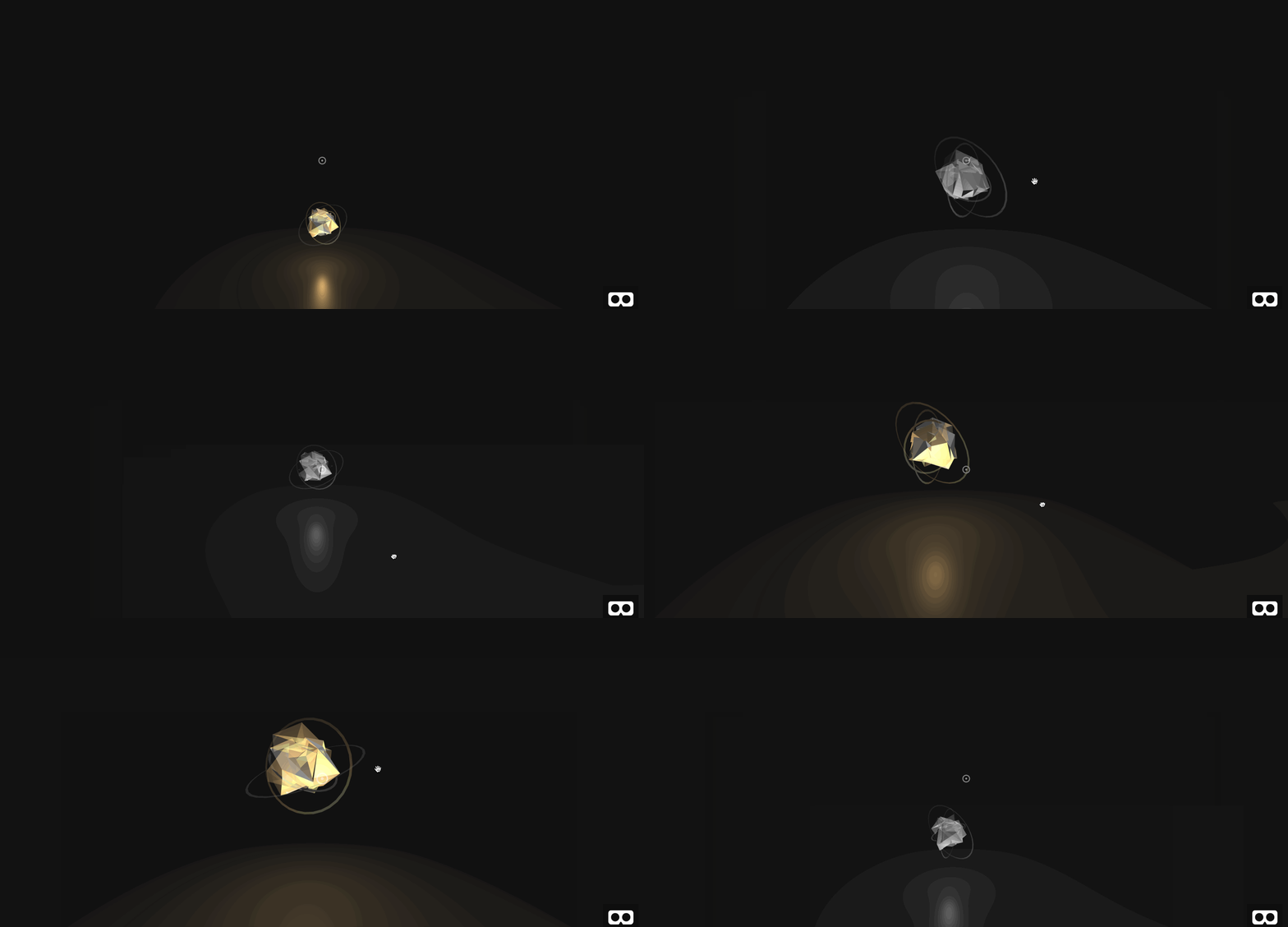
Each pair of players is given a ring of orbs. The goal is to “turn on” all orbs, where an orb is “on” if it’s elevated and bright. An orb is “off” if it’s lower and dim. However, certain “dominant” orbs affect their neighbors: if it switches state, its neighbors also switch state. Only player 2 can control the dominant orbs while only player 1 can control non-dominant orbs. This forces both players to collaborate to solve the puzzle. In this first part of the tutorial, we will build the environment and add the design elements for our VR game.
The seven steps in this tutorial are grouped into three sections:
- Setting Up The Scene (Steps 1–2)
- Creating The Orbs (Steps 3–5)
- Making The Orbs Interactive (Steps 6–7)
This first part will conclude with a clickable orb that turns on and off (as pictured below). You will use A-Frame VR and several A-Frame extensions.
Setting Up The Scene
1. Let’s Go With A Basic Scene
To get started, let’s take a look at how we can set up a simple scene with a ground:
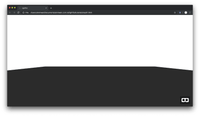
The first three instructions below are excerpted from my previous article. You will start by setting up a website with a single static HTML page. This allows you to code from your desktop and automatically deploy to the web. The deployed website can then be loaded on your mobile phone and placed inside a VR headset. Alternatively, the deployed website can be loaded by a standalone VR headset.
Get started by navigating to glitch.com. Then, do the following:
- Click on “New Project” in the top right,
- Click on “hello-webpage” in the drop-down,
- Next, click on index.html in the left sidebar. We will refer to this as your “editor”.
You should now see the following Glitch screen with a default HTML file.
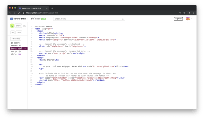
As with the linked tutorial above, start by deleting all existing code in the current index.html file. Then, type in the following for a basic webVR project, using A-Frame VR. This creates an empty scene by using A-Frame’s default lighting and camera.
<!DOCTYPE html>
<html>
  <head>
    <title>Lightful</title>
    <script src="https://aframe.io/releases/0.8.0/aframe.min.js"></script>
  </head>
  <body>
    <a-scene>
    </a-scene>
  </body>
</html>
Raise the camera to standing height. Per A-Frame VR recommendations (Github issue), wrap the camera with a new entity and move the parent entity instead of the camera directly. Between your a-scene tags on lines 8 and 9, add the following.
<!-- Camera! -->
<a-entity id="rig" position="0 3 0">
  <a-camera wasd-controls look-controls></a-camera>
</a-entity>
Next, add a large box to denote the ground, using a-box. Place this directly beneath your camera from the previous instruction.
<!-- Action! -->
<a-box shadow width="75" height="0.1" depth="75" position="0 -1 0" color="#222"></a-box>
Your index.html file should now match the following exactly. You can find the full source code here, on Github.
<html>
  <head>
    <title>Lightful</title>
    <script src="https://aframe.io/releases/0.8.0/aframe.min.js"></script>
  </head>
  <body>
    <a-scene>
      <!-- Camera! -->
      <a-entity id="rig" position="0 3 0">
        <a-camera wasd-controls look-controls></a-camera>
      </a-entity>

      <!-- Action! -->
      <a-box shadow width="75" height="0.1" depth="75" position="0 -1 0" color="#222"></a-box>
    </a-scene>
  </body>
</html>
This concludes setup. Next, we will customize lighting for a more mysterious atmosphere.
2. Add Atmosphere
In this step, we will set up the fog and custom lighting.
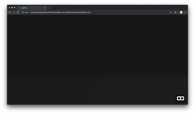
Add a fog, which will obscure objects far away for us. Modify the a-scene tag on line 8. Here, we will add a dark fog that quickly obscures the edges of the ground, giving the effect of a distant horizon.
<a-scene fog="type: linear; color: #111; near:10; far:15"></a-scene>
The dark gray #111 fades in linearly from a distance of 10 to a distance of 15. All objects more than 15 units away are completely obscured, and all objects fewer than 10 units away are completely visible. Any object in between is partially obscured.
Add one ambient light to lighten in-game objects and one-directional light to accentuate reflective surfaces you will add later. Place this directly after the a-scene tag you modified in the previous instruction.
<!-- Lights! -->
<a-light type="directional" castshadow="true" intensity="0.5" color="#FFF" position="2 5 0"></a-light>
<a-light intensity="0.1" type="ambient" position="1 1 1" color="#FFF"></a-light>
Directly beneath the lights in the previous instruction, add a dark sky. Notice the dark gray #111 matches that of the distant fog.
<a-sky color="#111"></a-sky>
This concludes basic modifications to the mood and more broadly, scene setup. Check that your code matches the source code for Step 2 on Github, exactly. Next, we will add a low-poly orb and begin customizing the orb’s aesthetics.
Creating The Orbs
3. Create A Low-Poly Orb
In this step, we will create a rotating, reflective orb as pictured below. The orb is composed of two stylized low-poly spheres with a few tricks to suggest reflective material.
Start by importing the low-poly library in your head tag. Insert the following between lines 4 and 5.
<script src="https://cdn.jsdelivr.net/gh/alvinwan/aframe-low-poly@0.0.5/dist/aframe-low-poly.min.js"></script>
Create a carousel, wrapper, and orb container. The carousel will contain multiple orbs, the wrapper will allow us to rotate all orbs around a center axis without rotating each orb individually, and the container will — as the name suggests — contain all orb components.
<a-entity id="carousel">
  <a-entity rotation="0 90 0" id="template" class="wrapper" position="0 0 0">
    <a-entity id="container-orb0" class="container" position="8 3 0" scale="1 1 1">
      <!-- place orb here -->
    </a-entity>
  </a-entity>
</a-entity>
Inside the orb container, add the orb itself: one sphere is slightly translucent and offset, and the other is completely solid. The two combined mimic reflective surfaces.
<a-entity class="orb" id="orb0" data-id="0">
  <lp-sphere seed="0" shadow max-amplitude="1 1 1" position="-0.5 0 -0.5"></lp-sphere>
  <lp-sphere seed="0" shadow max-amplitude="1 1 1" rotation="0 45 45" opacity="0.5" position="-0.5 0 -0.5"></lp-sphere>
</a-entity>
Finally, rotate the sphere indefinitely by adding the following a-animation tag immediately after the lp-sphere inside the .orb entity in the last instruction.
<a-animation attribute="rotation" repeat="indefinite" from="0 0 0" to="0 360 0" dur="5000"></a-animation>
Your source code for the orb wrappers and the orb itself should match the following exactly.
<a-entity id="carousel">
  <a-entity rotation="0 90 0" id="template" class="wrapper" position="0 0 0">
    <a-entity id="container-orb0" class="container" position="8 3 0" scale="1 1 1">
      <a-entity class="orb" id="orb0" data-id="0">
        <lp-sphere seed="0" shadow max-amplitude="1 1 1" position="-0.5 0 -0.5"></lp-sphere>
        <lp-sphere seed="0" shadow max-amplitude="1 1 1" rotation="0 45 45" opacity="0.5" position="-0.5 0 -0.5"></lp-sphere>
        <a-animation attribute="rotation" repeat="indefinite" from="0 0 0" to="0 360 0" dur="5000"></a-animation>
      </a-entity>
    </a-entity>
  </a-entity>
</a-entity>
Check that your source code matches the full source code for step 3 on Github. Your preview should now match the following.
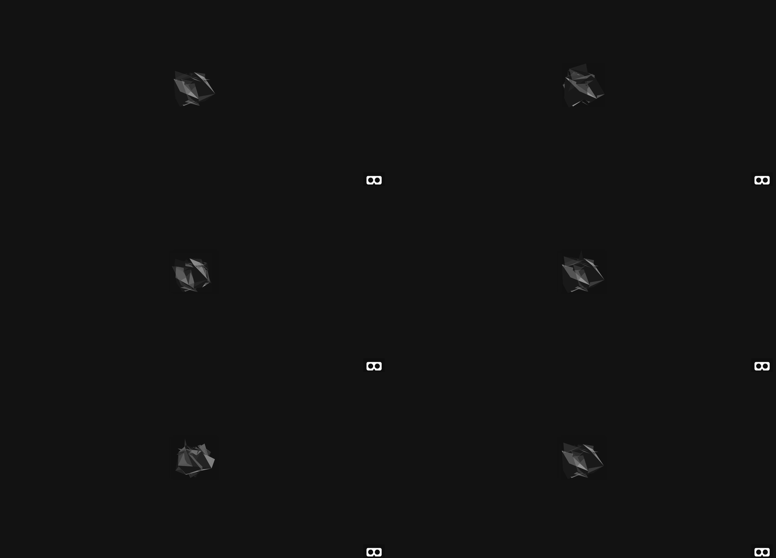
Next, we will add more lighting to the orb for a golden hue.
4. Light Up The Orb
In this step, we will add two lights, one colored and one white. This produces the following effect.
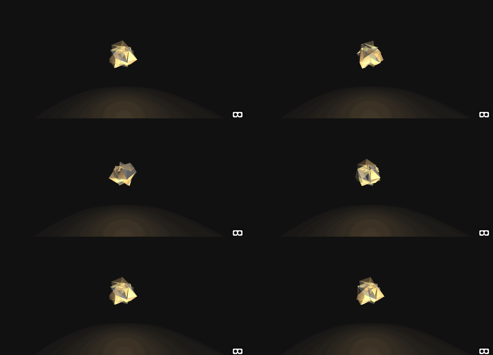
Start by adding the white light to illuminate the object from below. We will use a point light. Directly before #orb0 but within #container-orb0, add the following offset point light.
<a-entity position="-2 -1 0">
    <a-light distance="8" type="point" color="#FFF" intensity="0.8"></a-light>
</a-entity>
In your preview, you will see the following.
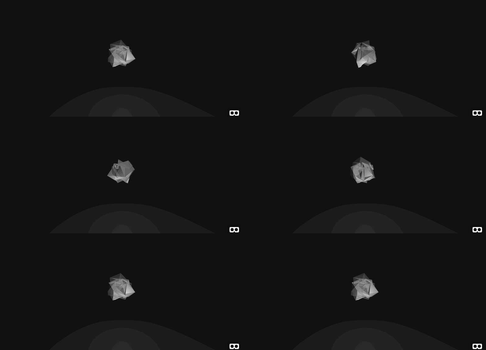
By default, lights do not decay with distance. By adding distance="8", we ensure that the light fully decays with a distance of 8 units, to prevent the point light from illuminating the entire scene. Next, add the golden light. Add the following directly above the last light.
<a-light class="light-orb" id="light-orb0" distance="8" type="point" color="#f90" intensity="1"></a-light>
Check that your code matches the source code for step 4 exactly. Your preview will now match the following.

Next, you will make your final aesthetic modification to the orb and add rotating rings.
5. Add Rings
In this step, you will produce the final orb, as pictured below.
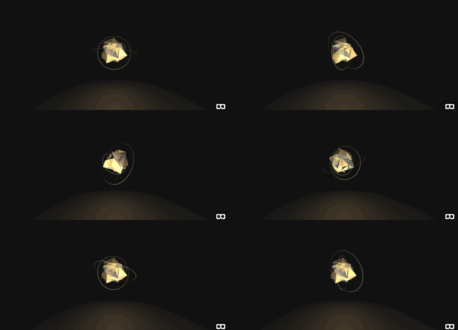
Add a ring in #container-orb0 directly before #orb0.
<a-ring color="#fff" material="side:double" position="0 0.5 0" radius-inner="1.9" radius-outer="2" opacity="0.25"></a-ring>
Notice the ring itself does not contain color, as the color will be imbued by the point light in the previous step. Furthermore, the material="side:double" is important as, without it, the ring’s backside would not be rendered; this means the ring would disappear for half of its rotation.
However, the preview with only the above code will not look any different. This is because the ring is currently perpendicular to the screen. Thus, only the ring’s “side” (which has 0 thickness) is visible. Place the following animation in between the a-ring tags in the previous instruction.
<a-animation attribute="rotation" easing="linear" repeat="indefinite" from="0 0 0" to="0 360 0" dur="8000"></a-animation>
Your preview should now match the following:

Create a variable number of rings with different rotation axes, speeds, and sizes. You can use the following example rings. Any new rings should be placed underneath the last a-ring.
<a-ring color="#fff" material="side:double" position="0 0.5 0" radius-inner="2.4" radius-outer="2.5" opacity="0.25">
  <a-animation attribute="rotation" easing="linear" repeat="indefinite" from="0 45 0" to="360 45 0" dur="8000"></a-animation>
</a-ring>
<a-ring color="#fff" material="side:double" position="0 0.5 0" radius-inner="1.4" radius-outer="1.5" opacity="0.25">
  <a-animation attribute="rotation" easing="linear" repeat="indefinite" from="0 -60 0" to="-360 -60 0" dur="3000"></a-animation>
</a-ring>
Your preview will now match the following.

Check that your code matches the source code for step 5 on Github. This concludes decor for the orb. With the orb finished, we will next add interactivity to the orb. In the next step, we will specifically add a visible cursor with a clicking animation when pointed at clickable objects.
Making The Orbs Interactive
6. Add A Cursor
In this step, we will add a white cursor that can trigger clickable objects. The cursor is pictured below.
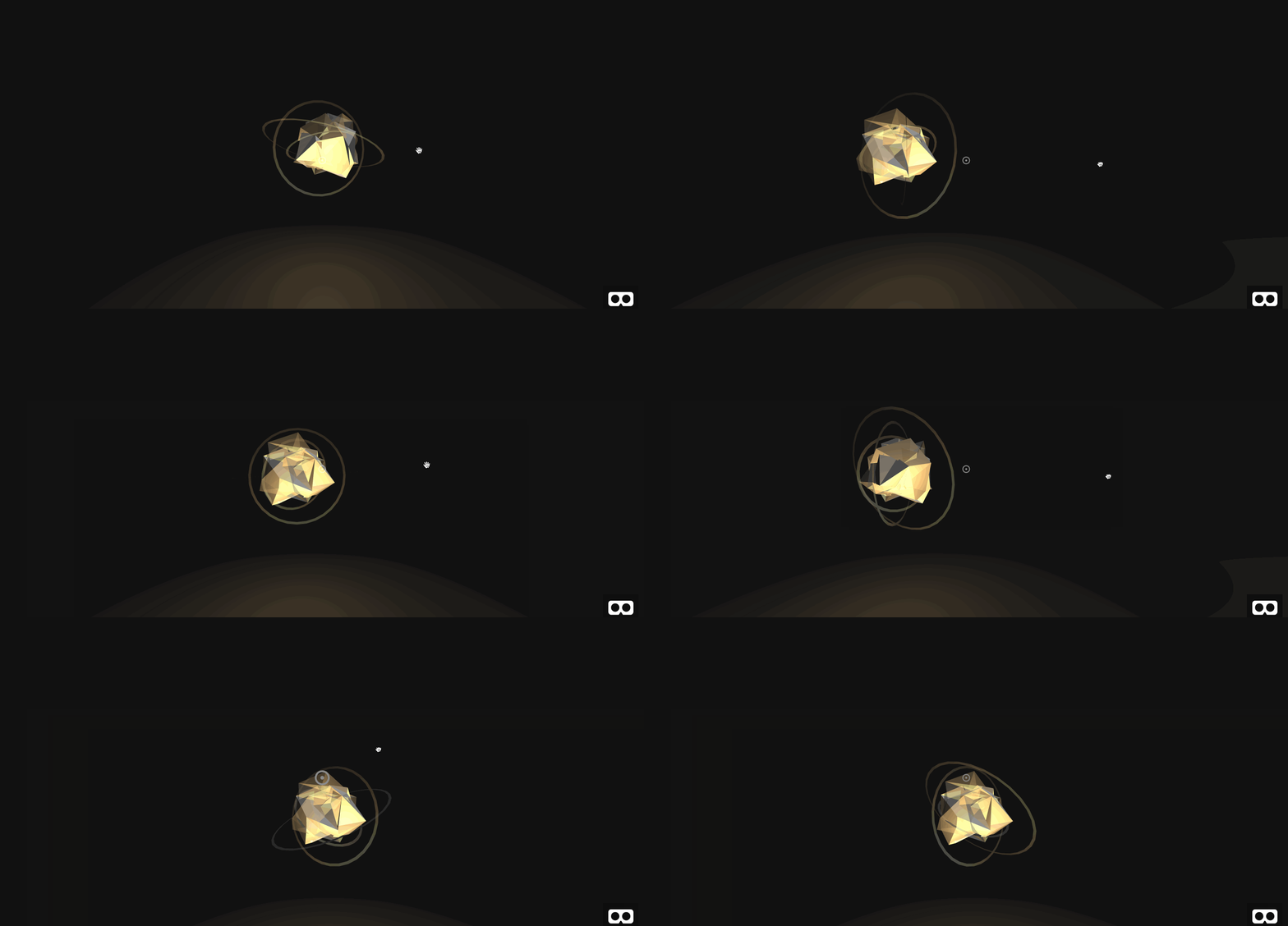
In your a-camera tag, add the following entity. The fuse attribute allows this entity the ability to trigger click events. The raycaster attribute determines how often and how far to check for clickable objects. The objects attribute accepts a selector to determine which entities are clickable. In this case, all objects of class clickable are clickable.
<a-entity cursor="fuse: true; fuseTimeout: 250"
      position="0 0 -1"
      geometry="primitive: ring; radiusInner: 0.03; radiusOuter: 0.04"
      material="color: white; shader: flat; opacity: 0.5"
      scale="0.5 0.5 0.5"
      raycaster="far: 20; interval: 1000; objects: .clickable">
    <!-- Place cursor animation here -->
</a-entity>
Next, add cursor animation and an extra ring for aesthetics. Place the following inside the entity cursor object above. This adds animation to the cursor object so that clicks are visible.
<a-circle radius="0.01" color="#FFF" opacity="0.5" material="shader: flat"></a-circle>
<a-animation begin="fusing" easing="ease-in" attribute="scale"
   fill="backwards" from="1 1 1" to="0.2 0.2 0.2" dur="250"></a-animation>
Next, add the clickable class to the #orb0 to match the following.
<a-entity class="orb clickable" id="orb0" data-id="0">
Check that your code matches the source code for Step 6 on Github. In your preview, drag your cursor off of them onto the orb to see the click animation in action. This is pictured below.

Note the clickable attribute was added to the orb itself and not the orb container. This is to prevent the rings from becoming clickable objects. This way, the user must click on the spheres that make up the orb itself.
In our final step for this part, you will add animation to control the on and off states for the orb.
7. Add Orb States
In this step, you will animate the orb in and out of an off state on click. This is pictured below.
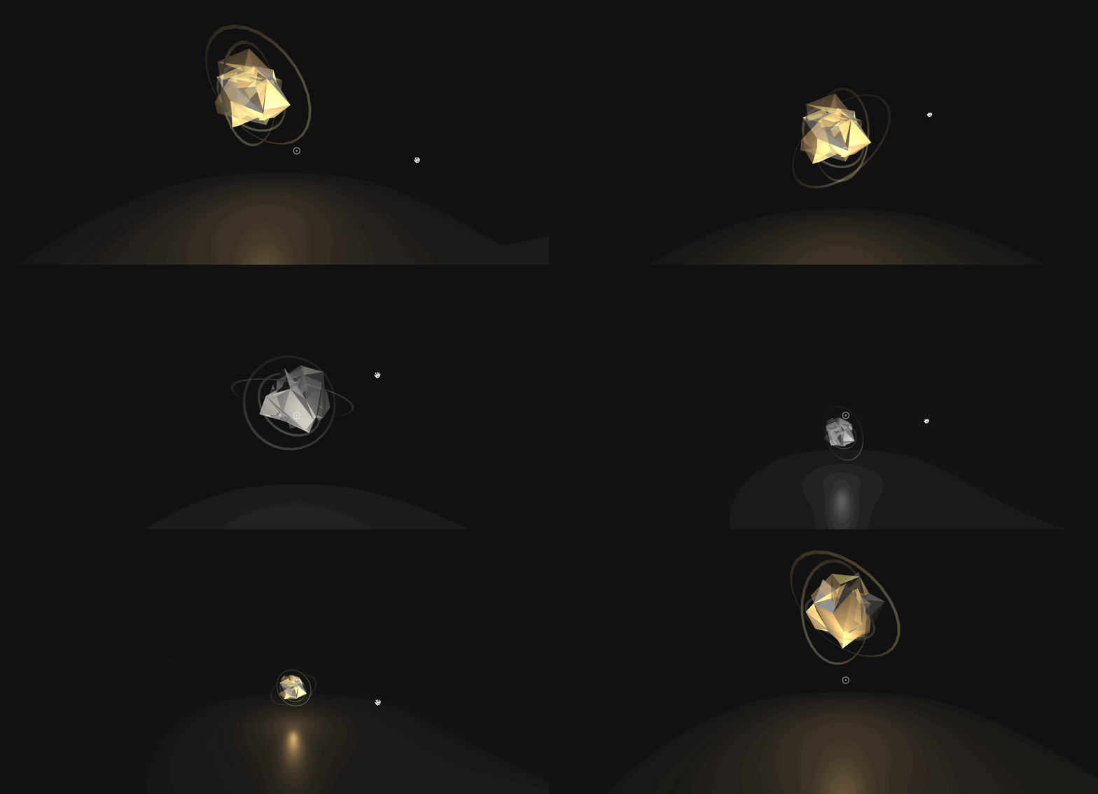
To start, you will shrink and lower the orb to the ground. Add a-animation tags to the #container-orb0 right after #orb0. Both animations are triggered by a click and share the same easing function ease-elastic for a slight bounce.
<a-animation class="animation-scale" easing="ease-elastic" begin="click" attribute="scale" from="0.5 0.5 0.5" to="1 1 1" direction="alternate" dur="2000"></a-animation>
<a-animation class="animation-position" easing="ease-elastic" begin="click" attribute="position" from="8 0.5 0" to="8 3 0" direction="alternate" dur="2000"></a-animation>
To further emphasize the off state, we will remove the golden point light when the orb is off. However, the orb’s lights are placed outside of the orb object. Thus, the click event is not passed to the lights when the orb is clicked. To circumvent this issue, we will use some light Javascript to pass the click event to the light. Place the following animation tag in #light-orb0. The light is triggered by a custom switch event.
<a-animation class="animation-intensity" begin="switch" attribute="intensity" from="0" to="1" direction="alternate"></a-animation>
Next, add the following click event listener to the #container-orb0. This will relay the clicks to the orb lights.
<a-entity id="container-orb0" ... onclick="document.querySelector('#light-orb0').emit('switch');">
Check that your code matches the source code for Step 7 on Github. Finally, pull up your preview, and move the cursor on and off the orb to toggle between off and on states. This is pictured below.

This concludes the orb’s interactivity. The player can now turn orbs on and off at will, with self-explanatory on and off states.
Conclusion
In this tutorial, you built a simple orb with on and off states, which can be toggled by a VR-headset-friendly cursor click. With a number of different lighting techniques and animations, you were able to distinguish between the two states. This concludes the virtual reality design elements for the orbs. In the next part of the tutorial, we will populate the orbs dynamically, add game mechanics, and set up a communication protocol between a pair of players.
 (rb, dm, il)
