How Prevalent is Dark UX?
Iconic comedy duo Mitchell and Webb once asked a very important question: “Are we the baddies?” Given that, at the time, they were dressed in Nazi uniforms with skulls on their hats, and looked like rejected villains from a Wolfenstein game, the answer was something of a foregone conclusion.
But what about us? No, no web or UX designers that I know of have ever invaded Poland, or done any of the more horrifying things that Nazis are known for, thankfully. But then, we’ve got a whole field of design called “dark UX”, and that’s… concerning. In other words:
It sure feels like dark UX is everywhere…
“Are we the baddies?” How bad is it these days? It sure feels like dark UX is everywhere, with companies trying to get their hands on your cash no matter the cost.
The generally accepted definition of dark UX is something along the lines of: Intentionally malicious, deceitful, or even just highly manipulative design patterns that try to trick you into doing something you otherwise wouldn’t.
I think, to answer that question, we need to establish that the first bit—the intentional malice, deceit, or manipulation—is the defining characteristic of dark UX. Just getting people to do something they might otherwise not… it’s not always a bad thing — doctors and especially dentists, try to do that all the time, to varying degrees of success.
Marketing, even, introduces you to ideas and products you may not otherwise know about, and so would not otherwise buy. While marketing can very often feel scummy, I am forced to admit that there is technically nothing wrong with putting your brand out there.
But when designers (and the companies that hire them) flat-out disregard the will, and/or well-being of the users, that’s when we have a problem. Let’s look at some classic examples, several of which come courtesy of the Dark Patterns twitter feed, because websites never behave badly when you want to take screenshots:
Opt-Out Newletters (or Even Purchases!)
Sign-up forms often come with the option to get their newsletter pre-selected. I’ve also run into airlines that have some of their add-on services pre-selected during the ticket purchase process. Forgetting to unselect those is an expensive mistake to make.
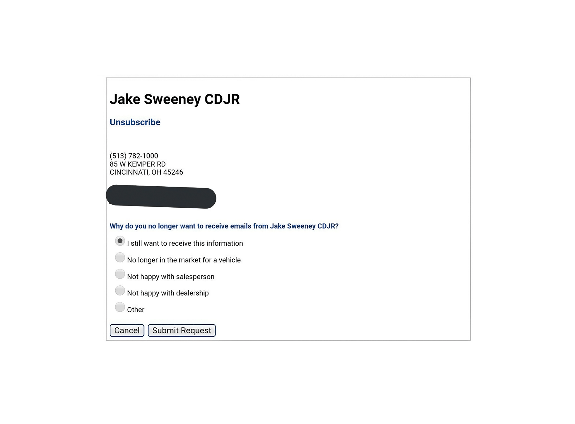
But then there’s this process for unsubscribing from an email newsletter, which is pretty flagrant:
Scummy “No” Buttons
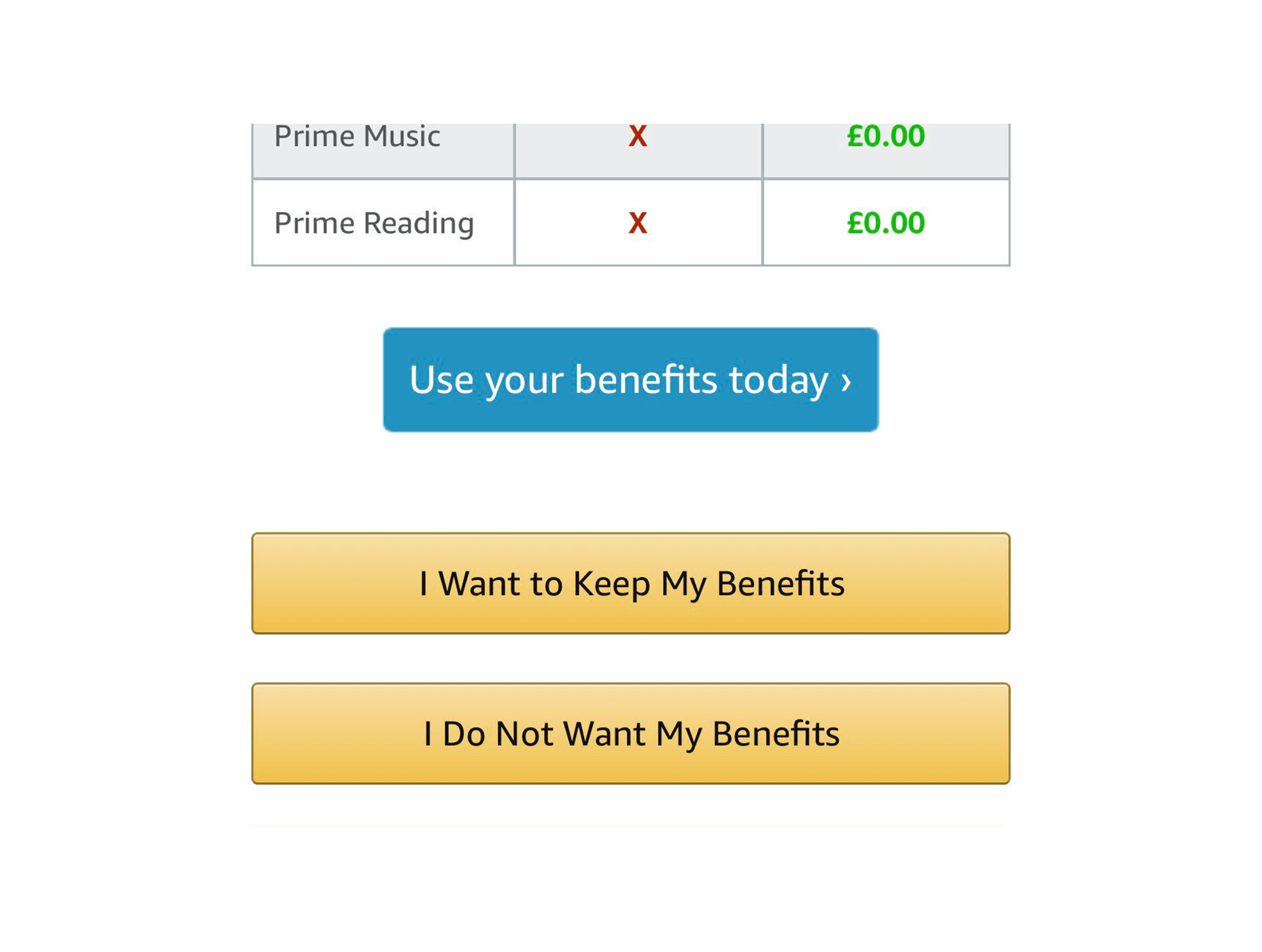
You know, the ones that say things like: “No, I don’t want to better my life immeasurably by receiving these product offers. By clicking this button, I acknowledge that my life is worthless, my children will be left homeless, and I am a terrible person.”
Even Amazon is doing it:
The Complete Lack of “No” Buttons
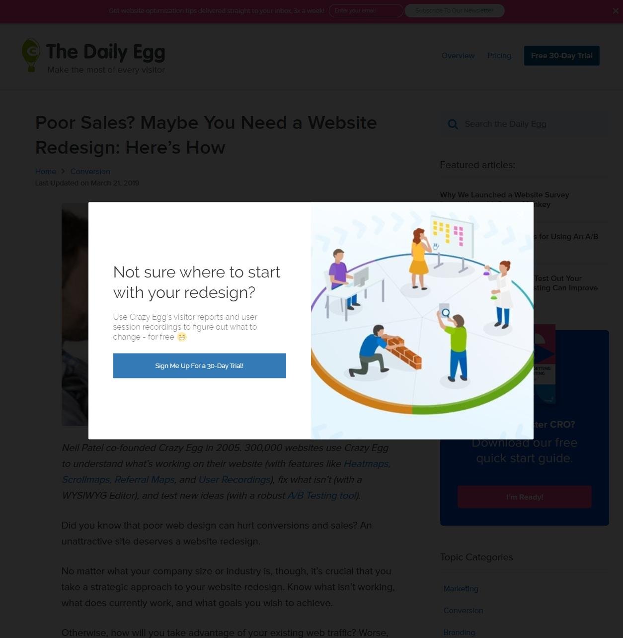
Then there are the people that don’t even include a “no” button, or an “exit” button. I’ve had it happen with Google Play Music sometimes giving me no way to listen to my music unless I either sign up for their family plan, or refresh the page. I couldn’t get a screenshot of that, so here’s one of CrazyEgg doing something similar:
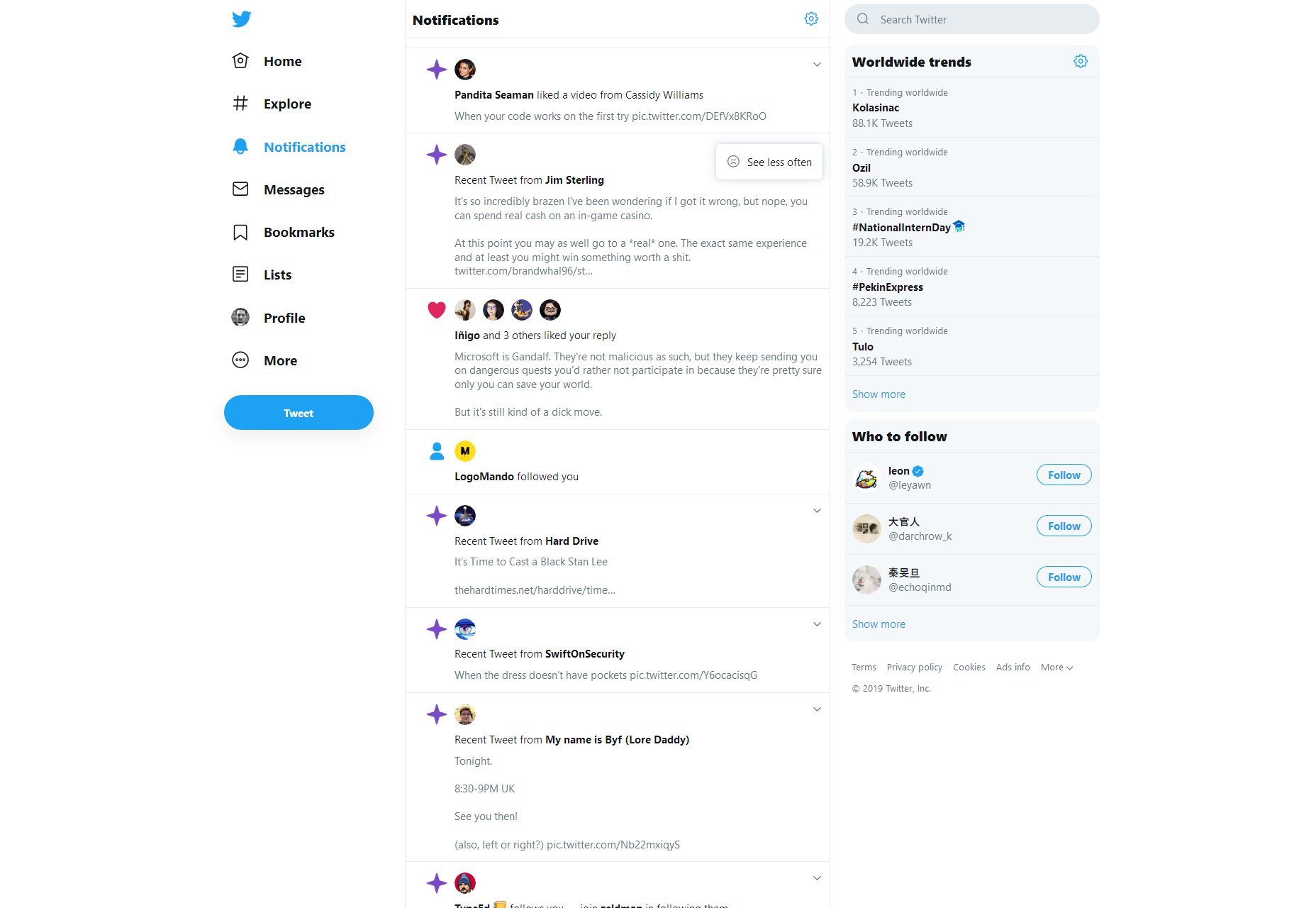
Also, Twitter won’t even let you turn off their more annoying features. There’s only a button to “see less” of them, and no one’s sure if it actually works.

Intentionally Frustrating Products
Recently, I reviewed a service named Smashinglogo (no relation) for another website. See how I’m not linking it? That’s for a reason. It’s supposed to be an AI-based logo generator and… well it does that. But you have to depend almost entirely on the AI to randomly give you the logo you want. The customization features are minimal, and partially random too.
But the site makes very sure to tell you that you can hire one of their professional designers to finish up your logo at any time. It just costs a bit more.
This sort of design is actually a notorious problem in the world of video games, and not just the mobile titles. Middle Earth: Shadow of War launched as a very grindy sort of game that took a long time to complete, but you could make it easier on yourself by purchasing “just a few, simple time savers” on top of buying the full-priced game. Assassin’s Creed: Odyssey took flak for pretty much the same reason. It wasn’t too bad if you like playing all the side quests in a game, but it was still a problem.
Predatory Features/Mechanics
We can look to video games for even more examples. Mobile games introduced the idea of the “loot box”, a purchase which will always grant you some sort of digital reward within the game. But what you get is randomized, so you can never be sure of getting what you want. They’ve made their way into 60 USD desktop titles as well, and they’re specifically designed to tap into the gambler’s instinct.
It used to be just an industry controversy, but now governments the world over are looking into this situation
It used to be just an industry controversy, but now governments the world over are looking into this situation, with UK Mainstream outlets like the BBC documenting what happens when someone who has compulsive gambling tendencies gets suckered in by video games, which are supposed to be comparatively “safe”.
Dark UX is Everywhere…Oops
I wish I had better news. Look, it’s not that the majority of websites are necessarily using dark UX patterns. I frankly couldn’t find any hard data on that, but I doubt it. Is all their marketing honest? I don’t know about that, but I don’t think that most websites are trying to trick users into clicking stuff.
But not every website is Amazon, Twitter, or Google. While most sites may not have dark UX, a lot of the biggest sites and products do, affecting a number of people that is potentially in the billions.
I’d like to think designers are mostly good people, but the ones employed by bad companies have done a lot of damage. What can we do to correct this? Either we can burn it all down and try to develop a post-money society, or we can try to convince our corporate overlords that treating people right will net them more money in the long run.
I’ve always believed that true (brand) love is better than Stockholm Syndrome. Now we just need to convince everyone else.
Featured image via DepositPhotos.


