Ghost Buttons with Directional Awareness in CSS
It would surprise me if you’d never come across a ghost button ?. You know the ones: they have a transparent background that fills with a solid color on hover. Smashing Magazine has a whole article going into the idea. In this article, we’re going to build a ghost button, but that will be the easy part. The fun and tricky part will be animating the fill of that ghost button such that the background fills up in the direction from which a cursor hovers over it.
Here’s a basic starter for a ghost button:
See the Pen
Basic Ghost Button ? by Jhey (@jh3y)
on CodePen.
In most cases, the background-color has a transition to a solid color. There are designs out there where the button might fill from left to right, top to bottom, etc., for some visual flair. For example, here’s left-to-right:
See the Pen
Directional filling Ghost Button ? by Jhey (@jh3y)
on CodePen.
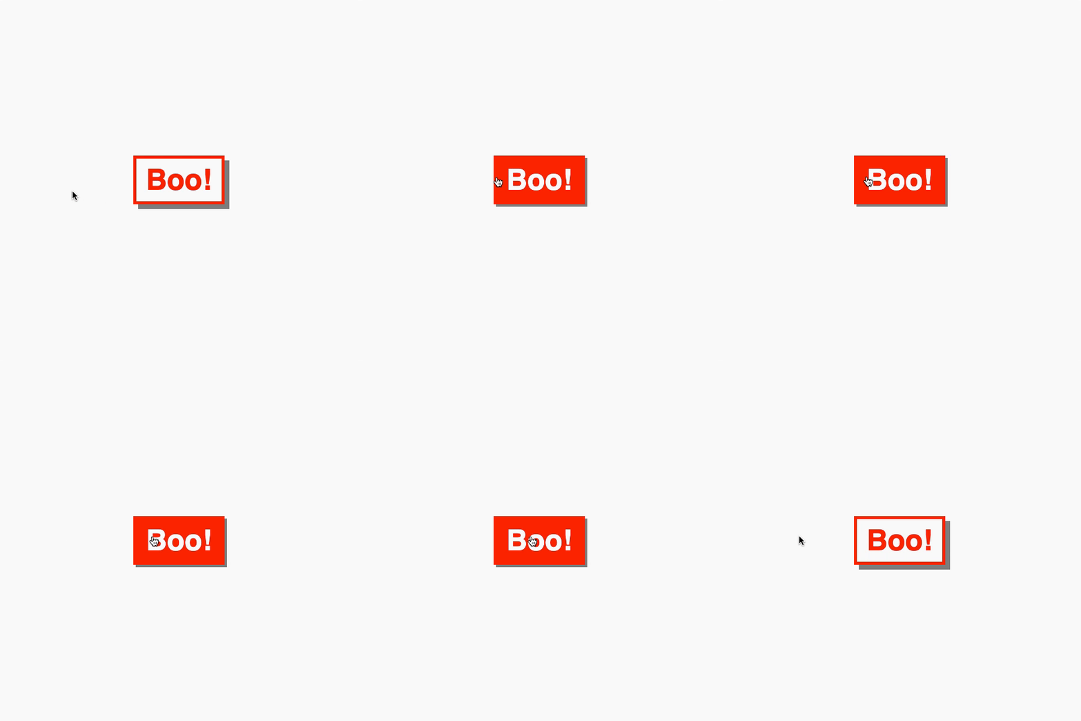
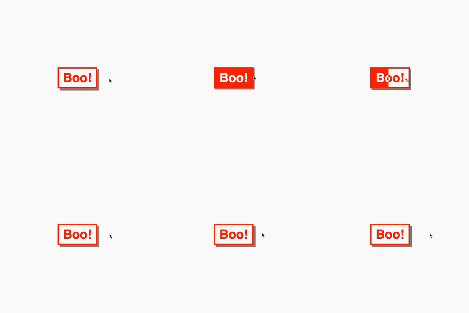
There’s a UX nitpick here. It feels off if you hover against the fill. Consider this example. The button fills from the left while you hover from the right.
It is better if the button fills from our initial hover point.

So, how can we give the button directional awareness? Your initial instinct might be to reach for a JavaScript solution, but we can create something with CSS and a little extra markup instead.
For those in camp TL;DR, here are some pure CSS ghost buttons with directional awareness!
See the Pen
Pure CSS Ghost Buttons w/ Directional Awareness ??? by Jhey (@jh3y)
on CodePen.
Let’s build this thing step by step. All the code is available in this CodePen collection.
Creating a foundation
Let’s start by creating the foundations of our ghost button. The markup is straightforward.
<button>Boo!</button>Our CSS implementation will leverage CSS custom properties. These make maintenance easier. They also make for simple customization via inline properties.
button {
  --borderWidth: 5;
  --boxShadowDepth: 8;
  --buttonColor: #f00;
  --fontSize: 3;
  --horizontalPadding: 16;
  --verticalPadding: 8;

  background: transparent;
  border: calc(var(--borderWidth) * 1px) solid var(--buttonColor);
  box-shadow: calc(var(--boxShadowDepth) * 1px) calc(var(--boxShadowDepth) * 1px) 0 #888;
  color: var(--buttonColor);
  cursor: pointer;
  font-size: calc(var(--fontSize) * 1rem);
  font-weight: bold;
  outline: transparent;
  padding: calc(var(--verticalPadding) * 1px) calc(var(--horizontalPadding) * 1px);
  transition: box-shadow 0.15s ease;
}

button:hover {
  box-shadow: calc(var(--boxShadowDepth) / 2 * 1px) calc(var(--boxShadowDepth) / 2 * 1px) 0 #888;
}

button:active {
  box-shadow: 0 0 0 #888;
}
Putting it all together gives us this:
See the Pen
Ghost Button Foundation ? by Jhey (@jh3y)
on CodePen.
Great! We have a button and a hover effect, but no fill to go with it. Let’s do that next.
Adding a fill
To do this, we create elements that show the filled state of our ghost button. The trick is to clip those elements with clip-path and hide them. We can reveal them when we hover over the button by transitioning the clip-path.

They must line up with the parent button. Our CSS variables will help a lot here.
At first thought, we could have reached for pseudo-elements. There won’t be enough pseudo-elements for every direction though. They will also interfere with accessibility… but more on this later.
Let’s start by adding a basic fill from left to right on hover. First, let’s add a div. That div will need the same text content as the button.
<button>Boo!
  <div>Boo!</div>
</button>
Now we need to line our div up with the button. Our CSS variables will do the heavy lifting here.
button div {
  background: var(--buttonColor);
  border: calc(var(--borderWidth) * 1px) solid var(--buttonColor);
  bottom: calc(var(--borderWidth) * -1px);
  color: var(--bg, #fafafa);
  left: calc(var(--borderWidth) * -1px);
  padding: calc(var(--verticalPadding) * 1px) calc(var(--horizontalPadding) * 1px);
  position: absolute;
  right: calc(var(--borderWidth) * -1px);
  top: calc(var(--borderWidth) * -1px);
}
Finally, we clip the div out of view and add a rule that will reveal it on hover by updating the clip. Defining a transition will give it that cherry on top.
button div {
  --clip: inset(0 100% 0 0);
  -webkit-clip-path: var(--clip);
  clip-path: var(--clip);
  transition: clip-path 0.25s ease, -webkit-clip-path 0.25s ease;
  // ...Remaining div styles
}

button:hover div {
  --clip: inset(0 0 0 0);
}
See the Pen
Ghost Button w/ LTR fill ? by Jhey (@jh3y)
on CodePen.
Adding directional awareness
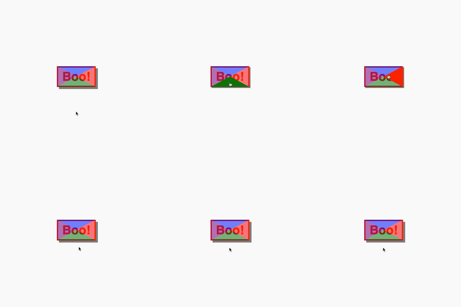
So, how might we add directional awareness? We need four elements. Each element will be responsible for detecting a hover entry point. With clip-path, we can split the button area into four segments.

:hover segmentsLet’s add four spans to a button and position them to fill the button.
<button>
  Boo!
  <span></span>
  <span></span>
  <span></span>
  <span></span>
</button>
button span {
background: var(--bg);
bottom: calc(var(--borderWidth) * -1px);
-webkit-clip-path: var(--clip);
clip-path: var(--clip);
left: calc(var(--borderWidth) * -1px);
opacity: 0.5;
position: absolute;
right: calc(var(--borderWidth) * -1px);
top: calc(var(--borderWidth) * -1px);
z-index: 1;
}We can target each element and assign a clip and color with CSS variables.
button span:nth-of-type(1) {
  --bg: #00f;
  --clip: polygon(0 0, 100% 0, 50% 50%, 50% 50%);
}
button span:nth-of-type(2) {
  --bg: #f00;
  --clip: polygon(100% 0, 100% 100%, 50% 50%);
}
button span:nth-of-type(3) {
  --bg: #008000;
  --clip: polygon(0 100%, 100% 100%, 50% 50%);
}
button span:nth-of-type(4) {
  --bg: #800080;
  --clip: polygon(0 0, 0 100%, 50% 50%);
}
Cool. To test this, let’s change the opacity on hover.
button span:nth-of-type(1):hover,
button span:nth-of-type(2):hover,
button span:nth-of-type(3):hover,
button span:nth-of-type(4):hover {
  opacity: 1;
}
Uh-oh. There’s an issue here. If we enter and hover one segment but then hover over another, the fill direction would change. That’s going to look off. To fix this, we can set a z-index and clip-path on hover so that a segment fills the space.
button span:nth-of-type(1):hover,
button span:nth-of-type(2):hover,
button span:nth-of-type(3):hover,
button span:nth-of-type(4):hover {
  --clip: polygon(0 0, 100% 0, 100% 100%, 0 100%);
  opacity: 1;
  z-index: 2;
}
See the Pen
Pure CSS Directional Awareness w/ clip-path ? by Jhey (@jh3y)
on CodePen.
Putting it all together
We know how to create the fill animation, and we know how to detect direction. How can we put the two together? Use the sibling combinator!
Doing so means when we hover a directional segment, we can reveal a particular fill element.
First, let’s update the markup.
<button>
  Boo!
  <span></span>
  <span></span>
  <span></span>
  <span></span>
  <div>Boo!</div>
  <div>Boo!</div>
  <div>Boo!</div>
  <div>Boo!</div>
</button>
Now, we can update the CSS. Referring to our left-to-right fill, we can reuse the div styling. We only need to set a specific clip-path for each div. I’ve approached the ordering the same as some property values. The first child is top, the second is right, and so on.
button div:nth-of-type(1) {
  --clip: inset(0 0 100% 0);
}
button div:nth-of-type(2) {
  --clip: inset(0 0 0 100%);
}
button div:nth-of-type(3) {
  --clip: inset(100% 0 0 0);
}
button div:nth-of-type(4) {
  --clip: inset(0 100% 0 0);
}
The last piece is to update the clip-path for the relevant div when hovering the paired segment.
button span:nth-of-type(1):hover ~ div:nth-of-type(1),
button span:nth-of-type(2):hover ~ div:nth-of-type(2),
button span:nth-of-type(3):hover ~ div:nth-of-type(3),
button span:nth-of-type(4):hover ~ div:nth-of-type(4) {
  --clip: inset(0 0 0 0);
}
Tada! We have a pure CSS ghost button with directional awareness.
See the Pen
Pure CSS Ghost Button w/ Directional Awareness ? by Jhey (@jh3y)
on CodePen.
Accessibility
In its current state, the button isn’t accessible.

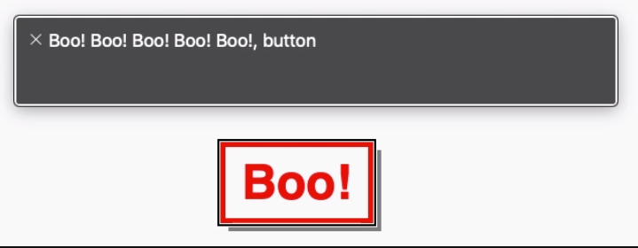
Those extra elements aren’t helping much as a screen reader will repeat the content four times. We need to hide those elements from a screen reader.
<button>
  Boo!
  <span></span>
  <span></span>
  <span></span>
  <span></span>
  <div aria-hidden="true">Boo!</div>
  <div aria-hidden="true">Boo!</div>
  <div aria-hidden="true">Boo!</div>
  <div aria-hidden="true">Boo!</div>
</button>
No more repeated content.
See the Pen
Accessible Pure CSS Ghost Button w/ Directional Awareness ? by Jhey (@jh3y)
on CodePen.
That’s it!
With a little extra markup and some CSS trickery, we can create ghost buttons with directional awareness. Use a preprocessor or put together a component in your app and you won’t need to write out all the HTML, too.
Here’s a demo making use of inline CSS variables to control the button color.
See the Pen
Pure CSS Ghost Buttons w/ Directional Awareness ??? by Jhey (@jh3y)
on CodePen.
The post Ghost Buttons with Directional Awareness in CSS appeared first on CSS-Tricks.
