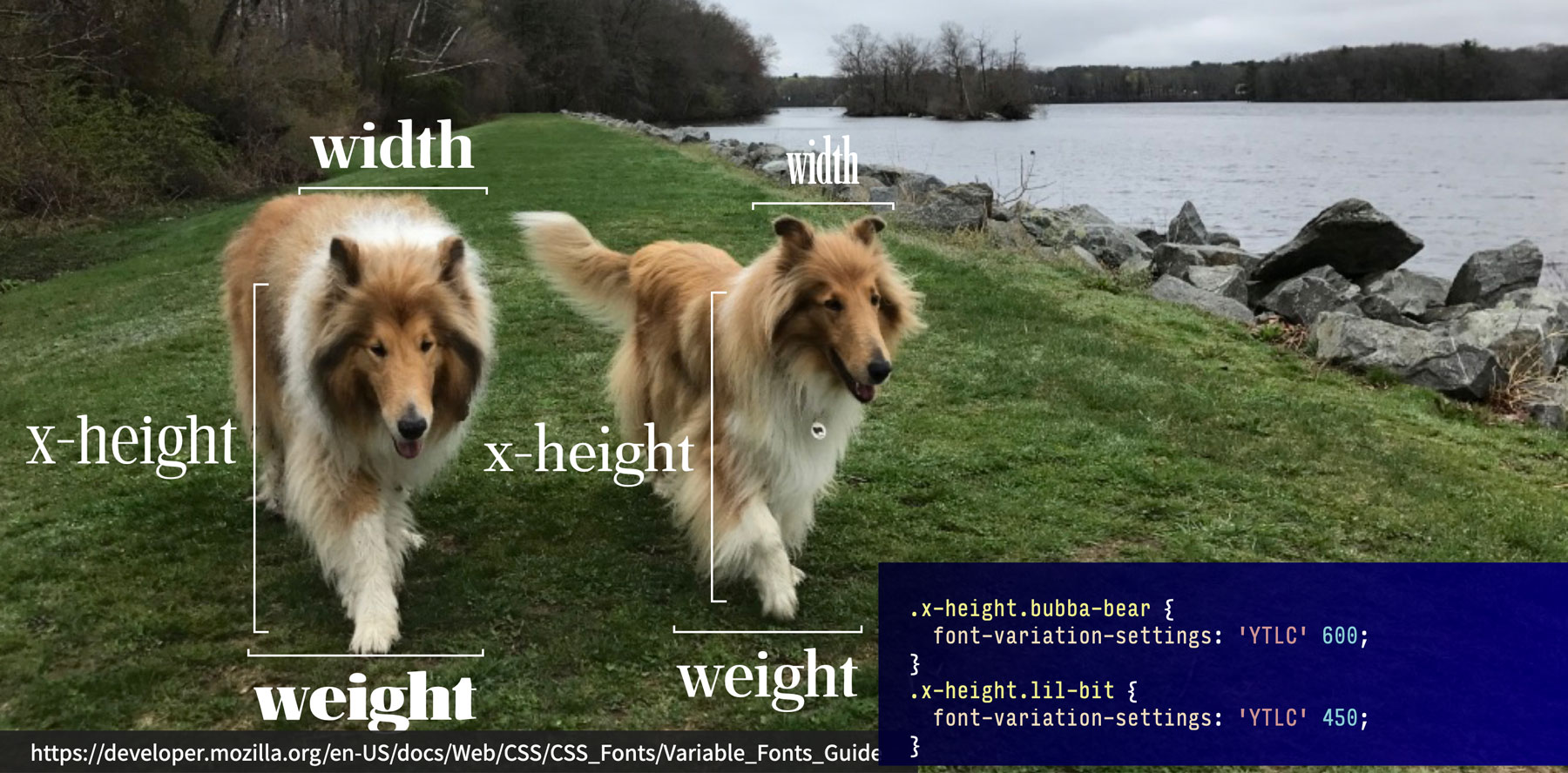
Variations on Theme: Reinventing Type on the Web
If anyone knows anything about me, it’s usually one of two things: that I have two outrageously fluffy dogs, or that I like fonts and typography. Like, really really like them. So while I am super excited about how well Tristan is doing with his hydrotherapy —we’re walking 50% further than he was able just a couple months ago, without having to take breaks in the middle—I’m even more riled up about variable fonts.
I know, you’re probably all really shocked.
I’ve been pretty single-minded about them since their introduction three years ago, and think they are going to be a massively Big Thing. But it just hasn’t gotten to that tipping point—yet. But a few things are coming together that make me think this just might be the year. Let me step back a bit and explain.
See the Pen
Variable font, outlined by Jason Pamental (@jpamental)
on CodePen.
The future is variable
Variable fonts are an evolution of the OpenType font specification that allows a single file to contain all of the variations of width, weight, slant, italics, and virtually any other permutation of a typeface the type designer want’s to expose—all in a single file. That one file is highly efficient, so it’s far smaller than all of the individual files. For the web, that means we can in many cases save considerable data download, reduce the number of HTTP requests, and in general vastly increase the design flexibility at our disposal. A pretty big change from those plain ‘ol static web fonts we’ve been using for the past 10 years. There’s loads of good stuff out there about them (I’ve written a few here, here, here, and here), but you can also browse the tag right here on CSS Tricks.
This browser support data is from Caniuse, which has more detail. A number indicates that browser supports the feature at that version and up.
Desktop
| Chrome | Opera | Firefox | IE | Edge | Safari |
|---|---|---|---|---|---|
| 66 | 53 | 62 | No | 17 | 11 |
Mobile / Tablet
| iOS Safari | Opera Mobile | Opera Mini | Android | Android Chrome | Android Firefox |
|---|---|---|---|---|---|
| 11.0-11.2 | No | No | 76 | 78 | 68 |
Now that browser support is pretty complete (for the most part everything but IE11 and a couple of Android browsers like Baidu and UC), availability of variable fonts is improving (check out v-fonts.com), and Google is launching support for them via their new API—it feels like this might finally be the breakout year for them.
What excites me the most about that is what we’ll see people create. I’m sure at first it will be lots of “rip and replace”, similar to what we saw on the Nielson/Norman group site with their inclusion of Source Sans Variable on their site last year, or what Google has been testing with Oswald Variable on sites 148 million times a day for the past several months. Basically just using that instead of a few static instances to reap the benefits of faster page loads and less code.
Which is great, but only just a beginning.
What I’m looking forward to seeing is people embracing the full range of what these fonts can do. Going form ultra-light to super-heavy, super-condensed to extra-wide. Whatever the fonts support is there for us to explore. I’m hoping to see designers dive in and explore the power of great typography. Type that speaks more and varied volumes to help guide us around our sites and apps. Type set in motion that can lead us from here to there.
See the Pen
Layout variations, part deux by Jason Pamental (@jpamental)
on CodePen.
Will some of it be awful?
Probably. But so were a lot of early responsive websites. And lots of sites with static web fonts when they first launched. Or Flash-based sites. All of these have been evolutions of what we can design and make on the web. It’s up to us to do it well instead of poorly. I’m excited to learn together.
After all, if type is the voice of our words—with variable fonts—that voice has become a chorus.
The post Variations on Theme: Reinventing Type on the Web appeared first on CSS-Tricks.
