Print-Inspired Layout on the Web
I always love seeing people get inspired by print design and trying to port it over to the web. There is a much deeper history of interesting print work to draw from, and still a ton of modern work happening that eclipses most digital design work today. The web is fully capable of bold, interesting designs, yet we see it all-too-rarely.
Just lately, we’ve seen a little surge of interest…
Dan Davies took inspiration from nine different print articles and built layouts that are similar in spirit to each of them.
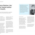
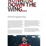

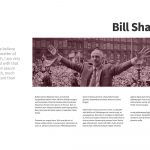


Ahmad Shadeed rebuilt a rather complex grid layout with bold typography inspired by an image from a book.
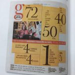
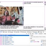

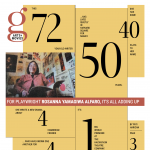
Facundo Corradini built out a design from The New York Times Style Magazine.
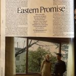
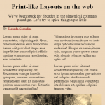
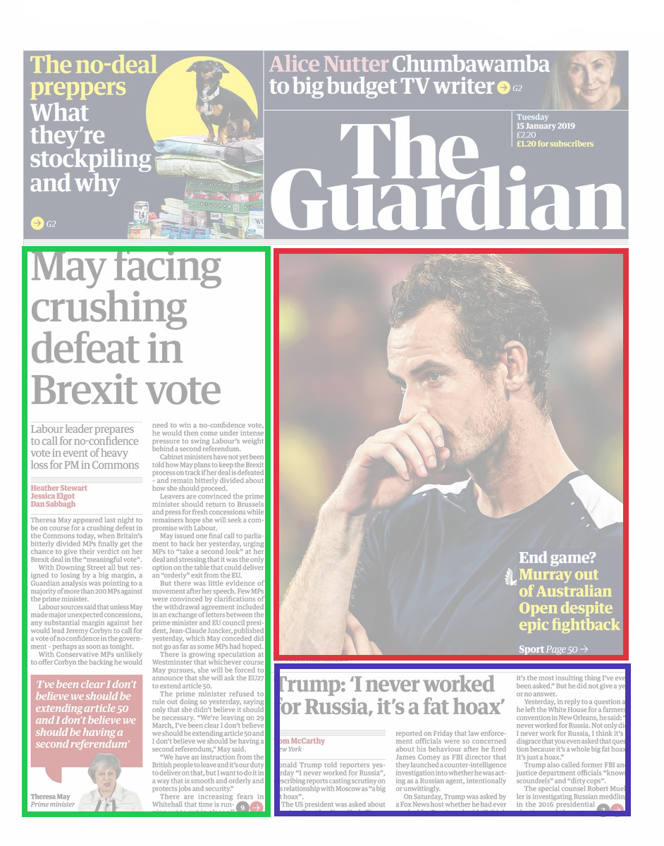
Frederick O’Brien compared newspaper design to web design.
We’ve seen this kind of exploration before. I explored it in this article, which is largely about the CSS tools we have to do this work better, but also includes demos like this one I made as well as this one from Stuart Robson.
Also:
- Jen Simmons has been banging this drum for ages. “Getting out of our ruts” is a phrase she used in a presentation that hits home for me.
- Jules Forrest has done lots of grid explorations like this one that appears to be highly print-inspired.
- Raisa Yang has explored magazine layout, this one using
columns, which I don’t see used all that much out in the wild but is highly inspired by print.
I think it would be fun to put together an article with all the main CSS tools we have for replicating print-like designs. I just might do that, but what might talk me out of it is the fact that it’s sorta everything in CSS. CSS is about styling, and all styling is on the table for building unique designs.
The post Print-Inspired Layout on the Web appeared first on CSS-Tricks.
