How To Design An Iconic Logo?

Have you ever wondered why Adidas, Nike, Apple, Unilever, and many others have such remarkable logotypes? What is the inner side of their success? We have an answer! These companies have followed certain rules to create meaningful and interesting logos.
We analyzed their experience and chose the 5 best tips for an iconic logo design. Let’s discuss these points and learn how to use them!
Top 5 Tips For Creating Iconic Logo Design
1. Give it some sense or meaning
When I first saw Toyota’s logo I knew nothing about what it meant. However, since the logo itself made totally no sense to me initially, I decided to google it. What I discovered was the fact that we can retrieve every single letter of the brand name from the logo. Needless to say, my jaw dropped in a long excited ‘Wow!’.
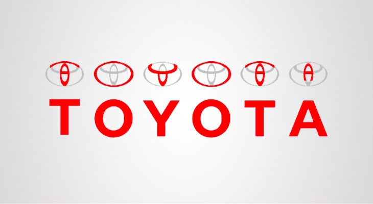
The most crucial point here is that Toyota’s logo is very eye-catching and is easy to recognize among many other car producers. What is more, such an interesting approach to the use of meaning will make the logo an absolute highlight, and if you see the explanation once you’ll never ever forget it.
There’s another option: when you have an idea for a logo, include elements that represent the area you are dealing with. Let’s take a look at our Approval Studio logo.

Approval Studio is a collaboration artwork proofing tool for designers and the logotype fully represents it. There are several people holding hands of each other in a circle to show teamwork – a complete puzzle piece! Speaking of collaboration, it is one more important element of any kind of design work including logos, so if you are interested in a solid artwork approval tool, follow the link below.
2. Use colors wisely
Have you ever heard of colors psychology? Different colors may have different influences on a person and, thus, on the perception of your brand by your target audience.
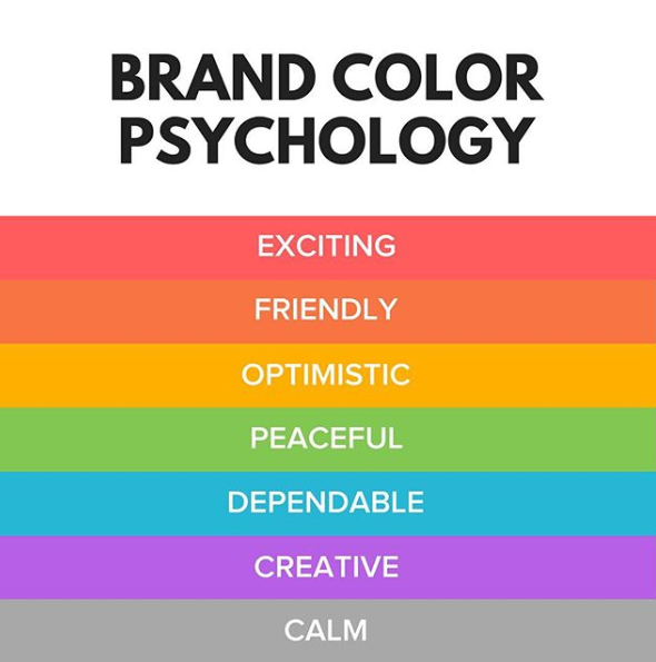
Consequently, having a clear image of using colors, you can evoke needed feelings regarding your logo and brand in general. Let’s take a look at a list of some colours and discover how we can use them:
Red – excitement. Aim: calling for action or evoking strong emotions. Example: YouTube – a platform that is built on actions filmed on video and your emotional response to them.
Orange – creativity and happiness. Aim: building a positive attitude. Example: Nickelodeon – a cartoon platform designed for kids to have fun.
Pink – toys and childish playfulness. Aim: attracting little kids. Example: Barbie – a toy brand that makes dolls.
Green – nature and money. Aim: making an impact on health and fertility. Example: Greenpeace – an organisation whose main task is environment care.
Blue – stability, peace, and trust. Aim: building a feeling of trust, reliability, and safety. Example: Walmart – a supermarket network that needs the trust of the buyers to thrive.
Purple – power and luxury. Aim: showing status and nobility. Example: Milka – a European chocolate producer that is considered as one of the best in the world.
White – humanity and cleanliness. Aim: creating contrast. It is often combined and interchanged with Black that represents mystery and elegance. Aim: creating consistency. Example: Chanel – one of the most famous fashion houses that are considered as one of the indicators of style and relevance.
Grey – neutrality and balance. Aim: underlining balance between colors and making the logo more color-friendly. Example: Apple – a famous electronic gadget developer that wants to accent how well-balanced and perfect their products are.
Brown – earthy color. Aim: sharing comfort and security. Example: UPS – shipping and logistics service that need its customers to trust their goods to them.
3. Multiple variations
If you consider having multiple lines of your product or types of services, you may need several logo variants. This will prove beneficial in the long run because you may adjust an image to a certain style or idea you need to represent. Considering that trends change very quickly and people get bored with everything old very fast, ability to react fast to the changes with the logo adjustments are instrumental for any company.
For example, Adidas has several clothing lines that have different logos which suit them perfectly. Adidas Originals is about casual clothing, usual Adidas logo represents sports stuff, and Adidas Neo stands for teenager clothes. Let’s take a look:
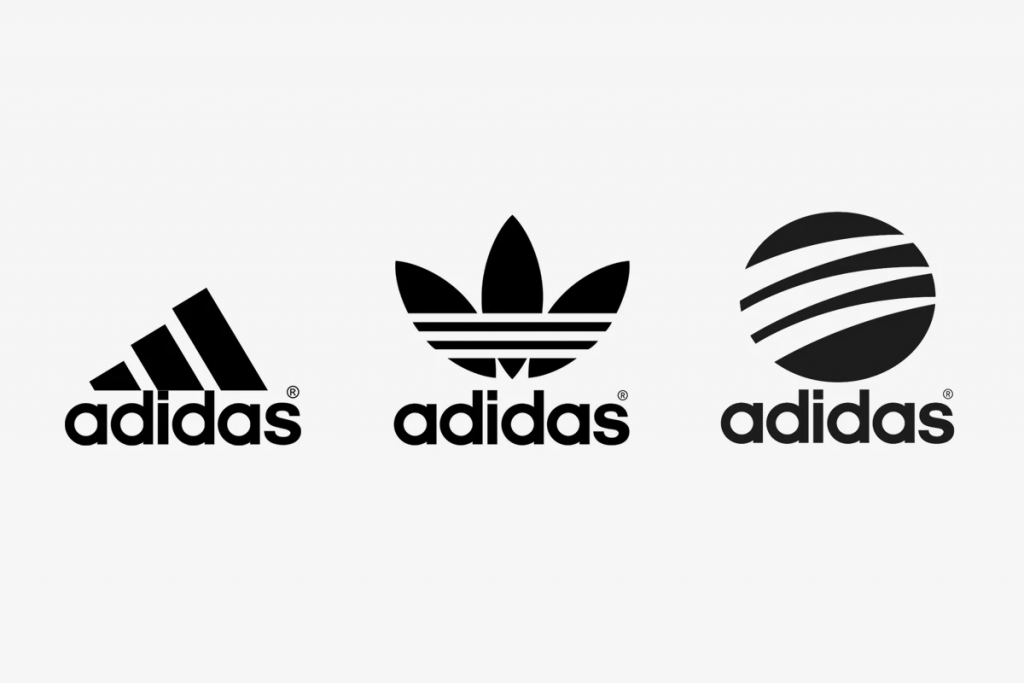
So, having several logos gives you more ideas for small variations with the flow of time. Refreshing your visual components might be crucial in your brand development and will definitely pay off in the future.
4. Let your logo ‘breathe’
Considering a recent boom of minimalism, your logo needs to be simple and not overwhelmed with excessive elements to catch the eye of a potential customer. Such approach will help you to make the logo more consistent and give it some ‘fresh air’
What does it mean? Whatever is depicted on your logotype needs some space. Do not add too many extra elements around. Also, personal space for each component will change your logo drastically and make it cosy.
Let’s take a look at Unilever.
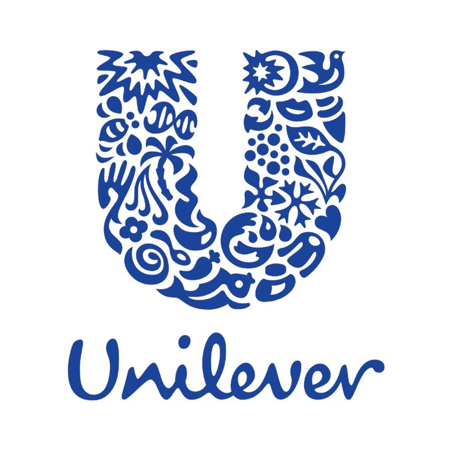
Every element has its own space and, despite the fact that the logo includes many of them, the overall image looks smart and consistent because all the elements create the letter “U”. It is a lot and not too much at the same time, which makes the logo unique and builds customer’s interest in the brand, making them remember it. Who doesn’t know Unilever, really?
5. A scalable logo means no pains in the back
When you have finished artwork, the time has come to think about rocking the world. The marketing campaign for your brand may and will include many different approaches and strategies, and you have to be prepared for each of them from using digital marketing to huge banners in the city. The logo of your brand will definitely be used in each of them, which means you have to be ready to adjust logo’s size so that it doesn’t lose the quality even on the biggest screens or banners.
Do not wait until you decide to roll in big printing – you may get tons of problems to deal with, and re-making the logo shouldn’t be one of them. You must be ready for everything from the very beginning of your brand. Better safe than sorry as they say – last-minute adjustments might make the quality of work far worse.
Final Thoughts
Working on logos is definitely not easy, but there are certain strategies you can use to make your product more recognizable. A logo is the heart of the brand, and if you want it to perform, take it responsibly. We hope that our guide was helpful, and, at some point, your logos will be extremely famous and everyone will be using them as examples. And, naturally, Approval Studio is more than ready to help you with it. Take care!
