20 Unmissable Websites, June 2020
Every month we publish a roundup of the 20 most unmissable websites newly launched, or updated in the previous four weeks.
In June’s edition you’ll find everything from corporate sites for global power-houses, to personal sites for innovative designers. This month we’re seeing a lot of flamboyance, a lot of passion, and the color of the moment is (hooray!) yellow. Enjoy!
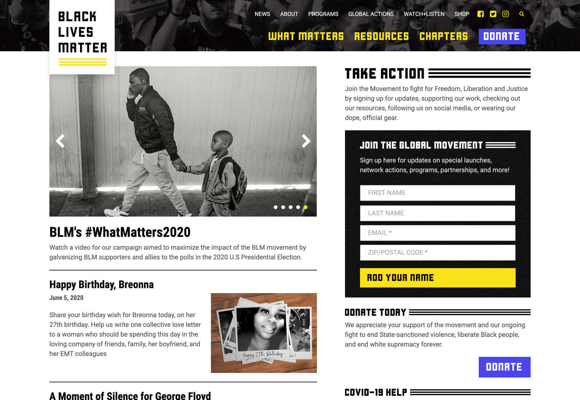
Black Lives Matter
In recent weeks there have been protests in the US and beyond in response to alleged police brutality directed at people of color. The Black Lives Matter website is a central hub for news, resources, and information on civil rights campaigns in 38 countries.
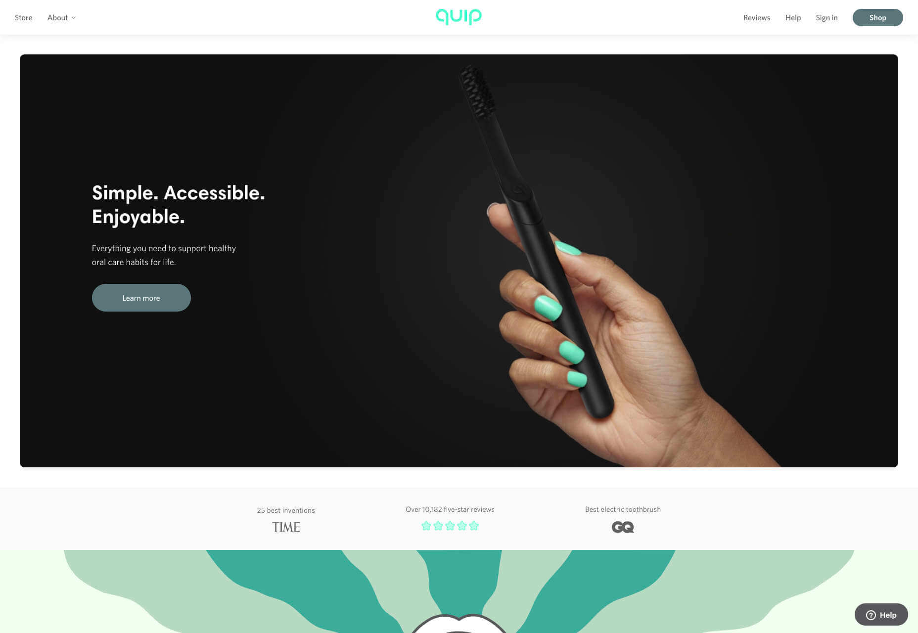
Quip
Quip is a site focused on helping us build, and maintain healthy oral care habits. Centred around its innovative products, this site mixes images, illustration, and motion effortlessly to create a healthcare brand that’s highly appealing.
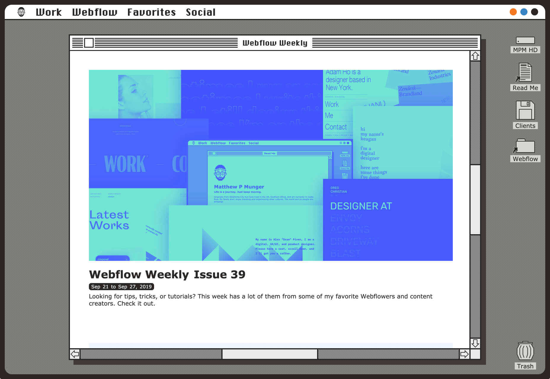
Matthew P Munger
This portfolio site for Matthew P Munger is a delightful jaunt through a Mac OS of yesteryear. What we really enjoyed is that despite being presented in this early-90s style, the UI manages to adapt itself responsively.
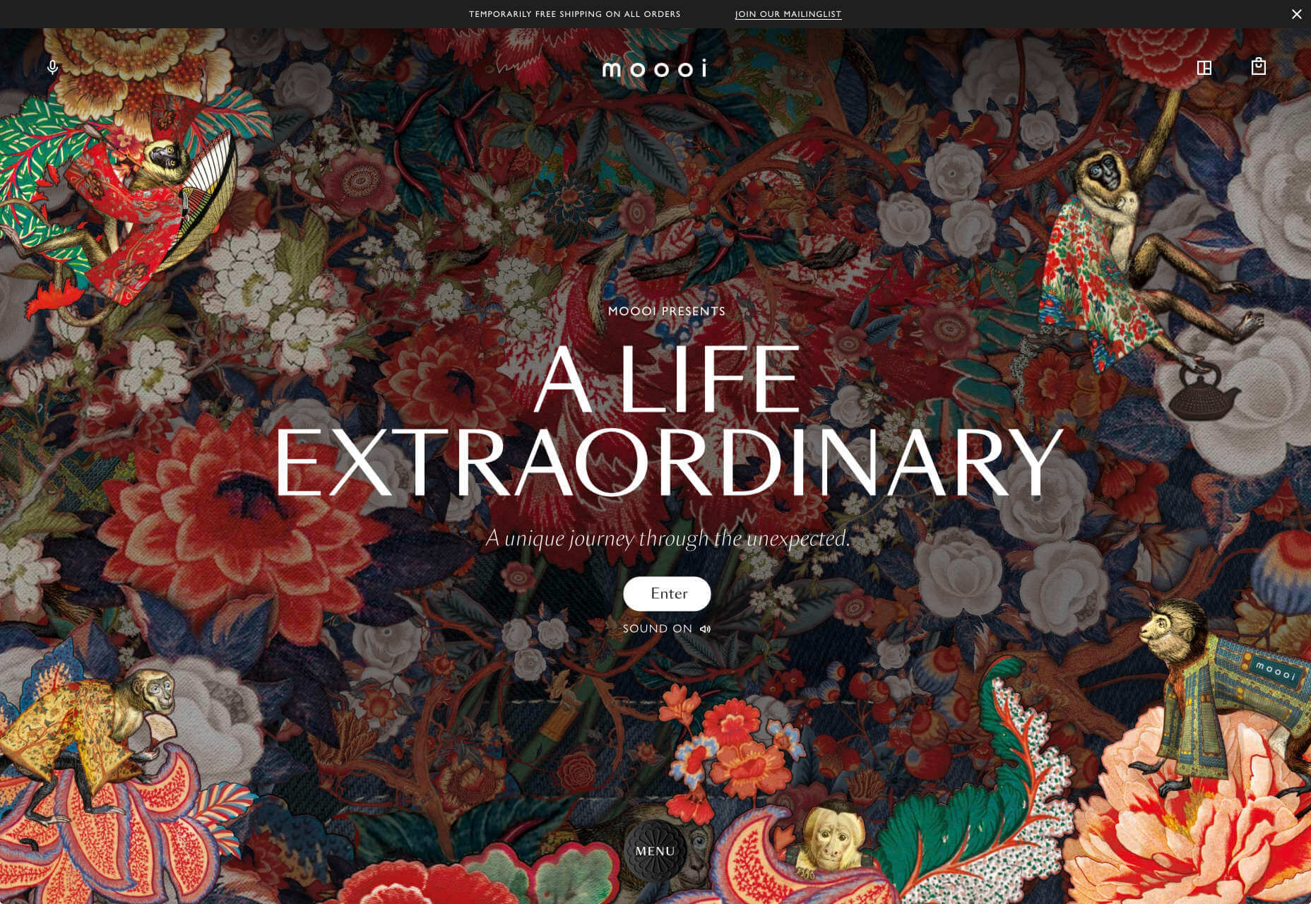
Moooi
There’s a maximal feel to Moooi’s site, layers of illustration enlarge so you feel like Alice falling down the rabbit hole. But the real excellence of this site is the tiny UI details, like the draggable bar that reveals the product videos.
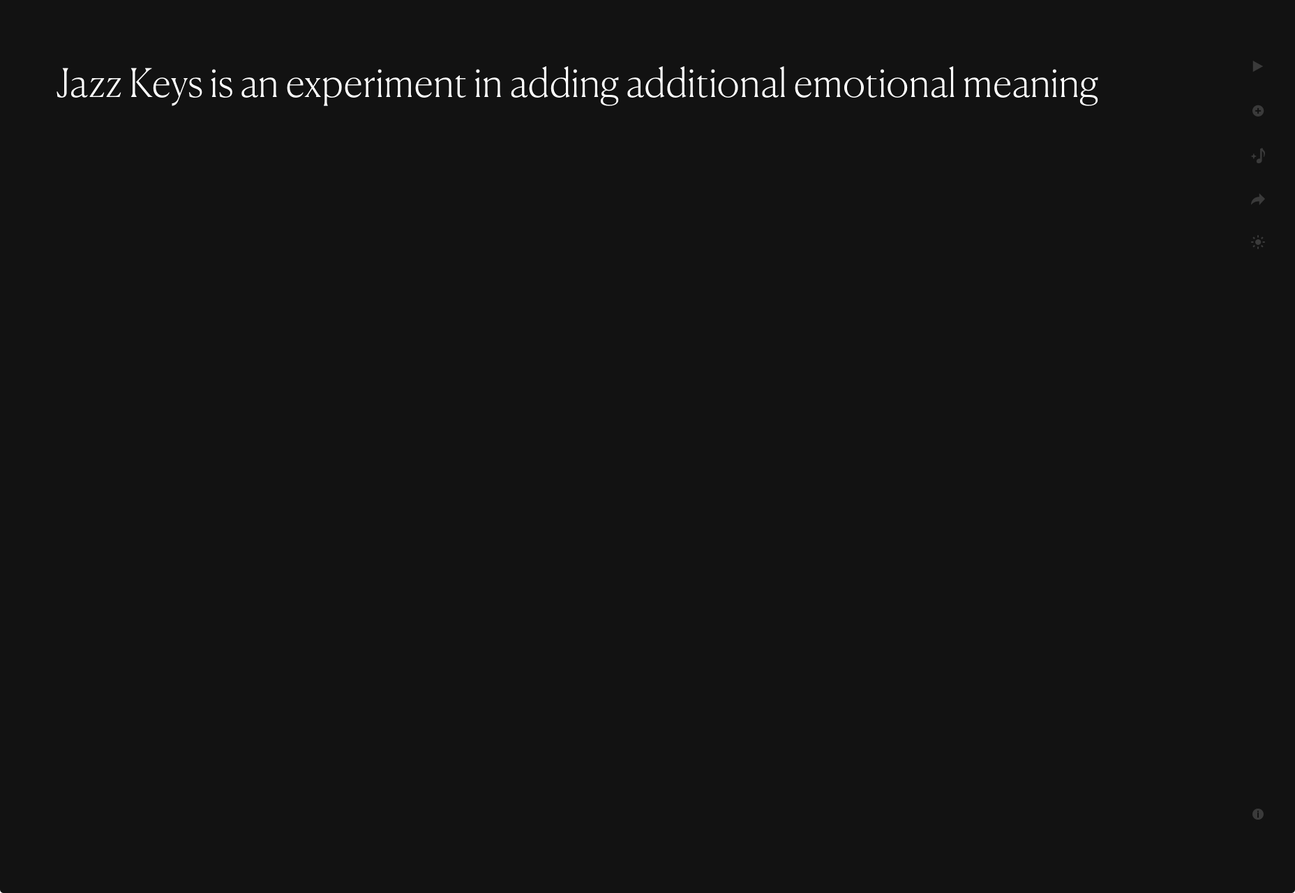
Jazz Keys
Jazz Keys is an experiment in adding extra emotional meaning to the often impersonal messages we send digitally. Type your message and hear it play in sound. You can send your message to anyone, and let them hear your words.
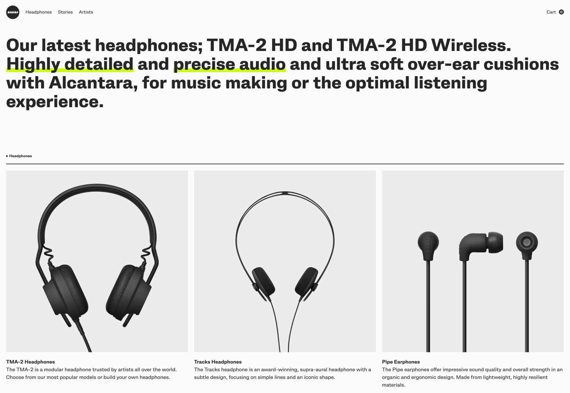
AIAIAI
There’s a brutally cool black and white aesthetic to AIAIAI’s site. The dark, low-contrast product photography’s absence of color punctuated by some shocking neon, and the occasional golden shine of a plug.
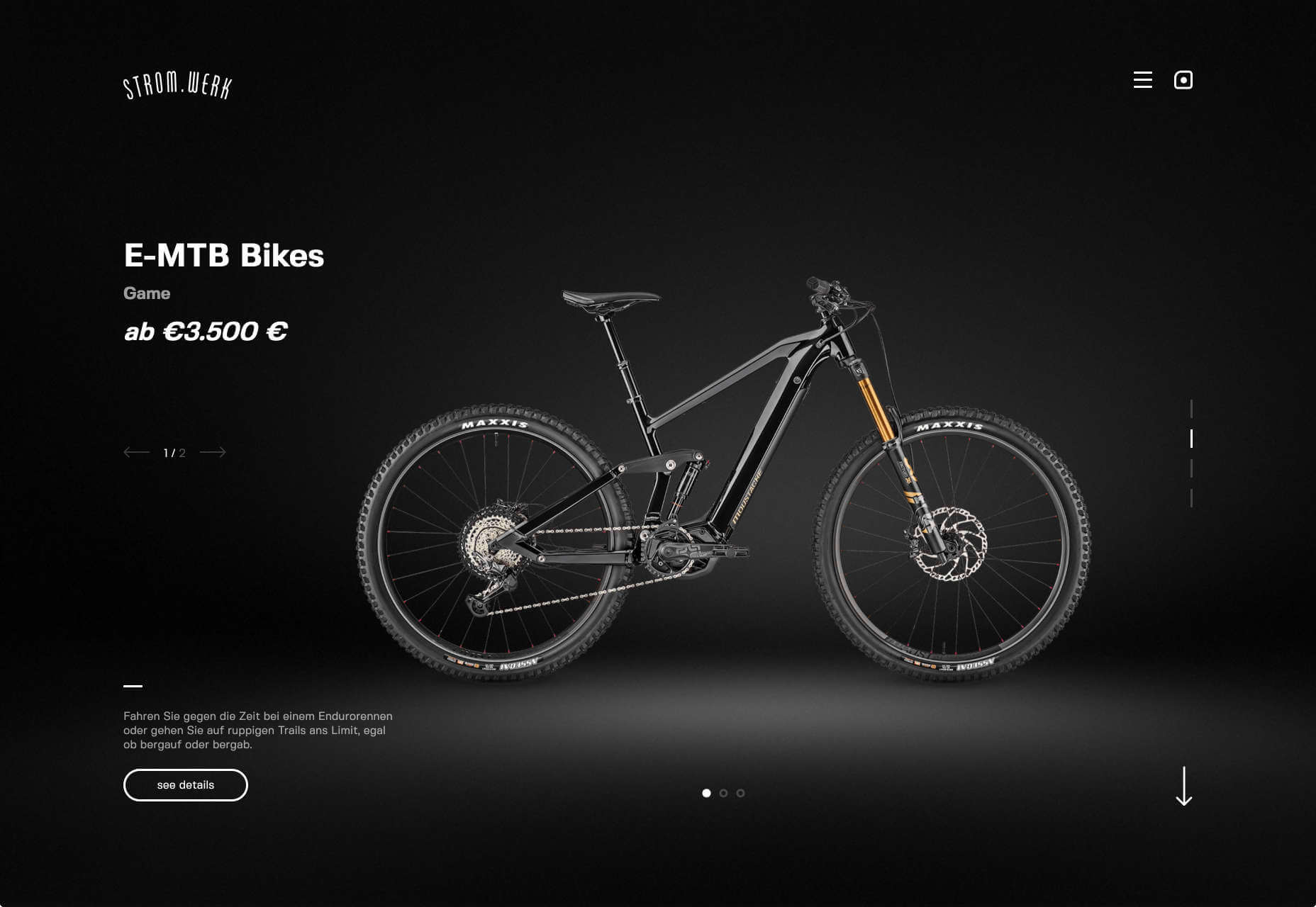
Stromwerk
Cycling is taking over the world, and one of the biggest new trends is for e-bikes. Stromwerk’s site does an excellent job of taking something that seems a bit like cheating, and transforming it into something rugged and cool.
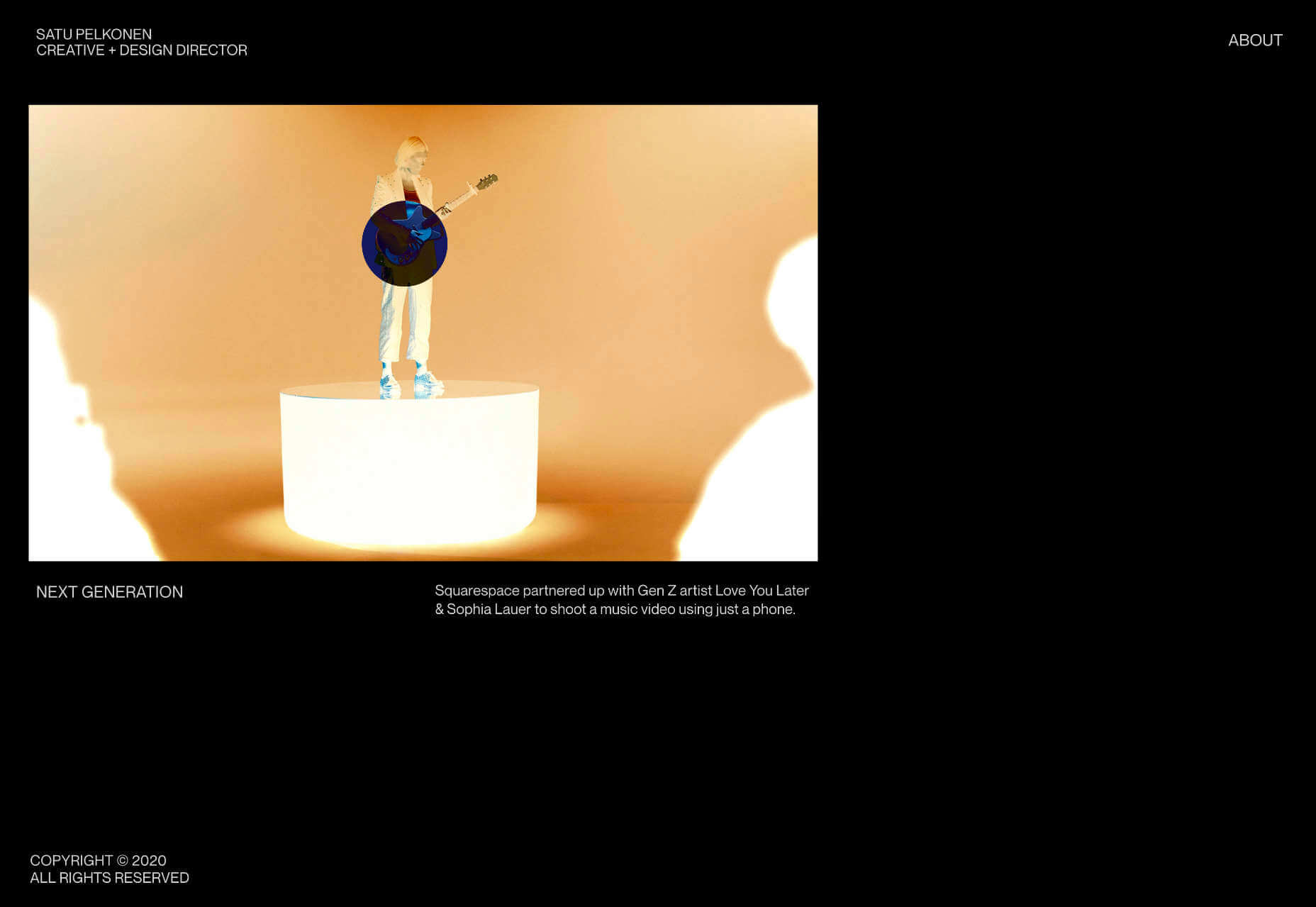
Satu Pelkonen
Satu Pelkonen is a NY-based creative director who joined Squarespace in 2019. His site features a really cool custom cursor that inverts the thumbnail it’s hovering over, creating a delightful, simple interaction.
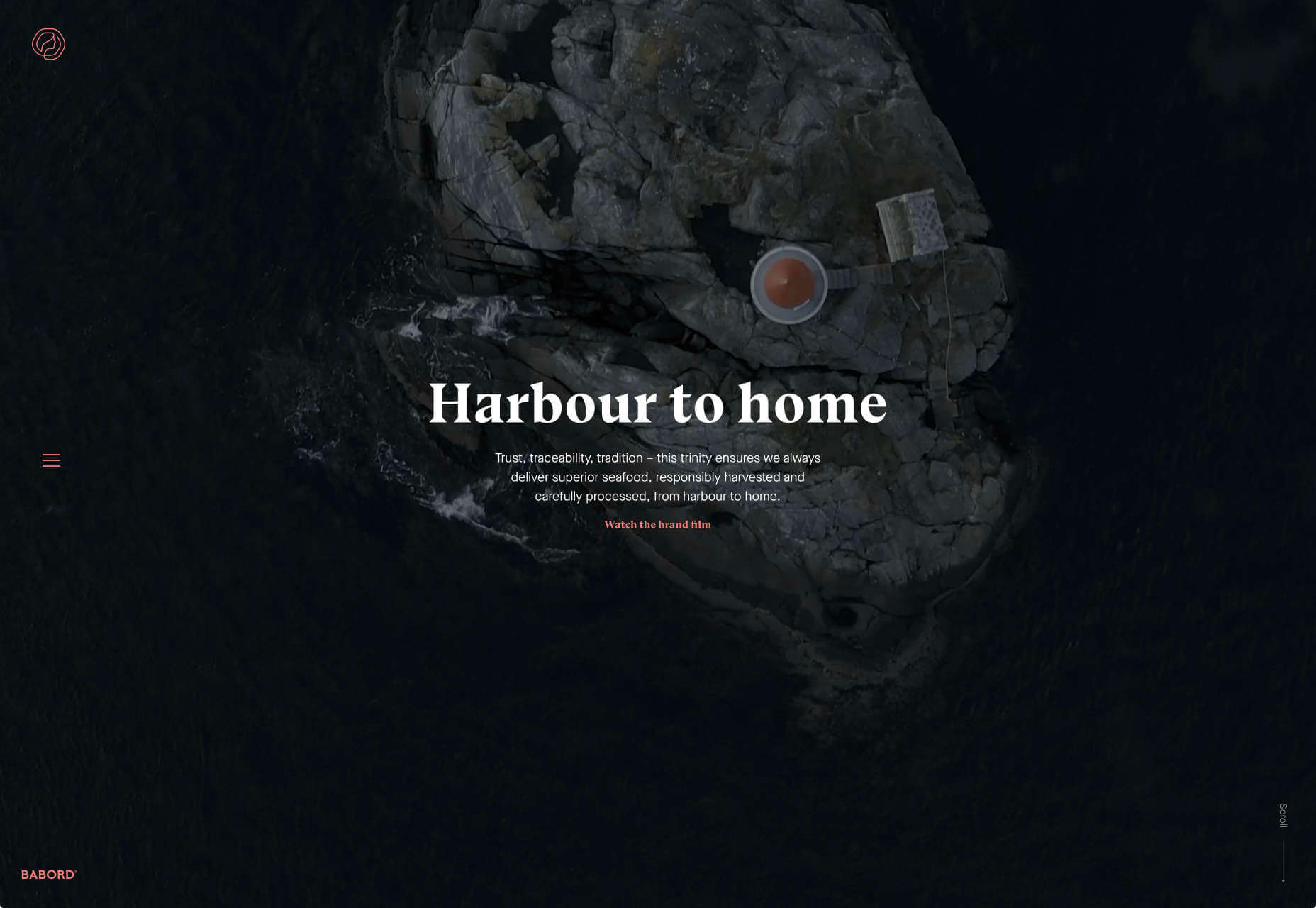
Babord
Babord is a Norwegian seafood supplier. The relationship Norwegian’s have with the sea is evident, and the site transforms simple fishing into an almost mystical experience. Plus that brand font is fantastically daring.
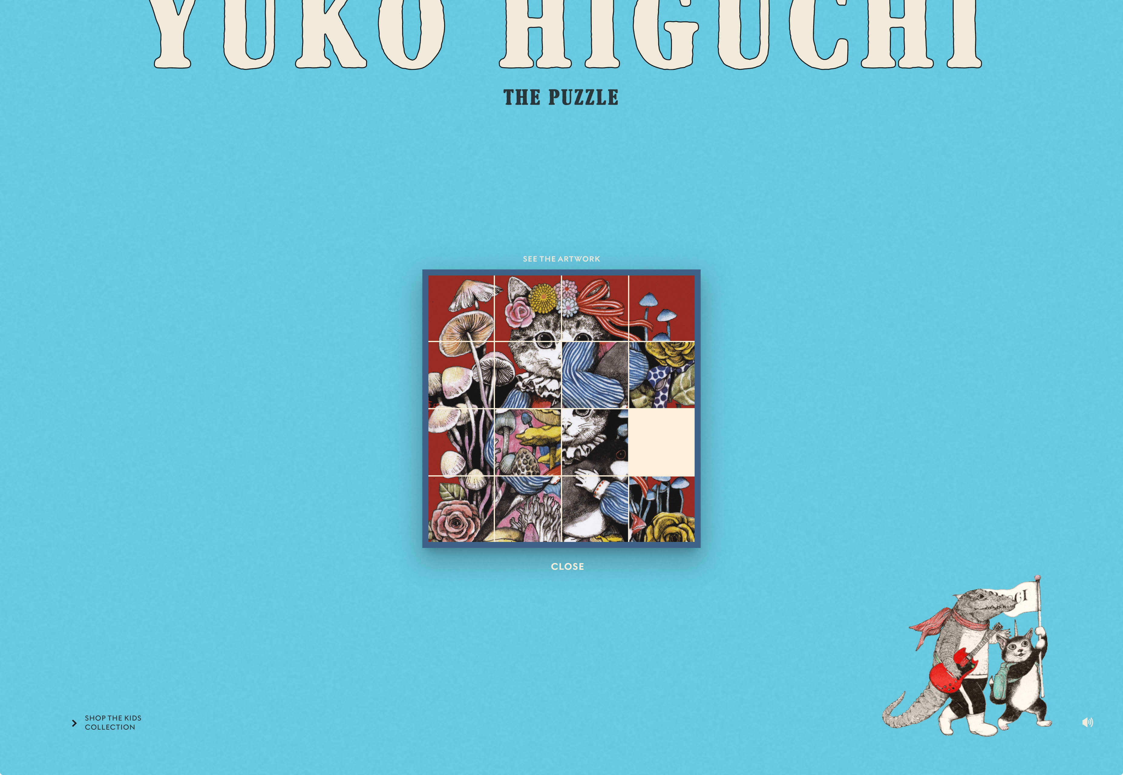
Yuko Higuchi x Gucci
Guggi has a history of expansive and ambitious marketing campaigns. This latest micro-site from Italy allows you to play a fun, tile-slide game based around the fashion label’s new kids collection.
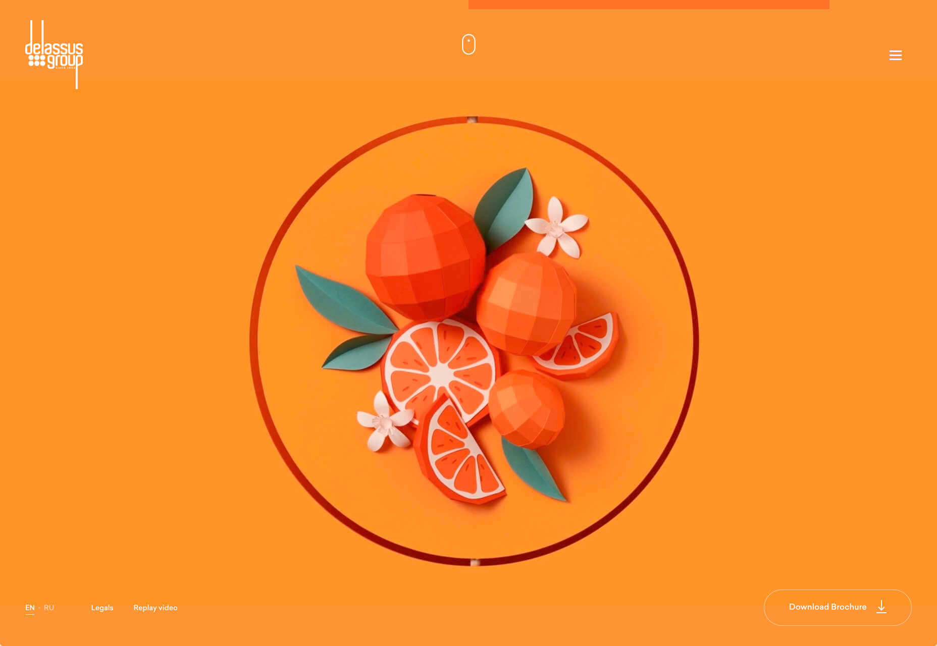
Delassus
Delassus is a Moroccan company that grows ingredients from citrus fruits to avocados. Its whole site is a cornucopia of 3D design, with models of its products, and humorous typography. Bold, and fun, and practical too.
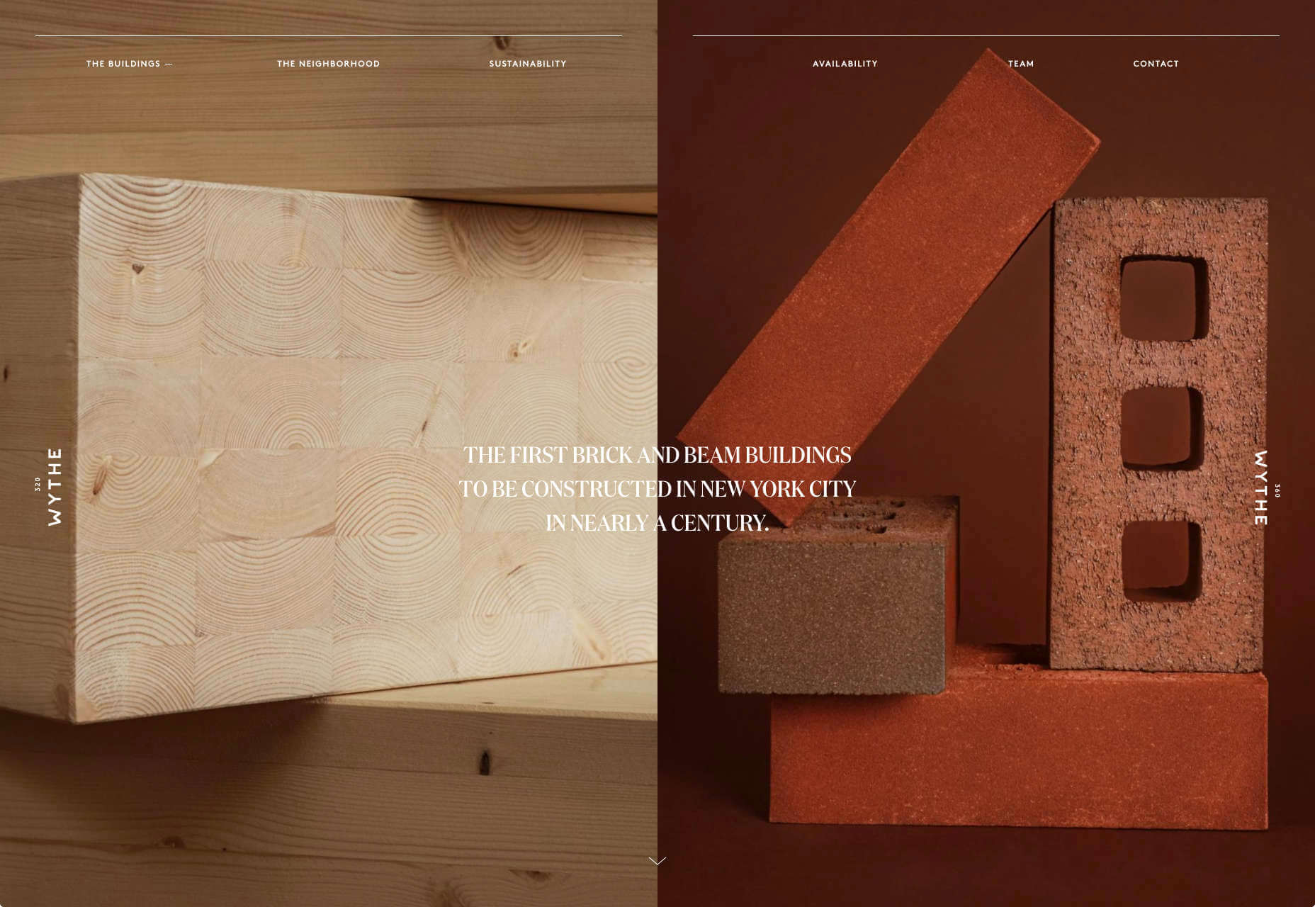
320 and 360 Wythe
Who would think that bricks and timber could look so glamorous? That’s what this site for two new buildings in Brooklyn achieves. The colors, the mockups, and the old-timey photography give these new builds a much needed heritage.
Readymag Design Workout
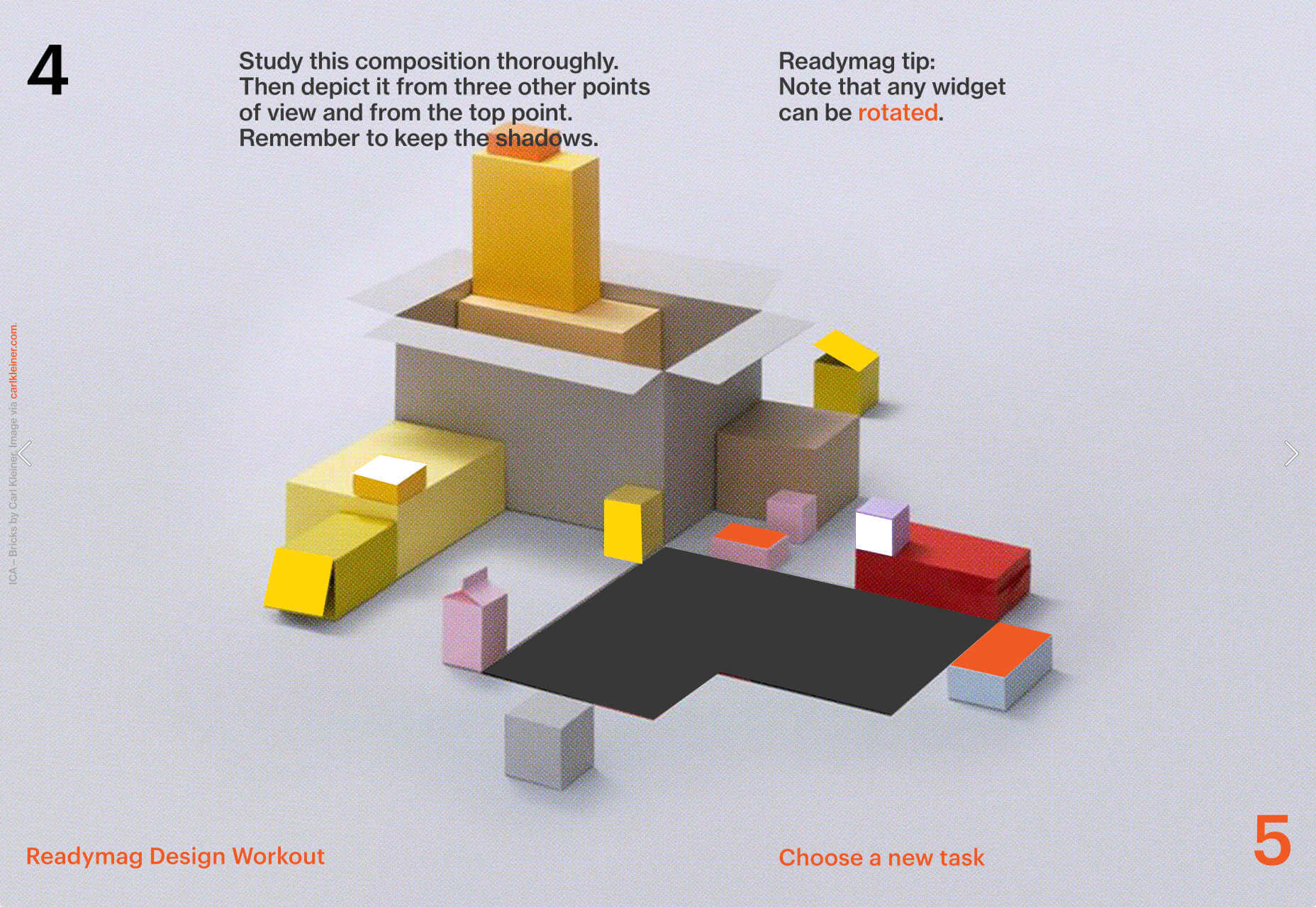
To keep you creative during the pandemic, Readymag has created this daily training program to hone your design skills and help you with decision making. It’s a drag and drop playground, with real world tasks to challenge you.
Radical Design Course
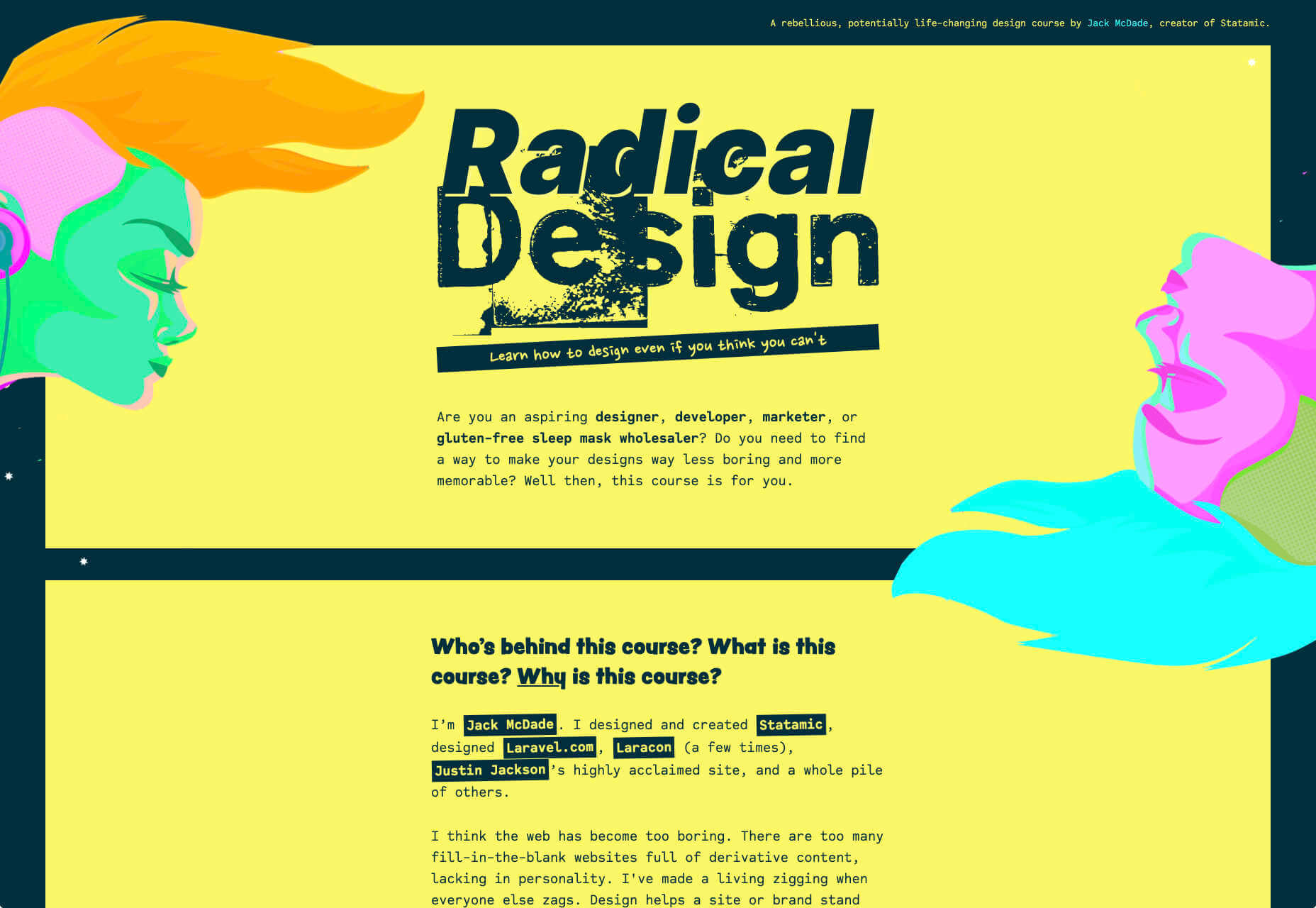
If you think that web design’s just too samey, then you’ll appreciate the launch page for the upcoming Radical Design course. It features tons of yellow, engaging typography, and some super-cute illustrations.
Bastarda
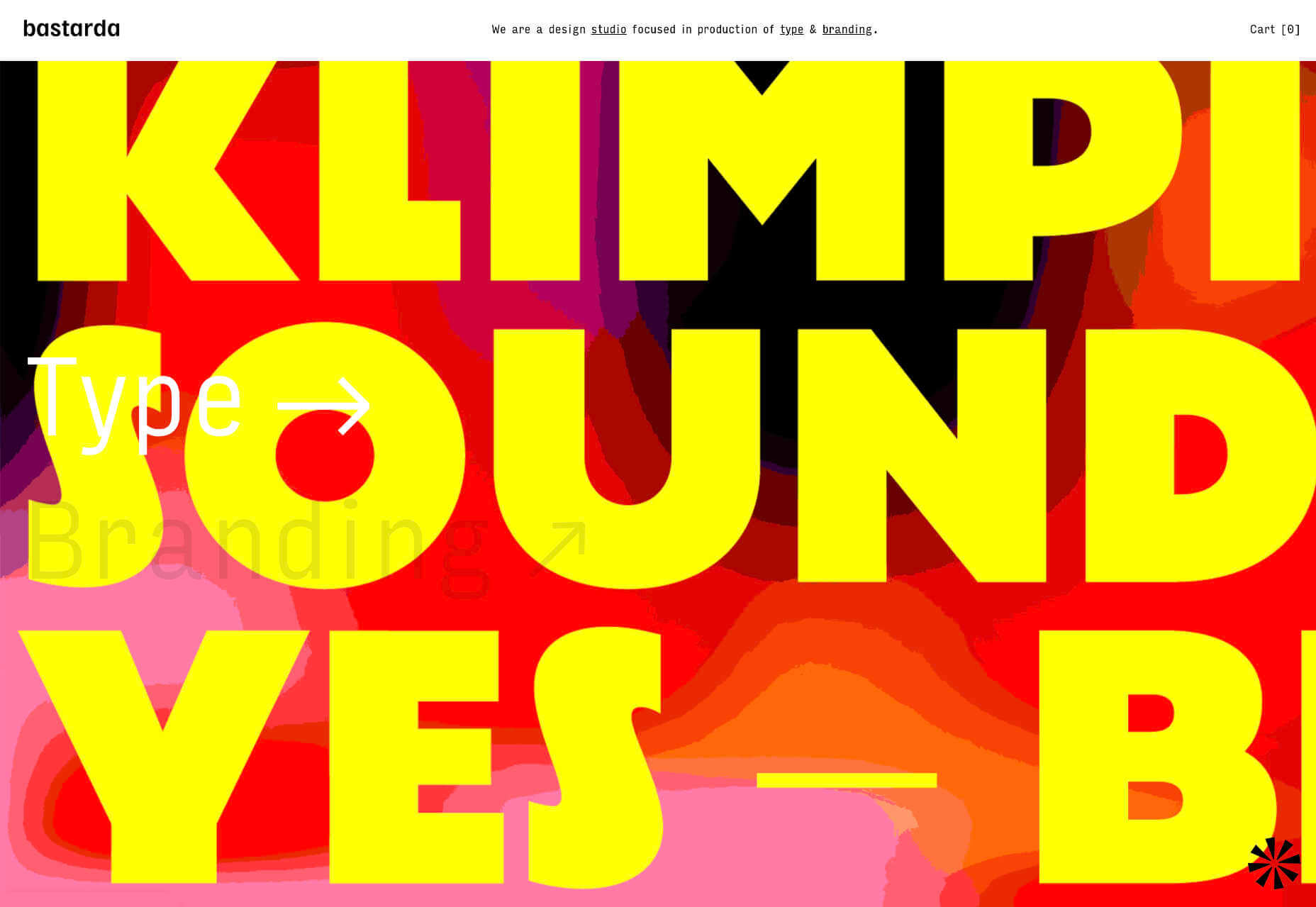
Bastarda is a type and branding design studio from Bogotá, Colombia. It has managed to create a sense of both simple, structured minimalism, and energy and excitement with hovers on its main links that trigger awesome reels.
Jens Nielsen
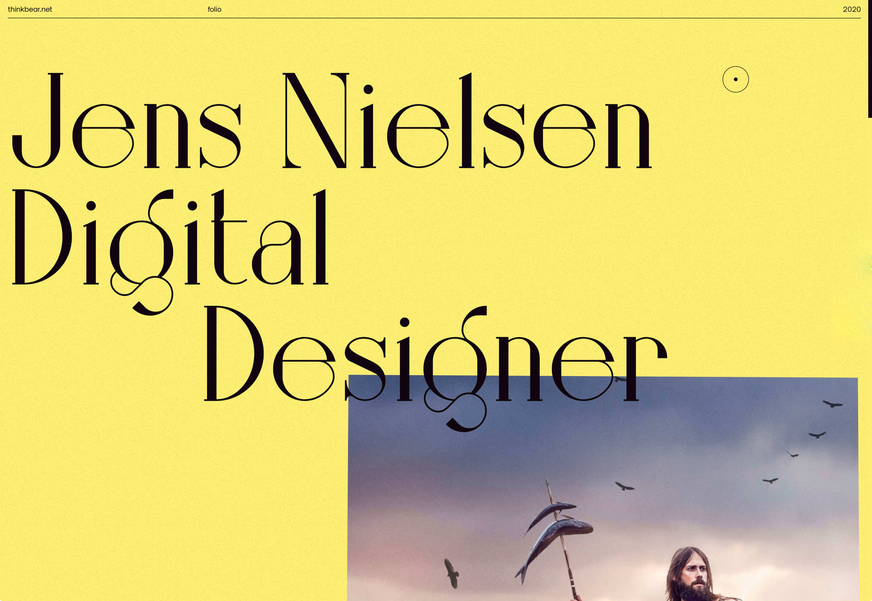
This awesome portfolio for Jens Nielsen features some great artwork, a super-brave choice of font, and some really cool mouse overs that flash up thumbnails of work that’s all linked up on Dribbble.
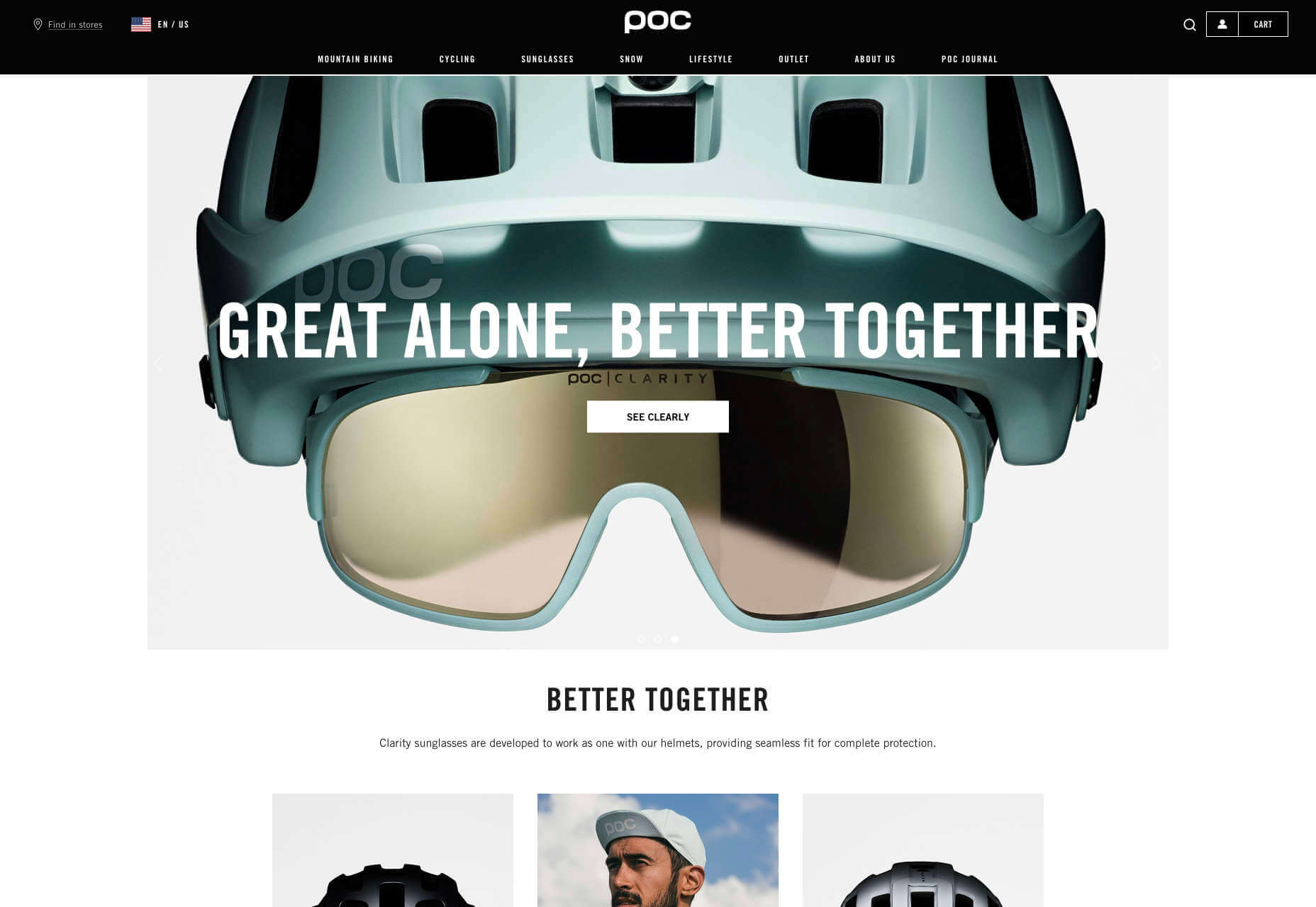
POC
More cycling this month curtesy of POC, makers of cycling helmets and apparel. This site does an awesome job of balancing lifestyle imagery, and a clean, practical e-commerce site that is easy to explore.
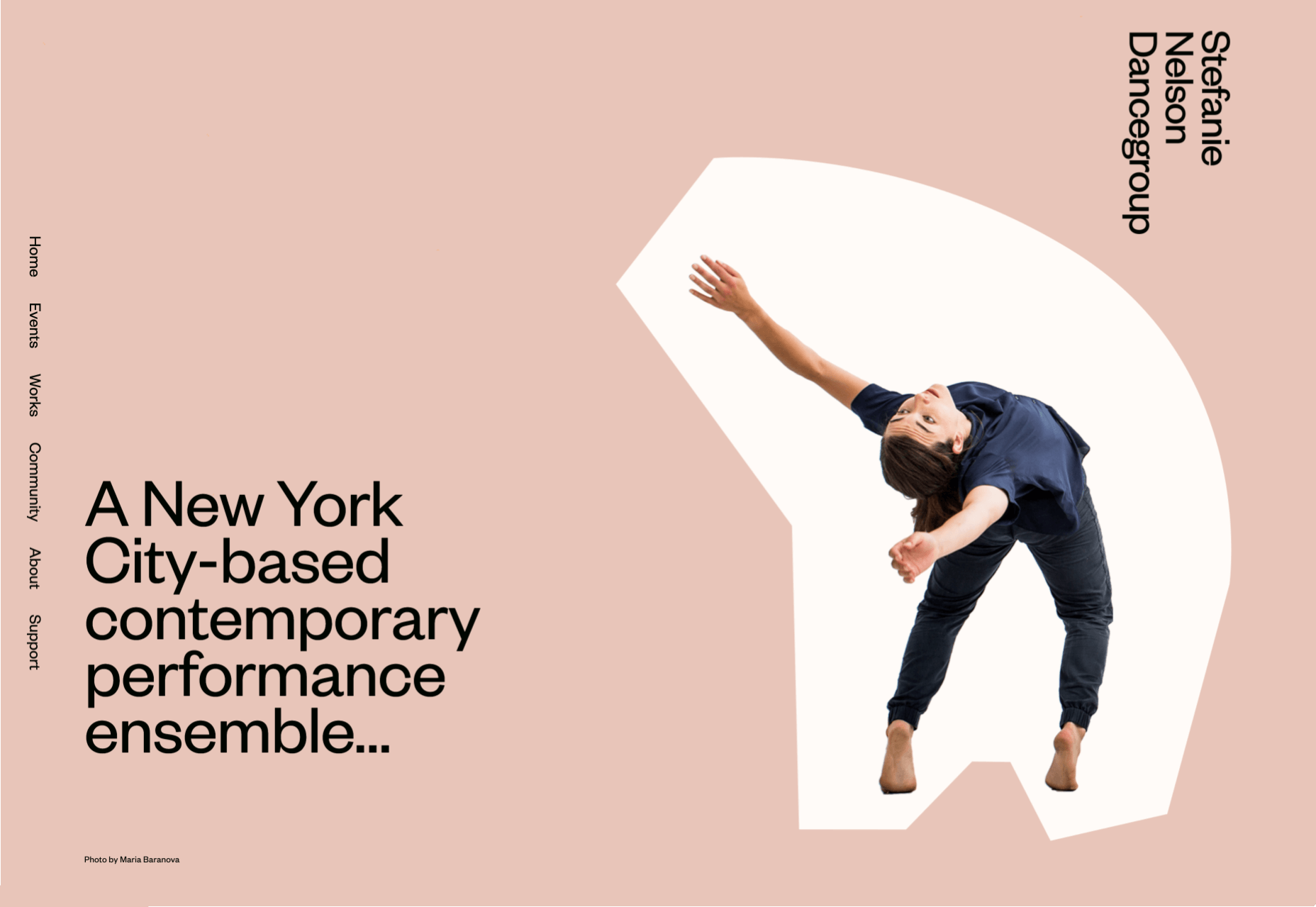
Stefanie Nelson Dancegroup
Some of the most striking design of the last century can be found on the radical covers of jazz albums. The Stefanie Nelson Dancegroup site follows a similar path with abstract shapes on the site mimicking body movements.
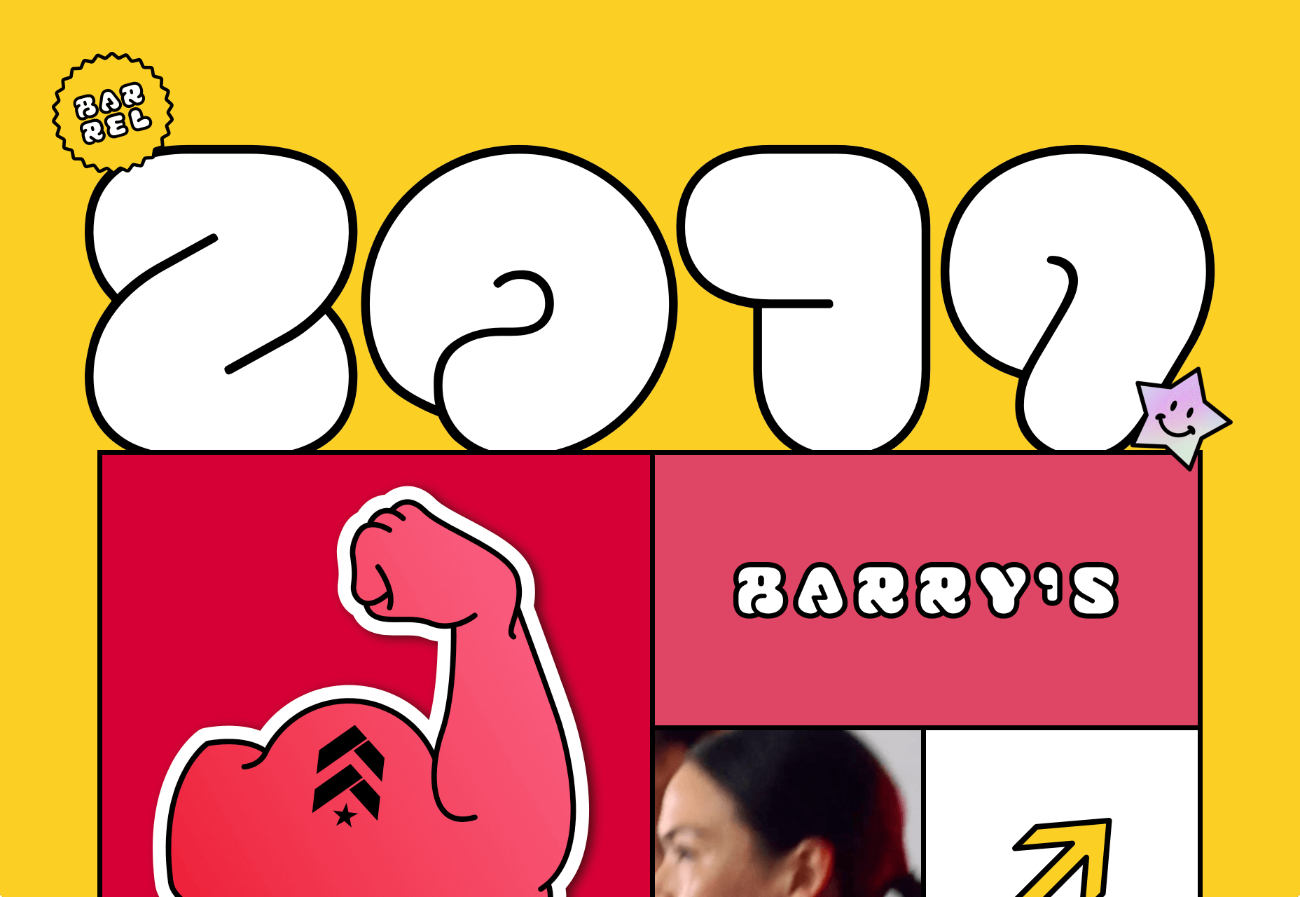
Barrel 2019
Barrel is a design studio that specialises in wellness brands, from workout products to the vitamins you take. This recap of their work from last year is fun, colorful, and a great opportunity for them to break away from their usual style.
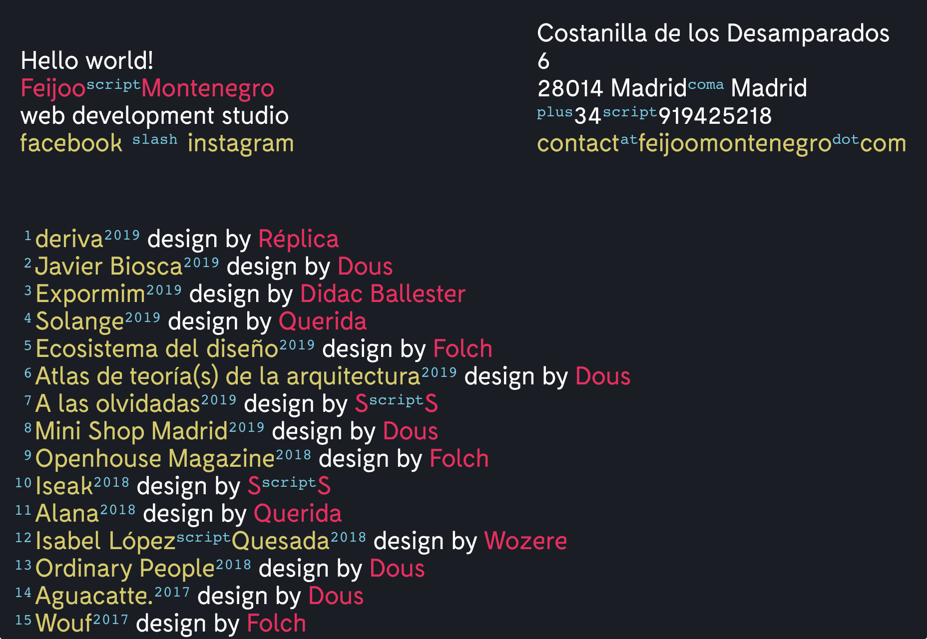
Feijoo
I have a soft-spot for all-text sites, and this simple list one-pager by Feijoo is right up their with my favorites. Perhaps is reminds me of my Sublime Text theme. Either way, I love the details like the numerals being replaced by words.
