12 Ways To Improve User Interview Questions
12 Ways To Improve User Interview Questions
Slava Shestopalov 2020-06-09T10:30:00+00:00
2020-06-10T09:35:11+00:00
An experienced interviewer takes care of many things: builds hypotheses, selects interviewees, composes invitations, schedules appointments, sets the stage, and, of course, writes an interview script. Any of these preparations can go wrong, but the script failure means all the effort is in vain. So, if you haven’t interviewed people a lot before or you have to delegate it to non-designers, I’d recommend paying attention to high-quality questions, in the first place. Then, there is a chance they’ll smooth out other potential shortcomings.
We’ll talk about 12 kinds of questions explained with examples. The first part includes six frequent mistakes and how to fix them. The second part presents six ways to improve decent questions and take control of difficult situations.
Pitfall #1: Hypothetical Questions
“I don’t care if people will use the new features,” said no budget owner ever. Investing in design and development, people want to make sure money will return. And direct asking, unfortunately, is not an effective way to check it, although it may intuitively seem a great idea. “Let’s go out of the office and ask ‘em!” In my practice, there were a lot of cases when people said they liked a feature but were reluctant to pay for it. So, is there any method to make sure that something not functioning yet will be needed when implemented?

I cannot recall anything more relevant than referring to people’s past experiences and behavior in similar situations. If users don’t have a habit of saving articles for later on all the news sites, what is the chance they’ll start doing it on your website? As Jakob Nielsen said, “Users spend most of their time on other sites.”
Pitfall #2: Closed Questions
Closed questions appear from a natural human wish to be approved and gain support. However, in the interviews, they aren’t useful enough. A yes-or-no question doesn’t provoke reserved people to talk and doesn’t help much to reveal their motives and way of thinking.
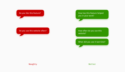
To be fair, closed questions are not evil. For example, they can serve a handy facilitation technique to make a talkative interviewee stop and turn back to the point. Also, they can help to double-check the information previously received through open questions. But if your goal is to gather as much information as possible, open questions will work better.
Pitfall #3: Leading Questions
The things considered polite in everyday conversations may be harmful to the efficiency of a user interview. Trying to help an interviewee with the options can guide them in saying what they don’t really think. A user interview is not the most comfortable situation for the majority of people, and they try to pass it as quickly as possible and at minimum effort. As a result, people tend to agree with anything more or less close to the truth or with a socially-expected choice instead of composing their answer from scratch.
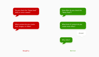
That’s why it’s better to move one step at a time and build the next question upon the answer to the previous one.
Pitfall #4: Selfish Questions
Idea authors sometimes act like proud parents?—?they want everyone to admire their child. The downside of such an attitude in user interviews is the unconscious usage of the pronouns “we” or “our.” As a result, users feel as if they are taking an exam and should either adore what they see or maintain neutrality, disguising real complaints.
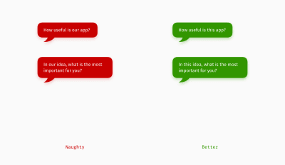
In your interview script, replace possessive pronouns with neutral words like “this site” and “that application” or just call a subject of conversation by the name.
Pro tip: as an interviewer, you can try hiding or understating your job title and relation to the topic.
Pitfall #5: Stacked Questions
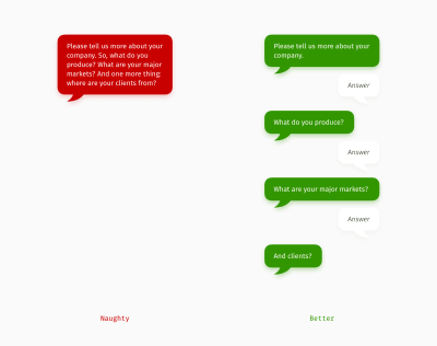
There are many reasons why we ask stacked questions. It can be a human desire to be heard, the fear of being interrupted, or worrying that you might forget the next question while listening to the current answer. However, for the interview efficiency, stacked questions are not an option. Interviewees often select the one they are more comfortable to answer to or the one they managed to memorize from the stack. Remembering questions shouldn’t become the interviewee’s burden, so it’s better to ask them one by one. (And maybe the answers are so comprehensive that you won’t need some of the planned questions anymore.)
Pitfall #6: Explanation Instead Of A Question
Teams that work together for some time often establish their own language and tend to bring it into the product they are building. But will users understand such words as “dashboard,” “smart update,” “inclusion,” or “trigger”? Explanatory questions put an interviewee into the position of a lexicographer and help to check what sense (if any) they put into brand concepts and expert terminology. For a designer, it gives insights into how the future product?—?a website, app, or self-service terminal?—?should speak to people.
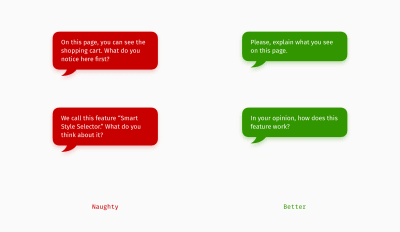
The opposite side of this approach is explaining it yourself and leading people before they have a chance to share their opinions. Think about this: in the interview, you are superior and can put pressure on users making them get your point. But will you always be there for thousands of users to explain how the product works? Probably no. So, it’s more efficient to discover people’s thinking styles and then create self-explanatory solutions rather than create something and push it in interviews.
We’ve just covered six major interviewing mistakes. The next portion of advice will be about making fairly good questions even more powerful and dealing with difficult interview situations.
Pitfall #7: Question Clutter
Open questions are great until you realize there are too many details to figure out. The best method in such a situation is storytelling?—?describing a recent or the most prominent experience. As a result, an interviewee talks about a real situation and is less inclined to compose a socially desired answer or summarize various cases.
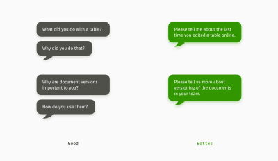
Besides, storytelling gives the freedom to speak about aspects a person considers necessary. Usually, people start with or talk longer about the most crucial experiences.
Pitfall #8: Too General Questions
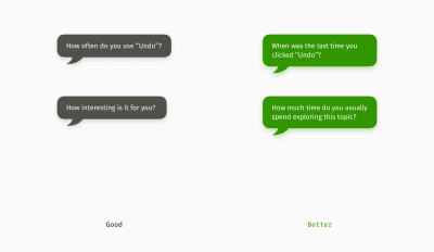
When you’ve figured out regularity or general attitude, it’s the right moment to ask the interviewee about an example. Recent-experience questions can fill in the gaps, which might have appeared while answering general questions. For an interviewer, it’s another powerful method to check if users aren’t accidentally exaggerating or dropping significant details.
Pitfall #9: Talking About What You Can Observe
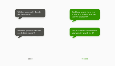
When you are lucky enough and interview people in their “natural habitat,” it’s a perfect chance to see their work process with your own eyes. So, if there is an opportunity to ask a user to demonstrate typical actions?—?offline or online?—?you’ll gather tons of insights. It’s a chance to learn about users’ habits (including shortcuts and favorite programs), level of computer skills, software environment, and the way of thinking (mental model).
Pitfall #10: Tolerating Vagueness
Abstract nouns and adjectives, for example, “comfort,” “accessibility,” “support,” “smart,” or “user-friendly,” are probably the trickiest words in the language because everyone interprets them differently. When you hear abstract names, that’s not enough to document them as they are. These words require “unboxing” and only then can support design decision-making.
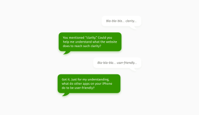
“Nothing is clear enough” has become my second favorite slogan after the classical UX phrase “It depends.” “Nothing is clear enough” means that you cannot be certain about the meaning if you hardly visualize a scenario from your interviewee’s life. The best way to unbox abstract concepts is by turning them into verbs.
Pitfall #11: Missing Numbers
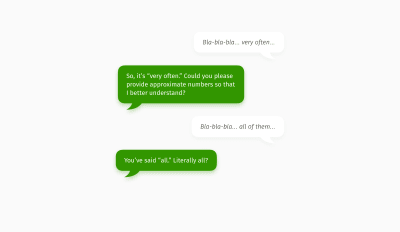
Generalizations like “all,” “never,” “always,” “nobody,” “often,” or“frequently” are as unclear as abstract nouns and adjectives. But the way to “unbox” generalizations is different?—?through quantifying. Basically, you ask questions about approximate numbers or proportions. An interviewee, of course, might not provide you statistics, but at least you’ll understand whether the user’s “very frequent” is about “more than a half” or “nearly 20%.” Another example: the same phrase “a lot” can mean “50 per day” for work emails, but it’ll be only “5 per year” for cybersecurity alerts.
Pitfall #12: Undervalued WH-Questions
As a non-native speaker, I remember these questions from the English classes at school. The teacher often asked us to make WH-questions (What? Where? When? Who? How?) so that we could start a conversation and break the awkward silence. Nothing had changed from school times. Now, as a designer, I often use WH-questions as the main interviewing instrument.

My favorite question is “why.” For the sake of politeness and a more friendly atmosphere, I conceal it behind the following phrases, “What are you trying to achieve when you…?” or “Can you please explain the reason/value of…?” This is how in pursuit of a root cause you can ask several “whys” in a row without annoying your interviewee.
Summary
The question techniques above are pretty straightforward and might not take into account the nuances of a particular conversation or interviewee. Of course, even the best questions won’t make all the answers automatically objective, but they can make information more reliable and actionable. All in all, it’s always on an interviewer to adjust according to the situation. Here are the three core principles if you are in doubt about particular questions.
Experience holds more truth than a hypothesis.
“
That’s why it’s recommended to ask about cases from the past and similar examples from other areas of a user’s life.
Let them tell their story; your ideas can wait
The goal of an interview is to explore the truth, not to sell or demonstrate something. If you force an interviewee to support you, it might mean the rest of the people won’t agree either. Also, give preference to clarifying the unknown versus checking hypotheses?—?for hypotheses, a better method is prototyping and testing.
If you cannot imagine it, you don’t get it
In a series of 1–2-hour user interviews, it’s so easy to get lazy and pretend you understand what you hear. Try challenging interviewee’s statements in your mind, “Did he say the truth? Do I know why she says that? What exactly do they mean telling me about it?”
Recommended Reading
- “The Mom Test: How to Talk to Customers and Learn If Your Business is a Good Idea when Everyone is Lying to You,” a book by Rob Fitzpatrick.
- “User Interviews: How, When, and Why to Conduct Them,” an article by Kara Pernice for Nielsen Norman Group.
- “The 3 Types of User Interviews: Structured, Semi-Structured, and Unstructured,” a video by Maria Rosala for Nielsen Norman Group.
- “The Art of the User Interview,” an article by Nick Babich for Springboard.
- “How to Conduct User Interviews,” an article by Interaction Design Foundation.
- “First Rule of Usability? Don’t Listen to Users,” an article by Jakob Nielsen for Nielsen Norman Group.
- “Interviewing Users,” an article by Jakob Nielsen for Nielsen Norman Group.
(cc, yk, il)