10 Best Marketing Agency Websites (Examples, Inspo, and Templates!)
Marketers are skilled in developing strategies, producing visual assets, writing text with high impact, and optimizing everything for engagement and conversion on websites, social media, and everywhere else in between. However, a marketing plan is only as successful as the website you use to get leads from.
Because of this, your marketing agency requires a website that completely impresses visitors.
Continue reading for a list of 10 best marketing agency websites, which you can use as inspiration for your own site’s design or as a quick and simple guide to creating a new one.
We’ll also show you how BeTheme might be useful if you’re seeking suggestions on a WordPress theme or page builder to speed up the process.
10 top websites for marketing agencies in 2023
Having an excellent portfolio is not enough for your marketing agency website.
It must have a similar aesthetic to the websites you will create for customers. The copy should be attractive so customers should regret not discovering you sooner. Additionally, it must include built-in conversion-boosting features.
Do you want to see how that comes along?
Find motivation here:
1. Porter Novelli
Porter Novelli has developed marketing campaigns for many of the world’s top brands. With as impressive a portfolio as this agency has, their website design and copy are clean, simple, and to the point. Rather than bog down prospective clients with too many details, they give their visuals ample room to speak on behalf of the agency. If you want to create a similarly simple, yet powerful visual effect, start with the BeMedia 2 pre-built site.
2. BeMarketing 2
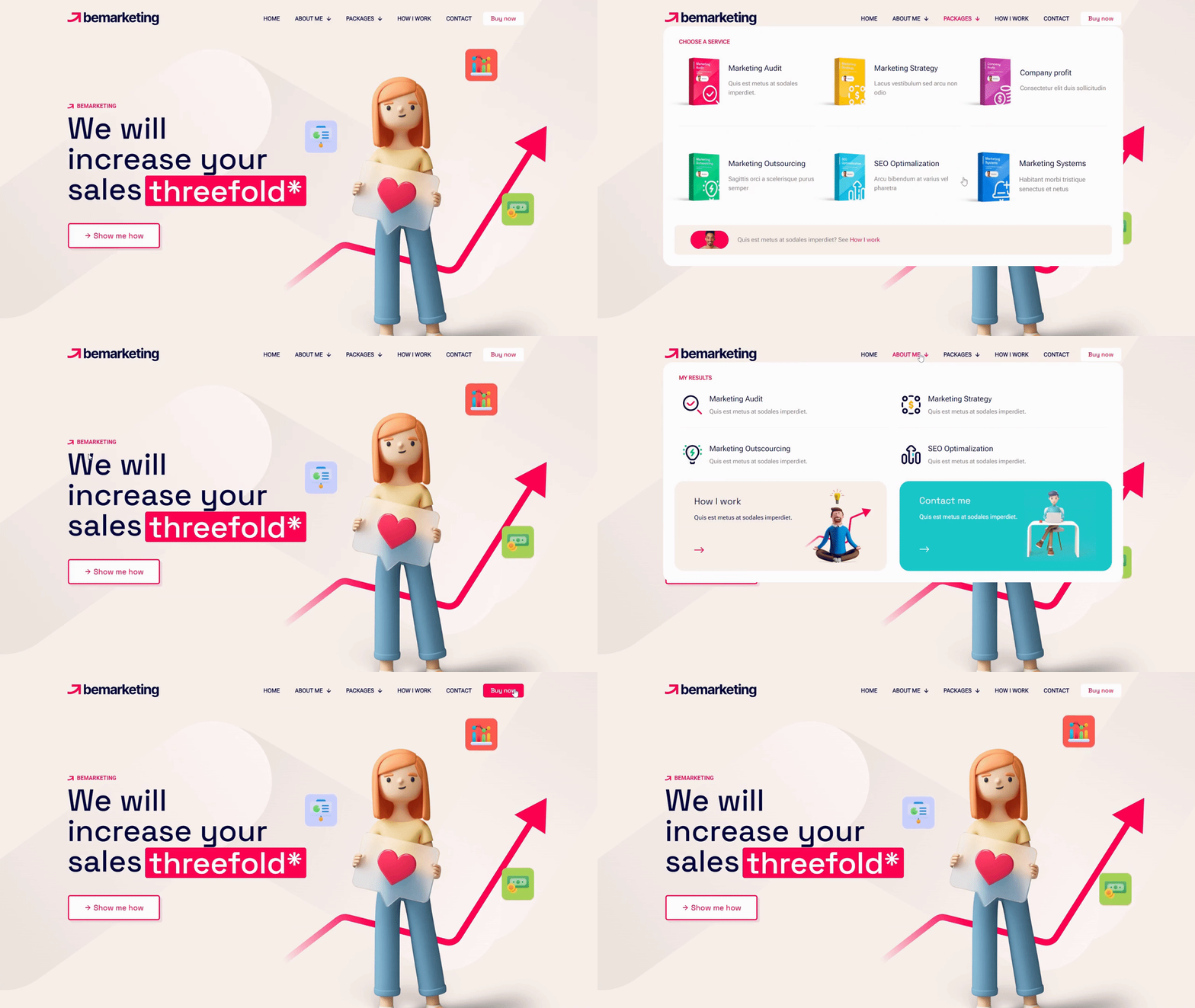
While it’s typical to see websites for marketing agencies chock full of images and videos showcasing their work, BeMarketing 2 adopts a different strategy.
Most of the websites your leads will visit don’t appear like the 3D/flat illustration design does. Additionally, it’s designed to showcase both your work and the digital goods you offer in a way that is incredibly engaging.
3. Lilo Social
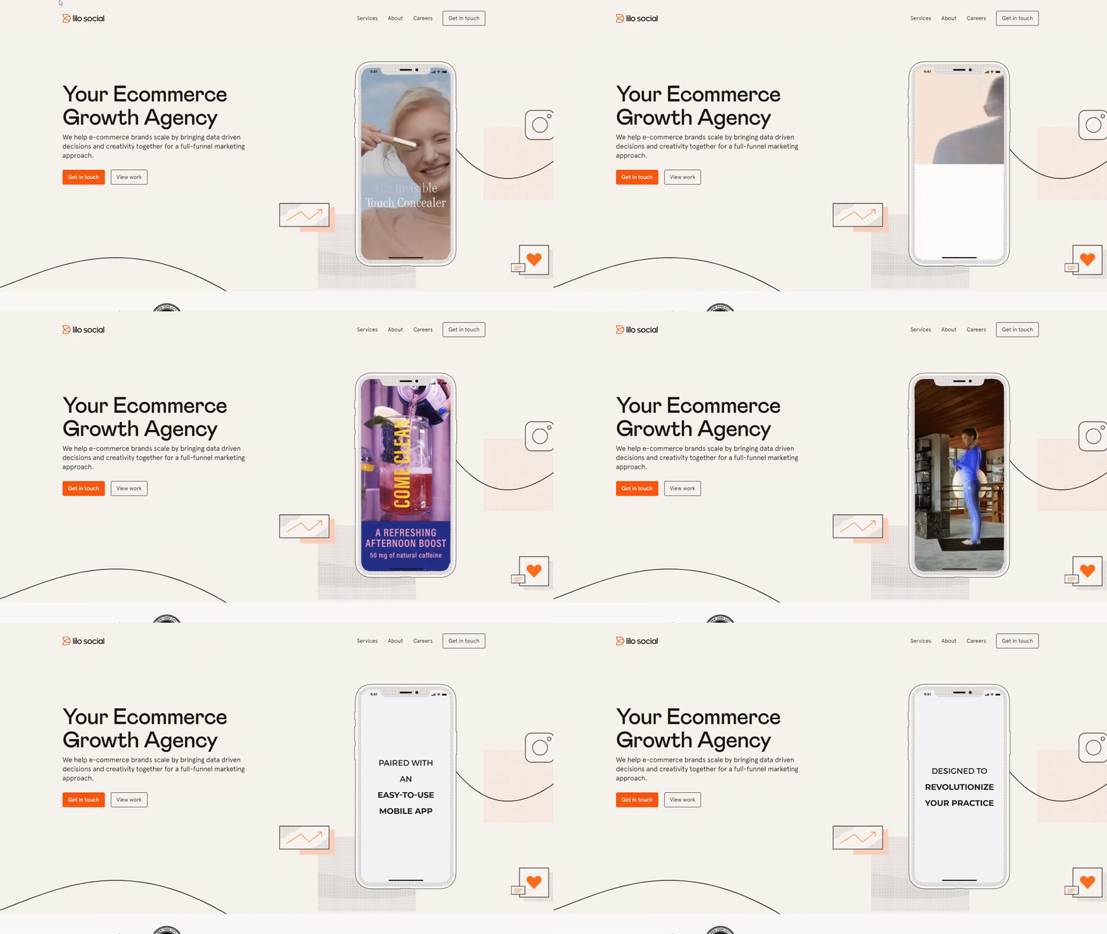
The website for Lilo Social is a great example of how to successfully ditch the predictable symmetry and grid layouts that so many marketing agency websites use. With a lightweight design, hand-drawn and illustrated geometric elements, and a well-balanced (albeit asymmetric) layout, Lilo Social’s site carves a unique path and does it well. If you’re looking to create a similar effect, consider using the BeAgency 6 site.
4. BeBusiness 6
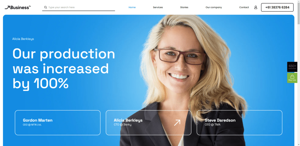
Having your marketing agency’s human aspect visible to potential clients is one of the finest methods to establish trust. The prebuilt BeBusiness 6 website does this.
You may give your agency an accessible, sympathetic vibe while also highlighting your successes by presenting the individuals who work for it as well as the clients you’ve served throughout time.
5. BeCreative 4
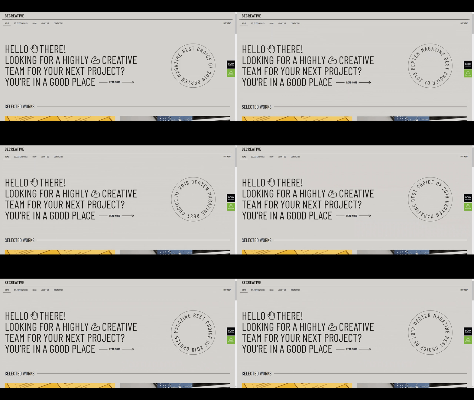
There are additional techniques to look more personable to the clientele you wish to work with for your firm. Everything hinges on who they are. An excellent alternative for focusing on medium-sized corporations and organizations would be the prior agency site. On the other side, BeCreative 4’s young style, which has spinning emblems, funky fonts, and emoji, is quite successful in luring customers from smaller businesses, particularly those led by members of Generation Z.
6. BeAgency 8
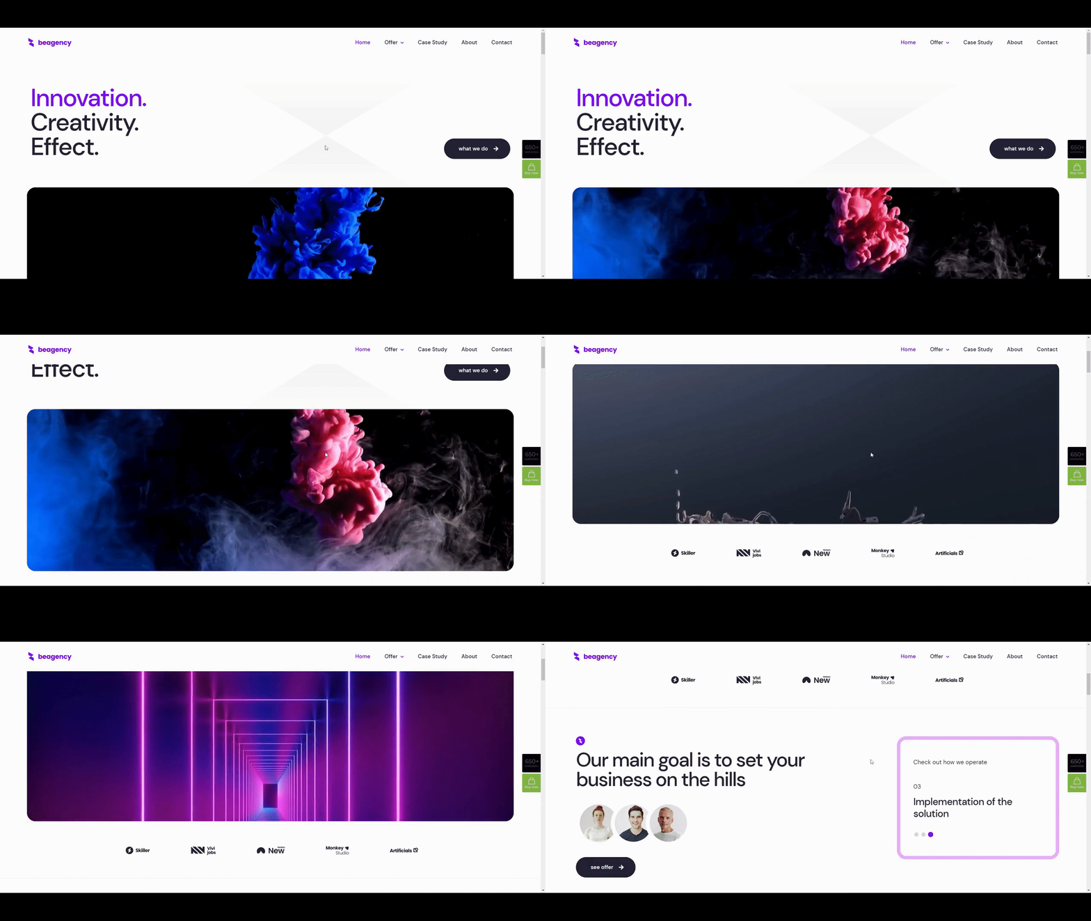
Want to persuade people that your company is the best at understanding engagement? Design the hero section of your website using a different strategy from BeAgency 8’s prebuilt website. You may get visitors to interact with your website right away by using the fold to provide a sneak peek of your content.
7. BeAgency 5
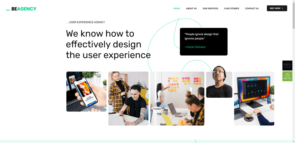
A wonderful example of how basic design will always be fashionable is seen in BeAgency 5. In this age of distraction, it’s important to incorporate unexpected shocks into your basic design to keep people interested. To entice visitors into the agency’s content, this site, for instance, combines hand-drawn features, eye-catching trust marks, and hover-triggered action alternatives.
8. BeAgency 7
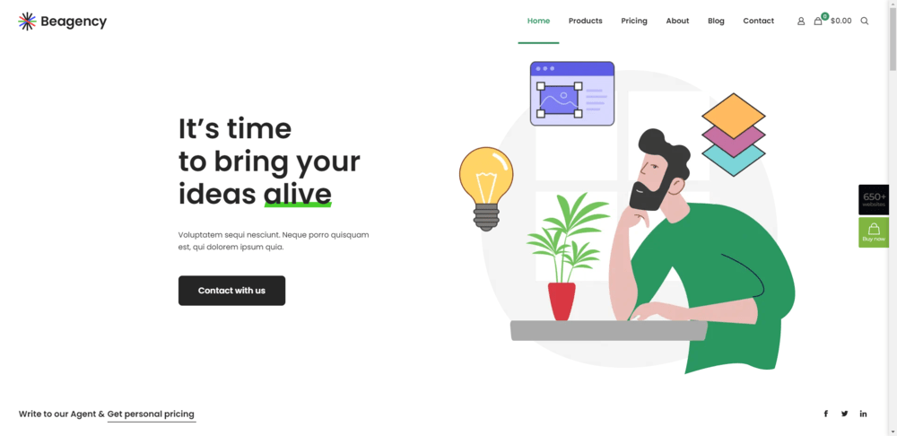
More than just attracting and generating leads is possible with a marketing agency website. Consider BeAgency 7 as an example. The purpose of this prebuilt website is to sell marketing services. Visitors are immediately made aware of this via the Pricing page and the ecommerce components incorporated into the header. Put your website to work for you like this one does if you’re searching for a solution to streamline your sales process.
9. BeBusiness 4
If you’re starting a new marketing firm, visitors to your website need to be greatly impressed. A striking design will be beneficial. The same is true for trust indicators like number counters, FAQs, and well-known partnerships. All of these features and more are available on the BeBusiness 4 website.

10. BeLanding 4
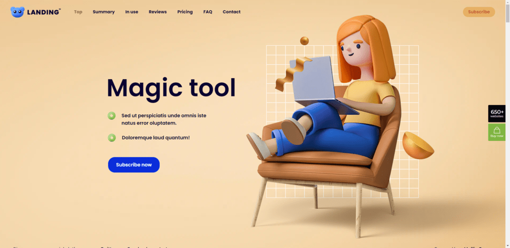
Websites for various kinds of businesses and purposes can also be a terrific source of inspiration, in addition to those for marketing agencies. For example, BeLanding 4 is a fantastic illustration of how to pack a ton of details about your portfolio, client endorsements, pricing, and more onto a single web page. To help users navigate the page’s extensive information, mascots have been put to prominent places of the page.
Generate better results with a strong marketing agency website
You’ll be able to generate leads and get new clients thanks to your substantial body of online work. But in order to showcase your very finest and most successful work, you need a website where you can put it all together. Additionally, it must turn interested leads into paying customers.
The 10 best marketing agency websites that you saw provide several methods for accomplishing this.
You want a WordPress theme and page builder that makes it simple for you to establish a website for your agency without limiting what you can design. It’s also a good idea to seek a solution that can be used to create websites for your own clientele.
Your theme should include white labeling features that allow you to customize the WordPress backend in addition to being a WordPress design powerhouse. Make the login screen your own. Replace the theme’s branding with your own (or the logo of your client). Even block access to the visibility of dashboard sections that your customer doesn’t require.
You’ve been searching for an all-inclusive solution, and BeTheme is it.
Everything you need to develop your website as well as the websites of your clients is included, including 650+ pre-built sites (some of which are represented in the list above), a strong and user-friendly website builder, and white labeling.