SEO: Using Headlines Correctly
Captions don’t create a top ranking on their own, but they are an important factor when it comes to rating a page. Thus, using headlines correctly is an essential task at all times. Today, I’ll show you how to use headlines appropriately and display them in the most optimal way.
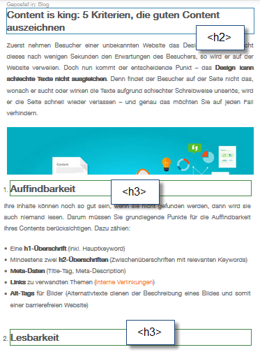
The heading tag is used to define headlines. Here, the different headings of a content page are defined one by one using HTML. To determine the order, and, in some cases, the formatting, they are defined via . The “n” is replaced with a number. For instance:
-
Primary Heading
-
Secondary Heading
-
Tertiary Heading
-
Quaternary Heading
- and so on
The longer the text, the more headlines and sub-headlines can and should be used. Of course, that doesn’t only help the search engine – the reader can read a well-structured text much easier, and thus finds the information he’s looking for much faster. This way, the reader receives the desired added value from your website.
Using Headlines
Per page, the main heading
should only be used once. The sub-headlines can be utilized multiple times, but they should be in a healthy proportion to the text. There is no fixed number on how often they should be used. The primary factor is that the reader is not disturbed by them. Here, you should trust your intuition.
The same flair should also be proven when it comes to the content of the headings. Simply spamming keywords will be counterproductive for the website. Clear, short, and precise headings of 4 to 6 words, starting with the keyword, are recommendable. This way, the reader, as well as the search engine can quickly evaluate the article. A clear and informative heading also gives the user a comprehensible overview of the following article.
This information is more or less obvious, at least it can be found very easily on the internet, and most webmasters know about it. In theory, it would not be a problem to apply it. Unfortunately, this often sounds a lot easier than it actually is.
Headings in Website Themes and Shop Systems
As only a minority of people still program their website page by page and manually in HTML, CMS systems with ready-to-use website themes are often used. These modular systems are practicable and useful, but they are very rigid in certain situations. Here, the devil lies in the detail. Headings are not always evident at first glance. In themes, headings are often displayed in the form of tags, to highlight a particular text paragraph or to display it larger. This is easier to program, but it is a problem for the search engine, as a lot of irrelevant text passages on the page are unnecessarily highlighted.

In the example of the famous Avada theme shown above, headlines are used in the footer. This is something you should pay attention to when setting up a new website using this theme.
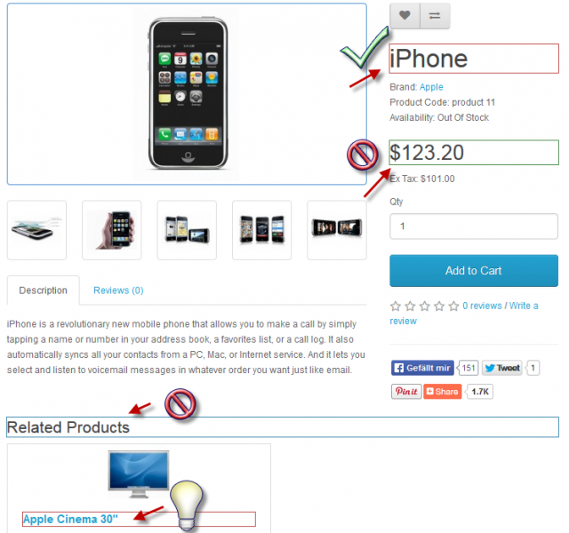
Sometimes, headlines are used for tax rates or shipment options in shop systems. In these cases, it ‘s hard to change that. Often, this pushes the users of CMS and shop systems to the limit of their knowledge and forces them to hire a programmer, which can be rather expensive at times. Still, you should pay attention that the theme treats the shop system and these aspects correctly right from the start.

In the case mentioned above, the product name is correct, but the price is not as relevant, and thus, it shouldn’t be displayed as a heading. “Related Products” is not really a relevant information either. As long as the amount of products that are under an existing article is tolerable, it’s no problem to display them as a heading.
Useful Browser Extensions
There are several tools to help you recognize this in advance, instead of having to read out the entire source code. For a lot of browsers, there are apps and extensions that can read out these things rather quickly, like the Web Developer in Firefox, for example. There, you can simply add a frame to all headings via “Contour” > “Add Contours to the Headings.” The framed caption can then be found in the source code much easier. This gives you the option to make changes by yourself. Usually, shop systems come with a demo version, which is a perfect fit to test the changes on.
Using Headings Correctly: Alternatives to the Tag
As an alternative to the tag, the font should just be formatted the way you want it to be. for example, to highlight all bold printed words.
With the h1 Tag:
This is a real Headline
This is a real Headline
With the Strong and Style Tag:
This only looks like a Headline
This only looks like a Headline
While the two pieces of text are almost identically when it comes to the appearance, the source code is disparate. Here, you can also notice the advantage that text parts without hn can be adjusted to the design and the personal imagination much better. Thus, using headings correctly can also mean forgoing headlines.
(dpe)
