Flexbox and Truncated Text
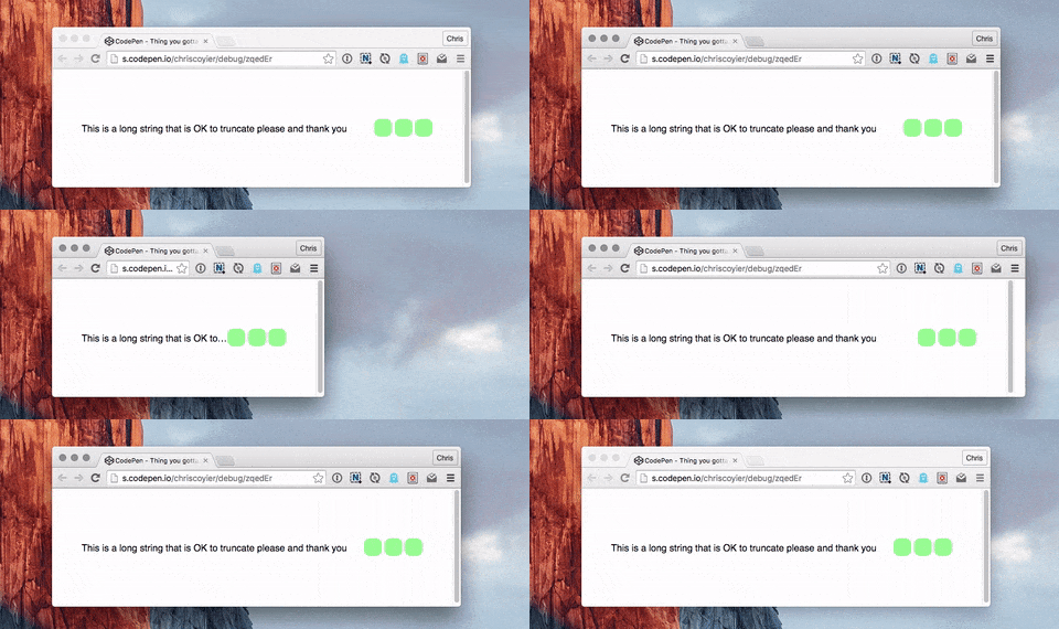
Situation: you have a single line of text in a flex child element. You don’t want that text to wrap, you want it truncated with ellipsis (or fall back to just hiding the overflow). But the worst happens. The unthinkable! The layout breaks and forces the entire flex parent element too wide. Flexbox is supposed to be helping make layout easier!
Fortunately, there is a (standardized) solution. You just need to use a non-flexbox property/value to do it.
What we want
The potential problem

Not only might this prevent the narrowing of a container, it might blow a container out super wide.
Child elements (of the flex child) are the issue.
Confusing things a bit… if the text at hand is directly within the flex child, things work fine:
<div class="flex-parent">
  <div class="flex-child">
    Text to truncate here.
  </div>
  <div class="flex-child">
    Other stuff.
  </div>
</div>
/* Text is directly within flex child,
so doing the wrapping here */
.flex-child
white-space: nowrap;
overflow: hidden;
text-overflow: ellipsis;
}The problem comes up when there are child elements, like:
<div class="flex-parent">
  <div class="flex-child">
    <h2>Text to truncate here.</h2>
  </div>
  <div class="flex-child">
    Other stuff.
  </div>
</div>
/* Text is a header now,
so need to truncate there for it to work */
.flex-child > h2 {
white-space: nowrap;
overflow: hidden;
text-overflow: ellipsis;
}The solution is min-width: 0; on the flex child
Or min-width some actual value. Without this, the flex child containing the other text elements won’t narrow past the “implied width” of those text elements.
When I first ran into this problem, I found the solution via a Pen by AJ Foster. He writes:
According to a draft spec, the above text should not fully collapse when the flex container is resized down. Because .subtitle has a width of 100%, the min-width: auto calculation that flexbox makes says that its container should be larger than we want.
I found this behavior consistent across Chrome, Opera, and Firefox. Safari was shrinking/truncating even without the min-width (against spec, I think).
Demo
See the Pen Thing you gotta know about flexbox by Chris Coyier (@chriscoyier) on CodePen.
- Works: Text is directly inside flex child
- Broken: Text is in an
- Works: Text is in
min-widthset on flex child
Flexbox and Truncated Text is a post from CSS-Tricks
