Full Width Containers in Limited Width Parents
I bookmarked a tweet a few months ago, as it was a bonafide CSS trick and that’s what we love around here.
The issue is: how do we make a full-browser-width container when we’re inside a limited-width parent?
Starting Point
We want to stretch it exactly as wide as the browser window.
Here’s some minimal assumed markup:
<!-- parent -->
<main>

  <p>Stuff.</p>

  <!-- container we want to be full width -->
  <figure class="full-width">
    <!-- could be whatever content -->
    <img src="dog.jpg" alt="">
  </figure>

</main>
Considerations
If we could use absolute positioning, we could set the container to be at left: 0; and width: 100%; – but we can’t, because we want the container to remain in flow.
Can’t we just apply some negative margin to each side and pull it outwards? In some circumstances, we can!
With Known % Width
Let’s say the parent container was 60% wide and centered. That means there is 20% width on either side of it. But margin is calculated based on the parent element, so to pull it to the left 20% of the browser window, you’d need 1/3 of the width of the parent, so…
main {
  width: 60%;
  margin: 0 auto;
  /* creates 20% margins on either side */
}
.full-width {
  /* 1/3 of 60% = the 20% margin on either side */
  margin-left: -33.33%;
  margin-right: -33.33%;
}
With Known Non-% Parent Width
Under most other circumstances, we just don’t have enough information to know exactly how far to pull out the full width container with negative margins.
Well, unless…
We could use the width of the browser window in our CSS math. The amount we want to “pull” to the left and right is half the width of the browser window plus half the width of the parent. (Assuming the parent is centered.)
So, so our parent is 500px wide:
.full-width {
  margin-left: calc(-100vw / 2 + 500px / 2);
  margin-right: calc(-100vw / 2 + 500px / 2);
}
A fixed width like that feels a little red-flaggy (i.e. what happens on narrower screens?), all this would likely be wrapped in a media query that makes it only apply on larger screens:
@media (min-width: 500px) {
  main {
    width: 500px;
    margin: 0 auto;
  }
  .full-width {
    margin-left: calc(-100vw / 2 + 500px / 2);
    margin-right: calc(-100vw / 2 + 500px / 2);
  }
}
Since our demo was an image, you might also do something like .full-width img { width: 100%; } too, to get that full coverage.
If it’s less brain bending, you might have luck reducing to:
@media (min-width: $max-width) {
  .full-width {
    margin-left: calc(50% - 50vw);
    margin-right: calc(50% - 50vw);
  }
}
Translate
Since animations (probably) aren’t involved here, it’s probably not super necessary, but you could pull the container back to the edge with transforms instead.
@media (min-width: 40em) {
  .full-width {
    width: 100vw;
    transform: translateX(calc((40em - 100vw)/2));
  }
}
@supports()
The above idea was taken from a Pen by Brandon Mathis where he combined that idea with wrapping it all in @supports.
/* See warning below */
@supports (width: 100vw) {
  .full-width {
    width: 100vw;
  }
  @media all and (min-width: 40rem) {
    .full-width {
       transform: translateX(calc((40rem - 100vw)/2));
    }
  }
}
The idea here is that none of this would apply if the browser didn’t support viewport units. That way you could pull fallback behavior above this in the CSS and let this override it if it can.
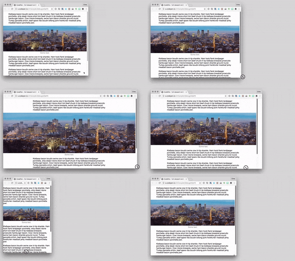
Seems like a good idea, but in my testing only Firefox got this right. Chrome would sometimes incorrectly apply the media query when it wasn’t supposed to (screenshot). (I say “sometimes” as it seemed like a redraw would “fix” it, only to not apply the media query the other direction.) Edge also didn’t seem to apply the media query rules at all (screenshot). Maybe nested @-rules are a bit buggy yet.
No calc() needed
Sven Wolfermann followed up Jon Neal’s idea with a clever variation that doesn’t need calc():
.full-width {
  width: 100vw;
  position: relative;
  left: 50%;
  right: 50%;
  margin-left: -50vw;
  margin-right: -50vw;
}
The idea here is: push the container to the exact middle of the browser window with left: 50%;, then pull it back to the left edge with negative -50vw margin.

Very clever! This way you don’t need any information about the parent width at all. Do note that both this and the calc() version require the parent to be exactly centered in the browser.
You might even think: why bother with the right and margin-right? It’s true you don’t really need it on a left-to-right site, but if there is any chance of direction: rtl; happening, you’ll need the right properties, so having both is more bulletproof.
I’m gonna put a fork of this method here, as it seems the most useful.
See the Pen full viewport width image (container) inside article by Chris Coyier (@chriscoyier) on CodePen.
Full Width Containers in Limited Width Parents is a post from CSS-Tricks
