Reducing Complexity: A New Trend in Mobile Design
We’ve been living in a world of clean, clear, and minimalistic design for a while now. It’s inevitable to ask oneself what could be next. Regarding minimalism, a couple of pioneers like Facebook, Apple, and Airbnb, have already given an answer. “Reducing complexity” is the keyword, continuously simplifying the design. There’s not a lot that remains of the compound, but still appealing designs of the apps of these three businesses.
What is the Reduction of Complexity Supposed to be?
Have you never heard of the reduction of complexity before? That’s not a big deal; the term is still rather new. It is used to describe a design that goes much further than the typical measure of minimalistic, flat design. Of course, one could claim that it’s not more than the next, logical step of minimalism in mobile design. However, there are a couple of characteristics that define this new trend.
The Definitions for This New Trend From the Silicon Valley are the Following:
- Larger, bolder headings
- Straightforward and universal icons
- Avoiding the use of colors
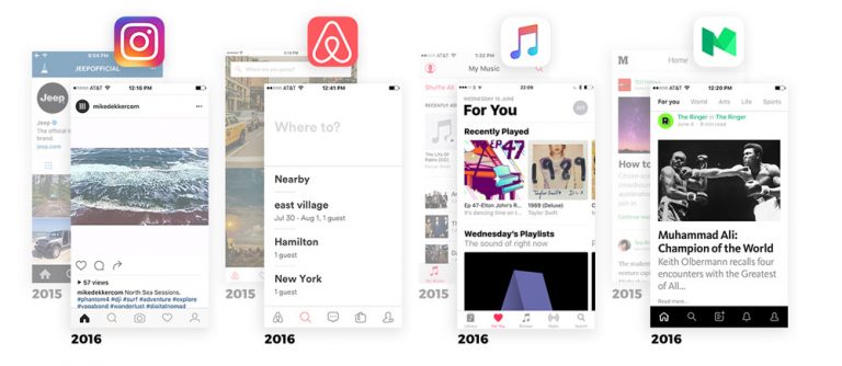
The result of these few traits create apps that look as if they all originated from one design workshop.
The Trend’s First Appearance
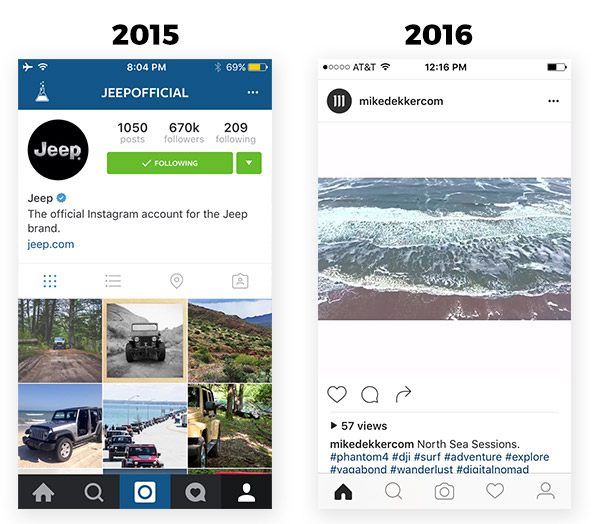
The trend first appeared at the end of May of this year when Instagram released its new user interface.
As you can see, Instagram reduced a lot of the formerly blue and gray color scheme that dominated in 2015. Fonts became bolder, the navigation at the bottom was purged, and the icons were simplified.
What remains is a black-white-UI with a clear focus on the content and user-friendliness.
Airbnb
Shortly after the release of the new Instagram UI, one could see that Airbnb also started providing its app in a simple, clear design with a lot less complexity. The logic behind this new trend that will probably affect a lot more apps soon is familiarity. Everything looks almost the same, and the users will be able to orientate themselves instantly.

The revamped UI of Airbnb did not receive the large media echo of the new Instagram app that was released one month later. Maybe, the reason is that Instagram also revealed a new, cool app icon on top of that.
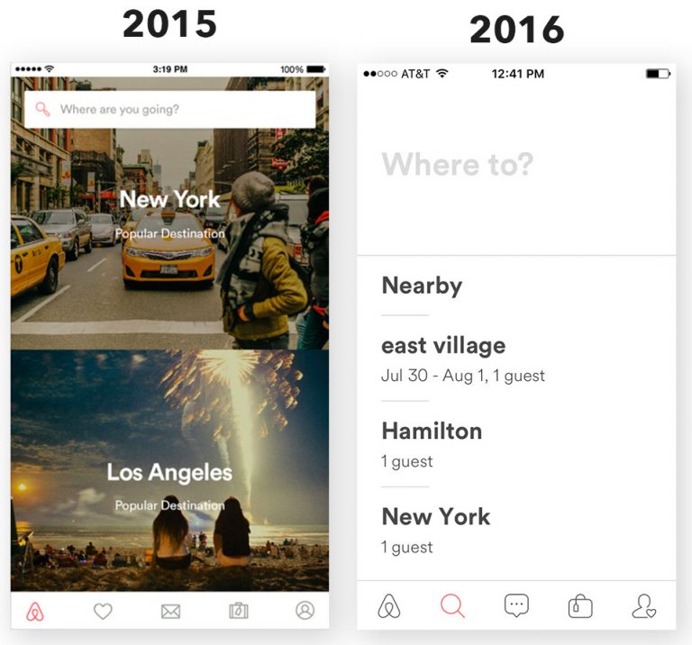
Airbnb shows a reduction in seemingly redundant areas of parts of the apps as well. Large, bold fonts have taken the spot of beautiful images. Colors were reduced and icons were simplified. What remains is an app that values functionality, displayed in black and white, and reduced to the content.
Whether the app’s design won anything from this reduction certainly is a question of taste.
Apple
Apple is the most recent example for a design that has fully dedicated itself to the reduction of complexity. Last month on the WWDC, the tech giant announced a bunch of interesting things for the consumers, including the release of iOS 10. This was announced as the largest iOS release of all time. At least, it is supposed to be the next big thing since iOS 8, which was advertised in a similarly boastful way.
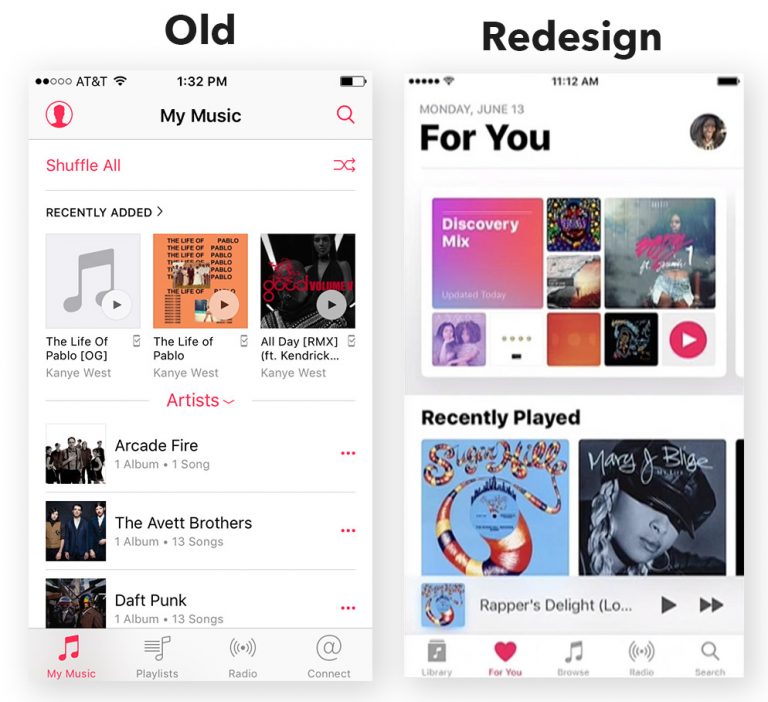
Here is a comparison of the Apple Music app before and after the redesign:

The redesign of Apple Music is obvious on first sight. Other, important aspects of the new iOS version are UX updates, and a couple additional features. But the redesign of the UI is instantly noticeable. The look was completely refreshed and spiced up with a card design for the album covers. Large, bold fonts and this very card design are what dominates, and are supposed to make the album covers stand out and more appealing.
However, Apple does not lose track of the pure doctrine of complexity reduction. They use different, solid icons and shadow in map design. The new design seems like a mixture of the old layout line, and the new, reduced design. Personally, I like the old design much better, but we have to take whatever they offer us.
The pure key elements for the reduction of complexity were inherited. The large, bold fonts, as well as the clean black-white-UI.
What Does That Mean For Us?
You need to stay strong right now. All it means is that we’ll have to say goodbye to the design of our favorite apps. The pure app design will continue to adapt, and the individuality of layout will probably die out soon.
The tech branch is, like many others as well, a league of imitators. The users that already got a taste of the new uniform design have not complained yet. How were they supposed to: the big players of mobile operating systems have been rolling out new, binding design guidelines to the developers for a while already. Android with its material design, and Apple with its reduced, clear (uniform) design.
More and more developers will jump on the uniform design train when it comes to their apps’ layout, resulting in a monotonous app design. This can have both advantages and disadvantages. The fact that you will feel “at home” in every app appears to be an advantage. However, one advantage is the lack of personality, as it is slowly given up, step by step.

Whether you are for or against the monochrome blandness of the new uniform designs, you can’t design that it is a sign of progress. The product development process starts to turn into an integral process that focuses on the users.
The old development process was not solely focused on the app’s functionality, but also on an appealing design, which, in the end, is a part of user friendliness as well. Most of the time, the design department was only asked to “make it look good”. After that, hours and days were put into the design process of the app. Oftentimes, the functionality was left behind the design requirements.
Now, developers have more options and are able to fully focus on the app and its functionality for the consumer. The appearance is clear from the very beginning and can not be changed, allowing the developers to create the best possible product for the users.
The Ultimate Guide for the Reduction of Complexity
Follow these guidelines, and you’ll have a good chance to develop an award winning app.
- Remove the colors. Okay, you can use any color, as long as it’s black and white. The content is what counts.
- Make larger, bolder, and blacker headings and fonts. Do you see that heading in your app? Make it much larger, bolder, and pitch black.
- Use very simple and minimalistic icons. Once again: don’t use colors. Do you want bonus points? Simplify your navigation and generally place it at the bottom. From left to right: home, search, primary action, secondary action, profile.
- Whitespace? Just triple it. It will be fine. Maybe even quadruple it. That’s fine too. What can go wrong?
- Make the app icon bright and shiny. Maybe use colors and a lightning, because this is the only place where you get to show personality and establish your brand. As well as set yourself apart from the others.
The Webdesign Trend Also Goes Towards More Simplicity.
Conclusion
A rising star was born on the sky of mobile design. However, the reduction of complexity also reduced any individualism and personality that used to be a part of apps. Soon enough, everything will most likely look and feel the same. This brings up the question if we, the users, will be the winners or losers of this new trend. What’s your opinion?
Source/Graphics: SWARM
