Marketers are skilled in developing strategies, producing visual assets, writing text with high impact, and optimizing everything for engagement and conversion on websites, social media, and everywhere else in between. However, a marketing plan is only as successful as the website you use to get leads from.
Because of this, your marketing agency requires a website that completely impresses visitors.
Continue reading for a list of 10 best marketing agency websites, which you can use as inspiration for your own site’s design or as a quick and simple guide to creating a new one.
We’ll also show you how BeTheme might be useful if you’re seeking suggestions on a WordPress theme or page builder to speed up the process.
10 top websites for marketing agencies in 2023
Having an excellent portfolio is not enough for your marketing agency website.
It must have a similar aesthetic to the websites you will create for customers. The copy should be attractive so customers should regret not discovering you sooner. Additionally, it must include built-in conversion-boosting features.
Do you want to see how that comes along?
Find motivation here:
1. Porter Novelli
Porter Novelli has developed marketing campaigns for many of the world’s top brands. With as impressive a portfolio as this agency has, their website design and copy are clean, simple, and to the point. Rather than bog down prospective clients with too many details, they give their visuals ample room to speak on behalf of the agency. If you want to create a similarly simple, yet powerful visual effect, start with the BeMedia 2 pre-built site.
2. BeMarketing 2
While it’s typical to see websites for marketing agencies chock full of images and videos showcasing their work, BeMarketing 2 adopts a different strategy.
Most of the websites your leads will visit don’t appear like the 3D/flat illustration design does. Additionally, it’s designed to showcase both your work and the digital goods you offer in a way that is incredibly engaging.
3. Lilo Social
The website for Lilo Social is a great example of how to successfully ditch the predictable symmetry and grid layouts that so many marketing agency websites use. With a lightweight design, hand-drawn and illustrated geometric elements, and a well-balanced (albeit asymmetric) layout, Lilo Social’s site carves a unique path and does it well. If you’re looking to create a similar effect, consider using the BeAgency 6 site.
4. BeBusiness 6
Having your marketing agency’s human aspect visible to potential clients is one of the finest methods to establish trust. The prebuilt BeBusiness 6 website does this.
You may give your agency an accessible, sympathetic vibe while also highlighting your successes by presenting the individuals who work for it as well as the clients you’ve served throughout time.
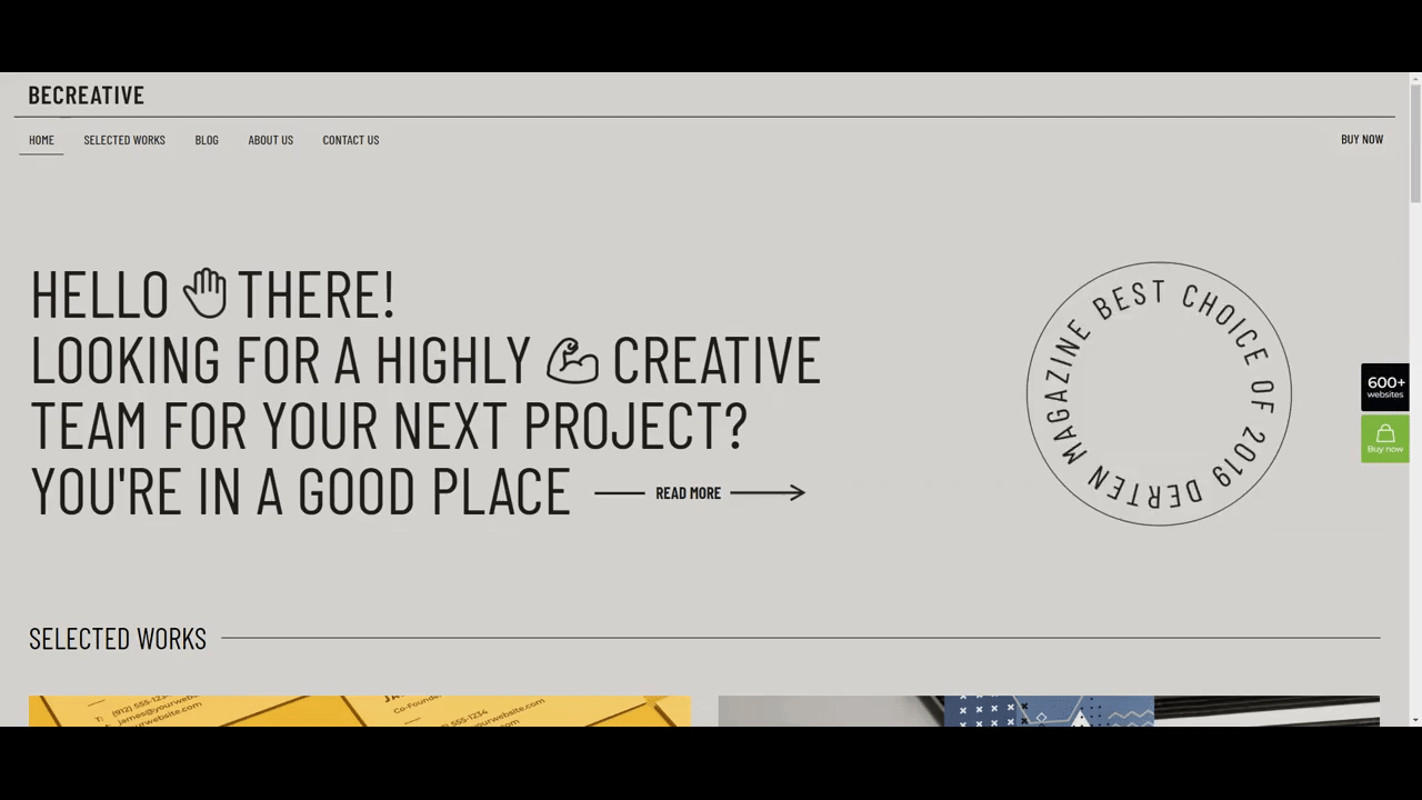
5. BeCreative 4
There are additional techniques to look more personable to the clientele you wish to work with for your firm. Everything hinges on who they are. An excellent alternative for focusing on medium-sized corporations and organizations would be the prior agency site. On the other side, BeCreative 4’s young style, which has spinning emblems, funky fonts, and emoji, is quite successful in luring customers from smaller businesses, particularly those led by members of Generation Z.
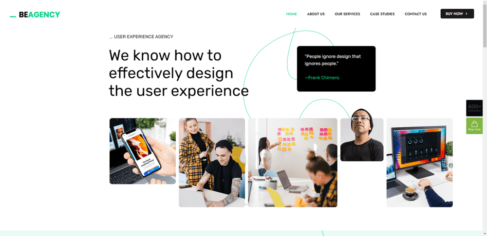
6. BeAgency 8
Want to persuade people that your company is the best at understanding engagement? Design the hero section of your website using a different strategy from BeAgency 8’s prebuilt website. You may get visitors to interact with your website right away by using the fold to provide a sneak peek of your content.
7. BeAgency 5
A wonderful example of how basic design will always be fashionable is seen in BeAgency 5. In this age of distraction, it’s important to incorporate unexpected shocks into your basic design to keep people interested. To entice visitors into the agency’s content, this site, for instance, combines hand-drawn features, eye-catching trust marks, and hover-triggered action alternatives.
8. BeAgency 7
More than just attracting and generating leads is possible with a marketing agency website. Consider BeAgency 7 as an example. The purpose of this prebuilt website is to sell marketing services. Visitors are immediately made aware of this via the Pricing page and the ecommerce components incorporated into the header. Put your website to work for you like this one does if you’re searching for a solution to streamline your sales process.
9. BeBusiness 4
If you’re starting a new marketing firm, visitors to your website need to be greatly impressed. A striking design will be beneficial. The same is true for trust indicators like number counters, FAQs, and well-known partnerships. All of these features and more are available on the BeBusiness 4 website.
10. BeLanding 4
Websites for various kinds of businesses and purposes can also be a terrific source of inspiration, in addition to those for marketing agencies. For example, BeLanding 4 is a fantastic illustration of how to pack a ton of details about your portfolio, client endorsements, pricing, and more onto a single web page. To help users navigate the page’s extensive information, mascots have been put to prominent places of the page.
Generate better results with a strong marketing agency website
You’ll be able to generate leads and get new clients thanks to your substantial body of online work. But in order to showcase your very finest and most successful work, you need a website where you can put it all together. Additionally, it must turn interested leads into paying customers.
The 10 best marketing agency websites that you saw provide several methods for accomplishing this.
You want a WordPress theme and page builder that makes it simple for you to establish a website for your agency without limiting what you can design. It’s also a good idea to seek a solution that can be used to create websites for your own clientele.
Your theme should include white labeling features that allow you to customize the WordPress backend in addition to being a WordPress design powerhouse. Make the login screen your own. Replace the theme’s branding with your own (or the logo of your client). Even block access to the visibility of dashboard sections that your customer doesn’t require.
You’ve been searching for an all-inclusive solution, and BeTheme is it.
Everything you need to develop your website as well as the websites of your clients is included, including 650+ pre-built sites (some of which are represented in the list above), a strong and user-friendly website builder, and white labeling.
Geeky OS security enhancements don’t exactly make big headlines in the front-end community, but it stands to reason that passkeys are going to be a “thing”. And considering how passwords and password apps affect the user experience of things like authentication and form processing, we might want to at least wrap our minds around them, so we know what’s coming.
That’s the point of this article. I’ve been studying and experimenting with passkeys — and the WebAuthn API they are built on top of — for some time now. Let me share what I’ve learned.
Here’s the obligatory section of the terminology you’re going to want to know as we dig in. Like most tech, passkeys are wrought with esoteric verbiage and acronyms that are often roadblocks to understanding. I’ll try to de-mystify several for you here.
Relying Party: the server you will be authenticating against. We’ll use “server” to imply the Relying Party in this article.
Client: in our case, the web browser or operating system.
Authenticator: Software and/or hardware devices that allow generation and storage for public key pairs.
FIDO: An open standards body that also creates specifications around FIDO credentials.
WebAuthn: The underlying protocol for passkeys, Also known as a FIDO2 credential or single-device FIDO credentials.
Passkeys: WebAuthn, but with cloud syncing (also called multi-device FIDO credentials, discoverable credentials, or resident credentials).
Public Key Cryptography: A generated key pair that includes a private and public key. Depending on the algorithm, it should either be used for signing and verification or encrypting and decrypting. This is also known as asymmetric cryptography.
RSA: An acronym of the creators’ names, Rivest Shamir and Adel. RSA is an older, but still useful, family of public key cryptography based on factoring primes.
ES256: An elliptic curve public key that uses an ECDSA signing algorithm (PDF) with SHA256 for hashing.
RS256: Like ES256, but it uses RSA with RSASSA-PKCS1-v1.5 and SHA256.
What are passkeys?
Before we can talk specifically about passkeys, we need to talk about another protocol called WebAuthn (also known as FIDO2). Passkeys are a specification that is built on top of WebAuthn. WebAuthn allows for public key cryptography to replace passwords. We use some sort of security device, such as a hardware key or Trusted Platform Module (TPM), to create private and public keys.
The public key is for anyone to use. The private key, however, cannot be removed from the device that generated it. This was one of the issues with WebAuthn; if you lose the device, you lose access.
Passkeys solves this by providing a cloud sync of your credentials. In other words, what you generate on your computer can now also be used on your phone (though confusingly, there are single-device credentials too).
Currently, at the time of writing, only iOS, macOS, and Android provide full support for cloud-synced passkeys, and even then, they are limited by the browser being used. Google and Apple provide an interface for syncing via their Google Password Manager and Apple iCloud Keychain services, respectively.
How do passkeys replace passwords?
In public key cryptography, you can perform what is known as signing. Signing takes a piece of data and then runs it through a signing algorithm with the private key, where it can then be verified with the public key.
Anyone can generate a public key pair, and it’s not attributable to any person since any person could have generated it in the first place. What makes it useful is that only data signed with the private key can be verified with the public key. That’s the portion that replaces a password — a server stores the public key, and we sign in by verifying that we have the other half (e.g. private key), by signing a random challenge.
As an added benefit, since we’re storing the user’s public keys within a database, there is no longer concern with password breaches affecting millions of users. This reduces phishing, breaches, and a slew of other security issues that our password-dependent world currently faces. If a database is breached, all that’s stored in the user’s public keys, making it virtually useless to an attacker.
No more forgotten emails and their associated passwords, either! The browser will remember which credentials you used for which website — all you need to do is make a couple of clicks, and you’re logged in. You can provide a secondary means of verification to use the passkey, such as biometrics or a pin, but those are still much faster than the passwords of yesteryear.
More about cryptography
Public key cryptography involves having a private and a public key (known as a key pair). The keys are generated together and have separate uses. For example, the private key is intended to be kept secret, and the public key is intended for whomever you want to exchange messages with.
When it comes to encrypting and decrypting a message, the recipient’s public key is used to encrypt a message so that only the recipient’s private key can decrypt the message. In security parlance, this is known as “providing confidentiality”. However, this doesn’t provide proof that the sender is who they say they are, as anyone can potentially use a public key to send someone an encrypted message.
There are cases where we need to verify that a message did indeed come from its sender. In these cases, we use signing and signature verification to ensure that the sender is who they say they are (also known as authenticity). In public key (also called asymmetric) cryptography, this is generally done by signing the hash of a message, so that only the public key can correctly verify it. The hash and the sender’s private key produce a signature after running it through an algorithm, and then anyone can verify the message came from the sender with the sender’s public key.
How do we access passkeys?
To access passkeys, we first need to generate and store them somewhere. Some of this functionality can be provided with an authenticator. An authenticator is any hardware or software-backed device that provides the ability for cryptographic key generation. Think of those one-time passwords you get from Google Authenticator, 1Password, or LastPass, among others.
For example, a software authenticator can use the Trusted Platform Module (TPM) or secure enclave of a device to create credentials. The credentials can be then stored remotely and synced across devices e.g. passkeys. A hardware authenticator would be something like a YubiKey, which can generate and store keys on the device itself.
To access the authenticator, the browser needs to have access to hardware, and for that, we need an interface. The interface we use here is the Client to Authenticator Protocol (CTAP). It allows access to different authenticators over different mechanisms. For example, we can access an authenticator over NFC, USB, and Bluetooth by utilizing CTAP.
One of the more interesting ways to use passkeys is by connecting your phone over Bluetooth to another device that might not support passkeys. When the devices are paired over Bluetooth, I can log into the browser on my computer using my phone as an intermediary!
The difference between passkeys and WebAuthn
Passkeys and WebAuthn keys differ in several ways. First, passkeys are considered multi-device credentials and can be synced across devices. By contrast, WebAuthn keys are single-device credentials — a fancy way of saying you’re bound to one device for verification.
Second, to authenticate to a server, WebAuthn keys need to provide the user handle for login, after which an allowCredentials list is returned to the client from the server, which informs what credentials can be used to log in. Passkeys skip this step and use the server’s domain name to show which keys are already bound to that site. You’re able to select the passkey that is associated with that server, as it’s already known by your system.
Otherwise, the keys are cryptographically the same; they only differ in how they’re stored and what information they use to start the login process.
The process… in a nutshell
The process for generating a WebAuthn or a passkey is very similar: get a challenge from the server and then use the navigator.credentials.create web API to generate a public key pair. Then, send the challenge and the public key back to the server to be stored.
Upon receiving the public key and challenge, the server validates the challenge and the session from which it was created. If that checks out, the public key is stored, as well as any other relevant information like the user identifier or attestation data, in the database.
The user has one more step — retrieve another challenge from the server and use the navigator.credentials.get API to sign the challenge. We send back the signed challenge to the server, and the server verifies the challenge, then logs us in if the signature passes.
There is, of course, quite a bit more to each step. But that is generally how we’d log into a website using WebAuthn or passkeys.
The meat and potatoes
Passkeys are used in two distinct phases: the attestation and assertion phases.
The attestation phase can also be thought of as the registration phase. You’d sign up with an email and password for a new website, however, in this case, we’d be using our passkey.
The assertion phase is similar to how you’d log in to a website after signing up.
The navigator.credentials.create API is the focus of our attestation phase. We’re registered as a new user in the system and need to generate a new public key pair. However, we need to specify what kind of key pair we want to generate. That means we need to provide options to navigator.credentials.create.
// The `challenge` is random and has to come from the server
const publicKey: PublicKeyCredentialCreationOptions = {
  challenge: safeEncode(challenge),
  rp: {
    id: window.location.host,
    name: document.title,
  },
  user: {
    id: new TextEncoder().encode(crypto.randomUUID()), // Why not make it random?
    name: 'Your username',
    displayName: 'Display name in browser',
  },
  pubKeyCredParams: [
    {
      type: 'public-key',
      alg: -7, // ES256
    },
    {
      type: 'public-key',
      alg: -256, // RS256
    },
  ],
  authenticatorSelection: {
    userVerification: 'preferred', // Do you want to use biometrics or a pin?
    residentKey: 'required', // Create a resident key e.g. passkey
  },
  attestation: 'indirect', // indirect, direct, or none
  timeout: 60_000,
};
const pubKeyCredential: PublicKeyCredential = await navigator.credentials.create({
  publicKey
});
const {
  id // the key id a.k.a. kid
} = pubKeyCredential;
const pubKey = pubKeyCredential.response.getPublicKey();
const { clientDataJSON, attestationObject } = pubKeyCredential.response;
const { type, challenge, origin } = JSON.parse(new TextDecoder().decode(clientDataJSON));
// Send data off to the server for registration
The response provides a couple of bits of useful information. First, we have our public key in this response, and we need to send that to the server to be stored. Second, we also get back the clientDataJSON property which we can decode, and from there, get back the type, challenge, and origin of the passkey.
For attestation, we want to validate the type, challenge, and origin on the server, as well as store the public key with its identifier, e.g. kid. We can also optionally store the attestationObject if we wish. Another useful property to store is the COSE algorithm, which is defined above in our PublicKeyCredentialCreationOptions with alg: -7 or alg: -256, in order to easily verify any signed challenges in the assertion phase.
The navigator.credentials.get API will be the focus of the assertion phase. Conceptually, this would be where the user logs in to the web application after signing up.
// The `challenge` is random and has to come from the server
const publicKey: PublicKeyCredentialRequestOptions = {
  challenge: new TextEncoder().encode(challenge),
  rpId: window.location.host,
  timeout: 60_000,
};
const publicKeyCredential: PublicKeyCredential = await navigator.credentials.get({
  publicKey,
  mediation: 'optional',
});
const {
  id // the key id, aka kid
} = pubKeyCredential;
const { clientDataJSON, attestationObject, signature, userHandle } = pubKeyCredential.response;
const { type, challenge, origin } = JSON.parse(new TextDecoder().decode(clientDataJSON));
// Send data off to the server for verification
We also get the type, challenge, and origin from the clientDataJSON again. The signature is now included in the response, as well as the authenticatorData. We’ll need those and the clientDataJSON to verify that this was signed with the private key.
The authenticatorData includes some properties that are worth tracking First is the SHA256 hash of the origin you’re using, located within the first 32 bytes, which is useful for verifying that request comes from the same origin server. Second is the signCount, which is from byte 33 to 37. This is generated from the authenticator and should be compared to its previous value to ensure that nothing fishy is going on with the key. The value should always 0 when it’s a multi-device passkey and should be randomly larger than the previous signCount when it’s a single-device passkey.
Once you’ve asserted your login, you should be logged in — congratulations! Passkeys is a pretty great protocol, but it does come with some caveats.
Some downsides
There’s a lot of upside to Passkeys, however, there are some issues with it at the time of this writing. For one thing, passkeys is somewhat still early support-wise, with only single-device credentials allowed on Windows and very little support for Linux systems. Passkeys.dev provides a nice table that’s sort of like the Caniuse of this protocol.
Also, Google’s and Apple’s passkeys platforms do not communicate with each other. If you want to get your credentials from your Android phone over to your iPhone… well, you’re out of luck for now. That’s not to say there is no interoperability! You can log in to your computer by using your phone as an authenticator. But it would be much cleaner just to have it built into the operating system and synced without it being locked at the vendor level.
Where are things going?
What does the passkeys protocol of the future look like? It looks pretty good! Once it gains support from more operating systems, there should be an uptake in usage, and you’ll start seeing it used more and more in the wild. Some password managers are even going to support them first-hand.
Passkeys are by no means only supported on the web. Android and iOS will both support native passkeys as first-class citizens. We’re still in the early days of all this, but expect to see it mentioned more and more.
After all, we eliminate the need for passwords, and by doing so, make the world safer for it!
Resources
Here are some more resources if you want to learn more about Passkeys. There’s also a repository and demo I put together for this article.
Live Demo (no actual information is collected by the form)
Are you looking for the best WooCommerce theme to help you build your online store, but are afraid of making a wrong choice?
For starters, you want to select a WordPress WooCommerce theme since not all WordPress themes offer complete WooCommerce support. If a theme doesn’t support WooCommerce, it won’t support all the available addons and extensions. And it will make it all the more difficult, if indeed even possible, to build the online store you have in mind.
WooCommerce is a free, open-source e-commerce plugin built for WordPress websites. The plugin allows you to easily sell almost any type of product while giving your visitors an intuitive and seamless on-brand buying experience.
The best WordPress theme for you will therefore be a WordPress WooCommerce theme, whether you’re about to create a new eCommerce site or redesign your current site.
The following list of the 11 Best WooCommerce Themes features one or more themes that will best meets your needs.
BeTheme, the biggest WooCommerce theme of them all, is more than capable of meeting your needs. BeBuilder, BeBuilder Woo, the Loop Builder, and 360+ professionally crafted pre-made websites are just a few of the 40+ powerful core features this popular (250,000 customers) website building machine places at your fingertips.
BeBuilder, the fastest WordPress website builder, lets you view each element as you customize it.
BeBuilder Woo helps you design versatile Shop and Single Product layouts that sell. 6 pre-defined layouts for Single Product are also at your disposal, you can create templates for Shop Archive or for Single Products, and BeBuilder Woo is loaded with customer-centric login, account management, and checkout features.
With the Loop Builder you can jazz up your website by designing any type of slider, blog, portfolio, or shop listing you can think of.
Add Be’s library of 650+ customizable pre-built websites and BeTheme’s flexibility becomes apparent.
Be’s updated Setup Wizard will help you get your project underway.
Click on the banner to learn more about what BeTheme can do for you.
Jupiter X, the go-to theme for many businesses, brands and marketers, is probably the best theme for WooCommerce with its huge WooCommerce base of exclusive shop features and capabilities.
Jupiter X is also the only Elementor theme that fully eliminates the need for an Elementor Pro subscription with its massive native widget library and native replacements to multiple Elementor features.
Key Jupiter X WooCommerce features include –
True shop builder: Build and customize product pages, membership pages, all checkout pages, and build single-step and multi-step checkouts
Checkout optimization features: Increase engagement and maximize profits with advanced sales funnels, order bumps, smart checkout notices, and more.
Fast Checkout features: Create Shopify-like checkouts with express checkout, sticky cart, checkout expiry and more.
Click on the banner to learn about Jupiter X’s many other WooCommerce features.
What makes Blocksy the best free eCommerce WordPress theme? Is it the selection of elegant pre-built starter sites? Or the powerful header builder and footer builder, both of which feature multiple content and design options? Or the fact that Blocksy is Gutenberg ready and features the latest web technologies?
Answer: Yes, yes, yes. And there’s more.
Blocksy is fast and features thoughtfully written clean code.
A content blocks feature allows you to insert any piece of content anywhere in your site, plus any changes you make to a page, section, or item is synced in real time in the preview window so as not to slow your workflow.
Blocksy is also compatible with the popular Elementor, Brizy, and Beaver Builder page builders, is compatible with WooCommerce, is responsive, and features a White Label module.
Click on the banner to learn even more reasons why Blocksy is best.
The Uncode WordPress theme for WooCommerce gives its users the ultimate in shop building experience with its advanced drag and drop Product Builder, impressive Shop layouts, custom Cart and Checkout, Ajax Filters, and more.
Other reasons for making Uncode your choice:
100,000+ sales that make it one of Envato’s top-selling themes of all times.
You can mix and match more than 70 carefully crafted and importable pre-made designs with over 100 builder modules to create custom pages.
The Wireframes plugin with its 500+ wireframes sections gives you a ton of design flexibility.
Total is an aptly named super-intuitive WooCommerce-ready multipurpose theme that has everything needed to give your online store a unique and custom look and to get it up and running quickly.
Use a pre-made custom demo, Total’s extended WPBakery page builder, or both to create your custom website.
In addition, you have at your fingertips 100+ builder modules and shortcodes, and 90+ section templates, with no limits on customizing options.
With the native WordPress customizer and advanced Total settings you can change site colors, widths, and typography, and view your changes live before making them permanent.
With the Avada WooCommerce builder you can create a completely customized experience for your WooCommerce users.
You can design and build your own conditional layouts for individual WooCommerce Products
You can create custom Shop, Cart, Checkout and Archive pages using the design flexibility and power of Avada Builder, Woo Design, and other Avada Builder Elements.
Avada is lightweight, responsive, and built for speed and its impeccable code quality translates into exceptional performance.
Avada is popular. It’s the #1 best-selling theme ever, with its more than 750,000 happy users.
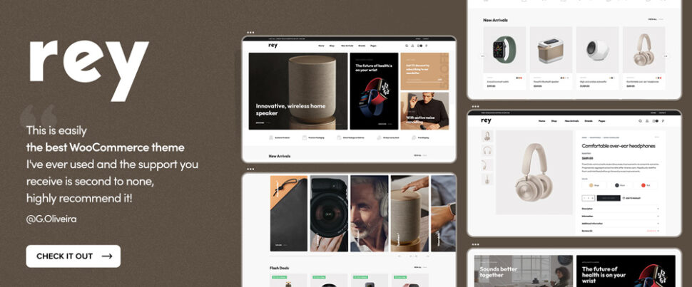
The Rey WooCommerce theme is so fully equipped and flexible that you very likely will not need to rely on external plugins, plus its website demos are feature-rich yet designed with minimizing workflow in mind. With a few edits you can get a store up and running in a few hours.
There are plenty of supporting features as well, including –
70+ internal optional modules and pre-made store templates.
flexible visual editing and fast search, filtering, and products navigation.
Rey is SEO friendly as well and puts you in good hands with its 5-star customer support.
WoodMart is ThemeForest’s most popular WooCommerce WordPress theme for a simple reason. It is loaded with features you will not find in most other eCommerce-oriented themes, such as –
shop and product page Elementor builders with an Elementor custom checkout feature, the WPBakery page builder, a header builder, and AJAX filters, product swatches, and search capabilities.
80+ prebuilt websites to get projects underway or combine to create your pages.
400+ templates you can use to prototype your website pages.
Woodmart, its plugins, and its dummy content can be installed in a few clicks.
Hongo is a modern and multi-purpose WooCommerce WordPress theme which is specially curated for creating WooCommerce stores and company websites.
Hongo users have plenty to work with, including –
12 Stunning and impressive store demos, 200 plus creative elements and a library of around 250 templates
Out of the box premium features like quick view, compare products, wishlist, catalog mode, advanced filters, color swatches, product tabs, and product videos.
WordPress Customizer and WPBakery custom shortcodes to support flexibility and customizability.
Users will also appreciate Hongo’s online detailed documentation and highly rated customer support.
The first thing people notice about XStore is its library of 120+ stunning and ready-to-go pre-built shops, which have become somewhat of a trademark for this theme.
Upon closer inspection, they find there’s plenty more to like about this WooCommerce WordPress theme including –
Its full support for Elementor and WPBakery, header builder, single product page builder, and 500+ prebuilt blocks.
$510 worth of premium plugins and a built-in WooCommerce email builder.
XStore gives every one of its users incredible value for a relatively small investment.
Electro is a clean, modern, user friendly, responsive and highly customizable WooCommerce Theme with a 1.25 sec load time that makes it an ideal choice for your WooCommerce electronics store.
Electro’s compatibility with both Elementor and WPBakery page builders will enable you to take your design to the next level.
You can choose from 7 awesome home pages and 3 different layouts to showcase your product, while using the power of Electro to add features like quick checkout and display product reviews.
*******
WordPress WooCommerce themes provide an excellent pathway to create an eCommerce shop and sell your products thanks to the easy to use WooCommerce extensions.
The right theme will ensure that your store will be both fast and reliable while providing an exceptional shopping experience that converts visitors to customers and boosts your store’s sales.
Choose one of these 11 Best WooCommerce WordPress Themes to launch your successful online store. There are no wrong choices here.
There are many considerations when building a calendar component — far more than what is covered in the articles I linked up. If you think about it, calendars are fraught with nuance, from handling timezones and date formats to localization and even making sure dates flow from one month to the next… and that’s before we even get into accessibility and additional layout considerations depending on where the calendar is displayed and whatnot.
Many developers fear the Date() object and stick with older libraries like moment.js. But while there are many “gotchas” when it comes to dates and formatting, JavaScript has a lot of cool APIs and stuff to help out!
I don’t want to re-create the wheel here, but I will show you how we can get a dang good calendar with vanilla JavaScript. We’ll look into accessibility, using semantic markup and screenreader-friendly -tags — as well as internationalization and formatting, using the Intl.Locale, Intl.DateTimeFormat and Intl.NumberFormat-APIs.
In other words, we’re making a calendar… only without the extra dependencies you might typically see used in a tutorial like this, and with some of the nuances you might not typically see. And, in the process, I hope you’ll gain a new appreciation for newer things that JavaScript can do while getting an idea of the sorts of things that cross my mind when I’m putting something like this together.
First off, naming
What should we call our calendar component? In my native language, it would be called “kalender element”, so let’s use that and shorten that to “Kal-El” — also known as Superman’s name on the planet Krypton.
Let’s create a function to get things going:
function kalEl(settings = {}) { ... }
This method will render a single month. Later we’ll call this method from [...Array(12).keys()] to render an entire year.
Initial data and internationalization
One of the common things a typical online calendar does is highlight the current date. So let’s create a reference for that:
const today = new Date();
Next, we’ll create a “configuration object” that we’ll merge with the optional settings object of the primary method:
We check, if the root element () contains a lang-attribute with locale info; otherwise, we’ll fallback to using en-US. This is the first step toward internationalizing the calendar.
We also need to determine which month to initially display when the calendar is rendered. That’s why we extended the config object with the primary date. This way, if no date is provided in the settings object, we’ll use the today reference instead:
const date = config.date ? new Date(config.date) : today;
We need a little more info to properly format the calendar based on locale. For example, we might not know whether the first day of the week is Sunday or Monday, depending on the locale. If we have the info, great! But if not, we’ll update it using the Intl.Locale API. The API has a weekInfo object that returns a firstDay property that gives us exactly what we’re looking for without any hassle. We can also get which days of the week are assigned to the weekend:
if (!config.info) config.info = new Intl.Locale(config.locale).weekInfo || {
  firstDay: 7,
  weekend: [6, 7]
};
Again, we create fallbacks. The “first day” of the week for en-US is Sunday, so it defaults to a value of 7. This is a little confusing, as the getDay method in JavaScript returns the days as [0-6], where 0 is Sunday… don’t ask me why. The weekends are Saturday and Sunday, hence [6, 7].
Before we had the Intl.Locale API and its weekInfo method, it was pretty hard to create an international calendar without many **objects and arrays with information about each locale or region. Nowadays, it’s easy-peasy. If we pass in en-GB, the method returns:
The last one is a Boolean that checks whether today exists in the month we’re about to render.
Semantic markup
We’re going to get deeper in rendering in just a moment. But first, I want to make sure that the details we set up have semantic HTML tags associated with them. Setting that up right out of the box gives us accessibility benefits from the start.
Calendar wrapper
First, we have the non-semantic wrapper: . That’s fine because there isn’t a semantic tag or anything like that. If we weren’t making a custom element,
might be the most appropriate element since the calendar could stand on its own page.
Month names
The element is going to be a big one for us because it helps translate dates into a format that screenreaders and search engines can parse more accurately and consistently. For example, here’s how we can convey “January 2023” in our markup:
The row above the calendar’s dates containing the names of the days of the week can be tricky. It’s ideal if we can write out the full names for each day — e.g. Sunday, Monday, Tuesday, etc. — but that can take up a lot of space. So, let’s abbreviate the names for now inside of an
where each day is a :
<ol>
  <li><abbr title="Sunday">Sun</abbr></li>
  <li><abbr title="Monday">Mon</abbr></li>
  <!-- etc. -->
</ol>
We could get tricky with CSS to get the best of both worlds. For example, if we modified the markup a bit like this:
…we get the full names by default. We can then “hide” the full name when space runs out and display the title attribute instead:
@media all and (max-width: 800px) {
  li abbr::after {
    content: attr(title);
  }
}
But, we’re not going that way because the Intl.DateTimeFormat API can help here as well. We’ll get to that in the next section when we cover rendering.
Day numbers
Each date in the calendar grid gets a number. Each number is a list item (
) in an ordered list (), and the inline tag wraps the actual number.
<li>
  <time datetime="2023-01-01">1</time>
</li>
And while I’m not planning to do any styling just yet, I know I will want some way to style the date numbers. That’s possible as-is, but I also want to be able to style weekday numbers differently than weekend numbers if I need to. So, I’m going to include data-* attributes specifically for that: data-weekend and data-today.
Week numbers
There are 52 weeks in a year, sometimes 53. While it’s not super common, it can be nice to display the number for a given week in the calendar for additional context. I like having it now, even if I don’t wind up not using it. But we’ll totally use it in this tutorial.
We’ll use a data-weeknumber attribute as a styling hook and include it in the markup for each date that is the week’s first date.
Let’s get the calendar on a page! We already know that is the name of our custom element. First thing we need to configure it is to set the firstDay property on it, so the calendar knows whether Sunday or some other day is the first day of the week.
We’ll be using template literals to render the markup. To format the dates for an international audience, we’ll use the Intl.DateTimeFormat API, again using the locale we specified earlier.
The month and year
When we call the month, we can set whether we want to use the long name (e.g. February) or the short name (e.g. Feb.). Let’s use the long name since it’s the title above the calendar:
For weekdays displayed above the grid of dates, we need both the long (e.g. “Sunday”) and short (abbreviated, ie. “Sun”) names. This way, we can use the “short” name when the calendar is short on space:
${[...Array(numOfDays).keys()].map(i => {
  const cur = new Date(year, month, i + 1);
  let day = cur.getDay(); if (day === 0) day = 7;
  const today = renderToday && (config.today.day === i + 1) ? ' data-today':'';
  return `
    <li data-day="${day}"${today}${i === 0 || day === config.info.firstDay ? ` data-weeknumber="${new Intl.NumberFormat(locale).format(getWeek(cur))}"`:''}${config.info.weekend.includes(day) ? ` data-weekend`:''}>
      <time datetime="${year}-${(pad(month))}-${pad(i)}" tabindex="0">
        ${new Intl.NumberFormat(locale).format(i + 1)}
      </time>
    </li>`
}).join('')}
Let’s break that down:
We create a “dummy” array, based on the “number of days” variable, which we’ll use to iterate.
We create a day variable for the current day in the iteration.
We fix the discrepancy between the Intl.Locale API and getDay().
If the day is equal to today, we add a data-* attribute.
Finally, we return the element as a string with merged data.
tabindex="0" makes the element focusable, when using keyboard navigation, after any positive tabindex values (Note: you should never add positive tabindex-values)
To “pad” the numbers in the datetime attribute, we use a little helper method:
const pad = (val) => (val + 1).toString().padStart(2, '0');
Week number
Again, the “week number” is where a week falls in a 52-week calendar. We use a little helper method for that as well:
I didn’t write this getWeek-method. It’s a cleaned up version of this script.
And that’s it! Thanks to the Intl.Locale, Intl.DateTimeFormat and Intl.NumberFormat APIs, we can now simply change the lang-attribute of the element to change the context of the calendar based on the current region:
de-DE
fa-IR
zh-Hans-CN-u-nu-hanidec
Styling the calendar
You might recall how all the days are just one
with list items. To style these into a readable calendar, we dive into the wonderful world of CSS Grid. In fact, we can repurpose the same grid from a starter calendar template right here on CSS-Tricks, but updated a smidge with the :is() relational pseudo to optimize the code.
Notice that I’m defining configurable CSS variables along the way (and prefixing them with ---kalel- to avoid conflicts).
The seven-column grid works fine when the first day of the month is also the first day of the week for the selected locale). But that’s the exception rather than the rule. Most times, we’ll need to shift the first day of the month to a different weekday.
Remember all the extra data-* attributes we defined when writing our markup? We can hook into those to update which grid column (--kalel-li-gc) the first date number of the month is placed on:
In this case, we’re spanning from the first grid column to the fourth grid column — which will automatically “push” the next item (Day 2) to the fifth grid column, and so forth.
Let’s add a little style to the “current” date, so it stands out. These are just my styles. You can totally do what you’d like here.
I like the idea of styling the date numbers for weekends differently than weekdays. I’m going to use a reddish color to style those. Note that we can reach for the :not() pseudo-class to select them while leaving the current date alone:
Oh, and let’s not forget the week numbers that go before the first date number of each week. We used a data-weeknumber attribute in the markup for that, but the numbers won’t actually display unless we reveal them with CSS, which we can do on the ::before pseudo-element:
We’re technically done at this point! We can render a calendar grid that shows the dates for the current month, complete with considerations for localizing the data by locale, and ensuring that the calendar uses proper semantics. And all we used was vanilla JavaScript and CSS!
But let’s take this one more step…
Rendering an entire year
Maybe you need to display a full year of dates! So, rather than render the current month, you might want to display all of the month grids for the current year.
Well, the nice thing about the approach we’re using is that we can call the render method as many times as we want and merely change the integer that identifies the month on each instance. Let’s call it 12 times based on the current year.
as simple as calling the render-method 12 times, and just change the integer for month — i:
[...Array(12).keys()].map(i =>
  render(
    new Date(date.getFullYear(),
    i,
    date.getDate()),
    config.locale,
    date.getMonth()
  )
).join('')
It’s probably a good idea to create a new parent wrapper for the rendered year. Each calendar grid is a element. Let’s call the new parent wrapper , where Jor-El is the name of Kal-El’s father.
<jor-el id="app" data-year="true">
  <kal-el data-firstday="7">
    <!-- etc. -->
  </kal-el>

  <!-- other months -->
</jor-el>
We can use to create a grid for our grids. So meta!
I figured we could do something similar without changing anything in the HTML or JavaScript. I’ve taken the liberty to include full names for months, and numbers instead of day names, to make it more readable. Enjoy!
You know what it’s like to pick up a new language or framework. Sometimes there’s great documentation to help you find your way through it. But even the best documentation doesn’t cover absolutely everything. And when you work with something that’s new, you’re bound to find a problem that doesn’t have a written solution.
That’s how it was for me the first time I created a React project — and React is one of those frameworks with remarkable documentation, especially now with the beta docs. But I still struggled my way through. It’s been quite a while since that project, but the lessons I gained from it are still fresh in my mind. And even though there are a lot of React “how-to” tutorials in out there, I thought I’d share what I wish I knew when I first used it.
So, that’s what this article is — a list of the early mistakes I made. I hope they help make learning React a lot smoother for you.
Using create-react-app to start a project
TL;DR Use Vite or Parcel.
Create React App (CRA) is a tool that helps you set up a new React project. It creates a development environment with the best configuration options for most React projects. This means you don’t have to spend time configuring anything yourself.
As a beginner, this seemed like a great way to start my work! No configuration! Just start coding!
CRA uses two popular packages to achieve this, webpack and Babel. webpack is a web bundler that optimizes all of the assets in your project, such as JavaScript, CSS, and images. Babel is a tool that allows you to use newer JavaScript features, even if some browsers don’t support them.
Both are good, but there are newer tools that can do the job better, specifically Vite and Speedy Web Compiler (SWC).
These new and improved alternatives are faster and easier to configure than webpack and Babel. This makes it easier to adjust the configuration which is difficult to do in create-react-app without ejecting.
To use them both when setting up a new React project you have to make sure you have Node version 12 or higher installed, then run the following command.
npm create vite
You’ll be asked to pick a name for your project. Once you do that, select React from the list of frameworks. After that, you can select either Javascript + SWC or Typescript + SWC
Then you’ll have to change directory cd into your project and run the following command;
npm i && npm run dev
This should run a development server for your site with the URL localhost:5173
Data can be passed to React components through something called props. These are added to a component just like attributes in an HTML element and can be used in a component’s definition by taking the relevant values from the prop object passed in as an argument.
This is more favorable as the code that can be read by modern browsers without the need for extra transformation.
Unfortunately, defaultProps do require some transformation to be read by the browser since JSX (JavaScript XML) isn’t supported out of the box. This could potentially affect the performance of an application that is using a lot of defaultProps.
In React, the propTypes property can be used to check if a component is being passed the correct data type for its props. They allow you to specify the type of data that should be used for each prop such as a string, number, object, etc. They also allow you to specify if a prop is required or not.
This way, if a component is passed the wrong data type or if a required prop is not being provided, then React will throw an error.
TypeScript provides a level of type safety in data that’s being passed to components. So, sure, propTypes were a good idea back when I was starting. However, now that TypeScript has become the go-to solution for type safety, I would highly recommend using it over anything else.
TypeScript is a programming language that builds on top of JavaScript by adding static type-checking. TypeScript provides a more powerful type system, that can catch more potential bugs and improves the development experience.
Class components in React are created using JavaScript classes. They have a more object-oriented structure and as well as a few additional features, like the ability to use the this keyword and lifecycle methods.
I prefer writing components with classes over functions, but JavaScript classes are more difficult for beginners to understand and this can get very confusing. Instead, I’d recommend writing components as functions:
Function components are simply JavaScript functions that return JSX. They are much easier to read, and do not have additional features like the this keyword and lifecycle methods which make them more performant than class components.
Function components also have the advantage of using hooks. React Hooks allow you to use state and other React features without writing a class component, making your code more readable, maintainable and reusable.
TL;DR: There’s no need to do it, unless you need hooks.
Since React 17 was released in 2020, it’s now unnecessary to import React at the top of your file whenever you create a component.
import React from 'react'; // Not needed!
export default function Card() {}
But we had to do that before React 17 because the JSX transformer (the thing that converts JSX into regular JavaScript) used a method called React.createElement that would only work when importing React. Since then, a new transformer has been release which can transform JSX without the createElement method.
You will still need to import React to use hooks, fragments, and any other functions or components you might need from the library:
import { useState } from 'react';

export default function Card() {
  const [count, setCount] = useState(0);
  // ...
}
Those were my early mistakes!
Maybe “mistake” is too harsh a word since some of the better practices came about later. Still, I see plenty of instances where the “old” way of doing something is still being actively used in projects and other tutorials.
To be honest, I probably made way more than five mistakes when getting started. Anytime you reach for a new tool it is going to be more like a learning journey to use it effectively, rather than flipping a switch. But these are the things I still carry with me years later!
If you’ve been using React for a while, what are some of the things you wish you knew before you started? It would be great to get a collection going to help others avoid the same struggles.
CSS trigonometry functions are here! Well, they are if you’re using the latest versions of Firefox and Safari, that is. Having this sort of mathematical power in CSS opens up a whole bunch of possibilities. In this tutorial, I thought we’d dip our toes in the water to get a feel for a couple of the newer functions: sin() and cos().
There are other trigonometry functions in the pipeline — including tan() — so why focus just on sin() and cos()? They happen to be perfect for the idea I have in mind, which is to place text along the edge of a circle. That’s been covered here on CSS-Tricks when Chris shared an approach that uses a Sass mixin. That was six years ago, so let’s give it the bleeding edge treatment.
Here’s what I have in mind. Again, it’s only supported in Firefox and Safari at the moment:
CodePen Embed Fallback
So, it’s not exactly like words forming a circular shape, but we are placing text characters along the circle to form a clock face. Here’s some markup we can use to kick things off:
I decorated things a bit in there, but only to get the basic shape and background color to help us see what we’re doing. Notice how we save the width value in a CSS variable. We’ll use that later. Not much to look at so far:
It looks like some sort of modern art experiment, right? Let’s introduce a new variable, --_r, to store the circle’s radius, which is equal to half of the circle’s width. This way, if the width (--_w) changes, the radius value (--_r) will also update — thanks to another CSS math function, calc():
Now, a bit of math. A circle is 360 degrees. We have 12 labels on our clock, so want to place the numbers every 30 degrees (360 / 12). In math-land, a circle begins at 3 o’clock, so noon is actually minus 90 degrees from that, which is 270 degrees (360 - 90).
Let’s add another variable, --_d, that we can use to set a degree value for each number on the clock face. We’re going to increment the values by 30 degrees to complete our circle:
OK, now’s the time to get our hands dirty with the sin() and cos() functions! What we want to do is use them to get the X and Y coordinates for each number so we can place them properly around the clock face.
The formula for the X coordinate is radius + (radius * cos(degree)). Let’s plug that into our new --_x variable:
There are a few housekeeping things we need to do to set up the numbers, so let’s put some basic styling on them to make sure they are absolutely positioned and placed with our coordinates:
Notice --_sz, which we’ll use for the width and height of the numbers in a moment. Let’s see what we have so far.
This definitely looks more like a clock! See how the top-left corner of each number is positioned at the correct place around the circle? We need to “shrink” the radius when calculating the positions for each number. We can deduct the size of a number (--_sz) from the size of the circle (--_w), before we calculate the radius:
--_r: calc((var(--_w) - var(--_sz)) / 2);
Much better! Let’s change the colors, so it looks more elegant:
We could stop right here! We accomplished the goal of placing text around a circle, right? But what’s a clock without arms to show hours, minutes, and seconds?
Let’s use a single CSS animation for that. First, let’s add three more elements to our markup,
@keyframes turn {
  to {
    transform: rotate(1turn);
  }
}
The only difference is the time the individual arms take to make a full turn. For the hours arm, it takes 12 hours to make a full turn. The animation-duration property only accepts values in milliseconds and seconds. Let’s stick with seconds, which is 43,200 seconds (60 seconds * 60 minutes * 12 hours).
animation: turn 43200s infinite;
It takes 1 hour for the minutes arm to make a full turn. But we want this to be a multi-step animation so the movement between the arms is staggered rather than linear. We’ll need 60 steps, one for each minute:
animation: turn 3600s steps(60, end) infinite;
The seconds arm is almost the same as the minutes arm, but the duration is 60 seconds instead of 60 minutes:
animation: turn 60s steps(60, end) infinite;
Let’s update the properties we created in the common styles:
What if we want to start at the current time? We need a little bit of JavaScript:
const time = new Date();
const hour = -3600 * (time.getHours() % 12);
const mins = -60 * time.getMinutes();
app.style.setProperty('--_dm', `${mins}s`);
app.style.setProperty('--_dh', `${(hour+mins)}s`);
I’ve added id="app" to the clockface and set two new custom properties on it that set a negative animation-delay, as Mate Marschalko did when he shared a CSS-only clock. The getHours() method of JavaScipt’s Date object is using the 24-hour format, so we use the remainder operator to convert it into 12-hour format.
In the CSS, we need to add the animation-delay as well:
.minutes {
  animation-delay: var(--_dm, 0s);
  /* other styles */
}

.hours {
  animation-delay: var(--_dh, 0s);
  /* other styles */
}
Just one more thing. Using CSS @supports and the properties we’ve already created, we can provide a fallback to browsers that do not supprt sin() and cos(). (Thank you, Temani Afif!):
And, voilà! Our clock is done! Here’s the final demo one more time. Again, it’s only supported in Firefox and Safari at the moment.
CodePen Embed Fallback
What else can we do?
Just messing around here, but we can quickly turn our clock into a circular image gallery by replacing the tags with then updating the width (--_w) and radius (--_r) values:
CodePen Embed Fallback
Let’s try one more. I mentioned earlier how the clock looked kind of like a modern art experiment. We can lean into that and re-create a pattern I saw on a poster (that I unfortunately didn’t buy) in an art gallery the other day. As I recall, it was called “Moon” and consisted of a bunch of dots forming a circle.
We’ll use an unordered list this time since the circles don’t follow a particular order. We’re not even going to put all the list items in the markup. Instead, let’s inject them with JavaScript and add a few controls we can use to manipulate the final result.
The controls are range inputs () which we’ll wrap in a and listen for the input event.
We’ll run this method on “input”, which will create a bunch of
elements with the degree (--_d) variable we used earlier applied to each one. We can also repurpose our radius variable (--_r) .
I also want the dots to be different colors. So, let’s randomize (well, not completely randomized) the HSL color value for each list item and store it as a new CSS variable, --_bgc:
const update = () => {
  let s = "";
  for (let i = 1; i <= rings.valueAsNumber; i++) {
    const r = spread.valueAsNumber * i;
    const theta = coords(dots.valueAsNumber * i);
    for (let j = 0; j < theta.length; j++) {
      s += `<li style="--_d:${theta[j]};--_r:${r}px;--_bgc:hsl(${random(
        50,
        25
      )},${random(90, 50)}%,${random(90, 60)}%)"></li>`;
    }
  }
  app.innerHTML = s;
}
The random() method picks a value within a defined range of numbers:
const random = (max, min = 0, f = true) => f ? Math.floor(Math.random() * (max - min) + min) : Math.random() * max;
And that’s it. We use JavaScript to render the markup, but as soon as it’s rendered, we don’t really need it. The sin() and cos() functions help us position all the dots in the right spots.
CodePen Embed Fallback
Final thoughts
Placing things around a circle is a pretty basic example to demonstrate the powers of trigonometry functions like sin() and cos(). But it’s really cool that we are getting modern CSS features that provide new solutions for old workarounds I’m sure we’ll see way more interesting, complex, and creative use cases, especially as browser support comes to Chrome and Edge.
This month’s edition of Exciting New Tools for Designers and Developers focuses on getting work done smarter.
We have invoicing apps and scheduling tools. Some resources will save you the trouble of hiring a designer or developer. And there are some really helpful testing and prototyping tools.
Glaze
Rise
Rise is an intelligent time tracker that helps you maximize your productivity. It’s an excellent solution for freelancers hoping to improve their income.
Relicx
Relicx is a testing app that tracks down the UX issues in your product using real user journeys. It’s 10x more effective than beta testing.
Outerbase
Outerbase is a GUI for your database. Easily view, edit, and manage all of the data in your database without needing to know SQL.
Selldone
Selldone is an enterprise-grade service for building large-volume ecommerce experiences. It’s no-code, white-labeled, and can handle millions of orders.
Cakedesk
Cakedesk is an excellent invoicing app for freelancers. You can send invoices and proposals and build a database of clients.
Roastd
Roastd is a feedback service that’s not for the faint of heart. You can pay for brutally honest feedback, and although it may hurt, acting on it will improve your conversions.
Galileo AI
Galileo AI is a new service that promises to design user interfaces for you. Trained on thousands of designs, it uses AI to create a design based on a text prompt.
Sizzy
Sizzy is a powerful browser for web development that packs all the tools you need into a single app. You can test different device sizes, debug, and it integrates with lots of devtools.
Linke
Linke is a link manager that lets you create fully branded short links that you can share on social media, your website, or via email. You’ll get notified whenever it’s clicked.
AssemblyAI
AssemblyAI is a speech recognition API that uses AI to detect speech, transcribe it to text, and understand it. It’s an incredible resource for anyone building customer service apps.
Freelance Brain
Freelance Brain is an add-on for Notion that helps you manage your freelance business. You can manage clients and projects for a more straightforward work life.
Glint
Glint is an excellent free GUI for Git. It allows you to version control your files in a visual manner, so you don’t need to mess around with the command line.
Maya
Maya is an AI assistant for startups. So instead of spending valuable time hunting through your data for answers, ask Maya and get better answers faster.
PersonaGen
PersonaGen is a fantastic alternative to spending hours writing personas for user testing. It uses the power of AI to create your personas in seconds.
Designing an onboarding process can be tricky; there are so many different options, and if you get it wrong, you could turn users off. This freebie is a great starting point for your own designs, either for prototyping or as a sanity check to ensure that you’ve included the essentials.
This awesome UI kit designed by Premium UI Kits features 28 mobile screens. The designs are based on the onboarding process for a budget planner, but they’re super easy to customize and can easily be transformed into any onboarding or sign-up process.
The design is in the popular minimal-tech style and features pill-shaped buttons and subtle gradients that make the screens feel both familiar and fresh.
All of the graphics are 100% vector-based, using customizable symbols for Sketch and Figma users.
You can use the Budget Planner Mobile UI Kit on your sites for free. Download it here now.
There’s a common theme in this month’s collection of website design trends – typography. All three of these trends showcase popular type elements that seem to be exploding in popularity.
Here’s what’s trending in design this month.
1. Focus on Typography
Admittedly this trend seems a little vague, but we think you’ll know it when you see it. Plenty of projects are being designed with an emphasis on typography.
This includes big, bold lettering, interesting typefaces, big variances in size or color, tiny type animations, and an overall stripping of strong imagery from the screen. You won’t see many photos or videos here (and if you do, they are probably small).
After that, almost anything is allowed. And the designs are quite stunning!
These projects include all kinds of typography, from experimental to bold. (You can even find it in the new typography animation in the new design for this website in the homepage banner.)
Here are three examples of three very different directions on this website design trend:
IGZIST combines an oversized slab serif with a handwriting style that takes the whole screen. With a black-and-white aesthetic and red accent, everything has an in-your-face feel. There’s a glitch animation that also layers on top of everything to keep it interesting.
Contra Bureau combines a too-close-for-comfort headline in “CONTRA” with sideways text, a sub-headline with underlines, and multiple typefaces in a bold red and beige color scheme to make you hang on to every word. Immense contrast in style and size contribute to the effectiveness of this typographic gem.
Readymag uses an interesting typeface in a color variable animation to make you ready and get your attention. The green-on-white pattern isn’t common and is a bit of a disruptor in itself. The most graphic elements on the screen are the navigation buttons and the brackets for small text elements.
2. Heroes with Very Little Text
This typography trend actually includes very little text. Many designers are creating hero headers with almost no text at all aside from simple navigation.
How does this work? How does a user engage when there isn’t anything to read?
The images have to be super engaging. And even then, this design style can still be a risk. Look at the examples below; is there enough to make you click or scroll?
Mathijs Hanenkamp’s portfolio site uses a big photo with a small headline in the bottom left corner. But there’s an interesting top layer with animation that makes you think are little more. Then when you realize it is for a photographer’s portfolio, everything kind of comes together.
AB Yachts has no text on the home hero besides the name brand. If you know the company, the video is probably enough to keep you going, but if not, it could be more of a stretch for unfamiliar users to continue engaging.
Edlewerke focuses on an unusual image (there’s also a tiny animation here) and navigation to help you move through the site. It’s visually striking, but is it enough? Tracking analytics on a design like this would definitely hold the answer to that question.
3. Serifs Everywhere
For designers that came up in the world of print, this website design trend can be a breath of fresh air – serifs everywhere!
While serifs have become much more common with websites, they still don’t come close to the usage of sans serifs. The right serifs can be beautiful and highly readable.
They can also be used in various ways to create a design with a nice focus on typography that isn’t the only focus of the design. This trend is more of a middle ground between the two more extreme examples above.
Momset uses a somewhat larger condensed modern serif for the primary headline in the hero area as well as other headers throughout the design. Color adds an extra element of interest here, and the use of space keeps this typeface readable.
Mbau goes super simple with a full-screen video that rolls behind a simple serif headline that never moves. This design feels elegant and classy, perfect for a travel site. Using “exclusive” in italics almost jumps off the screen because the design pulsates with that feeling.
Caddis Eye Appliances uses a large serif headline and subheaders balanced by smaller sans serif elements for other text elements. What’s fun about his entire design is that it is about being different – they use the term “nonconformists” – and the serif helps exemplify that mantra visually.
Conclusion
Typography trends are an exciting design element because, depending on your brand – and style guide – you may or may not be able to take advantage of these elements. How do you balance incorporating a trend and maintaining brand identity?
There’s not always an obvious answer, but many brands do find a way to create just the right elements to keep themselves looking fresh without losing who they are. Look at your brand rules to decide what constraints you have to work within and how you can bend to be both on-brand and on-trend.
Icons are essential for successful web design. They provide an eye-catching, unobtrusive way to communicate important information and improve user experience. With icons, websites become more interesting and easier to navigate.
These Free Education Icons are designed to help you add visual appeal and emphasize key ideas that complement the content of your website.
The simple, colorful modern design of these line icons make them perfect for use by students, teachers, and institutions. They’re a fun way to represent education-related topics like mathematics or chemistry. Each icon is supplied in vector format as a .ai and a .svg file, so you can scale them to fit your designs without losing quality.


